Categories
Level 5 Sequence and Messaging Sequence and Messaging: Project

Sequence and Messaging: Website design (interactive design)

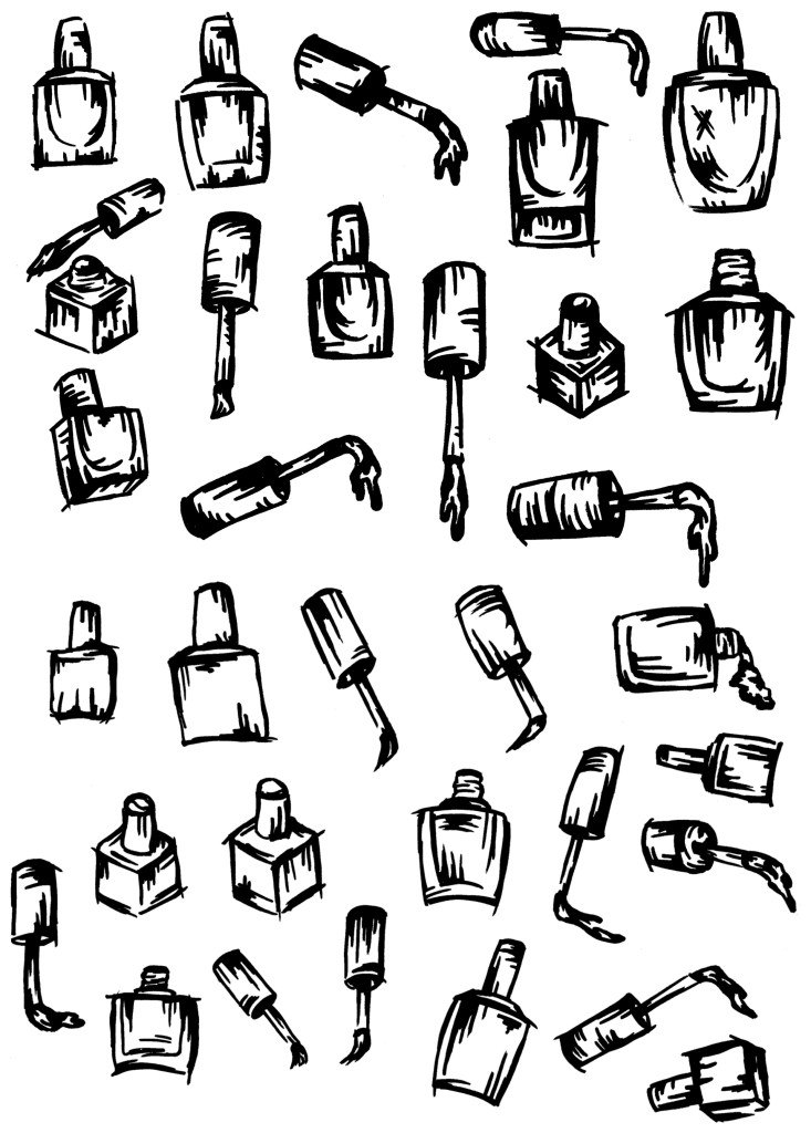
Plan: For the interactive design part of this project I chose to create a website mockup on Figma. I wanted to make a website rather than an app as it feels more relevant to a one off nail polish and convert event. Also it can simply be a separate tab of UN DNs existing website. Below is an initial plan of some ideas for my interactive website:

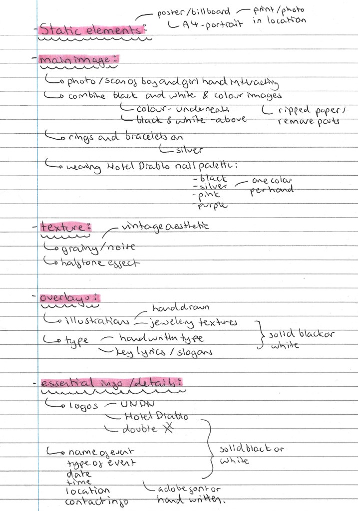
I then hand drew a simple plan for the design of the website. The plan consists of a 4 page layout, a home page, a welcome page, an about page and a details page. Below are notes about what visuals I’ll use and where they’ll go, details about the interactive transitions and more.

Digital mockup: after making the plan on paper I used Procreate to make a digital version, adding in the images and colours. This was a very basic plan which I made lots of changes to but I think it was a helpful step in making me visualise how it could look.

Figma wireframes: then I started working on Figma. I hadn’t used Figma before this project so it was a good opportunity to learn a new design tool. Earlier in the module I watched some tutorials so I had a basic understanding and found it relatively simple to use. Wireframes are used as placeholders to mark out where you want different elements to go. Once I was happy with the wireframes I started working over the top, adding in my images and text.

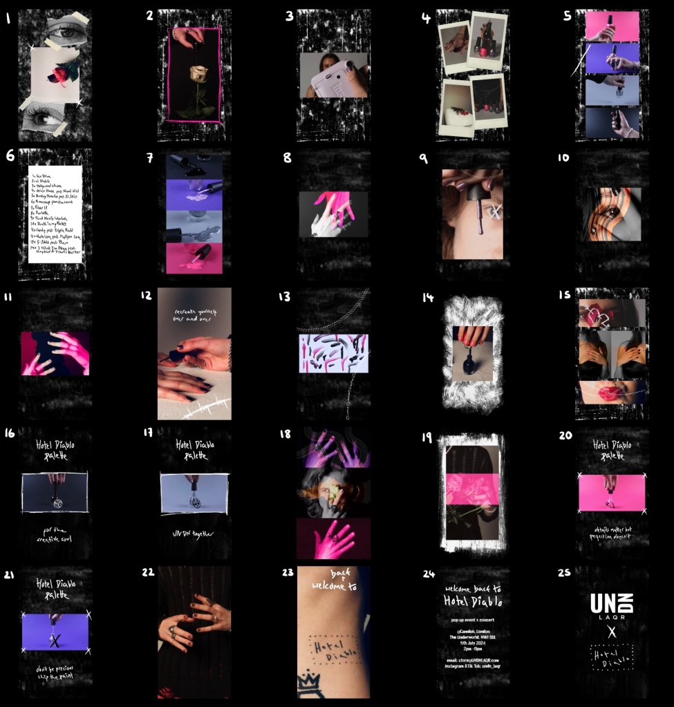
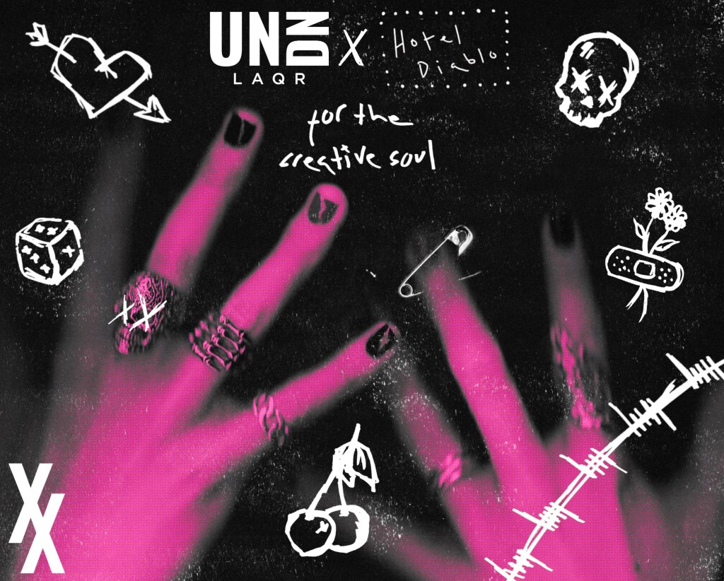
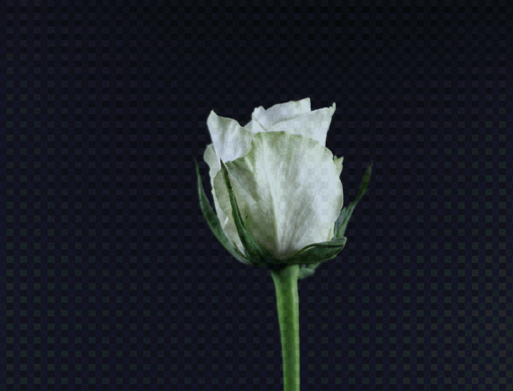
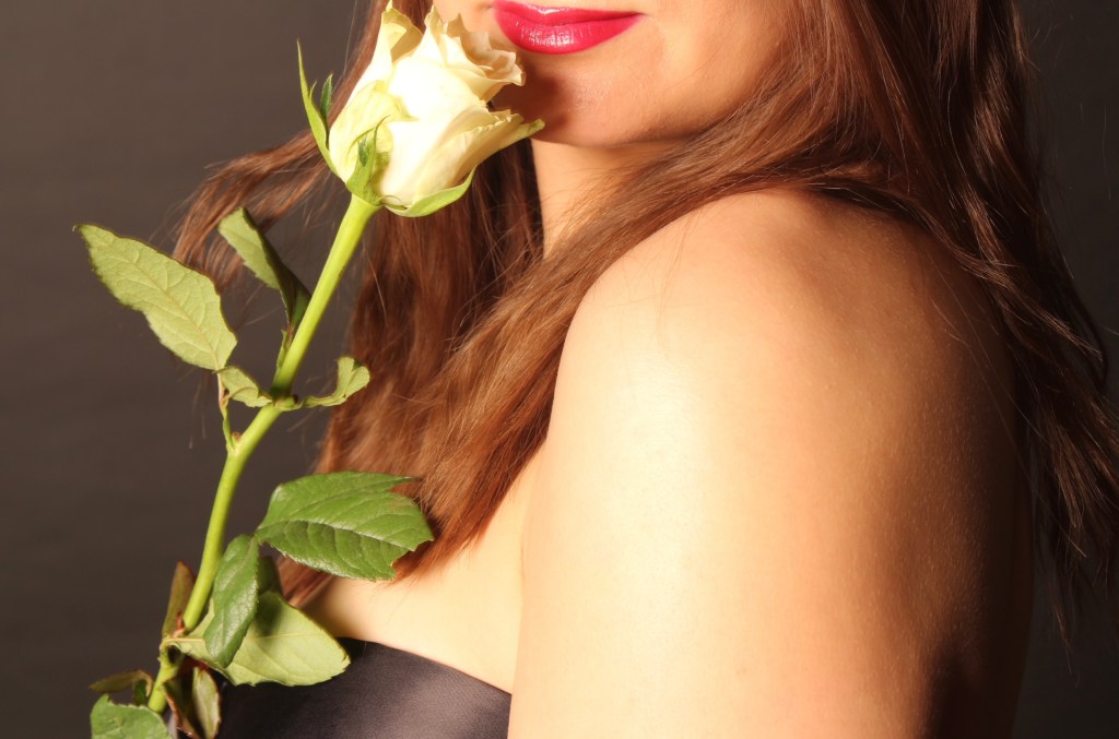
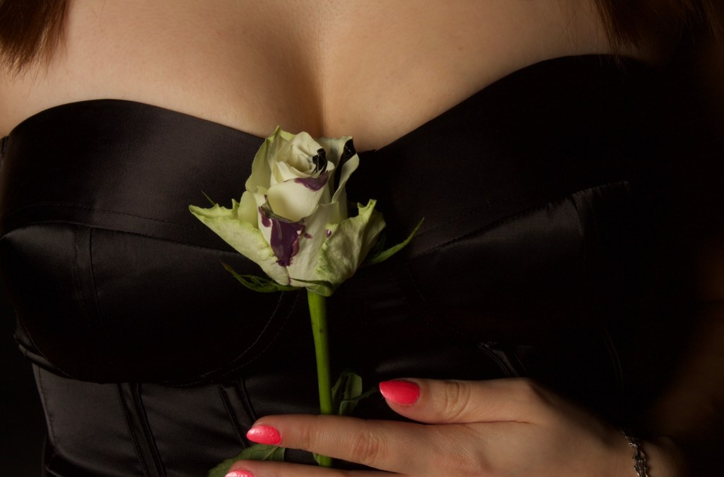
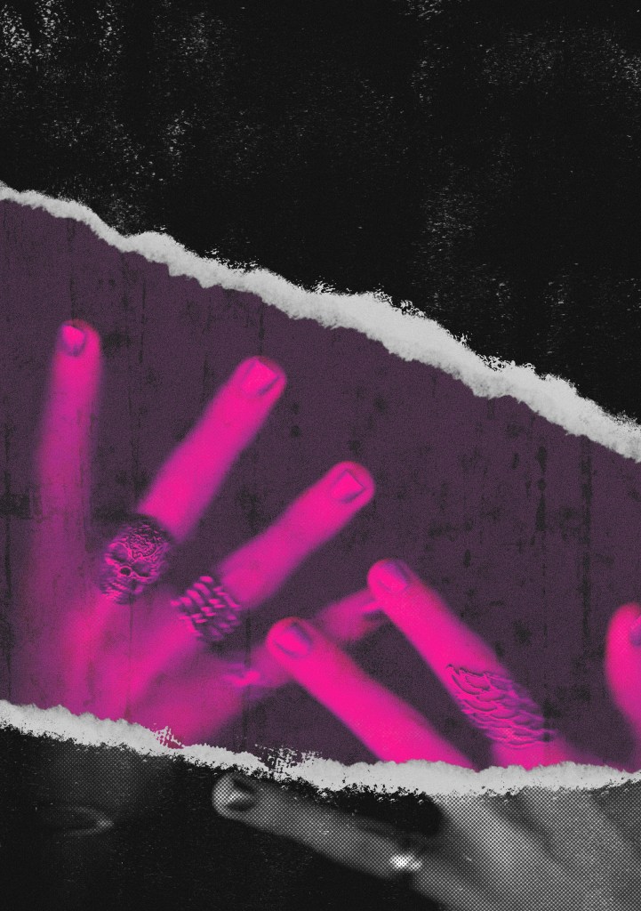
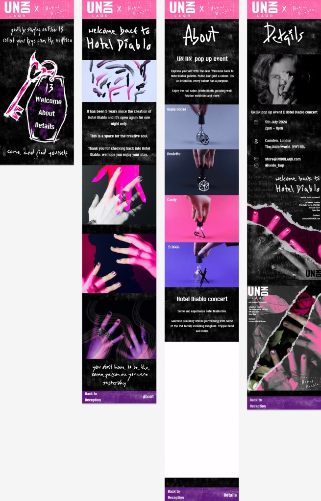
Final Figma design: these are the final versions of all 4 pages. I wanted to keep the visual identity really consistent with the video and posters. The colour scheme, textures and typography are the same. A lot of the images that are here are also used in the posters or video. The idea behind the website takes a lot of inspiration from the format of a hotel to immerse viewers in the world of Hotel Diablo. The language used across the pages push this concept. Across the other pages I have used a mixture of photos and animated GIFs. These just makes them experience of exploring the website more engaging because the visual media is varied. The main colour on the pages is black with white textures and has the pop of pink and purple at the top and bottom. This distribution of colour is similar to the video.

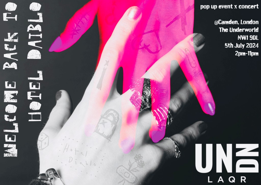
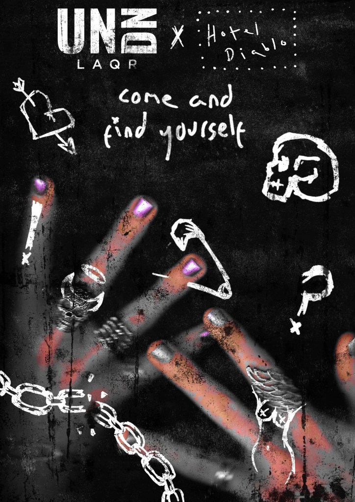
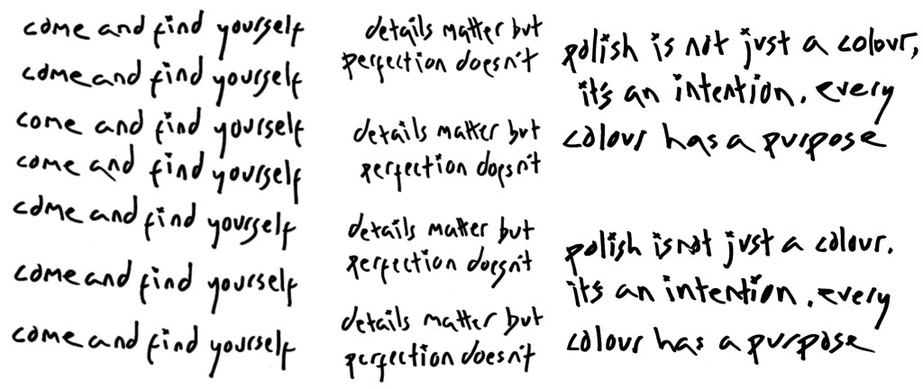
Home page: On the top of the home page it references ‘Floor 13’ which is a song on the album. Throughout the design I refer to the home page as the reception as if it was a hotel. The menu is on a key chain so they navigate through the page like they’re walking through Hotel Diablo. At the bottom it says ‘come and find yourself’, the first lyric on the album which is included in the posters and video too.

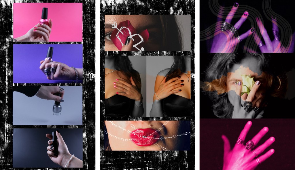
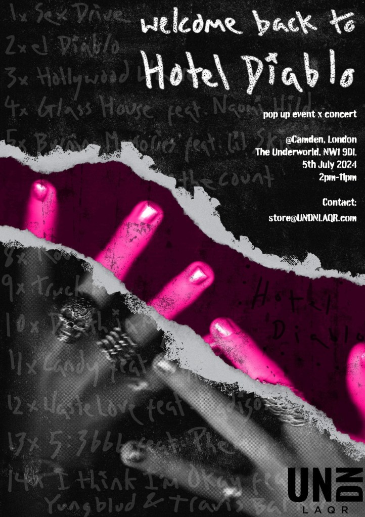
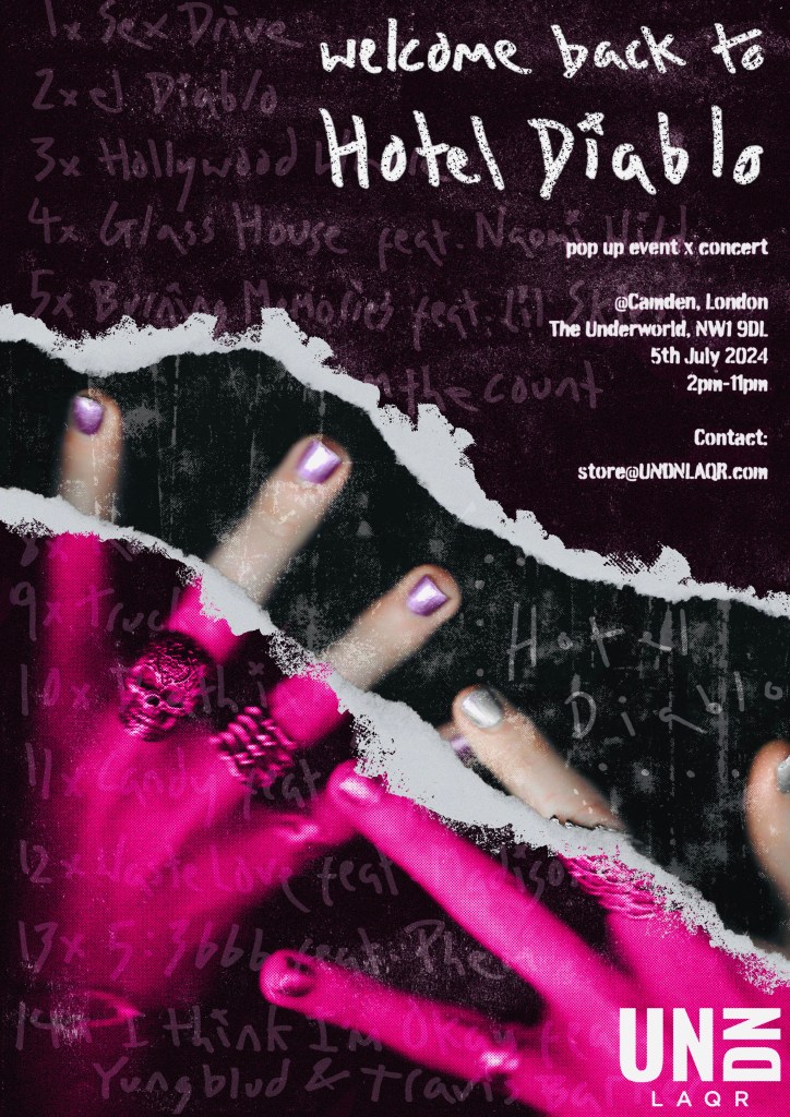
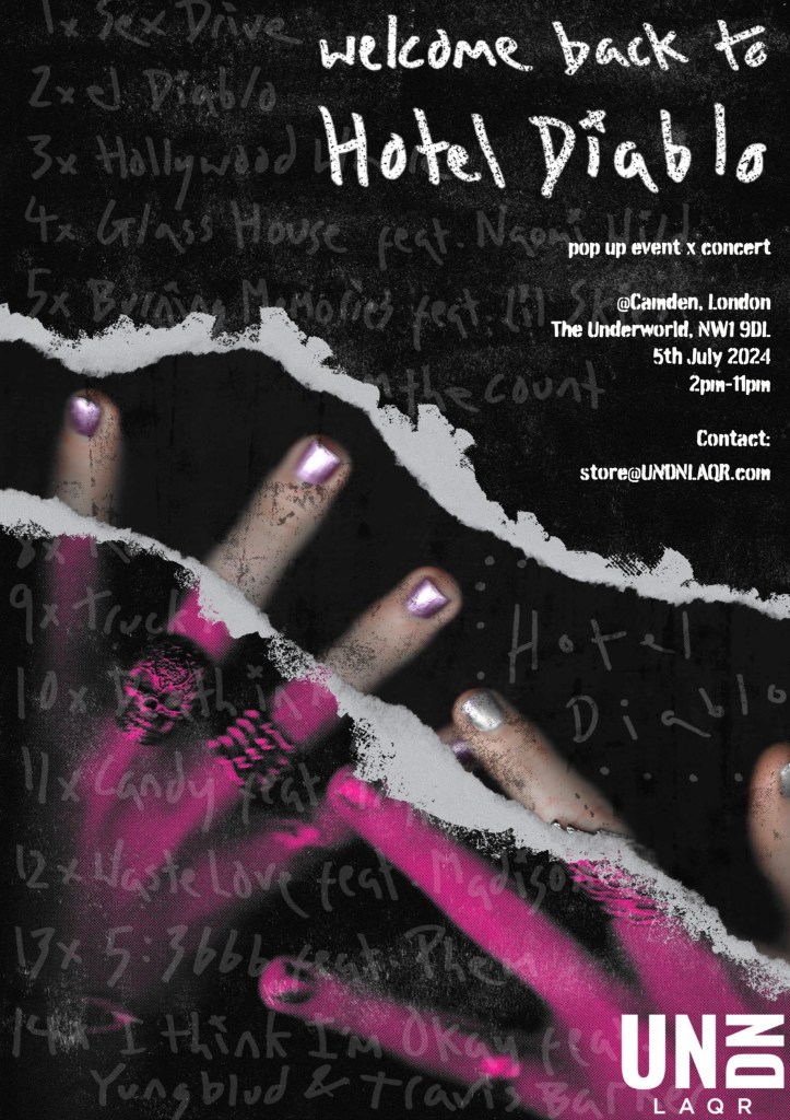
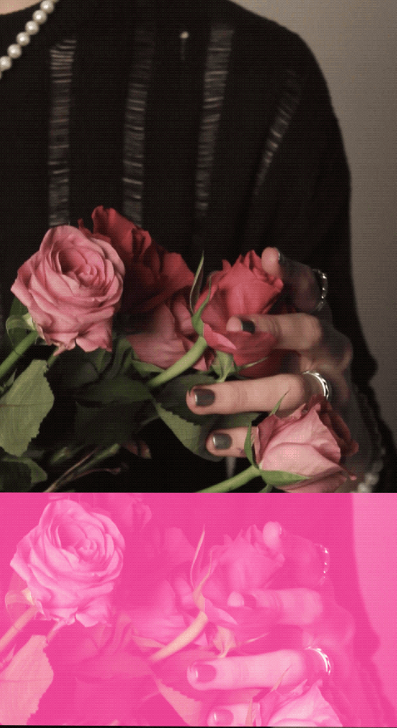
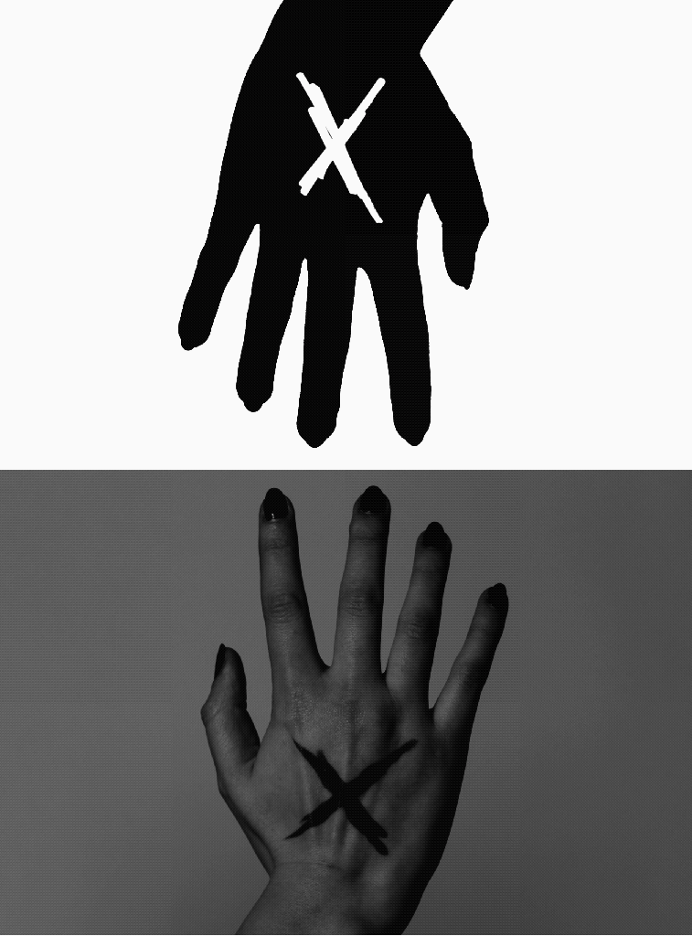
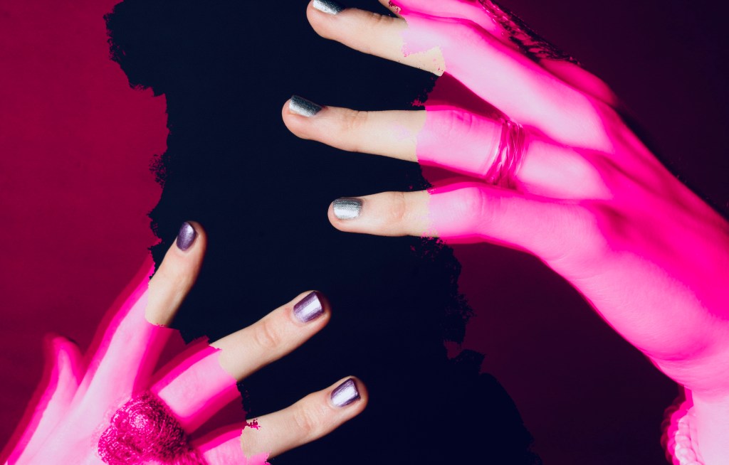
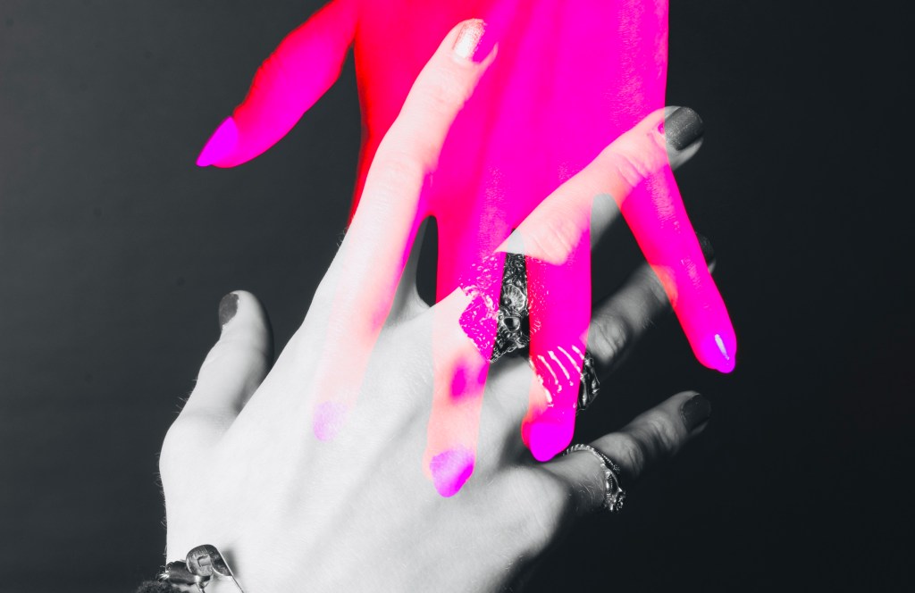
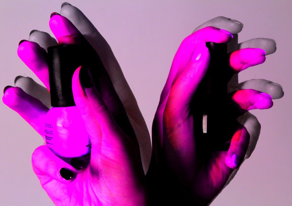
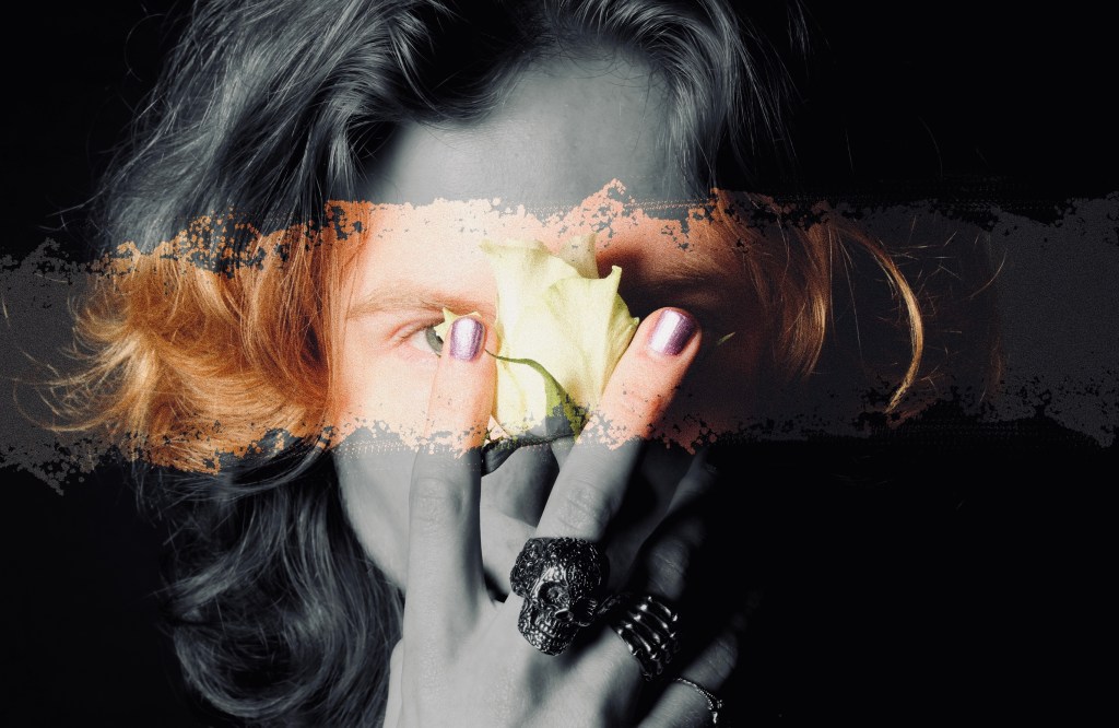
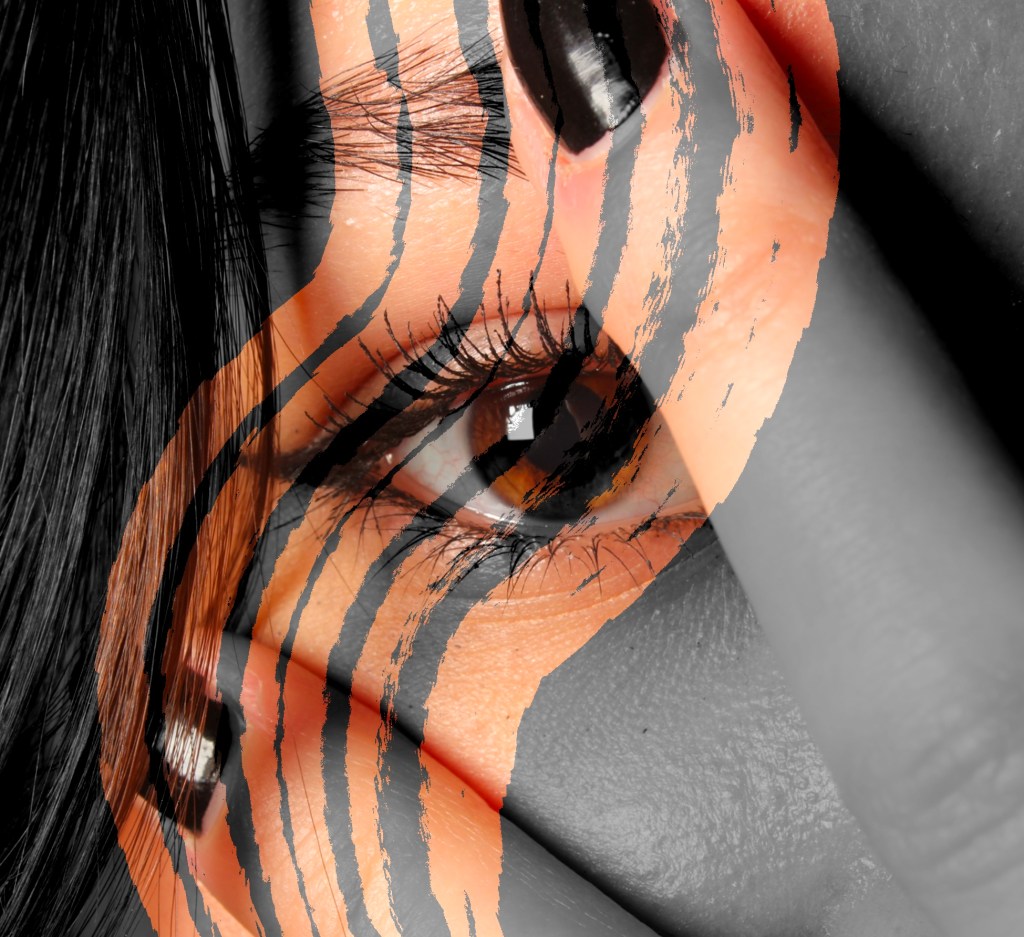
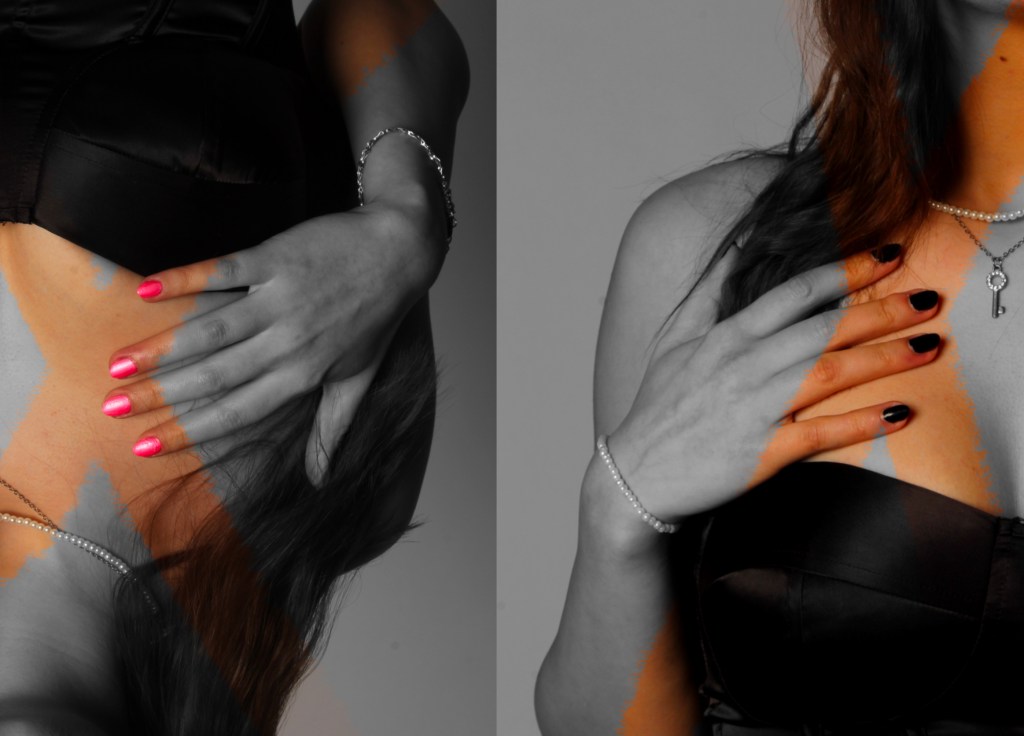
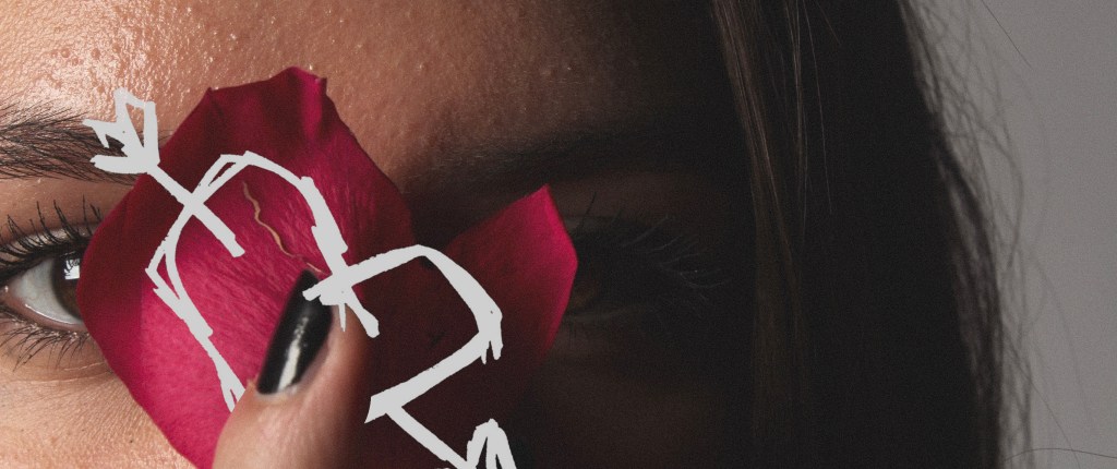
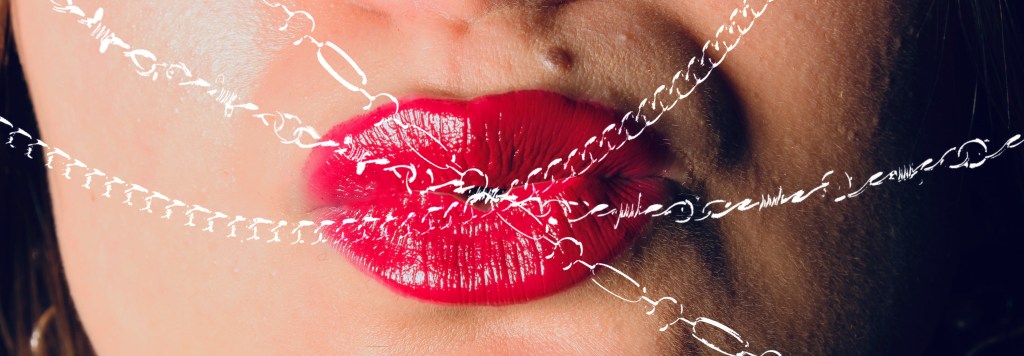
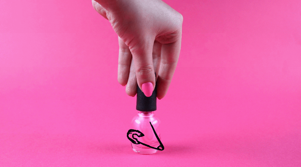
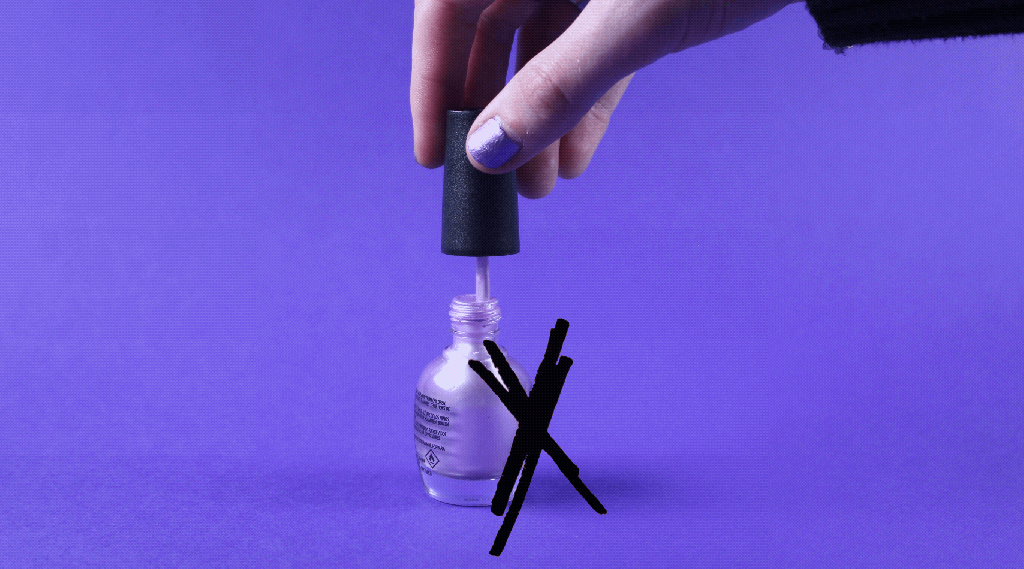
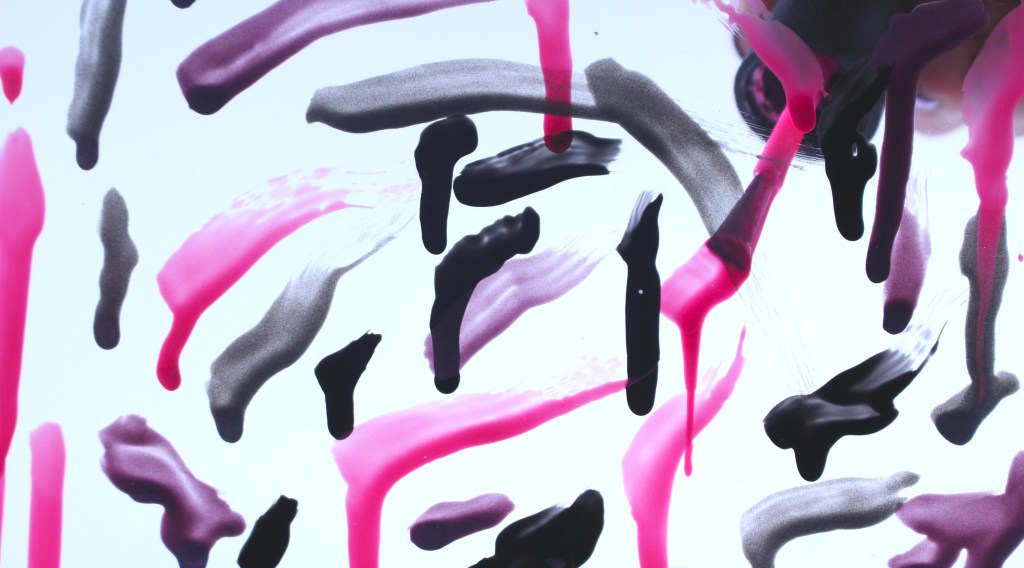
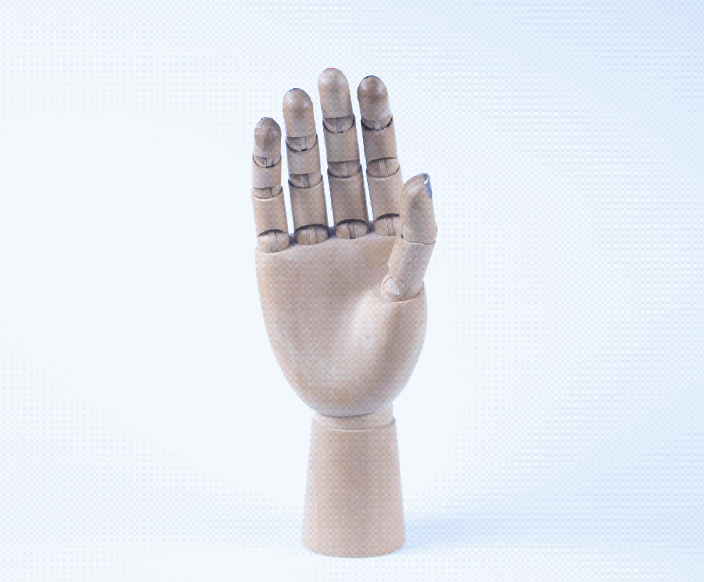
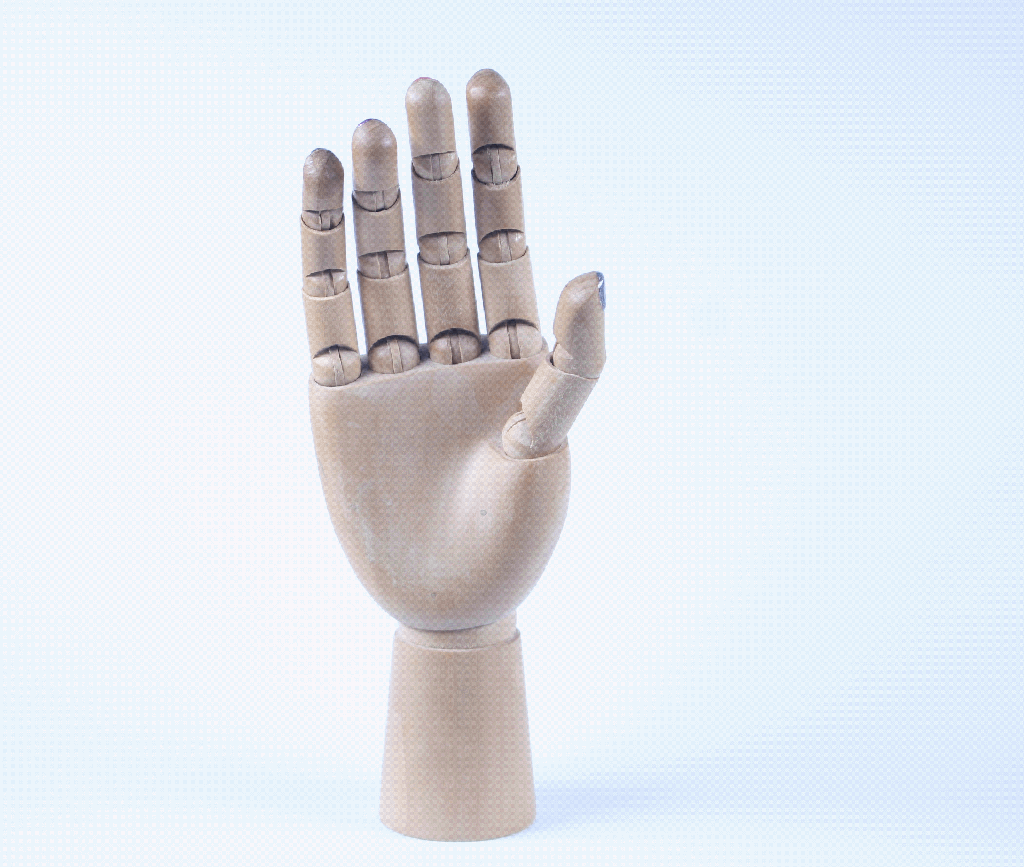
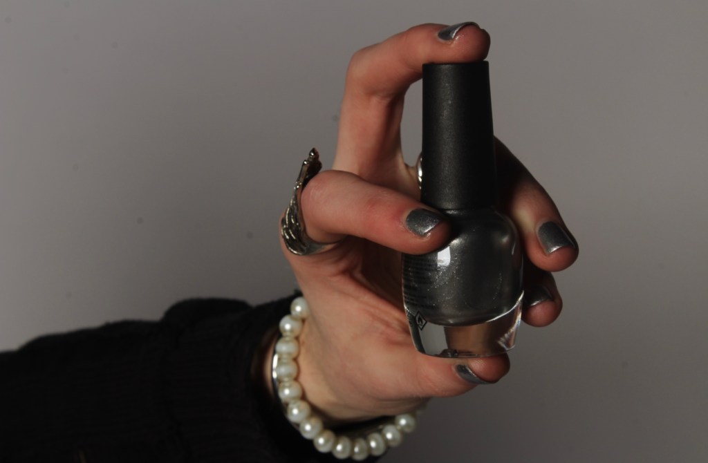
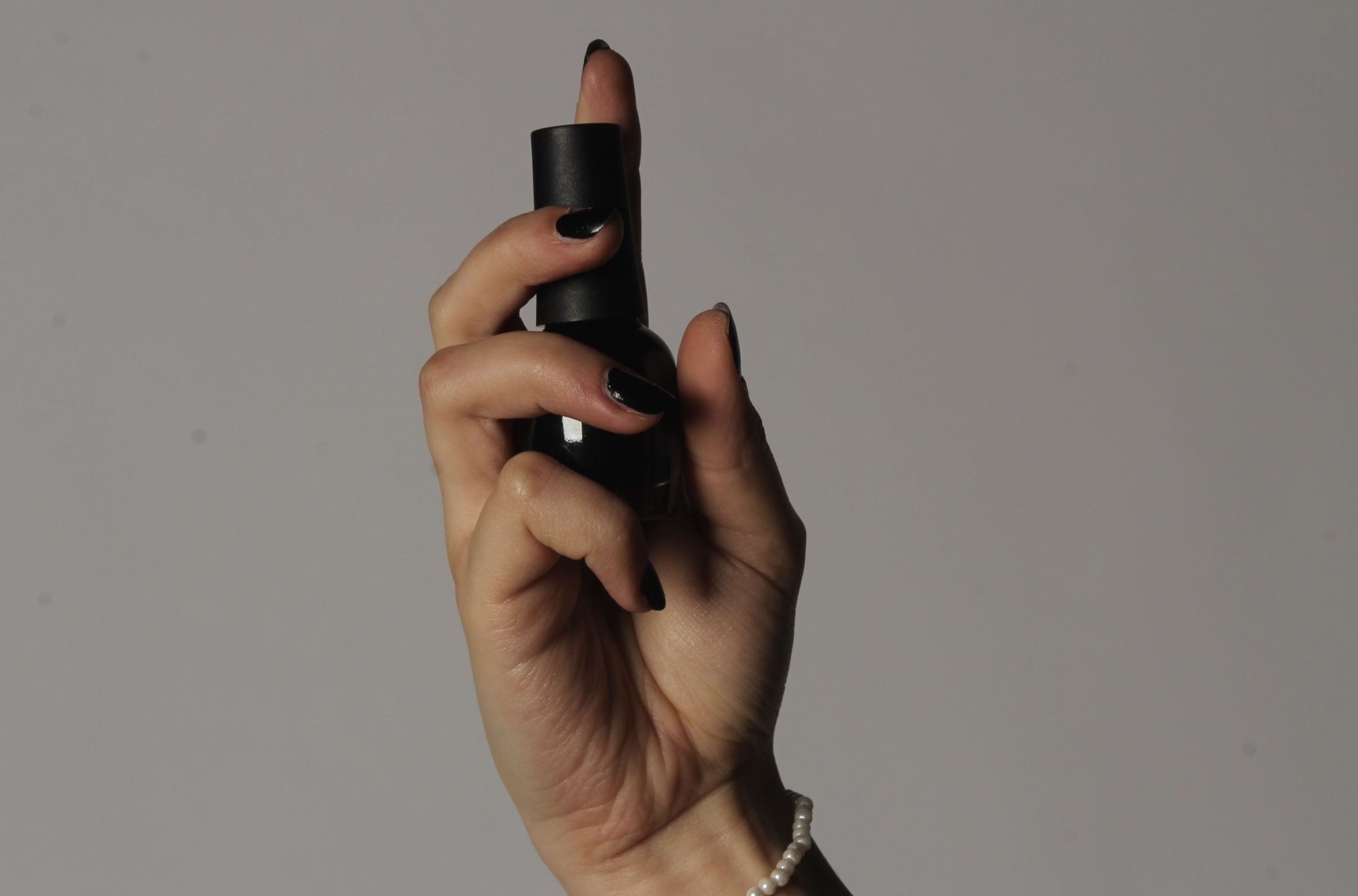
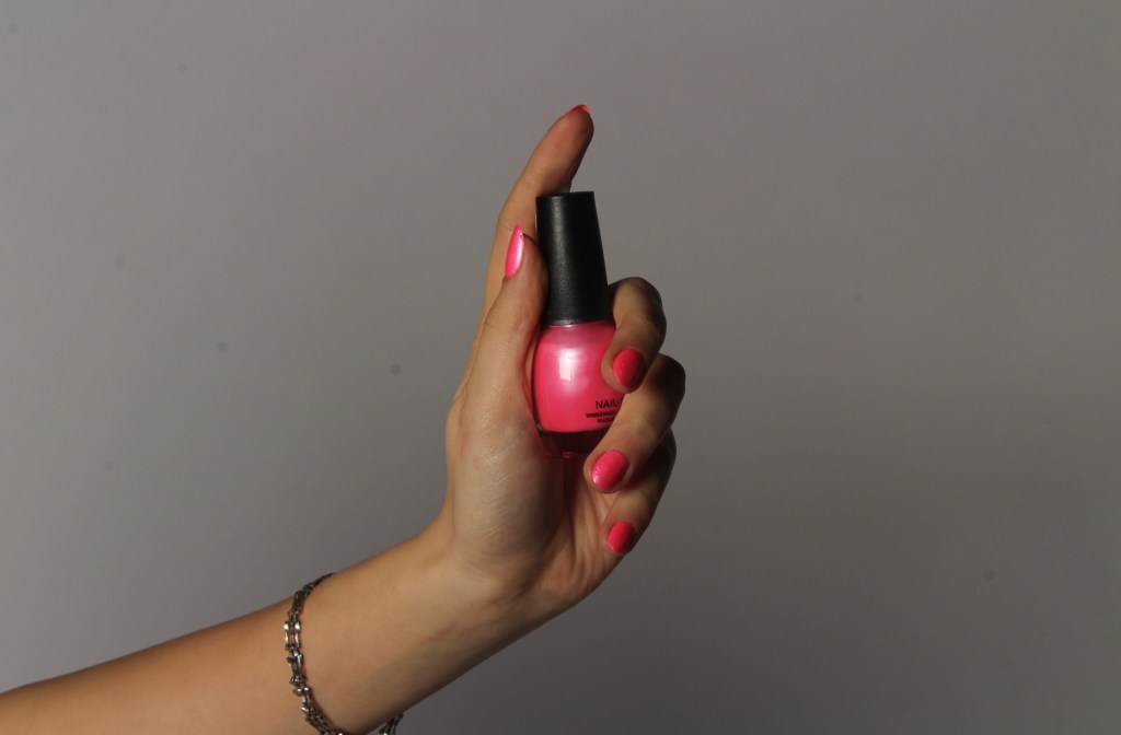
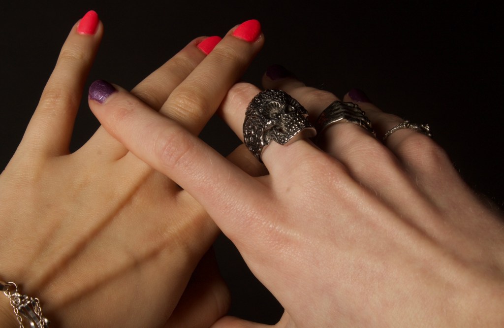
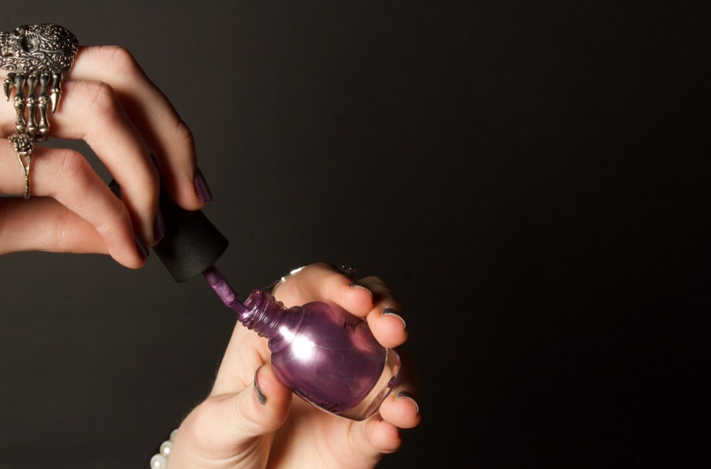
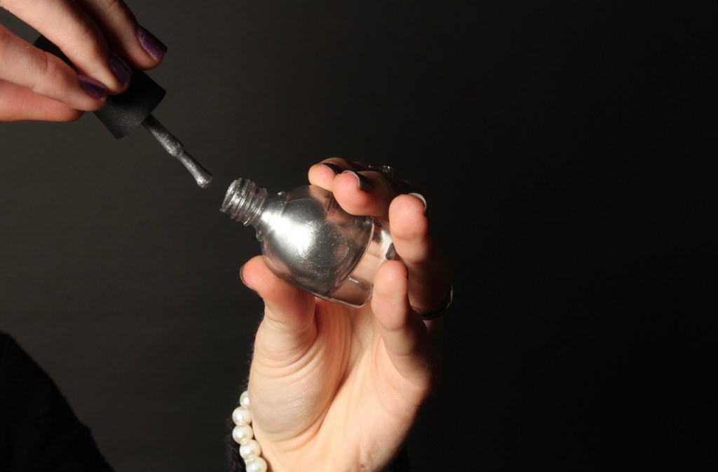
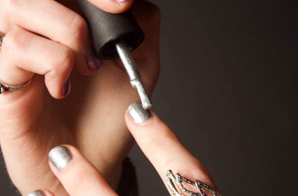
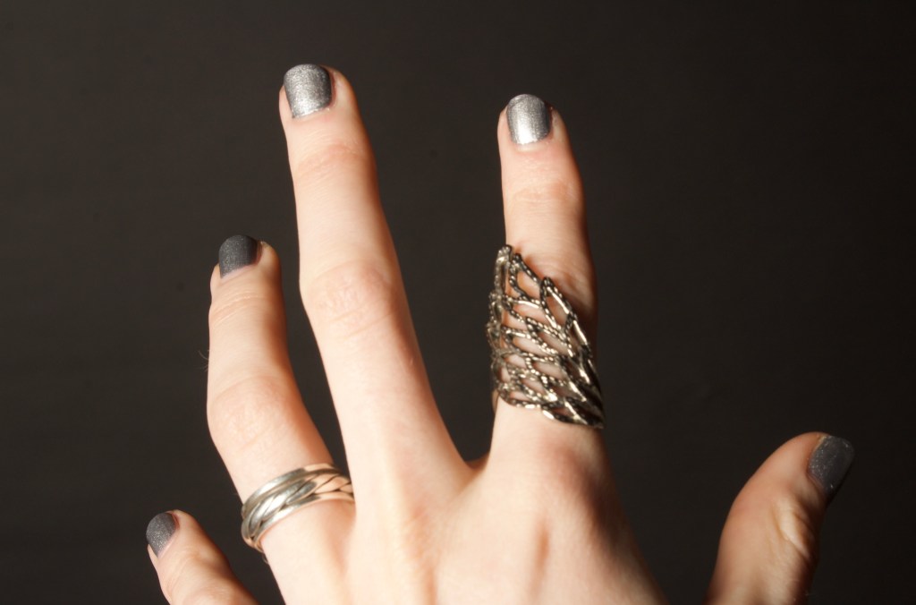
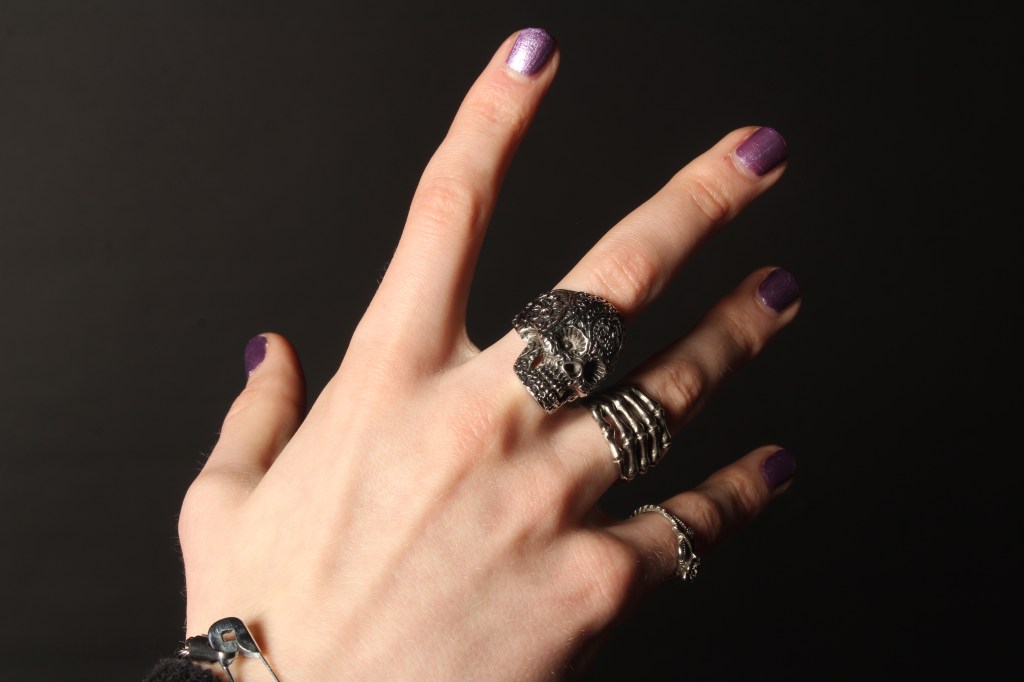
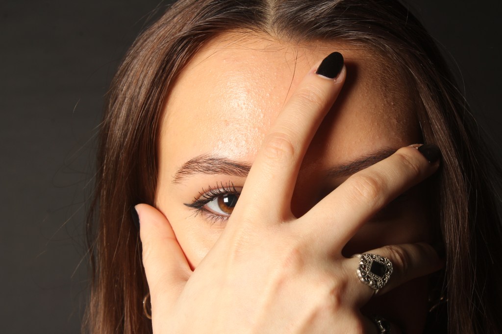
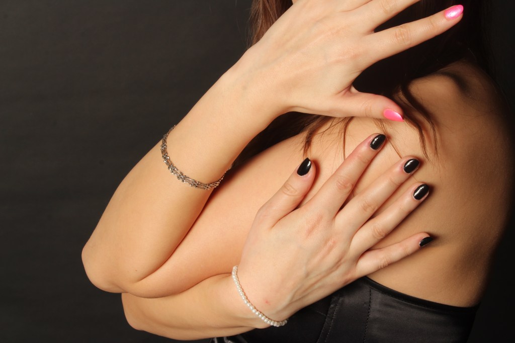
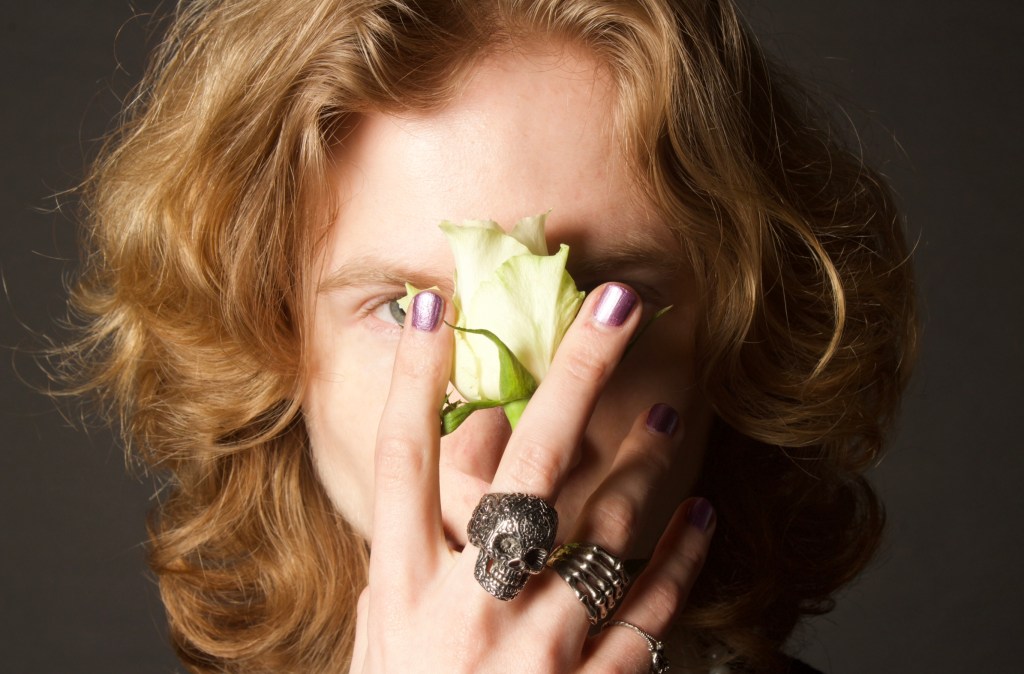
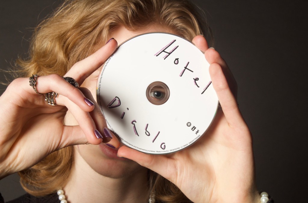
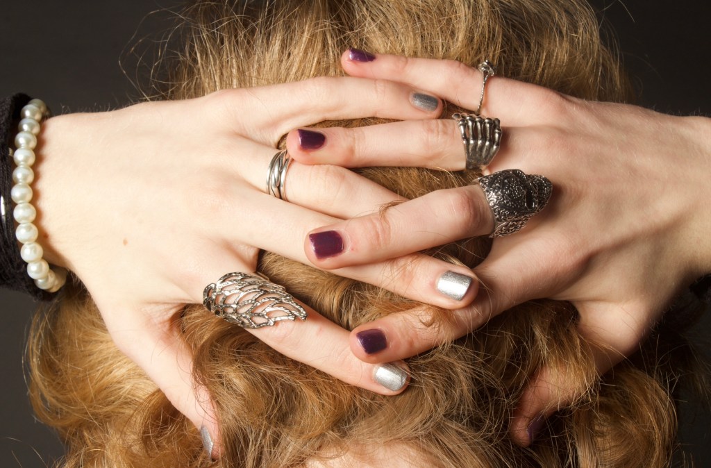
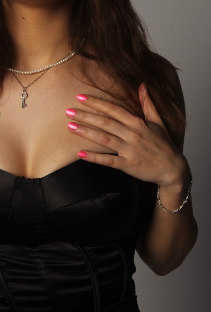
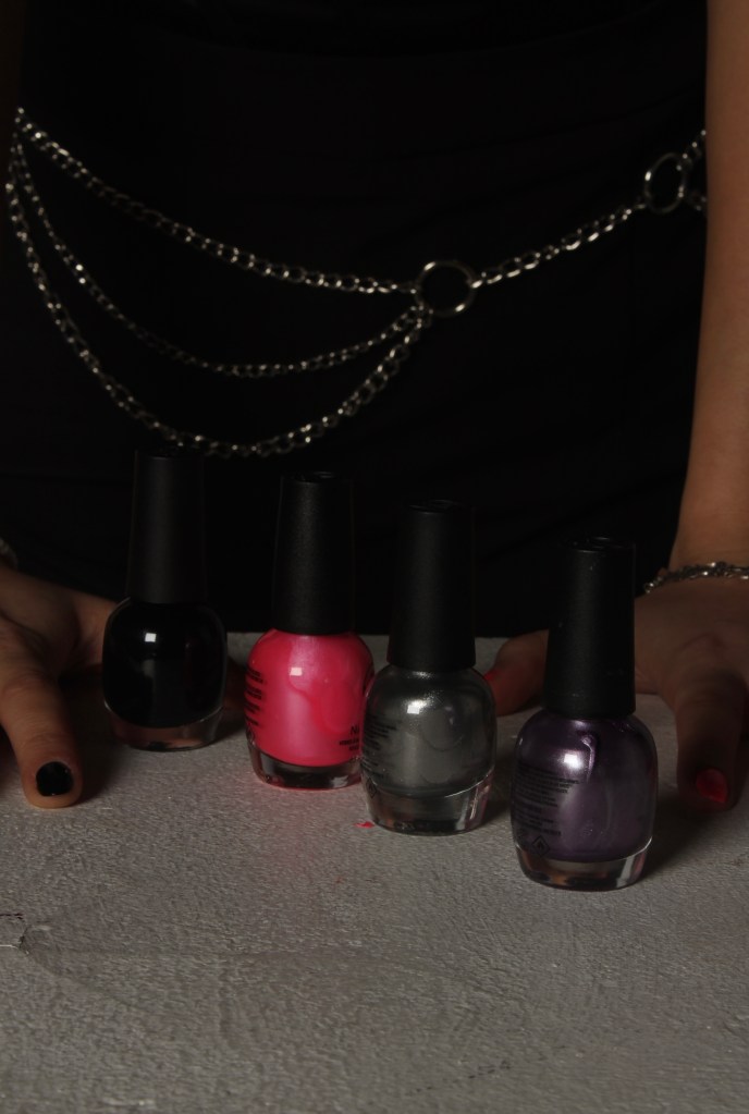
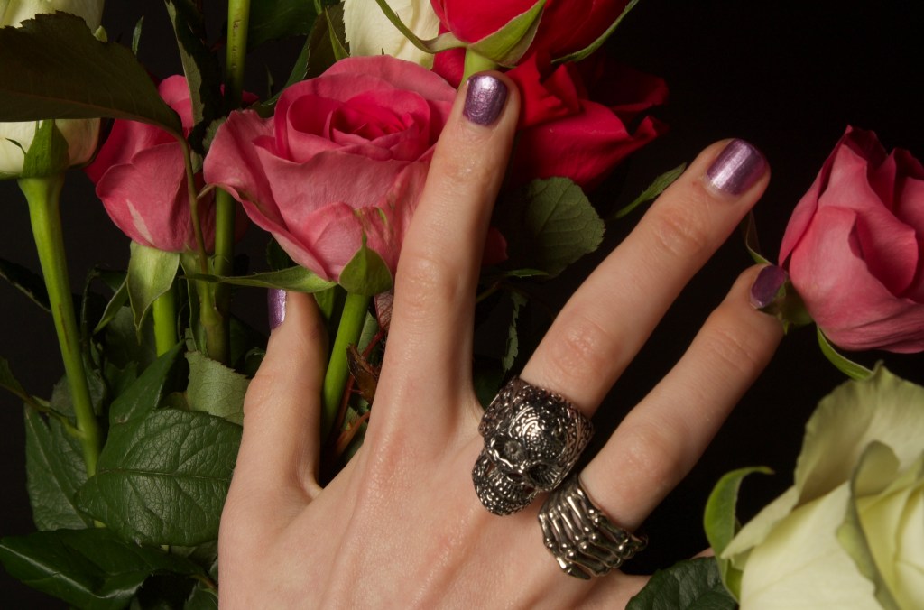
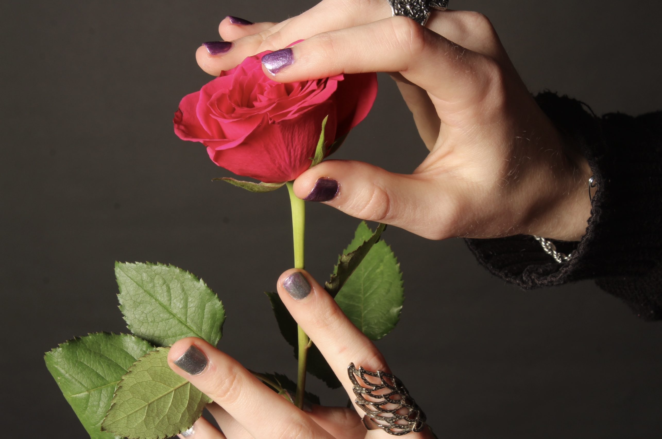
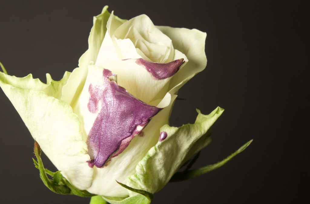
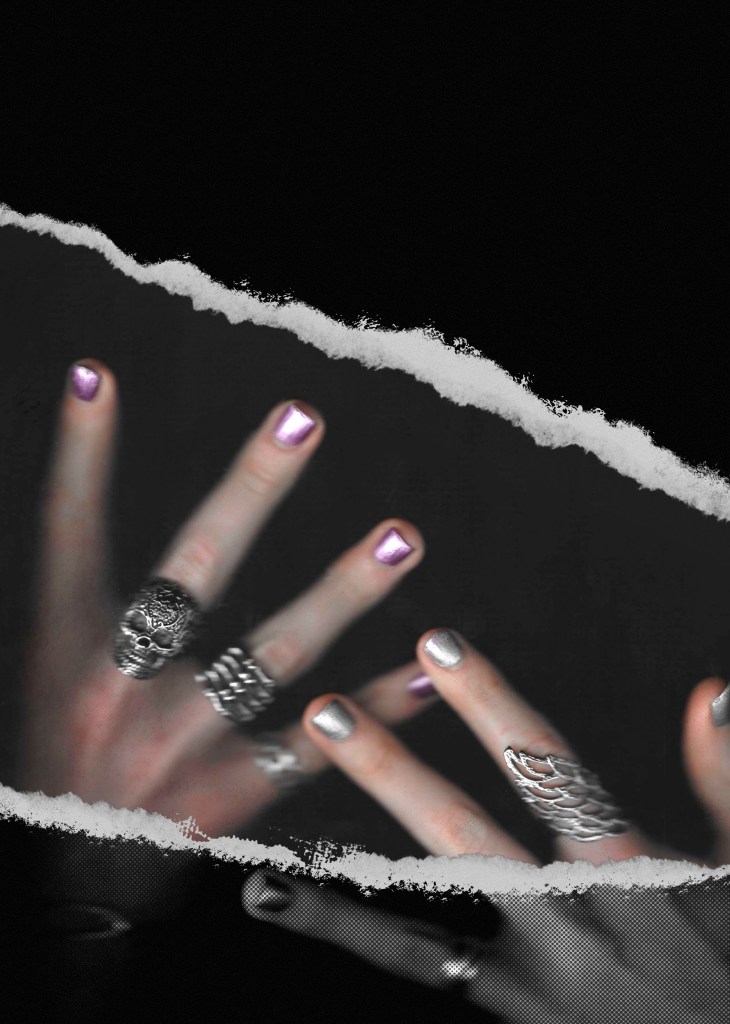
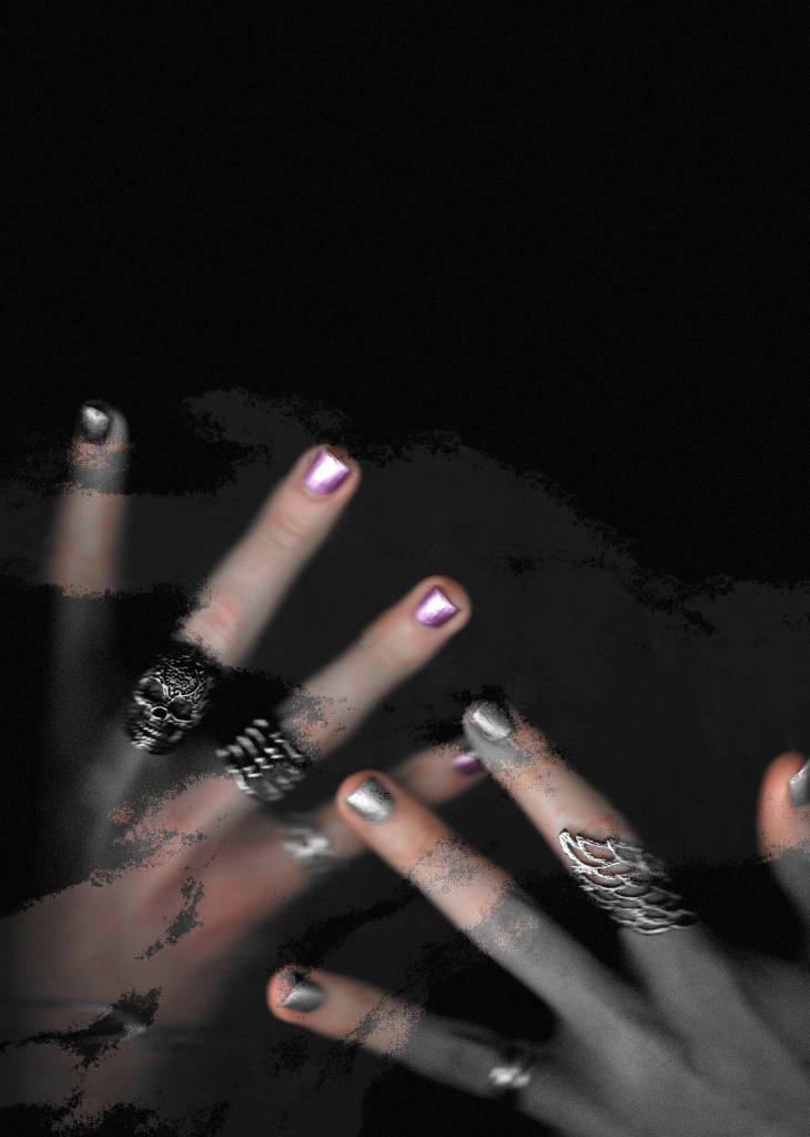
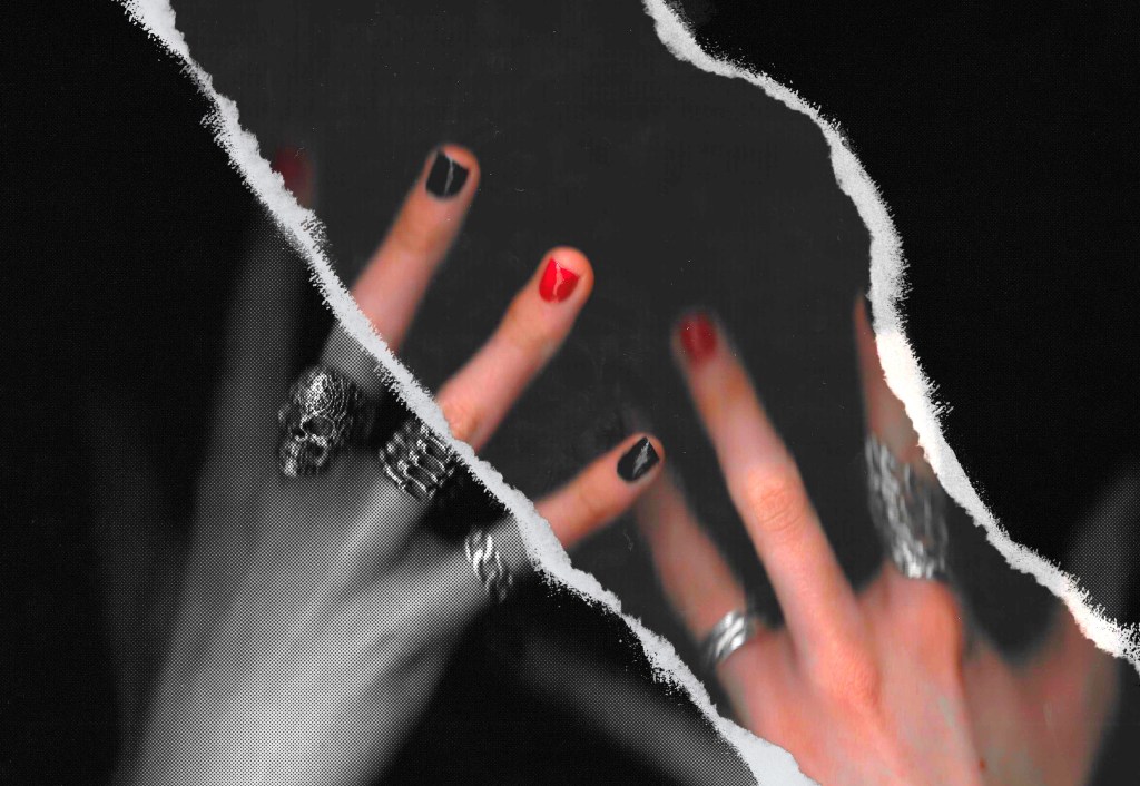
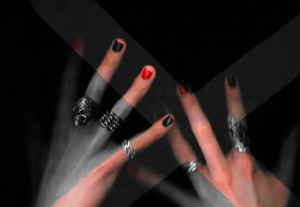
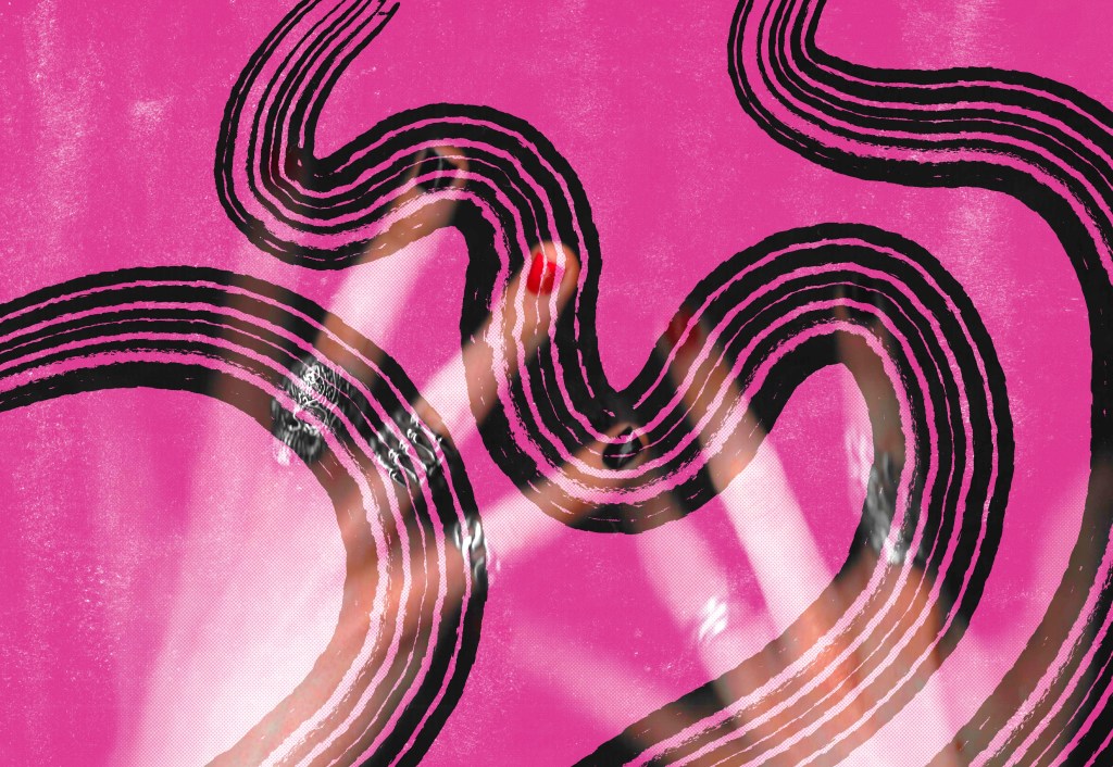
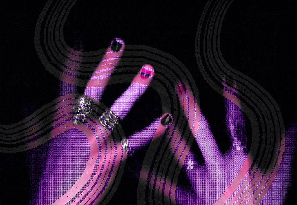
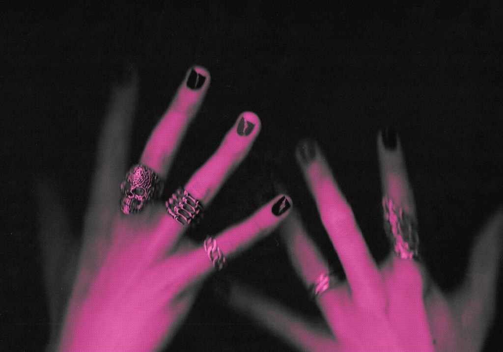
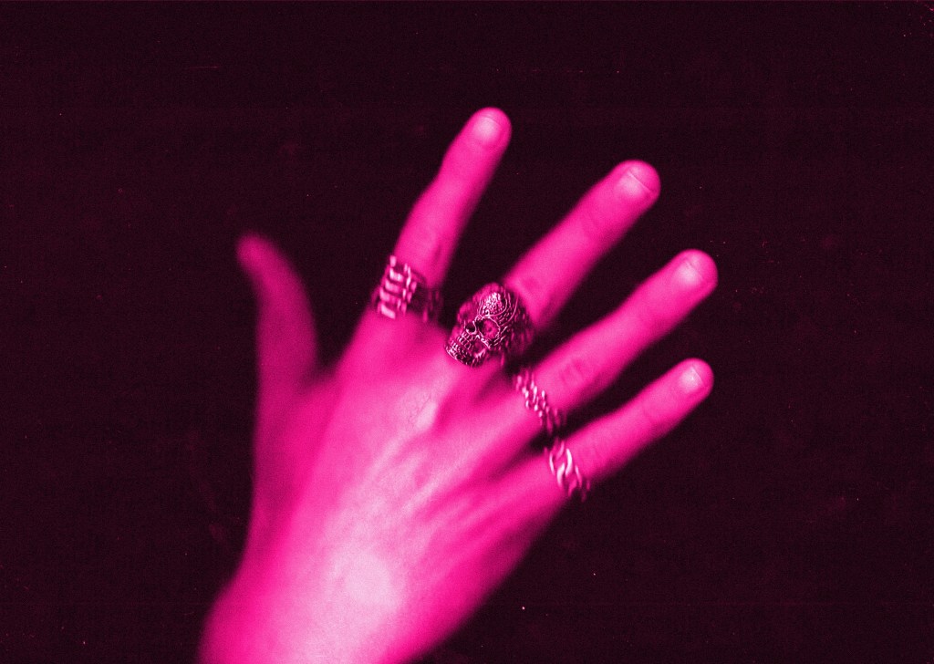
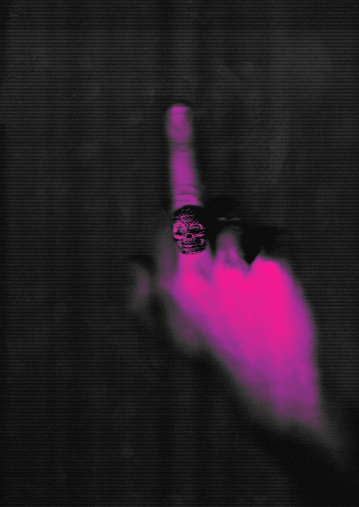
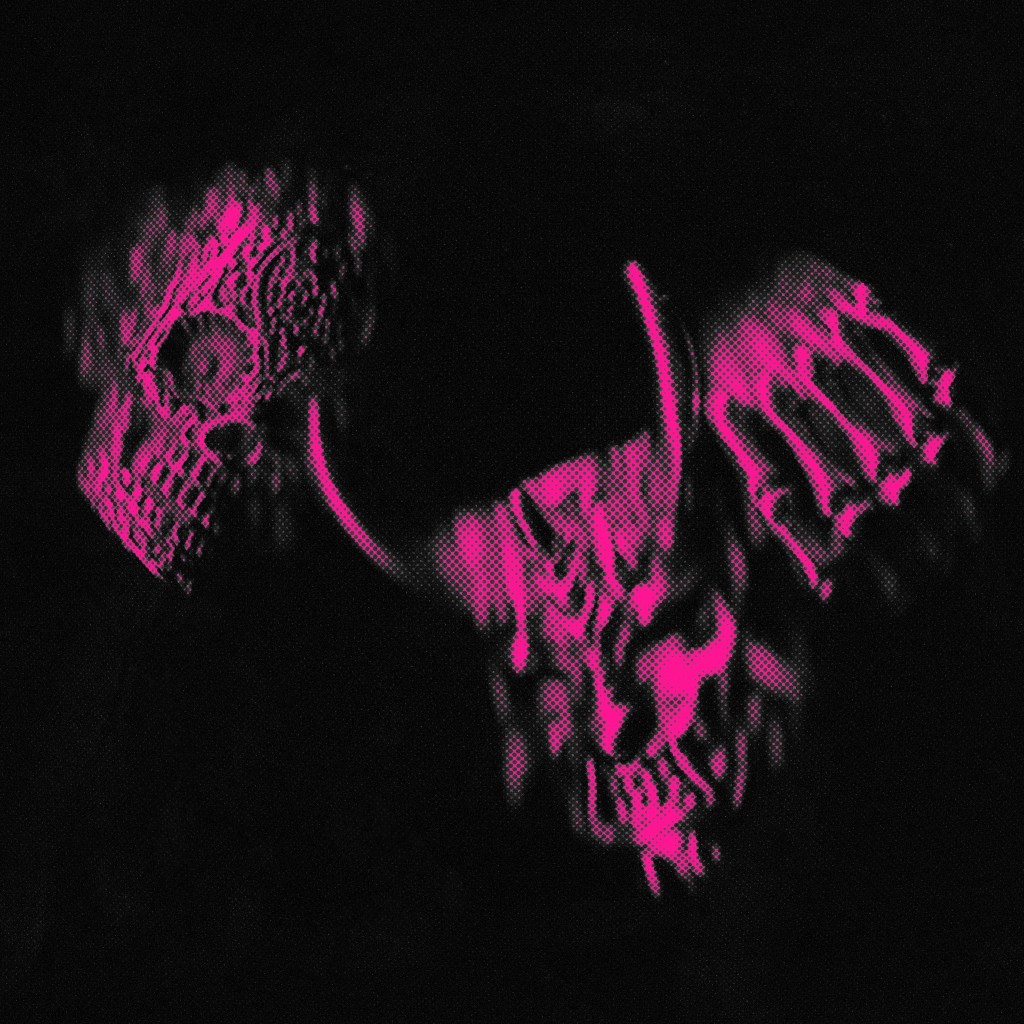
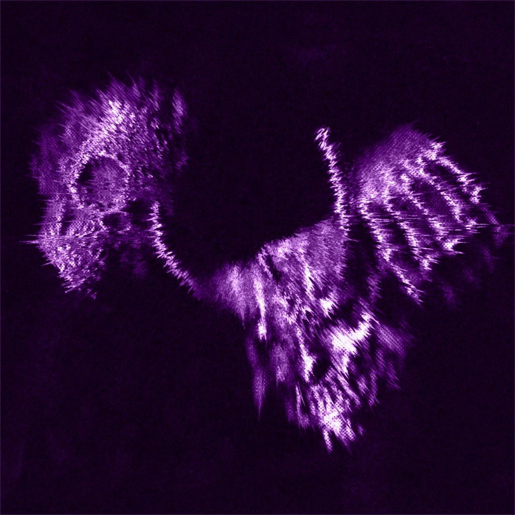
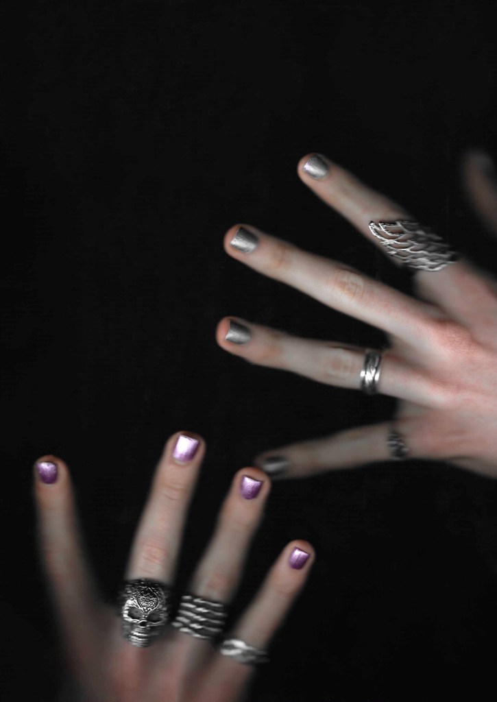
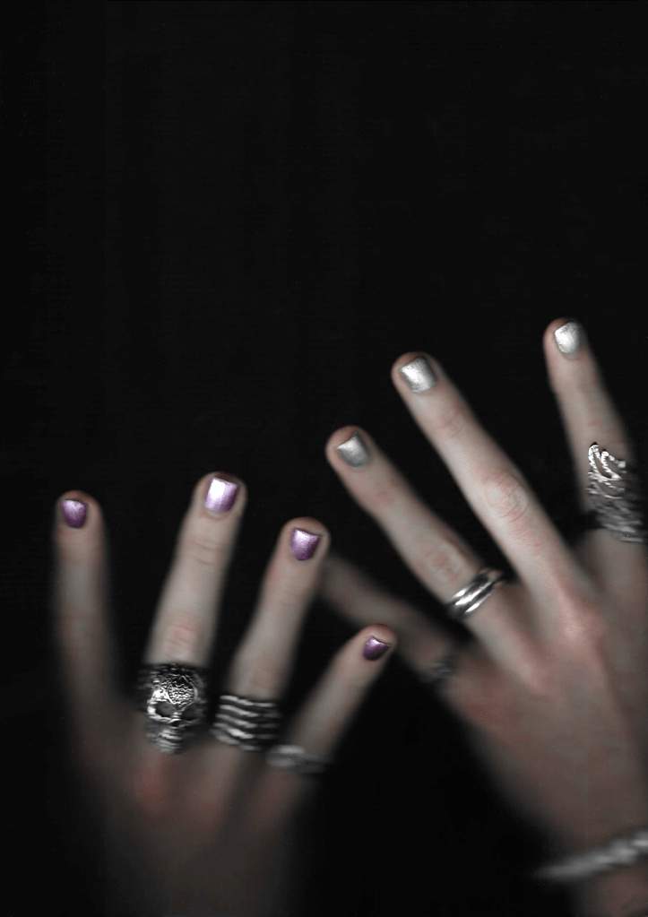
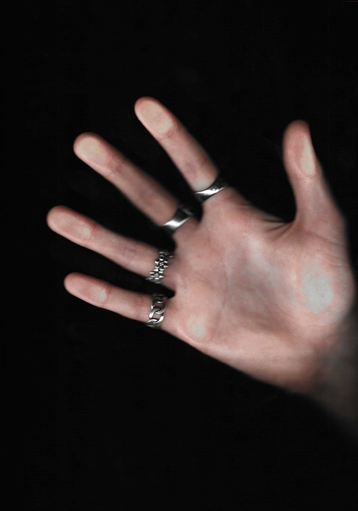
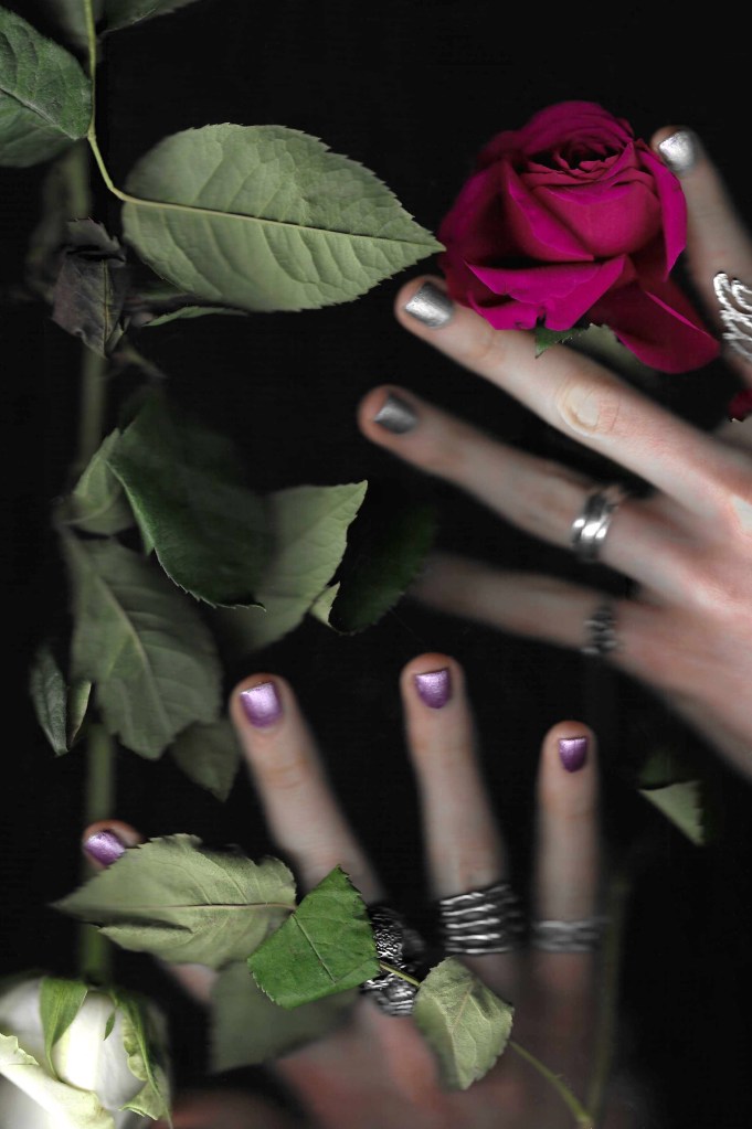
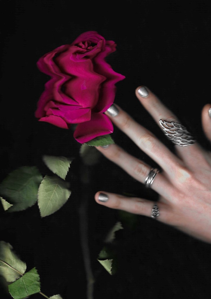
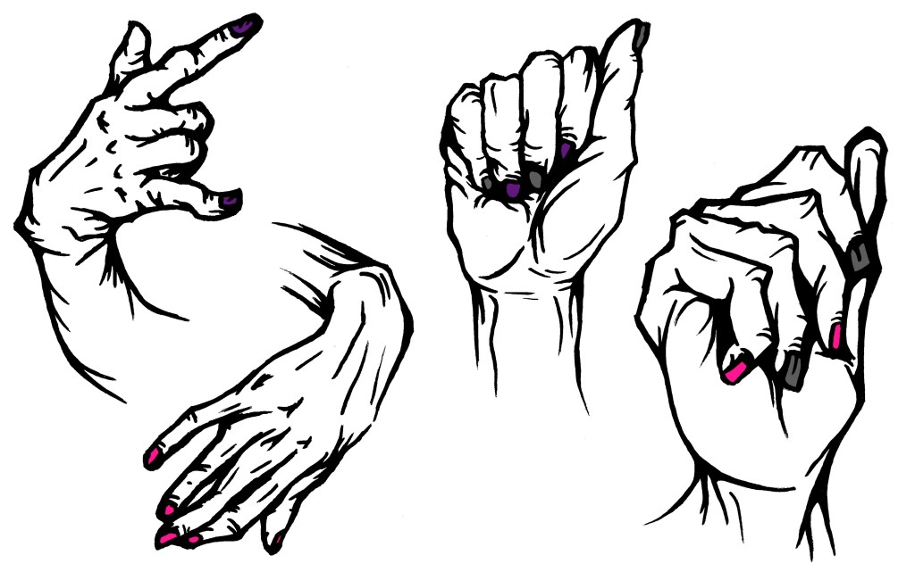
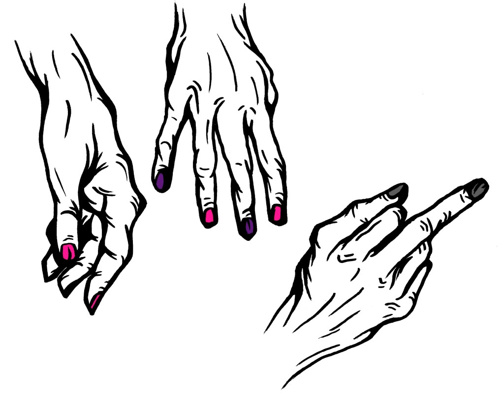
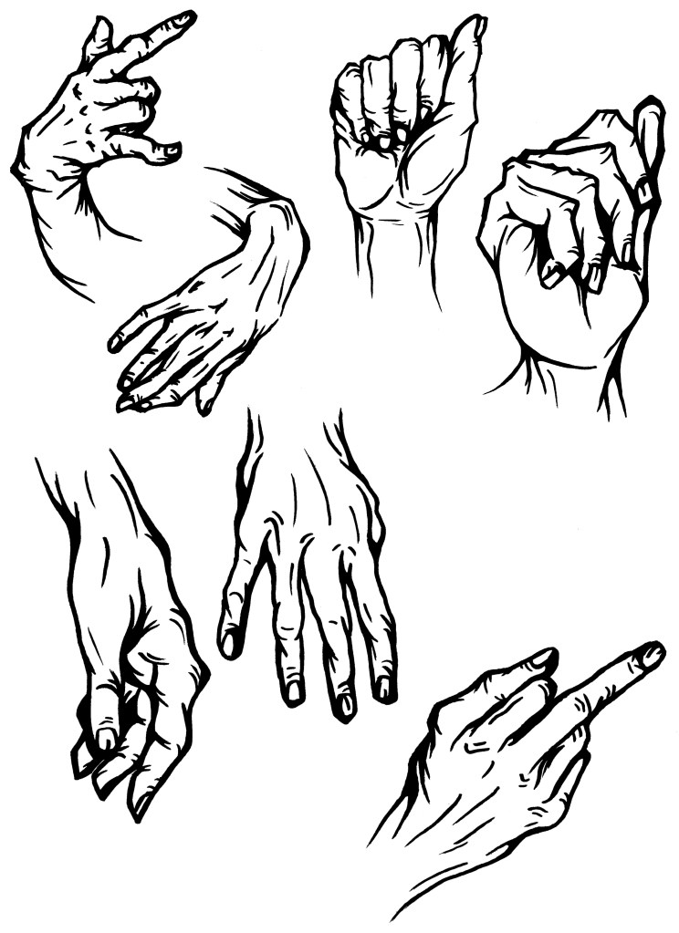
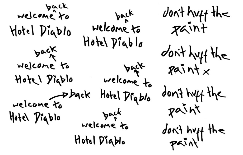
Welcome back to Hotel Diablo: this page is titled with the event name and introduced what the event is about. I chose the dripping nail polish GIF to be the first image they seen because it a unique and abstract image but also immediately gets across the product and colour palette. Then there are a series of edited images of hands showing the aesthetic of the event.

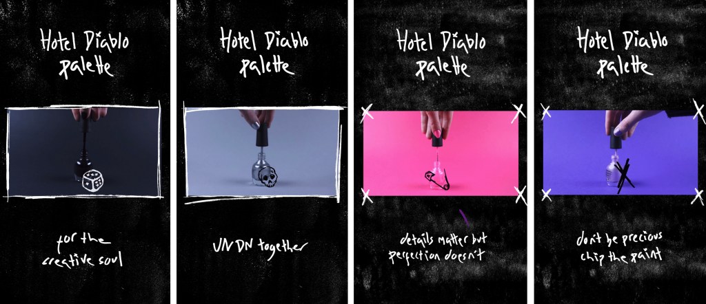
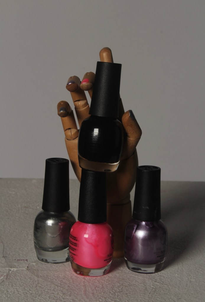
About: this page explains the 2 parts of the event, the UN DN pop up and the Hotel Diablo concert. I explain both parts are used animated GIFs to represent them. I gave each of the nail polish bottles a name from a song on the album and a way to connect both parts of the event. I think this is a cool way of naming them and is similar to the style of names that UN DN use. When explaining about the concert I say Yungblud and Trippie Redd will also be performing with MGK. They’re frequent collaborators and are features on Hotel Diablo so are relevant guests who will be popular with the target audience. Also I say ‘EST’ which is the name of MGKs fanbase. It stands for ‘every stands together’ and I included it as a subtle detail that fans would appreciate.

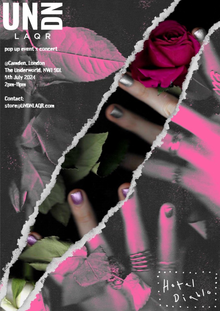
Details: this final page includes all the sensations information about the event. This page has 2 of the poster designs at the bottom. I wanted to connect the static and interactive designs. I would have the posters displayed change every couple of days so it stays exiting different for any viewer that came back to look at the details again.

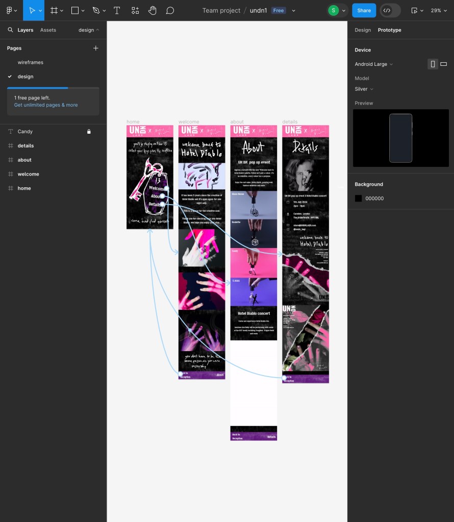
Prototype tab: this is a screenshot of the prototype tab my Figma document. This is where you make the interactions that allow viewers to move from one page to another. I kept mine fairly simple with the 3 buttons on the home page that take you to each of the corresponding pages. Then on each of the 3 pages there is a button to go back to the home page and a button to move onto the next page. This way they can just go from page to page or come back to the home page and use the key each time. I set slow transitions so that the viewer get more of a sense of where they’re going. The animation style I chose is a slide up to simulate an elevator that’s going up. This is another way to push the hotel concept of the website.

Final version with audio: I want there to be music playing the whole time while the viewer is on the website. I was unable to do this in Figma so this is a screen recording of me going between the pages with the Floor 13 instrumental playing. I chose this song as its one of the songs of the album and is where I say the viewer will be going in the first line of the home page. Also it’s another way to promote the music for the concert. The reason it’s only the instrumental version is that I think with the lyrics it would be too distracting but the instrumental just adds a cool touch to tie the whole concept together.

Full Floor 13 instrumental:

Reflection: I learnt a lot through creating this interactive website. I learnt how to use Figma and about the fundamentals of designing a website. I’m very happy with how the final design came out. It successfully carries that visual identity from the posters and video. I think through the visuals, translations and audio I was able to create an immersive website that takes the viewer into the world on Hotel Diablo and the event.

Categories
Level 5 Sequence and Messaging Sequence and Messaging: Project

Sequence and Messaging: Social Media Video (sequential outcome)

The intended platform for my video is Instagram. I like the more polished and refined aesthetic of Instagram rather than the more silly tone of TikTok. I think the style of my video suits Instagrams algorithm more so that would be its primary platform. UN DN share a lot of their Instagram style content on TikTok too so I would do that to maximise exposure for the event. Instagram reels are portrait with a 9:16 aspect ratio so this is the format I have designed mine in so that it looked professional. My video is longer than the suggested 30 seconds, it’s 50 seconds. Longer form videos are becoming increasingly popular on Instagram so does suit that algorithm. Also I made sure that it starts off interesting and is a past fast paced video so people don’t get bored while watching it. I tested the video on a range of people and I didn’t get any feedback saying it got boring or felt too long. Most said it felt like it was shorter than it was. To create this video I used Premier Pro and Procreate Dreams. Premier was for the sequencing and Procreate Dreams was for adding the overlays and hand drawn elements.

Audio: I had the song ‘Sex Drive’ by Machine Gun Kelly in my mind from very early on in the project. It’s the intro track to Hotel Diablo so is perfect for this event as it’s a good way to reintroduce the album. Also it’s good promotion for the concert if people hear and like the song. This is the full song:

I downloaded the song and have chosen this section to work with. I chose this section as I didn’t want the slow build up. I wanted it to be start into the body of the song so it grabs people’s attention immediately. Also this portion of the song has the line ‘come and find yourself’ which I’ve included on posters so I wanted there to be that connection. This section ends with the line ‘welcome to Hotel Diablo’ which I think is the perfect ending to summarise the event. This is the audio in the video:

Draft of video: when I showed this draft to my tutors and some friends I got a few imprnat bits of feedback which helped me improve the video. Some notable points were to speed up the pacing to keep it constantly flowing and make the backgrounds more simple to allow the images to shine. Some of changes I wanted to make where bring in more of my typography and sketches to connect the video to the rest of the visual identity more and colour grade the videos I shot because they looked too yellow. Also I wanted to add a section at the end that has the event details so people can found that information out directly through the video.

Final video: this is the final version of my social media video promoting the the UN DN x Hotel Diablo event titled ‘Welcome back to Hotel Diablo’.

Sequencing: when deciding how to sequence my video I used the ideas we explored in session 1. I took screenshots of each shot and rearranged them to make it the most engaging and consistently interesting. I wanted to evenly integrate the static and dynamic sections. By mixing the videos, photos and stop motion sequences it makes the video more unpredictable and keeps the viewer guessing about what will follow. This is the final sequencing of the video:

Frames from the video: below are some of my favourite shots from the video. The video is comprised of video footage, animated parts, lopping animated GIFs and static photos. Some examples of each is shown here:

Full screen videos:

Animated parts:

Animated GIFs:

Photos:

Reflection: I’m very happy with my final video. I’ve learnt a lot about video editing and creation from doing this and have become a lot more confident with Adobe Premier Pro and Procreate Dreams. I think I made good use of the audio by syncing up the visuals to the beat and the lyrics. Also the tone of the song fits nicely with the aesthetic of the video. The pacing of the video is fast with lots of transitions and a nice mixed of static and sequential elements. I think it is engaging and holds the viewers attention for the full 50 seconds. The visual identity I created in the posters is carried into the video. The bright colours, textures and added details are all present. This video has a drastically different tone and aesthetic to other nail polish related advertisements so will be recognisable and eye catching.

Categories
Level 5 Sequence and Messaging Sequence and Messaging: Project

Sequence and Messaging: Posters (static outcome)

Plan: below is a plan of what I wanted in the posters including what images, textures, overlays and information. The format I wanted for the poster was A4 but could be scaled up to A3 or A2. I chose this format as it’s a standard paper size so would be easy and cost effective to print. The poster were all made digitally but for the event I’d want some physically printed to go around Camden and the venue. To maximise the posters use I’d also share them on social media, particularly Instagram. Sharing them across multiple avenues of communication also helps increase engagement and awareness of the event.

Final posters: these are the 8 final poster designs. I created them with different intentions but they all maintain the same visual language in order to keep the identity of the event consistent.

Ripped scan posters: the first 4 posters are all based around the ripped paper. This is an aesthetic I have been developing and really like how it highlights the nails, making them the centre of attention in the composition. The idea was inspired by vintage rock band posters and some of the more experimental nail polish advertising I saw on Pinterest. The intention for these posters are to be printed and put around Camden before the event but would also be shared on social media and the website.

The first 3 are variations of the same design, they just have the colour focused in different places. I think having different variations of the poster around Camden would be fun as people could try to find all the different ones. These posters have a dark, moody aesthetic heavily inspired by the Hotel Diablo aesthetic. The ripped paper allows for the nails to stand out, making sure the UN DN element of the event is not missed. The logo is visible in the bottom right. Some notable parts of the design is the track list written in my hand made typography running through the ripped paper. This is not too distracting but is a nice detail that fans of the album would be able to pick up on. Also the Hotel Diablo symbol is subtlety placed under the rip. The idea behind this is the paper is ripped to reveal the album and people’s expression and creatively through their nail design. Also the title of the event ‘Welcome back to Hotel Diablo’ is written in my typography and placed in the top right corner. The event details are written in an Adobe font called Burnaby that has a similar textured style to the rest of the poster.

This poster had very similar ideas to the first 3 but use one of the scans with a rose. I wanted to bring the floral element into the posters. This poster has both the logos clearly on display in opposite corners. I removed the track list so this poster is less heavy on the Hotel Diablo side and more related to the overall aesthetic on the event.

Photographic posters: these 2 posters were made with photos I took in the studio rather than scans. They have a clearer aesthetic than the ripped paper ones so are more aimed towards the UN DN side of the event. The intention for these ones is that they’re used primarily on social media rather than printed. The key part of these is the striking pinks and purples. The colours are so bold that they would really stand out online compared to other advertising in this field.

The idea behind the first poster was the have a male and female hand interlocking to represent the unisex nature in UN DN. The pink hand really catches your eye in comparison to the rest of the greyscale image. I wanted to draw the viewers attention this way then get them to look at the subtle details on the hand. I put my sketches over the hands almost like tattoos. This is also where the Hotel Diablo logo is on this poster, because I wanted it to be subtle and thought this was a unique way to display it.

This is a different take on the ripped idea. Rather than ripped paper it’s more of a digital glitch style with the normal coloured fingers showing past the glitchy pink hands. This poster is all around very colourful as there are no bits in greyscale. I chose the place both the logos tighter in the top right corner to create a balance between the 2 sides of the event. In terms of added details this poster is the most simple. I made this decision as I feel the image and colours are so strong on their own, any other details would just be distracting.

Decorative posters: these posters are intended to be placed inside the venue. They’re solely decorative, just displaying the aesthetic and visual identity of the event. This means they don’t have the event details on them. They have both logos at the top clearly showing it’s a collaboration event. The first one has ‘come and find yourself’ written on it. This is the first lyric on Hotel Diablo so it’s a reference fans will understand. The second poster says ‘for the creative soul’, a slogan used by UN DN. For the visual style I went for lots of gritty textures and covered in my sketches. The style is inspired by the posters I made for ‘Bloody Valentine’ with this collage/scrapbook aesthetic.

Reflection: Overall I’m really pleased with the set of posters I’ve created. They are varied visually to align with the intention but all fit one solid visual identity. The typography, colours, logos are consistent throughout. Added details such a textures and sketches are used on some. I think these posters appeal to the audience well and really stand out in comparison to the other nail polish advertising that is currently being seen.

Categories
Level 5 Sequence and Messaging Sequence and Messaging: Project

Sequence and Messaging: Editing Photos

I took all the ideas and visual styles that I experimented with on the scans and applied them to my photographs. These include adding grunge and paper textures, adding the colour palette (mostly pink and purple), adding rips and overlaying the photos with sketches and jewellery textures. I plan for these to be used for some poster designs, make up some bits of the video and be included in the interactive design. As well as edited photos I made some animated GIF style sequences to be included in the video as they’re a fun dynamic way of using a static image. I want the visual identity to be clear and consistent across the static, sequential and interactive outcomes. Below are my edited photos from my session in the photography studio:

Reflection: With all of these edited photos and the edited scans I have a large collection of imagery to use. I have found the aesthetic that I want for my final pieces and have created a clear and unique visual identity. Now it’s time to start creating my poster designs, interactive piece and social media video.

Categories
Level 5 Sequence and Messaging Sequence and Messaging: Project

Sequence and Messaging: Photography

Stop Motion studio: I also booked myself into the stop motion studio to get some other shots . Stop Motion is a technique I’ve been working with in Digital Arts 2 so I, familiar and comfortable with the equipment and the technical process. I wanted to explore taking photos here is because it’s easier finely adjust the lighting and get really clear close ups of the nail polish. Also I wanted to have some stop motion sequences in my video as this is a growing trend in advertising and is a]something that I haven’t seen used in the nail polish world.

Coloured background close ups: The colours in these shots are really powerful. I bought paper to match each colour in the Hotel Diablo palette and the results are really striking. When using Dragon Frame to shoot in the stop Motion studio there’s an easy way to set the focus on one area and have the rest unfocused. This allowed me to get these nice shots of the nail polish spilt out over the paper. It shows the lovely shiny, metallic texture and shine that it has.

I’m really happy with these short, looping stop motion sequences that I shot with Dragon Frame and edited on Procreate. I wanted a jumpy animation so I shot it at a low frame rate. This helps show that it is stop motion rather than a typical nail polish video that would be seen on social media. I like the coordination between the backgrounds, nails and bottles. They make for really eye catching sequences. The addition of my hand drawn sketches adds another layer to the composition and helps to tie the visual identity together.

Paint drips: this is one of my favourite sequences that I shot. To achieve the shot I painted nail polish onto a glass sheet that I positioned close up to the camera. The photo is a picture from ten process of me layering up the nail polish. I like the abstractness of the stop motion sequence as it promotes the product but in a unique way. You still get the textural quality of the nail polish without actually showing it in a bottle or of someone nail. It also clearly focuses on the colour palette that will be used at the event.

Art hand models: I painted the art hand models nails with the Hotel Diablo palette. This is an object familiar to most creative people so aligns with the creative identity that UN DN has. I wanted a smooth stop motion look for these so shot it at a higher frame rate and moved it in small increments. I think these sequences are fun and contrast the typical clean cut style of nail polish promotion. It’s a slightly different way of showing nail polish being used, it goes against the expected image of a person with painted nails.

Flower: flowers have become an important subject in my sketches and photography. This sequence is a reference back to the Metamorphosis collection made by UN DN. The video show the petals of the flower falling of and then coming back which loops in a continuous cycle . At the moment the sequence does really show the visual identity I’m aiming for so if I do use it in my final pieces I will need to do some editing.

Halftone Images: these are a series of close up images focusing on eyes and the female body . These are subject that I’ve been exploring in my other photography and sketches. I experimented with different halftone patterns, grains, textures, colours and blend modes to see what effects I got get. I’m really pleased with the results and think they have a nice vintage style that is similar to comic book and classic band posters.

Polaroids: I took some Polaroid pictures during my session in the studio and digitally edited some of my normal photos onto Polaroids. I really like the vintage aesthetic of Polaroids and is something that UN DN have explored abut so I wanted to develop that. Also one of the parts of the pop up event will be a photo wall where people can take pictures will Polaroids and stick theirs up.

Categories
Level 5 Sequence and Messaging Sequence and Messaging: Project

Sequence and Messaging: Photography studio

I had an induction into the Photography Studios on Wednesday 6th March. We went through health and safety guidelines, rules for the studios and an overview of the essential equipment. Now that I’ve been inducted I can book out a session in one of the studios to take the photos and videos I need for the sequential and static elements of the briefs.

Formats: An important thing to consider before shooting these photos/ videos was what format I wanted the final outcomes to be. I want my sequential piece to be a video for Instagram. I will create my video in the dimensions of an Instagram reel so that it looks the best when posted. Also this format can nicely be posted onto YouTube shorts and TikTok but its style will be targeted to Instagram. The dimensions are listed below:

1080 pixels wide by 1920 pixels tall

Aspect ratio 9:16

The poster will primarily be designed in A4, I may design some at bigger sizes such as A3 and A2. This is a standard paper size so would be ideal for printing in bulk and putting around Camden and the venue for physical promotion. I plan to make a variety of designs in both portrait and landscape. With these formats decided I will be able to better plan my photos to fit the required dimensions and orientations.

Planning: below is my planning of the visuals for the video and the photo shoot. Planning this in details before allows me to better utilise my limited time in the studio to get all the shots I wanted. The plan contains information about the videos format and audio. It also has ideas of what specific shots I wanted to achieve and a detailed equipment list. All the props and equipment was either mine or I bought specifically for the shoot. I did borrow a camera, tripod and a range of lighting options from the University.

Photos – photography studio:

Videos:

Reflection: I really enjoyed my session in the photography studio. I learnt a lot of technical things about how to properly operate the camera and lighting to achieve different shots. I have lots of photos and videos that I can work from. I will use some of the photos for the photos and a combination of both for the video and interactive design. I’ve got a nice mix of portrait and landscape shots. I’ve also got a range of normal shots as some detailed close ups. With the accessories, colours and props I’m already starting to see the visual identity coming through. However, my issue with the raw shots is that they are still too similar to what is being posted on social media. Some of the photos as they are seem too predictable and played out so the way I edit the photos will be really important in making my work unique and recognisable.

Categories
Level 5 Sequence and Messaging Sequence and Messaging: Project

Sequence and Messaging: Visual Assets- Editing Scans

I was really happy with the results of my scanning experimentation. I like the dark, grainy aesthetic that it produces while still showing the shiny, metallic texture of the nail polish. The scans already dramatically differ from the normal promotional images seen on social media. But I still wanted to more of a distinct visual identity by bringing in the colour palette, sketches and typography. A concern that my tutors raised about my scans was how it’s not necessarily obvious that the focus is on the nail polish so I needed to try and find ways of highlighting this to show that it’s the focal point of the composition. I plan for the scans to mainly be used for the poster designs but may also be used a bit in the video.

Experimenting with rips: these are all different experiments I did around the idea of ripping or removing bits of a top layer to reveal the coloured scan. Nail polish is used as a form of self expression and the idea behind the rips is that it’s revealing someone true expression. I tried out different eraser brushes in Procreate and various paper textures. Having the top layer in greyscale really highlights the coloured nails on the layer beneath, immediately drawing your eye to that area. I particularly like the ones where the top layer looks like paper, I think this could make for a really nice poster. It has a nice vintage rock band feel so I think this style successfully blends the 2 visual styles into 1 identity.

Experimenting with colour: I think the colour palette I chose for the event was really strong and needed to be more visible in the designs than just on the nails. I experimented with where I put the colour, in the background or on the hands. Blending modes on Photoshop and Procreate were key in exploring different ways of presenting the colours. With the colour the scans are so much more visually interesting and unique. They really stand out from the other designs in this field. In some cases the colour does distract from the nail polish but I don’t think this is necessarily an issue because the visual style is meant to contrast the classic cleanly photographed aesthetic. The combination of textures, rips and colours is looking really nice and definitely something I will take into my poster designs.

Adding extra details: For these ones I took a couple edited scans and added in some of my hand drawn sketches, prints and jewellery textures. I inverted them to make them all white. These help to add another level of interest and meaning to the designs. I like how layered the visual identity is becoming but I don’t think I’ll use these extra details on all my designs. I think some images are strong enough with just the scans and colours and the extra bits will make them too busy.

Reflection: I’m really happy all the different ways I’ve experimented with editing the scans. I think my work is starting to reflect the unique visual identity I was aiming for with the textures, colours and extra details such as the sketches. It is distinctly different from any other nail polish advertising I found during my social media research. I also this is starting to successfully blend the dark, moody aesthetic of Hotel Diablo with the styles of UN DN. I will be taking these ideas into my posters designs.

Categories
Level 5 Sequence and Messaging Sequence and Messaging: Project

Sequence and Messaging: Visual Assets- Scanning

Scanning: this is a technique that I’ve been working on in my spare time as I like the image quality. I also touched on it in my ‘Bloody Valentine’ work. I wanted to utilise scanning in my project as it produces images that have a lovely blend of high resolution focussed areas and more blurred, grainy parts. Also I like the darkness of the backgrounds. This style has a similar look to some of the Hotel Diablo images but contrasting the style used by UN DN and nail polish advertising in general. Normally they used super high definition, well lit photos which I will use but I also wanted to incorporate more gurney, grainy scans. I particularly think this style of image will work well on posters, with the hand made sketches and typography.

Hands: not all of these scans of hands have the colours from the Hotel Diablo nail polish palette. I won’t be using those ones for final pieces, but they will be used for experimentation. I want to be very controlled with the colour seen in my final work as my colour palette will be important to the visual identity. These scans feature my hands with a few that have a girls hands in them too. I will get more of a mixture when it comes to the photography. This is important as UN DN prides itself on being a unisex brand and MGK has a very mixed audience so the advertising needs to represent both boy and girls. I took scans in different poses , orientations and distance away to get a variety of images to work with. Personally I like the ones that are about further away as they get more textured and grainy, giving them a more interesting effect. The scanning produced really nice shine on the nail polish which really helps make them stand out in the image. I think there’s already staring to be a nice blend between the different aesthetics.

Hands with flowers: I wanted to introduced roses into some to add another layer to the compositions. I think these are really successful, the colours of the roses really pop and nicely contrast the dark, grainy style. Flowers is a subject I started to explore in my sketches and think it could become a really important theme throughout my work. I like the colour and life they bring to an image which nicely sits between the dark, grunge aesthetic and the clean, pretty style typically used by nail polish companies. I will explore this more as I go through the project.

Jewellery: jewellery is going to play a key part in the visual identity of this event. I will specifically be using silver and pearl jewellery. These are my favourite types of jewellery so I have lots of pieces that I can used for the photos and scans. They nicely complement the colour palette. Silver jewellery has roots on punk and rock culture so works for that side of the aesthetic. Also pearls are becoming more trendy and are something MGK is seen wearing a lot. These 2 jewellery styles will be familiar and popular within the target audience. In the hand scans you can see lots of this jewellery and I wanted to experiment with it more. They create a really nice shine and could make interesting overlays and textures.

Reflection: I think these scanning experiments were really successfully. I’m very happy with the image quality and show the start of merging the 2 aesthetics into one cohesive visual identity for the event. I’m particularly pleased with how well the scanner is able to pick up the texture of the nail polish. The next step will be to start exploring how I can combine these scans with the typography, sketches and colour palette.

Categories
Sequence and Messaging Sequence and Messaging: Project

Sequence and Messaging: Visual Assets- Drawings

Sketches (hand drawn): through my research I found that the Hotel Diablo cd has motifs and sketches to depict different songs. Also UN DN occasionally use little sketches to overlay their photos. I wanted to develop on this ideas and have an important part of my visual identity by hand drawn sketches. I approached these sketches in a similar way to the typography. I wanted loose quick sketches that feel natural and unrefined. I wanted lots of sharp lines and crosses to make up the details. I also used the same black markers to get the same line quality and weight. I made a list of symbols are objects that represent the album, brand and overall aesthetic I wanted to achieve. All my sketches are below, some things included are: nail polish bottles, hands, skulls, cherries, safety pins, keys, dice, flowers and barbed wire. Below I will give a brief explanation as to why I chose certain things to illustrate.

Nail polish bottles: these are simply to act as a literal depiction of the product to connect UN DN to this style that they haven’t previously explored much. I want to balance out the 2 aesthetics and this style of sketches leans more towards the Hotel Diablo side so I want to make sure the connection to UN DN isn’t lost.

Hands: hands are obviously an essential part of advertising any nail polish brand so I wanted to bring this into my sketches. I went with stylised hands inspired by the Hotel Diablo graphic novel. On some I expedited with digitally adding the event colour palette to the nails, bringing this element of the visual identity back into the sketches which are otherwise all black.

Skulls: skulls have been used a little bit in UN DNs advertising and Hotel Diablo’s album art. They’re also just something I enjoy sketching and wanted to include it as I think it works with the dark, grunge you aesthetic that I want to incorporate.

Cherries: cherries are a fun symbol and bring a more colourful energy which can help balance out some of the darker symbol such as the skulls and barbed wire. Also they are sometimes used to represent sex or femininity.

Safety pins: these are an iconic Punk symbol. These have become linked with rock and emo culture so link with the style of music seen on the album and will be a familiar symbol to MGK’s audience. Also Camden, the location of the event, has lots of historical connection to the Punk movement so these sketches are a reference to that.

Locks and keys: these have a literal connection to the imagery seen in the Hotel Diablo comic. They also have a more metaphorical meaning. The album is very introspective and is about MGK essentially opening his mind to his audience, so these are a good way to symbolise that.

Dice and punctuation: the punctuation is a way of expressing the emotions seen throughout the album. The dice are specifically linked to the song ‘Roulette’ and the lyric on ‘el Diablo’ that says ‘I shoot dice, yeah, gamble with my life, yeah’. I wanted to include some sketches that are nods to specific songs that only fans would understand the meaning behind.

Flowers: flowers have been used a lot in the advertising of UN DN’s collection with JXDN called Metamorphosis. I really liked the aesthetic of this collection and wanted to carry some of that into my work. Flowers bring life to an image and help keep a positivity to the visual identity.

Chains and female bodies: MGK wears a lot of jewellery, that’s part of his brand image. Also it a common thin within rock and rap culture so will link to the clothing that the target audience would wear. The female bodies are inspired by some of the imagery seen on the inside of the Hotel Diablo cd. It’s also a reference to the sexual themes discussed on the album.

Devil and angles: these are a reference to the song ‘el Diablo’ and the themes of good vs evil snd right vs wrong, seen throughout the album. I think these could be used to overlay images to create an additional layer of meaning.

Stitching: stitching on a surface level is simply a cool symbol that could be used as a border of to decorate an image. It also has a more metaphorical meaning, symbolising repair and struggle, ideas central to the songs on Hotel Diablo.

Sketching from ‘Bloody Valentine’ project: these are the sketches I used in that project. For the most part they apply to my main project so I will be able to reuse them.

Printing: The lip and finger prints are from my work on ‘Bloody Valentine’ earlier in the module. The hearts and ace symbols are Lino prints that I made for my Digital Arts 2 project. I might use these visual assets in some of my designs as I feel they complete the other styles well. The symbols of lips, finger prints, hearts and aces all work seamlessly with the subjects of the hand drawn sketches.

Reflection: with my primary creative interest being illustration these were really enjoyable to created. I got to work with one of my favourite mediums in a style I really like. I like that these sketches have the same visual language as my typography, this will help to maintain a consistent and recognisable visual identity. These sketches do lean more towards the Hotel Diablo aesthetic but I will balance this out with the other imagery I create so that the nail polish part of the event isn’t overshadowed.

Categories
Level 5 Sequence and Messaging Sequence and Messaging: Project

Sequence and Messaging: Hand written Typography

I continued to develop my ideas for the projects typography. I decided to have the main, recognisable typefaces for the advertising to be in a rough, loose, hand written style. This is key to the visual identity of my event and will be seen across the static, sequential and interactive pieces. As I mentioned previously this is a stylised version of my handwriting, created with black markers. I chose to do them all in black for convenience and will digitally a,tee the colours if necessary. I experimented with the idea of writing out an alphabet in this style and constructing the text from that. I felt that this would make it too rigid and wouldn’t have the authentic and personal style that I was aiming for. The inspirations for this style was to try combine the typography used by both UN DN and Hotel Diablo to find a balance. It has the careless style of Hotel Diablo combined with the thick, bold line weight used by UN DN. More about this typography style can be found in my post about the event details and my work on ‘Bloody Valentine’.

Logo:

Hotel Diablo tracklist:

Hotel Diablo lyrics and UN DN slogans:

Reflection: I’m really happy with this typographic choice. While it was a more time consuming process than just using a digital typeface such as one available with Adobe, I think it was worth the extra time. I now have a unique typeface that will make my visual identity stand out from other nail polish companies or similar events. I did multiple versions of each word or phrase so that I had variation and options. Also I would like to try and create a similar stop motion effect that the Young V&A use in their visual identity.