Categories
Level 5 Sequence and Messaging Sequence and Messaging: Project

Sequence and Messaging: Action and Interaction Activity

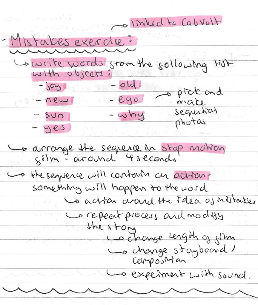
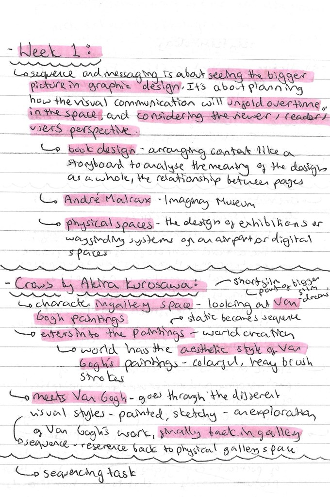
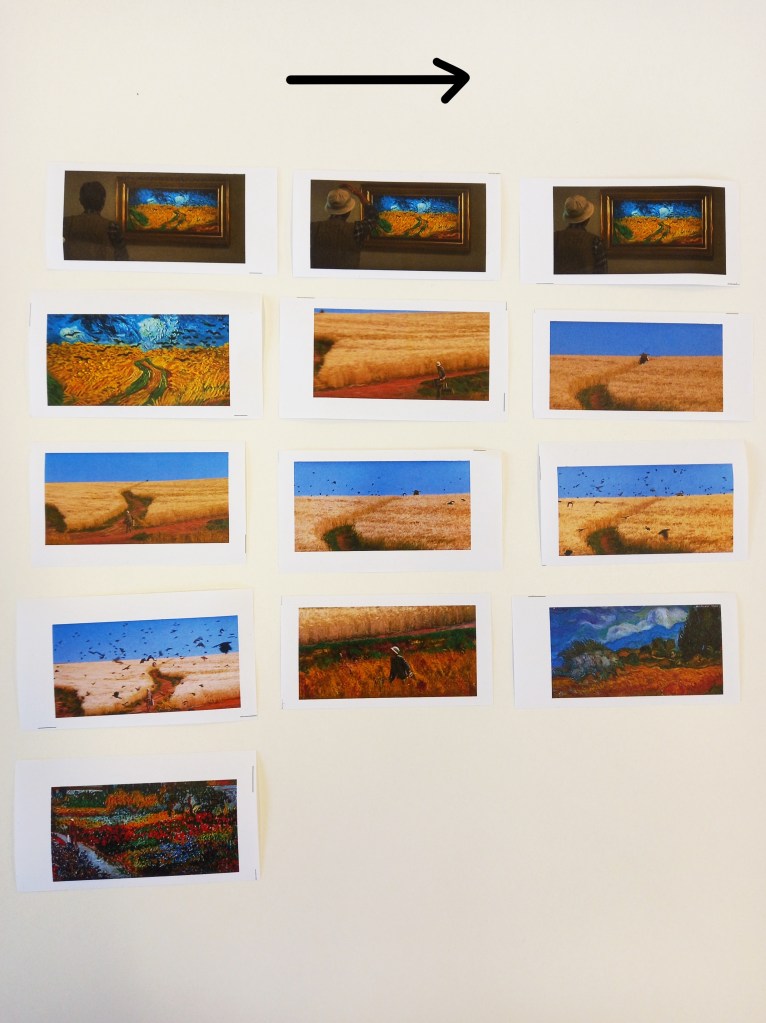
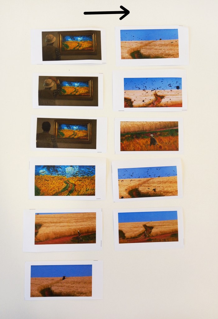
This is the creative activity we had in response to the action and interaction session. For this task we needed to pick a song or poem and make an image that encapsulates what the text means to us. We had to pick a word that summaries this and create it in our own lettering. This then had to be combined with an image to create a poster/ static layout. Our second task was to breakdown the song/ poem into small passages and create a sequential piece.

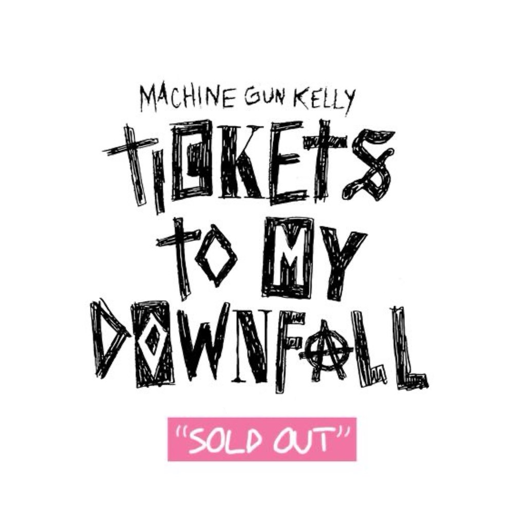
The song I chose was ‘Bloody Valentine’ by Machine Gun Kelly. This song is from his 2020 pop punk album titled ‘Tickets to my Downfall’. It’s on of my favourite songs that means a lot of me so I wanted to create some pieces that demonstrate this.

Ideas: below are my ideas for the imagery, typography and overall style/ aesthetic. I also wrote down possible words/ phrases I could use these include the song and album title and my favourite lyrics from the song.
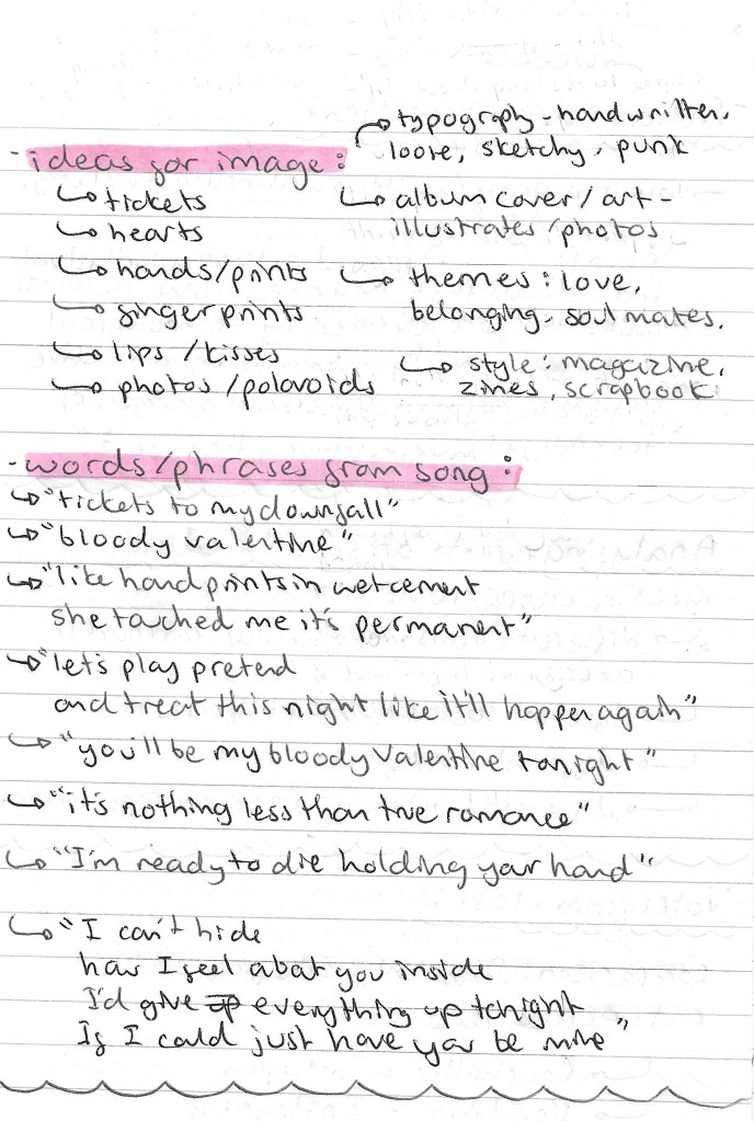
Bloody Valentine:

‘Tickets to my Downfall’ album cover:

Creating visual assets: after I brainstormed all my ideas I began to create visual assets in a variety of ways as I wanted to make mixed media outcomes.

These are scans I took from the interior of the vinyl. I wanted to use these are background for some of the posters. I love the collage style with photos and messy text and images over the top. I did some slight editing to these scans, adding some more texture to them and giving them an older, more vintage look.

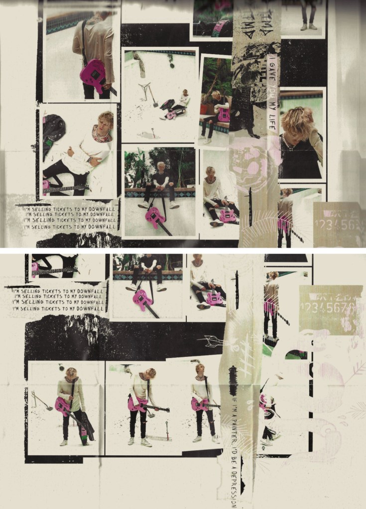
Below are some examples of typefaces that I took inspiration from. They are from the album cover and a selection of fonts with a similar aesthetic that I found on Pinterest. They all have a rough, sketchy and hand drawn look which I really like. This style compliments the scrapbook, collage look that I’m aiming for.

These are a selection of sketches and typography that I made. These are all hand drawn with a black marker and then scanned. I went for a sketchy, loose style with lots of rough lines. I created a few variations of the alphabet then took these and wrote out the song title, album name, and my favourite lyrics.

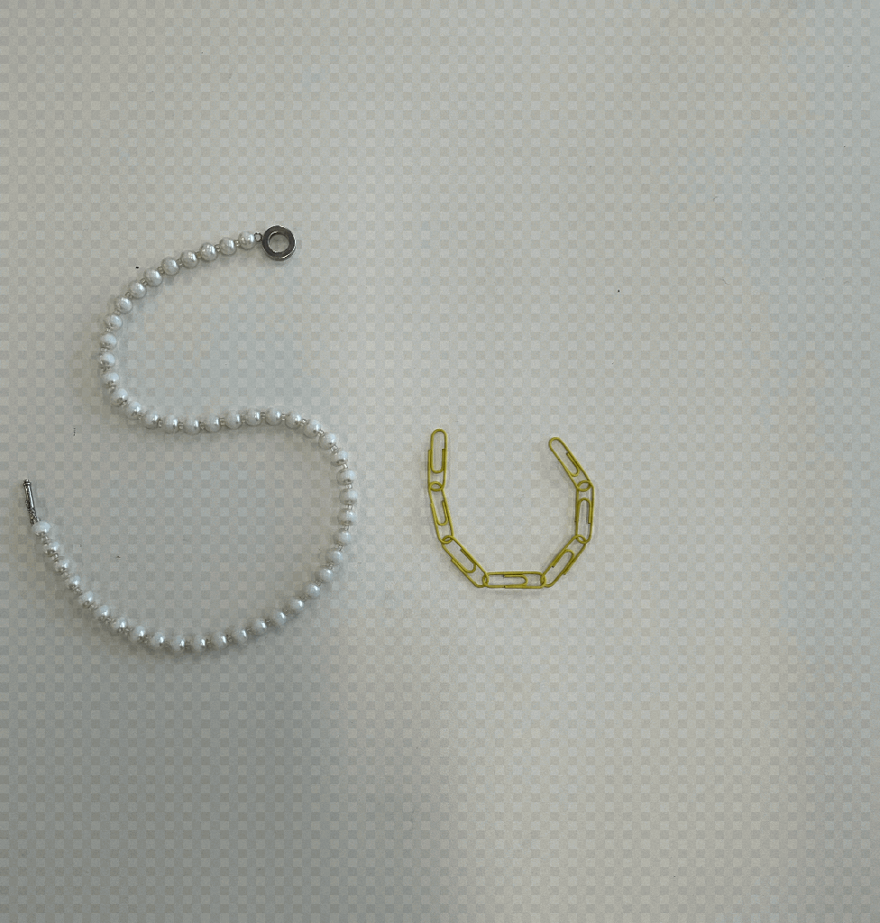
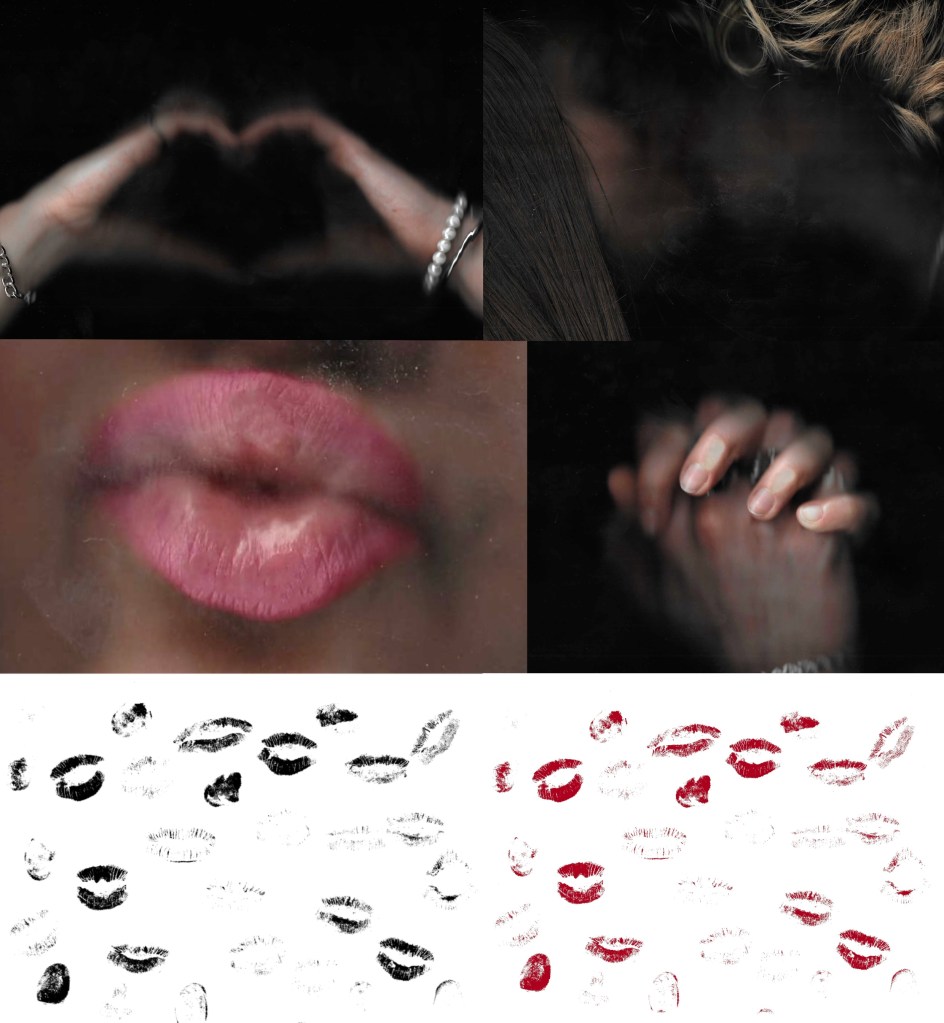
These are some scans that I made of me and my girlfriend. I chose to work with scans rather than photos because I like the gritty texture that it produces. I think that it aligns more with the aesthetic of the other elements that I’ve made for the posters. I also made some scans of lip and finger prints. I got my girlfriend involved with this because it compliments the themes explored in the song so would help enhance the meaning of my posters.

Posters:

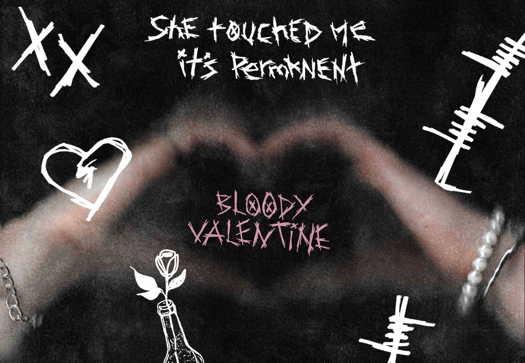
1- I went for a simple composition with the focus being on my typography which is centred and in a stand out colour, pink. It’s surrounded by a range of my sketches and some prints which I inverted to make white. The background is black which a grunge imported texture. The inspiration for this poster was a love note than you would draw and give to someone, with a darker emo influence, hence the hand drawn style of the sketches and typography.

2- This poster is similar to the first but with the introduction of a scanned picture of 2 people creating a heart shape. The typography is slightly less dominant in this one, there’s more of a balance between all the elements. This and the first poster make a nice pair as the maintain the same visual language.

3- This poster has a similar aesthetic but I started to include the album artwork. I used one of the scans and edited it heavily to completely change the colours and tone. Then I layered this with a few different lyrics and sketches all in pink. The final detail is a red kiss print, I wanted this to be a stand out element on this poster. I wanted this piece to look like a scrapbook/ journal where someone is fiddling and writing their ideas and thoughts.

4- For this went I went more towards the scrapbook idea. The background is the album artwork but is desaturated and has a vintage look. The sketches and details are black so aren’t immediately eye catching. I wanted the pink writing, lip print and scan to be the bits that draw the viewers attention. My favourite part of this piece is the incorporation of the scans as photos stuck into the scrapbook. This really enhances this idea and has a warm, hand made feeling.

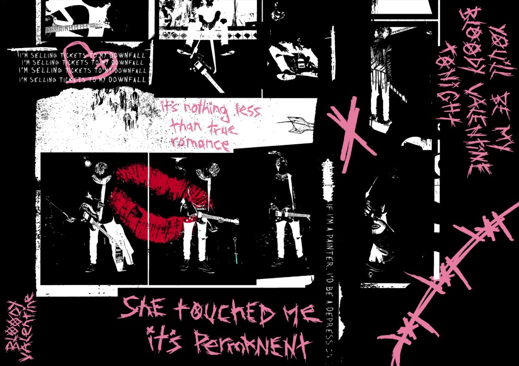
5- This is my favourite of all the posters. I like the coloured album art in the background. I desaturated it a bit so that it’s not overpowering but still shows the pink and green that are important to the song/ album aesthetic. It has a nice balance between the typography, sketches and scans. The sketches and type are all in white except the red lip prints which are eye catching but not too distracting from the other bits. This one really feels like a scrap book page that someone would make for someone they love. I think it encapsulates the meaning of the song and has the aesthetic of the album but with my own imagery and stylistic twist.

Videos: after creating a series of posters I made some sequential pieces. The idea behind these was that the scrapbook inspired pages remain static and the typography would change. I created the animations on Procreate. The 3 below are different versions of this:

Video with audio: I took one of the videos and added the instrumental to ‘Bloody Valentine’ to it. This just helps round off the concept and makes it more engaging. I chose the instrumental rather than the lyrics as I don’t want it look like a lyric video. Also I didn’t use all the lyrics so it would be distracting to read a different lyric to what is being said.

Reflection: I had lots of fun working on this task as I got to centre it around a song that I’m really passionate about. I enjoyed creating my own visual assets and typography in a rough, sketchy style. I’m very happy with the static and sequential outcomes that I created. I made a range of posters and videos that explored different ideas and aesthetics but all link back to the themes, concepts and meaning of the song. I’d like to incorporate some of theses ideas into my own project work such as the hand drawn sketches/typography and use of scanning.

Categories
Level 5 Sequence and Messaging

Sequence and Messaging: Action and Interaction

In the last couple of sessions we looked at static and sequential imagery and how to add actions and sound to a sequence. This week’s session was focused on action and interaction, by looking and different events on social media. It’s all about the companies creating something to get the consumer to interact. We looked at several types of comparisons, different events from similar categories, different social media platforms, different areas and different posts from same organisation. We looked at TikTok and Instagram as our social media platforms. Some of the organisations we researched were Coachella, Reading, Glastonbury and the Serpentine Gallery. This is relevant to our project as one of the outcomes we need to produce is a social media video, for Instagram or TikTok, so this is the type of research that we’ll need to do related to our industry/ event type. Below are all my notes that I made during the session and in my independent research:

Comparing different organisations : Coachella Instagram vs Reading Instagram:

Comparing different social media platforms: Reading Instagram vs Reading TikTok:

Comparing different social media platforms: Coachella Instagram vs Coachella TikTok:

Comparing different social media platforms: Glastonbury Instagram vs Glastonbury TikTok:

Comparing different areas: Burberry TikTok vs Hypnomotion TikTok:

Comparing different social media platforms: Serpentine Gallery Instagram vs Serpentine Gallery TikTok:

Comparing different posts within same organisation: Serpentine Gallery Instagram:

Stephen Dahl: he works in social media marketing at Sage Publications. Below are some of quotes from him about consumer culture theory:

Reflection: this session was interesting and has taught me lots about social media marketing. I learnt about the companies we looked at but more importantly I now have a better idea of how to research social media platforms in order to inform my creative decision making in the project. This type of research will help me better target my work to the relevant audience for a specific industry, product or event.

Categories
Level 5 Sequence and Messaging

Sequence and Messaging: Action and Sound

After last week’s session on static and sequential imagery, we looked at the action and sound of a sequence. This session was all about way of adding elements to a sequence to make it more engaging and enjoyable for the viewer. We first looked at an artist zine from the early 1900s called Cabaret Voltaine (Cabvolt). The message of the zine was about the importance of mistakes in an artists’ creative process. This links to the task we had later on in the session. The zine and my notes about it can be seen below:

Videos: then we started to look at different examples of videos to analyse the sequencing, actions and sound. My favourite one we looked at was a music video by Brazilian rapper Emicida titled ‘Pantera Negra’ meaning black panther in Portuguese. I like the limited colour palette of black, grey and red. This emphasises the title and the contrasting red is really eye catching and bold. The visuals are nicely synced to the song, sometimes with the lyrics and other times with the beat. The stand out part for me is the combination of photography and hand drawn overlays. This is a style I really like and would consider incorporating into my project work. Below are some screenshots from the video and som notes I made about it:

Movie titles: we also looked a some title sequences from the YouTube channel ‘Movie Titles’. These are a really good source of inspiration as they focus on music and actions. They are sequenced in a way to be engaging and capture the viewers attention, something that we’ll need to do for our social media videos (sequential outcome). My favourite of the ones we looked at was the Pink Panther title sequence from 1963. I like the fun and playful way that the characters interact with the credits. Below are some notes and screenshots from the video:

Mistakes task: this was our main task for the session and links back to the ideas seen in the Cabvolt zine. We had to pick from a selection of words and write it with random objects. Then we needed to create a stop motion sequence out of this word. The stop motion sequence needs to contain an action, something has to happen to the word.

This was the first sequence that I made. I chose the word ‘SUN’ and made it out of a pearl necklace and a chain of yellow paper clips. I created the stop motion sequence of Procreate. The action in the sequence is the paper clips moving to go from ‘U’ to ‘N’. The idea behind this movement was to symbolise a sunrise and sunset. The movement isn’t particularly smooth but this plays into the idea of allowing mistakes and imperfections to be in your creative process.

The second word I chose to do was ‘NEW’, which I made entirely out of paper clips. I used a range of different colours but made one fade into another to add another element of interest to my sequence. My thought process behind the action was to make the word appear from nothing so the action symbolises the word. I chose to make the canvas grow with the word to further emphasise this idea. I also made this stop motion sequence on Procreate.

Premier Pro: Adobe Premier Pro is an industry standard video editing software that I haven’t used before. It’s a very powerful tool so we could be used to make our social media videos. We had an introduction to the software during the session which was helpful but I felt I needed more in depth knowledge so I watched some extra videos after the lesson.

This is a labelled diagram of Premier Pro’s interface:

These are the notes I took from the in class introduction and my own additional research about importing media, essential tools, exporting and more:

iMovie: iMovie is another video editing software that I’m not familiar with. It’s a more basic software but is still good to learn about as it can be helpful for simple functions like adding audio to a video. One benefit of iMovie is that I can use it on my iPad so it’s more accessible for me whereas Premier Pro has to be run on a computer.

Some notes I made about iMovie:

Additional sequences: I decided to make a couple more stop motion sequences at home. To make these I used Procreate to construct the sequence and iMovie to add the audio.

New: I chose to make another sequence using ‘New’. This one looks a lot more professional in regard to smoothness of the animation and colour. Instead of taking photos I used a scanner to get each frame. This worked better as the colours came out a lot stronger. The idea behind the sequence is that the letters appear from one side, travel across the screen. They get scrunched up and leave the screen. Then the whole sequence is reversed so that the text appears again, making it ‘new’. This is a screen shot of my iMovie project, it has the stop motion sequence I made on Procreate above and the audio below:

These are 2 versions of the final video, the only difference is that the second one has a cartoonish style filter. My inspiration for these was children’s TV show titles so I chose fun colours, movement and audio.

Old: I chose to explore a different word for this one. I wanted to represent ‘old’ in a different way for each letter. For ‘o’ I used an apple and it slowly gets eaten, ‘l’ is a stack of coins that falls and ‘d’ is a piece of paper that gets cut. I made the sequence by taking photos and using the animation feature on Procreate. I chose to add movement lines to emphasise what is happening to each letter and make the movements more dynamic and cartoonish.

This is the finalised video, I’m happy with the actions of each letter and the randomness of what each one is made of. Also I think the movement lines add a nice layer to the sequence. Constructing the audio was fun, I chose different sound effects from iMovies library and made slight adjustments such as speed and volume to make them all fit nicely together.

Reflection: I enjoyed this session, I was able to learn a lot and get lots of inspiration for by project by watching different examples of sequences including music videos and movie titles. Also it was really helpful to get an introduction to Premier Pro and iMovie. I’d like to try out Premier Pro in the next couple of weeks and continue to work with iMovie for more simple video creation tasks. The mistakes task was really fun, I enjoyed creating several stop motion sequences with various methods. They progressively got better and I think adding audio made them more engaging and enjoyable to watch.

Categories
Level 5 Sequence and Messaging

Sequence and Messaging: Static and Sequential

In the first session of the module we looked at static and sequential imagery, for the project outcome we need to create both static and sequential work so this was a good introduction to the topic. Below are some notes I made from the seminar slides:

Our main task of the session was to explore the short film titled ‘Crows’ by Akira Kurosawa, made in 1990. Above are some notes I made while watching the film. It is about a man who goes to a gallery to view some Van Gogh paintings. He is then transported into the paintings and becomes immersed in the world. He meets Van Gogh and then goes on a journey through the paintings, with his surroundings becoming progressively more stylised. It ends with him back in the gallery looking at the paintings.

We responded to the film with a sequencing task. We were put into groups and given a set of screenshots from a part of the film. We had to reorder the static images to create a new sequence which gives the story a new meaning. These where the sequences that my group created:

This is a review of the sequences that all the groups made and what their focus was. I was in group 4 and we focused on editing as for the second sequences we made we chose to discard some of the images in order for our sequence to flow better. We were also guided by how we wanted the sequence to sound. For our first sequence we planned to have it paired with an intense, dramatic horror movie inspired audio. Some other aspects that other groups focused on were colour, composition, contrast and story arc. These are all ideas that I could apply to my sequential project work.

Here are some more notes I made from the session including some key terminology and ideas about photography in regard to sequence and messaging:

One of the photographs taken by David Octavius Hill:

Reflection: This was a really enjoyable session, I think it was a good introduction into the module and some of the key concepts we will be working with. After this session I have a stronger understanding of the terms static and sequence and how I’ll need to use these for the project. The task was fun as it got us thinking about how we can compose a sequence from a series of static images and how editing the sequence can give it a different meaning. I found physically having the sequence in front of me and being able to rearing the images very helpful. Also I really liked Kurosawa’s short film and plan to watch more of his work.

Categories
Level 5 Sequence and Messaging

Sequence and Messaging: Introduction

In this session we were introduced to the Sequence and Messaging Module. Below are the notes I made about the Module aims, the briefs, assessment criteria and deadlines.

Project brief:

Assessment details: