Categories
Level 5 Sequence and Messaging Sequence and Messaging: Project

Sequence and Messaging: Event details and branding

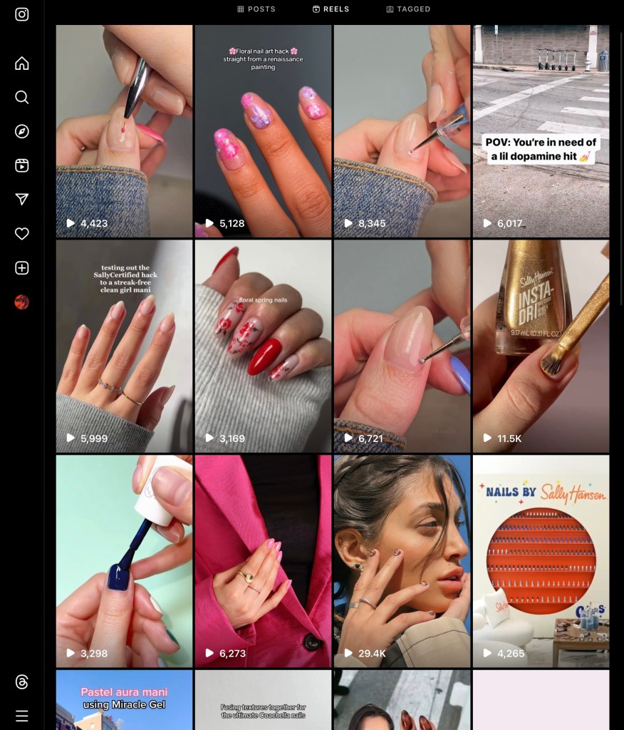
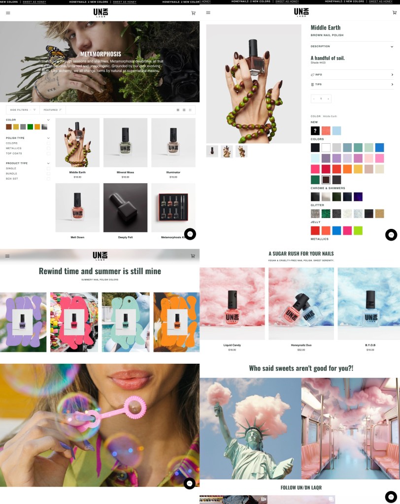
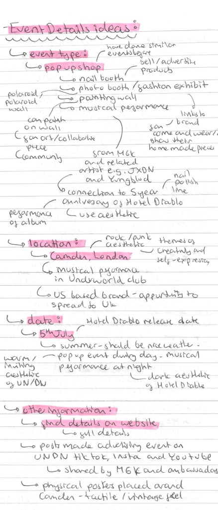
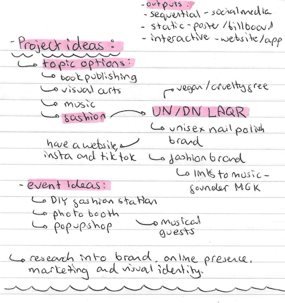
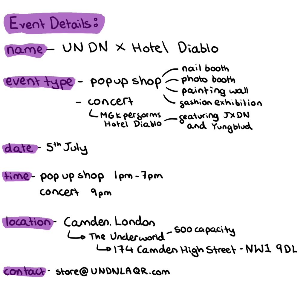
Event Details: These are the finalised details for my event combining UN DN LAQR and Hotel Diablo. I have chosen the event to be a pop up shop with a concert after. UN DN have done pop up event before so I have a basis to work from. At this event I’ll have a range of activities including a nail salon, photo booth, painting wall and fashion exhibition. After the pop up shop there will be a concert where MGK performs Hotel Diablo with some guests who link to the album and brand. I’ve chosen Camden, London as the location and will have it on the 5th July as it’ll be the 5 year anniversary of the album.

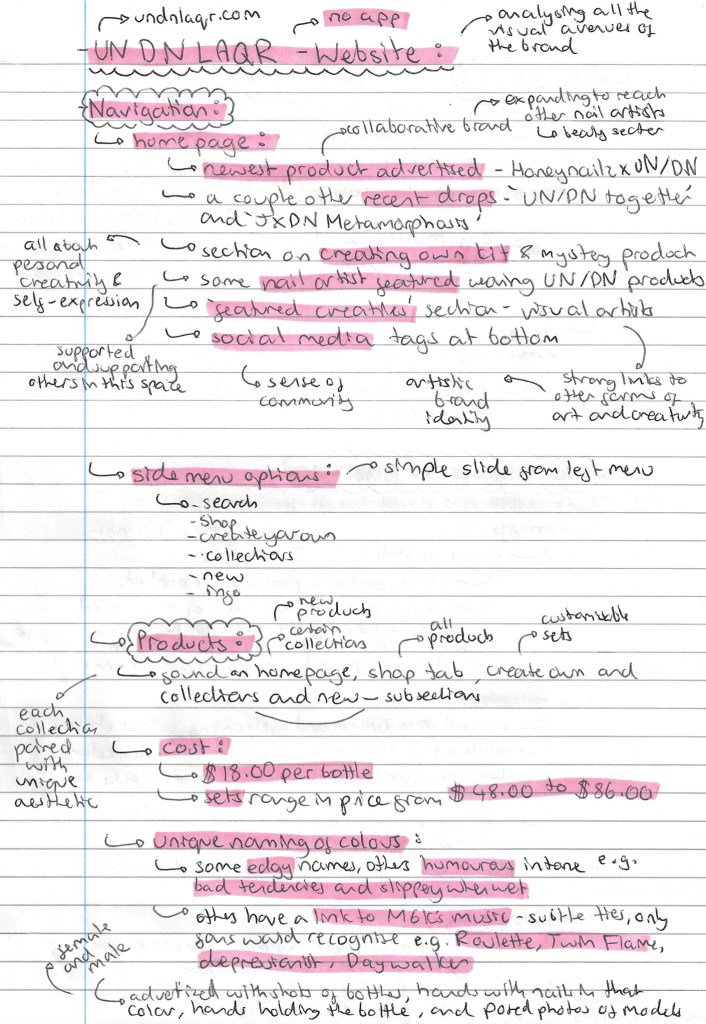
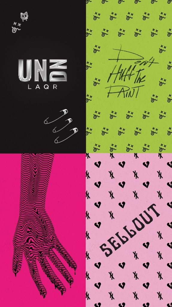
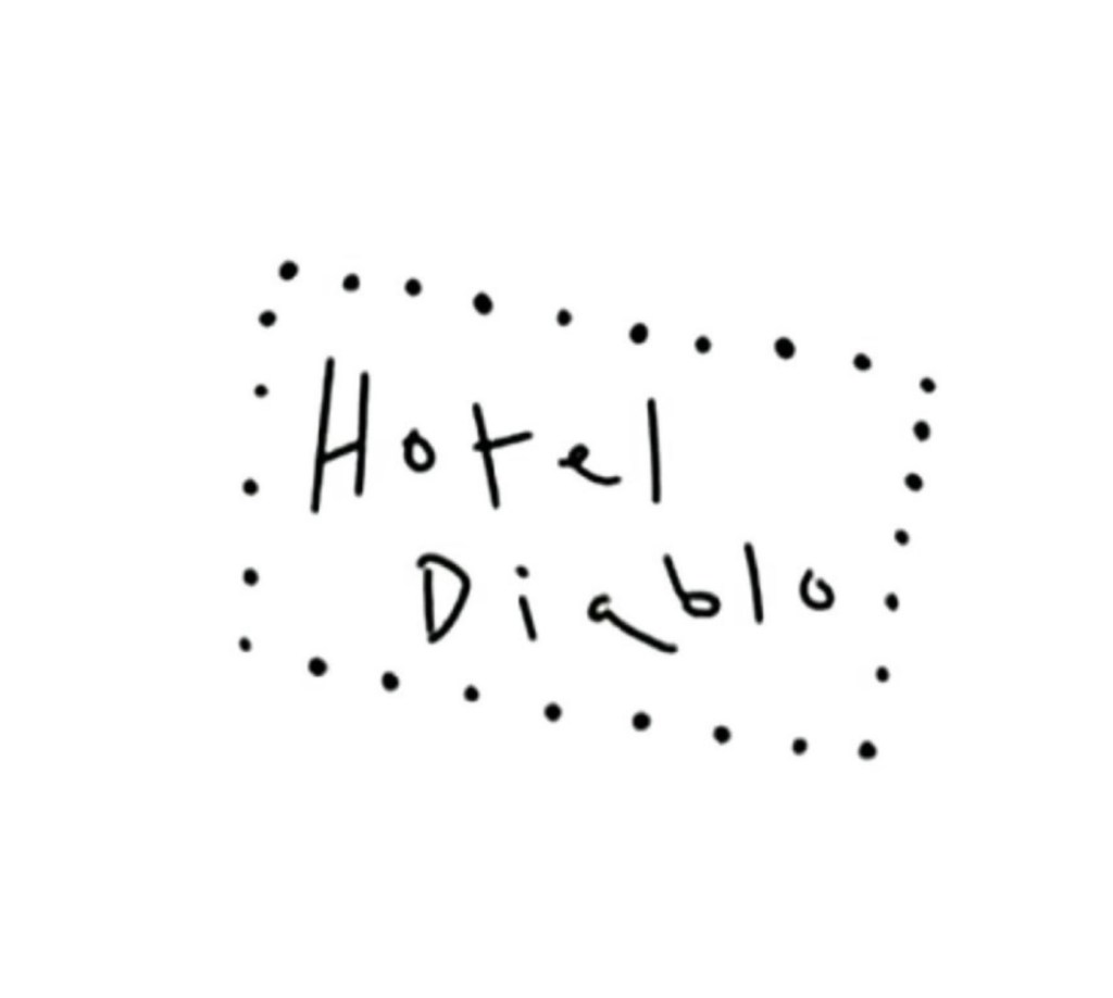
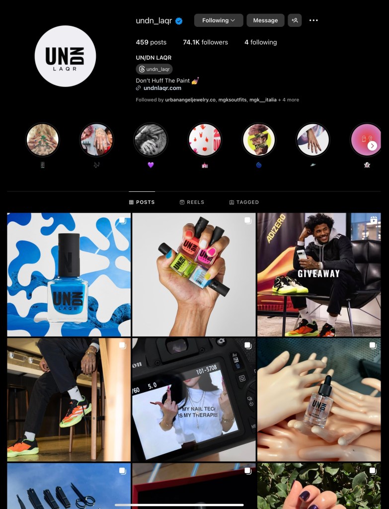
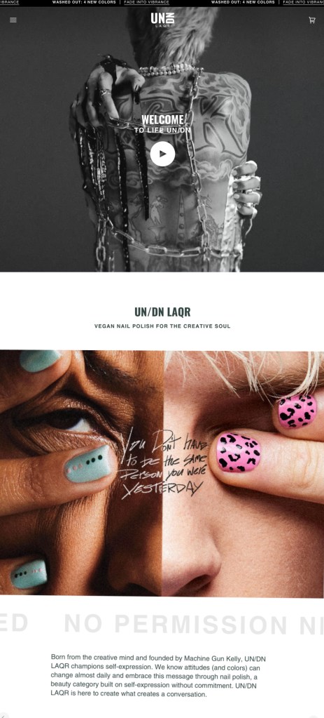
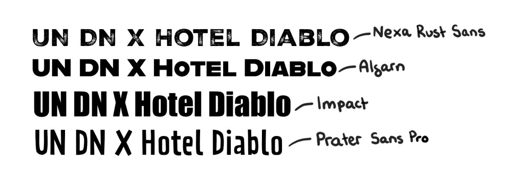
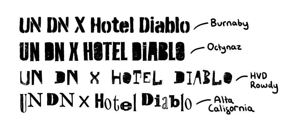
Logos: I won’t be redesigning either logo so will use the existing ones. The 2 logos are very contrasting aesthetics so it will be a challenge to visually balance them in my work. UN DN have simple bold typeface whereas Hotel Diablo have a much more rough hand made quality to it. Finding a middle ground between the 2 could be nice for the display typeface.

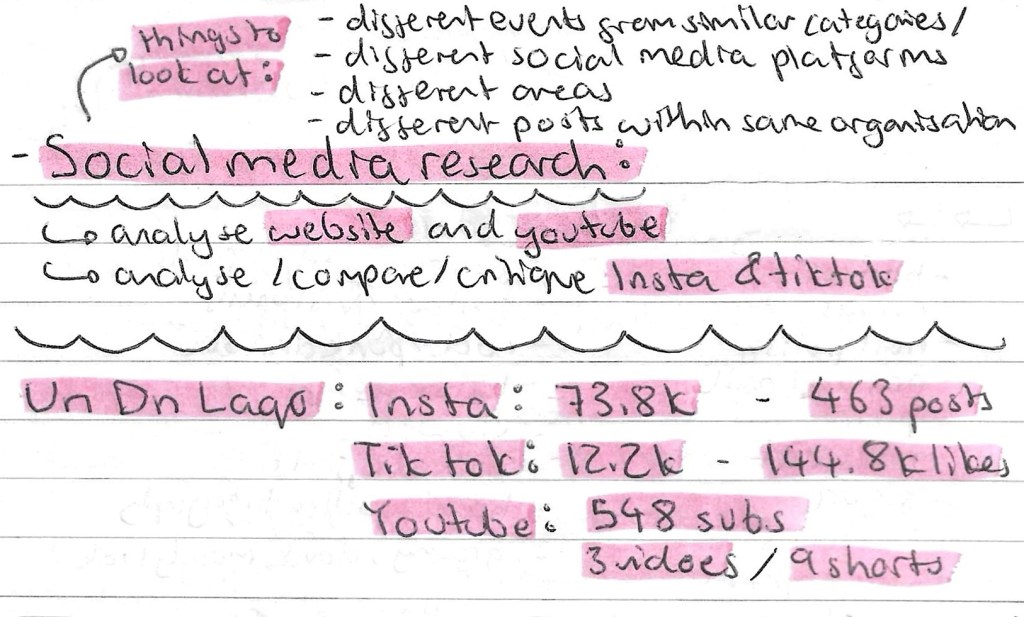
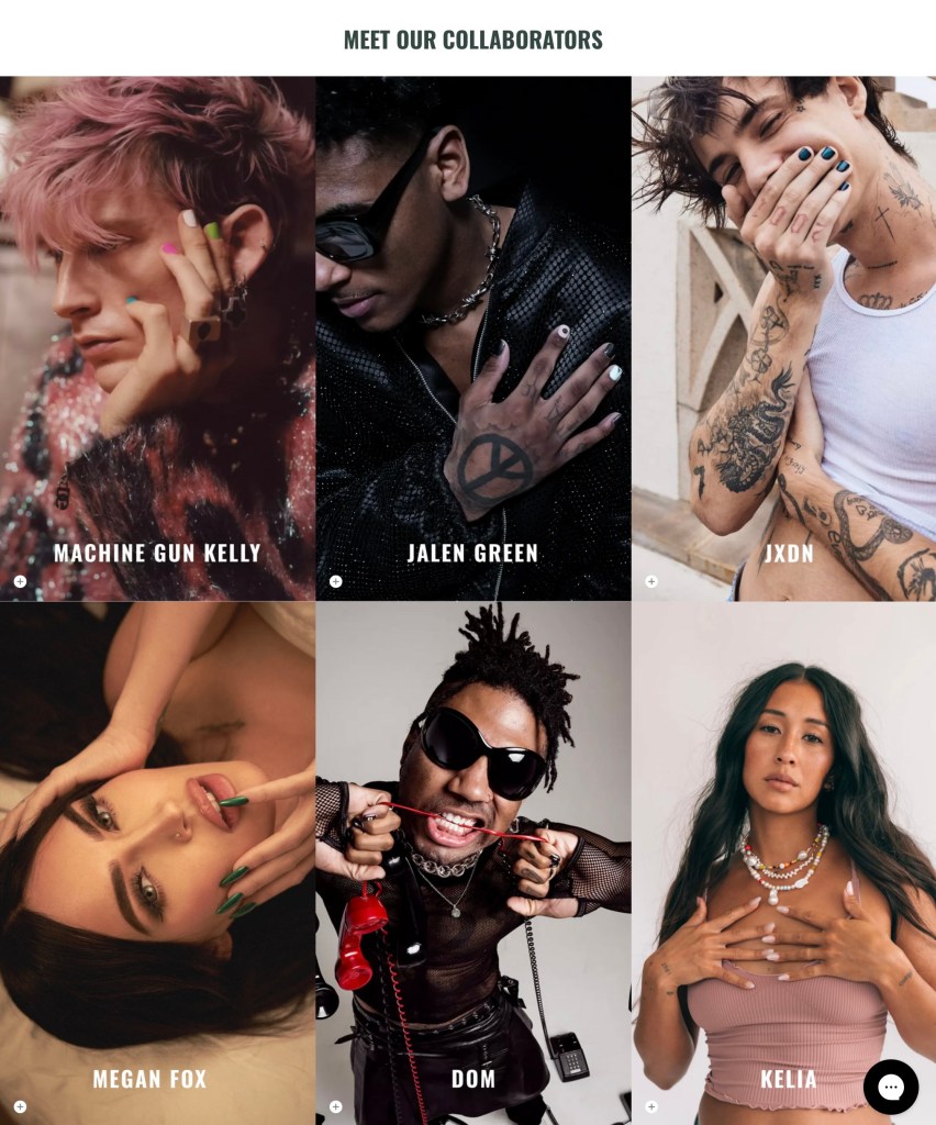
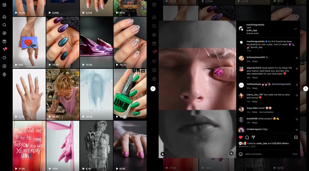
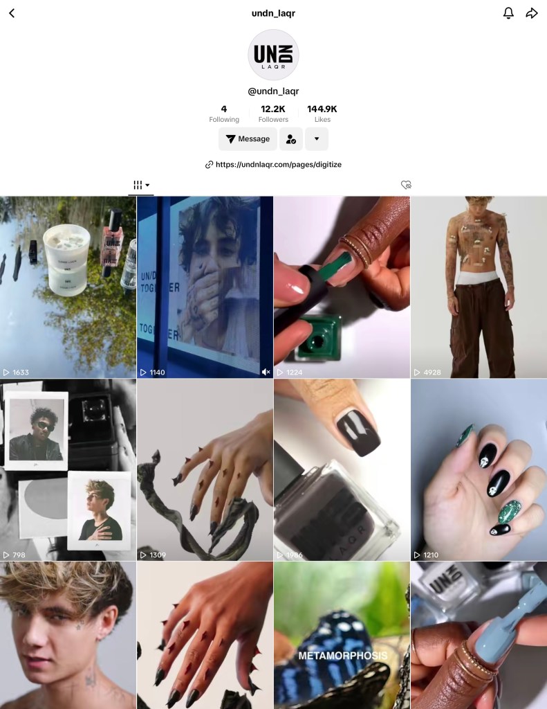
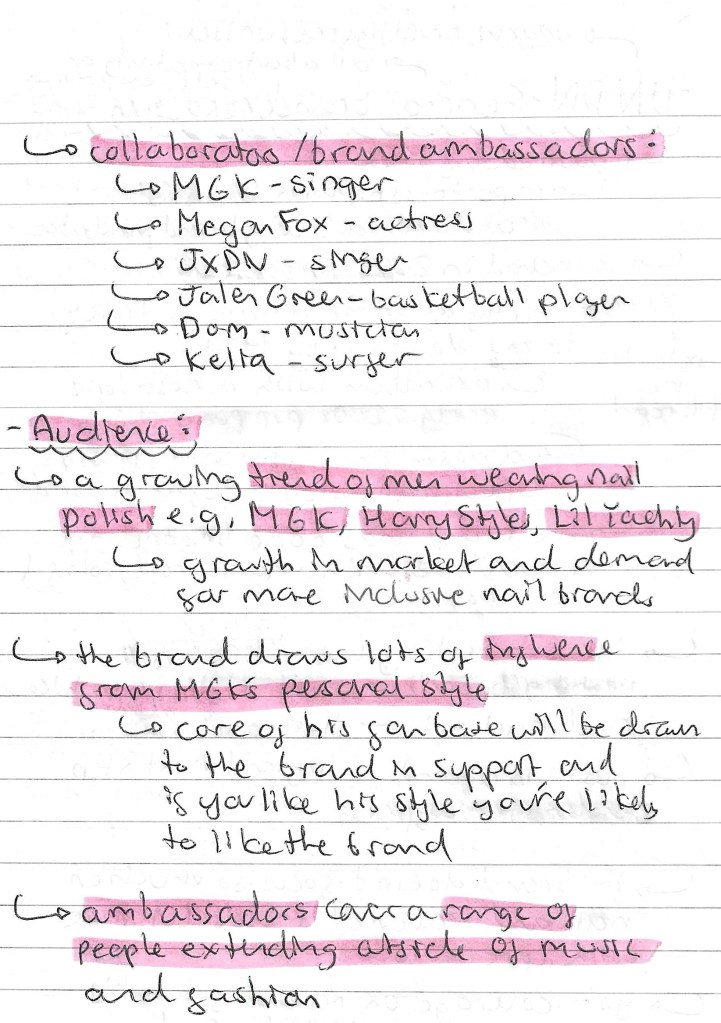
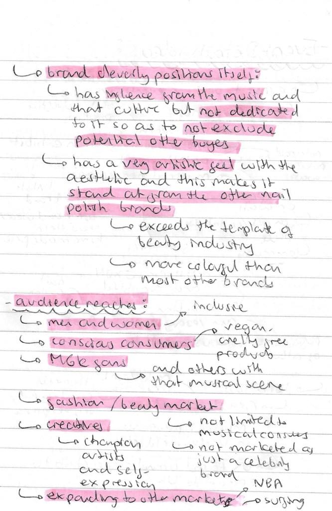
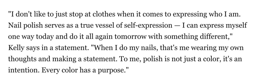
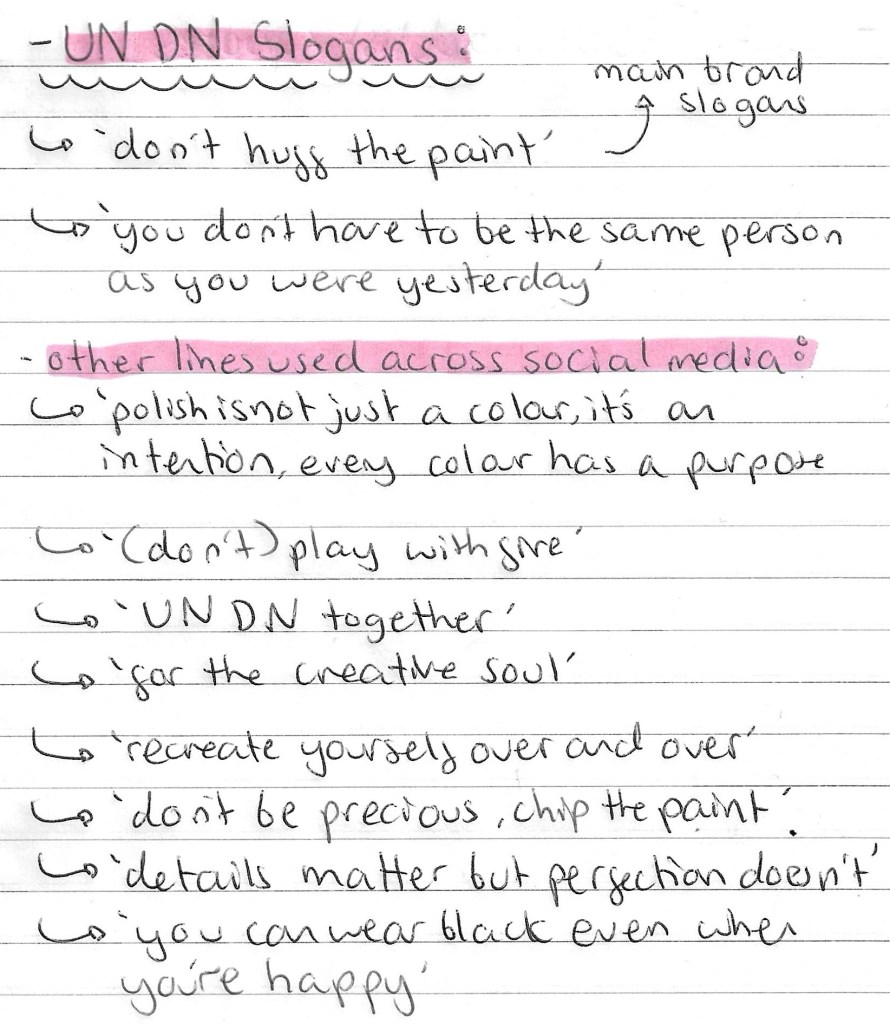
UN DN slogans: during my brands research I found a selection of intending slogans, quotes and captions from their social media pages . These could be good to include in my project work as I want to keep the style of language consistent to their actual style. Below are some of my favourites:

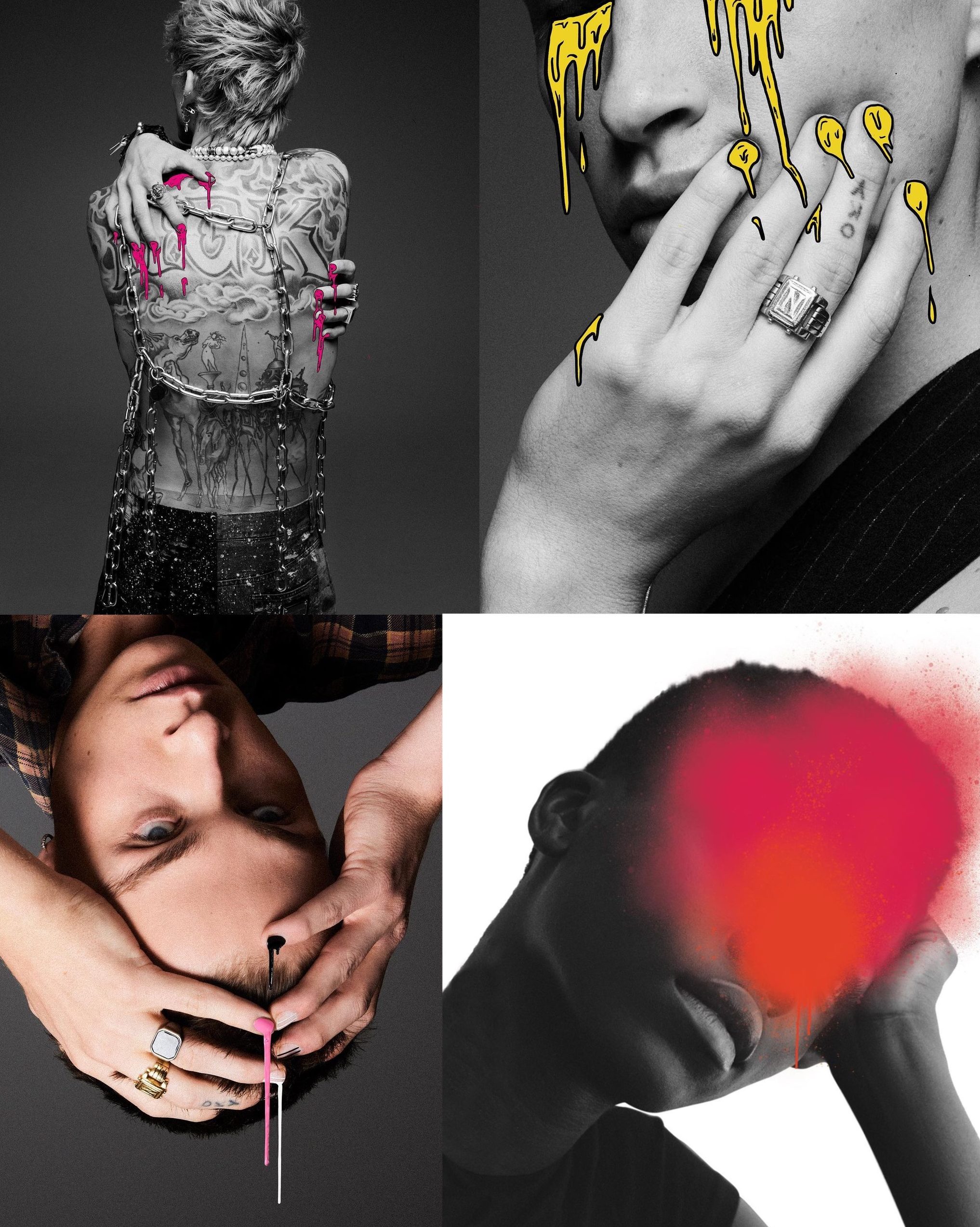
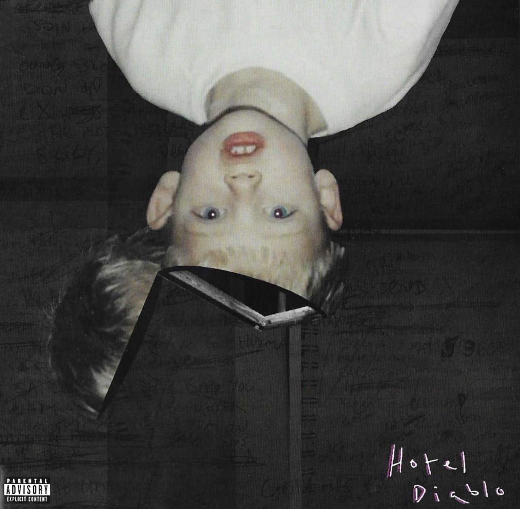
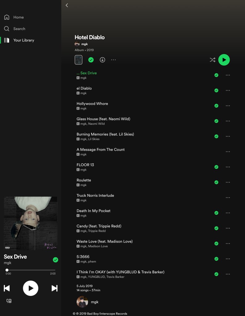
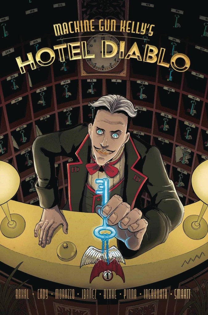
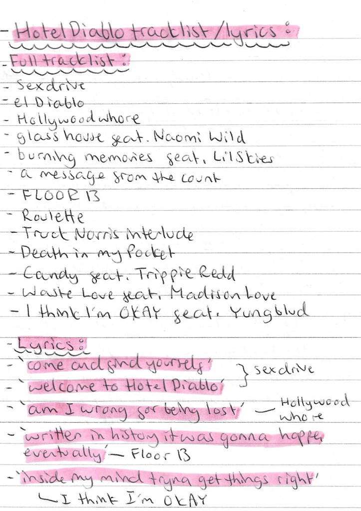
Hotel Diablo track list and lyrics: I noted down all the songs from Hotel Diablo as I’d like to incorporate the track list into my projected work. Also it could be nice to use specific song names in the advertising as a way to link the whole concept together. I also made a note of some specific lyrics from the album that I could use. I think this would be a good way of subtlety referencing the album in a way that fans will understand but the average viewer won’t.

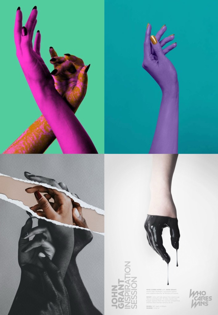
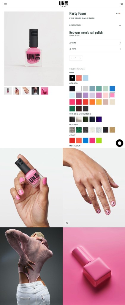
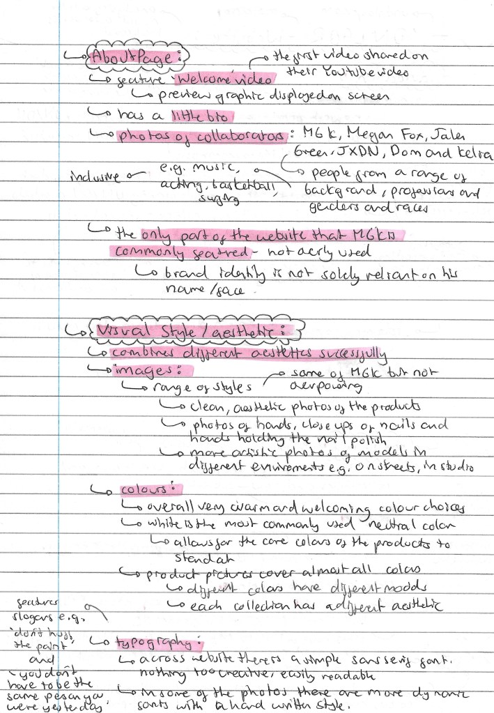
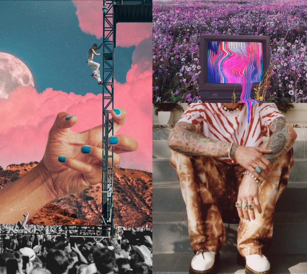
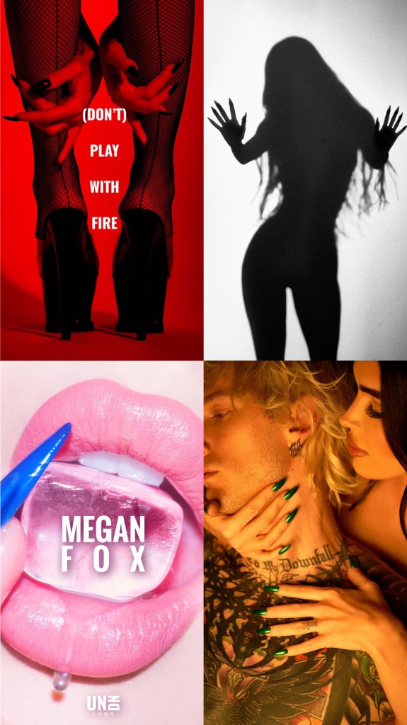
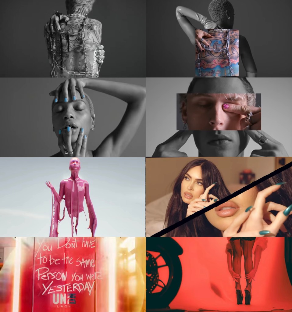
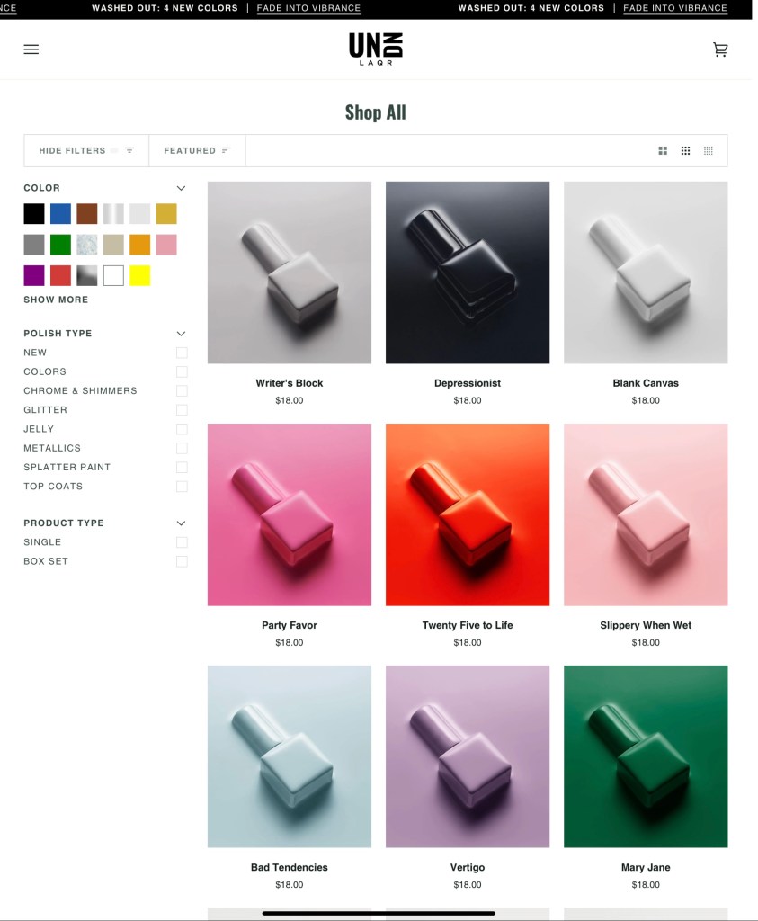
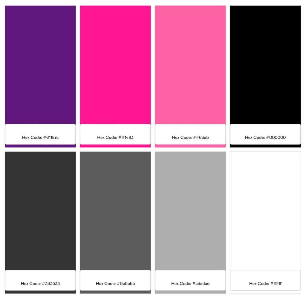
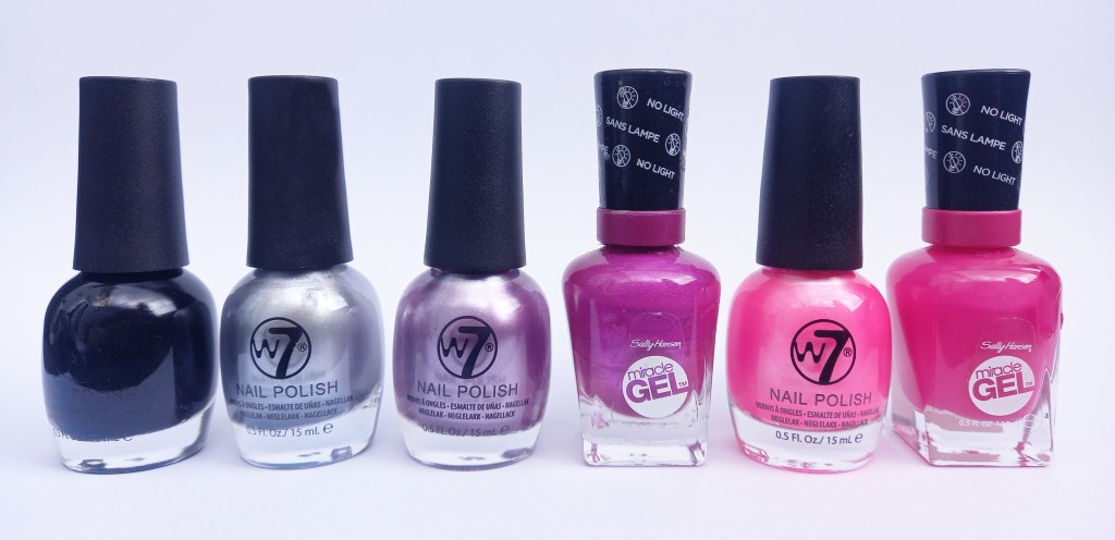
Colour palette: UN DN don’t have a specific colour palette that they use, they tend to change their colour scheme depending on the event or collection they’re promoting. Usually they’re colourful, generally leaning more towards a lighter aesthetic. This allows me lots of space to design a new palette. Hotel Diablo has a dark, moody colour palette, primarily being black, grey and purple. In order to combine these 2 visual identities I chose this palette. It has black and various shades of grey to keep the Hotel Diablo aesthetic. It also includes white which will mostly just be used for details such as text because I want the base colours to be dark. The pop of colour I have chosen are pink and purple. I added pink because it’s a colour strongly linked to Machine Gun Kelly and will help to bring a sense of life and excitement an otherwise dark palette.

I used a colour palette tester to show me all the possible colour combination that this palette creates with a contrast higher than 4:

I have bought nail polish in all the colours from the palette. All my adverting will be of these colours as this is going to be the Hotel Diablo nail polish collection. By creating a collection linked to Hotel Diablo I’m able to connect the 2 elements of my project and centre the advertising around that. The advertising will then be promoting the brand’s pop up shop and the concert of the album.

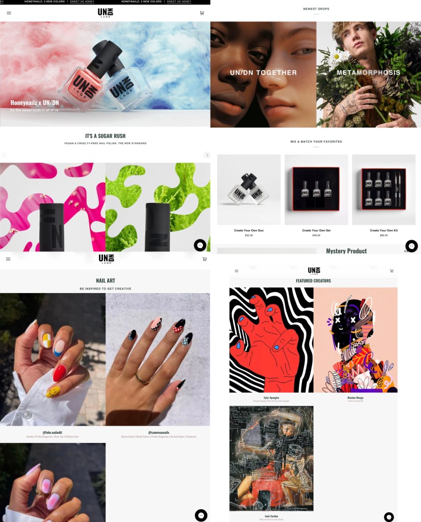
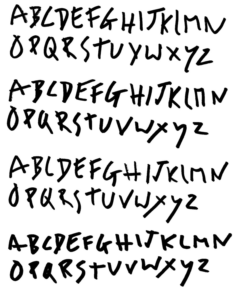
Typefaces: UN DN uses relatively simple and clear typefaces for their titles and bodies of text. They get creative and more experimental on some of their advertising, using more interesting typefaces. Hotel Diablo has a very loose and hand written style so I want to combine these 2 aesthetics.

Adobe typefaces: these are a selection of Adobe typeface that I’m considering using in my work. There’s a range of simple, bold ones inspired by UN DN and other more decorative ones which take inspiration from grunge and rock music.

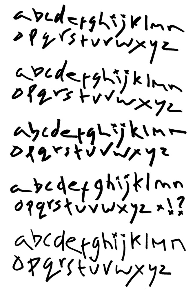
Hand written typefaces: I made these typefaces using a thick marker pen. They’re inspired by the hand written style on Hotel Diablo but are more bold and have a stronger line weight, similar to those used by UN DN. I want a loose, rough style so they are stylised versions of my own hand writing to make them feel natural and not too forced or perfect. These typefaces build on the styles I developed in the action and interaction activity where I worked on the song ‘Bloody Valentine’ by MGK.

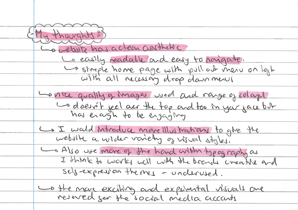
Reflection : this visual identity comprised of logos, slogans, colours and typefaces is going to be continually developed throughout the project. Designing a visual identity is an iterative process, the decisions are not fixed at this stage but it’s good to have a base to work from. The next steps will be to start experimenting and creating some visuals for the static, sequential and interactive pieces.

Categories
Level 5 Sequence and Messaging Sequence and Messaging: Project

Sequence and Messaging: Wider Project Research

In my previous post I did extensive research into all of UN DN’s social media accounts and their website. The next step was to do some broader research, looking at how nail polish is promoted on social media in general. I looked on Instagram, TikTok and Pinterest. I mainly focused on Instagram because that is the social media platform that I’m targeting my advertisements towards.

Instagram: on Instagram I looked at hashtags, some famous nail polish brands and a specific page that interested me. This range of research gave me a more in depth understanding of how nail polish is advertised, helping to guide my creative decision making.

Hashtags: I looked at loads of different hashtags related to nail polish to explore how it’s presented on Instagram as a whole. The 2 hashtags with the most posts were #nailsofinstagram and #nailpolish. Generally what I found what a consistent style of advertising under these hashtags. For the most part it was a simple, light, clean aesthetic. The photos were taken in strong warm lighting with a really high quality camera to highlight the detail and texture in the nails. Occasionally there would be interesting details in the background but often it was very simple. While there is nothing inherently wrong with this aesthetic, it became very repetitive and boring with all the posts largely conforming to 1 visual identity. In my project work I want to go against this and creative pieces that stand out and contrast this light, clean aesthetic. Some elements I did like was the common use of accessories in the photos such as rings and bracelets, which is something I want to use but make it more striking. Also they’re a lovely array of colours on display but mostly just in the nails, making these colours more bold in the pictures and videos could help make them more interesting. Below are some screenshots from these hashtags:

Nail polish brands: I researched some of the most popular nail polish brands and looked into their Instagram accounts. The brands I’ve shown below are Sally Hansen (404k followers) and Jinsoon (35k followers). The ideas I mentioned about the hashtags remained largely the same across these brands. The aesthetics of the pages are repetitive and predictable with lots of simple shots of painted nails. There’s very little creativity or inspired design work, it largely just follows a formula. Even between different brands the visual identities are similar and not easy to distinguish. This is reflected across the engagement with posts, particularly in the reels. For the most part it’s just steady views that are surprisingly low in comparison to the follower count. The reels tend to be nice relaxing videos of people doing their nails or speaking about them. These make for nice watching but are nothing different or unique which is why they don’t really break out of the brands following.

Sally Hansen X Jared McCain: This post by Sally Hansen in partnership with Jared McCain is one I specifically wanted to talk about. Aesthetically it’s an incredibly simple, it’s just a guy talking on his house with no effects or editing. However, it’s the most viewed reel on their instagram with 1.1 million plays. This is so far ahead of their average. There’s a few interesting things I took from this. It shows the importance of brand collaboration. He is a basketball player so it helped expose the brands to a new audience. This is something UN DN does well with their range of brand ambassadors. Also the post shows the importance of going against the grain. Men wearing nail polish is becoming more popular but is still met with a lot of negativity. This is reflected in the comments section of the post with quite a lot of negative comments but ultimately gets a lot more engagement. The majority of nail polish promotion to targeted towards women with its more feminine aesthetic and I want to challenge this in my work. The idea of nail polish being for men and women is an important part of UN DN and is something that will be key to my project work.

Nails of LA: this is a particular nail polish account that I like. It’s the page of an LA based nail artist who works a lot with celebrities such as Megan Fox, MGK, Landon Barker and Kim Kardashian. They often share posts about UN DN and work with a lot of the same people and have some similar aspects to their visual identities. What I like about this account is the more unique visual identity. I like the use of accessories and a more alternative/ rock leaning aesthetic. These are styles I’d like to work with in my project.

Instagram reflection: overall I found through my research of how nail polish is promoted on Instagram that it was very repetitive and the post became too formulated. It was primarily all just light, clean photos of hands with little creativity or originality. As a result of this there were very few videos or photos that really broke out of the community of followers. I want to go against this in my work, creating a unique aesthetic that stand out from all the other posts on Instagram.

TikTok: Instagram was the main social media platform I researched as it’s where I plan to target my video. But I did do some research into how nail polish is shown on TikTok, mostly just looking at the hashtags. The main one I looked at was. #nailpolish as it had the most posts, 450k. There wasn’t a huge difference from the aesthetic seen on Instagram. The format of the videos are less professional and more conversational which is simply the nature of TikTok. They are once again repetitive and result in relatively low engagement. There was more typography on display but nothing that really stood out to me, it was mostly just simple typefaces with no real characters or uniqueness. The style of the content here isn’t what I’m aiming for in my project.

Visual Research (Pinterest): after researching on Instagram and TikTok I looked on Pinterest to see what content they had related to nail polish. There was a lot of images that followed the same visual identity that was seen on social media. But I was able to find some more unique and creative pieces that inspired me which are below .

I like the more experimental use of colour. Having unnatural colours in the face instantly makes the images more striking. Also there are strong colours in the background so the overall image is eye catching. The poses of the hands are more interesting than a lot of the content of social media. I really like the image with the rip in it. It’s a nice way of playing with colour, having some bits it greyscale and other parts in full colour. This can be seen in the bottom images too as they only have colour on the lips and nails, an easy way to draw attention to the nails. The bottom images have a vintage style with the colours and textures, I’d like to incorporate this into my work as it’s different to the clean images currently seen in do use media.

Categories
Level 5 Sequence and Messaging Sequence and Messaging: Project

Sequence and Messaging: UN DN social media analysis

An essential part of this project is social media research. This allows us to better understand the brand, event and audience to make informed and targeted creative decisions. This post has my research on all of UN DN’s social media platforms, Instagram, TikTok, YouTube and their website. I took what learnt from the action and interaction research workshop and applied it to my project. This way I was able to cover all angles of social media research. I looked at different posts within same organisation, different social media platforms, different areas and different events from similar categories.

Brand logo: simple, bold typeface. Doesn’t reflect the brands creative identity but this contrast of styles helps it stand out against their advertising. I won’t be redesigning the logo so my work will be using their existing one.

Website:

Instagram:

TikTok:

YouTube:

Machine Gun Kelly Instagram and TIK TOK:

Reflection: doing all the research into the brands visual identity across all their social media and website was very helpful. I now have a much greater understanding of the brands visual style, what advertising is successful for them and how they appeal to their audience. It has also provided me with lots of inspiration for the style and aesthetic of my project work. The next step will be to research the wider context on my project, so look at how nail polish is advertised generally and how similar events are promoted.

Categories
Level 5 Sequence and Messaging

Sequence and Messaging: Figma Introduction

This was the other activity we did during our session introducing interactive sequences. We were introduced to Figma which is the website we’ll be using to make our interactive pieces. Prior to this session I had never used Figma so it was all new to me. Figma is a collaborative web application for interface design. It’s used for people to create, share and test designs for websites, apps and other digital products. It easily unites and streamlines the creative process for a design team.

Figma community: this is an additional website that has lots of inspiration, examples, templates, visual assets and more than anyone with a Figma account can use.

Note from videos: our introduction in the lesson was very brief so I watched a series of introductory tutorials from Figma’s YouTube channel to advance my knowledge and confidence with the application. I learnt a lot from these videos, all the notes I made from them are below:

I feel that I’ve learnt a lot about Figma and how to use it from the introduction in class and my own research. I will be using it to create my interactive piece for my UN DN X Hotel Diablo event. We have the option to either make a mockup for a website or app. I’ll be doing a website as I feel it’s more relevant to the type of event I’ll be creating. The important things to keep in mind when it comes to creating this will be that it needs to use the relevant and useful information, maintained the visual identity of the event and includes interactive elements. These can be easily added into a Figma design by using the prototype tab and creating connections between 2 pages.

Categories
Level 5 Sequence and Messaging

Sequence and Messaging: Introduction to interactive sequences

This project has 3 outcomes, a static piece, a sequential piece and an interactive piece. So far in the module we’ve covered static and sequential so this we starting looking at interactive sequences. We had an introduction to Figma, my notes for this are on the next post.

Our first activity was looking at storyboarding and rhythm. I will use storyboarding as a technique to plan my social media video. This is a good way visualise what will happen in the sequence and how best to add rhythm and action into to stop it from becoming boring. A good way to do this could be physically draw or print different parts of the sequence and rearrange them. This is the way we worked in session 1 to analyse Kurosawa’s short film. We where given some advice on ways to stop a sequence becoming monotonous such as changing angles, zooming in and out, changing the background and mixing dynamic and static elements.

Simplifying complex lettering: for this task we looked a the Young V & A and their visual identity, specifically their typography. They take a selection of basic typefaces but use them in a fun and dynamic way with stop motion. This style nicely appeals to their target audience which is children and it’s an engaging way of using typefaces. This is a good example of targeting creative decision to a specific demographic. Below are more notes on this topic:

These are examples of the visual identity of Young V & A. The first is digital/sequential advertising, the second is physical/static advertising and the third is a series of physical merchandise. What’s interesting about these is that they’re not consistent with colour but still maintain a consistent visual identity through their strong use of typography and style of image. This is a good example of how you can really vary a certain design elements so long as others are kept consistent.

Reflection: this session was good as we started to looked at interactive design. Also I am now ready to start creating a storyboard for my sequential piece after our activity about how to successfully add action and rhythm to make a storyboard more engaging. The research about Young V & A was good as I learnt about an interesting way of manipulating typefaces. Their use of stop motion is a good way to incorporate many simple typefaces and make them into a visually engaging sequence. This is a style that I will consider for my project work.

Categories
Level 5 Sequence and Messaging Sequence and Messaging: Project

Sequence and Messaging: Brands Research and Ideas

General brand research: I did some more in depth research into UN DN to find out as much as I could about the brand. This helped give me a better understanding of the company so I could make more informed decisions in my project work. Below are some notes I made from my research:

Audience: an important area of research for this project is to look at the audience for the brand and event. This is key as I will need to target all my advertising to this audience so I need to understand who they are and what they will like. The brand has a clear aesthetic and visual identity but cleverly positions itself in the market to attract attention and interest from a wide ranging audience. A simple way they do this is by having brand collaborators and ambassadors for different demographics and industries. Another way they they wider their potential consumer base is by clearly stating that it’s a unisex nail polish brand. Most nail polish companies target their products to women, excluding a potential male audience. There’s a growing trend of men wearing nail polish so this progressive move is clever from the brands perspective. This dude ranging audience means I have lots of creative freedom in my project. More details on their audience are below:

Quote from Machine Gun Kelly:

Event details ideas: in a previous post I discussed the basics of my event idea. I have developed the idea and the details about the event type, location, date and other information can be seen here:

Categories
Level 5 Sequence and Messaging

Sequence and Messaging: The Instagram and TikTok Effect- BBC Documentaries

I watched these 2 BBC documentaries as a way to extend my knowledge about the social media platforms. This is important for the project as we need to produce a video for Instagram or TikTok so this knowledge will help me make more informed decisions about my creative work. Below are my notes on the 2 documentaries:

The Instagram effect:

The TikTok effect:

I found the documentaries insightful and enjoyable to watch. I learnt a lot about 2 of the world’s leading social media platforms. I now have a better understanding of their history, purpose, algorithm, issues and lots of other interesting information. I’ll be using this research to aid my creative decision making for the social media video (sequential outcome).

Categories
Level 5 Sequence and Messaging

Sequence and Messaging: The Visual Identity of a Sequence

This week we explored the visual identity of a sequence. Before this we had explored creating sequences with actions, audios and interactions so now we are looking at how to give a sequence a recognisable identity. For our project work it will be important that all our outcomes are tied together by a consistent visual language to make them feel connected. This is key when promoting an event across different platforms, especially social media. The first activity was looking at a series of contemporary creative festivals and analysing visual identity. Below are a list of the festivals that we explored:

London Design Festival: this is London’s longest running design festival and below is its visual identity from 2021. It has a very simple colour palette of just 3 colours, black, white and red. The red is a bold colours so immediately draws people’s attention and it’s strongly connected to London. I like the 3D typographic style, it’s unique and interesting enough that it can carry a poster with just the typography. This simple combination of colour and typography is enough to be the visual identity and this can be seen across advertising and a variety of merchandise.

Yaga festival: This festival has a really a really strong use of colour. They use bold, eye catching and psychedelic colour combinations. The colours are the key part of visual identity as they use unique and unusual combinations of colours so will stick in the minds of viewers. Similarly to the London Design Festival, vibrant red typography is really eye catching and contrasting to the rest of the colour palette. Below a range of digital advertising, physical advertising and merchandise all with a consistent visual identity:

Sequences in abstract films- early 20th century: our second activity was to look at a range of avant-garde abstract films from the early 20th century. Here is a list of the films we watched and some notes I made about them:

Walter Ruttmann (top) and Michael Socha (bottom): Ruttman’s 1921 film titled ‘Lichtspiel Opus’ has simple motion graphics with colourful abstract shapes. At the time this was very advanced animation. Most animation at the time was black and white so these pops of colour really made his work stand out and be more visually interesting. The influence of this style of work can still be seen today. For example in the work by Michael Socha who puts a modern twists on it. The animation is much smoother but the principle of simple abstract shapes moving remains the same.

Title sequences: another activity we had was looking at the visual identity of different title sequences. We looked at 5 different title sequences from the 1900s. Below are the notes I made about each sequences:

Vertigo (1958):

Dr. No (1962):

The good, the bad and the ugly (1966):

Review of the title sequence activity:

Mission Impossible title sequence: this was an interesting example to look at as it has developed a lot from its original in 1969 to its most recent one from 2023. The style and visual language has remained the same which has helped give the franchise its recognisable visual identity. The quality of the visuals has improved significantly with the advancements in digital technology available. The most noticeable change is the pace of the sequences increasing. The originals were seen as fast but now they’re dramatically quicker. This helps keep the, feeling fresh and exciting to viewers. This is a great example of a sequence that has maintained its visual identity while still evolving to meet the current demands.

Beyond Divisions: this is a Student Design award winning piece from 2022. I really like the visual style of this video. It has hand made paper textures, grainy textures, paper cut outs all put together in a collage format. Also the use of bright colours against greyscale images is a really effective colour palette as it helps guide the eye to the important parts. The combination of visual styles is something I would like to try use in my project work.

Reflections: this session was helpful as it taught me a lot about the importance of creating a unique and recognisable visual identity. This is key to this project as all 3 of the outcomes will needed to have the same visual language in terms of colour, aesthetic, imagery and typography. We looked at design festivals, abstract films and title sequences, giving me a broad range of research to take ideas from. As well as learning about the importance of a visual identity I started to think more about what sort of styles I’d like my project to have, these are ideas I’ll be developing over the coming weeks.

Categories
Level 5 Sequence and Messaging Sequence and Messaging: Project

Sequence and Messaging: Project Ideas- Hotel Diablo

My project will be combining UN DN and Hotel Diablo to create one event and cohesive visual identity. Hotel Diablo is an album released by Machine Gun Kelly in 2019. It’s primarily a rap album but has strong influences from rock and pop punk. It’s a very introspective album with quite dark themes. This is reflected through the album aesthetic as there’s lots of black and greys. The pops of colour that are seen as usually purple. The overall concept behind the album is that Hotel Diablo is a part of Machine Gun Kelly’s mind and this album is taking this listener there. It’s one of my personal favourites albums so I really want to explore in through this project. Below is the symbol of that album:

Album cover: the cover helps to show the idea that Hotel Diablo is a place in his mind that the listener will visit. Having him as a child on the cover suggests that this part of his mind has been active since childhood so there’s a lot of emotional build up. I really like the grainy texture on the cover and all the handwritten notes in the background. I want to take these aesthetics into my project work.

Back of album: the back of the album features a picture of him now, contrasting the front cover. I like the tattoo on the back of his head, suggesting it’s a portal or gateway to Hotel Diablo. This symbolism is really nice and idea I will use in my work. Also the track list is written in a loose, hand written style. This is something I explored though my work on ‘Bloody Valentine’ so is I style I could definitely take inspiration from.

Interior of CD: in the same way I did for ‘Bloody Valentine’ I have scanned the interior of a physical copy of the album. Each song on the album has its own image that represents it, some more literal than others. I won’t be using these as backgrounds because I want to create all the imagery myself but they’re a good source of inspiration and a look into the visual identity of the album. The pops of colour against the greyscale images is a really eye catching style. I really like the paper cut out, collage inspired style.

Tracklist (Spotify): this is a clearer image of the track list from the album

Hotel Diablo graphic novel: Machine Gun Kelly also made a graphic novel titled Hotel Diablo. It is a way of depicting Hotel Diablo as a real place rather than a metaphorical place in his mind. One theme that really stands out to me is keys which play an important role is the story. They’re ultimately a metaphor for being able to unlock a part of your mind. I’d like to incorporate keys into some of my imagery. I have a copy of this so I’ll be able to look through it for ideas.

Categories
Level 5 Sequence and Messaging Sequence and Messaging: Project

Sequence and Messaging: Project Ideas- UN DN LAQR

The company I will be using for my project is UN DN LAQR, a nail polish brand owned by Machine Gun Kelly. I have chosen this brand as out of the 4 topic options, fashion and music where the ones that most appealed to me. UN DN is a fashion brand with strong links to music as it’s owned by a musician so I can combine the 2 topics. Below is some notes about the brand and my initial ideas for the event I will promote:

One of the reasons I like this brand so much is their creative and colourful advertising. Their visual identity stands out from that of other nail polish brands which is what initially attracted me to the brand. They’re very colourful and vary their style from collection to collection so offer lots of room for creative freedom. I will be exploring this more in my social media research. Below are some screenshots from their Instagram and website to get a sense of their brand identity.

UN DN Instagram:

UN DN website:

Project ideas: I started to brainstorm some initial ideas for my project. The event I want to promote is a pop up shop that is connected to a concert. The pop up shop will include things like a nail station, photo booth and fashion show. My idea for location is in Camden, London as it has a very creative atmosphere with lots of links to music and fashion. I also want to have a concert at the event where Machine Gun Kelly performs his album ‘Hotel Diablo’ for its 5 year anniversary. This way I’ll be combing fashion and music. I think connecting the nail polish brand and one of his albums leaves lots of room for creative exploration as I’ll need to combine to 2 contrasting aesthetics into one consistent visual identity for the event. Below are more details on this and some ideas about what I’ll produce for the static, sequential and interactive outcomes.

Ideas for visual style/aesthetic: one of the main challenges this project will present is trying to combine the visual styles of UN DN and Hotel Diablo. Below is a list of possible styles I could use for my project. This list has included styles/aesthetics seen in either than brand or album or just other styles that I like and would be interested in exploring.