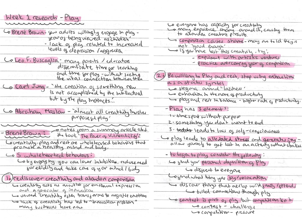
In this session we got more of an introduction to the Module requirements and started to explore the topic of ‘play’. Below are my notes and ideas from the session and my independent research.
On one of the slides from the power point, there was a list of people who have studied ‘play’, I wrote down their names and the key quote from them. I researched each of them and found Brene Brown’s ideas particularly interesting. He wrote an article called ‘The Power of Vulnerability’ and within this he talks about 5 wholehearted behaviours that promote a healthy mind and body, which I made notes on. I also looked at a couple other people including Carrie Brummer and Tim Brown. The notes on all of these can be found below:
In the session we had an activity where we spoke in group about ‘play’ and answered a series of questions. I made notes and took some recordings of our discussion. I then presented our ideas and answers in this mind map. This was a helpful way to get us to start engaging with the topic of play and thinking about our own perceptions of the topic.
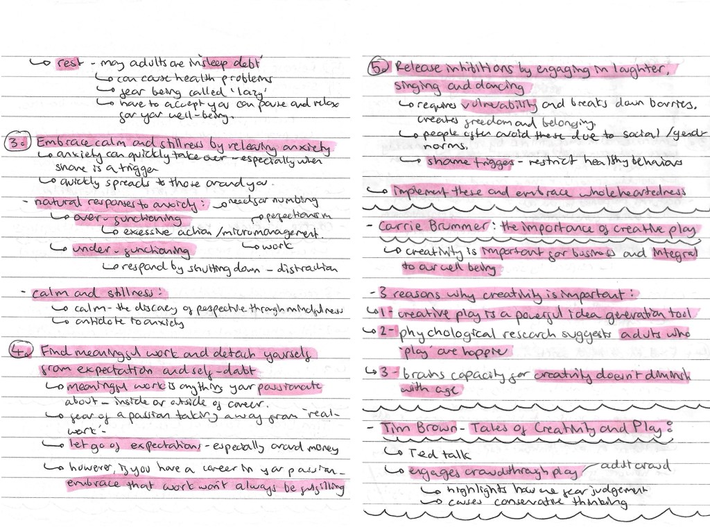
Prompted by the session, I did some subject and contextual research. I looked at the definition of ‘play’, the differences between learning and play, the scientific benefits of play and play for adults. All the research and ideas are below:
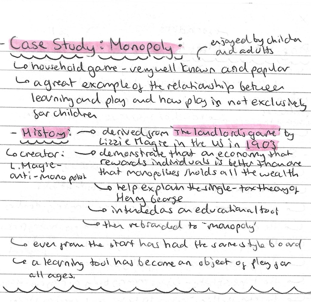
I wanted to pick a famous and popular game to study as board games are one of the first types of ‘play’ that I thought of during our group discussion and is something I’m considering basing my project around. I chose to research Monopoly and found it has an interesting history, starting out as an educational tool and later becoming a game. This is a good example of the fundamental connection between play and learning at all ages.
I found an article by Dr. Brown titled ‘play personalities’ which thought was an interesting idea so I made some notes of the 8 ‘play personalities’ and what each one means.
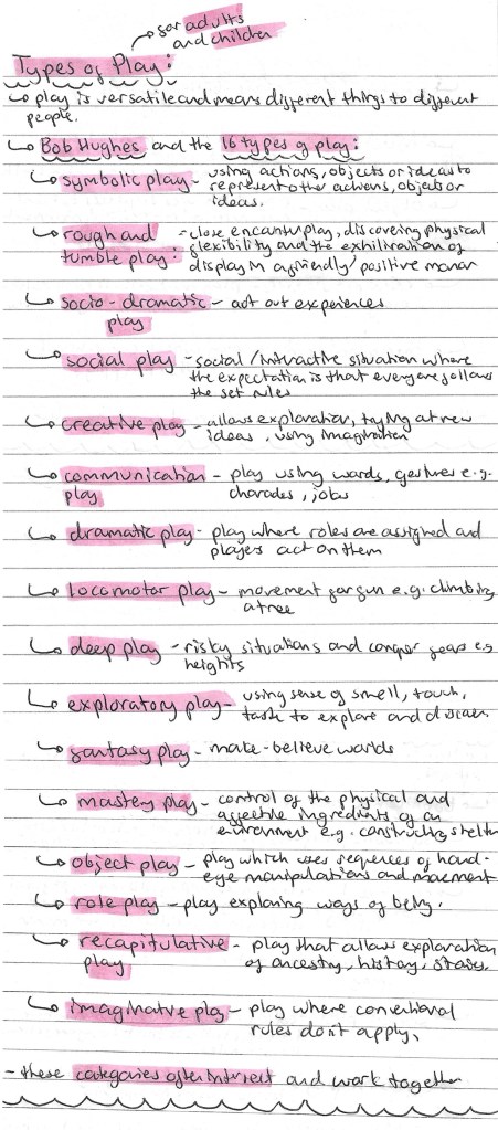
To get a comprehensive understand of what it means to ‘play’, I researched the different types of play for both adults and children. I used Bob Hughes’s article about the 16 different types of play.
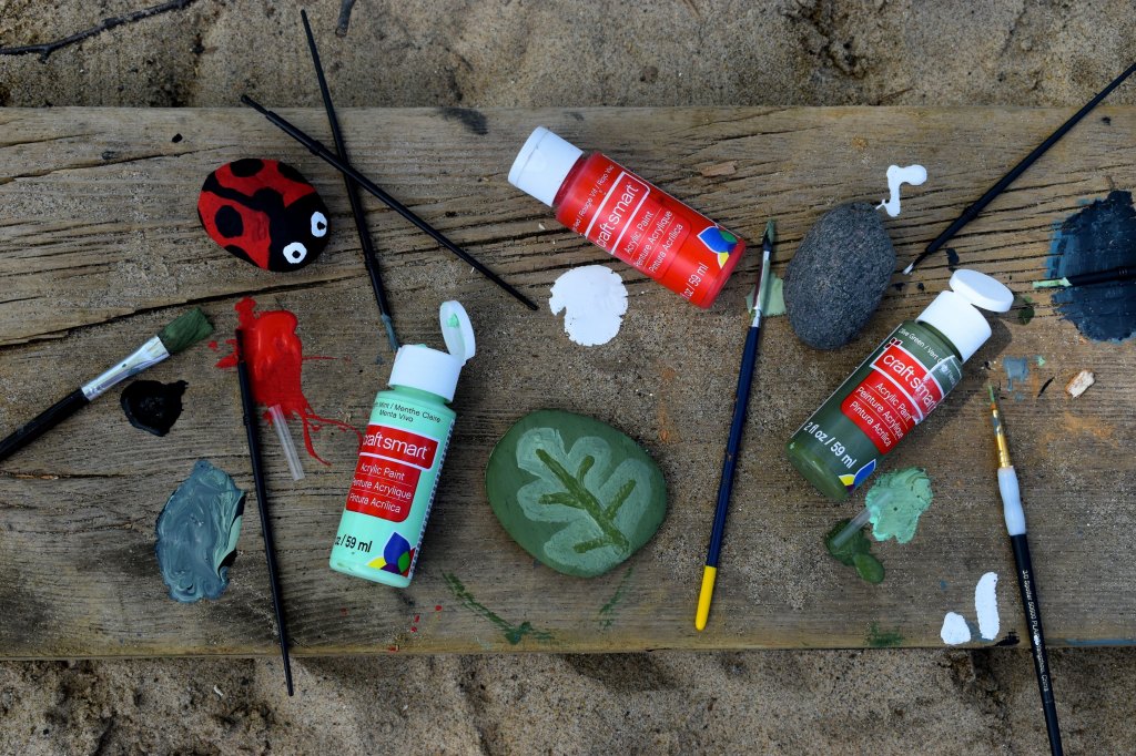
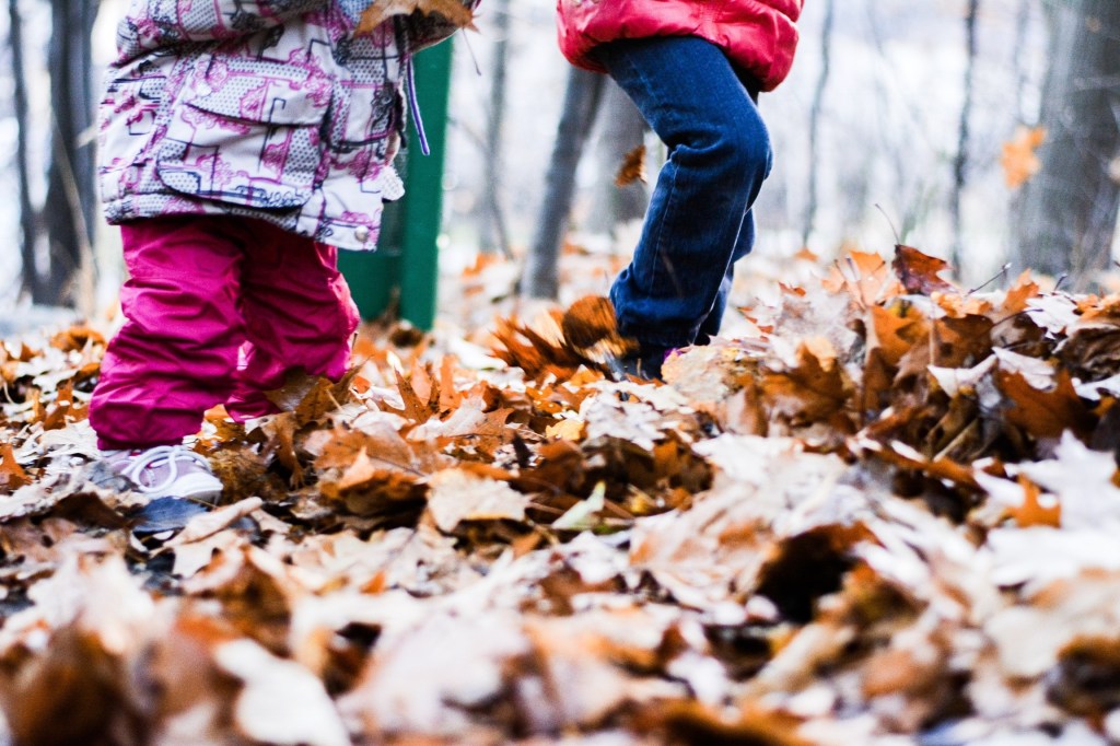
I made a list of different objects of ‘play’. Objects of ‘play’ is something we talked about in our group discussion so I wanted to make a list of all the different objects and activities I could think of. This was a good way to start generating ideas for the project. To help me I divided the objects into creative/making, games, activities/outdoors and other.
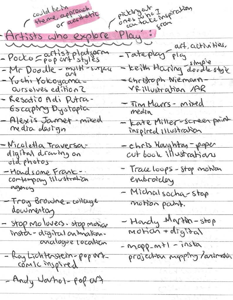
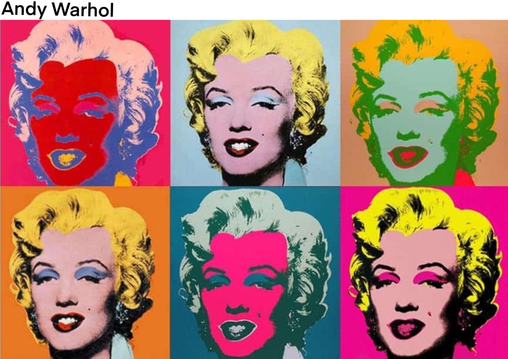
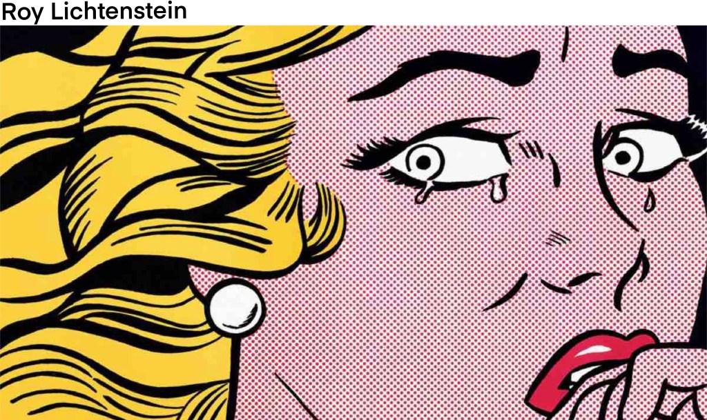
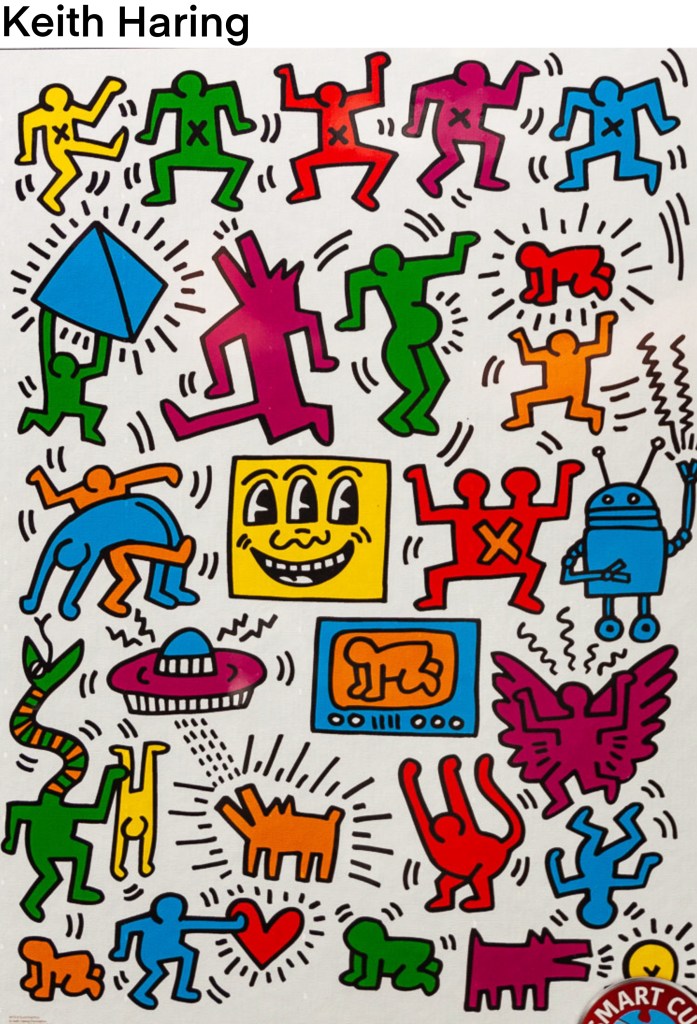
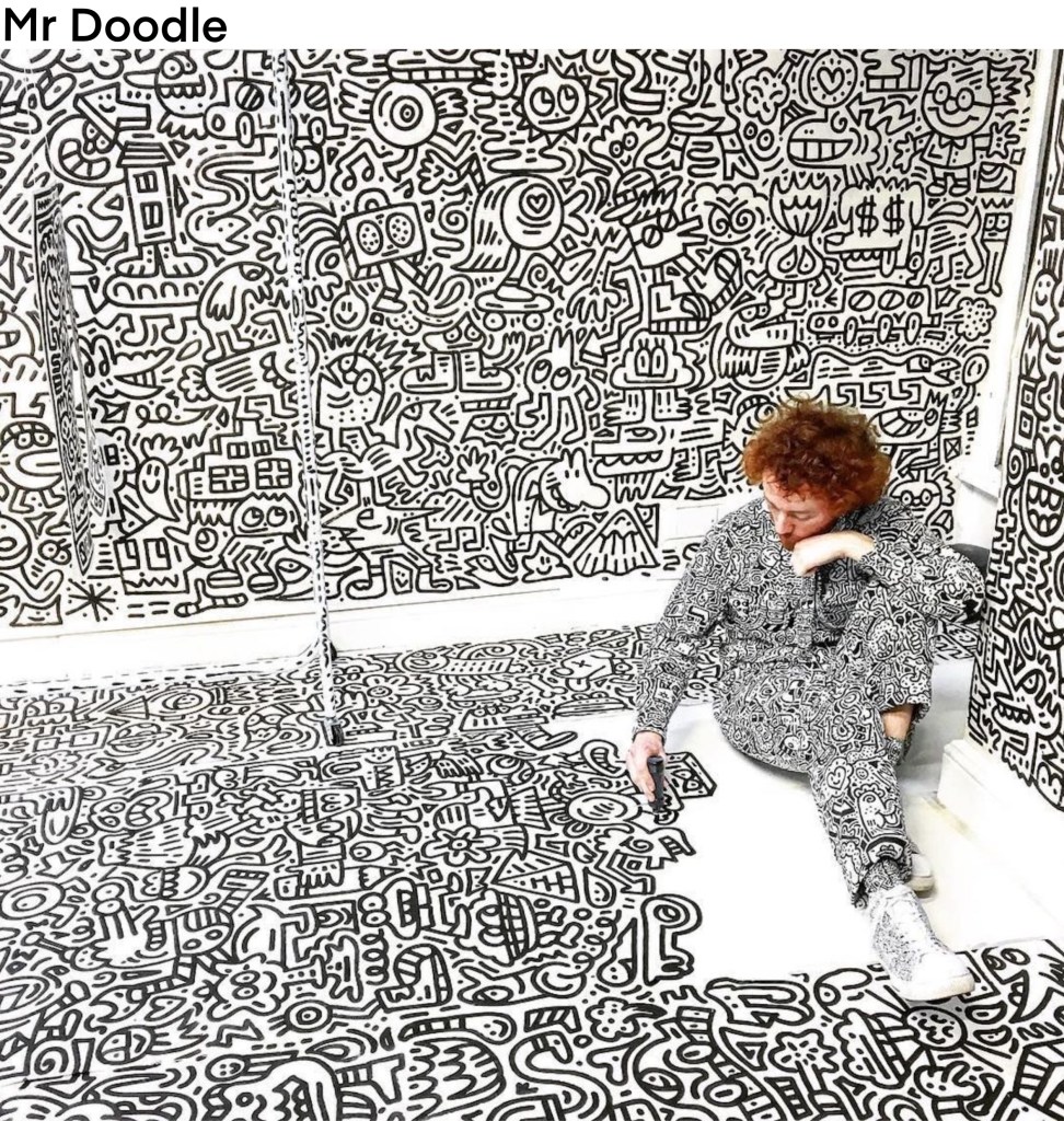
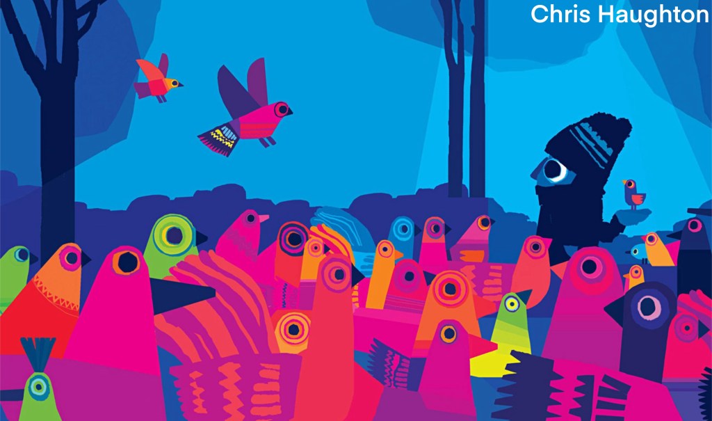
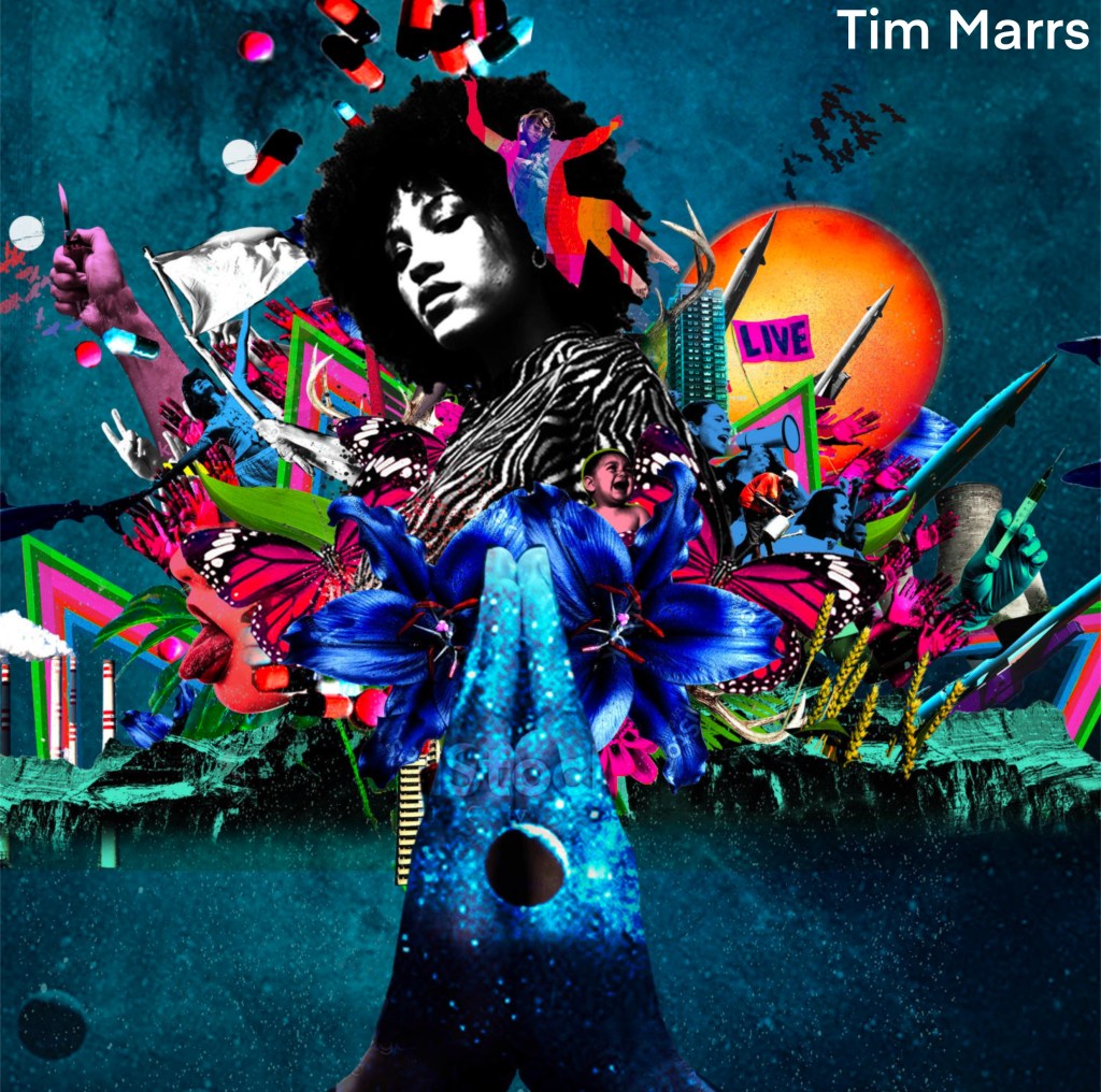
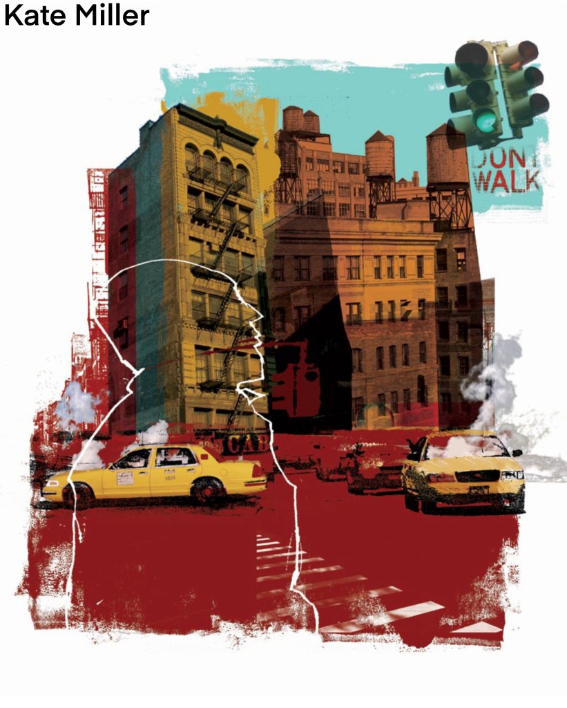
I also researched artists that explore ‘play’ either through their theme, approach or aesthetic. Below is a list of artists whose work I liked and found inspiring for the project. I made a note of the type of art they create and have included images from the artists mentioned.
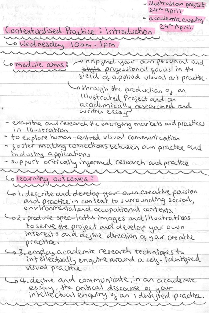
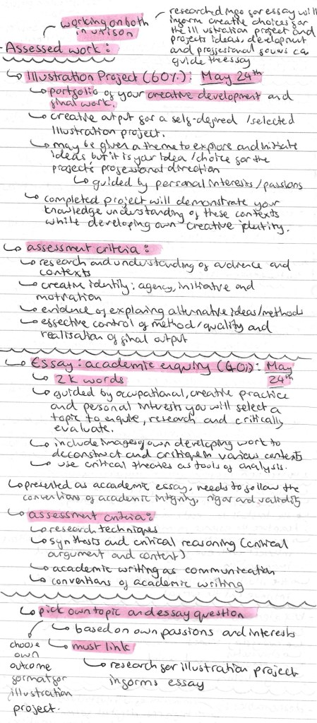
In this session we were introduced to the Contextualised Practice Module. Below are the notes I made about the Module aims, the briefs, assessment criteria and deadlines.
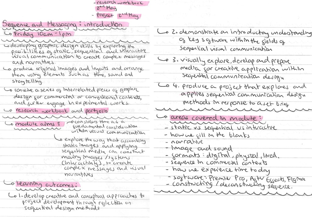
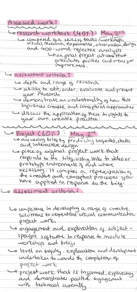
In this session we were introduced to the Sequence and Messaging Module. Below are the notes I made about the Module aims, the briefs, assessment criteria and deadlines.
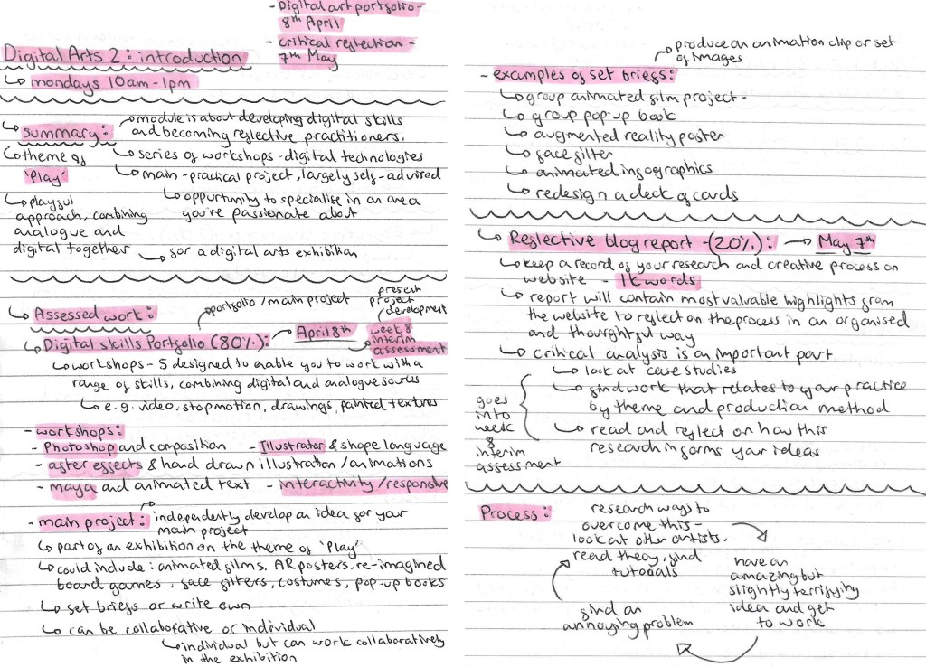
In this session we were introduced to the Digital Arts 2 Module. Below are the notes I made about the Module aims, the briefs, assessment criteria and deadlines.
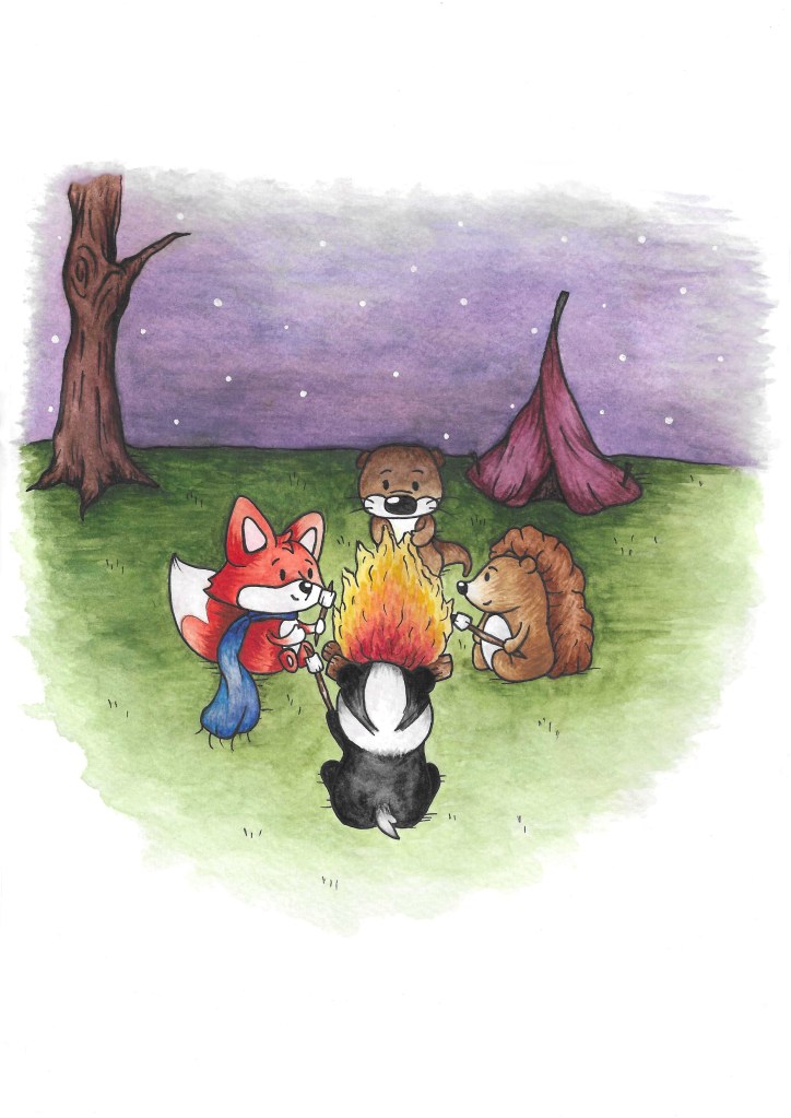
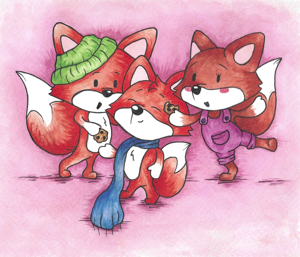
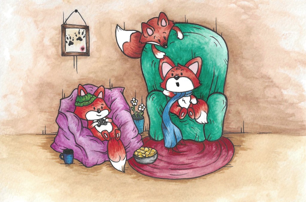
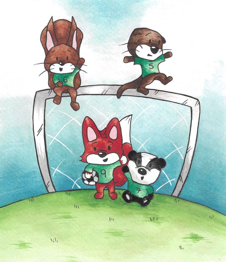
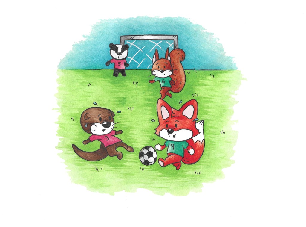
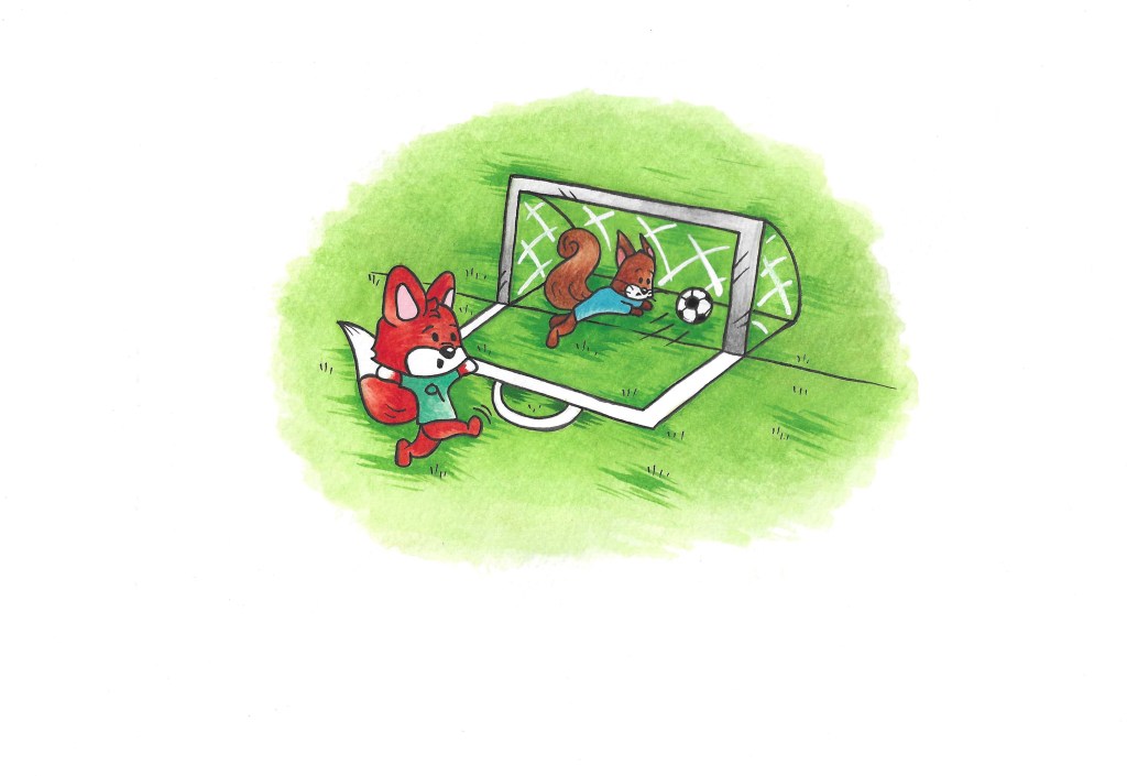
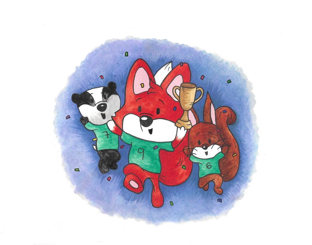
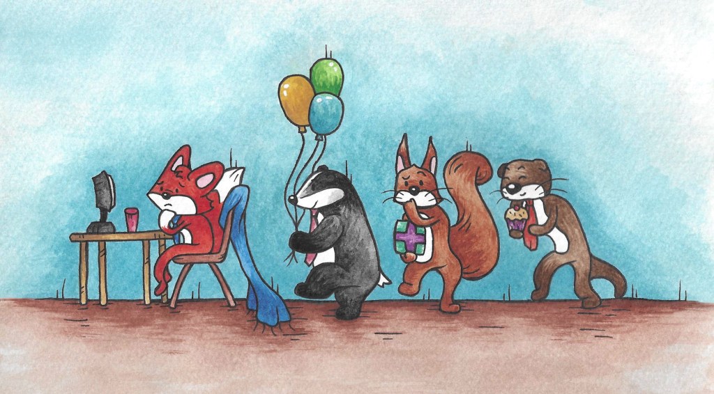
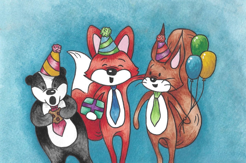
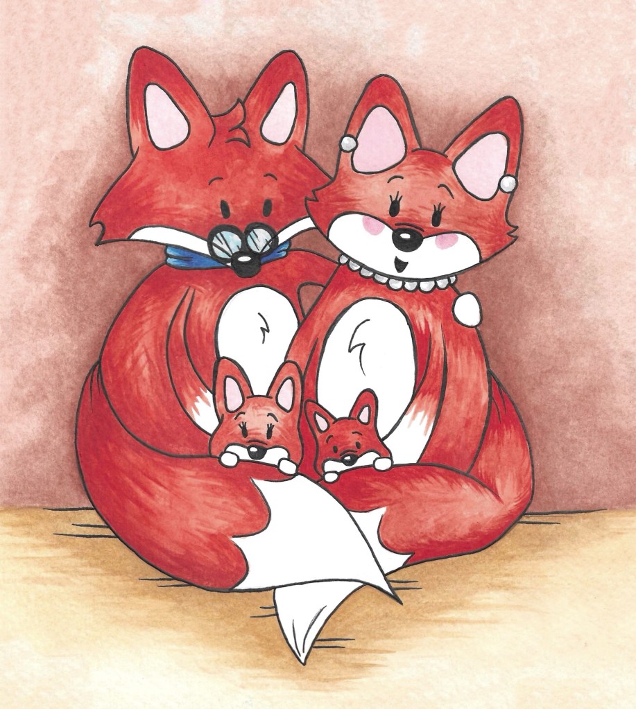
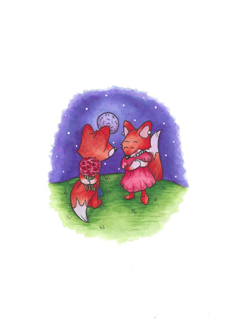
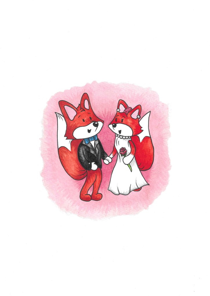
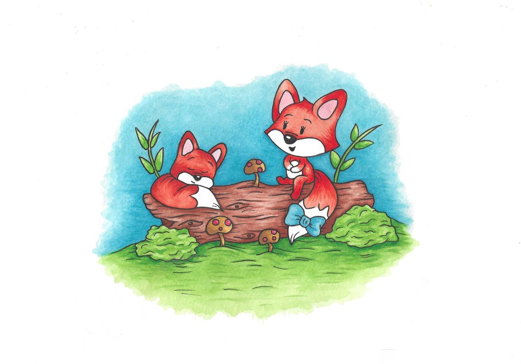
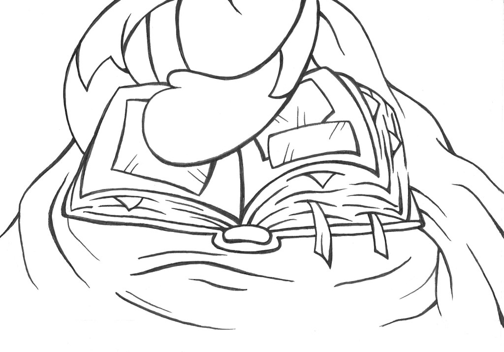
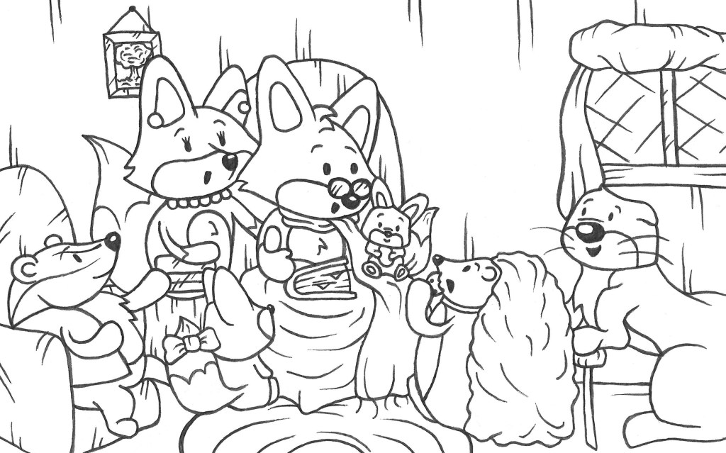
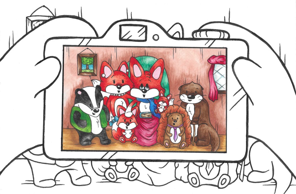
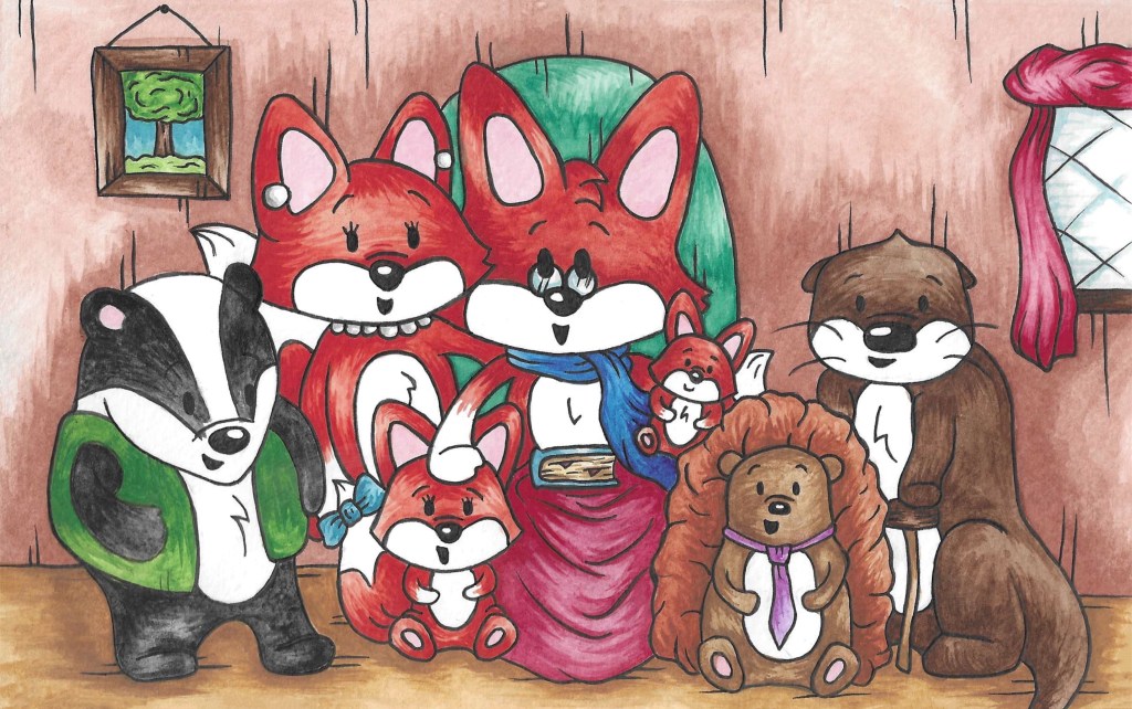
These are all the finished images I used, I made them with watercolour and pen:
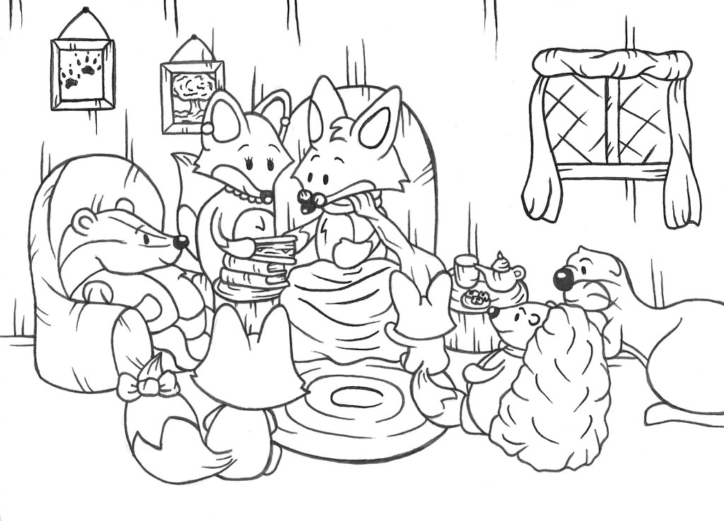
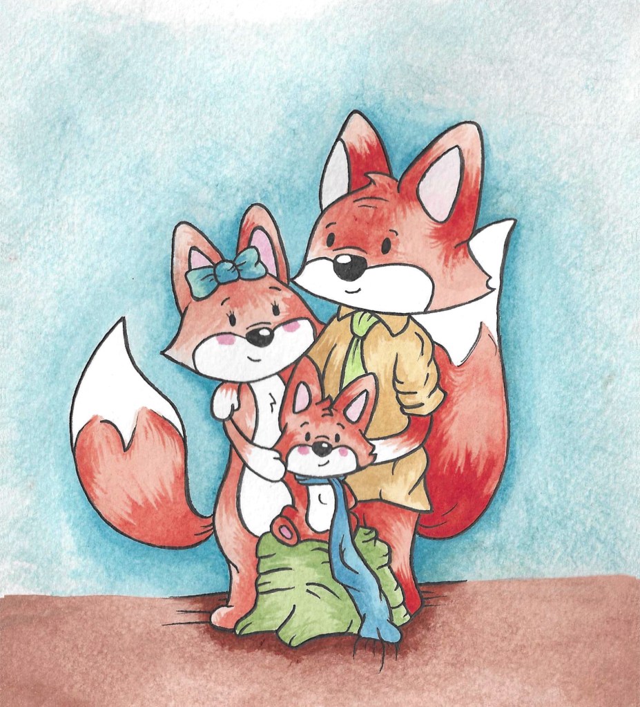
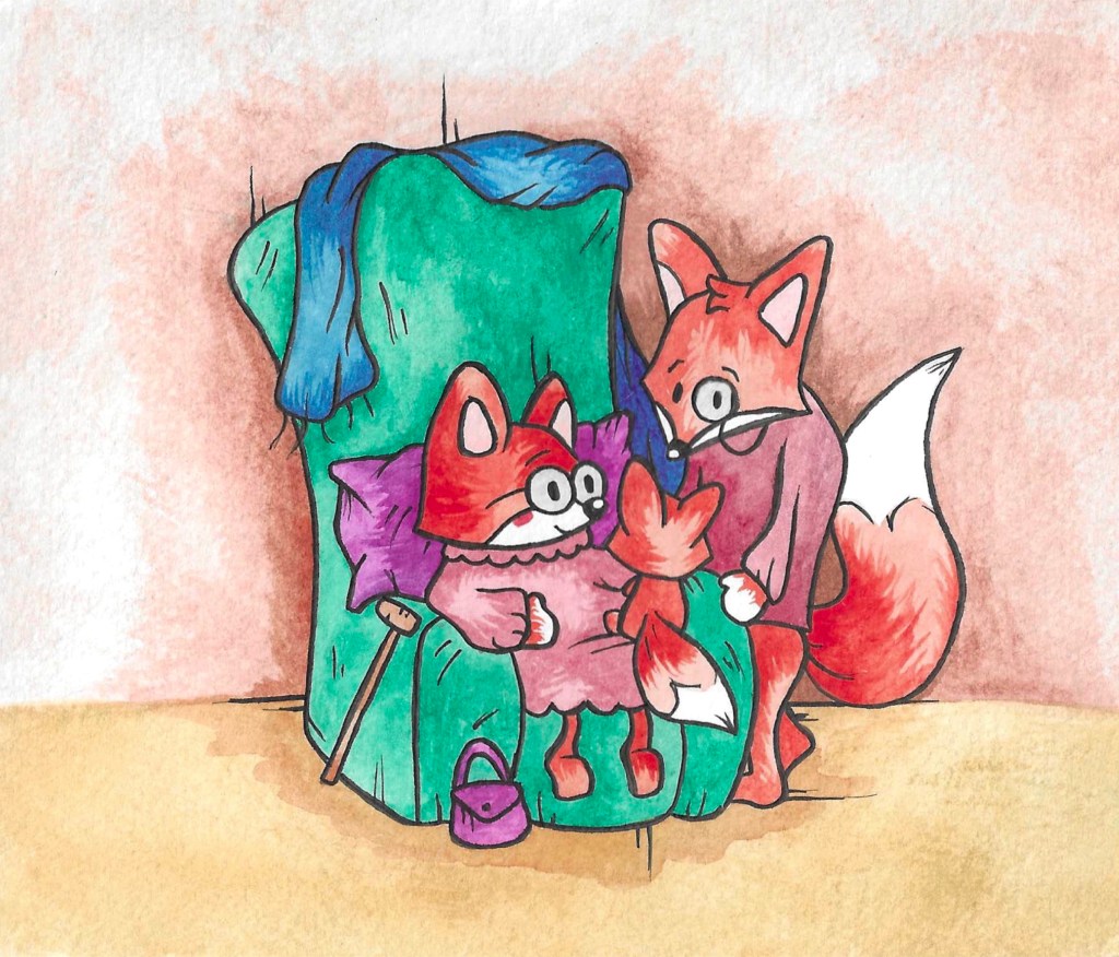
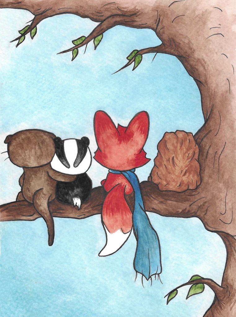
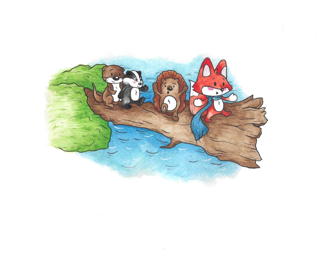
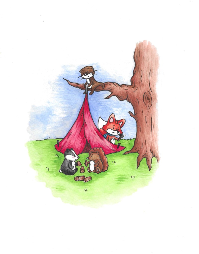
In summary the story is about an old fox who is with his family and friends and he shows them a photo album of his life. I worked a lot on creating an interesting narrative structure. The structure I chose has 3 layers, the present scene, the photo album and the memories. The narrative starts with the current scene then jumps back and forth between the photo album and the memories and eventually returns to the current scene. I think the last page is particularly important for the narrative as the present scene becomes a photo in the album.
I chose the title as it immediately explains 2 of the key themes in the story, time and family. Also, it has simple words that can be under- stood by young children. The brief wanted the story to be aimed at children and young adults and I think I achieved both. The story is lighthearted and fun, when this is combined with the colourful and warm illustrations I think it would be appealing to children and help build their visual literacy skills. The style I tried to achieve is heavily inspired by the children book illustrators I liked growing up such as Beatrix Potter and Axel Scheffler. I wanted the style to be nostalgic for young adults and remind them on the picture book they read as I child. The story is about family, belonging and love, these are all timeless themes and are relatable to people of all ages as my narrative covers a character’s journey from being a baby to being and adulthood.
The format I chose to make was a digital book. I wanted to combine traditional mediums and digital software to create my story. All the illustrations are made by hand with watercolour and pen. I chose these mediums as I like combination of the bright, warm colours and the strong black lines. I then scanned all the images and made any small corrections I needed using Adobe Photoshop. For the format I used Adobe InDesign. By the final stages I had all of my layout described but I still had to make decisions about the background as I needed to make a clear visual difference between the 3 different layers of the narrative. As well as different background I used different visual assets to help make the difference clear such as tape for the corners of the photos and bubbles for the memories. The next step for this story would be to actually get the InDesign document that I made printed into a physical book to help give the story a more tactile experience.
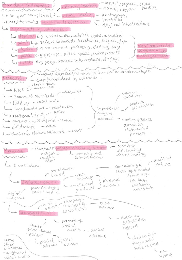
The brief required us to make a minimum of 4 outcomes for the project. There are 5 different formats of outcomes that we could work with; digital, print, physical, spatial and events. I planned to create something for each of these formats. I didn’t want to just make a series of random outcomes, I wanted to keep them connected with a couple of central themes and consistent with the branding and visual identity I made. I researched lots of companies and social campaigns who tackle a similar topics to get inspiration and ideas. Here are some notes I made during my research and planning of the outcomes.
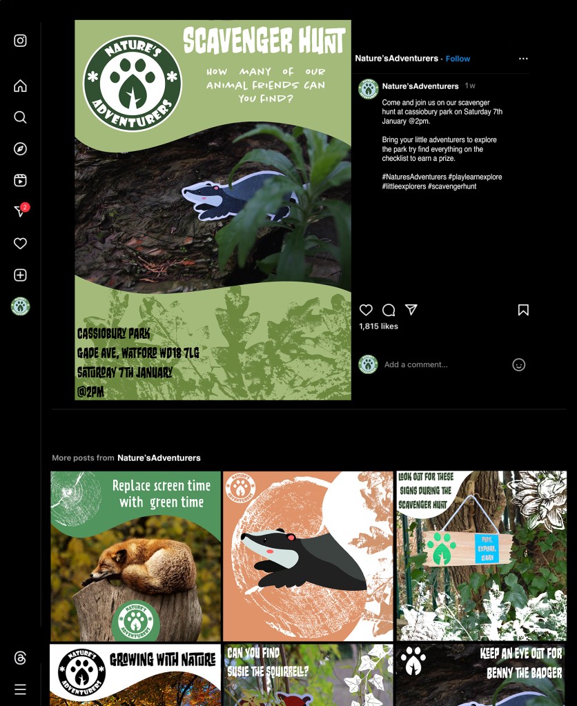
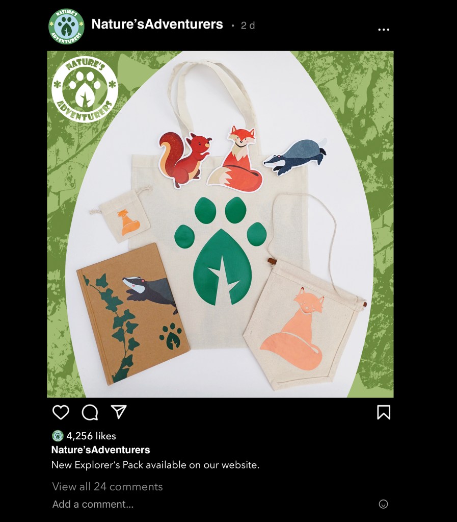
I chose to split my outcomes into 2 main sections. The ‘Explorers Packs’ which would be a more merchandise based one. I chose the name ‘Explorers Pack’ because it aligns with the slogan ‘Little Explorers’. The other will be a scavenger hunt which would be an event that the campaign would run. I chose this because it’s an event that children can do to really engage with nature and immerse themselves in their surrounding. Also it’s more enjoyable for children than a walk or hike as there’s more of a direct goal, find a series of things. These will allow me to cover all 5 types of outcomes and diversify the engagement that people can have with my campaign. I also thought about a few ideas that aren’t part of either of those outcomes but would supplement them. Below are all the outcomes that I made for the project divided into sections titled; mockup merchandise, hand made merchandise, posters and social media posts.
Mockup Merchandise: Although I didn’t actually make them they’re a series of physical outcomes. Out of everything these were the first outcomes I made as they’re fairly quick to make. It was a good way to experiment with different ideas about how to combine the branding identity and visual assets onto merchandise. To make these mockups I used a range of different digital software such as Adobe Illustrator and Illustrator Beta, Adobe Photoshop and Procreate. The more complex ones I did with Illustrator Betas mock up feature but for the more flat and simple ones I used Photoshop and Procreate. All the items could be used in an Explorer Pack as there’s a range of fun and practical items that children could use.
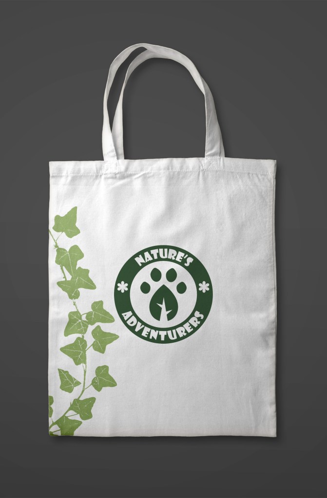
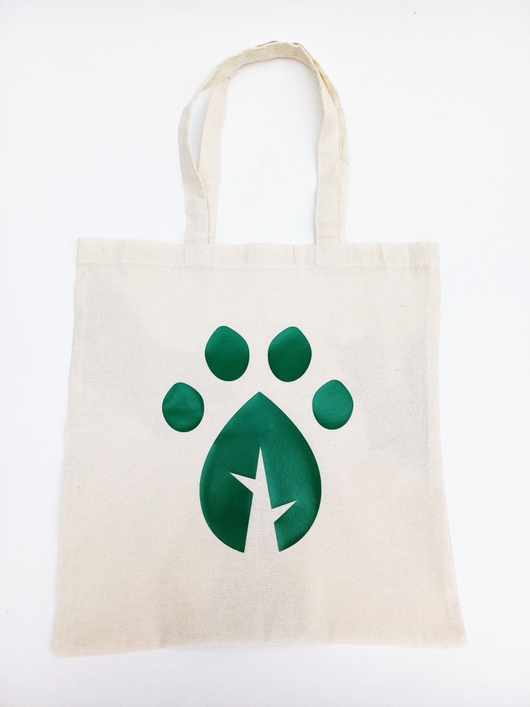
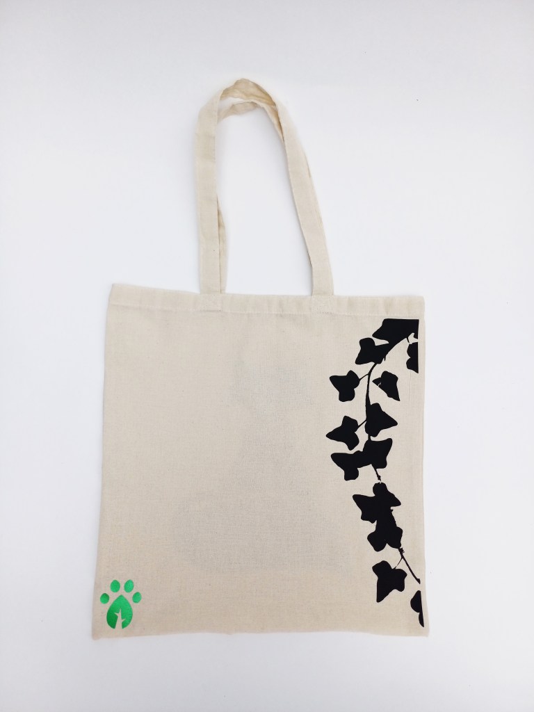
Tote bags: Some sort of bag is almost always included in nature kits to hold the rest of the items from the kit and any other things they may need. Tote bags are popular at the moment as a simple way to brand an item. They can carry a lot of stuff but also fold up small so would be ideal for a child to bring with them when going for a walk or doing any activity in nature. I made several designs using Illustrator and Photoshop.
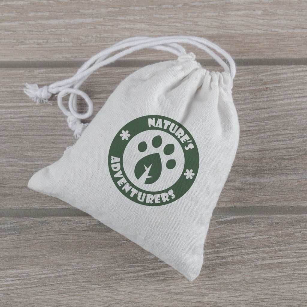
Mini drawstring bags: To try show the folds of the bag I used Illustrator Betas mock up tool which allows your design to wrap around an object. These bags could serve multiple purposes in the Explorers Pack. 1 could be to store any items they collect when they’re out in nature such as interesting leaves and rock. Another could be to carry items like bird seas and nuts that they could put out for the wildlife. Also they could store the other items from this campaigns such as the badges they collect for completing different activities.
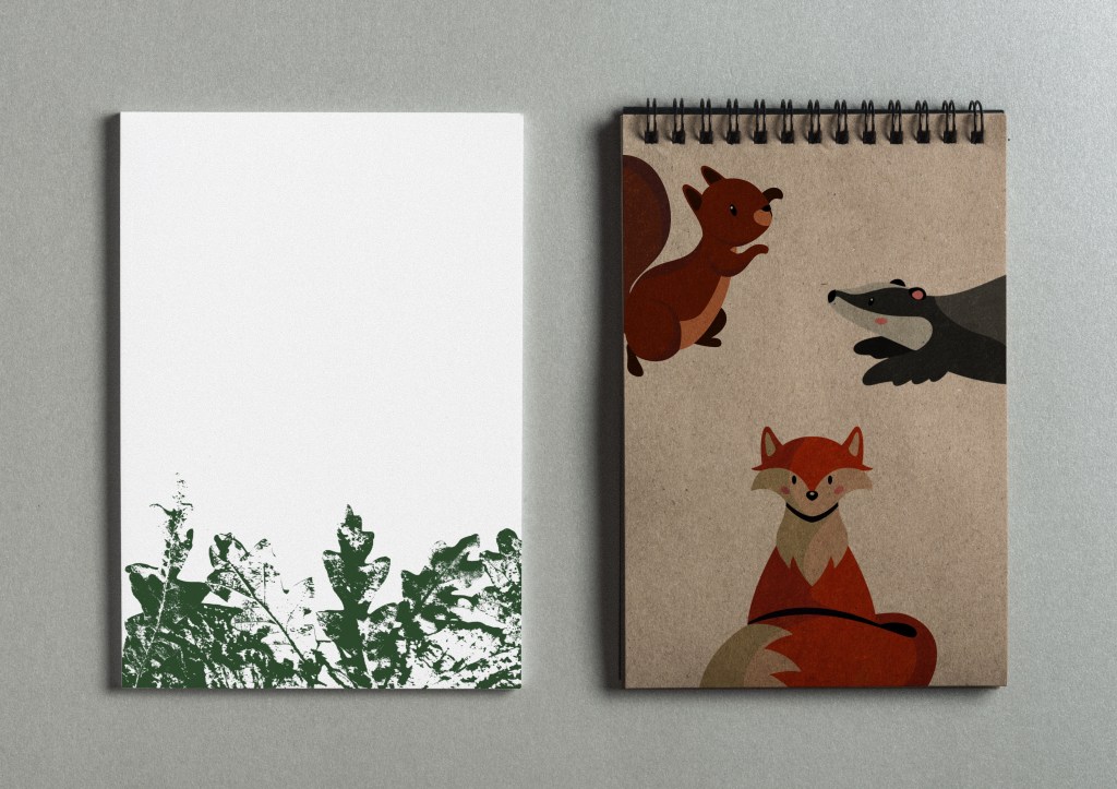
Notebooks: Notebooks are a commonality between most companies that make sets of merchandise for children. I made several different designs on Procreate, I think the top one is the most successful. The characters really bring the design to life and turn what is otherwise just a boring notebook into something more engaging to a child. Also having the pages branded with one of the textures I made is a small touch but makes the product feel more unique.
Other accessories:
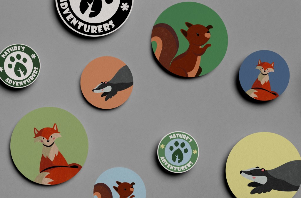
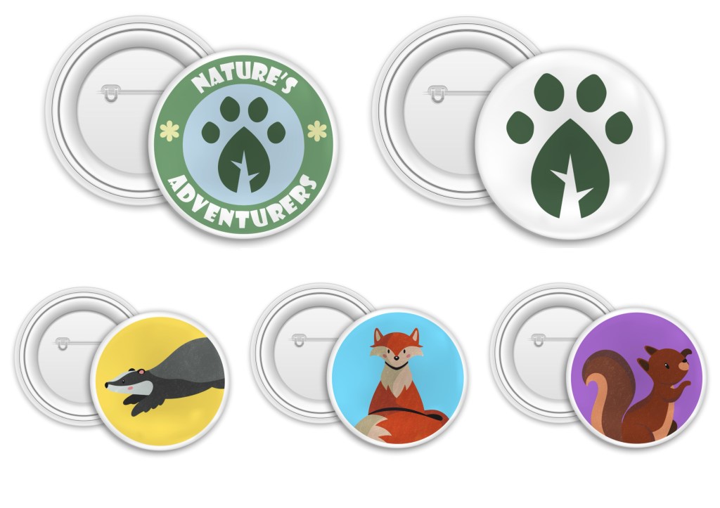
Stickers and badges: I made these mockups as fun little extras that could be in the Explorers Pack. I also thought they could be used as an incentive for engagement, for example for completing challenge they could get a sticker or badge and this could build up into a collection. It’s important when making merchandise to have colourful and engaging products so I think stickers and badges of the characters and logo would be popular.
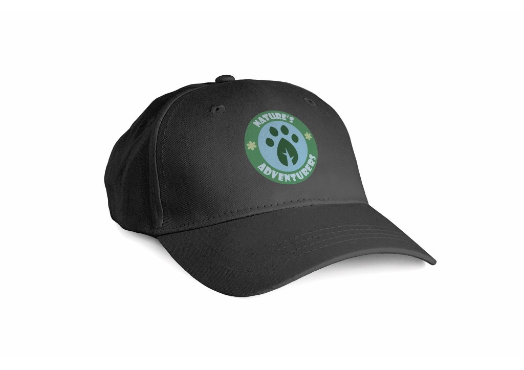
Cap: Using Illustrator Beta I added the full coloured logo onto a plain cap to create this mockup. It’s a simple design but is an essential for children to have when being outside in the sun so would make a good addition to the Explorers Pack.
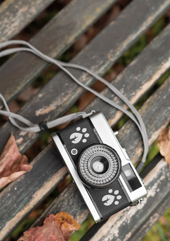
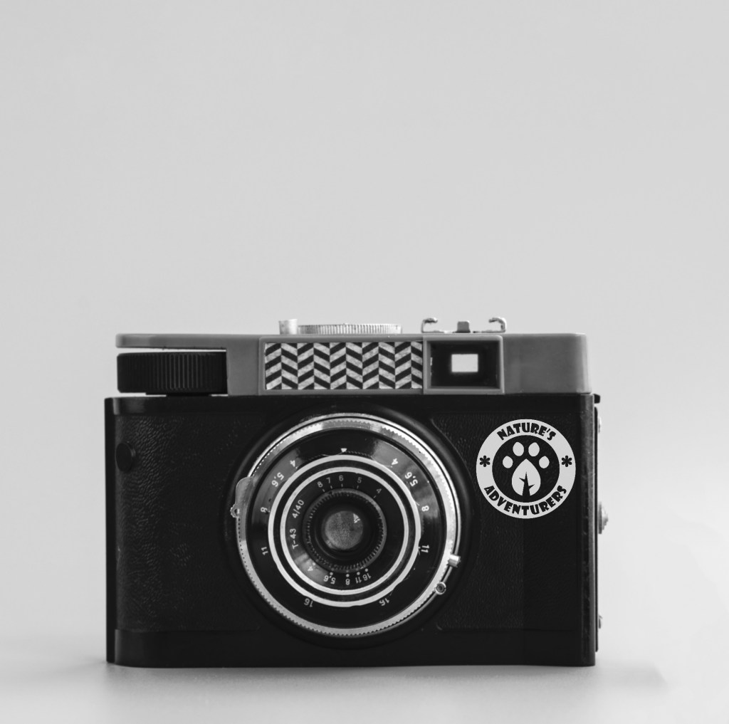
Cameras: I added the submark and logo onto digital cameras using Photoshop to brand them. I think this would be a good and unique item to have in an Explorers Pack as it would encourage children to pay closer attention to their surroundings as well as potentially sparking passion for photography. It’s more hands than simply using a phone camera and would help reduce the need to be on their phones when out in nature.
Hand made merchandise: These are more physical outcomes. The products are relevant to both the Explorer Packs and scavenger hunt. After creating the series of mockups I started actually making some merchandise for the campaign. To create these products I bought some blank items and customised them in the 2D craft area at the University. I first did an introduction into the facility to get an ideas as to what sort merchandise I could realistically make with the equipment they have. The tool I used a lot was the Cricut maker and its accompanying software. This allows you to upload a design and the machine will precisely cut it out. The material I used for the design was HTV (heat transfer vinyl). I used a mixture of plain colours and metallic colours. The design would be cut by the Cricut machine then I would iron it onto the item. Once I made the items I photographed them outside using a Conon camera and a big roll of white paper for the background. I wanted to take nice product shots to make the campaign look professional and so I could later make a mockup instagram post promoting it.
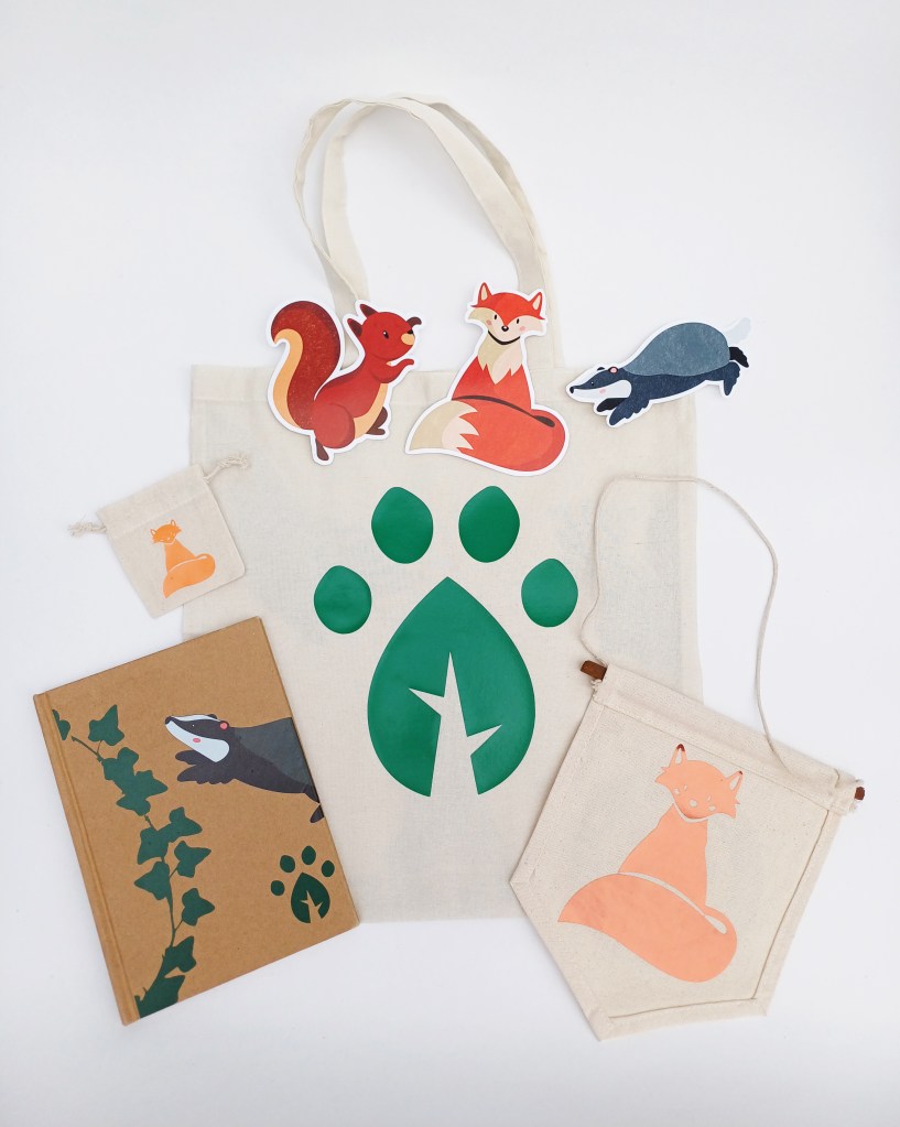
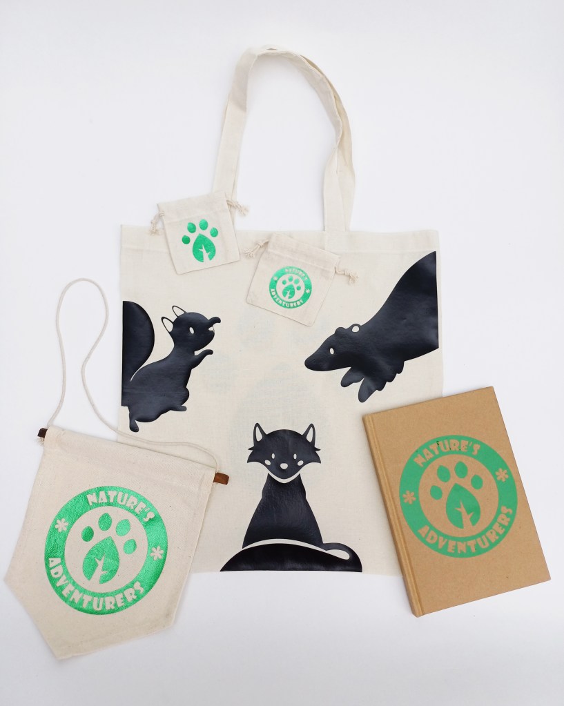
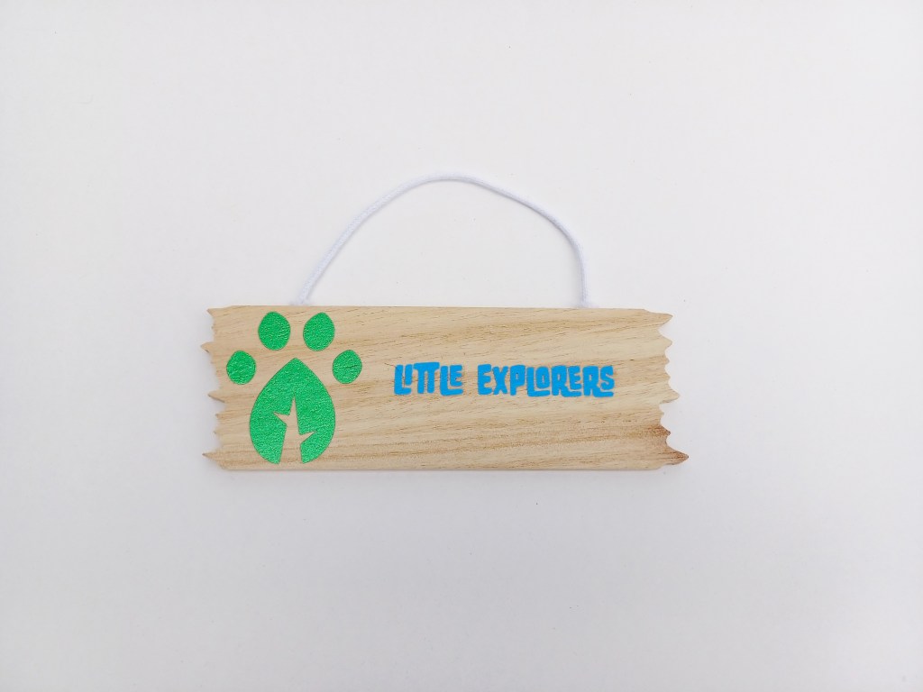
Explorer Packs: When making the merchandise I was constantly thinking about my target audience and the idea of the Explorers Pack to make sure everything remained relevant and on theme. I used a lot of the ideas from the mockups but had to make some alterations due to the resources and facilities I had available to me. Below are 2 different Explorer Pack options. Option one is more focused on the animal characters and contains a tote bag, 3 stickers, a mini drawstring bag, a hanging sign and a notebook. Option 2 is more focused on the branding with more of the logos and contains a tote bag, 2 drawstring bags, a notebook and a hanging sign.
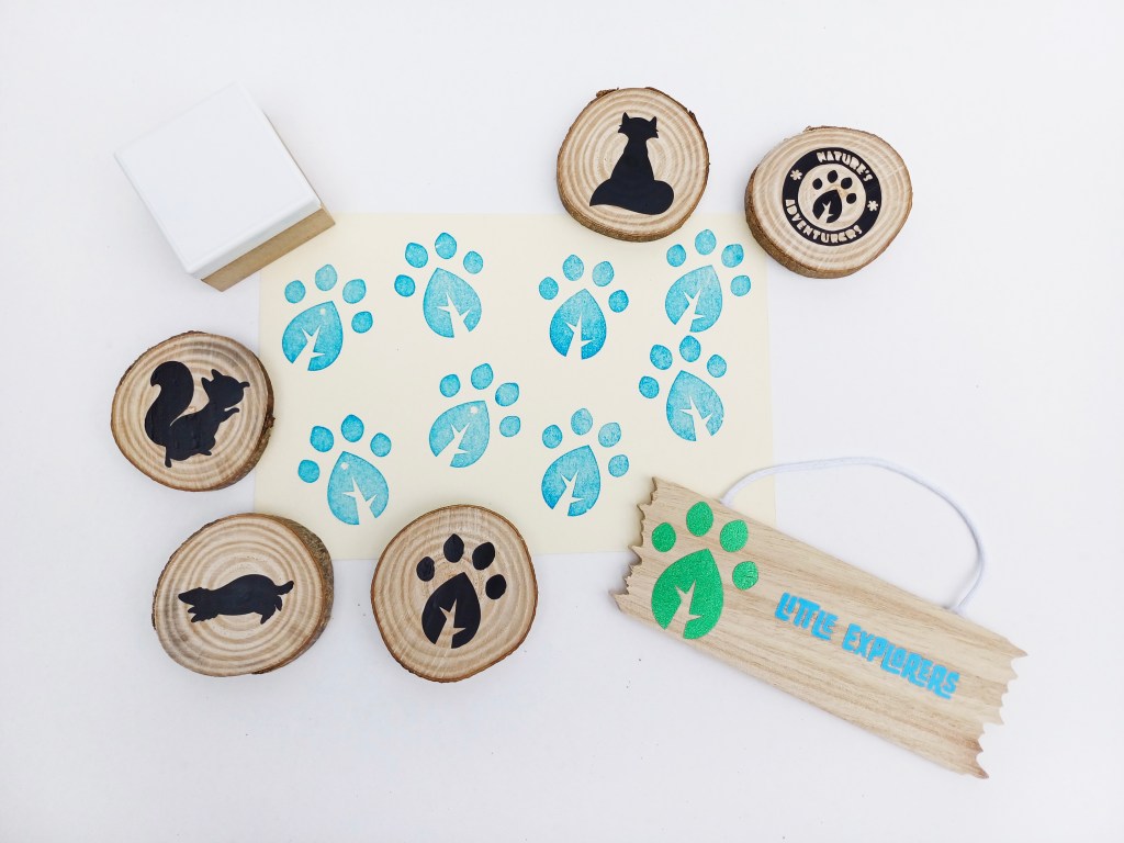
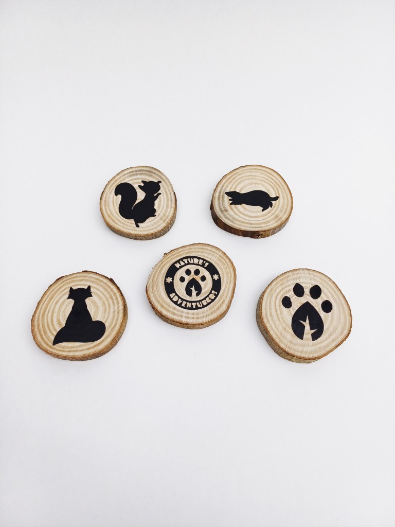
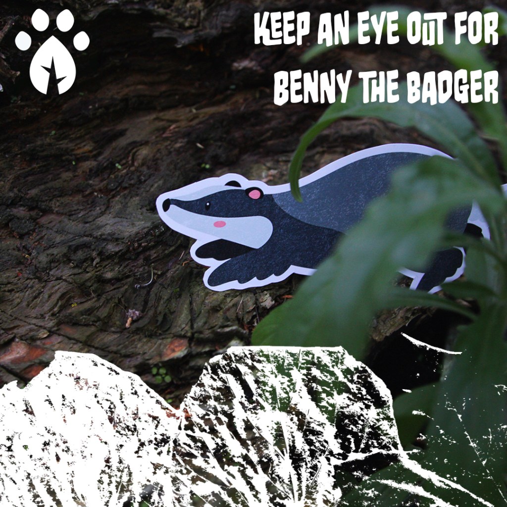
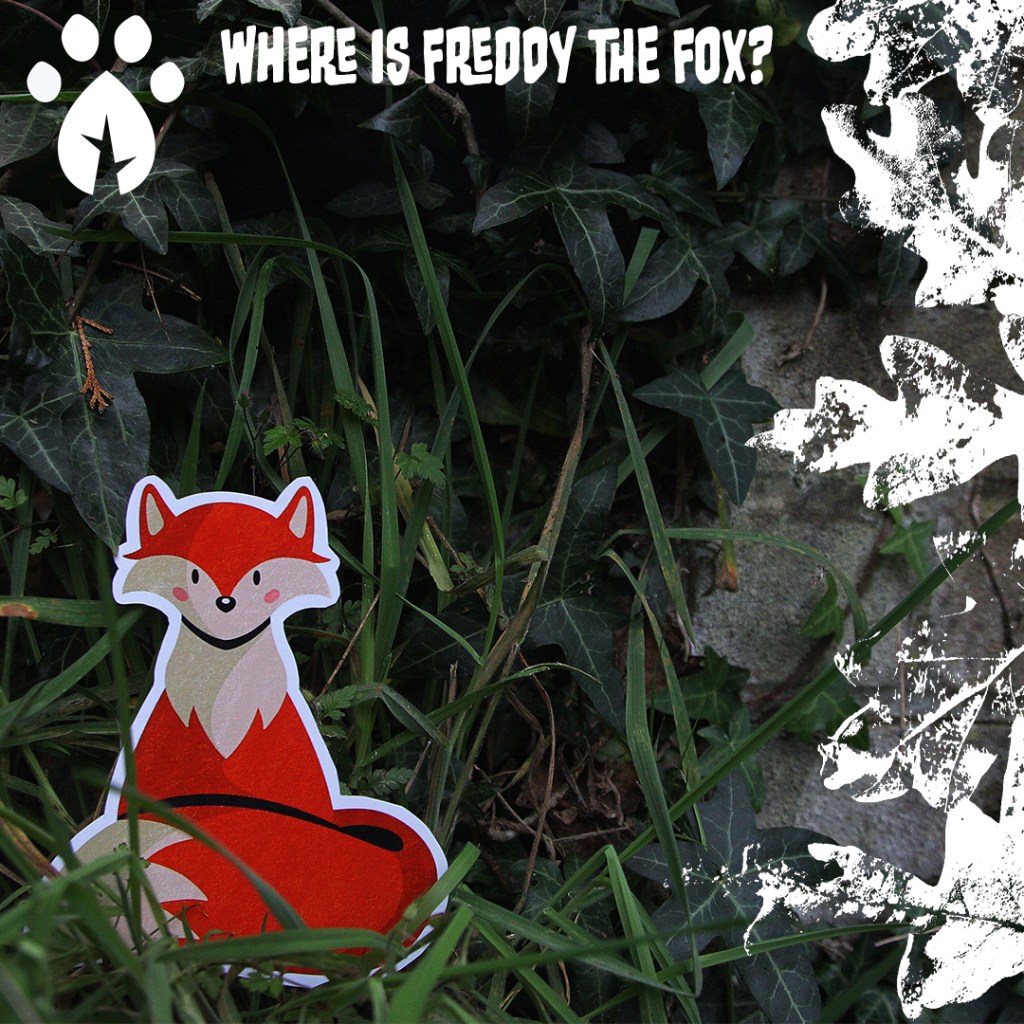
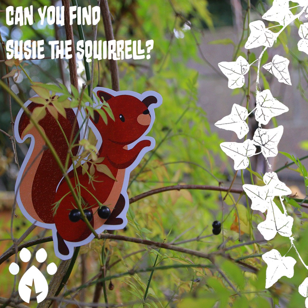
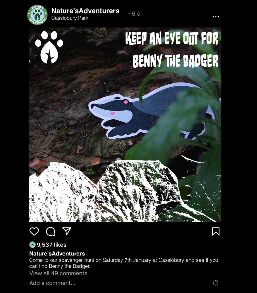
Scavenger hunt items: The event outcome I planned was a scavenger hunt. I was thinking about ways to make this more unique and specific to my campaign. The idea I came up with was that each child who takes part would get a checklist and a stamp of the submark logo. Each time they found something on the checklist they would stamp it. The things on the checklist would be different plants such as specific type of trees and flowers as well as commonly seen animals and insects. To make it brand specific there would also be branded hanging signs and cut outs of the animal characters that they’d have to find. When they complete the scavenger hunt and have stamped all of their checklist they would be given a prize and it would be one of the wooden discs with the logo or an animal character on it. These could be collected by completing multiple activities and stored in one of the drawstring bags from the Explorers Packs.
Individual items:
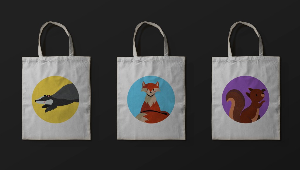
Tote bags (Explorers Pack): I made several different designs: 2 are with on the characters, 1 is with the submark logo and the other is with one of the textures I made. I like all the designs as they all work for the target audience and align with the branding identity but I’d say my favourite is the top one as it is the most fun and dynamic. I think using the silhouette style designs help draw attention to the shapes of the animals and give it a clean look that a parent and child could use.
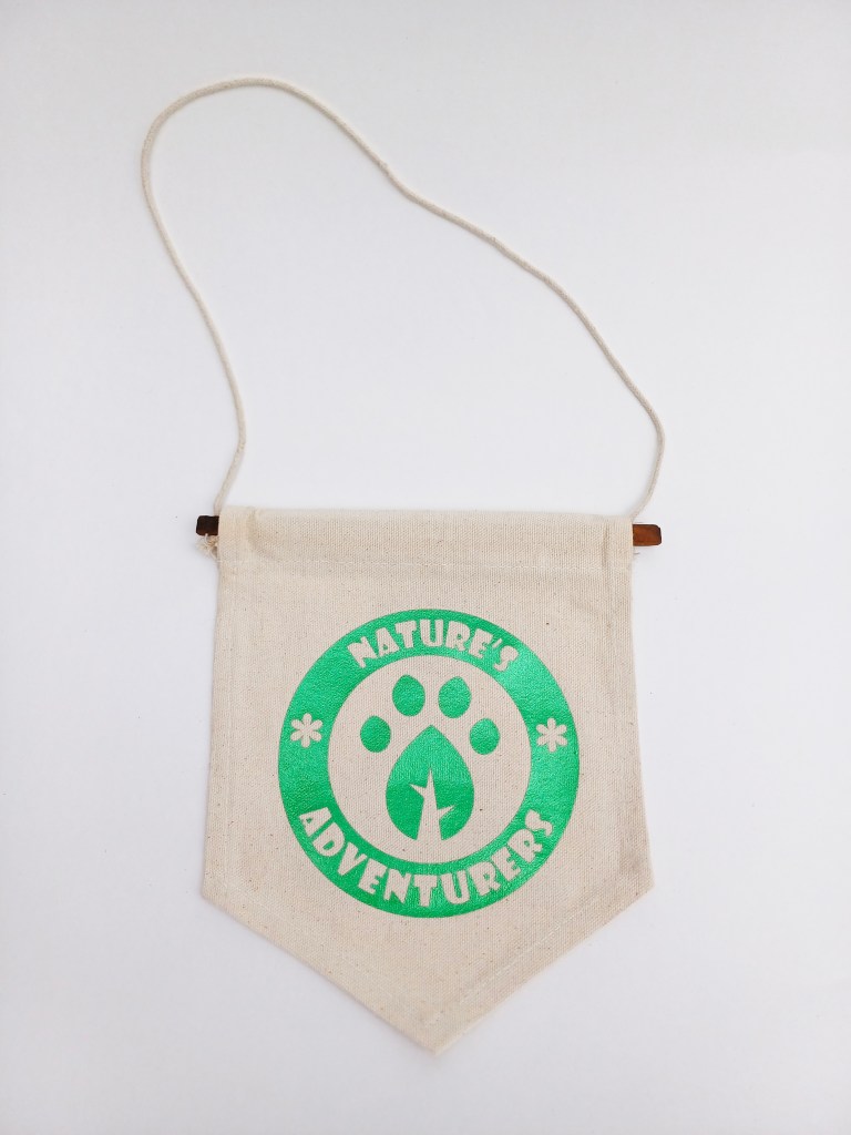
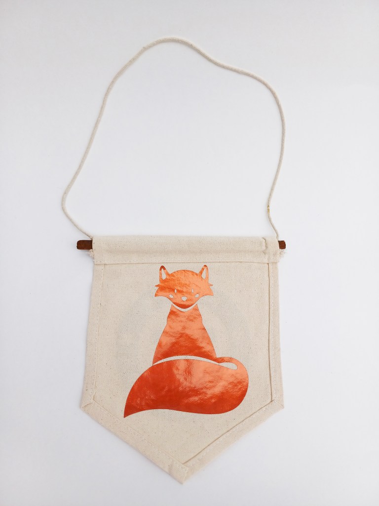
Hanging signs (Explorers Pack): I didn’t make mockups for these but thought that could be a nice additional item for the Explorer Packs which children could decorate their rooms with. I did 1 with the logo and 1 with Freddy the fox.
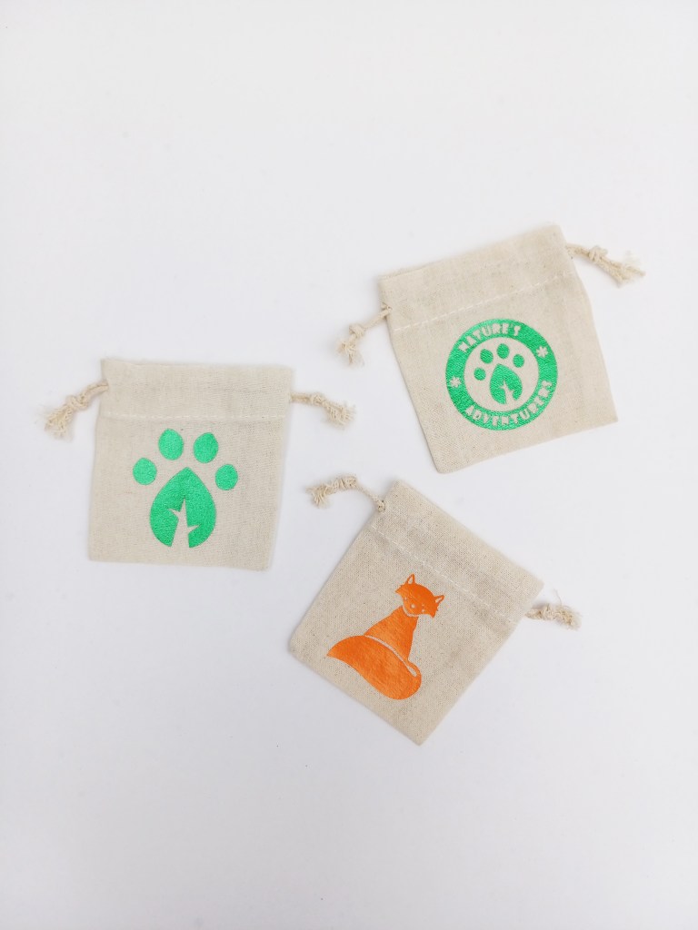
Mini drawstring bags (Explorers Pack): I closely followed the mockup designs for these bags. The only change I had to make was to do the fox in a single colour rather than in full colour. This was due to limitations I had with the materials and machinery available. However I actually think with the size of the bags it works better in just this metallic orange, any more detail would unnecessary and too small.
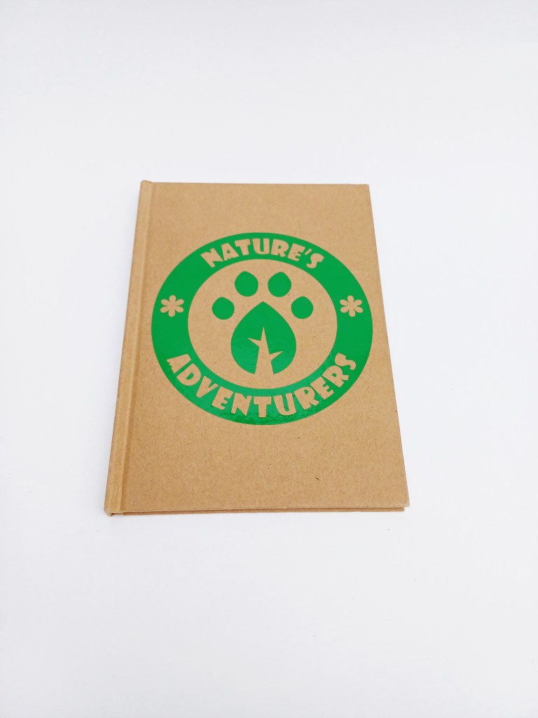
Notebooks (Explorers Pack): To make these 2 notebook designs I combined ideas from all my mockups. 1 simply has the logo is a bold and bright green. I think this one works as a piece of simple branding but I don’t think it is unique and visually interesting enough. The other has a more complex design with a vine texture, Benny the Badger and the submark logo. I prefer this one for my target audience as it’s more busy and combines more elements of the campaigns visual identity. To get the character in full colour I printed it on sticker paper and used the Cricut maker to cut around it.
Stickers (Explorers Pack): For these I did the same process as making the badger design for the notebook. The only difference is I used glossy paper to give it a nicer, more premium feeling. These are exactly like one of the sets of mockups I made and would be a nice item for children to have and use to customise something like a sketchbook.
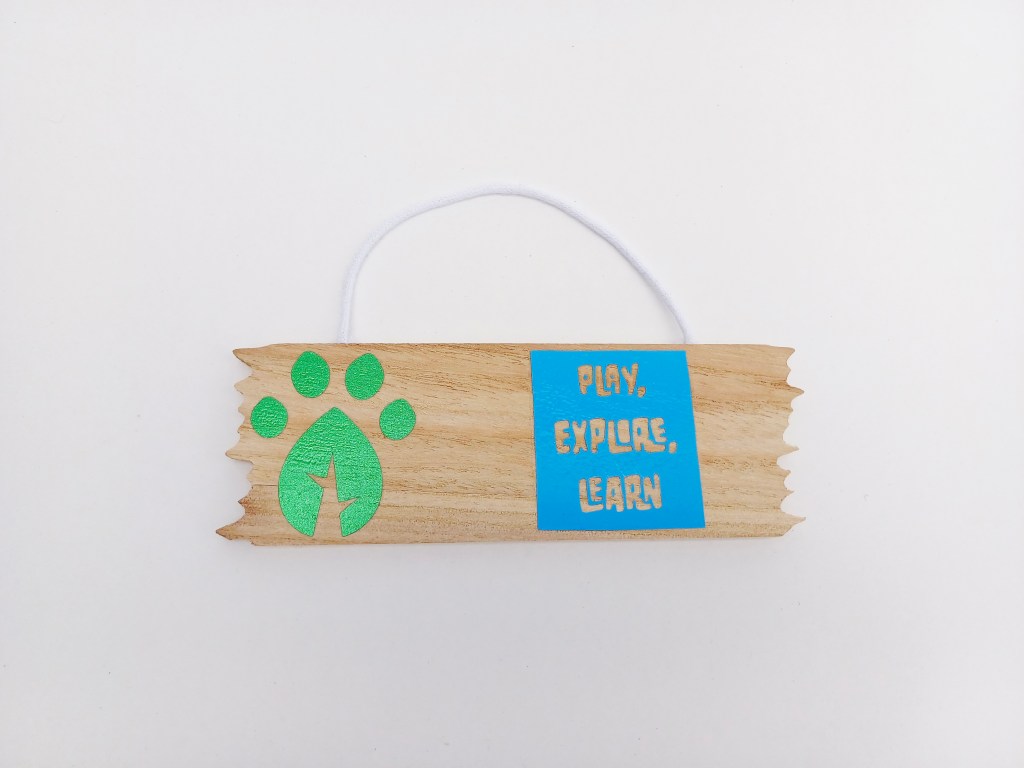
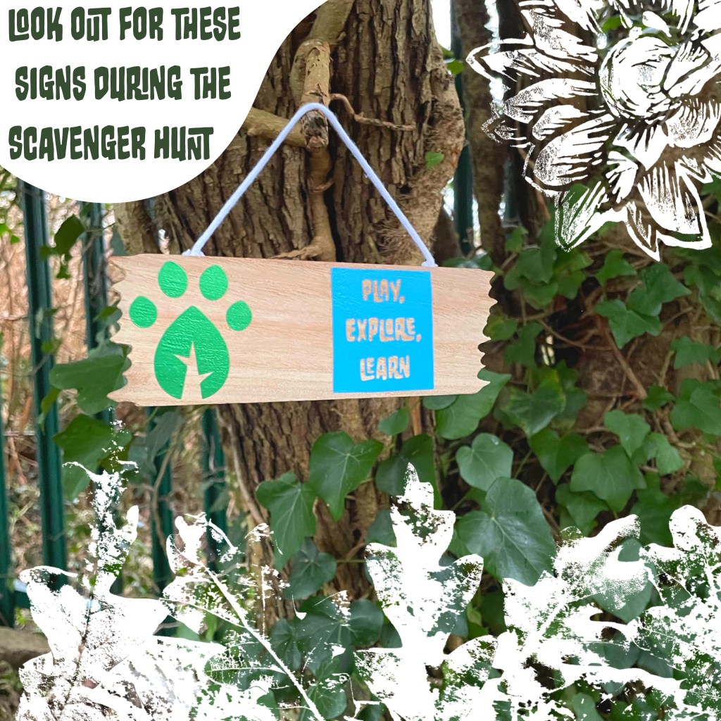
Hanging signs (scavenger hunt): Up to this point I had only really worked on canvas and other woven material and paper so I wanted to experiment with putting the HTV on other materials. I didn’t make a mockup for these designs because they were just a successful experiment. To my surprise they took really well to the wood so I was able to creates these signs for the scavenger hunt with the submark logo and different campaign slogans. The reason I wanted them to be signs in the scavenger hunt is that it gives the children a more diverse range of things to look for hopefully making it more engaging.
Wooden discs (scavenger hunt): After the success of putting the HTV on the signs I wanted to experiment further. The signs are made of a very processed wood do was still relatively smooth. These wooden discs have more grain and texture. The HTV did stick well but took longer to hold. I’m really happy with these and think they’d make really nice prizes for completing the scavenger hunt so could act as good incentives for engagement with the activities.
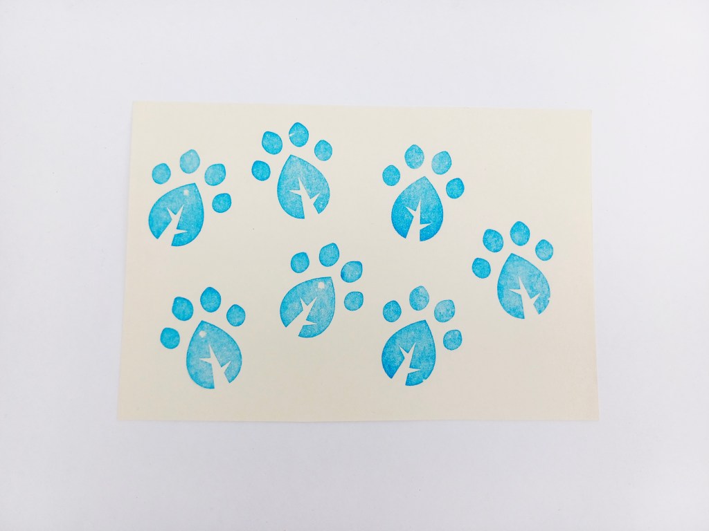
Stamp (scavenger hunt): This stamp was made by uploading the design and a machine then presses the design onto the rubber like material creating the stamp. The stamp would be used to mark off what things on the checklist they have found on the scavenger hunt. I wanted to make a stamp as it’s just more fun than using a pen to tick it off. This style of stamp holds a lot of ink for a long time so would rarely need to have more ink put on it, making it more convenient and user friendly. I chose the paw print leaf rather than the full logo as it’s a more bold shape with less detail so even if they didn’t stamp it well or it smudged you’d still be able to tell what it is.
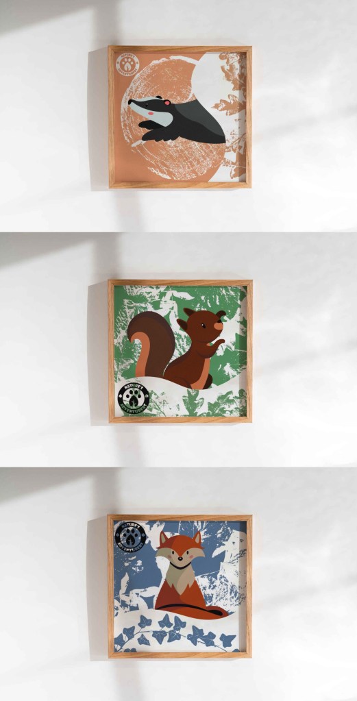
Posters: These are a series of printed outcomes. I didn’t physically print these as poster but I did mockups of them in context. These poster were a good way to focus more on combining the branding identity and campaigns visual identity. To make these posters I used 2 digital softwares, Adobe Photoshop and Procreate. With the merchandise I was more limited to what I could in regard to colour and composition by the materials that were available to me. But with the posters there was more creative freedom in that aspect. I made 2 different types of posters, character posters and promotional posters.
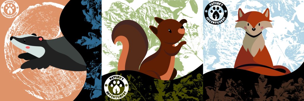
Character posters: I wanted to make a set of 3 posters, one of each character. To make them feel like a set I wanted to have the same visual style across all 3. The posters gave me the opportunity to develop on the aesthetic I’d been working on with the textures overlayed on the curvy shapes with the brand colours. The first image with all 3 in a row was my first attempt. I liked the composition, the placement on the logos, the characters, the curved shapes and the textures I chose. However it was the colours that I was unsatisfied with. Firstly I made the green and blue background colours too light so didn’t stick to the brand colour palette. I also think I overcomplicated the colours especially for the target audience. The characters are already colourful so they don’t need so made didn’t colours around them. Also I think the colours in the curved shapes are too dark and don’t align with the visual identity I wanted.
I fixed the issues I mentioned and came up with the 3 posters below. I think keeping the backgrounds to just 1 colour and white is much more visually appealing and makes the poster look more cohesive. The colours are now all ones that are in the branded colour palette so align better with the rest of the outcomes.
Poster mockups: I used Adobe Photoshop to create the mockups of the posters in frames. I think they work well as a set and successfully convey to visual identity and tone that I want the campaign to have. Along with the hanging signs I think these will make nice decorations for a child’s room.
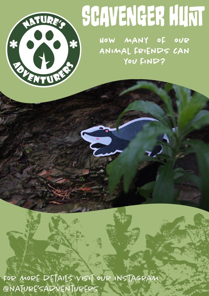
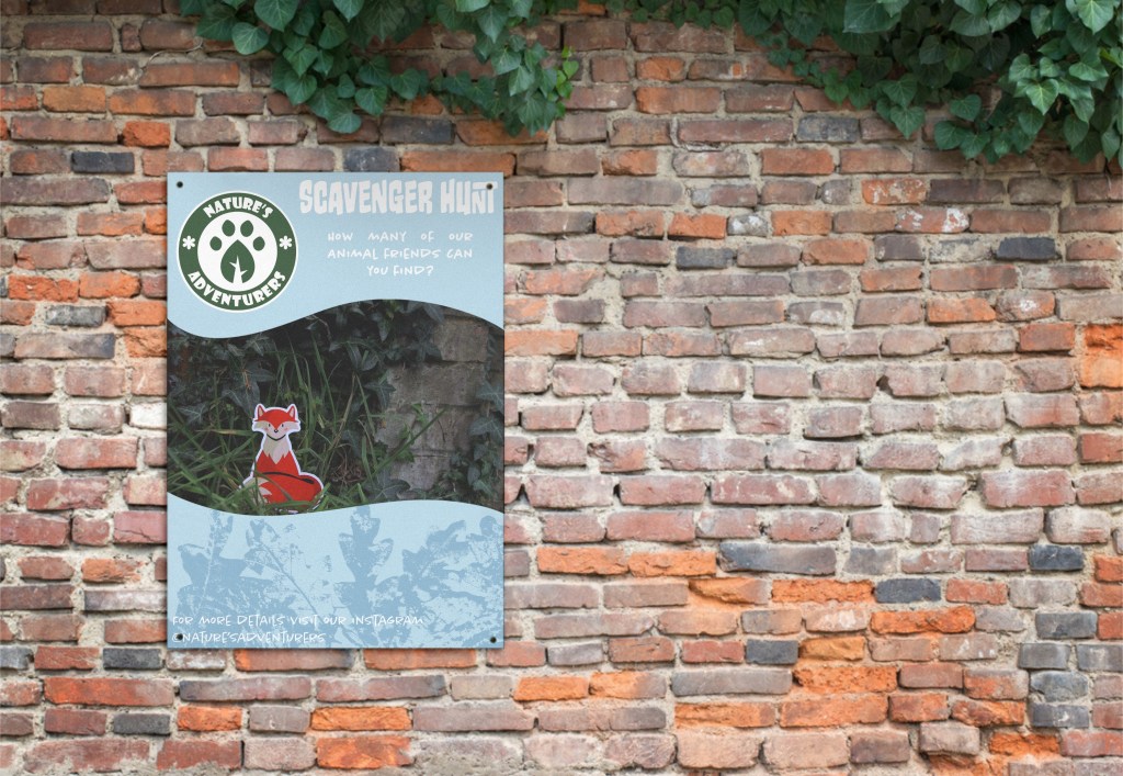
Scavenger hunt posters: The second kind of poster that I made were promotional posters for the scavenger hunt. These posters needed to serve a different purpose while still keeping a consistent visual language. The character ones are solely decorative, these ones are made to not only be visually engaging but also promote an event so needed more context than just a logo and character.
I used the photos I took of the character cut outs as they’re something that would be on the checklist for the scavenger hunt. Combined this with the curved shapes, textures and brand colours to match the other posters. But this time I added text to give information on the event. I used 2 typefaces from the selection of brand typefaces, Monsterific BB and Chantal Light. I kept the details to a minimum by just including the name of the event, a question to engage viewers and where to get more information from. I thought too much information would be off putting to a child so this way they will get interested and the parents could go to the instagram mentioned on the poster to find out more. I made 2 versions of the using the same template, only changing the character and colour.
Poster mockups: To apply these to their context I created mockups using Adobe Phototshop. This allowed me to adjust the opacity and blend mode to allow the creases and shadows to be seen, making it more realistic. Unlike the character posters these were made to be viewed by the general public so would be placed in a range of located, such as near parks, schools and shopping centres. By applying them to this context the poster also become a spatial outcome.
Social media posts: These are a series of digital outcomes. The social media platform that I chose to work with was Instagram as that’s my personal favourite and I think it’s one of the best for starting companies to have. I think much of what I created is transferable to other platforms. The posts allowed me to further explore the campaigns visual identity and further explore the ideas from the posters. Where they sit in terms of aesthetic and purpose is somewhere in between the character posters and the promotional posters. To make these posts I used 2 digital softwares, Adobe Photoshop and Procreate. I used Procreate for much of the design then took it into Photoshop to work with the text. This is because the typefaces I chose are all Adobe fonts.
General posts: These are a set of general posts for the Instagram account. I used some of the stock images I downloaded to create these. I tried to cover and represent all aspects of the campaign so there’s one of a child in nature, one of natural scenery, one of an animal and one of some outdoor crafts. I used a range of brand colour, textures, and slogans to show a range of the campaigns visual identity. They are all clearly look like a set but are unique enough that they don’t get too repetitive and boring. I would use the image is draw in the viewers attention and then more details would be in the caption on the post. This would help make the online presence appeal to both parents and children.
Scavenger hunt posts: The next 4 posts are all specific to promoting the scavenger hunt. The photos are all of things that would be on the checklist to find, the hanging sign and the animal cut outs. By bringing these items into their context they also become spatial outcomes. I went for a slightly different visual style to help differentiate these from the general posts. They still have the same design elements just with some variation. Because the photos already have lots of colour, I decided to completely remove any colour from the branding details and keep them all white, creating a nice bold contrast. I used Monsterific BB for all of the text used on the posts.
Instagram mockups: The last outcome I created was these Instagram mockups. To achieve this I took screenshots of some existing Instagram account and used Adobe Photoshop to make the necessary changes. These included adding in my own photos, account name, profile picture and captions. This is something I had worked on earlier in the module on the ‘Fake You’ task so was fairly confident in editing profiles. I made 3 mockups, 2 prompting the scavenger hunt and 1 promoting the Explorers Packs. I tried using the captions of the posts to share the essential details that would need to be know when hosting an event. This allowed me to work on the tone of language to make it appropriate to my audience. I made sure to keep it fun and light heart to align with the campaigns identity.
The next step was to take the visual assets I had created and start developing them into ideas that I can use to create outcomes for the campaign. The 3 visual style I have chosen are natural textures, digital illustrations and photography. I was very happy which each style individually but the challenge is to combine the 3 contrasting visual aesthetic to create a cohesive brand identity. I experimented with the raw assets to see how best to use them for the campaign.
I took the textures that I made from scanning and printing and played with the colours to make them match the tone and aesthetic of the campaign. I used the brand colour palette which I saved on Procreate and all the relevant Adobe softwares. I used different blend modes to achieve different distributions of colour. This process is far more time effective than doing physical prints in each colour. I certainly wanted less black as I wanted white to be the most common neural tone as it helps lighten the image and give it a more welcoming feeling. Below are some experiments I did using the leaf textures, wood textures, lino prints and branded colour palette.
In order to make the digital illustration of my characters more versatile I removed the textures I put on them and vectorised them on Adobe Illustrator. I used the image trace tool, this is the same process I used for the logo. They can now be scaled really big and really small. I still like the look of the textured versions so I may still use them for some outcomes. Below are the vectorised version of each character:
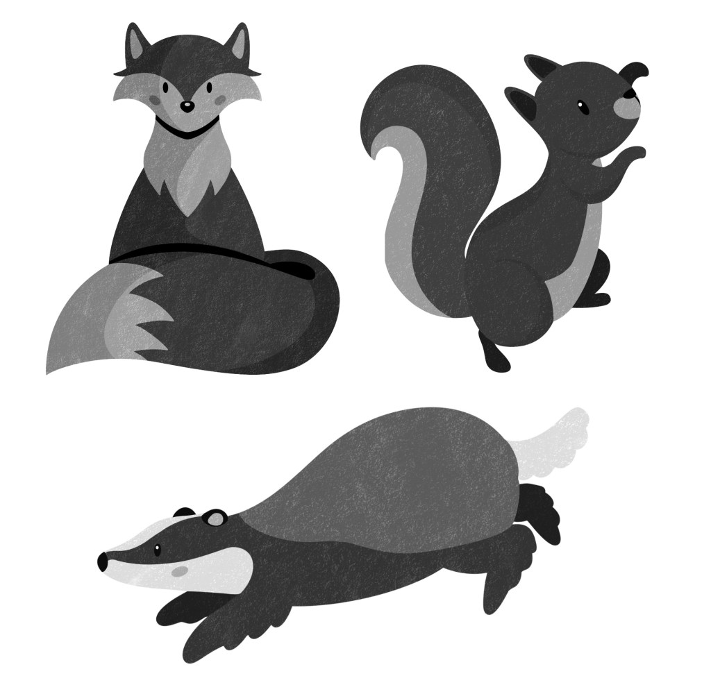
In one of the sessions I had I was given feedback on my designs and told that for some outcomes, in particular merchandise, the characters may be better with less colour. This is because I already have lots of strong colours in the brand palette so to actually make the characters stand out I need to remove the colour. I experimented with different ways to do this. First I tried just desaturating the colours but I didn’t like this as they seemed too lifeless and I thought the details didn’t translate well.
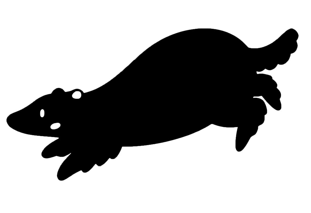
I preferred this more graphic silhouette style. It’s a much more minimalistic look and I think it’s nice as you still get the shape so can recognise the character and what animal it is. I’m going to try experiment with this style on some merchandise.
I wanted to start combining the photographs I took of the cut outs of the characters with the textures. I saved white PNG versions of some of the textures and played with different compositions. I chose white as it’s clean and simple and was the most eye catching colour against the busy photos. I really like the unique combination of the visual styles. In these compositions I can see potential for social media posts and possibly posters.
I experimented with this way of combining them on some of the stock images but found that in some cases the textures didn’t stand out enough no matter what colour I used. The solution I came up with for this problem was to use these nice curved shapes with colours from the branded palette and put the textures over the top. This style is something I really wanted to continue with and use as a key part of my brands visual language especially for digital and printed outcomes. The curves are versatile and can be used to compliment the subject of the photos.
I experimented with the each style of visual asset and ways to combine them to create a cohesive visual language. I am happy with the ideas and the next step is the experiment with combining the visual styles with the other branding elements (typefaces and logo). Also I will begin making the outcomes for the campaign.
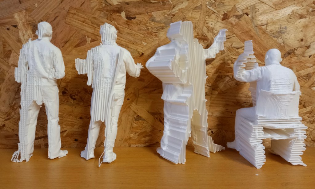
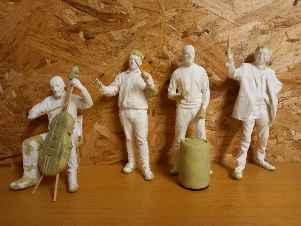
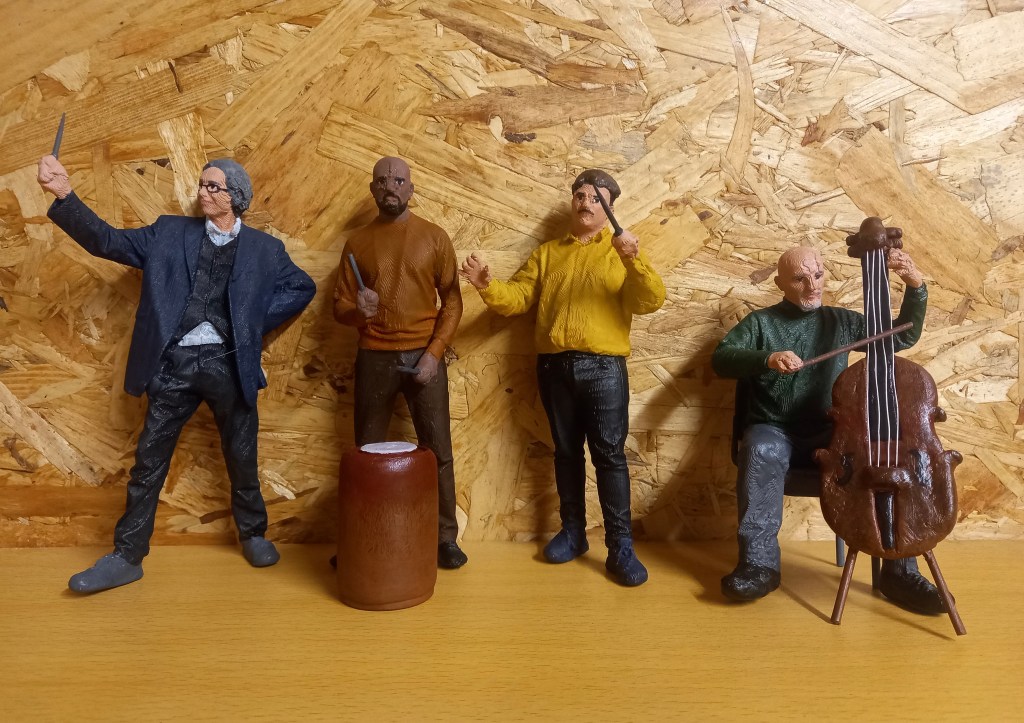
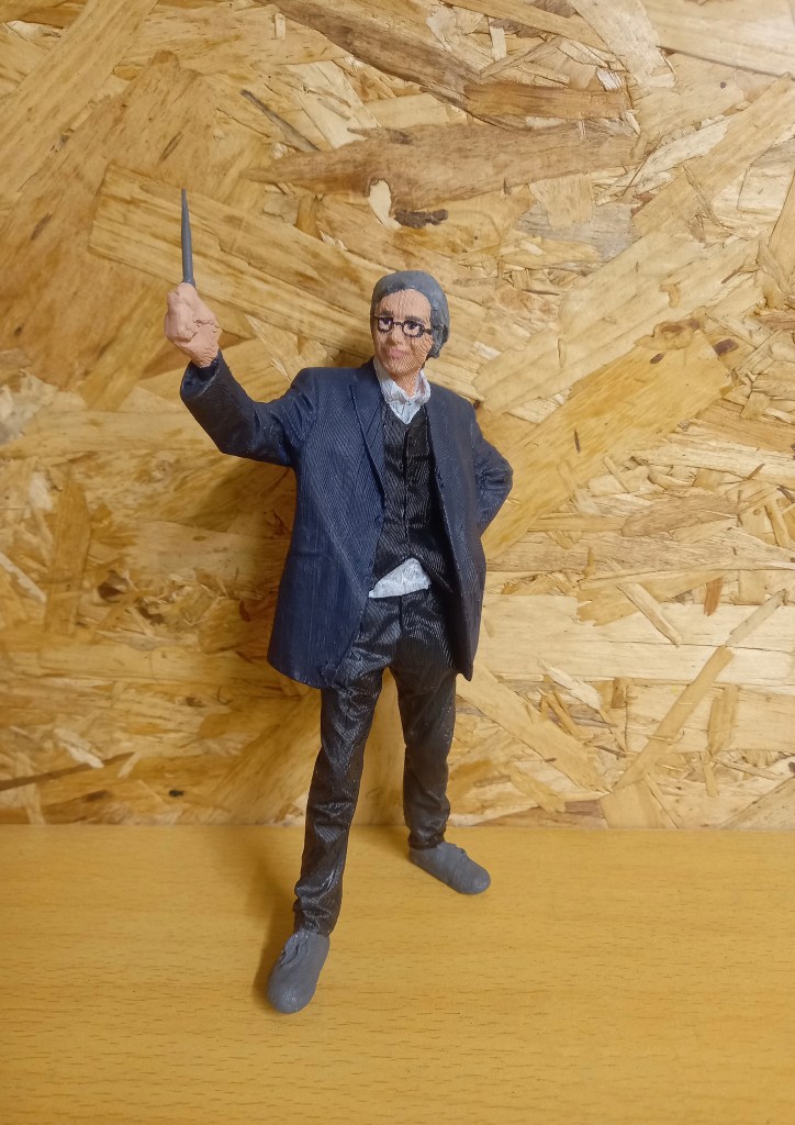
This batch of prints are from the new scans. Me and my partner split the batch in half so we each got 4 new prints to work on. My batch has our tutor as Professor Pepper, and 3 members of the orchestra; the conductor, drummer and cello player.
These scans had more complex poses so required more work before they were ready to paint. There was lots of extra bits of filament that I needed to remove with tweezers and then sand down to create a smooth surface.
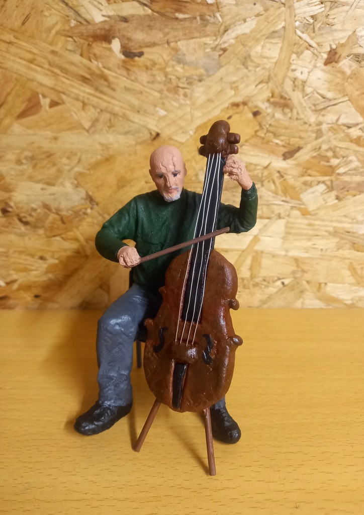
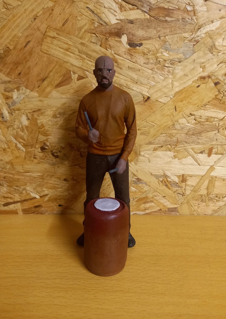
Also, compared to the previous batch I had a lot more modelling and repairing to do. As usual the tops of heads and feet needed work to fill in. All of the prints were holding stuff in their hands. We used props during scanning to recreate this but they were too thin so didn’t print well, meaning I had to remove what was there and create something new. To create the props they’re holding like the drum sticks I used 2 different thicknesses of cocktail sticks which I then attached to the model using a combination on miliput and hot glue. I also created the drum and cello. The drum is made from an empty roll of film which I covered in a smooth layer of miliput and added details to the top. The cello is made from miliput and wooden sticks. I used the sticks to create the shape and neck then built up the details with the miliput. I will add strings made of thin wire at the end, after it’s painted.
When the miliput and glue was dry and had hardened I spayed them with primer to help to paint adhere to the surfaces well.
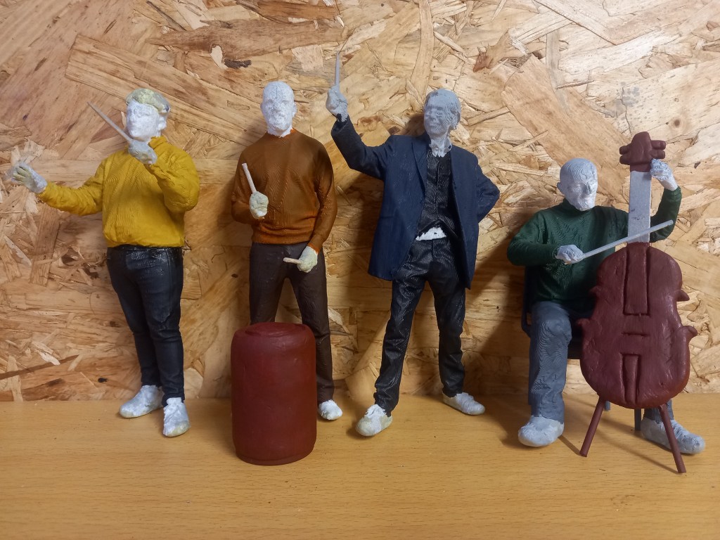
These are progress photos that show the basic colour of the instruments and clothing.
Here are the 4 completed figures and the 2 instruments that go with them. These figures really pushed me as the had more detail and complex poses than the previous batch. I chose to contradict the usual black and white attire of an orchestra by using a more colourful palette while not making them too bright. I did this to make them more visually interesting and it will help draw attention to them when they’re in the model. One particular piece that I’m pleased with is the cello. I think I made the shape well using a combination of wooden sticks to create a scaffolding and built up the details using modelling clay. I then painted it and coated it to give it a nice glossy finishing to imitate the wood used in instruments like the cello. I then added 4 strings using a thin metal wire which I attached using hot glue and miliput to secure and blend it into the body of the cello. Also it fits well in the pose of the figure and is true to scale.
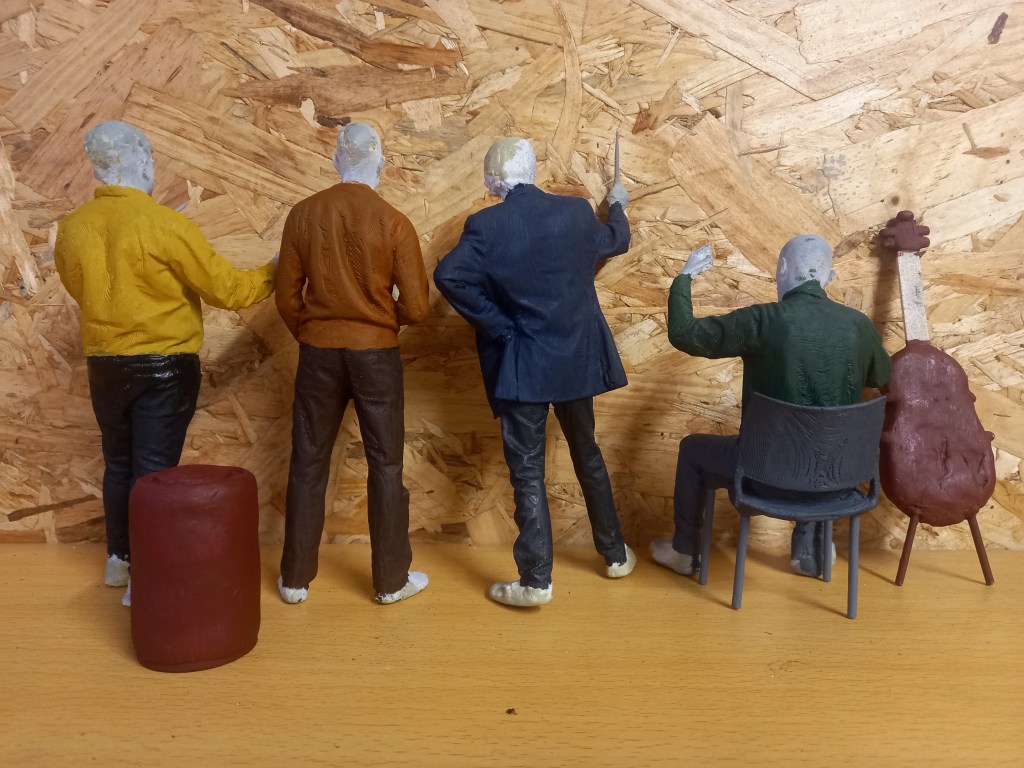
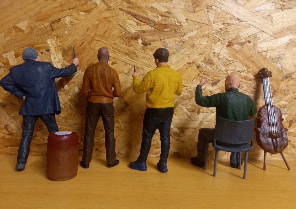
The next 4 images are close up shots of the completed figures, the cello player, conductor, drummer and Professor Pepper.
I have chosen the branding/campaign identity by creating a name, slogan and designing the logo, colour palette and typefaces. Now it’s time to create the visual assets for the branding outcomes. In order to decide the visual style I researched what children ages 5-10 respond best to. I plan to have 3 key visual asset styles, natural textures, digital illustrations and photography.
Natural Textures
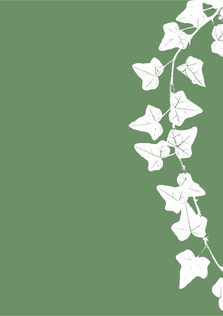
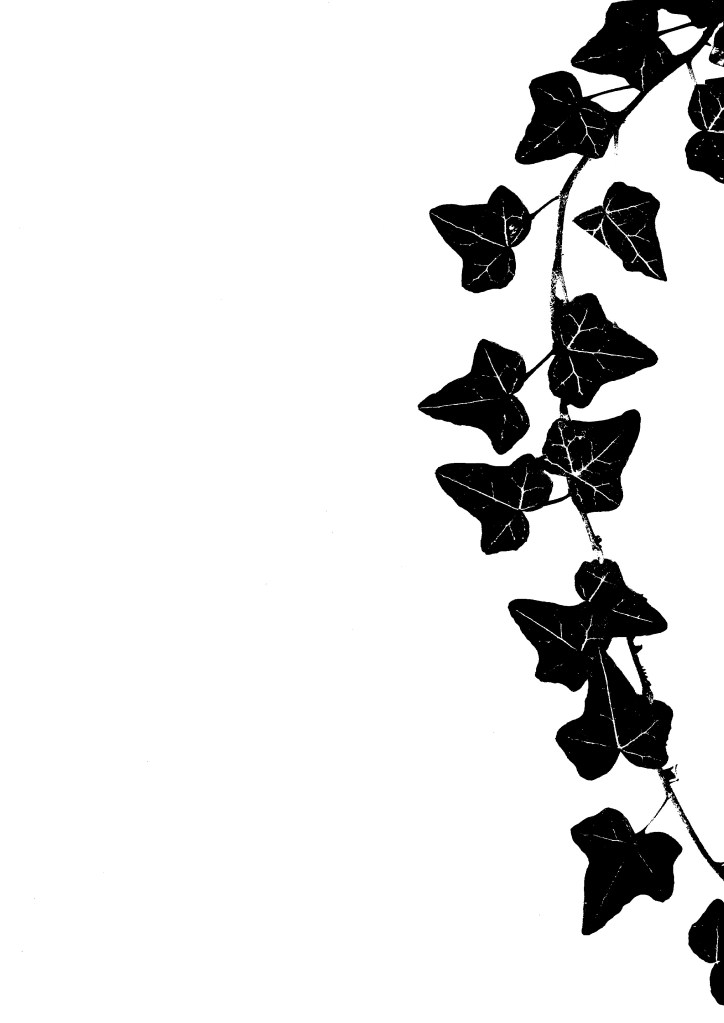
I made a range of natural textured work to use as backgrounds, borders and overlays. To do this I used digital scanners to scan real textures and different printing styles. This delicate style is aimed more towards the parents as older people appreciate more subtle and refined details. The textures will complement the bright colour palette and help emphasise the natural, hands-on theme of the campaign.
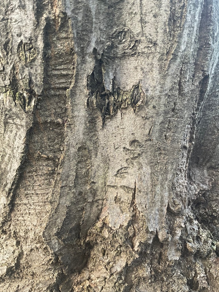
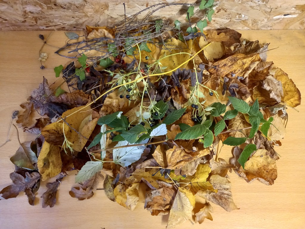
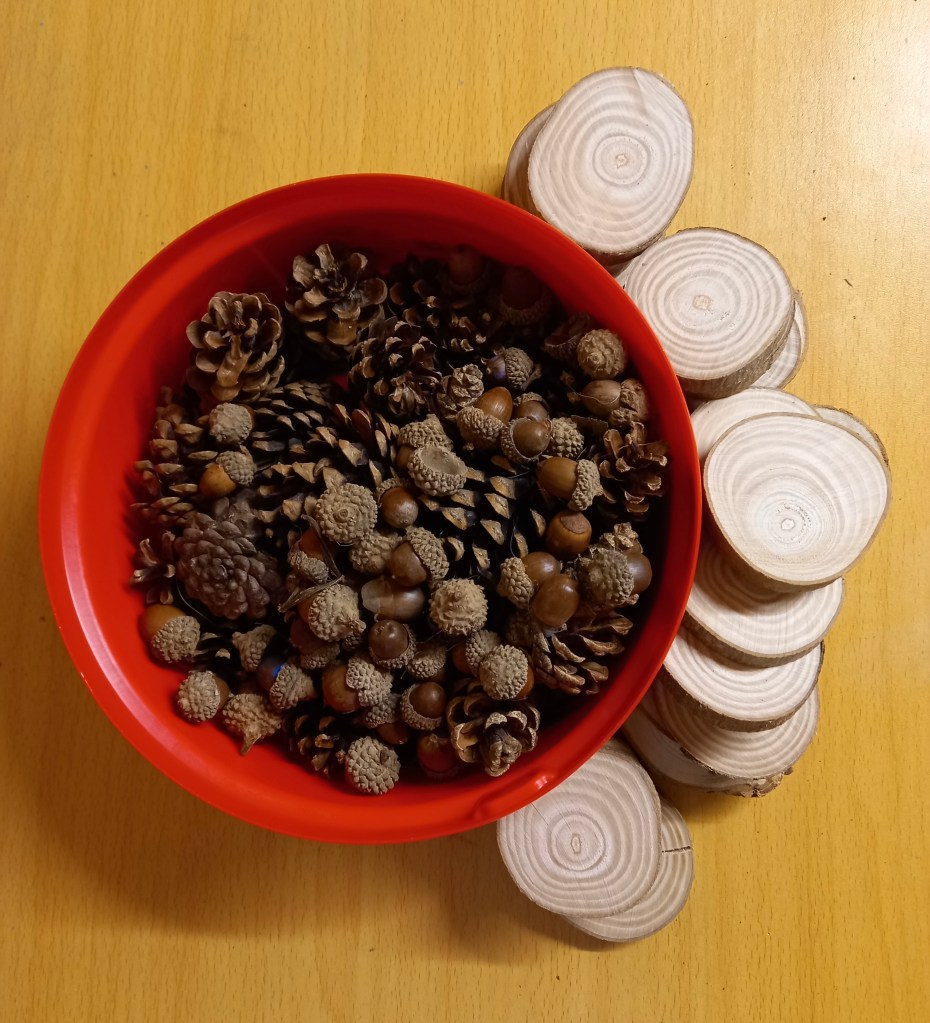
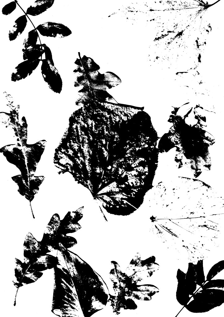
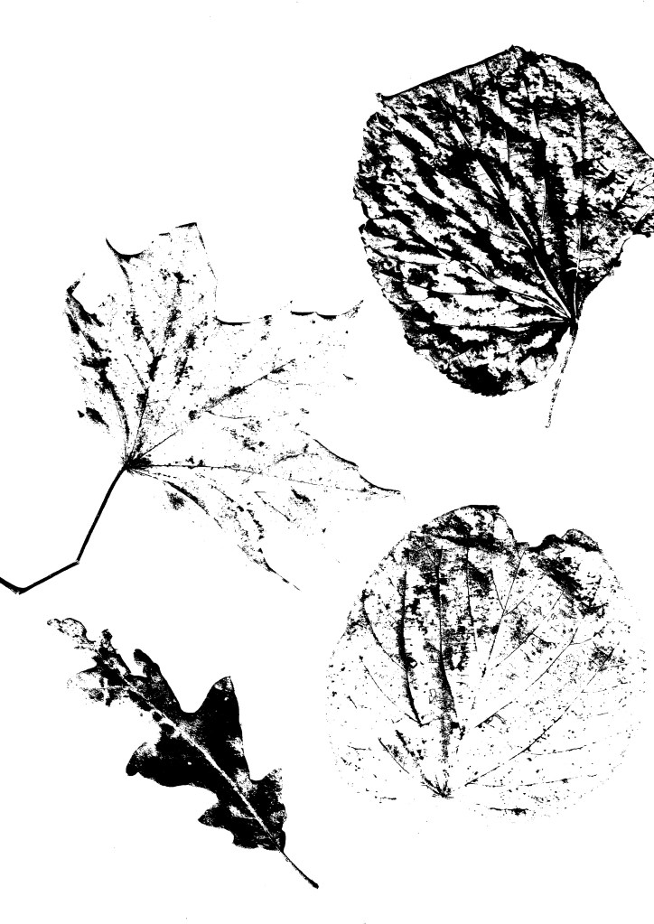
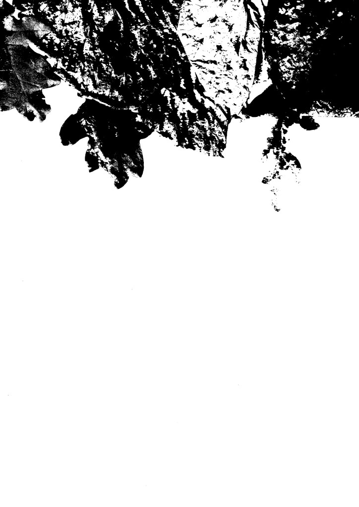
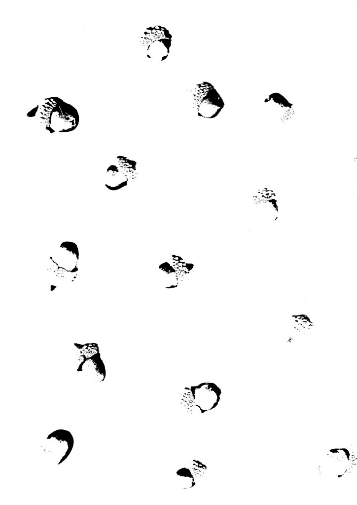
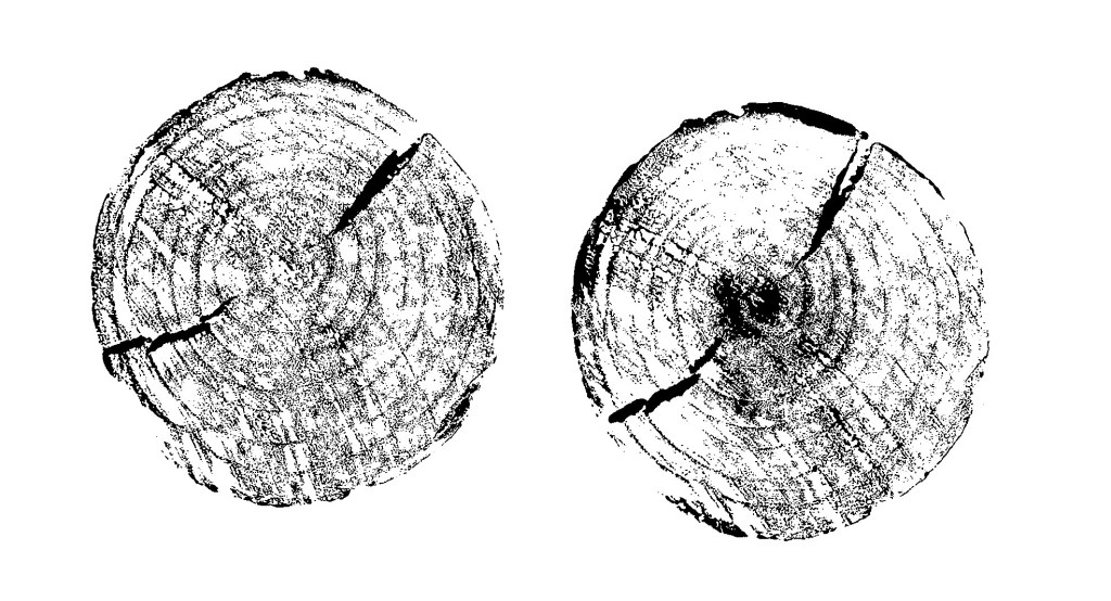
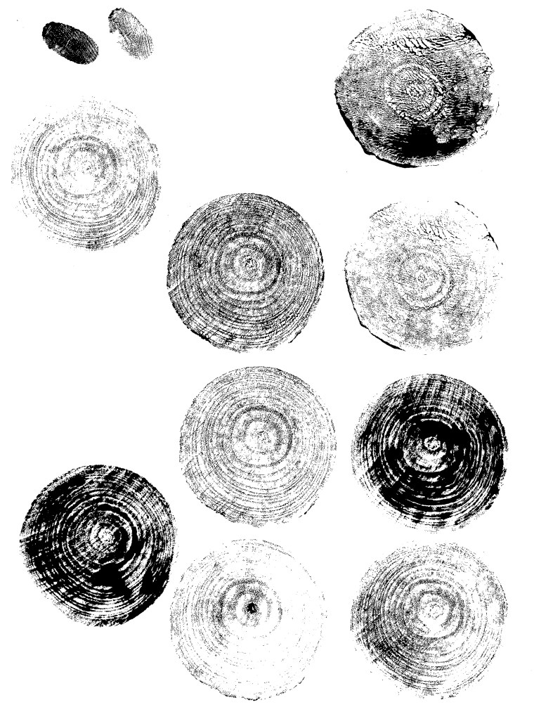
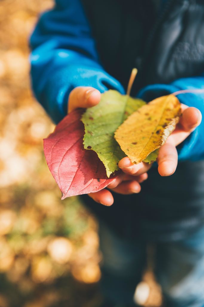
Below are a range of natural textures that I have collected and photographed. They include tree bark, leaves, pine cones and acorns.
I used the printer scanner that I have at home to make a bunch of different compositions from the random assortment of leaves I collected. Some are with lots of leaves covering the whole area, some are in more organised placements such as the corners and others are focused on specific leaves. This gives me a range of images to edit and use.
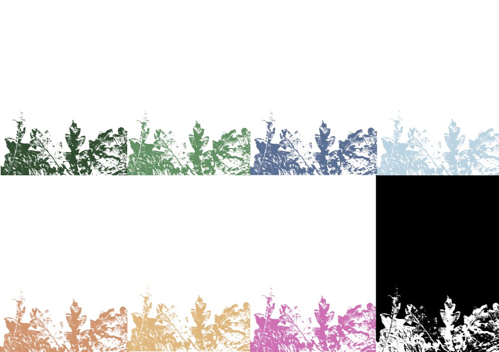
The scanning software that I use (HP Smart) has a range of filters that can be applied to the scan so I experimented with them and chose to use this one as I like the graphic contrast it creates between the light and dark parts. It has the style of a screen print which is an aesthetic that I really like.
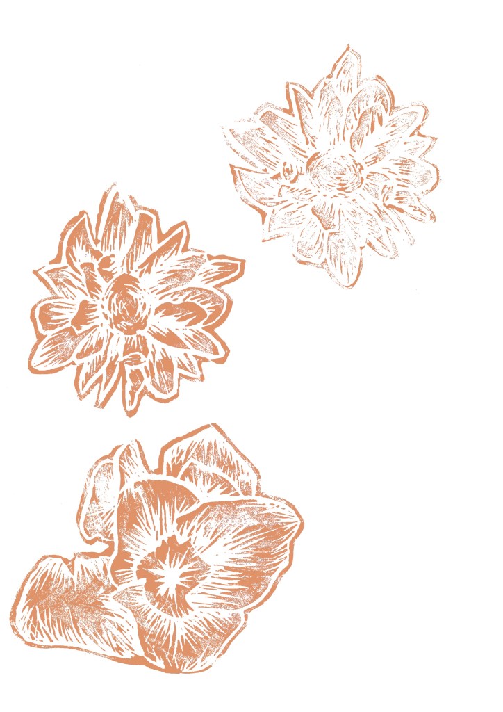
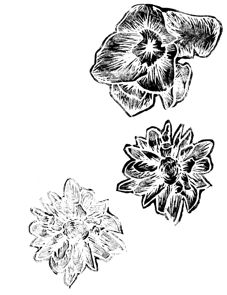
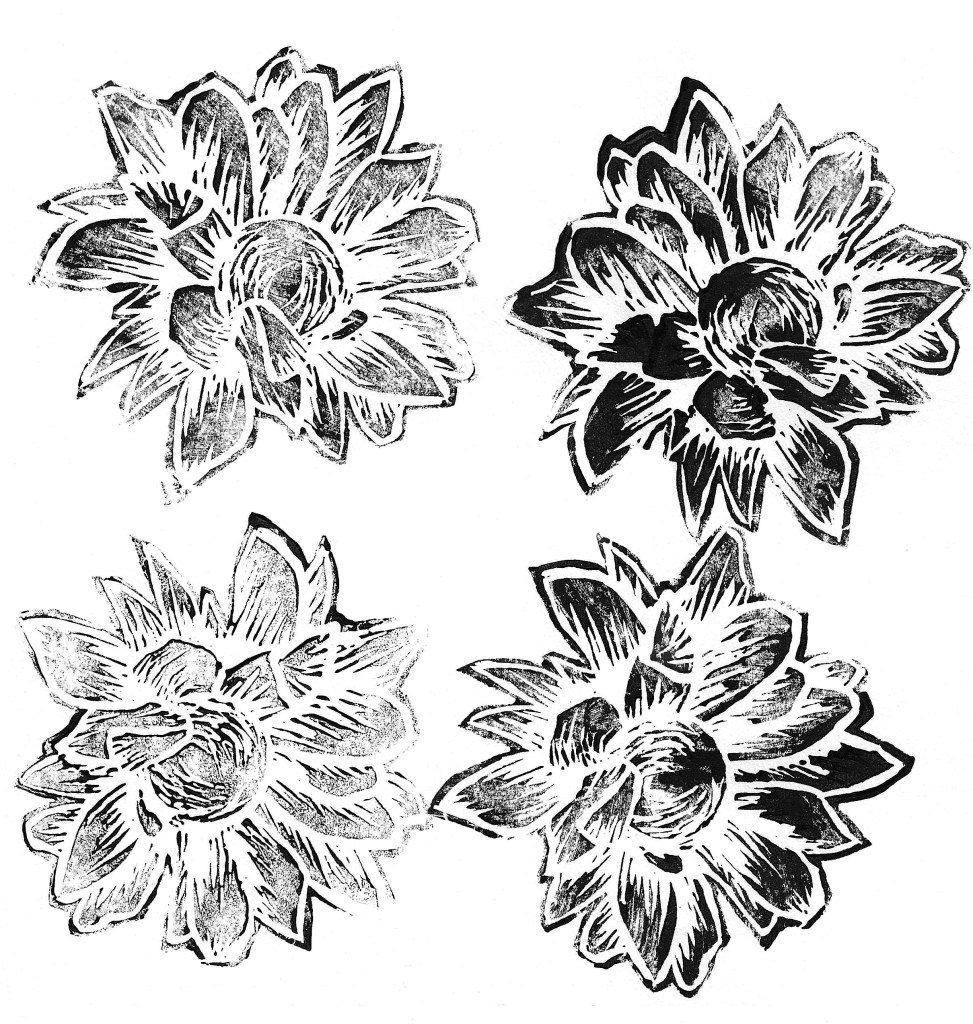
Lino printing is a technique that I have experimented with previously and I think it creates a really nice textured look. Using the printing facilities at the University I carved at series of floral Lino cuts. I chose a dynamic carving style to create lots of texture. From my previous experience I have found that this style produces the most bold and striking results. To save myself time I only printed in black ink, making sure to get some darker and some more faded prints with each design. I will later colour them digitally to align better with the campaign identity.
I also experimented with printing over wooden discs. Initially I tried using the same ink I used for the Lino prints but it was too thick so it didn’t print the fine textures of the grain. So I tried using black acrylic and that worked much better as it’s thinner so the prints came out much more detailed. In the same way I did with the Lino prints, I only printed them in black and will alter the colour digitally.
Digital Illustrations
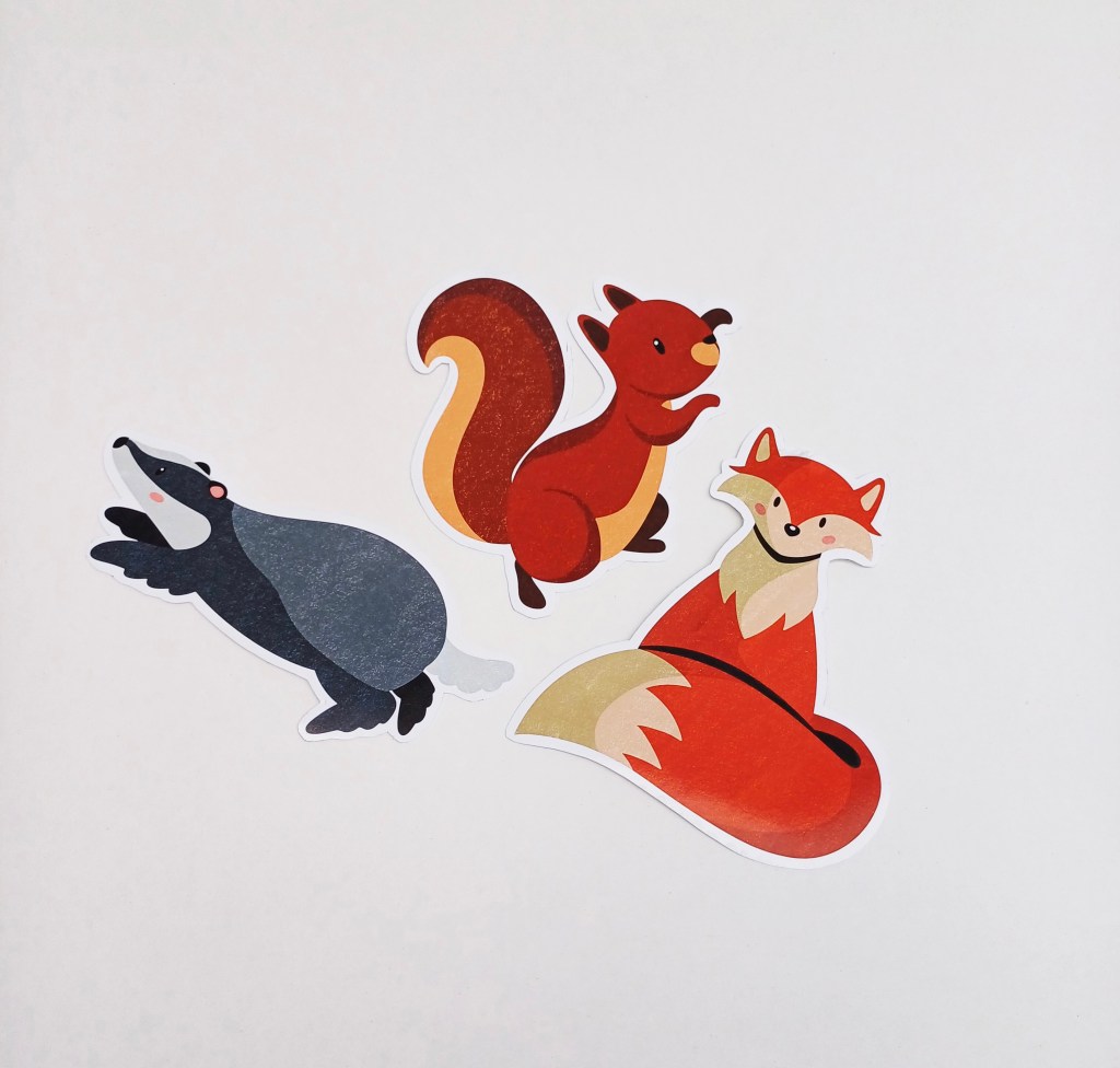
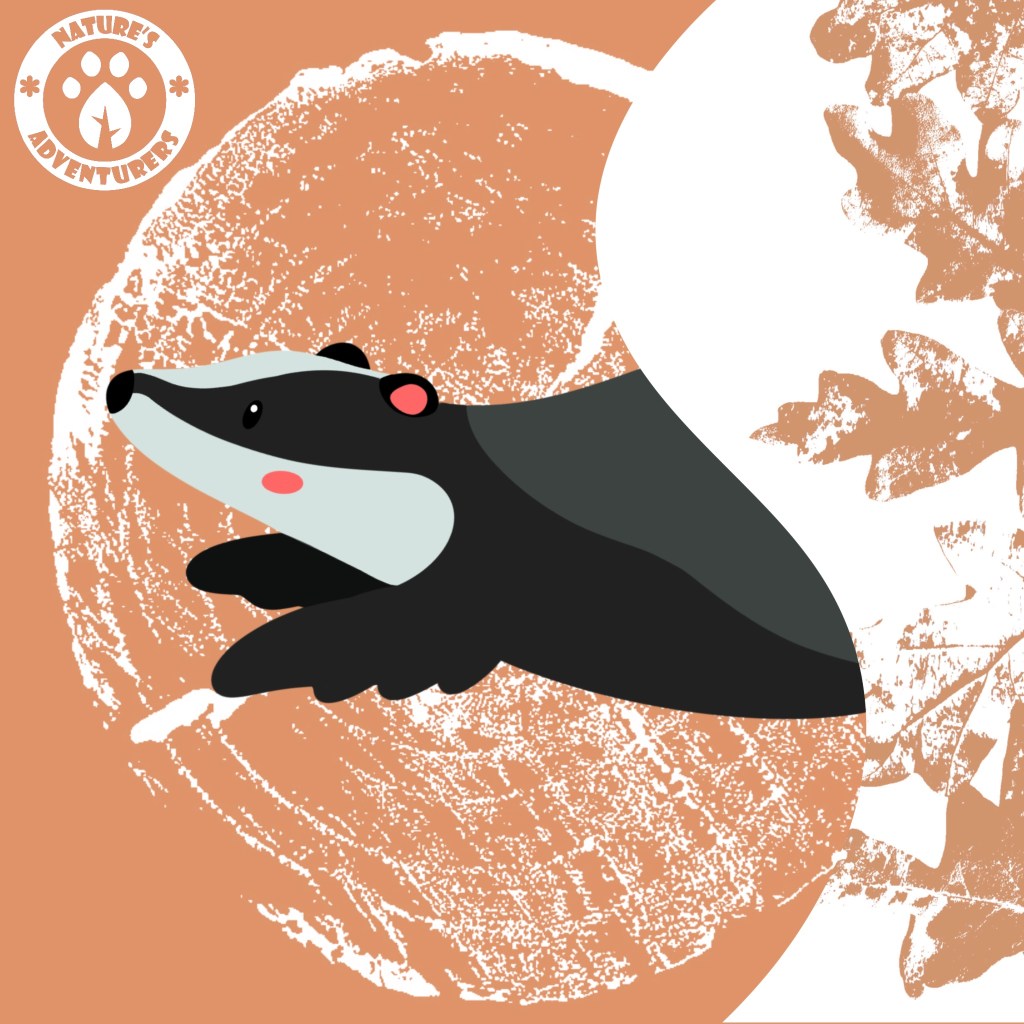
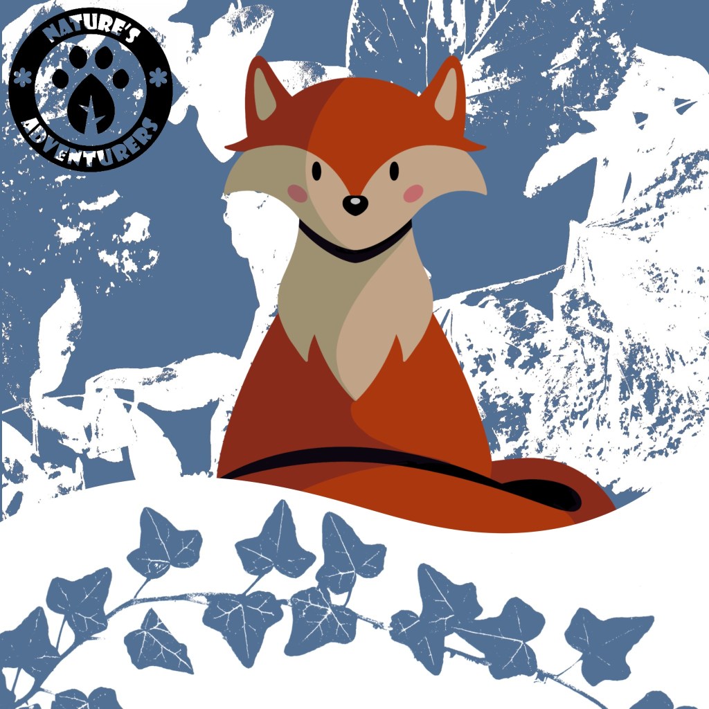
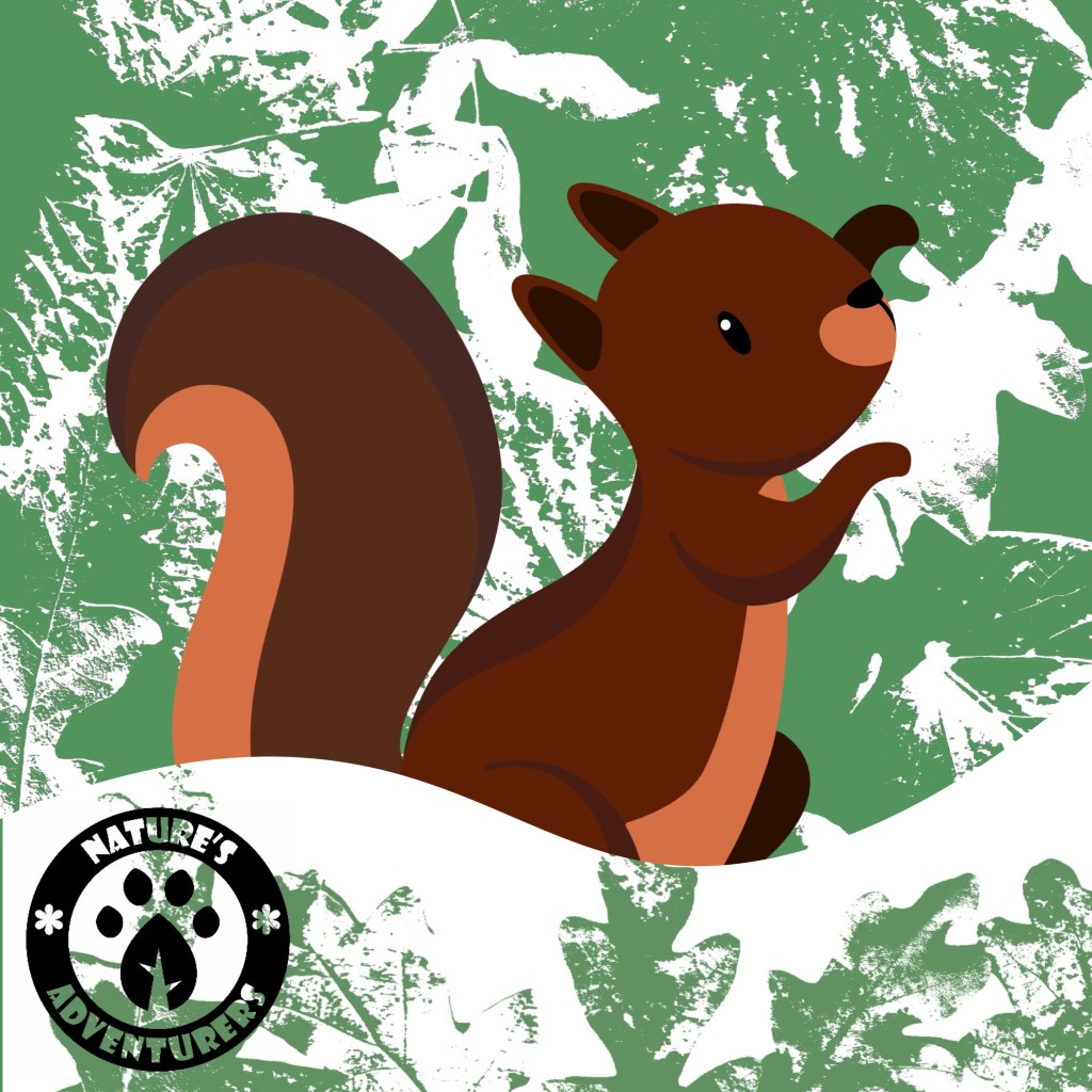
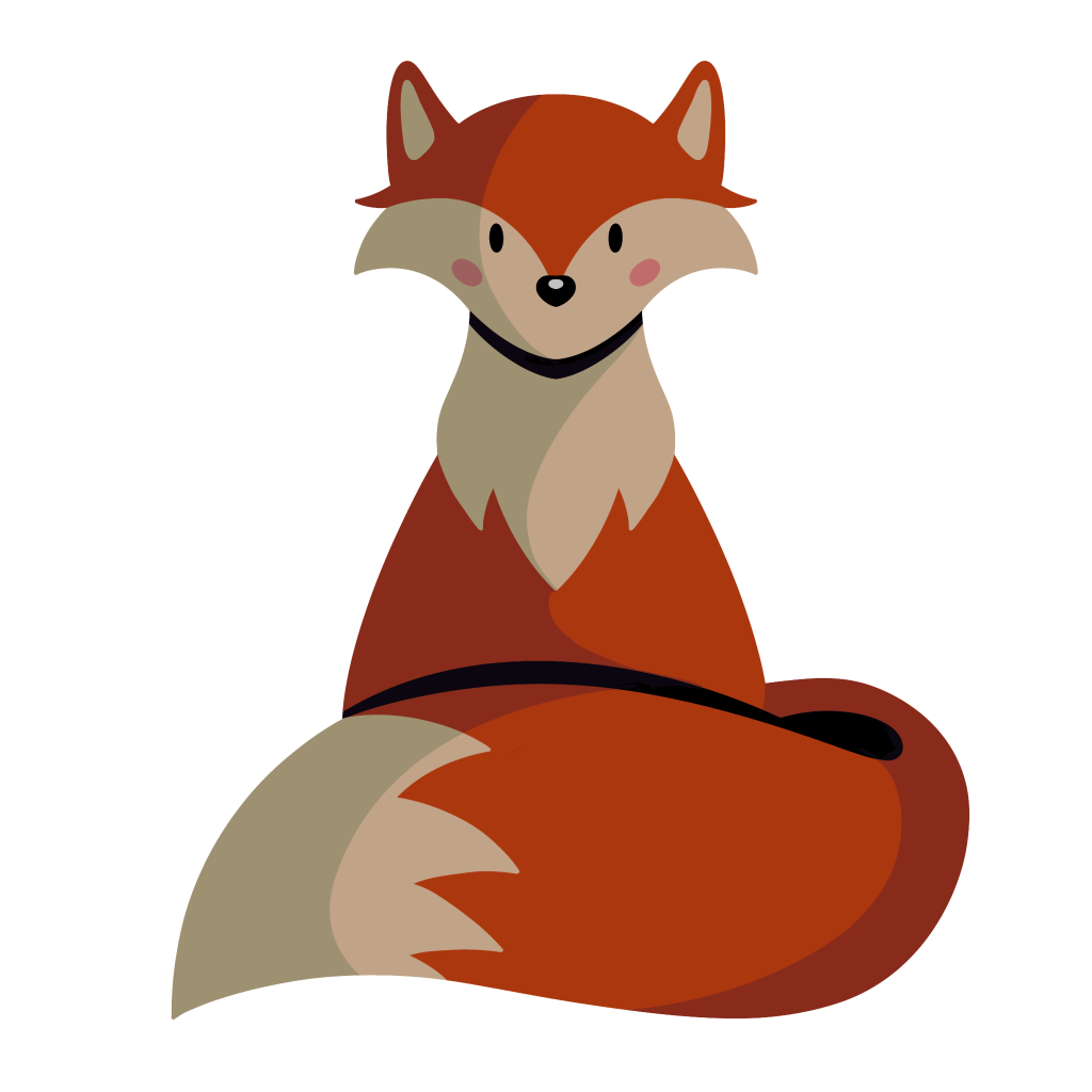
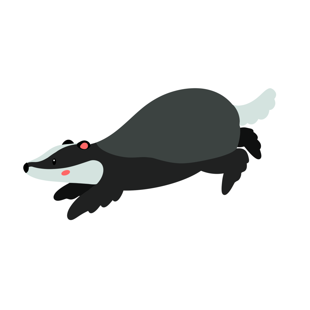
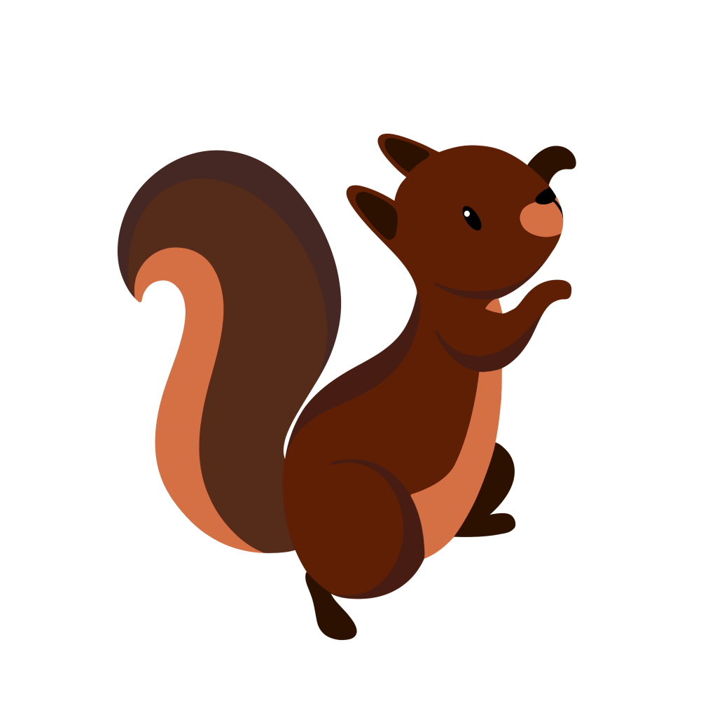
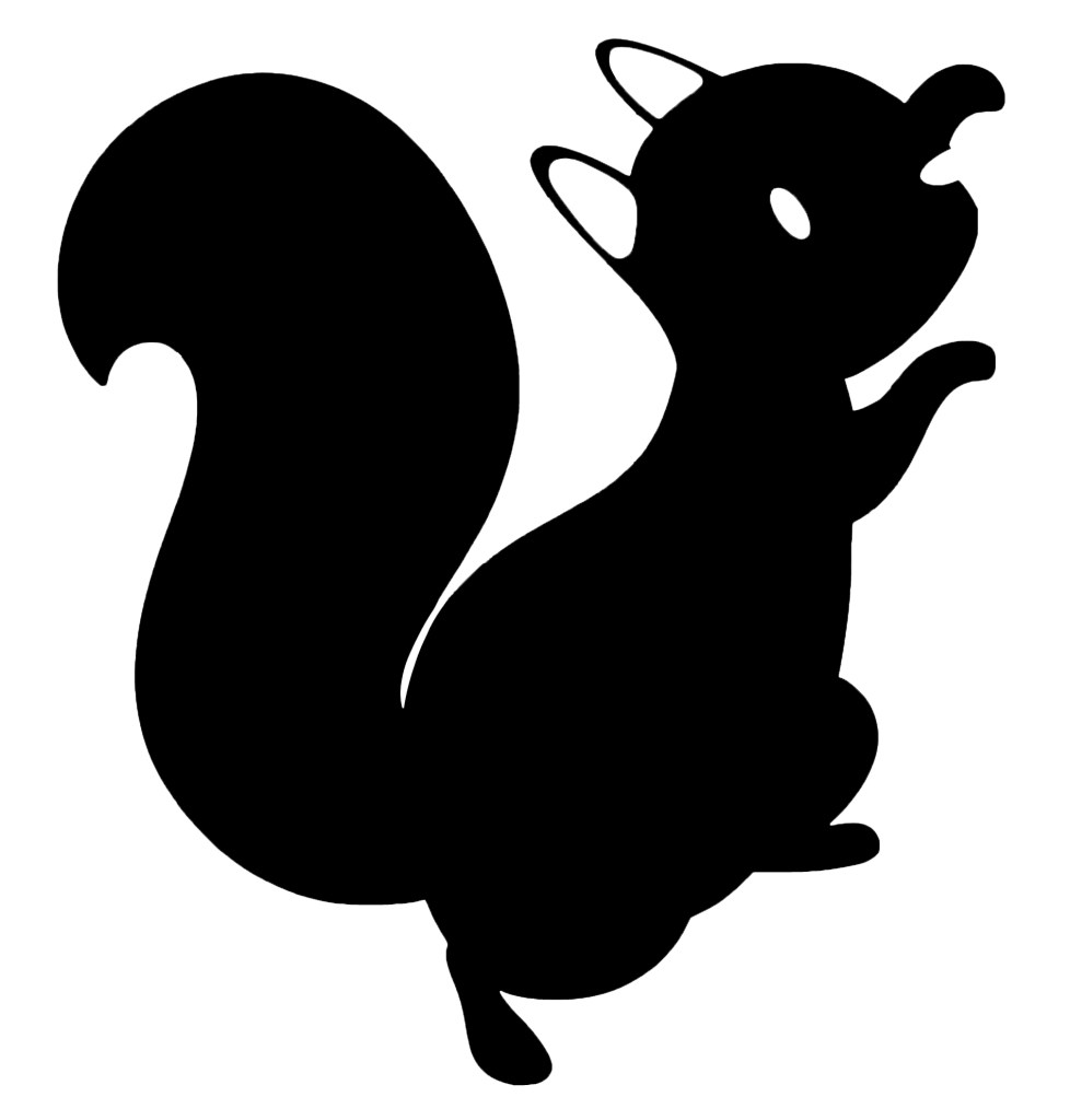
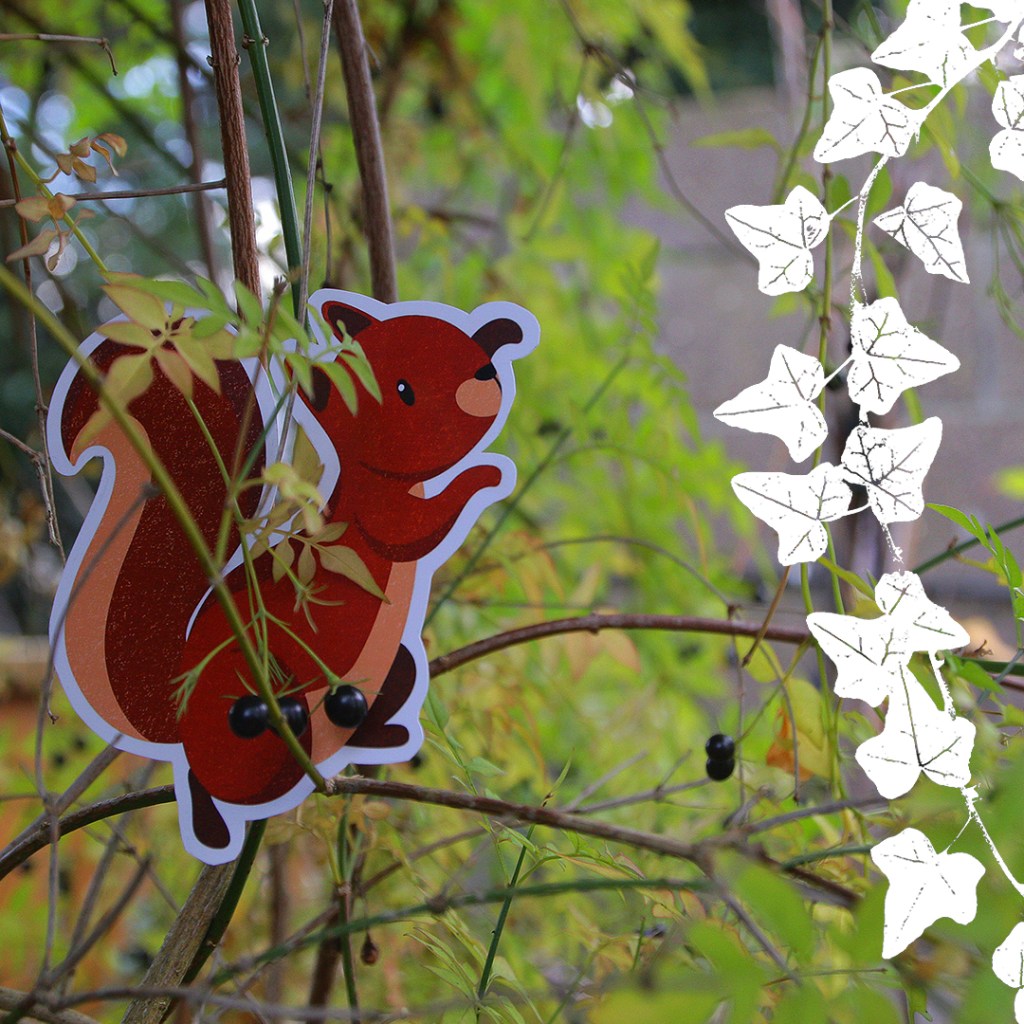
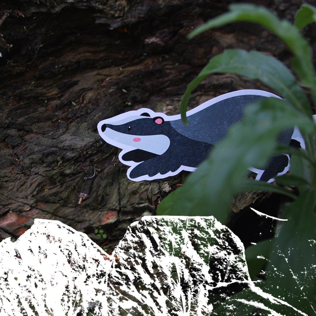
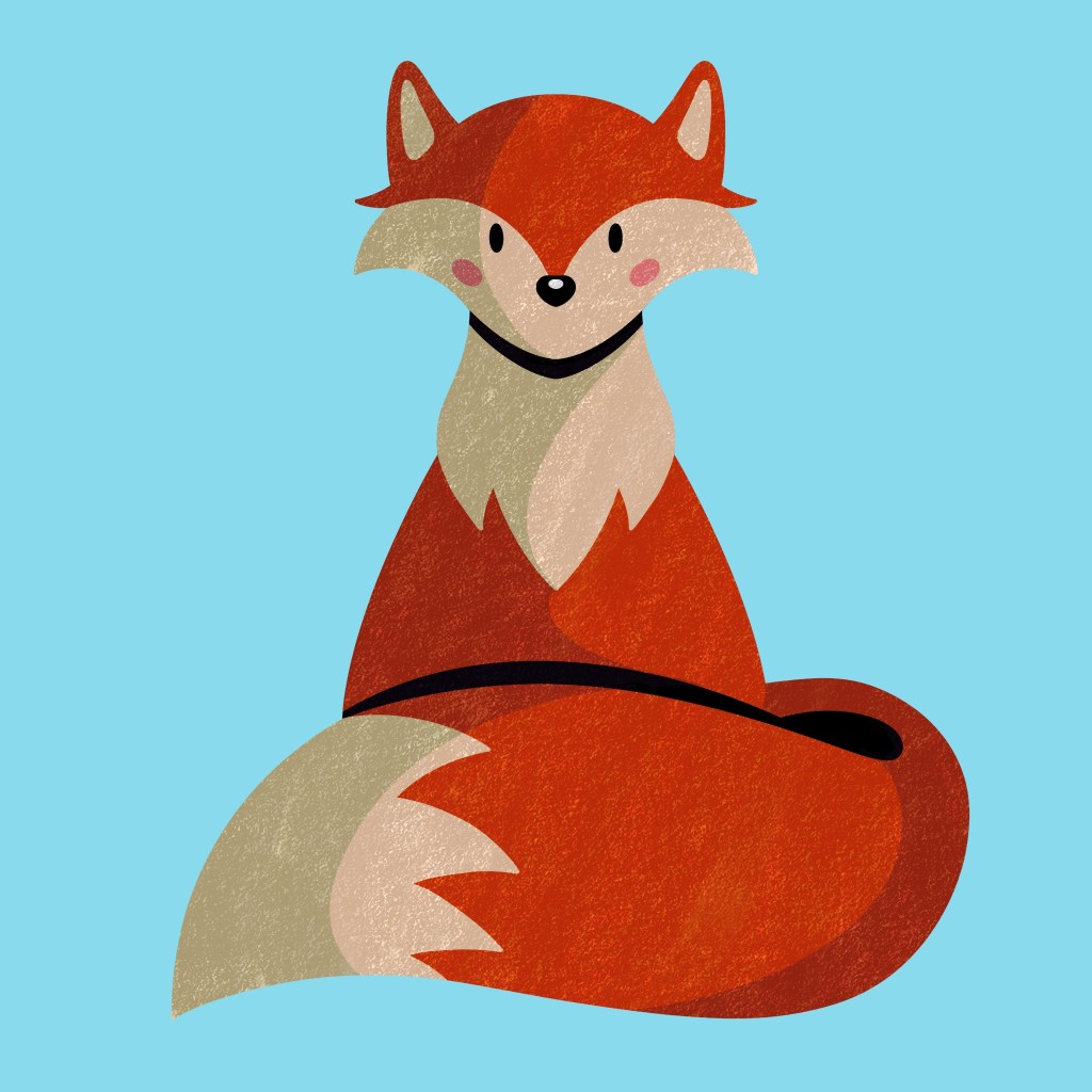
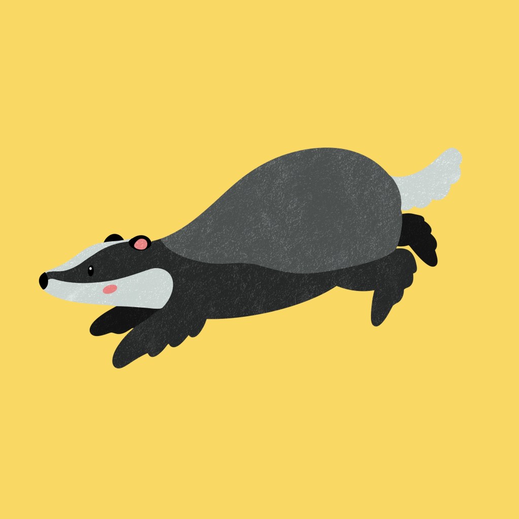
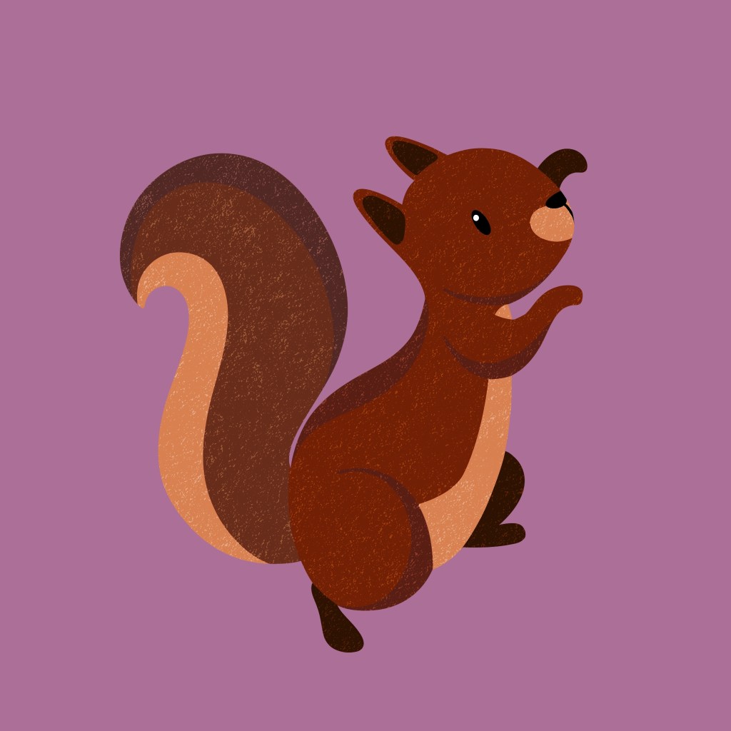
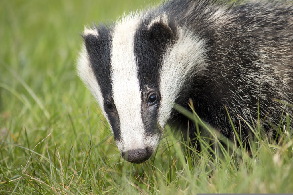
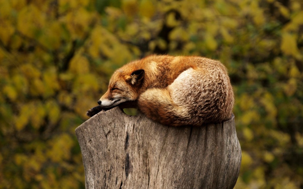
I created characters that will be used across publications and merchandise because it gives the campaign a welcoming and friendly face that will help to engage and encourage children to take part. Many brands use animal mascots such as Tony the Tiger to encourage children to engage with the product. These characters are of UK wildlife as the campaign is based in the Uk so children will relate better to these animals as opposed to a lion for example. I researched different Uk wildlife and decided to go with a fox, badger and squirrel as they’re easily recognisable as they all have distinctive characteristics. I came up with names for each character to help bring them to life. They’re as Freddy the fox, Benny the badger and Susie the squirrel. I wanted them all the end with and ‘e’ sounds and be an alliteration to make them sound cute and be memorable even for children. I used digital media (Procreate) to make these cartoonish and fun vector style illustrations as this way I’ll be able to achieve eye catching colours on screen and in print. These characters will stand out and nicely contrast the organic textured work. I made sure to not make the colours too bright and use CMYK colours so they will look the same on screen and in print.
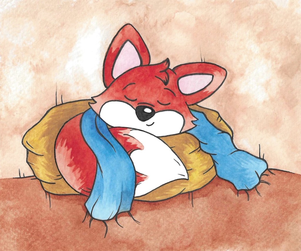
Freddy the fox
Benny the badger
Susie the squirrel
Photography
The other visual style I will use is photography. Through my research I found that almost all brands about nature feature photography as a key part of their branding. Photography is a great way to attract both the parents and children. This will help add a realism to the branding, in contrast to the cartoonish characters. I think the blend of these 3 visual styles is unique as I haven’t come across another brand who uses all 3 simultaneously.
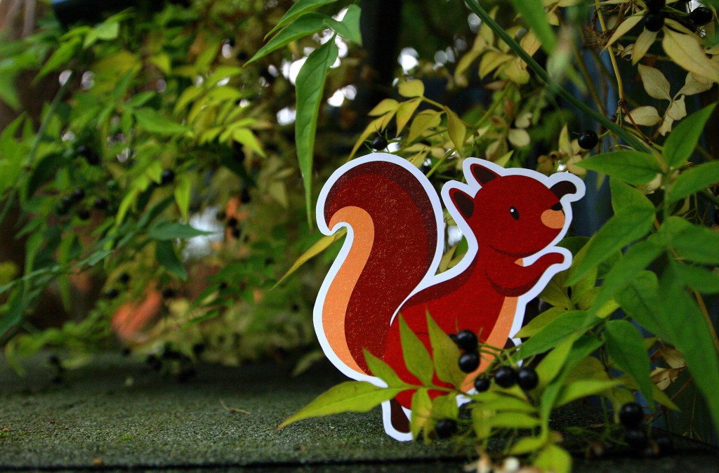
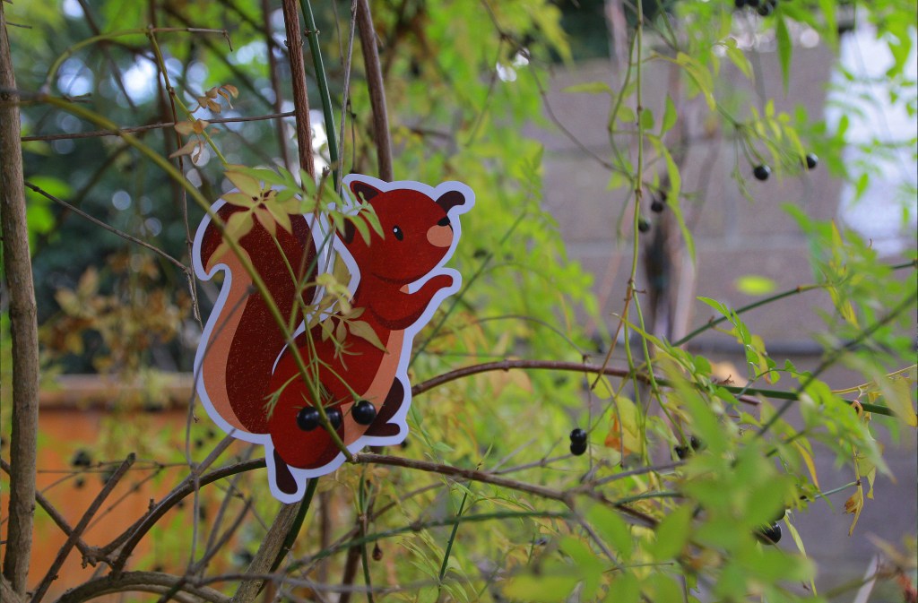
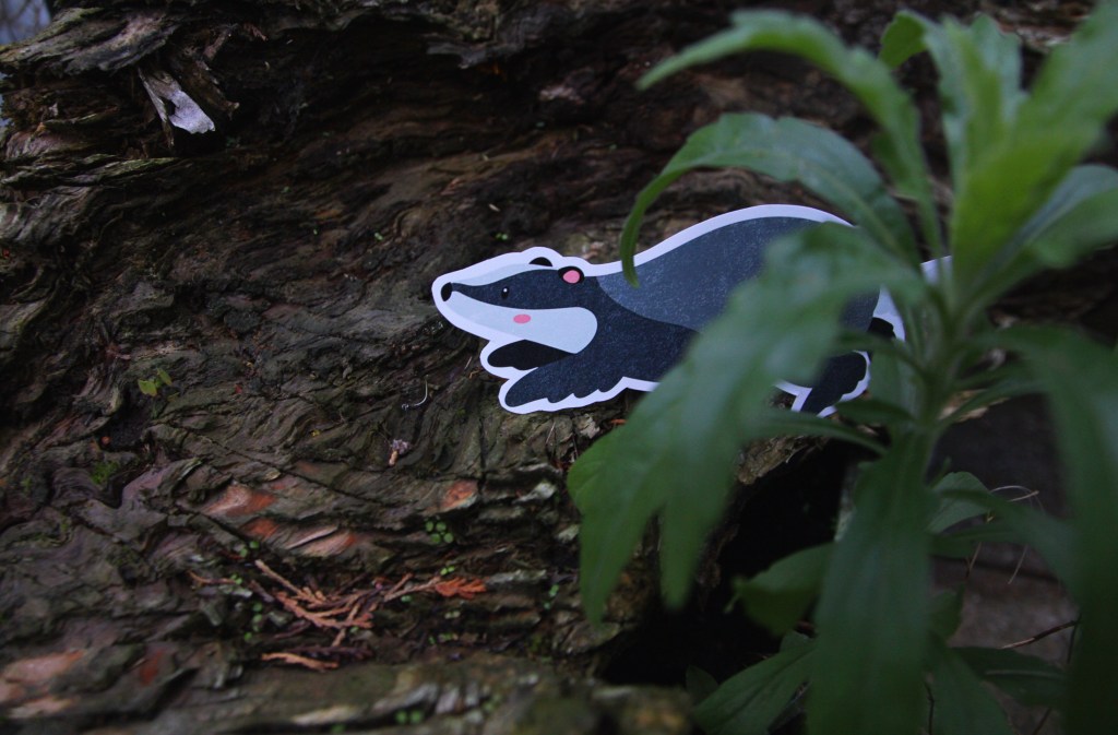
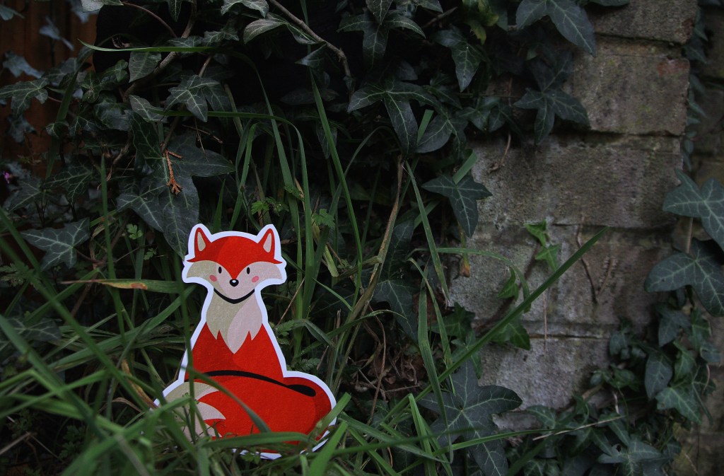
I rented a camera from the University to take some of my own photos for the campaign. The camera I used was a Canon EOS 60D. I don’t have much experience with high quality cameras so I explained my ideas to the staff in the Photography store and they recommended this one because it is ideal for high resolution images and one of the easier models to use as a beginner. The campaigns and brands that are the most successful, especially when aimed at children, are the ones who step into world creation. I attempted this by trying to bring my digital characters into the real world, creating a spatial outcome. To do this I printed out the characters in nice glossy paper and with a good quality printer then cut them out and placed them around my garden. I’m very happy with the results as the camera produced highly quality photos depicting the chapters I created as if they were real animals. I like the contrast between the natural surrounds and the digital drawings.
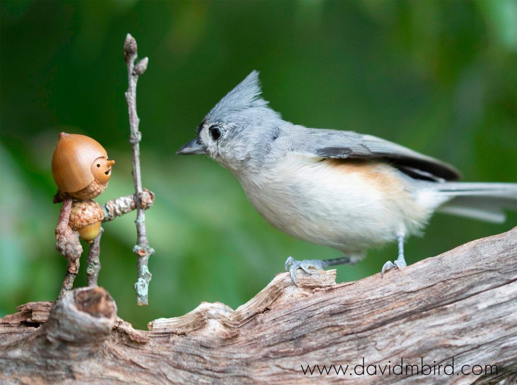
I took inspiration from the artist David M Bird who makes little characters and captures these beautiful moments of his characters interacting with nature. One of his photographs is below:
To supplement my own photos I will be using royalty free photos from websites such as Pixabay and Unsplash. I downloaded photos of natural scenery, plants, animals, and children playing that I can use for promotional material for the campaign. With stock photos there is often the issue of them looking generic and boring so I spent some time trying to find interesting and targeted ones for specific purposes. Once I combine the photos with the other visual assets and branding elements they will become unique and more engaging for my target audience.
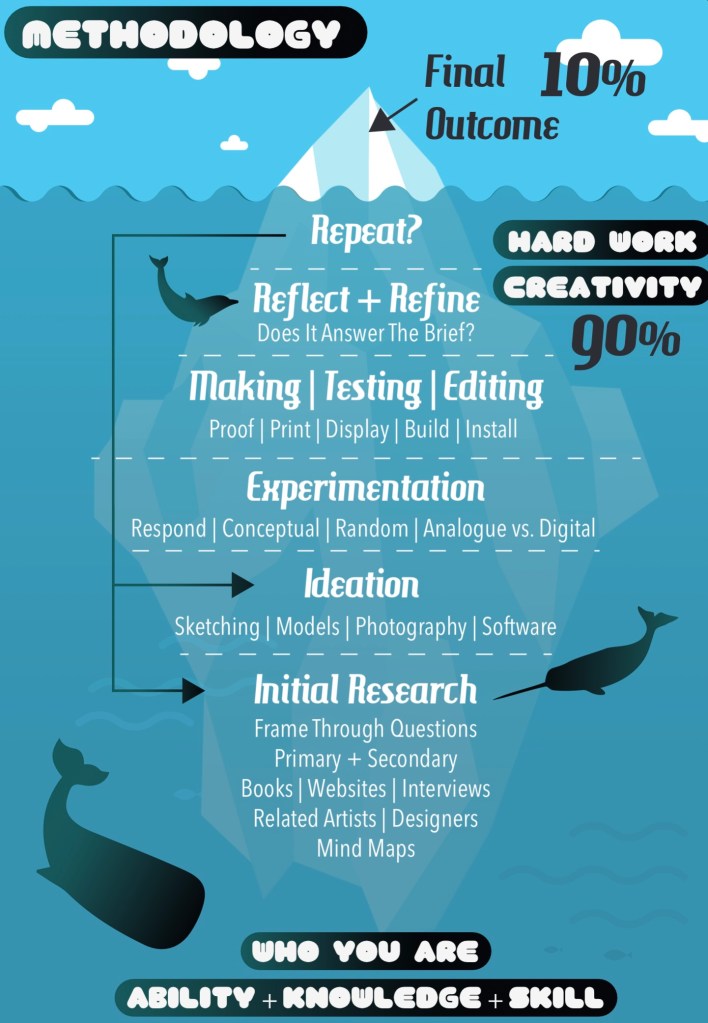
I worked on creating the branding identity for my campaign about getting children more involved and engaged with nature. This is a diagram that illustrates the process of completing a project. It can be applied to this ‘campaign for change’ brief. It’s still the early stages of the project so I’m still working at the initial research and ideation parts.
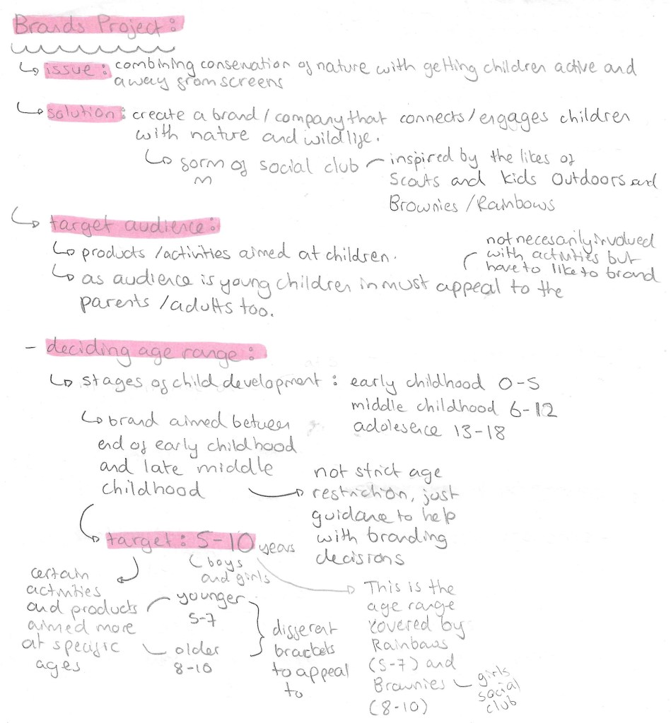
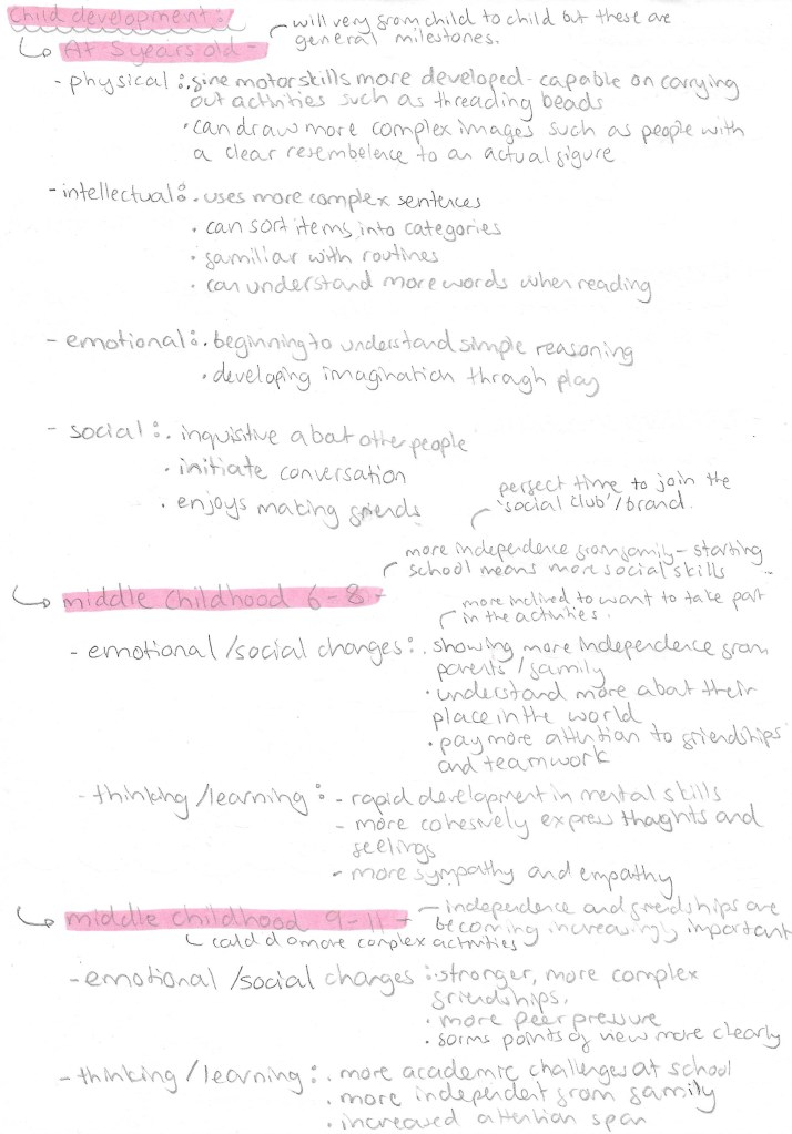
Before making any branding decisions it’s important to research and figure out exactly what topic you want to tackle. The main thing I needed to figure out more specifically was who I wanted my target audience to be. My campaign will be a type of social club, inspired by the Scouts and Brownies, to engage children with the natural world. I looked into the different stages of child development to get a better understand of what age group I wanted to target. I decided to aim my campaign at children aged 5-10. This is not a strict rule as anyone would be welcome but more of a guideline to help me create the branding and campaign. 5-10 covers the end of early childhood to the middle of middle childhood. Some activities and product may be more target to the younger or older end of this bracket but everything will be suitable for all.
This is my research into children in this age bracket. With this information I can properly target my branding and campaign style. The key reasons for choosing this age group are that by 5 most children have a basic level of reading and can understand and carry out activities. And by 10 then can complete more complex activities and are much more social. Extending the age range any more would make branding decisions much more tricky, less cohesive and less targeted.
Branding/Campaign identity:
With the topic and target audience decided it was time to create the campaigns identity which is comprised of a name, slogans, colour palette and selection of typefaces. Before making decisions about any of these I established what I wanted the values of my campaign to be. So I created a list of 10 words that sum up my campaigns values: adventurous, crafty, educational, engaging, fun, friendly, kind-hearted, social, warm and welcoming.
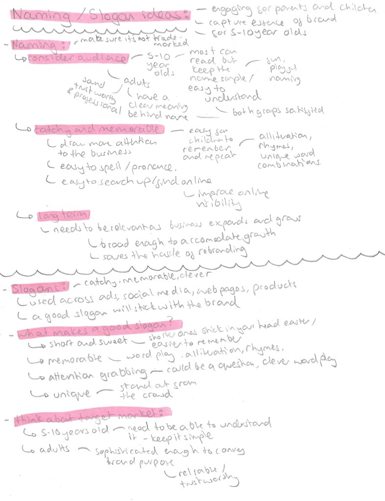
Name/Slogan:
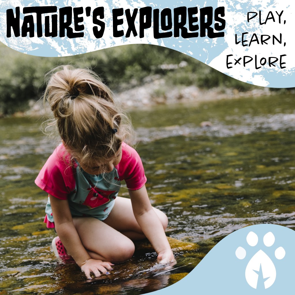
For the name it has to appeal to children as they’re the target audience but also the parents. I went through different versions of the name before I settled on ‘Nature’s Adventurers’. My initial idea was to call the campaign ‘growing with nature’ but with some research I found there was already a company with this name so didn’t want to potentially infringe on any copyright laws. So I then thought of ‘Nature’s Little Adventurers’ but found this too wordy so settled on ‘Nature’s Adventurers’. Also I thought that including ‘little’ in the name may come across as patronising to the older children in my target audience so didn’t want to exclude anyone. The name is short and simple but gets across the key themes of the campaign.
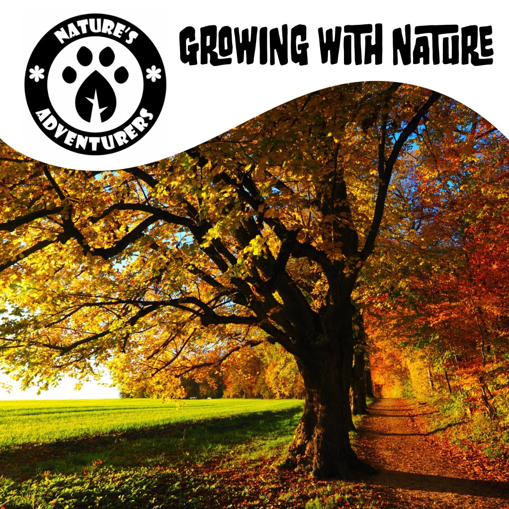
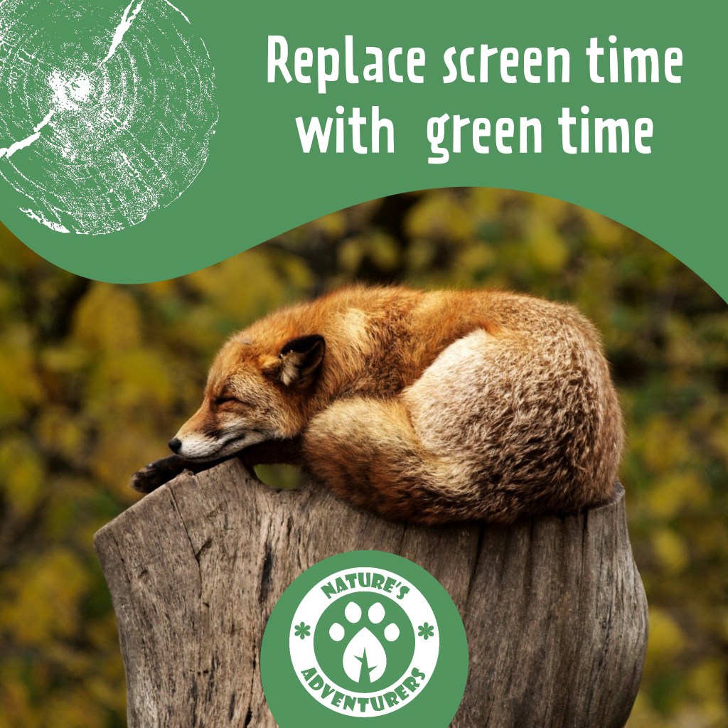
3 word slogans such as Nike’s ‘just do it’, are particularly catchy and popular so I wanted to create my own for the official slogan of the campaign. I tried different combinations of words but choose ‘play, learn, explore’ as they’re all short and simple words that children in my target audience would know and understand. Also the 3 words sum up and encapsulate what I want to achieve with the campaign. I came up with other taglines that can be used across flyers and social media. I really liked ‘growing with nature’ so I wanted to keep it as a possible taglines seen as I couldn’t use it for the name. For activities and products targeted at the younger part of the target audience I could refer to them as ‘Little Explorers’, this name could be used on merchandise such as badges and stickers. A tagline that I thought would be more targeted at the parents was ‘replace screen time with green time’. It has a nice rhyme to it and explorers the other part of the campaign which is to reduce screen time for children by getting them out in nature.
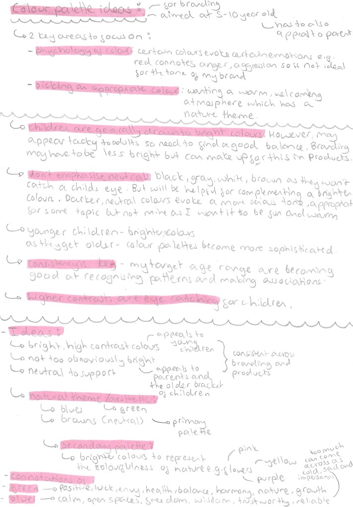
Colour Palette:
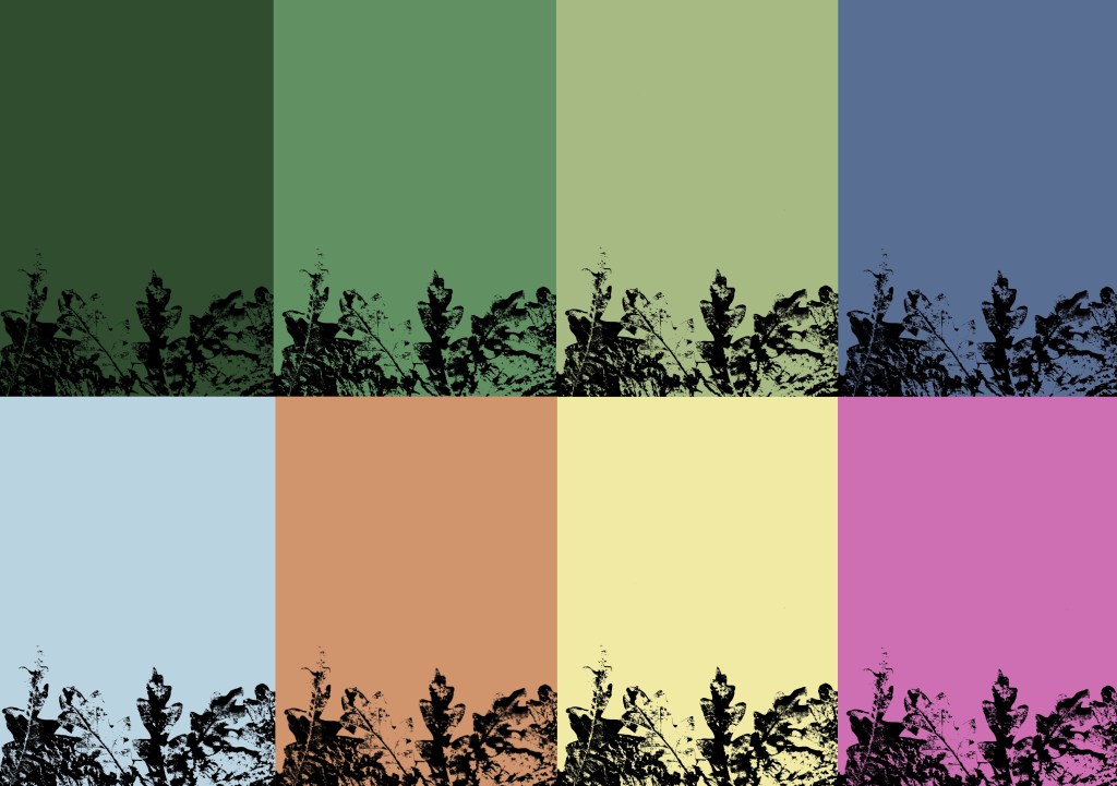
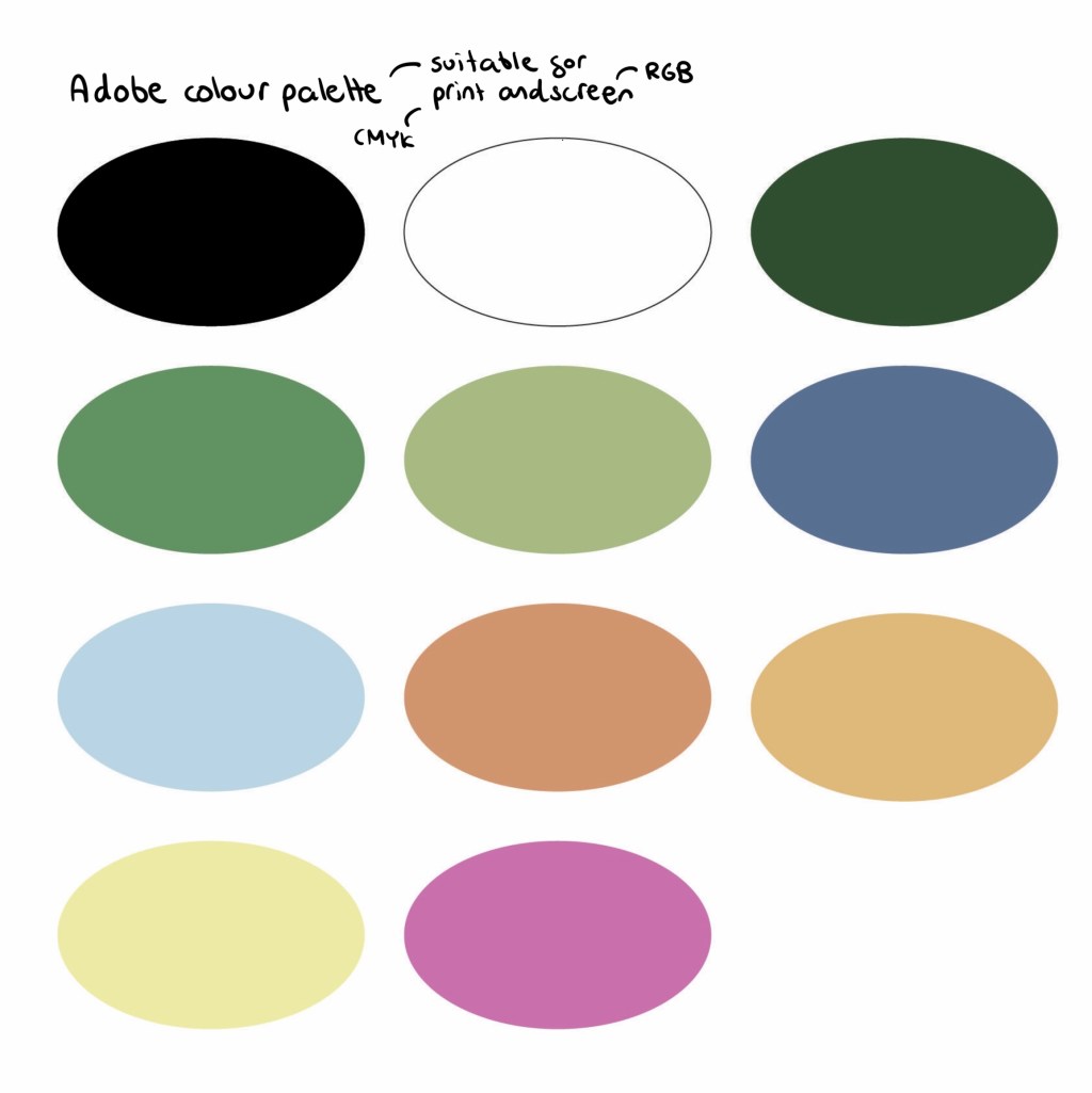
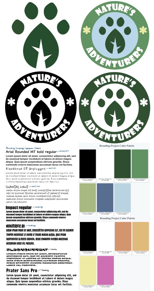
This is the final colour palette I chose for the branding. I did lots of research into how to tailor a colour palette to children. I will keep the palette consists across all platforms and products as children respond well to consistency as they’re good at recognising patterns. The key pieces of advice where that children are generally drawn to bright colours but make them not too bright as they could come across at tacky to the parents and don’t emphasise neutral colours. I went through lots of variations before I chose this palette. For the neutrals I wanted black and white as they go well in every palette. I would primarily use white more for backgrounds as it lightens up the page and black for the writing as it’s easily readable, making it child friendly. Green and blue as they’re commonly associated with nature so would translate this message well to children. I chose a couple different shades of each. These are cool colours so I wanted to contrast these with some warmer colours, these being orange, yellow and pink. These are eye catching and pair well with the cooler shades.
I took this palette and added it into Adobe Illustrator and Photoshop. I chose colours that aren’t too bright so they’re easy on the eyes and are compatible in both CMYK and RGB colour modes. This means I can use the same palette across print and digital media.
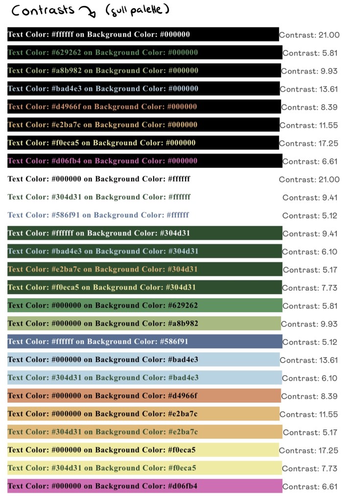
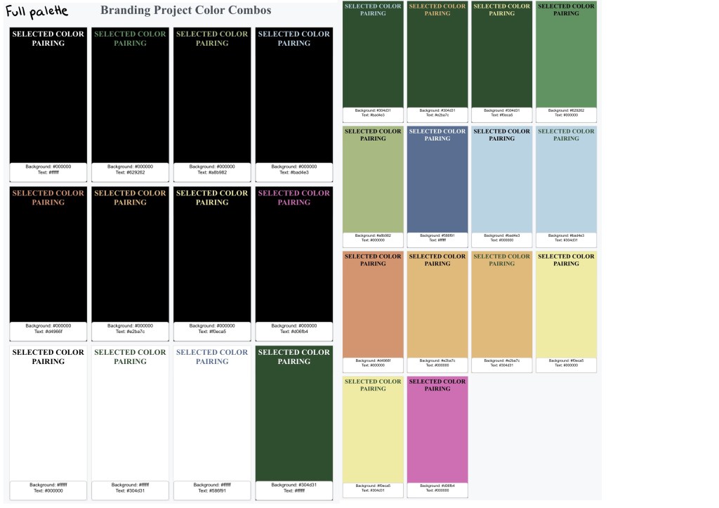
I put the palette into a software that checks the contrast between colours. A score of 4.5 and above is the target for a good pairing. These are all the colour pairing with above a 4.5 contrast. The colour palette gives me a wide range of compatible colours to use.
These are of the compatible pairings that are user friendly:
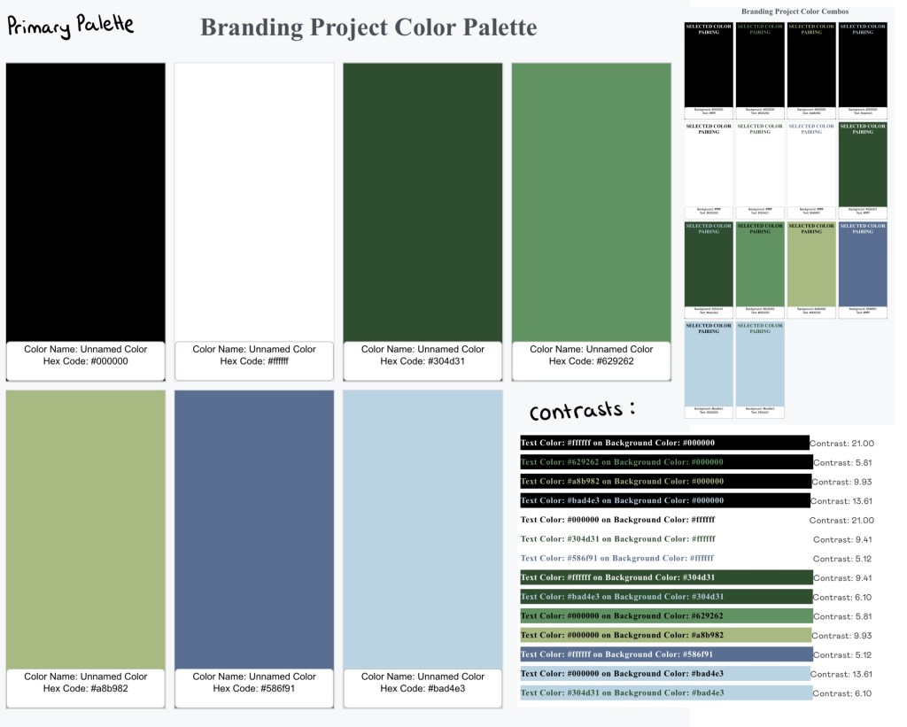
The cooler, more natural earthy tones are the primary colour palette. This image shows the colours, compatible pairings and contrasts within the primary palette:
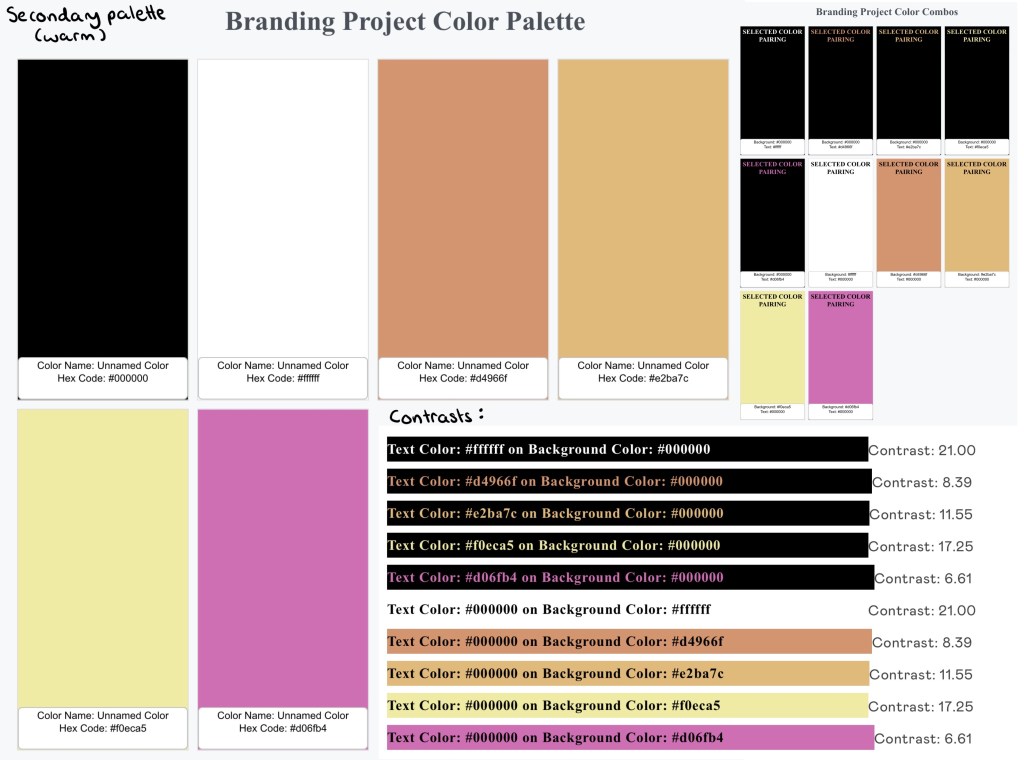
The primary palette will be complimented with accents of the warmer secondary palette. This image shows the colours, compatible pairings and contrasts within the secondary palette:
Typefaces:
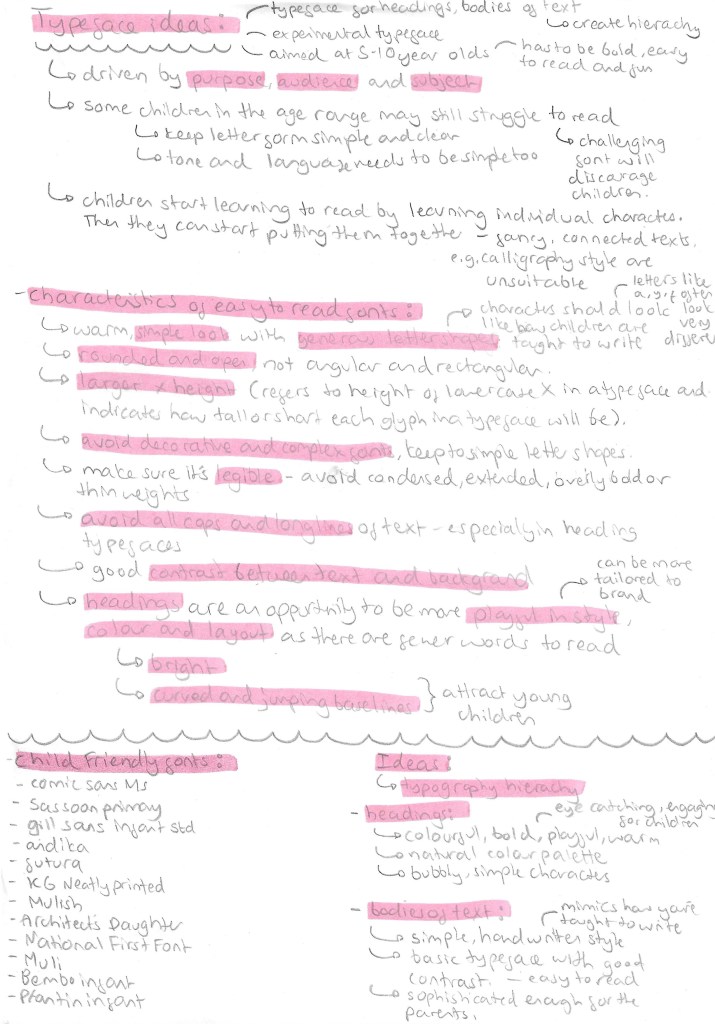
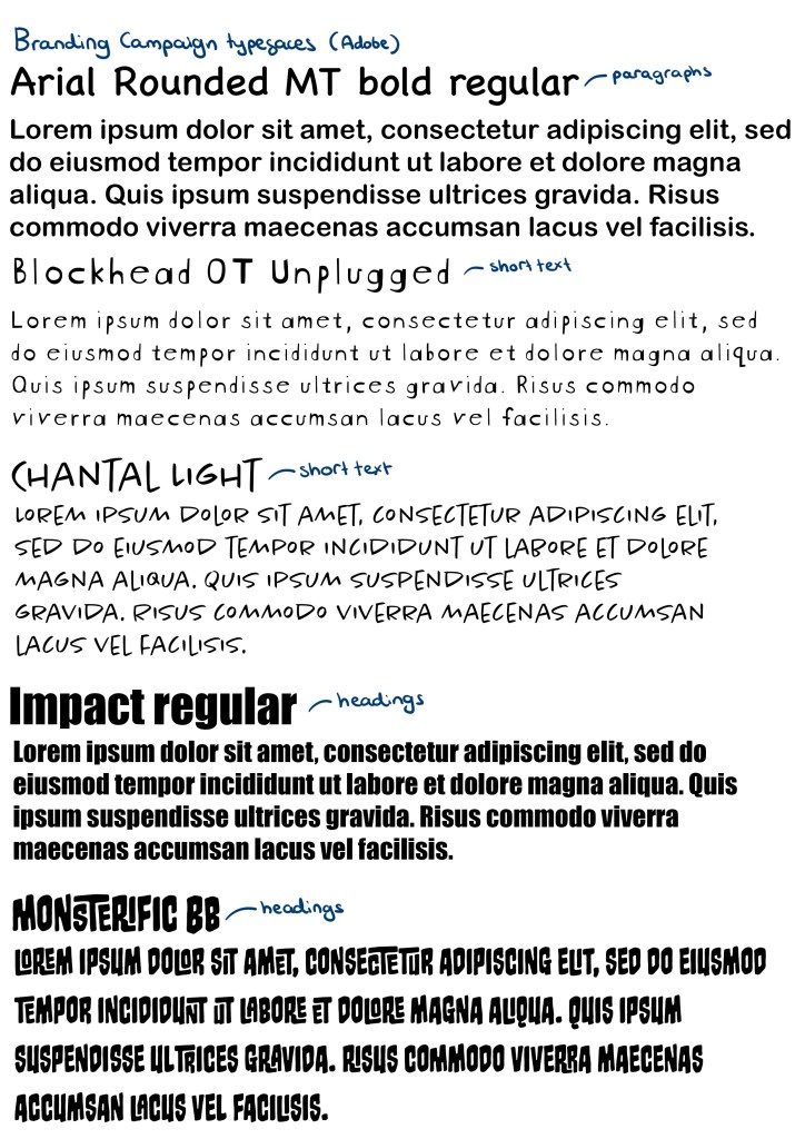
A good set of typefaces for a brand needs at least a typeface for bodies of text, a typefaces for heading and a more decorative typeface. Deciding on good typefaces was important as it needs to be appealing to both parents and children as well as legible to accommodate for children with different levels of reading ability. I looked in the Adobe font stock as I wanted all the fonts I chose to be easily available across Photoshop, Illustrator and InDesign as there are the software I plan to create most of my products. For the paragraphs I chose Arial Rounded MT bold regular. This is a simple typeface with nice rounded edges that give it a friendly appeal. It also maintains a professional look that is aimed at the parents because these larger bodies of text with be information for them. For the shorter bodies of text I’ll use a combination of Blockhead OT Unplugged and Chantal Light. They’re more dynamic and fun with nice simple letter forms that are written in the style that I child would learn to write in. The hand written style is perfect for notes and captions. For headings I’ll use Impact Regular and Monsterific BB. Impact is a rigid bold typeface that is perfect for more professional heading. Monstreific is more decorative and fun so is perfect for title and products I want the children to engage with.
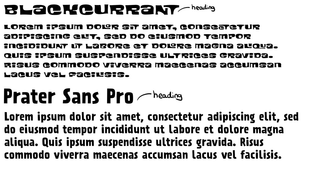
Blackcurrant and Prater Sans Pro are 2 more Adobe fonts I added to my collection of typefaces to use. I had a meeting about my project and got feedback on the typography choices. I was told I needed more heading fonts that reflect the fun and playful theme of my campaign. Impact is too rigid and compact for some headings so I chose a couple other options.
Logo:
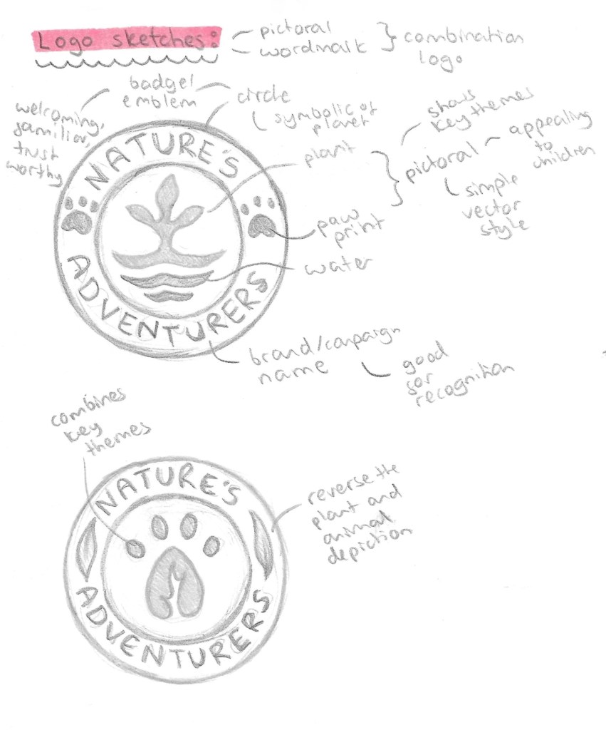
The style of logo I wanted was a combination logo that has an image and the brand name. This is ideal for starting businesses and campaigns as it gets people familiar with the image and the name, improving recognition and in the future 1 element could be removed and leave other. I also wanted it to be en emblem style and resemble a badge so having an image in the middle with the name curved around it. This will then make it perfect for merchandising. Below are a couple sketches I did of ideas with annotations for the reason behind the design choices.
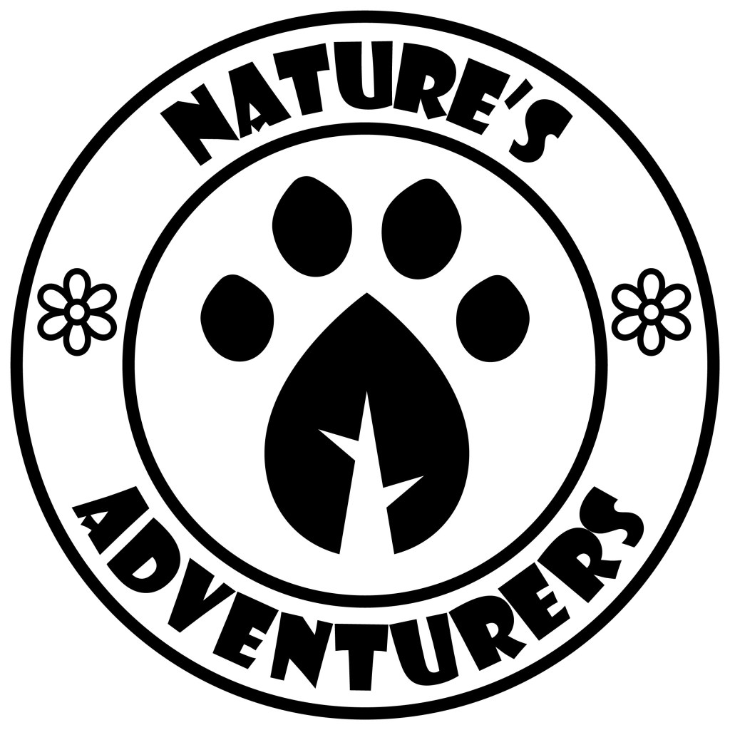
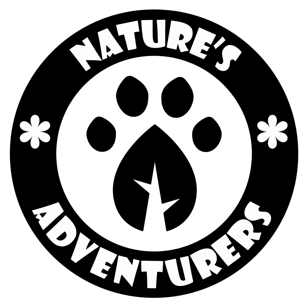
I then combined the designs into this logo which I made of Adobe Illustrator mostly just using the shape tools, pen tool and pathfinder tool. I made it in black and white because it’s important that the logo works in grey scale before introducing colour as colour is such a powerful tool for messaging. I used Impact for the typeface as it’s bold and legible even from a distance.
These versions are made with white and just dark green or black. They won’t be the official coloured logo but it’s good to have a couple variants of the logo with minimal colour to use on certain formats and merchandise.
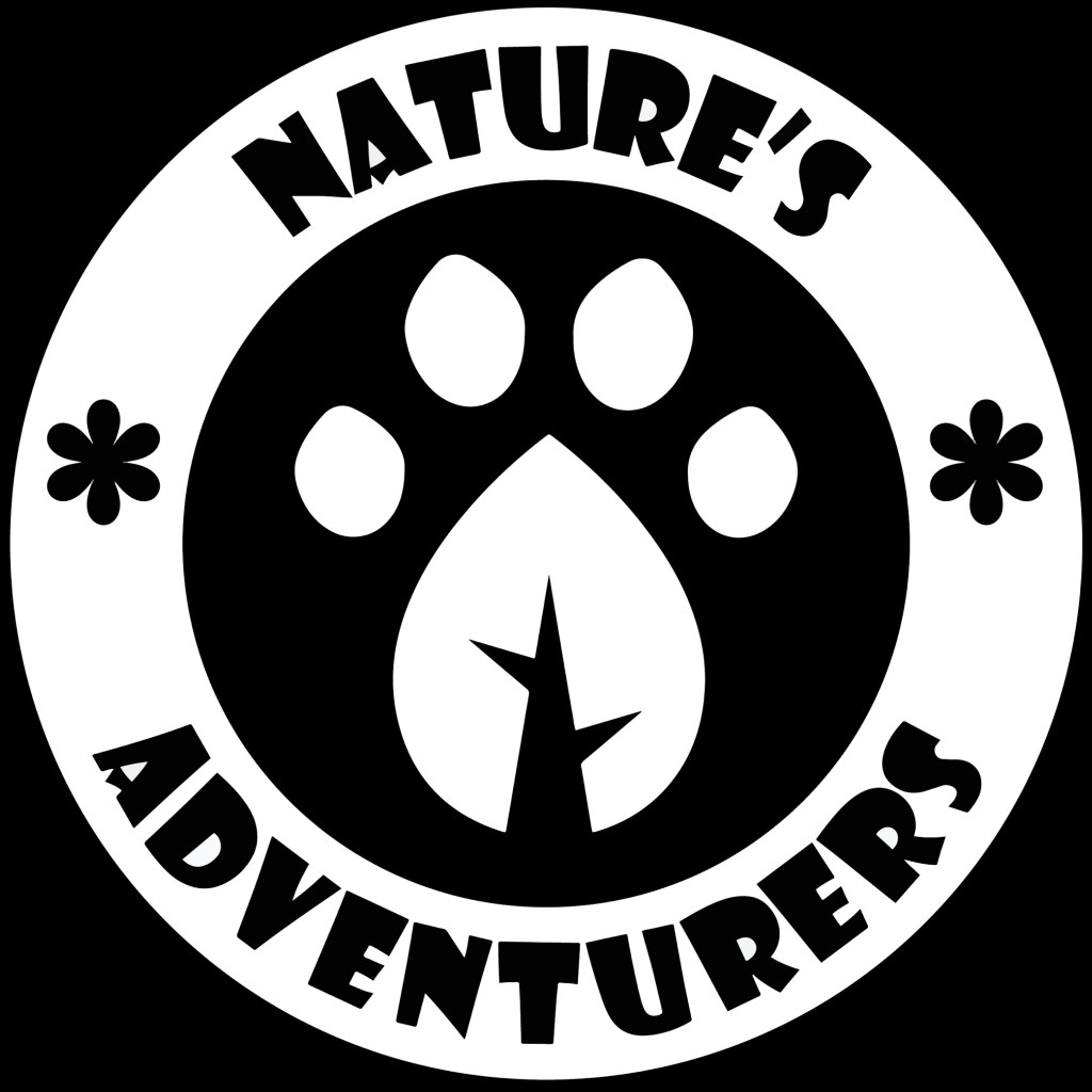
I took the paw print leaf design out of it logo and will use this as the most reduced emblem of the campaign. This is in the same way that brands like Puma have their logo with the symbol and brand name but often they only use the symbol. I really like the design that I created and think it will work well across all formats. This is the submark logo.
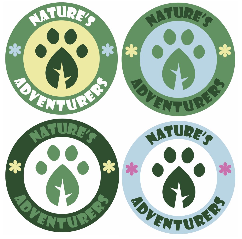
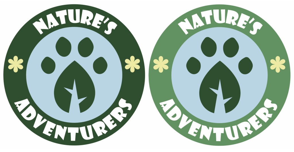
Here are 4 full coloured versions made using colours from the colour palette I made, this means they will work on screen and in print.
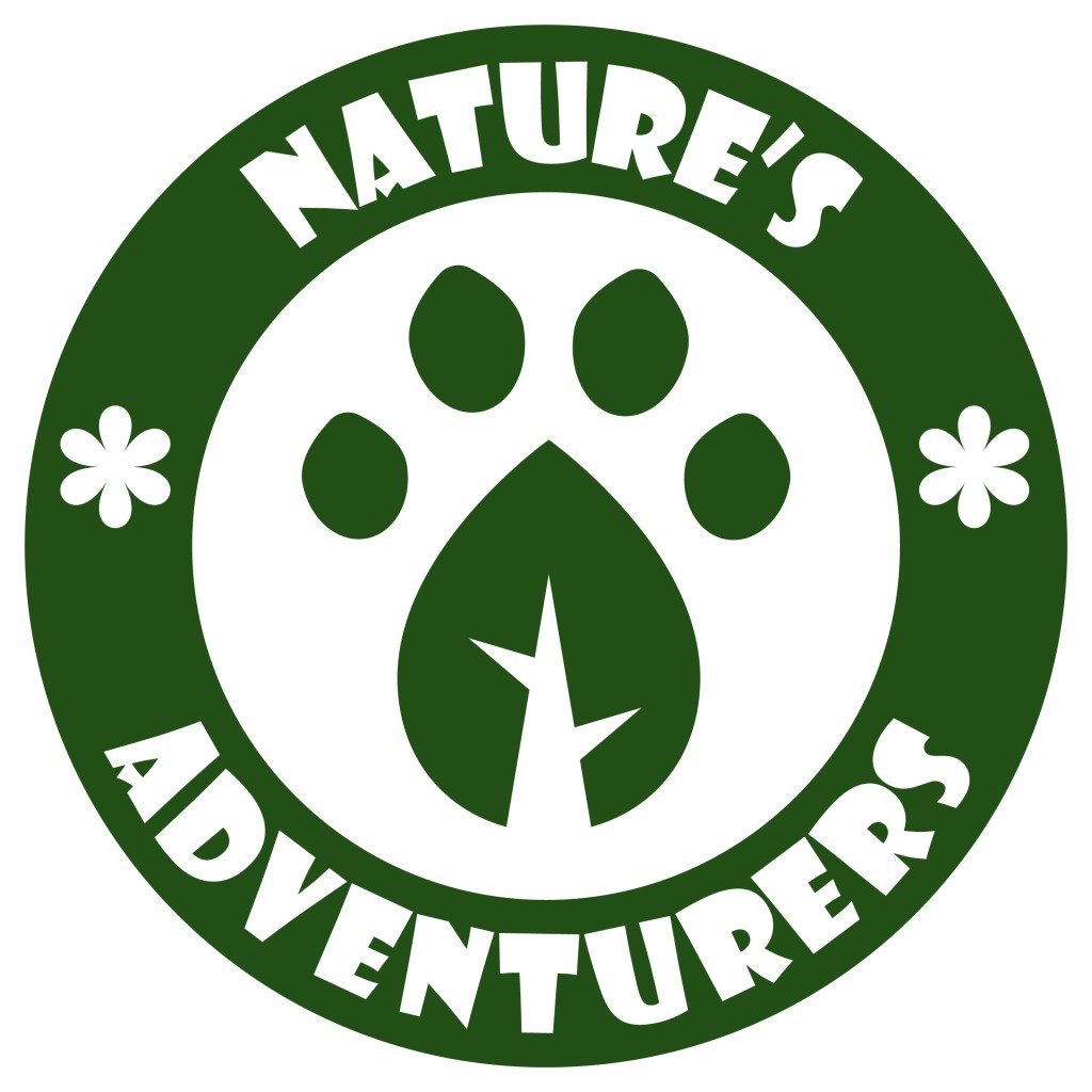
These are my favourite 2 variations of the coloured logo, they have the same layout of colour just with different shades of green. I am struggling to decide which one to use so I’ll ask a range of people and try test the logo on my target audience to get feedback. The green and blue work well together and create a natural and welcoming look. I think the small yellow flowers add a warmth to the logo. I’m happy with the image in the centre and I was able to combine an animal paw print and a leaf to make a single image which translate the themes of the campaign.
After thinking about it and asking a range of people, I chose the logo on the right to be the main logo of the campaign. The feedback I got was that the lighter green outer circle is more welcoming and fun and made the paw print leaf stand out more. I then took the logo and vectorised it in Adobe Illustrator using the image trace tool so it’s scalable. This means I can change its size and the image won’t lose quality and become pixelated. This is ideal for a logo because you can put it on a big billboard or a small badge and it will have the exact same quality.