In the last couple of sessions we looked at static and sequential imagery and how to add actions and sound to a sequence. This week’s session was focused on action and interaction, by looking and different events on social media. It’s all about the companies creating something to get the consumer to interact. We looked at several types of comparisons, different events from similar categories, different social media platforms, different areas and different posts from same organisation. We looked at TikTok and Instagram as our social media platforms. Some of the organisations we researched were Coachella, Reading, Glastonbury and the Serpentine Gallery. This is relevant to our project as one of the outcomes we need to produce is a social media video, for Instagram or TikTok, so this is the type of research that we’ll need to do related to our industry/ event type. Below are all my notes that I made during the session and in my independent research:
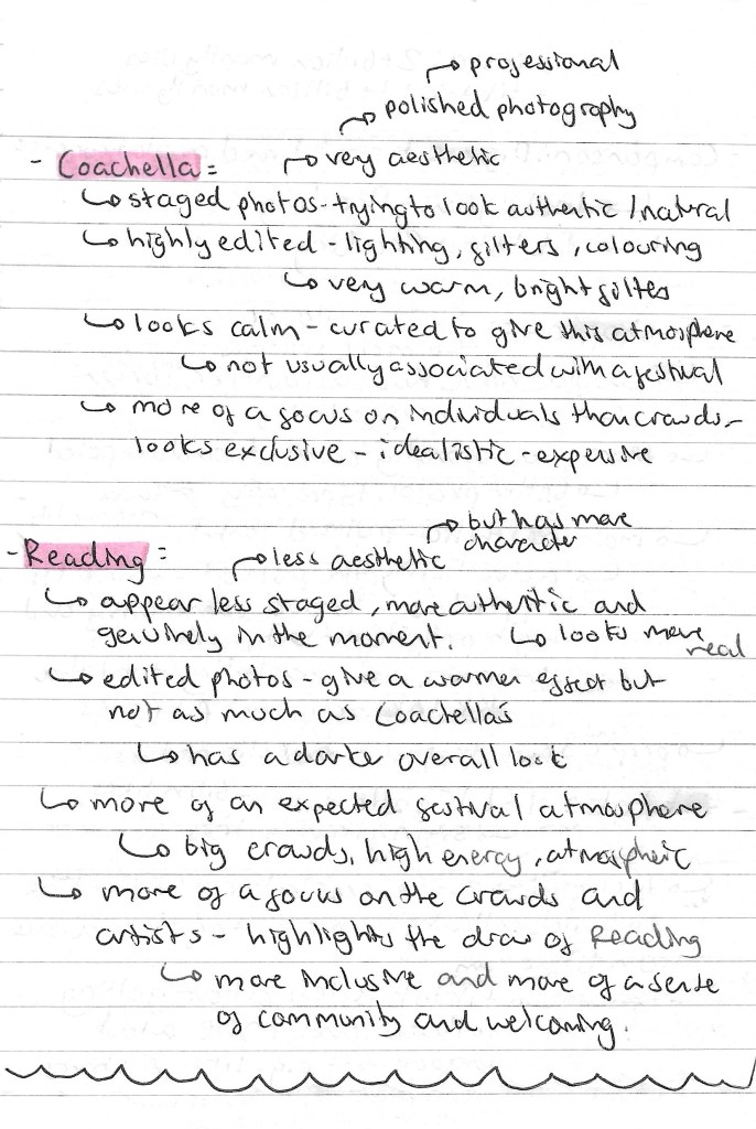
Comparing different organisations : Coachella Instagram vs Reading Instagram:
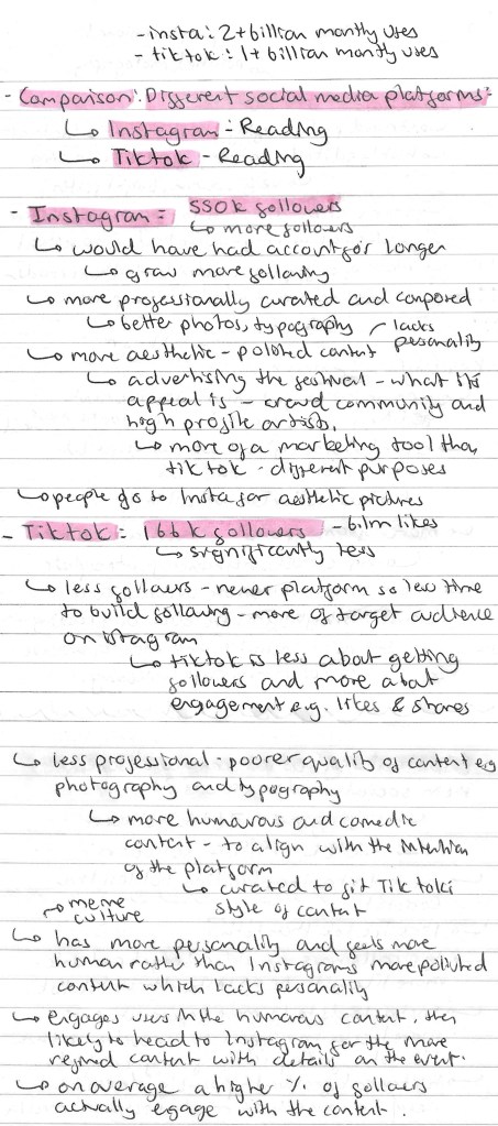
Comparing different social media platforms: Reading Instagram vs Reading TikTok:
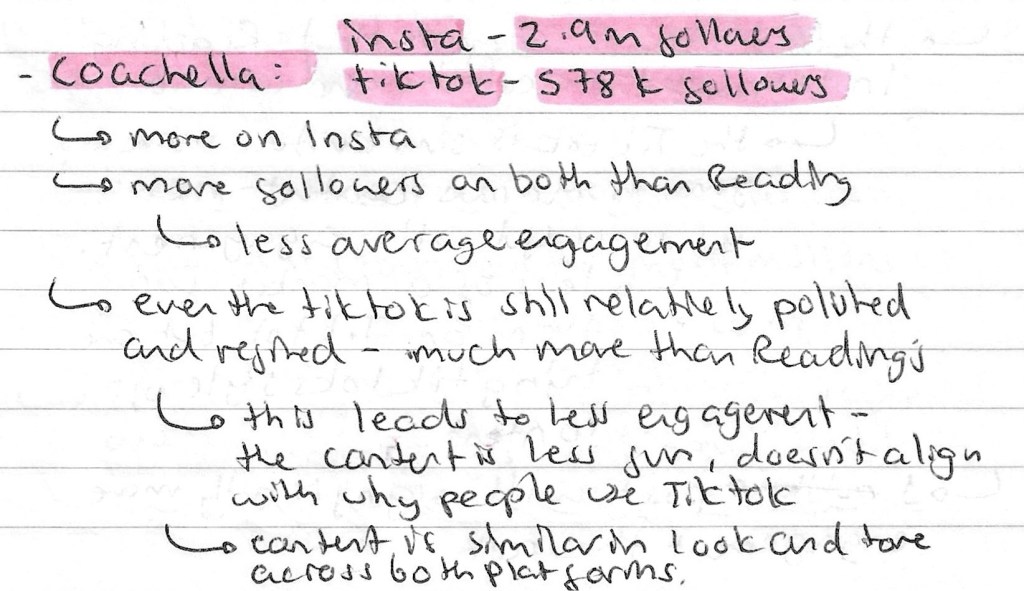
Comparing different social media platforms: Coachella Instagram vs Coachella TikTok:
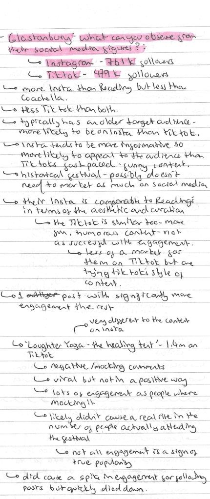
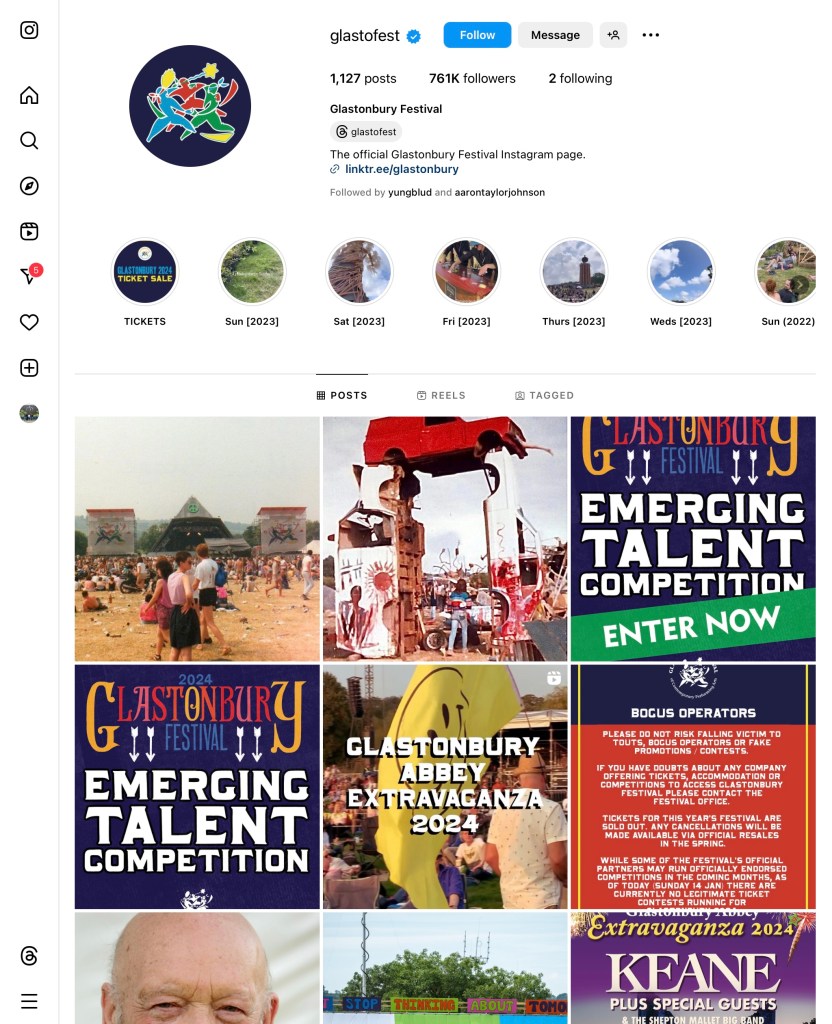
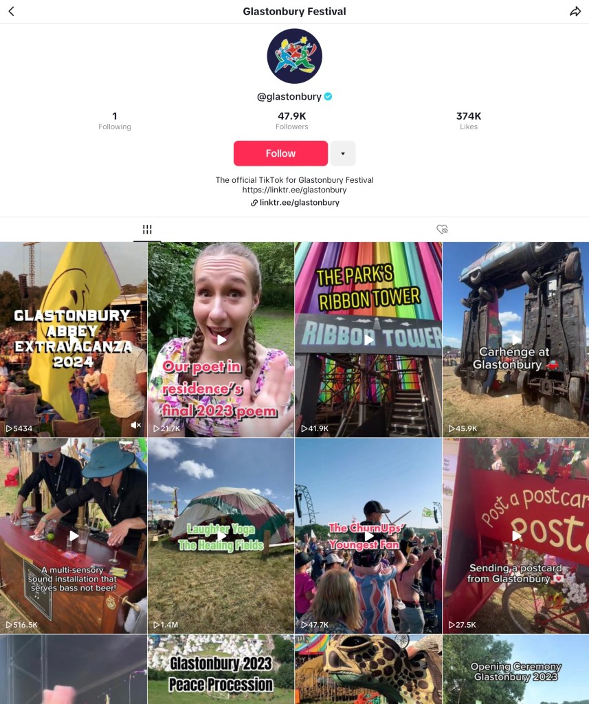
Comparing different social media platforms: Glastonbury Instagram vs Glastonbury TikTok:
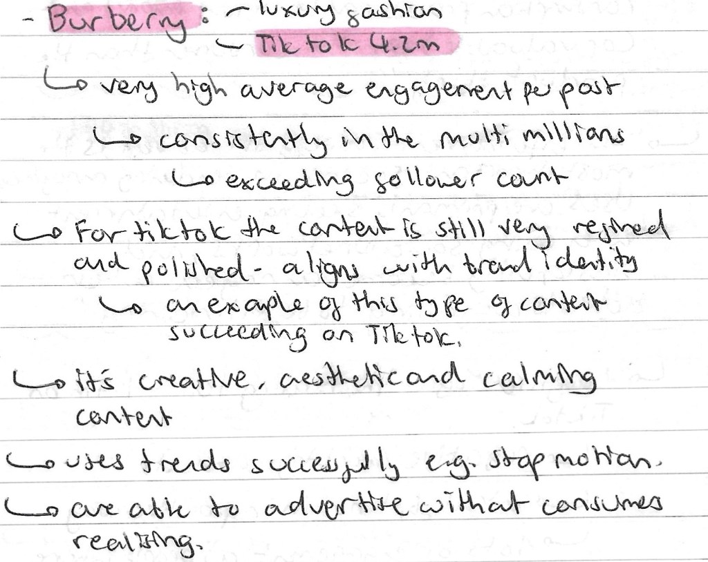
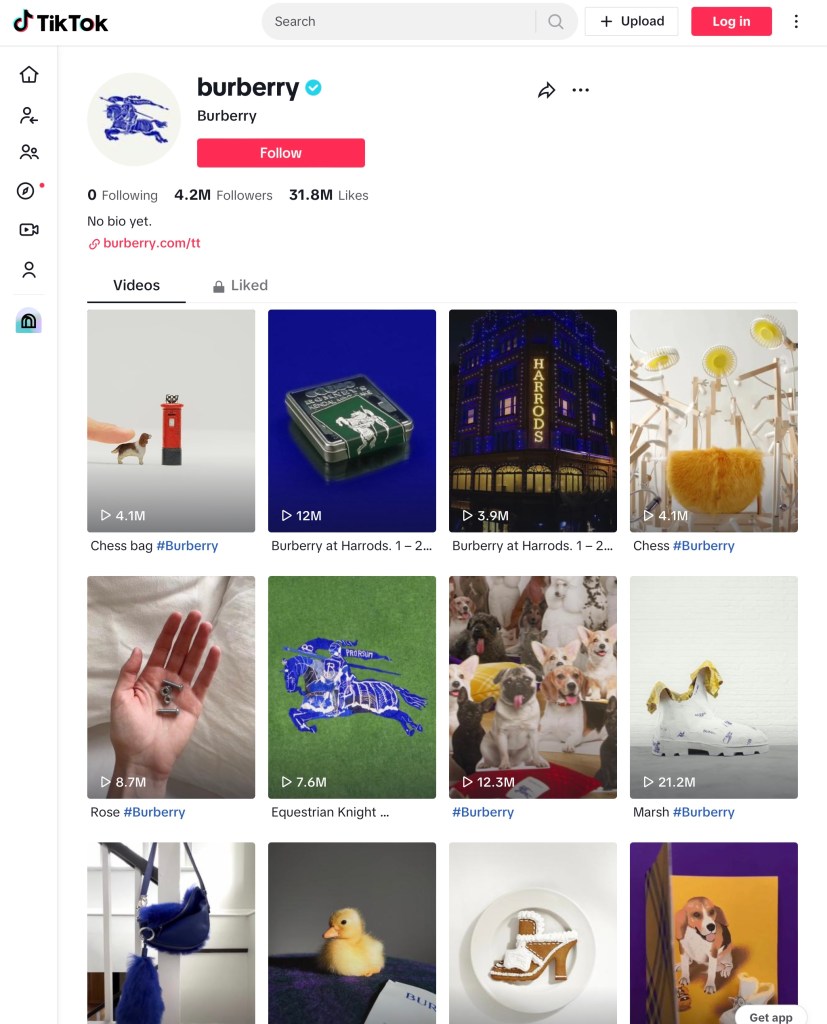
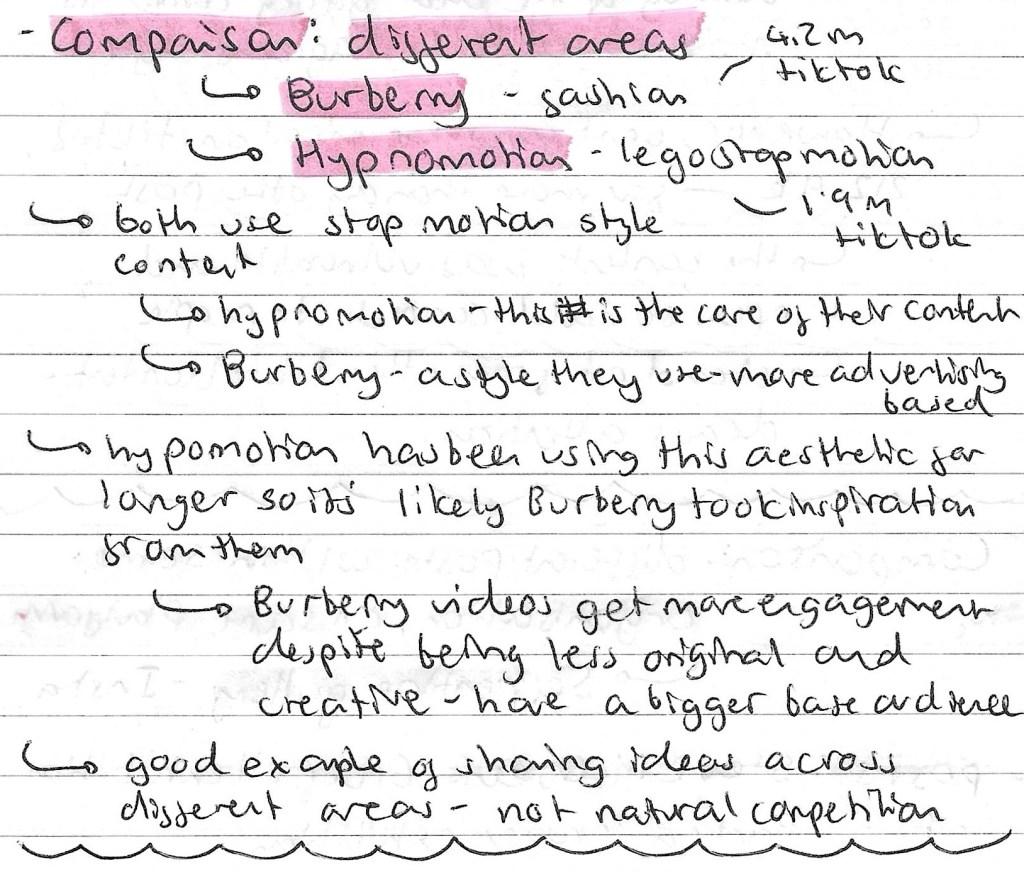
Comparing different areas: Burberry TikTok vs Hypnomotion TikTok:
Comparing different social media platforms: Serpentine Gallery Instagram vs Serpentine Gallery TikTok:
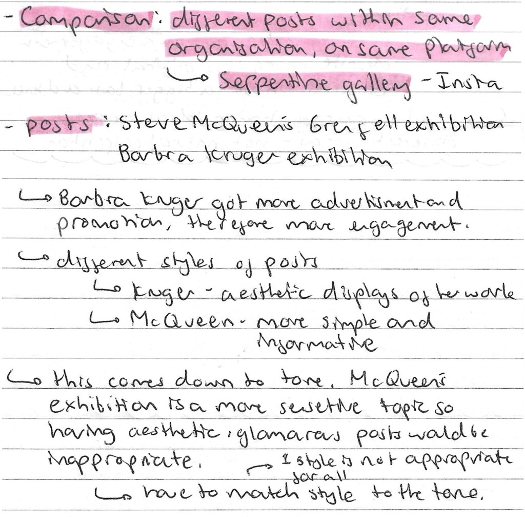
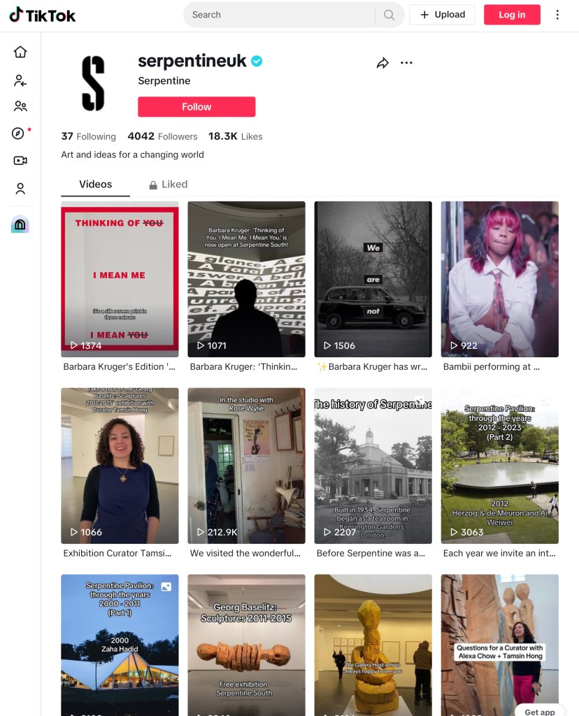
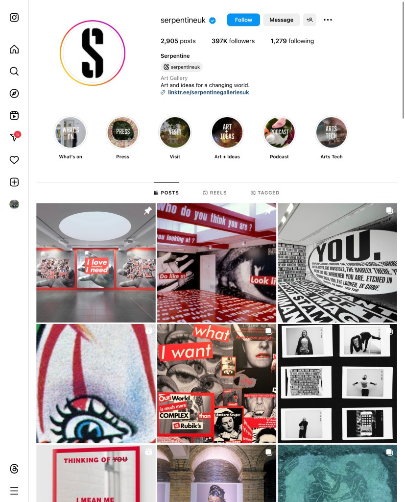
Comparing different posts within same organisation: Serpentine Gallery Instagram:
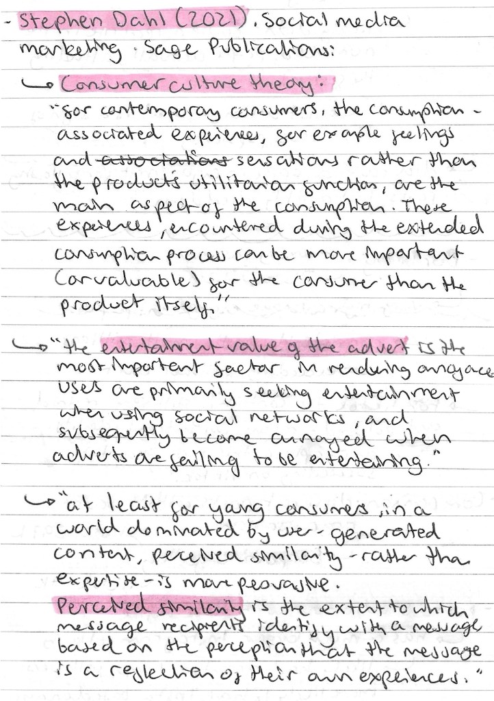
Stephen Dahl: he works in social media marketing at Sage Publications. Below are some of quotes from him about consumer culture theory:
Reflection: this session was interesting and has taught me lots about social media marketing. I learnt about the companies we looked at but more importantly I now have a better idea of how to research social media platforms in order to inform my creative decision making in the project. This type of research will help me better target my work to the relevant audience for a specific industry, product or event.
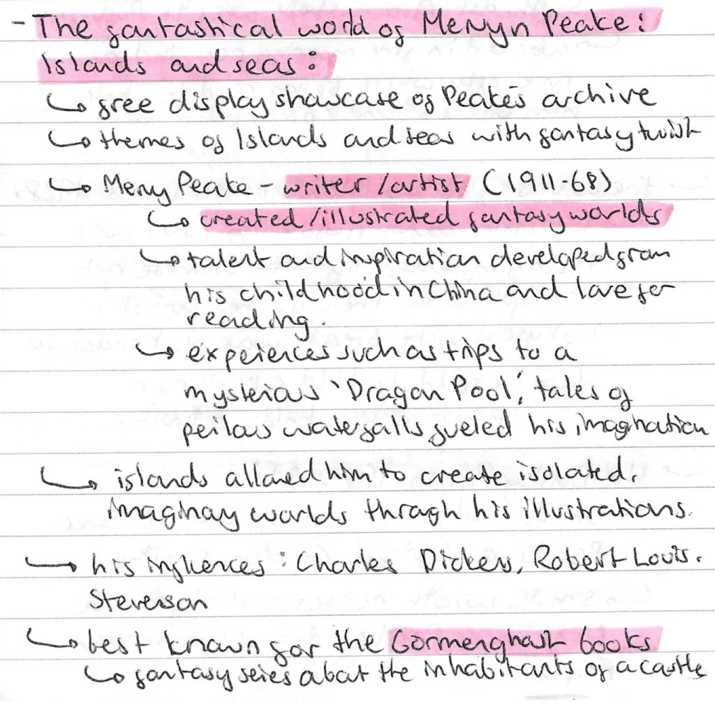
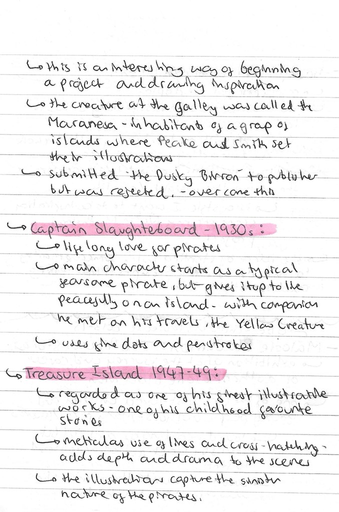
We visited the British library as a chance for us to engage with, critically respond to and document wider contexts of visual research. I went to the Malorie Blackman and Mervyn Peake exhibitions, 2 people who I didn’t previously know of. Below are some notes about the different choices of galleries we could visit:
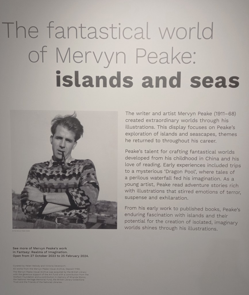
The fantastical world of Mervyn Peake: Islands and Seas
This was a free display showcase of Peake’s archive with images all centred around the themes of the seas and islands with a fantasy twist.
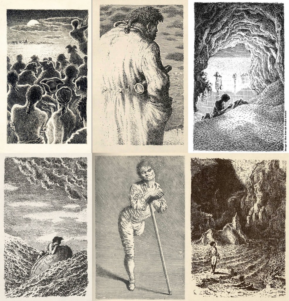
These are a series of photos of Mervyn Peake’s work. They’re a combination of ones I took at the exhibition and ones I collected after when doing additional research:
Gormenghast: Peake’s most famous work- a fantasy series about the inhabitants of a castle
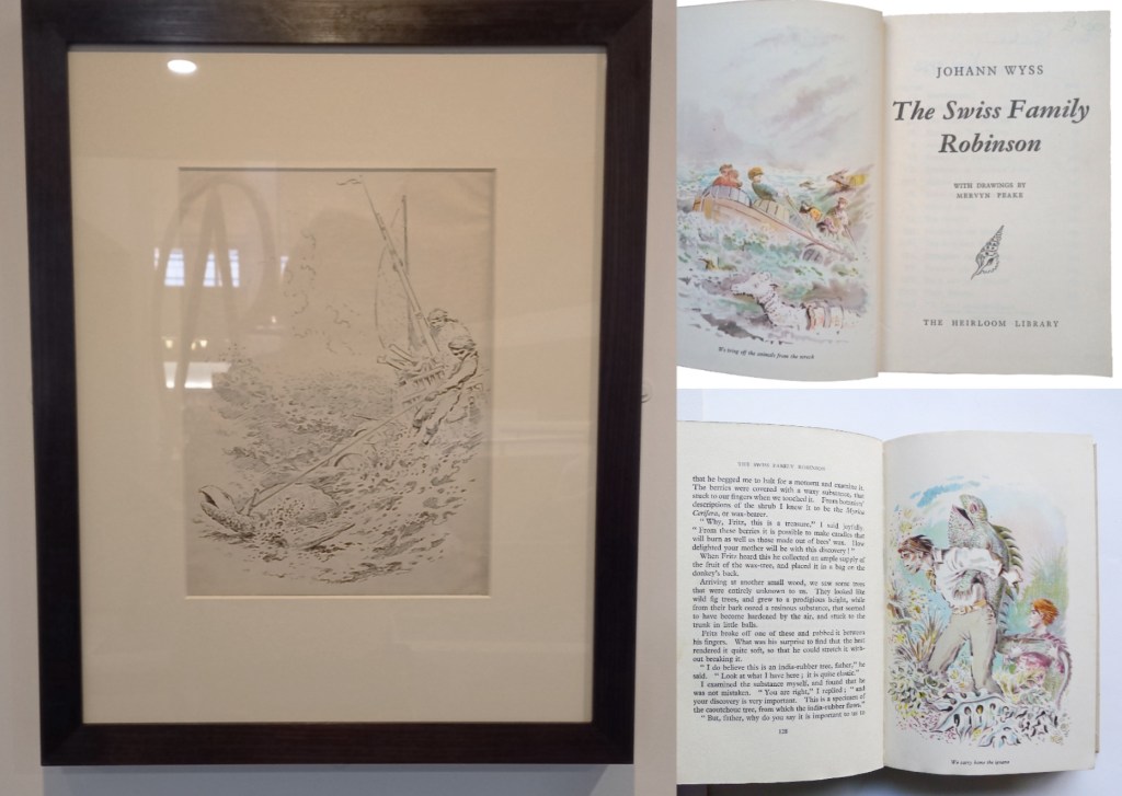
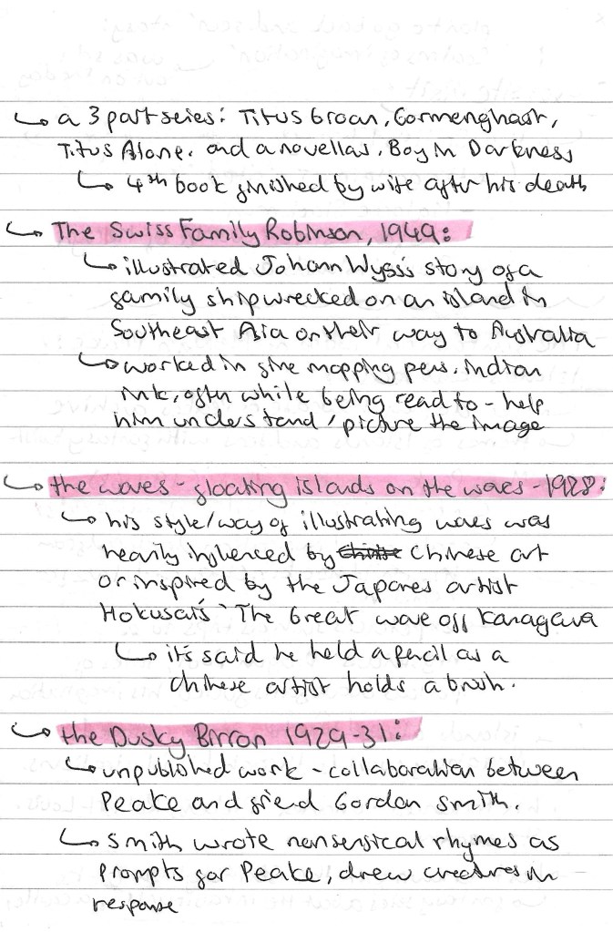
The Swiss Family Robinson:
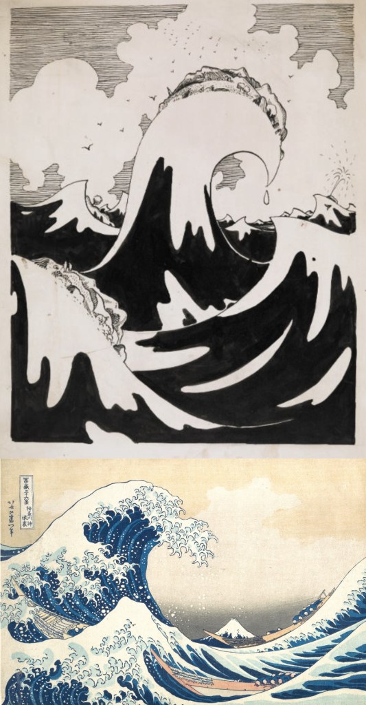
The waves:
Captain Slaughterboard:
Treasure Island:
Notes I made after the visit about the different collections that where at the exhibition:
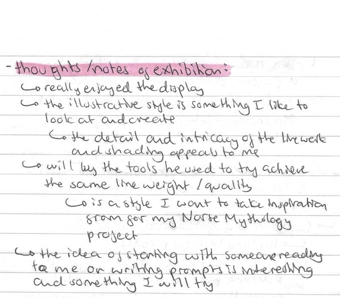
Reflection: I really enjoyed learning about another illustrator and getting to see some work from his archive. I like his illustrative style and the fine quality of the line work and shading. This is a style I would like to experiment with and bring into my own project. His Treasure Island project is my favourite of his work as he uses lots of intricate hatching to build up the details and depth. Also Peake said that he would often illustrate a text as someone was reading it to him. This is a similar approach to what we did in one of the workshops and could be an interesting way of trying to illustrate the Norse myths.
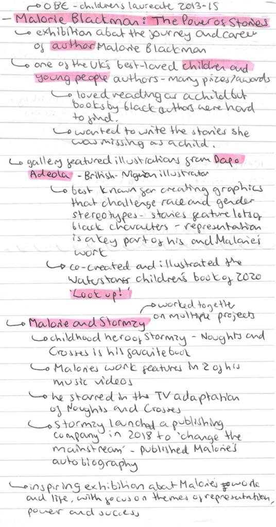
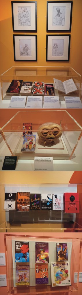
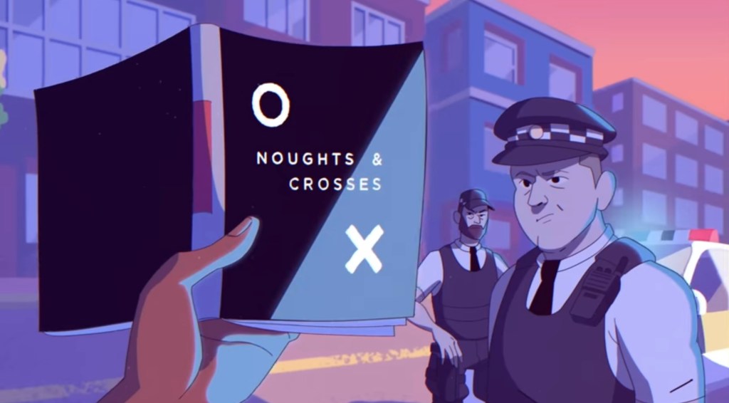
Malorie Blackman: The Power of Stories: this was an exhibition all about the life and work of Malorie Blackman who is a British writer who was Children’s Laureate from 2013 to 2015. She primarily writes literature and television dramas for children and young adults. A common theme in her work is using sci fi to explore social and ethical issues. For example ‘Noughts and Crosses’ is a fictional adaptation of Britain that she uses to explore the theme of racism.
Here are some notes I took while at the exhibition:
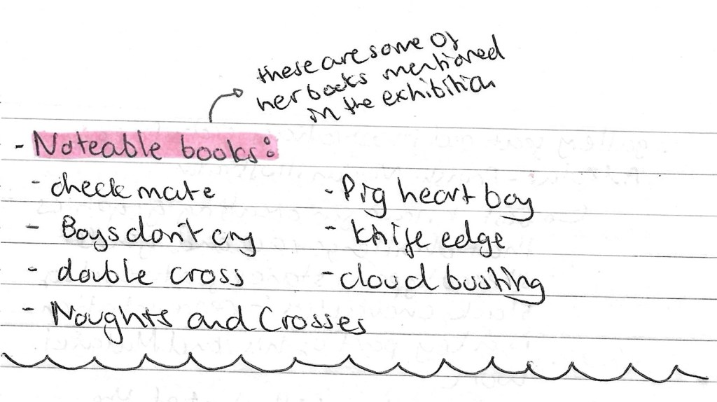
This is a list of some of her most well known books and television dramas:
These are some of the photos I took from the exhibition:
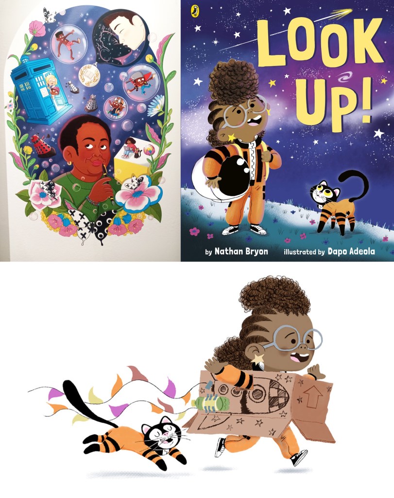
After visiting the exhibition I researched some of her publications and found she regularly works with the Dapo Adeola, a British-Nigerian illustrator who has a really fun and cute style. His work often explores space to tackle issues such as race and gender stereotypes. I like the stylised characters and think they work well alongside his strong use of colour.
This is a screenshot from the music video to Stormzy’s song ‘Superheroes’ where he references Malorie Blackman and her book ‘Noughts and Crosses’. Stormzy had said that this was his favourite book and that Malorie is a huge inspiration for him.
Fantasy Realms of Imagination: this was another exhibition at the British Library. I wasn’t able to visit it on the day as the tickets where all sold out but I have booked tickets to go at a later date as I feel like the topic and style could provide good inspiration for my Norse Mythology project.
This visit to the British library was very interesting and I got to learn about an illustrator and author that I didn’t know about before. The exhibition about Malorie Blackman was really inspiring and uplifting as there was a lot about perseverance and tackling social issues. I really enjoyed looking at the display of Peake’s work as I like his illustration style and would like to incorporate that type of hatching and mark making into my Norse Mythology project.
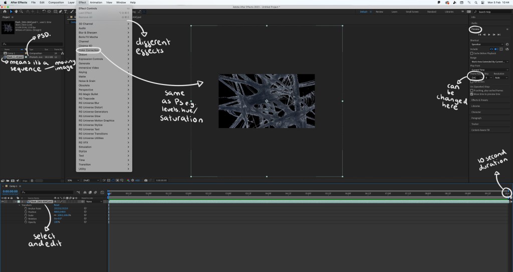
Prior to this session I had never used After Effects but it is something I had been wanting to learn for a while. I would like to incorporate this software into the production of my project in some way to help me learn how to use this animation software.
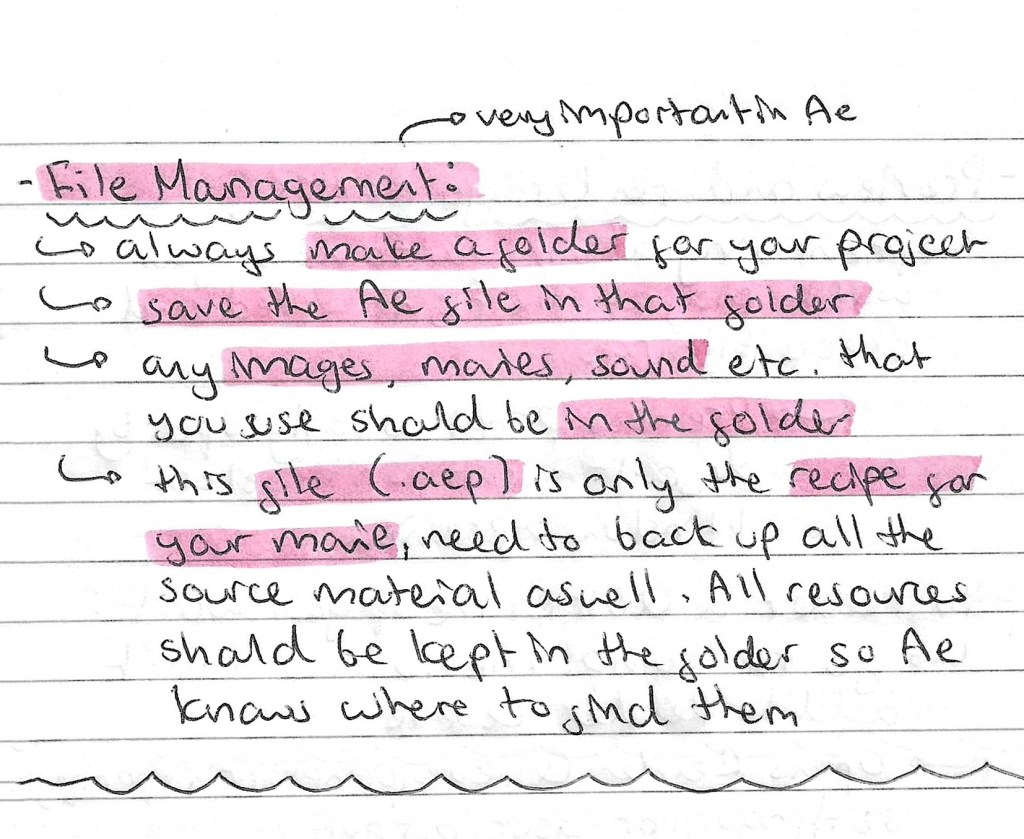
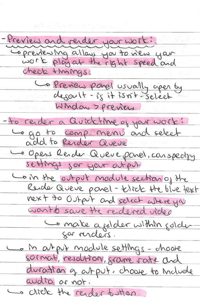
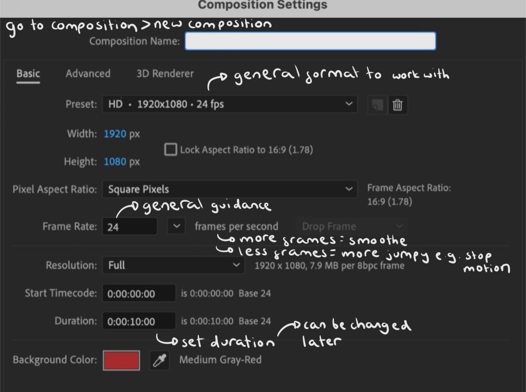
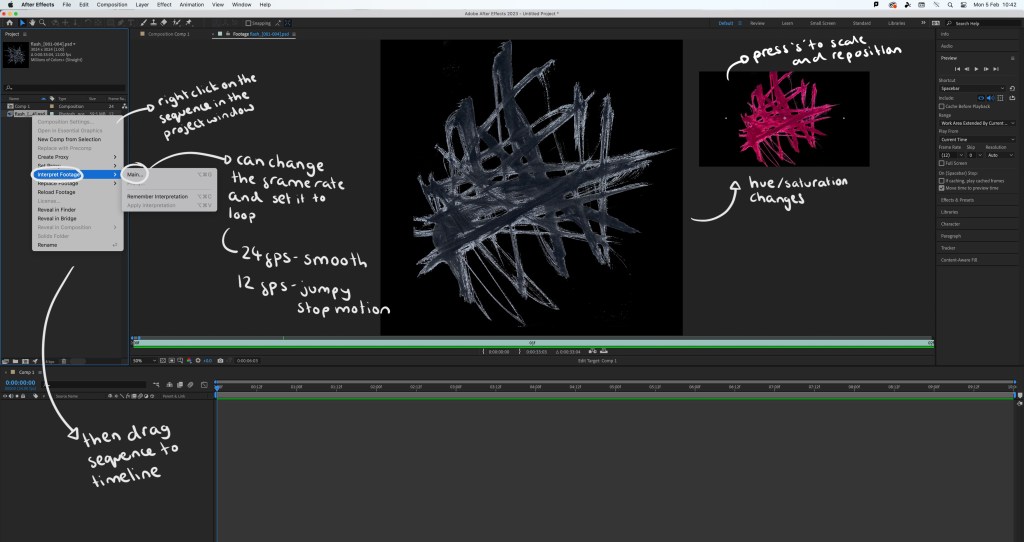
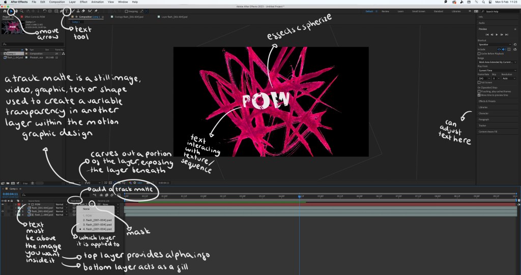
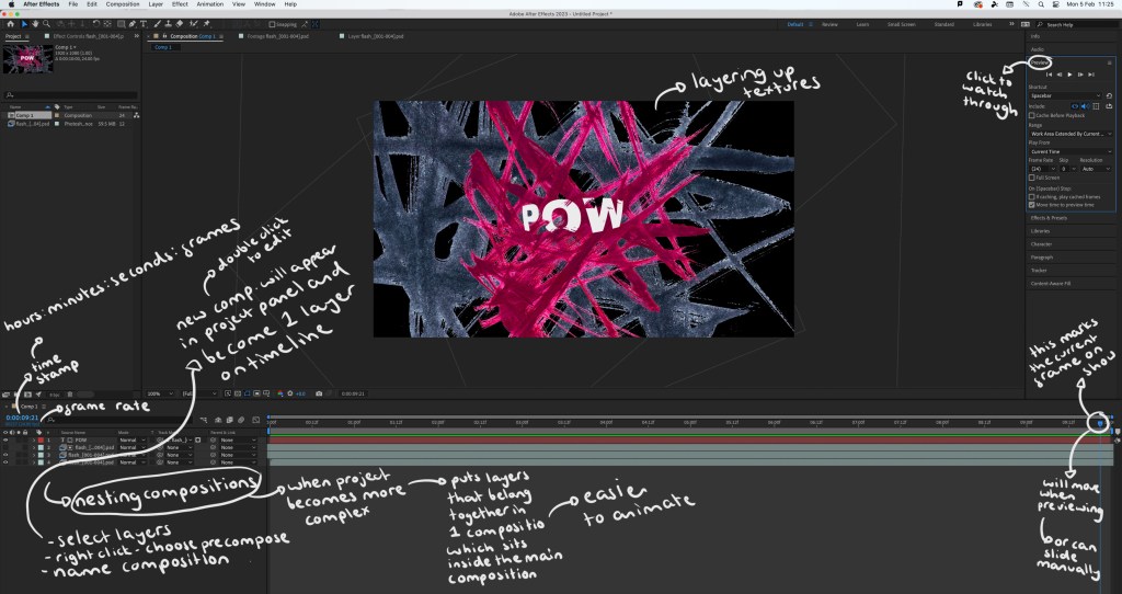
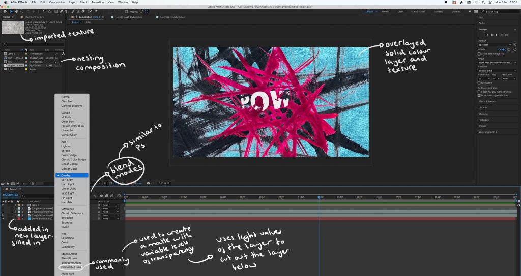
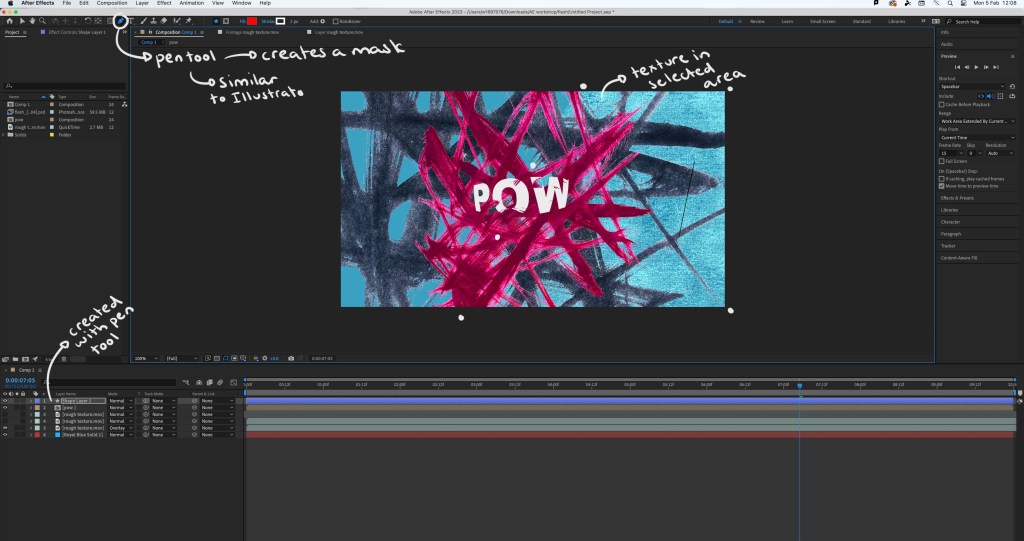
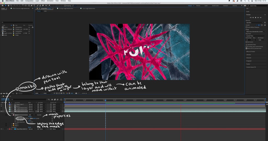
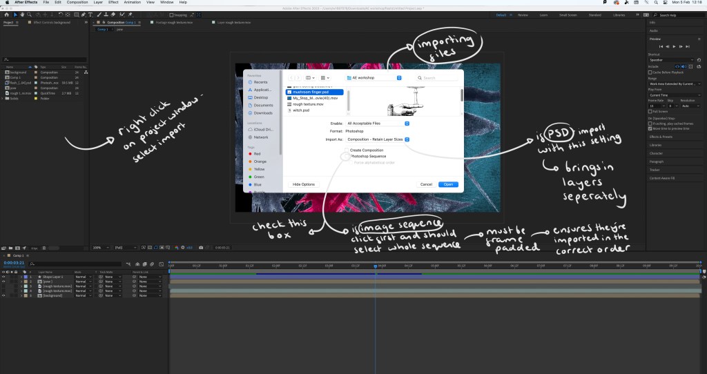
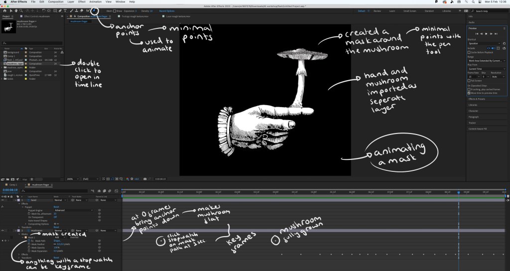
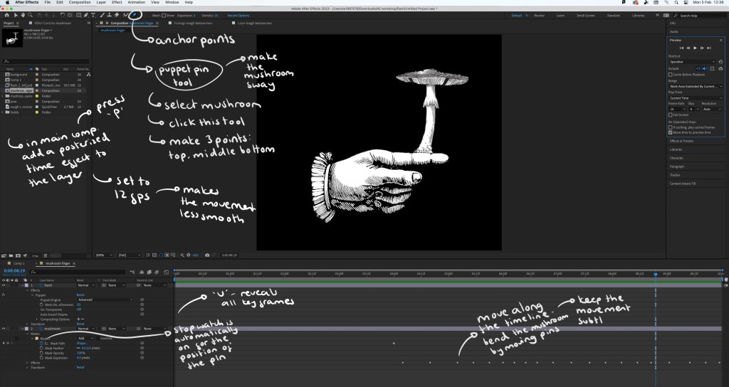
Notes on file management, key framing and rendering:
Screenshots from the session with annotations:
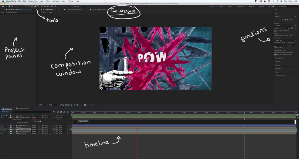
Interface:
Step by step guide:
The video I made during the workshop: while this video is relatively simple, there’s a lot of effects and editing that went into making it. By doing this simple exercise I learnt a lot about the basics of using After Effects. The most interesting things I learnt doing this was how to create and animate a mask which can be seen as the mushroom grows and the wiggle code that allows an asset to shake. I did find the workshop challenging as it’s a way of working that I’m not used to but it taught me a lot and I’m satisfied with the outcome.
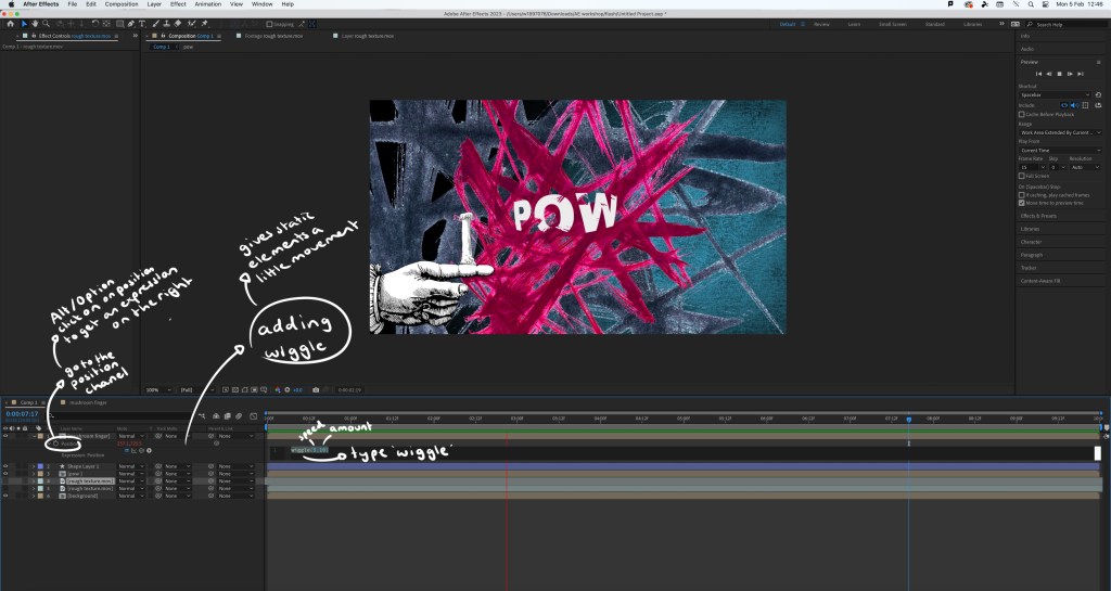
Extra experiments: after completing the workshop I practiced the things I learnt by adding effects and animated elements to the digital collages I made on Photoshop. This gives the static assets a new dimension and can help make a composition more playful.
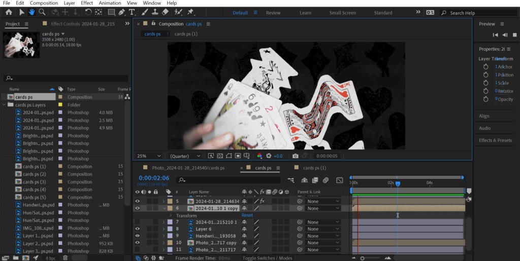
1. As Photoshop and After Effects are both Adobe softwares I was able to share the PSD file directly with After Effects so all the elements and assets were on individual layers, making it easy to animate certain parts. For this piece I added a strong wiggle code to the printed textures behind the cards, making them aggressively shake and make the composition more dynamic. Adding a wiggle is an easy effect, it just requires 1 line of code. Also I used puppet pins to manipulate the cards, making them flow. I’m happy with this piece, I was able to create a smooth animation which pushed my skills with the puppet pin tool.
2. For this one I also used the puppet pins to create smooth, subtle movements of the plants. I used the transform command to animate the characters moving up. I made each movement smaller to create slow and steady movements as a way of building on the calm atmosphere of the collage. I found creating smooth movements challenging but after multiple tries I’m happy with the result.
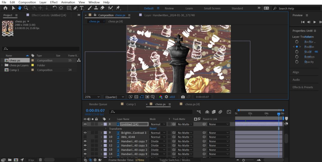
3. This is the most simple of the animations. I just added a wiggle code to the white chess pieces in the background. I made this wiggle fast and over a small distance to create an intense shake. I did this to make it seem like the ghost pieces where annoyed, adding a more playful element to an otherwise static image.
Reflection: Overall I found this workshop challenging as it was an introduction to a complex animation software that I’d never used before. I was able to learn a lot about the basics of the programme and am not comfortable with the how to set up a project, the interface, the basic features and some more specialised animating commands. I think the most interesting and useful tools I learnt about were the puppet pin tool and creating/animating a mask. I’m happy with the outcome I made from the workshop, especially the animations I added to my digital collages. For the project I was to choose something that gives me the opportunity to explore animation and advance my skills and knowledge of After Effects.
Inspiration from Handymartian, Troy Browne and Socha animation:
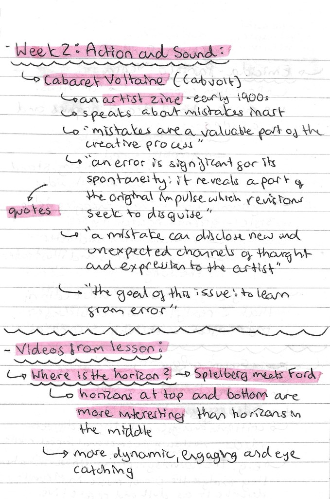
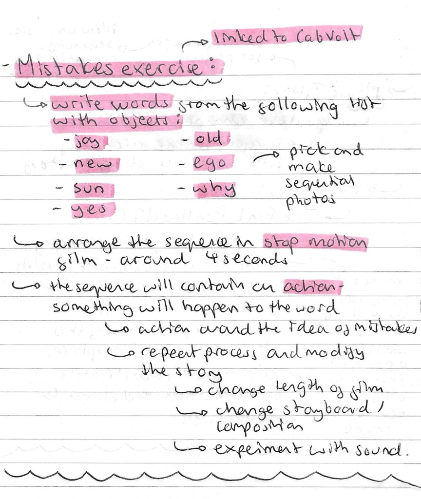
After last week’s session on static and sequential imagery, we looked at the action and sound of a sequence. This session was all about way of adding elements to a sequence to make it more engaging and enjoyable for the viewer. We first looked at an artist zine from the early 1900s called Cabaret Voltaine (Cabvolt). The message of the zine was about the importance of mistakes in an artists’ creative process. This links to the task we had later on in the session. The zine and my notes about it can be seen below:
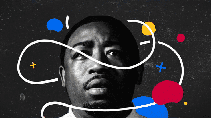
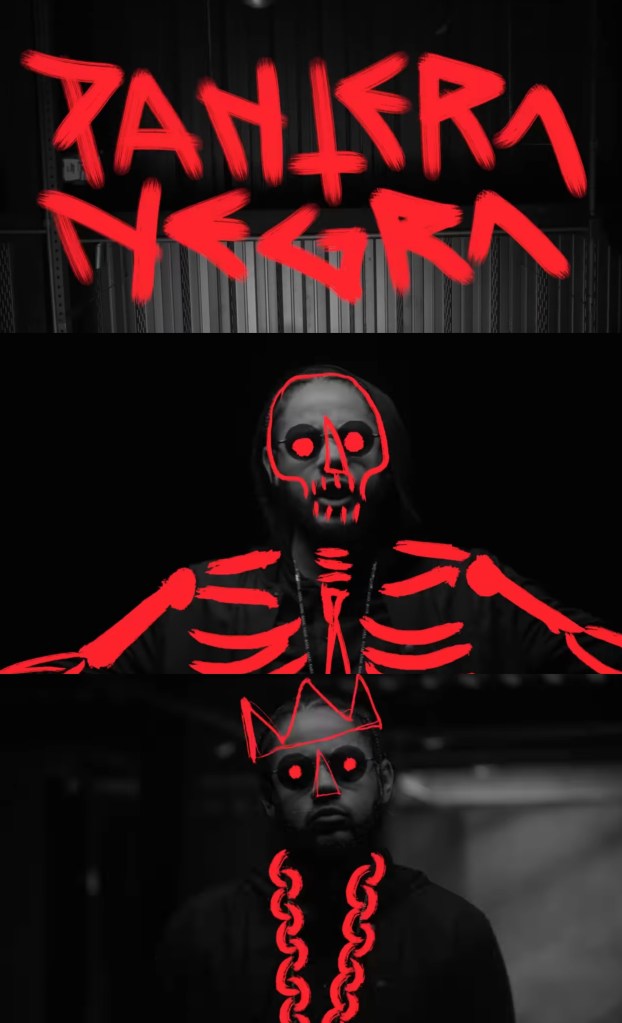
Videos: then we started to look at different examples of videos to analyse the sequencing, actions and sound. My favourite one we looked at was a music video by Brazilian rapper Emicida titled ‘Pantera Negra’ meaning black panther in Portuguese. I like the limited colour palette of black, grey and red. This emphasises the title and the contrasting red is really eye catching and bold. The visuals are nicely synced to the song, sometimes with the lyrics and other times with the beat. The stand out part for me is the combination of photography and hand drawn overlays. This is a style I really like and would consider incorporating into my project work. Below are some screenshots from the video and som notes I made about it:
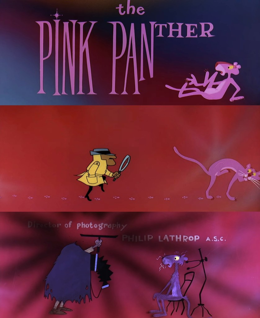
Movie titles: we also looked a some title sequences from the YouTube channel ‘Movie Titles’. These are a really good source of inspiration as they focus on music and actions. They are sequenced in a way to be engaging and capture the viewers attention, something that we’ll need to do for our social media videos (sequential outcome). My favourite of the ones we looked at was the Pink Panther title sequence from 1963. I like the fun and playful way that the characters interact with the credits. Below are some notes and screenshots from the video:
Mistakes task: this was our main task for the session and links back to the ideas seen in the Cabvolt zine. We had to pick from a selection of words and write it with random objects. Then we needed to create a stop motion sequence out of this word. The stop motion sequence needs to contain an action, something has to happen to the word.
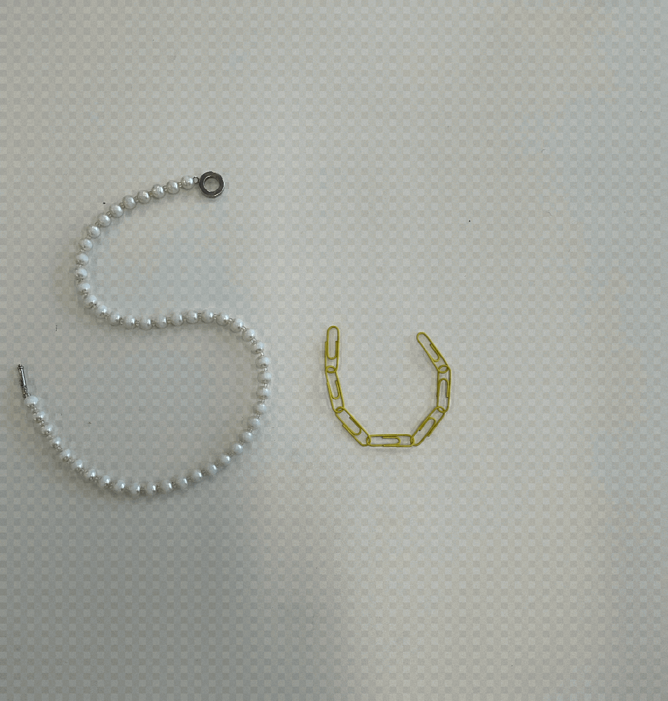
This was the first sequence that I made. I chose the word ‘SUN’ and made it out of a pearl necklace and a chain of yellow paper clips. I created the stop motion sequence of Procreate. The action in the sequence is the paper clips moving to go from ‘U’ to ‘N’. The idea behind this movement was to symbolise a sunrise and sunset. The movement isn’t particularly smooth but this plays into the idea of allowing mistakes and imperfections to be in your creative process.
The second word I chose to do was ‘NEW’, which I made entirely out of paper clips. I used a range of different colours but made one fade into another to add another element of interest to my sequence. My thought process behind the action was to make the word appear from nothing so the action symbolises the word. I chose to make the canvas grow with the word to further emphasise this idea. I also made this stop motion sequence on Procreate.
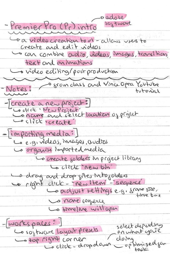
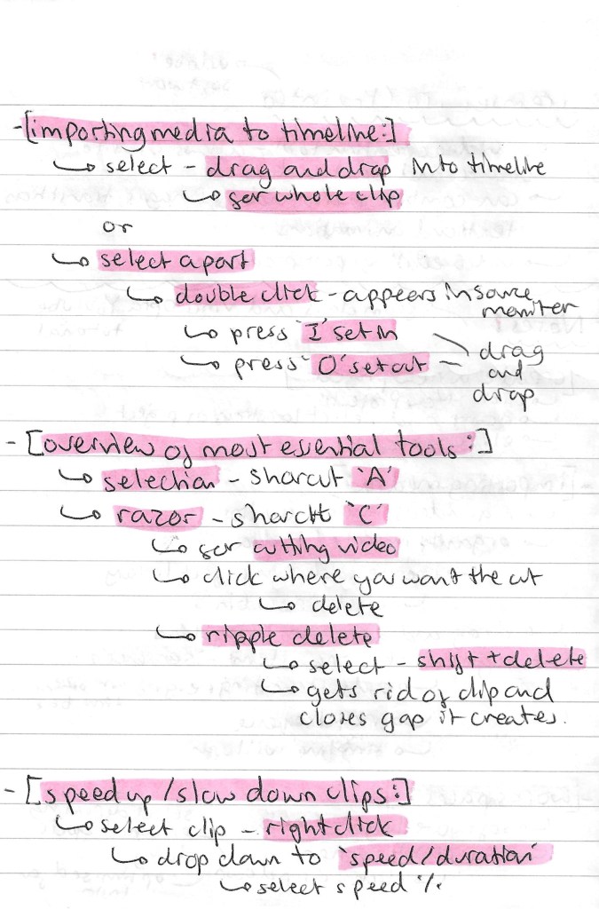
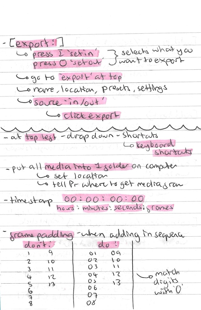
Premier Pro: Adobe Premier Pro is an industry standard video editing software that I haven’t used before. It’s a very powerful tool so we could be used to make our social media videos. We had an introduction to the software during the session which was helpful but I felt I needed more in depth knowledge so I watched some extra videos after the lesson.
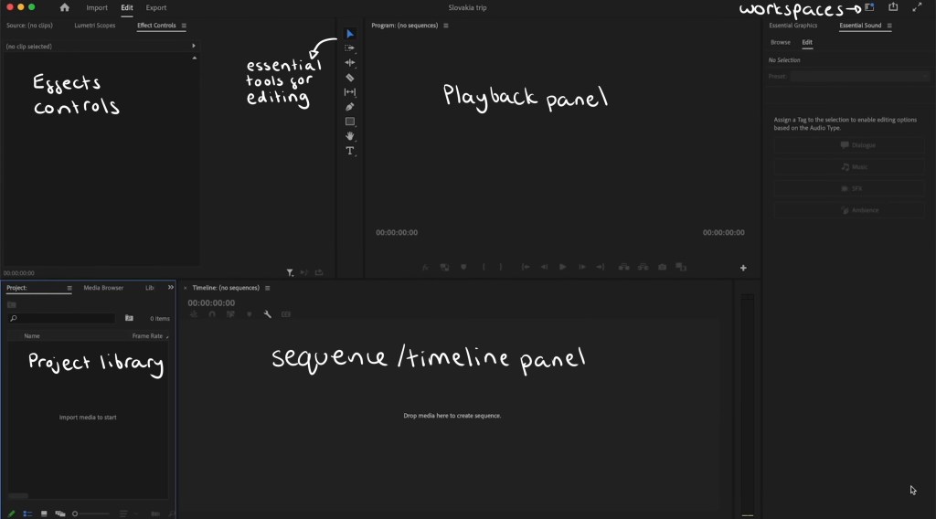
This is a labelled diagram of Premier Pro’s interface:
These are the notes I took from the in class introduction and my own additional research about importing media, essential tools, exporting and more:
iMovie: iMovie is another video editing software that I’m not familiar with. It’s a more basic software but is still good to learn about as it can be helpful for simple functions like adding audio to a video. One benefit of iMovie is that I can use it on my iPad so it’s more accessible for me whereas Premier Pro has to be run on a computer.
Some notes I made about iMovie:
Additional sequences: I decided to make a couple more stop motion sequences at home. To make these I used Procreate to construct the sequence and iMovie to add the audio.
New: I chose to make another sequence using ‘New’. This one looks a lot more professional in regard to smoothness of the animation and colour. Instead of taking photos I used a scanner to get each frame. This worked better as the colours came out a lot stronger. The idea behind the sequence is that the letters appear from one side, travel across the screen. They get scrunched up and leave the screen. Then the whole sequence is reversed so that the text appears again, making it ‘new’. This is a screen shot of my iMovie project, it has the stop motion sequence I made on Procreate above and the audio below:
These are 2 versions of the final video, the only difference is that the second one has a cartoonish style filter. My inspiration for these was children’s TV show titles so I chose fun colours, movement and audio.
Old: I chose to explore a different word for this one. I wanted to represent ‘old’ in a different way for each letter. For ‘o’ I used an apple and it slowly gets eaten, ‘l’ is a stack of coins that falls and ‘d’ is a piece of paper that gets cut. I made the sequence by taking photos and using the animation feature on Procreate. I chose to add movement lines to emphasise what is happening to each letter and make the movements more dynamic and cartoonish.
This is the finalised video, I’m happy with the actions of each letter and the randomness of what each one is made of. Also I think the movement lines add a nice layer to the sequence. Constructing the audio was fun, I chose different sound effects from iMovies library and made slight adjustments such as speed and volume to make them all fit nicely together.
Reflection: I enjoyed this session, I was able to learn a lot and get lots of inspiration for by project by watching different examples of sequences including music videos and movie titles. Also it was really helpful to get an introduction to Premier Pro and iMovie. I’d like to try out Premier Pro in the next couple of weeks and continue to work with iMovie for more simple video creation tasks. The mistakes task was really fun, I enjoyed creating several stop motion sequences with various methods. They progressively got better and I think adding audio made them more engaging and enjoyable to watch.
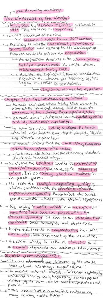
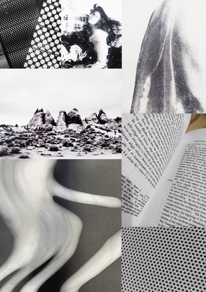
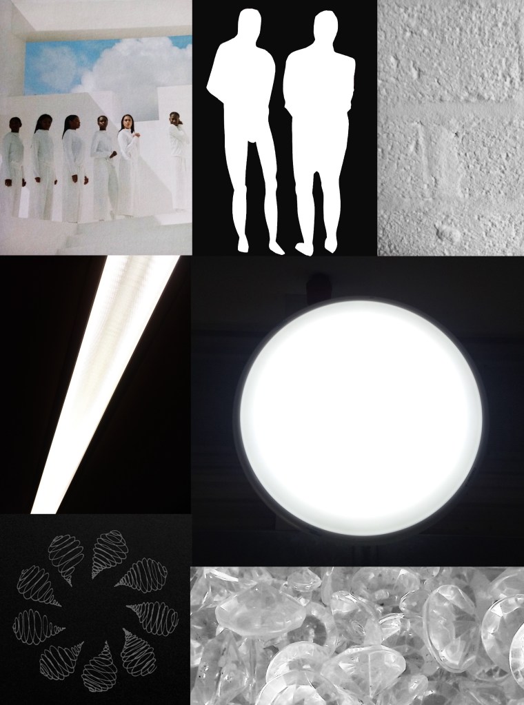
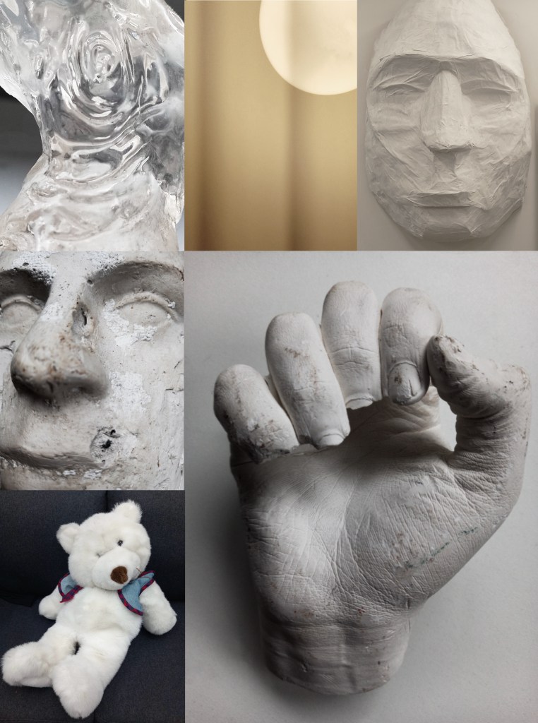
In this session we looked at a chapter from Herman Melville’s book ‘Moby Dick’ titled ‘The Whiteness of the Whale’. In preparation for this workshop I researched the text to get a sense of its themes and ideas. Also I wrote down some key quotes, all of this research can be seen below:
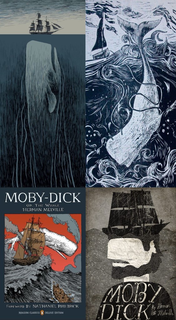
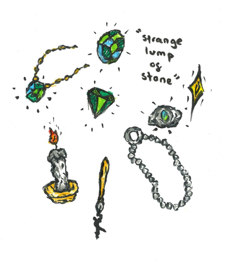
I did some visual research of the text to see what illustrations have been made previously to get inspiration for my own work. Here is a selection of images I collected:
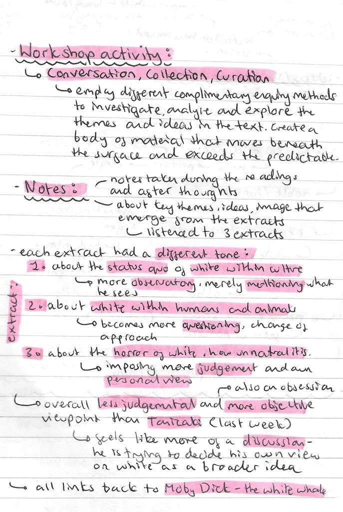
This page explains the workshop activity:
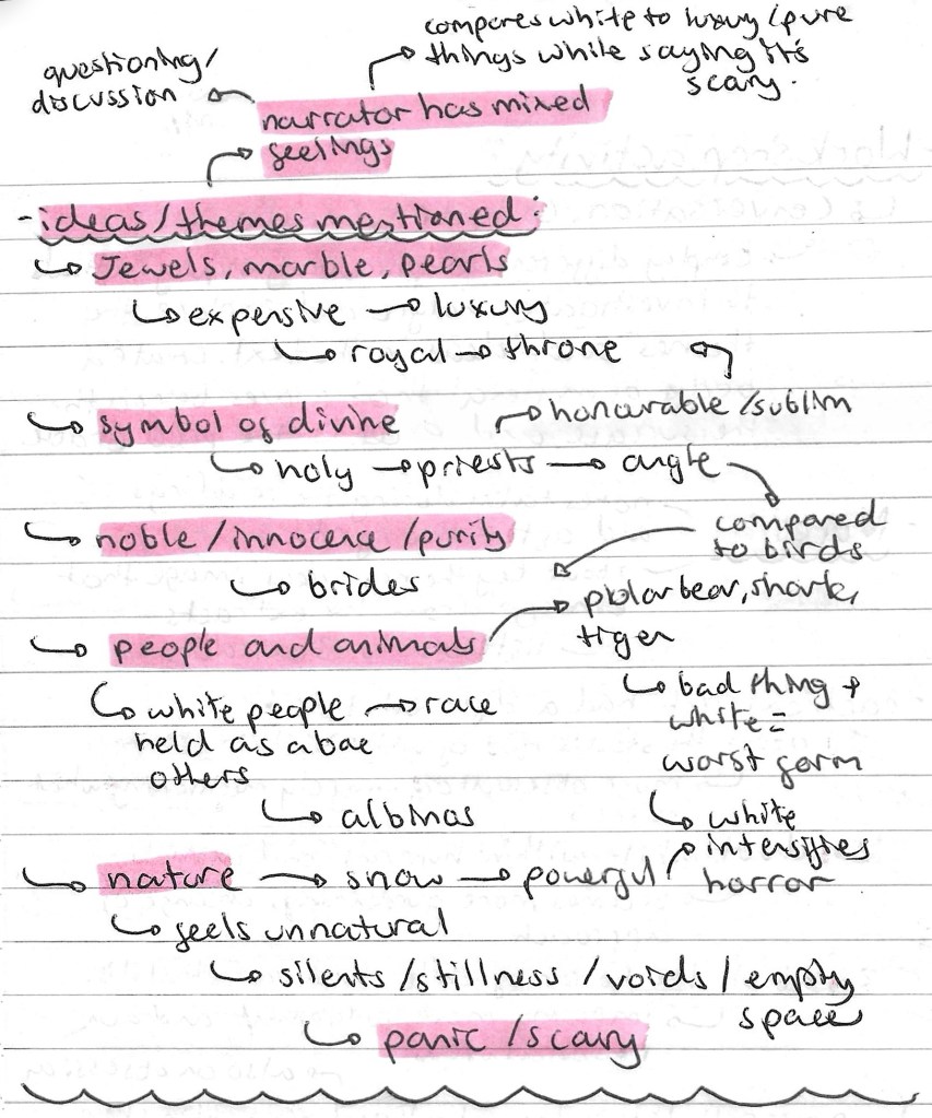
Here are some notes I made about themes and ideas that I noticed during our class readings of the extract, including jewels, innocence and nature:
After reading the text and making notes about the themes and ideas we went around the campus and collected visual media that we felt linked to the text. One obvious theme to keep in mind was the colour white so the majority of the things I collected were white. I wanted to at least have most of the images in greyscale as I thought colour would distract from the themes and not really represent the text. I also explored other themes such as people, nature and jewels. When collecting the visual media I had these themes in mind but I also just collected things that I thought were interesting whether that be in shape/form, texture or pattern.
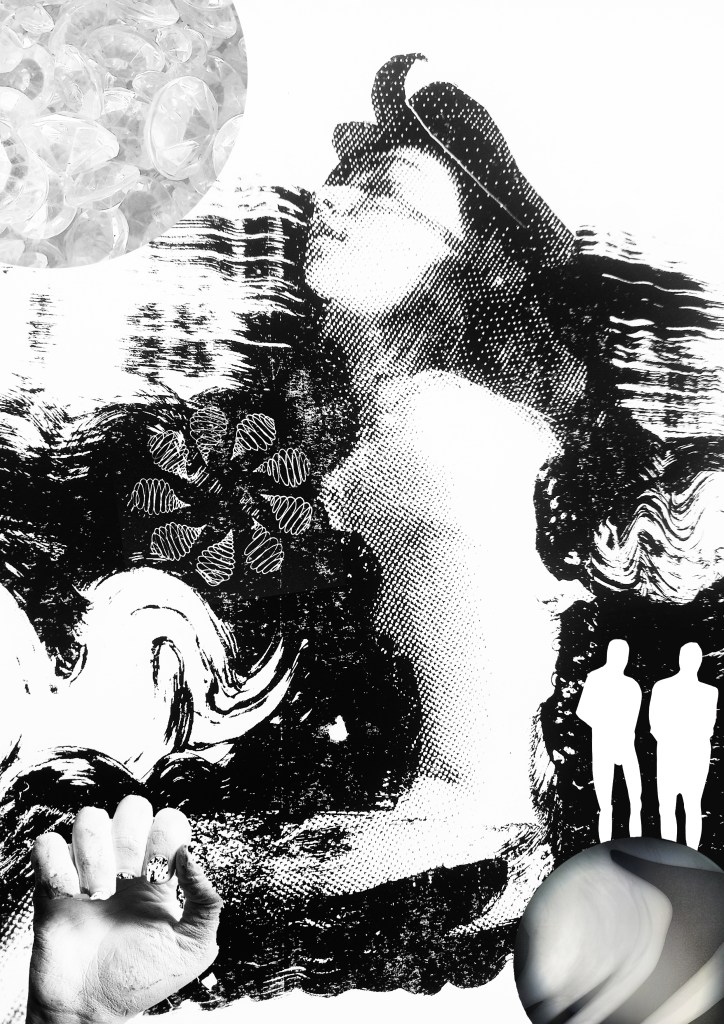
After the session I created 2 collages using the images that I collected. I enjoy creating digital collages and found it a good exercise to really think about what I had collected and how I could combine them into compositions. I wanted to have the themes and ideas of the text present but not be an obvious depiction/ illustration of it. Working more abstractly is not something I do often so I wanted to explore that as it’s something I felt I could improve on from the last workshop. I think the full greyscale compositions are interesting as the details hide themselves so when you look at it your eyes aren’t immediately draw in by colour so you have to take a closer look to see all the different elements.
Overall I enjoyed this session looking at an extract from ‘Moby Dick’ and collecting related visual media. Physically going out and collecting things to take photos and scans of isn’t something I usually do but I found it to be an interesting way of working. It made me view the text in a more thematic way rather than looking for the exact things described. Then combining them into a collage gave me a way of reconnecting all my ideas and thoughts together to create something that conceptually represents the text. This way of collecting related visual media and combining them could be a useful way of working for me in the future.
Today we went through some of tools and features that Photoshop offers. Out of all the creative software we will be exploring in this module, I’m most confident with Photoshop having used it a fair amount in my first year. I had become confident will the basic tools and a handful of more specialised features and am now looking to master the basics and put them into practise.
We looked at some examples of creative practices with a focus on composition and mixed media digital collage. Some of the artists that I looked at in the first week produce work in this style such as Chris Haughton, Tim Marrs and Kate Miller. Below are a list of artists who produce work with interesting compositions and use of mixed media digital collage. This is a style I really like but not something I regularly produce so this workshop was a great opportunity for me to push myself and explore this style of work.
Artist Research:
Jill Calder: her style is really fun with lots of brightly coloured elements all layering up to create a busy composition. It has a looseness to the mark making that I find appealing, this coupled with the colours helps to create a magical feeling to artwork. There is a nice hand made quality to these mark and textures.
Andy Potts: these digital collages have nice textures on them which I would think are real textures that I have been scanned in to make them feel less flat. The colours are much more controlled, choosing limited colour palettes, making use of complimentary partings. The layers build up in layers with varying opacities.
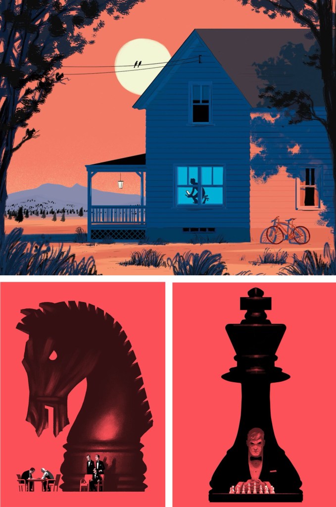
Paul Blow: this is a more refined and clean digital style. The less chaotic compositions help make each element stand out more with his powerful use of limited colour palettes. I particularly like the chess pieces as he’s transformed a board game into an intense and cinematic piece largely down to the scaling and colouring of the different parts.
Michelle Thompson: these digital collages have the most resemblance to traditional hand made collages, lots of rough elements placed together in a more free way. I really like the different textures and minimal colours as it really makes certain parts stand out.
Maria Midttun: the printed textures are created by hand, scanned in and manipulated digitally. This helps to ground the digital collage in a traditional collage style. I like the contrast between the rough cut, block coloured backgrounds with the greyscale textures used to make the characters.
David Foldvari: these pieces have a really nice quality of marks with rough inky lines being mixed with detailed shaded parts. The controlled minimal use of colour helps to draw the viewer into a certain part with the striking red standing out on the black and white.
Photoshop workshop:
We had a Photoshop demonstration of a range of basic tools before we began working on the creative challenge. Here are some of the things we went through:
Setting up a canvas (Size, PPI, RGB & CYMK)
Overview of Photoshop tools (Sidebar and tabs)
Copying and Pasting image assets into the canvas
Cutting, Moving, Rotating, Transforming, Erasing
Editing Colour, Contrast and Opacity
Using the Clone Stamp, Brush and Paint Bucket tools
Layers panel (Organising, Grouping and Naming)
Quick Mask tool
History panel
Useful shortcuts
I was at least comfortable with most of these as Photoshop is a software I used semi-regularly. The ones from the list that I found the most challenging where using the quick mask tool and the shortcuts. The main difficulty for me was using Photoshop on the Universities Macs as I’m more used to using it on an IPad or Windows laptop. This means the interfaces and keyboard commands are slightly different for what I’m used to, making my process slower. In particular, I’m much more comfortable selecting and cutting images with the touch screen on an IPad.
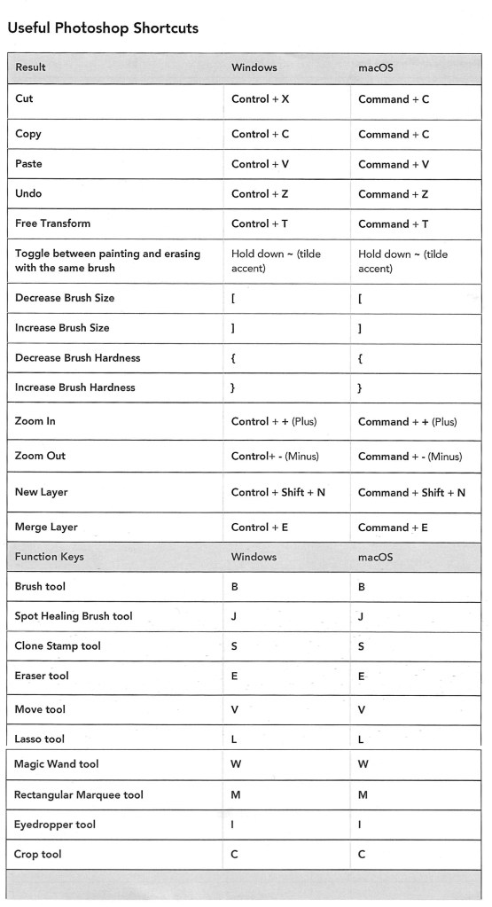
Below is a table of key Photoshop shortcuts across different devices:
Creative challenges: Visual Juxtaposition
Key terms:
Juxtaposition: an act or instance of placing close together or side by side for comparison and contrast.
Collage: a picture or design created through the assemblage of different forms, thus creating something new.
We had to combine imagery and manipulate material from a range of sources to create a new meaning to express the theme of ‘play’. I used my collection of visual media that I made based on the theme of ‘play’ and images from the British Library’s collection on Flickr to create visual juxtapositions and metaphors in Photoshop. I made the images below during and after the session:
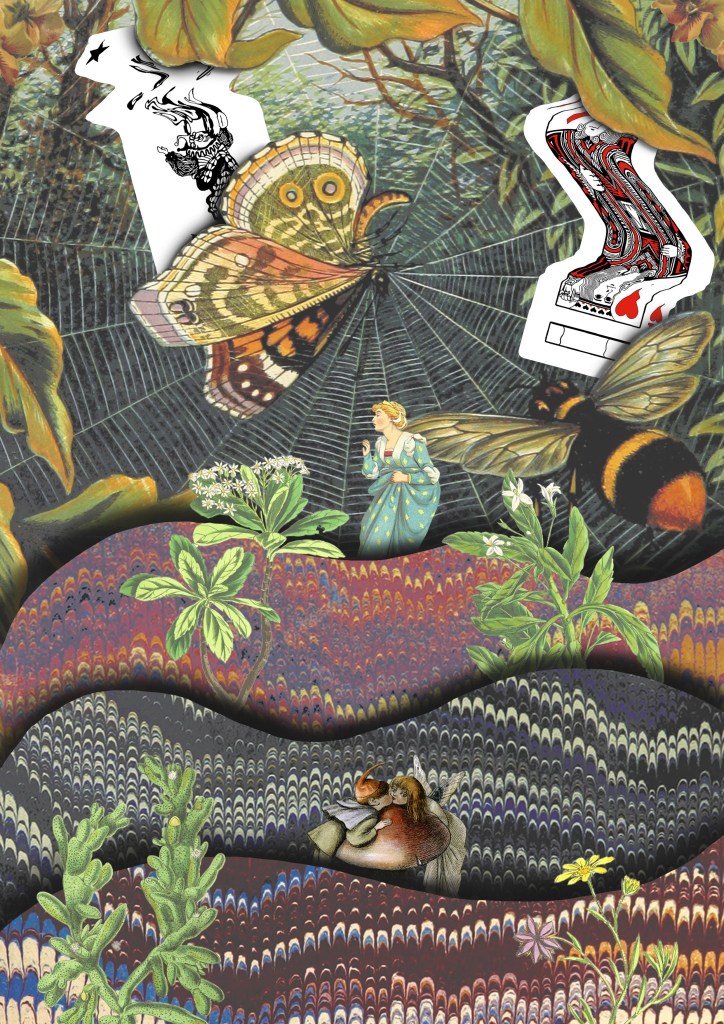
1. For this one I wanted to go for a really random style by mixing elements that visually shouldn’t go together into a cohesive compositions. I think I was able to achieve this by using a combination of images from Flickr and the card textures that I created to form the collage. Using layers was key to this piece and I was able to create depth by layering the 3 greyscale textures and the bottom and place the chess piece with the card design in between them.
2. This collage was created solely with images I took from Flickr. I really wanted to use these as I love this traditional illustration style and think it works really well in a digital collage. The difficulty of the image was cutting out the complex shapes cleanly. To do this I had to use a range of selection tools including the lasso, object selection and quick selection tool to remove the backgrounds. This was a time consuming process but it was worth the time to achieve the detail and precision. For the style and composition I took inspiration from Michelle Thompson, who I mentioned in my artist research.
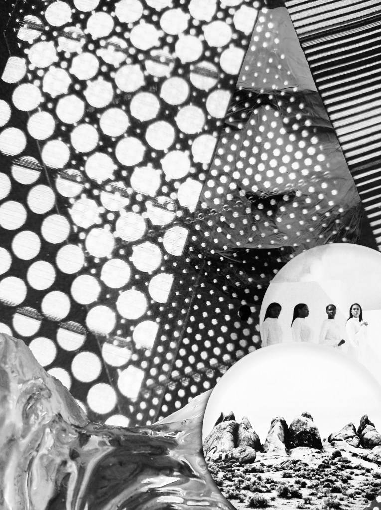
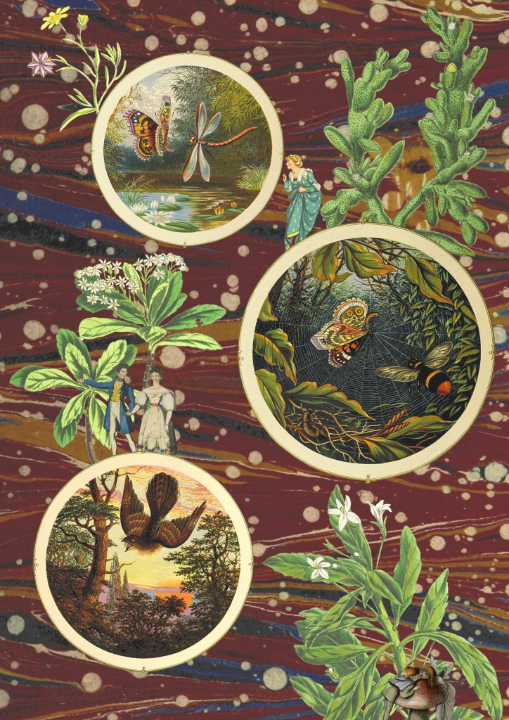
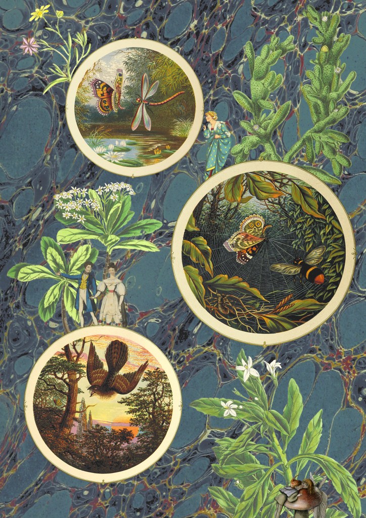
3 and 4. The next 2 are variations of the same image, with only the backgrounds changed. I couldn’t decide which background I liked more as they both work well in the composition and give the collage different feelings. For this one I tried to create a more conceptual collage with a narrative. I used circular photo frames to act as portals with characters and objects interacting with them. Once again the main difficulty was cutting out the images cleanly. I enjoyed creating this more fantasy based one with more of a playful idea and meaning rather than just an aesthetic collage.
5. I drew on the ideas from images 3 and 4 and combined them with some of the visual elements from image 1, the cards and background. Theres a juxtaposition between the visual language of the images from Flickr and my experimental card scans. I was able to balance these contrasting elements by maintaining the same playful and fantasy style. I used a lot of the Photoshop tools we discussed in the workshop to create this including, selection tools, layering, brushes and editing the colours.
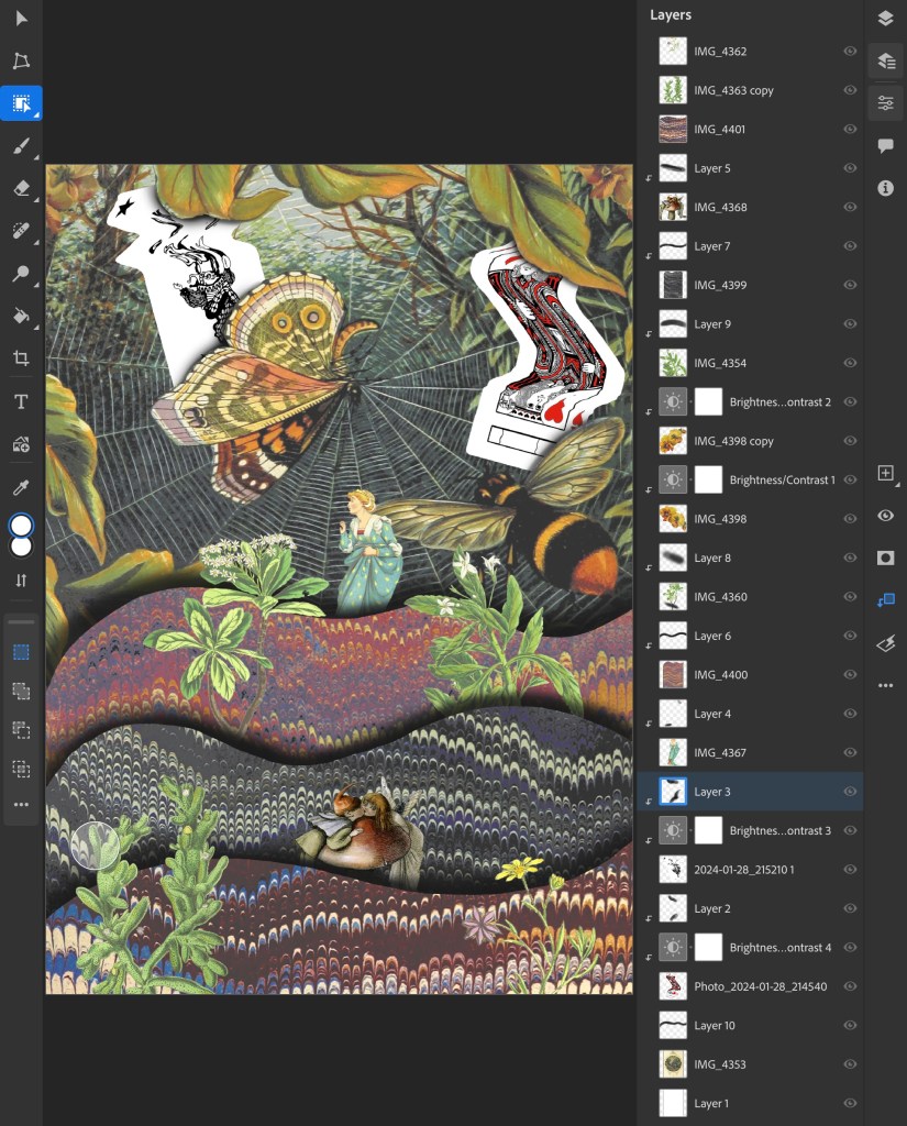
This is a screenshot from my Photoshop document showing all the layers and adjustment layers used to build up this collage:
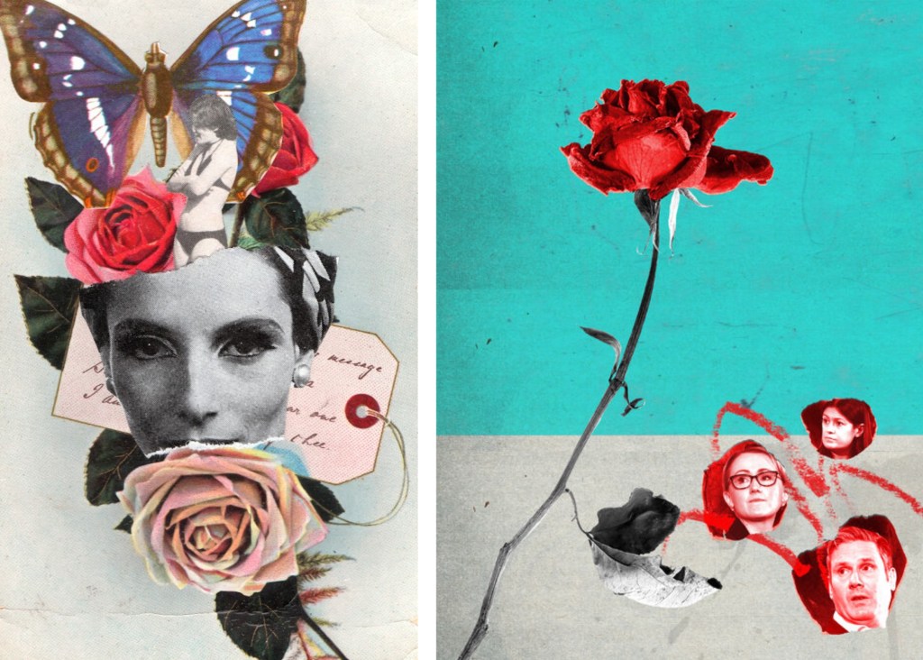
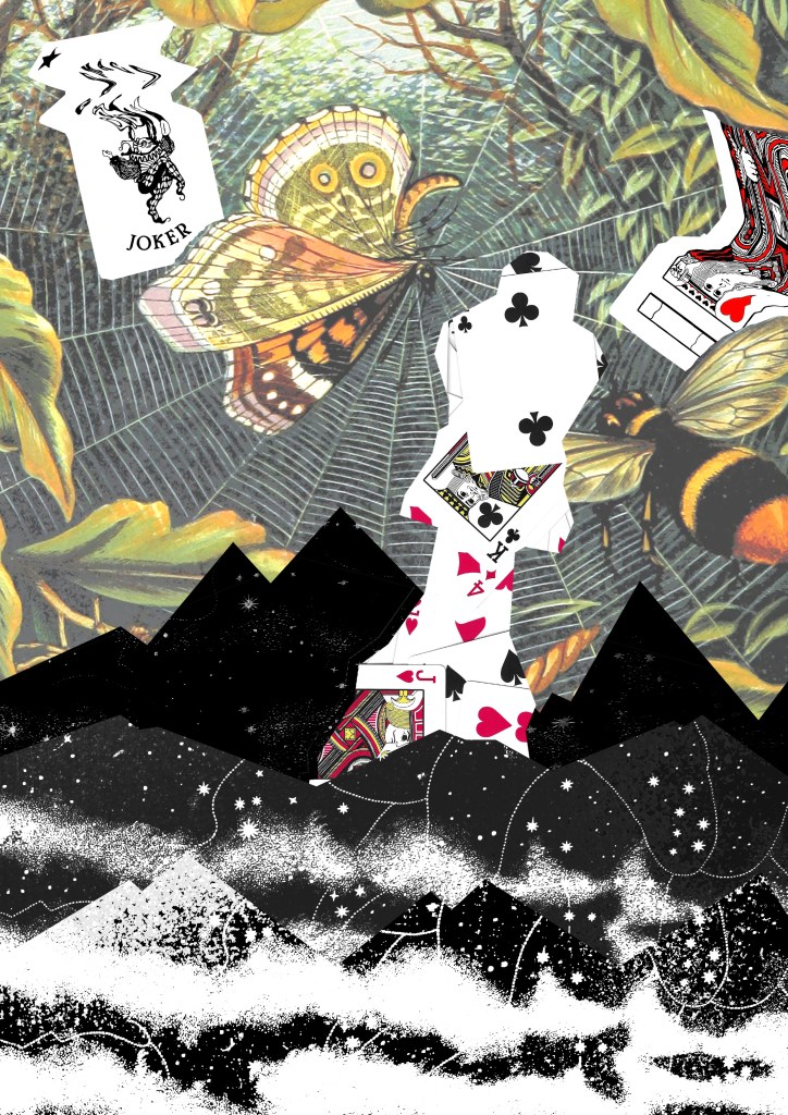
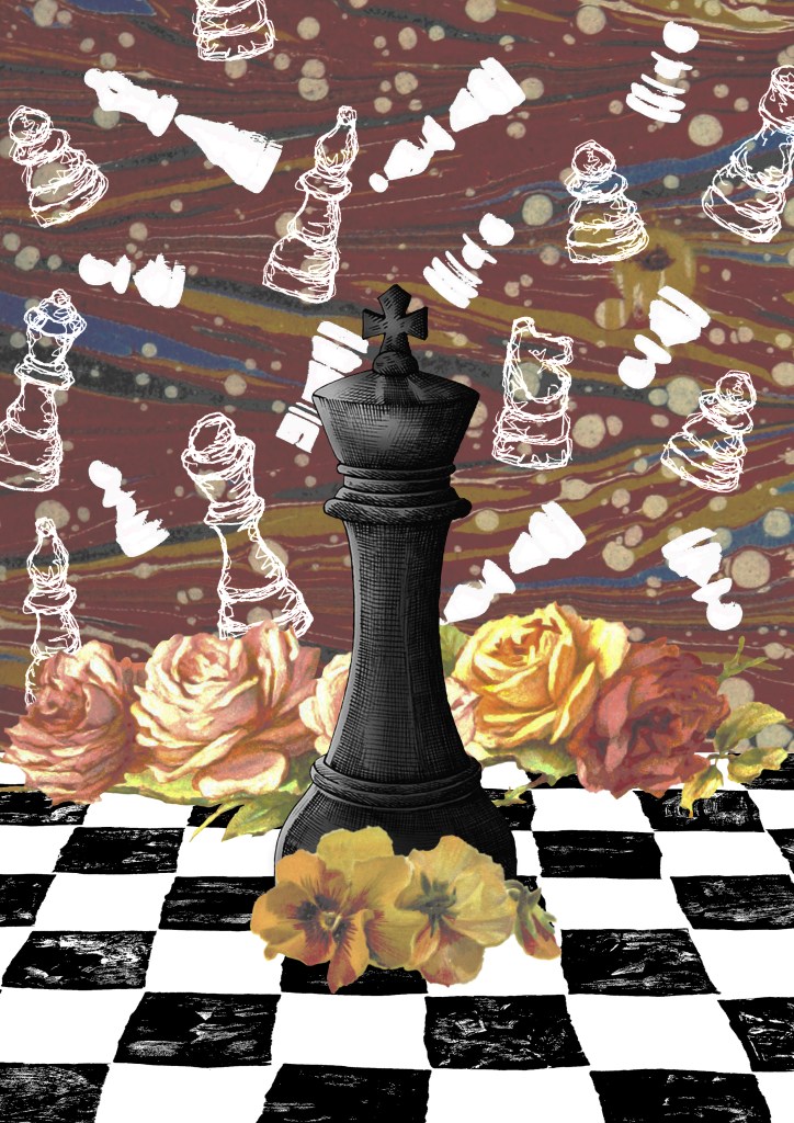
6. The previous collages has a playful concept whereas this one I went for a more obvious depiction on play by using my chess piece illustrations and Lino printed board. I combined these with a background and floral images from Flickr. The concept of this collage was that the black chess piece had one the game and all the white pieces in the background are ghosts. These one challenged me to combined multiple contrasting visual aesthetics into one collage.
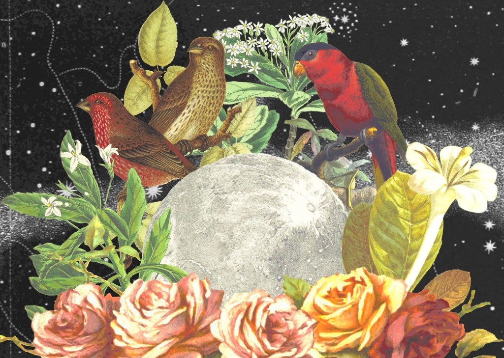
7. I wanted to create some more with the cards theme so made this one of magical cards. I used a layer mask to add the blue texture to only the part flowing from the cards. Then I overlayed the Lino printed symbol on top using blending modes. I went for a more dynamic composition for this one with unbalanced large and small elements.
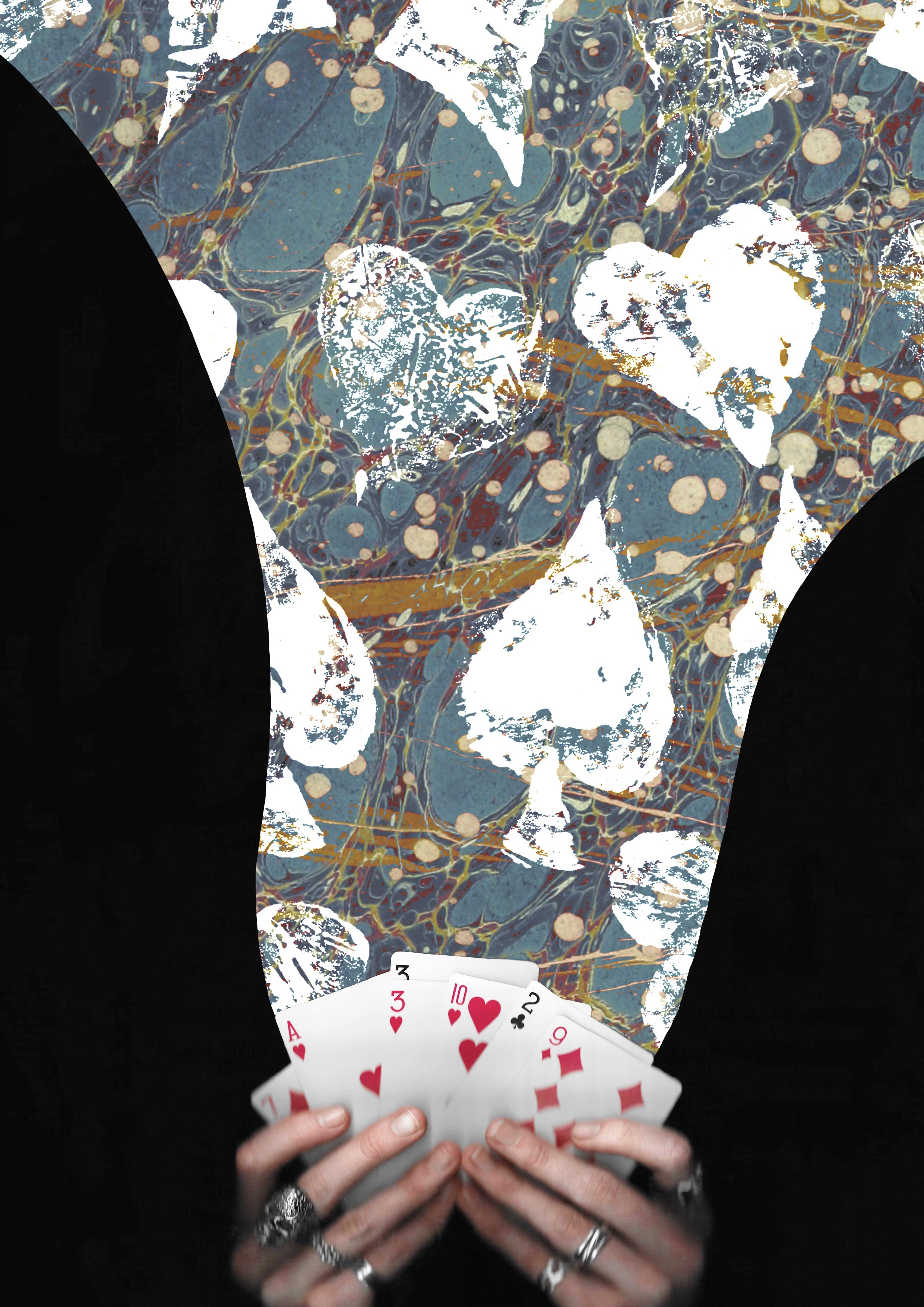
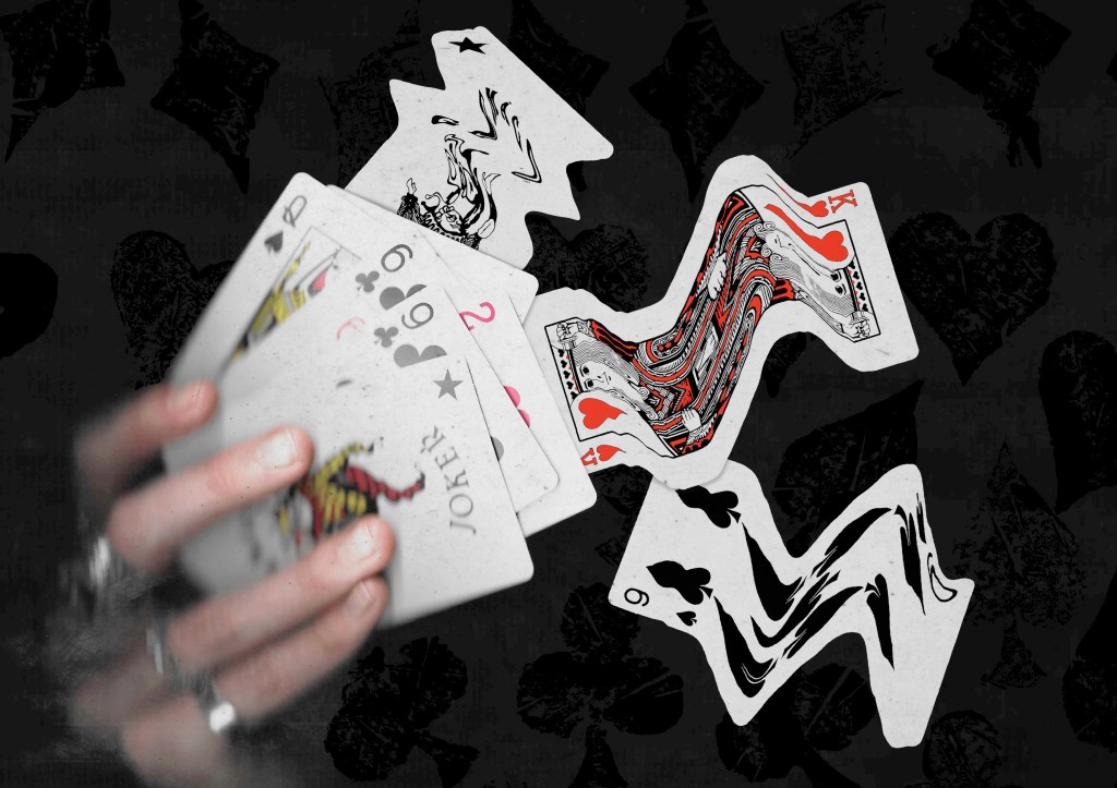
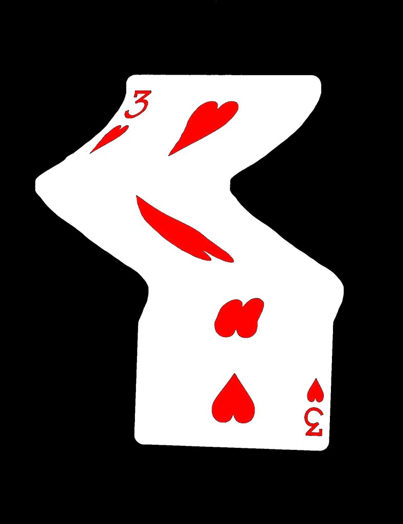
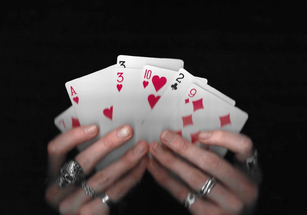
8. This is another collage using the scans I took of my hands holding some cards. This one also has a fantasy, playful concept with the cards moving out of the deck in a dynamic way. I really like this ideas and think it could work really well with an animated events of the 3 warped cards moving.
Reflection: I really enjoyed this Photoshop workshop, I was able to advance my skills with the basics tools and learn some new more advance tools. I’m happy with the series of collage I was able to create during and after the session in response to the creative challenge. I tackled the theme of play with both the visual elements, style and concepts to create a range of collages with juxtaposition. I experimented with the composition and arrangement to create a range of image, some being balanced and others being more dynamic. When creating the digital collages I considered hierarchy, scale, colour, tone, marks and texture.
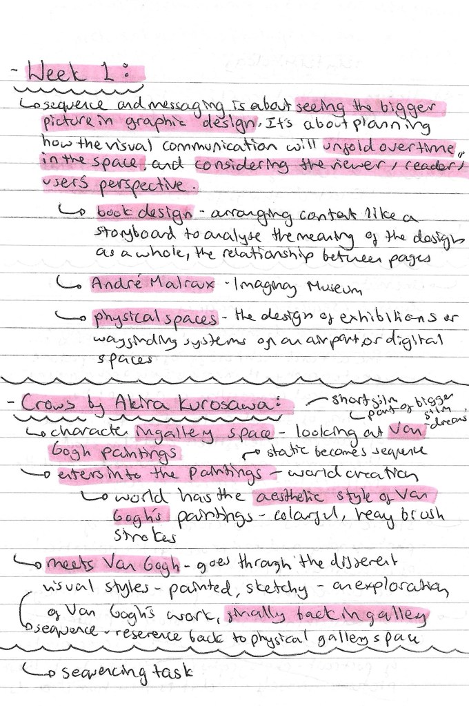
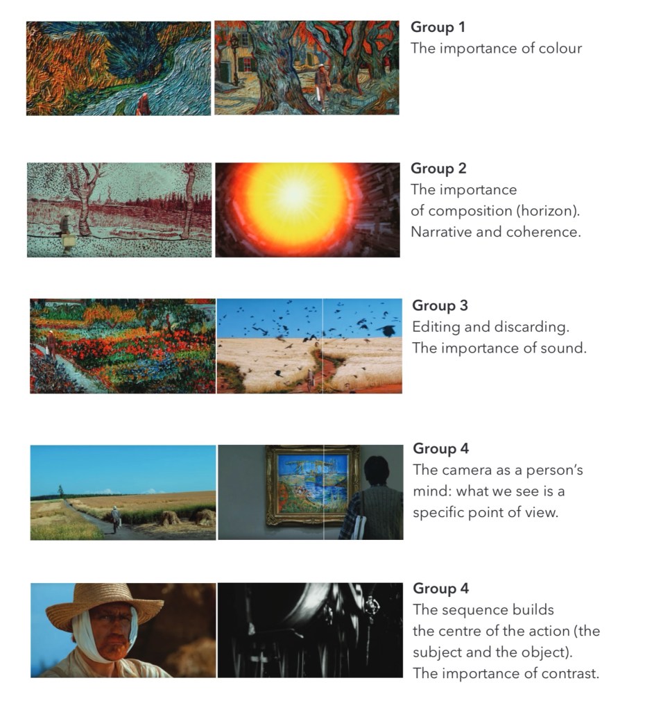
In the first session of the module we looked at static and sequential imagery, for the project outcome we need to create both static and sequential work so this was a good introduction to the topic. Below are some notes I made from the seminar slides:
Our main task of the session was to explore the short film titled ‘Crows’ by Akira Kurosawa, made in 1990. Above are some notes I made while watching the film. It is about a man who goes to a gallery to view some Van Gogh paintings. He is then transported into the paintings and becomes immersed in the world. He meets Van Gogh and then goes on a journey through the paintings, with his surroundings becoming progressively more stylised. It ends with him back in the gallery looking at the paintings.
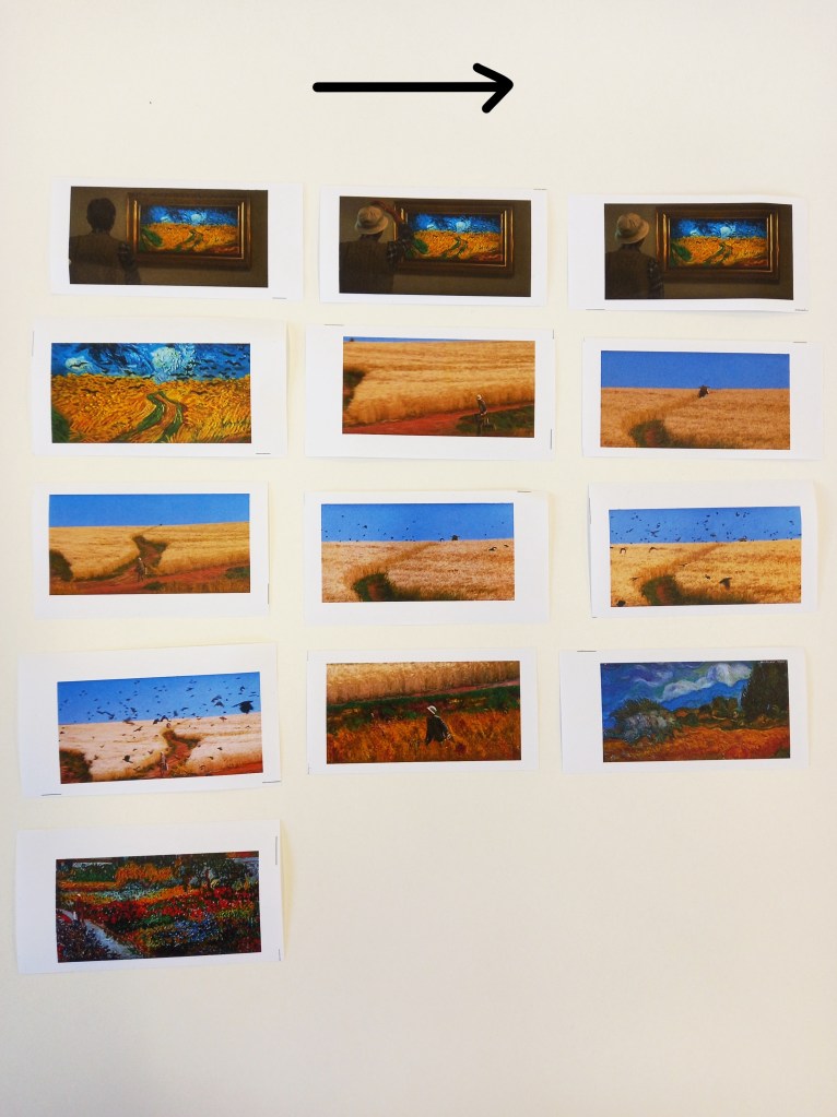
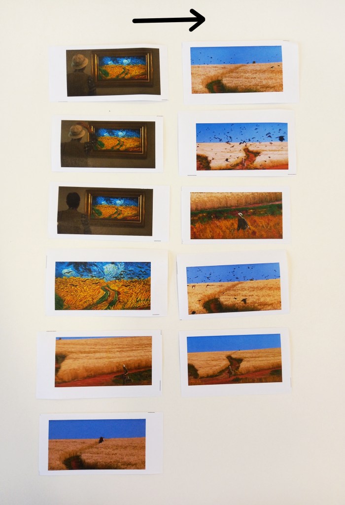
We responded to the film with a sequencing task. We were put into groups and given a set of screenshots from a part of the film. We had to reorder the static images to create a new sequence which gives the story a new meaning. These where the sequences that my group created:
This is a review of the sequences that all the groups made and what their focus was. I was in group 4 and we focused on editing as for the second sequences we made we chose to discard some of the images in order for our sequence to flow better. We were also guided by how we wanted the sequence to sound. For our first sequence we planned to have it paired with an intense, dramatic horror movie inspired audio. Some other aspects that other groups focused on were colour, composition, contrast and story arc. These are all ideas that I could apply to my sequential project work.
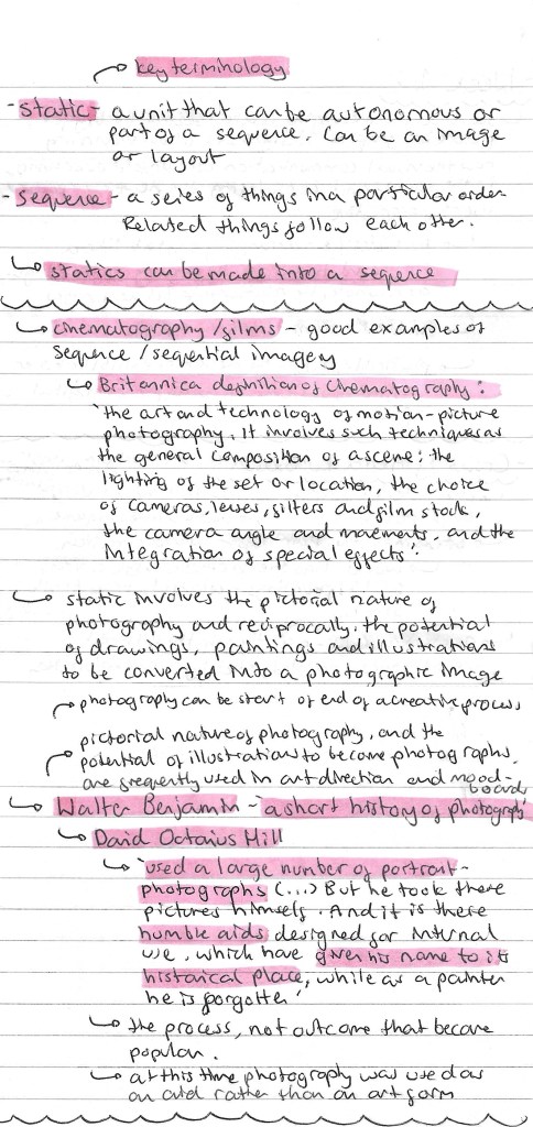
Here are some more notes I made from the session including some key terminology and ideas about photography in regard to sequence and messaging:
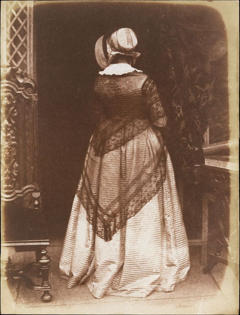
One of the photographs taken by David Octavius Hill:
Reflection: This was a really enjoyable session, I think it was a good introduction into the module and some of the key concepts we will be working with. After this session I have a stronger understanding of the terms static and sequence and how I’ll need to use these for the project. The task was fun as it got us thinking about how we can compose a sequence from a series of static images and how editing the sequence can give it a different meaning. I found physically having the sequence in front of me and being able to rearing the images very helpful. Also I really liked Kurosawa’s short film and plan to watch more of his work.
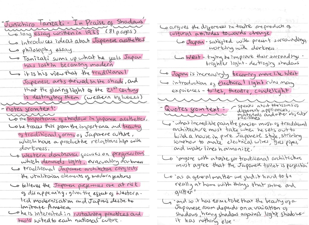
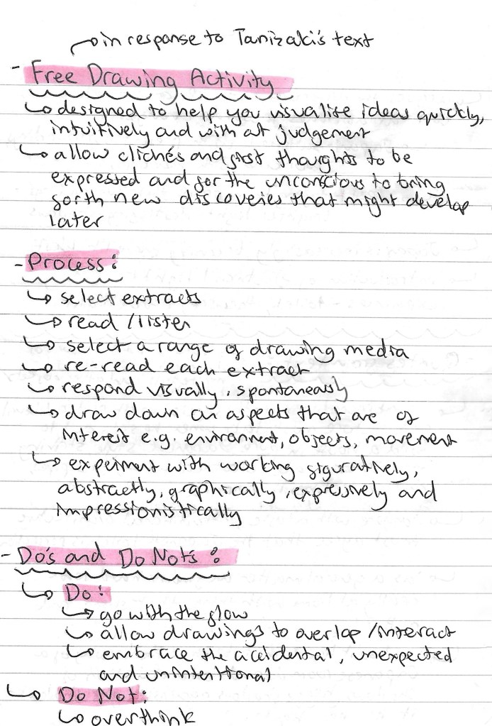
In this session we had a free drawing workshop in response to an extract from Tanizaki’s text ‘In Praise of Shadows’. In preparation for this session I read through the extract and did some research about it to get some contextual knowledge of the piece. Below is all my research and notes on the author, themes and some quotes:
Here are some details of the Free drawing activity that we did in response to the text, including the purpose, process and tips:
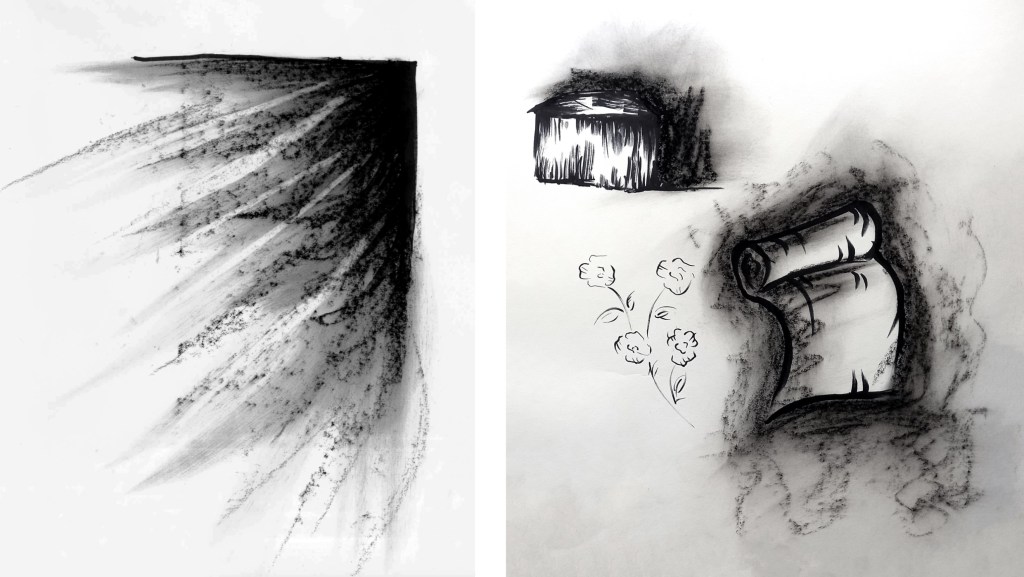
Below are some of my outcomes from the free drawing activity. I explored a few different styles and mediums such as mark making with charcoal, single line pen drawings and oil pastel illustrations.
With the charcoal I was able to create expressive marks that really show the theme of shadows. I really like the piece of the left where I used the charcoal to create the effect of light beaming through a window but with shadows. This has an interesting juxtaposition between light and dark which is a central theme in the text. In the images on the right I combined pen and charcoal. The different mediums contrast each other nicely with the more controlled nature of the pen marks against the rough textured marks made by the charcoal.
These are a series of single line pen illustrations of different things mentioned in the text including a flower, scroll and house. This is a style I’ve worked with before and am quite comfortable with. It’s a go to technique for me when I need to work quickly.
These illustrations are an exploration of combining oil pastel and pen. I’ve worked a lot with both mediums but never tried to combine them so it was an interesting experiment for me. I really liked the strong pops of colour over loose, sketchy style pen illustrations. This is an aesthetic I’d like to work with more in the future.
Overall I enjoyed this free drawing session, it pushed me out my comfort zone as I’m not used to working fast in response to reading or listening to a text. It is something I’m looking to improve and this session helped me feel more comfortable with it so I will explore it more in the future. In regard to the outcomes, I like them as I experimented with different combination of mediums but I was still too literal for most on my images. A lot of them are depictions of objects mentioned in text. While this is a good skill for an illustrator I’d like to try and work more abstractly, looking at the themes and concepts in the text rather than literal depictions of what is being described.
For this Module we will need to create an Illustration Project and an essay. We get to choose our own topic but the 2 outcomes need to be linked. The topic I’ve chosen is Norse Mythology as it’s something I’m interested in but don’t know too much so it will be interesting to research and learn. Before starting the research I had a very basic understanding of the topic, most of which came from modern pop culture adaptations such as Marvels interpretation of Thor and other characters. This is where I was first introduced to the topic and what sparked my interest. With this research I wanted to find out more about this topic and specifically its history. The comparison of the traditional descriptions/ depictions to modern version could be an interesting avenue to explore.
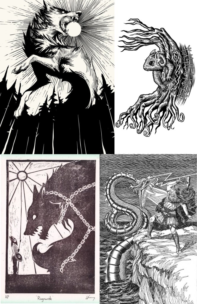
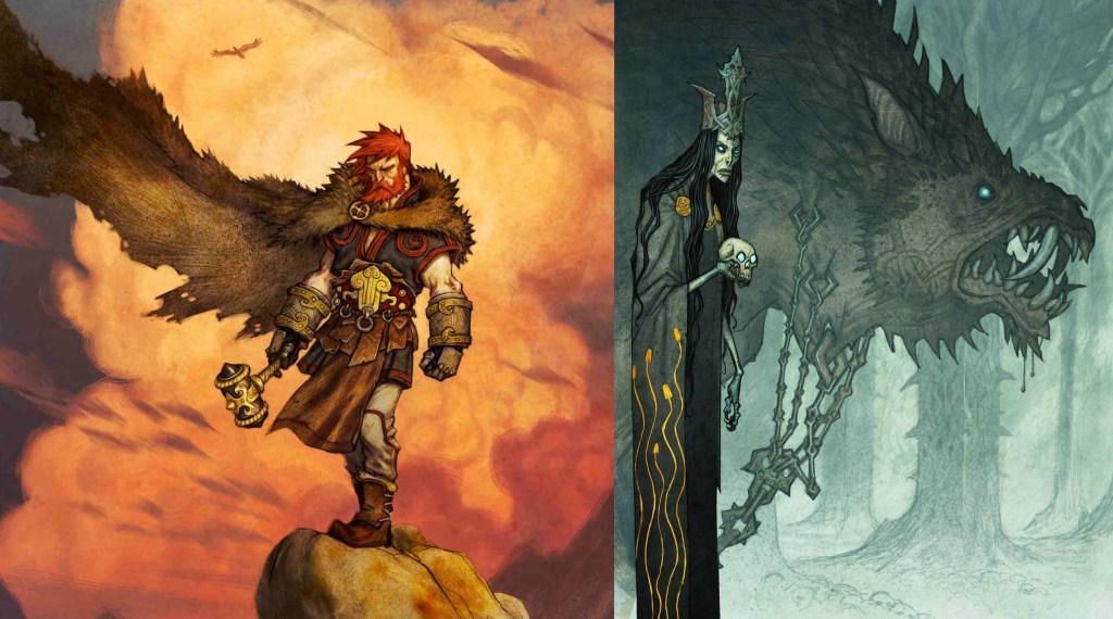
Here are a range of artworks about the topic of Norse Mythology. They’re a starting point for my ideas about the Illustration Project. At this stage I haven’t looked into any specific artists, I just did a broad search on Google and Pinterest to collect visual media that interested me. I immediately noticed that there will be big range of style ranging from, fine black line work to highly detailed colour images. This gives me lots of ideas to take inspiration from.
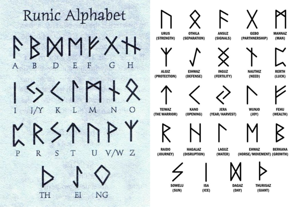
This is the Runic alphabet which would have been used at the time of the creation of Norse Mythology. It’s interesting to know and could be used as another element in my illustrations.
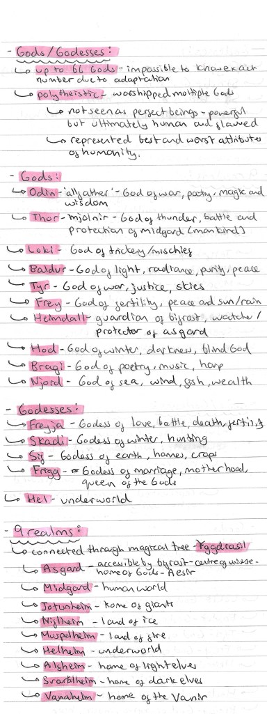
In order to get a good foundational knowledge of the topic I did lots of research into the history, the different gods/goddesses, the 9 realms, the creatures and the creation story. Notes on this research is below:
Image I found on Pinterest explaining the family tree of the Norse gods:
The Norse interpretation of the structure of the universe:
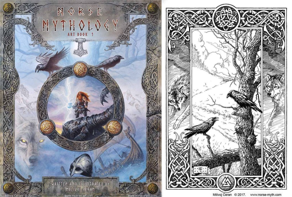
I made a list of some of the key stories in Norse Mythology (below), from this list I’ll research some in detail. I started to look into ways that Norse Mythology has been used in pop culture, such as in Marvel movies/ comics and Neil Gaiman’s ‘American Gods’. Also I began to explore some specific artists who have created work surrounding the topic of Norse Mythology including William Gershom Collingwood, Martin Eskil Winge, Johan Egerkrans and Milivoj Ceran.
William Gershom Collingwood (1854-1932): an English author, artist, antiquary and professor of Fine Arts at the University of Reading. I was drawn to his illustrations because of the traditional shading style and detail in the mark making that he uses to create shape and tone.
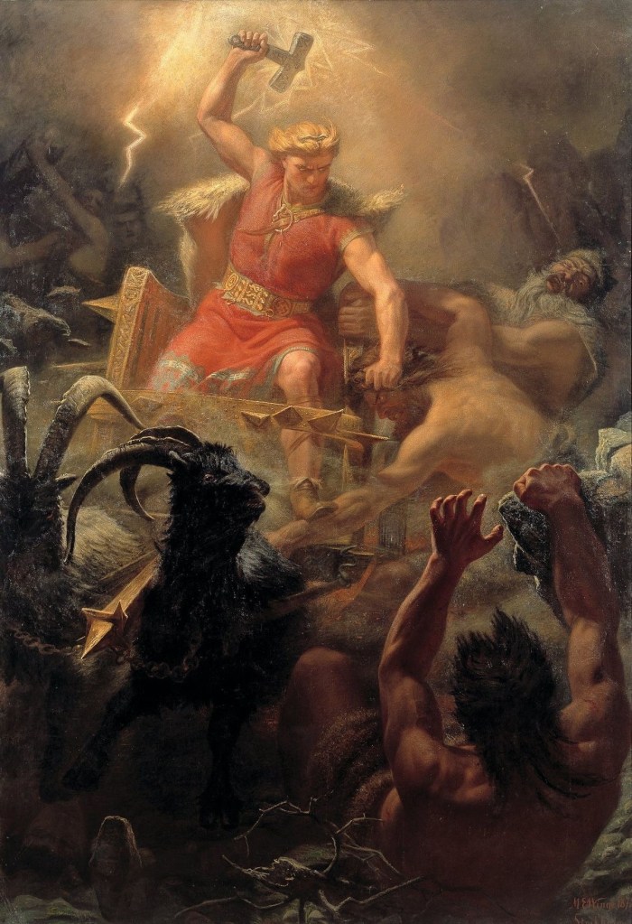
Marten Eskil Winge (1825–1896): was a Swedish artist and professor at the Royal Swedish Academy of Arts. Winge’s paintings are beautifully detailed with really striking use of colour. I really like the energy and drama he is able to create in his dynamic and chaotic compositions.
Johan Egerkrans (born 1978): a Swedish illustrator and author, mainly of Fantasy, folklore and Palaeontology, working as a children’s book illustrator since 2005. He has a modern, digital illustrative style with stylised characters. My favourite part of his work is the strong use of limited colour palettes used to create a mood and atmosphere.
Milivoj Ceran: a Croatian illustrator working in traditional media. He is well known for his Magic the Gathering art and other fantasy based work. He has 2 distinct styles, colour and black and white shading, both are intricately detailed. I like his compositional style and way of incorporating traditional Norse symbols and patterns into his illustrations.
Here are some initial ideas I had for the illustration project and essay after some initial research about Norse Mythology:
As part of the first session we had to start thinking about ‘play’ objects and create a range of materials/assets related to these objects that we could use in the upcoming software workshops.
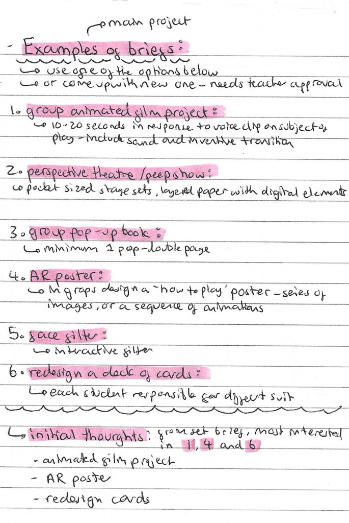
This is a list of the project briefs we could choose from. We can either pick one off the list of propose a new one to our tutors. My initial thoughts on the briefs are that I’m most drawn to options 1, 4 and 6. These are the animated film project, AR poster and redesigning a pack of cards. But I’m also open to coming up with my own idea. Redesigning a deck of cards is within my comfort come of design and illustration so it might me I’ve to push myself to try something I’ve not explored before such as animation or immersive arts.
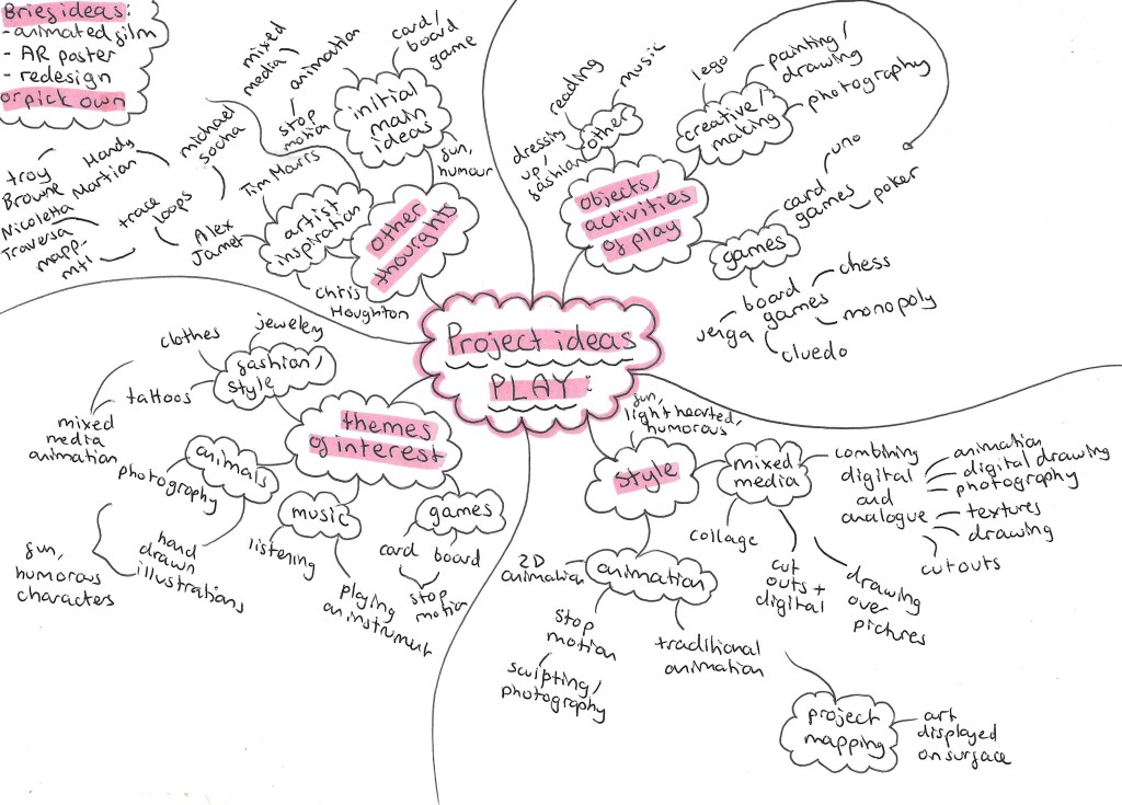
Here is a mind map of some of my initial thoughts and ideas for the ‘play’ project.
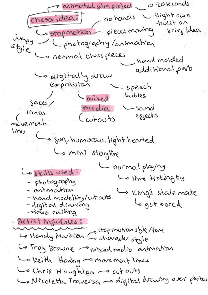
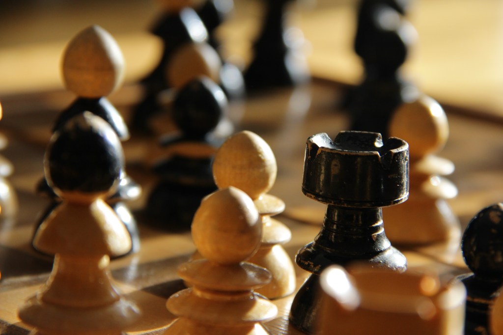
This is an idea I had for the project. I would need to propose this idea to my tutors as it’s not one of the suggested briefs although it does draw inspiration from the animated film project. The idea is to create a stop motion animated film using chess pieces. There are more details on the idea below:
Games is the topic I want to explore within this ‘play project’. The types of games I wanted to work with is either board games or card games. The next step was to create a range of material to use upcoming workshops. I will be adding to this when I think of more ideas and feel that I need more visual media to work with.
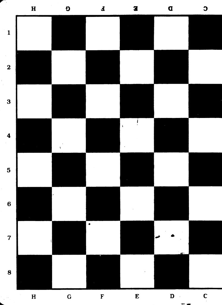
Chess:
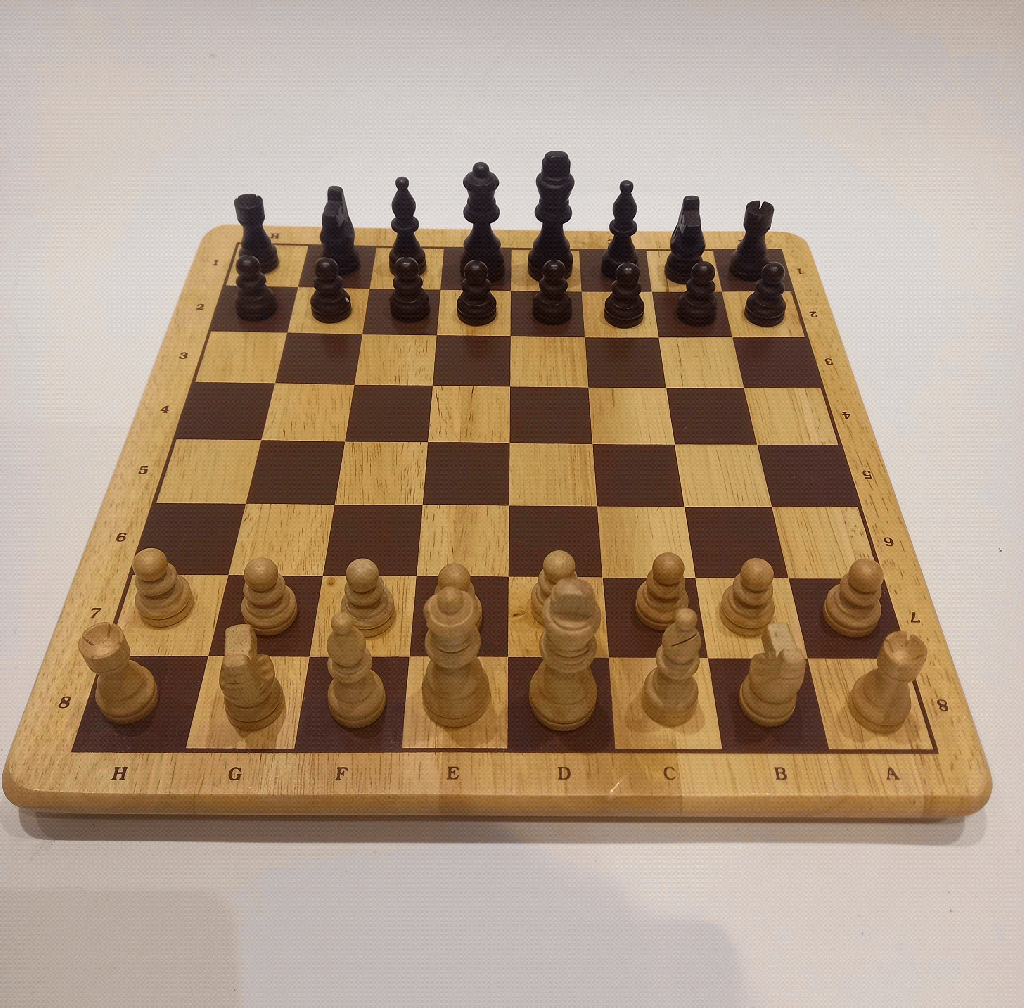
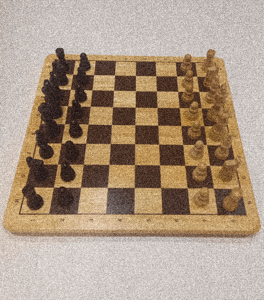
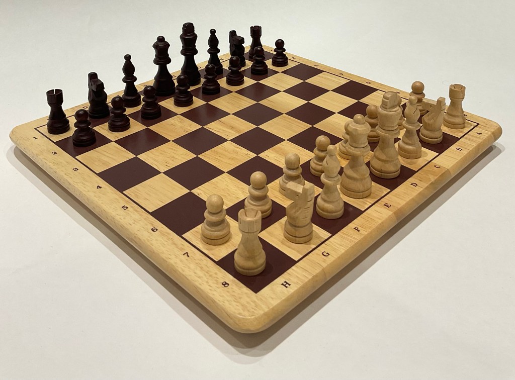
I made and complied lots of visual media related to chess. I chose chess as it’s a historical and widely popular game that most people at least recognise. It’s a game that I really enjoyed as a child and is played by many across a wide range of ages and I can see lots of room to explore the game in a creative and playful way.
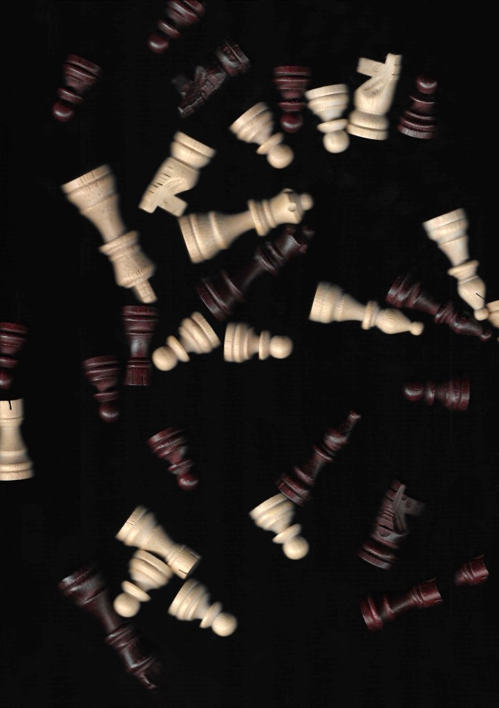
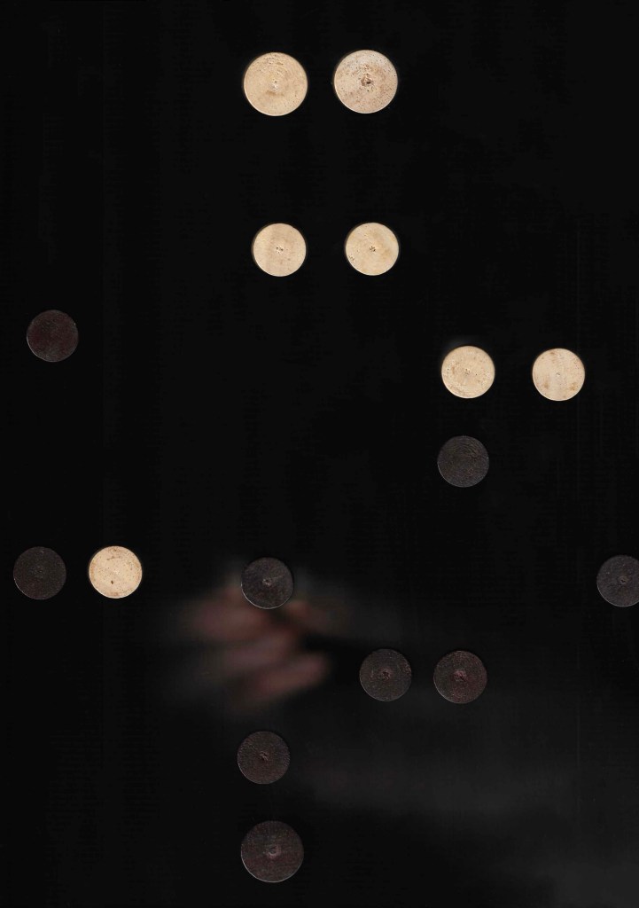
Stop motion:
Photographs:
Photographs (from Flickr):
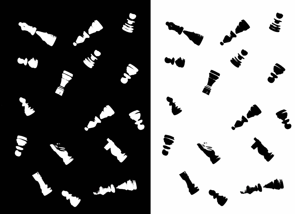
Scanning:
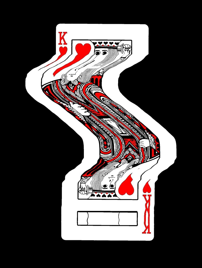
Edits of scans:
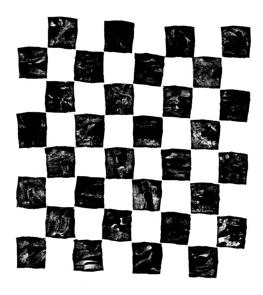
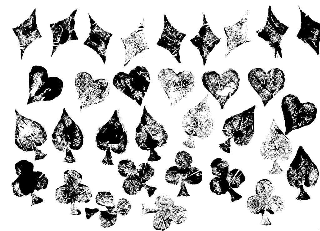
Printing (Lino):
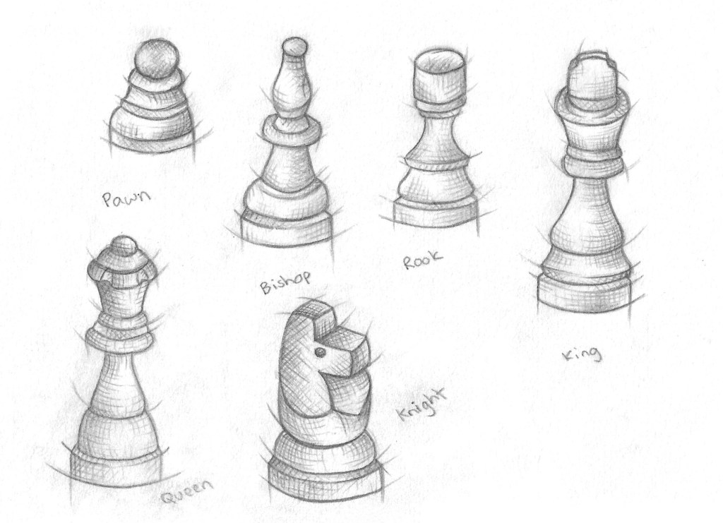
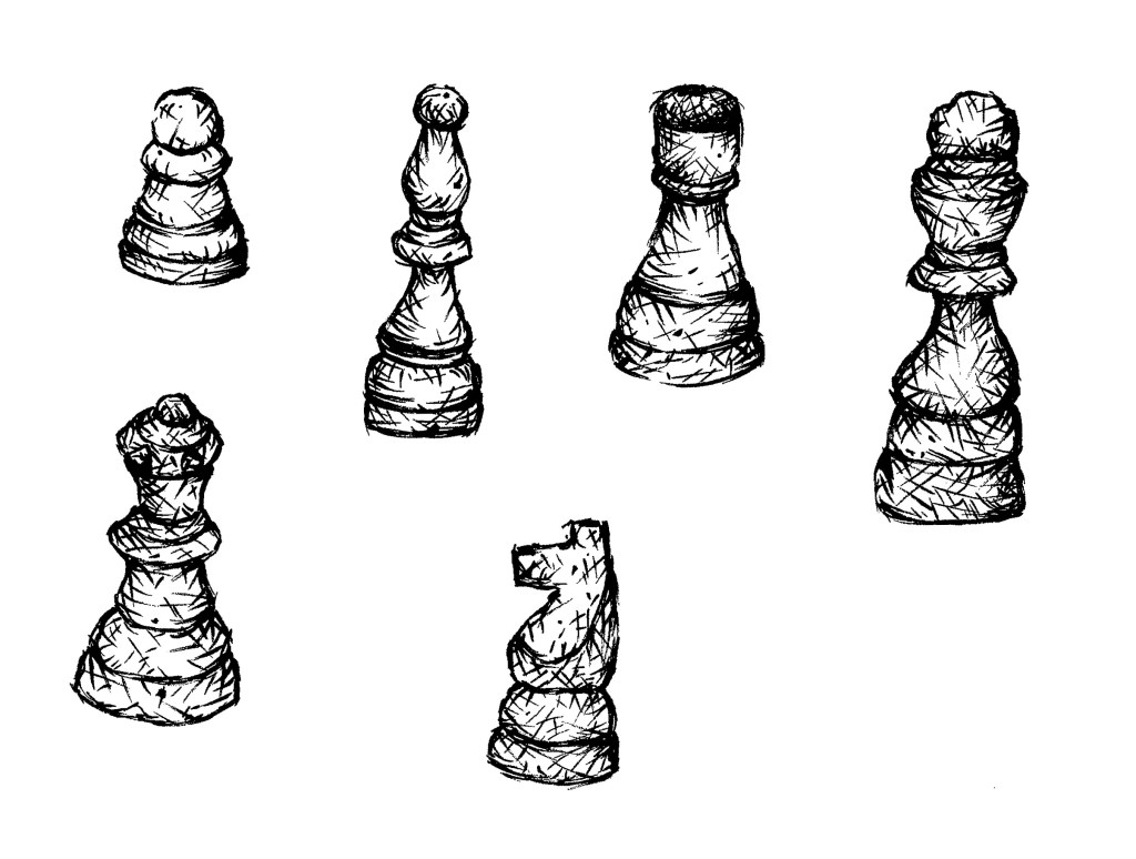
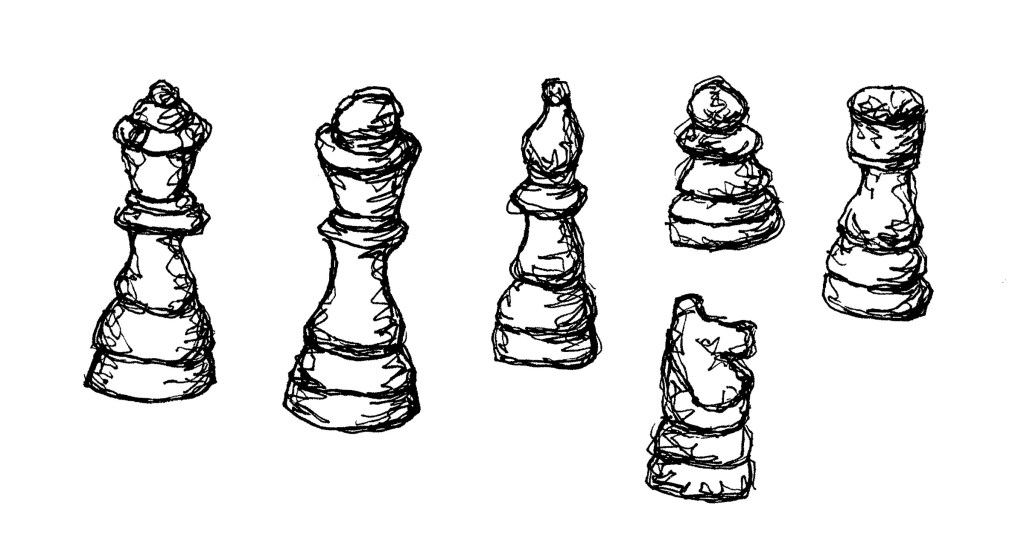
Illustrations:
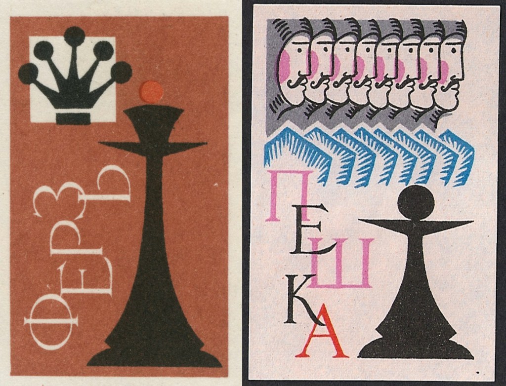
Illustrations (from Flickr):
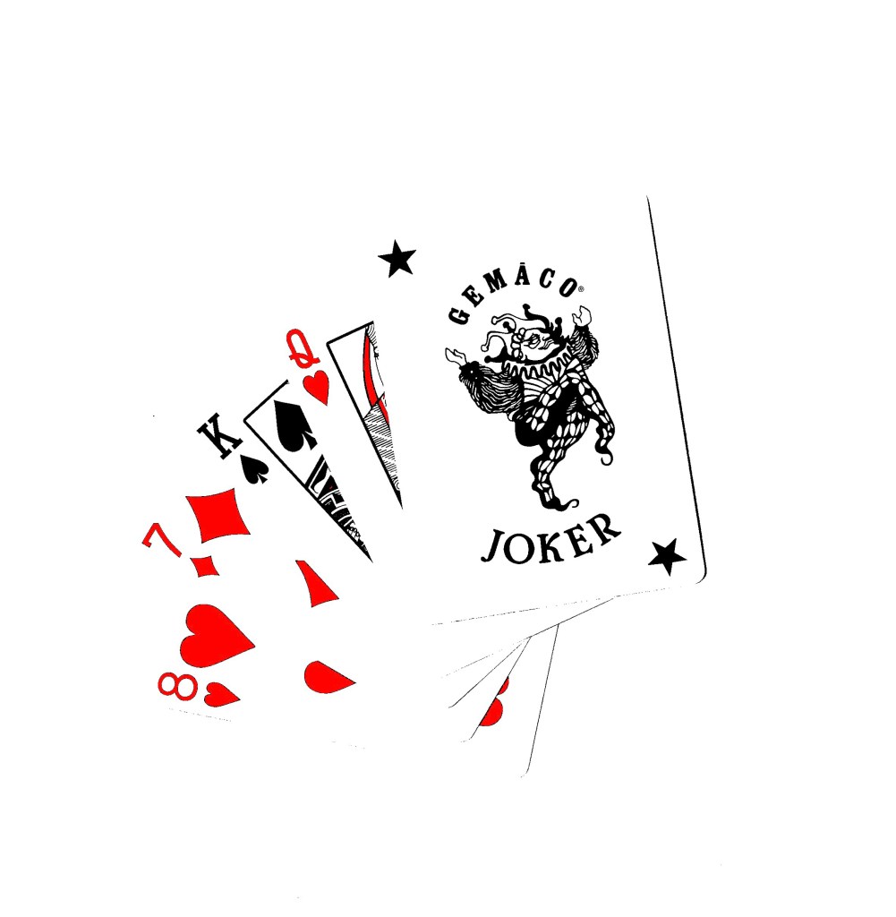
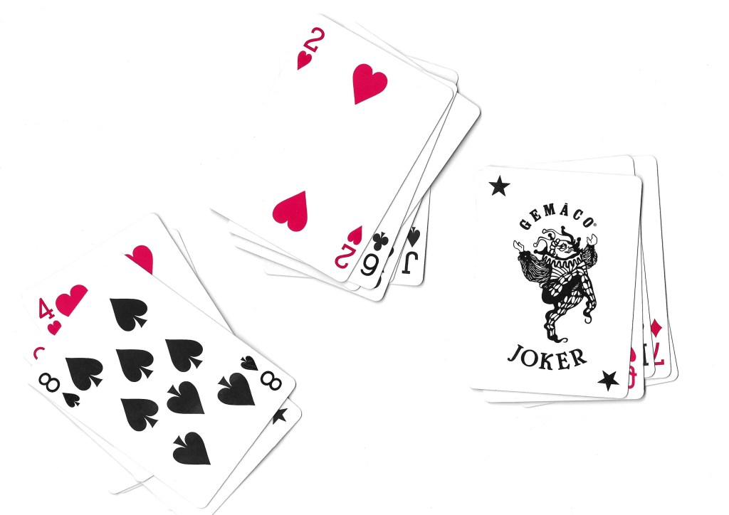
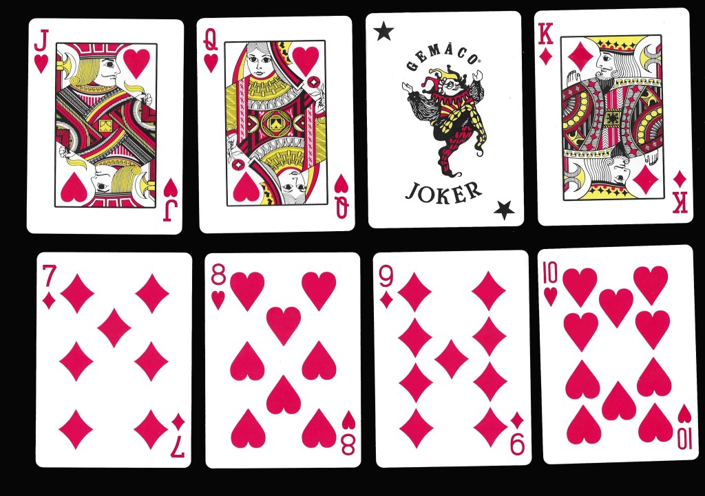
Cards: the other topic that I created a bank of visual media for is cards. Cards is an iconic symbol of play for both adults and children’s so fits perfectly into the modules brief. Creating a deck of cards is one of the set briefs that interests me and just generally it’s a topic I’m interested it and would like to creatively explore.
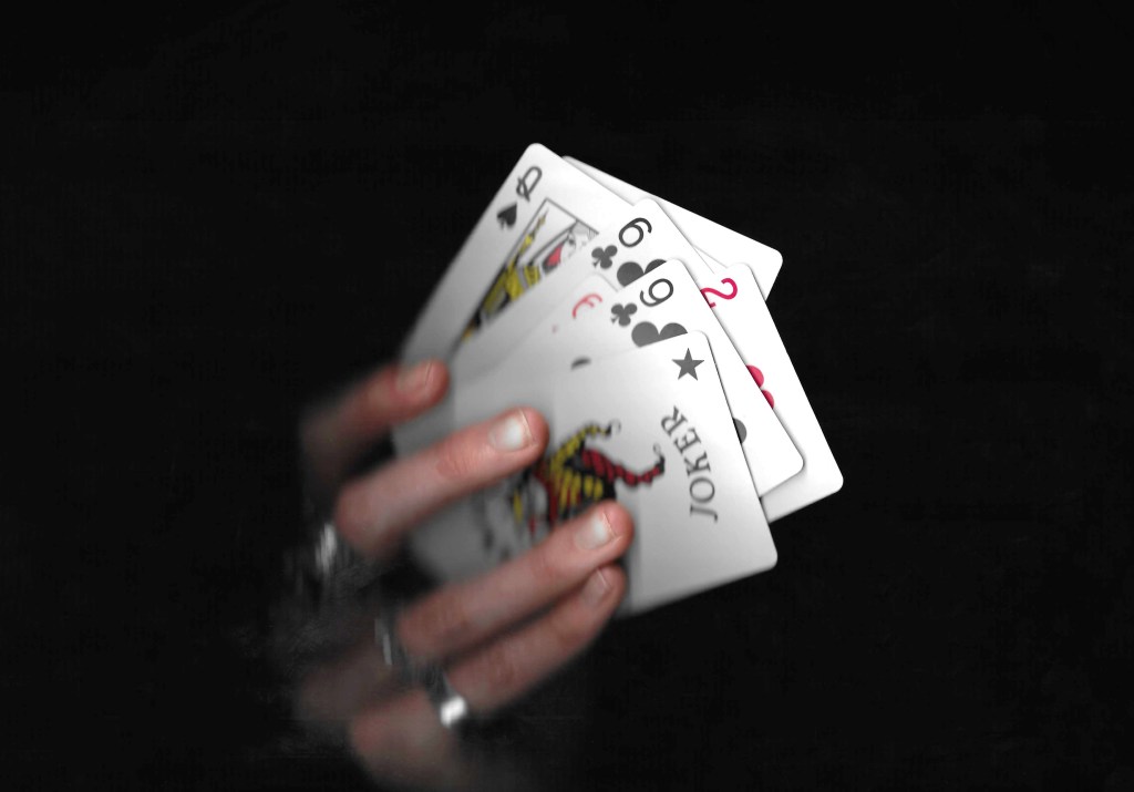
Scans:
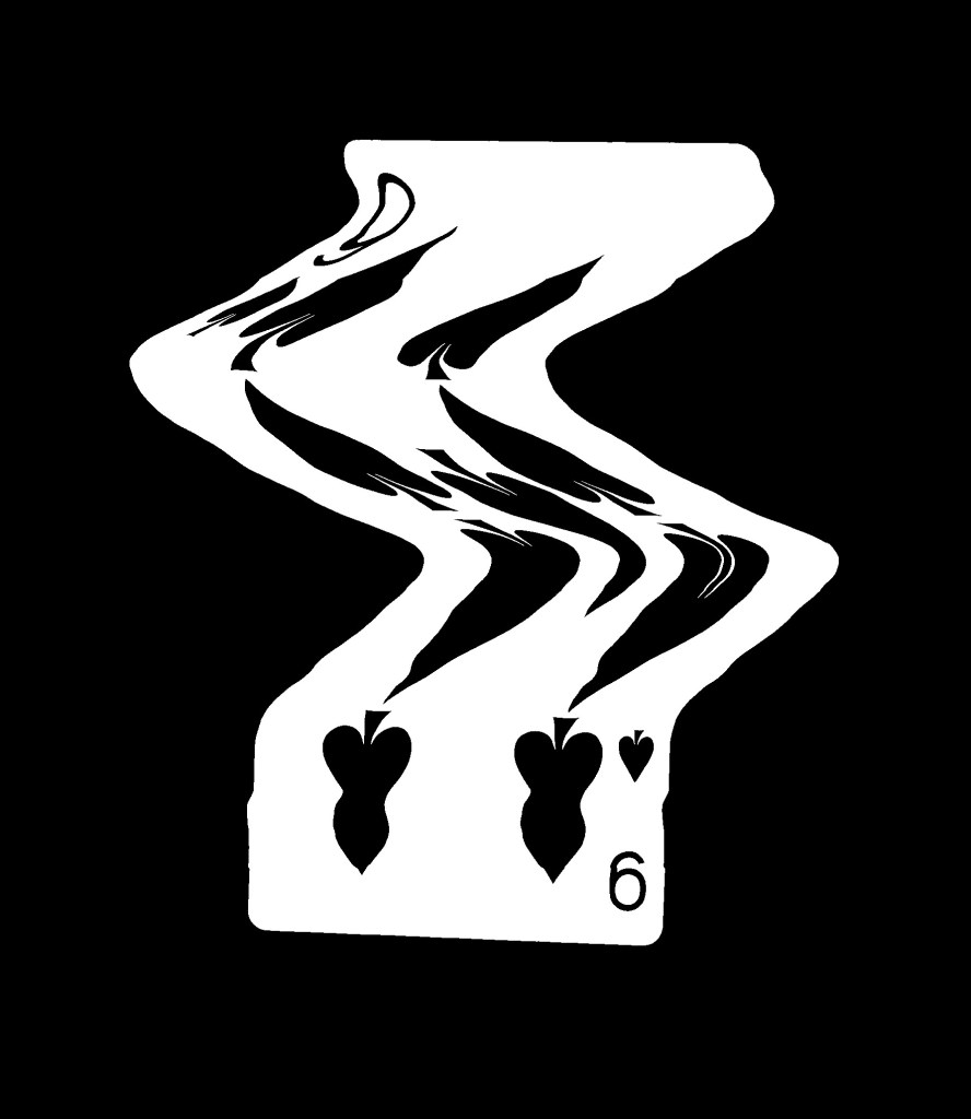
Experimental scans:
Printing (Lino):
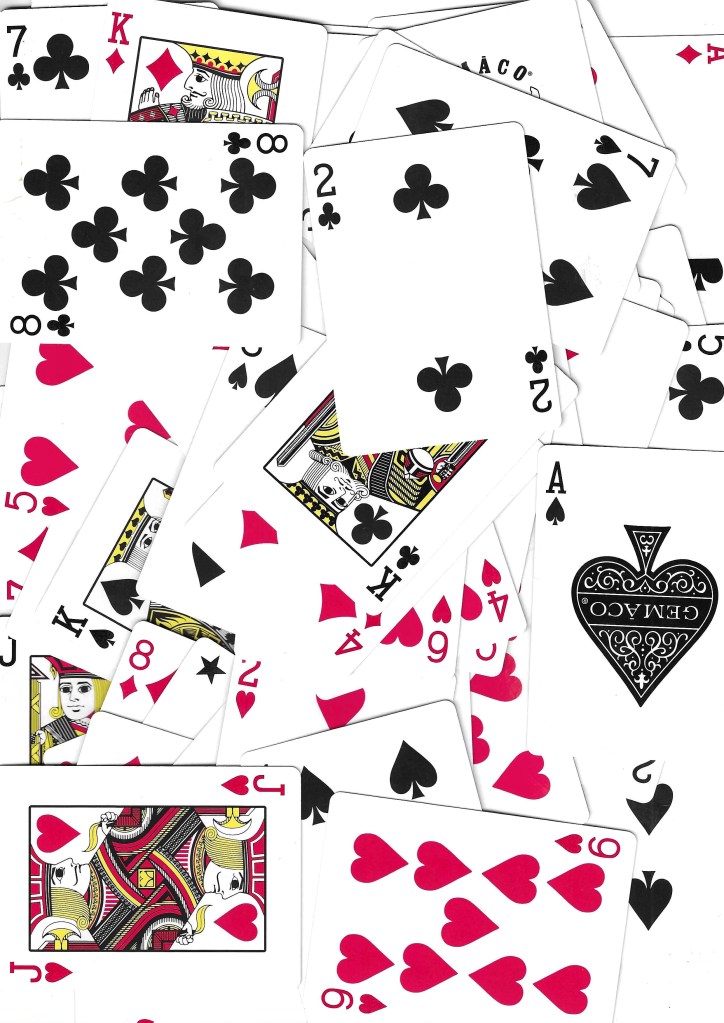
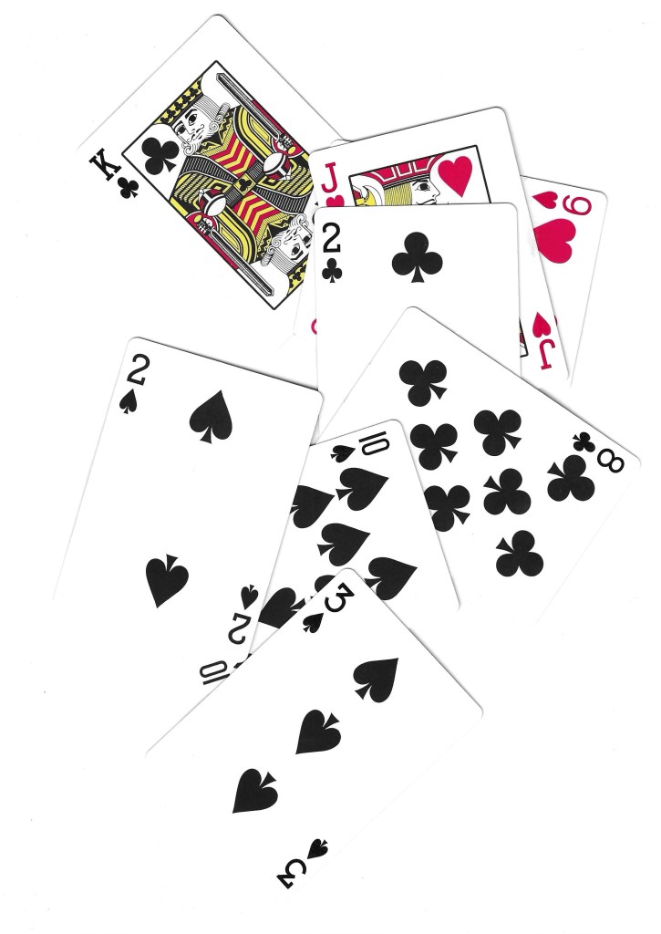
Images from Flickr:
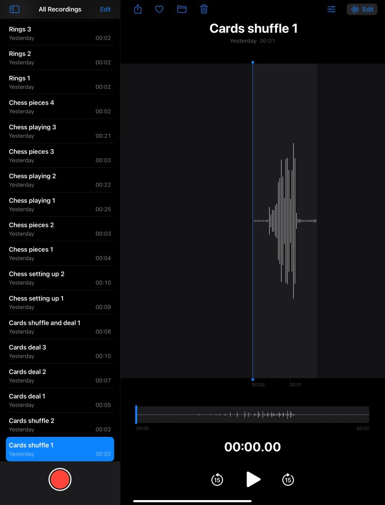
Audios:
In addition to create lots of visual media to use, I recorded a series of sounds related to the images. These included shuffling cards, moving chess pieces on the board and dropping rings. I can use these sounds to overlay videos and animations to provide another dimension to my work.