Categories
Contextualised Practice Contextualised Practice: Project Level 5

Contextualised Practice: Project mediums

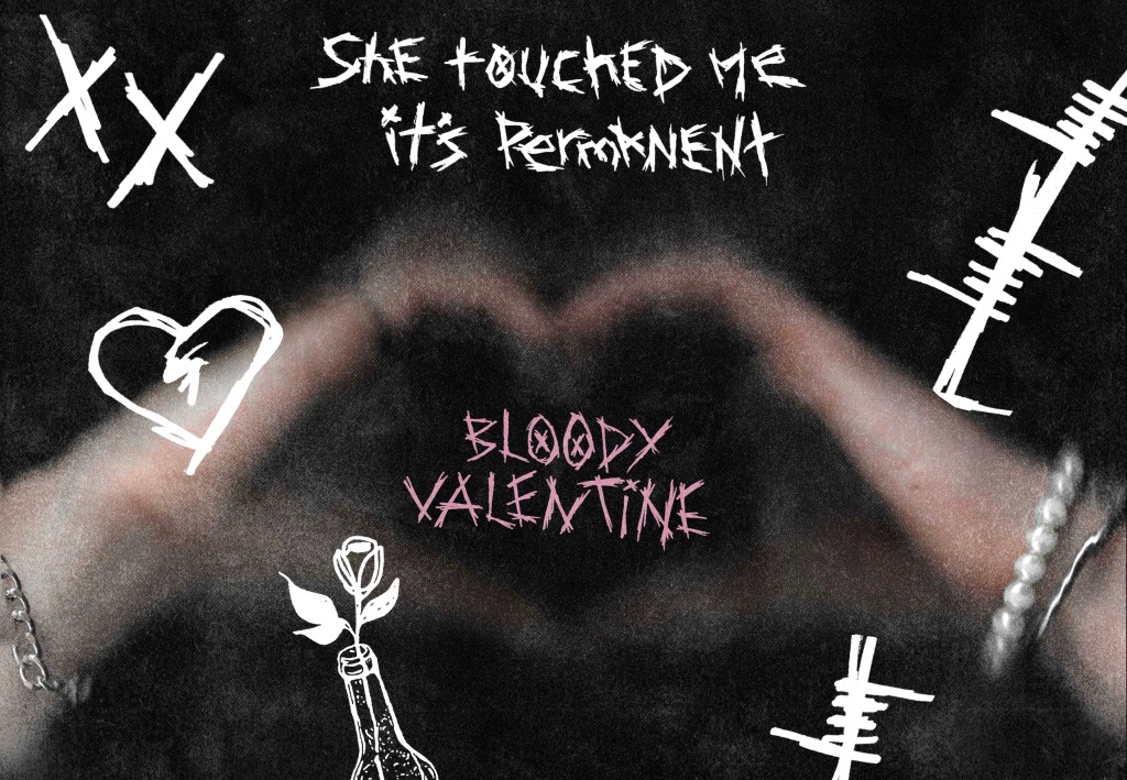
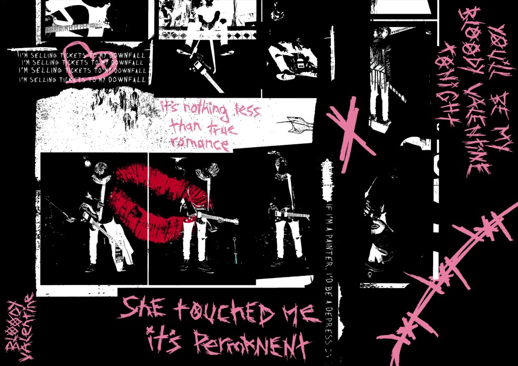
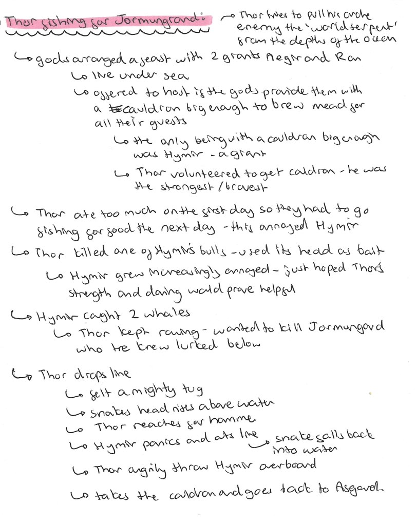
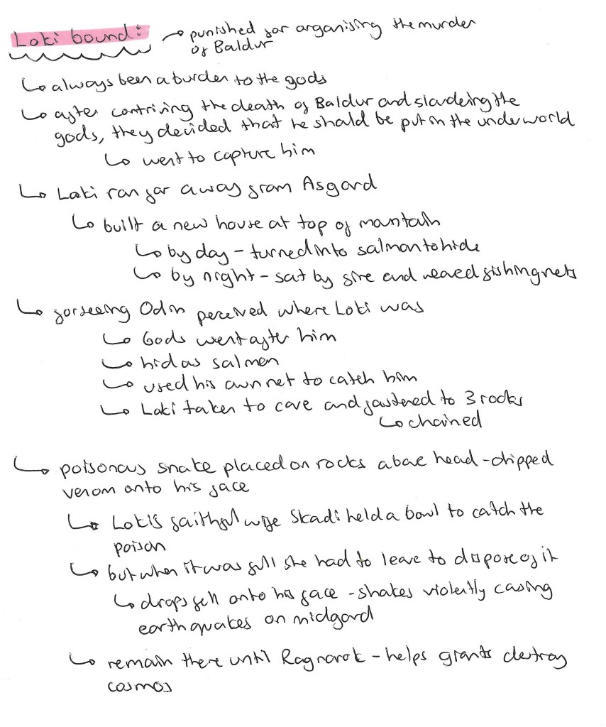
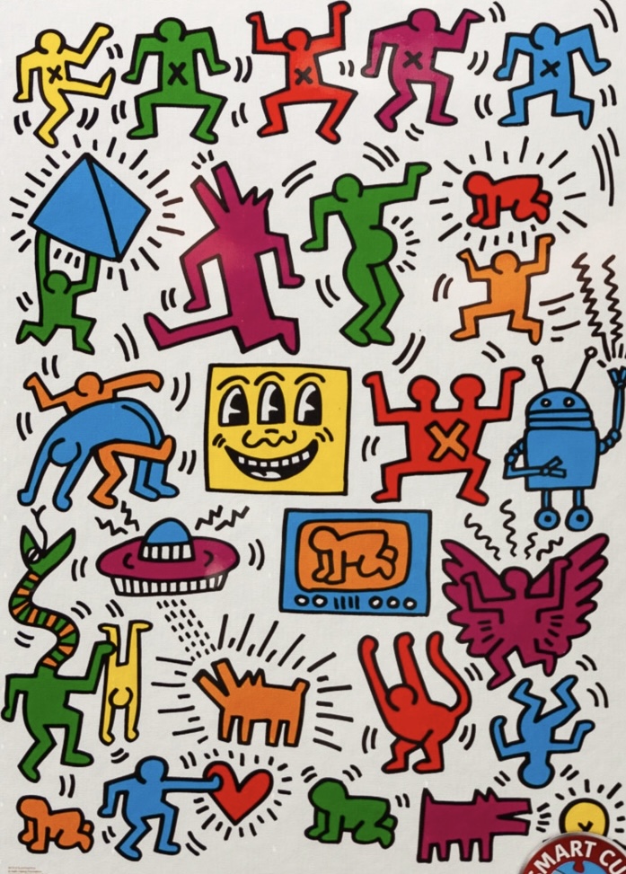
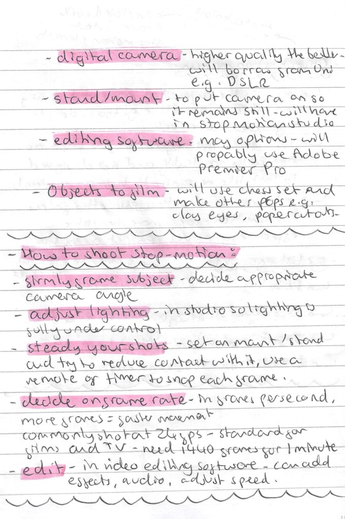
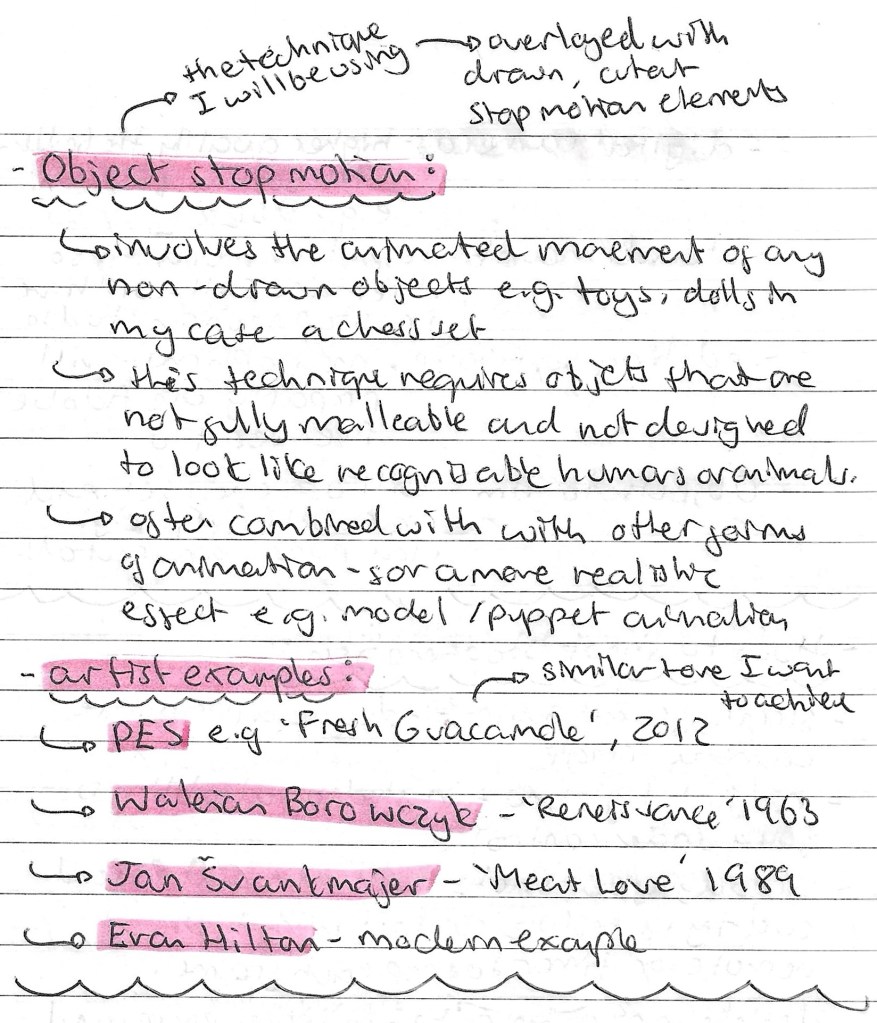
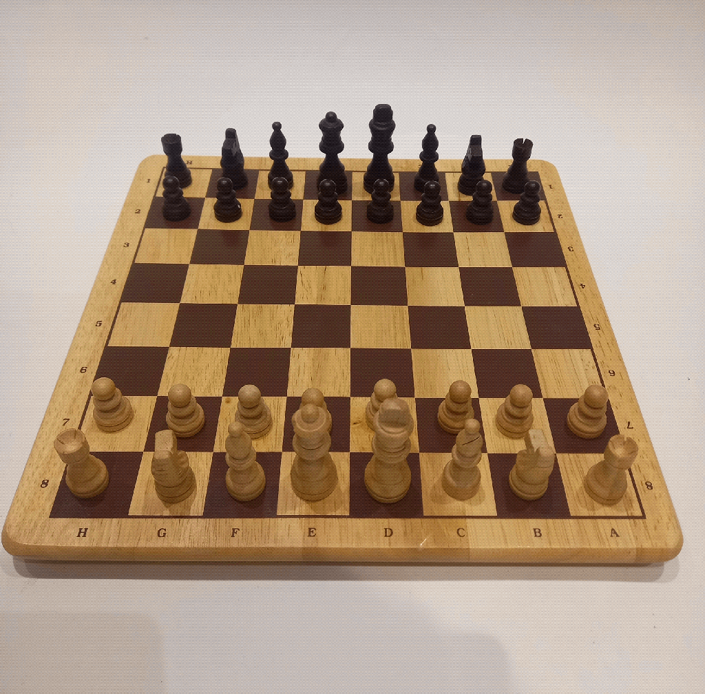
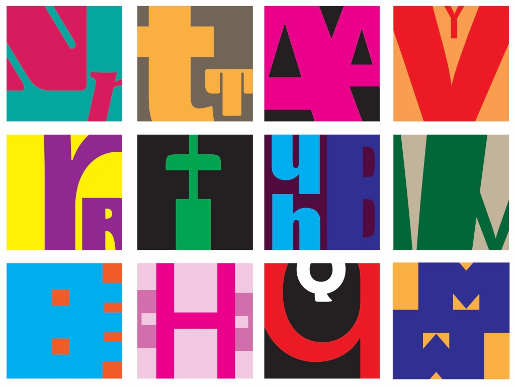
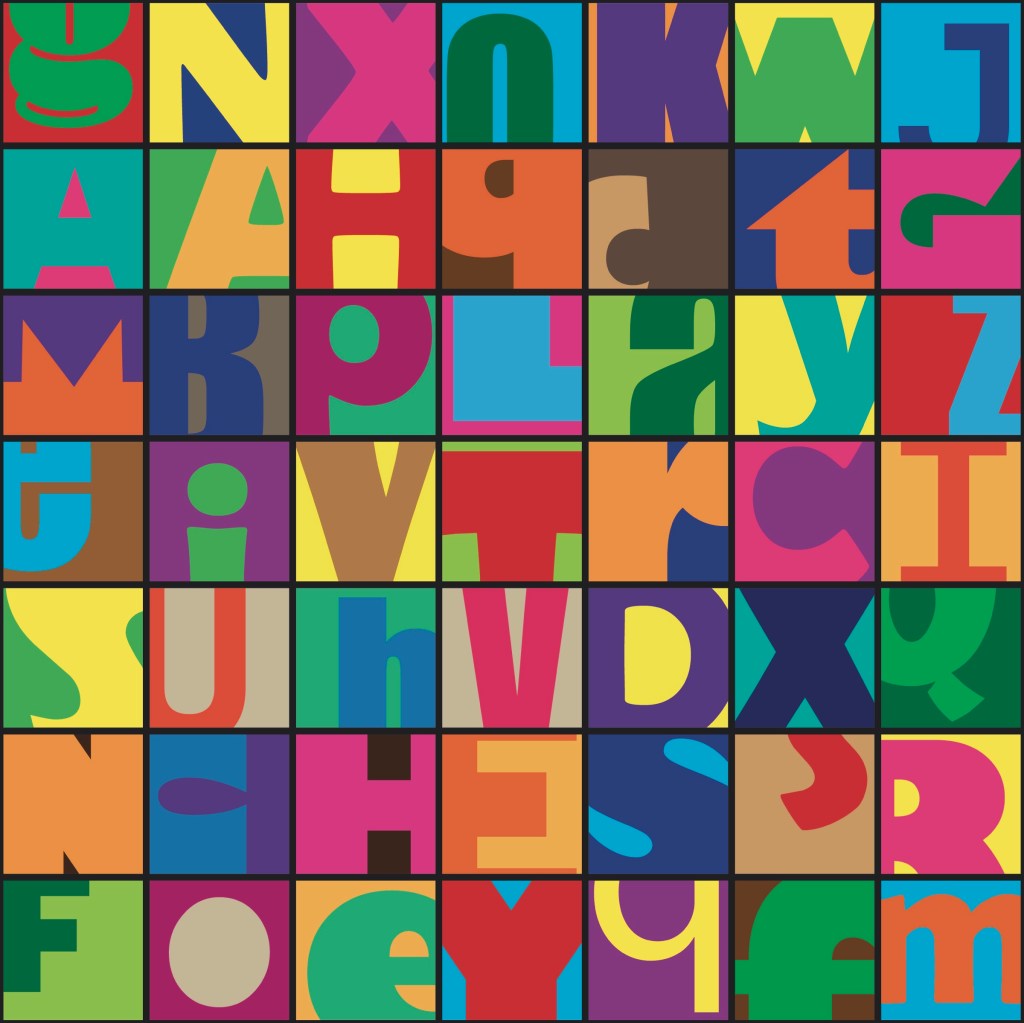
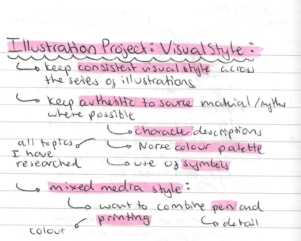
After extensive visual research I decided of what style and mediums I wanted to create my illustrations in. I want all the illustrations to have a consistent visual style, making them look like a coherent series. Through my research I found lots of reference images and want to keep my images authentic to the source material in regard to the character descriptions and colour palette. The style I have chosen is a mixed media, combining pen and printing. The combination of bright, bold colours with more intricate and fine details will help my work to appeal to younger and older audiences.

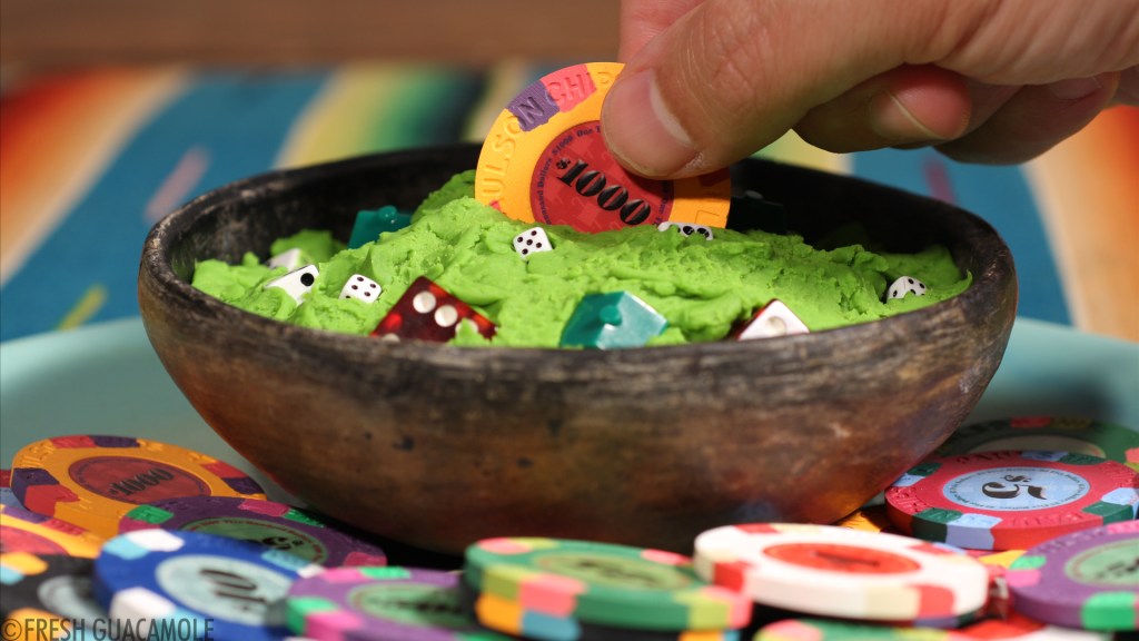
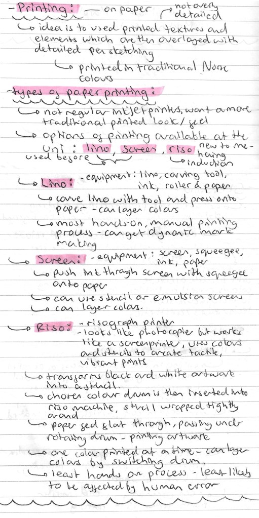
Printing: I want to experiment with printing for these illustrations. I plan to combine printed elements with pen sketching. The decision I needed to make was which type of printing to use. It would have been nice to be able to do hands on experiments with a range of printing styles but due to time constraints I needed to choose one. I want the illustrations to be printed on paper to achieve a more texture look. The 3 types of printing available at the University are Lino, screen and Riso. Below I made some notes about the basics of each type of printing:

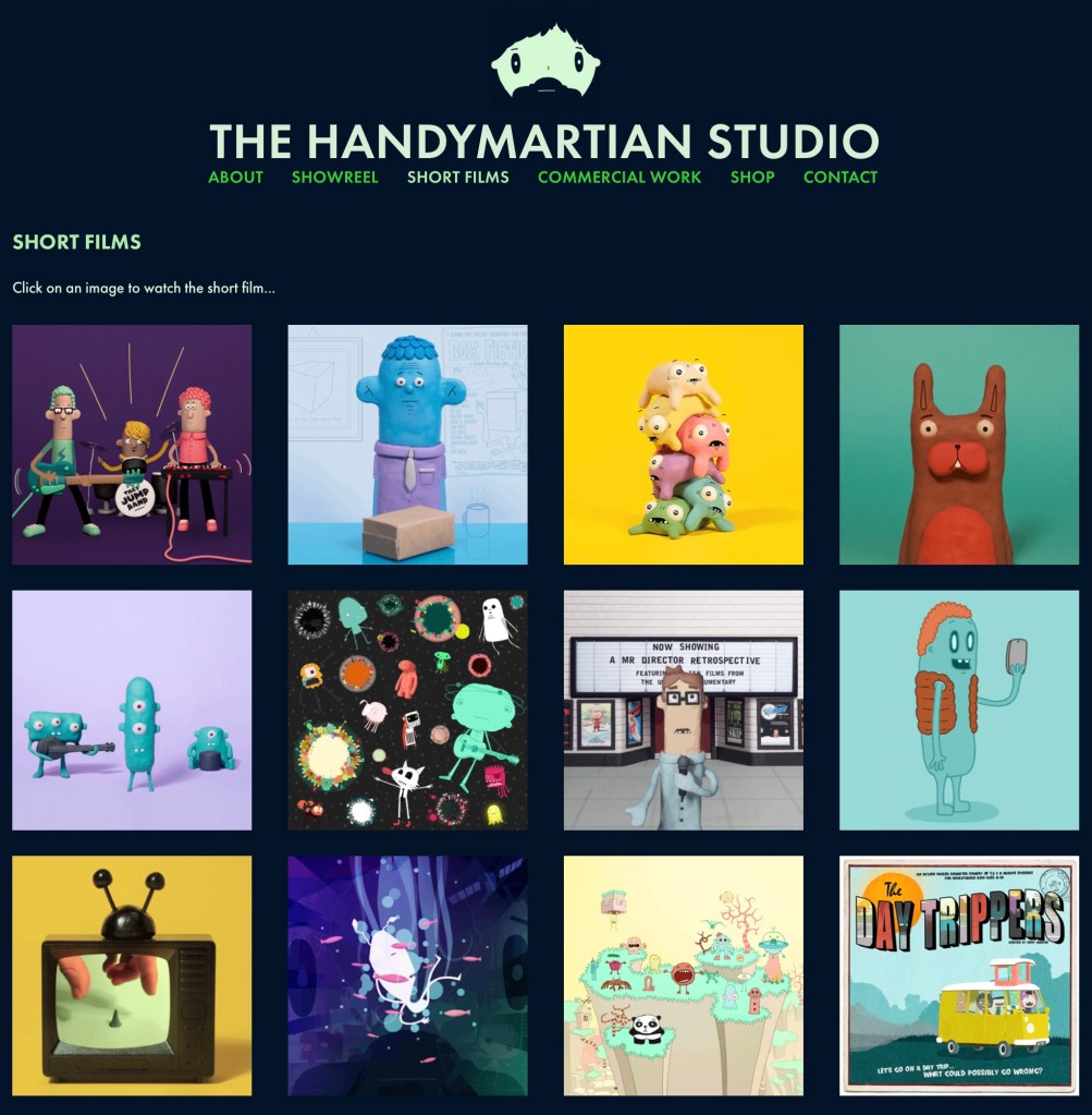
My previous work: these are some examples of my previous work that I’ve done using different printing techniques. Left- screen printing of fabric. Middle- screen printing on paper. Right- Lino printing.

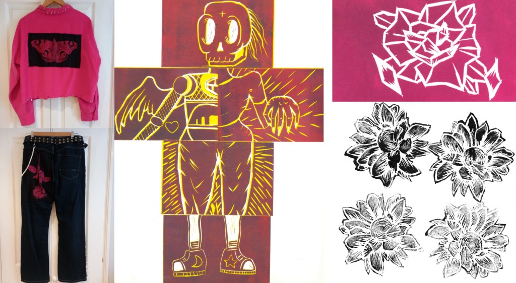
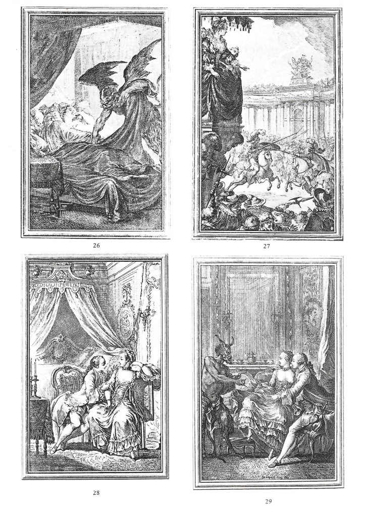
Lino Printing: these are some examples of Lino printing I collected when researching the style. This is the printing style I’m most familiar with having used it a fair amount before. I like the hands on nature and the imperfect dynamic mark making you can achieve when carving the Lino. Also it’s a good style for layering large areas of colour.

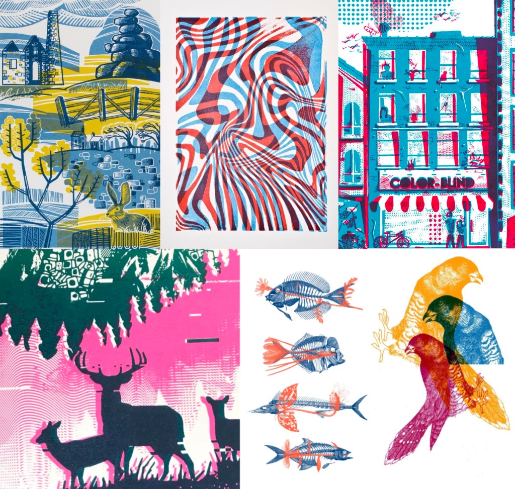
Screen Printing: these are some examples of screen printing on paper that I collected when researching the style. I have only done screen printing on paper once but have done screen printing on fabric a few times so I’m familiar with the process. This is a less hands on process but can achieve striking, overlapping layers of colour. Also you can create more detailed images easier with screen printing.

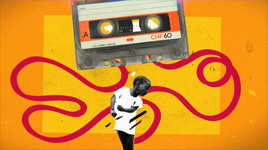
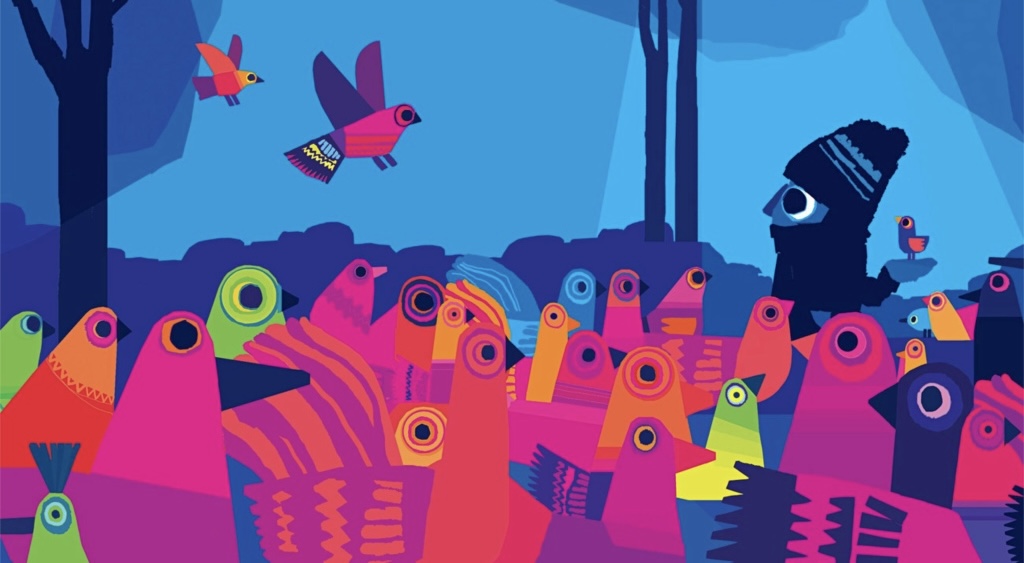
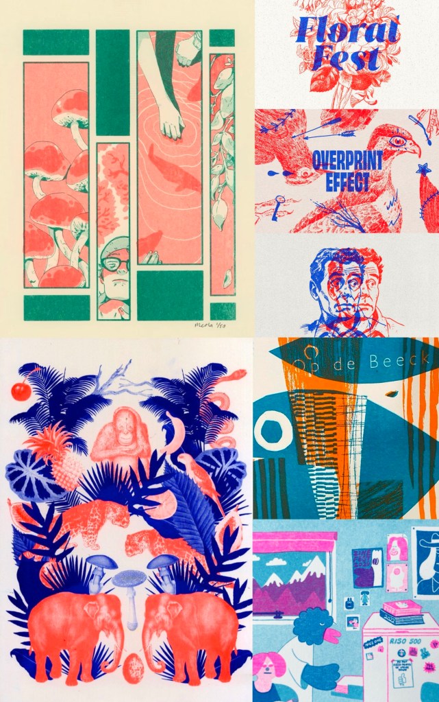
Riso Printing: these are some examples of riso printing I collected when researching the style. Riso printing is completely new to me, I have used it before so all my knowledge of it comes from research. Essentially Riso is an automated screen printing process that uses colours and stencils to create vibrant prints. In my research above I made some notes about the technical process. This is the printing style I have decided to go with. I want to use this module to explore a new technique so it is the ideal time to try Riso. Also it’s a quicker and more cost effective process than screen printing so I can produce more prints.

Pen: I wanted to combine the printing with pen, specifically a biro or fine liner. The pen will be used to add details and shading to the characters/ scenes. I’m not exactly sure at this point how I’ll combine the two mediums. Working with pen is something I’ve done a lot before and it’s one of my favourite mediums to work with. Below are some notes on my ideas for what styles of mark making I will incorporate into my project work:

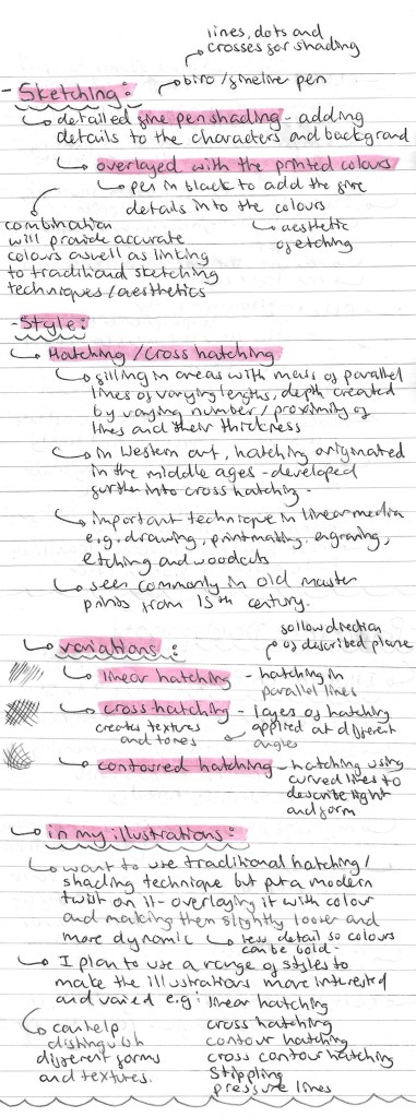
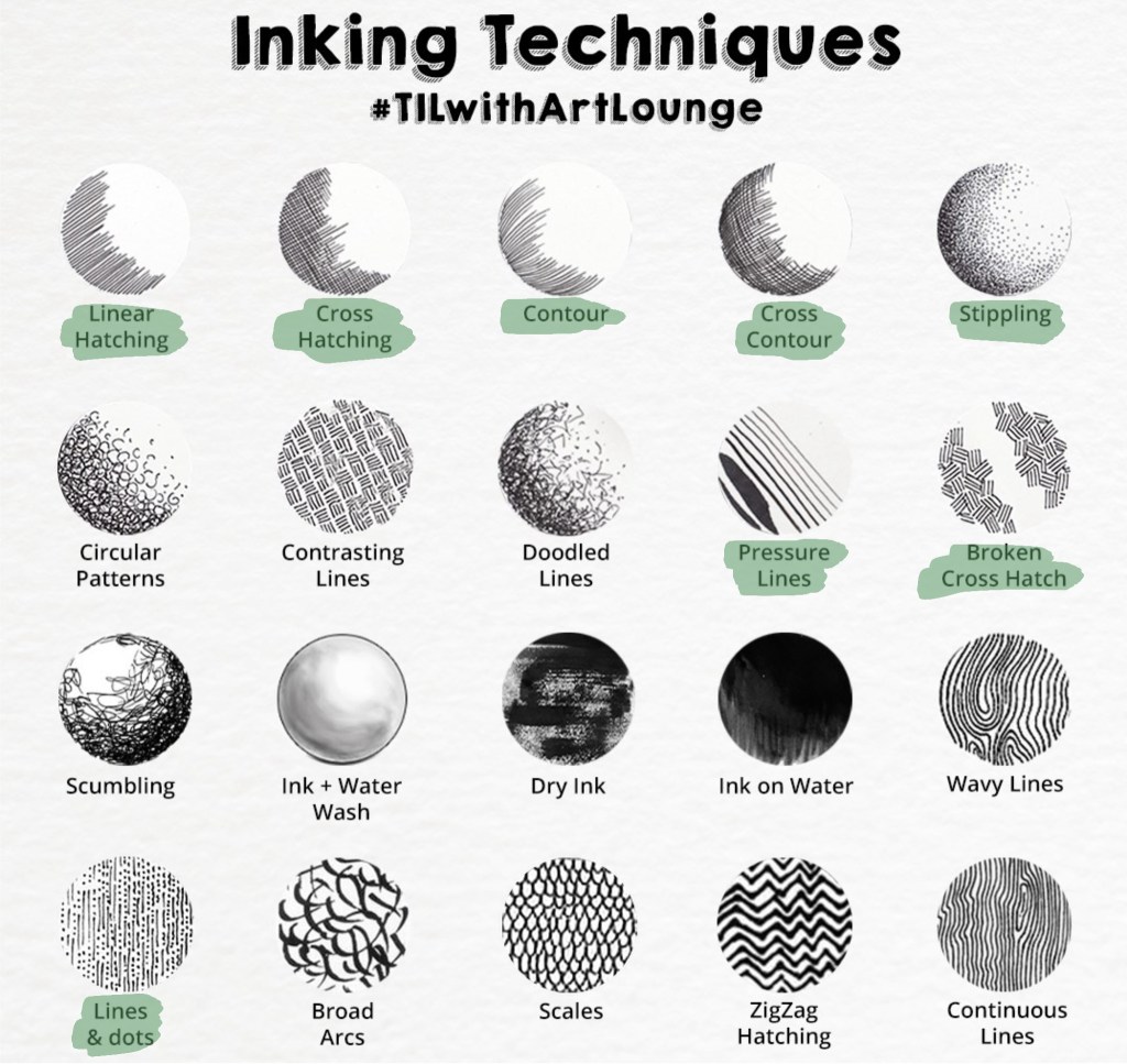
Here are a range of possible mark making styles I could use in my illustrations. The ones highlighted in green are ones I’d like to use. I plan to combine different techniques in order to make the shading more interesting and varied.

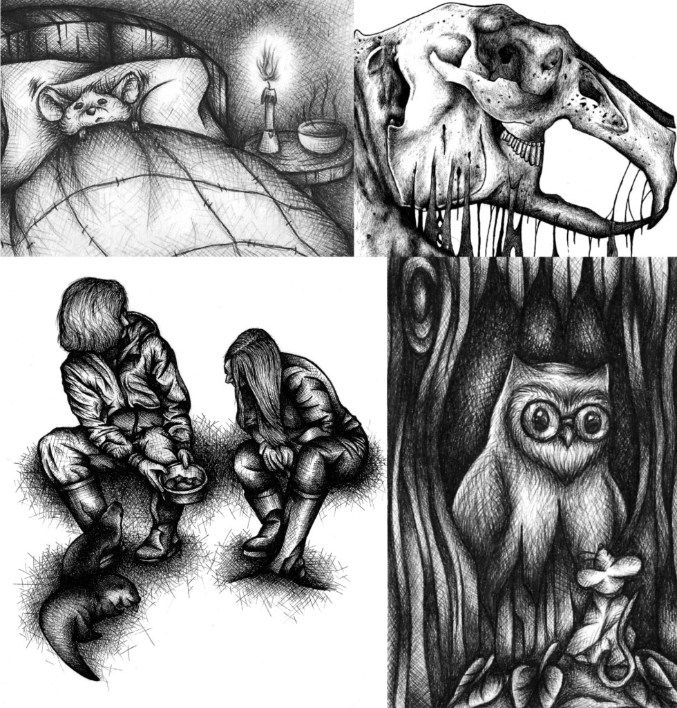
These are some examples of my previous pen work showing a range of different shading techniques including linear hatching, cross hatching, contour, cross contour and stippling:

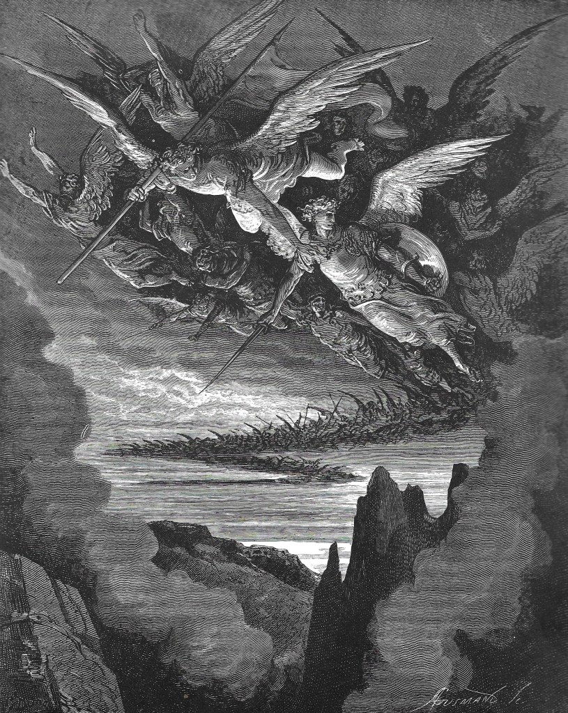
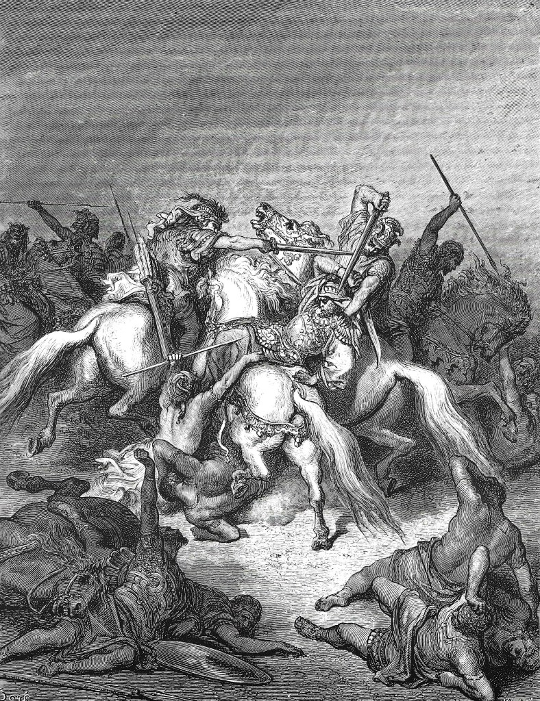
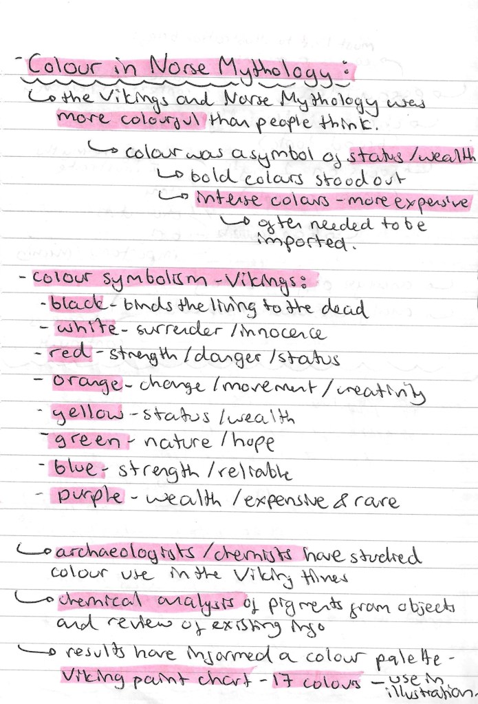
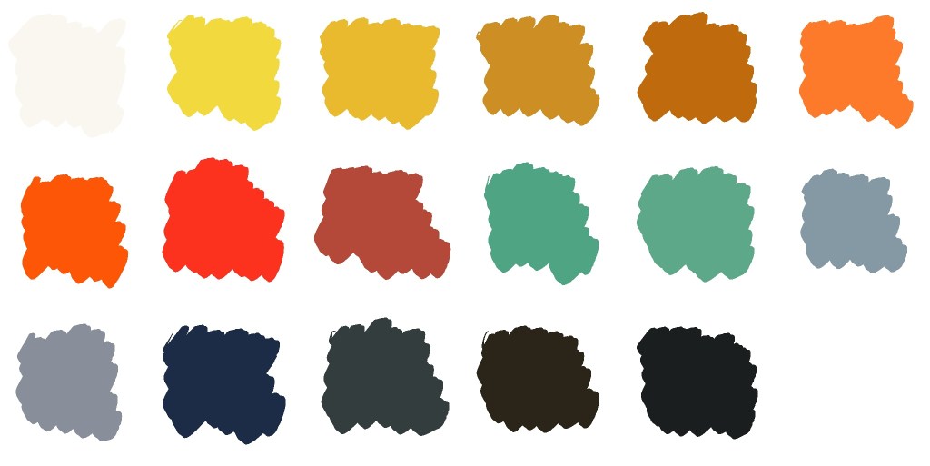
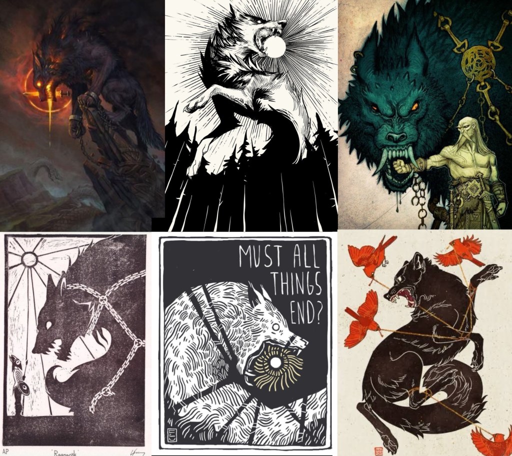
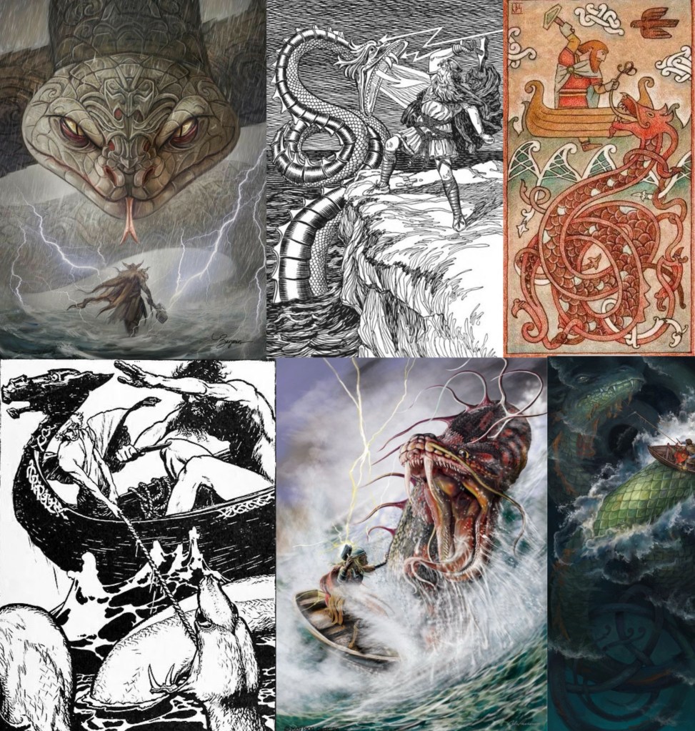
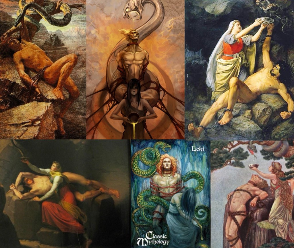
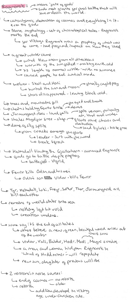
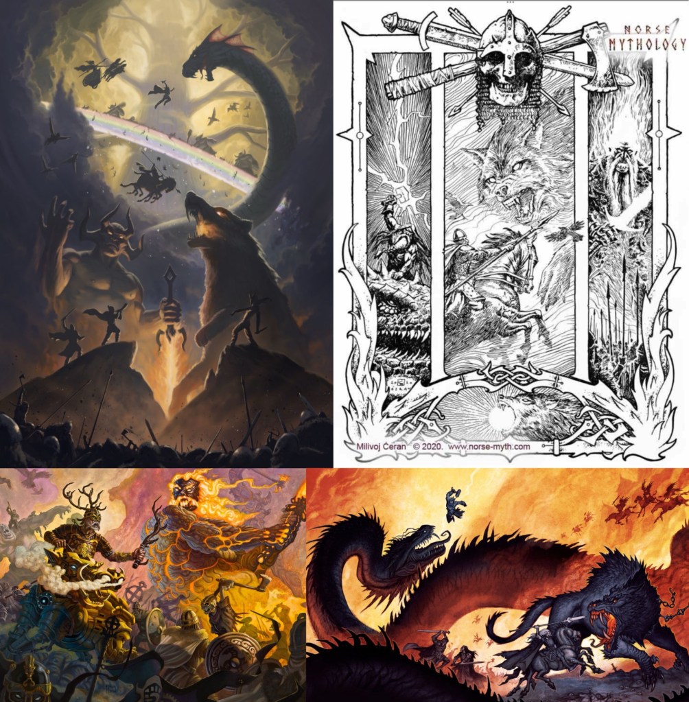
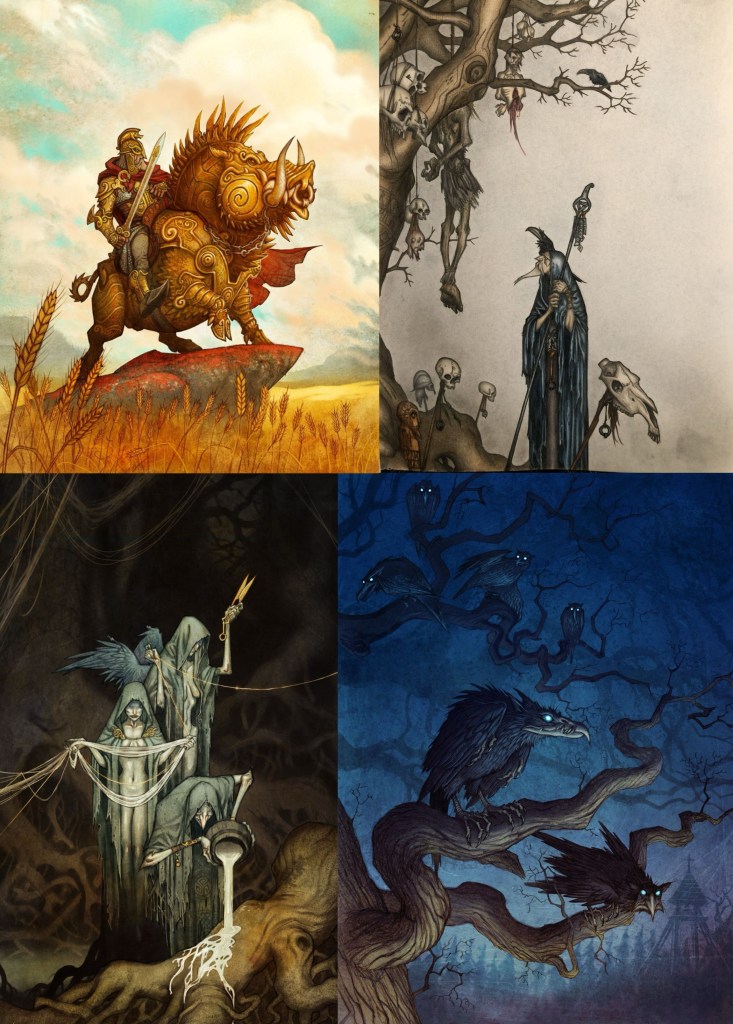
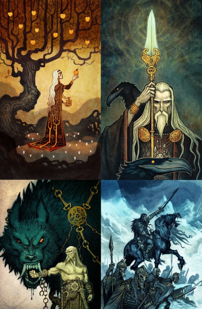
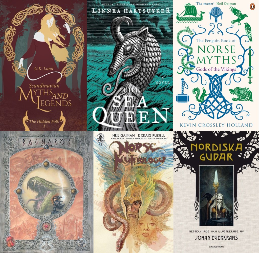
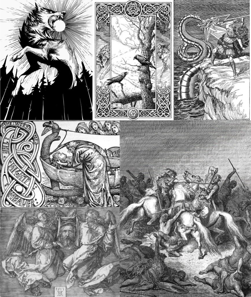
These are a range of artworks, primarily based around Norse mythology, which uses these styles of shading and line work that I can take inspiration from:

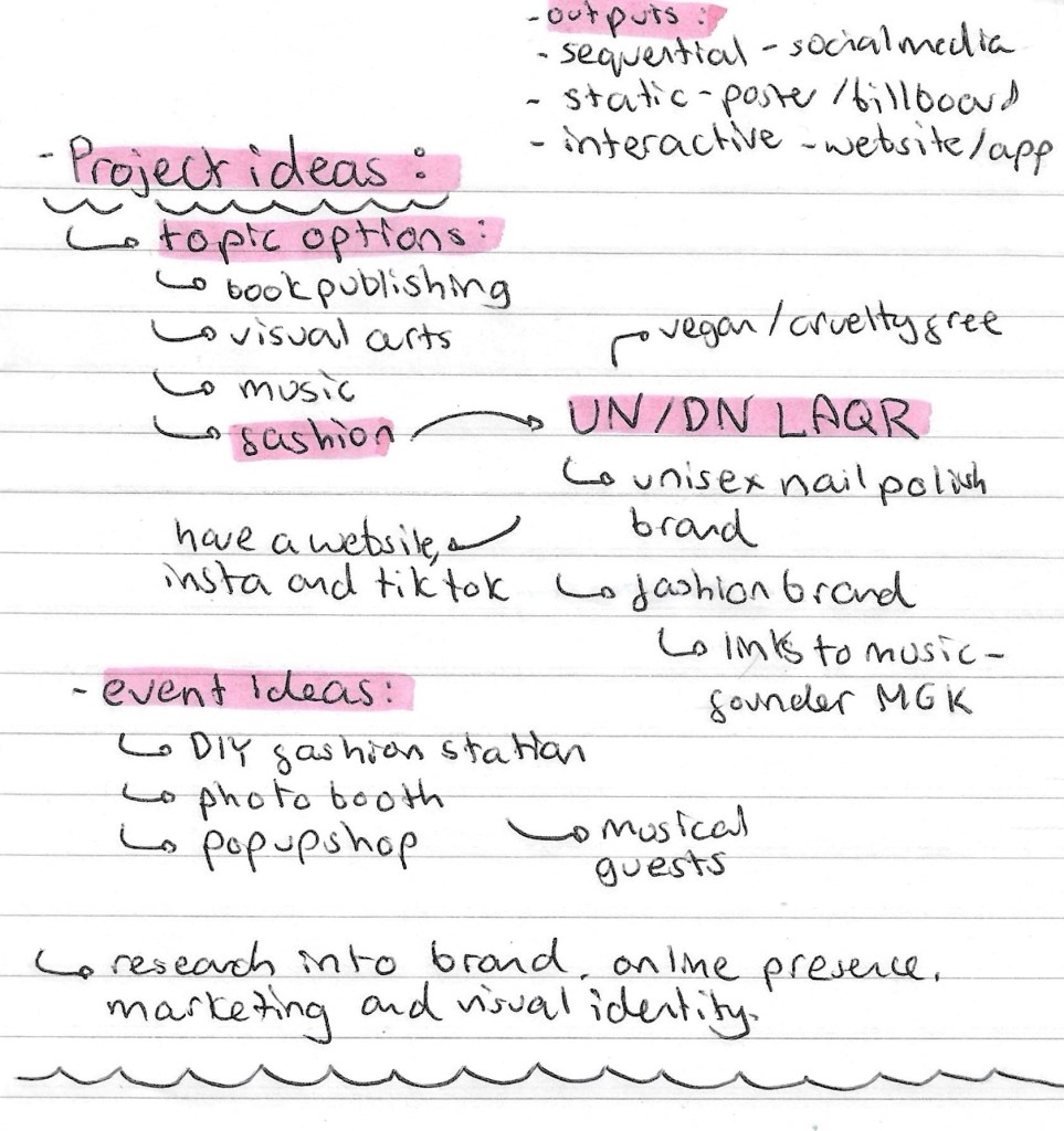
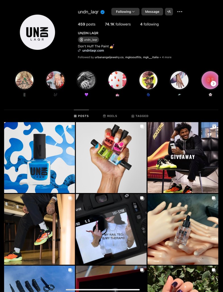
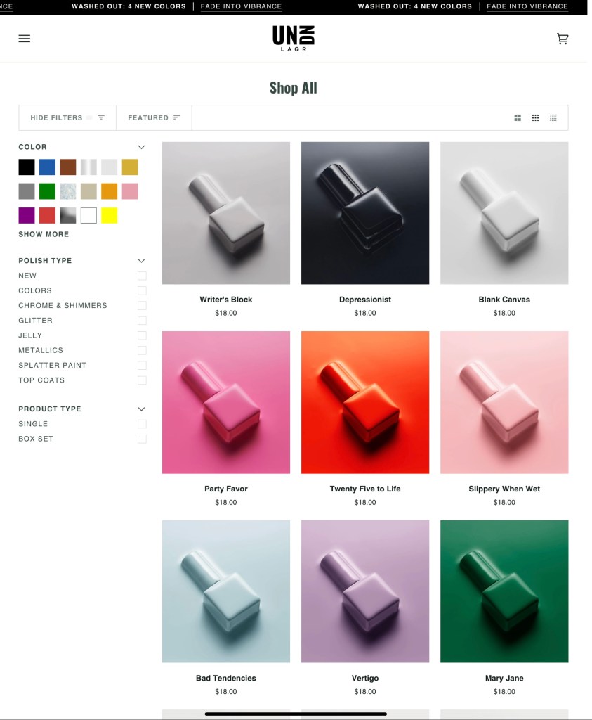
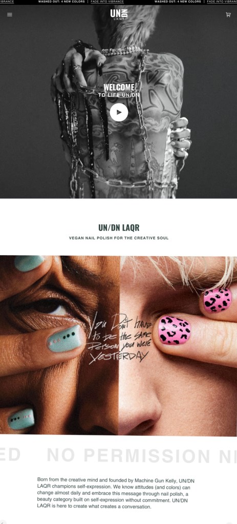
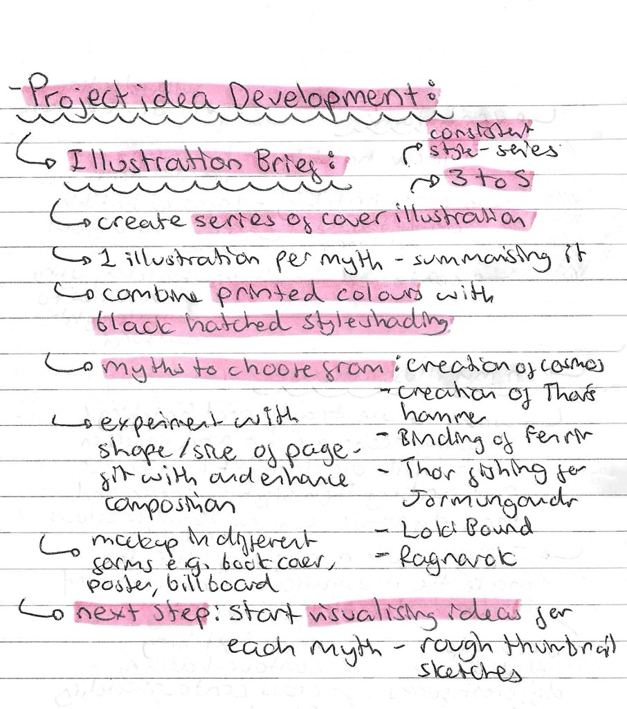
Project development:

Here is my latest plan for the project:

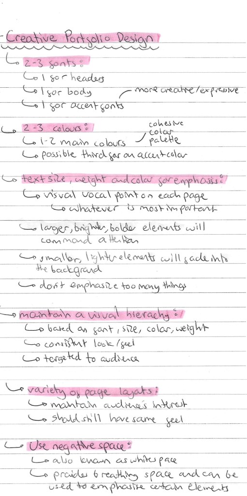
Some notes on making a creative portfolio that I can use and take into my own portfolio that I’ll be making at the end of this project. Some of the key points where using 2-3 fonts and colours, varying text size, weight and colour for emphasis and maintaining a visual hierarchy.

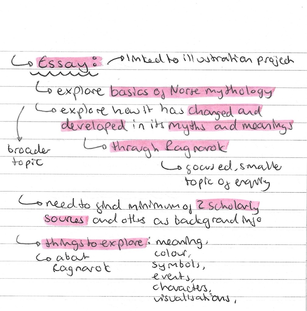
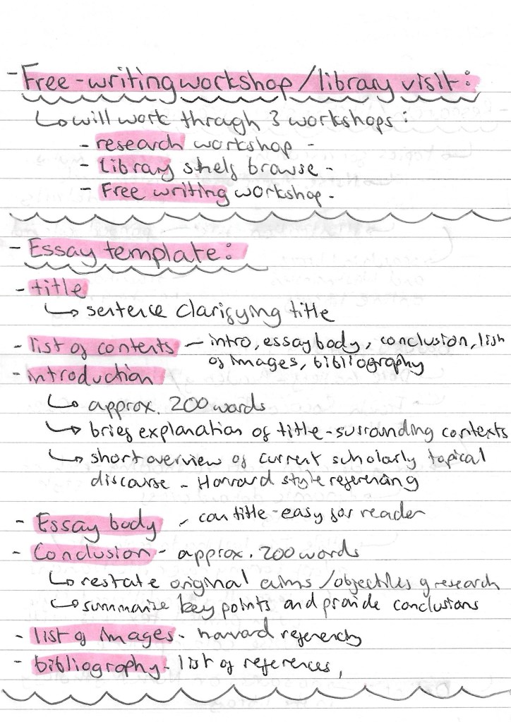
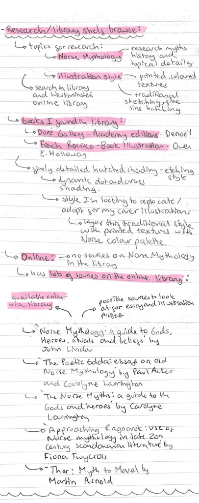
Here is my latest plan for the essay:

Categories
Contextualised Practice Contextualised Practice: Project Level 5

Contextualised Practice: Library Visit/ Research Workshop

In this session we did a little bit on our essays, looking at the structure and formalities of an academic essay that we needed to follow. I took some notes of this which can be seen below. The main part was a research workshop where we visited the University library to find inspiration for our essays.

I was initially looking for books about Norse mythology but soon discovered that there were very few books about this topic in the library. There are a lot of sources about it on the online library so I looked there and made a list of possible reference for me to look at. I then chose to expand what I was looking for and try to find visual reference material rather than factual material about Norse Mythology. I started researching books that had highly detailed hatching illustrations as this is a style I’m thinking about incorporating into my project. I was able to find a couple books with this style called ‘French Rococo’ by Owen E. Holloway and ‘Doré Gallery- Academy editions’ by Denoël.

French Rococo Book Illustration – Owen E. Holloway

Doré Gallery – Denoël

This session was beneficial in getting more ideas for this visual style of my Norse Mythology project. Initially the library search was frustrating as I was just looking for sources on Norse mythology and couldn’t find any but when I broadened my search to find inspiration for the visual style it was more successful. By the end of the session I found lots of references on Norse mythology through the universities online library and a couple of books with detailed hatching illustrations that I’ll take inspiration from for my project.

Categories
Digital Arts 2 Digital Arts 2: Project Level 5

Digital Arts 2: Stop Motion studio induction- Dragonframe

Before shooting the scenes I had to have an induction into the stop motion studio. We went through the basics rules of the room, health and safety and an introduction into the equipment.

The most important thing I learnt was Dragon Frame. I had never heard of this software before so I was having to learn it from scratch. It is an industry standard stop motion animation software. It has been used to make several full-length stop motion films, including Disney’s Frankenweenie and Laika’s Coraline and ParaNorman as well as stop motion TV shows such as Shaun the Sheep.

I learnt a lot about the software including how to setting it up with the camera, navigating the interface, shooting the frames and exporting the image sequences. Here are the notes that I took from the induction and my independent research into Dragon Frame:

As well as the induction I had at the university I looked at this websites to learn about Dragon Frame:

Introduction to Stop Motion Animation

Categories
Level 5 Sequence and Messaging Sequence and Messaging: Project

Sequence and Messaging: Project Ideas- Hotel Diablo

My project will be combining UN DN and Hotel Diablo to create one event and cohesive visual identity. Hotel Diablo is an album released by Machine Gun Kelly in 2019. It’s primarily a rap album but has strong influences from rock and pop punk. It’s a very introspective album with quite dark themes. This is reflected through the album aesthetic as there’s lots of black and greys. The pops of colour that are seen as usually purple. The overall concept behind the album is that Hotel Diablo is a part of Machine Gun Kelly’s mind and this album is taking this listener there. It’s one of my personal favourites albums so I really want to explore in through this project. Below is the symbol of that album:

Album cover: the cover helps to show the idea that Hotel Diablo is a place in his mind that the listener will visit. Having him as a child on the cover suggests that this part of his mind has been active since childhood so there’s a lot of emotional build up. I really like the grainy texture on the cover and all the handwritten notes in the background. I want to take these aesthetics into my project work.

Back of album: the back of the album features a picture of him now, contrasting the front cover. I like the tattoo on the back of his head, suggesting it’s a portal or gateway to Hotel Diablo. This symbolism is really nice and idea I will use in my work. Also the track list is written in a loose, hand written style. This is something I explored though my work on ‘Bloody Valentine’ so is I style I could definitely take inspiration from.

Interior of CD: in the same way I did for ‘Bloody Valentine’ I have scanned the interior of a physical copy of the album. Each song on the album has its own image that represents it, some more literal than others. I won’t be using these as backgrounds because I want to create all the imagery myself but they’re a good source of inspiration and a look into the visual identity of the album. The pops of colour against the greyscale images is a really eye catching style. I really like the paper cut out, collage inspired style.

Tracklist (Spotify): this is a clearer image of the track list from the album

Hotel Diablo graphic novel: Machine Gun Kelly also made a graphic novel titled Hotel Diablo. It is a way of depicting Hotel Diablo as a real place rather than a metaphorical place in his mind. One theme that really stands out to me is keys which play an important role is the story. They’re ultimately a metaphor for being able to unlock a part of your mind. I’d like to incorporate keys into some of my imagery. I have a copy of this so I’ll be able to look through it for ideas.

Categories
Level 5 Sequence and Messaging Sequence and Messaging: Project

Sequence and Messaging: Project Ideas- UN DN LAQR

The company I will be using for my project is UN DN LAQR, a nail polish brand owned by Machine Gun Kelly. I have chosen this brand as out of the 4 topic options, fashion and music where the ones that most appealed to me. UN DN is a fashion brand with strong links to music as it’s owned by a musician so I can combine the 2 topics. Below is some notes about the brand and my initial ideas for the event I will promote:

One of the reasons I like this brand so much is their creative and colourful advertising. Their visual identity stands out from that of other nail polish brands which is what initially attracted me to the brand. They’re very colourful and vary their style from collection to collection so offer lots of room for creative freedom. I will be exploring this more in my social media research. Below are some screenshots from their Instagram and website to get a sense of their brand identity.

UN DN Instagram:

UN DN website:

Project ideas: I started to brainstorm some initial ideas for my project. The event I want to promote is a pop up shop that is connected to a concert. The pop up shop will include things like a nail station, photo booth and fashion show. My idea for location is in Camden, London as it has a very creative atmosphere with lots of links to music and fashion. I also want to have a concert at the event where Machine Gun Kelly performs his album ‘Hotel Diablo’ for its 5 year anniversary. This way I’ll be combing fashion and music. I think connecting the nail polish brand and one of his albums leaves lots of room for creative exploration as I’ll need to combine to 2 contrasting aesthetics into one consistent visual identity for the event. Below are more details on this and some ideas about what I’ll produce for the static, sequential and interactive outcomes.

Ideas for visual style/aesthetic: one of the main challenges this project will present is trying to combine the visual styles of UN DN and Hotel Diablo. Below is a list of possible styles I could use for my project. This list has included styles/aesthetics seen in either than brand or album or just other styles that I like and would be interested in exploring.

Categories
Level 5 Sequence and Messaging Sequence and Messaging: Project

Sequence and Messaging: Action and Interaction Activity

This is the creative activity we had in response to the action and interaction session. For this task we needed to pick a song or poem and make an image that encapsulates what the text means to us. We had to pick a word that summaries this and create it in our own lettering. This then had to be combined with an image to create a poster/ static layout. Our second task was to breakdown the song/ poem into small passages and create a sequential piece.

The song I chose was ‘Bloody Valentine’ by Machine Gun Kelly. This song is from his 2020 pop punk album titled ‘Tickets to my Downfall’. It’s on of my favourite songs that means a lot of me so I wanted to create some pieces that demonstrate this.

Ideas: below are my ideas for the imagery, typography and overall style/ aesthetic. I also wrote down possible words/ phrases I could use these include the song and album title and my favourite lyrics from the song.

Bloody Valentine:

‘Tickets to my Downfall’ album cover:

Creating visual assets: after I brainstormed all my ideas I began to create visual assets in a variety of ways as I wanted to make mixed media outcomes.

These are scans I took from the interior of the vinyl. I wanted to use these are background for some of the posters. I love the collage style with photos and messy text and images over the top. I did some slight editing to these scans, adding some more texture to them and giving them an older, more vintage look.

Below are some examples of typefaces that I took inspiration from. They are from the album cover and a selection of fonts with a similar aesthetic that I found on Pinterest. They all have a rough, sketchy and hand drawn look which I really like. This style compliments the scrapbook, collage look that I’m aiming for.

These are a selection of sketches and typography that I made. These are all hand drawn with a black marker and then scanned. I went for a sketchy, loose style with lots of rough lines. I created a few variations of the alphabet then took these and wrote out the song title, album name, and my favourite lyrics.

These are some scans that I made of me and my girlfriend. I chose to work with scans rather than photos because I like the gritty texture that it produces. I think that it aligns more with the aesthetic of the other elements that I’ve made for the posters. I also made some scans of lip and finger prints. I got my girlfriend involved with this because it compliments the themes explored in the song so would help enhance the meaning of my posters.

Posters:

1- I went for a simple composition with the focus being on my typography which is centred and in a stand out colour, pink. It’s surrounded by a range of my sketches and some prints which I inverted to make white. The background is black which a grunge imported texture. The inspiration for this poster was a love note than you would draw and give to someone, with a darker emo influence, hence the hand drawn style of the sketches and typography.

2- This poster is similar to the first but with the introduction of a scanned picture of 2 people creating a heart shape. The typography is slightly less dominant in this one, there’s more of a balance between all the elements. This and the first poster make a nice pair as the maintain the same visual language.

3- This poster has a similar aesthetic but I started to include the album artwork. I used one of the scans and edited it heavily to completely change the colours and tone. Then I layered this with a few different lyrics and sketches all in pink. The final detail is a red kiss print, I wanted this to be a stand out element on this poster. I wanted this piece to look like a scrapbook/ journal where someone is fiddling and writing their ideas and thoughts.

4- For this went I went more towards the scrapbook idea. The background is the album artwork but is desaturated and has a vintage look. The sketches and details are black so aren’t immediately eye catching. I wanted the pink writing, lip print and scan to be the bits that draw the viewers attention. My favourite part of this piece is the incorporation of the scans as photos stuck into the scrapbook. This really enhances this idea and has a warm, hand made feeling.

5- This is my favourite of all the posters. I like the coloured album art in the background. I desaturated it a bit so that it’s not overpowering but still shows the pink and green that are important to the song/ album aesthetic. It has a nice balance between the typography, sketches and scans. The sketches and type are all in white except the red lip prints which are eye catching but not too distracting from the other bits. This one really feels like a scrap book page that someone would make for someone they love. I think it encapsulates the meaning of the song and has the aesthetic of the album but with my own imagery and stylistic twist.

Videos: after creating a series of posters I made some sequential pieces. The idea behind these was that the scrapbook inspired pages remain static and the typography would change. I created the animations on Procreate. The 3 below are different versions of this:

Video with audio: I took one of the videos and added the instrumental to ‘Bloody Valentine’ to it. This just helps round off the concept and makes it more engaging. I chose the instrumental rather than the lyrics as I don’t want it look like a lyric video. Also I didn’t use all the lyrics so it would be distracting to read a different lyric to what is being said.

Reflection: I had lots of fun working on this task as I got to centre it around a song that I’m really passionate about. I enjoyed creating my own visual assets and typography in a rough, sketchy style. I’m very happy with the static and sequential outcomes that I created. I made a range of posters and videos that explored different ideas and aesthetics but all link back to the themes, concepts and meaning of the song. I’d like to incorporate some of theses ideas into my own project work such as the hand drawn sketches/typography and use of scanning.

Categories
Contextualised Practice Contextualised Practice: Project Level 5

Contextualised Practice: Project Ideas/Research

Developing project ideas: the idea I’m working on for my project is to illustrate a series of myths, creating 1 illustration for each. I want that illustration to act as a ‘cover’ for the story. Not in the sense of a book cover but more as a single image that tells the story showing the gods, creatures and story. These images could then be applied to many contexts. The series will have a consistent visual style. I am aiming for my work to be versatile in regard to format and audience. Below I made a list of some of the most important Norse myths and marked ones of initial interest to me:

Colours in Norse Mythology: a topic that interests me is the colours used by the Vikings. I researched this as I’d like to achieve an authentic colour palette in my illustrations. The Vikings were more colourful than people may think, with colour being a symbol of status/wealth. Bold and bright colours were more expensive and often needed to be imported. Below is a list of colour symbolism for the Vikings, these are ideas I could bring into my illustrations. I found a colour palette that was created based of chemical and archaeological analysis of Viking artefacts. The palette has 17 colours.

Norse colour palette: The palette has a nice range of earthen tones and string warm colours. Using just this palette you could create eye catching and authentic illustrations.

I added this palette to Procreate and Photoshop, the 2 main drawing softwares that I use.

This is a list of colours associated with different Norse gods and goddesses. I plan to use these ideas and the general Norse colour symbolism in my project.

Symbols in Norse Mythology: symbols are important in Norse mythology, often being used in Norse artworks. Symbols were used by Vikings to represent gods, beliefs, creatures, myths and objects. Including some subtle symbol in my work could be an interesting element. Below is a list of 10 important symbols in Norse mythology, a brief description of what it represents and an image of each:

Myths: from the list is key myths I made I chose 6 to research in depth. These are the creation of the cosmos, creation of Thor’s hammer, binding of Fenrir, Thor fishing Jörmungandr, Loki bound and Ragnarok. I chose this set as they evenly cover the timeline of Norse mythology, an interesting range of gods, goddesses, creatures, objects and environments. I researched each one in detail, making notes on the story, characters, themes and some examples of artwork depicting each one. For this research I look at the original sources such as the Prose and Poetic Edda and summaries on various websites.

Creation of the cosmos:

Creation of Thor’s hammer:

Binding of Fenrir:

Thor fishing for Jörmungandr:

Loki bound:

Ragnarok:

Additional visual research: as well as researching images depicting specific myths, I gathering lots of general resources of Norse mythology artwork.

Johan Egerkrans: I will be taking lots of inspiration from Egerkrans’s work. There are many elements I admire including the colour palette, compositions, stylisation of characters and ability to create a narrative within a single image.

Milivoj Ceran: Ceran has a more simple style in regard to colour, replacing bold colour palettes for finely detailed hatching. This is a technique I’d like to incorporate into my work. I really like how he frames his images and creates dynamic compositions that tell a story.

Book covers: Although I’m not producing a series of book covers, they are a good source of reference as their purpose is to summarise the story into a single image. In particular, the covers of Joanne M. Harris’s book really stood out to me. I really like the dark colour palettes that allow the small bits of bright colours to be very striking. Also I like the incorporation of fine patterns it’s the images and the traditional style borders. Below are some examples of these and some other Norse mythology covers that I like:

The next steps for this project will be to decide on the mediums I want to use and begin sketching some ideas for each illustration.

Categories
Digital Arts 2 Level 5

Digital Arts 2: Maya

Maya is a 3D computer graphics application used for creating 3D animations. I’ve never used this software or anything similar so it’s out of my creative comfort zone. This style of art isn’t something that really interests me but it’s always worth trying out new styles and softwares.

Notes for workshop:

Screenshots from workshop with annotations:

Maya animation: using Maya I was able to create and animate the word ‘Chess’, this is the topic I will be exploring in my project. I learnt how to add text and adjust its characteristic such as size and font. Then I changed the colour, added a shader and a bevel to make the word look more interesting. My favourite part was learning how to download and add textures to certain parts of the word. I chose a wooden texture which I put on all parts of the letter except the front. This gave the letters a clean white and dark brown wooden colour combination which are the colours of my chess board. The hard part was animating the word. I did find this difficult but I am happy with what I was able to create. The letters jump up one at a time with a delay in between then smoothly fall down. Below is the exported video of my animation:

Artist Inspirations:

Danae Gosset:

Joey Judkins:

Dedouze:

3D type artists:

Reflection: Overall, this was my least favourite of the workshops. I found Maya challenging and not a particularly enjoyable software to use. I did find researching artists who work within this field interesting and found some whose work appeals to me but generally this is not an area of visual art that I really like. For this reason I don’t plan to incorporate 3D lettering animation into my project. I prefer more hand made and traditional styles on animation such as stop motion and frame by frame drawing.

Categories
Digital Arts 2 Digital Arts 2: Project Level 5

Digital Arts 2: Project Ideas/ Research

Chess Stop Motion ideas: this is my project idea that I proposed to my tutors. It’s a twist on the suggested animated film brief. In summary I want to create a short stop motion chess film. I am aiming for just over 1 minute of run time. I want the style to be fun and silly with some nice cinematic shots. Stop motion isn’t something I’ve done before and I’ve been wanting to try it out for a while and this is the perfect opportunity. Stop motion is an artistic medium that combines analogue and traditional techniques. I plan to explore this combination further by using some hand made overlays and some digital editing effects.

Target audience: my intention for this project is to make a short stop Motion video that is appropriate and suitable for all. I want it to have a fun tone that anyone can enjoy. I want the plot of the video to be simple enough that children can understand it but have enough drama and intrigue that adults can also enjoy it. Stop Motion videos are growing in popularity on social media so I am drawing inspiration that that trend and proposing that the video be viewed in this context.

Artists inspiration: As stop motion animation is a new style to me I did lots of research into artists who create work in this style to take inspiration from. I’ve also got a few artists who don’t work within stop motion but there are ideas from their work I like for this project. Below is a list of artists whose work I like and want to take inspiration from. I’ve written what parts of their work I am inspired by and attached images of their work below:

Handy Martian:

PES:

Cliff Beddy:

Andrea Animates:

Hypno Motion:

Evan Hilton:

Rich Webber:

Troy Browne:

Chris Haughton:

Keith Haring:

Chess and Guns: a game that mixes chess and real-time third person combat. This game doesn’t fit the tone of what I want my project to be but it does have a nice cinematic and dramatic style which I can take influence from. I really like the different angles that the board is viewed from, I want to get a range of angles in my films. Some more panned out to view the whole board and others that are more intense and level with the pieces.

Stop Motion Research: it’s key in any project to do contextual and academic research before stating to create the project. This is particularity important when exploring a new theme, technique or style. I did lots of research into stop motion, looking at the different types, the history, the equipment, how to shoot it and some artist examples. Below are some notes from my research:

This is one of the main sources I used to collect this information:

https://www.adobe.com/creativecloud/animation/discover/stop-motion-animation.html

The Humpty Dumpty Circus (1898):

PES- ‘Fresh Guacamole’ (2012):

Project Storyboard: This is the first complete draft of a storyboard for my project. Creating a storyboard is not something I do regularly so I did some research into how to best create interesting and engaging storyboards.
The storyboard consists of a beginning, 3 main acts and an end. This is a classic story structure so through it was best to keep to a traditional format for the narrative. In this storyboard I began to think about what would happen in each scene and how they would flow together to tell a whole story. I also made notes about some of the effects and audios I wanted to have on the video. There are also some technical notes such the orientation, aspect ratio and frame rate that I want.

Further ideas: these are more notes on my ideas for the project. They focus more of the visuals and how I want the different shots in each scene to look. For inspiration on the cinematography of the video I watched some videos from the YouTube channel ‘every frame a painting’, they study topics such as how to do action comedy and framing a fight scene.

Stop Motion Experimentations: I made these simple tests to help better visualise my idea. I shot these at home but for the real video I will use the stop motion studio at the university. I’m happy with these visualisation and think this idea is worth carrying out. There are lots of things I will improve on these videos for the final videos such as making the camera steady and having a higher frame rate so the movements are smoother. I really like the additions of the movement lines inspired by Keith Haring, I think they add a fun dimension to the animation.

Photographic styles: these are images I downloaded from Flickr. I want to achieve shots similar to these for some of the shots, mainly in act 3. I like the clarity of the images and the angle they’re taken from.

One thing I am experimenting with is the idea of adding faces to the pieces. This idea is inspired by Handy Martian and his stop motion videos. My idea is to have simple faces with dramatic expression to help give the pieces personality and make the film more humorous. I’m undecided if I will mould the expression onto the pieces by hand using modelling clay or digitally add them in post production.

Categories
Digital Arts 2 Level 5

Digital Arts 2: Illustrator

Adobe Illustrator is a software that I’m comfortable with having been introduced to it in Digital Arts 1 last year and using it heavily during the Brands module I did last semester. I still find certain parts challenging such as creating complex forms with the pen tool. I’ve wanted to continue developing my skills and growing my confidence with the software so this workshop was the perfect opportunity.

Notes from workshop:

I was comfortable with most of these tools on Illustrator prior to the workshop but only at a fairly basic level. I feel that the areas to need to improve on most are using the pathfinder and clipping mask tools as these can really advance a piece and help speed up a workflow.

Design websites for inspiration:

https://spin.co.uk

https://www.itsnicethat.com

https://eyeondesign.aiga.org

Armin Hofmann: this is an artist that creates unique and playful typefaces which he then applies to posters. I really like his work and how he creates typefaces that are strong enough to carry a poster without the need for images or other design elements. The typefaces are interesting as he stretches the limit of what a letterform is to the point that some may not even recognise it.

Visual Research: after looking at a range of typographical art the things that interest me the most are the combinations of bright colours and breaking the letter forms into sections. These are ideas an themes I wanted to experiment with in my Illustrator work.

Illustrator Workshop: in the session we worked with the idea of Figure and Ground, having the letterform and the subject. I experimented with the colour combinations and how much of the letter form I showed. Some are obvious and others are more abstracted as I only showed a small section of the letter. I really enjoyed this more playful approach to typography as it’s not normally something I work with. Below is a step by step guide of how I created these small squares containing the letters. Creating a clipping mask on Illustrator is not something I knew how to do before so that was an interesting skill to learn.

Outcomes from workshop: during the session I produced a range of different letterform experiments. My favourites are the more abstracted ones where I only show a small section or a really zoomed in part of the letterform. I find these more visually interesting and unique. They also became more playful and fun when I started adding multiple letterform into one square as the negative space created was interesting.

Independent work: Word-search: after the workshop I took the ideas I had been working on to create a unique style of word search. Word searches are a classic game and form of play enjoyed by adults and children. I wanted to bring a twist to this by making it more complicated. I only showed a section of each letterform, making it harder to spot the words. I also used a range of colour combinations and typefaces to throw off the viewers eye. I’m happy with this piece but to improve it I would make it bigger with more squares and more words to find to make the game more fun and last longer.

Words to find: play, cards, chess, games

These are the answers to the word search. When creating it I started by placing down just the words that needed to be found and the pop laughed the rest of the grid with random letters.

Reflection: I really enjoyed this session, it gave me an opportunity to practice and build on my developing Illustrator skills. I improved on the skills I already had and learnt new tool such as the clipping mask tool. Experimenting with typography is not something I do often but is something I’ll consider for my project. I am happy with the pieces I created as I think there is a playful use of typefaces, colours and composition which I applied to a game scenario, a word search.