This was the other activity we did during our session introducing interactive sequences. We were introduced to Figma which is the website we’ll be using to make our interactive pieces. Prior to this session I had never used Figma so it was all new to me. Figma is a collaborative web application for interface design. It’s used for people to create, share and test designs for websites, apps and other digital products. It easily unites and streamlines the creative process for a design team.
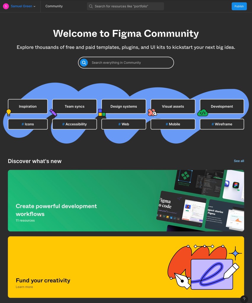
Figma community: this is an additional website that has lots of inspiration, examples, templates, visual assets and more than anyone with a Figma account can use.
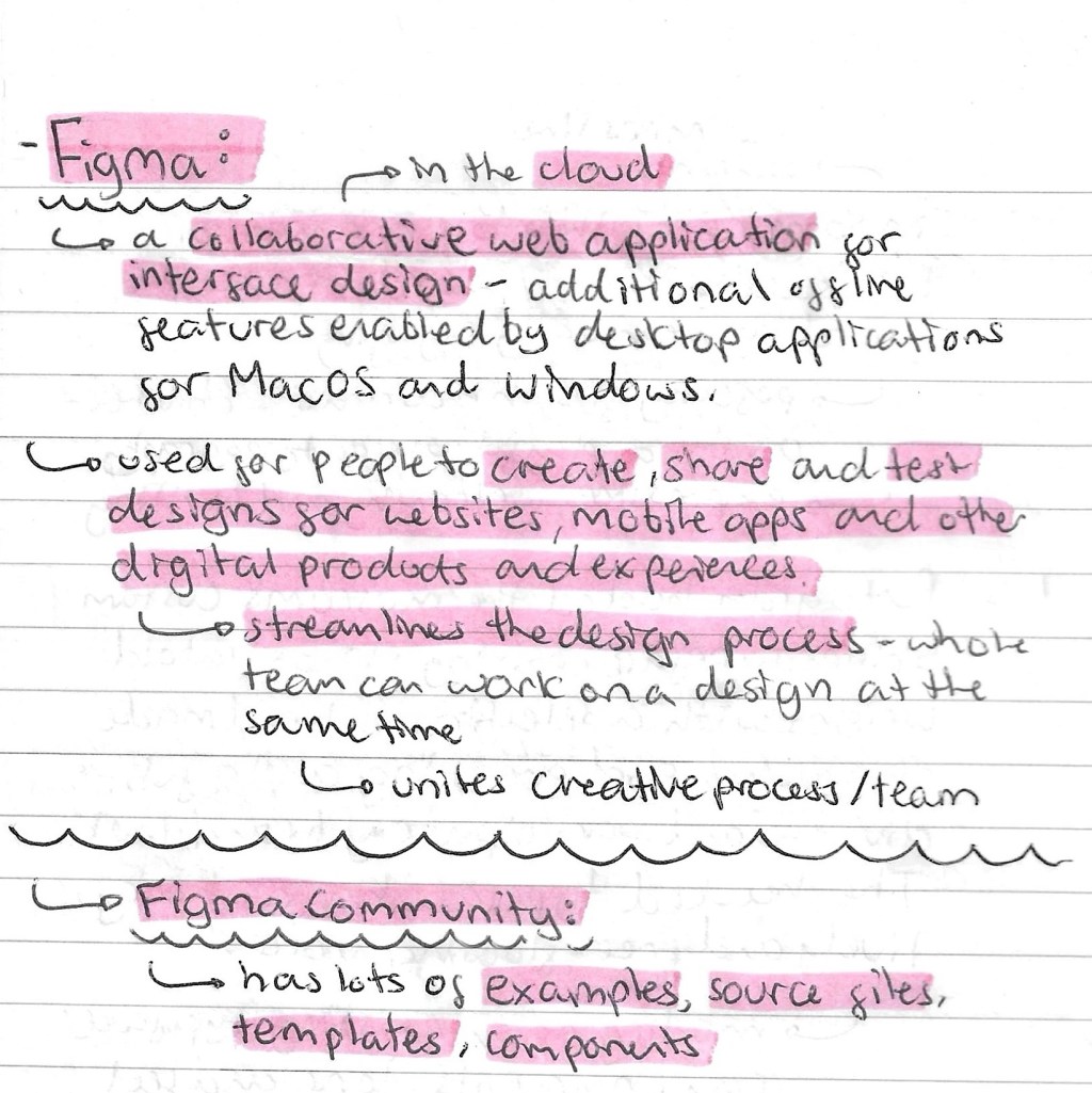
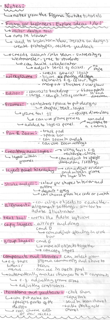
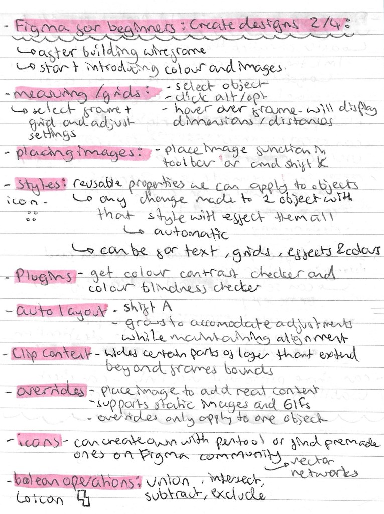
Note from videos: our introduction in the lesson was very brief so I watched a series of introductory tutorials from Figma’s YouTube channel to advance my knowledge and confidence with the application. I learnt a lot from these videos, all the notes I made from them are below:
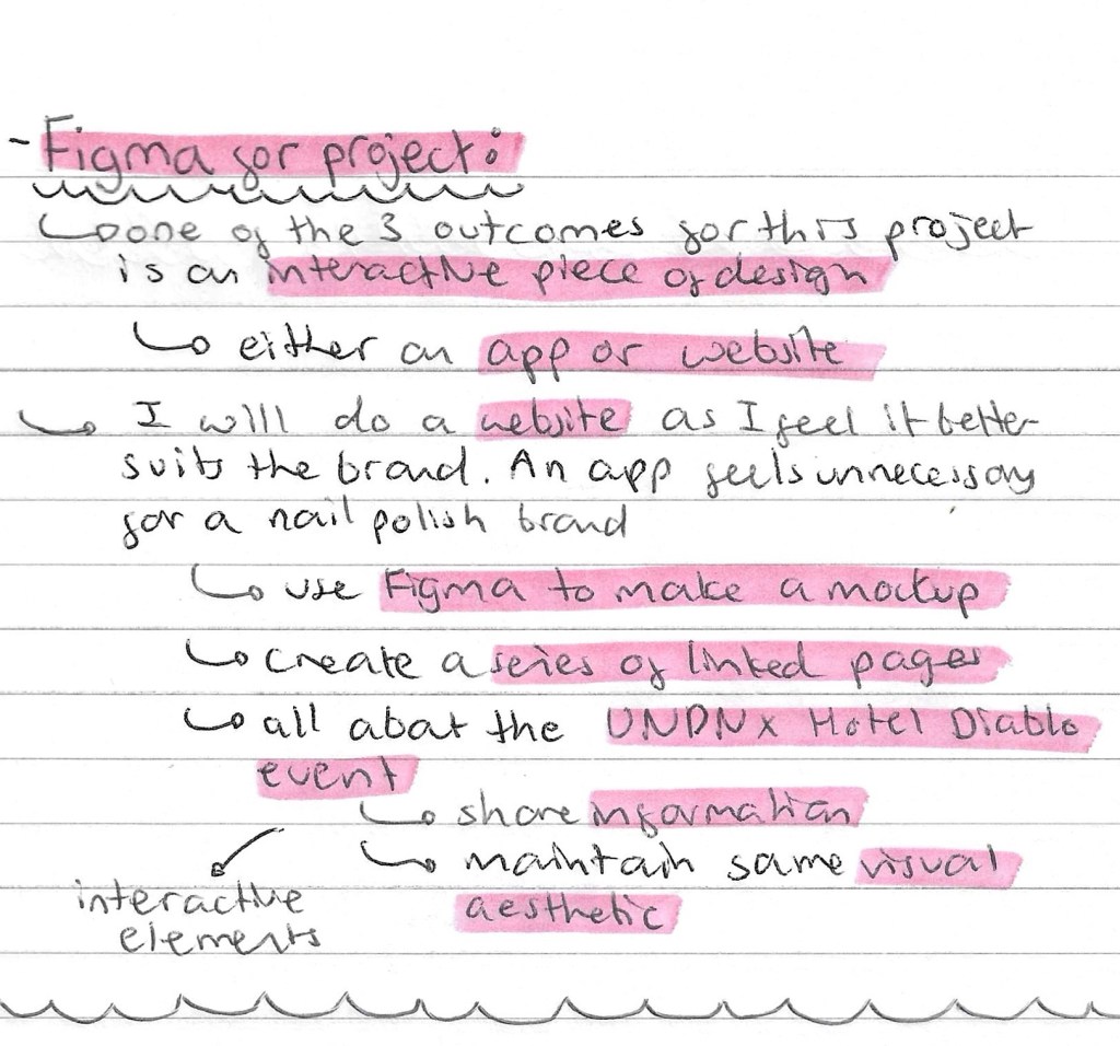
I feel that I’ve learnt a lot about Figma and how to use it from the introduction in class and my own research. I will be using it to create my interactive piece for my UN DN X Hotel Diablo event. We have the option to either make a mockup for a website or app. I’ll be doing a website as I feel it’s more relevant to the type of event I’ll be creating. The important things to keep in mind when it comes to creating this will be that it needs to use the relevant and useful information, maintained the visual identity of the event and includes interactive elements. These can be easily added into a Figma design by using the prototype tab and creating connections between 2 pages.
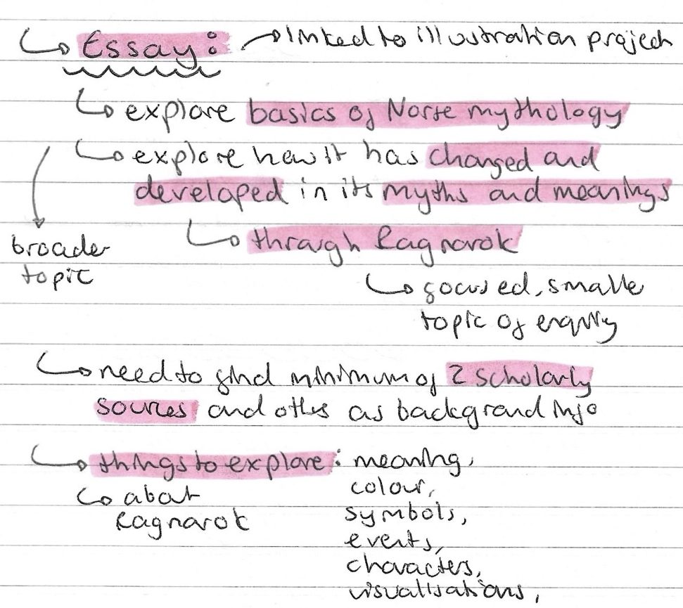
Earlier in the semester I made a list of potential essay questions linked in Norse Mythology and from this I narrowed down the topic I wanted to write about. I haven’t got an exact title as of yet but I decided I want to base it around how Norse Mythology has changed and developed over time. As it’s only a 2000 word essay I had to narrow down the topic of enquiry so I have chosen to centre it around Ragnarok. This is one of the most well known and interesting Norse myths so there are lots of sources to look at and reference. In the illustration project I’m creating an illustration of Ragnarok so it goes hand in hand with this. Through the research I’ll do for the essay I’ll be able to create a more interesting depiction of Ragnarok.
I began to make a plan for my essay, thinking about sources and structure:
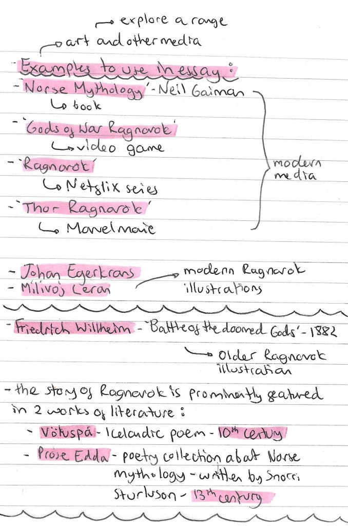
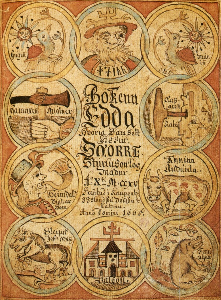
Here is a list of sources that I could reference in my essay, ranging from the earliest written sources to modern pop culture adaptations. As I’m looking at how it’s changed and developed I need to reference sources from different time periods. I think it’ll make for an interesting comparison and discussion.
After researching different printing techniques I decided that I wanted to use Riso printing for my Norse mythology illustrations. As I had never used the Riso printer before I had to book in for an induction. Before the induction I did some research to learn a bit about Riso printing so I would have some basic knowledge going into the induction. Some interesting things I learnt can be seen below:
Notes from induction: including information on costs, creating a master, printing size, paper weight, colour profiles, texture and registration:
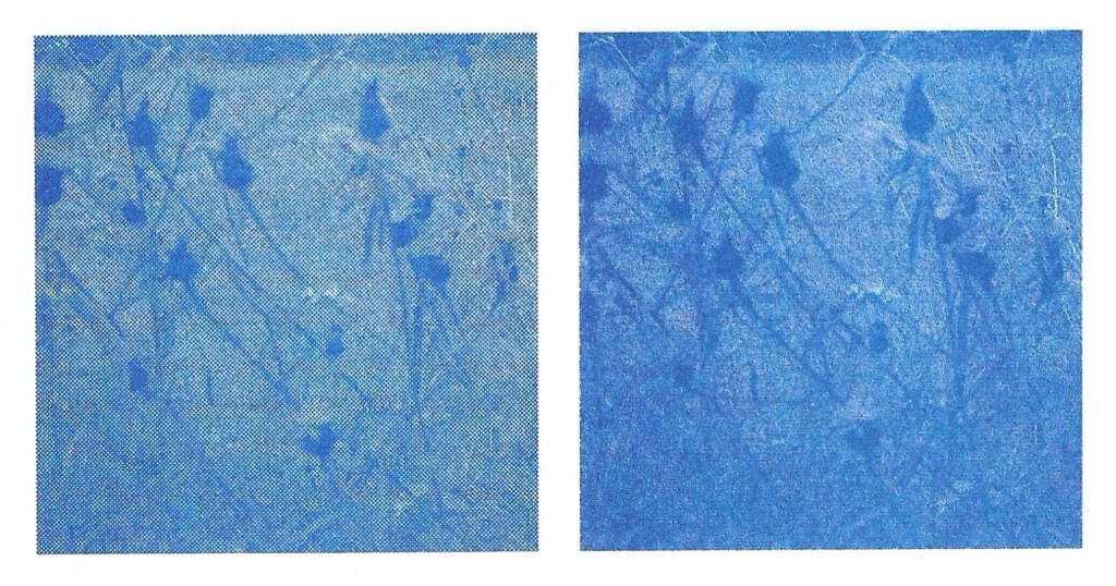
Printing texture: Riso printing can achieve 2 different textures, halftone/gain touch (left) or screen covered (right). The specific settings of these can be adjusted to achieve different looks. In my printing I’d like to experiment with both textures. Below is a comparison of the 2 types:
Colour Profiles: Riso prints each colour layer separately. To do this you need to convert the image into a series of different colour profiles. To get a full colour prints you need to layer up the different colours. The image below shows a blue, red and yellow print which combined make a full colour print:
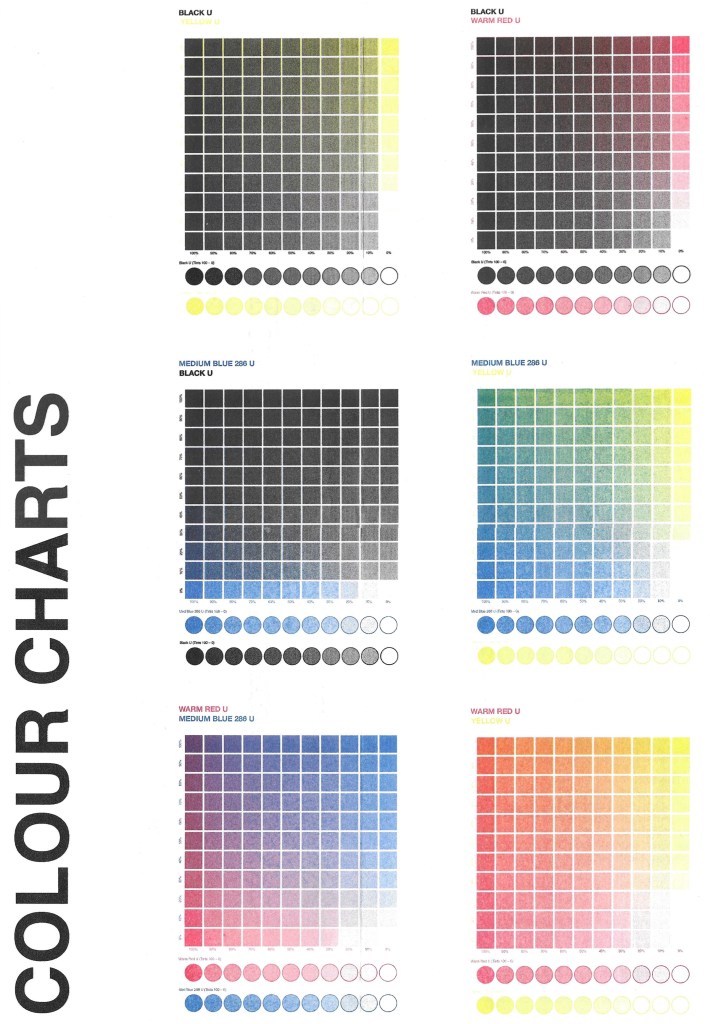
Colour charts: the university has a limited selection of colours to use for Riso printing. The options are black, red, blue and yellow. I will experiment with using different combinations of these colours for my printing. Below are all the different colours that you can achieve by using combinations of the 4 available colours:
Riso for project: I will be using Riso printing for my project as it has a nice, vintage aesthetic also it’s a versatile and cost effective printing technique. Riso printing allows for a precise control over colours so I will be able to layer colours to achieve my desired palette. I will combine the printing with pen hatching/shading. The next step is to make refined sketches on appear and then digitally add colour. By doing it digitally it allows me to separate the colours onto different layers, making it easier to create the colour profiles needed for Riso printing.
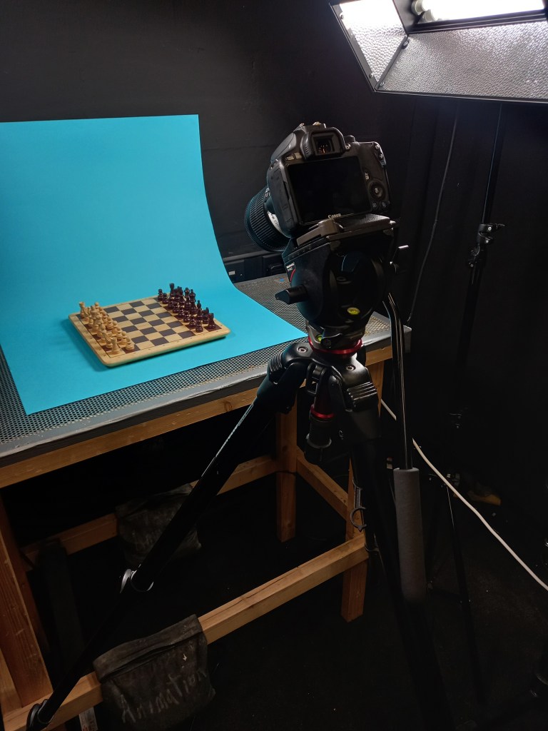
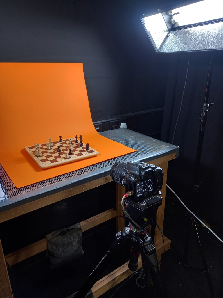
During the reading week I booked out one of the bays in the stop motion for the week to shoot my stop motion sequences. I booked it out for the whole week to give myself plenty of time as I will be learning on the go and am unsure exactly how long it takes to shoot stop motion. I used the first day primarily for hiring out all the necessary equipment, learning how to use and set it up and getting comfortable with actually shooting a smooth stop motion sequence.
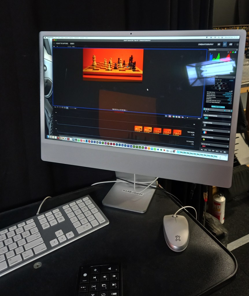
The equipment I hired out was a Canon 100D camera, a tripod, a dedo light and a focusing lens for the dedo. I borrowed all of these for the week from the media stores. There was also 2 big lights, 1 in each side of the table that was already setup in the studio. Setting everything up was a long process that took me the first day to get comfortable with. Cable management was important as there was so many wires that I had to carefully organise them to avoid a safety hazards. Once I put the camera on the tripod, I connected it to DragonFrame on the computer using a USB cable. This allowed me to see a live feed from the camera. This helped with framing and meant I could crop the view to the correct dimensions, 16:9. With the camera and lights all set up it was time to organise the sets and start shooting the sequences.
Photos from the studio:
Set up from scene 1:
Set up for scene 2:
Set up for scene 5:
Set up for final shot:
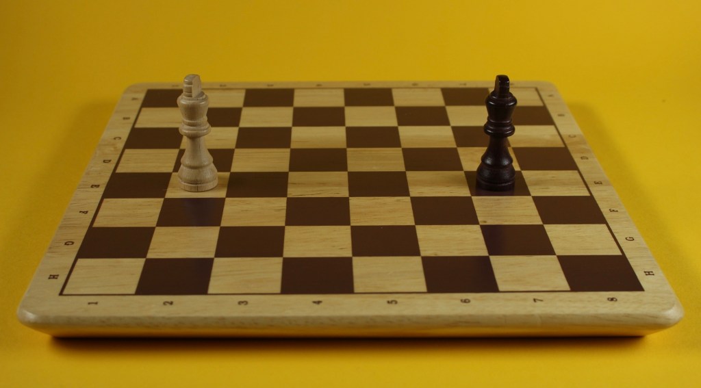
1 frame from each shot: Before going into the studio I made a plan for how I wanted each shot to be visually but I adapted these plans when I was there due to restrictions caused by the equipment or improvement in my ideas. This part of the project was fully controlled by me so I had complete creative freedom. In regard to the backgrounds and sets I wanted minimal designs but bright, eye catching colours, inspired by Handy Martian. I chose this style so the focus would be on the movement and pieces and not have too many distractions. I wanted to make the changes in colour, lighting and camera angles interesting to the viewer. Also I want to add effects to some scenes in the editing so these will help make the scenes more engaging.
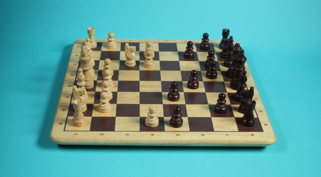
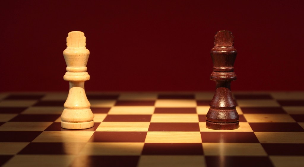
Scene 1: Game begins: The opening scene show the start of the game , where pieces begin to move at a steady speed, shot in 24 frames per second. For scene 1 I chose to have simple, balanced lighting coming from the 2 studio lights. I chose the background to be blue so it’s a cool, calm colour so that the video starts at a low intensity. The camera angle is from slightly above to get a good view of the whole board. I had to reshoot this scene a few times as I initially struggled to get the movements smooth. I was able to achieve the smooth movement I wanted by moving the pieces at smaller increments.
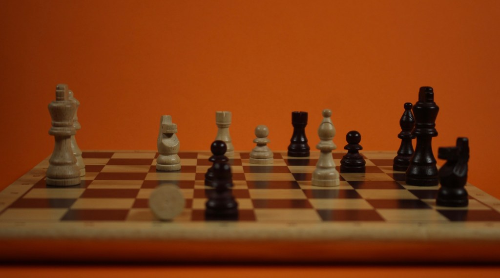
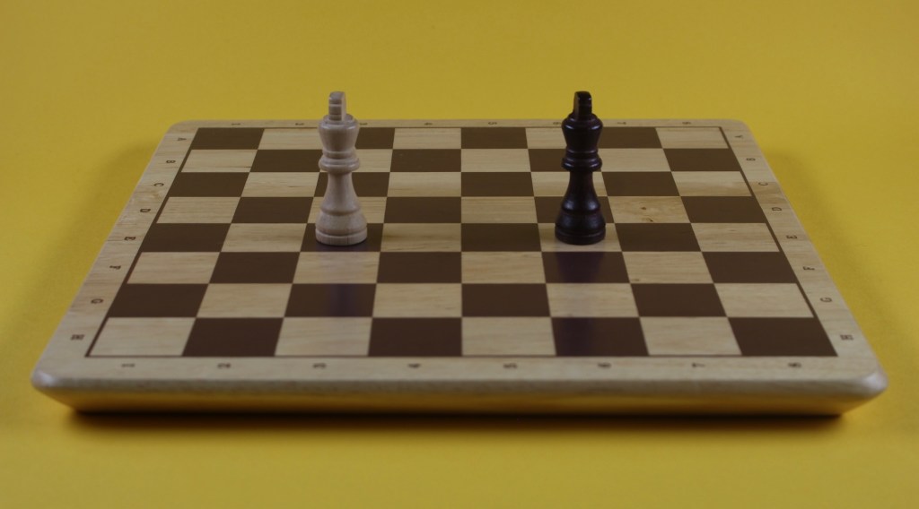
Scene 2:Battle: I wanted to have a big contrast between scenes 1 and 2 to get across a dramatic increase in intensity. The game has gone on and in scene 2 you see several pieces get knocked over. When shooting the sequence I made sure to adjust the focus to the area of the board that the battle was happening so that in editing I can zoom into that area and it won’t look blurry. This scene is also in 24 frames per second but during the editing I may slow down the pieces falling for dramatic effect. The way I made the pieces fall was using blue tack and slowly moving them down. This worked well, the only issue being that at some points it was visible which is something I’ll need to hide with editing and effects. I shot this scene at a lower angle, with dimmer lighting and an intense orange background. These changes make the scene feel more intense.
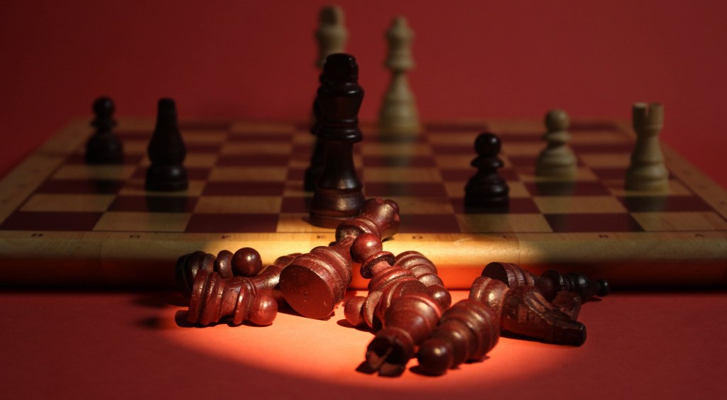
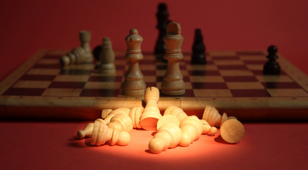
Scene 3 and 4:Graveyards: scenes 3 and 4 show the piles of fallen pieces from the back and white sides. I chose to make the scenes identical in composition to show how the game was very even. The focus of the scenes are the fallen pieces but they are static so to make the scenes more interesting I added pieces moving in the background. They move at a slow frame rate to achieve a slow motion effect. The camera angles were very similar to scene 2 and had only a slight shift in background colour, shifting to a more intense orange which ended up appearing more red due to the lighting. The big compositional shift was the lighting, I made the 2 studio lights very dim and used the dedo light with the focusing lens to achieve a spotlight on the fallen pieces.
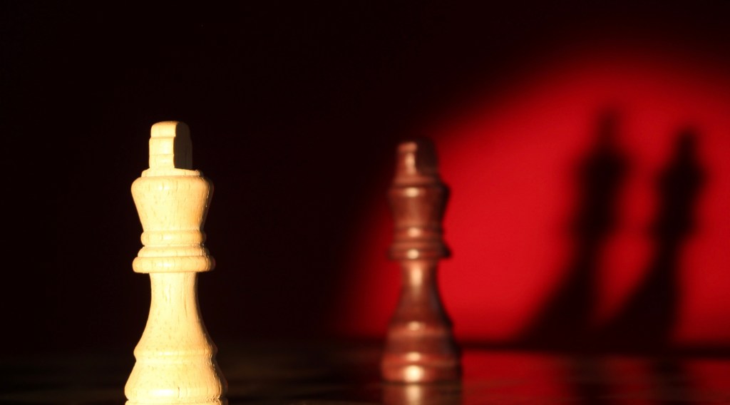
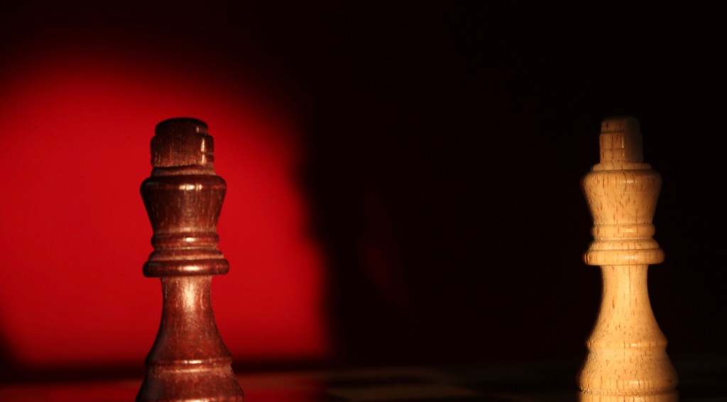
Scene 5: Face off: this is the face off scene that happens when all the pieces have been knocked down except the kings. I wanted this scene to be very cinematic and continue building up the intensity. In this scene the 2 kings move towards each other, the movement is very simple in this scenes so I had to really focus on getting it smooth. For this scene I zoomed in more and turned down the studio lights meaning most of the light was coming from the dedo light. This created a nice dramatic spot light that the pieces moved in to.
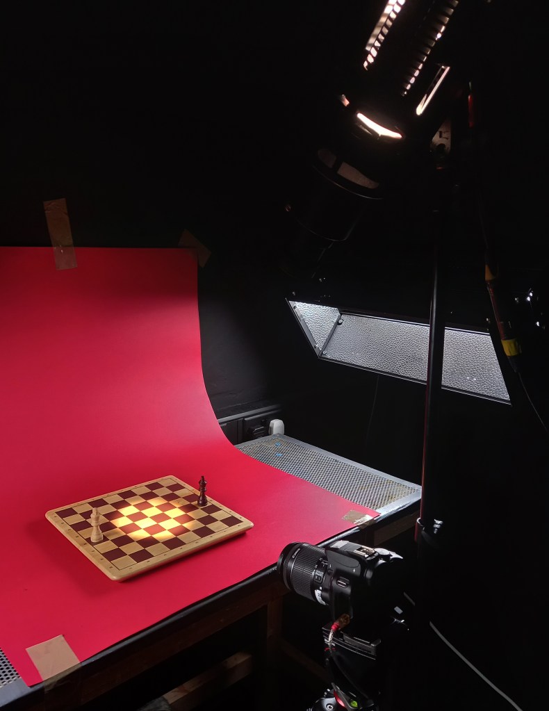
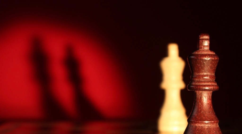
Scene 6 and 7: Intense shadows: scenes 6 and 7 are increased intensity face offs. I chose to make these fast paced scenes so there wasn’t too much of the video focused solely around the face off between the kings. I didn’t plan these scenes, they were improvised on the day. The ended up being some of my favourite shots due to the cinematic lighting and shadows. To achieve this I completely turned off the studio lights so all the light came from the dedo which allowed for these nice shadows to be cast on the bright red background. The movement of this scene is interesting as it’s the only scene that the pieces are stationary, it is the board that I moved to create this sense that the camera is rotating around the board.
Scene 8: Lights off: this is a short scene that comes at the climax of the building intensity. There is no movement in this scene, the only thing that happened is the lights slowly fade out to compete darkness. The aesthetic of a complete continuation of scenes 6 and 7 with the same camera angle, lighting and background. I struggled to make the lighting fade out smoothly so I will have to fix this during the editing.
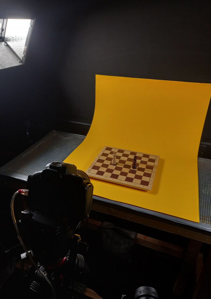
Scene 9: Running away: this is the final scene of the video. I wanted there to be a huge shift in intensity and composition between this and the previous scenes. I built up the drama across the previous scenes which reached its peak at scene 8. Then this scene would remove all of that to show how over dramatic the other scenes had been. In this scene the 2 kings end their face off and erratically run away from each other because they’re too scared to battle. I wanted this scene to be funny and contrast the tone of the rest of the video. I removed the intensity by going back to the camera angle and lighting from the opening scene. I chose yellow as it’s a far less intense colour than the orange and reds I’d used previously so it’s another way of showing the reduction in drama.
Reshooting scene 9: Running away: I went back another day to reshoot scene 9 as I was unhappy with it. I felt that it was too short and there wasn’t enough movement. In the new version the scene lasts double the time and the kings move much faster and more chaotically around the board eventually reaching back to their start position where they start frantically spinning. I think these changes help to translate the silliness of the scene and the fear of the kings better than the first version.
Videos: when I finished shooting the scenes I saved the whole DragonFrame folder onto my drive, this included the image sequences and the videos. I downloaded the videos on my iPad and make a few quick test videos on iMovie.
1.This video is just the scenes put together in order. It has no editing or changes in them, this is exactly how they where shot with DragonFrame.
2. In this video I adjusted the speed of some of the scenes to help make the whole video flow better.
3. I began to experiment with the audio, just using iMovie sound effects to start getting a sense of where I wanted sound effects and what kind of audio I wanted to go for.
Reflection: I learnt so much during my time shooting these stop motion sequences in the studio. I learnt lots about using equipment such as Canon Cameras, and different lighting which I’m now comfortable with. I found learning about and using DragonFrame particularly interesting as this is an industry standard software that I’m confident with setting up and using. My technical and practical knowledge of stop motion animation improved so much and I was able to create scenes that were better than I had initially planned in terms of cinematography and quality of animation. The next step for this project is to start creating the analogue assets to use as effects in the video.
Developed Storyboard: this is my more detailed and defined storyboard for the stop motion chess project. Now that I have a more technical understanding on stop motion and how to shoot it on Dragon Frame I was able to make more informed decisions on how to structure the narrative and how to frame each shot. This storyboard has a detailed breakdown of the editing and effects I want in each scene and how I’ll make them, digital or analogue.
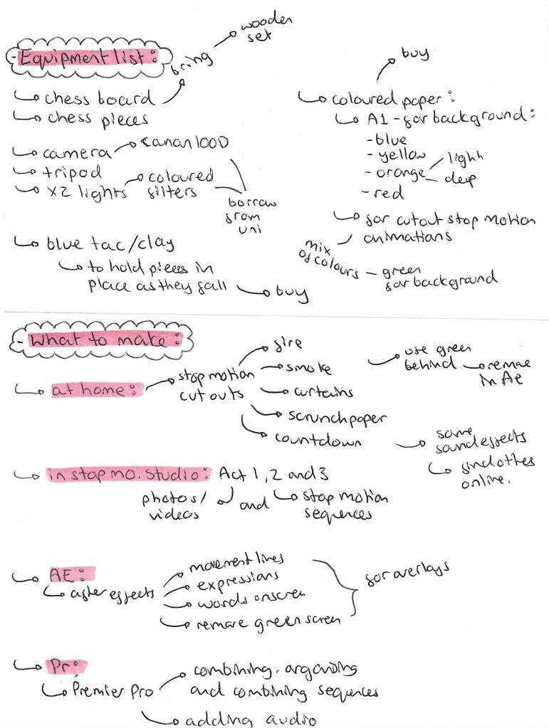
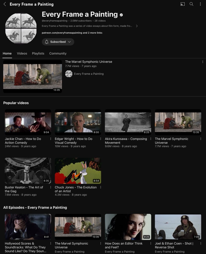
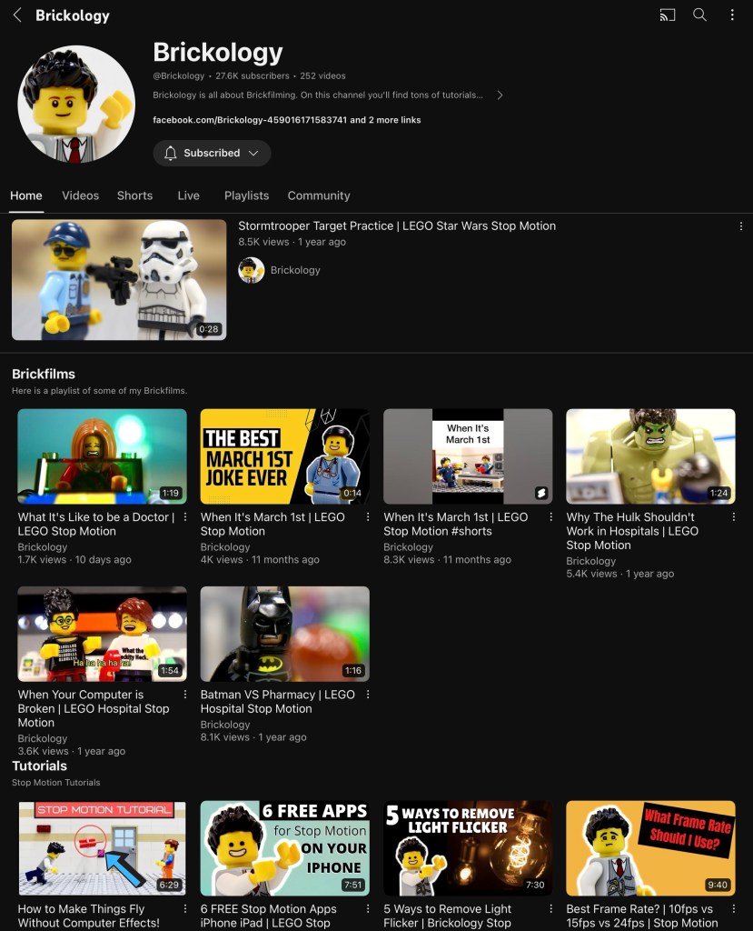
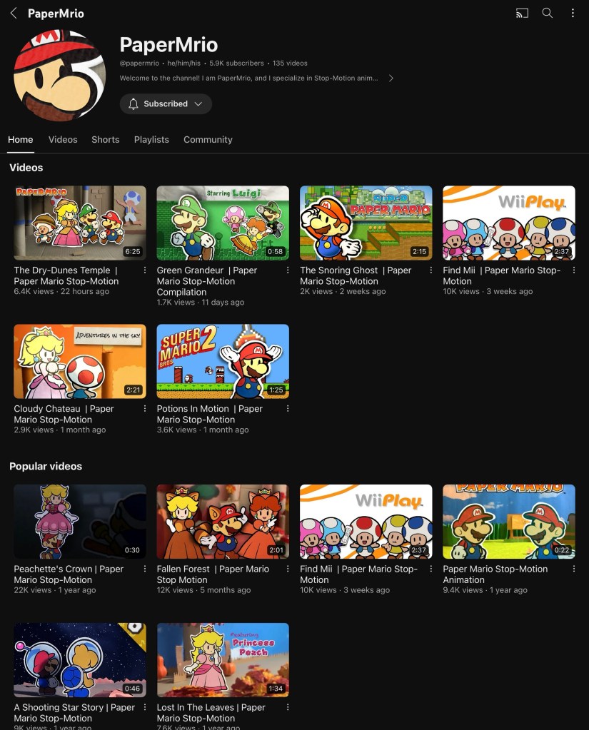
Inspiration of visuals/cinematography: these are 3 YouTube channels I have been looking at for inspiration and tips. ‘Every Frame a Painting’ is good for researching cinematography as they have videos on using audio, shooting action sequences, framing fight scenes. ‘Brickology’ and ‘PaperMrio’ are good for inspiration on how to shoot short stop motion film with a fun and colourful style. They also provide technical advice on how to frame and set up scenes.
Now that I’ve got my detailed storyboard that I’m happy with and have done lots of research I am ready to book some time in the stop motion studio to actually shoot the scenes for the final video.
This project has 3 outcomes, a static piece, a sequential piece and an interactive piece. So far in the module we’ve covered static and sequential so this we starting looking at interactive sequences. We had an introduction to Figma, my notes for this are on the next post.
Our first activity was looking at storyboarding and rhythm. I will use storyboarding as a technique to plan my social media video. This is a good way visualise what will happen in the sequence and how best to add rhythm and action into to stop it from becoming boring. A good way to do this could be physically draw or print different parts of the sequence and rearrange them. This is the way we worked in session 1 to analyse Kurosawa’s short film. We where given some advice on ways to stop a sequence becoming monotonous such as changing angles, zooming in and out, changing the background and mixing dynamic and static elements.
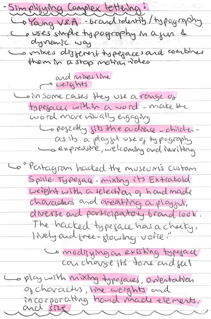
Simplifying complex lettering: for this task we looked a the Young V & A and their visual identity, specifically their typography. They take a selection of basic typefaces but use them in a fun and dynamic way with stop motion. This style nicely appeals to their target audience which is children and it’s an engaging way of using typefaces. This is a good example of targeting creative decision to a specific demographic. Below are more notes on this topic:
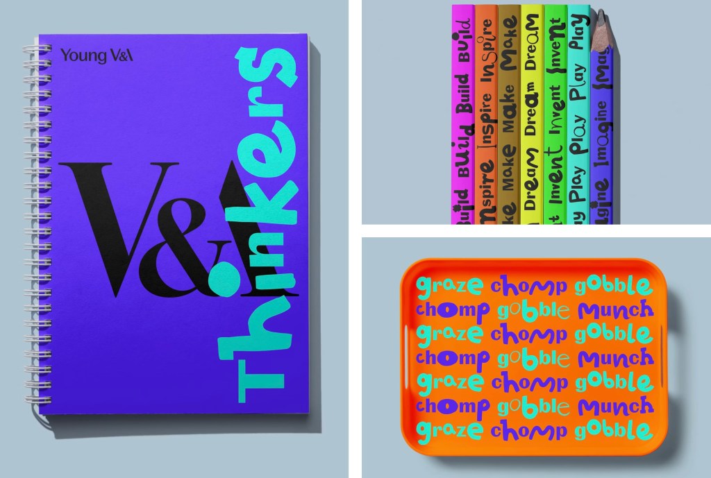
These are examples of the visual identity of Young V & A. The first is digital/sequential advertising, the second is physical/static advertising and the third is a series of physical merchandise. What’s interesting about these is that they’re not consistent with colour but still maintain a consistent visual identity through their strong use of typography and style of image. This is a good example of how you can really vary a certain design elements so long as others are kept consistent.
Reflection: this session was good as we started to looked at interactive design. Also I am now ready to start creating a storyboard for my sequential piece after our activity about how to successfully add action and rhythm to make a storyboard more engaging. The research about Young V & A was good as I learnt about an interesting way of manipulating typefaces. Their use of stop motion is a good way to incorporate many simple typefaces and make them into a visually engaging sequence. This is a style that I will consider for my project work.
General brand research: I did some more in depth research into UN DN to find out as much as I could about the brand. This helped give me a better understanding of the company so I could make more informed decisions in my project work. Below are some notes I made from my research:
Audience: an important area of research for this project is to look at the audience for the brand and event. This is key as I will need to target all my advertising to this audience so I need to understand who they are and what they will like. The brand has a clear aesthetic and visual identity but cleverly positions itself in the market to attract attention and interest from a wide ranging audience. A simple way they do this is by having brand collaborators and ambassadors for different demographics and industries. Another way they they wider their potential consumer base is by clearly stating that it’s a unisex nail polish brand. Most nail polish companies target their products to women, excluding a potential male audience. There’s a growing trend of men wearing nail polish so this progressive move is clever from the brands perspective. This dude ranging audience means I have lots of creative freedom in my project. More details on their audience are below:
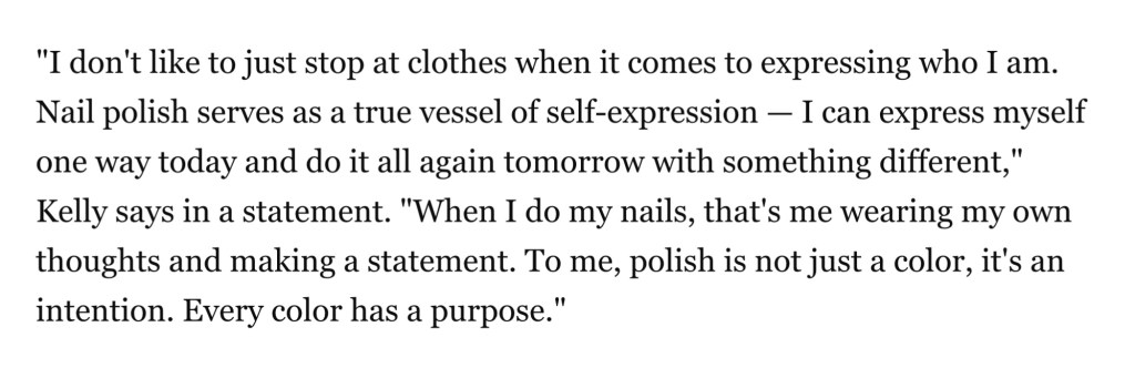
Quote from Machine Gun Kelly:
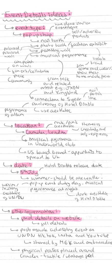
Event details ideas: in a previous post I discussed the basics of my event idea. I have developed the idea and the details about the event type, location, date and other information can be seen here:
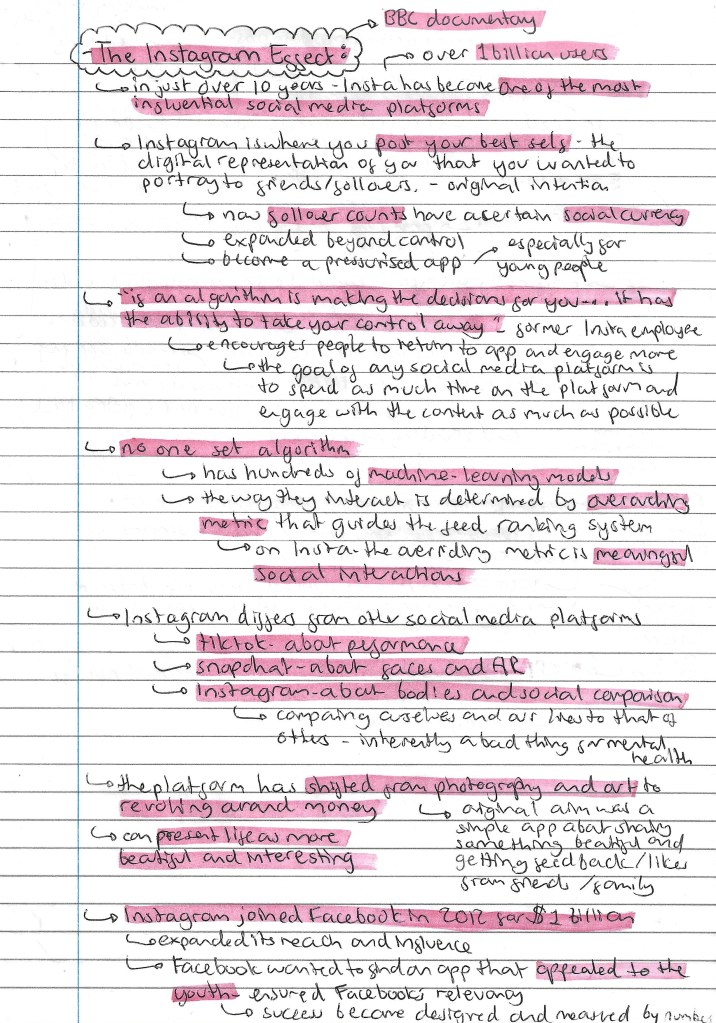
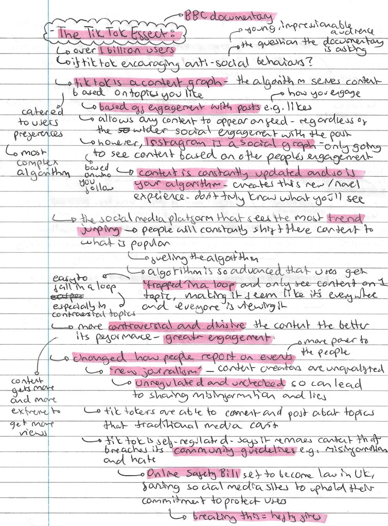
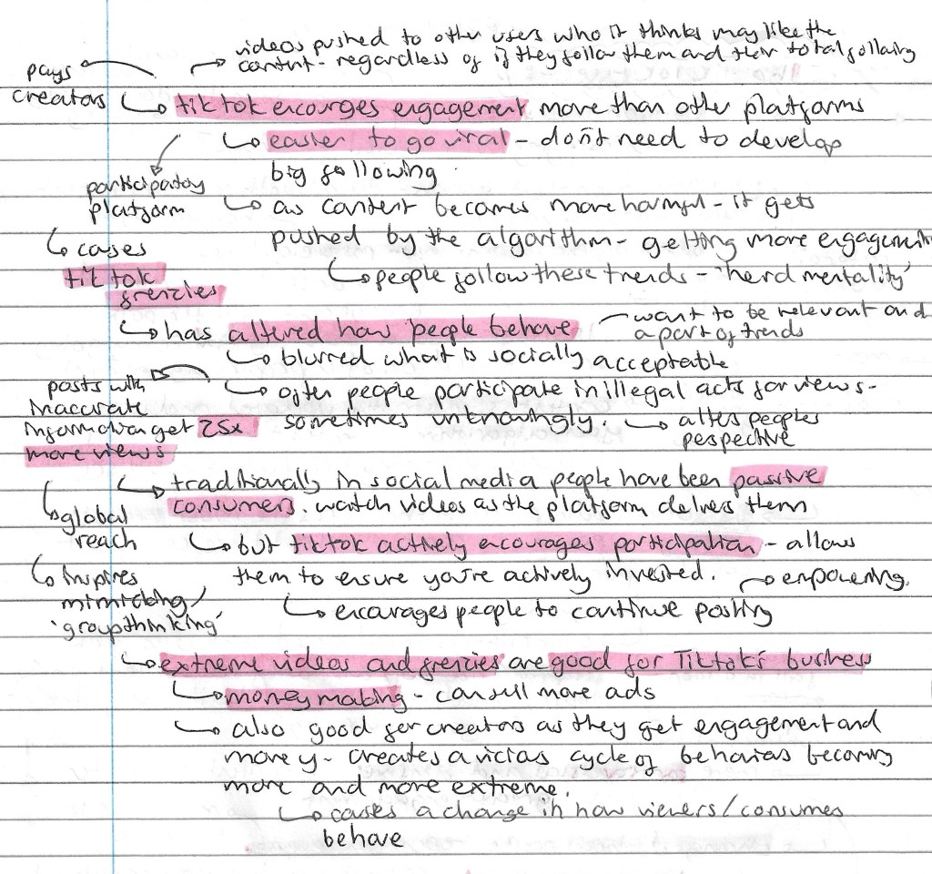
I watched these 2 BBC documentaries as a way to extend my knowledge about the social media platforms. This is important for the project as we need to produce a video for Instagram or TikTok so this knowledge will help me make more informed decisions about my creative work. Below are my notes on the 2 documentaries:
The Instagram effect:
The TikTok effect:
I found the documentaries insightful and enjoyable to watch. I learnt a lot about 2 of the world’s leading social media platforms. I now have a better understanding of their history, purpose, algorithm, issues and lots of other interesting information. I’ll be using this research to aid my creative decision making for the social media video (sequential outcome).
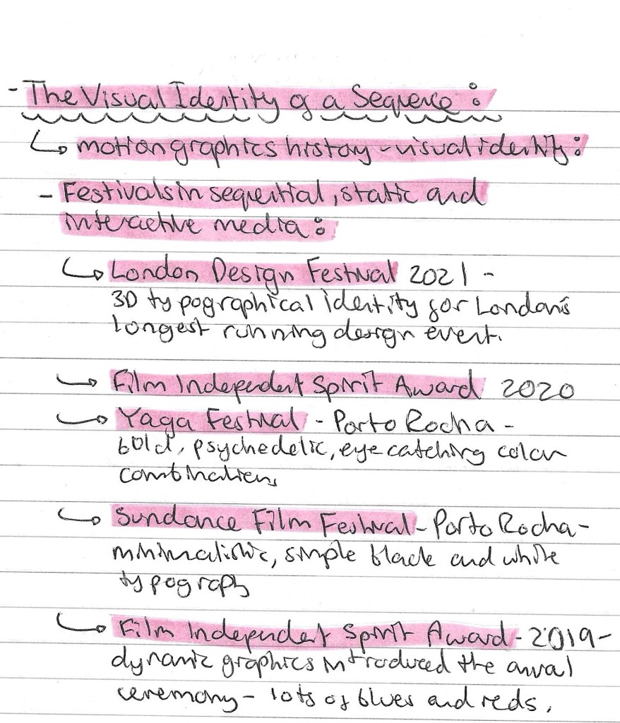
This week we explored the visual identity of a sequence. Before this we had explored creating sequences with actions, audios and interactions so now we are looking at how to give a sequence a recognisable identity. For our project work it will be important that all our outcomes are tied together by a consistent visual language to make them feel connected. This is key when promoting an event across different platforms, especially social media. The first activity was looking at a series of contemporary creative festivals and analysing visual identity. Below are a list of the festivals that we explored:
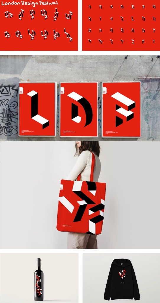
London Design Festival: this is London’s longest running design festival and below is its visual identity from 2021. It has a very simple colour palette of just 3 colours, black, white and red. The red is a bold colours so immediately draws people’s attention and it’s strongly connected to London. I like the 3D typographic style, it’s unique and interesting enough that it can carry a poster with just the typography. This simple combination of colour and typography is enough to be the visual identity and this can be seen across advertising and a variety of merchandise.
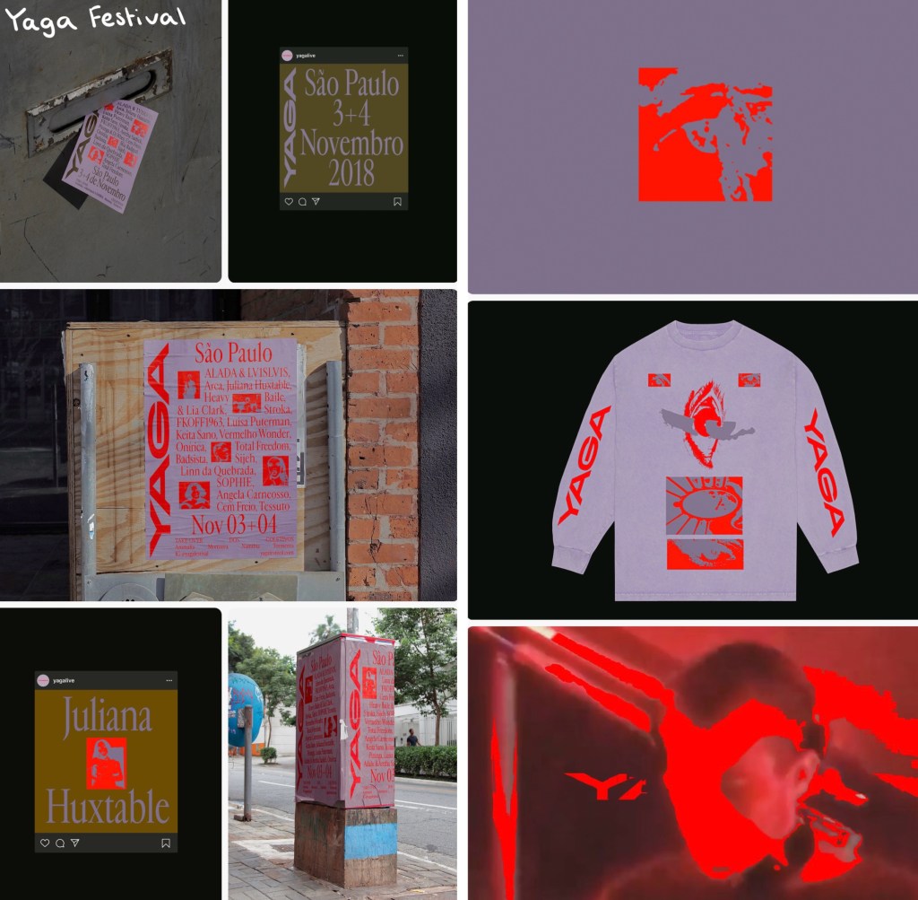
Yaga festival: This festival has a really a really strong use of colour. They use bold, eye catching and psychedelic colour combinations. The colours are the key part of visual identity as they use unique and unusual combinations of colours so will stick in the minds of viewers. Similarly to the London Design Festival, vibrant red typography is really eye catching and contrasting to the rest of the colour palette. Below a range of digital advertising, physical advertising and merchandise all with a consistent visual identity:
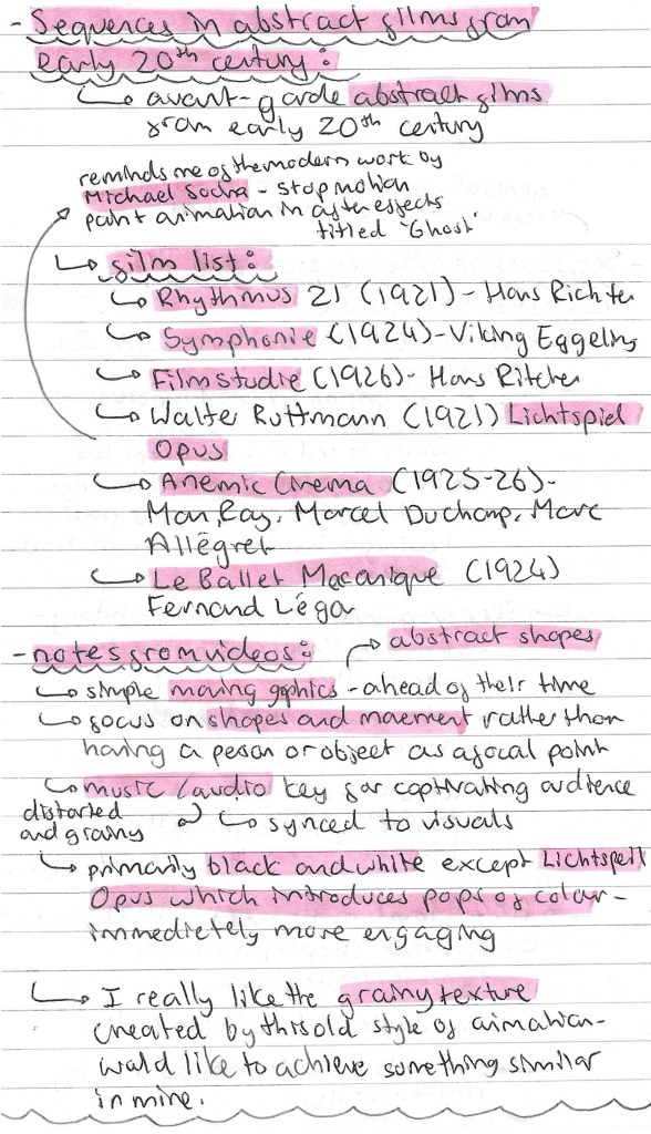
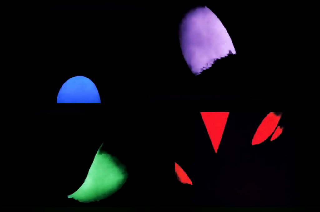
Sequences in abstract films- early 20th century: our second activity was to look at a range of avant-garde abstract films from the early 20th century. Here is a list of the films we watched and some notes I made about them:
Walter Ruttmann (top) and Michael Socha (bottom): Ruttman’s 1921 film titled ‘Lichtspiel Opus’ has simple motion graphics with colourful abstract shapes. At the time this was very advanced animation. Most animation at the time was black and white so these pops of colour really made his work stand out and be more visually interesting. The influence of this style of work can still be seen today. For example in the work by Michael Socha who puts a modern twists on it. The animation is much smoother but the principle of simple abstract shapes moving remains the same.
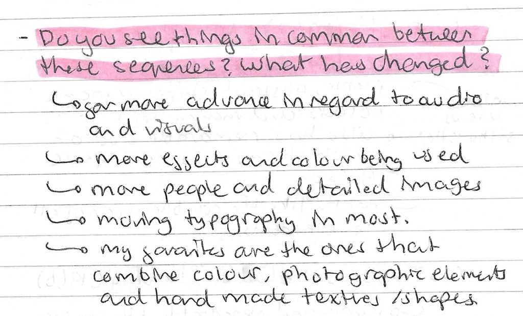
Title sequences: another activity we had was looking at the visual identity of different title sequences. We looked at 5 different title sequences from the 1900s. Below are the notes I made about each sequences:
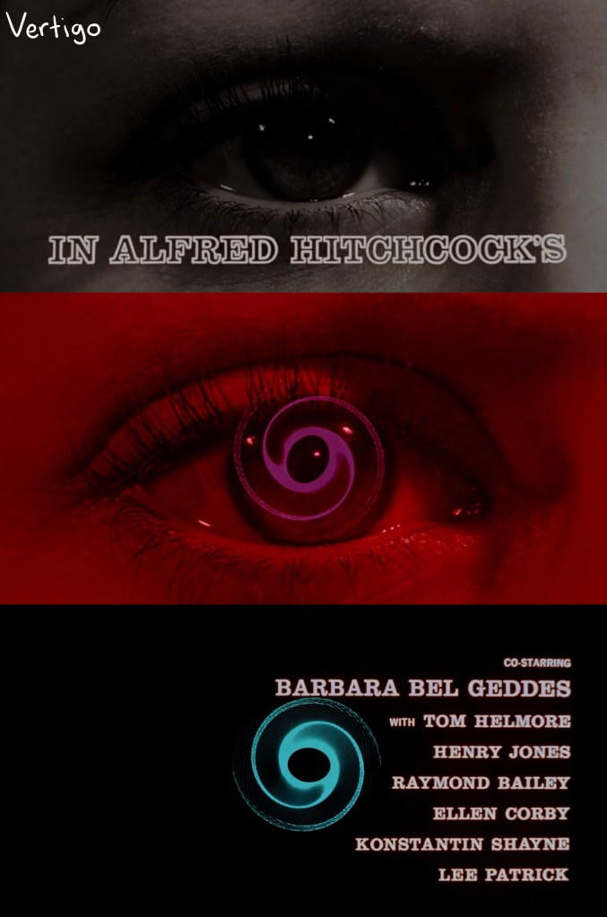
Vertigo (1958):
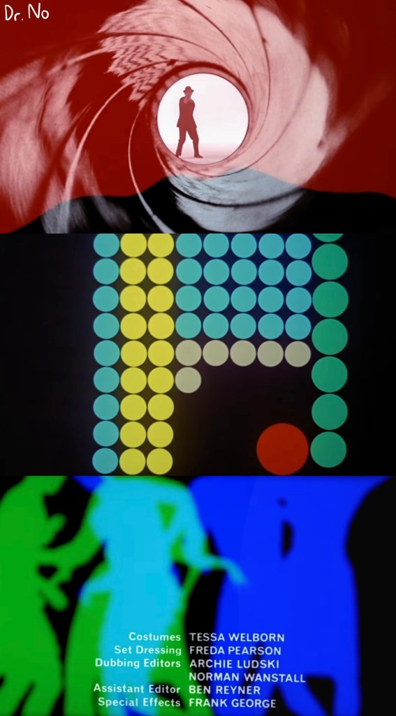
Dr. No (1962):
The good, the bad and the ugly (1966):
Review of the title sequenceactivity:
Mission Impossible title sequence: this was an interesting example to look at as it has developed a lot from its original in 1969 to its most recent one from 2023. The style and visual language has remained the same which has helped give the franchise its recognisable visual identity. The quality of the visuals has improved significantly with the advancements in digital technology available. The most noticeable change is the pace of the sequences increasing. The originals were seen as fast but now they’re dramatically quicker. This helps keep the, feeling fresh and exciting to viewers. This is a great example of a sequence that has maintained its visual identity while still evolving to meet the current demands.
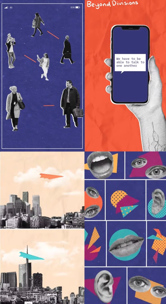
Beyond Divisions: this is a Student Design award winning piece from 2022. I really like the visual style of this video. It has hand made paper textures, grainy textures, paper cut outs all put together in a collage format. Also the use of bright colours against greyscale images is a really effective colour palette as it helps guide the eye to the important parts. The combination of visual styles is something I would like to try use in my project work.
Reflections: this session was helpful as it taught me a lot about the importance of creating a unique and recognisable visual identity. This is key to this project as all 3 of the outcomes will needed to have the same visual language in terms of colour, aesthetic, imagery and typography. We looked at design festivals, abstract films and title sequences, giving me a broad range of research to take ideas from. As well as learning about the importance of a visual identity I started to think more about what sort of styles I’d like my project to have, these are ideas I’ll be developing over the coming weeks.
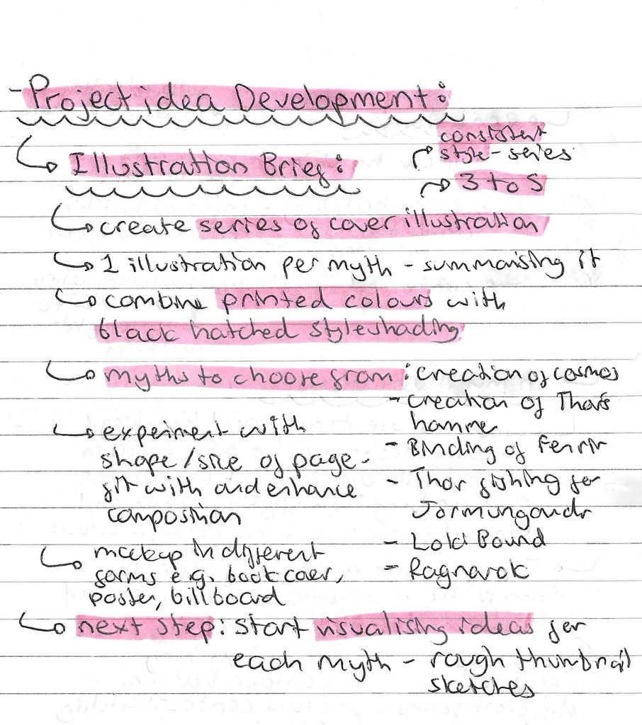
This summarises my most up to date plan for the project. I chose 5 myths to illustrate as I wanted the series to have an odd number and felt 3 wasn’t enough to really explore the topic. The 5 are all the myths I researched except the creation of Thor’s hammer. I decided to remove this one as it was the it was less character based and I wanted to work mostly with the gods/goddesses and creatures.
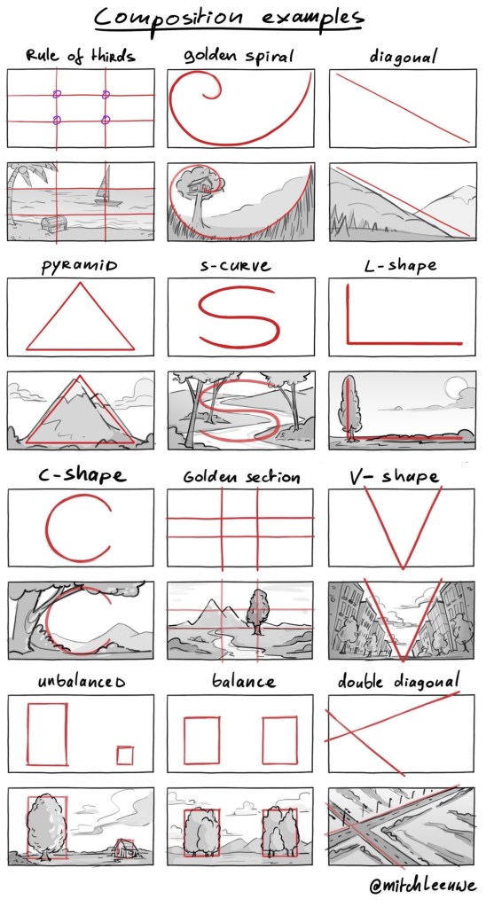
Compositions: I really wanted to explore composition in these illustration by varying the shape/ size of the image and the compositional shape. Lots of the examples of Norse mythology art that I liked had really interesting compositions, playing with balance and sizing.
Thumbnail sketches: these are quick thumbnail sketches I made for each myths. I used these as a way to get my ideas onto paper and made some notes about the ideas for each. Using thumbnail sketches is a great way to quickly visualise your plan for an image, it’s a step I almost always use in my creative process. After sketching these I then review them and draw more resolved images for each with the necessary changes.
Here are my more refined sketches, in chronological order of the myths:
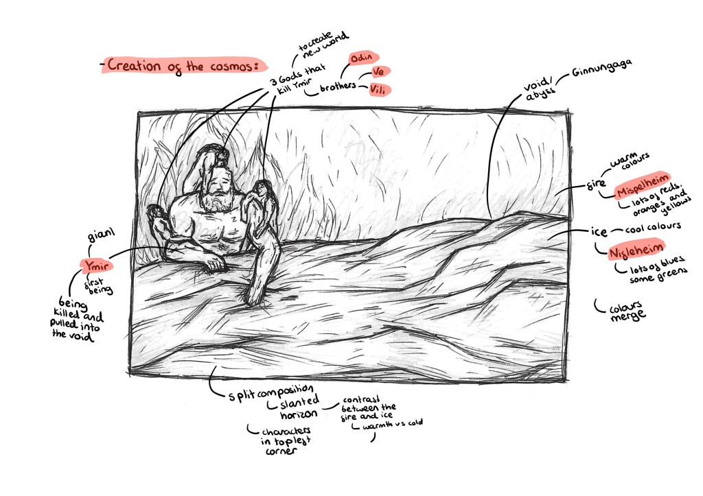
Creation of the cosmos: this image illustrates the Norse creation story. In the background will be fire, representing Mispelheim and in the foreground will be ice, representing Nifelheim. These 2 worlds cross the void/abyss, called Ginnungaga, and collide. On the left on the image there are 4 characters. The large one being Ymir, a giant who is said to be the first living being. The 4 smaller ones are 3 gods, Odin, Ve and Vili. The 3 brothers kill Ymir and construct the cosmos from his corpse. In my image they are dragging him into the void between the 2 worlds so it depicts the moments before they kill Ymir and build the cosmos. I want a split composition with a slight slanted horizon line. The colours will really emphasise the contrast, with cool tones in the foreground and warm tone in the background. The image will be unbalanced, with all the characters on one side. I made this decision as I want to draw the viewers eye to this section and then make them notice how much empty space there is. This is to try empathises how these are the only beings alive at this time. In terms of image dimension I want it to be slightly longer and thinner than A4 to get across the vastness the creation story.
This is an image that really inspired me. I want to keep the split composition but make there more of a balance between the ice and fire and a slanted horizon line. Also I will put all the characters to one corner, drawing the attention to the drama. I want to use a more intense version of the colour palette seen here.
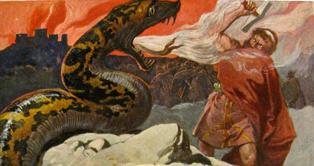
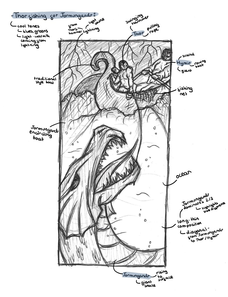
Thor fishing for Jörmungandr: this image shows the story of Thor and Hymir going on a fishing trip. The pair went out on a small boat to catch some fish for their village. On their journey they caught what they assumed to just be a large fish but ended up being Jörmungandr who got caught on the wire. Thor and Jörmungandr had been long time foes so Thor wanted to kill him but Hymir wanted to sail away. My image is divided into 2 uneven sections by the water horizon line, a small top section and a large boots section. At the top there are Thor and Hymir in their small, traditional Viking boat. Thor holding Mjölnir and the fishing line, wanting to attack and Hymir trying to sail away. In the bottom section is the head of Jörmungandr, I want to make the saves unbalanced to get across how large and dangerous the Midgard serpent is. Jörmungandr is rising to the surface ready to attack so th image is just after he gets caught on the line and before he rises out the water. I wanted to capture this moment so there’s suspense. The image size helps with this as it’s a long, thin shape, allowing the snake to dominate most of the space. For the colour I’m thinking earthy tones with lots of blues and greens. I want the lighting from Thor’s hammer to be a light source and to have Jörmungandr partially hidden by shadows to make him more ominous.
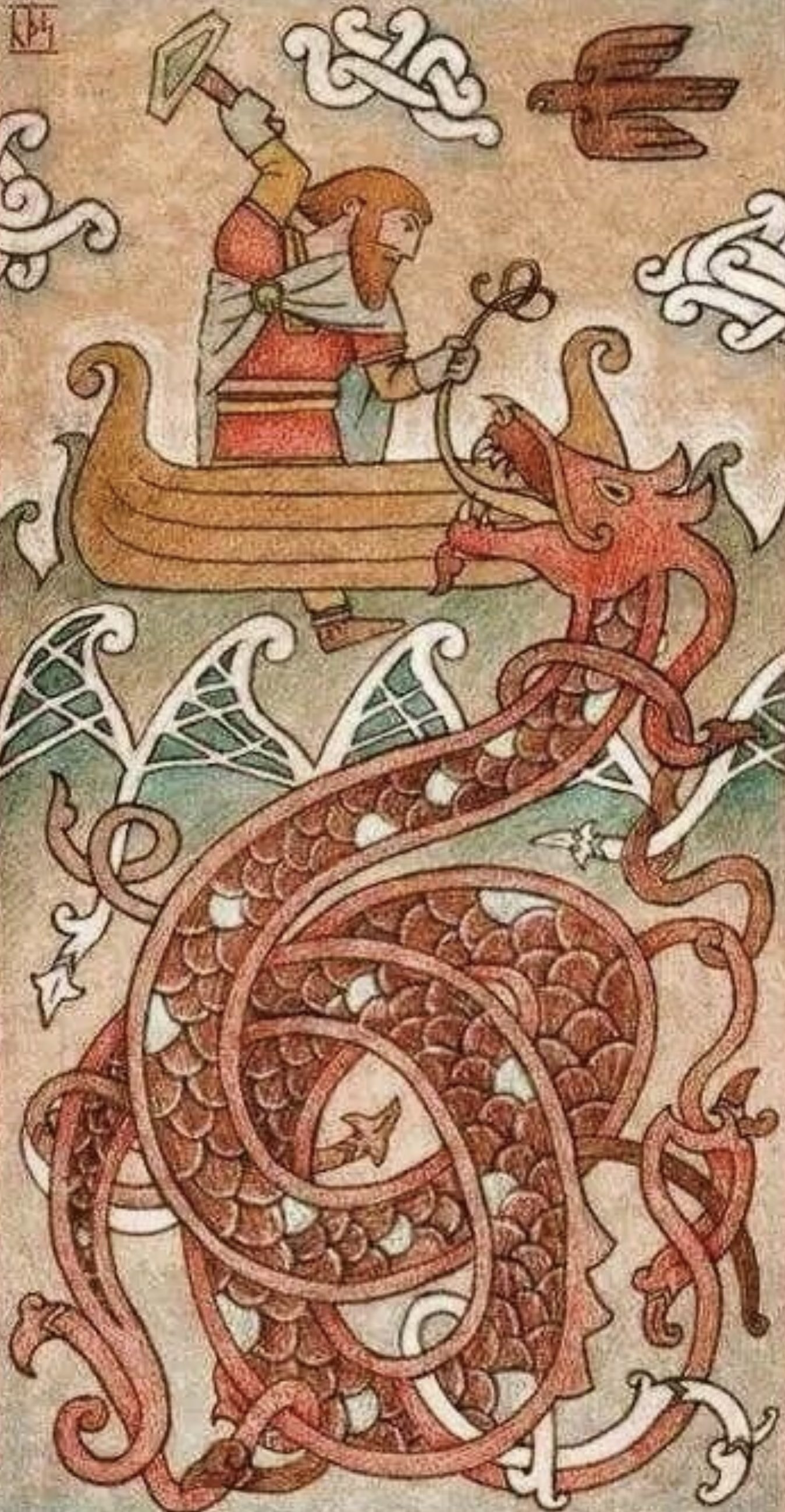
I drew inspiration from this image, with the position of the characters and shape of canvas. However, I want to completely change the colour palette and make the image more dramatic. Jörmungandr will be much larger in comparison to the other characters. Also Jörmungandr will not yet have come out of the water. I think it’s important to have Hymir in the scene as he plays an important role and is often overlooked in illustrations.
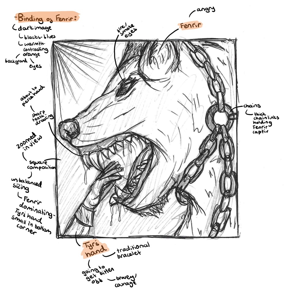
Binding of Fenrir: this image is about when the gods had to try to bind Fenrir. Fenrir was getting too big and powerful so the gods decided they had to lock him up. To do this they tricked Fenrir into thinking it was a game of strength. Each time they would put a chain around him and say it was a test to see if he could break it, eventually hoping they would put one that couldn’t be broken. Fenrir grew suspicious and said he would only play along if someone would put their hand in his mouth. To gain this trust Tyr put his hand in Fenrirs mouth knowing it was going to get bitten off. This is a story of sacrifice and bravery. Most of the image is taken up by Fenrir. Some details I want to include are a big chain around his neck and fire coming from his eyes. In the bottom left corner will be the hand of Tyr in the mouth, just before Fenrir snaps his jaw shut. I want to use a contrasting palette with bright warm tones in the background reflecting off the cool toned characters. This will portray the intensity of the situation. The image will be square shaped, I chose this balanced shape so that the unbalanced sizing between Fenrir and the hand will be more striking. This image will be very zoomed in only showing Fenrirs head and Tyrs hand so its really highlighting the details to emphasise the danger.
I was inspired by this piece but wanted to change a few key elements. I want it much more zoomed in as I feel it looks less intense when everything is shown. Also I wanted to incorporate a really bold, contrasting colour palette. This image shows the moment Tyrs hand is bitten, in mine I want to show a couple seconds earlier to really get across the power and size of Fenrirs jaw.
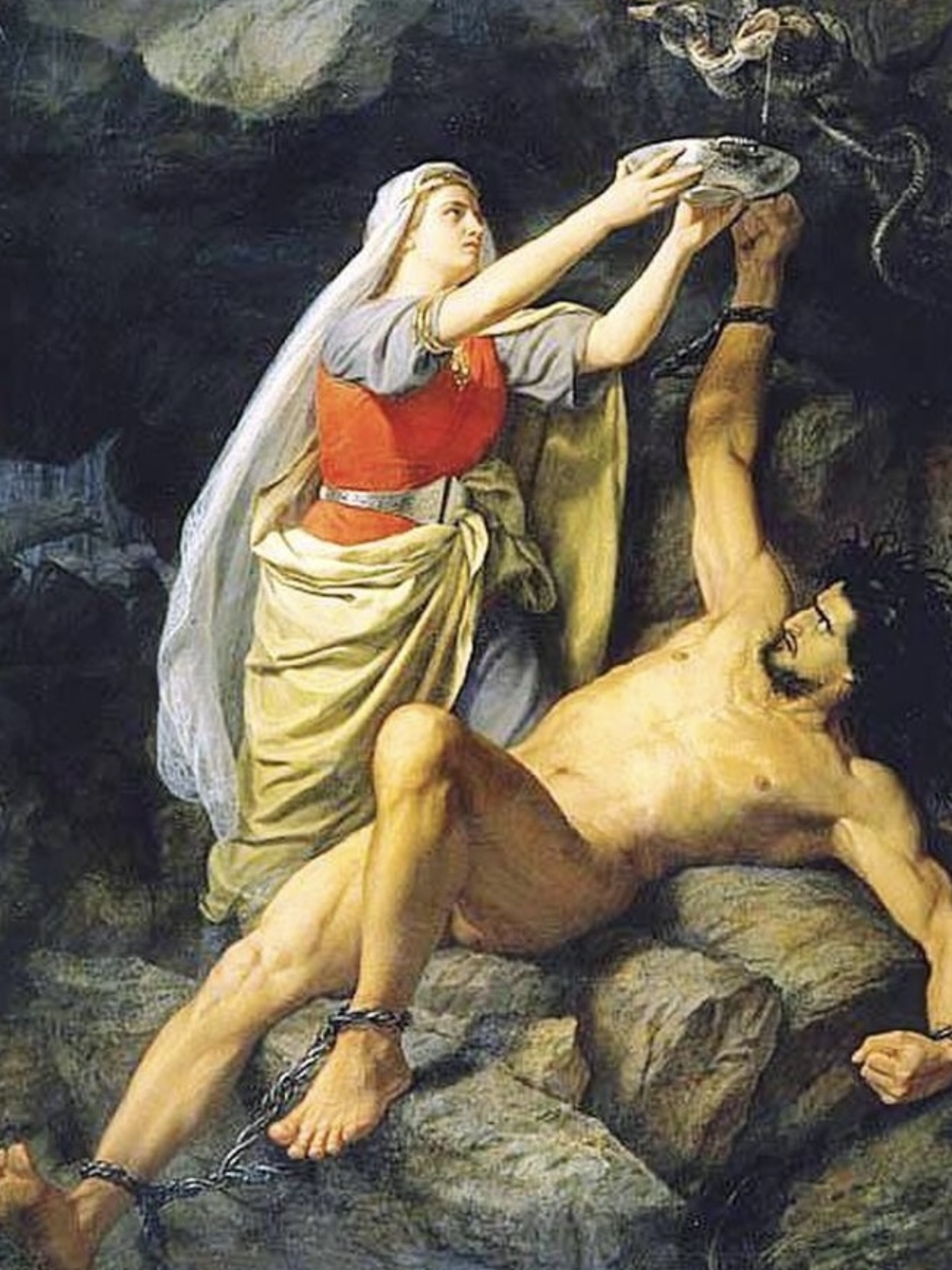
Loki bound: this image tells the story about Loki being imprisoned. Loki was part of the plot to kill Baldur so the gods decided they needed to capture him. Loki ran far away but was eventually found and captured by Odin. He is then chained to the rocks and has a venomous snake placed above his head. His wife Skadi holds a bowl over his head to catch the venom but when the bowl gets full she needs to go pour it away. This is when the venom falls on Loki causing his to shake violently. He remains here until Ragnarok. I’m going for a layered composition with 3 key parts. In the background is a vast desert. The middle has Loki tied to some rocks with the snake wrapped around a tree, hovering over his face. In the foreground is Skadi pouring away the bowl of venom, surrounded by skulls. I want Skadi to be in the front and centre as she is key to the myths as a symbol of loyalty and unconditional love. I want the palette to be very warm, with lots of intense yellows and oranges. The feel I want t.o achieve is uncomfortable heat, to show the drama of the situation. I want the image to have a long, thin size to mirror the Thor fishing Jörmungandr image. Also I want the viewer to see Skadi at the bottom first then their eyes to move up and notice Loki’s situation with the snake.
I will be taking lots of inspiration from traditional paintings of the myths, for example the one below. The changes I will make are to make the snake bigger and more intimidating and show Skadi pouring away the venom, not collecting it from over Loki’s face. This way there is more drama in the illustration as any second now the venom will hit Loki. Another thing I want to change is the colour palette, making is far more warm and intense as I feel the colours below don’t translate the severity of the situation.
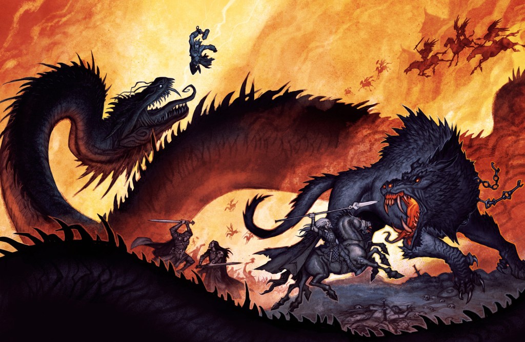
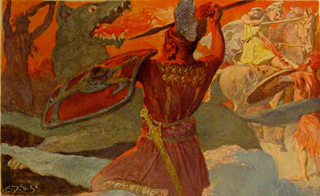
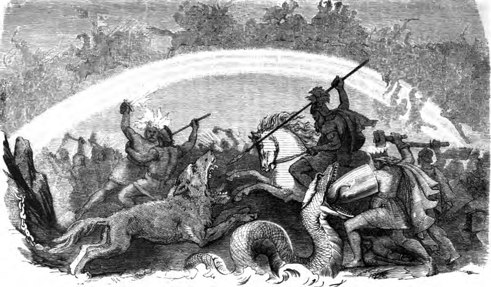
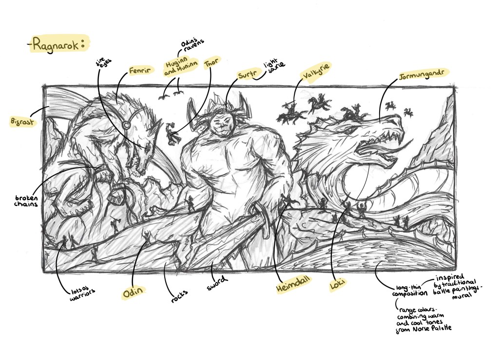
Ragnarok: this image tells prophecy of Ragnarok, meaning ‘doom of the gods’ in Old Norse. In the final battle the gods meet the giants, including Fenrir (left), Surtr (middle) and Jörmungandr (right). Norse mythology is a set of chronological tales, with Ragnarok making the end. On the left of the image is Fenrir who broke out of the shackles he was in on the other image. I have included details such as the broken chains and fire eyes. Fenrir battles Odin during Ragnarok so there is a silhouette of Odin holding his spear, behind Fenrir is the bifrost which is broken during Ragnarok. Fenrir is said to devour the sun so I have positioned him so he’s climbing up the rocks, ready to stretch out into the sky. In the middle is Surtr who leads the fire giants into battle. He wields a fiery sword which he uses to split the world. As a way of suggesting this I have a gap between the rocks that are in the foreground. Surtr will be the main light source of the image. On the right is Jörmungandr who has risen from the sea and spreads his venom over the land. Jörmungandr is said to grow and wrap around the world, I made him larger than the previous illustration so suggest this growth. Around the creatures there are lots of silhouettes of gods/goddesses. Some are random but others are specific characters including Thor, Loki, Odin, Heimdall and Valkyries. The colour palette I want is a combination between extreme warm tones and darker tones. The light and warmth comes from Surtr which reflects onto the surroundings and other characters. The image shape is long and thin, inspired by traditional battle paintings/ murals. Also I want to to be similar as the image of the creation story to act make the series feel cyclical and connected.
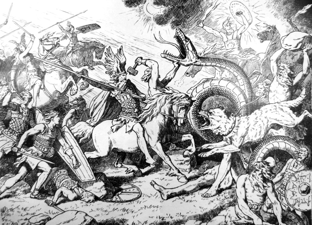
I was inspired by this style of image, depicting the battle field during Ragnarok. Some key elements I want to change are the scale and colour. I will make the creatures much bigger and more threatening. I want the focus of the illustration to be the creature, not the gods so I will make the gods smaller and just simple silhouettes. Also I want a full colour illustration to help show the intensity and drama of the battle.