Categories
Contextualised Practice Level 5

Contextualised Practice: Creative Worksop

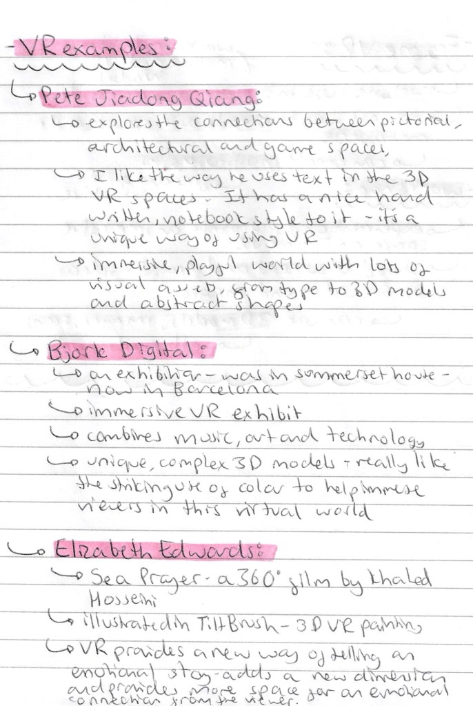
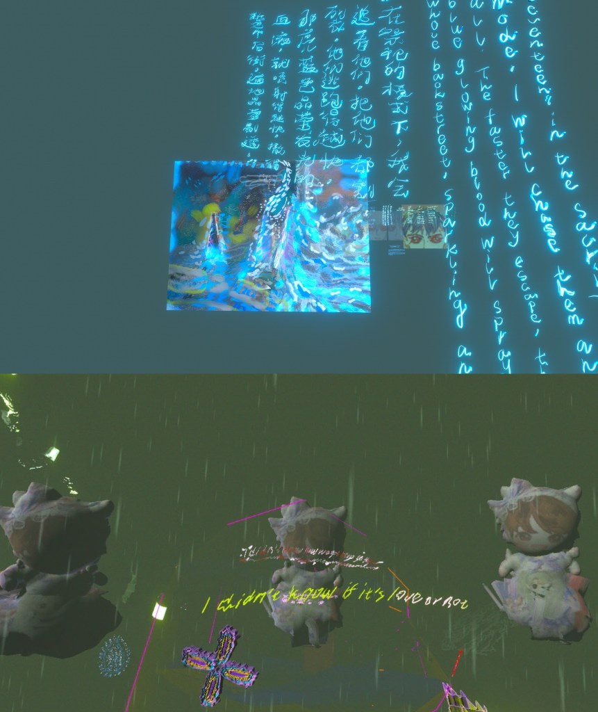
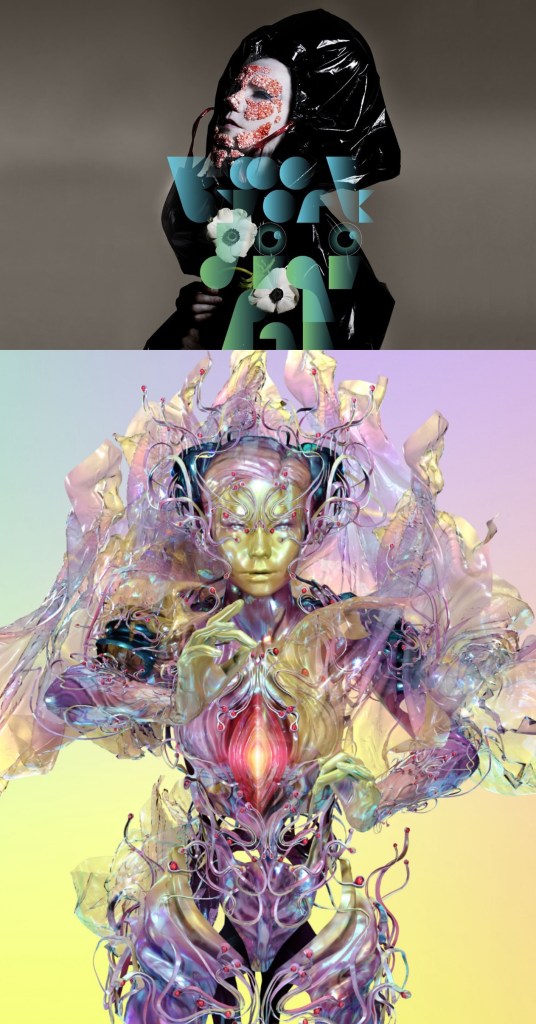
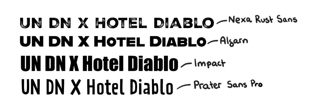
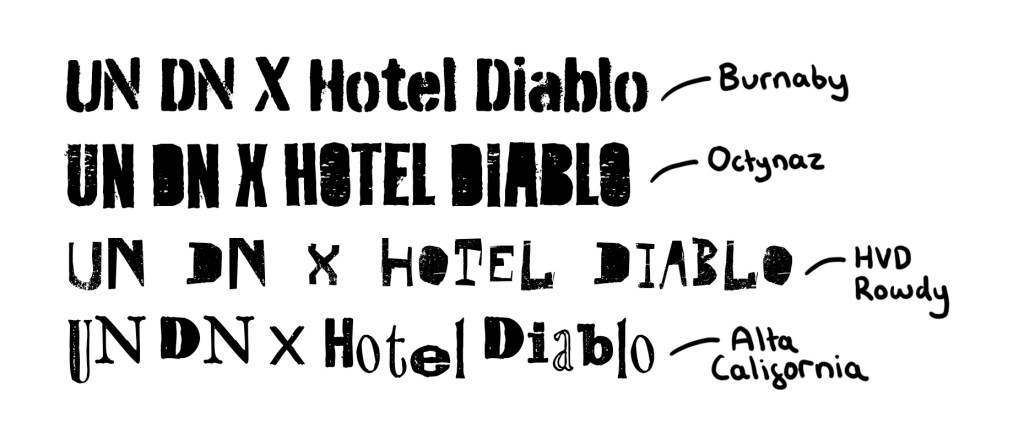
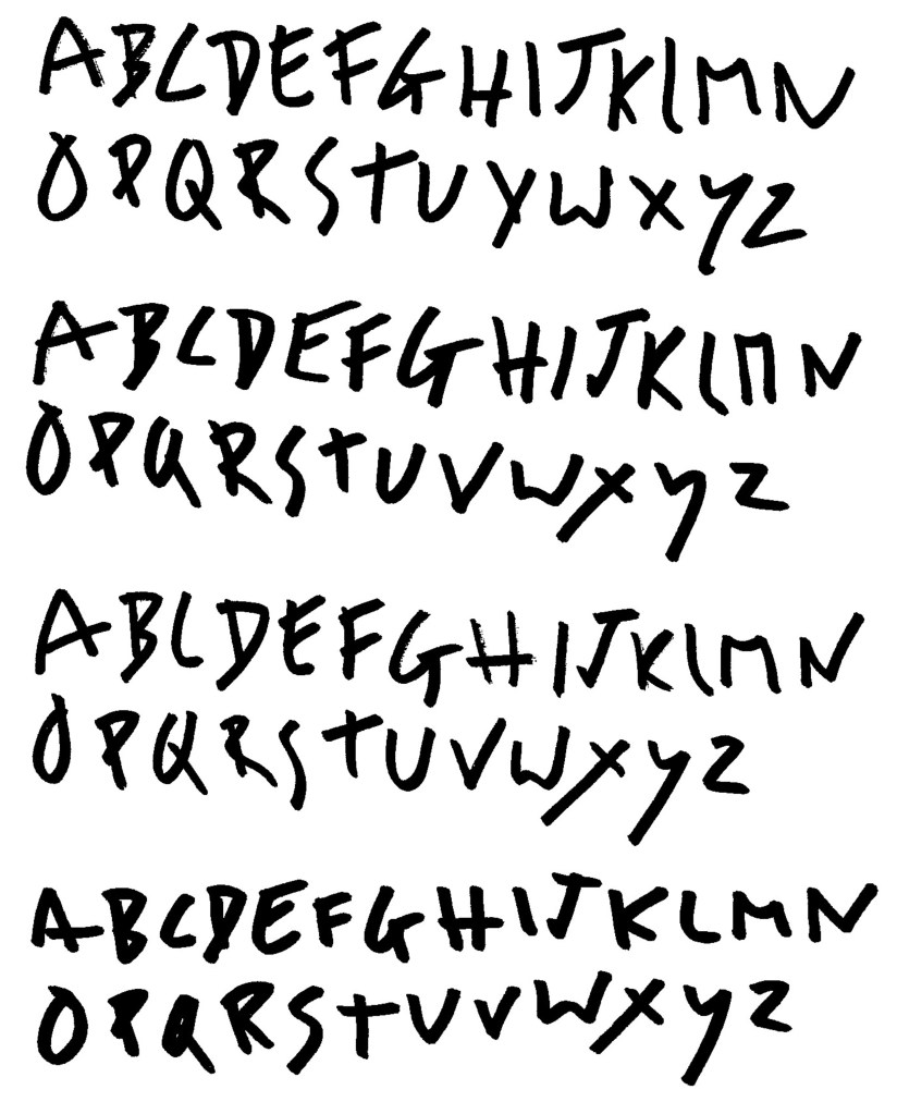
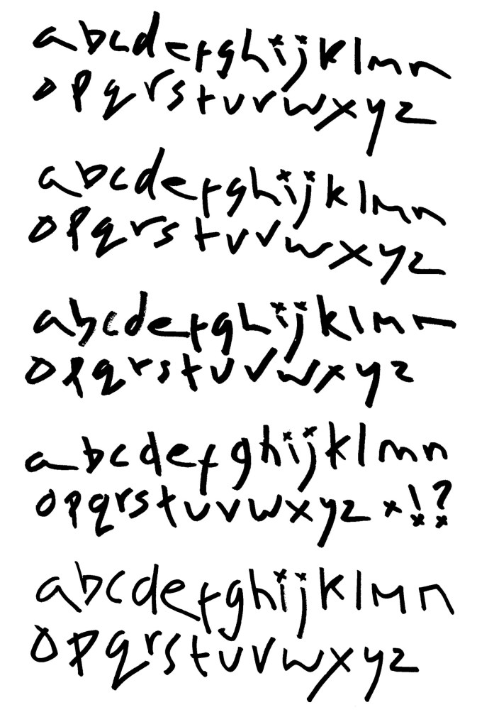
For this session we had a guest lecturer, Aidan Barefoot who works at Underway studios, come and deliver a workshop. The focus of this workshop was to be experimental and try out different styles, mediums and mark making objects. I’d say that I’m not experimental enough in my creative work and I need to push myself more in this regard so this sessions was ideal.

Visual Inspiration for workshop:

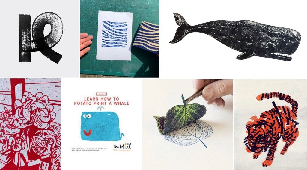
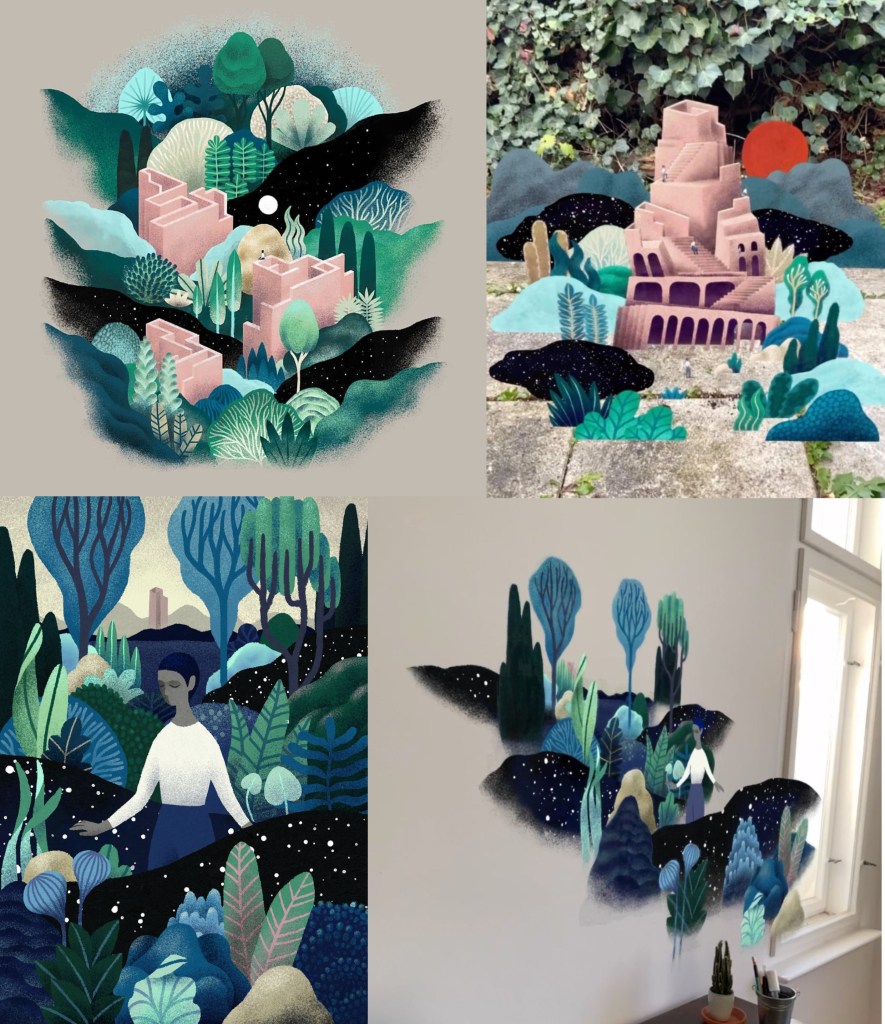
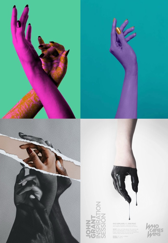
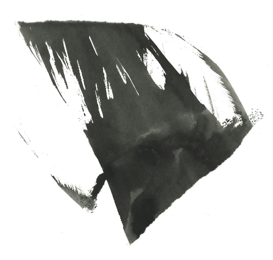
Underway Studios: this is the studio that Aiden works at, they largely focus on different printing techniques. This is an example of their work:

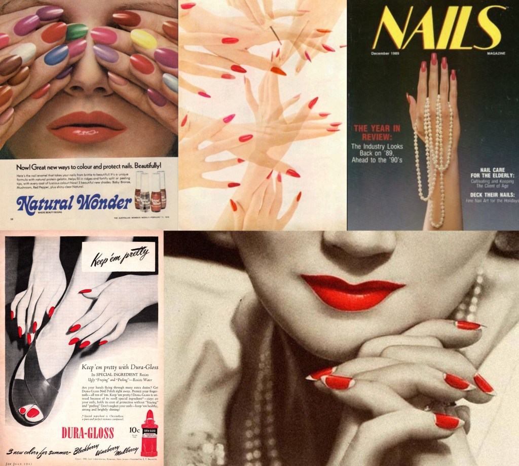
Aiden Barefoot: below is the link to Aiden’s website and some examples of his work. I really like all the experimental tectures and marks he is able to inorporste into his work. The mixed media aspect of his work is really nice and is a style I like to work with.

https://www.behance.net/aidybrft

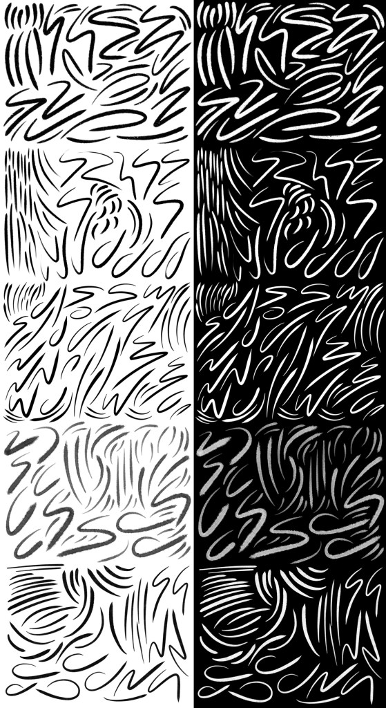
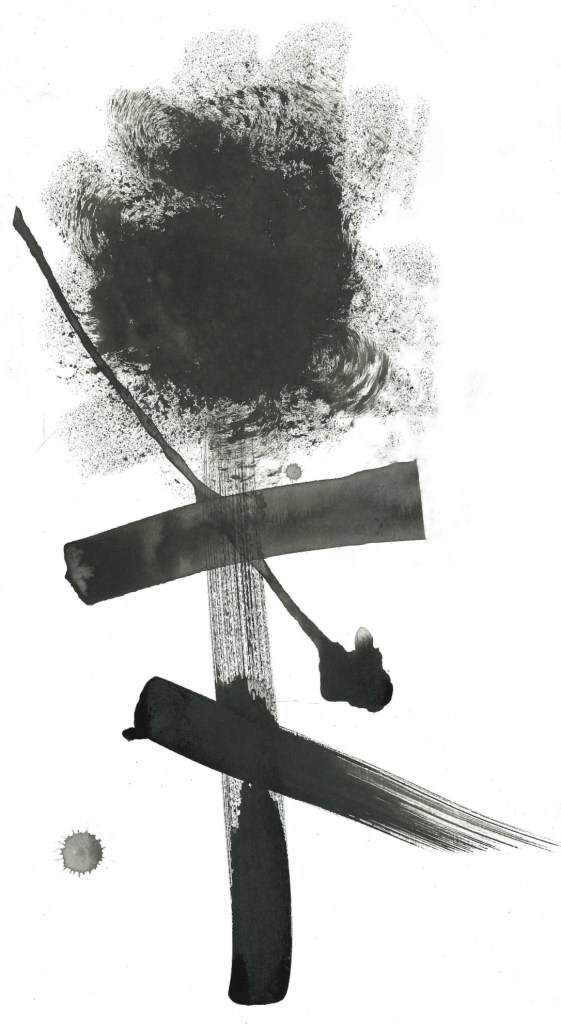
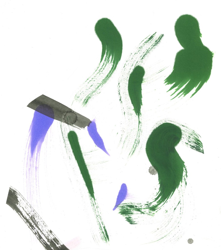
My experimental work: going into it I didn’t have much of a plan of what I wanted to do I just knew that I wanted to experiment and try create interesting textures and patterns using mediums and mark making objects I wouldn’t normally try.

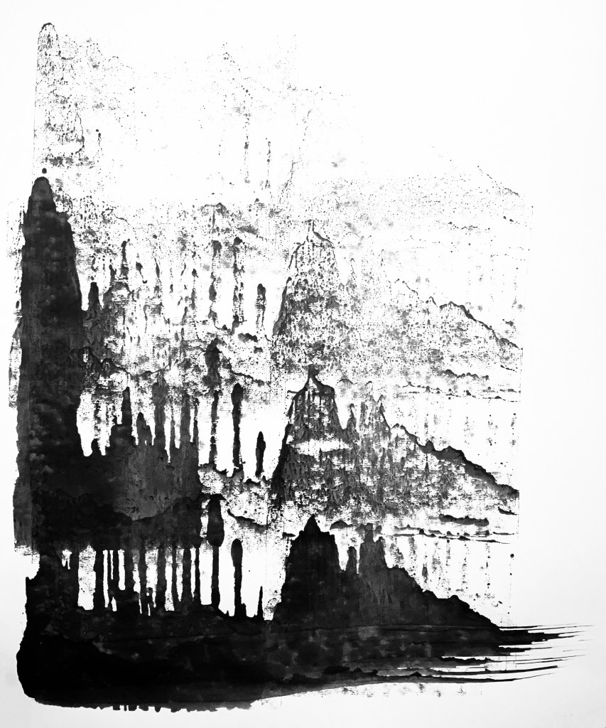
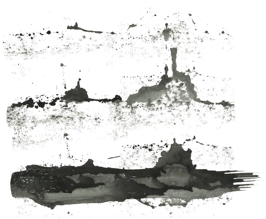
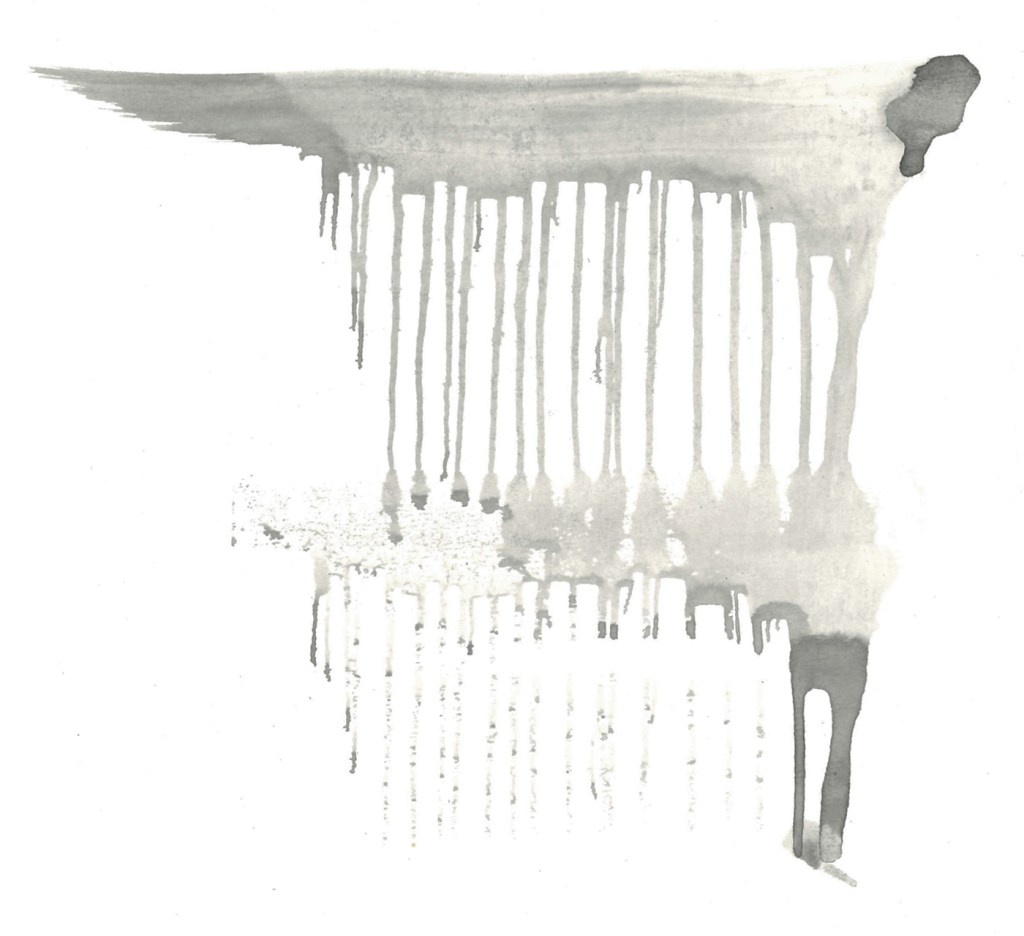
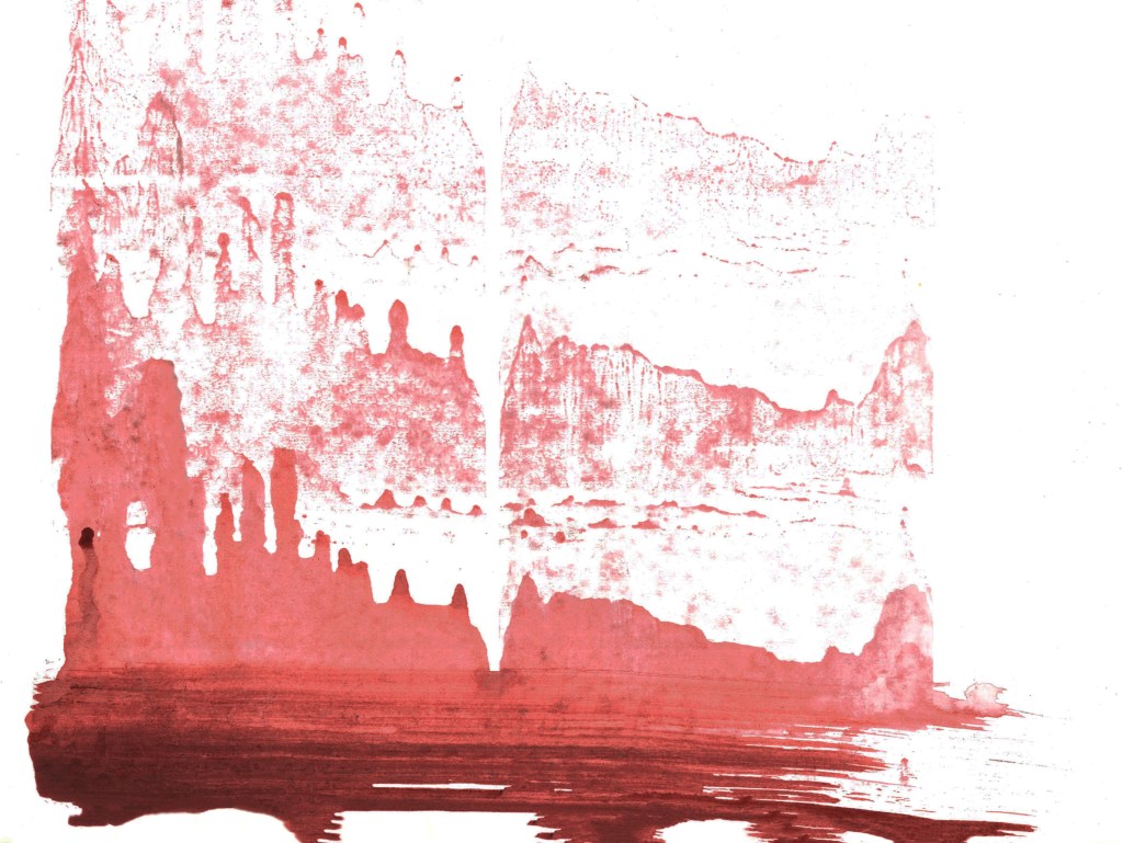
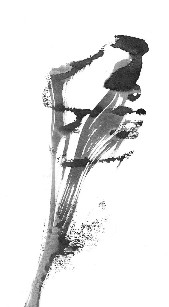
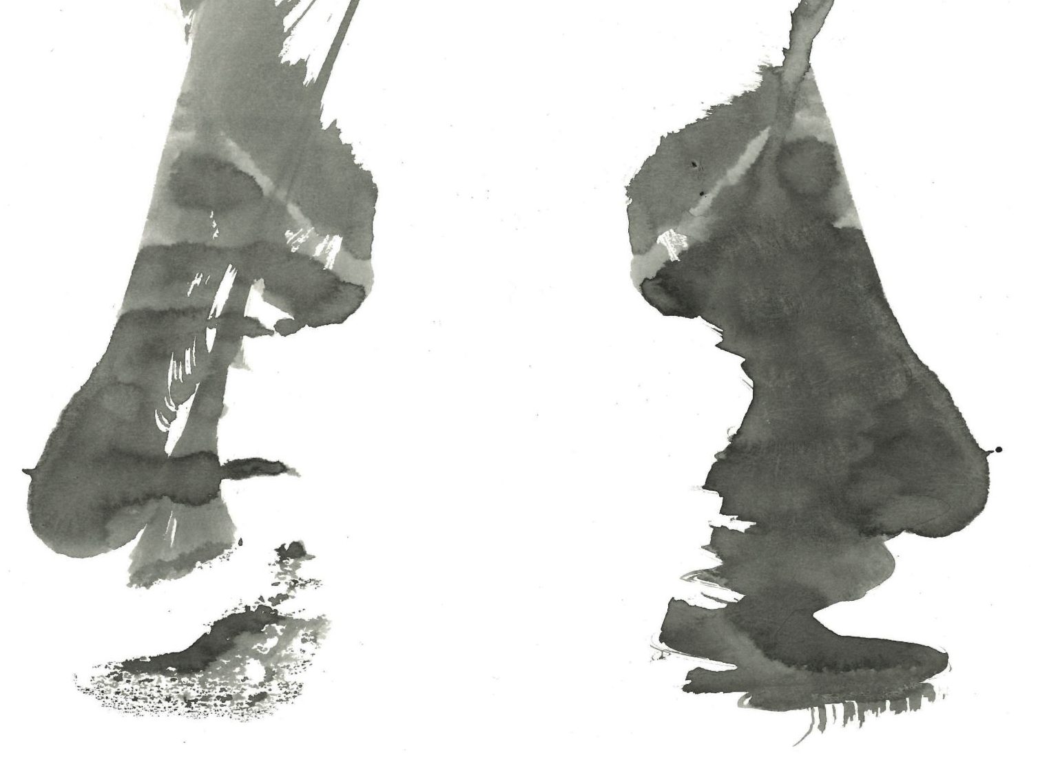
Ink and Lino print roller: for these pieces I used a paint brush to put some ink along the bottom of the page and then used a Lino print roller to push it up the page. I did multiple rolls to get a nice layered effect. This made really nice effects that to me resemble mountain ranges.

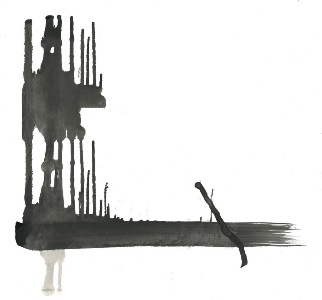
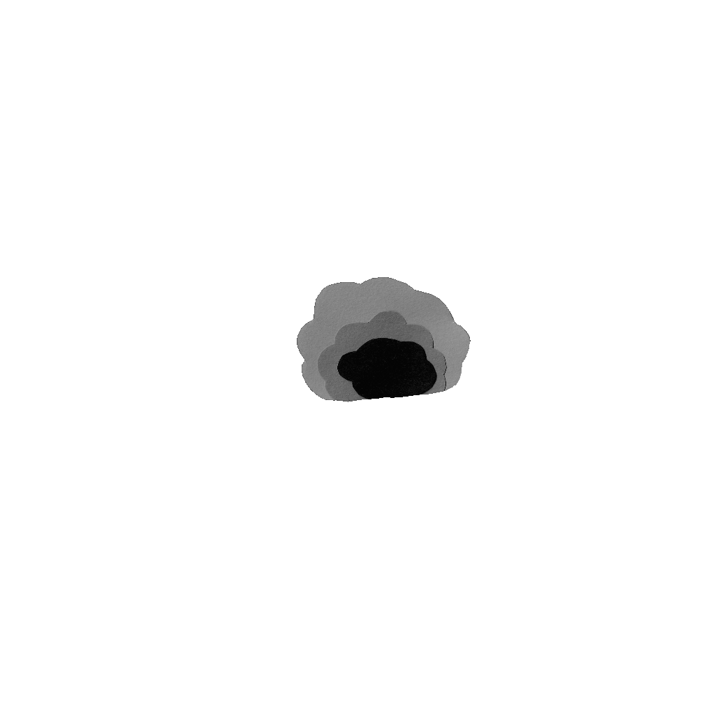
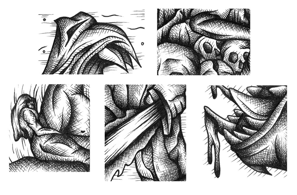
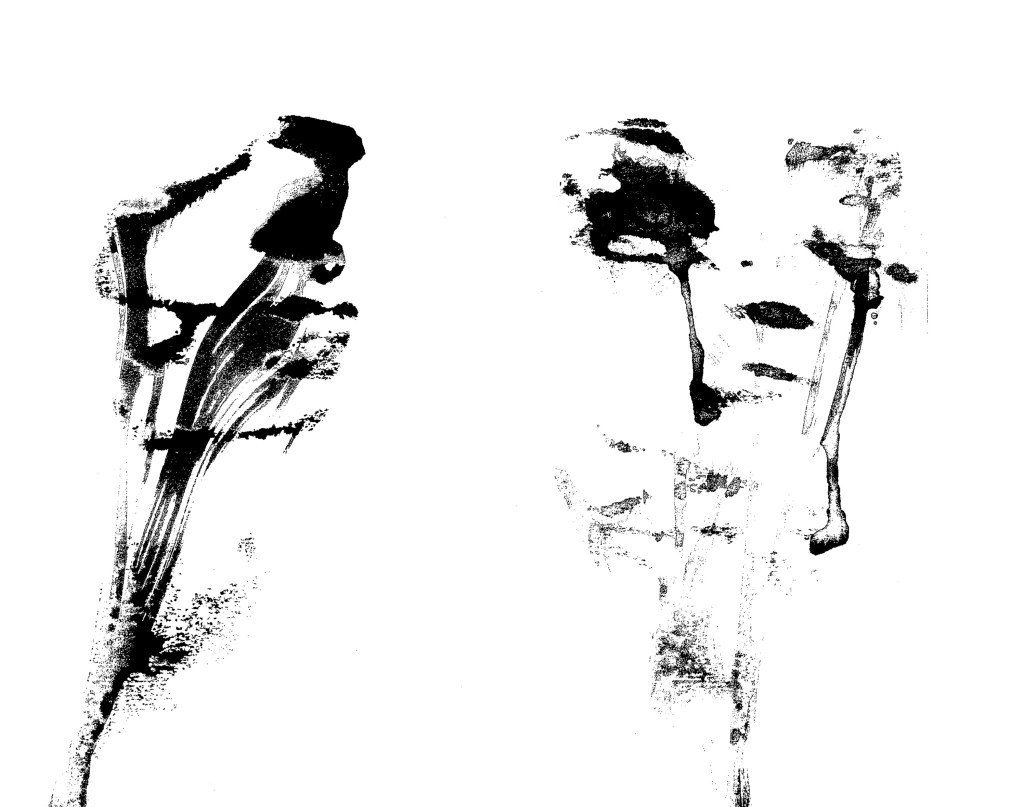
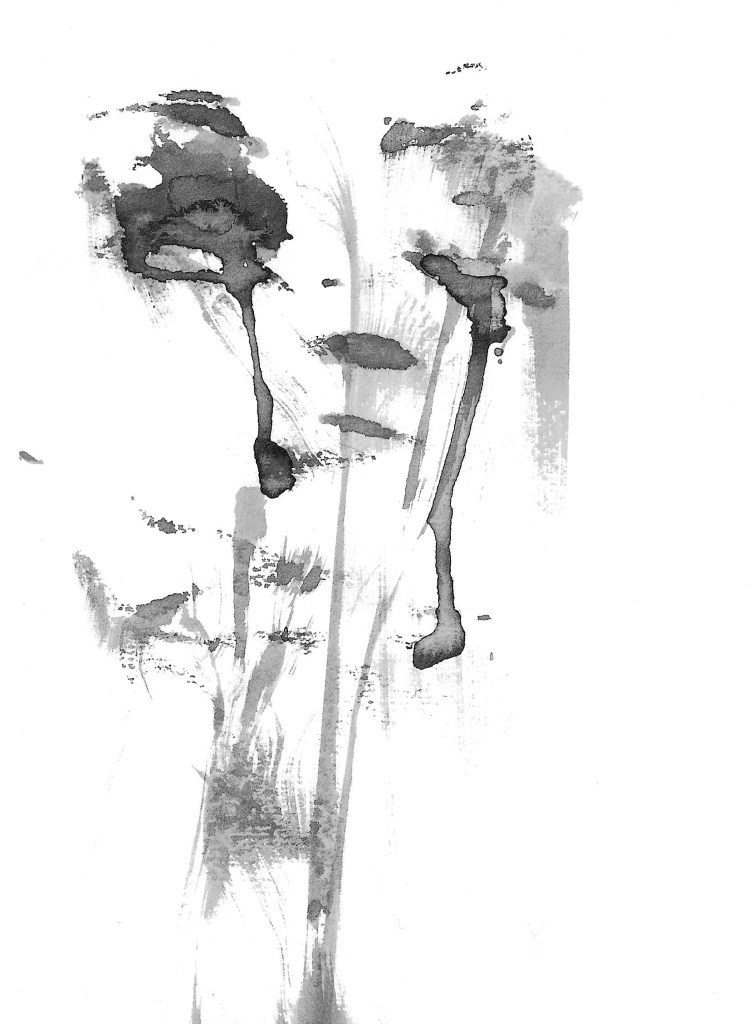
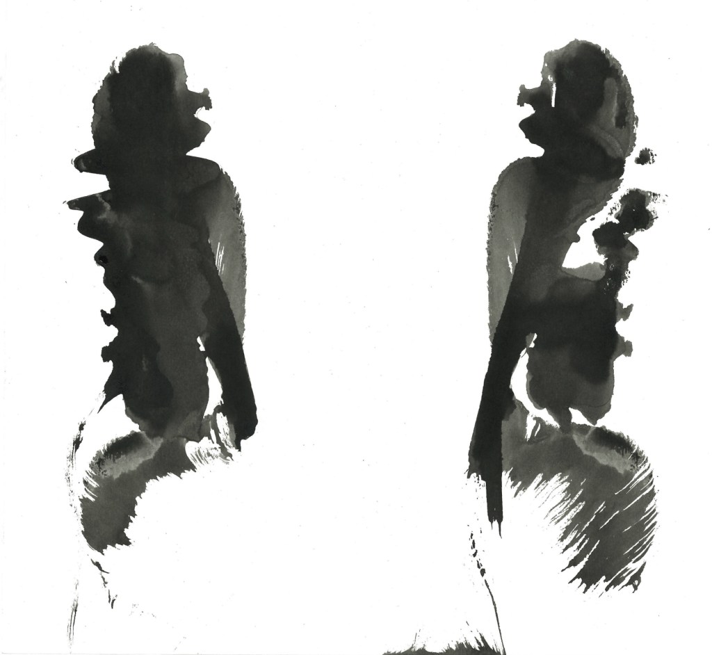
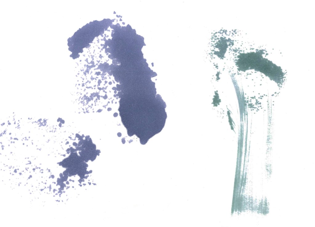
Ink and string: for these I dipped a piece of string and placed it randomly on a piece of paper, then I folded over the paper and pulled the string out. It created these lovely patterns with interesting textures. What I like about this technique is often it creates forms that I’m able to see as different objects. For example in the image below I can see a flower (left) and the face of a person crying (right):
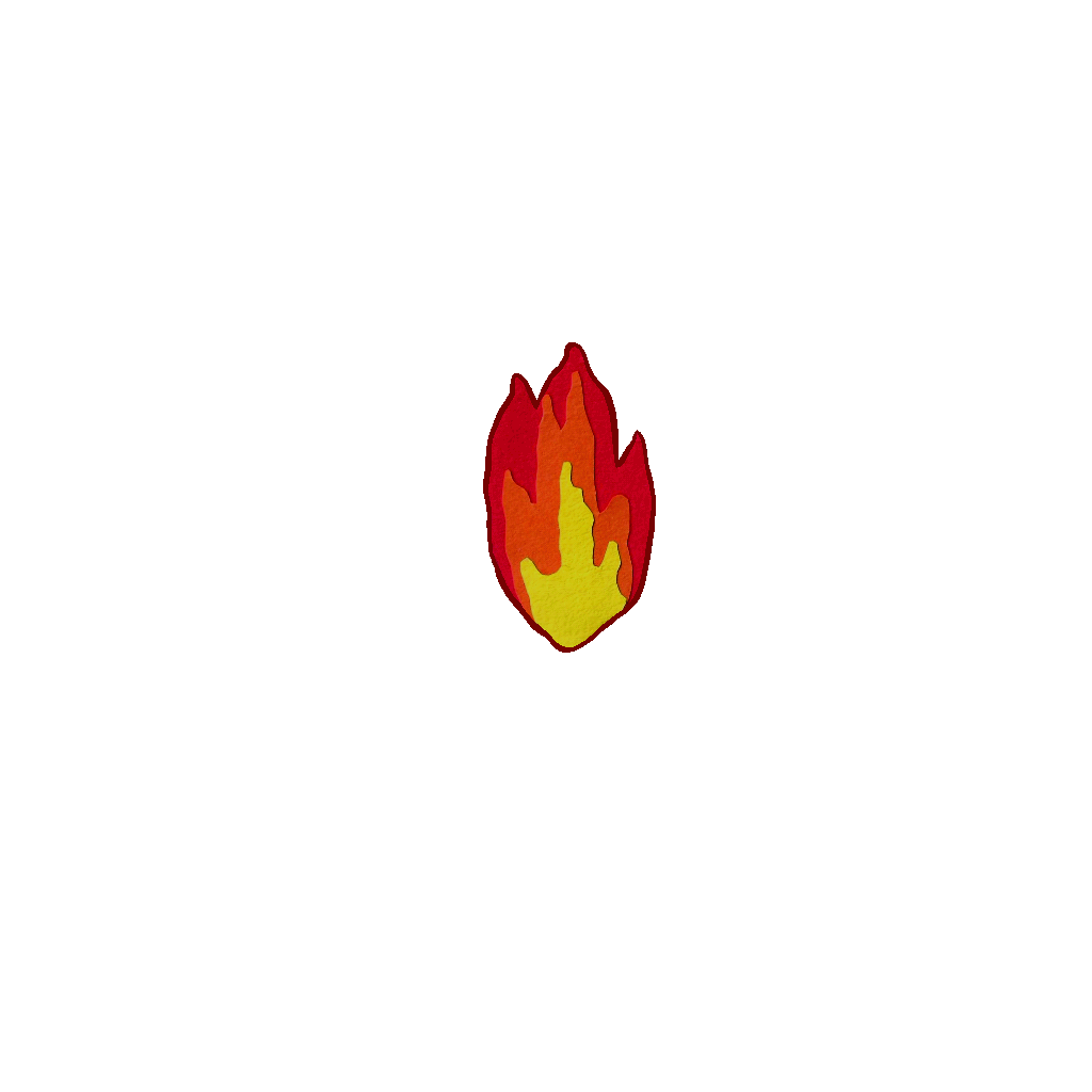
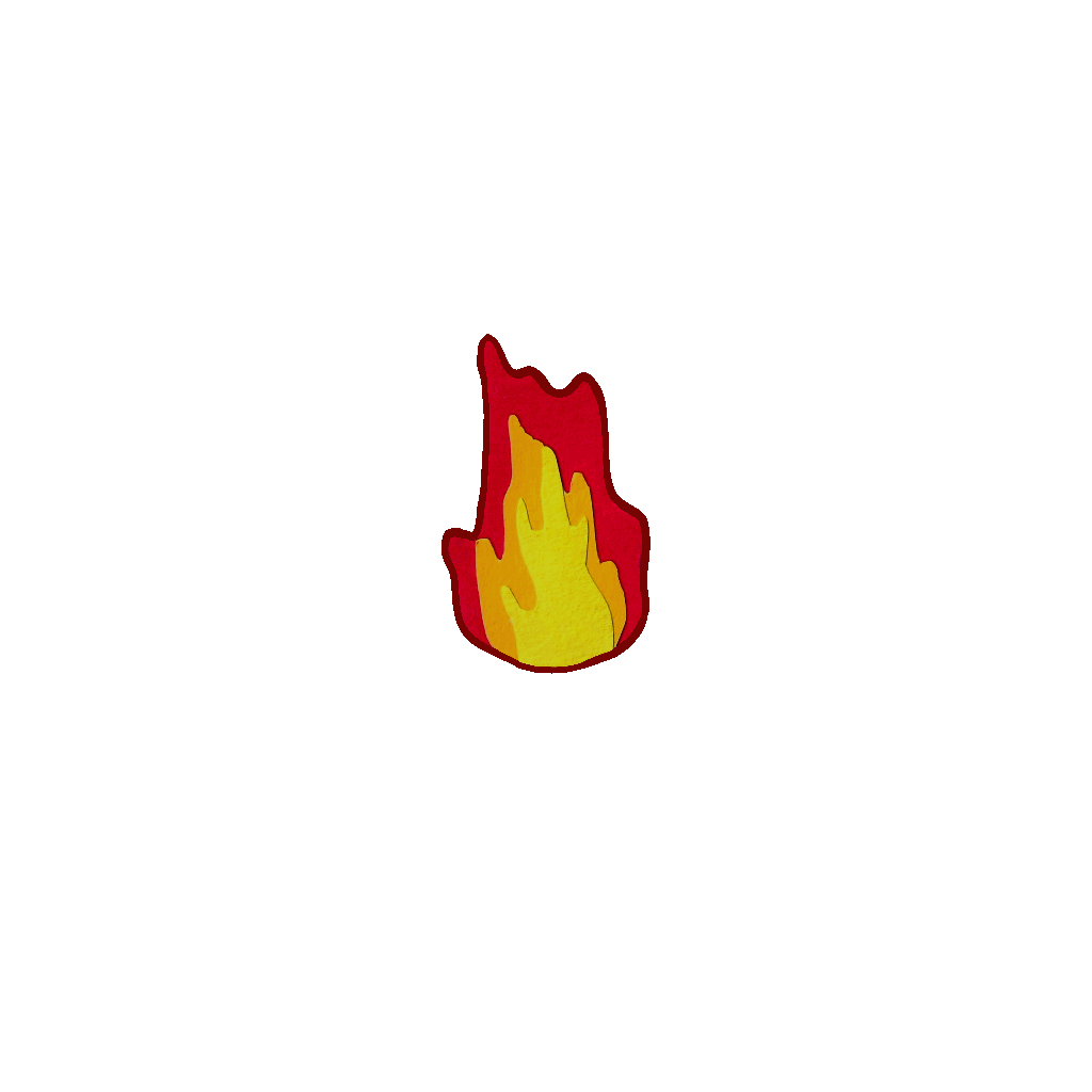
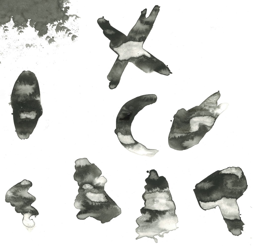
Other experiments:

I really like when we have creative workshops like this and are able to just experiment. It’s something I don’t do enough and will make a conscious effort to spend more time doing. I’m happy with the experiments I did, I found 2 new ways of working with ink that I otherwise wouldn’t know about. In addition to this I also really like some of the individual pieces I made as these techniques are good for creating unique and dynamic artworks. I didn’t want to directly link the images I was creating to my Norse mythology project but I will be connecting this work to it. I’m going to take some of the textures I made and create custom brushes on Procreate that I can use to add unique textures to my illustrations.

Categories
Digital Arts 2 Digital Arts 2: Project Level 5

Digital Arts 2: Planning editing and visual effects

I have all the chess sequences and all the 2D cut out sequences so it’s now time to plan out how I want to edit the video. João, an animation student, joined me on this project to help with the editing of the video. This is really helpful as it will speed up the editing process as I won’t need to learn the software from scratch independently. This will allow for more ambitious editing and result in an overall better video. As João joined the project late and will only be helping with the final stages it allowed me to take up an art directory role, overseeing the production. We decided that all the editing would be done together so we could continuously bounce ideas off each other. Also I didn’t want to just hand the editing of the video over to him as I still want my vision to be seen in the editing it’s the perfect opportunity to learn how to use the editing softwares.

Below are mine and João’s plans for the editing and effects in the video. We each made one individually then had a meeting to discuss our ideas come up with a combined plan for how we want the video to look.

My Plan:

Joao’s Editing Ideas Storyboard:

Visual Effect tests: after discussing our ideas I began to test out some of the ideas by overlaying the animated GIFs of the 2D cut outs on some frames from the chess video to see how the 2 styles look together. Overall I’m really happy with the combination of styles. I thinks it’s a unique and fun blend of analogue and digital styles. When it comes to adding the effects onto the videos is after effects we will be able more precise about colour corrections and placement to ensure they feel a part of the scene and not just an effect stuck on top.

Movement lines experiments: inspired by Keith Haring’s art I want to add movement lines to some of the sequences. Specially scenes 1, 2 and 9. I tested out different brushes on Procreate and different types of dynamic lines. I really like the idea of having black movement lines for the white chess pieces and white movement lines for the black chess pieces. I think this contrast will be unexpected and more visually engaging. To get the lines to After Effects I will draw the line big in Procreate so it won’t be pixelated and export it as a PNG.

Categories
Digital Arts 2 Digital Arts 2: Project Level 5

Digital Arts 2- Shooting 2D Stop Motion

Studio session: to shoot the 2D paper cut out sequences I booked 1 day in the stop motion studio. I borrowed the same camera I used for the chess sequences, Canon 100D which I connected to DragonFrame using a USB cable. Instead of using a tripod I was able to attach the camera to a mount over the shooting area. In regard to lighting I only needed the 2 built in lights and just adjust the distances to get an even lighting.

Shooting these was a much easier process than shooting the chess sequences. I put down a green piece of paper to act as a green screen. Then I lined up the camera to the paper by looking at the live view on DragonFrame. I placed the asset in the middle and adjusted the focus to that area. I shot each frame using the onion skin opacity tool so the frames would be lined up, saving me time in post production.

Assets: this video shows all the sequences I shot in the studio of my 2D paper cut out assets.

Editing:

I removed the green backgrounds of each frame using Photoshop and did some basic colour correction to each to get a nice consistent look between each frame in the sequence and make them more vibrant.

Title: I chose the title ‘Long Live the Kings’ as it has an obvious link to chess that people will understand before seeing the video. Also I think it summarises the plot while also mocking the dramatic nature of the video because of the intensity builds up just for the kings to run away in fear. After the studio session I decided I decided I wanted to create the title of the project in a paper cut out style, similar to the countdown. For each word of the title I made 3 versions in order to create a fun, messy animation style with each letter changing on a loop. I didn’t want to book out the studio and equipment for just this one thing so I decided to try creating this at home. To do this I used my scanner and a contrasting coloured background. Then I did the same process of removing the background from each frame on Photoshop and altering the colour.

Animated GIFs: once I had each frame removed from the background and edited to improve the colours I created looping animated GIFs of each sequence using the animation feature on Procreate. I chose to use Procreate because it’s a program I’m comfortable with and it has a simple animation feature that is ideal for creating looping GIFs.

2 count down animations: for these I added a border to imitate ripped paper. This helps make them stand out and make the shapes more dynamic and unique.

4 fire animations:

4 smoke animations:

2D Stop Motion sequences:

4 graves: I made these images of graves using the paper cut out. I added the textured border and letters on Procreate. I decided against using the grave rising animations as I think they would draw too much attention in the scenes and distract from the main parts,

Categories
Contextualised Practice Contextualised Practice: Project Level 5

Contextualised Practice: Developed Sketches

I scanned in my original rough sketches and resized them to fill a piece of A4 paper. Then I printed them and used a light box to trace them in pencil. I used them as references for my refined sketches, making the necessary changes/ improvements. For each illustration I will explain the changes I made and have included a quote from one of the original literary sources that inspired the illustration.

The Creation of the Cosmos: I didn’t make any major changes to this illustrations, except making the image slightly longer and thinner. Other than that I just improved on the sketch, adding in more details to the characters, fire and ice.

Quote from the Poetic Edda:

“Of old was the age | when Ymir lived;

Sea nor cool waves | nor sand there were;

Earth had not been, | nor heaven above, But a yawning gap, | and grass nowhere.”

Thor fishing Jormungandr: the concept of the image remained the same but I did make a couple of key changes. One thing I removed was Jörmungandr wrapping around the ship as it didn’t flow nicely with the rest of the composition and took away from the sense that he was coming from the depths of the sea. Also I significantly extended the image, making it a lot longer and therefore appearing thinner too. This was to show more of Jörmungandr and really emphasise how monstrous he is. Other that than I just improved on the sketch, adding more details to the characters, boat, sea and sky.

Quote from Prose Edda:

“the squamous serpent squirms with rage”

The binding of Fenrir: No drastic changes were made to the concept or composition, I just improved on the drawings of the hand and Fenrir. For the hand I used a photo of my own hand for reference, making sure that it was very small in comparison to Fenrir’s mouth to emphasised the imbalance of power/strength. To draw Fenrir I used reference photos of wolves to help me get the proportions are forms right. I’m really happy with the sketch and this it improved significantly from the original one with the most important detail being the increase in size of Fenrir’s mouth.

Quote from Prose Edda:

“They wanted the wolf to try this also,

Saying to him that he would become very famous for his strength,

If so strong a chain was not able to hold him.”

Loki bound: the only major change I made for this one was extending the image to make it longer and thinner. This is because I felt showing all of Skadi and being able to see where she was pouring the venom allowed for a more interesting and complete image. Also I wanted it to have similar dimensions to the Jörmungandr image. I also improve on the sketch, focusing on the people and making sure the proportions where correct.

Quote from Völuspá:

“I see one in bonds by the boiling springs;

Like Loki he looks, loathsome to view:

There Sigyn sits, sad by her husband,

In woe by her man. Well would you know more?

From the east through Venom Valley runs

Over jagged rocks the River Gruesome.”

Ragnarok: I didn’t make any major changes I just refined the details. I improved the sketches of all the creatures and silhouettes of the gods. I decided to limit the number of gods I had so there was more emphasis of the ones that are key to the story. I did make the image slightly longer and thinner to match the creation story illustration and make it feel more like a traditional battlefield image.

Quote from Prose Edda:

“From the south comes Surt

With blazing fire- brand,

The sun of the war god

Shines from his sword.”

Hatching sections: one of the mediums I’m going to use for these illustrations is hatching and pen shading. I did some experiments with different styles of mark making and found that I like using straight line hatching for shading with a pen. Here is 1 section from each image that I did completely in this style:

I’m really happy with the finalised sketches and think that the changes have significantly improved the images. The next step for this project will be to scan my final sketches and take them into Procreate to begin adding colour.

Categories
Digital Arts 2 Digital Arts 2: Project Level 5

Digital Arts 2: Paper cut out animations

An essential part of the module brief was to combine analogue and digital media. Throughout the workshop session I experimented with various digital softwares and approaches. The core medium for my project is stop motion which does combine digital and traditional media. However, I wanted to expand on this and take both the analogue and digital approaches further. For the digital side I will be exploring softwares such as Adobe After Effect and Premier Pro for editing the video. The way I want to introduce more analogue media into the video is by using paper cut outs for overlays and effects. I really like this more traditional animation style and think it will uniquely contrast the clean, cinematic visuals of the video.

Plan: below is my plan for the paper cut out animation, including the assets I want to make, how I’ll make them, where I’ll use them in the video and my artistic inspirations.

Artist references/ inspirations:

Chris Haughton:

Ollanski:

Natasza Center: guest lecturer who specialises in hand drawn animation

Style idea- my previous work: this is a piece I made as an exercise for my module ‘Sequence and Messaging’. I was experimenting with paper stop motion and this sort of cut outs is a style I want to use for the countdown and title. Also the sound effect used in this video is similar the style of audio I want to use in the video.

Paper cut out assets:

These are all the fire, smoke and countdown assets that I made. These took a long time to create as I wanted to be precise and detailed with each asset. I made 4 fire and 4 smoke sequences, each consisting of 10 assets. Each asset is made from 3 layers of colours.

The next step will be to photograph each asset and create the animated sequence.

Categories
Digital Arts 2 Digital Arts 2: Project Level 5

Digital Arts 2: Contextual Project Research

Stop Motion Academic Research: to supplement my general research I explored some academic texts around the subjects of Stop Motion animation and Chess. This type of research provides a different level of knowledge and helps to deepen your understanding of a topic. I used the information I learnt to help fuel my creativity and ideas for the creation of my Stop Motion project.

’The Blend of Reality and Illusion’- paper by Yizhao Gong:

Key Quotes:

“The contrast between the realism of the stop-motion technique and the fantastical nature of the story adds to the unique appeal of stop-motion animation compared to the omnipotent CGI.”

“Stop-motion animation is an animation in which a model poses an action according to a specific law, and the model’s action is shot frame by frame to form a sequence, which is then combined to turn into a movie.”

“The pursuit of real texture has injected fresh vitality into the character modeling of the stop-motion animation so that the audience can capture the realism of its presentation and bring a different visual feel to the animation.”

“When animating, designers not only work on the characters but also use lighting and other methods to create a fantasy world that is indistinguishable from the real thing. The setting environment plays a crucial role in creating the sense of reality in stop-motion animation. It is the specific space needed for the story’s development and an essential factor in showing the plot.”

“The perfect combination of sound and image can better express the author’s emotion. The introduction of effect sound can bring similar emotional experiences to people in different spatial and temporal backgrounds, so it is widely used in stop-motion animation creation.”

’Where will stop Motion animation take us next?’- Medium article:

Link to article : https://esmeprasad.medium.com/where-will-stop-motion-animation-take-us-next-412c5d0d51c7

‘Humpty Dumpty’s Circus’ by Albert E. Smith:

‘The Phantom Carriage’ by Victor Sjöström:

’King Kong’ by Willis H. O’Brien:

Chess Research: I did some in depth research on chess, specifically on its history and its importance in art and literature. I don’t think this level of knowledge is necessary for the creation of my project as it’s not a historical or factual piece, it’s has more of a fun and silly tone. However, I find the game interesting and wanted to explore more about its history and significance. Below are my notes from the research:

Oldest chess piece discovered:

‘Through the looking glass’ by Lewis Carroll

Categories
Digital Arts 2 Level 5

Digital Arts 2: Immersive Arts

Before this session I had very minimal knowledge of Immersive Arts. The only practical experience I have on this topic was doing a 1 off workshop on AR last year. I did enjoy that and am happy to explore this in more depth in this workshop. I wanted to use this workshop as a way to break a break from my main project about chess and do something different. So I didn’t use chess for any of the exercise and chose a different way to explore play.

Augmented Reality (AR):

AR Examples:

’Revive’ Exhibition:

Susi Vetter:

Artivive: I used Artivive in the session I did on AR previously so I had a basic understanding on it going into the session.

Illustration I found on Pinterest: scan this image with the Artivive app to view the AR elements- this is the trigger image.

Screenshots from workshop with annotations:

This is a video of what the AR elements look like when the trigger image is scanned with the Artivive app. I’m really happy with the result of this exercise. I found using Artivive fairly straight forward but can see how it would get more complex as you bring in more AR elements. To create this I added the trigger image and then started adding in PNGs of some of my otter illustrations and arranged them around the main image. I played with the composition, having them at different heights and distances away from the trigger image so that there’s depth in the AR elements. The otters create a fun and playful scene that the viewer can explore by moving the camera from side to side and up and down.

Virtual Reality (VR):

VR Examples:

Pete Jiadong Qiang:

Bjork Digital:

Elizabeth Edwards:

Frame VR: I’d never use Frame VR or anything similar so this kind of technology was completely new to me.

The Otterverse: I chose to continue with the otter theme for the VR exercise. The website was relatively simple to navigate and use. I first chose which base world I wanted, I chose this one as it was the most colourful and fun which was the time I wanted to go for. Then I began downloaded free 3d models from Sketch Fab and importing them into this world. I populated the world with around 8 otters, each one slightly different. Within the scene I wanted to create little narratives such as the otter peeking out of the tent and the flying otter. This makes it more playful and fun to explore round and try find these different things. It was a good introduction into creating a fully digital, immersive world that people can explore.

Here are some screenshots from the Otterverse:

Click this link to view the Otterverse:

https://framevr.io/sxd-qrz-dgq

Reflection: I really enjoyed this workshop learning about 2 different types of immersive arts, AR and VR. I liked having a break from working on my chess project and engage with the theme of play in a different way by using otters as my topic. I had very little knowledge or experience with immersive arts so I was able to take a lot from the session. I found both activities fairly straight forward in regard to using the websites. I’m happy with the outcomes I created, I think they’re fun, playful and where a good introduction to the technology we were learning about. Out of AR and VR I definitely prefer AR as it is a way to advance my more traditional and usual style of art whereas VR is completely isolated from that. I won’t be using this technology in my project but it is something I’d like to explore more in the future.

Categories
Level 5 Sequence and Messaging Sequence and Messaging: Project

Sequence and Messaging: Event details and branding

Event Details: These are the finalised details for my event combining UN DN LAQR and Hotel Diablo. I have chosen the event to be a pop up shop with a concert after. UN DN have done pop up event before so I have a basis to work from. At this event I’ll have a range of activities including a nail salon, photo booth, painting wall and fashion exhibition. After the pop up shop there will be a concert where MGK performs Hotel Diablo with some guests who link to the album and brand. I’ve chosen Camden, London as the location and will have it on the 5th July as it’ll be the 5 year anniversary of the album.

Logos: I won’t be redesigning either logo so will use the existing ones. The 2 logos are very contrasting aesthetics so it will be a challenge to visually balance them in my work. UN DN have simple bold typeface whereas Hotel Diablo have a much more rough hand made quality to it. Finding a middle ground between the 2 could be nice for the display typeface.

UN DN slogans: during my brands research I found a selection of intending slogans, quotes and captions from their social media pages . These could be good to include in my project work as I want to keep the style of language consistent to their actual style. Below are some of my favourites:

Hotel Diablo track list and lyrics: I noted down all the songs from Hotel Diablo as I’d like to incorporate the track list into my projected work. Also it could be nice to use specific song names in the advertising as a way to link the whole concept together. I also made a note of some specific lyrics from the album that I could use. I think this would be a good way of subtlety referencing the album in a way that fans will understand but the average viewer won’t.

Colour palette: UN DN don’t have a specific colour palette that they use, they tend to change their colour scheme depending on the event or collection they’re promoting. Usually they’re colourful, generally leaning more towards a lighter aesthetic. This allows me lots of space to design a new palette. Hotel Diablo has a dark, moody colour palette, primarily being black, grey and purple. In order to combine these 2 visual identities I chose this palette. It has black and various shades of grey to keep the Hotel Diablo aesthetic. It also includes white which will mostly just be used for details such as text because I want the base colours to be dark. The pop of colour I have chosen are pink and purple. I added pink because it’s a colour strongly linked to Machine Gun Kelly and will help to bring a sense of life and excitement an otherwise dark palette.

I used a colour palette tester to show me all the possible colour combination that this palette creates with a contrast higher than 4:

I have bought nail polish in all the colours from the palette. All my adverting will be of these colours as this is going to be the Hotel Diablo nail polish collection. By creating a collection linked to Hotel Diablo I’m able to connect the 2 elements of my project and centre the advertising around that. The advertising will then be promoting the brand’s pop up shop and the concert of the album.

Typefaces: UN DN uses relatively simple and clear typefaces for their titles and bodies of text. They get creative and more experimental on some of their advertising, using more interesting typefaces. Hotel Diablo has a very loose and hand written style so I want to combine these 2 aesthetics.

Adobe typefaces: these are a selection of Adobe typeface that I’m considering using in my work. There’s a range of simple, bold ones inspired by UN DN and other more decorative ones which take inspiration from grunge and rock music.

Hand written typefaces: I made these typefaces using a thick marker pen. They’re inspired by the hand written style on Hotel Diablo but are more bold and have a stronger line weight, similar to those used by UN DN. I want a loose, rough style so they are stylised versions of my own hand writing to make them feel natural and not too forced or perfect. These typefaces build on the styles I developed in the action and interaction activity where I worked on the song ‘Bloody Valentine’ by MGK.

Reflection : this visual identity comprised of logos, slogans, colours and typefaces is going to be continually developed throughout the project. Designing a visual identity is an iterative process, the decisions are not fixed at this stage but it’s good to have a base to work from. The next steps will be to start experimenting and creating some visuals for the static, sequential and interactive pieces.

Categories
Level 5 Sequence and Messaging Sequence and Messaging: Project

Sequence and Messaging: Wider Project Research

In my previous post I did extensive research into all of UN DN’s social media accounts and their website. The next step was to do some broader research, looking at how nail polish is promoted on social media in general. I looked on Instagram, TikTok and Pinterest. I mainly focused on Instagram because that is the social media platform that I’m targeting my advertisements towards.

Instagram: on Instagram I looked at hashtags, some famous nail polish brands and a specific page that interested me. This range of research gave me a more in depth understanding of how nail polish is advertised, helping to guide my creative decision making.

Hashtags: I looked at loads of different hashtags related to nail polish to explore how it’s presented on Instagram as a whole. The 2 hashtags with the most posts were #nailsofinstagram and #nailpolish. Generally what I found what a consistent style of advertising under these hashtags. For the most part it was a simple, light, clean aesthetic. The photos were taken in strong warm lighting with a really high quality camera to highlight the detail and texture in the nails. Occasionally there would be interesting details in the background but often it was very simple. While there is nothing inherently wrong with this aesthetic, it became very repetitive and boring with all the posts largely conforming to 1 visual identity. In my project work I want to go against this and creative pieces that stand out and contrast this light, clean aesthetic. Some elements I did like was the common use of accessories in the photos such as rings and bracelets, which is something I want to use but make it more striking. Also they’re a lovely array of colours on display but mostly just in the nails, making these colours more bold in the pictures and videos could help make them more interesting. Below are some screenshots from these hashtags:

Nail polish brands: I researched some of the most popular nail polish brands and looked into their Instagram accounts. The brands I’ve shown below are Sally Hansen (404k followers) and Jinsoon (35k followers). The ideas I mentioned about the hashtags remained largely the same across these brands. The aesthetics of the pages are repetitive and predictable with lots of simple shots of painted nails. There’s very little creativity or inspired design work, it largely just follows a formula. Even between different brands the visual identities are similar and not easy to distinguish. This is reflected across the engagement with posts, particularly in the reels. For the most part it’s just steady views that are surprisingly low in comparison to the follower count. The reels tend to be nice relaxing videos of people doing their nails or speaking about them. These make for nice watching but are nothing different or unique which is why they don’t really break out of the brands following.

Sally Hansen X Jared McCain: This post by Sally Hansen in partnership with Jared McCain is one I specifically wanted to talk about. Aesthetically it’s an incredibly simple, it’s just a guy talking on his house with no effects or editing. However, it’s the most viewed reel on their instagram with 1.1 million plays. This is so far ahead of their average. There’s a few interesting things I took from this. It shows the importance of brand collaboration. He is a basketball player so it helped expose the brands to a new audience. This is something UN DN does well with their range of brand ambassadors. Also the post shows the importance of going against the grain. Men wearing nail polish is becoming more popular but is still met with a lot of negativity. This is reflected in the comments section of the post with quite a lot of negative comments but ultimately gets a lot more engagement. The majority of nail polish promotion to targeted towards women with its more feminine aesthetic and I want to challenge this in my work. The idea of nail polish being for men and women is an important part of UN DN and is something that will be key to my project work.

Nails of LA: this is a particular nail polish account that I like. It’s the page of an LA based nail artist who works a lot with celebrities such as Megan Fox, MGK, Landon Barker and Kim Kardashian. They often share posts about UN DN and work with a lot of the same people and have some similar aspects to their visual identities. What I like about this account is the more unique visual identity. I like the use of accessories and a more alternative/ rock leaning aesthetic. These are styles I’d like to work with in my project.

Instagram reflection: overall I found through my research of how nail polish is promoted on Instagram that it was very repetitive and the post became too formulated. It was primarily all just light, clean photos of hands with little creativity or originality. As a result of this there were very few videos or photos that really broke out of the community of followers. I want to go against this in my work, creating a unique aesthetic that stand out from all the other posts on Instagram.

TikTok: Instagram was the main social media platform I researched as it’s where I plan to target my video. But I did do some research into how nail polish is shown on TikTok, mostly just looking at the hashtags. The main one I looked at was. #nailpolish as it had the most posts, 450k. There wasn’t a huge difference from the aesthetic seen on Instagram. The format of the videos are less professional and more conversational which is simply the nature of TikTok. They are once again repetitive and result in relatively low engagement. There was more typography on display but nothing that really stood out to me, it was mostly just simple typefaces with no real characters or uniqueness. The style of the content here isn’t what I’m aiming for in my project.

Visual Research (Pinterest): after researching on Instagram and TikTok I looked on Pinterest to see what content they had related to nail polish. There was a lot of images that followed the same visual identity that was seen on social media. But I was able to find some more unique and creative pieces that inspired me which are below .

I like the more experimental use of colour. Having unnatural colours in the face instantly makes the images more striking. Also there are strong colours in the background so the overall image is eye catching. The poses of the hands are more interesting than a lot of the content of social media. I really like the image with the rip in it. It’s a nice way of playing with colour, having some bits it greyscale and other parts in full colour. This can be seen in the bottom images too as they only have colour on the lips and nails, an easy way to draw attention to the nails. The bottom images have a vintage style with the colours and textures, I’d like to incorporate this into my work as it’s different to the clean images currently seen in do use media.

Categories
Level 5 Sequence and Messaging Sequence and Messaging: Project

Sequence and Messaging: UN DN social media analysis

An essential part of this project is social media research. This allows us to better understand the brand, event and audience to make informed and targeted creative decisions. This post has my research on all of UN DN’s social media platforms, Instagram, TikTok, YouTube and their website. I took what learnt from the action and interaction research workshop and applied it to my project. This way I was able to cover all angles of social media research. I looked at different posts within same organisation, different social media platforms, different areas and different events from similar categories.

Brand logo: simple, bold typeface. Doesn’t reflect the brands creative identity but this contrast of styles helps it stand out against their advertising. I won’t be redesigning the logo so my work will be using their existing one.

Website:

Instagram:

TikTok:

YouTube:

Machine Gun Kelly Instagram and TIK TOK:

Reflection: doing all the research into the brands visual identity across all their social media and website was very helpful. I now have a much greater understanding of the brands visual style, what advertising is successful for them and how they appeal to their audience. It has also provided me with lots of inspiration for the style and aesthetic of my project work. The next step will be to research the wider context on my project, so look at how nail polish is advertised generally and how similar events are promoted.