Categories
Brands Level 5

Brands: Semiotics in Design

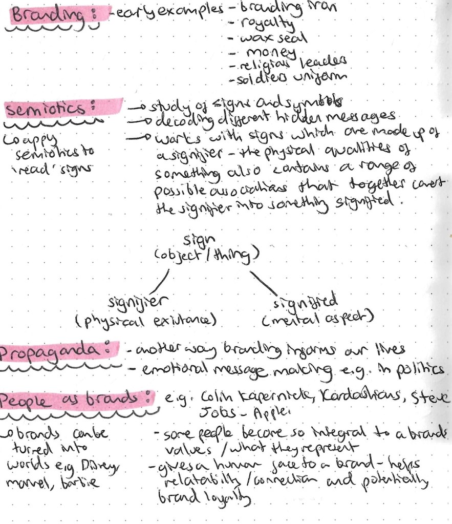
In this session we learn about semiotics and all the key terms surrounding this topic. Then we applied these concepts to branding and how brands use semiotics in advertising and finally putting these ideas into practice. Semiotics is the study of signs and symbols and signification and how meaning is created. Below are the key terminology for this topic:

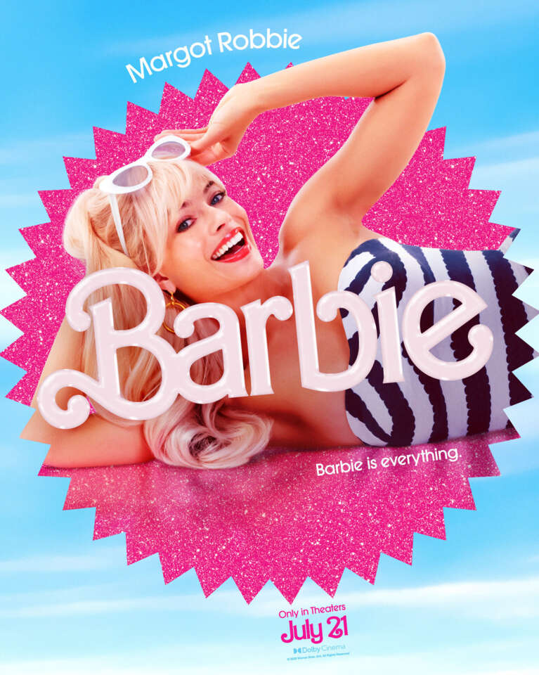
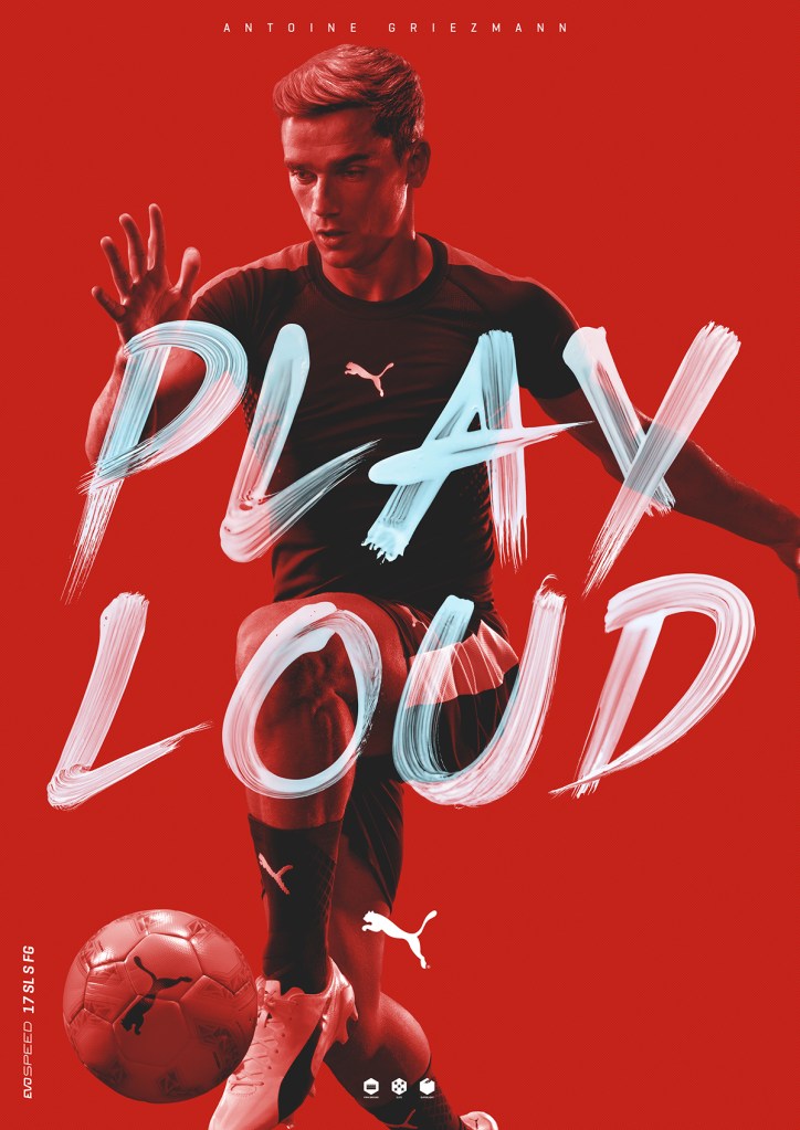
Semiotics are always being used when designing something. For instance different typography choices suggest different things. This can be as simple as bold lettering making something appear more important. This is also key to colour choices as different colour suggest different things so manipulating this is important for branding for example black and white representing something serious.

This is the Frederici ice cream advert that I broke down and analysed semiotically. It’s a really interesting advert to study as it’s packed full of messages and signs all trying to persuade you to buy the product. Upon further research I found out that the advert was actually banned for being offensive. The creator of the advert defended it saying that the pregnancy is representative of making the ice cream. This shows how you can’t fully control how someone views your work and not everyone draws the same messages from an image.

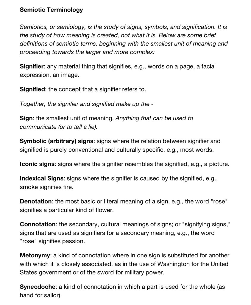
Below is a good representation of how the terms sign, signifier and signified are linked. There’s also a description of the 3 different types of signifiers; icon, index and symbol.

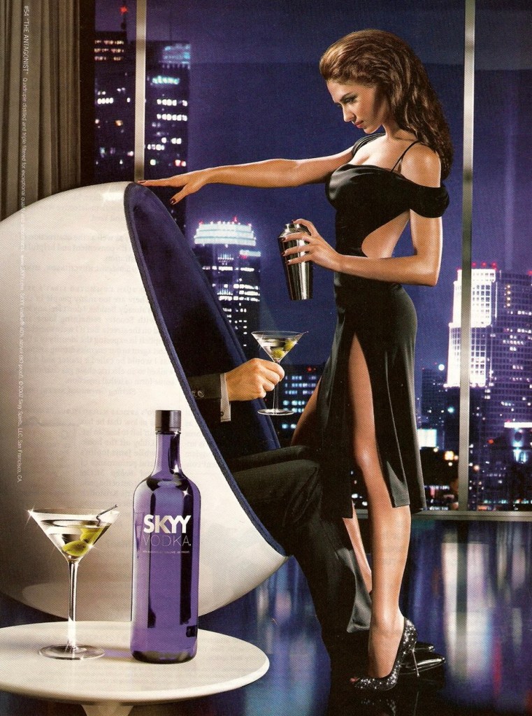
Then we had an exercise where we looked at different adverts and broke down the semiotics involved and how this is used to market the product or service they’re selling. Below are the 2 adverts I studied and a breakdown of the signs and messages involved in them.

Then we moved onto the next task called anchor and relay. For this we had to take a stock image and make 3 different advertisements for 3 different brands by adding the brand logo and a slogan that we make up. This is making us think about semiotics and how we can manipulate an image to push a product or a narrative.

The image I chose was of a dog playing in some water out in nature. It’s a nice clear stock image that I could see lots of potential branding possibilities for. I first wrote what I could see in the image and the messages of these things and come up with possible slogan ideas. Then I through about possible industries to apply these slogans too and finally researched specific companies.

The first one I did was for a company called The Natural Adventure. The logo fit really well in this open space as the top right corner and the colour fit the natural theme of the image. Then I decided on the slogan ‘running wild and free’ in large text in the middle. I wanted it to be big and eye catching. The colour is blue to continue with the natural theme but a dark shade with a white highlighted border to help it stand out.

The second company is the well known dog care brand Pedigree. Their logo nicely contrasts the colours of the image making is stand out and be distinctive. Then I used the open space at the top for the slogan ‘let your hair down’. I copied the white of the typeface in the logo but picked a less rigid font and added a blur to the border.

The third one is for the camera company Canon. For this image I wanted to restrict myself and not use any colour in the logo or slogan and not use the top right corner again. I made the logo black and compensated for the lack of colour by making it larger. I chose the slogan ‘capture the moment’ and made it white and in a bold legible font. I placed this on the horizon of the water and trees as it’s a dark area so would allow the slogan to be easily visible.

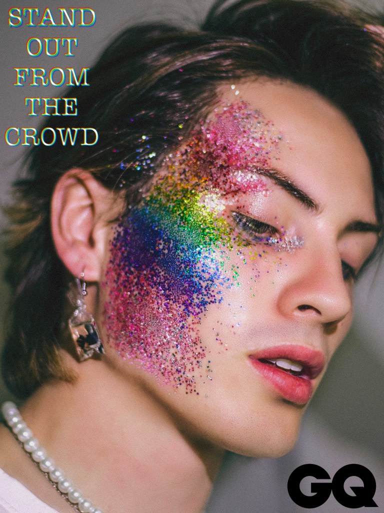
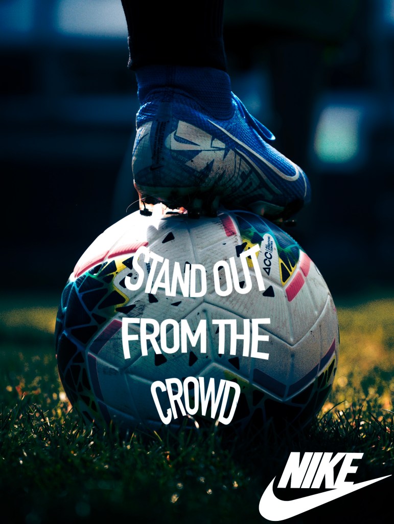
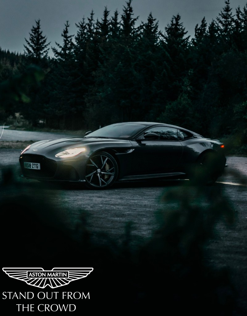
The other part of this task was to make a slogan and then chose 3 stock images and 3 different brands to make an advertisement for. I found starting with the slogan more difficult than starting with the image because when I see an image I am able able to brainstorm ideas from is easily but phrases not so much. The slogan I chose was ‘stand out from the crowd’ as I could see many possible industries to apply this to. Also it’s a well known saying already but not connected to a particular brand so people will already be familiar with this idea.

The first brand was Nike and specifically for their football merchandise. The logo has a simple geometric font so I used a similar style typeface just with thinner lettering. I made both of these in white to make them stand out from the dark image with lots of cool tones. I put the slogan in the ball and warped it to reflect the shape.

For the Aston Martin advert I wanted to keep it classy and simple to reflect the values and identity of the brand. Put both the slogan and logo in the bottom corner as it not distract from the image of the product. I made them both white to provide enough of a contrast that they stand out while keeping it classy by choosing a simple font.

The third advert is for GQ magazine. The logo is placed in the bottom right in black as this is where the company often places their logo in publications. The slogan is in the top left because I wanted it close to the glitter on the man’s face as this is the most eye catching part of the image. I tried to reflect the glitter in the typeface by giving it a colour, broken apart look.

Categories
Industry 2: Professional Practice and Enterprise Level 5

Industry 2: Career Skills Group Project Prep for Video

We each began to write up scripts for the questions we where answering using our research. We made slight adjustments to the order and redistributed who was saying what part to make it more even. I did a few drafts and kept timing myself to see how long each of my answers would take to say. Each answer could be around 30 seconds long, so this was a good exercise in having to condense research into just the key bits. For a couple of my questions I collaborated with others in the groups as there was overlaps in the research. This is my drafted script for my answers.

Then we all met up as a group and created 1 script with each of our answers on. This took a while as we had to get the lengths of each answer right. Then we added the images we wanted on our pages to the Google slides. This was a helpful tool as it allowed us to work on the same document across multiple devices and see instant changes. We then coloured coded the parts to make it clear which bits each of us would say. My speaking parts are in orange.

After some practices we recorded to audio for the video making sure to keep it in a back and forth conversational Q and A style. To try and make the audio more interesting we added some vocal effects and changed some of the speeds. But we made sure that each speaker had the same vocal effect on each of their parts to make it clear that it was a conversation between multiple people. Having 1 combined script was very helpful and made the recording process easier. With the audio done the next step was to make the visuals for the presentation.

Categories
Level 5 Visual Storytelling

Visual Storytelling: Philip Guston Gallery visit (Tate Modern)

This week we visited the Philip Guston exhibition at the Tate Modern. Guston was a Canadian-American painter, print maker, muralist and draftsman. He predominantly worked using oil paints. His worked has been a part of many artistic movements such as abstract expressionism, modern art, figurative art, neo-expressionism and social realism. Prior to visiting the exhibition I didn’t know of him but did recognise a couple pieces of his work.

Guston links into the visual storytelling module as his work usually presents a narrative. His artwork often functions as a tableaux, this is a term I learnt in the first week. A tableaux is a narrative presented in a single image. This makes his work useful to study for this module.

One of the things about the exhibition that really stood out to me was how it was presented. As you walked through it you viewed his work in chronological order. This was interesting as I was able to see the changes and developments in his style and approaches. I certainly like some sections more than other. The images below are in chronological order staring from his earliest work.

The piece, ‘Female Nude with Easel’ from 1935 is one of his early pieces. The first 4 images are all from the same period and have a similar style. I really like the technical quality of these, the forms and shading are all perfect and you can see the start of themes that become more common in his later work such as the human figure and clusters of objects. I really like this style, it’s one of my favourite periods from his career.

This piece titled ‘Nude Philosopher in Space-Time’, 1935, draws inspiration from surrealist painter Lorser Feitelson whose influence can be seen in the dreamlike image. Similar to the image above, a nude is partnered with an array of objects. At first glance the objects may appear random with helps to make the viewer more intrigued. Upon closer look the objects suggest the form of a person. This idea of deconstructing the human form into seemingly random objects is seen in the image above as well. With the legs of the stool representing legs, the easel being the body and ball being the head. The atmosphere of these paintings in dreamlike and almost eerie as they are made up of normal everyday objects yet feel really unnatural. Also it’s marks the beginning of Guston’s exploration into playing with objects and composition.

This piece called ‘Bombardment’ from 1937 is a particular favourite of mine. It has the same style as the previous pieces but it far more dynamic so there’s a lot more to take in. I like how clustered in appears and the choices of a circular canvas helps make the subjects feel like they’re leaping towards you. Guston really began to create narratives in his images. From a technical perspective it’s a brilliant example of foreshortening and using a vanishing point.

This piece from 1940 called ‘Gladiators’ shows a slight shift in style. It still has the chaotic composition of people and objects but has taken a slightly more abstract approach. I actually really like this style and think by reducing some of the detail and realism it becomes more dynamic and eye catching.

This piece from the 1950s shows the dramatic change in style. The work lost all realism and themes of people and objects. It became all about colour. I personally am not a fan of this period of his work as it doesn’t have the elements that I enjoy about his other work. It doesn’t have the same sense of storytelling and narrative. The one part I do like about it is that you can see this experimentation with colour aided his later work.

This piece was made in 1969 and is titled ‘The Studio’. This marked the move away from abstraction and back to the depicting figures. However the style had almost completely changed. It’s a far more cartoonish and technically simple painting style. The colour are more bold and forms less precise. This painting is widely recognized as an early meta-self portrait, in which Guston presents himself, laboring at his easel in the hood that he will continue to employ as a motif in future Klansmen works. As with a lot of his work, this is a response to a social/ political narrative, in this case the Civil Rights Movement and the racism seen in America. In many of the paintings features the hooded figures, Guston depicts them doing regular things, highlighting how racism is all around and while it’s obvious people let it go unnoticed.

‘Painting, Smoking, Eating’ from 1972 is done in the same style. You can clearly see how this new style has evolved from his previous ones. It has the themes of people, objects and narrative storytelling from his early work combined with the chaotic use of colour from the abstract experimentation. I find this style interesting but still prefer the early work simply because it’s more refined and detailed.

’The Line’, made in 1978 is my personal favourite of his later works. This piece is an example of a tableaux as it tells a story in just 1 image. It’s composition is less busy and has a more reserved colour palette than many of his other pieces but I think this helps you focus on the key parts of this painting. The hand is descending from the clouds, resembling a lightning bolt. It’s drawing a single straight line with what appears to be a stick of charcoal. To me it seems to represent the power of art and artistic creation. The hand appears to either by guided by something powerful or a God like being as it descends from the heavens. I think this piece has the right amount of detail without being realistic.

Overall I found visiting the Guston exhibition a good experience as I was able to learn about another artist and enrich my understanding of narrative storytelling in images. His work was interesting as it went through many different styles which are all visually very different but in some way are connected. I personally like his early and late work but am not so keen on the work in the middle.

Categories
Level 5 Visual Storytelling

Visual Storytelling: Social Engagement Narrative

The first of the possible briefs that we explored was the social engagement narrative. A social engagement narrative requires you to construct an educational workshop pack that invites a recognised target group to explore and create narratives. These can contain pamphlets, performance activities, image making tuition and technical training.
We looked though some social engagement narrative examples and then has to think about issues that we’re interested in. I wanted to do it based around nature. From this topic I decided to go with the question ‘how to get more children interested and observant of their natural surroundings?’

To get some initial ideas we completed a crazy 8s activity which is for brainstorming. Then I researched some existing companies that tackle a similar problem to see how they do it.

Then I began to plan out ideas for how I would carry this out. I thought that the best way would be to diversify engagement by doing activities/ experiences, physical products and digital technology. This would help reach a wider audience and engage more children in the cause. Then I thought about the audience I wanted and how I was gonna go about attracting and appealing to them. The other thing to decide on was what I wanted the interaction to be between my idea and the audience.

I started to think about branding decisions. I thought about some potential names such as ‘Plant the Seed’ and ‘Growing with Nature’. Below are some examples of colour scheme ideas and some typography choices.

These water colour and pen sketches are an example of a possible style for the illustrations. They are done in a sketchy style with not too much detail but a focus on colour to make the engaging and recognisable to children.

Categories
Brands Level 5

Brands: Loyalty and Trust

In this weeks session we learnt about brand loyalty and trust. Brand loyalty is when a customer repeatedly purchases from the same brand despite competitors offering similar products and services. A customer could feel trust in a brand due to shared values, if you see your own values reflected in the brand then you’re more likely to invest your time and money. I found this interesting in connection to my brand research from last week as I have brand loyalty for Puma and WWF so it was interesting to see exactly why that may be.

This is the movie poster from Straight Outta Compton which became a viral meme.

Some examples of other images made with the template. This is great marketing as it went viral online so there was widespread interaction with it.

We also learnt some ways in which brands create this relationship. Often brands target children in order to create that relationship early in the hopes this loyalty will carry into adulthood. For example many cartoons have been merchandised such as Transformers. Also brands will create opportunities to experience them through multiple points of engagement. The companies with the best branding are able to take their concept and create a world such as Marvel, Harry Potter and Disney. We also learnt about different campaign strategies and how they’re able to appeal to their target audience.

Our research task for the week was to choose from a selection of brands and research them and how they’re able to create brand loyalty and trust. I chose to look into the Barbie brand. The general map for how a brand creates loyalty is through the brand personality combined with the experience which creates consistent satisfaction and then loyalty. I enjoyed this research and in particular learning how engrained inclusivity and diversity is in the brand values. Some believe this is a newer addition to the brand ethos but it was actually there from the start. This is a key reason as to why Barbie is able to create loyalty as people see themselves and their values reflected in the brand.

The evolution of the Barbie logo. Has remained similar in typeface and colour but the has been subtile change made.

An old piece of Barbie advertising. From when Barbie was simply an inclusive toy doll brand for girls.

A movie poster from the live action Barbie movie staring Margot Robbie. Barbie has transformed from a simple doll brand to a world where consumers can engage in multiple ways .This poster, similar to Straight Outta Compton went viral online with people putting themselves and others in place of Margot Robbie. Still pushing the key idea of inclusivity.

This model breaks down the idea of creating brand loyalty into 2 sections, brand personality and brand experience. Each of these are broken down into sub sections. When a customer likes the brand personality and is happy with the brand experience this leads to satisfaction and with consistency it will create brand loyalty.

Some more detail on the different parts that make up brand personality and brand experience.

I used this model to explain how the 2 brands that I researched last week, Puma and WWF, are able to create brand loyalty. I used a combination of my knowledge from last week and additional research to explain each part.

Also I did a bit of research into people as brands as this is a topic that interested me. I found out that this idea is broken into 2 sections, brands as people and people as brands. Brands as people is where brands establish a human persona to advance their sales and build a stronger relationship with the consumer. Whereas people as brands is where an individual needs to market themselves a brand in order to sell a product and advance their popularity. This ideas are seen all the time in celebrity culture.

Categories
Industry 2: Professional Practice and Enterprise Level 5

Industry 2: Career Skills Group Project Development

Prior to the session I started to condense my research into sections with only the most important parts. This will make it easier when I’m making my slide for the team document and deciding what we put in the 5 minute video. The sections that I’m gonna include is an introduction, the history, future and importance of children’s book illustrations and a couple of case studies.

As a group we discussed our plans for the layout and presentation of the video. We initially said doing voice overs of each of our sections. We liked that but wanted to make the video more engaging and cohesive between our research. So the way we’ve decided to do it is in the form of a conversational Q&A. The conversation with flow thematically rather than from 1 persons research then move onto the next person. This will help us combine our research to create a good map of the industry. Each answer will flow nicely into the next question.
We started by sharing our research then we created questions from each persons research that we thought where the most interesting. From these question we planned out an order that would make sense and cover everything we wanted to say.
This is the plan for how the voice over will go. In terms of the look of the video we will have the question appear on the screen and then images and key bullet points that caption and support the answer.

Over the week we will each properly plan out our questions and answers. Also we will share any relevant research with each other that are needed for our joint answers and collect the images we’ll use to support what we say. So before we meet up to record the audio we will have create a detailed script of what we want to say.

For the team document we don’t need a cohesive layout or look so this is more showing our individual passions and creativity. I’m gonna make mine in a poster style on InDesign using the majority of the concise version of my research.

Categories
Industry 2: Professional Practice and Enterprise Level 5

Industry 2: Career Skills Group Project Research

This week I spent time researching the topic of children’s book illustrations. This is a broad topic and is only 1 section to fit into a short presentation. To help me keep my research concise I outline the different specific topics I wanted to cover. These were: a short introduction, a brief history on the topic, where the future of the industry is heading, the importance of illustrated children’s books and a couple of case studies. I really enjoyed this research and learnt lots of new information, some of which won’t make it into the presentation but is good to know.

The 2 case studies I want to include are about Alex T. Smith and Evgenia Malina. These are both illustrators whose style and work I admire. I will include some information about them both and hopefully be able to contact them. I will try reach out to them on Instagram. I’ve planned some potential interview questions for them that I hope I’ll get to ask and include in the video.

After collecting all the information I started to consider the structure and layout of my part of the presentation. The next step will be to reduce my research into small, easily understood sections and make a script for me to read alongside the presentation.

Categories
Brands Level 5

Brands: Research

We where given a follow up task to research 2 brands we liked. I chose Puma and WWF as they’re both brands I’ve spent money on and feel a connection to. 1 is more product based whereas the other is more about what they stand for so I thought they would make an interesting pair to research. I found this very enjoyable as I was able to get a deeper understand about how these brands work and what makes them appeal to me. I’ve developed some ideas of what kind of brand aesthetics and tactics that I like.

Puma:

The evolution of the Puma logo.

An old Puma advert for football boots. A line of boots that is still available today.

A newer advertisement of a newer version of the same boots. Shows how the brand has evolved but staying consistent to their core values and products. This leads to brand loyalty.

A strong use of colour is key to lots of Pumas modern marketing campaigns. Also using a famous footballer to encourage people to buy the product.

WWF:

The changes to the WWF logo.

An advertisement campaign that relied heavily of the photography. It’s a very simple formula, photo of animal looking shocked and a slogan. Many versions of this where made. The slogan is a simple, catchy question that is designed to get the viewer to think. As humans we connote that bodily action with an emotion, although the animals won’t be doing it for that reason we humanise them.

This is the adoption pack that WWF offers. It’s targeted towards children but not exclusively. It’s a good way to get people to donate as they’re offering rewards for contribution.

I think this kind of research is going to be key for this module so I’ll continue to research different kinds of brands and have a look at the idea of people being brands.

Categories
Brands Level 5

Brands: Introduction

In our first Brands session we went through the Module handbook and I made notes about the deadlines, assessment criteria and assessment deliverable

We had an introductory lecture where we discussed the basic topics such as what makes a brand, the meanings of branding, marketing and advertising and semiotics. A brand is a combination of visual communication representations. Some elements that makes up a brand are a name, logo, colour palette, typefaces, language, slogan, aesthetic tone and consistency. I made notes and research some bits further. I found it all very interesting as it’s all relatable in day to day life as we’re constantly exposed to brands and their marketing/ advertising. Even just from this session it’s made me more aware and conscious of the way brands work.

Categories
Level 5 Visual Storytelling

Visual Storytelling: Introduction

In our first Visual Storytelling session we went through the Module handbook and I made notes about the deadlines, assessment criteria and assessment deliverables.

We had a lecture where we went through some of the basics of narrative theory and narrative devices. As well as some key individuals and their ideas of narratives. I made notes from this and plan to research some of these points further. I particularly found Propp’s idea of the 8 character roles interesting as I could see each of these roles in a lot of the movies and books that I like.

The Hero Myth Cycle: