Developed Storyboard: this is my more detailed and defined storyboard for the stop motion chess project. Now that I have a more technical understanding on stop motion and how to shoot it on Dragon Frame I was able to make more informed decisions on how to structure the narrative and how to frame each shot. This storyboard has a detailed breakdown of the editing and effects I want in each scene and how I’ll make them, digital or analogue.
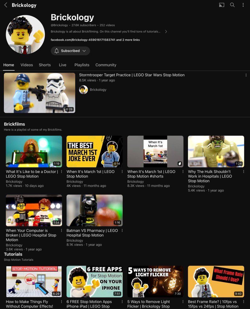
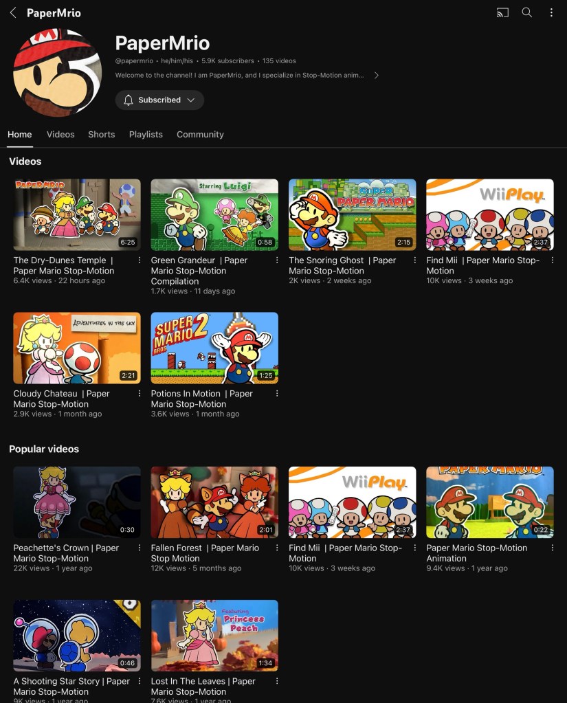
Inspiration of visuals/cinematography: these are 3 YouTube channels I have been looking at for inspiration and tips. ‘Every Frame a Painting’ is good for researching cinematography as they have videos on using audio, shooting action sequences, framing fight scenes. ‘Brickology’ and ‘PaperMrio’ are good for inspiration on how to shoot short stop motion film with a fun and colourful style. They also provide technical advice on how to frame and set up scenes.
Now that I’ve got my detailed storyboard that I’m happy with and have done lots of research I am ready to book some time in the stop motion studio to actually shoot the scenes for the final video.
Before shooting the scenes I had to have an induction into the stop motion studio. We went through the basics rules of the room, health and safety and an introduction into the equipment.
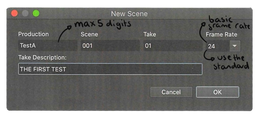
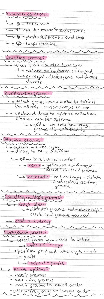
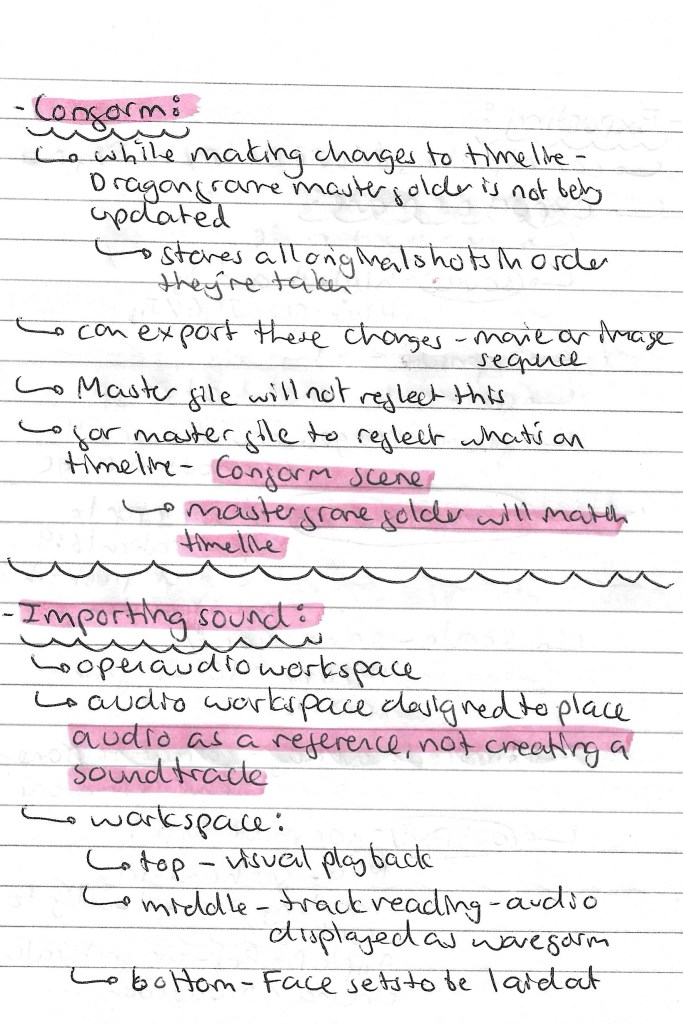
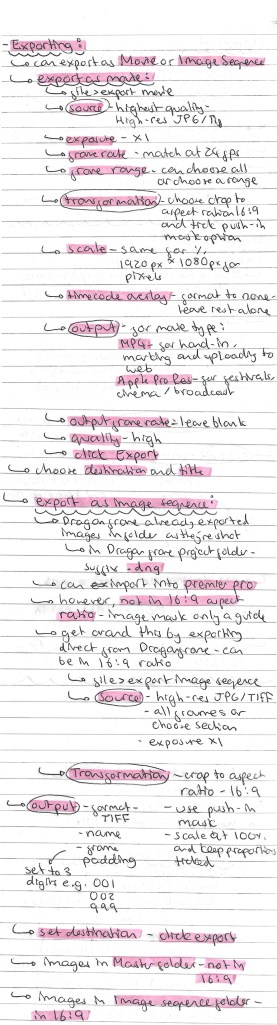
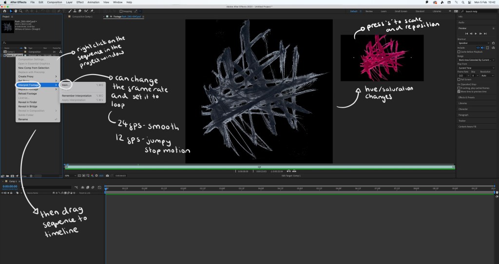
The most important thing I learnt was Dragon Frame. I had never heard of this software before so I was having to learn it from scratch. It is an industry standard stop motion animation software. It has been used to make several full-length stop motion films, including Disney’s Frankenweenie and Laika’s Coraline and ParaNorman as well as stop motion TV shows such as Shaun the Sheep.
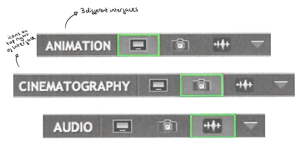
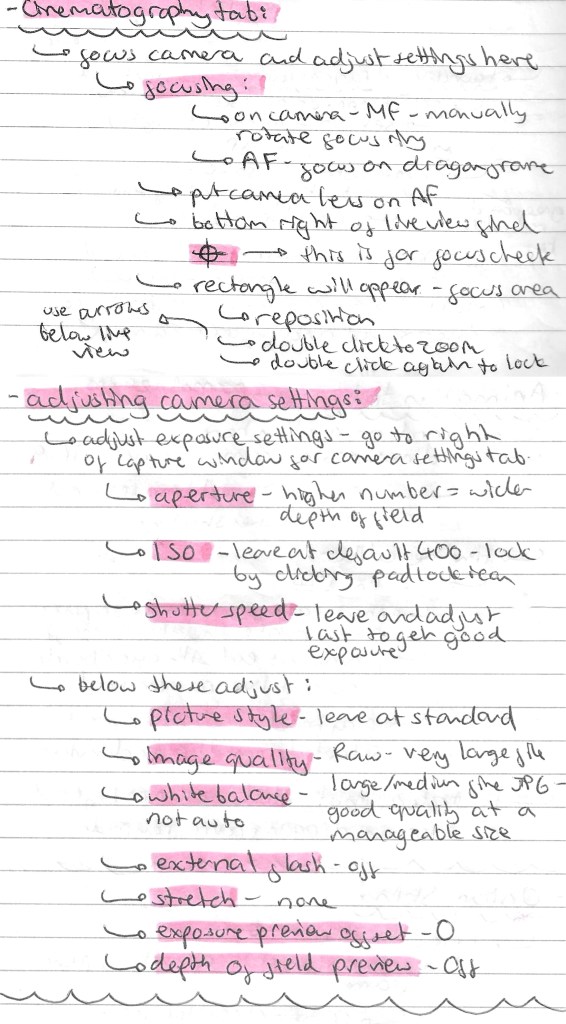
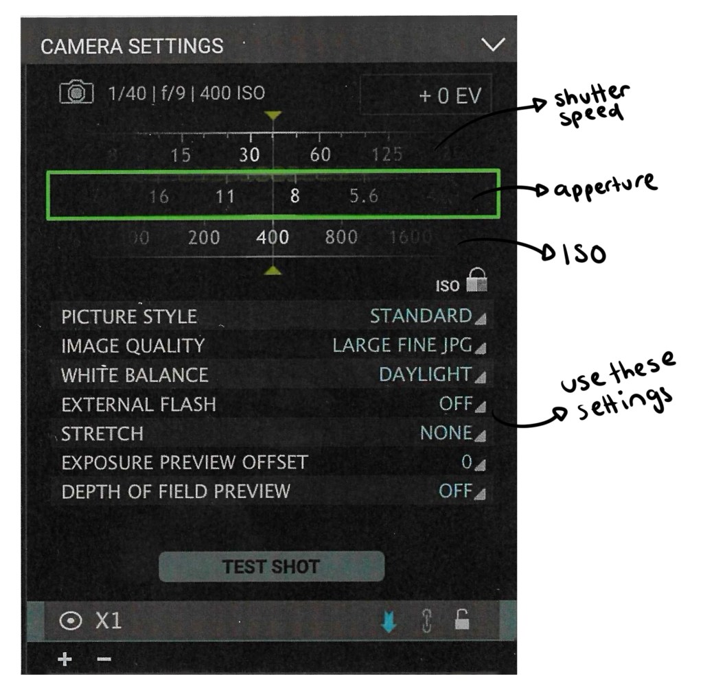
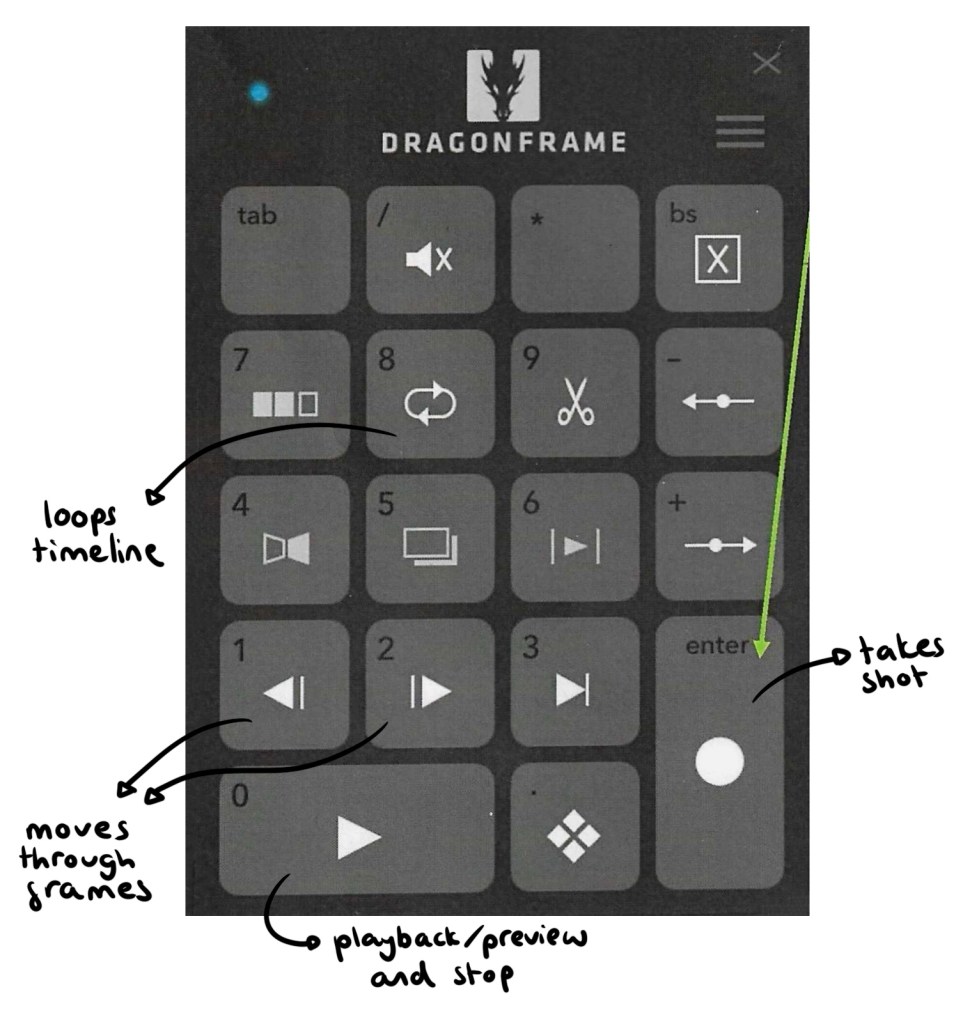
I learnt a lot about the software including how to setting it up with the camera, navigating the interface, shooting the frames and exporting the image sequences. Here are the notes that I took from the induction and my independent research into Dragon Frame:
As well as the induction I had at the university I looked at this websites to learn about Dragon Frame:
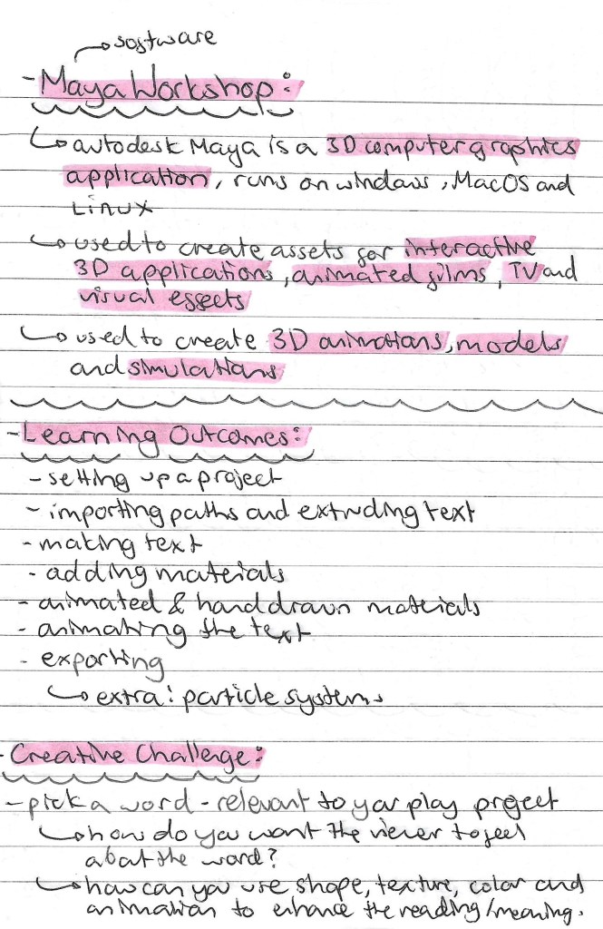
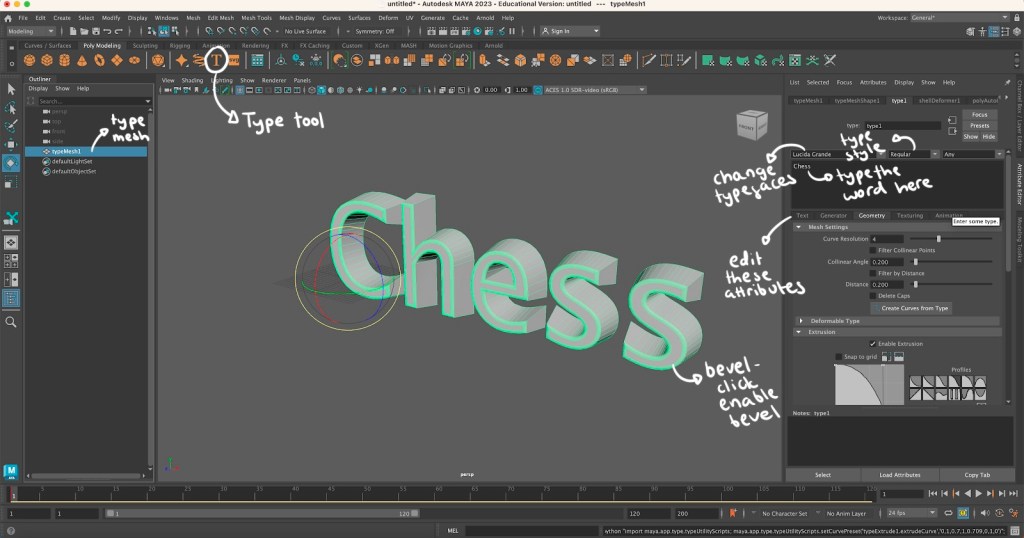
Maya is a 3D computer graphics application used for creating 3D animations. I’ve never used this software or anything similar so it’s out of my creative comfort zone. This style of art isn’t something that really interests me but it’s always worth trying out new styles and softwares.
Notes for workshop:
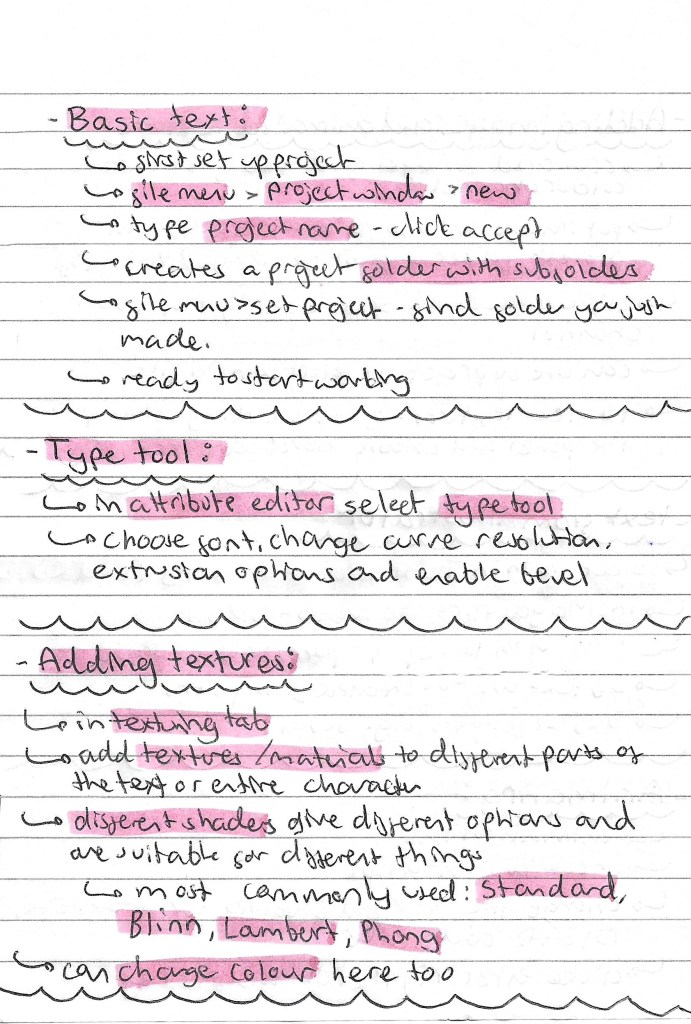
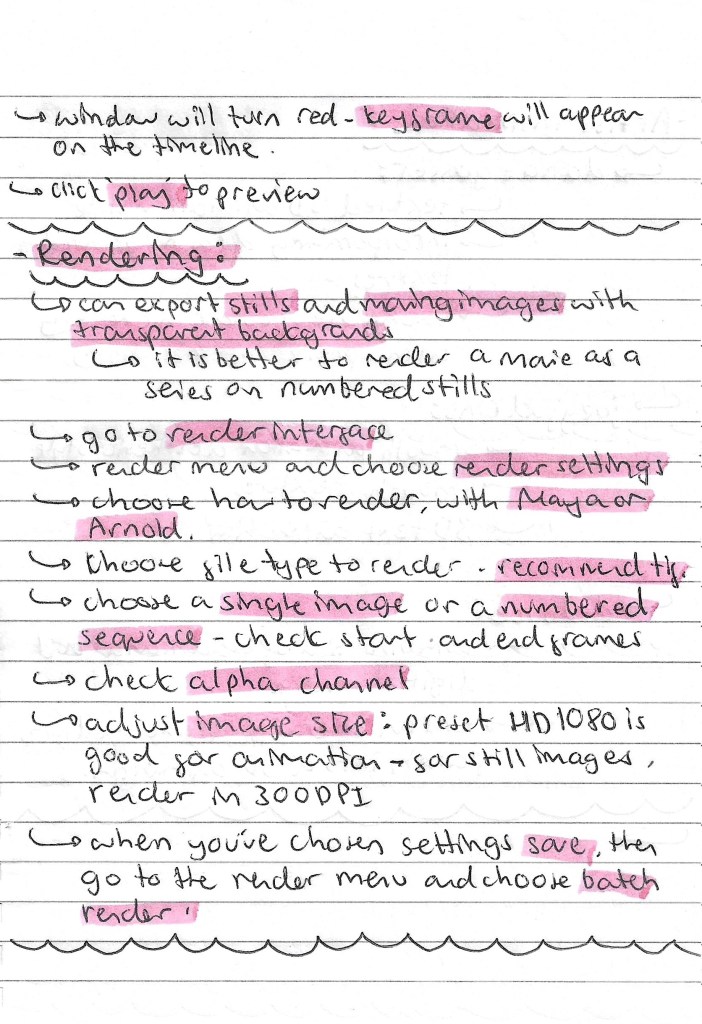
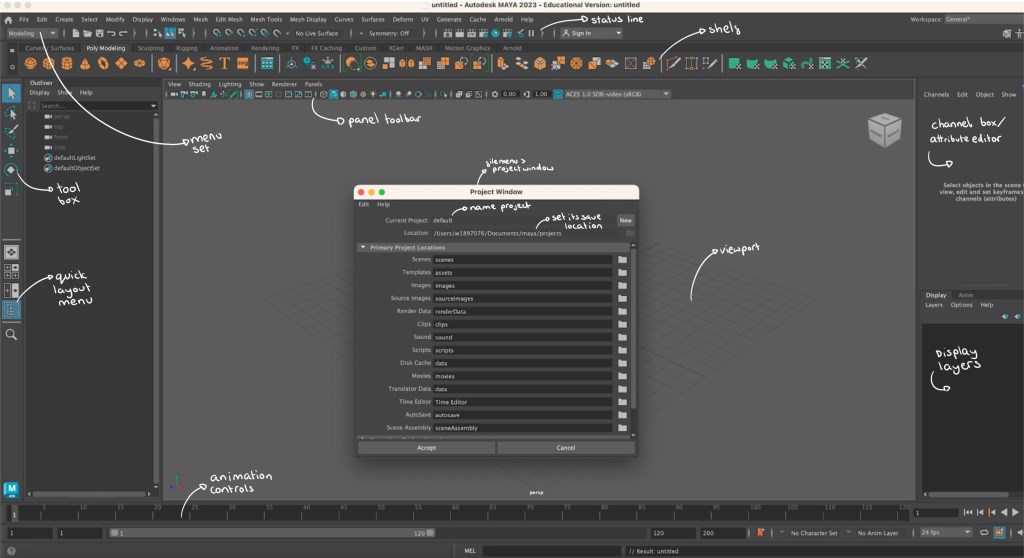
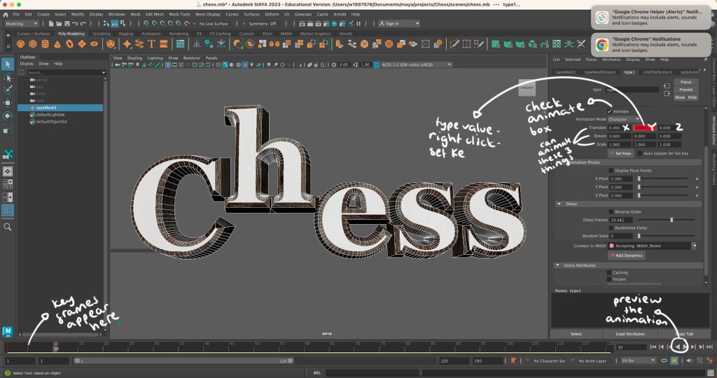
Screenshots from workshop with annotations:
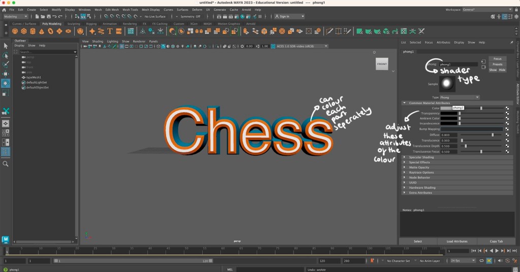
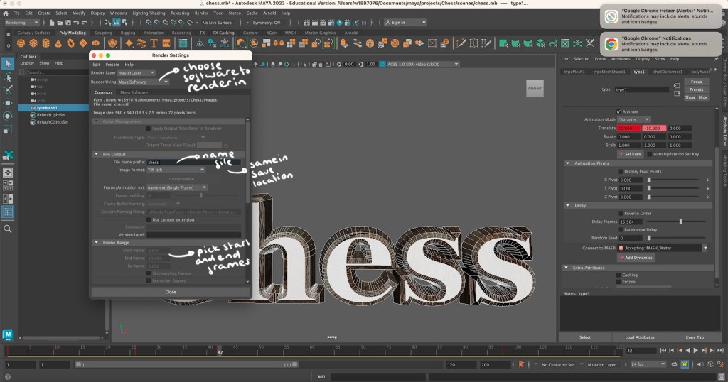
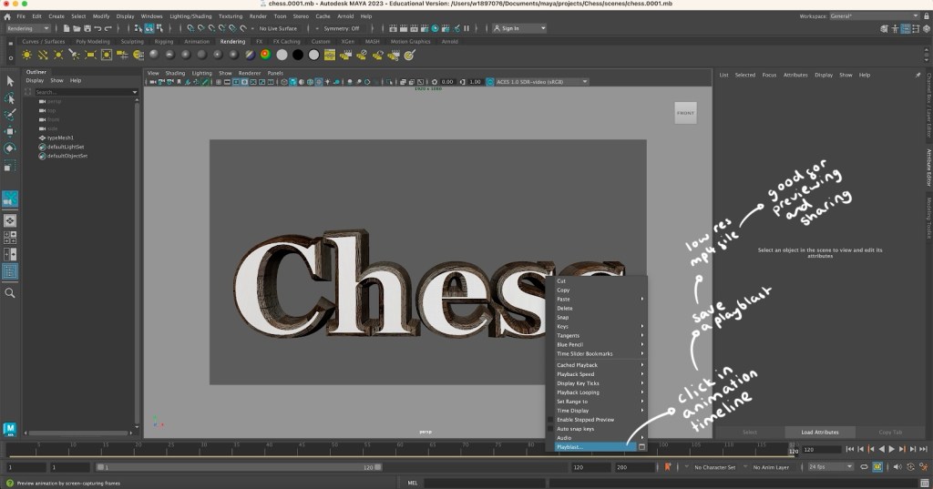
Maya animation: using Maya I was able to create and animate the word ‘Chess’, this is the topic I will be exploring in my project. I learnt how to add text and adjust its characteristic such as size and font. Then I changed the colour, added a shader and a bevel to make the word look more interesting. My favourite part was learning how to download and add textures to certain parts of the word. I chose a wooden texture which I put on all parts of the letter except the front. This gave the letters a clean white and dark brown wooden colour combination which are the colours of my chess board. The hard part was animating the word. I did find this difficult but I am happy with what I was able to create. The letters jump up one at a time with a delay in between then smoothly fall down. Below is the exported video of my animation:
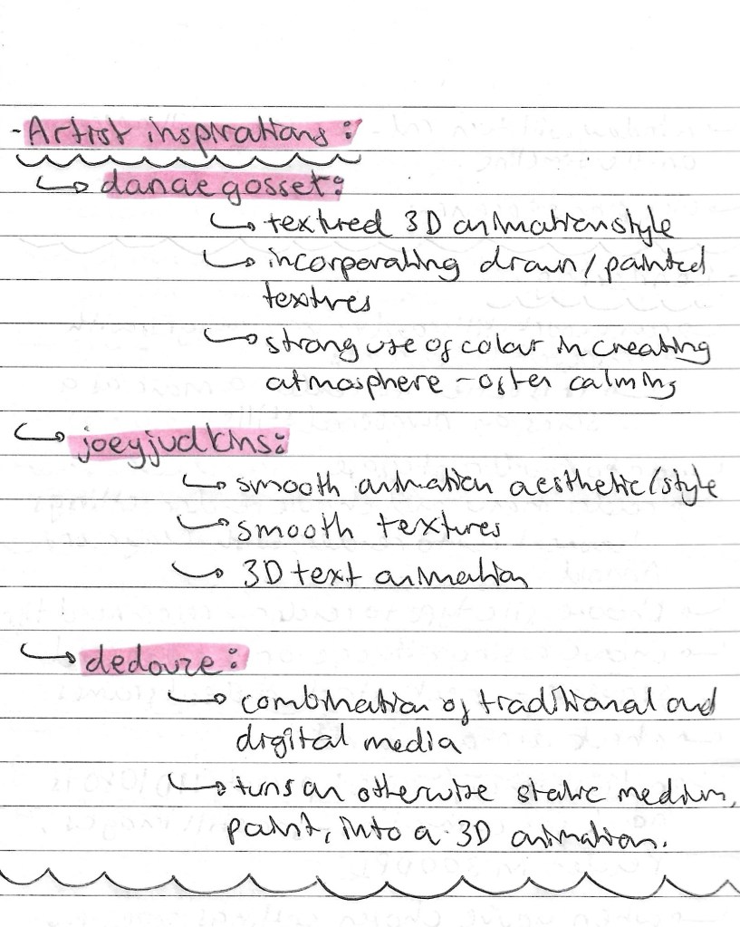
Artist Inspirations:
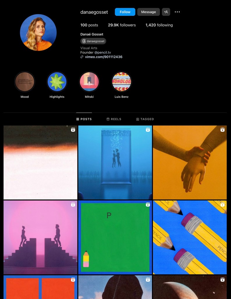
Danae Gosset:
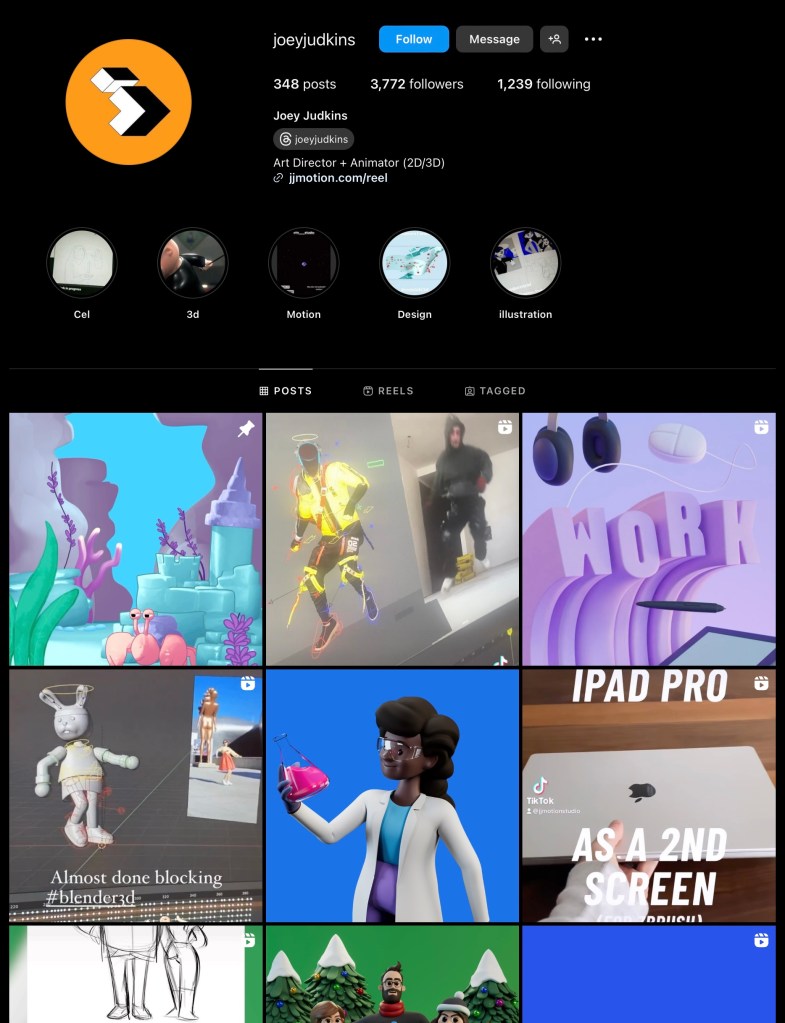
Joey Judkins:
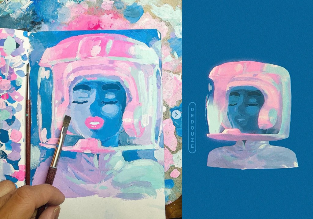
Dedouze:
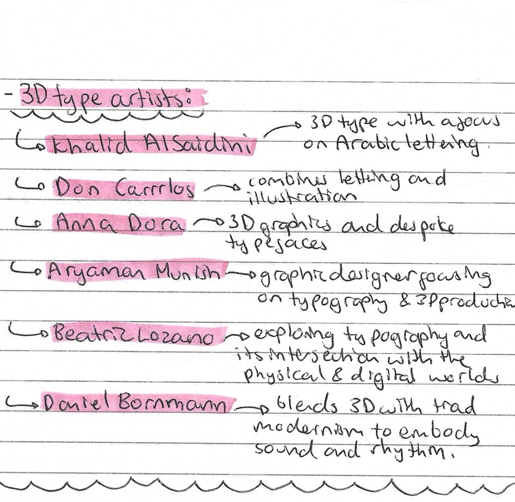
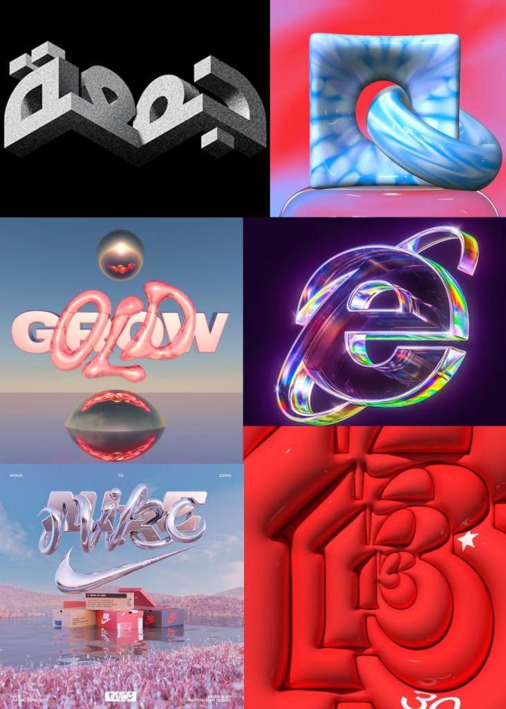
3D type artists:
Reflection: Overall, this was my least favourite of the workshops. I found Maya challenging and not a particularly enjoyable software to use. I did find researching artists who work within this field interesting and found some whose work appeals to me but generally this is not an area of visual art that I really like. For this reason I don’t plan to incorporate 3D lettering animation into my project. I prefer more hand made and traditional styles on animation such as stop motion and frame by frame drawing.
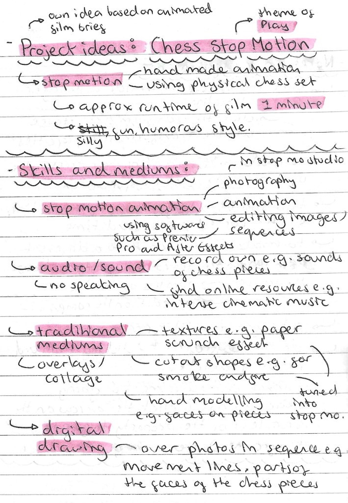
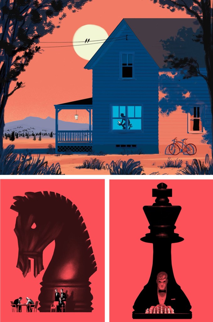
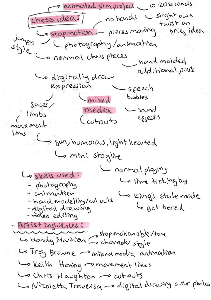
Chess Stop Motion ideas: this is my project idea that I proposed to my tutors. It’s a twist on the suggested animated film brief. In summary I want to create a short stop motion chess film. I am aiming for just over 1 minute of run time. I want the style to be fun and silly with some nice cinematic shots. Stop motion isn’t something I’ve done before and I’ve been wanting to try it out for a while and this is the perfect opportunity. Stop motion is an artistic medium that combines analogue and traditional techniques. I plan to explore this combination further by using some hand made overlays and some digital editing effects.
Target audience: my intention for this project is to make a short stop Motion video that is appropriate and suitable for all. I want it to have a fun tone that anyone can enjoy. I want the plot of the video to be simple enough that children can understand it but have enough drama and intrigue that adults can also enjoy it. Stop Motion videos are growing in popularity on social media so I am drawing inspiration that that trend and proposing that the video be viewed in this context.
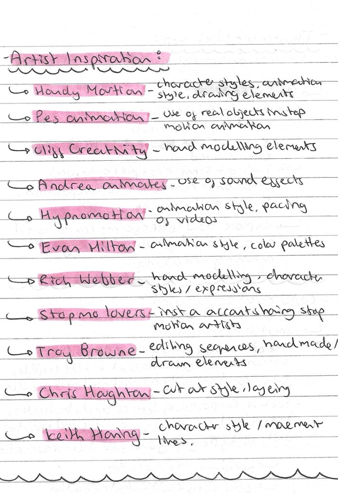
Artists inspiration: As stop motion animation is a new style to me I did lots of research into artists who create work in this style to take inspiration from. I’ve also got a few artists who don’t work within stop motion but there are ideas from their work I like for this project. Below is a list of artists whose work I like and want to take inspiration from. I’ve written what parts of their work I am inspired by and attached images of their work below:
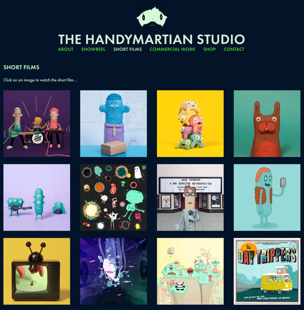
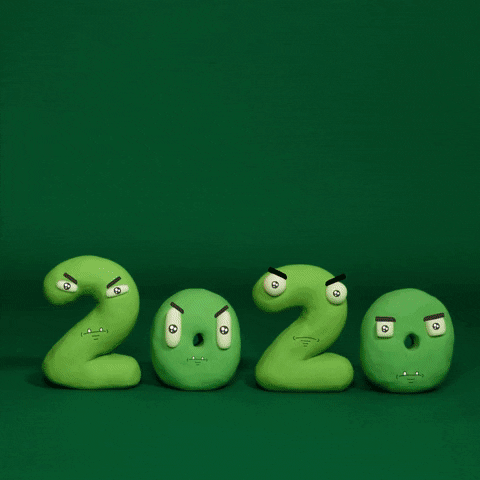
Handy Martian:
PES:
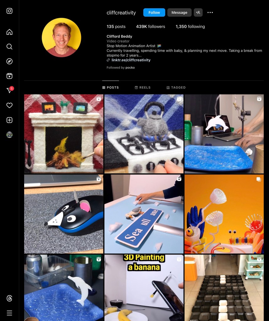
Cliff Beddy:
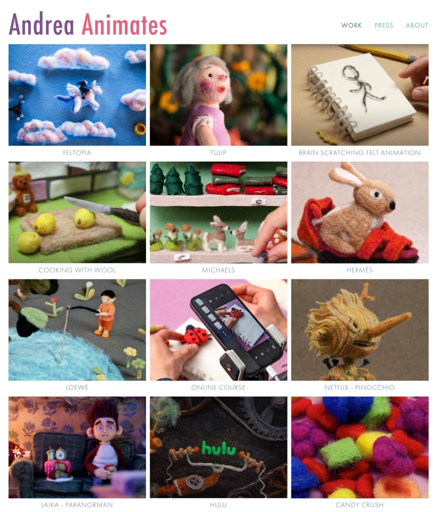
Andrea Animates:
Hypno Motion:
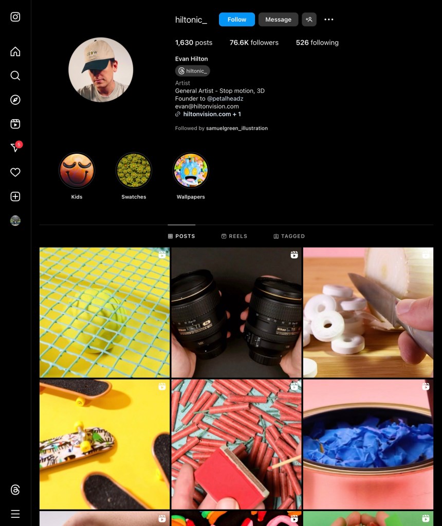
Evan Hilton:
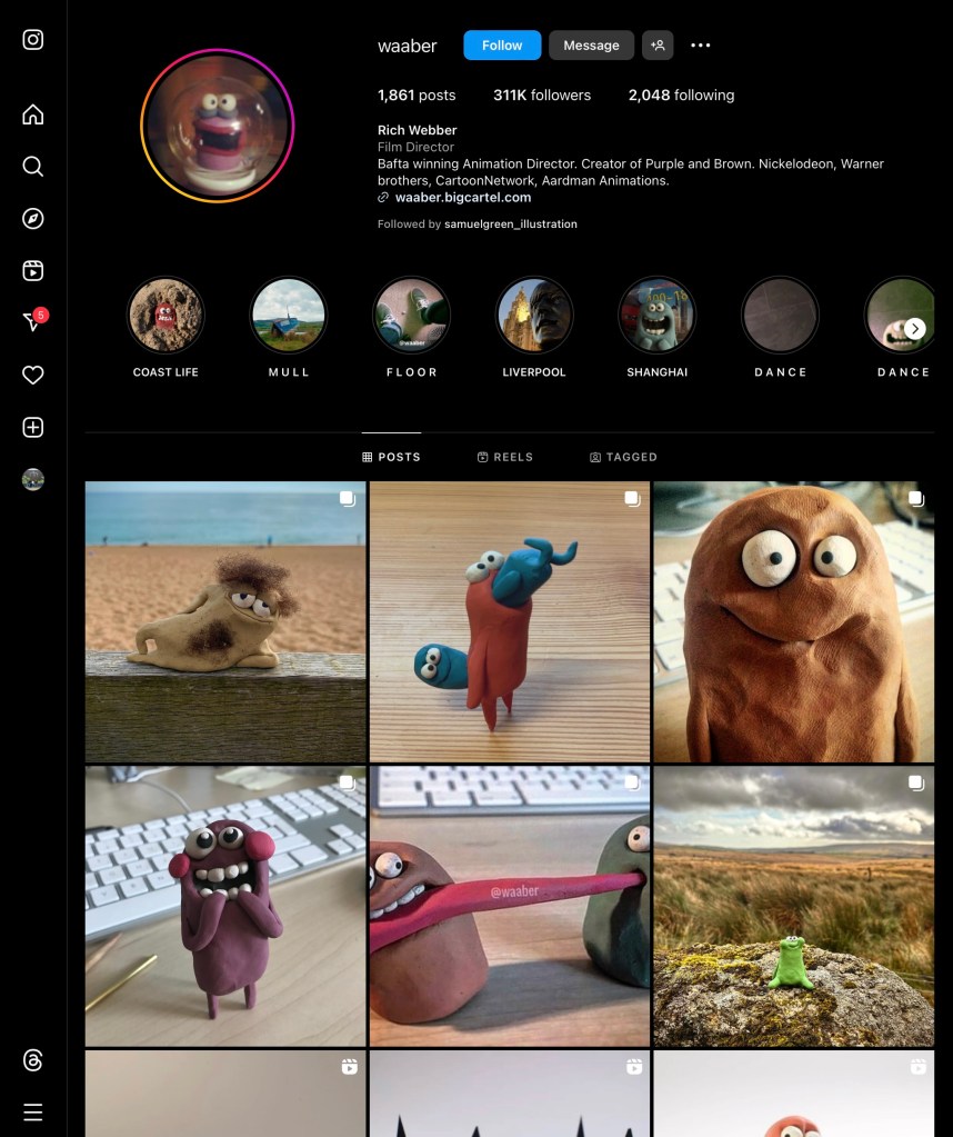
Rich Webber:
Troy Browne:
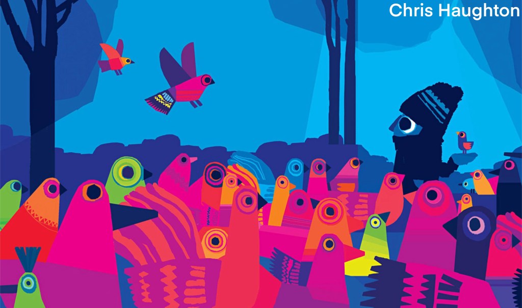
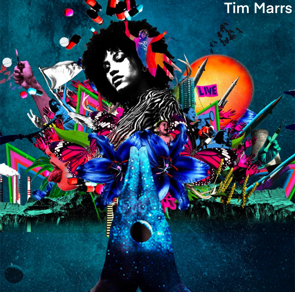
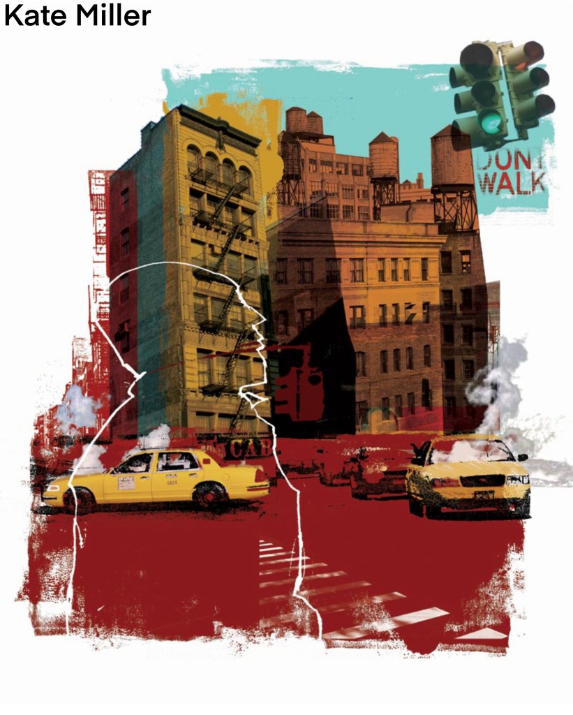
Chris Haughton:
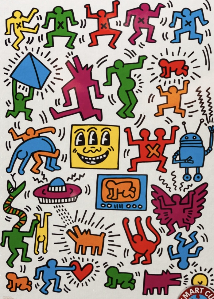
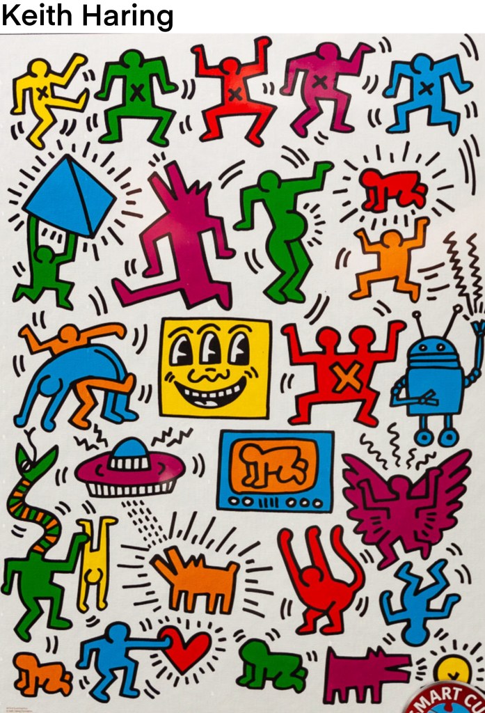
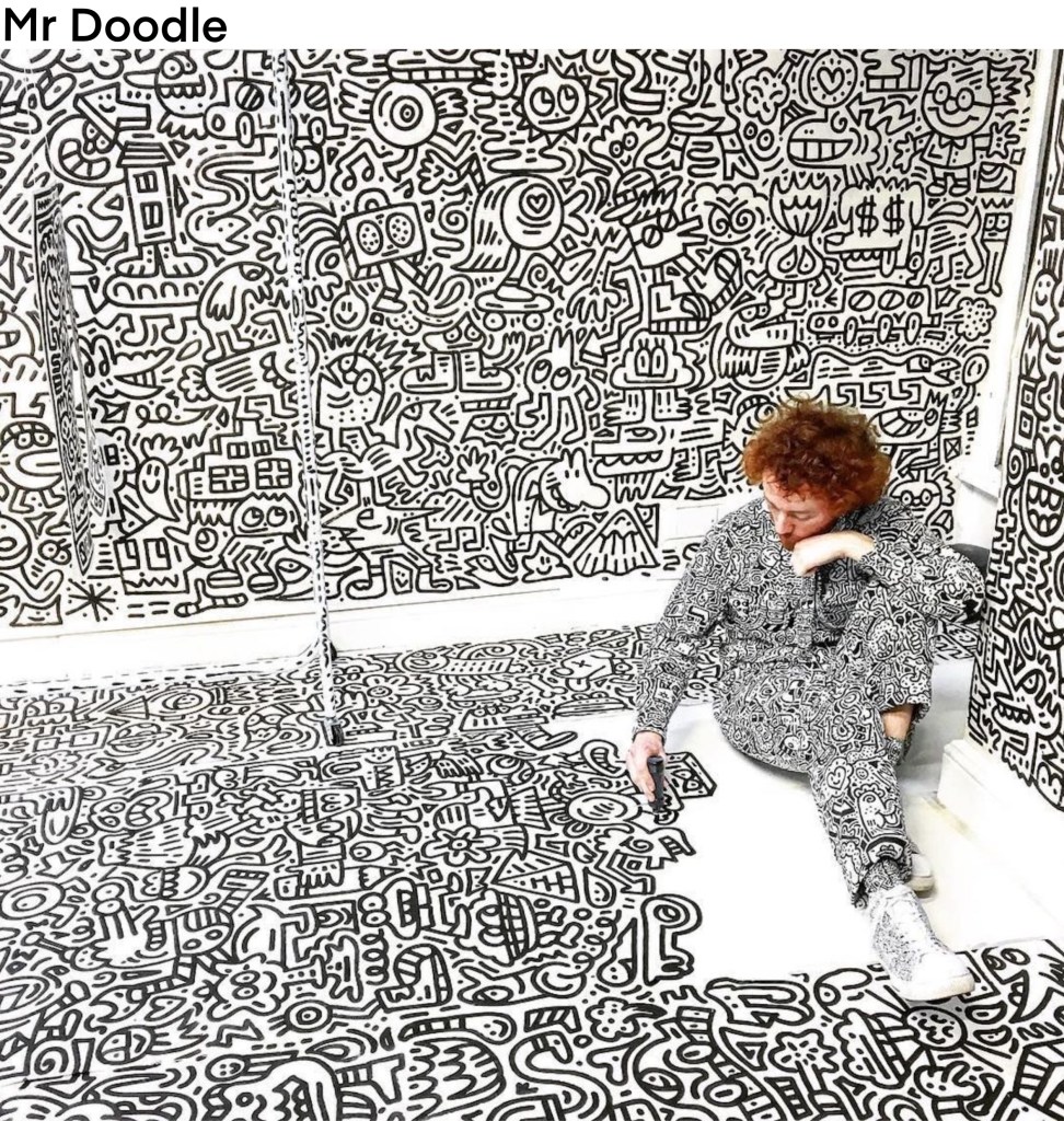
Keith Haring:
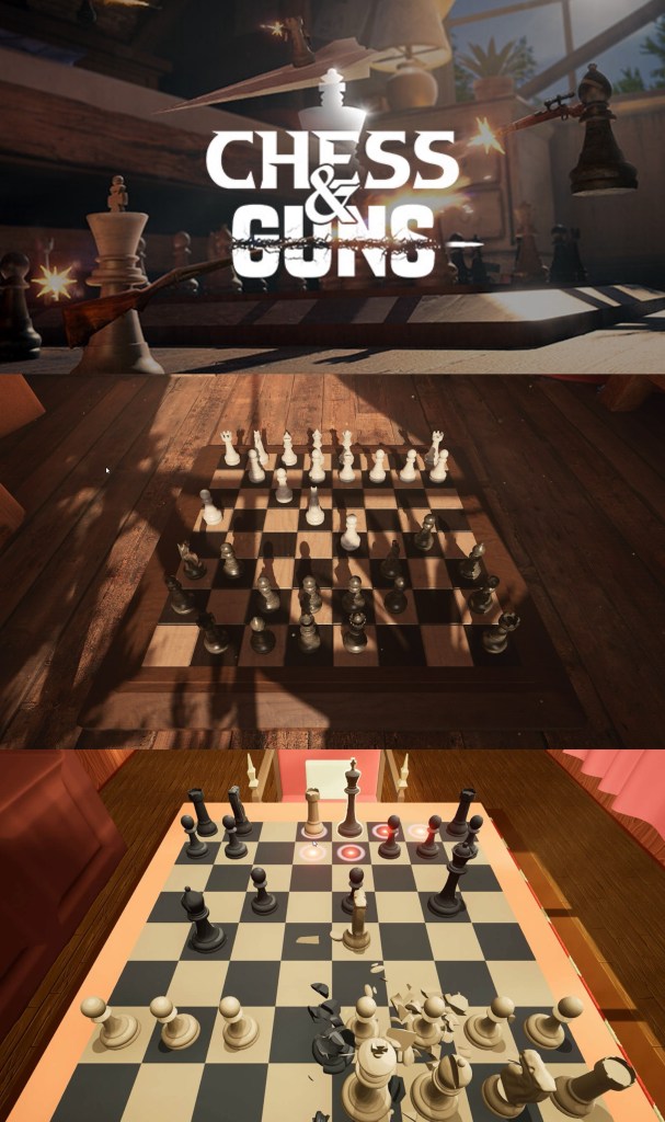
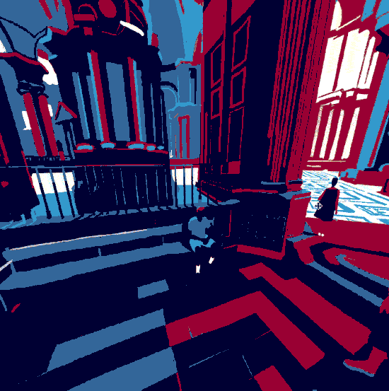
Chess and Guns: a game that mixes chess and real-time third person combat. This game doesn’t fit the tone of what I want my project to be but it does have a nice cinematic and dramatic style which I can take influence from. I really like the different angles that the board is viewed from, I want to get a range of angles in my films. Some more panned out to view the whole board and others that are more intense and level with the pieces.
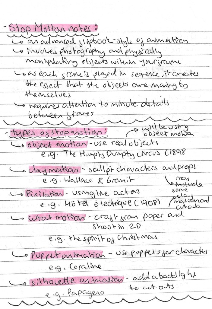
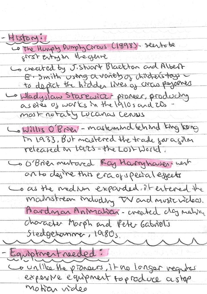
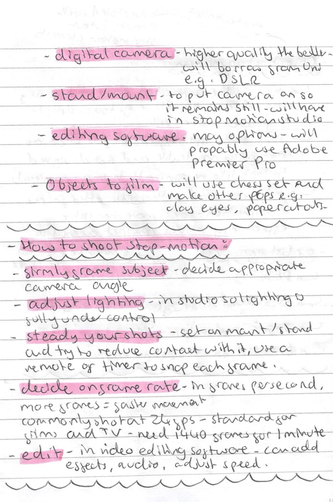
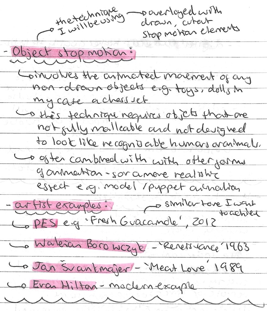
Stop Motion Research: it’s key in any project to do contextual and academic research before stating to create the project. This is particularity important when exploring a new theme, technique or style. I did lots of research into stop motion, looking at the different types, the history, the equipment, how to shoot it and some artist examples. Below are some notes from my research:
This is one of the main sources I used to collect this information:
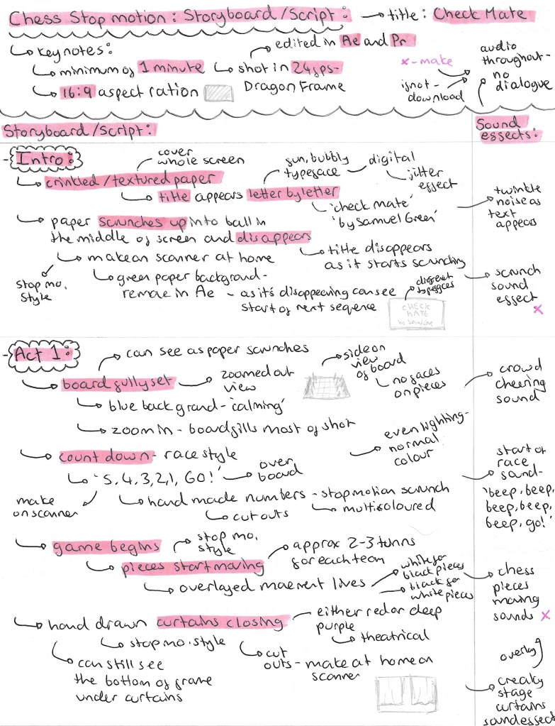
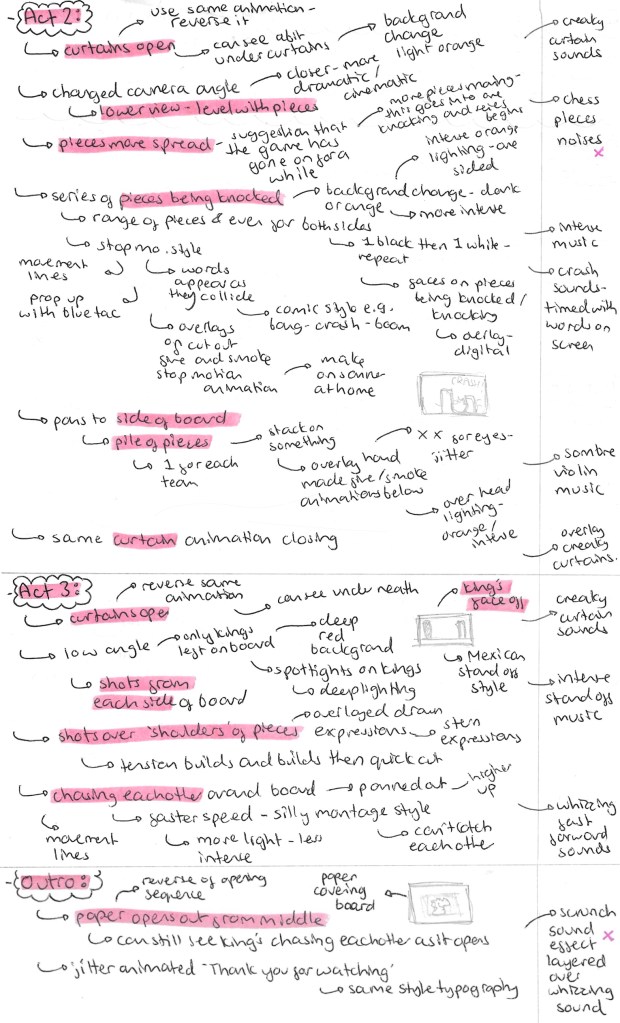
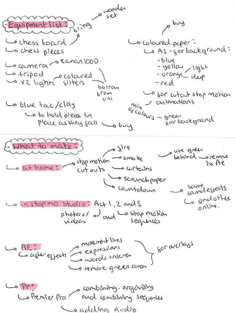
Project Storyboard: This is the first complete draft of a storyboard for my project. Creating a storyboard is not something I do regularly so I did some research into how to best create interesting and engaging storyboards. The storyboard consists of a beginning, 3 main acts and an end. This is a classic story structure so through it was best to keep to a traditional format for the narrative. In this storyboard I began to think about what would happen in each scene and how they would flow together to tell a whole story. I also made notes about some of the effects and audios I wanted to have on the video. There are also some technical notes such the orientation, aspect ratio and frame rate that I want.
Further ideas: these are more notes on my ideas for the project. They focus more of the visuals and how I want the different shots in each scene to look. For inspiration on the cinematography of the video I watched some videos from the YouTube channel ‘every frame a painting’, they study topics such as how to do action comedy and framing a fight scene.
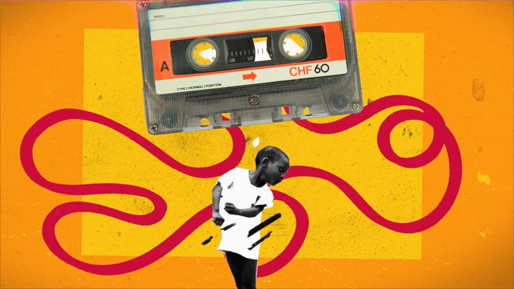
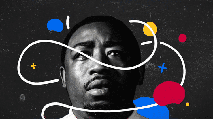
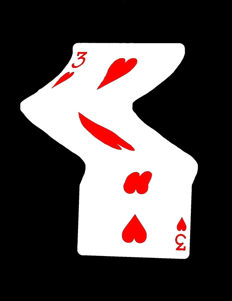
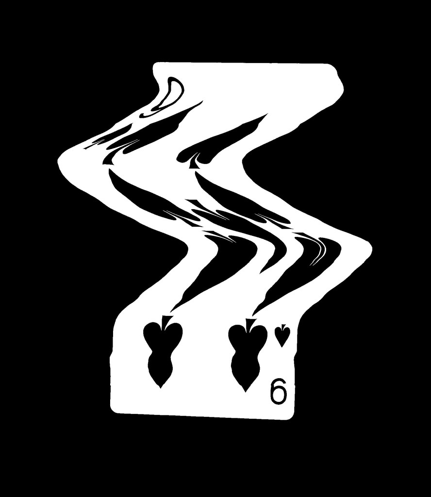
Stop Motion Experimentations: I made these simple tests to help better visualise my idea. I shot these at home but for the real video I will use the stop motion studio at the university. I’m happy with these visualisation and think this idea is worth carrying out. There are lots of things I will improve on these videos for the final videos such as making the camera steady and having a higher frame rate so the movements are smoother. I really like the additions of the movement lines inspired by Keith Haring, I think they add a fun dimension to the animation.
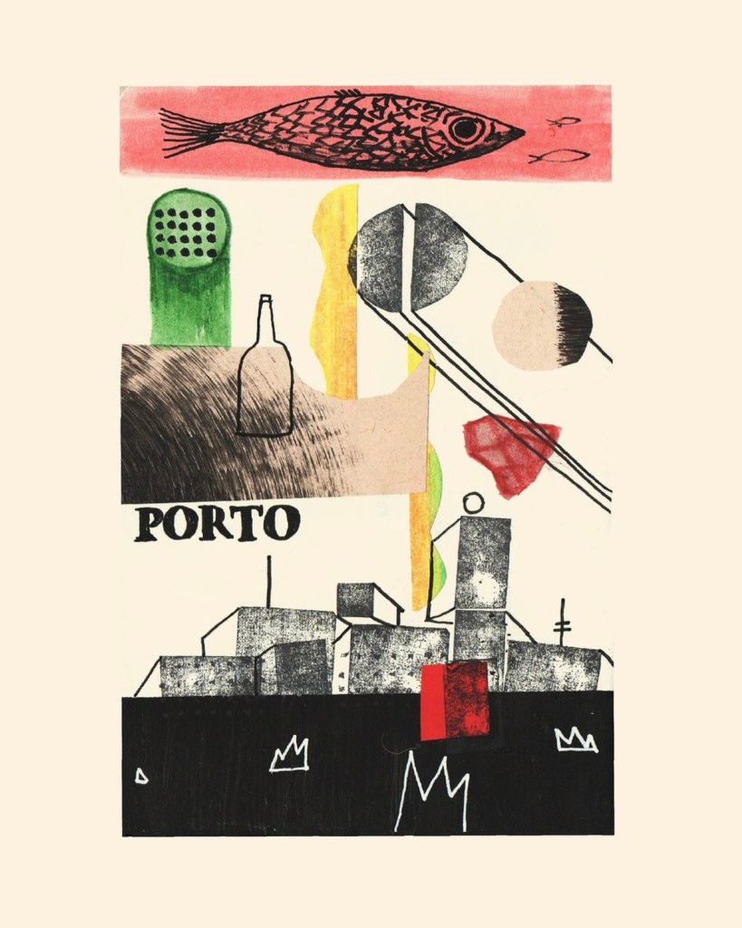
Photographic styles: these are images I downloaded from Flickr. I want to achieve shots similar to these for some of the shots, mainly in act 3. I like the clarity of the images and the angle they’re taken from.
One thing I am experimenting with is the idea of adding faces to the pieces. This idea is inspired by Handy Martian and his stop motion videos. My idea is to have simple faces with dramatic expression to help give the pieces personality and make the film more humorous. I’m undecided if I will mould the expression onto the pieces by hand using modelling clay or digitally add them in post production.
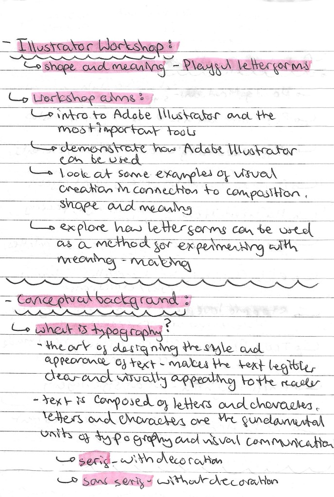
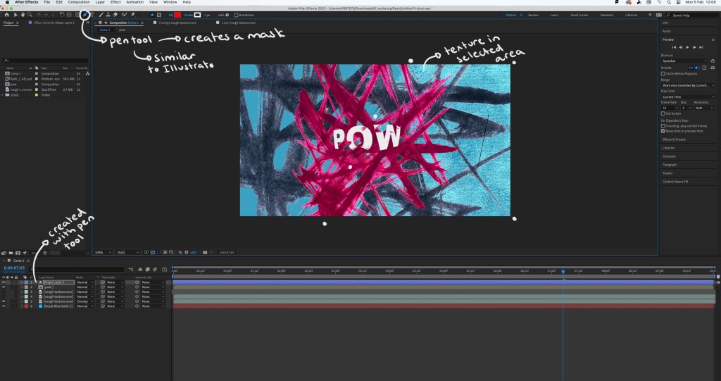
Adobe Illustrator is a software that I’m comfortable with having been introduced to it in Digital Arts 1 last year and using it heavily during the Brands module I did last semester. I still find certain parts challenging such as creating complex forms with the pen tool. I’ve wanted to continue developing my skills and growing my confidence with the software so this workshop was the perfect opportunity.
Notes from workshop:
I was comfortable with most of these tools on Illustrator prior to the workshop but only at a fairly basic level. I feel that the areas to need to improve on most are using the pathfinder and clipping mask tools as these can really advance a piece and help speed up a workflow.
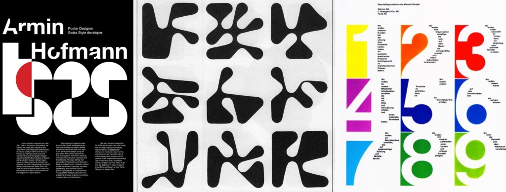
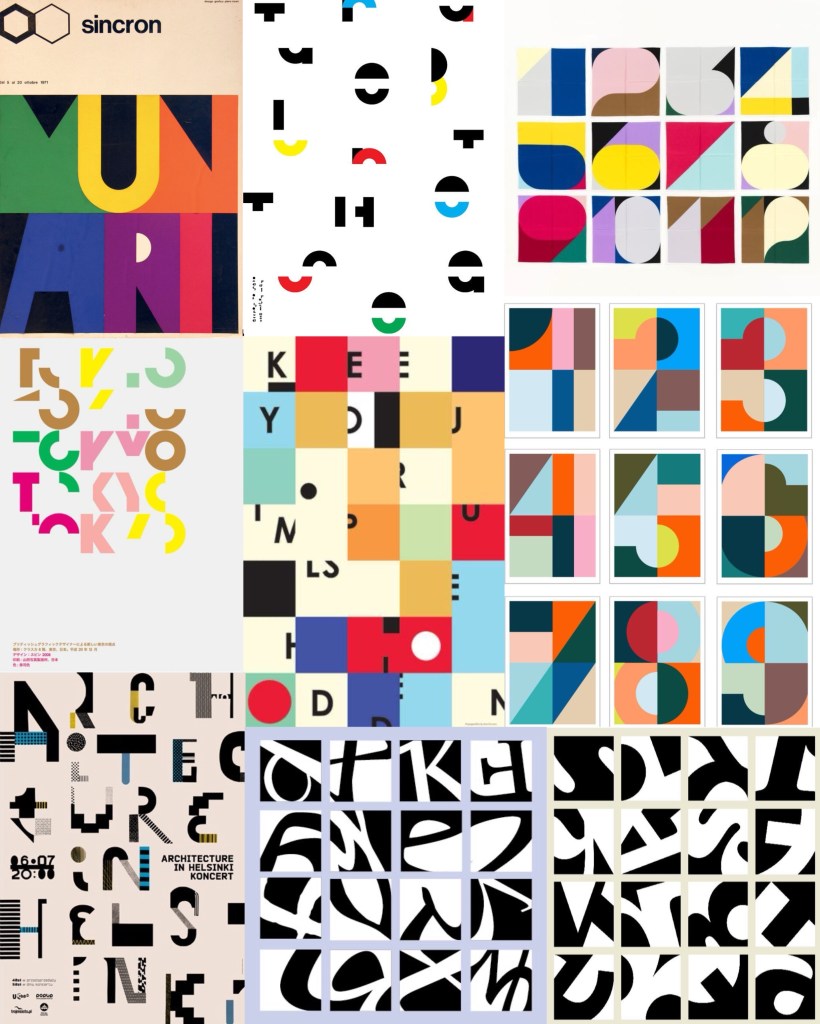
Armin Hofmann: this is an artist that creates unique and playful typefaces which he then applies to posters. I really like his work and how he creates typefaces that are strong enough to carry a poster without the need for images or other design elements. The typefaces are interesting as he stretches the limit of what a letterform is to the point that some may not even recognise it.
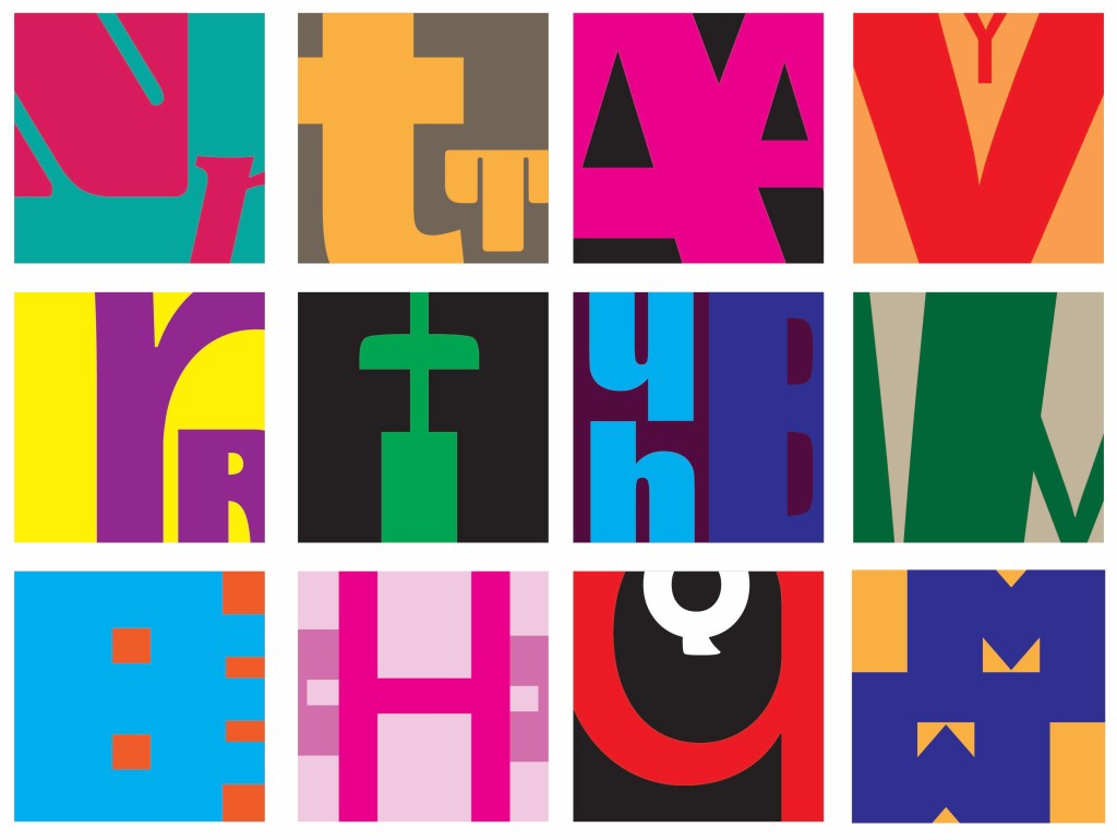
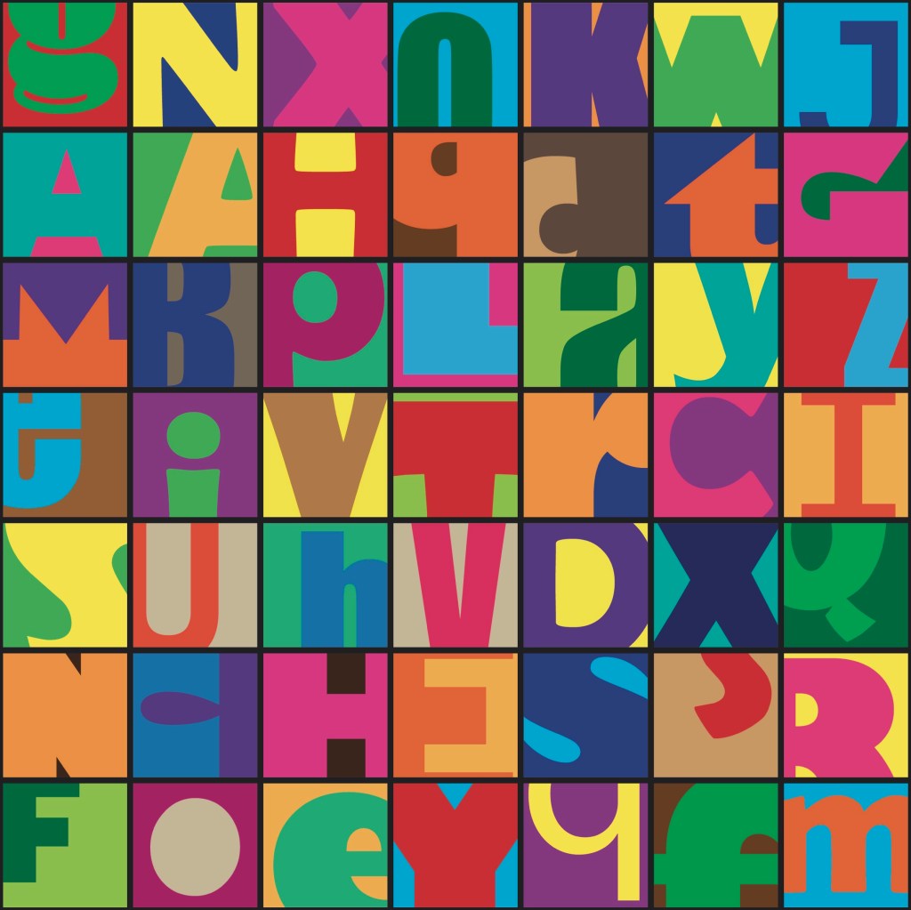
Visual Research: after looking at a range of typographical art the things that interest me the most are the combinations of bright colours and breaking the letter forms into sections. These are ideas an themes I wanted to experiment with in my Illustrator work.
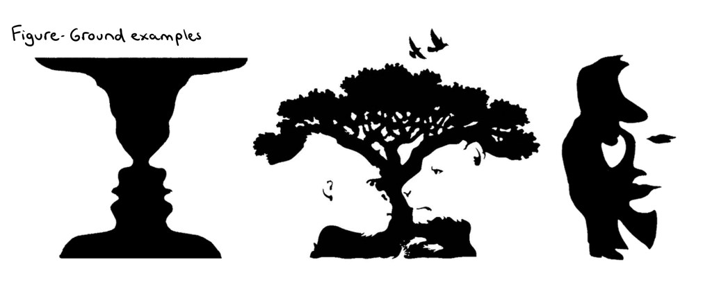
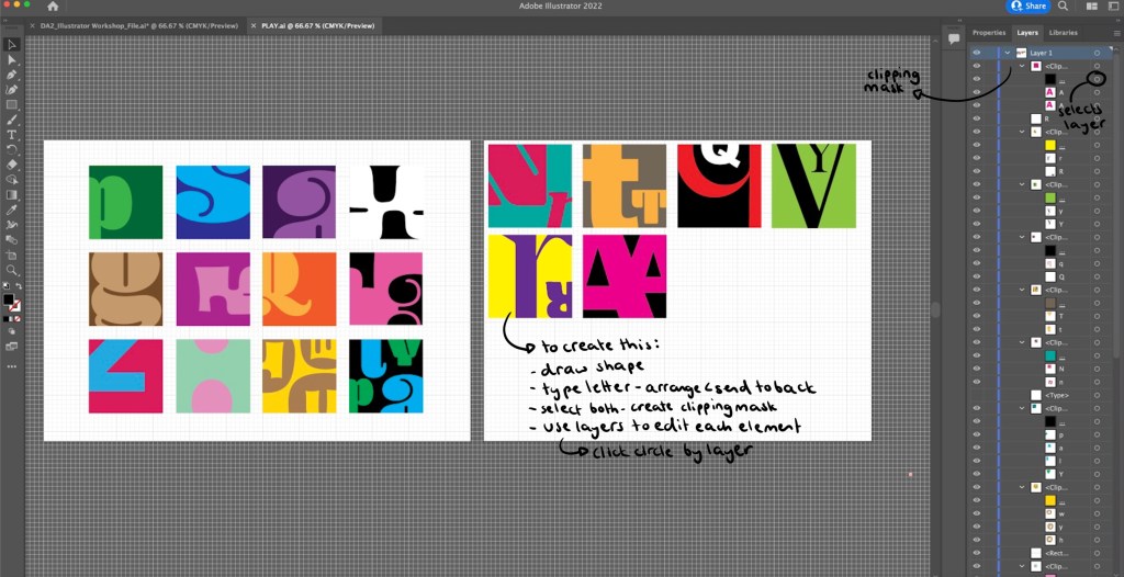
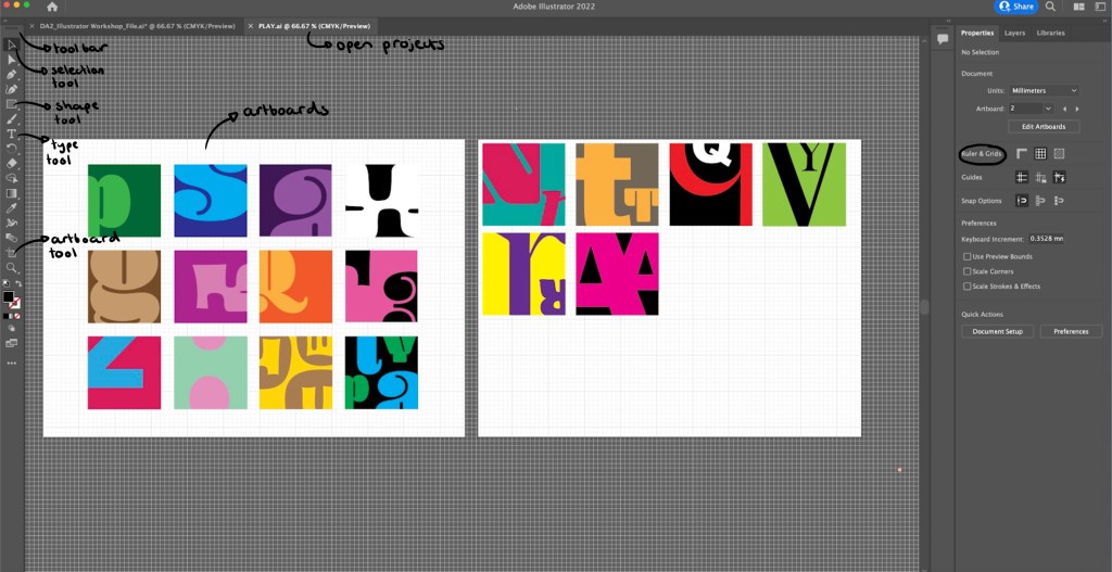
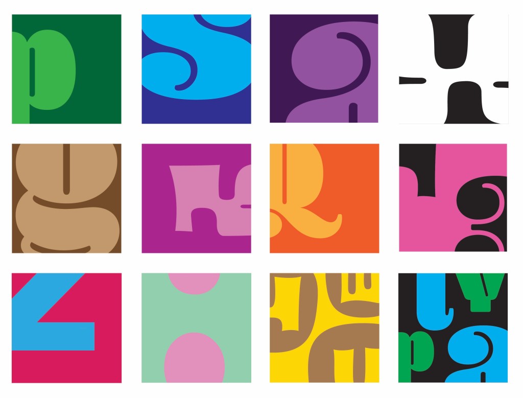
Illustrator Workshop: in the session we worked with the idea of Figure and Ground, having the letterform and the subject. I experimented with the colour combinations and how much of the letter form I showed. Some are obvious and others are more abstracted as I only showed a small section of the letter. I really enjoyed this more playful approach to typography as it’s not normally something I work with. Below is a step by step guide of how I created these small squares containing the letters. Creating a clipping mask on Illustrator is not something I knew how to do before so that was an interesting skill to learn.
Outcomes from workshop: during the session I produced a range of different letterform experiments. My favourites are the more abstracted ones where I only show a small section or a really zoomed in part of the letterform. I find these more visually interesting and unique. They also became more playful and fun when I started adding multiple letterform into one square as the negative space created was interesting.
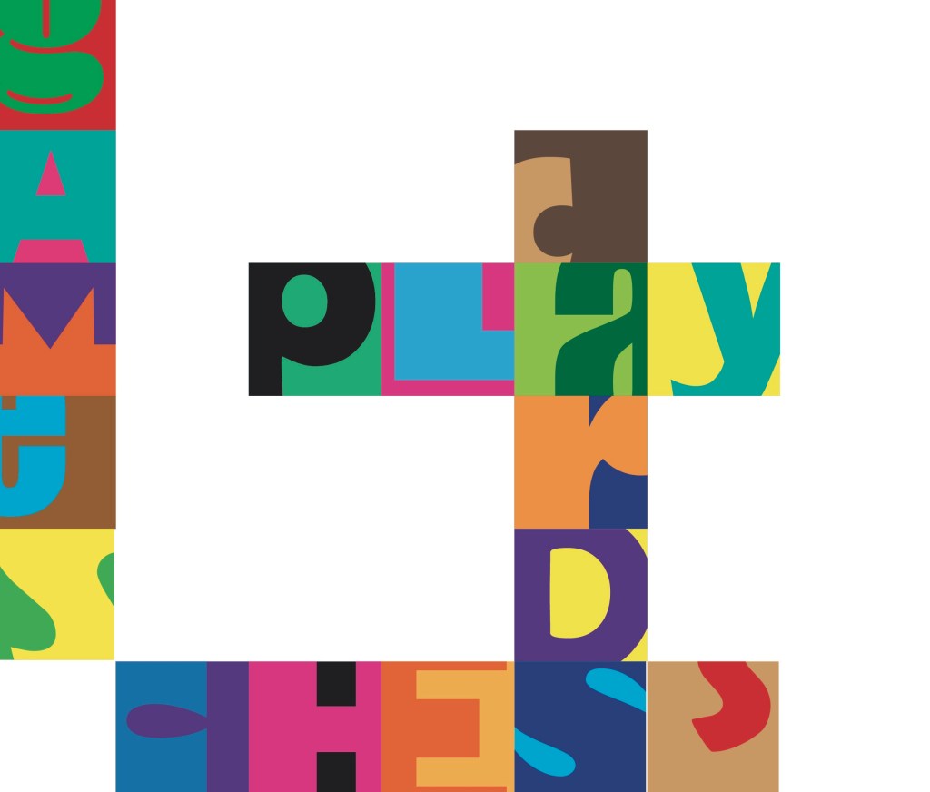
Independent work: Word-search: after the workshop I took the ideas I had been working on to create a unique style of word search. Word searches are a classic game and form of play enjoyed by adults and children. I wanted to bring a twist to this by making it more complicated. I only showed a section of each letterform, making it harder to spot the words. I also used a range of colour combinations and typefaces to throw off the viewers eye. I’m happy with this piece but to improve it I would make it bigger with more squares and more words to find to make the game more fun and last longer.
Words to find: play, cards, chess, games
These are the answers to the word search. When creating it I started by placing down just the words that needed to be found and the pop laughed the rest of the grid with random letters.
Reflection: I really enjoyed this session, it gave me an opportunity to practice and build on my developing Illustrator skills. I improved on the skills I already had and learnt new tool such as the clipping mask tool. Experimenting with typography is not something I do often but is something I’ll consider for my project. I am happy with the pieces I created as I think there is a playful use of typefaces, colours and composition which I applied to a game scenario, a word search.
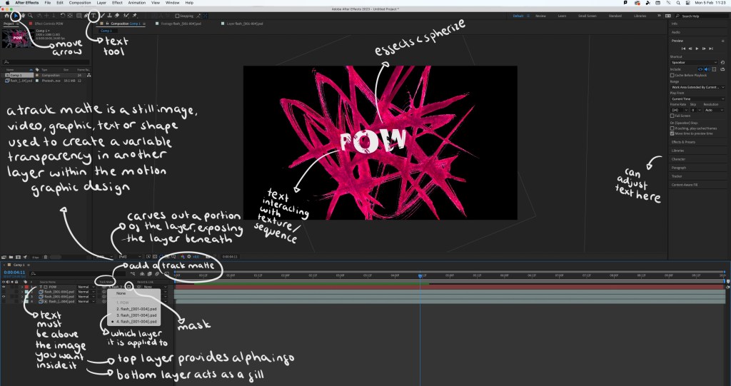
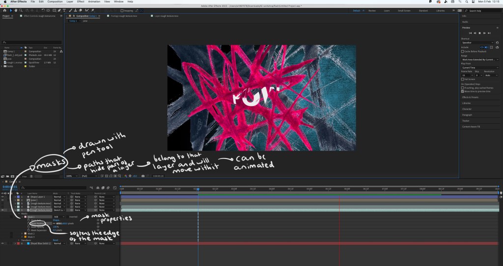
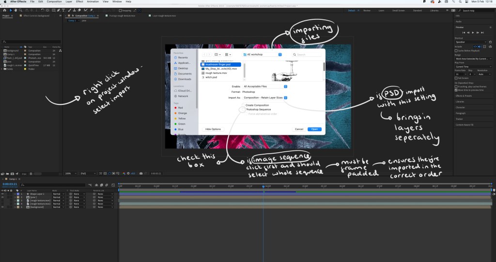
Prior to this session I had never used After Effects but it is something I had been wanting to learn for a while. I would like to incorporate this software into the production of my project in some way to help me learn how to use this animation software.
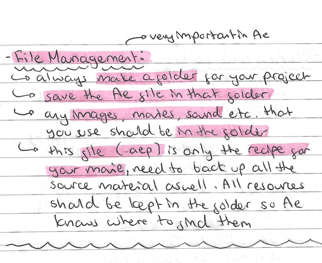
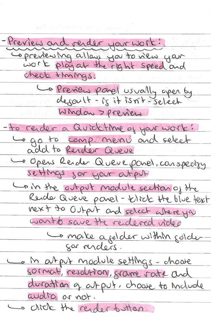
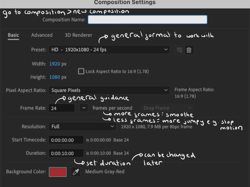
Notes on file management, key framing and rendering:
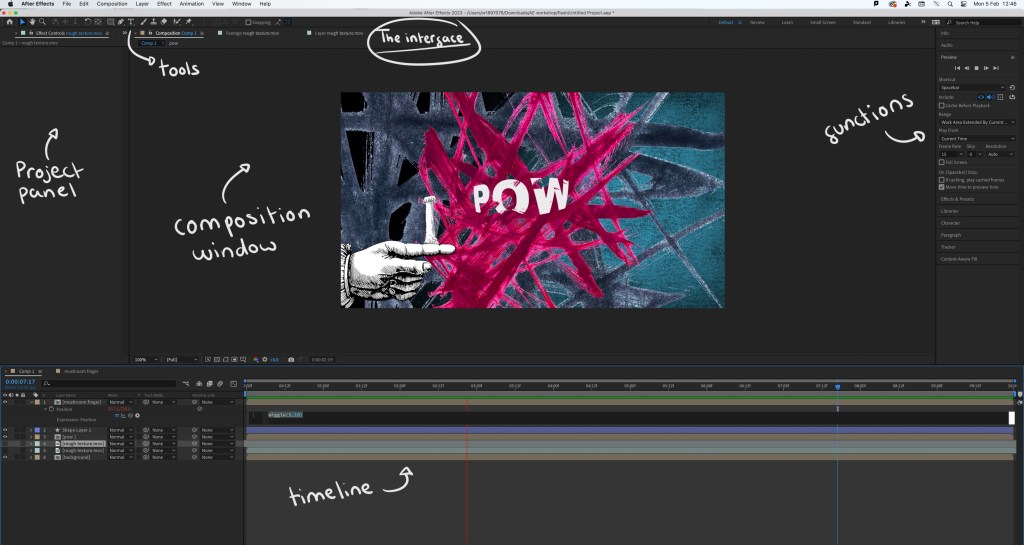
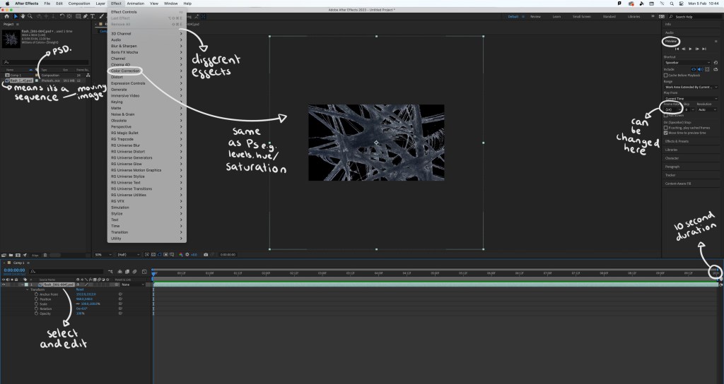
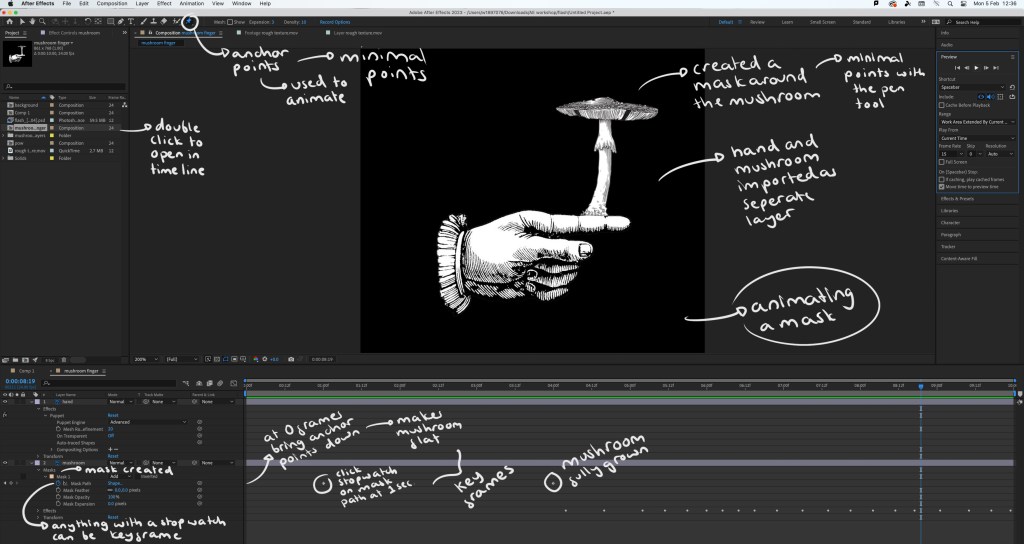
Screenshots from the session with annotations:
Interface:
Step by step guide:
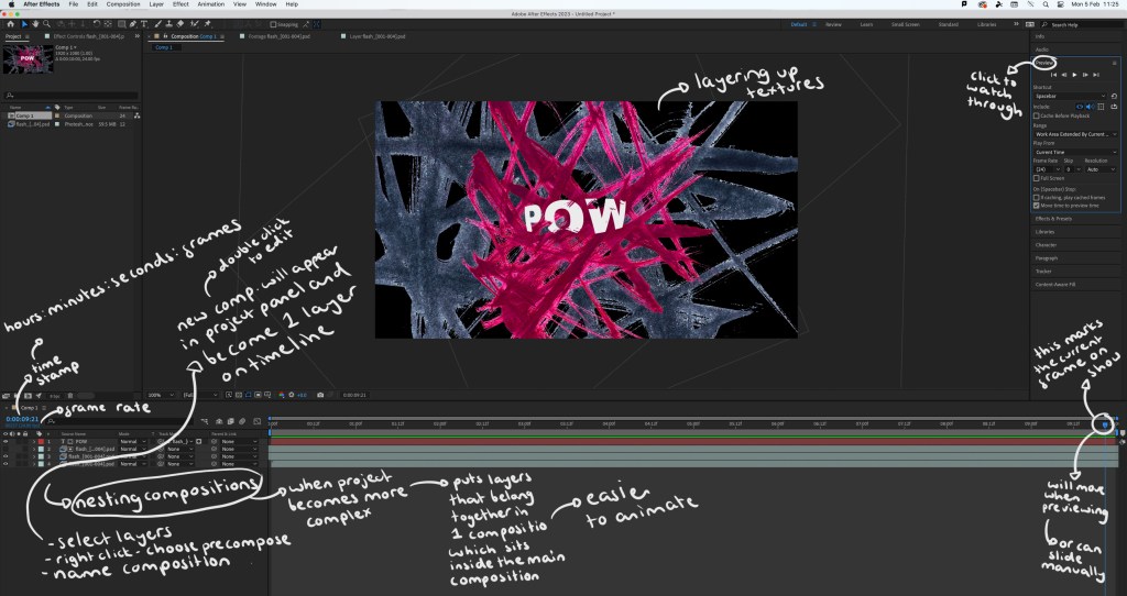
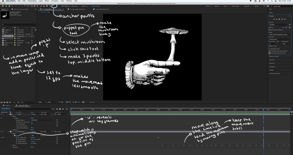
The video I made during the workshop: while this video is relatively simple, there’s a lot of effects and editing that went into making it. By doing this simple exercise I learnt a lot about the basics of using After Effects. The most interesting things I learnt doing this was how to create and animate a mask which can be seen as the mushroom grows and the wiggle code that allows an asset to shake. I did find the workshop challenging as it’s a way of working that I’m not used to but it taught me a lot and I’m satisfied with the outcome.
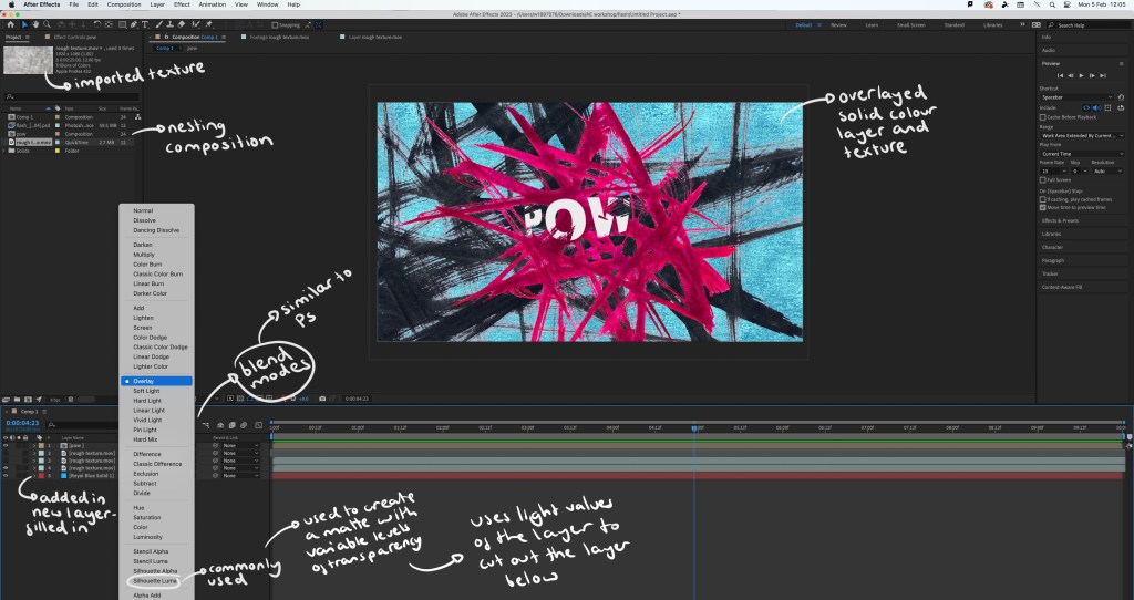
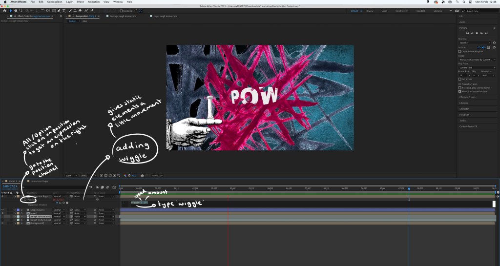
Extra experiments: after completing the workshop I practiced the things I learnt by adding effects and animated elements to the digital collages I made on Photoshop. This gives the static assets a new dimension and can help make a composition more playful.
1. As Photoshop and After Effects are both Adobe softwares I was able to share the PSD file directly with After Effects so all the elements and assets were on individual layers, making it easy to animate certain parts. For this piece I added a strong wiggle code to the printed textures behind the cards, making them aggressively shake and make the composition more dynamic. Adding a wiggle is an easy effect, it just requires 1 line of code. Also I used puppet pins to manipulate the cards, making them flow. I’m happy with this piece, I was able to create a smooth animation which pushed my skills with the puppet pin tool.
2. For this one I also used the puppet pins to create smooth, subtle movements of the plants. I used the transform command to animate the characters moving up. I made each movement smaller to create slow and steady movements as a way of building on the calm atmosphere of the collage. I found creating smooth movements challenging but after multiple tries I’m happy with the result.
3. This is the most simple of the animations. I just added a wiggle code to the white chess pieces in the background. I made this wiggle fast and over a small distance to create an intense shake. I did this to make it seem like the ghost pieces where annoyed, adding a more playful element to an otherwise static image.
Reflection: Overall I found this workshop challenging as it was an introduction to a complex animation software that I’d never used before. I was able to learn a lot about the basics of the programme and am not comfortable with the how to set up a project, the interface, the basic features and some more specialised animating commands. I think the most interesting and useful tools I learnt about were the puppet pin tool and creating/animating a mask. I’m happy with the outcome I made from the workshop, especially the animations I added to my digital collages. For the project I was to choose something that gives me the opportunity to explore animation and advance my skills and knowledge of After Effects.
Inspiration from Handymartian, Troy Browne and Socha animation:
Today we went through some of tools and features that Photoshop offers. Out of all the creative software we will be exploring in this module, I’m most confident with Photoshop having used it a fair amount in my first year. I had become confident will the basic tools and a handful of more specialised features and am now looking to master the basics and put them into practise.
We looked at some examples of creative practices with a focus on composition and mixed media digital collage. Some of the artists that I looked at in the first week produce work in this style such as Chris Haughton, Tim Marrs and Kate Miller. Below are a list of artists who produce work with interesting compositions and use of mixed media digital collage. This is a style I really like but not something I regularly produce so this workshop was a great opportunity for me to push myself and explore this style of work.
Artist Research:
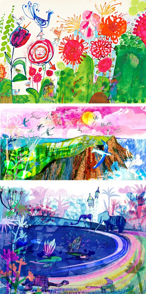
Jill Calder: her style is really fun with lots of brightly coloured elements all layering up to create a busy composition. It has a looseness to the mark making that I find appealing, this coupled with the colours helps to create a magical feeling to artwork. There is a nice hand made quality to these mark and textures.
Andy Potts: these digital collages have nice textures on them which I would think are real textures that I have been scanned in to make them feel less flat. The colours are much more controlled, choosing limited colour palettes, making use of complimentary partings. The layers build up in layers with varying opacities.
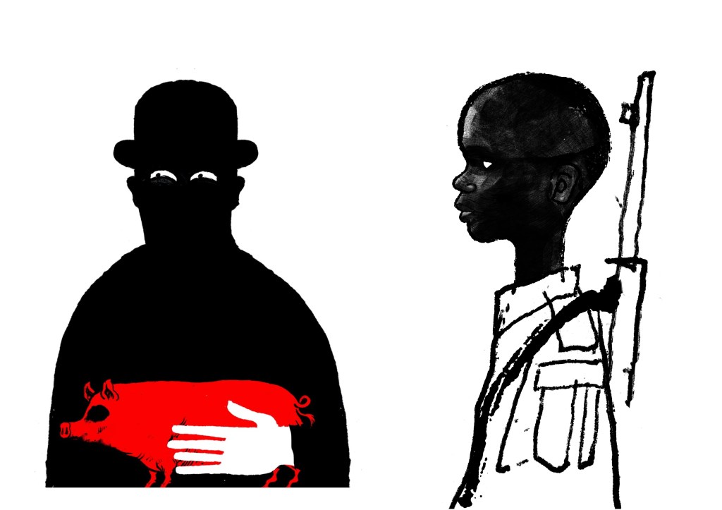
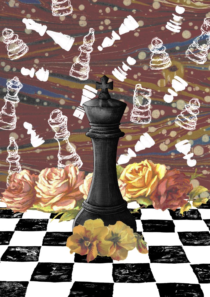
Paul Blow: this is a more refined and clean digital style. The less chaotic compositions help make each element stand out more with his powerful use of limited colour palettes. I particularly like the chess pieces as he’s transformed a board game into an intense and cinematic piece largely down to the scaling and colouring of the different parts.
Michelle Thompson: these digital collages have the most resemblance to traditional hand made collages, lots of rough elements placed together in a more free way. I really like the different textures and minimal colours as it really makes certain parts stand out.
Maria Midttun: the printed textures are created by hand, scanned in and manipulated digitally. This helps to ground the digital collage in a traditional collage style. I like the contrast between the rough cut, block coloured backgrounds with the greyscale textures used to make the characters.
David Foldvari: these pieces have a really nice quality of marks with rough inky lines being mixed with detailed shaded parts. The controlled minimal use of colour helps to draw the viewer into a certain part with the striking red standing out on the black and white.
Photoshop workshop:
We had a Photoshop demonstration of a range of basic tools before we began working on the creative challenge. Here are some of the things we went through:
Setting up a canvas (Size, PPI, RGB & CYMK)
Overview of Photoshop tools (Sidebar and tabs)
Copying and Pasting image assets into the canvas
Cutting, Moving, Rotating, Transforming, Erasing
Editing Colour, Contrast and Opacity
Using the Clone Stamp, Brush and Paint Bucket tools
Layers panel (Organising, Grouping and Naming)
Quick Mask tool
History panel
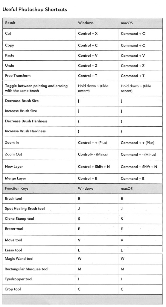
Useful shortcuts
I was at least comfortable with most of these as Photoshop is a software I used semi-regularly. The ones from the list that I found the most challenging where using the quick mask tool and the shortcuts. The main difficulty for me was using Photoshop on the Universities Macs as I’m more used to using it on an IPad or Windows laptop. This means the interfaces and keyboard commands are slightly different for what I’m used to, making my process slower. In particular, I’m much more comfortable selecting and cutting images with the touch screen on an IPad.
Below is a table of key Photoshop shortcuts across different devices:
Creative challenges: Visual Juxtaposition
Key terms:
Juxtaposition: an act or instance of placing close together or side by side for comparison and contrast.
Collage: a picture or design created through the assemblage of different forms, thus creating something new.
We had to combine imagery and manipulate material from a range of sources to create a new meaning to express the theme of ‘play’. I used my collection of visual media that I made based on the theme of ‘play’ and images from the British Library’s collection on Flickr to create visual juxtapositions and metaphors in Photoshop. I made the images below during and after the session:
1. For this one I wanted to go for a really random style by mixing elements that visually shouldn’t go together into a cohesive compositions. I think I was able to achieve this by using a combination of images from Flickr and the card textures that I created to form the collage. Using layers was key to this piece and I was able to create depth by layering the 3 greyscale textures and the bottom and place the chess piece with the card design in between them.
2. This collage was created solely with images I took from Flickr. I really wanted to use these as I love this traditional illustration style and think it works really well in a digital collage. The difficulty of the image was cutting out the complex shapes cleanly. To do this I had to use a range of selection tools including the lasso, object selection and quick selection tool to remove the backgrounds. This was a time consuming process but it was worth the time to achieve the detail and precision. For the style and composition I took inspiration from Michelle Thompson, who I mentioned in my artist research.
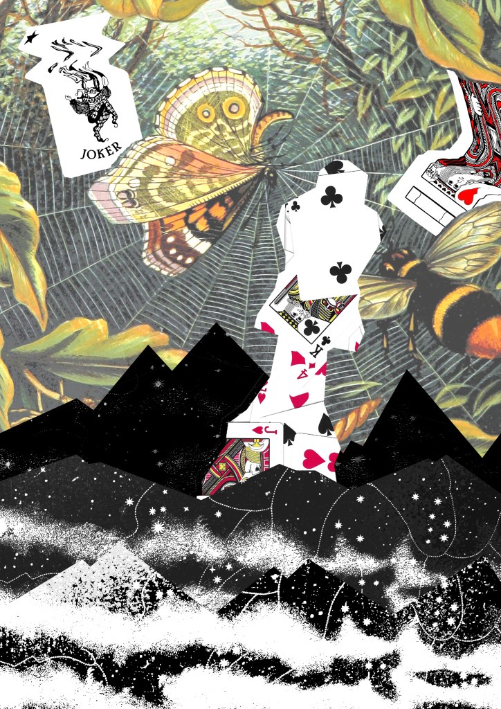
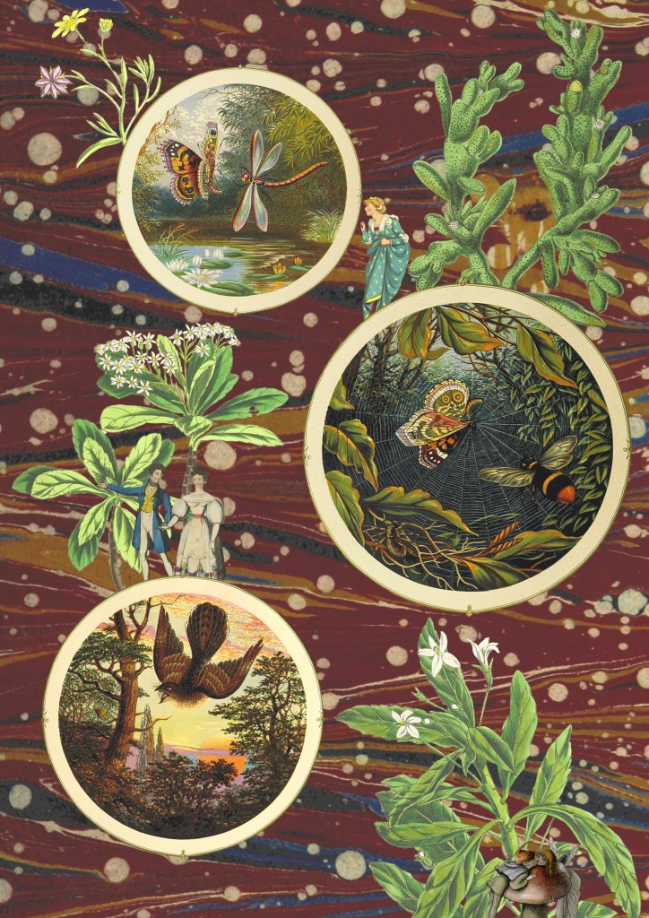
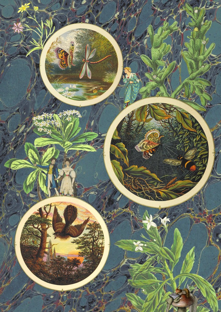
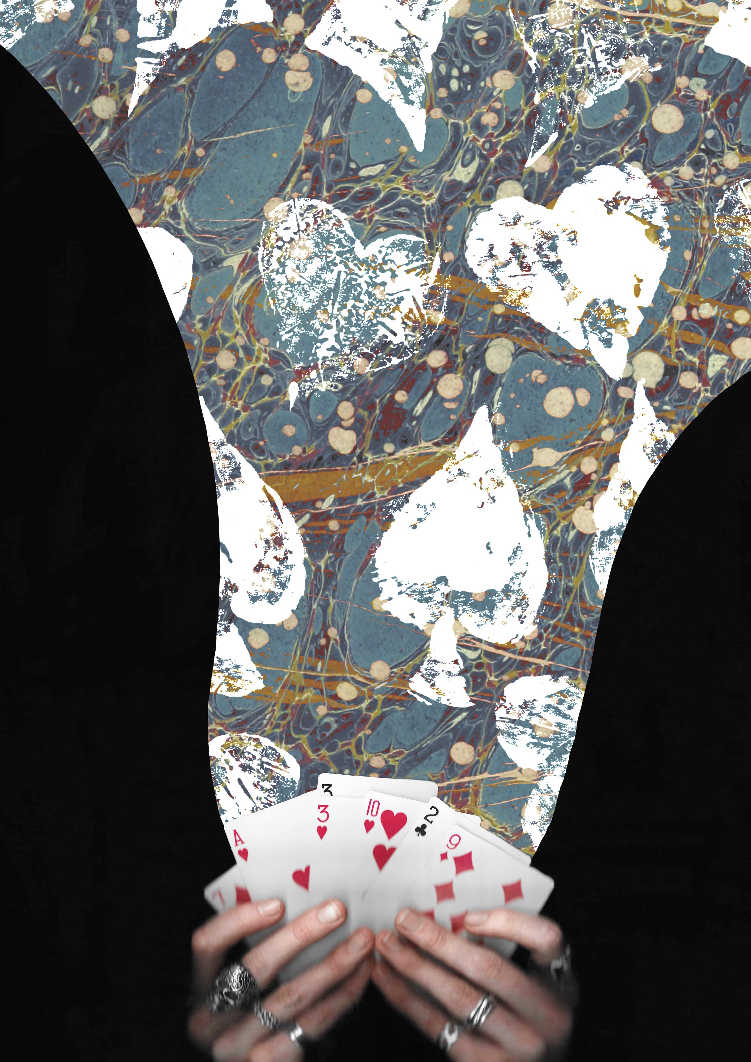
3 and 4. The next 2 are variations of the same image, with only the backgrounds changed. I couldn’t decide which background I liked more as they both work well in the composition and give the collage different feelings. For this one I tried to create a more conceptual collage with a narrative. I used circular photo frames to act as portals with characters and objects interacting with them. Once again the main difficulty was cutting out the images cleanly. I enjoyed creating this more fantasy based one with more of a playful idea and meaning rather than just an aesthetic collage.
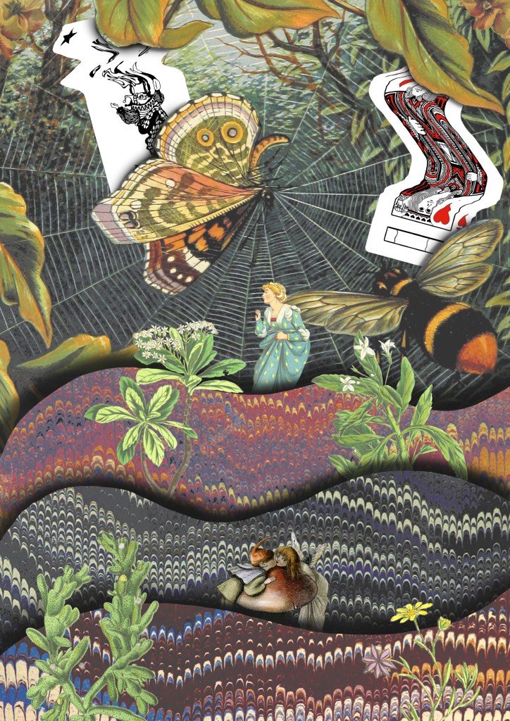
5. I drew on the ideas from images 3 and 4 and combined them with some of the visual elements from image 1, the cards and background. Theres a juxtaposition between the visual language of the images from Flickr and my experimental card scans. I was able to balance these contrasting elements by maintaining the same playful and fantasy style. I used a lot of the Photoshop tools we discussed in the workshop to create this including, selection tools, layering, brushes and editing the colours.
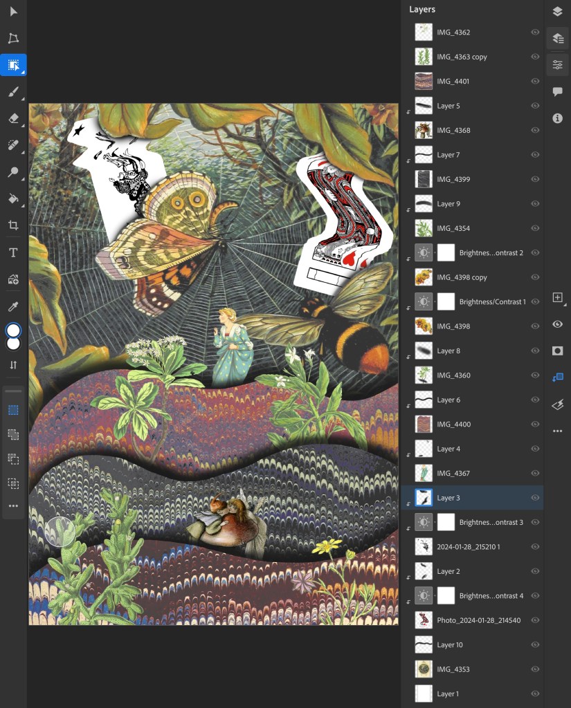
This is a screenshot from my Photoshop document showing all the layers and adjustment layers used to build up this collage:
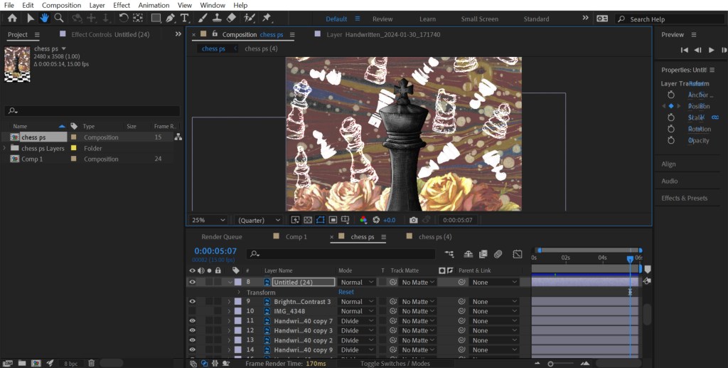
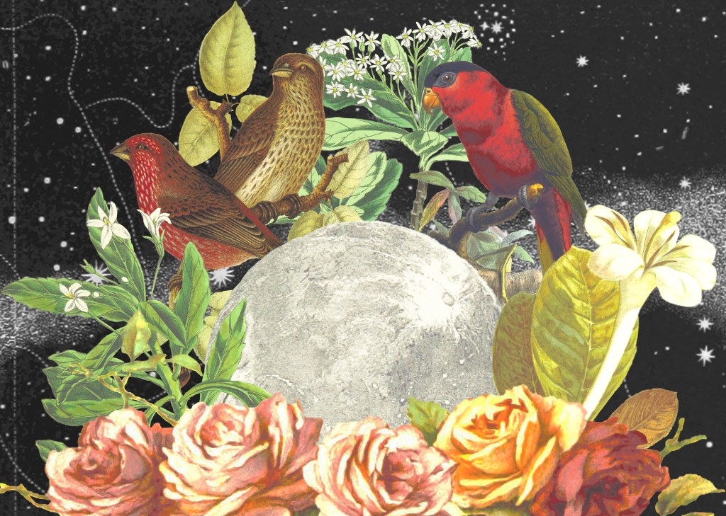
6. The previous collages has a playful concept whereas this one I went for a more obvious depiction on play by using my chess piece illustrations and Lino printed board. I combined these with a background and floral images from Flickr. The concept of this collage was that the black chess piece had one the game and all the white pieces in the background are ghosts. These one challenged me to combined multiple contrasting visual aesthetics into one collage.
7. I wanted to create some more with the cards theme so made this one of magical cards. I used a layer mask to add the blue texture to only the part flowing from the cards. Then I overlayed the Lino printed symbol on top using blending modes. I went for a more dynamic composition for this one with unbalanced large and small elements.
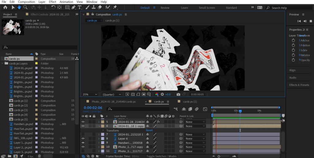
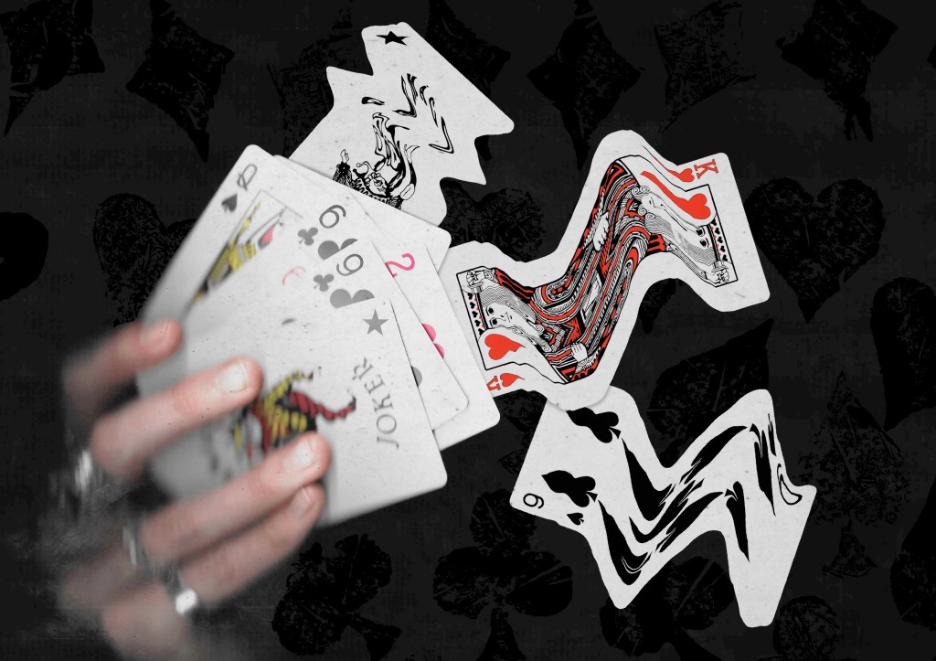
8. This is another collage using the scans I took of my hands holding some cards. This one also has a fantasy, playful concept with the cards moving out of the deck in a dynamic way. I really like this ideas and think it could work really well with an animated events of the 3 warped cards moving.
Reflection: I really enjoyed this Photoshop workshop, I was able to advance my skills with the basics tools and learn some new more advance tools. I’m happy with the series of collage I was able to create during and after the session in response to the creative challenge. I tackled the theme of play with both the visual elements, style and concepts to create a range of collages with juxtaposition. I experimented with the composition and arrangement to create a range of image, some being balanced and others being more dynamic. When creating the digital collages I considered hierarchy, scale, colour, tone, marks and texture.
As part of the first session we had to start thinking about ‘play’ objects and create a range of materials/assets related to these objects that we could use in the upcoming software workshops.
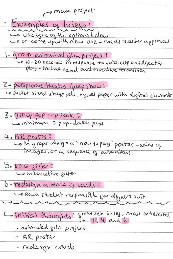
This is a list of the project briefs we could choose from. We can either pick one off the list of propose a new one to our tutors. My initial thoughts on the briefs are that I’m most drawn to options 1, 4 and 6. These are the animated film project, AR poster and redesigning a pack of cards. But I’m also open to coming up with my own idea. Redesigning a deck of cards is within my comfort come of design and illustration so it might me I’ve to push myself to try something I’ve not explored before such as animation or immersive arts.
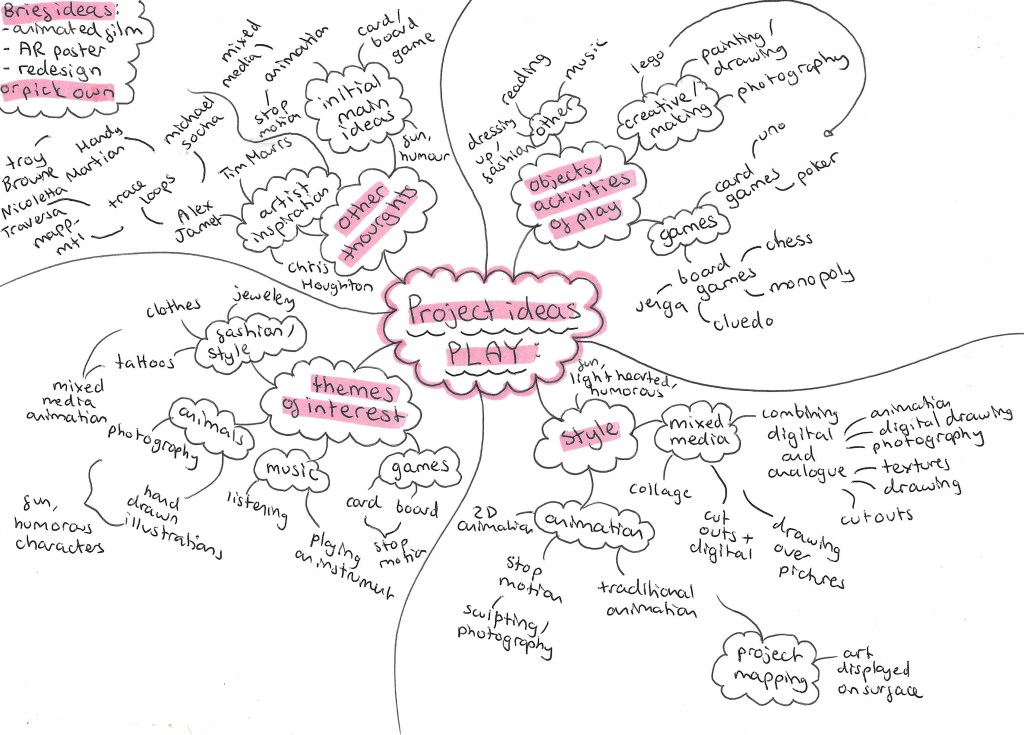
Here is a mind map of some of my initial thoughts and ideas for the ‘play’ project.
This is an idea I had for the project. I would need to propose this idea to my tutors as it’s not one of the suggested briefs although it does draw inspiration from the animated film project. The idea is to create a stop motion animated film using chess pieces. There are more details on the idea below:
Games is the topic I want to explore within this ‘play project’. The types of games I wanted to work with is either board games or card games. The next step was to create a range of material to use upcoming workshops. I will be adding to this when I think of more ideas and feel that I need more visual media to work with.
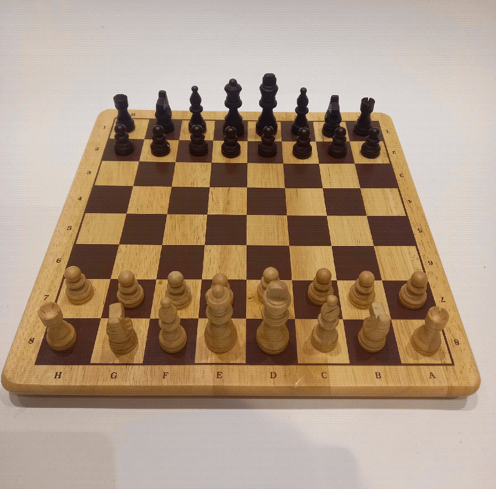
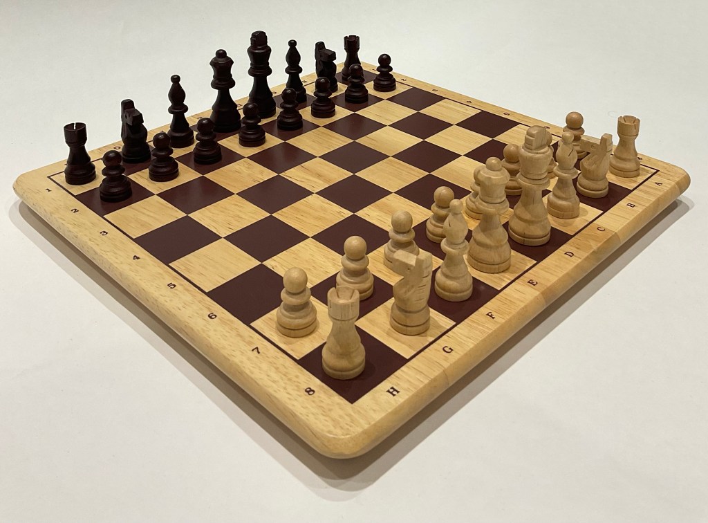
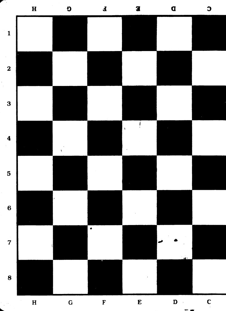
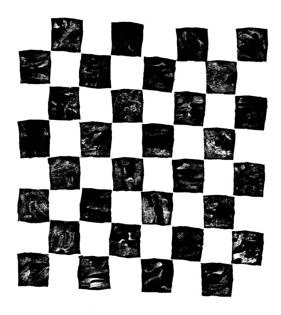
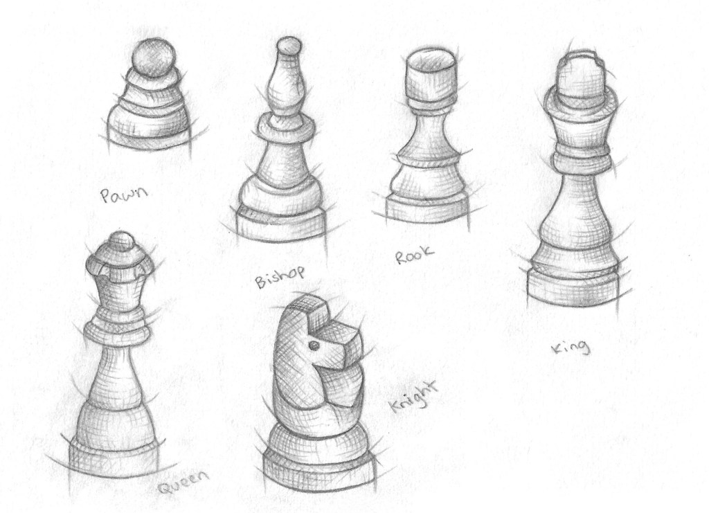
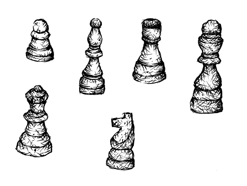
Chess:
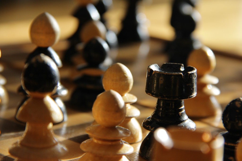
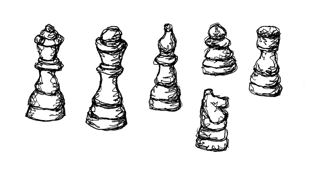
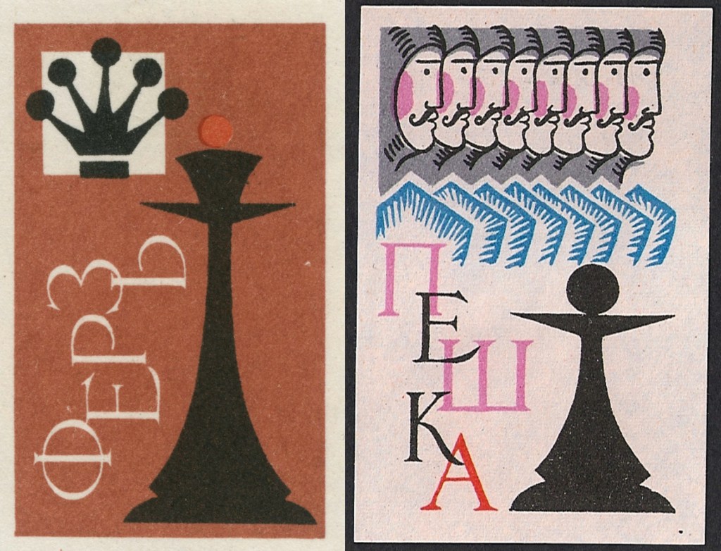
I made and complied lots of visual media related to chess. I chose chess as it’s a historical and widely popular game that most people at least recognise. It’s a game that I really enjoyed as a child and is played by many across a wide range of ages and I can see lots of room to explore the game in a creative and playful way.
Stop motion:
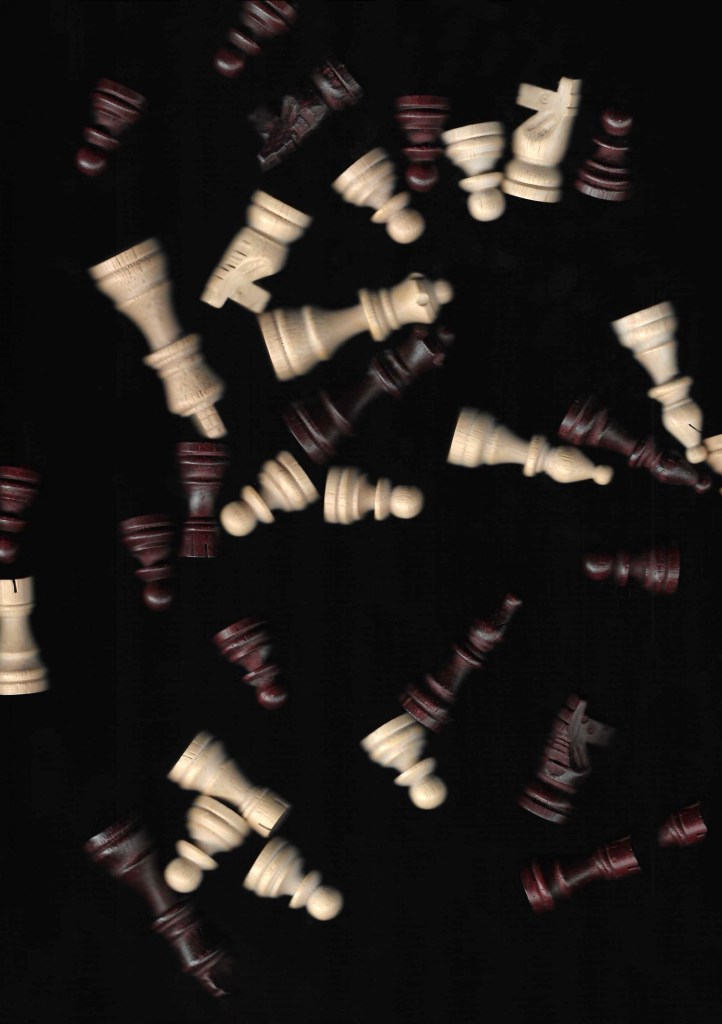
Photographs:
Photographs (from Flickr):
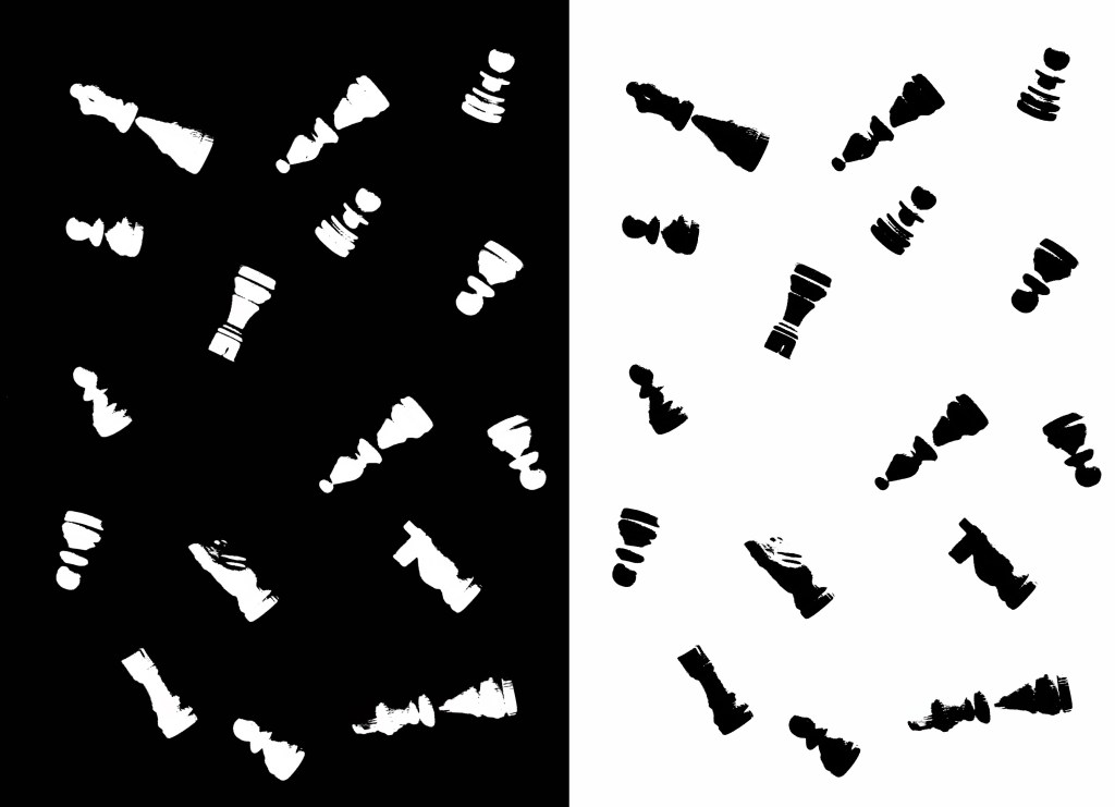
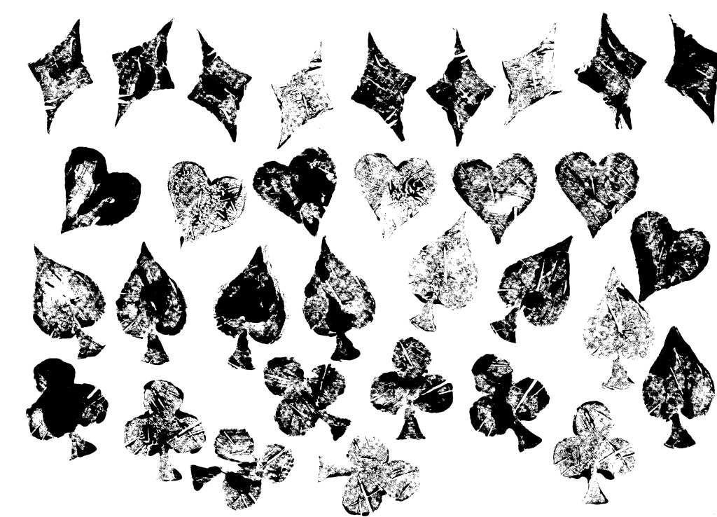
Scanning:
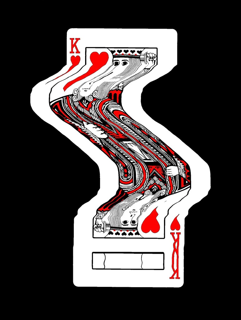
Edits of scans:
Printing (Lino):
Illustrations:
Illustrations (from Flickr):
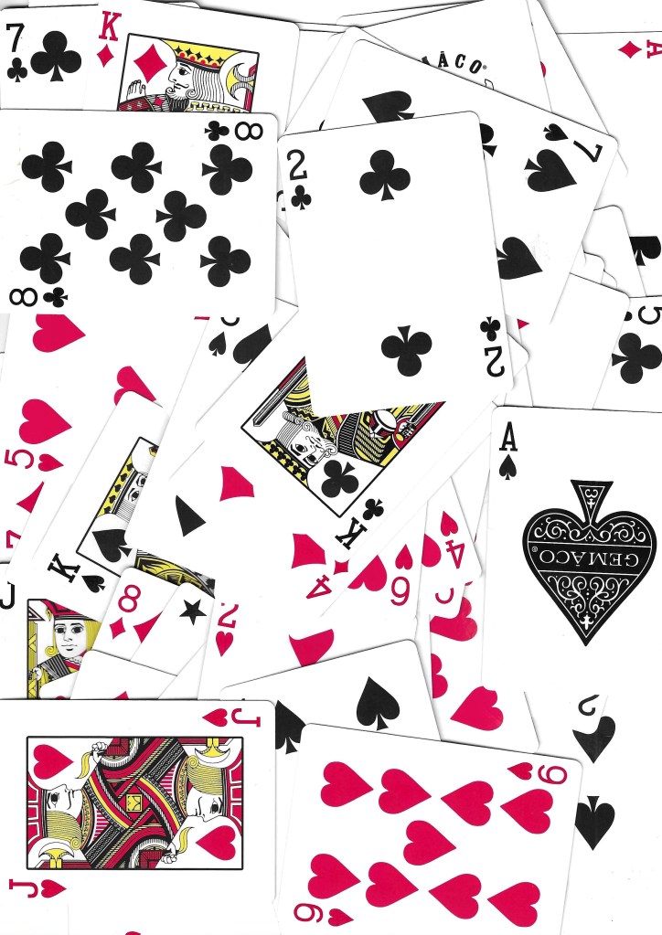
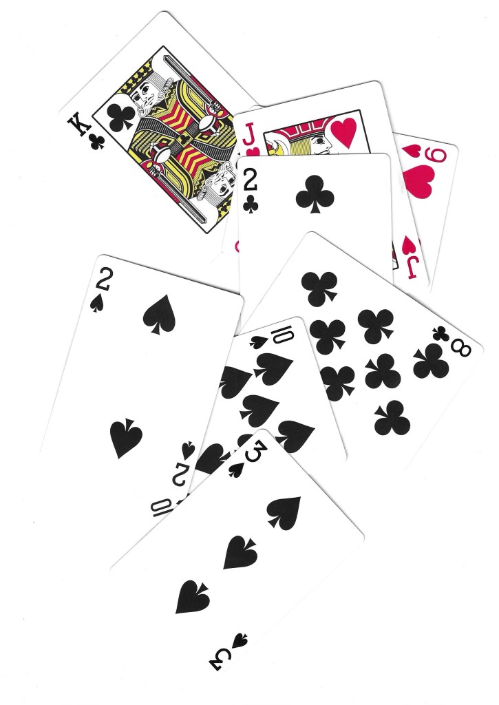
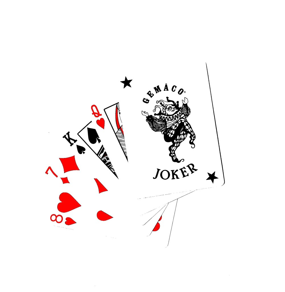
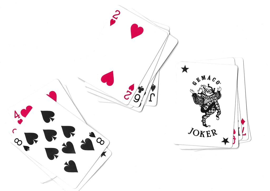
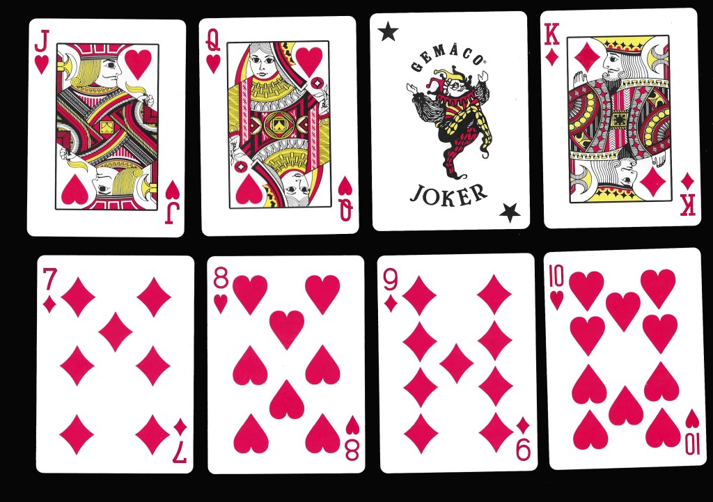
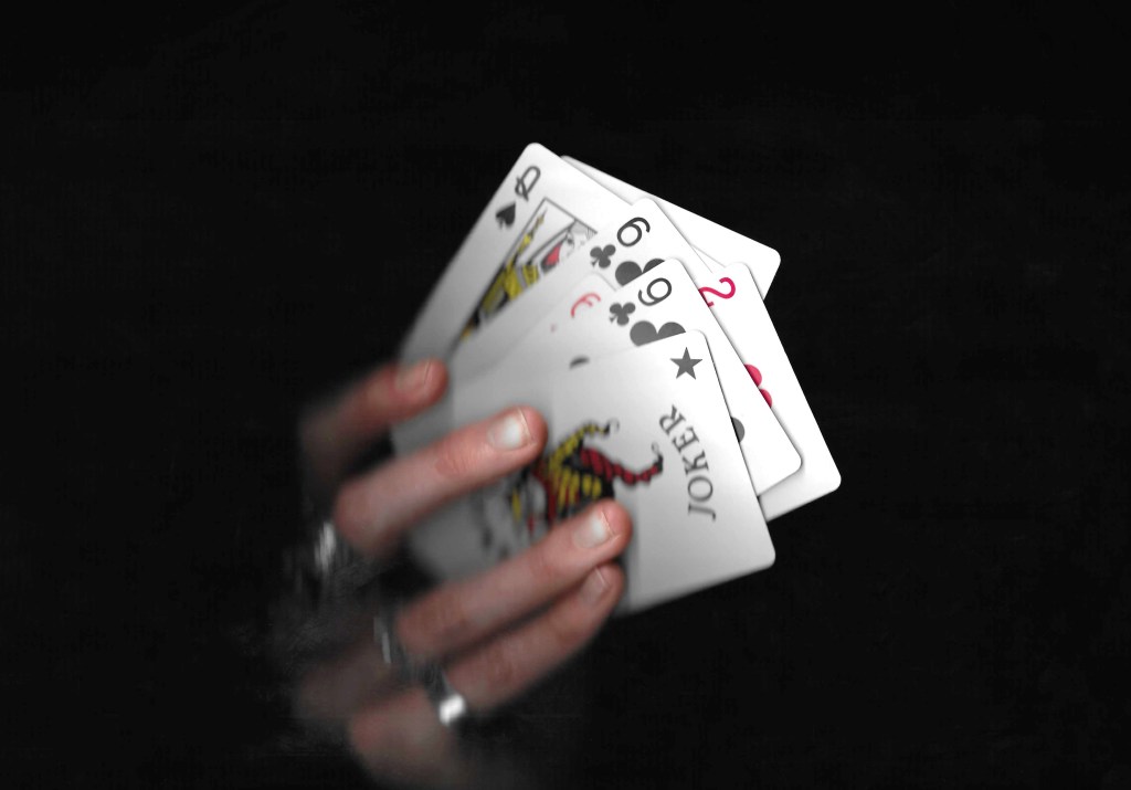
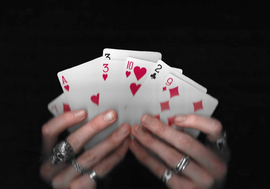
Cards: the other topic that I created a bank of visual media for is cards. Cards is an iconic symbol of play for both adults and children’s so fits perfectly into the modules brief. Creating a deck of cards is one of the set briefs that interests me and just generally it’s a topic I’m interested it and would like to creatively explore.
Scans:
Experimental scans:
Printing (Lino):
Images from Flickr:
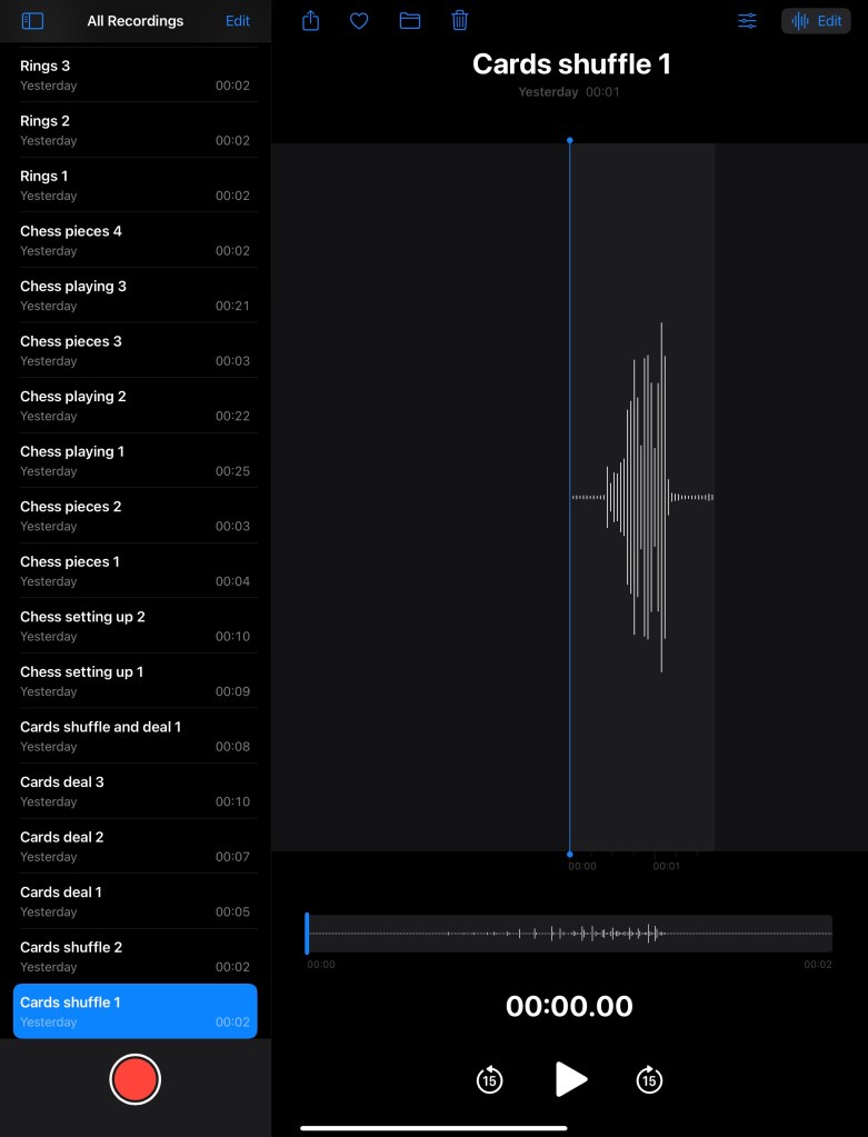
Audios:
In addition to create lots of visual media to use, I recorded a series of sounds related to the images. These included shuffling cards, moving chess pieces on the board and dropping rings. I can use these sounds to overlay videos and animations to provide another dimension to my work.
In this session we got more of an introduction to the Module requirements and started to explore the topic of ‘play’. Below are my notes and ideas from the session and my independent research.
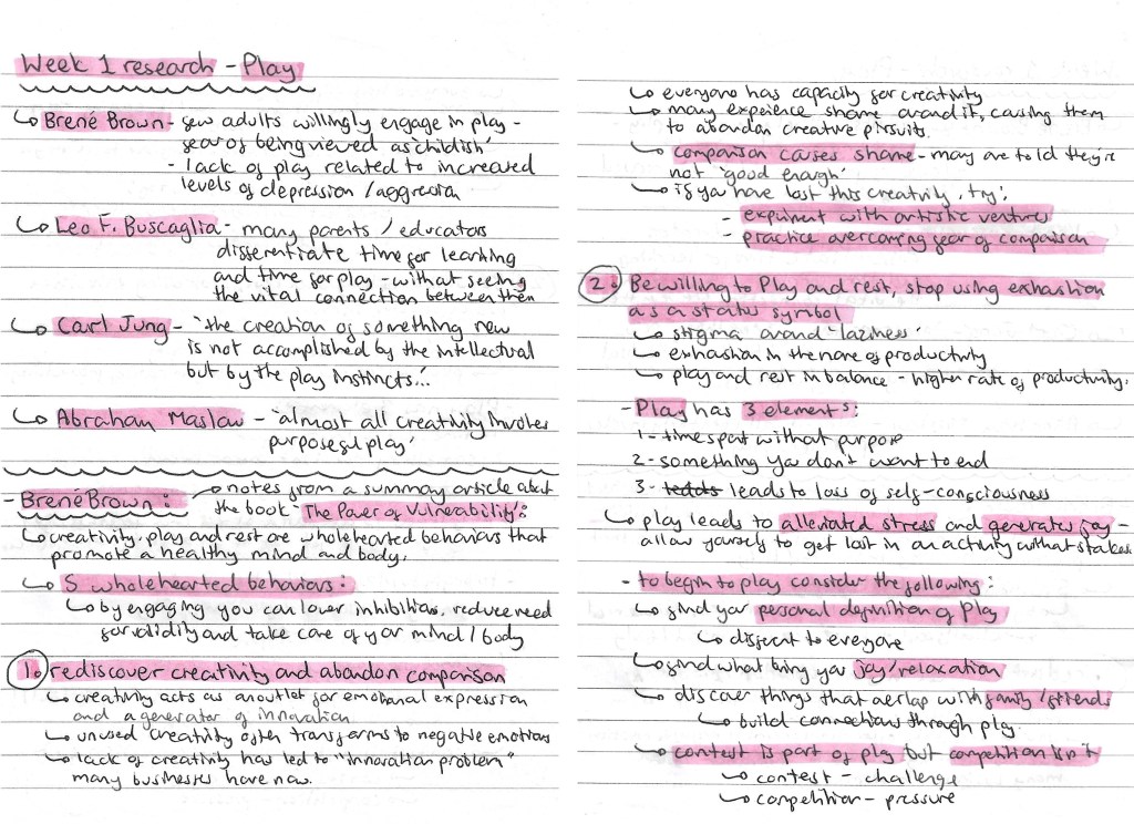
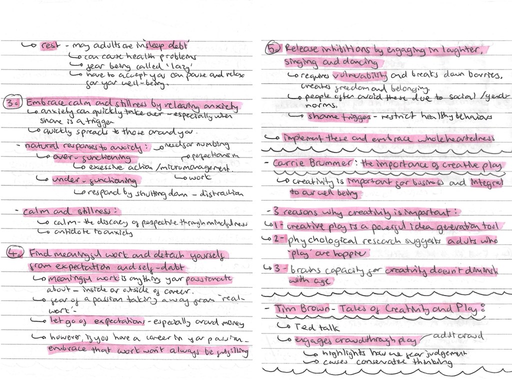
On one of the slides from the power point, there was a list of people who have studied ‘play’, I wrote down their names and the key quote from them. I researched each of them and found Brene Brown’s ideas particularly interesting. He wrote an article called ‘The Power of Vulnerability’ and within this he talks about 5 wholehearted behaviours that promote a healthy mind and body, which I made notes on. I also looked at a couple other people including Carrie Brummer and Tim Brown. The notes on all of these can be found below:
In the session we had an activity where we spoke in group about ‘play’ and answered a series of questions. I made notes and took some recordings of our discussion. I then presented our ideas and answers in this mind map. This was a helpful way to get us to start engaging with the topic of play and thinking about our own perceptions of the topic.
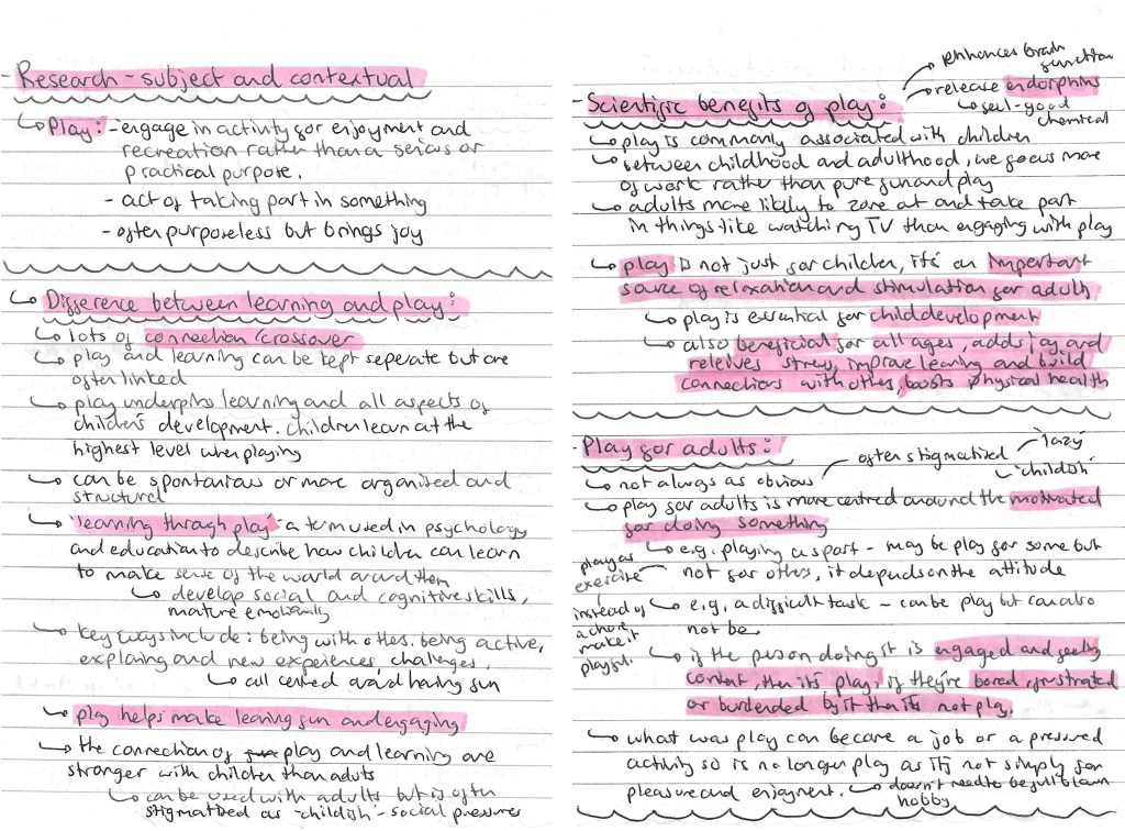
Prompted by the session, I did some subject and contextual research. I looked at the definition of ‘play’, the differences between learning and play, the scientific benefits of play and play for adults. All the research and ideas are below:
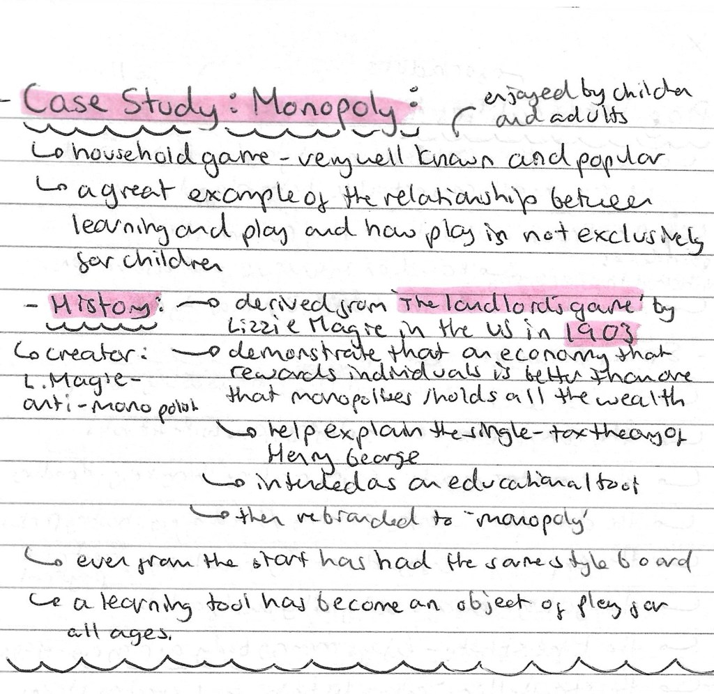
I wanted to pick a famous and popular game to study as board games are one of the first types of ‘play’ that I thought of during our group discussion and is something I’m considering basing my project around. I chose to research Monopoly and found it has an interesting history, starting out as an educational tool and later becoming a game. This is a good example of the fundamental connection between play and learning at all ages.
I found an article by Dr. Brown titled ‘play personalities’ which thought was an interesting idea so I made some notes of the 8 ‘play personalities’ and what each one means.
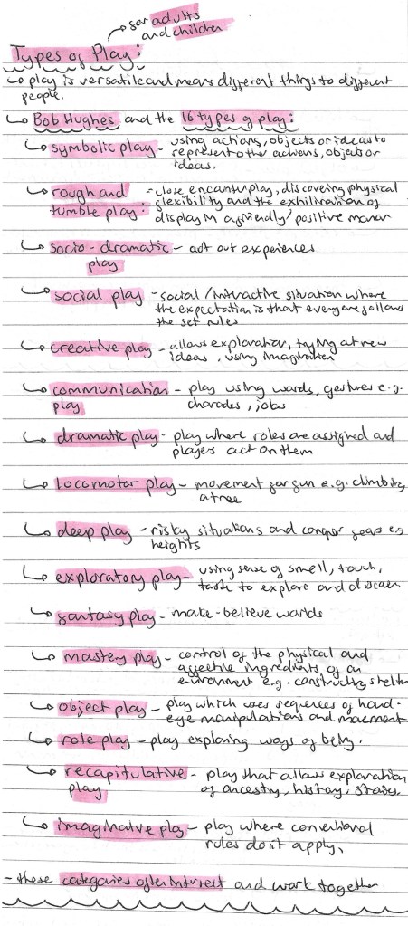
To get a comprehensive understand of what it means to ‘play’, I researched the different types of play for both adults and children. I used Bob Hughes’s article about the 16 different types of play.
I made a list of different objects of ‘play’. Objects of ‘play’ is something we talked about in our group discussion so I wanted to make a list of all the different objects and activities I could think of. This was a good way to start generating ideas for the project. To help me I divided the objects into creative/making, games, activities/outdoors and other.
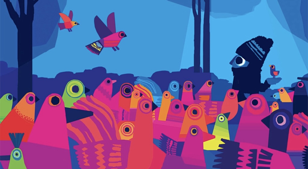
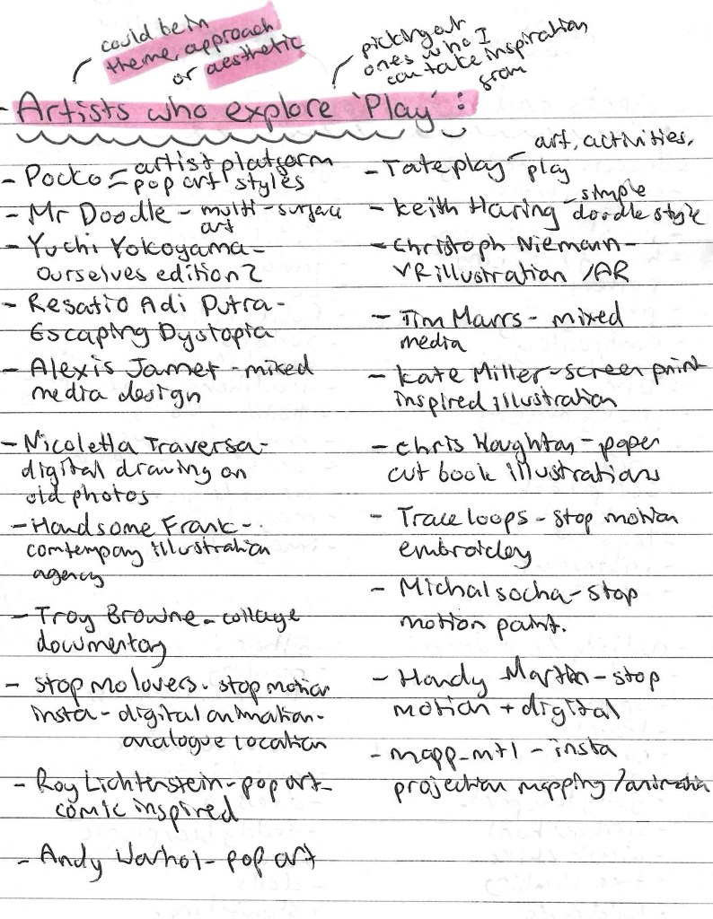
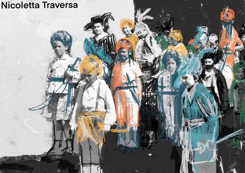
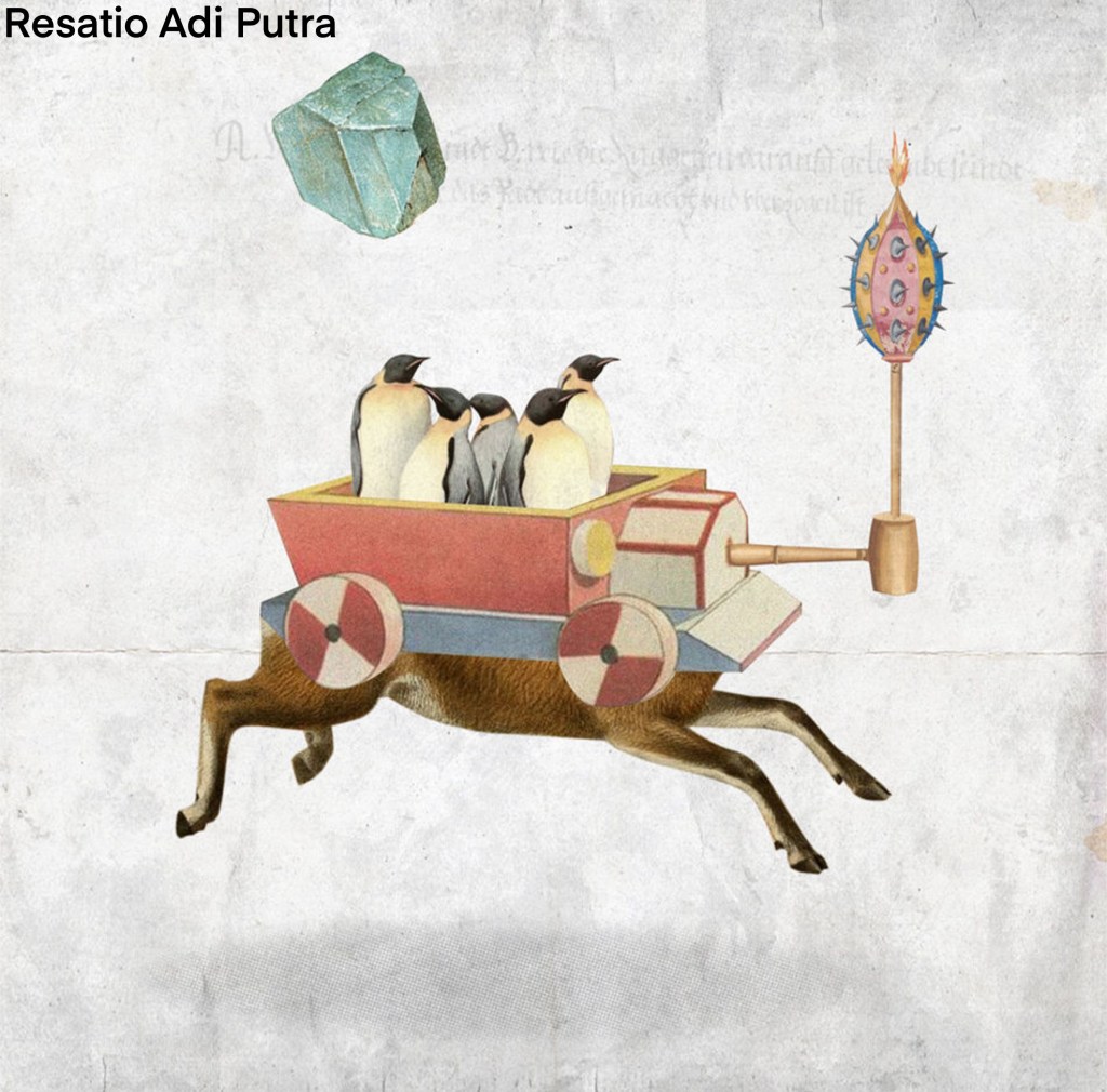
I also researched artists that explore ‘play’ either through their theme, approach or aesthetic. Below is a list of artists whose work I liked and found inspiring for the project. I made a note of the type of art they create and have included images from the artists mentioned.
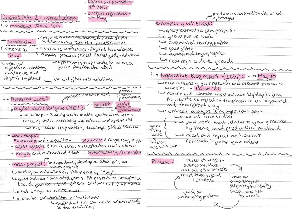
In this session we were introduced to the Digital Arts 2 Module. Below are the notes I made about the Module aims, the briefs, assessment criteria and deadlines.