Categories
Contextualised Practice Contextualised Practice: Project Level 5

Contextualised Practice: Initial Sketches

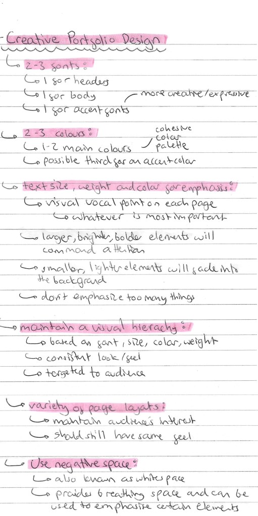
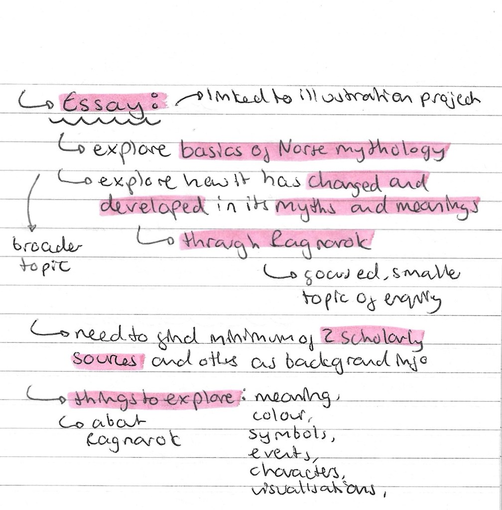
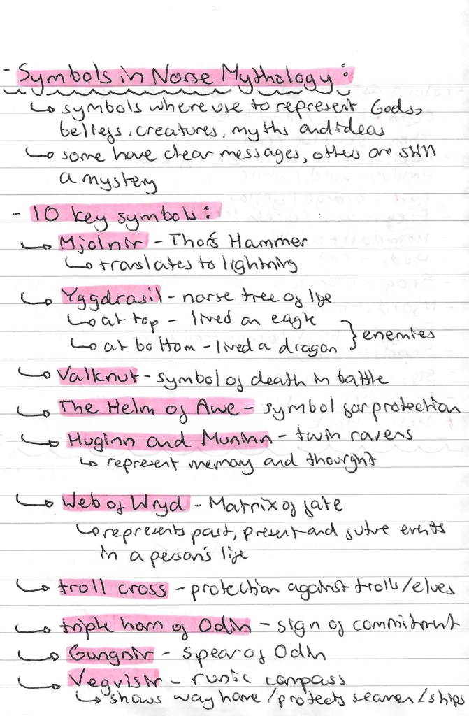
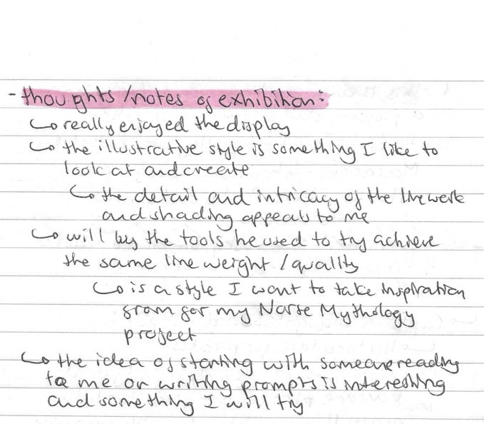
This summarises my most up to date plan for the project. I chose 5 myths to illustrate as I wanted the series to have an odd number and felt 3 wasn’t enough to really explore the topic. The 5 are all the myths I researched except the creation of Thor’s hammer. I decided to remove this one as it was the it was less character based and I wanted to work mostly with the gods/goddesses and creatures.

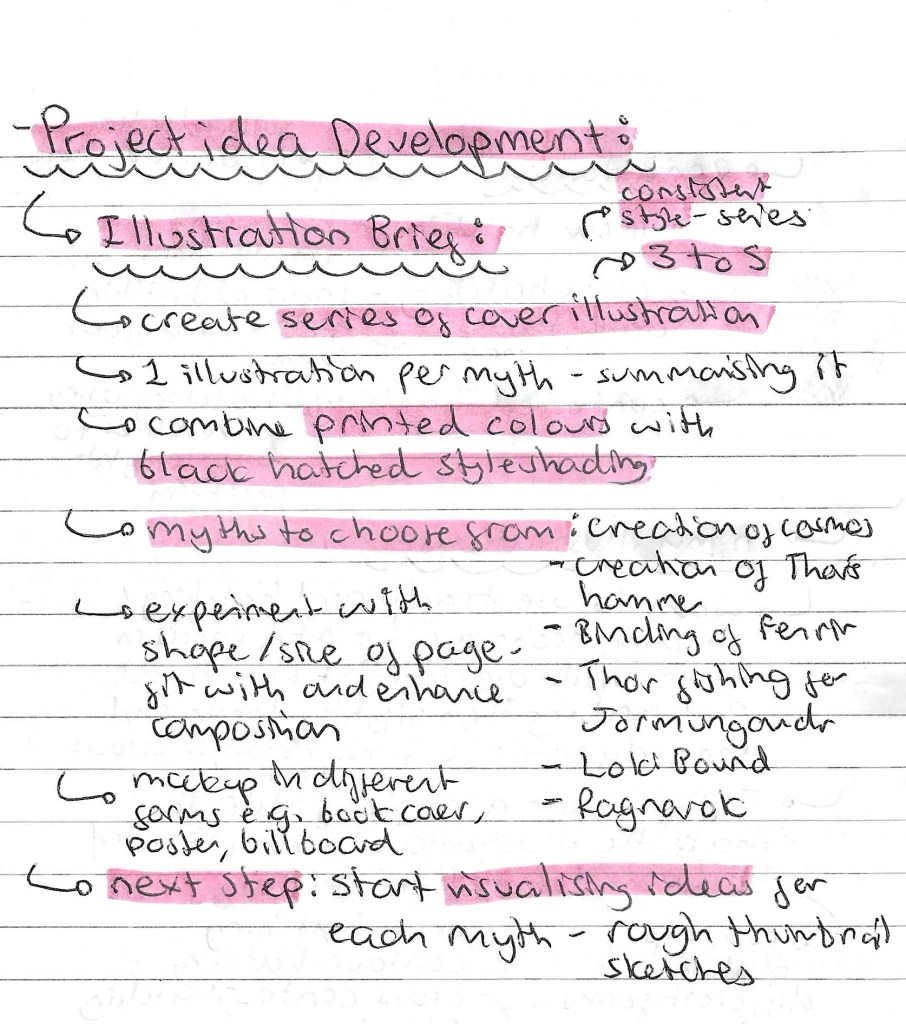
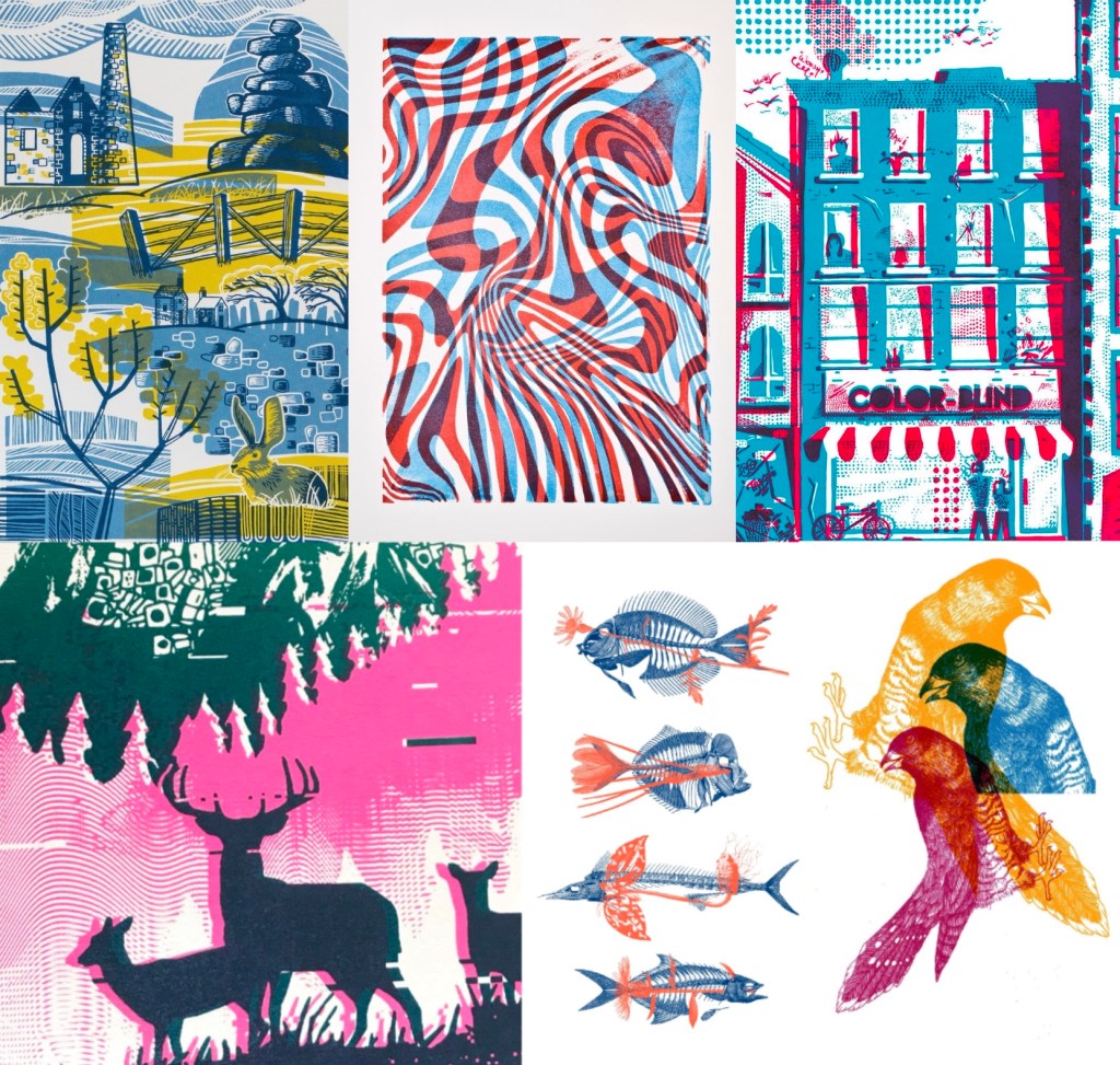
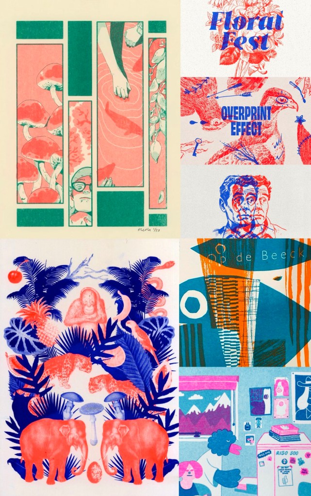
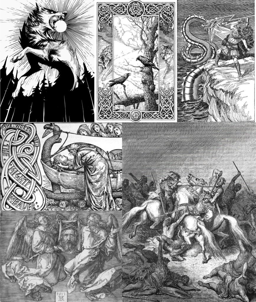
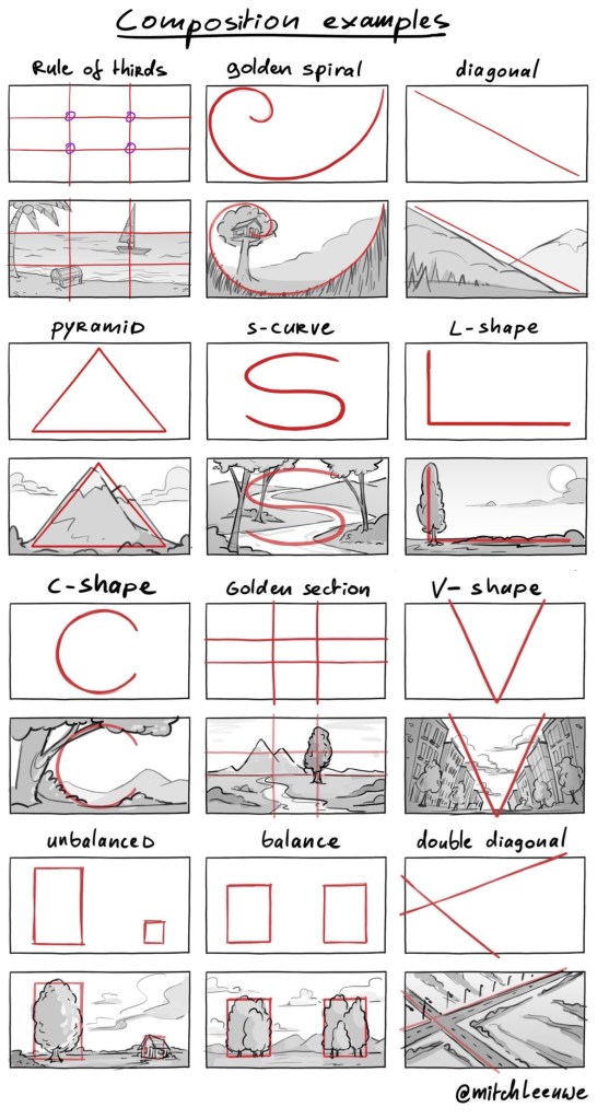
Compositions: I really wanted to explore composition in these illustration by varying the shape/ size of the image and the compositional shape. Lots of the examples of Norse mythology art that I liked had really interesting compositions, playing with balance and sizing.

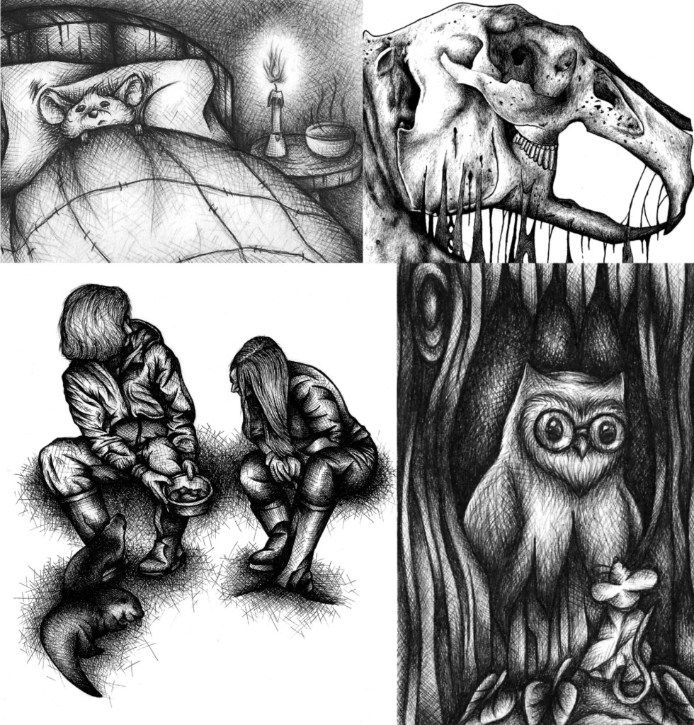
Thumbnail sketches: these are quick thumbnail sketches I made for each myths. I used these as a way to get my ideas onto paper and made some notes about the ideas for each. Using thumbnail sketches is a great way to quickly visualise your plan for an image, it’s a step I almost always use in my creative process. After sketching these I then review them and draw more resolved images for each with the necessary changes.

Here are my more refined sketches, in chronological order of the myths:

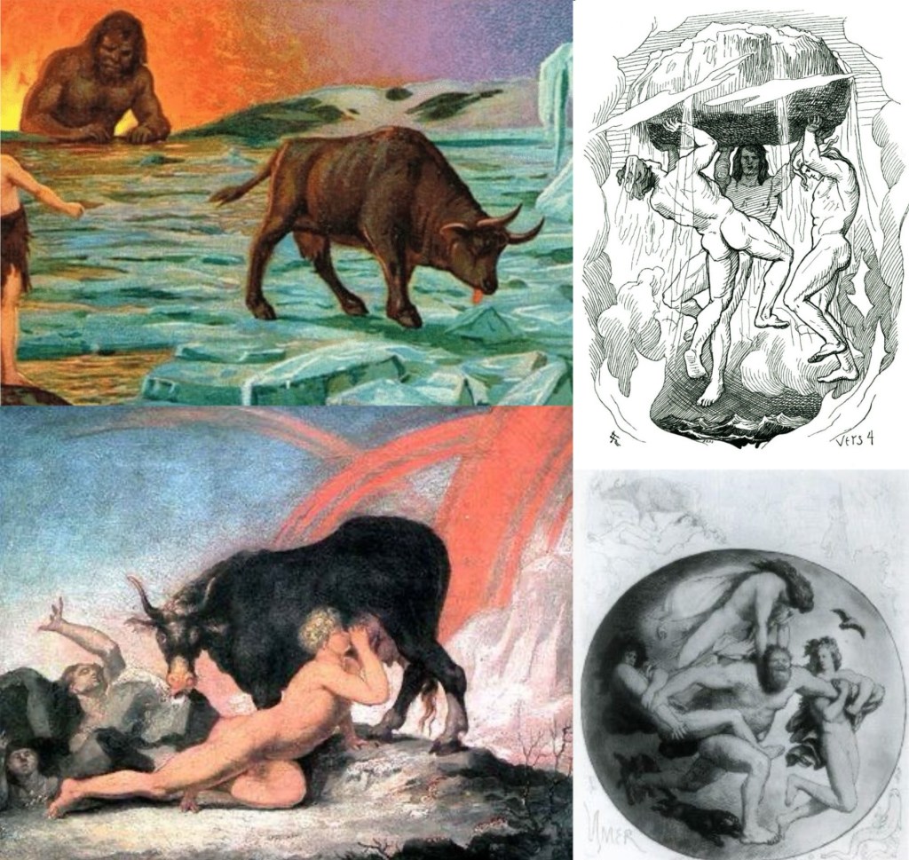
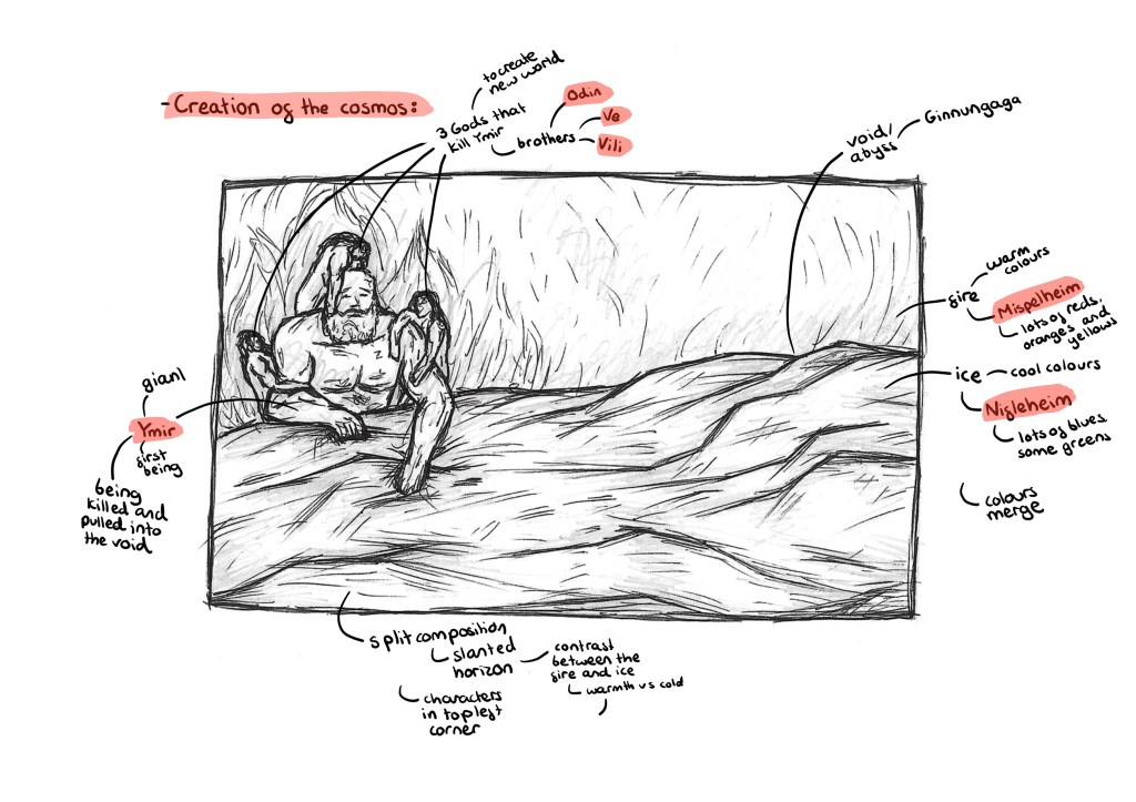
Creation of the cosmos: this image illustrates the Norse creation story. In the background will be fire, representing Mispelheim and in the foreground will be ice, representing Nifelheim. These 2 worlds cross the void/abyss, called Ginnungaga, and collide. On the left on the image there are 4 characters. The large one being Ymir, a giant who is said to be the first living being. The 4 smaller ones are 3 gods, Odin, Ve and Vili. The 3 brothers kill Ymir and construct the cosmos from his corpse. In my image they are dragging him into the void between the 2 worlds so it depicts the moments before they kill Ymir and build the cosmos. I want a split composition with a slight slanted horizon line. The colours will really emphasise the contrast, with cool tones in the foreground and warm tone in the background. The image will be unbalanced, with all the characters on one side. I made this decision as I want to draw the viewers eye to this section and then make them notice how much empty space there is. This is to try empathises how these are the only beings alive at this time. In terms of image dimension I want it to be slightly longer and thinner than A4 to get across the vastness the creation story.

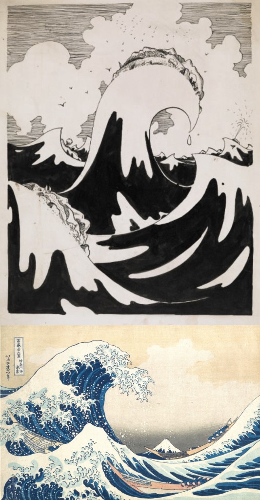
This is an image that really inspired me. I want to keep the split composition but make there more of a balance between the ice and fire and a slanted horizon line. Also I will put all the characters to one corner, drawing the attention to the drama. I want to use a more intense version of the colour palette seen here.

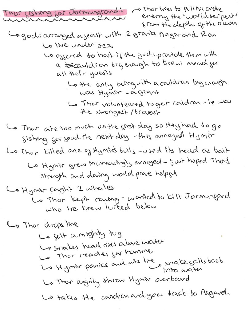
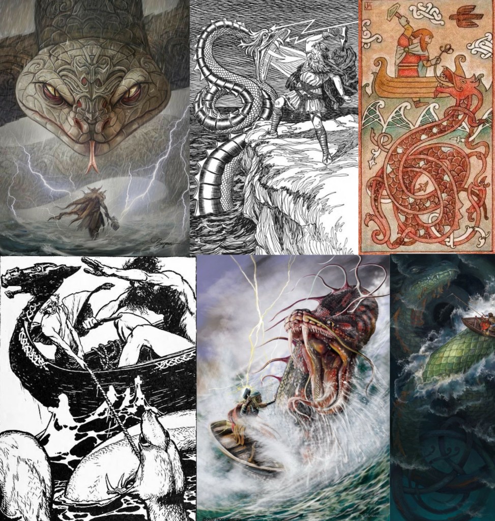
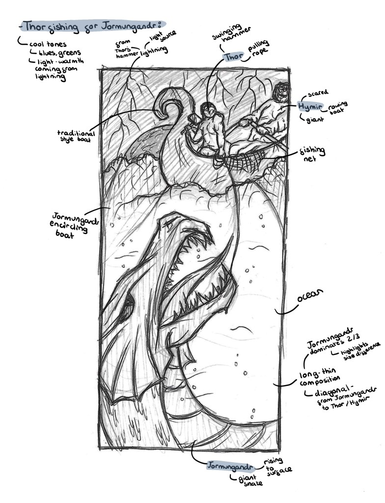
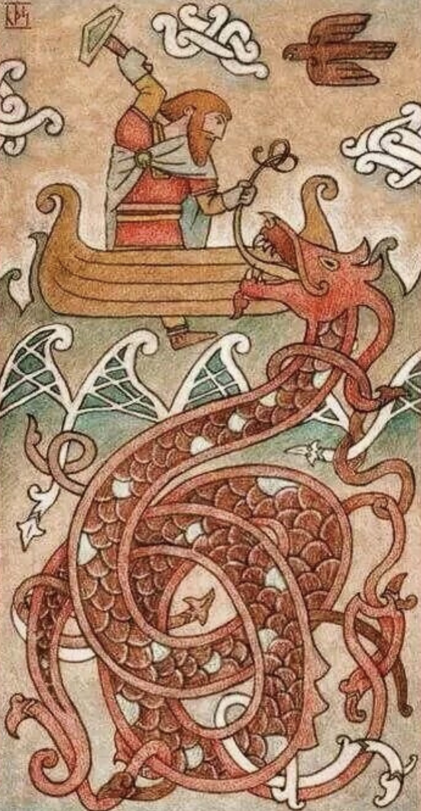
Thor fishing for Jörmungandr: this image shows the story of Thor and Hymir going on a fishing trip. The pair went out on a small boat to catch some fish for their village. On their journey they caught what they assumed to just be a large fish but ended up being Jörmungandr who got caught on the wire. Thor and Jörmungandr had been long time foes so Thor wanted to kill him but Hymir wanted to sail away. My image is divided into 2 uneven sections by the water horizon line, a small top section and a large boots section. At the top there are Thor and Hymir in their small, traditional Viking boat. Thor holding Mjölnir and the fishing line, wanting to attack and Hymir trying to sail away. In the bottom section is the head of Jörmungandr, I want to make the saves unbalanced to get across how large and dangerous the Midgard serpent is. Jörmungandr is rising to the surface ready to attack so th image is just after he gets caught on the line and before he rises out the water. I wanted to capture this moment so there’s suspense. The image size helps with this as it’s a long, thin shape, allowing the snake to dominate most of the space. For the colour I’m thinking earthy tones with lots of blues and greens. I want the lighting from Thor’s hammer to be a light source and to have Jörmungandr partially hidden by shadows to make him more ominous.

I drew inspiration from this image, with the position of the characters and shape of canvas. However, I want to completely change the colour palette and make the image more dramatic. Jörmungandr will be much larger in comparison to the other characters. Also Jörmungandr will not yet have come out of the water. I think it’s important to have Hymir in the scene as he plays an important role and is often overlooked in illustrations.

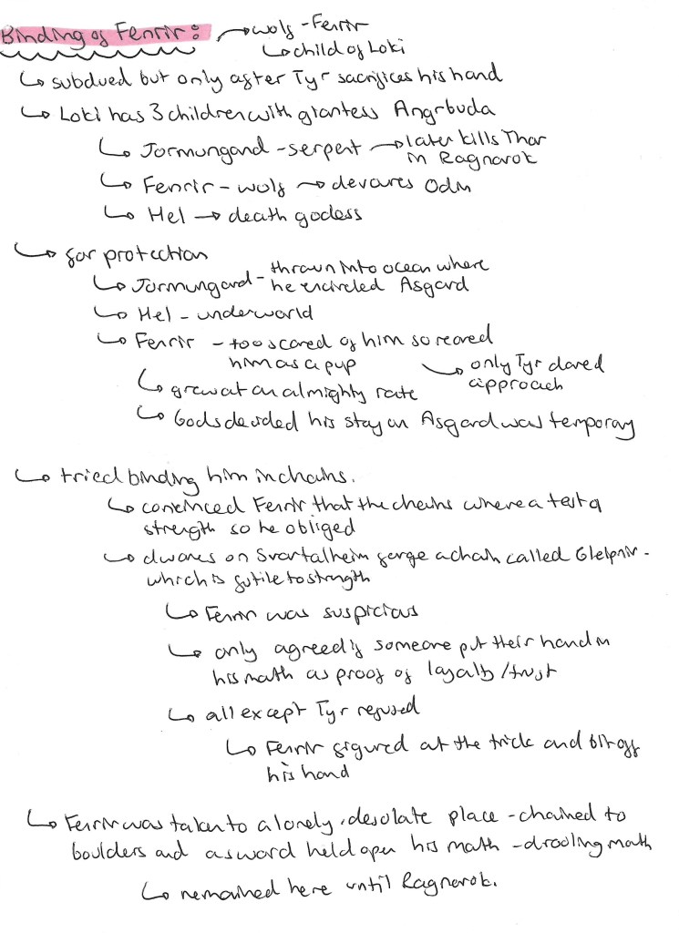
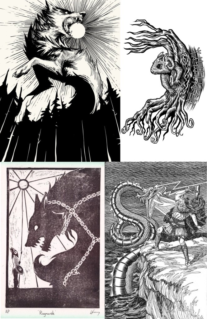
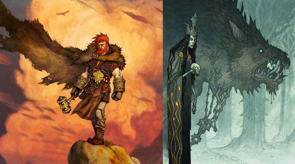
Binding of Fenrir: this image is about when the gods had to try to bind Fenrir. Fenrir was getting too big and powerful so the gods decided they had to lock him up. To do this they tricked Fenrir into thinking it was a game of strength. Each time they would put a chain around him and say it was a test to see if he could break it, eventually hoping they would put one that couldn’t be broken. Fenrir grew suspicious and said he would only play along if someone would put their hand in his mouth. To gain this trust Tyr put his hand in Fenrirs mouth knowing it was going to get bitten off. This is a story of sacrifice and bravery. Most of the image is taken up by Fenrir. Some details I want to include are a big chain around his neck and fire coming from his eyes. In the bottom left corner will be the hand of Tyr in the mouth, just before Fenrir snaps his jaw shut. I want to use a contrasting palette with bright warm tones in the background reflecting off the cool toned characters. This will portray the intensity of the situation. The image will be square shaped, I chose this balanced shape so that the unbalanced sizing between Fenrir and the hand will be more striking. This image will be very zoomed in only showing Fenrirs head and Tyrs hand so its really highlighting the details to emphasise the danger.

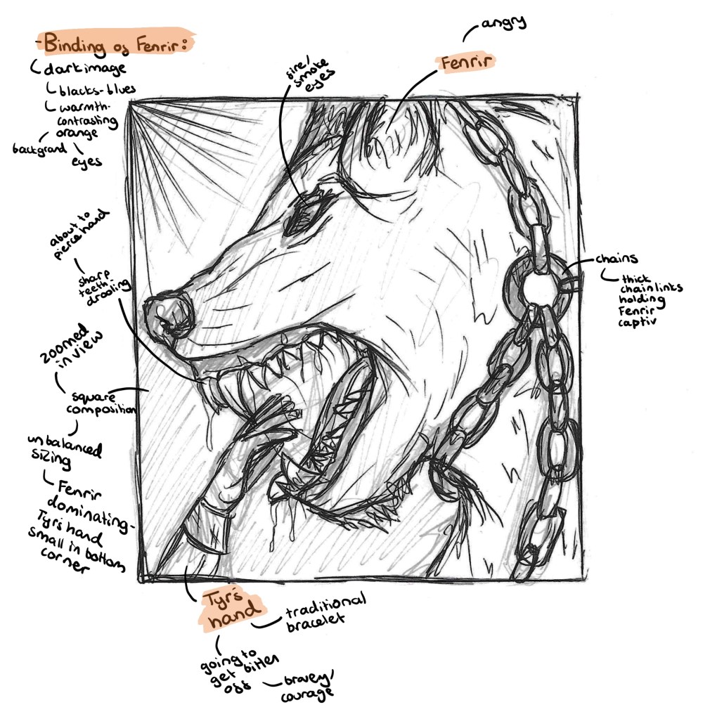
I was inspired by this piece but wanted to change a few key elements. I want it much more zoomed in as I feel it looks less intense when everything is shown. Also I wanted to incorporate a really bold, contrasting colour palette. This image shows the moment Tyrs hand is bitten, in mine I want to show a couple seconds earlier to really get across the power and size of Fenrirs jaw.

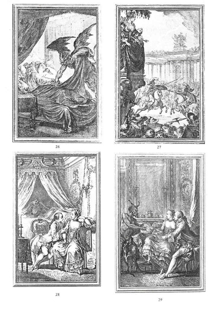
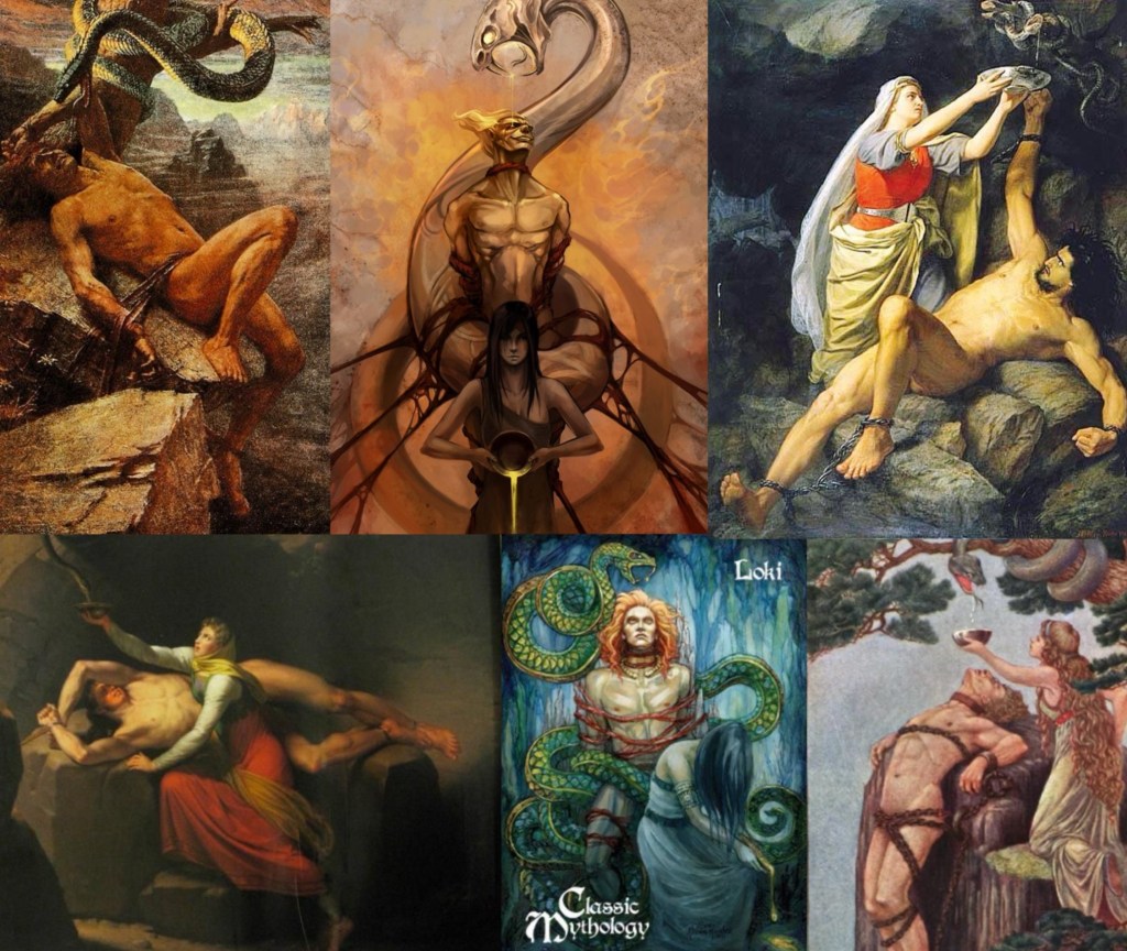
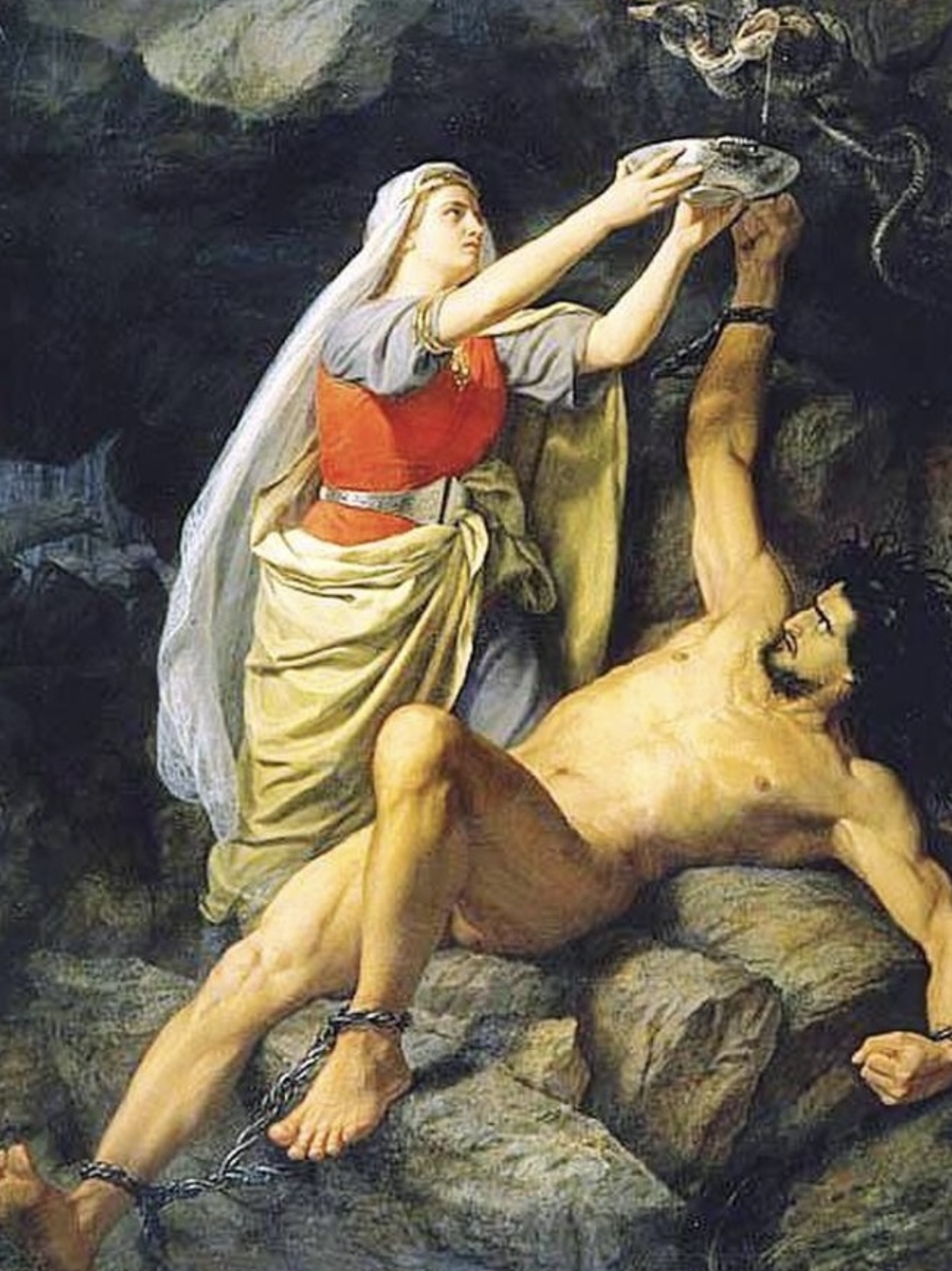
Loki bound: this image tells the story about Loki being imprisoned. Loki was part of the plot to kill Baldur so the gods decided they needed to capture him. Loki ran far away but was eventually found and captured by Odin. He is then chained to the rocks and has a venomous snake placed above his head. His wife Skadi holds a bowl over his head to catch the venom but when the bowl gets full she needs to go pour it away. This is when the venom falls on Loki causing his to shake violently. He remains here until Ragnarok. I’m going for a layered composition with 3 key parts. In the background is a vast desert. The middle has Loki tied to some rocks with the snake wrapped around a tree, hovering over his face. In the foreground is Skadi pouring away the bowl of venom, surrounded by skulls. I want Skadi to be in the front and centre as she is key to the myths as a symbol of loyalty and unconditional love. I want the palette to be very warm, with lots of intense yellows and oranges. The feel I want t.o achieve is uncomfortable heat, to show the drama of the situation. I want the image to have a long, thin size to mirror the Thor fishing Jörmungandr image. Also I want the viewer to see Skadi at the bottom first then their eyes to move up and notice Loki’s situation with the snake.

I will be taking lots of inspiration from traditional paintings of the myths, for example the one below. The changes I will make are to make the snake bigger and more intimidating and show Skadi pouring away the venom, not collecting it from over Loki’s face. This way there is more drama in the illustration as any second now the venom will hit Loki. Another thing I want to change is the colour palette, making is far more warm and intense as I feel the colours below don’t translate the severity of the situation.

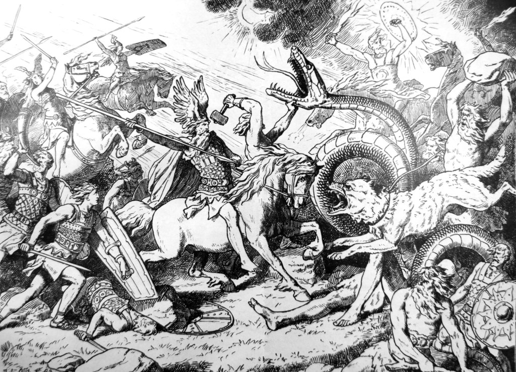
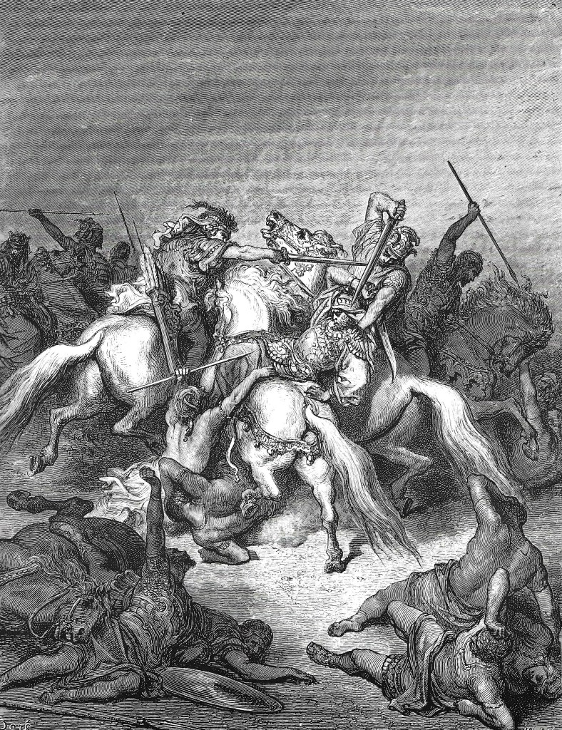
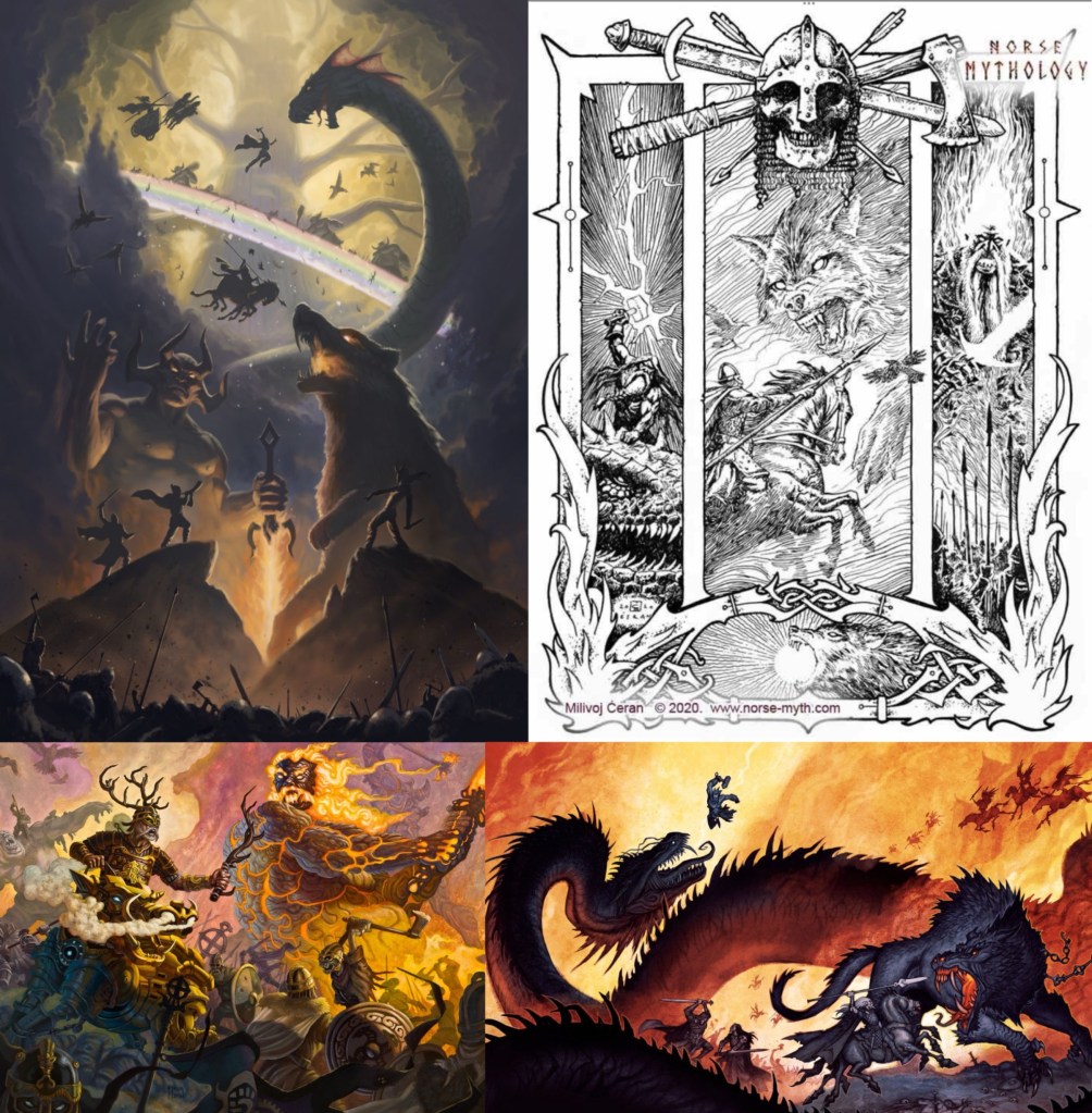
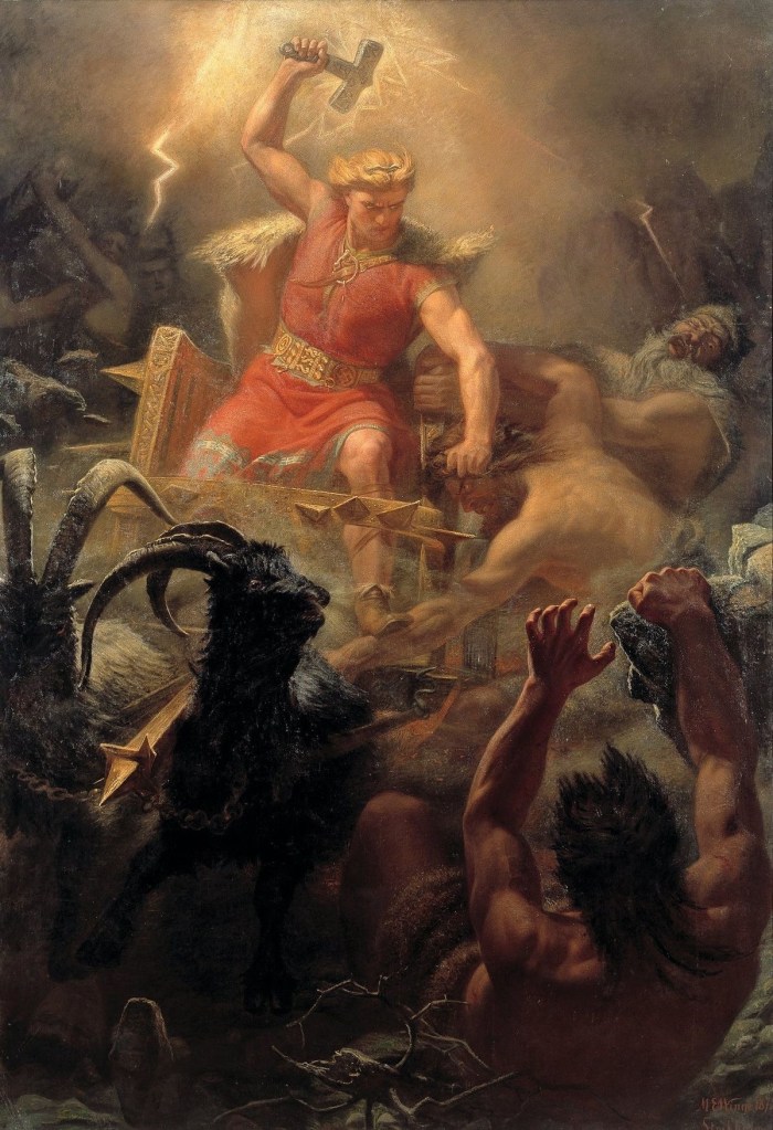
Ragnarok: this image tells prophecy of Ragnarok, meaning ‘doom of the gods’ in Old Norse. In the final battle the gods meet the giants, including Fenrir (left), Surtr (middle) and Jörmungandr (right). Norse mythology is a set of chronological tales, with Ragnarok making the end. On the left of the image is Fenrir who broke out of the shackles he was in on the other image. I have included details such as the broken chains and fire eyes. Fenrir battles Odin during Ragnarok so there is a silhouette of Odin holding his spear, behind Fenrir is the bifrost which is broken during Ragnarok. Fenrir is said to devour the sun so I have positioned him so he’s climbing up the rocks, ready to stretch out into the sky. In the middle is Surtr who leads the fire giants into battle. He wields a fiery sword which he uses to split the world. As a way of suggesting this I have a gap between the rocks that are in the foreground. Surtr will be the main light source of the image. On the right is Jörmungandr who has risen from the sea and spreads his venom over the land. Jörmungandr is said to grow and wrap around the world, I made him larger than the previous illustration so suggest this growth. Around the creatures there are lots of silhouettes of gods/goddesses. Some are random but others are specific characters including Thor, Loki, Odin, Heimdall and Valkyries. The colour palette I want is a combination between extreme warm tones and darker tones. The light and warmth comes from Surtr which reflects onto the surroundings and other characters. The image shape is long and thin, inspired by traditional battle paintings/ murals. Also I want to to be similar as the image of the creation story to act make the series feel cyclical and connected.

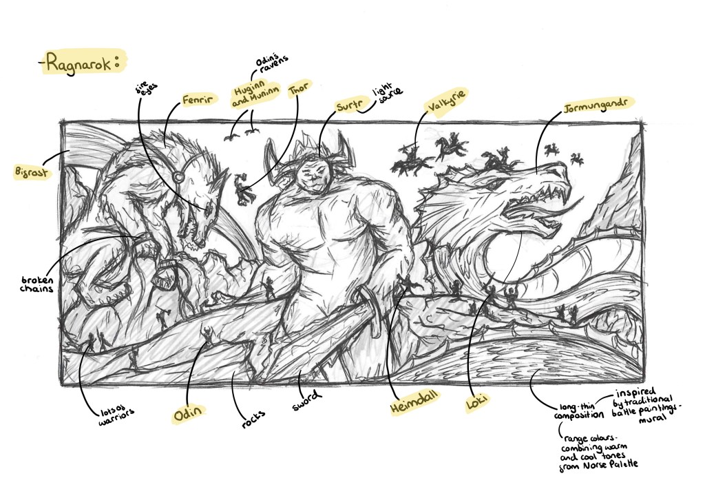
I was inspired by this style of image, depicting the battle field during Ragnarok. Some key elements I want to change are the scale and colour. I will make the creatures much bigger and more threatening. I want the focus of the illustration to be the creature, not the gods so I will make the gods smaller and just simple silhouettes. Also I want a full colour illustration to help show the intensity and drama of the battle.

Categories
Contextualised Practice Contextualised Practice: Project Level 5

Contextualised Practice: Project mediums

After extensive visual research I decided of what style and mediums I wanted to create my illustrations in. I want all the illustrations to have a consistent visual style, making them look like a coherent series. Through my research I found lots of reference images and want to keep my images authentic to the source material in regard to the character descriptions and colour palette. The style I have chosen is a mixed media, combining pen and printing. The combination of bright, bold colours with more intricate and fine details will help my work to appeal to younger and older audiences.

Printing: I want to experiment with printing for these illustrations. I plan to combine printed elements with pen sketching. The decision I needed to make was which type of printing to use. It would have been nice to be able to do hands on experiments with a range of printing styles but due to time constraints I needed to choose one. I want the illustrations to be printed on paper to achieve a more texture look. The 3 types of printing available at the University are Lino, screen and Riso. Below I made some notes about the basics of each type of printing:

My previous work: these are some examples of my previous work that I’ve done using different printing techniques. Left- screen printing of fabric. Middle- screen printing on paper. Right- Lino printing.

Lino Printing: these are some examples of Lino printing I collected when researching the style. This is the printing style I’m most familiar with having used it a fair amount before. I like the hands on nature and the imperfect dynamic mark making you can achieve when carving the Lino. Also it’s a good style for layering large areas of colour.

Screen Printing: these are some examples of screen printing on paper that I collected when researching the style. I have only done screen printing on paper once but have done screen printing on fabric a few times so I’m familiar with the process. This is a less hands on process but can achieve striking, overlapping layers of colour. Also you can create more detailed images easier with screen printing.

Riso Printing: these are some examples of riso printing I collected when researching the style. Riso printing is completely new to me, I have used it before so all my knowledge of it comes from research. Essentially Riso is an automated screen printing process that uses colours and stencils to create vibrant prints. In my research above I made some notes about the technical process. This is the printing style I have decided to go with. I want to use this module to explore a new technique so it is the ideal time to try Riso. Also it’s a quicker and more cost effective process than screen printing so I can produce more prints.

Pen: I wanted to combine the printing with pen, specifically a biro or fine liner. The pen will be used to add details and shading to the characters/ scenes. I’m not exactly sure at this point how I’ll combine the two mediums. Working with pen is something I’ve done a lot before and it’s one of my favourite mediums to work with. Below are some notes on my ideas for what styles of mark making I will incorporate into my project work:

Here are a range of possible mark making styles I could use in my illustrations. The ones highlighted in green are ones I’d like to use. I plan to combine different techniques in order to make the shading more interesting and varied.

These are some examples of my previous pen work showing a range of different shading techniques including linear hatching, cross hatching, contour, cross contour and stippling:

These are a range of artworks, primarily based around Norse mythology, which uses these styles of shading and line work that I can take inspiration from:

Project development:

Here is my latest plan for the project:

Some notes on making a creative portfolio that I can use and take into my own portfolio that I’ll be making at the end of this project. Some of the key points where using 2-3 fonts and colours, varying text size, weight and colour for emphasis and maintaining a visual hierarchy.

Here is my latest plan for the essay:

Categories
Contextualised Practice Contextualised Practice: Project Level 5

Contextualised Practice: Library Visit/ Research Workshop

In this session we did a little bit on our essays, looking at the structure and formalities of an academic essay that we needed to follow. I took some notes of this which can be seen below. The main part was a research workshop where we visited the University library to find inspiration for our essays.

I was initially looking for books about Norse mythology but soon discovered that there were very few books about this topic in the library. There are a lot of sources about it on the online library so I looked there and made a list of possible reference for me to look at. I then chose to expand what I was looking for and try to find visual reference material rather than factual material about Norse Mythology. I started researching books that had highly detailed hatching illustrations as this is a style I’m thinking about incorporating into my project. I was able to find a couple books with this style called ‘French Rococo’ by Owen E. Holloway and ‘Doré Gallery- Academy editions’ by Denoël.

French Rococo Book Illustration – Owen E. Holloway

Doré Gallery – Denoël

This session was beneficial in getting more ideas for this visual style of my Norse Mythology project. Initially the library search was frustrating as I was just looking for sources on Norse mythology and couldn’t find any but when I broadened my search to find inspiration for the visual style it was more successful. By the end of the session I found lots of references on Norse mythology through the universities online library and a couple of books with detailed hatching illustrations that I’ll take inspiration from for my project.

Categories
Contextualised Practice Contextualised Practice: Project Level 5

Contextualised Practice: Project Ideas/Research

Developing project ideas: the idea I’m working on for my project is to illustrate a series of myths, creating 1 illustration for each. I want that illustration to act as a ‘cover’ for the story. Not in the sense of a book cover but more as a single image that tells the story showing the gods, creatures and story. These images could then be applied to many contexts. The series will have a consistent visual style. I am aiming for my work to be versatile in regard to format and audience. Below I made a list of some of the most important Norse myths and marked ones of initial interest to me:

Colours in Norse Mythology: a topic that interests me is the colours used by the Vikings. I researched this as I’d like to achieve an authentic colour palette in my illustrations. The Vikings were more colourful than people may think, with colour being a symbol of status/wealth. Bold and bright colours were more expensive and often needed to be imported. Below is a list of colour symbolism for the Vikings, these are ideas I could bring into my illustrations. I found a colour palette that was created based of chemical and archaeological analysis of Viking artefacts. The palette has 17 colours.

Norse colour palette: The palette has a nice range of earthen tones and string warm colours. Using just this palette you could create eye catching and authentic illustrations.

I added this palette to Procreate and Photoshop, the 2 main drawing softwares that I use.

This is a list of colours associated with different Norse gods and goddesses. I plan to use these ideas and the general Norse colour symbolism in my project.

Symbols in Norse Mythology: symbols are important in Norse mythology, often being used in Norse artworks. Symbols were used by Vikings to represent gods, beliefs, creatures, myths and objects. Including some subtle symbol in my work could be an interesting element. Below is a list of 10 important symbols in Norse mythology, a brief description of what it represents and an image of each:

Myths: from the list is key myths I made I chose 6 to research in depth. These are the creation of the cosmos, creation of Thor’s hammer, binding of Fenrir, Thor fishing Jörmungandr, Loki bound and Ragnarok. I chose this set as they evenly cover the timeline of Norse mythology, an interesting range of gods, goddesses, creatures, objects and environments. I researched each one in detail, making notes on the story, characters, themes and some examples of artwork depicting each one. For this research I look at the original sources such as the Prose and Poetic Edda and summaries on various websites.

Creation of the cosmos:

Creation of Thor’s hammer:

Binding of Fenrir:

Thor fishing for Jörmungandr:

Loki bound:

Ragnarok:

Additional visual research: as well as researching images depicting specific myths, I gathering lots of general resources of Norse mythology artwork.

Johan Egerkrans: I will be taking lots of inspiration from Egerkrans’s work. There are many elements I admire including the colour palette, compositions, stylisation of characters and ability to create a narrative within a single image.

Milivoj Ceran: Ceran has a more simple style in regard to colour, replacing bold colour palettes for finely detailed hatching. This is a technique I’d like to incorporate into my work. I really like how he frames his images and creates dynamic compositions that tell a story.

Book covers: Although I’m not producing a series of book covers, they are a good source of reference as their purpose is to summarise the story into a single image. In particular, the covers of Joanne M. Harris’s book really stood out to me. I really like the dark colour palettes that allow the small bits of bright colours to be very striking. Also I like the incorporation of fine patterns it’s the images and the traditional style borders. Below are some examples of these and some other Norse mythology covers that I like:

The next steps for this project will be to decide on the mediums I want to use and begin sketching some ideas for each illustration.

Categories
Contextualised Practice Level 5

Contextualised Practice: Off-Site Visit- The British Library

We visited the British library as a chance for us to engage with, critically respond to and document wider contexts of visual research. I went to the Malorie Blackman and Mervyn Peake exhibitions, 2 people who I didn’t previously know of. Below are some notes about the different choices of galleries we could visit:

The fantastical world of Mervyn Peake: Islands and Seas

This was a free display showcase of Peake’s archive with images all centred around the themes of the seas and islands with a fantasy twist.

These are a series of photos of Mervyn Peake’s work. They’re a combination of ones I took at the exhibition and ones I collected after when doing additional research:

Gormenghast: Peake’s most famous work- a fantasy series about the inhabitants of a castle

The Swiss Family Robinson:

The waves:

Captain Slaughterboard:

Treasure Island:

Notes I made after the visit about the different collections that where at the exhibition:

Reflection: I really enjoyed learning about another illustrator and getting to see some work from his archive. I like his illustrative style and the fine quality of the line work and shading. This is a style I would like to experiment with and bring into my own project. His Treasure Island project is my favourite of his work as he uses lots of intricate hatching to build up the details and depth. Also Peake said that he would often illustrate a text as someone was reading it to him. This is a similar approach to what we did in one of the workshops and could be an interesting way of trying to illustrate the Norse myths.

Malorie Blackman: The Power of Stories: this was an exhibition all about the life and work of Malorie Blackman who is a British writer who was Children’s Laureate from 2013 to 2015. She primarily writes literature and television dramas for children and young adults. A common theme in her work is using sci fi to explore social and ethical issues. For example ‘Noughts and Crosses’ is a fictional adaptation of Britain that she uses to explore the theme of racism.

Here are some notes I took while at the exhibition:

This is a list of some of her most well known books and television dramas:

These are some of the photos I took from the exhibition:

After visiting the exhibition I researched some of her publications and found she regularly works with the Dapo Adeola, a British-Nigerian illustrator who has a really fun and cute style. His work often explores space to tackle issues such as race and gender stereotypes. I like the stylised characters and think they work well alongside his strong use of colour.

This is a screenshot from the music video to Stormzy’s song ‘Superheroes’ where he references Malorie Blackman and her book ‘Noughts and Crosses’. Stormzy had said that this was his favourite book and that Malorie is a huge inspiration for him.

Fantasy Realms of Imagination: this was another exhibition at the British Library. I wasn’t able to visit it on the day as the tickets where all sold out but I have booked tickets to go at a later date as I feel like the topic and style could provide good inspiration for my Norse Mythology project.

This visit to the British library was very interesting and I got to learn about an illustrator and author that I didn’t know about before. The exhibition about Malorie Blackman was really inspiring and uplifting as there was a lot about perseverance and tackling social issues. I really enjoyed looking at the display of Peake’s work as I like his illustration style and would like to incorporate that type of hatching and mark making into my Norse Mythology project.

Categories
Contextualised Practice Level 5

Contextualised Practice: ‘The Whiteness of the Whale’ and drawing workshop

In this session we looked at a chapter from Herman Melville’s book ‘Moby Dick’ titled ‘The Whiteness of the Whale’. In preparation for this workshop I researched the text to get a sense of its themes and ideas. Also I wrote down some key quotes, all of this research can be seen below:

I did some visual research of the text to see what illustrations have been made previously to get inspiration for my own work. Here is a selection of images I collected:

This page explains the workshop activity:

Here are some notes I made about themes and ideas that I noticed during our class readings of the extract, including jewels, innocence and nature:

After reading the text and making notes about the themes and ideas we went around the campus and collected visual media that we felt linked to the text. One obvious theme to keep in mind was the colour white so the majority of the things I collected were white. I wanted to at least have most of the images in greyscale as I thought colour would distract from the themes and not really represent the text. I also explored other themes such as people, nature and jewels. When collecting the visual media I had these themes in mind but I also just collected things that I thought were interesting whether that be in shape/form, texture or pattern.

After the session I created 2 collages using the images that I collected. I enjoy creating digital collages and found it a good exercise to really think about what I had collected and how I could combine them into compositions. I wanted to have the themes and ideas of the text present but not be an obvious depiction/ illustration of it. Working more abstractly is not something I do often so I wanted to explore that as it’s something I felt I could improve on from the last workshop. I think the full greyscale compositions are interesting as the details hide themselves so when you look at it your eyes aren’t immediately draw in by colour so you have to take a closer look to see all the different elements.

Overall I enjoyed this session looking at an extract from ‘Moby Dick’ and collecting related visual media. Physically going out and collecting things to take photos and scans of isn’t something I usually do but I found it to be an interesting way of working. It made me view the text in a more thematic way rather than looking for the exact things described. Then combining them into a collage gave me a way of reconnecting all my ideas and thoughts together to create something that conceptually represents the text. This way of collecting related visual media and combining them could be a useful way of working for me in the future.

Categories
Contextualised Practice Level 5

Contextualised Practice: Tanizaki’s ‘In Praise of Shadows’ and Drawing Workshop

In this session we had a free drawing workshop in response to an extract from Tanizaki’s text ‘In Praise of Shadows’. In preparation for this session I read through the extract and did some research about it to get some contextual knowledge of the piece. Below is all my research and notes on the author, themes and some quotes:

Here are some details of the Free drawing activity that we did in response to the text, including the purpose, process and tips:

Below are some of my outcomes from the free drawing activity. I explored a few different styles and mediums such as mark making with charcoal, single line pen drawings and oil pastel illustrations.

With the charcoal I was able to create expressive marks that really show the theme of shadows. I really like the piece of the left where I used the charcoal to create the effect of light beaming through a window but with shadows. This has an interesting juxtaposition between light and dark which is a central theme in the text. In the images on the right I combined pen and charcoal. The different mediums contrast each other nicely with the more controlled nature of the pen marks against the rough textured marks made by the charcoal.

These are a series of single line pen illustrations of different things mentioned in the text including a flower, scroll and house. This is a style I’ve worked with before and am quite comfortable with. It’s a go to technique for me when I need to work quickly.

These illustrations are an exploration of combining oil pastel and pen. I’ve worked a lot with both mediums but never tried to combine them so it was an interesting experiment for me. I really liked the strong pops of colour over loose, sketchy style pen illustrations. This is an aesthetic I’d like to work with more in the future.

Overall I enjoyed this free drawing session, it pushed me out my comfort zone as I’m not used to working fast in response to reading or listening to a text. It is something I’m looking to improve and this session helped me feel more comfortable with it so I will explore it more in the future. In regard to the outcomes, I like them as I experimented with different combination of mediums but I was still too literal for most on my images. A lot of them are depictions of objects mentioned in text. While this is a good skill for an illustrator I’d like to try and work more abstractly, looking at the themes and concepts in the text rather than literal depictions of what is being described.

Categories
Contextualised Practice Contextualised Practice: Project Level 5

Contextualised Practice: Topic Research- Norse Mythology

For this Module we will need to create an Illustration Project and an essay. We get to choose our own topic but the 2 outcomes need to be linked. The topic I’ve chosen is Norse Mythology as it’s something I’m interested in but don’t know too much so it will be interesting to research and learn. Before starting the research I had a very basic understanding of the topic, most of which came from modern pop culture adaptations such as Marvels interpretation of Thor and other characters. This is where I was first introduced to the topic and what sparked my interest. With this research I wanted to find out more about this topic and specifically its history. The comparison of the traditional descriptions/ depictions to modern version could be an interesting avenue to explore.

Here are a range of artworks about the topic of Norse Mythology. They’re a starting point for my ideas about the Illustration Project. At this stage I haven’t looked into any specific artists, I just did a broad search on Google and Pinterest to collect visual media that interested me. I immediately noticed that there will be big range of style ranging from, fine black line work to highly detailed colour images. This gives me lots of ideas to take inspiration from.

This is the Runic alphabet which would have been used at the time of the creation of Norse Mythology. It’s interesting to know and could be used as another element in my illustrations.

In order to get a good foundational knowledge of the topic I did lots of research into the history, the different gods/goddesses, the 9 realms, the creatures and the creation story. Notes on this research is below:

Image I found on Pinterest explaining the family tree of the Norse gods:

The Norse interpretation of the structure of the universe:

I made a list of some of the key stories in Norse Mythology (below), from this list I’ll research some in detail. I started to look into ways that Norse Mythology has been used in pop culture, such as in Marvel movies/ comics and Neil Gaiman’s ‘American Gods’. Also I began to explore some specific artists who have created work surrounding the topic of Norse Mythology including William Gershom Collingwood, Martin Eskil Winge, Johan Egerkrans and Milivoj Ceran.

William Gershom Collingwood (1854-1932): an English author, artist, antiquary and professor of Fine Arts at the University of Reading. I was drawn to his illustrations because of the traditional shading style and detail in the mark making that he uses to create shape and tone.

Marten Eskil Winge (1825–1896): was a Swedish artist and professor at the Royal Swedish Academy of Arts. Winge’s paintings are beautifully detailed with really striking use of colour. I really like the energy and drama he is able to create in his dynamic and chaotic compositions.

Johan Egerkrans (born 1978): a Swedish illustrator and author, mainly of Fantasy, folklore and Palaeontology, working as a children’s book illustrator since 2005. He has a modern, digital illustrative style with stylised characters. My favourite part of his work is the strong use of limited colour palettes used to create a mood and atmosphere.

Milivoj Ceran: a Croatian illustrator working in traditional media. He is well known for his Magic the Gathering art and other fantasy based work. He has 2 distinct styles, colour and black and white shading, both are intricately detailed. I like his compositional style and way of incorporating traditional Norse symbols and patterns into his illustrations.

Here are some initial ideas I had for the illustration project and essay after some initial research about Norse Mythology:

Categories
Contextualised Practice Level 5

Contextualised Practice: Introduction

In this session we were introduced to the Contextualised Practice Module. Below are the notes I made about the Module aims, the briefs, assessment criteria and deadlines.