Categories
Contextualised Practice Contextualised Practice: Project Level 5

Contextualised Practice: Experimenting with styles

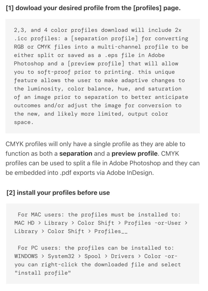
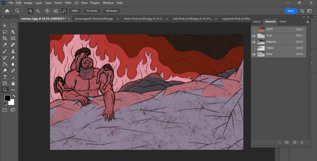
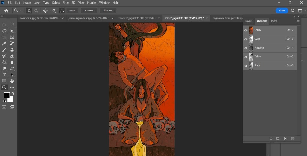
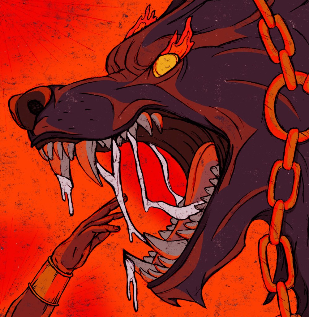
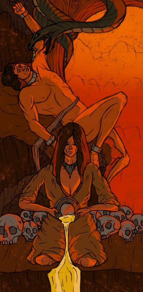
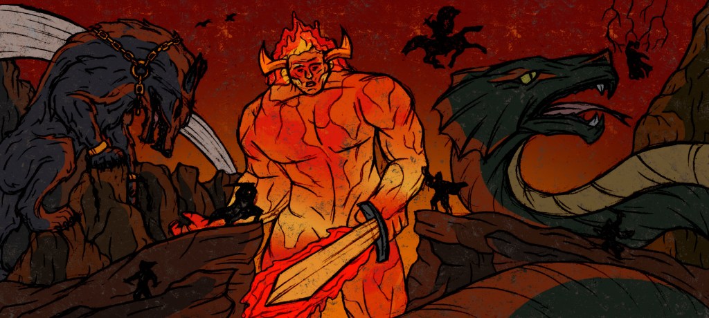
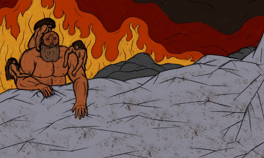
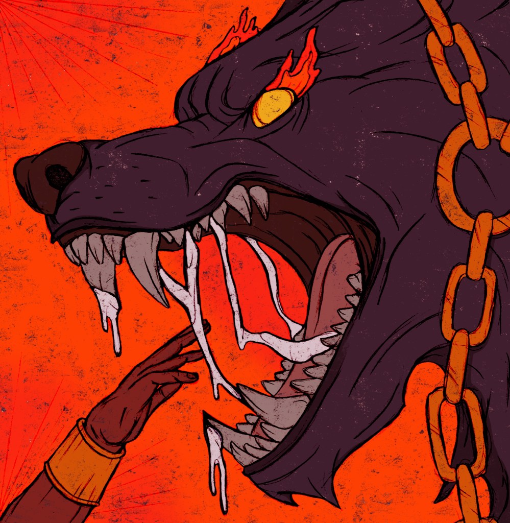
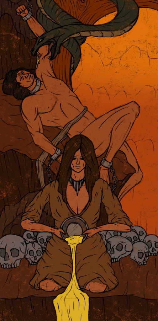
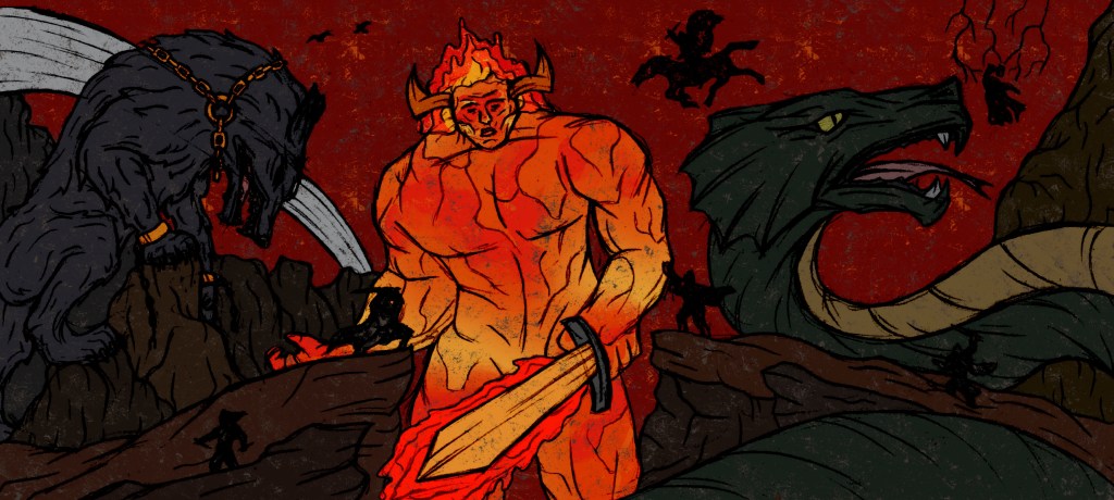
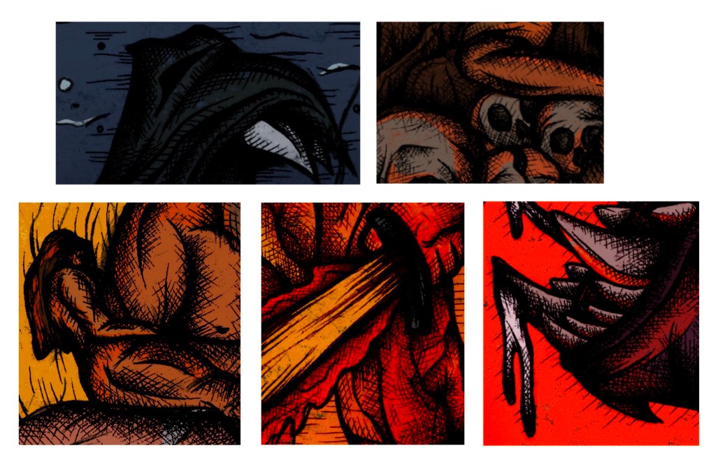
I have my finalised colour illustrations and I wanted to do some experiments to see how they would look with different filters and variations. This helped me get an idea of potentially what formats my work could take other than just printed images. It also helped me see how to expand my work to different audiences.

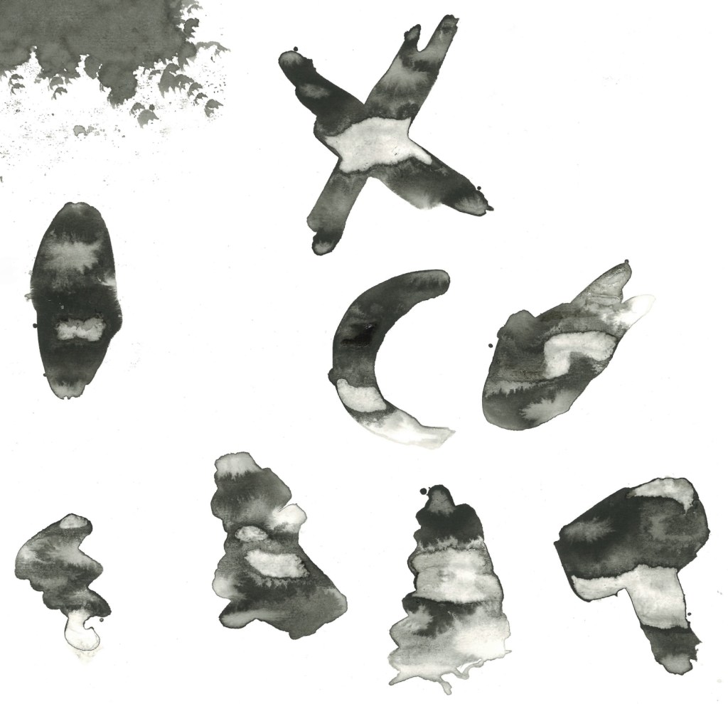
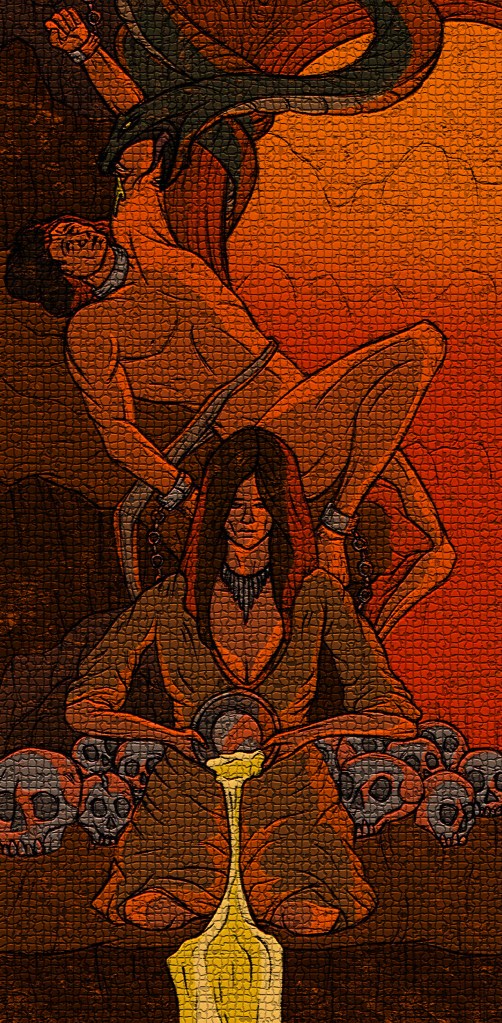
Hatching over colour: I took the hatching sections that I made and overlayed them onto my coloured illustrations to see how the 2 elements work together. I like the style but I prefer the style that the images already had as I feel this style of dense hatching and shading makes the illustrations too dark and block some of the colour. If I was to do a whole image with this combination, I would make the hatching less dense to allow the colour palette shine.

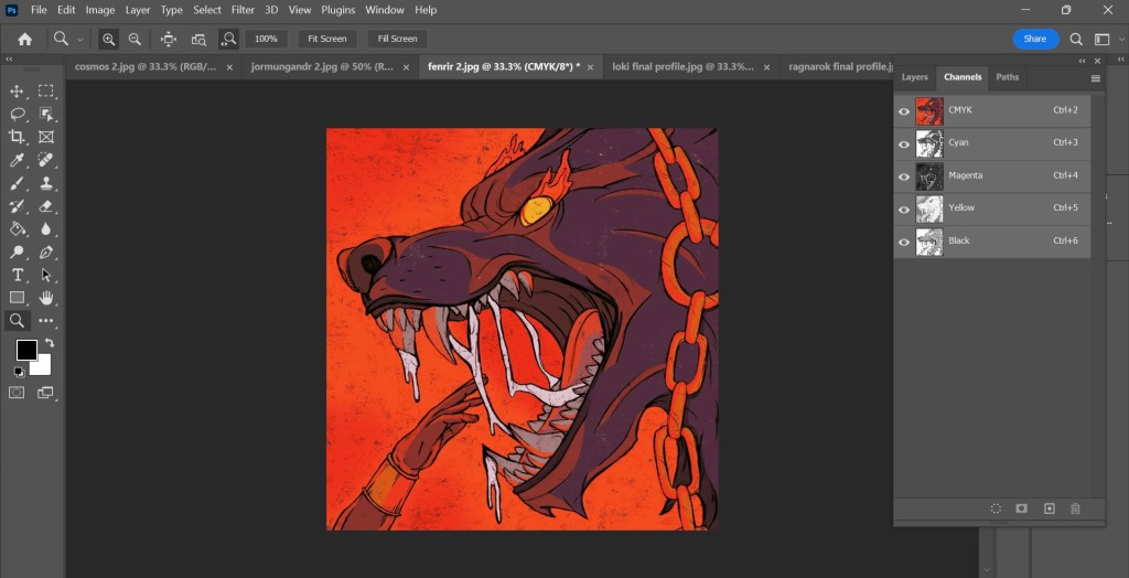
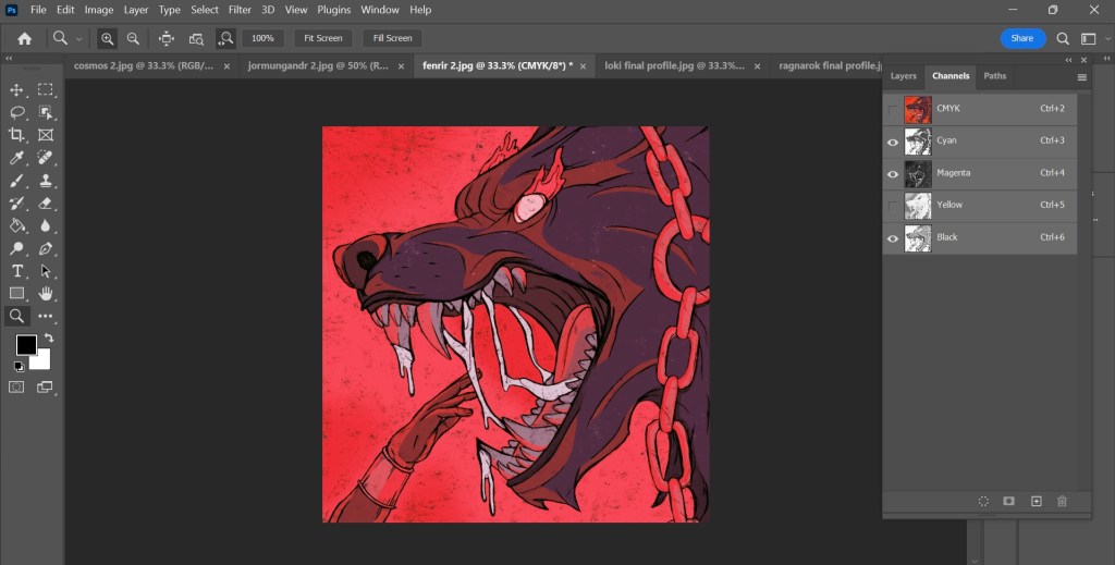
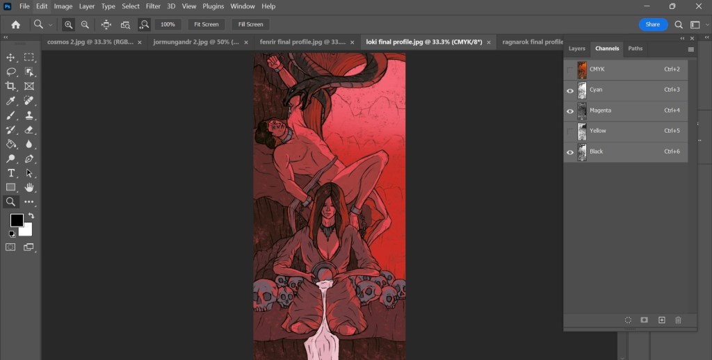
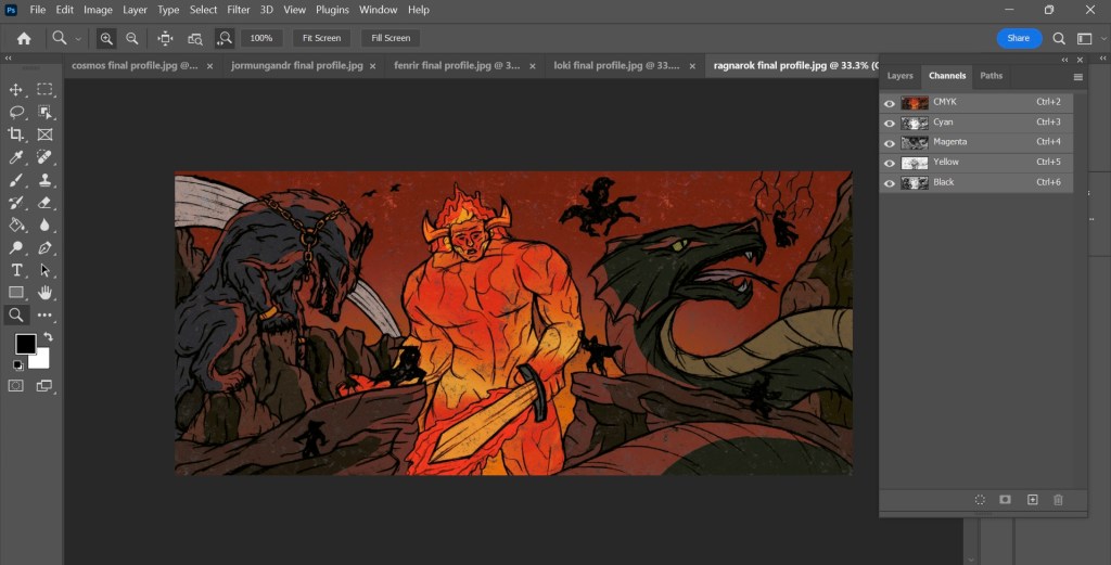
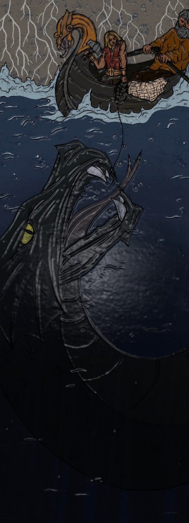
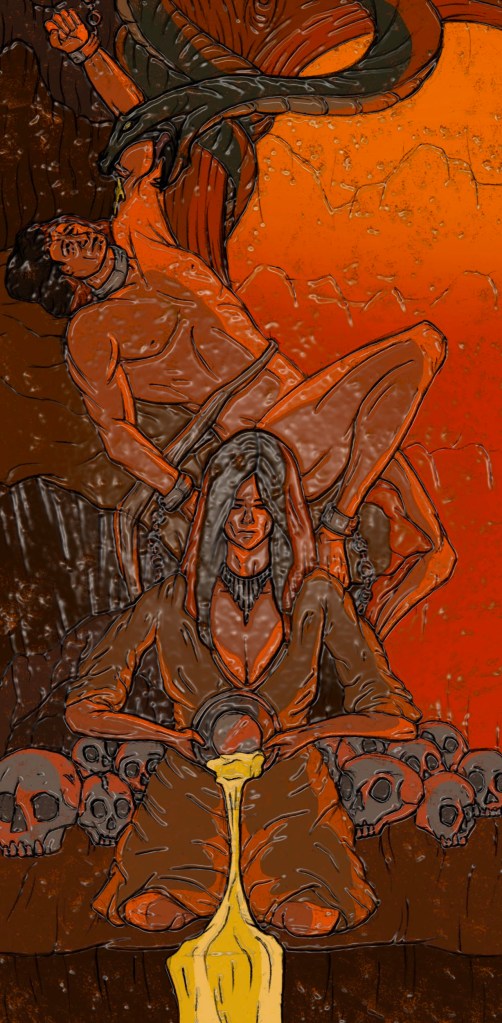
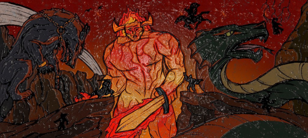
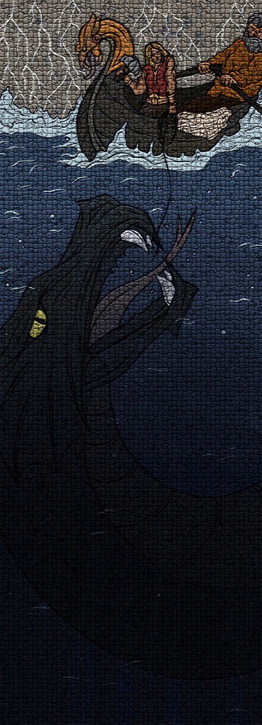
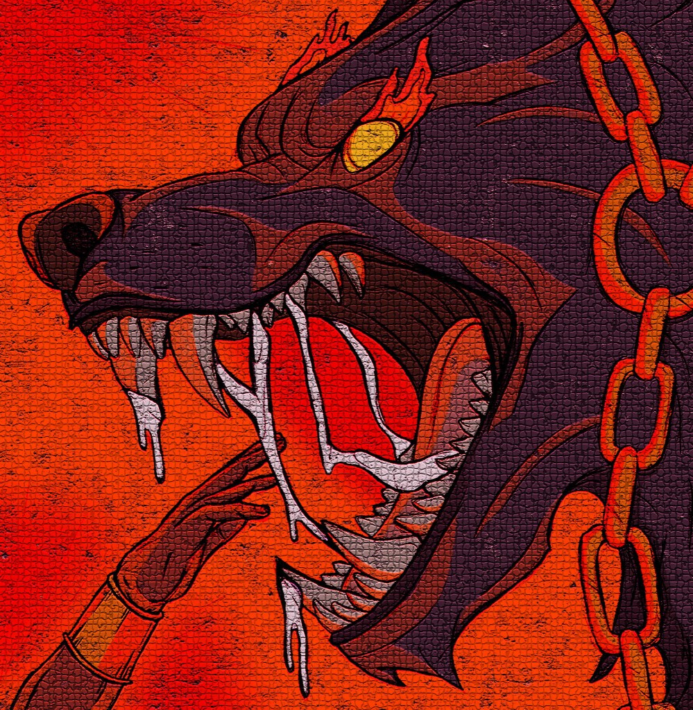
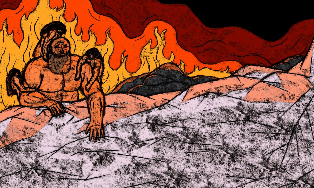
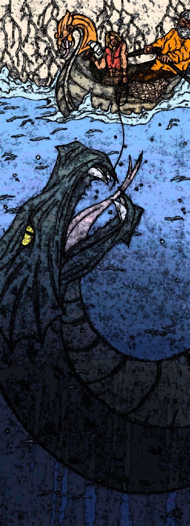
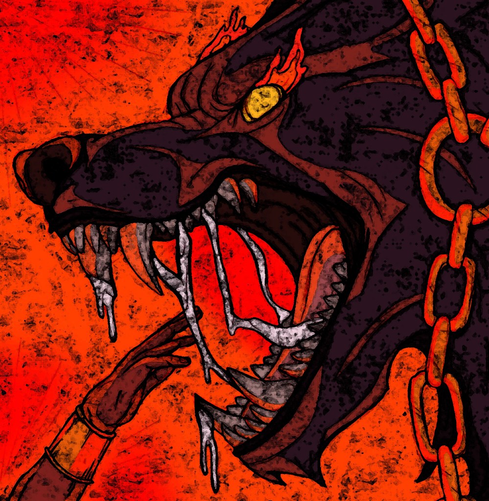
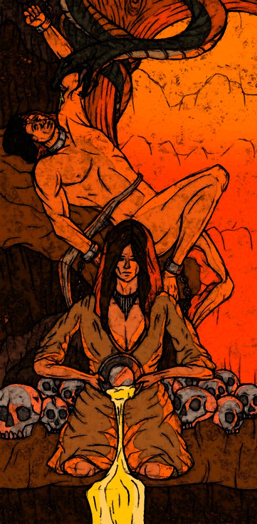
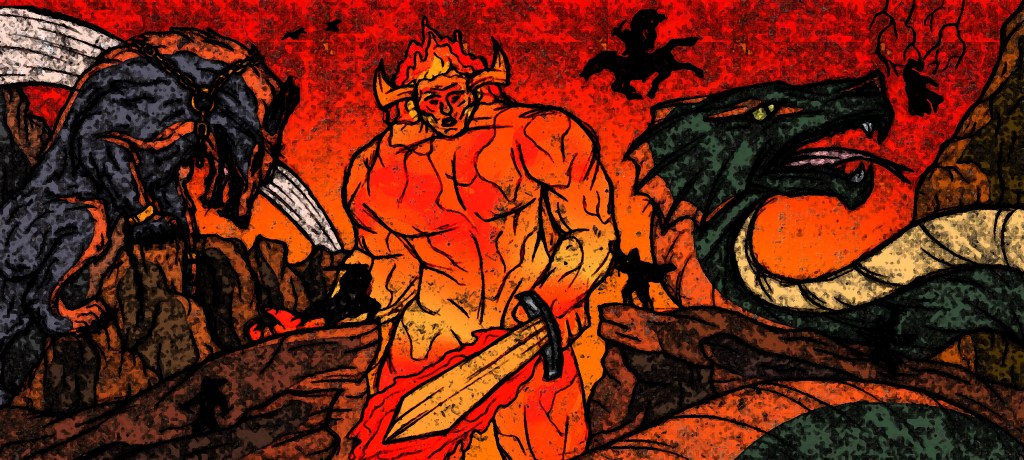
Photoshop filters/editing: all of the other experiments were done on Adobe Photoshop using the image filters. For each I did the whole set of illustrations as I think it’s key that they’re kept as a set. While they work as stand alone images I think they are made better when placed together and get a better sense of the whole story.

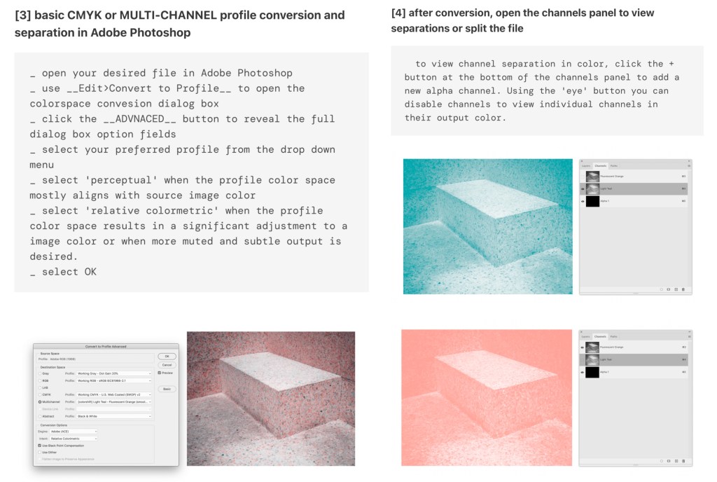
Plastic wrap filter: this filter is my favourite out of all the ones I tried. It makes the images look like glossy tiles. This is an outcome I had never considered but I now think these illustrations could make a really nice set of decorative tiles.

Mosaic filter: continuing with the theme of tiles, I applied a mosaic filter to my series of illustrations. I think having these as mosaic pieces would be interesting as it’s an old technique which contrasts my modern style of illustrations. I can imagine these being big mural style mosaics which would an interesting way to experience them.

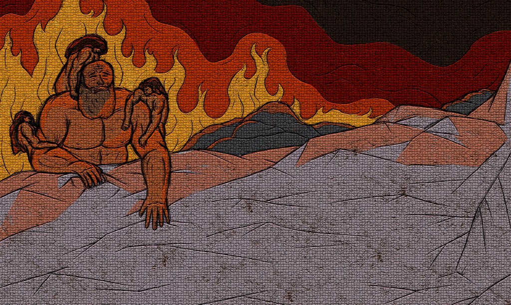
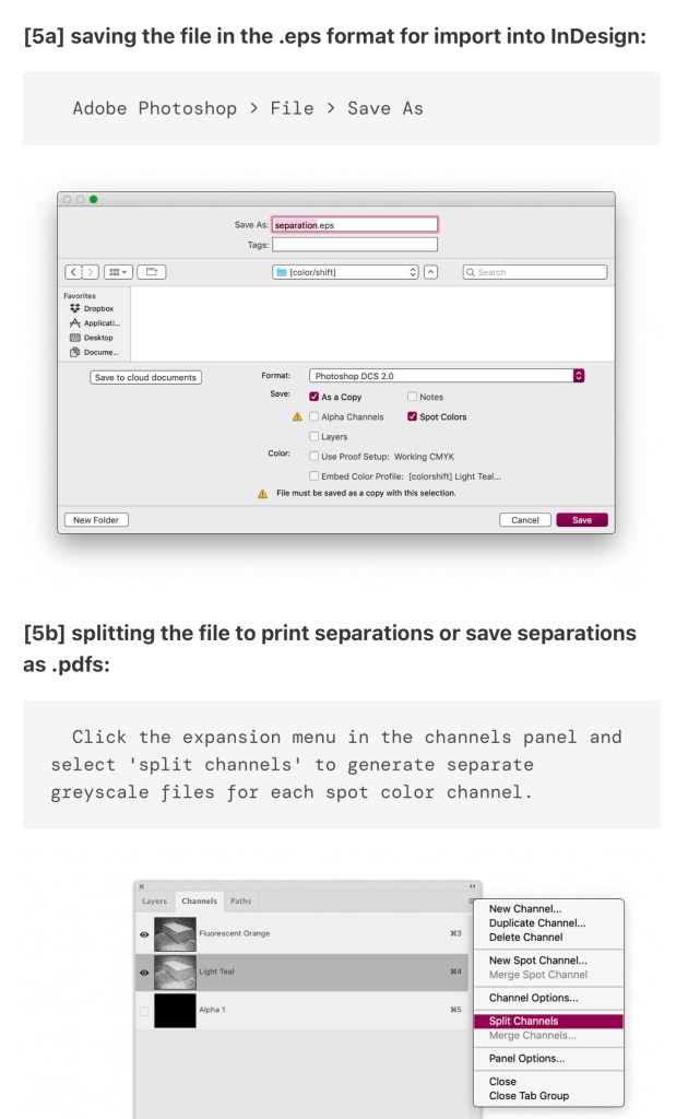
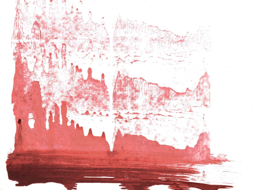
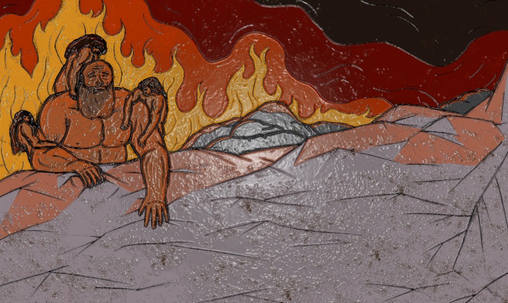
Fresco filter: to achieve these I used a combination of the Fesco filter on Photoshop and overlaying some of the textures I created in the creative workshop. This really lightened up the images and added more of a random texture. I like the aesthetic and think they could make interesting posters which could be scaled up or down. I wouldn’t replace the originals with them but I think they’re a fun variant.

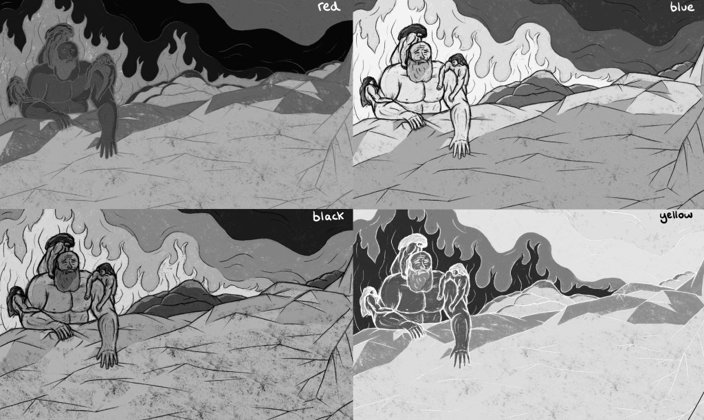
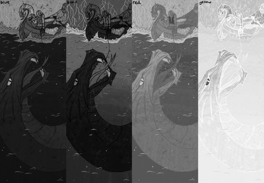
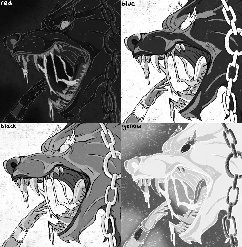
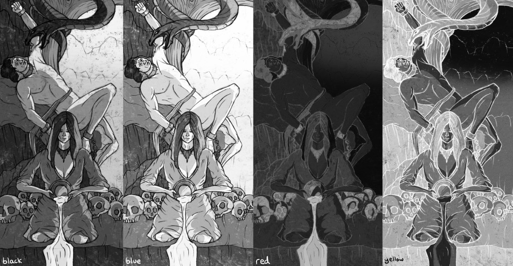
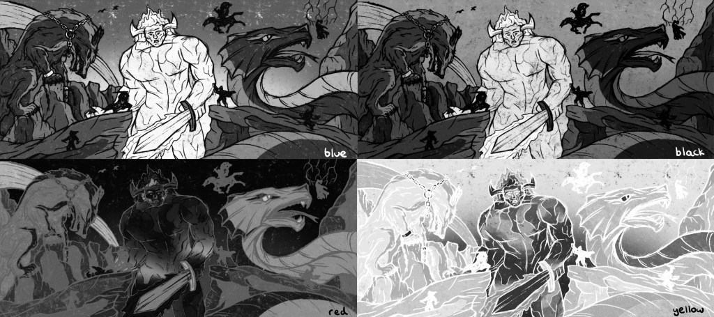
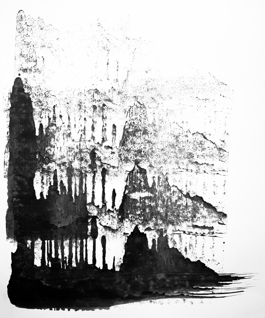
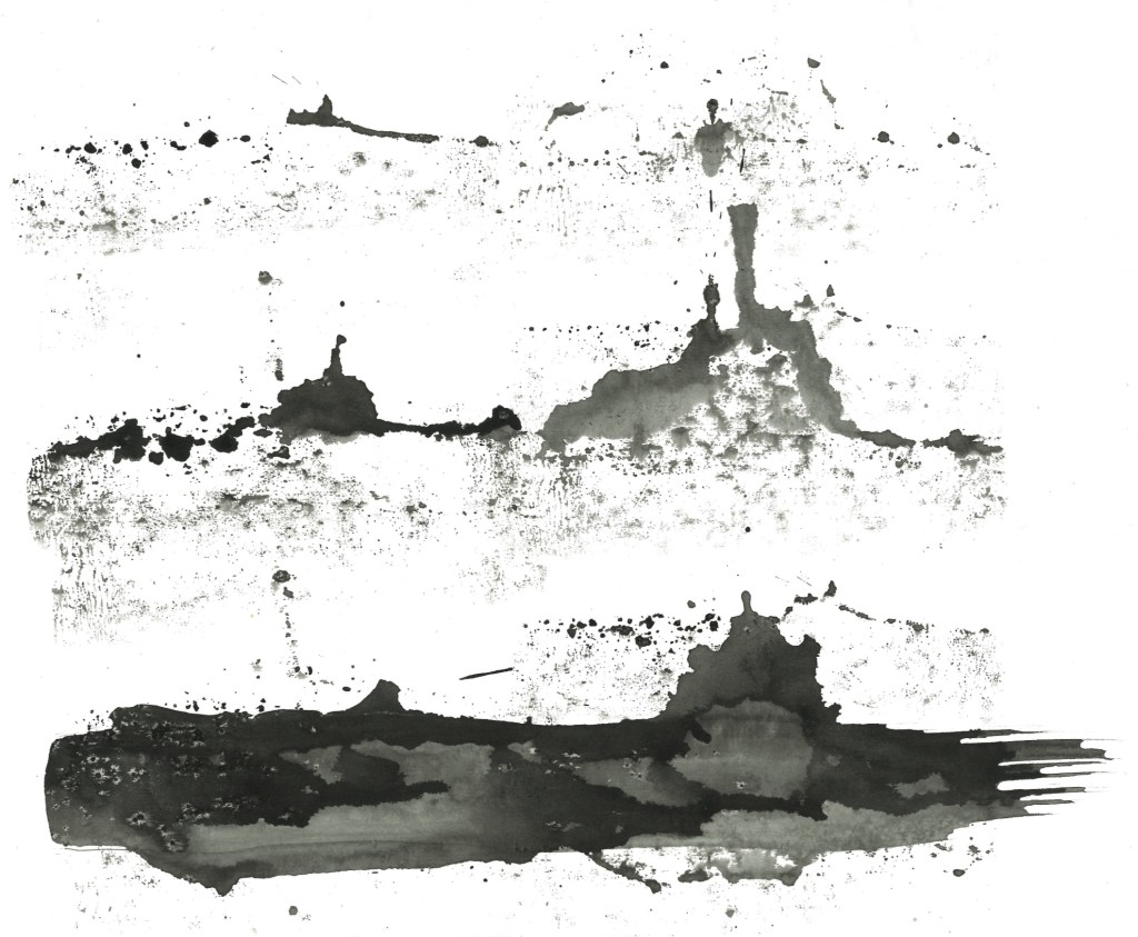
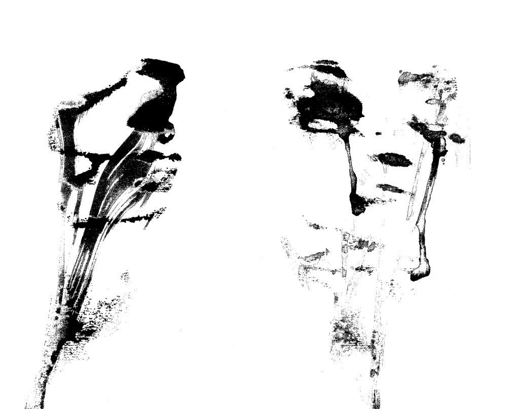
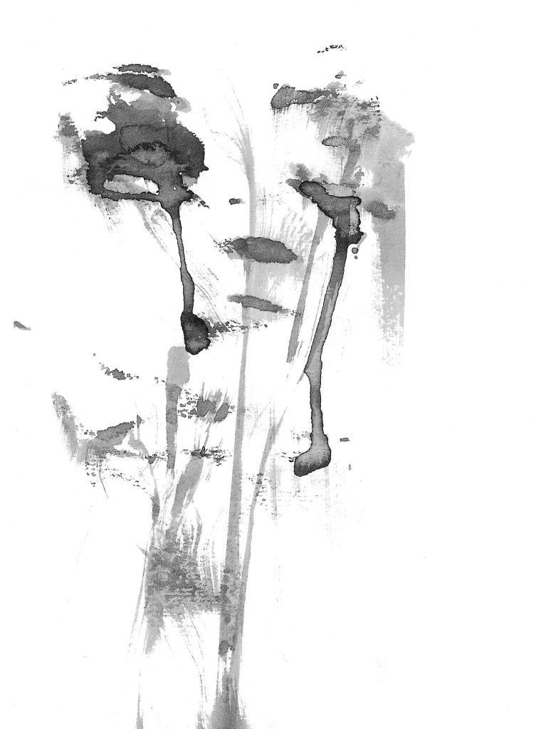
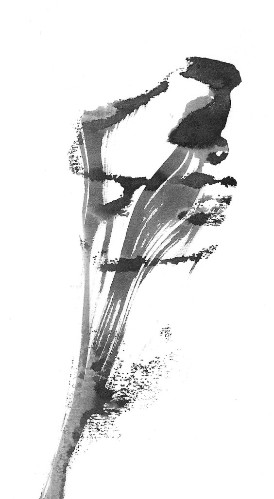
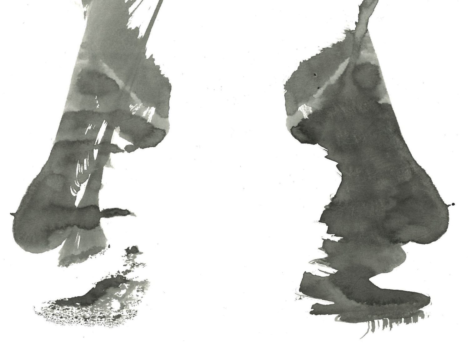
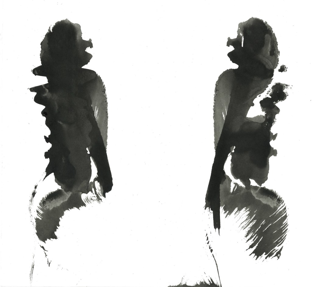
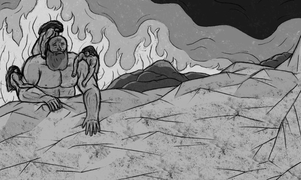
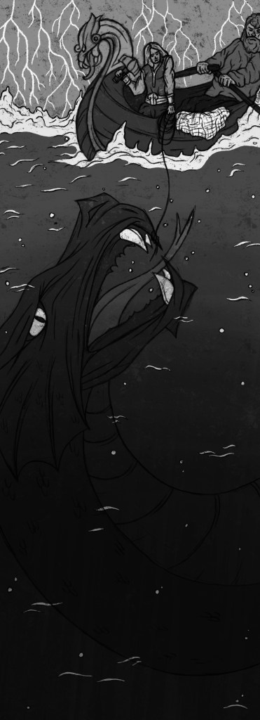
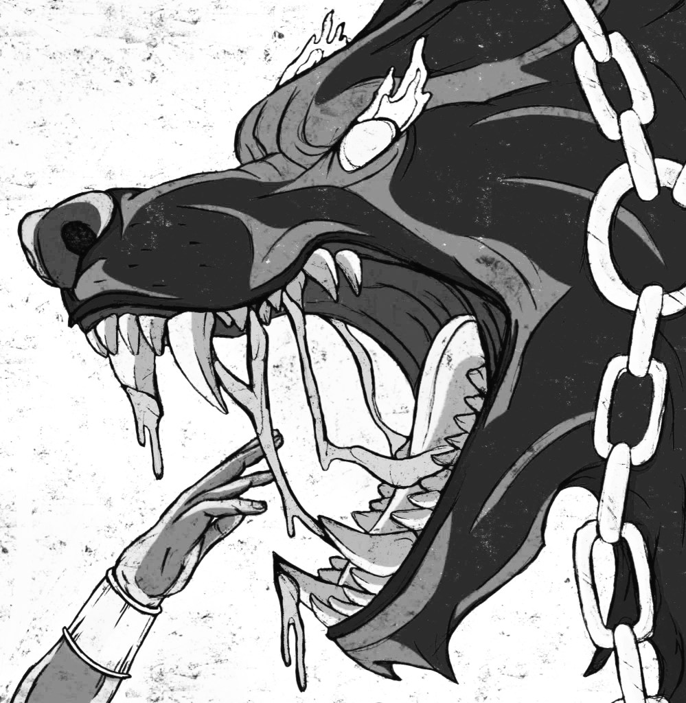
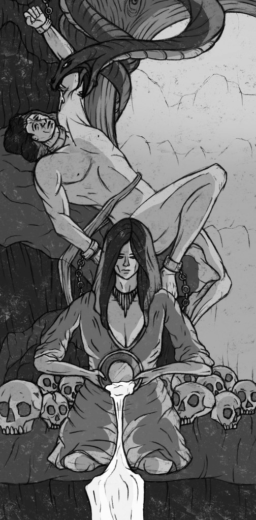
Black and white: these are greyscale versions of the colour images. It’s interesting to see how they look without colour as colour was such a key part of my development of the illustrations. I think seeing them like this shows the strength of the designs and compositions and the still tell the stories and are visually strong. However, the colour really elevates them so I wouldn’t use greyscale version of the images for any sort of outcome.

Creating these different experiments was a fun process and gave me some new ideas on what formats and styles my illustrations could take such as a tile or mosaic.

Categories
Contextualised Practice Contextualised Practice: Project Level 5

Contextualised Practice: Preparing for Riso Printing

Now that I have my finalised colour illustrations I need to prepare the files for in the correct way for Riso printing. One important thing I did throughout the process of colouring the my images was to put each bit of colour on a different layer. This made adjusting the colour easier and will make creating the colour profiles easier.

Color/shift: downloading colour profiles

During the induction I learnt about a couple of different websites that can be use to create colour profiles for Riso printing. The one I used was Color/shift. Using this website you can download specific colour profiles and then add them to an image and it will automatically sepertea the colours. Below is the link to their website and a list of instructions on how to download and use different colour profiles:

https://colorshift.theretherenow.com/how-to-use

Colours available at University for Riso Printing: when picking what colour profiles to use it was important to keep this colour chart in mind as I will only be able to achieve these colours:

Photoshop Colour Profiles: I downloaded the CMYK colour profile as it is very close to the blue, red, black and yellow that I can use for Riso printing. With this I was able to get an idea of how the prints will look and what potential colour combination I could use. Below are screenshots on the colour profile being applied to my illustrations. The top one for each is a combination of all the colours and the second has one colour removed.

Creation of the Cosmos:

Thor fishing Jormungandr:

Binding of Fenrir:

Loki bound:

Ragnarok:

Colour Seperations: after applying the colour profile to my images and experimenting with different combination I separated each layer. When you separate them they automatically become greyscale as this is the format they need to be in for Riso printing. I then saved each separate colour profile as a PDF. Below are the 4 colour separations for each illustration that I can use for printing:

Now that I’ve added the colour profile as saved each colour separation as a PDF I’m ready to begin printing.

Categories
Contextualised Practice Contextualised Practice: Project Level 5

Contextualised Practice: Finalising the colour

I had the base colours for each illustration and after I reflected on them it was time to make the necessary changes and improvements in order to finalise the colour.

Creation of the cosmos: the main change was adding reflections and glow from the fire onto the characters, rocks and ice. This change really ties the 3 parts of the composition together.

Thor fishing Jormungandr: I made Jörmungandr a less vibrant green and the bottom of the image darker to make Jörmungandr stand out less in the water and be more mysterious. This also makes the eyes and teeth more eye catching.

Binding Fenrir: adding in the warm highlights onto the characters really makes the image more dramatic and intense. It also made Fenrir look a lot more menacing and intimidating.

Loki bound: I made the whole composition warmer and added lots of highlights onto the characters and scenery. This now creates an uncomfortable warmth to show the suffering of the characters.

Ragnarok: Surtr now acts as the light source to the whole image. There is a glow from him reflected on all the creatures and scenery. The image now looks a lot more intense and shows the drama of the final battle.

Categories
Digital Arts 2 Digital Arts 2: Project Level 5

Digital Arts 2: Chess Stop Motion-Final video

Reflection: Overall I’m happy with the outcome of this project. It turned out better than I was expecting, I was able to achieve smoother and more cinematic stop motion sequences and with the help of João the editing and audio are much more detailed than I had planned. I think it fulfils the brief well, as its topic and style is centred around the theme of play. I chose the subject to be a game of chess which is an example of play that is enjoyed globally by adults and children. I was able to successfully combine digital and analogue approaches. I learnt lots of new digital softwares including Dragon Frame, Adobe Premier Pro, Adobe After Effects and Adobe Audition. I combined this with analogue media such as the paper cut out animations and stop motion. I think the combination of these approaches is fun, visually engaging and unique.

Categories
Digital Arts 2 Digital Arts 2: Project Level 5

Digital Arts 2: Adobe Audition

Adobe Audition is a software I have never used before and had absolutely no knowledge of so I was able to learn a lot from the session we had using it. Before we started creating the audio for the video we made a plan for what sound effects and audios we wanted at each part of the video. In the same way we did for planning the visual effects, we independently made a list of our ideas. Then we each shared our ideas and discussed them to create a joint list. The list below is our joint plan for the videos audio:

The hardest part was finding all the audios and sound effects we wanted. We got them from a range of places including YouTube, IMovie, BBC sound library and some of our own recordings. João was pretty confident with the software and I was able to pick it up pretty fast as it’s not overly complex to use. As a result of this we were able to create a more complex and advanced audio that we had planned. There’s lots of layers to the audio throughout with precise editing in terms of when the audios start and stop and how loud each layer is at what time. We were able to create the audio for the whole video in one session. Below is a photo from our Adobe Audition session:

The next post has the final video with the audio.

Categories
Contextualised Practice Contextualised Practice: Project Level 5

Contextualised Practice: Colour

Base Colours: I scanned my final sketches and edited them to make them look like they were drawn in pen rather than pencil. To colour my images I used Procreate. I have a large range of brushes I can use and created some of my own textured brushes from the images I made in the creative workshop. This post shows all my illustrations with base colours. Before starting I had a pretty good idea of the colour palette I wanted for each image. I took inspiration from the Norse mythology colour palette which consists of colours found of Norse artefacts.

Creation of the cosmos: this image is divided into 2 distinct sections with different palettes. The top sections is fire so has a very warm feeling and the bottom is ice with a much cooler palette. This contrast is key to telling the Norse creation story. This image needs the 2 parts to merge more so I will add reflections of the fire onto the characters and ice.

Thor fishing Jormungandr: I wanted this image to have a more earthy palette which is why I went for lots of greens, blues and browns. These colours work as a nice and cohesive palette. There are a couple points of contrast that really stand out, the eyes and teeth of Jörmungandr. I want to try emphasise these more to make them more eye catching for the viewer. Another alteration I want to make is to have the bottom of the image darker, to hide Jörmungandr more and make him seem like he’s rising from the depths of the ocean.

Binding of Fenrir: the contrast between the intense warmth of the orange and the cool tones of Fenrir are really striking. I’m really happy with the colours, the image just needs reflections of the warmth on the characters to much it feel like the heat it surrounding them rather than just behind them. I think this change will significantly improve the design and make it less flat.

Loki bound: the colour palette of this image had the smallest range, mostly just consisting of shades of brown and yellow. I wanted this image to feel almost uncomfortably hot to show the suffering of the characters. The current colours are too muted to really translate this idea. I’ll need to add in more orange and highlights will play a key parts in creating this sense of overwhelming heat.

Ragnarok: this image has the most diverse colour palette. The background a scenery is mostly deep red and a mixture of dark browns. The gods are simple black silhouettes. Each of the creatures has their own colours. I’m happy with this distribution of colour but my main issue with it currently is that it’s generally too dark. It needs more light and warmth radiating from the centre (Surtr) to lighten up the rest of the characters/surroundings.

The next step will be to add in lighting, highlights and shadows to make them all feel more dramatic and visually engaging. This will be a key part in getting across the narrative of the images as at the moment they feel pretty flat and a bit lifeless.

Categories
Digital Arts 2 Digital Arts 2: Project Level 5

Digital Arts 2: After Effects editing

Before this project I had more knowledge of After Effects than I did of Premiere, having had a workshop on it earlier in the semester. In the workshop and my own independent study I was able to create some simple animations and was happy with the progress. However, After Effects is a more complicated and extensive software so there is plenty of basics still to learn and hopefully I can learn some more specific and advanced skills.

Thanks to having João join the project we were able to achieve more advanced and technical editing than I could have achieved on my own. I think particularly during our After Effects sessions we had a really good working relationship as we where able to continually develop on each others ideas which really helped us advance the editing beyond our original plans. On here we did lots of work with the title, outro sequence, fire, smoke and movement lines. One particular tool that I learnt a lot about was masking. In several sequences we drew and animated masks using key framing. The scene that has the editing I’m most proud of is scene 2, the battle scene. It has colour correction, zooms, fire, glow, movement lines and masking. Below is a photo of our work on After Effects:

This is how the video looked by the end of our 2 sessions of After Effects:

From this video there wasn’t any corrections we felt needed to be made so we can take this straight to Adobe Audition and start working on the final part, the audio.

Categories
Digital Arts 2 Digital Arts 2: Project Level 5

Digital Arts 2: Premier Pro Editing

Prior to this project I only had a very basic knowledge of Premier Pro from watching demos and tutorials I hadn’t actually made anything on it myself. This was the first software that me and João used as it’s a video creation tool. One part that I was unsure about before was how to correctly set up folders on Premiere. If the media isn’t saved correctly Premiere won’t be able to load it when you next open it. This will delay the process and mean that they you need to go through and manually ‘link media’ 1 by 1. To save everything we created a folder on the desktop and then at the end of the session saved onto my OneDrive and his hard drive.

What we did on Premier was import all of the chess stop motion sequences and the GIFs of the 2D paper cut out. With this we put them all in the right order, adjusted the speed and duration of each sequence, adding the transitions we wanted. We were able to make some of the shots more cinematic and intense by using zooms and framing techniques. We also did some colour correction to some of the shots to make them look more vibrant and intense. This is a photo of our work on Premiere:

This is what we had made by the end of our session on Premiere Pro:

After reviewing the video we made on Premier there are some bits I was unhappy with and want to change before we start editing on After Effects. For example I want the scrunching of the paper to be faster as I think it’s currently takes up too much time and distracts from the flow of the video.

Categories
Contextualised Practice Level 5

Contextualised Practice: Creative Worksop

For this session we had a guest lecturer, Aidan Barefoot who works at Underway studios, come and deliver a workshop. The focus of this workshop was to be experimental and try out different styles, mediums and mark making objects. I’d say that I’m not experimental enough in my creative work and I need to push myself more in this regard so this sessions was ideal.

Visual Inspiration for workshop:

Underway Studios: this is the studio that Aiden works at, they largely focus on different printing techniques. This is an example of their work:

Aiden Barefoot: below is the link to Aiden’s website and some examples of his work. I really like all the experimental tectures and marks he is able to inorporste into his work. The mixed media aspect of his work is really nice and is a style I like to work with.

https://www.behance.net/aidybrft

My experimental work: going into it I didn’t have much of a plan of what I wanted to do I just knew that I wanted to experiment and try create interesting textures and patterns using mediums and mark making objects I wouldn’t normally try.

Ink and Lino print roller: for these pieces I used a paint brush to put some ink along the bottom of the page and then used a Lino print roller to push it up the page. I did multiple rolls to get a nice layered effect. This made really nice effects that to me resemble mountain ranges.

Ink and string: for these I dipped a piece of string and placed it randomly on a piece of paper, then I folded over the paper and pulled the string out. It created these lovely patterns with interesting textures. What I like about this technique is often it creates forms that I’m able to see as different objects. For example in the image below I can see a flower (left) and the face of a person crying (right):

Other experiments:

I really like when we have creative workshops like this and are able to just experiment. It’s something I don’t do enough and will make a conscious effort to spend more time doing. I’m happy with the experiments I did, I found 2 new ways of working with ink that I otherwise wouldn’t know about. In addition to this I also really like some of the individual pieces I made as these techniques are good for creating unique and dynamic artworks. I didn’t want to directly link the images I was creating to my Norse mythology project but I will be connecting this work to it. I’m going to take some of the textures I made and create custom brushes on Procreate that I can use to add unique textures to my illustrations.

Categories
Digital Arts 2 Digital Arts 2: Project Level 5

Digital Arts 2: Planning editing and visual effects

I have all the chess sequences and all the 2D cut out sequences so it’s now time to plan out how I want to edit the video. João, an animation student, joined me on this project to help with the editing of the video. This is really helpful as it will speed up the editing process as I won’t need to learn the software from scratch independently. This will allow for more ambitious editing and result in an overall better video. As João joined the project late and will only be helping with the final stages it allowed me to take up an art directory role, overseeing the production. We decided that all the editing would be done together so we could continuously bounce ideas off each other. Also I didn’t want to just hand the editing of the video over to him as I still want my vision to be seen in the editing it’s the perfect opportunity to learn how to use the editing softwares.

Below are mine and João’s plans for the editing and effects in the video. We each made one individually then had a meeting to discuss our ideas come up with a combined plan for how we want the video to look.

My Plan:

Joao’s Editing Ideas Storyboard:

Visual Effect tests: after discussing our ideas I began to test out some of the ideas by overlaying the animated GIFs of the 2D cut outs on some frames from the chess video to see how the 2 styles look together. Overall I’m really happy with the combination of styles. I thinks it’s a unique and fun blend of analogue and digital styles. When it comes to adding the effects onto the videos is after effects we will be able more precise about colour corrections and placement to ensure they feel a part of the scene and not just an effect stuck on top.

Movement lines experiments: inspired by Keith Haring’s art I want to add movement lines to some of the sequences. Specially scenes 1, 2 and 9. I tested out different brushes on Procreate and different types of dynamic lines. I really like the idea of having black movement lines for the white chess pieces and white movement lines for the black chess pieces. I think this contrast will be unexpected and more visually engaging. To get the lines to After Effects I will draw the line big in Procreate so it won’t be pixelated and export it as a PNG.