The intended platform for my video is Instagram. I like the more polished and refined aesthetic of Instagram rather than the more silly tone of TikTok. I think the style of my video suits Instagrams algorithm more so that would be its primary platform. UN DN share a lot of their Instagram style content on TikTok too so I would do that to maximise exposure for the event. Instagram reels are portrait with a 9:16 aspect ratio so this is the format I have designed mine in so that it looked professional. My video is longer than the suggested 30 seconds, it’s 50 seconds. Longer form videos are becoming increasingly popular on Instagram so does suit that algorithm. Also I made sure that it starts off interesting and is a past fast paced video so people don’t get bored while watching it. I tested the video on a range of people and I didn’t get any feedback saying it got boring or felt too long. Most said it felt like it was shorter than it was. To create this video I used Premier Pro and Procreate Dreams. Premier was for the sequencing and Procreate Dreams was for adding the overlays and hand drawn elements.
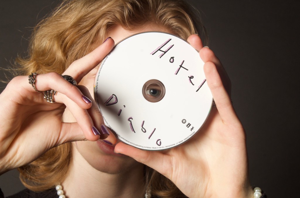
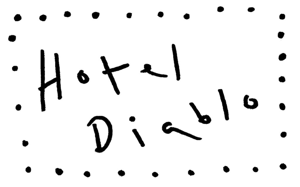
Audio: I had the song ‘Sex Drive’ by Machine Gun Kelly in my mind from very early on in the project. It’s the intro track to Hotel Diablo so is perfect for this event as it’s a good way to reintroduce the album. Also it’s good promotion for the concert if people hear and like the song. This is the full song:
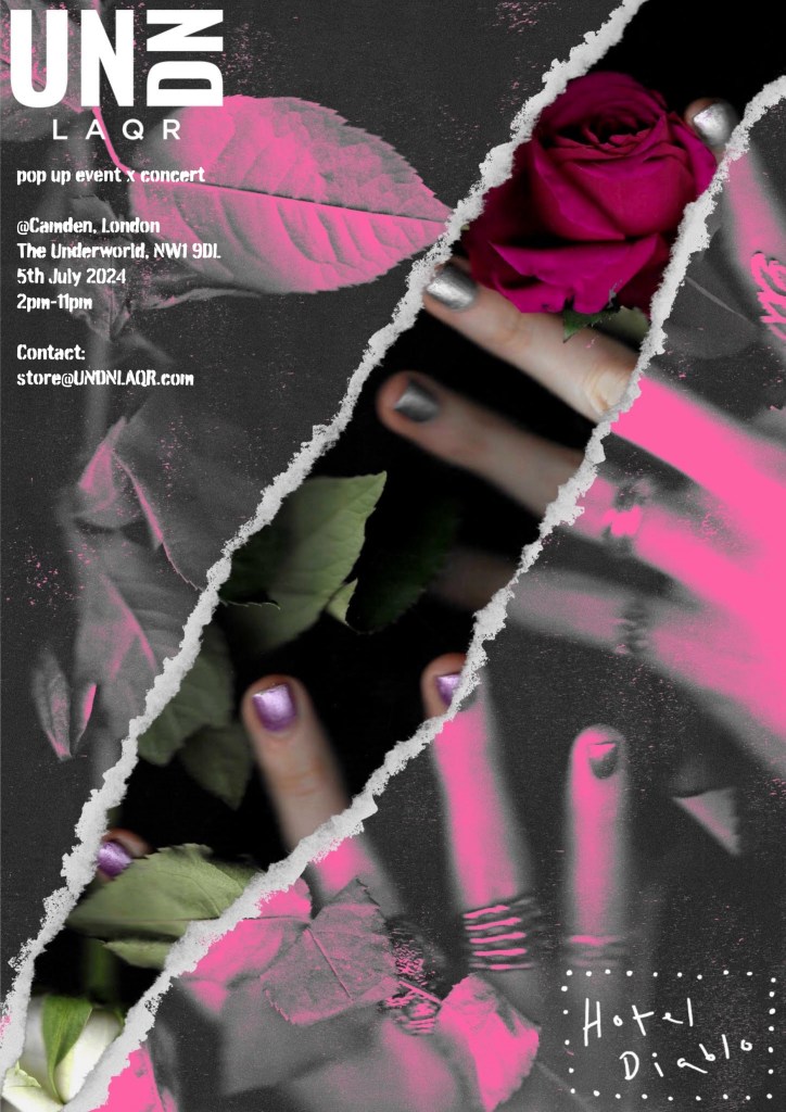
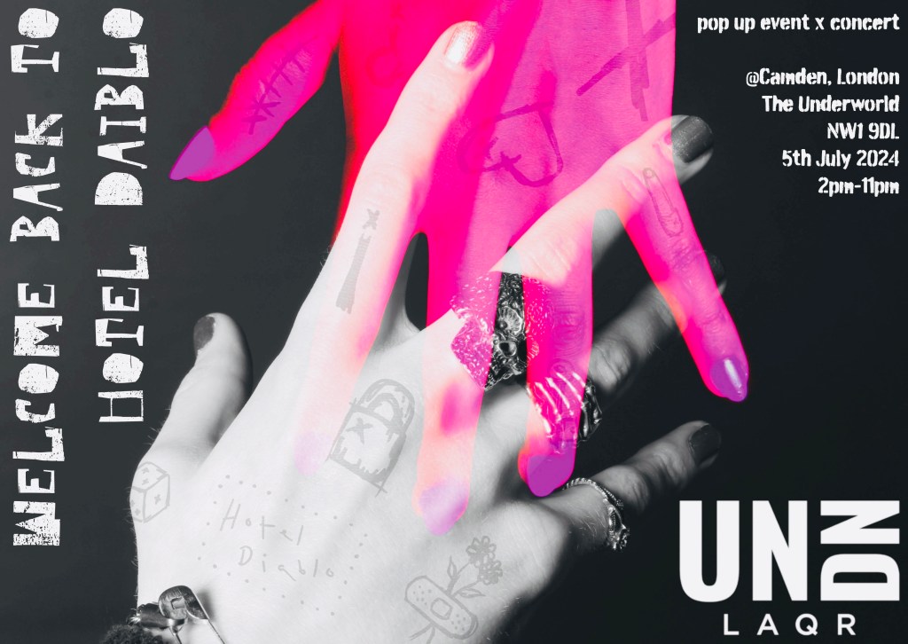
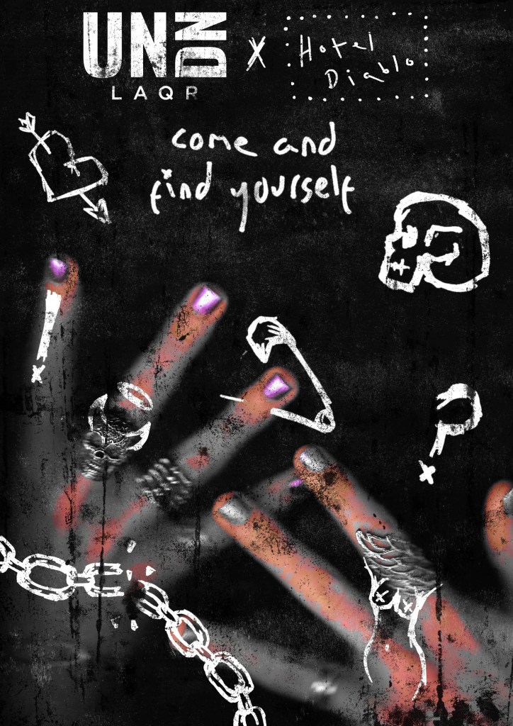
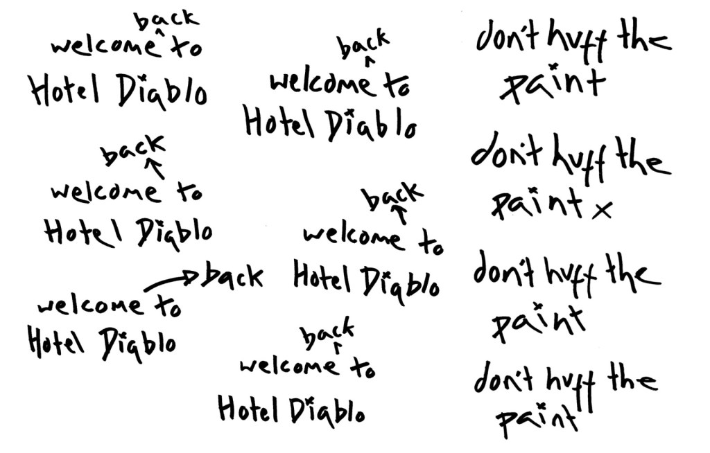
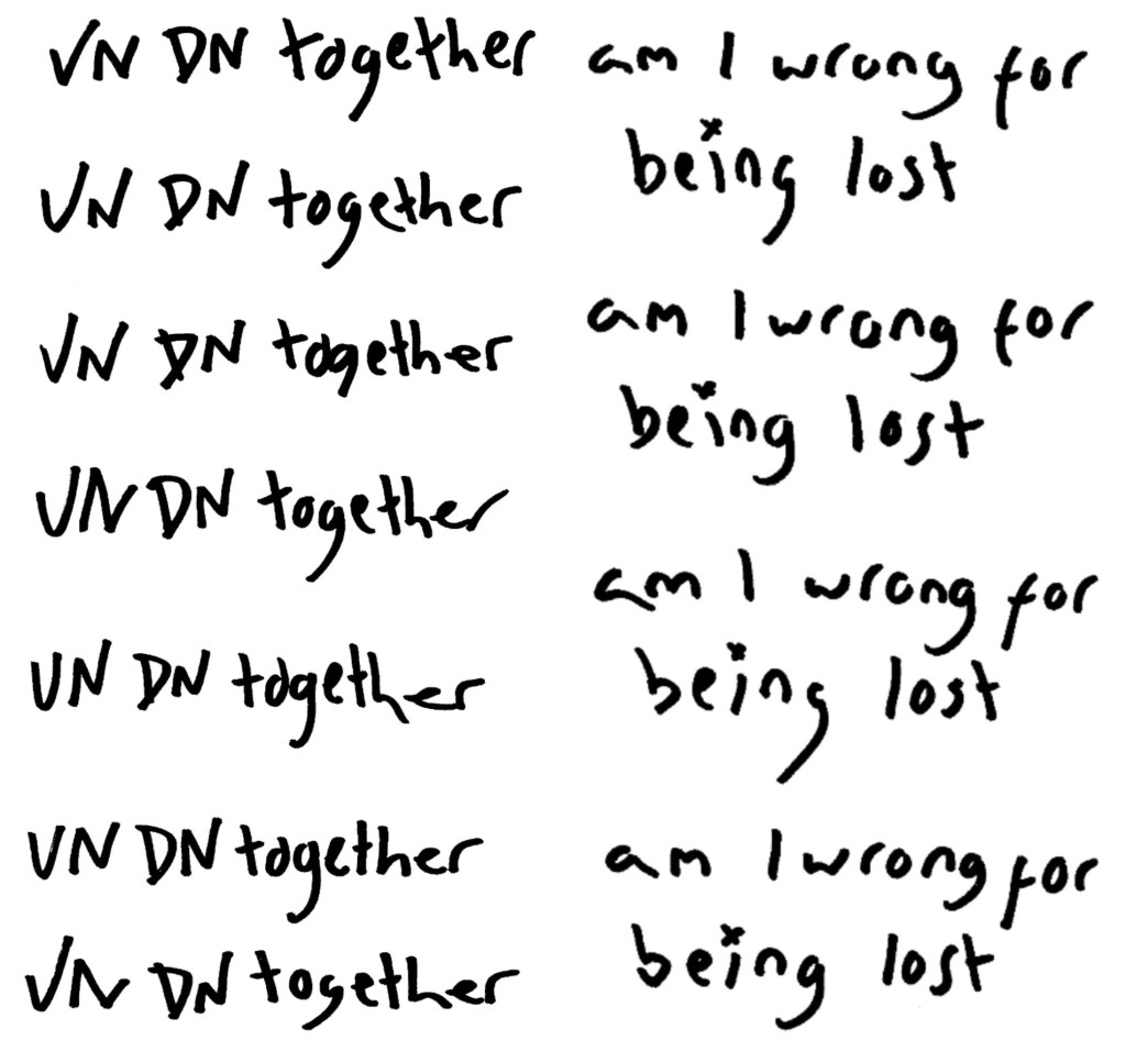
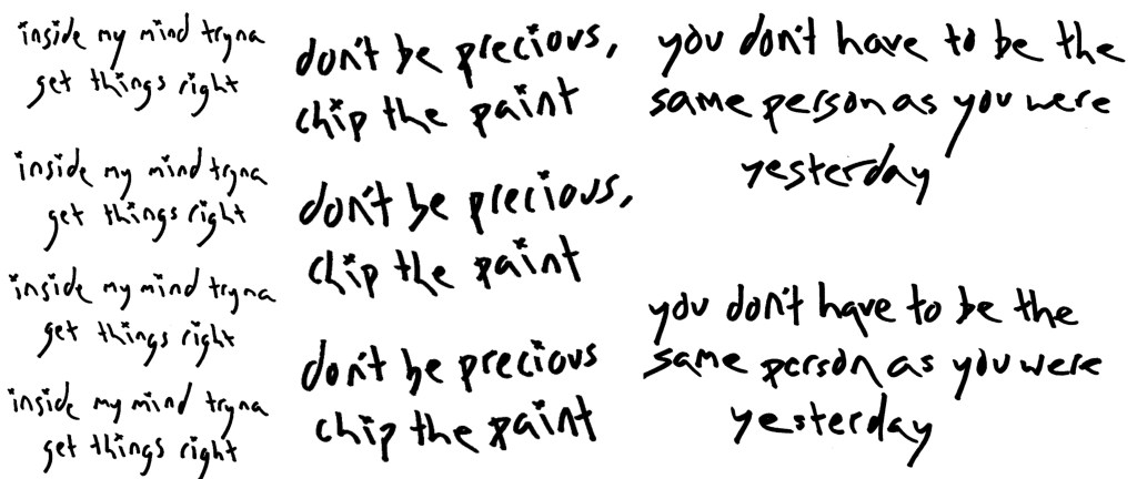
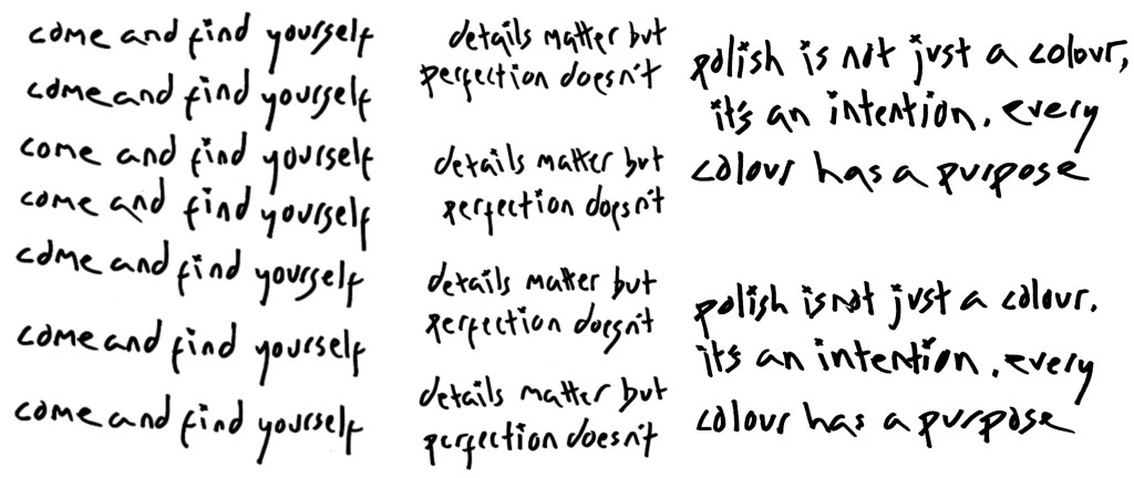
I downloaded the song and have chosen this section to work with. I chose this section as I didn’t want the slow build up. I wanted it to be start into the body of the song so it grabs people’s attention immediately. Also this portion of the song has the line ‘come and find yourself’ which I’ve included on posters so I wanted there to be that connection. This section ends with the line ‘welcome to Hotel Diablo’ which I think is the perfect ending to summarise the event. This is the audio in the video:
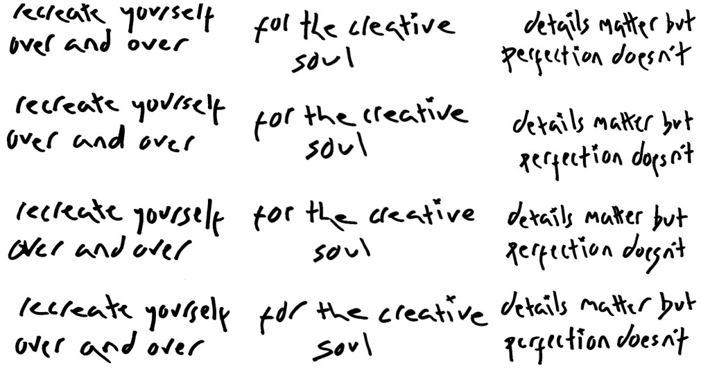
Draft of video: when I showed this draft to my tutors and some friends I got a few imprnat bits of feedback which helped me improve the video. Some notable points were to speed up the pacing to keep it constantly flowing and make the backgrounds more simple to allow the images to shine. Some of changes I wanted to make where bring in more of my typography and sketches to connect the video to the rest of the visual identity more and colour grade the videos I shot because they looked too yellow. Also I wanted to add a section at the end that has the event details so people can found that information out directly through the video.
Final video: this is the final version of my social media video promoting the the UN DN x Hotel Diablo event titled ‘Welcome back to Hotel Diablo’.
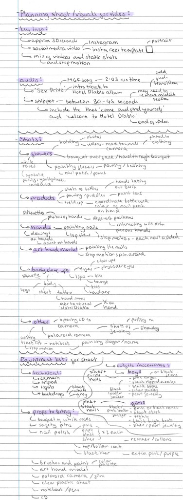
Sequencing: when deciding how to sequence my video I used the ideas we explored in session 1. I took screenshots of each shot and rearranged them to make it the most engaging and consistently interesting. I wanted to evenly integrate the static and dynamic sections. By mixing the videos, photos and stop motion sequences it makes the video more unpredictable and keeps the viewer guessing about what will follow. This is the final sequencing of the video:
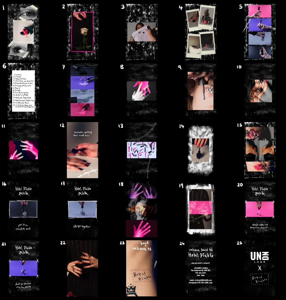
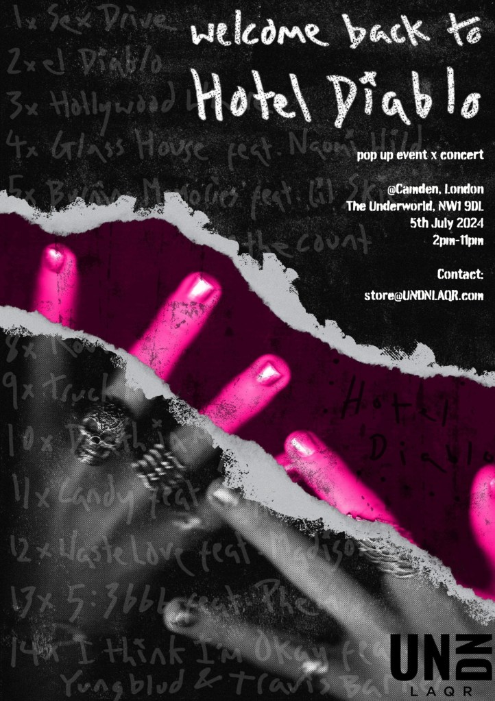
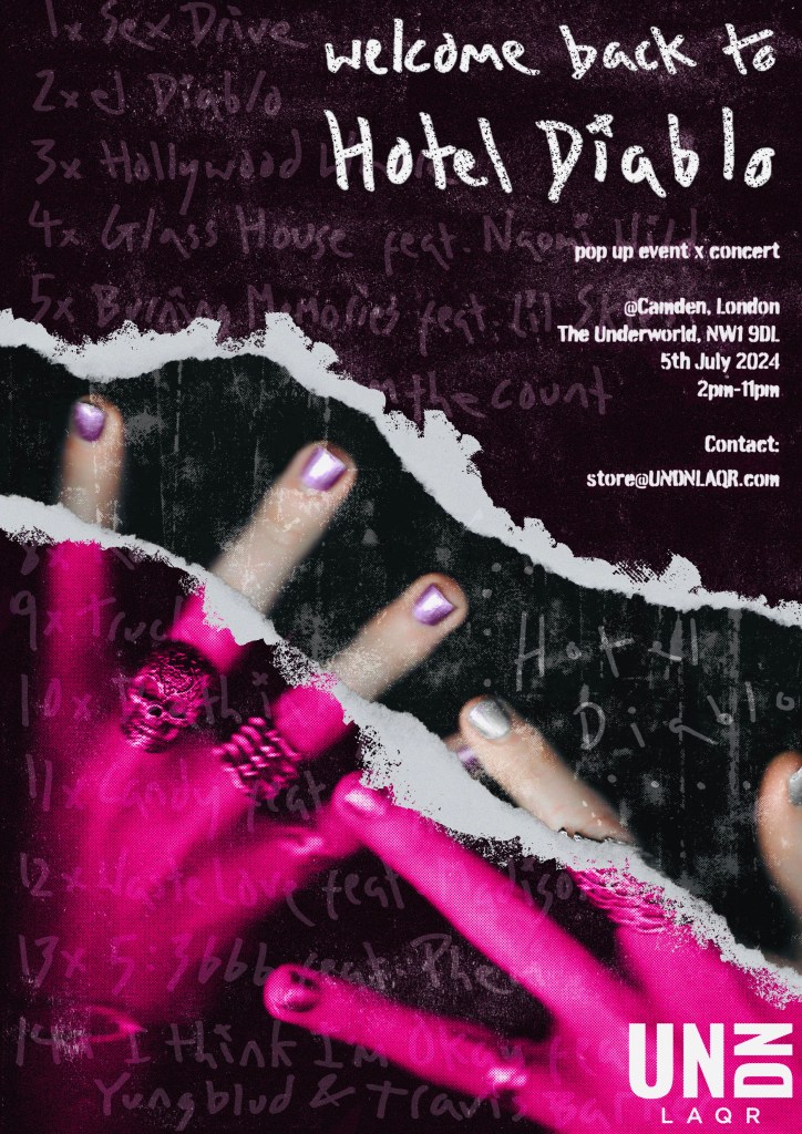
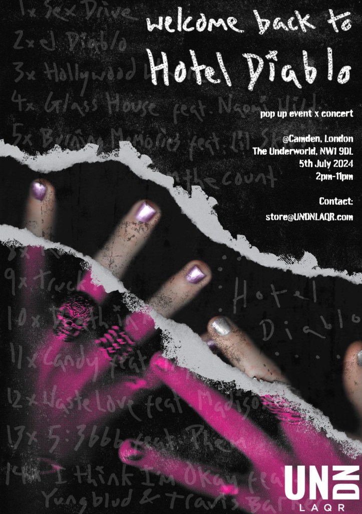
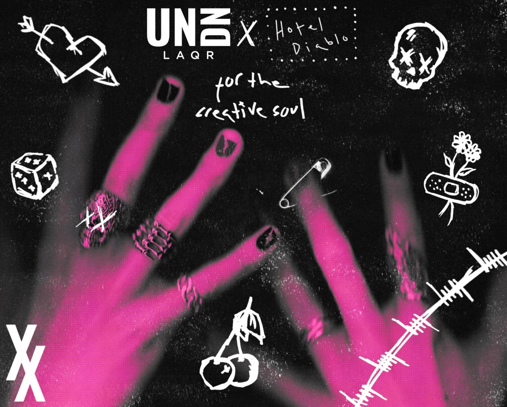
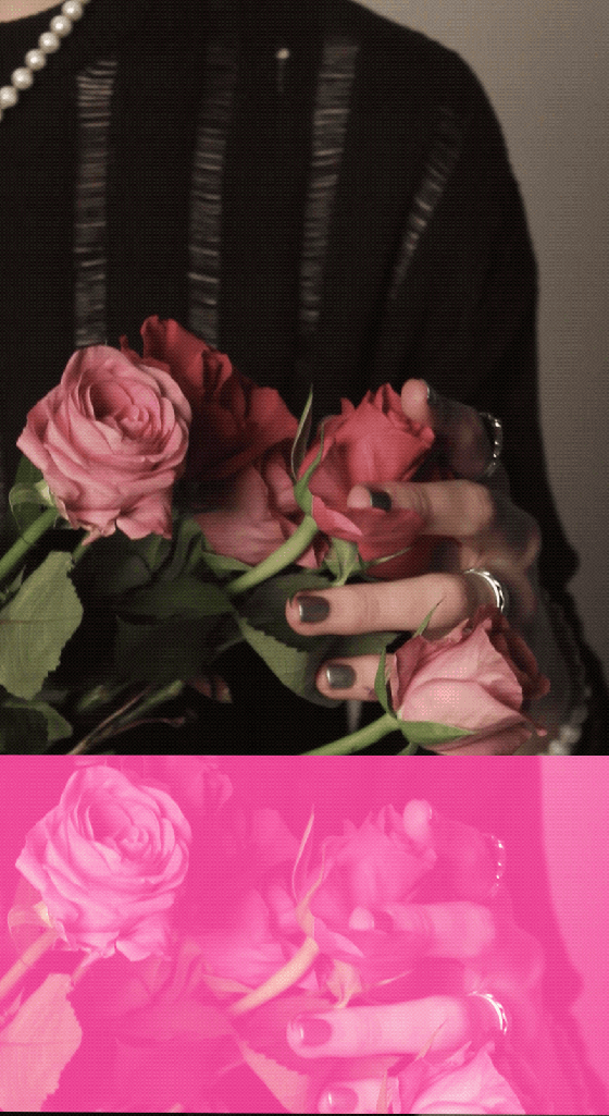
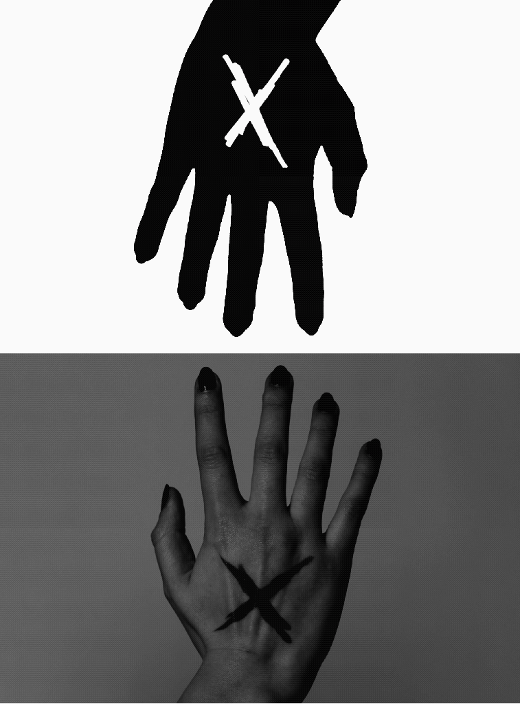
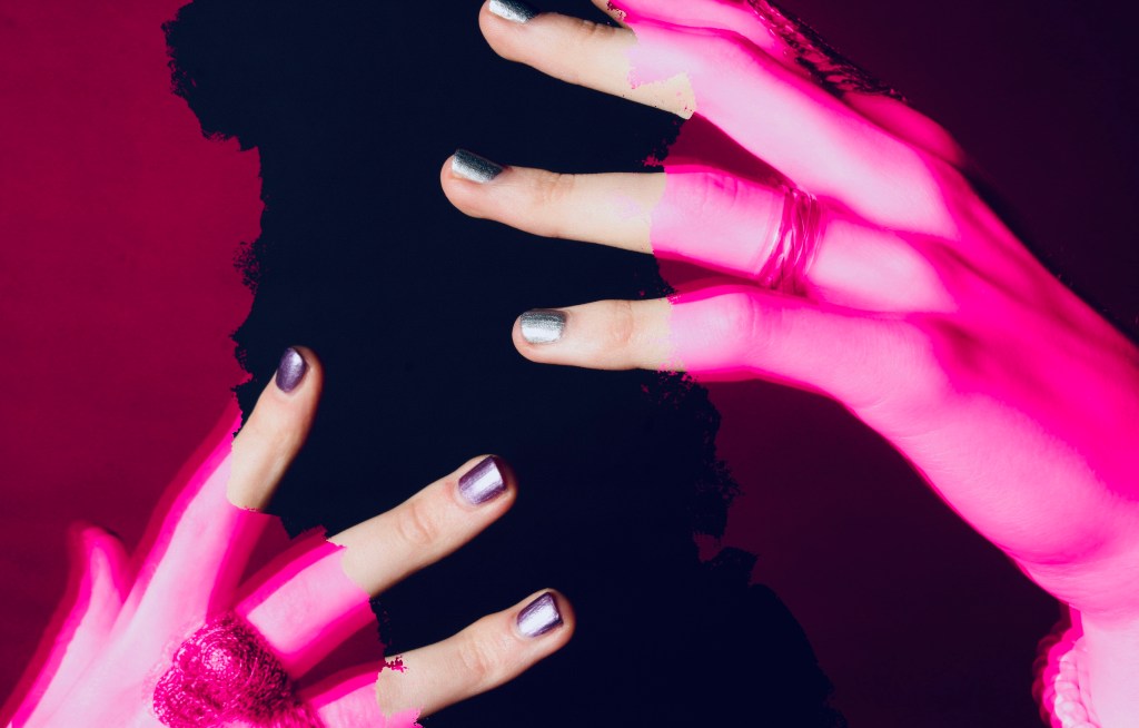
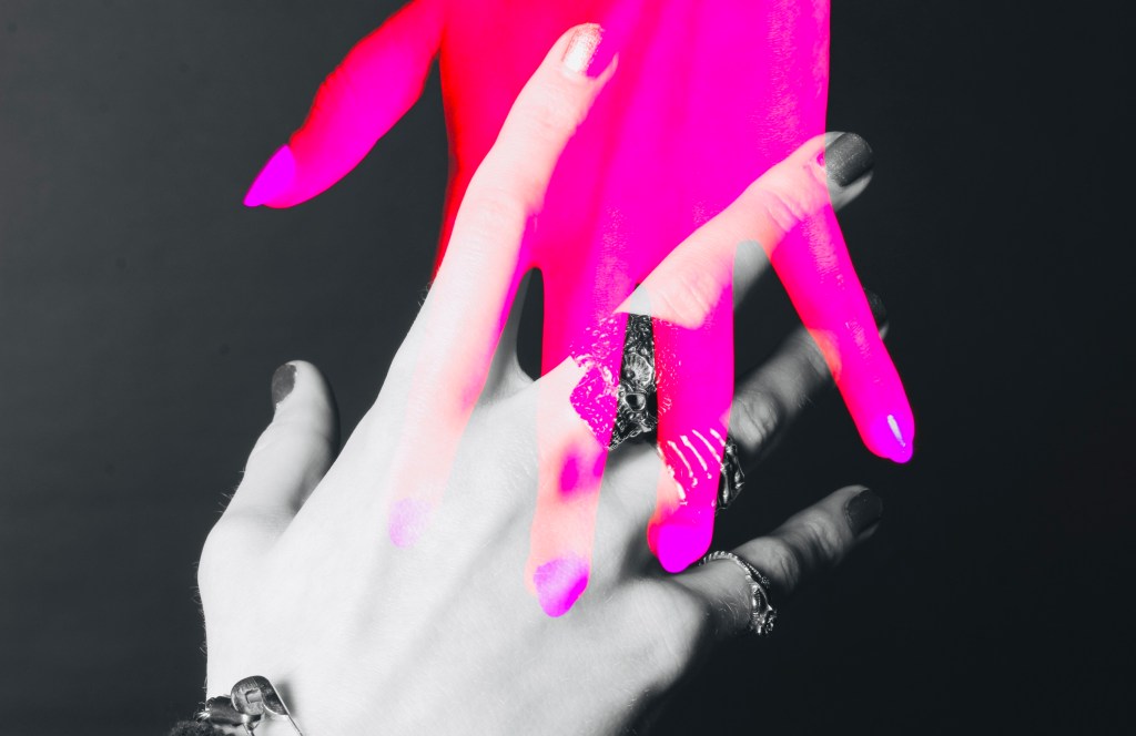
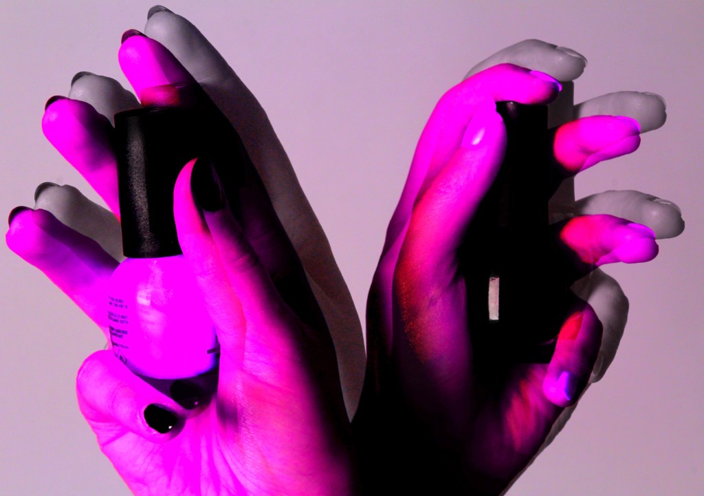
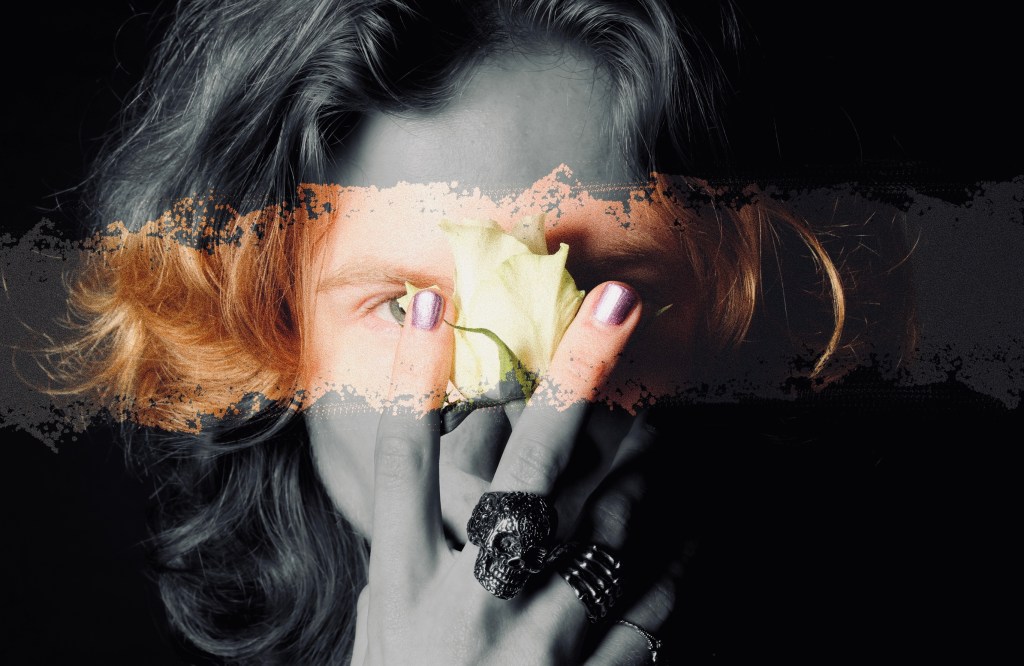
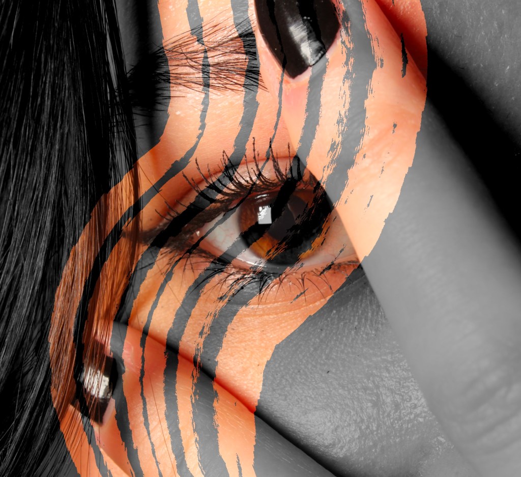
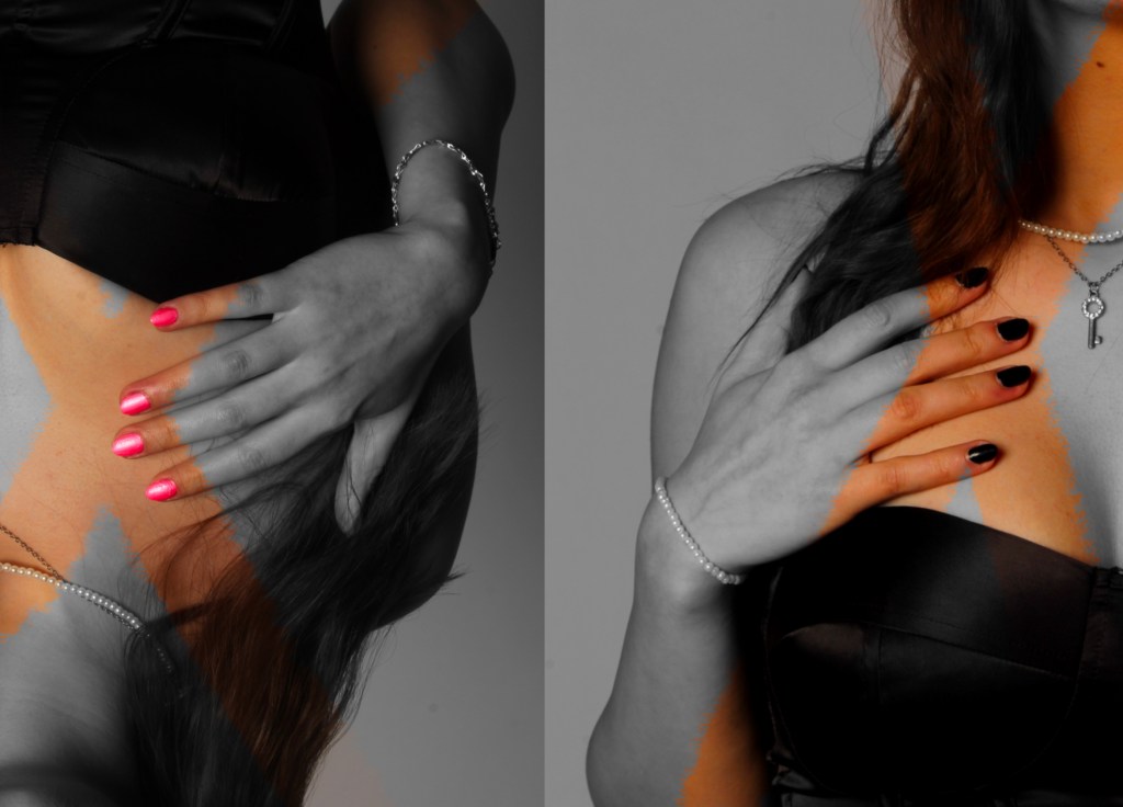
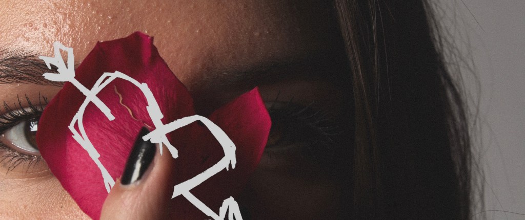
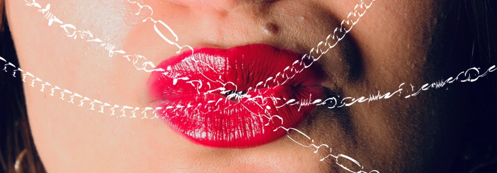
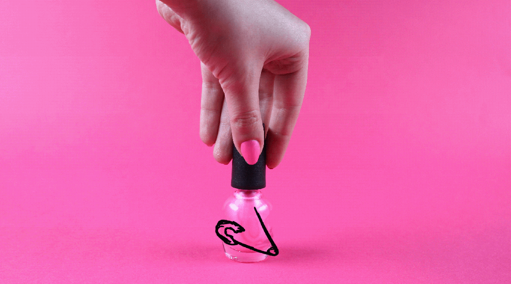
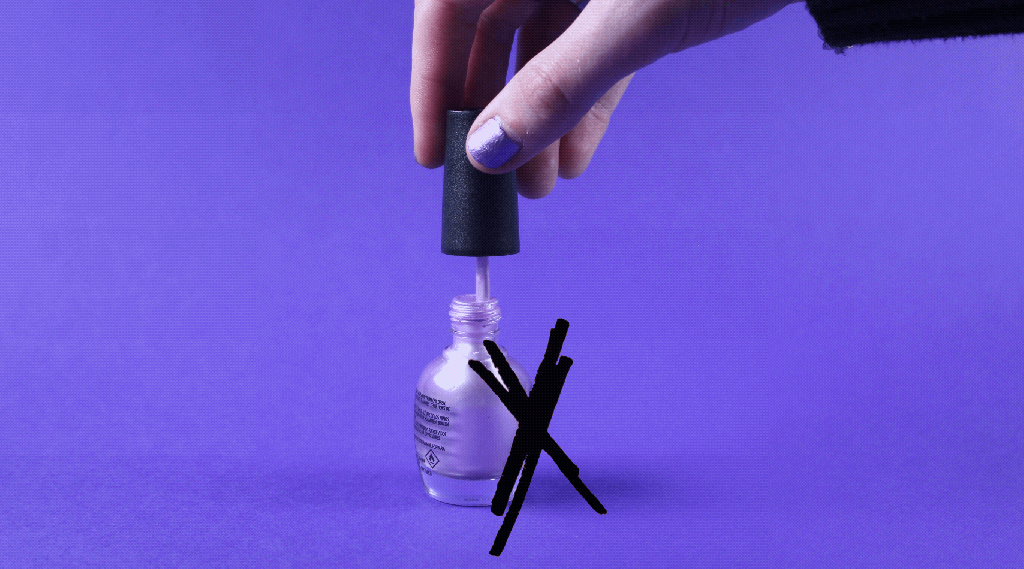
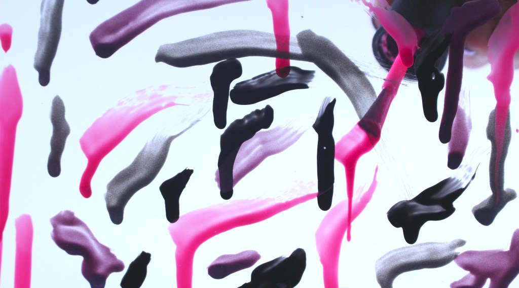
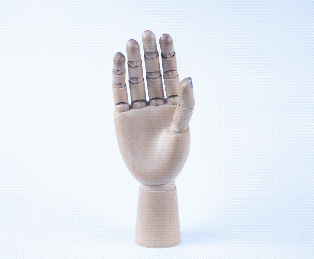
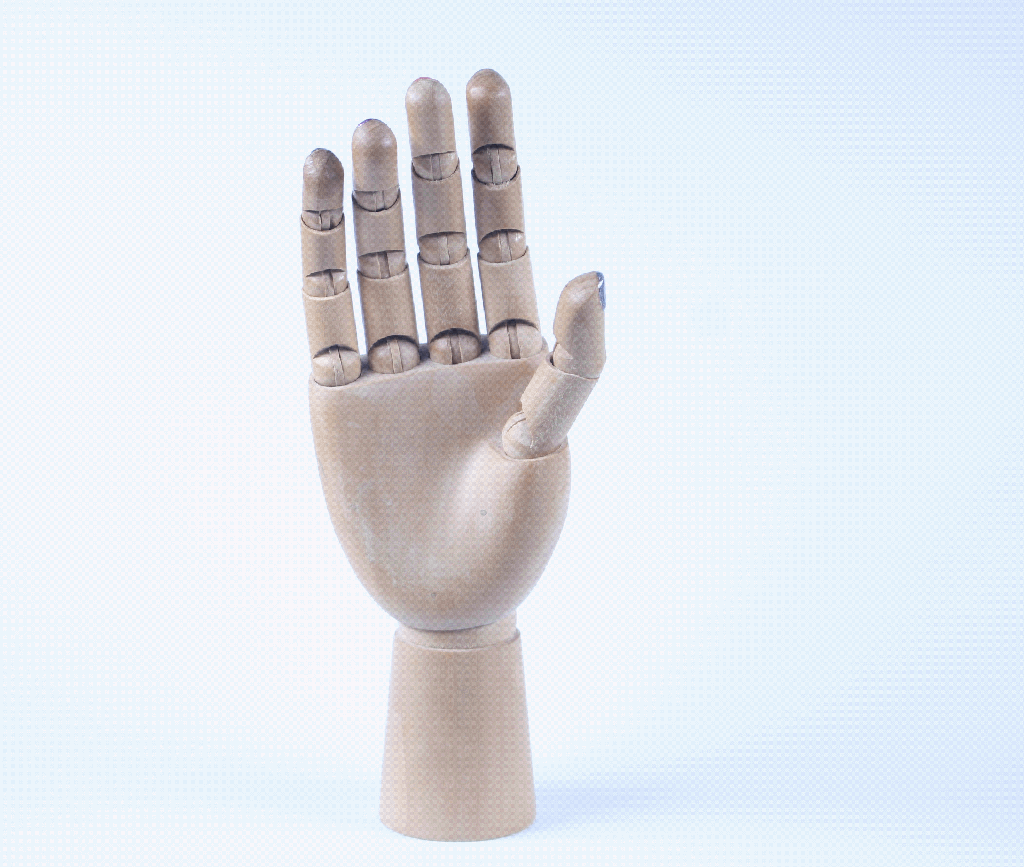
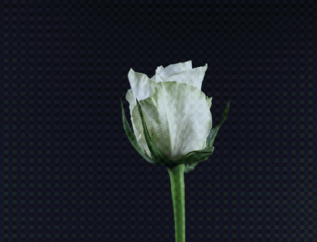
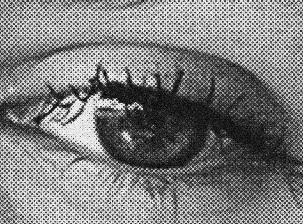
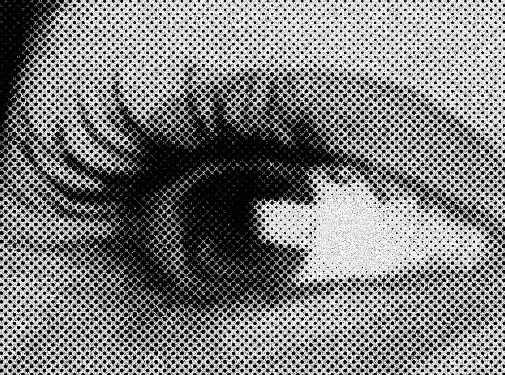
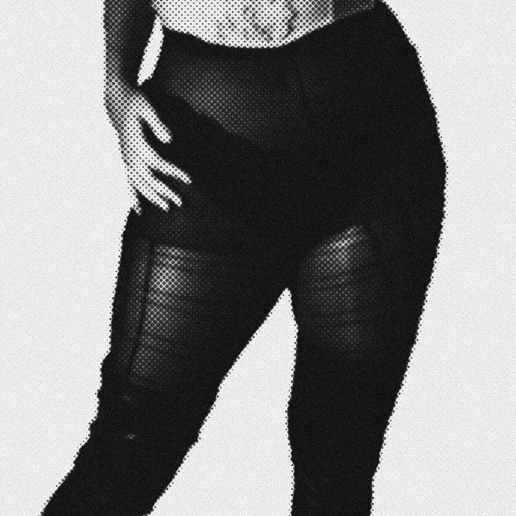
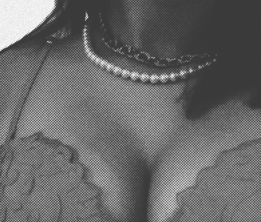
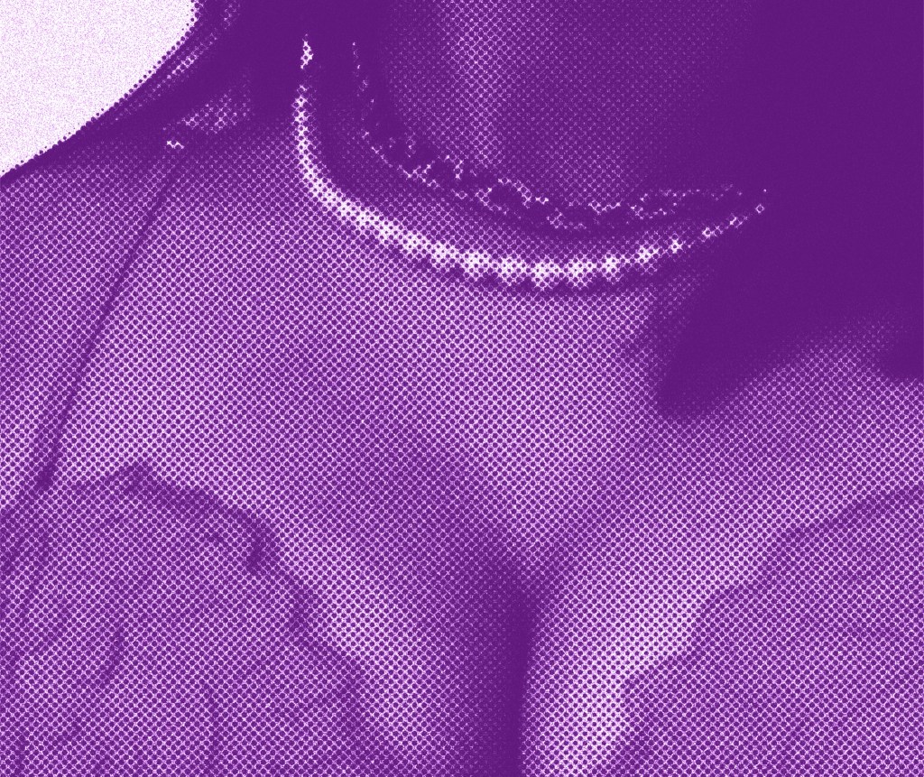
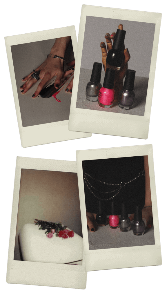
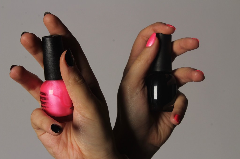
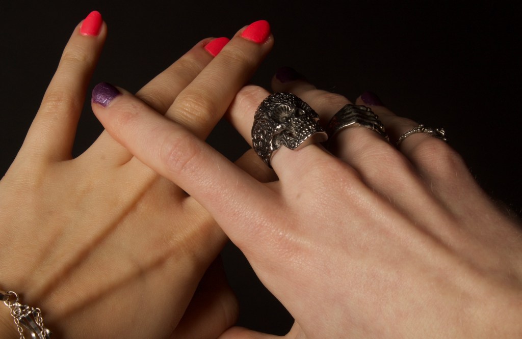
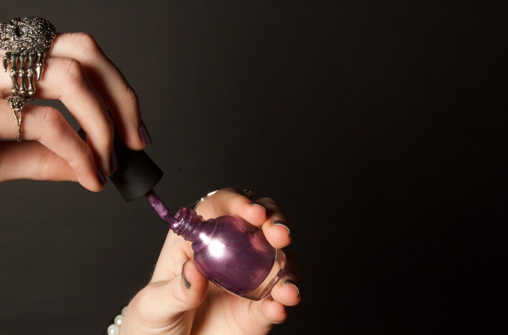
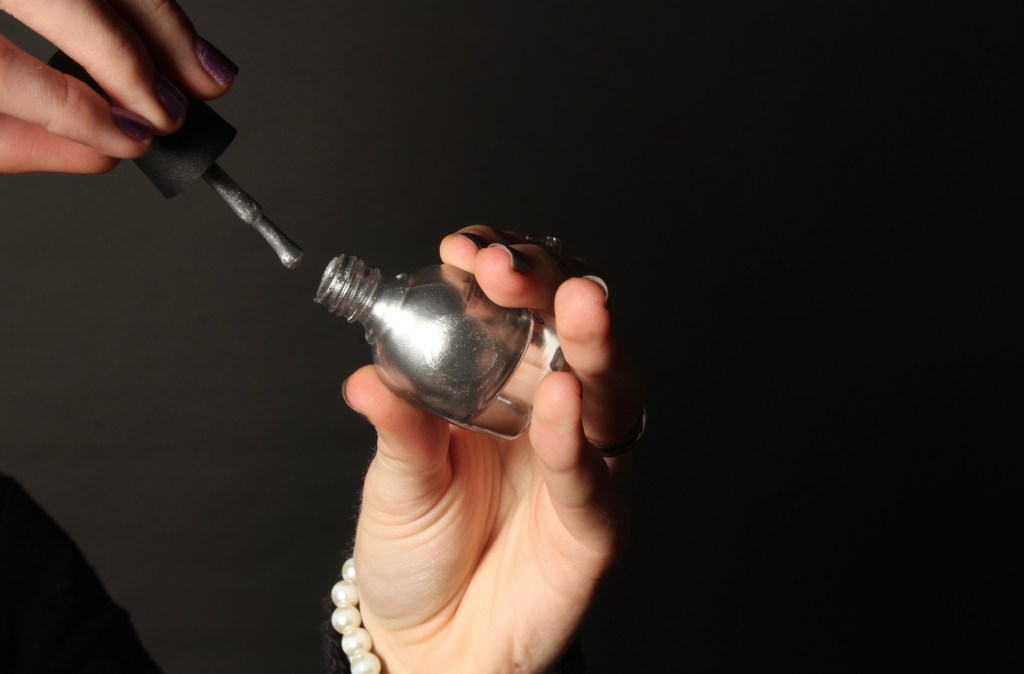
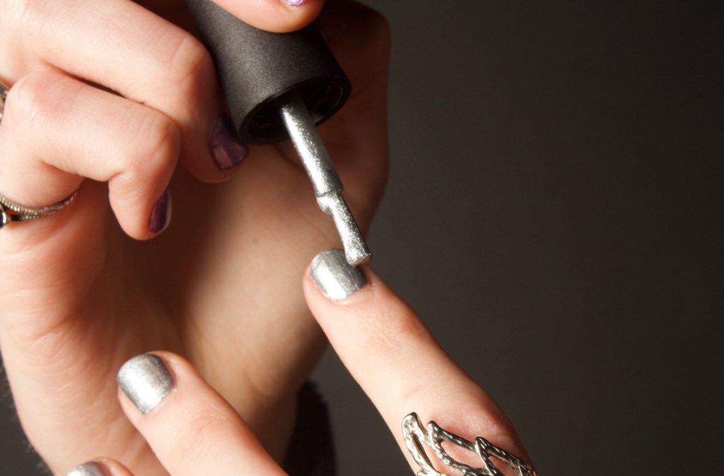
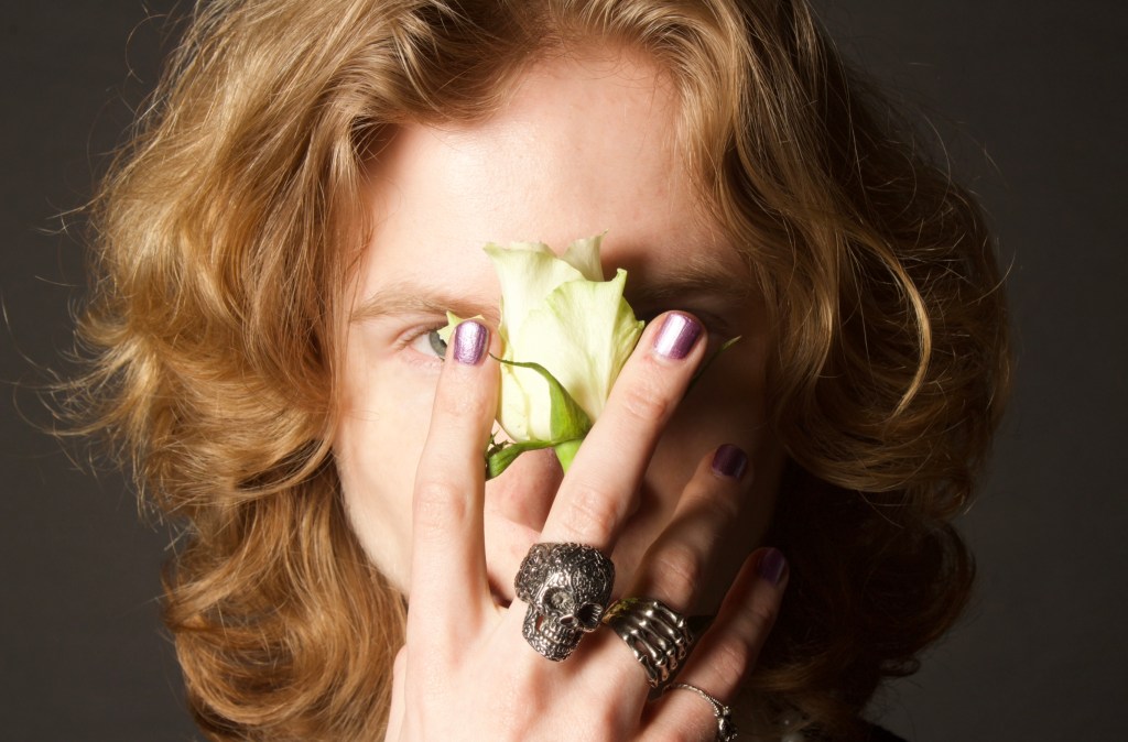
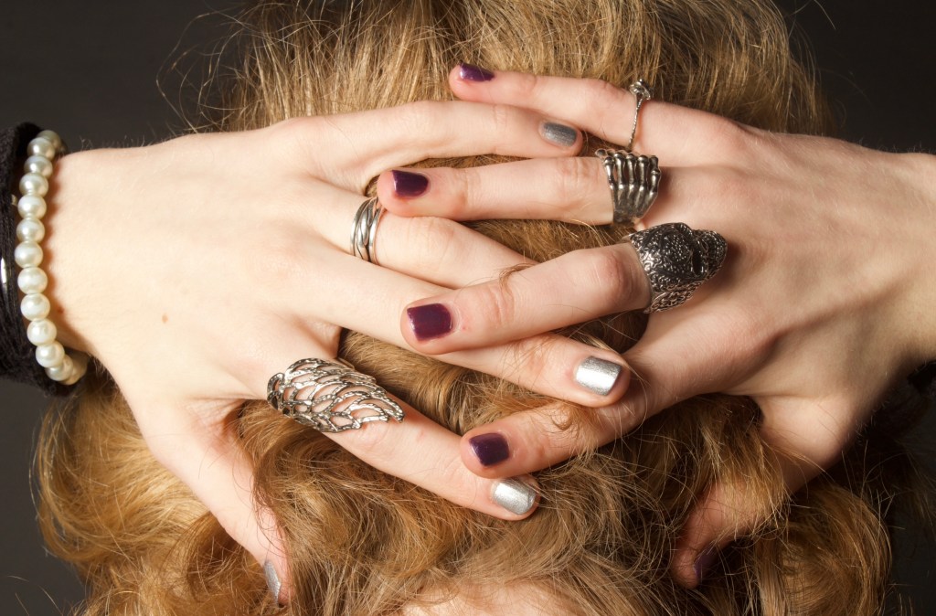
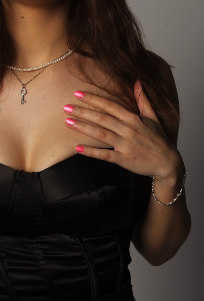
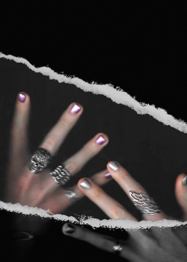
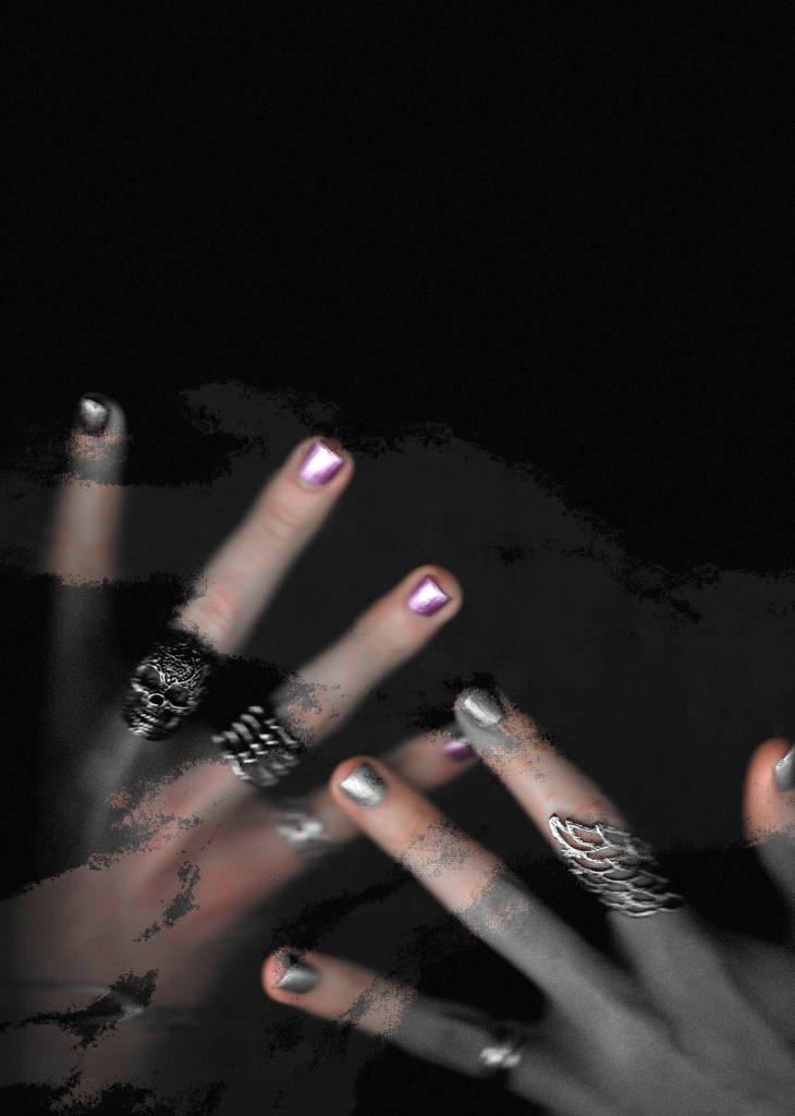
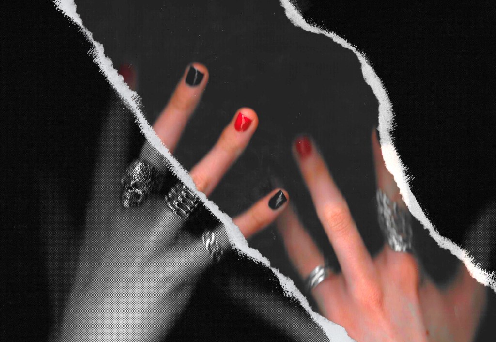
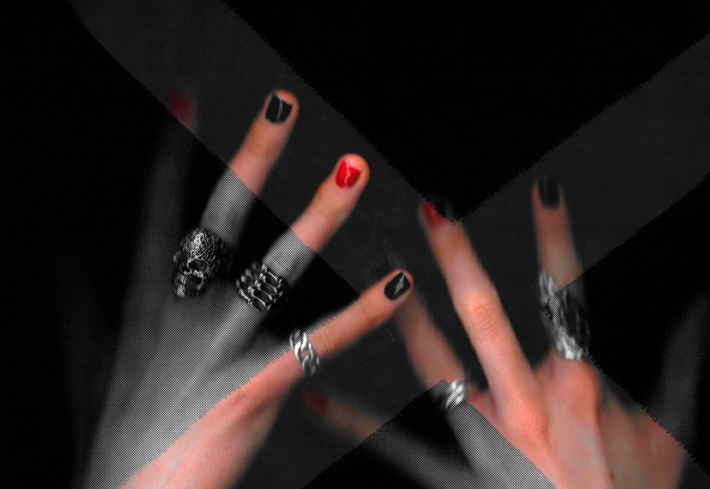
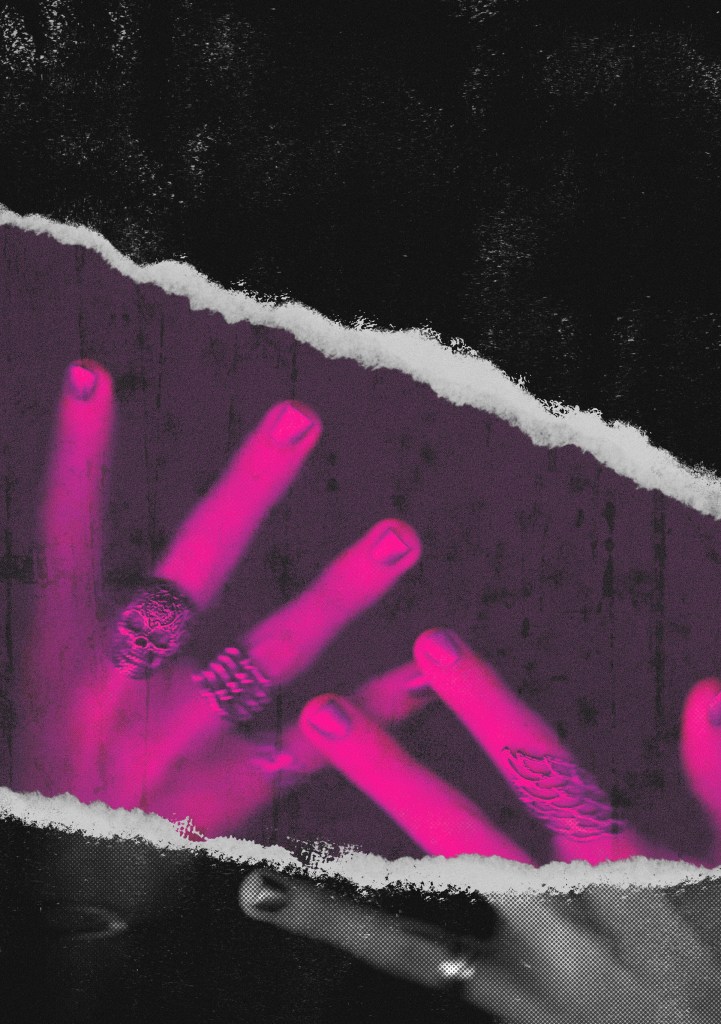
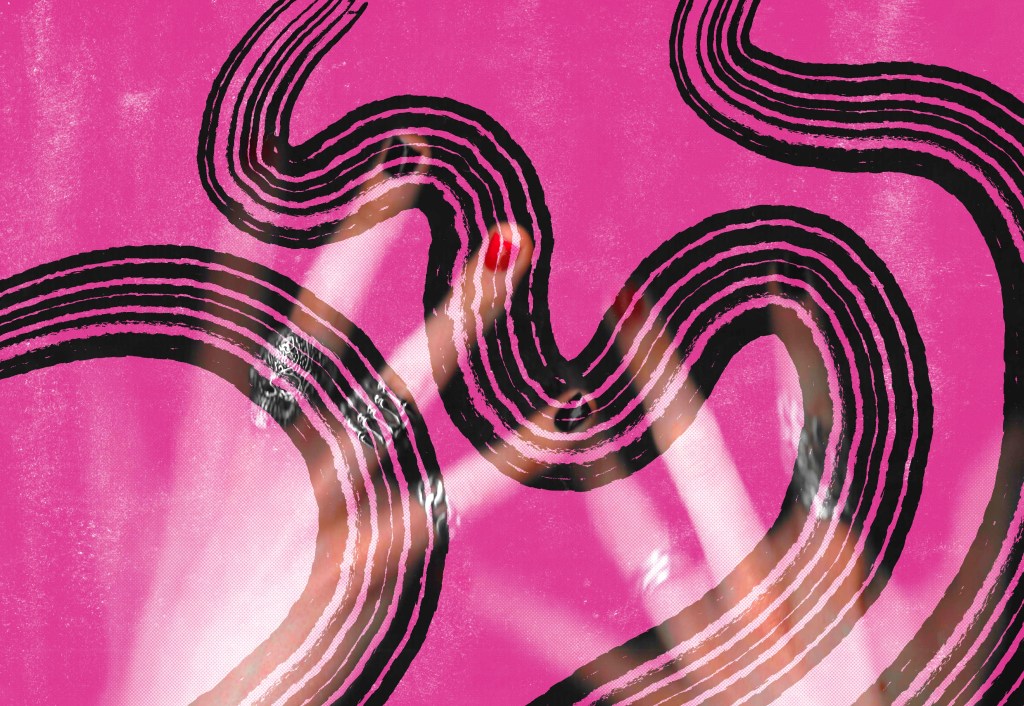
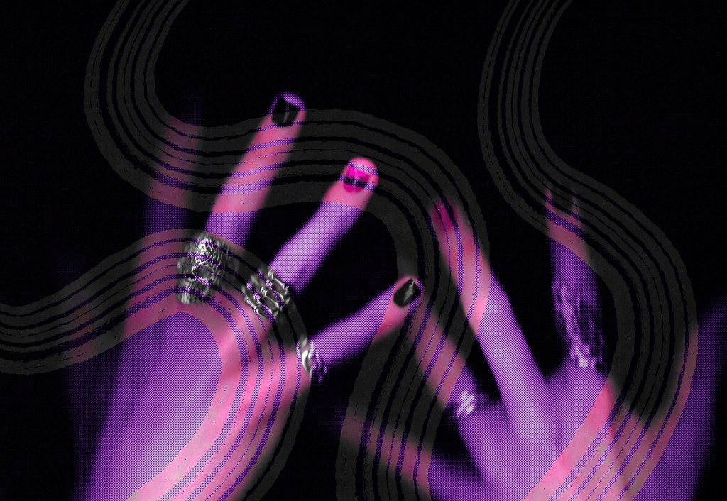
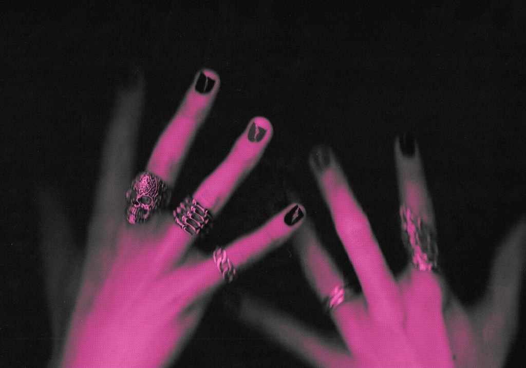
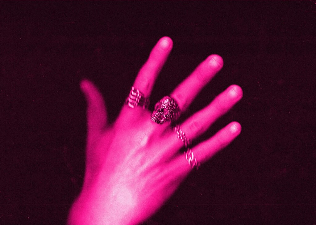
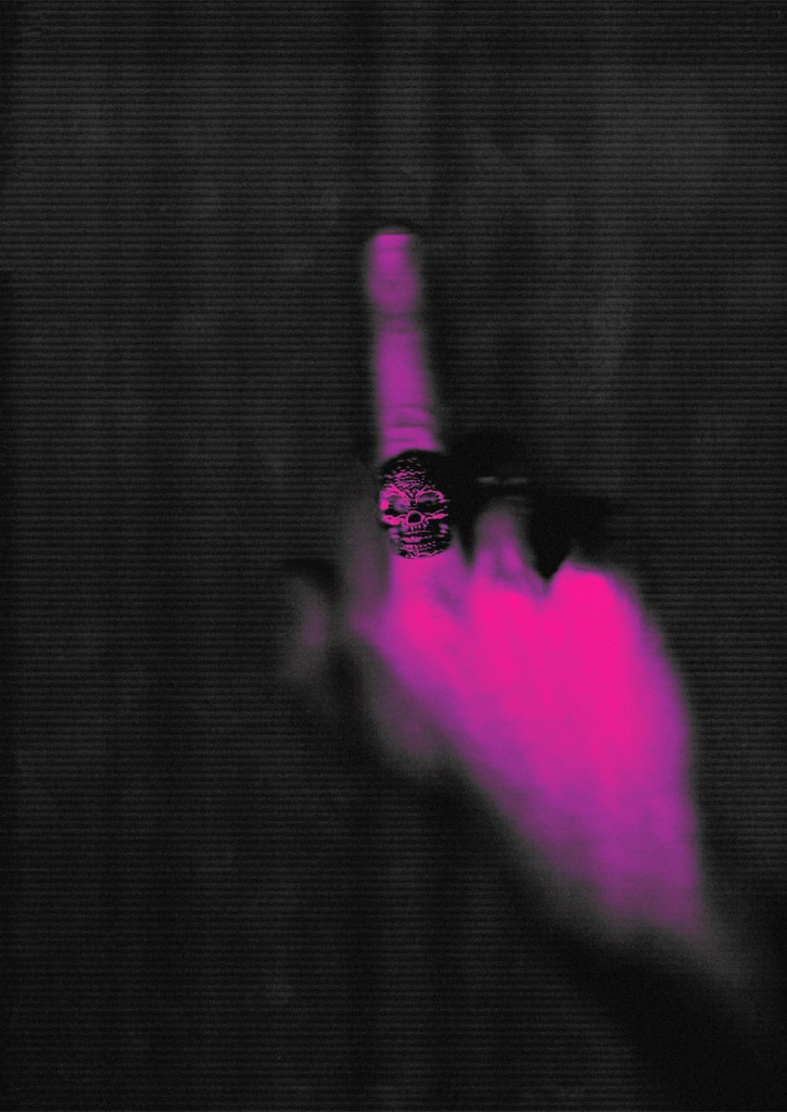
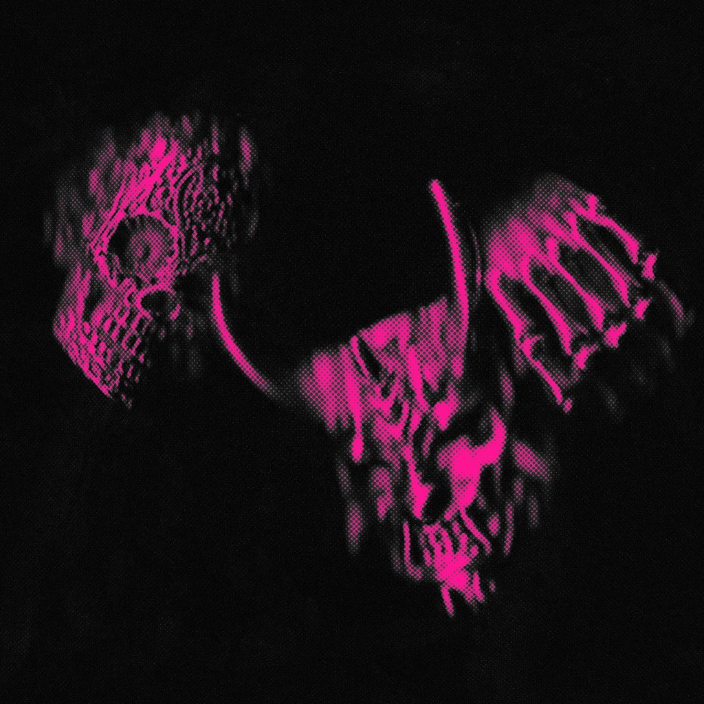
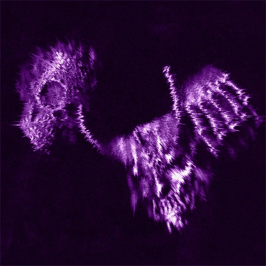
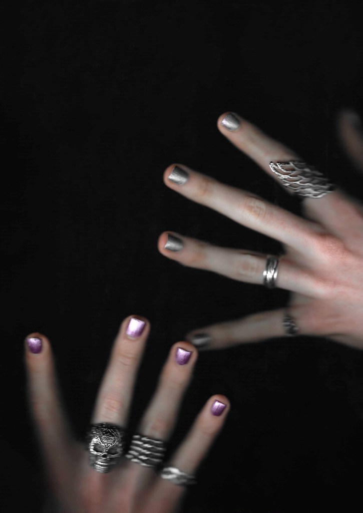
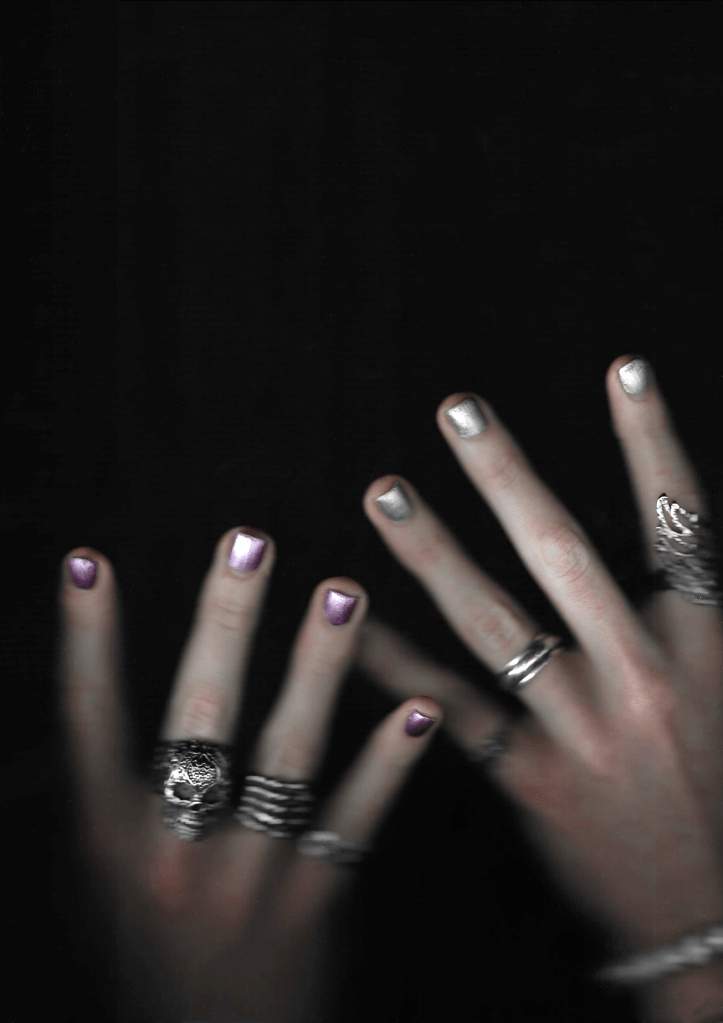
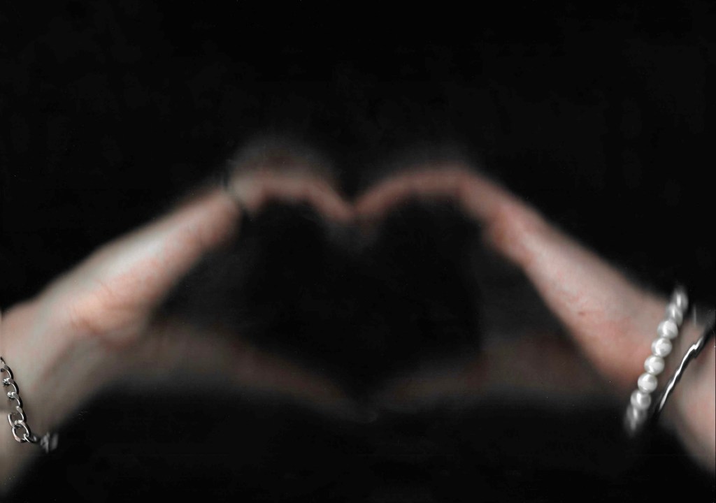
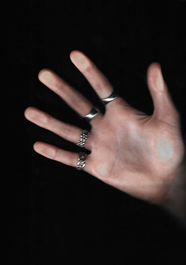
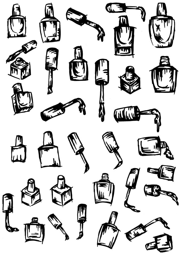
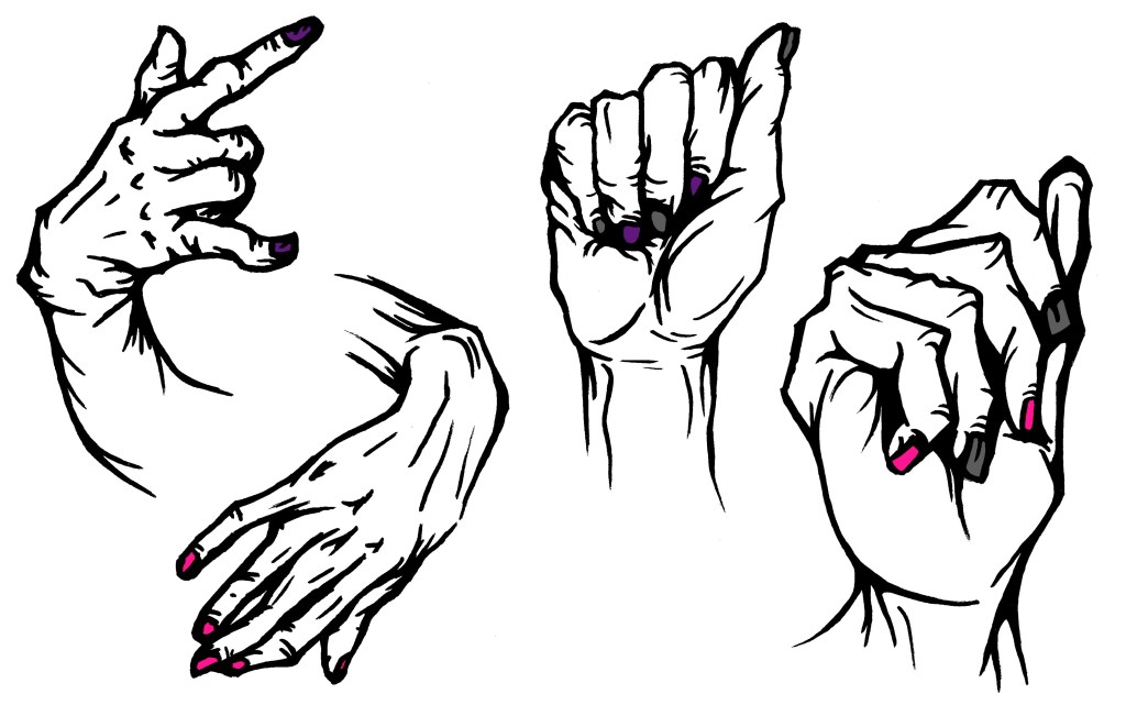
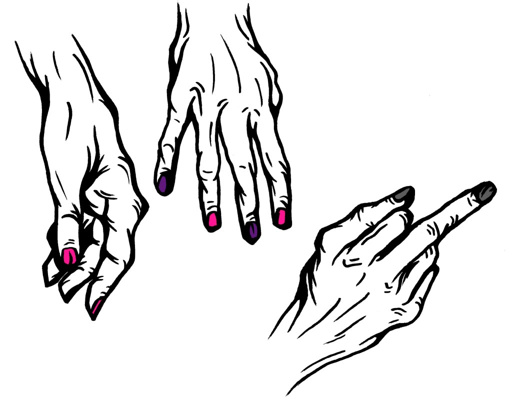
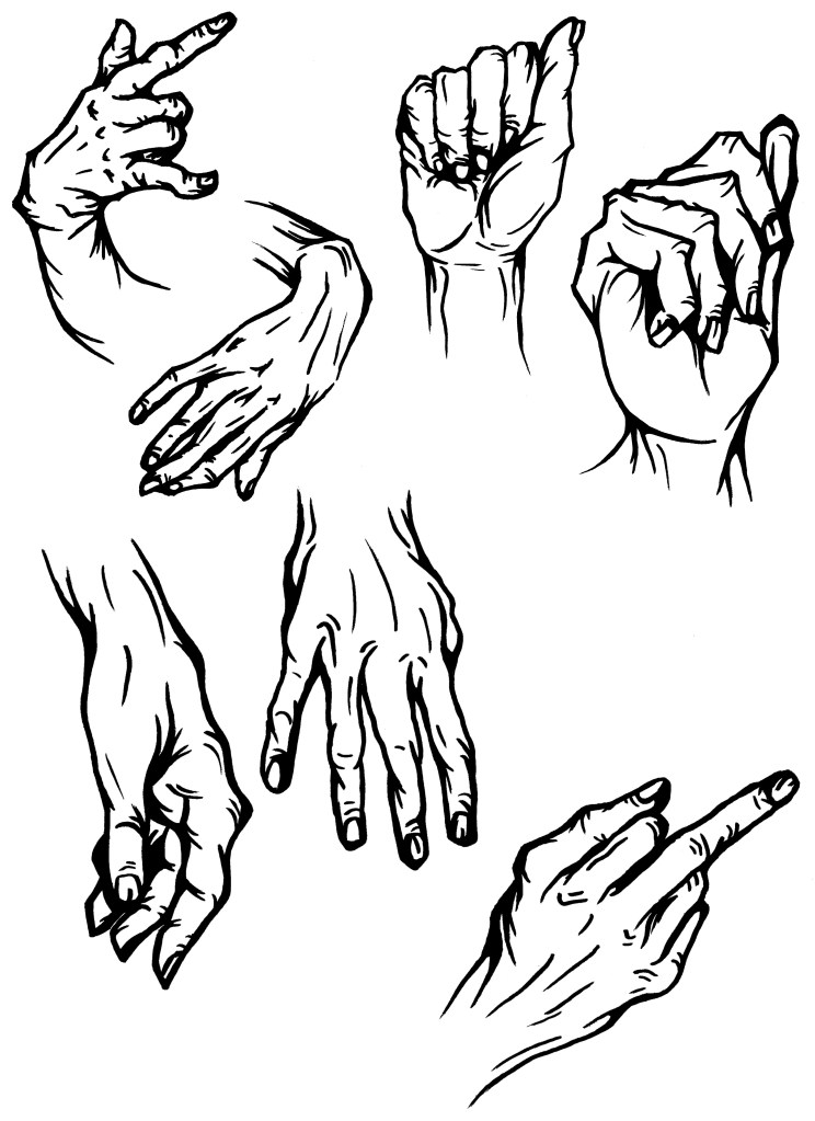
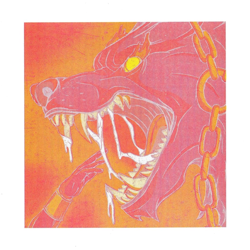
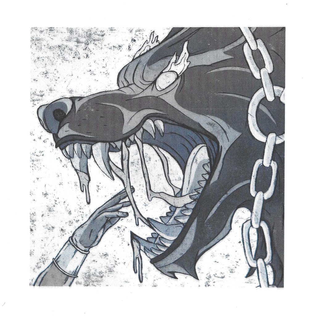
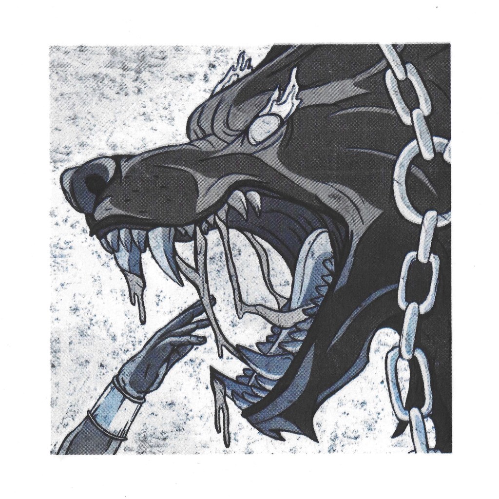
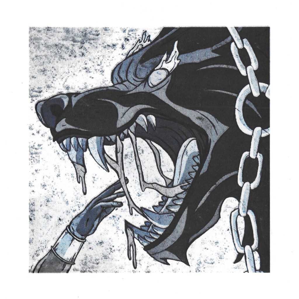
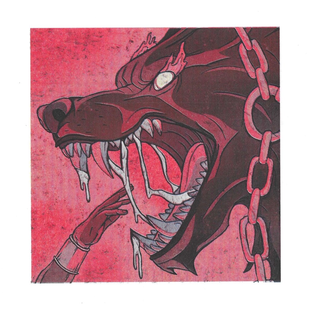
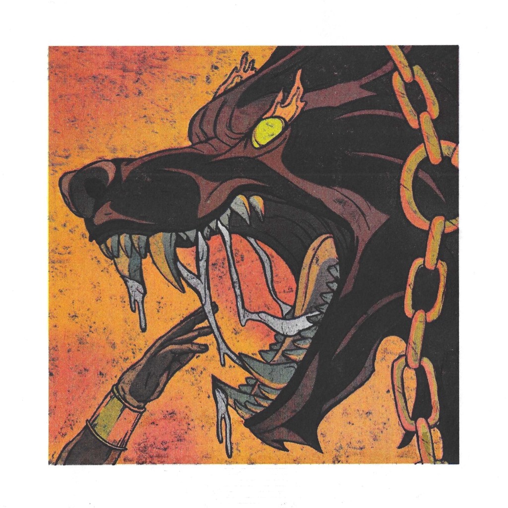
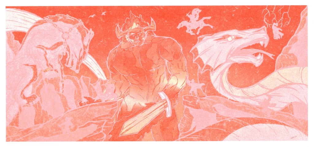
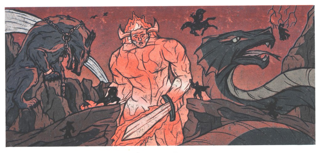
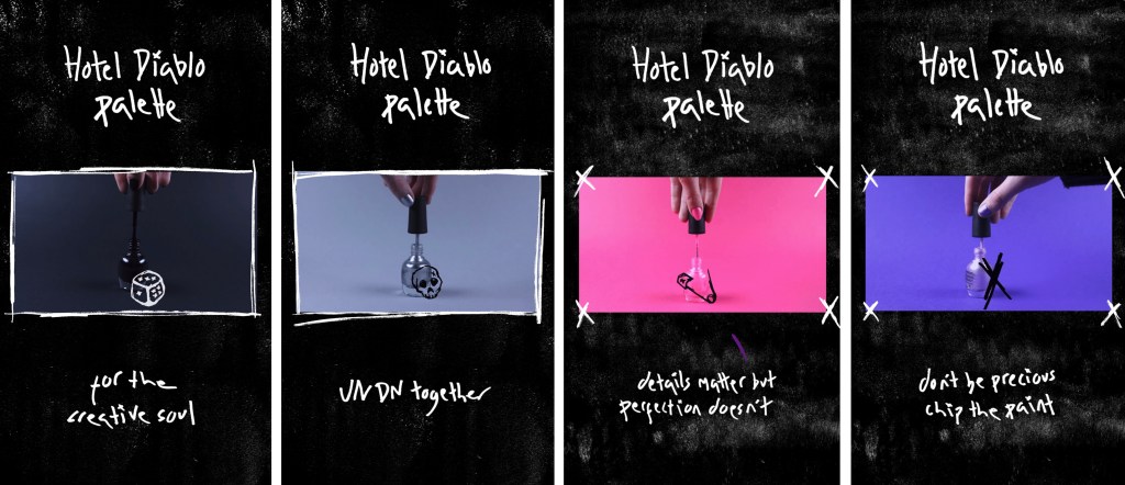
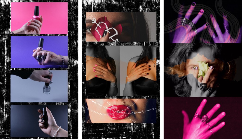
Frames from the video: below are some of my favourite shots from the video. The video is comprised of video footage, animated parts, lopping animated GIFs and static photos. Some examples of each is shown here:
Full screen videos:

Animated parts:

Animated GIFs:
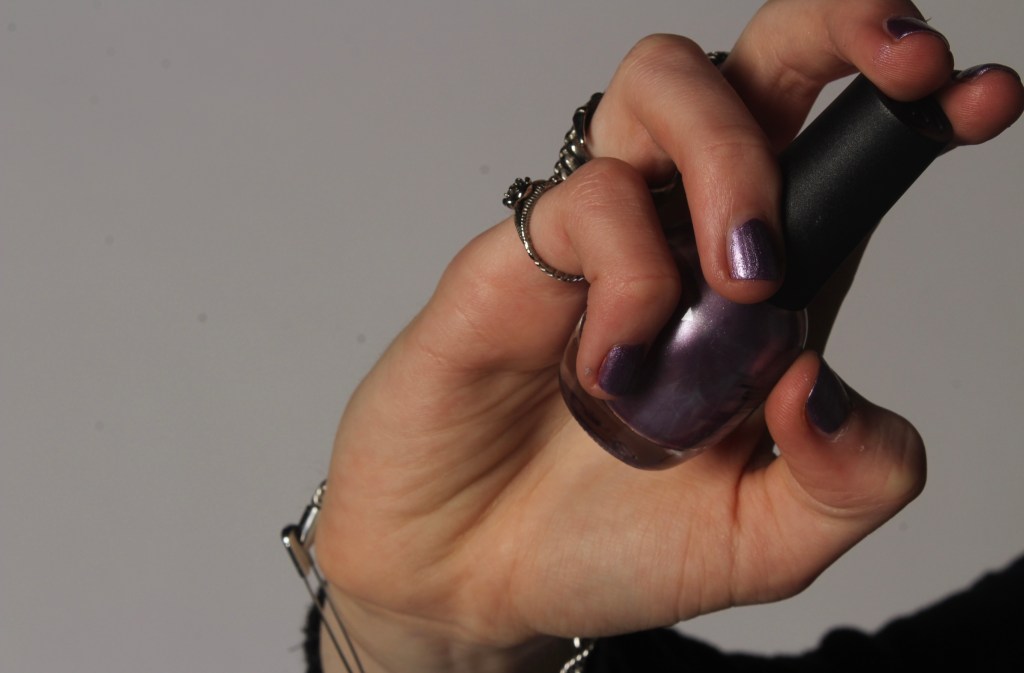
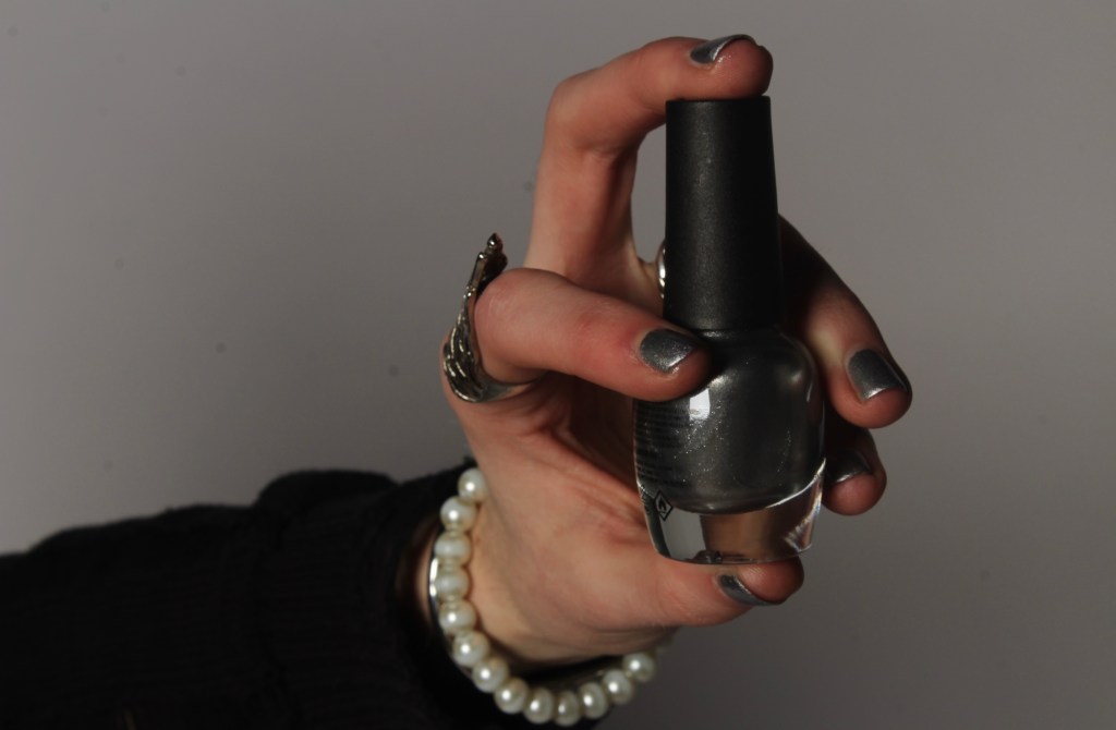
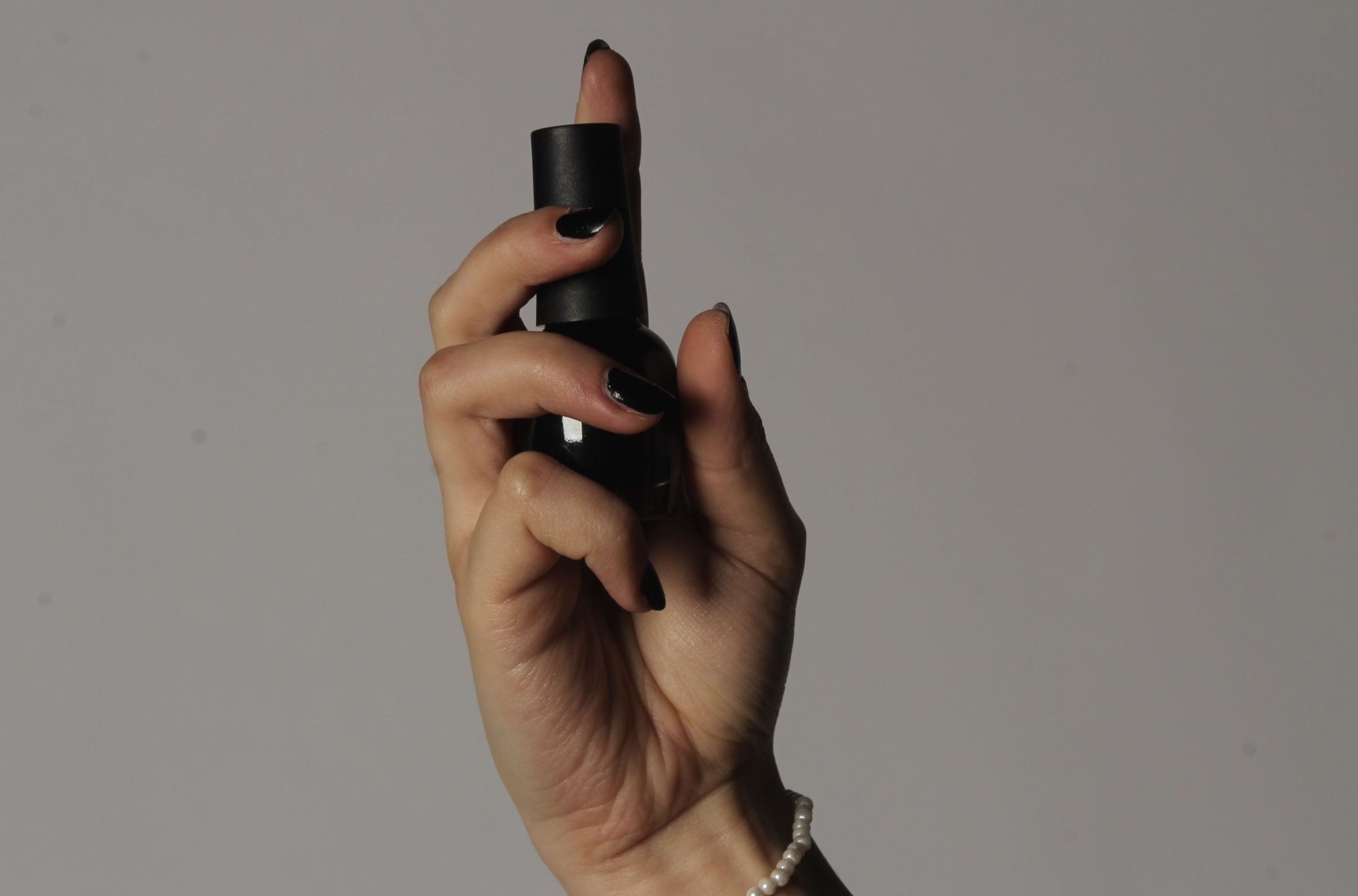
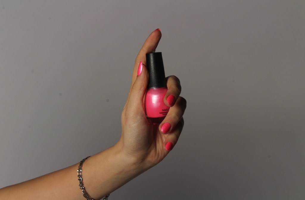
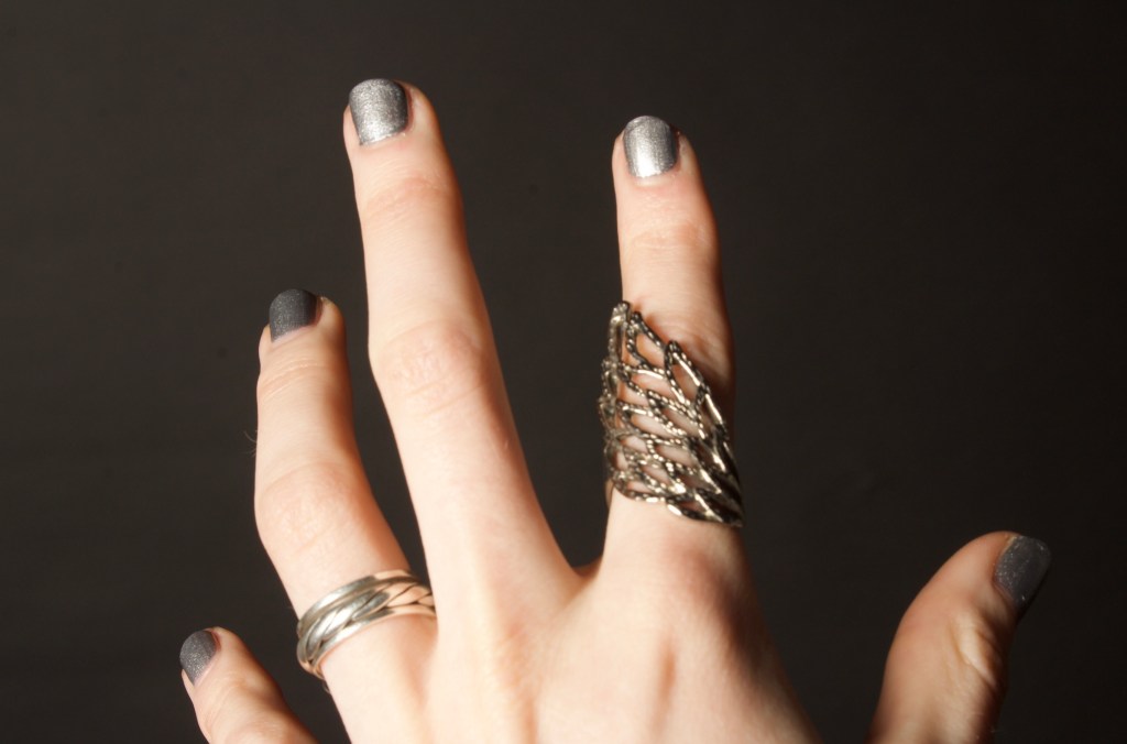
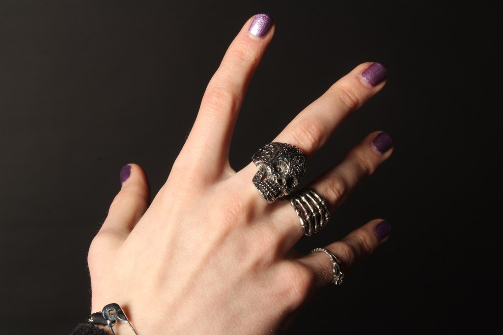
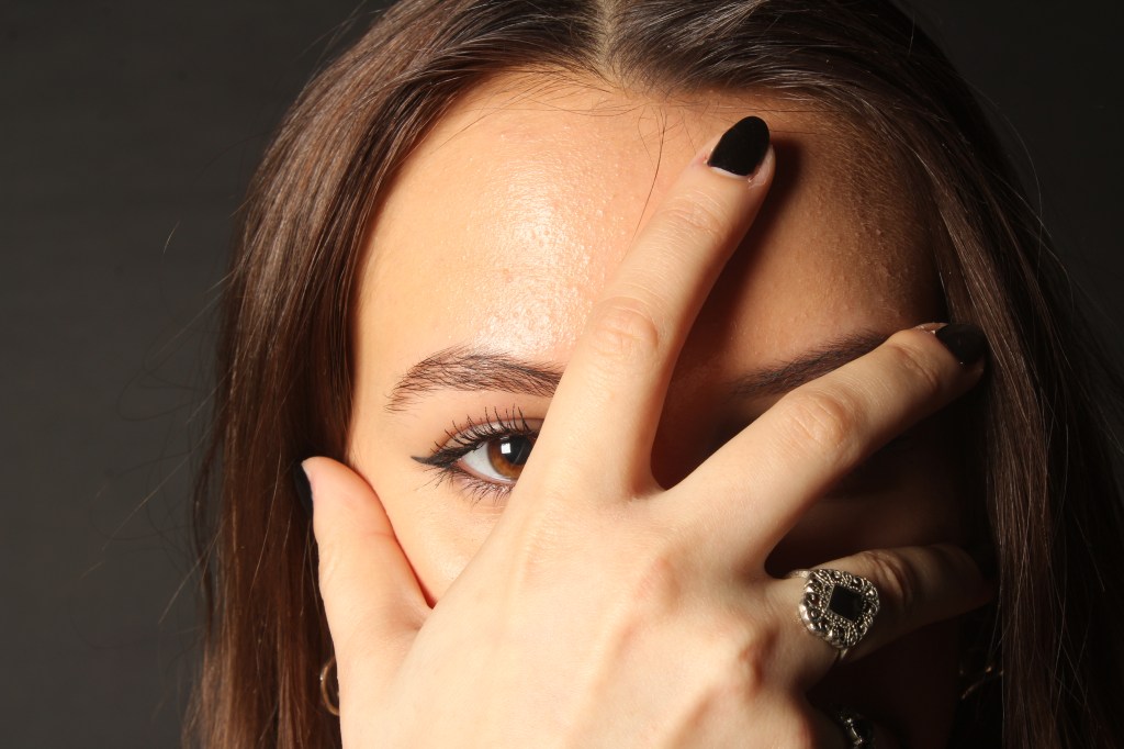
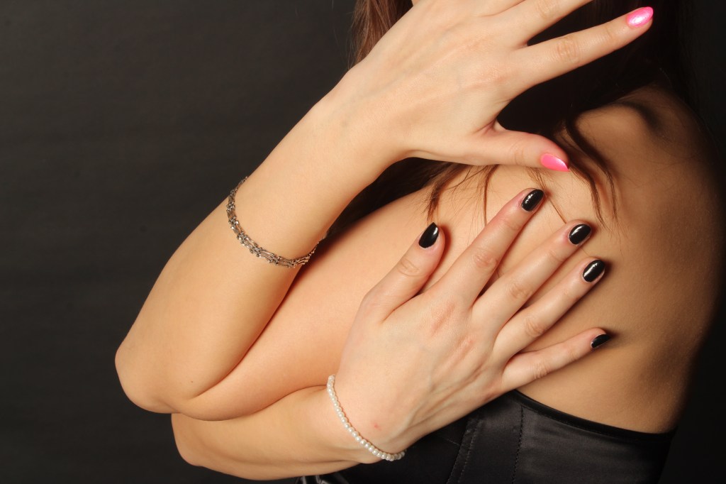
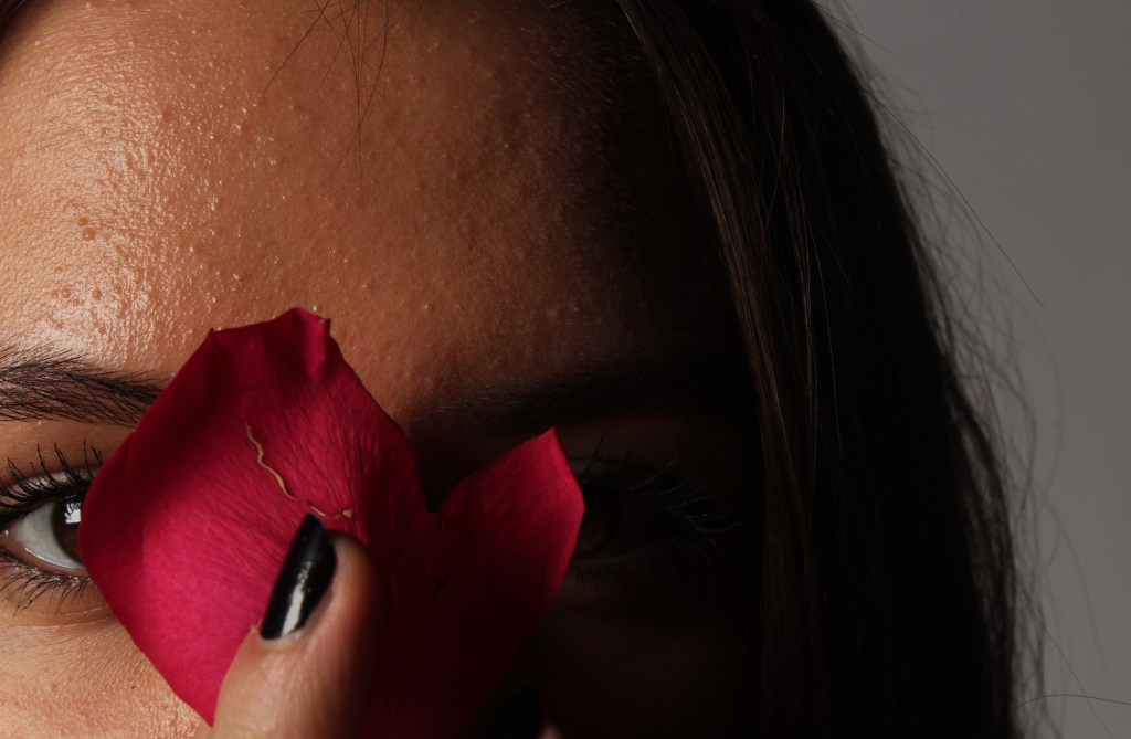
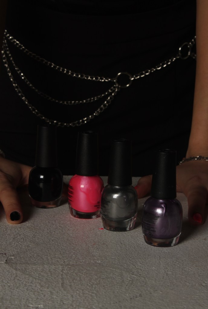
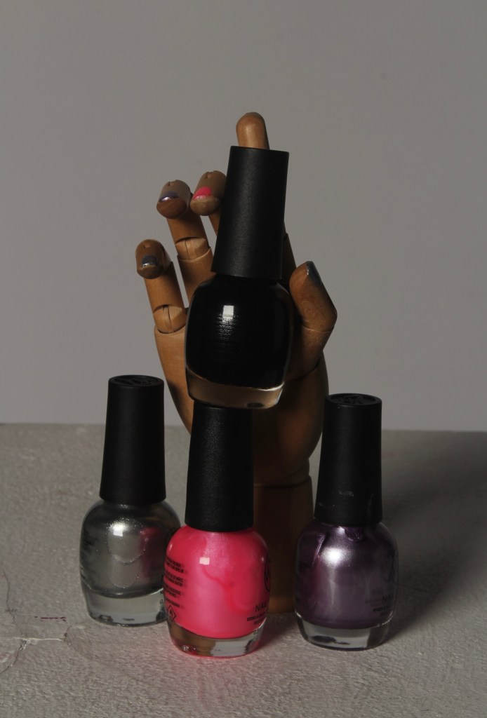
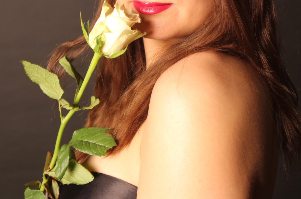
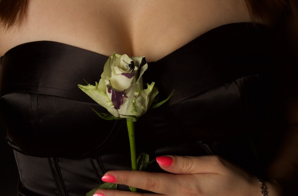
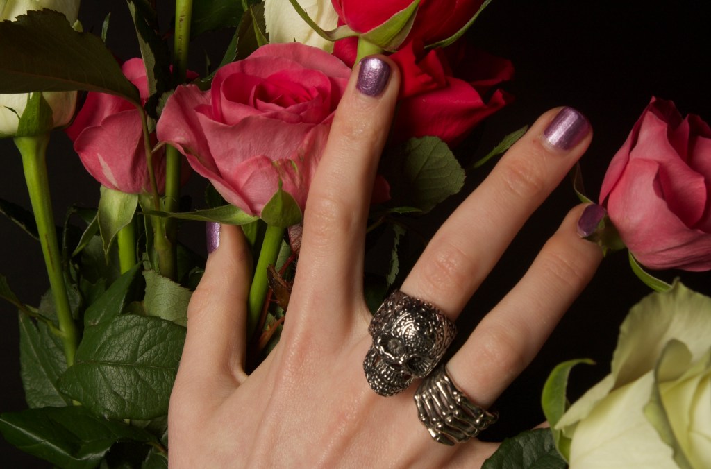
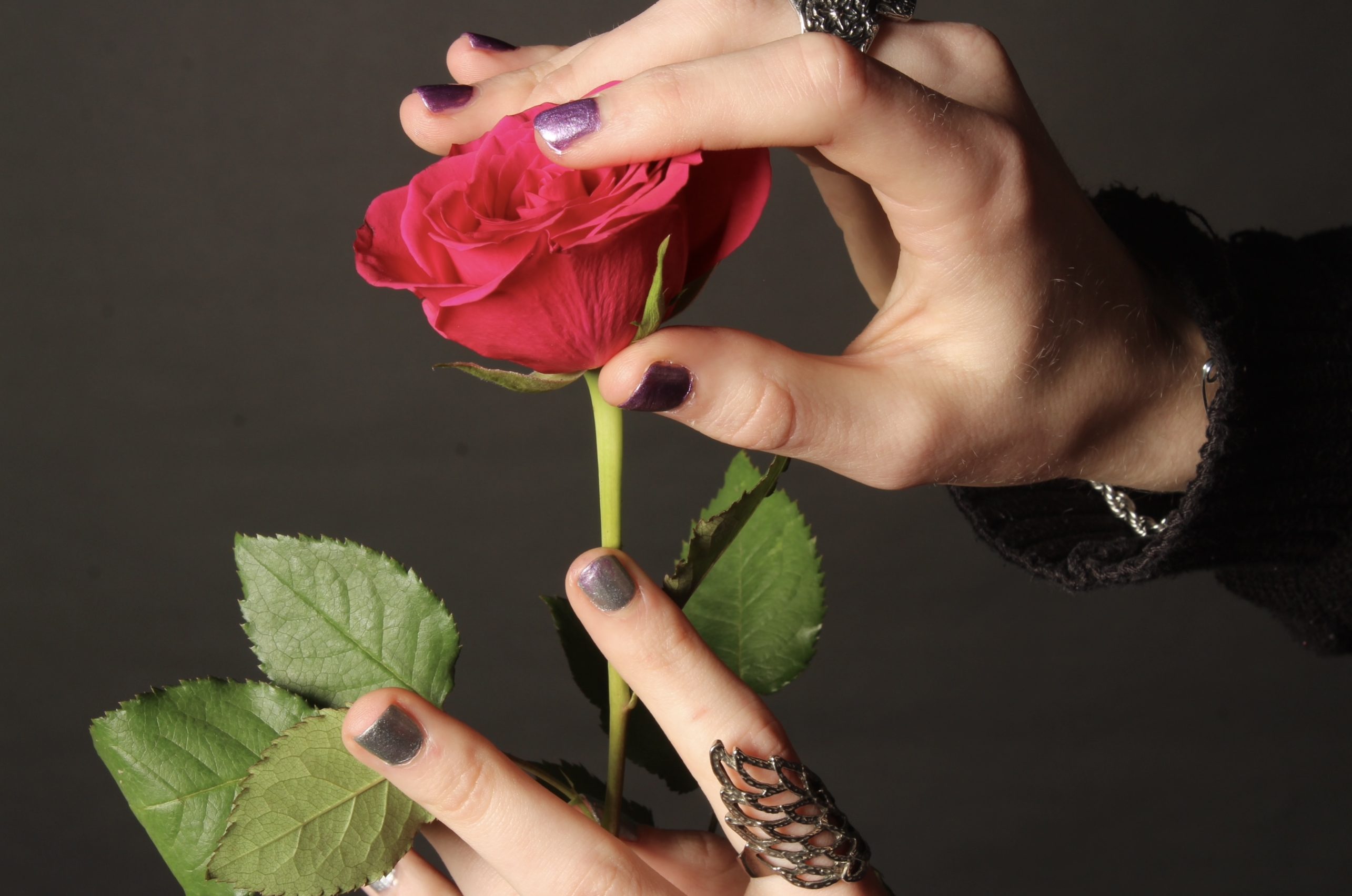
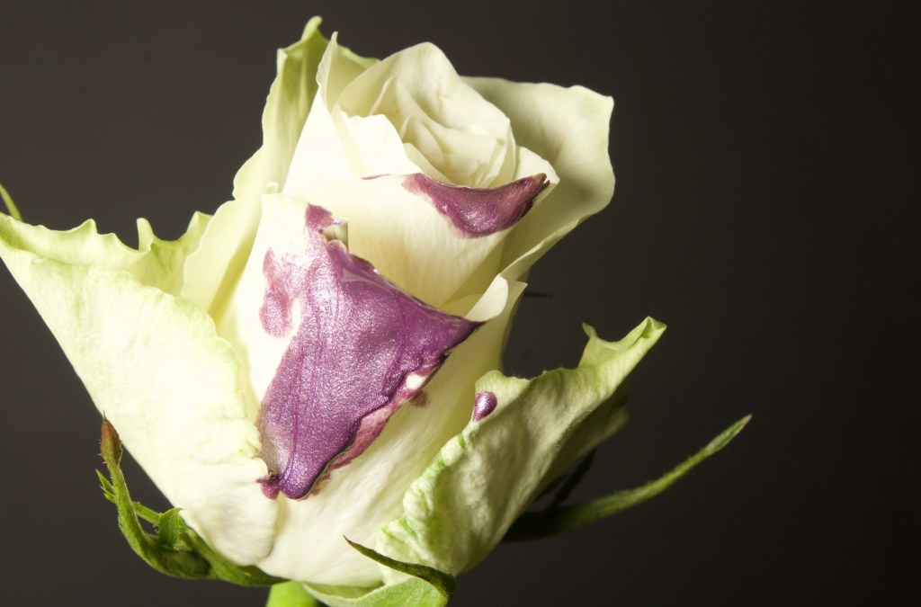
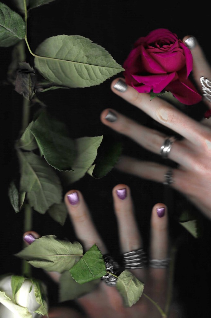
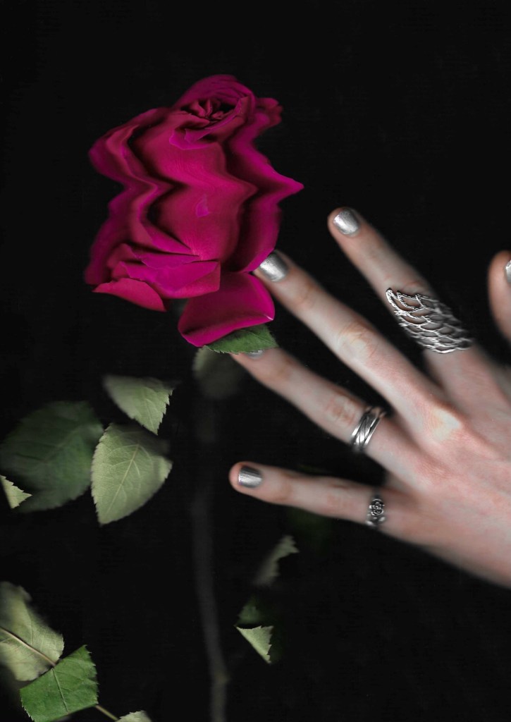
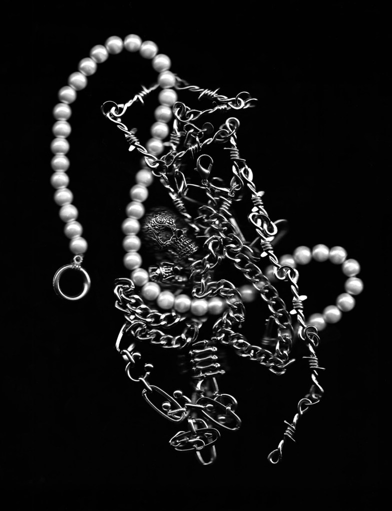
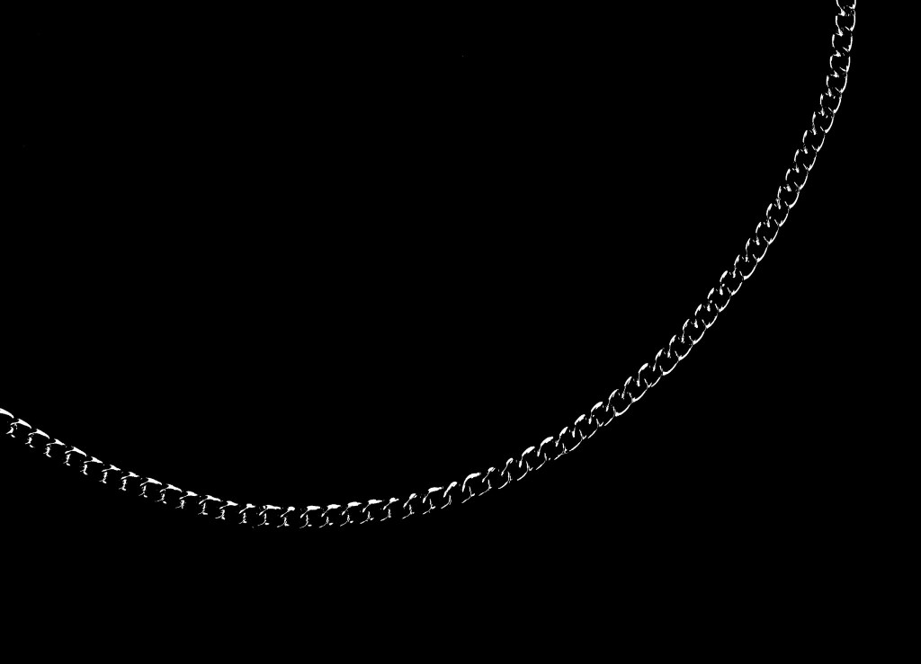
Photos:
Reflection: I’m very happy with my final video. I’ve learnt a lot about video editing and creation from doing this and have become a lot more confident with Adobe Premier Pro and Procreate Dreams. I think I made good use of the audio by syncing up the visuals to the beat and the lyrics. Also the tone of the song fits nicely with the aesthetic of the video. The pacing of the video is fast with lots of transitions and a nice mixed of static and sequential elements. I think it is engaging and holds the viewers attention for the full 50 seconds. The visual identity I created in the posters is carried into the video. The bright colours, textures and added details are all present. This video has a drastically different tone and aesthetic to other nail polish related advertisements so will be recognisable and eye catching.