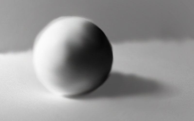
Before painting with light it is essential to understand how light interacts with an object to create highlights and shadows. This image breaks down the different areas of light and shadow of an egg. I used theses ideas for my own digital paintings.
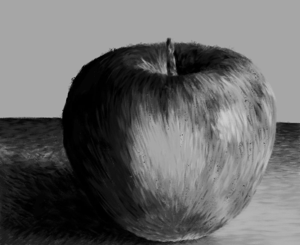
In preparation for this weeks session of photoshop I watched the tutorial which talked about lighting and tone and how to paint digitally using different brushes. I then made my own digital painting on an apple using those techniques. I’m happy with the outcome as I think i was able to manipulate the brushes and shades to show the shadows ad highlights of the object. The shading wasn’t as smooth as I would have wanted so I want to learn how to achieve a glossier finish.
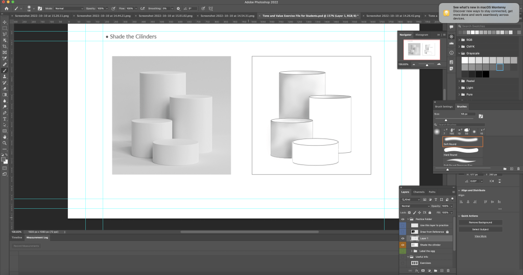
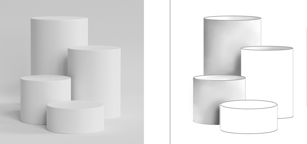
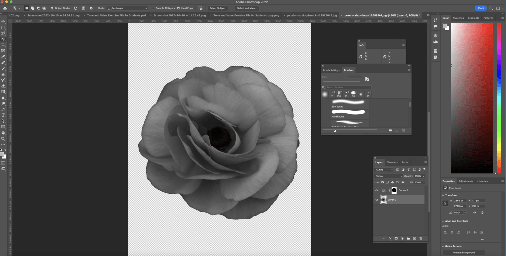
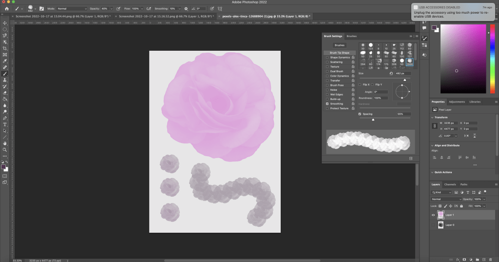
Digital painting of an apple.I learnt in more details about different brushes and how to change them. Our task was to some of the cylinders using the Wacom tablet and brush tool. First I selected the area I wanted to shade using the magic wand tool to ensure I wasn’t adding tone to any other parts of image except my targeted part. I selected the brush tool and tested out different bushes and brush settings. I chose to use the soft round brush which is in the general brushes category. I adjusted the settings to allow the pen pressure on the Wacom to be visible. With this I began to shade using the greyscale palette. Here are a couple cylinders with more refined shading as I further emphasised the dark and light sections.Another practice piece. For this one I used the soft round brush with pressure opacity to give it a lighter texture. I then made my own brush using a photo of a rose that I downloaded. First I desaturated it to make it black and white. Then I selected the image, inverted it then removed the background. Next I selected define brush preset and named it.This is the brush I made and tested out different colours and spacings.
This week we focused on the brush tool and how to effectively use it to add tonal values to an object. In order to do this we had to use the selection tools that we learnt the previous week. I improved my understanding of the relationship between and object and a light source which will help me with my art in general as this is a key aspect of drawing. I started to get more comfortable using the brush tools and testing out the different brush options as well as settings such as hardness and opacity. After leaning about this method of shading I still prefer hand drawn shading as I feel that I have more control of shade and texture.
In this session we began to respond to a text that we read called ‘sell your house and buy gold’. We did this through figure drawing where we had a live model. The text presented many prevalent themes such as fear, dystopia, paranoia, shadows, and disaster. I used these themes to try and shape my work in order for it to better represent the ideas, emotions and atmosphere of the text. Through these sketches I experimented with tone, shape and media.
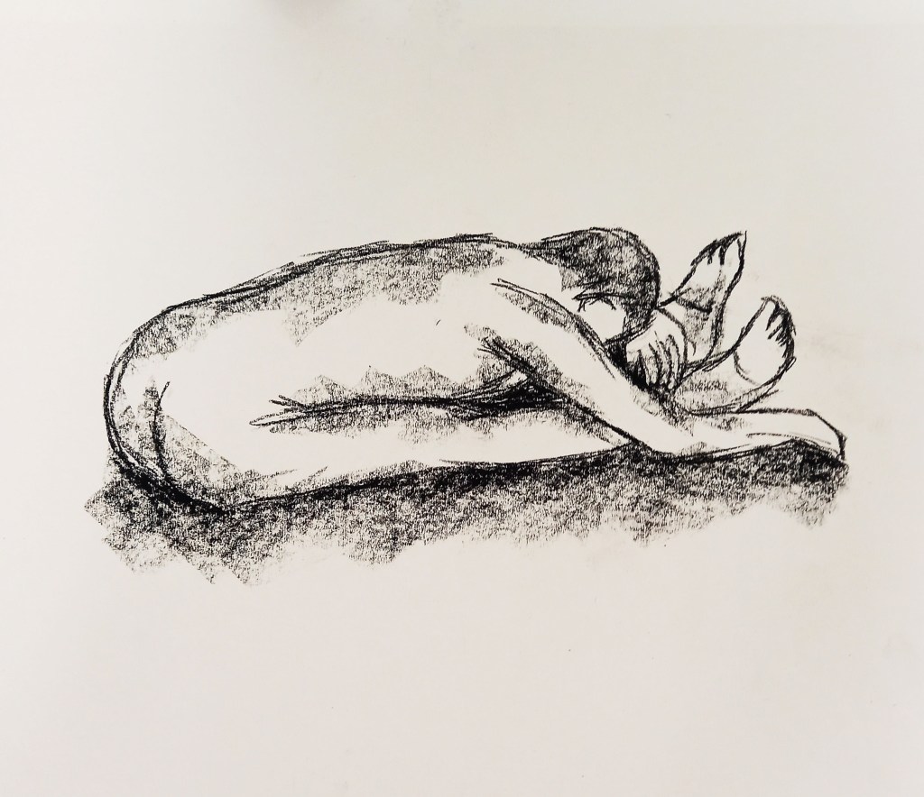
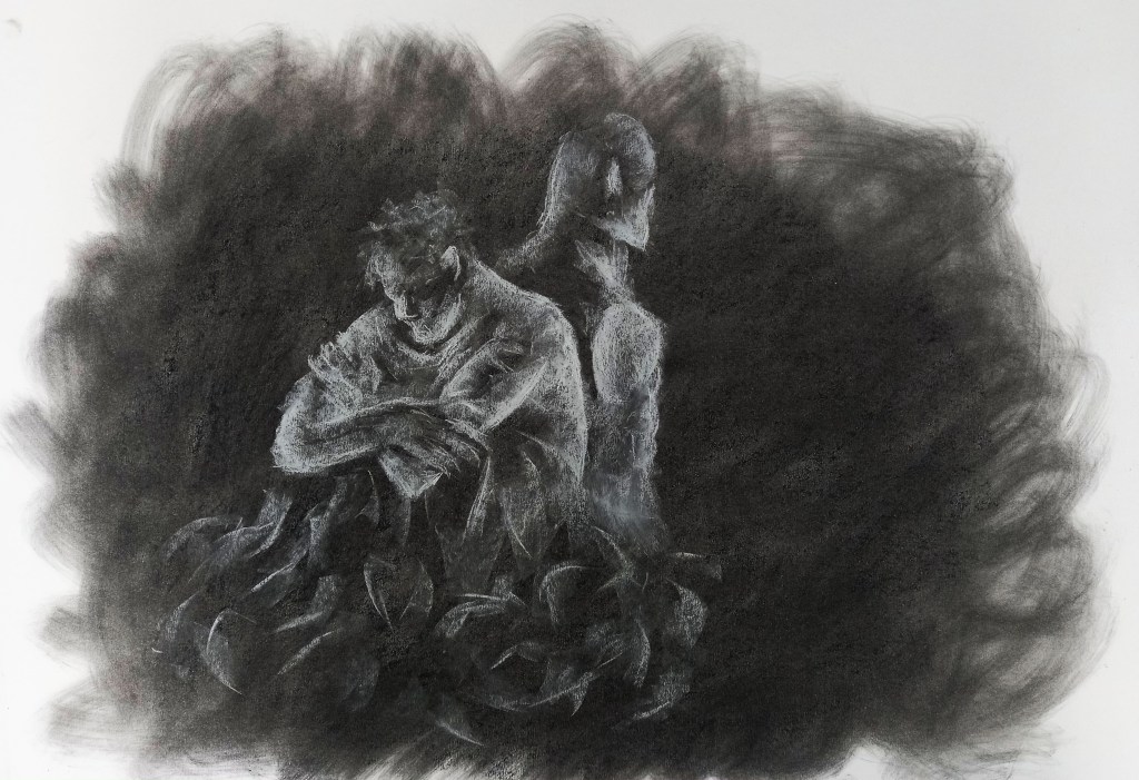
This is my favourite of the quick sketches. It was a 5 minute sketch so I had the time to add more detail. I chose to use charcoal as it is a good medium to use when trying to achieve solid black tones. I began to add in tone, something I explored more later, to capture the dark, gloomy atmosphere of the text. Also I think this pose is very good to reflect to fearful and sad tone of the text. These images were done with chalk and charcoal on a mid tone charcoal background. Again, these where done from observation and I began by drawing in the highlights then went in to add the shadows. I think the darker background and dramatic lighting of the figures reflects the tone and atmosphere of the text. This and the next image are both done exclusively with chalk on a dark charcoal background. I used a piece of tissue to smudge and swirl the background to create a dramatic and chaotic atmosphere. For me the pose reflects the themes of isolation and fear. I think just drawing the highlights was an effective technique to create the drama I wanted. This is a more abstract piece as I did draw from observation but adjusted and emphasised certain features. For example I only focused on the mannequin and the hands of the model. By leaving the hands black it creates an ominous and elusive feel to the image. These pieces where heavily inspired by the traditional painting technique chiaroscuro which is all about using intense light and dark area to create the appearance of a three dimensional object.
I enjoyed this workshop as I like figure drawing and am confident with the media I used. I will continue to develop my response to the ‘sell your house and buy gold’ brief.
In this session I further developed my skills on photoshop, with a more directed focus on composition and colouring. Prior to the lesson I watched a couple tutorial videos which helped me understand the basics. during the session, I experimented with lots of tools and techniques on different images of my work.
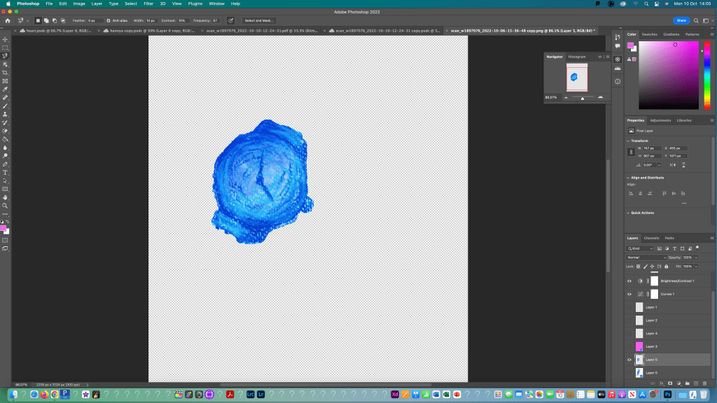
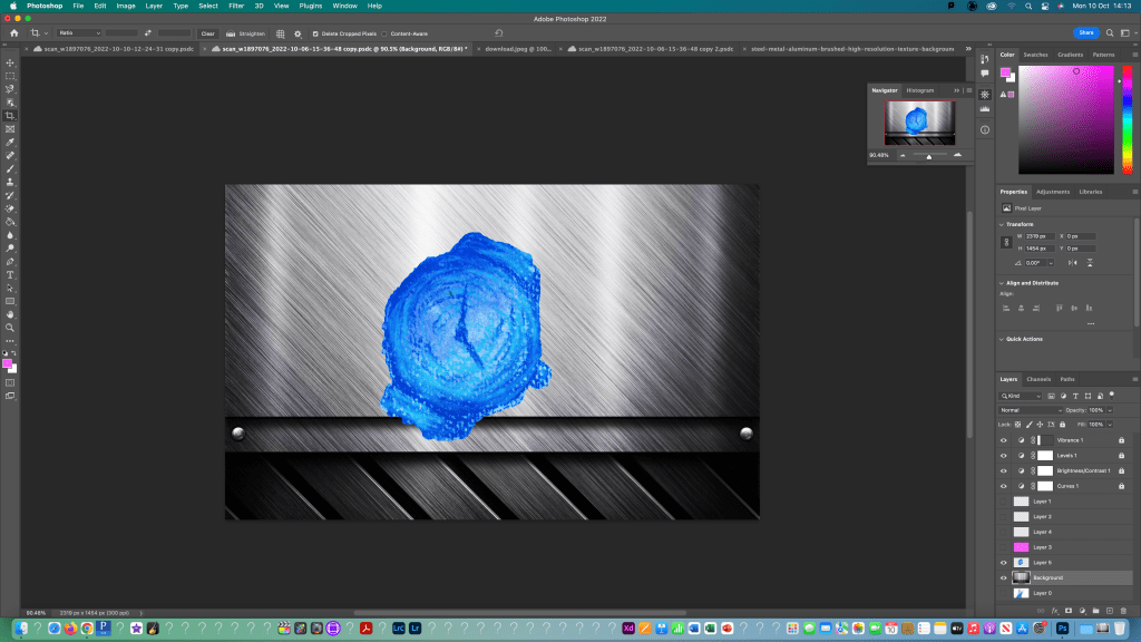
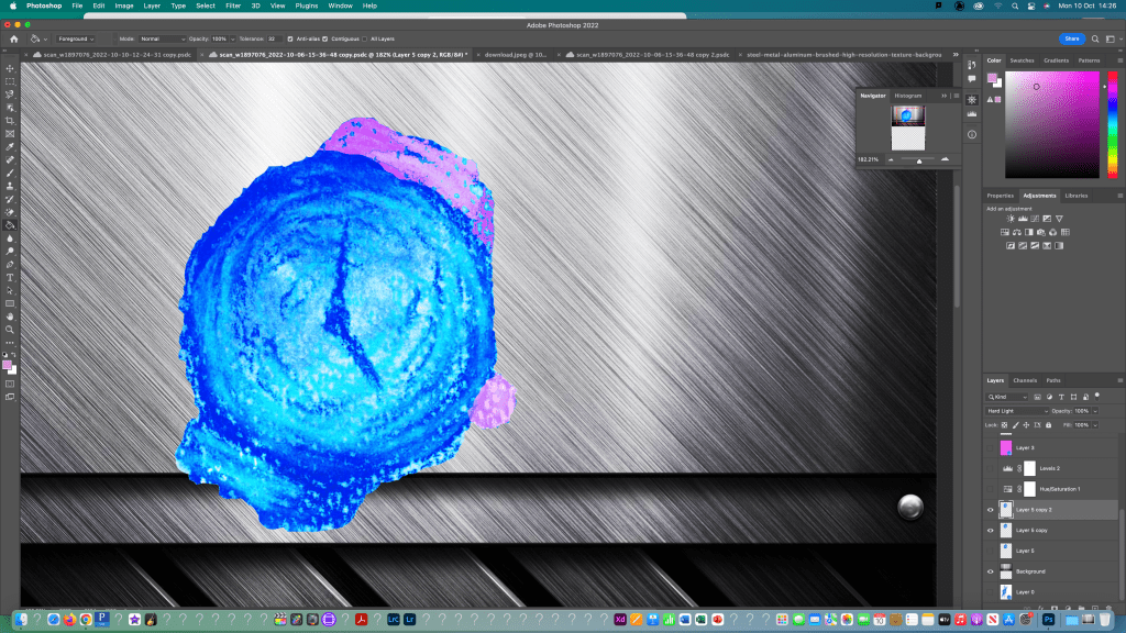
I began by opening my image in photoshop and turning it to a normal layer. Then used the crop and rotate tools to make the image easier to work with. I used what I learnt last week to edit the image using the curves, brightness and levels adjustment tools. Also, I cleaned it up using the spot healing tool.I first thing i tested was adding an image onto a solid colour background. I added a new layer and used this to put the part of my image that i selected using the object selection tool. I copied it to the new layer and used the paint bucket tool to fill the background a solid pink colour. Using the same process, I selected the other watch face and copied that to a new layer. I made sure to save my selections as I went so I could go back to them if I needed to. I did this by going to to the selection bar at the top and choosing save selection and gave it a name that I would remember related to each part. I then moved onto experimenting with textured backgrounds. I downloaded a metallic texture background and opened it on a new canvas in photoshop. Then I duplicated the layer into the watch file. Using free transform I adjusted the size and orientation of the object and background. I then moved onto experimenting with colour using the brush and bucket fill tools to get different effects. Also I adjusted the hue, saturation and opacity to change the way it colours reacted. Here’s another test I did where I changed the colour of the background and adjusted to image properties.
For this piece I selected the image using the object select tool and inverted it so I could fill just the background using the paint bucket tool. Then using the lasso selection tool I selected different parts of the eyes and filled them in with 2 different shades of red.
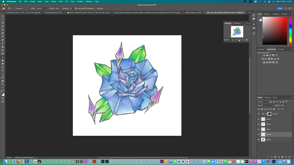
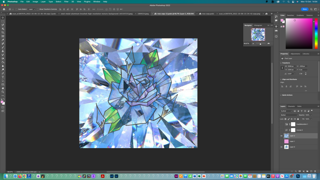
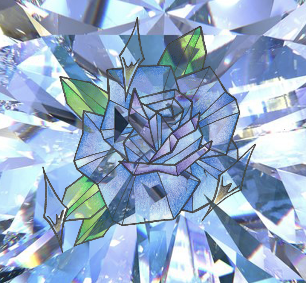
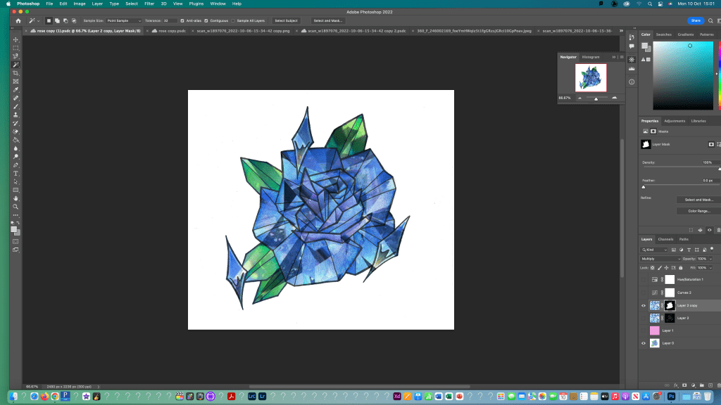
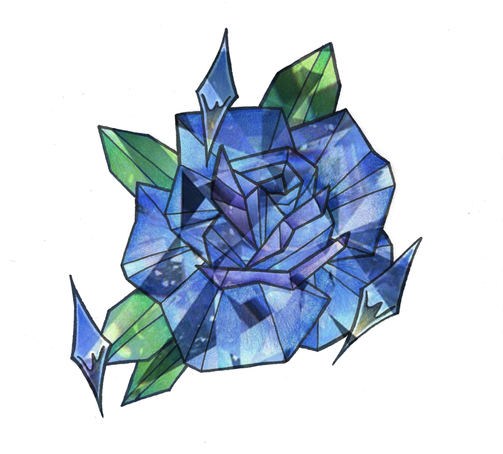
For this I used the magnetic lasso tool to draw around the top parts of the chrome sparkles to create a boundary which I then filled in with different opacities of pink using the brush tool. I made a new layer and coloured it pink then adjusted the colour settings to change how the layers are seen together to get a pink glow behind the rose. I used the same process as before to add a textured background then changed the colour settings to get the background to shine through the rose. I created a mask for the rose so the texture would only show through the rose and not in the background. Then I adjusted to properties to create the desired effect. This was another experiment with changing the line colour of an image. For this I first created a separate layer with a coloured background and then copy and pasted the same image multiple times to make a pattern of objects. Each one is on a different layer so I made sure to make all layers visible.
This weeks learning built on the basics that we did in the first session. We started to learn about layers, layer mask and the other frequently used tools such as the different selection options. I found some of the more difficult especially neatly selecting an object or part of an object but I began to get more confident with it. The tools we learnt will come in helpful when I want to edit a drawing to add new elements or experiment with colour or composition options.
I signed up for an induction into the print making studio, with a specific focus on relief printing. We were introduced to the equipment and machinery in the studio as-well as a type of printing called lino printing. This is a type of printing where you carve parts of a clay-like material to remove bits to create a design. then once your deign is made you roll ink over the surface and press it onto paper using one of the machines in the studio.
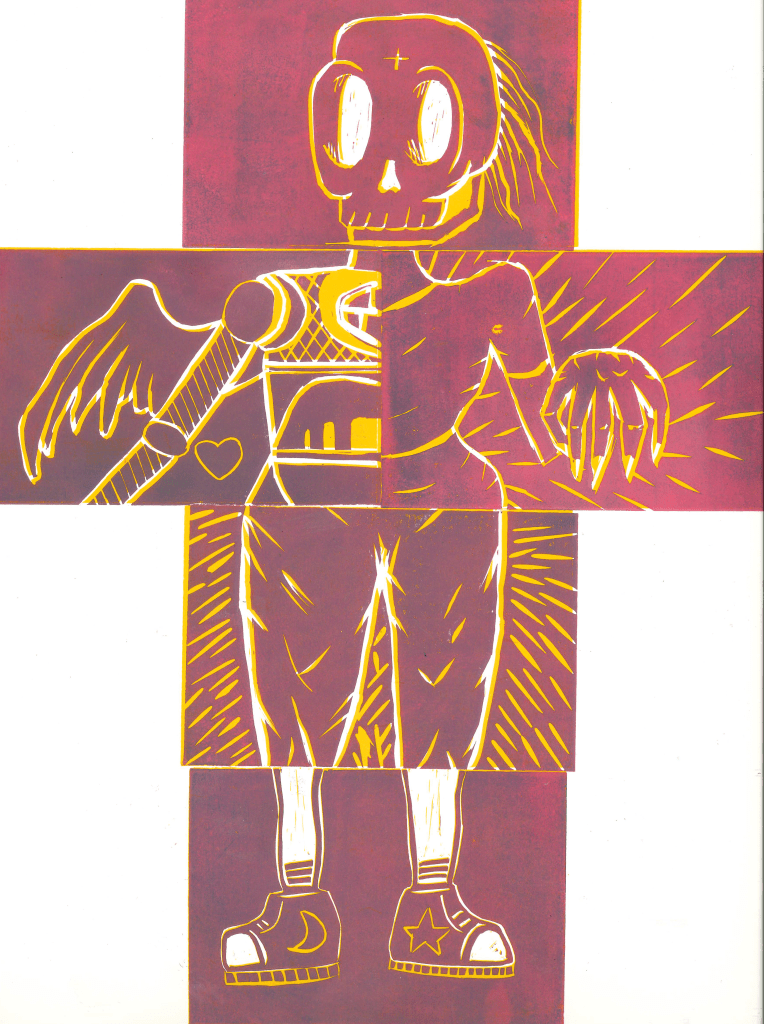
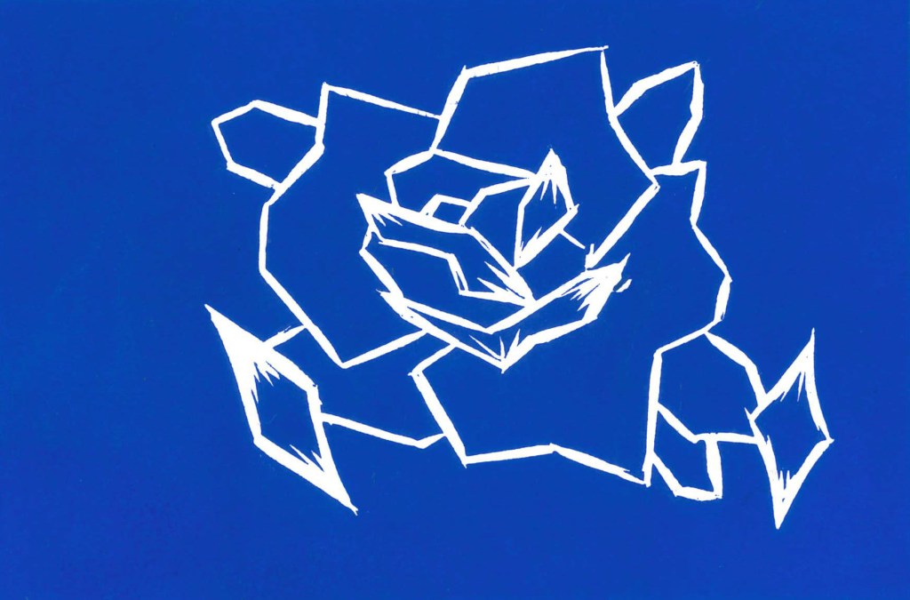
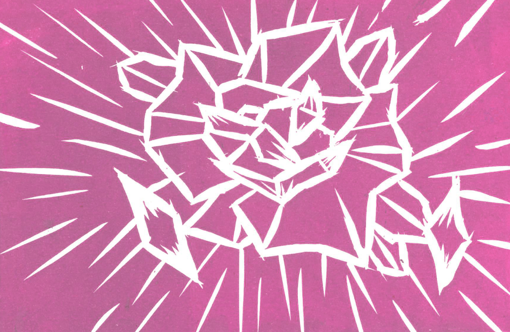
We did a group piece where each person made 1 lino cut and they came together to for a body. We then printed the figure and made a reduction print by removing more of the lino then printing it on top of the other colours. As we added more detail, less was printed meaning that some of the first colour showed through. I really liked the way these prints turned out with the two colours.I also did my own one, where i carved a geometric rose into the lino and printed it in a range of colours. I was happy with the sharpness of lines and boldness of the colours.This is my favourite of the prints as i think the extra detail help to create an interesting print and the colour came out very strong.
I enjoyed experimenting with lino print and I plan to use this technique more in my work. The hardest part of the process was understanding what bits to remove and leave unprinted in order to create a successful image.
This task was an extension of what we did last week with the observational drawings of our partners sentimental objects. I expanded on the ideas I already had and experimented with new styles and techniques. I also began to consider more about how I could reflect Jianyn’s personality and the things we discussed through my sketches.
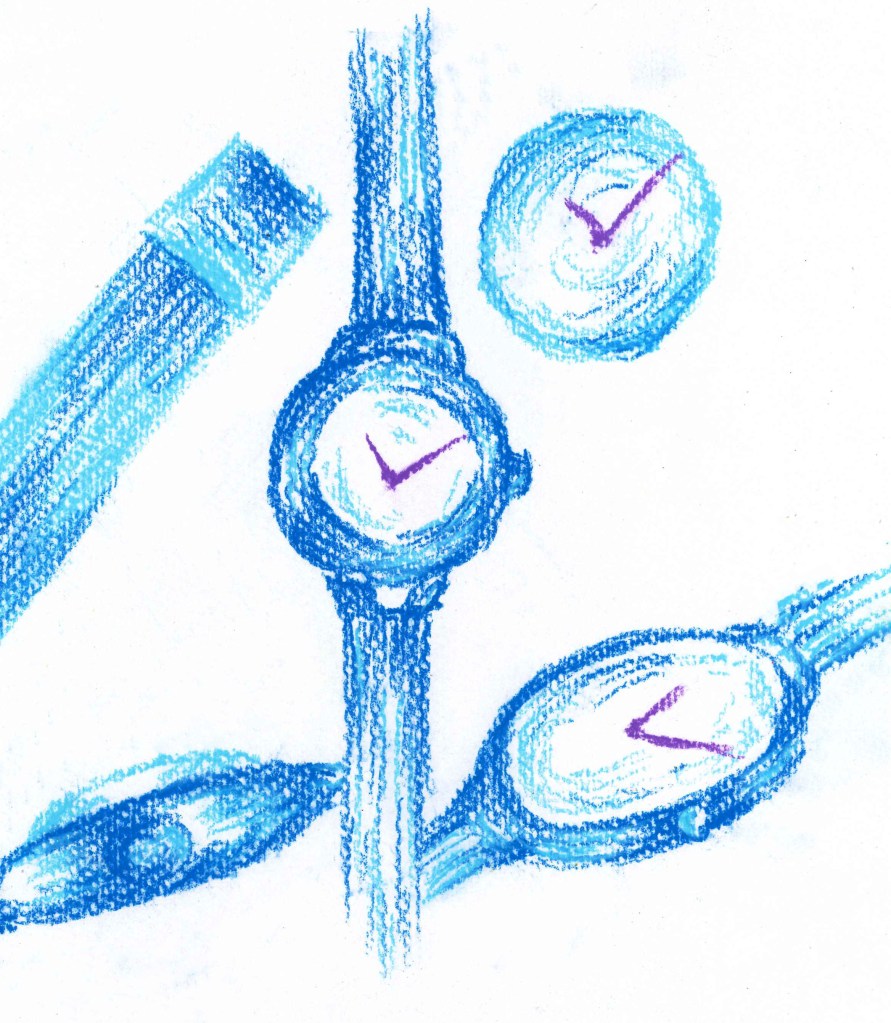
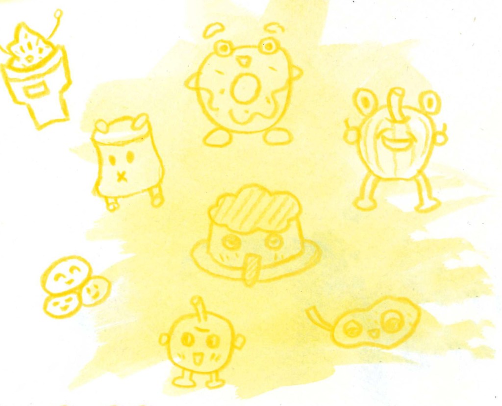
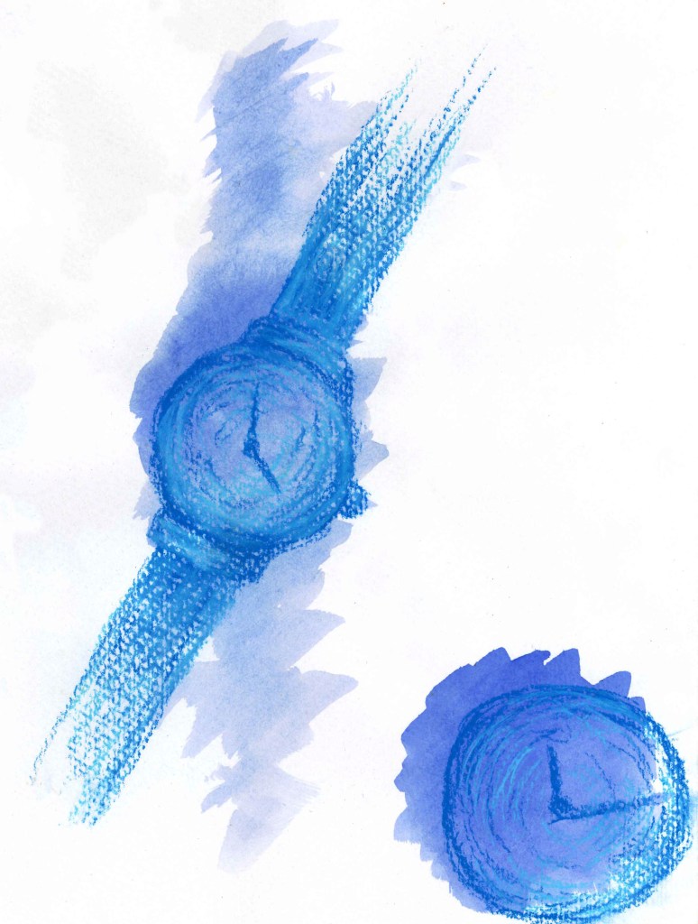
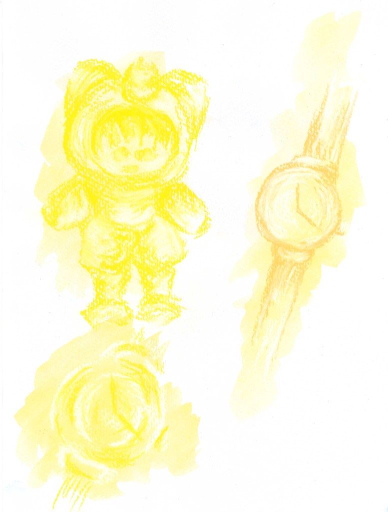
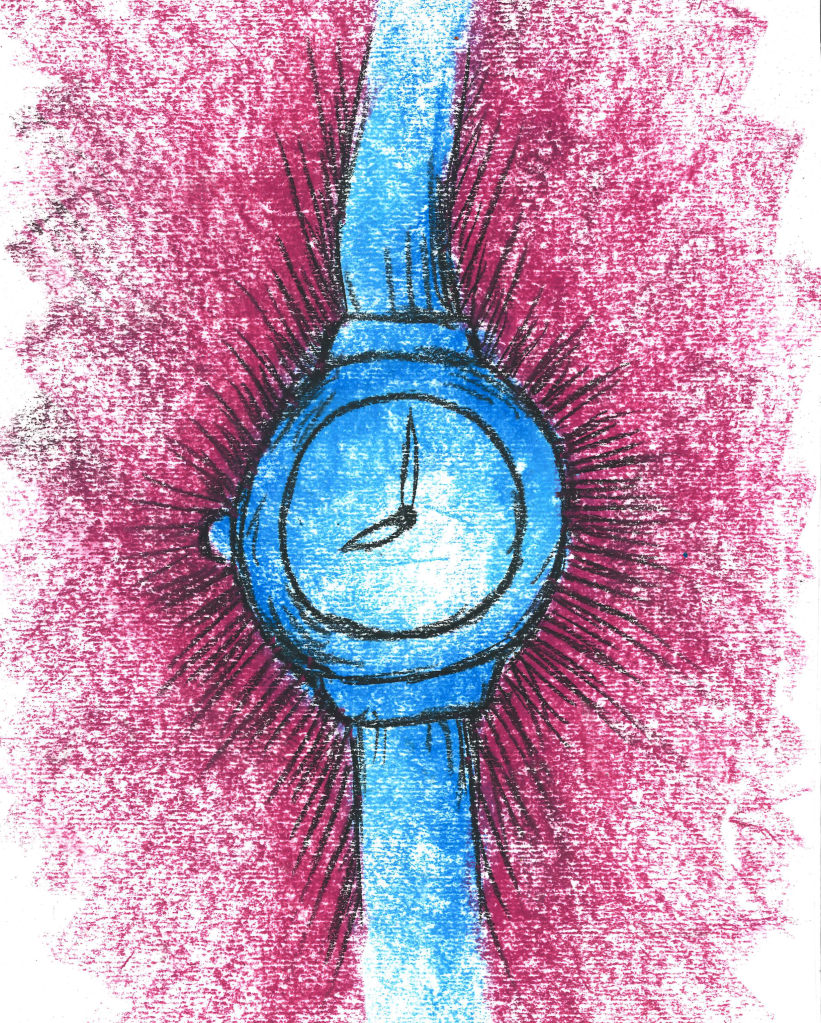
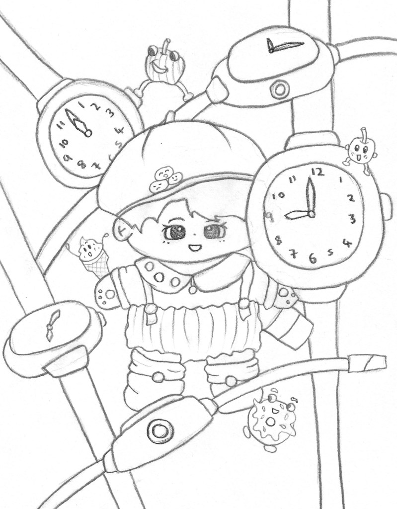
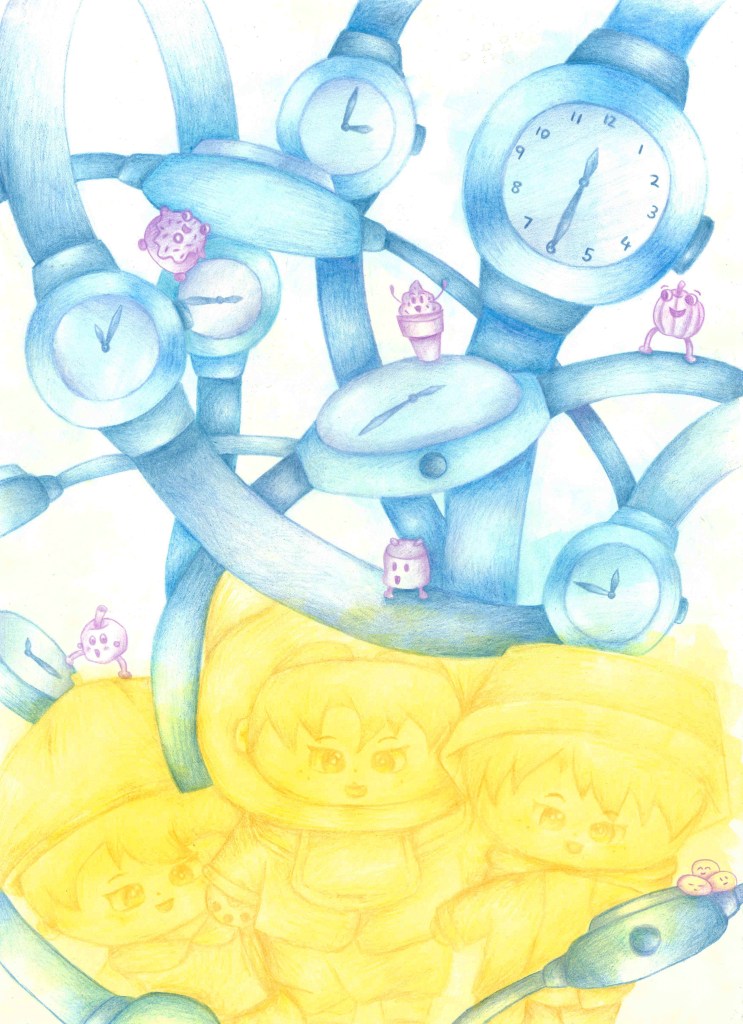
I continued to experiment with the blue monochromatic style for these watches. for these I used oil pastel and was pleased with the strength of colour I was able to make. In our discussion my partner said she really likes the colour yellow so I began to experiment with this colour. I think it helps convey her fun and bubbly personality. I used a water colour backdrop with coloured pencil sketches of some of her cartoon food designs, continuing with the monochromatic theme which I really like.These combined the watercolour background overlaid with a more detailed sketch. I like the aesthetic of having the rough shape of the object then sketching it but slightly moving the subject. It creates this nice mixed media overlapping image. More of the same style sketches. Continuing with the overlapping mixed media idea, I tested out doing a marker pen sketch over watercolour. I really like this one as the bold, dynamic marks made by the pen really compliment the subtle orange water colour behind it. A similar piece of a coloured pencil watch overlapping a marker pen watch.This sketch incorporates the blue watch with contrasting black lines and a strong purple background. This is all done in oil pastels and I really like the dramatic feel of the dark background which makes the light watch stand out by creating a strong contrast.At the end of this session I began to think about combining all the styles and still life sketches I’d done into one composition to reflect the personality of my partner. Here is my first rough idea of a composition. It has different angles of the teddy with lots of different sized watches overlapping each other. This creates a sense of movement and dynamism and I included some of Jiayun’s cartoon foods which are interacting with the other components of this sketch. I think this composition is able to portray a fun, cute and bubbly feeling which I believe reflects my partner and would also be aided by the addition of colour which is something I will continue to explore with more roughs. I was inspired by sci-fi and cartoon movie posters as wanted to capture that sort of life and playfulness.Another rough composition sketch. This one has only 1 teddy with watches surrounding it. I like the foods in this piece and the life they bring to it but I prefer the arrangement of the first rough as it has more movement and the teddy feels more apart of the composition.
Here is my final image for this brief. I took ideas from all three roughs but mostly the first one as it was my favourite. I chose to use a simple colour palette, limiting it to purple, blue and yellow as these are my partners favourite. Each of the three elements is limited to 1 colour. I used water colour to add a subtle backdrop colour and coloured pencils to add in the details and tones.I think this piece is successful in portraying my partners personality through her sentimental objects. I’m happy with the vibrant colours I used and think it creates a fun and playful atmosphere.
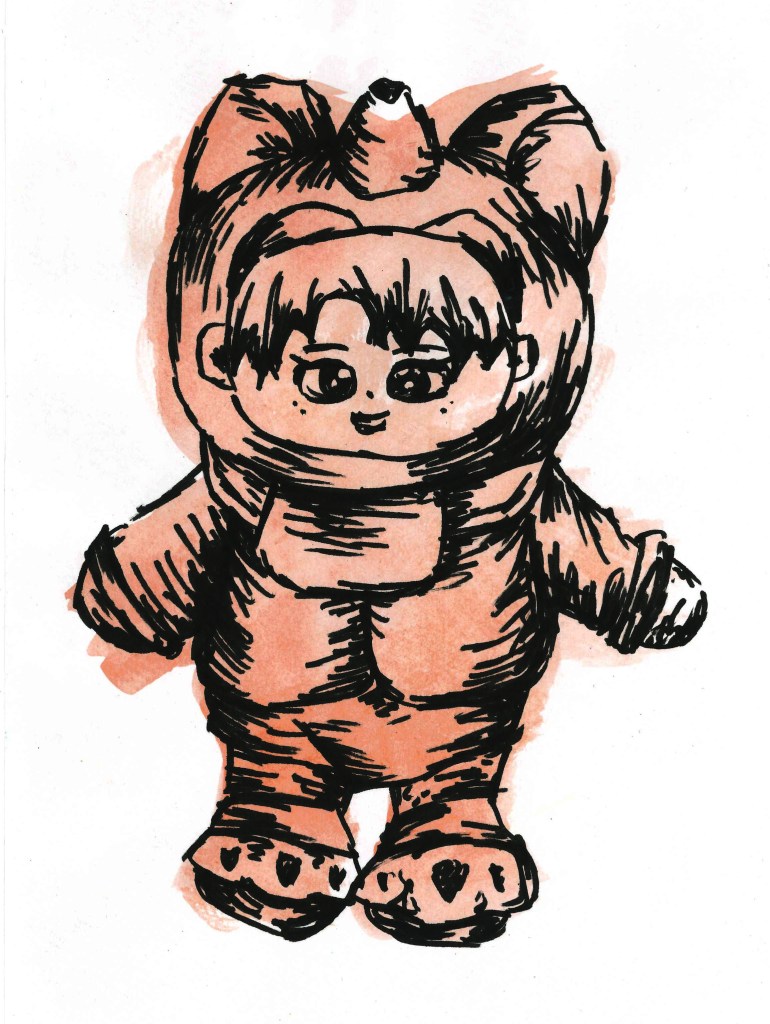
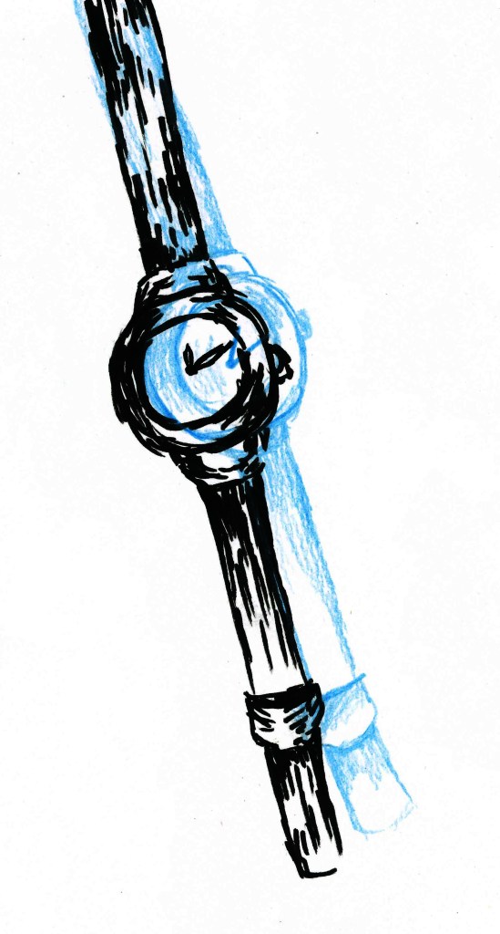
For this task we had to pair up with something who is very different to ourselves, whether that be in race, age, gender or any other difference. Then we had to show our partner 3 objects of ours that have sentimental value to us and discuss why they are significant to us. We also asked each other a series of other questions to help get to know each other better. My partner for this was Jiayun so I responded to our discussion with some sketches of her sentimental objects. I used different sketching styles and focuses to fully explore the objects.
All my sketches where done through observation, this greatly helped me capture to true forms of the objects.
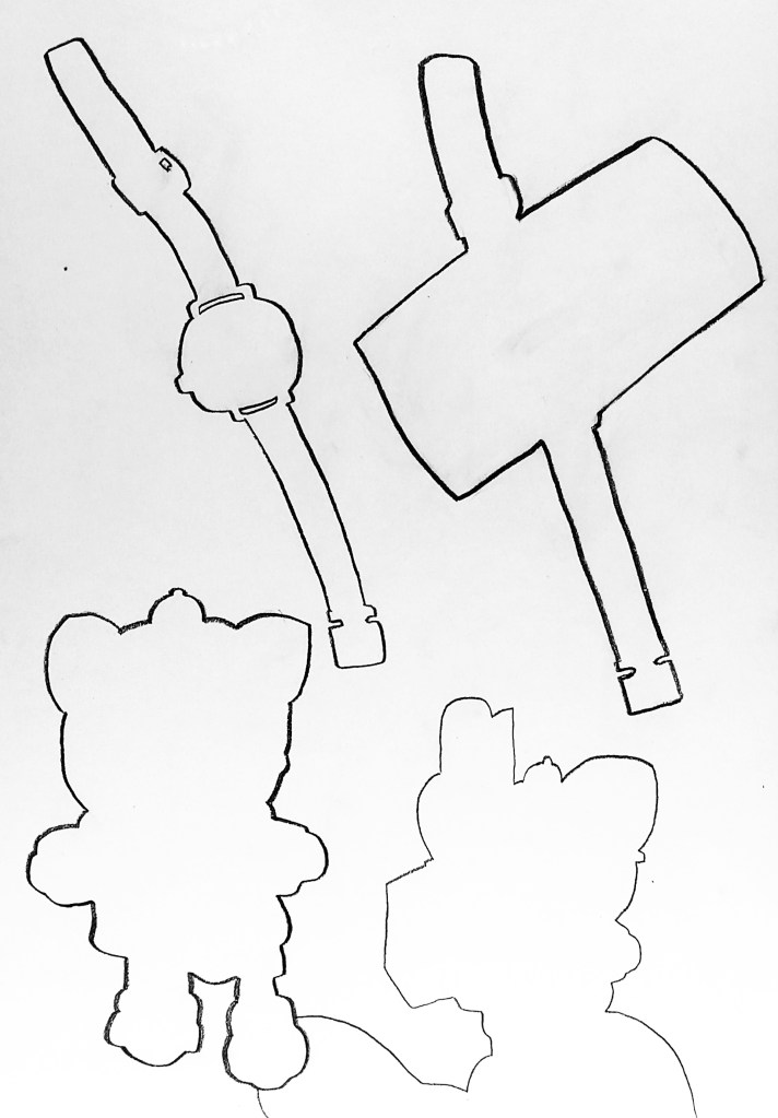
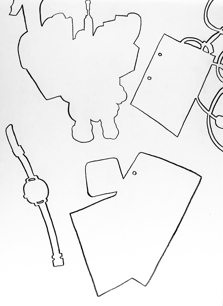
The first way that I studied the objects was using a drawing style called negative space, where you only draw the outside shapes of the object and its surroundings. This made me really focus of the shapes and forms to avoid unconscious preconceptions of a subject. It helped me to make clear observations about the subjects.More negative space sketches.
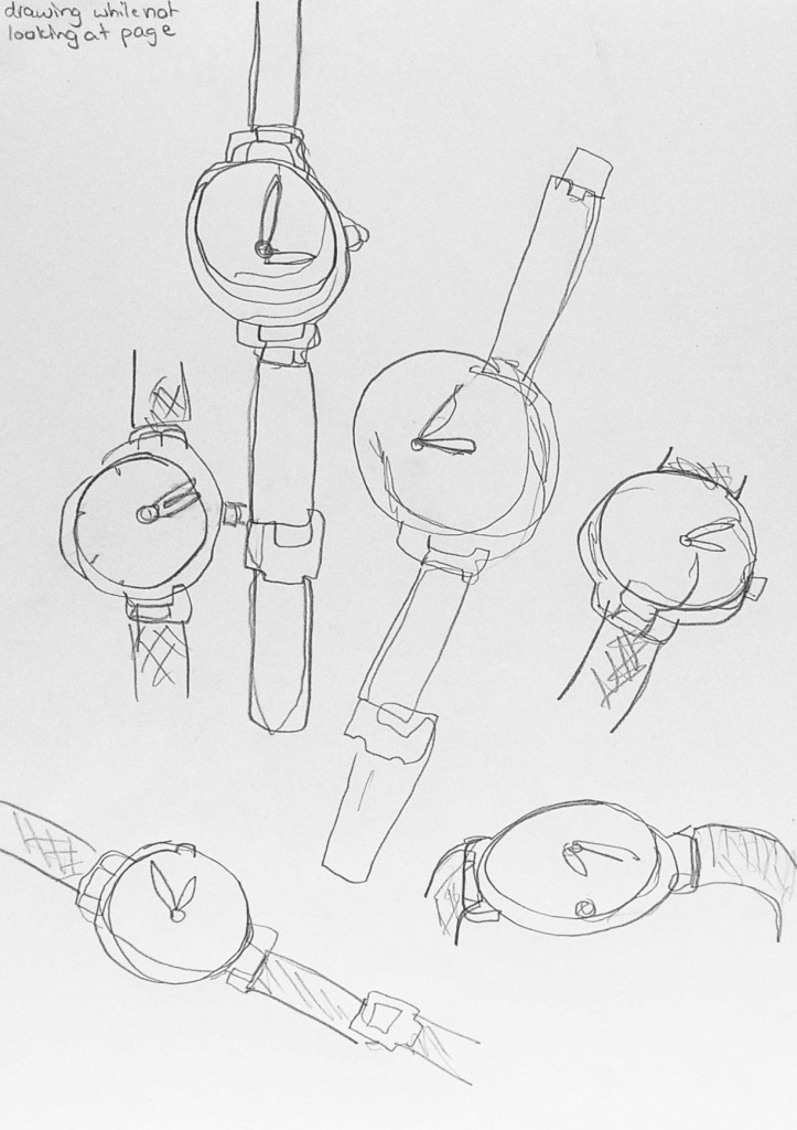
Next I experimented with looking at the whole subject and all its details. I attempted to sketch the object, in this case a watch, without looking at the page. These blind contour drawings helped me to focus on what I can see, not what thought I could see. I found this style of sketch challenging as I prefer a more controlled and refined style but it was good to experiment and helped me understand my subject.
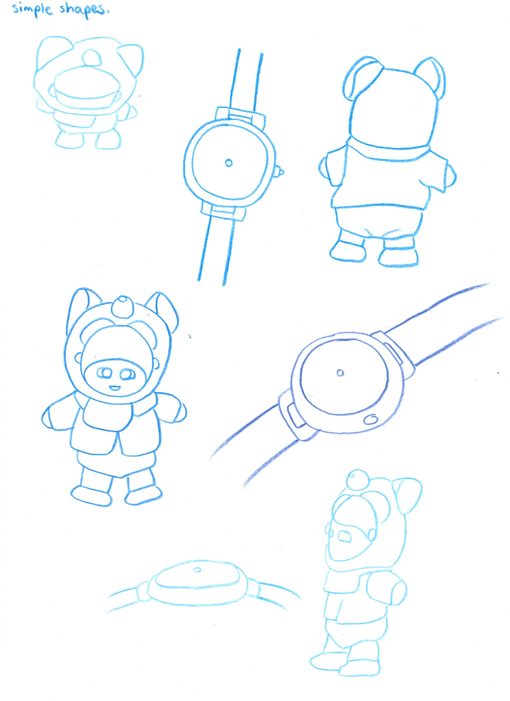
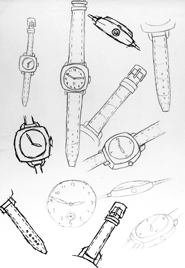
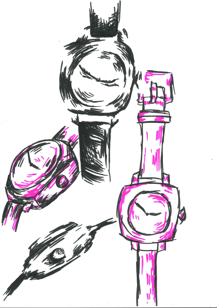
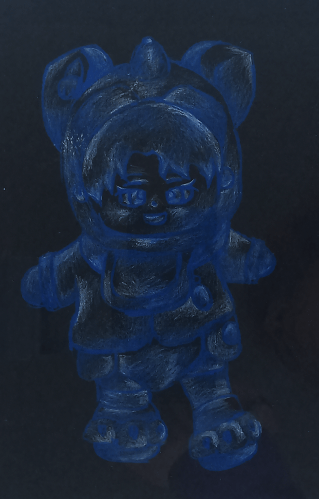
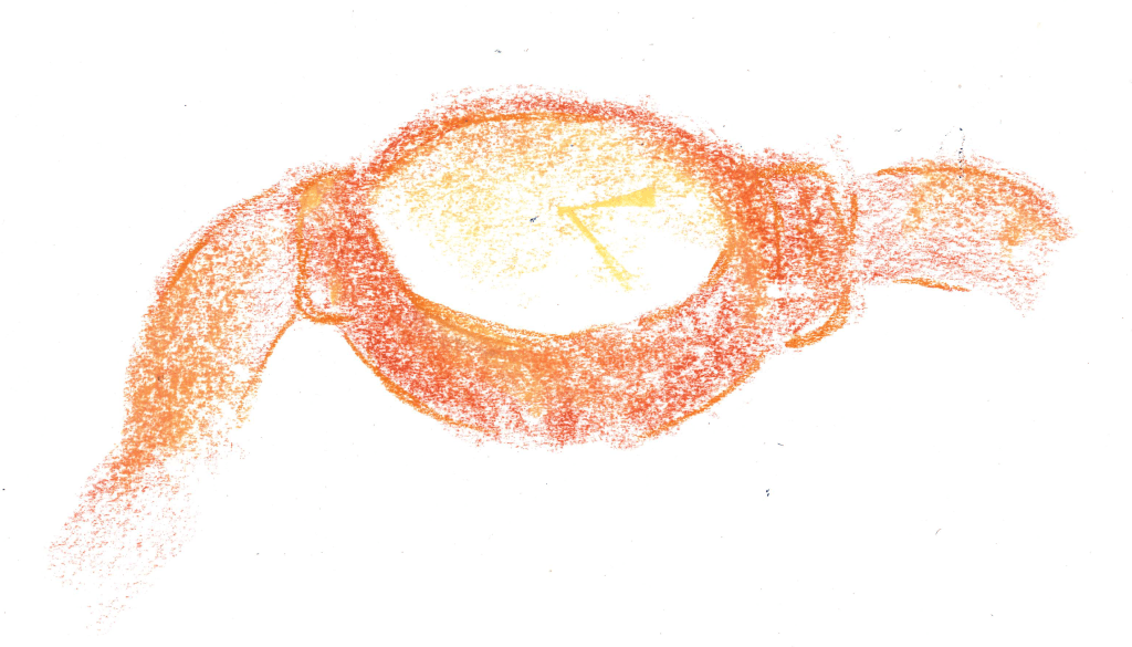
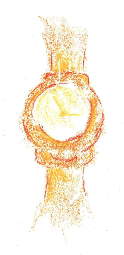
After that I moved onto building up images of the subjects by drawing the simple shapes that I could see. Breaking down a subject into simple shapes made it easier to sketch as the composition became much easier to understand. For example, I was able to sketch the watch from two circles and 2 rectangles, even with this simplified approach I was still able to convey what the subject was.After using the three techniques above, I had built up a greater understanding of my subjects so was able to more doing more detailed drawings, making sure to still pay close attention to the objects in order to get accurate observational drawings. Sketches primarily focusing on shapes, with minimal shading.I further explored tone using a graphic style of shading, with the black marker to represent the darkest parts, pink to represent the highlights and leaving the mid tones white. Using two different colours to represent the shadows and highlights meant I had to really focus and observe the differences in tone.I then explored the texture of the teddy. First I cut out a stencil of the shape used black paint on a rough sponge to convey the fluffy texture of the teddy. Different parts of the teddy had different textures so I represented this by how densely I applied the ink to each part.I expanded to my sketches looking at tone by drawing the watch at different angles on black paper, only using the highlights. This further improved my observational skills. This is a form of sculpting with shadows and highlights.For this sketch I used two shades of blue and white on paper to show the varying levels of tone on the teddy. This combined many of the elements of my previous sketches together. This page has some little transactions of Jiayun’s sketches to reflect some of what we discussed. Also it has three continuous line sketches from different angles of the teddy. This was another way to develop my observational skills as it required a lot of concentration in order to create the form of the object without taking the pencil off the page.The next three sketches are using experimenting using different chalks and charcoal. For the black one i used the charcoal to block in the darkest parts of the watch.This image and the next are both done using coloured chalks to show the golden colour if the watch. I used the flat side of the chalk to convey the tones and the sharp point to add structure to the different forms of the watch. I was very pleased with these as I think I was able to show both the forms and tones by manipulating a medium in two different ways. Same style sketch but from a different angel.
Using all these different drawing techniques and styles I was able to study and really understand the subject and create accurate sketches from observation.
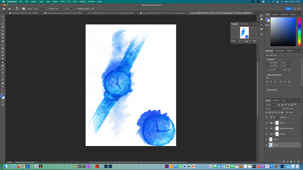
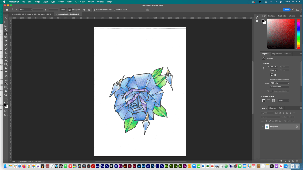
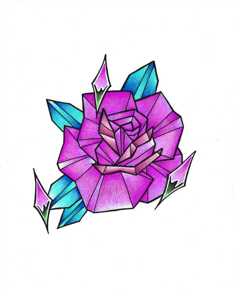
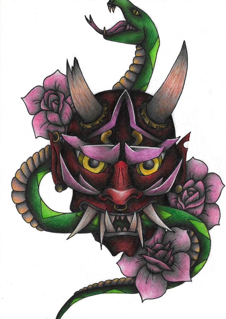
In this task I used Adobe Photoshop to edit and clean up my art to an industry standard so they’re ready to publish and share. I scanned my art using a scanner I had at home and this was to image I chose to edit.
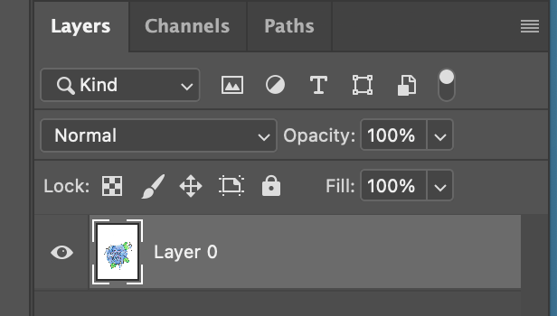
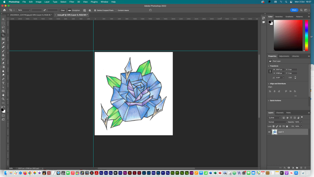
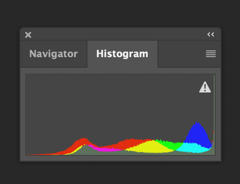
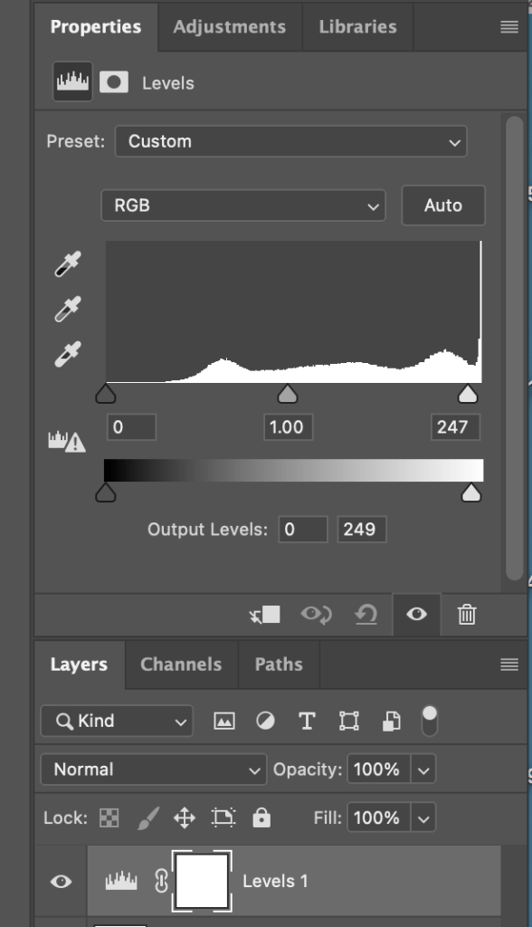
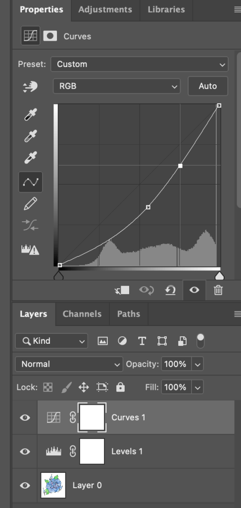
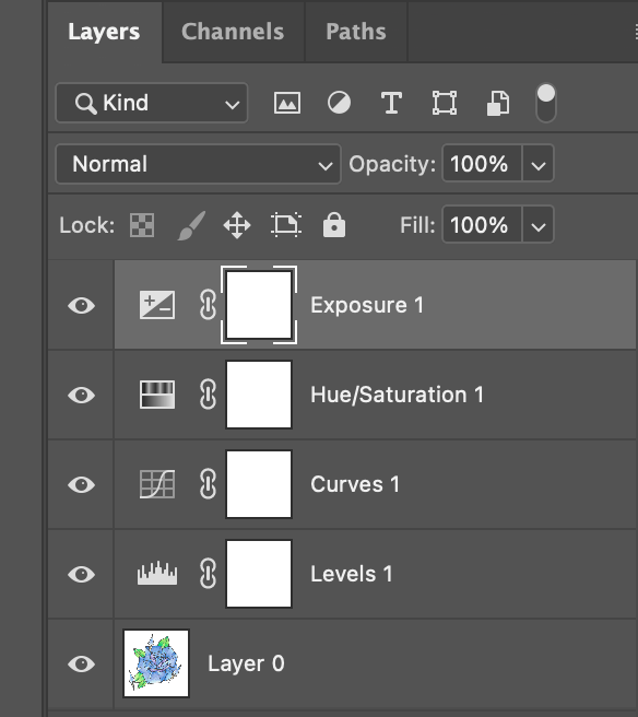
First I opened my scanned art in photoshop.Then I changed my image from a background layer to a normal layer (layer 0) so I could edit it properly.I rotated the image using the rotate tool and added rulers to help with measuring the dimensions.Using the rulers and the cropping tool I cropped my image to remove lots of the plain white background.I then looked at the histogram of my image to see the distribution of colours. In properties I used the levels tool to adjust the shade of my image.I further adjusted it using the curves tool which helped the colours be more bold and true to the original drawing.I edited the exposure and hue/saturation.
This is the final image. As you can see the image looks much cleaner and more professional after the photoshop editing.
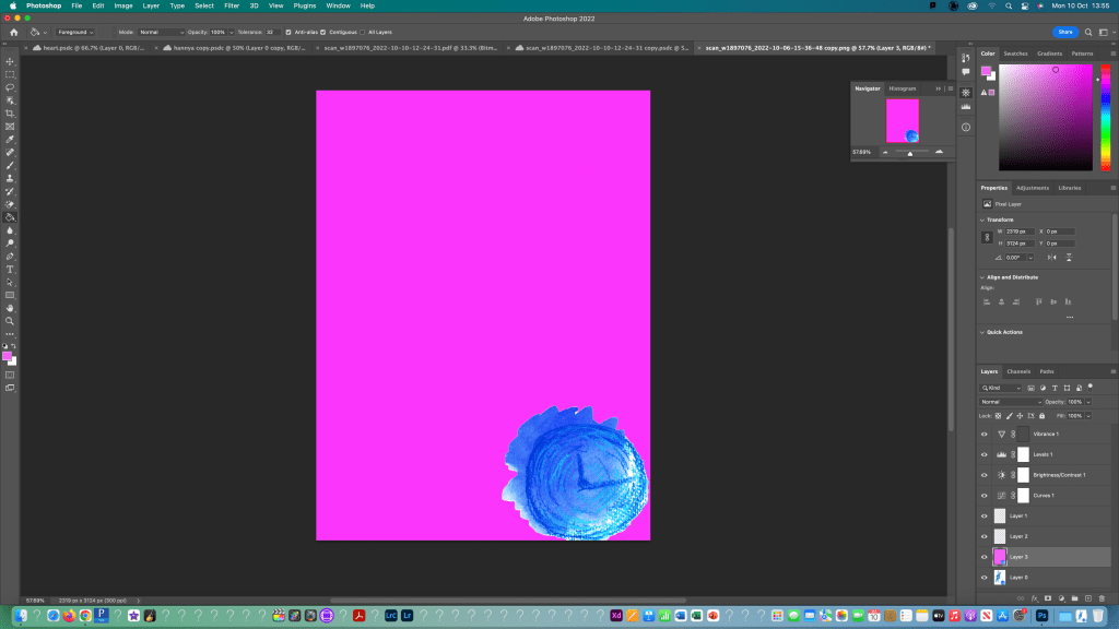
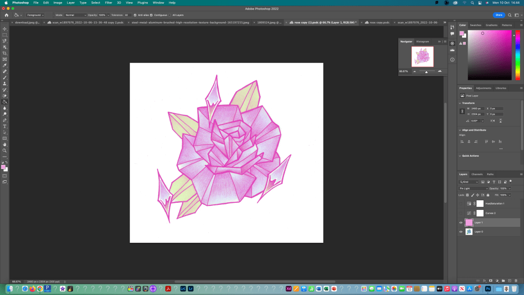
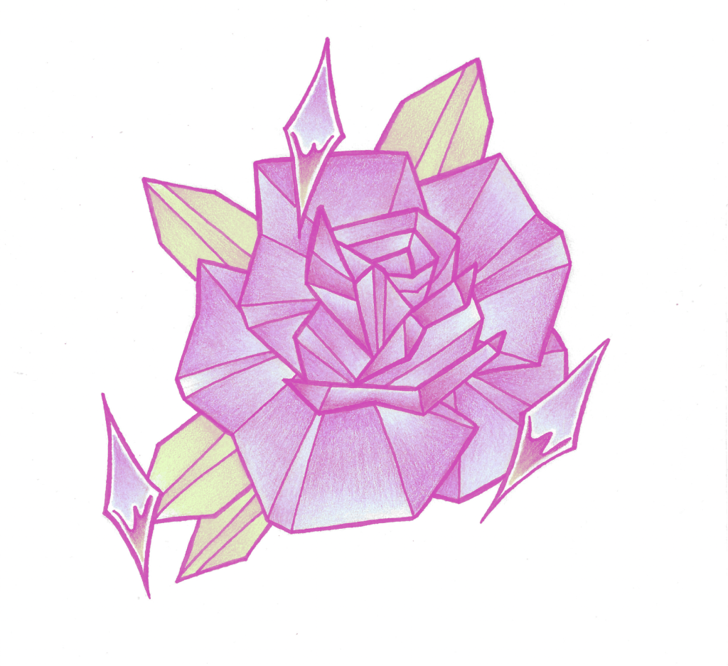
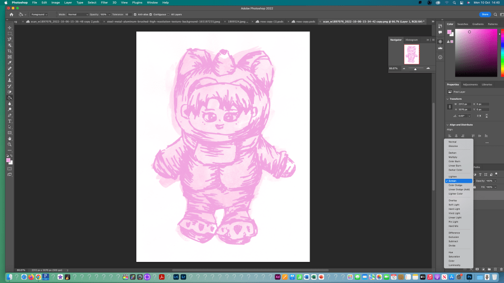
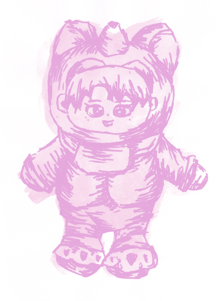
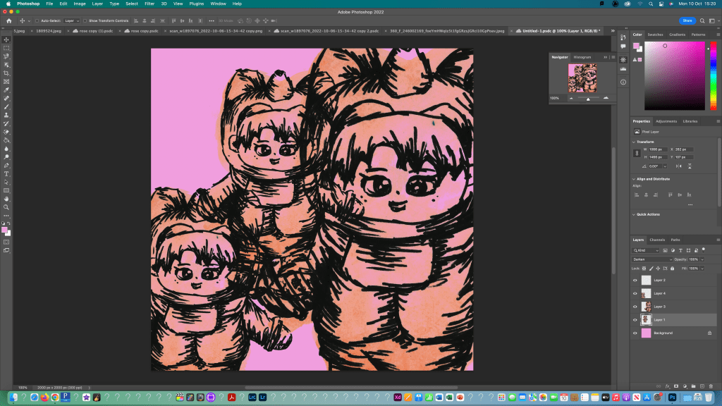
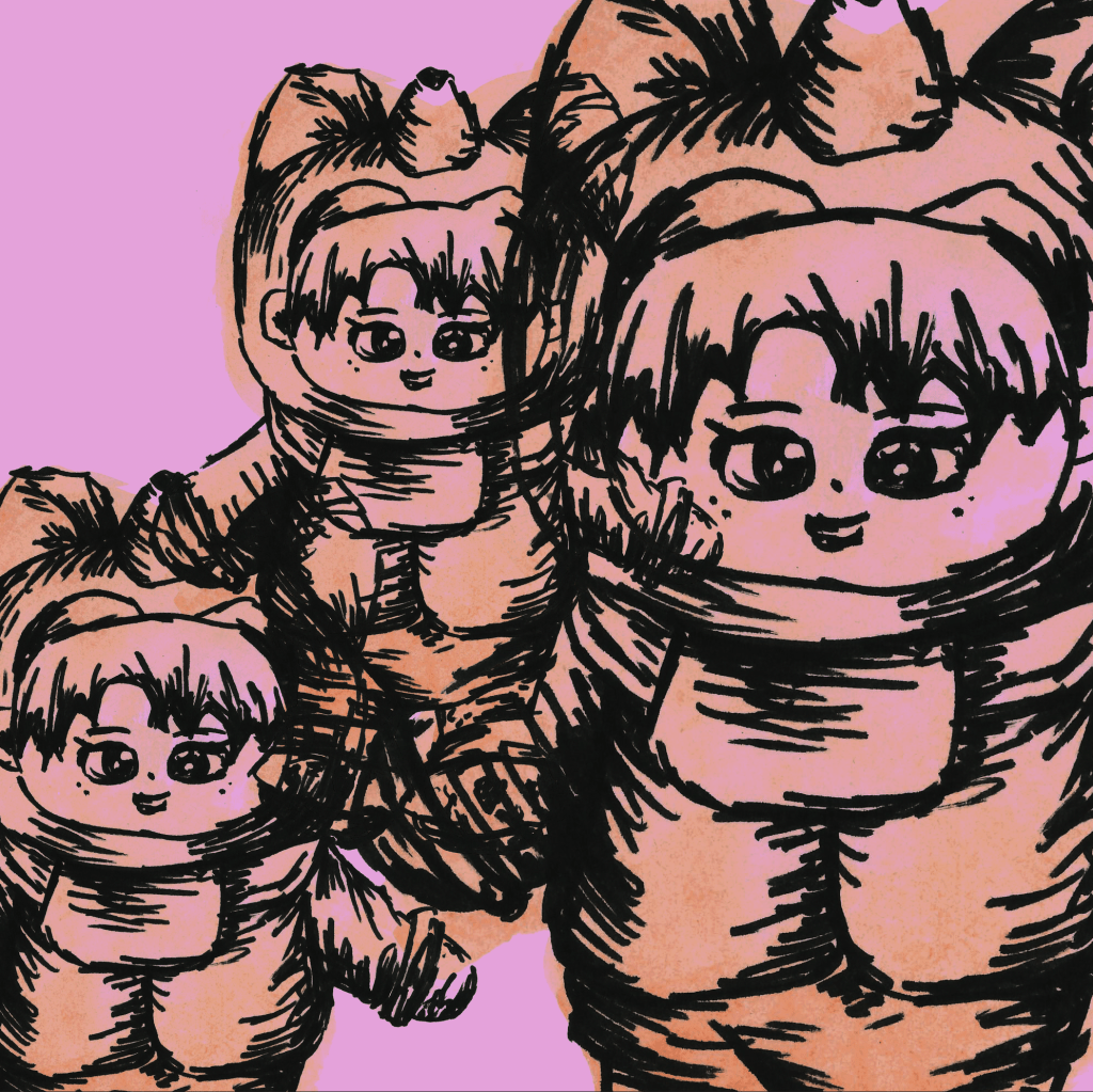
I further edited the image using some of the clipped adjustments such as adjusting the hue and saturation to make it a dark pink colour.I also edited this scanned image using the same steps.
I found that using the basic tools photoshop fairly straight forward and was able to successfully clean up my sketches to a good standard. This was helpful to learn as I can use it across the modules and the work I do outside of university to help make my images look neater and more presentable.