Categories
Drawing Exploration Level 4

Drawing Exploration: Intro

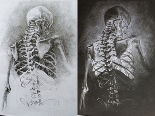
We were introduced to the Drawing Exploration module and split into 2 groups. The group I was in is doing the figure drawing section of the module first. We began the session more theory based work, learning terms such as Wabi-Sabi, and what makes something a drawing. We also looked at 7 considerations which can define and determine a drawing from inception to completion and engaged with drawing as a bio-mechanical process.

Then we looked at different pencils and why we use different ones. In particular we focused on 2H, HB and 2B as these where the only tools we used for the figure drawing we did later.

For the figure drawing we each took it in turns to model. Every sketch was done in under 4 minutes, forcing us to work quickly and record only the essential information. Initially we where given no instructions but later on we where told to focus on particular numbers of figures and sketch the scaffolding/framework first which helped to get the proportions of the body. Another technique that helped was putting 1 mark at the top and another at the bottom to keep the whole figure inside to make sure it stayed on the page.

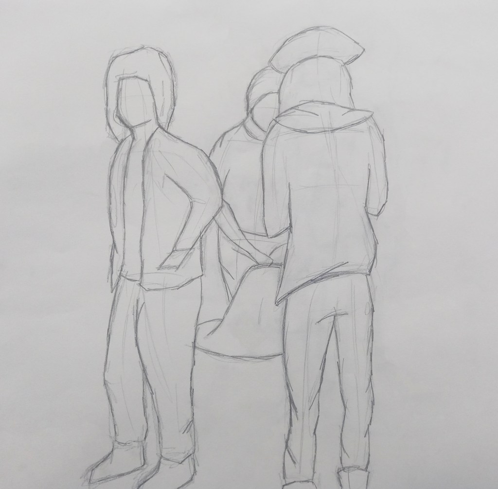
Overall I’m happy with the outcomes from this session and could see clear improvement especially after using the framework technique as the proportions looked more accurate.

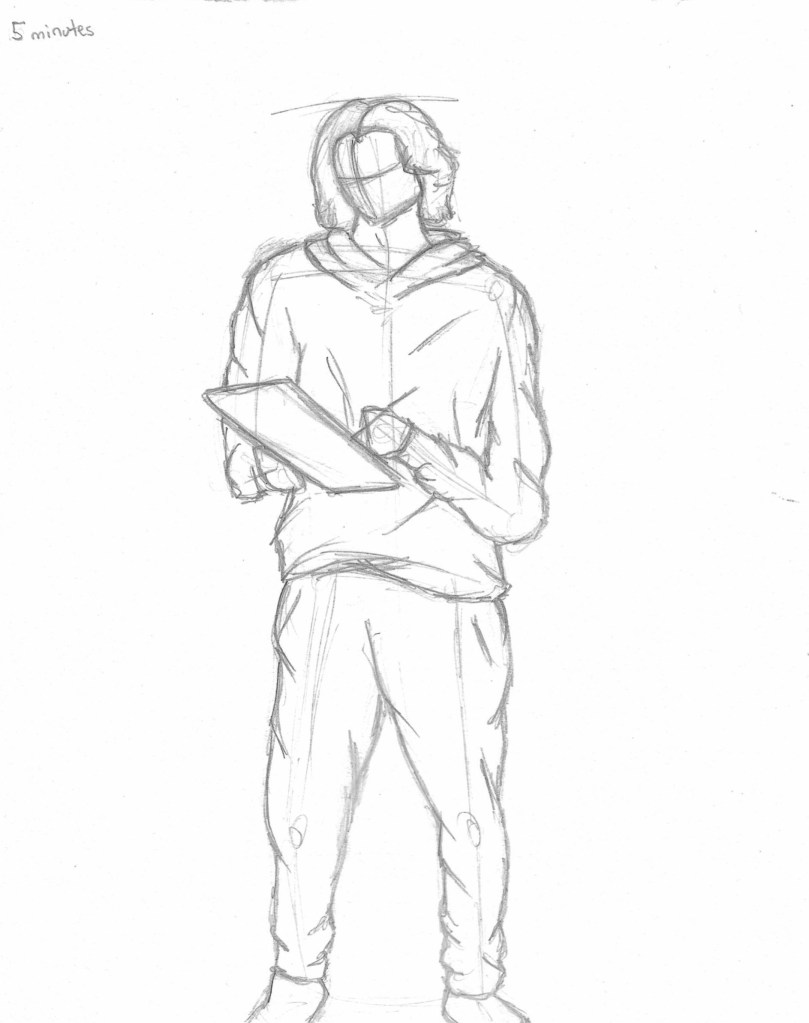
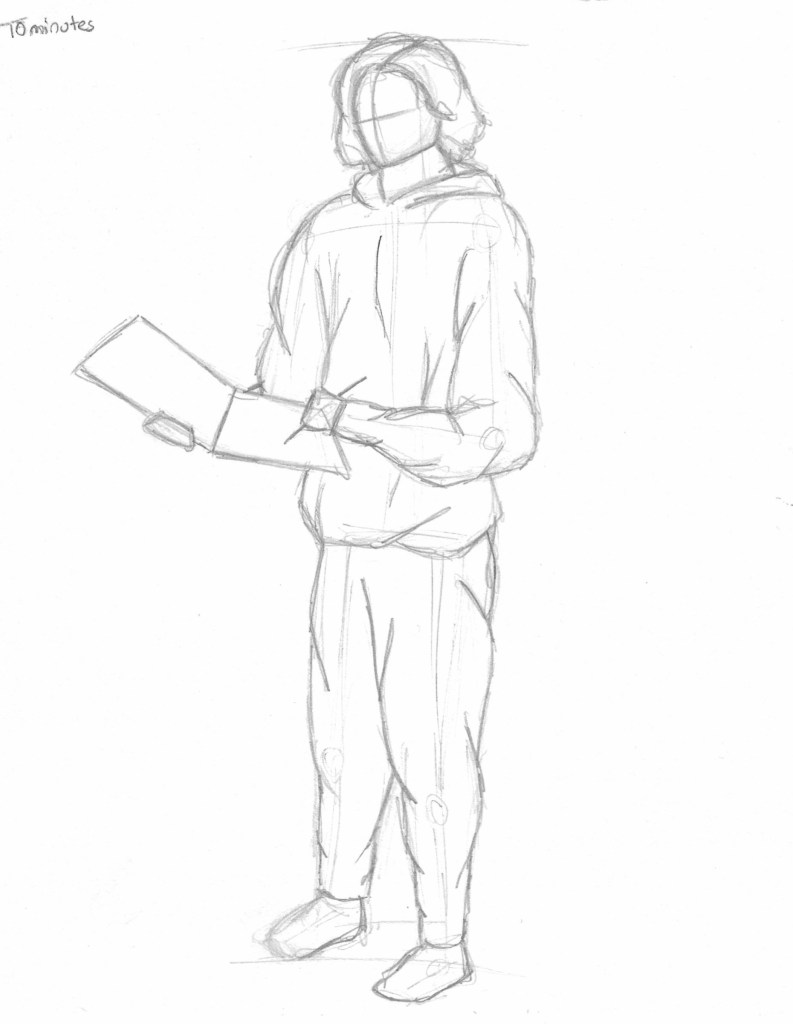
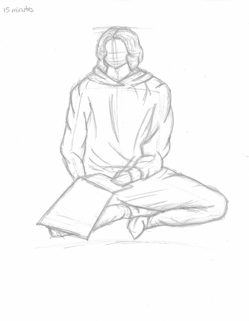
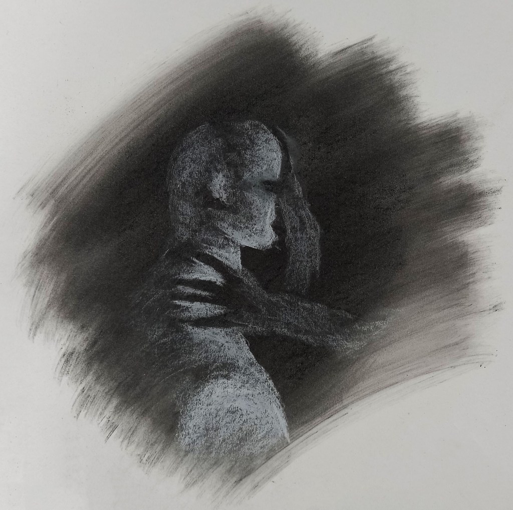
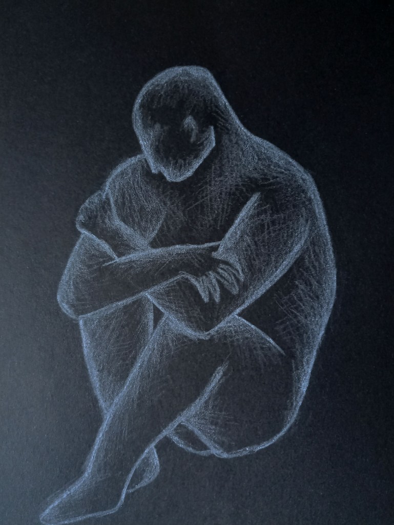
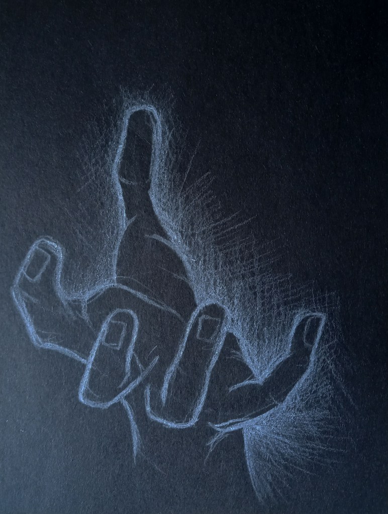
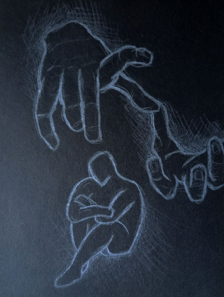
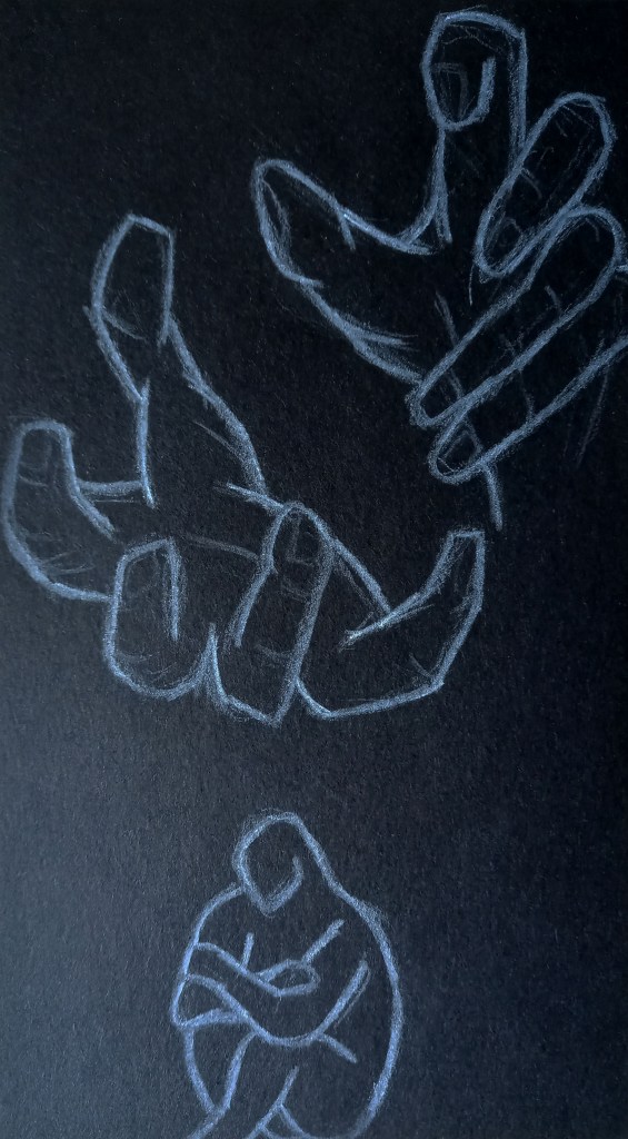
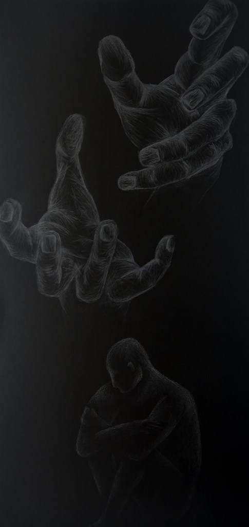
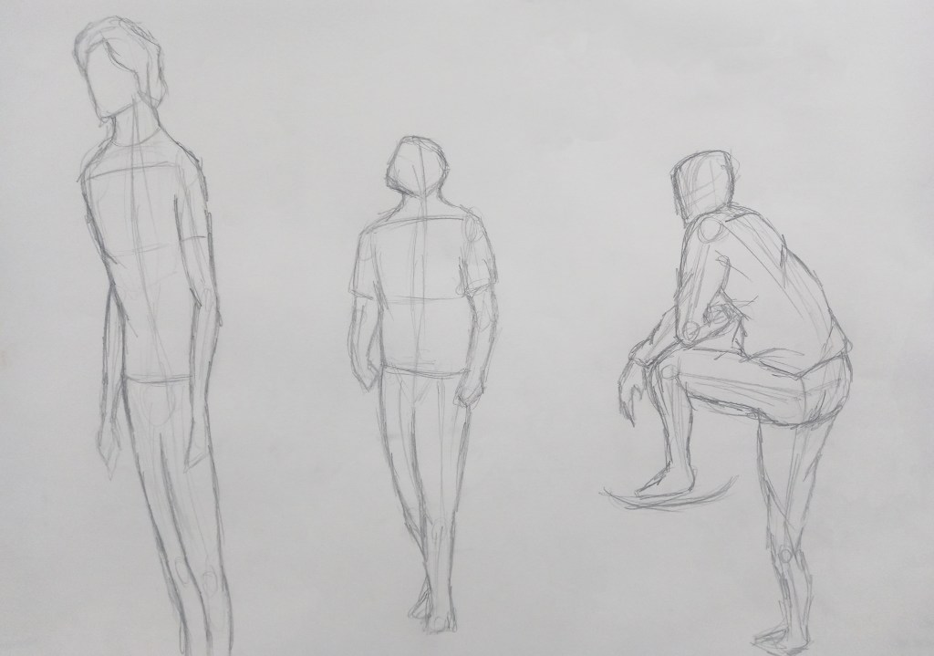
In my independent study I completed 3 figure drawing using the skills and strategies learnt in our session. I gave myself time limits of 15, 10 and 5 minutes to practice working fast and having abit longer for some to develop some details.

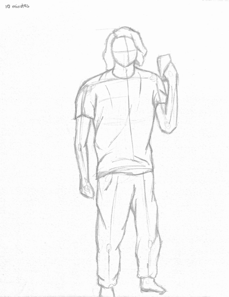
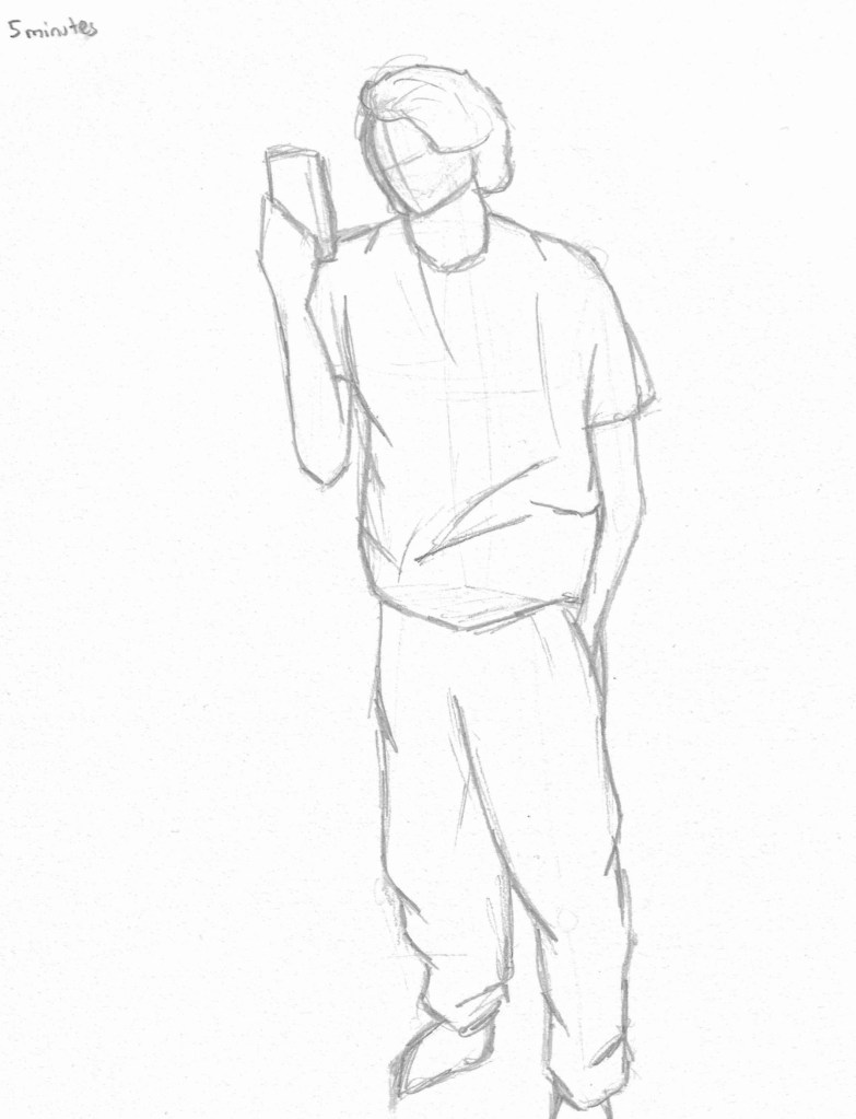
These sketches where done by standing/ sitting in front of a mirror and sketching myself. This was challenging as I had to stay very still and record the key information quickly. It’s something I had never experimented with and I think it was helpful as a way of improving my observational and quick mark making skills.

Categories
Level 4 Visual Messaging and Communication

Visual Messaging : Music packaging/ promotion week 2

I took all the ideas from my reference images and the roughs I made and began to create the packaging. I chose to design 2 alternate front covers rather than a pull out/ poster, a back cover and a design for the cd/vinyl.

This is the first album cover design. For this piece I used a combination of Illustrator and Procreate. I decided to do a low, central vantage point, making the hotel appear large and ominous. I’m happy with the way that I was able to incorporate the album title into the design using a gothic inspired gate. I added a cloudy design over and around the hotel to add depth and create an eery atmosphere. The colour scheme is fairly simple with just pinks, purples and blacks. These colours reflect the dark yet rich sound of the album.

This is the second front cover design made with Photoshop and Procreate. I used a similar colour scheme as the first one but there’s more purple and black and I chose to limit the pink to the light. This cover is more atmospheric, with more cloudy texturing obscuring the top and bottom of the hotel. I particularly like the neon glow effects I was able to achieve on the lightening, windows and Hotel Diablo sign. The hotel is a more simple design with the only details being the pink light.

For the back I chose to do the key design, I used Procreate for this. I like the texture and shadow I created on the key and tag. The key links well to the overall theme of a hotel. I continued with a similar colour scheme so it fits well as a complete packaging design. I used the key tag to show to track list which is essential for album packaging. Also the imagery suggests that the key will unlock those rooms, creating the idea of the album being a metaphorical hotel.

The cd/vinyl has a rusted keyhole design with a similar texture as the key. I added a sign at the top that says ‘welcome to Hotel Diablo’, I wanted to include this to link it to the theme and suggest that this is the doorway to the album and metaphorical hotel. I made this using Photoshop and Procreate.

The back of the cd/vinyl with the same texture as the front.

I then took my final designs and used Photoshop to put them together as a way of displaying them as a whole piece of packaging.

I really enjoyed this brief about creating a piece of music packaging. I was happy to create something about one of my favourite albums. I was able to draw lots of inspiration from the music, lyrics and other sources to create the packaging. Overall I’m happy with the final outcomes as they successfully incorporate my visual references and ideas while also reflecting the music on the album. Each part of the packaging works cohesively as a piece of packaging.

Categories
Level 4 Visual Messaging and Communication

Visual Messaging : Music packaging/ promotion

In this brief we have to design packaging for a cd or vinyl for an album or song of our choosing. The packing needs to include a front and back cover as well as a design for the cd/vinyl and could include an extra item such as a poster or pullout. I chose to make the packaging for an album called Hotel Diablo by Machine Gun Kelly. This is one of my favourite albums and I could see lots of ideas for imagery to represent the music through the pancaking for a vinyl.

Throughout the album MGK refers to a hotel but it’s never visualised in any of the actual packaging for the album. It’s more of a metaphorical hotel which represents his emotions. I wanted to represent this hotel visually as the key theme of the packaging.

I found some reference images of different hotels and buildings to use for inspiration. I wanted to use a comic book style for the hotel. I took specific inspiration from haunted house scenes, comic book hotels and Disney’s Tower of Terror.

In hotels there is often fancy detailing like these below which I wanted to include as a border for the front and back cover.

For a pullout/ poster I wanted to create a devil skull character with a key hole in its head to continue to theme of the hotel.

I wanted to use a key hole design on the vinyl/cd.

Here is my mind-map with initial ideas for each part of the packaging.

I then created roughs for each part. For the front cover I created a few different ideas for how to represent the hotel. The music in the album is quite dark in tone but also has an energy to it with the rich production. For me the best colours to represent the album are dark purples and pink so this is the colour scheme I’m gonna go with. The back cover will be a blue print of the hotel containing the track list to the album. Both these will have a decorative border around them. For the vinyl in want to add a key hole design with similar patterns to the borders to continue to hotel theme. For the pullout booklet I want to make a 2 sided design. The front with have the devil skull with the key hole and the back will have small images to represent each of the songs. I thought I could have these displayed in a windows like the hotel on the cover.

These are initial ideas for images to represent each song.

I combined my 3 roughs to make this composition. I particularly like the way the album title is incorporated into the design by using a gothic style gate.

Another idea I had for the back of the vinyl packaging was to use an image of an old fashioned key with a tag attached which has the track list on it.

Categories
Digital Arts 1 Level 4

Digital Arts 1: Photoshop collage

In this weeks session on Photoshop we recapped selection tools and learnt some more advanced ones and applied these to making a digital collage.

Some classic selection tools that we revisited where the lasso tool, polygon lasso tool and magnetic lasso tool. These are useful but sometimes don’t give very precise selections. There’s also the object selection tool, quick selection tool and magic wand tool. I used a combination of these tools to help make my digital collage.

I went on Pixabay and chose this photo of an astronaut and a drawing of a bouquet of flowers. These are the 2 images I used to make the collage.

First I pasted both images into separate layers on Photoshop. I tried different classic selection tools to get the rose and butterflies that I wanted from the picture. I found that the most useful for this was the object selection tool as it gave me the cleanest edges. Once selected I copied them into new layers. The, using free transform I moved them to where I wanted them to be in relation to the astronaut. In order to make them fit properly I selected parts using the lasso tool and removed them. A new way of selecting that we leant was by going to the selection menu and choosing colour range. This allows you to select all the parts of a specific colour this will be a useful tool for future work but I didn’t need it for this collage. Another way is by using quick masks. You click the quick mask button, at the bottom of the tool bar and you’ll know it’s activated when the layer appears red. Then by using the brush tool you go over the part of the image you want to select, this is useful as it gives as softer edge to a selected object.

For each individual layer with the newly selected parts on, I added an adjustment layer and created a clipping mask. These are very useful as they allow you to non destructively add adjustments to select parts of an image. I adjusted the brightness, saturation, hue and contrast until I got the effect I wanted. For the rose I also changed the blend mode so it fit better with the helmets reflective surface.

I used the same process to add more of the bouquet to the image. Overall, I’m happy with the outcome as it used a range of different selection tool to achieve the digital collage. Each selection tool has it own purpose and properties tat make it useful. I learnt how to use quick masks, clipped masks and colour selection as well as improving my skills with the classic selection tools. I think the clipping masks will be especially helpful for future work as they will speed up the work flow in a non destructive way.

Digital collage isn’t something that I’ve experimented with before but I do like the style. In particular, I like the work of Natasha Chomko and Gary Hoang, 2 artists who specialise in digital collages. I like the aesthetic of their work and how they layer images to create their compositions.

My essay for this module comments on the differences between traditional handmade work and digital work. Collage is an art style that is very traditional art style that has recently been done digitally. While I like digital collages, I think it is limited by by the lack of texture that a handmade collage has. Digital collages are usually more refined and detailed because image sizes and layouts are easier to manipulate. I think both techniques have their benefits but I personally still prefer the aesthetic of a hand made collage.

Categories
Digital Arts 1 Level 4

Digital Arts 1: Illustrator 2

In preparation for our second Illustrator session, I practiced what we did last week to create a portrait. I used a combination of different tools, including the shape tool, pen tool and arc tool. After creating the portrait I changed some of the line colours.

The focus of this weeks session was using the pen tool as its one of the more tricky tools to use in Illustrator. We did some practice tasks such as making simple lines, curved lines, arcs and rectangles all using the pen tool. When I became comfortable will the tool and how to manipulate it I made this simple outlined portrait design of Loki. All the lines used the pen tool, once I had draw the lines I further manipulated them by changing the stroke colour, thickness and shape. I made sure to reduce the number of anchor points to create smoother lines.

This piece is a more detailed image but used the same principles and the Loki one. I made the lines vary in thickness, colour and shape to make the portrait more interesting. The pen tool is difficult to understand and manipulate but I’m happy with the outcome of this weeks session as I’ve made progress with the tool. I’ll continue to practice with it as I an see how this software will be good for doing vector imagery which is something i’d like to explore.

Vector imagery is an art style that I enjoy and would like to create. Illustrator will be the best tool I’ve explored so far to do this style.

Categories
Level 4

Sneaker stamps collaborative project

All the Illustration, Graphic Design and Animation student where split into groups to work on a collaborative project to go alongside our digital arts learning. The aim of the project is to create a set of illustrated stamps and present them in a designed format containing some research and the design process. We were given complete control over the style of the stamps, whether that be digital or more traditional style illustrations.

My group and I discussed different options for the subject of the stamps but eventually decided on sneaker culture as we all agreed it would be fun and had lots of ideas of how to illustrate them. We then talked about which sneakers to do and wanted to pick iconic silhouettes that would be easily recognisable such as converse, Air Force 1s, vans, doc martens and Jordan’s. We each where given a shoe to do, mine was the Jordan’s.

Stamps are printed small so we thought that detailed realistic illustrations might not translate the best. Instead we thought that bold colours and simple shapes would work best. So the style we decided to go for was heavily inspired by the pop art movement.

Pop art often used patterns such as dots and geometric shapes in the background so we thought this was something we could experiment with.

Here are several quick composition sketches I did to test out and experiment with lots of different ideas.

After doing some sketches, this is the composition I decided to go with. I like the lace border as I think it fits the theme well. Also I think the images divided into 4 are very striking because of the range of colour you can get. For the shoes I chose 4 different angles all pointing to the middle. I wanted the silhouette with minimal details, enough to get the idea of what shoe it is but not too much as to not overcrowd the composition.

I drew over my sketch in marker so I could scan it and then used Adobe Capture to improve the line work. Before doing this I made a few last minute changes. I removed the geometric shapes in the background and they made the stamp too crowded and distracted from the shoe. I also removed the Jordan logo as it was too small to really be needed when viewing at an actual stamp size.

Using the skills I’ve developed in the digital arts module I added the colour on photoshop using the select and fill tool as well as the colour swatches. I’ve tested out lots of colour schemes, such as pastels colours, warm colours, cool colours and monochromatic ones. I’m gonna continue to experiment with colour schemes to find the final one that I’ll use as my stamp for the project.

I think my favourite of the colour schemes is this pastel one. I think it it a shift away from the traditional bold colours of pop art. I personally really like soft pastel colours and I think the colours I chose work well as a composition.

Categories
Digital Arts 1 Level 4

Digital Arts 1: Illustrator 1

This week we learnt the basics of Adobe Illustrator and used it to design characters from simple shapes. In preparation for the session I watched the tutorial videos which went over the basics of the software. Similarly to the other Adobe software you first have to select the canvas size and type that you want. Once open, it has a similar user interface as Photoshop and Indesign.

These are the cherries that I made. For this task we were only using simple shapes as a way of creating objects and characters. The cherries are made of simple shapes shapes as rectangles, circles and a triangle. In order to do this I used the different shape tools.After drawing the shapes I manipulated them by using the selection and direct selection tools. Also I used the fill tool to change the colour and stroke tool to adjust the thickness. One key thing was arranging the shapes so the ones you wanted to fully see were at the front.

After doing the cherries, which where basic in their composition, I moved onto doing an otter and koala. The shapes of these animals where more complicated and required me to manipulated the shapes more. Both animals where mostly made up of rectangles and circles. I used the colour swatches panel to add colour and changed the stroke size to 0 in order to remove the outlines. I began to combine shapes using the pathfinder tool to create more complex shapes.

I’m happy with the animals I made as I think I was able to manipulate simple shapes to create characters and have become more familiar with the basics of Adobe Illustrator.

Categories
Level 4 Visual Messaging and Communication

Visual Messaging: ‘Sell your house and buy gold’ week 3

This weeks brief was to develop upon our ideas from the last 2 weeks of working on the text ‘sell your house and buy gold’ and create a more finalised image. Over the last 2 weeks I worked on figure drawings and making a physical structure which I then photographed. I wanted to combine my 2 favourite figure drawings, which I think best represented the text, with the different colours and intensities of light that I explored in week 2.

This was my favourite image from the figure drawing. I think the pose clearly conveys the emotions and atmosphere so I chose to use this hunched over, sitting down pose. In week 2 I explored using intense lighting from different angles. I also looked at changing the colour by adding a red filter. I tested shining a hard red light from above and below the figure.

I preferred this composition with the light above as I think it helped further the themes of isolation and loneliness more.

I wanted to incorporate the hands from this image into my piece as I think the help to represent the text.

After deciding on the overall elements I wanted to include, I began to work on each part in more detail. I decided that I will use a black background to create an ominous and scary atmosphere.

This sitting down hunched over pose is what I decided to use. Using the white pencil I only wanted to add in highlights to create to figure without adding too much detail, especially on the face. I think a minimal figure reflects the theme of the text such as loneliness.

Hands are something that I’ve struggled with before I wanted to include them to try help me improve. I tested out a few different positions, I wanted them all to be reaching out to give the impression that they’re trying to reach the figure. This is a way of representing the theme of shadows that are mentioned in the text.

After working on the figure and hands separately I began to work on the composition. Scale is important for this as I wanted to figure to be small in comparison to the hands which appear to be reaching out tho grab him.

I then decided I wanted the paper to be a long, thin shape to mimic a tunnel or alleyway and make it look as though the walls and hands are closing in on the figure.

Here is my final image for this brief. I used white pencil on black paper. The light source is above the hands so they are much more detailed that the figure which is much more subtle. I wanted the figure to be less detailed to create the ominous atmosphere felt in the text. As mentioned above I tested different lighting but I think they actually take away from the piece so this is my favourite.

Categories
Digital Arts 1 Level 4

Digital Arts 1: Colour and Light, Colour and Mood- Photoshop

After last weeks session learning about how to paint with greyscale tones digitally we now moved onto painting with colour, specifically looking at how colours interact with light and how this can affect the mood of a piece.

This was a piece I did in preparation. I digitally pained this jellyfish on photoshop using a limited colour palette of just shades of green, black and white. I attempted to capture the bioluminescent light using subtle tonal changes.
This is the reference image that I worked from during session. On the right is a simple black and white line version of the image, I used this to select the shapes of the pears which i then coloured on another layer.
I selected 3 pairs from the image to focus on and colour. Through this exercise I became more confident with different brushes and selecting colours. To colour the pears I used soft and hard brushes, making sure to use the pen pressure. I also used a splatter brush to add some texture. To make the right colour I first filled the selected shape with a light base colour. Then I used the eyedropper tool to identify one of the mid tones and worked off of that shade by going up and down the colour picker, to achieve different hues of the same colour. I also worked by adjusting the size and opacity of the brush.
Another practice piece. I’m getting more confident with blending and adding texture to my objects to help make them look three dimensional.

These digital pieces are heavily inspired by traditional oil paintings. In my essay I compare traditional techniques to digital work. I’ve found that digital painting is a faster process than traditional painting as there are useful tool like the eyedropper tool and pre set brushes which streamline the process.

I also started to look at colour and how this can effect the mood and atmosphere of an image. For these 3 images I changed the background to different colours to add a warmer and more vibrant mood than the original image had. I did this by creating a gradient on a separate layer and changing the blending mode to combine the 2 layers.

I really enjoyed this weeks session about painting digitally with colour on Photoshop. I think I was successful in this weeks session and am happy with the pieces I produced. For the most part I used the same tools and techniques and the greyscale work but found it more enjoyable to work with colour. This is a technique I will definitely continue to use as I think it’s a good way of creating colourful and striking illustrations.

Categories
Level 4 Visual Messaging and Communication

Visual Messaging: ‘Sell your house and buy gold’ week 2

This was a continuation of last weeks work on the story ‘sell your house and buy gold’. We moved on from using figure drawing to represent the emotions and atmosphere of the character in the text to exploring the space depicted in the text. We were split into groups of 4 and made a model using a range of materials which we then photographed using different lighting and angles. In the text the space is depicted as dark, gloomy and very atmospheric as well as with the looming sense of danger and fear. We tried to capture all of this through our model.

Our model was a representation of the house that was depicted. We made 3 sides of the house to allow for an open side to make it easier to photograph. Also we distorted the shape of house and the windows to add the the eerie feel. We cut the windows out and used different materials to cover them such as a thin fabric to look like a curtain, a thin red plastic and a material with lots of holes on it. On one we added a cross over the window to try make some interesting shadows. We added a range of geometric shapes to represent the objects in a house and create a sense of chaos. Around the top of the model we put wires and a fabric to look like spider webs. All of this paired with the messy red and black paint create the scary, dangerous atmosphere that we understood from the text.

After completing our model we then photographed it, experimenting with different ways of lighting it. We used a range of larger and smaller lights and hard and soft lighting to see how it interacted with the model. After experimenting we found that the smaller, more concentrated lights worked better as the were able to light only 1 part and add to the eerie dangerous atmosphere. We were able to get some interesting photos from different angles. The windows really helped when photographing as we could get some interesting angles of the model.

This was a close up photo of the window to get the irregular shape and rough painted texture. We put a red sheet over the light to give this bold red which I think represents the space in the text well.
Here’s another close up of the window. I particularly like the bits of light shining through the window which creates some nice shapes and shadows. This is an edited version of the photo below. I turned the brightness and saturation down on photoshop to create a more gloomy feel to the photo.

This is one of my favourite photos we took. I really like the shadows cast by the objects and windows and the soft lighting. I also turned down the saturation on this one. I like that some of the details on the floor are cast in shadows helping create the sense of impending danger.
Similar photo but from a higher vantage point to get a different view of the model.
I like the strong lighting coming through the window which to me gives the impression of a eerie moonlight night.
For this one we used multiple light sources to really show off the details we made on the floor and walls of the model.
I think the cross shadow from the window works really well on this photo.
Another experiment with the red lighting. I turned up the brightness on photoshop to emphasise the red and sense of danger.
I like the low vantage point of the photo.
For this photo we experimented with using both blue and red lighting and I think the combination was very successful is reflecting the mood of the text.

I am happy with the model we made and think we got some good photos in response to ‘sell your house and buy gold’. However, if we were to redo this I would suggest a few changes which I think would help improve the outcome. I think I would add more windows and cut outs as they worked as good vantage points and creates some nice shadows. Also I think I would reduce the amount of black paint used or at least be more strategic about its placement to allow for more bold and obvious shadows.