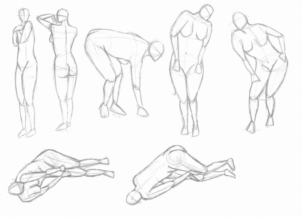
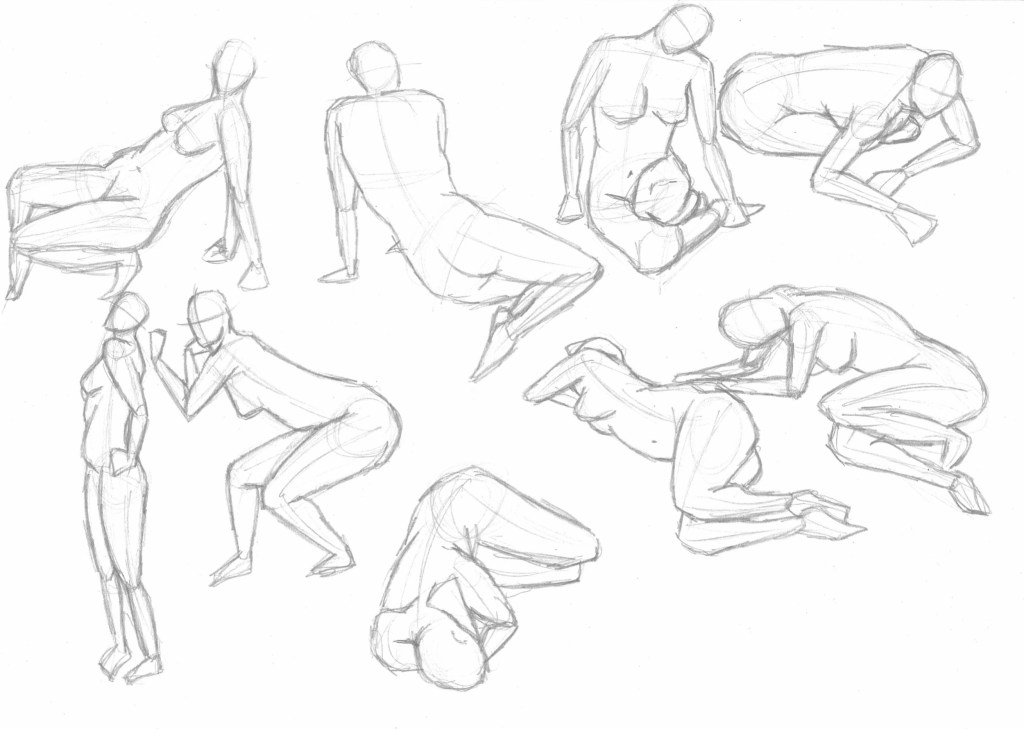
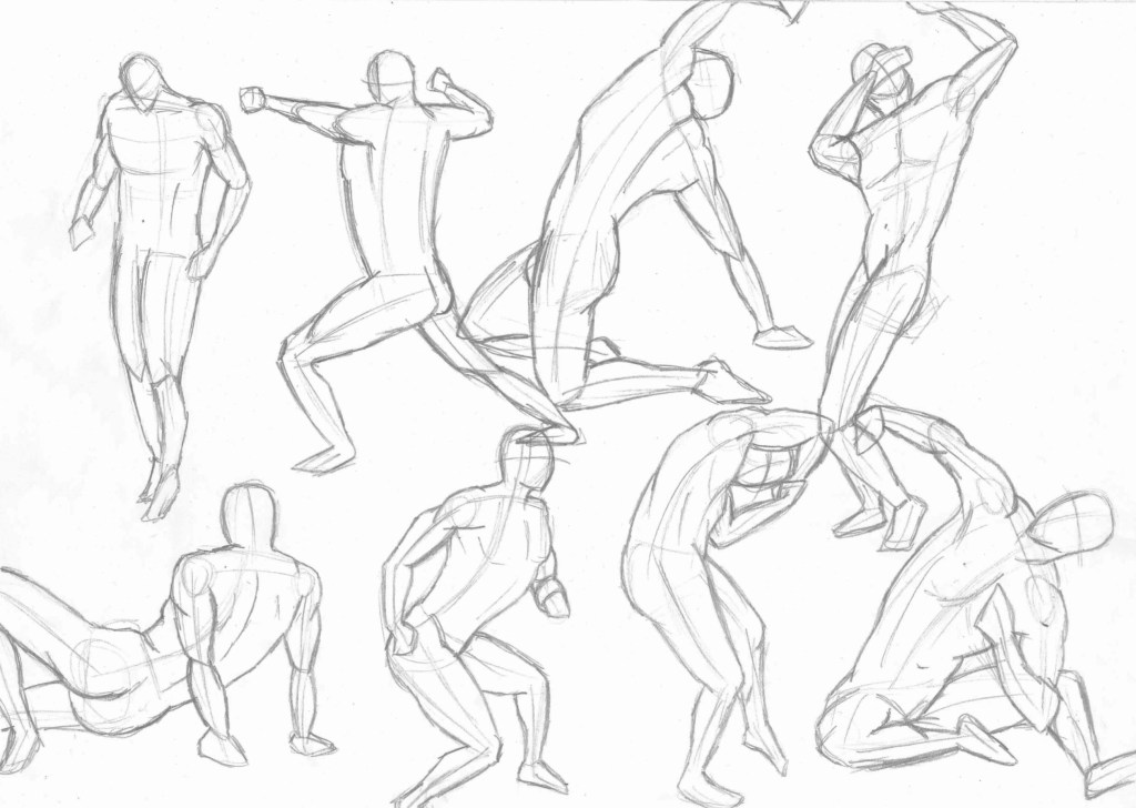
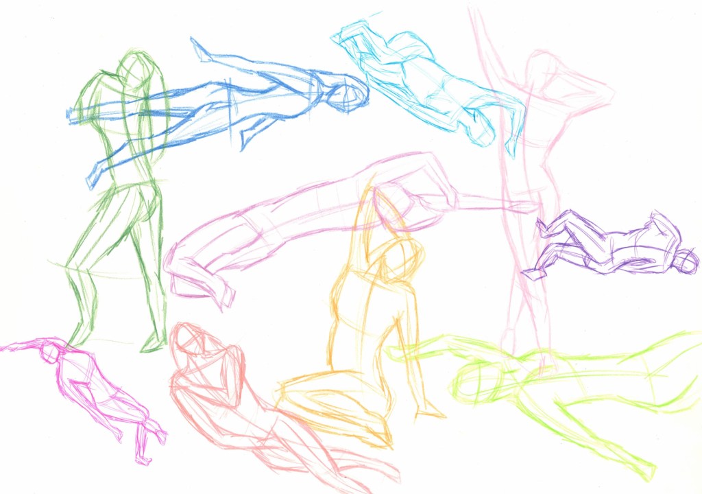
For the final week of figure drawing the focus was on shape and form. As with each session I began with quick sketches of different poses each around 1 to 2 minutes. I did lots of practice of this as I enjoy it and wanted to test myself by attempting to draw some complex poses such as laying down ones that I struggle with more. I used videos of both male and female models for this.
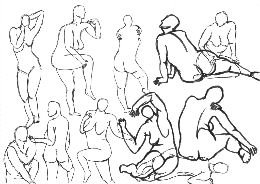
This is a page of continuous line sketches which is a good way of experimenting with shape and form. I’ve done continuous line sketches before but not for figures so this was difficult but overall I’m satisfied with how they tuned out. I tried to do sketches for a range of poses to push myself.
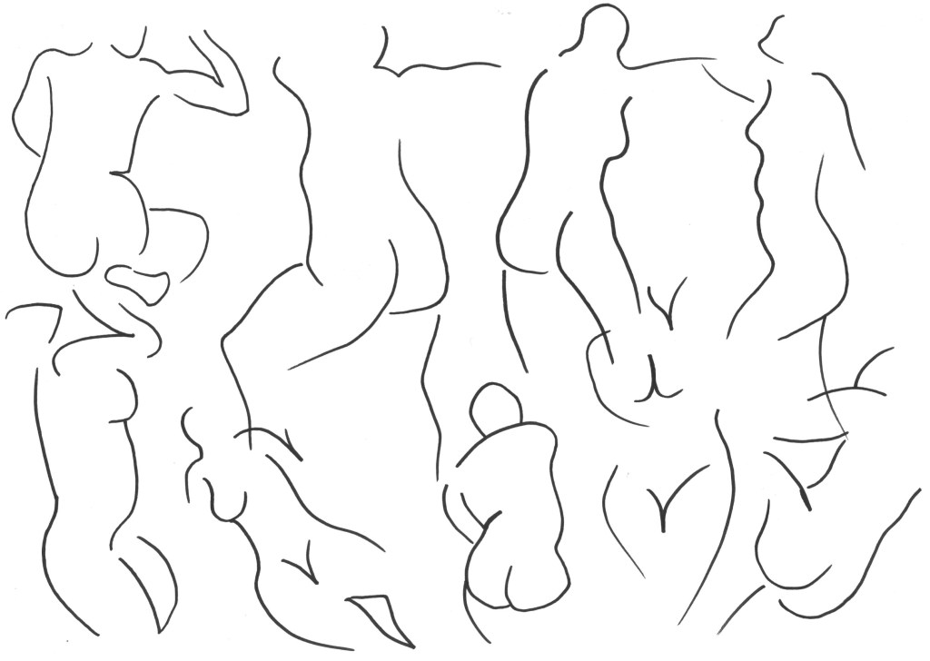
For this page I experimented with using minimal lines to construct a figure. This required me to focus of the negative space to see the silhouette of the figure and pick out line most essential lines. This was a fast activity and I think it was successful and not something I would have been able to do a few weeks ago as I wasn’t so confident with how to construct a figure.
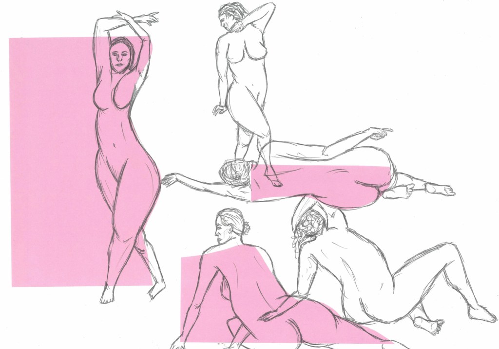
I began to introduce colour to expand upon what I did last week. I chose a line from the figures silhouette and cut it out from coloured paper then sketched the figure in biro over it. I liked experimenting with multi figure figure dawnings.
This task with essentially combining the work from the last to pages. I would pick out the key shapes from the figure and cut these out from coloured paper. I like how the figure are simplistic but there’s still enough detail to make the pose pose.
Overall I really enjoyed the figure drawing portion of the module, I learnt a lot of tips and techniques that I can use. Also we used a range of tools and mediums that have expanded my own personal tool kit of sketching. I feel a lot more confident with drawing figures in complex poses now but plan to continue to develop these skills as I think it’s an important skill to have as an illustrator.
In week 4 we focused on colour. We could choose what colourful medium we wanted to use and I chose coloured pencils and pens. Colour theory is a very complex topic and while I don’t know all about it, I have a solid understanding of basic colour relationships and how to use colours to effect the mood of a piece. This diagram shows a range of different relationships that can be used.
The first activity was a warmup with lots of quick 1 to 2 minutes sketches, just focusing on getting the figure accurate. For this I just chose random colours as there wasn’t time to consider the effects of them in this task.
Here are a selection of slightly longer poses which gave me more time to get a more accurate sketch of the figure. I can definitely see improvement in my sketching from this session to the first week.
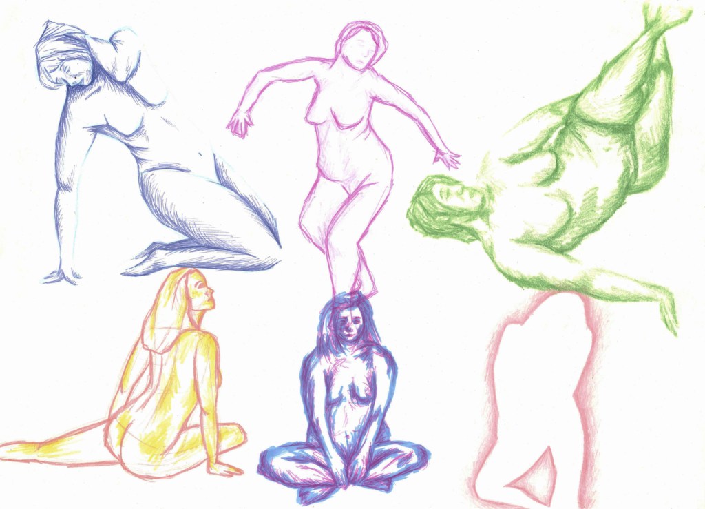
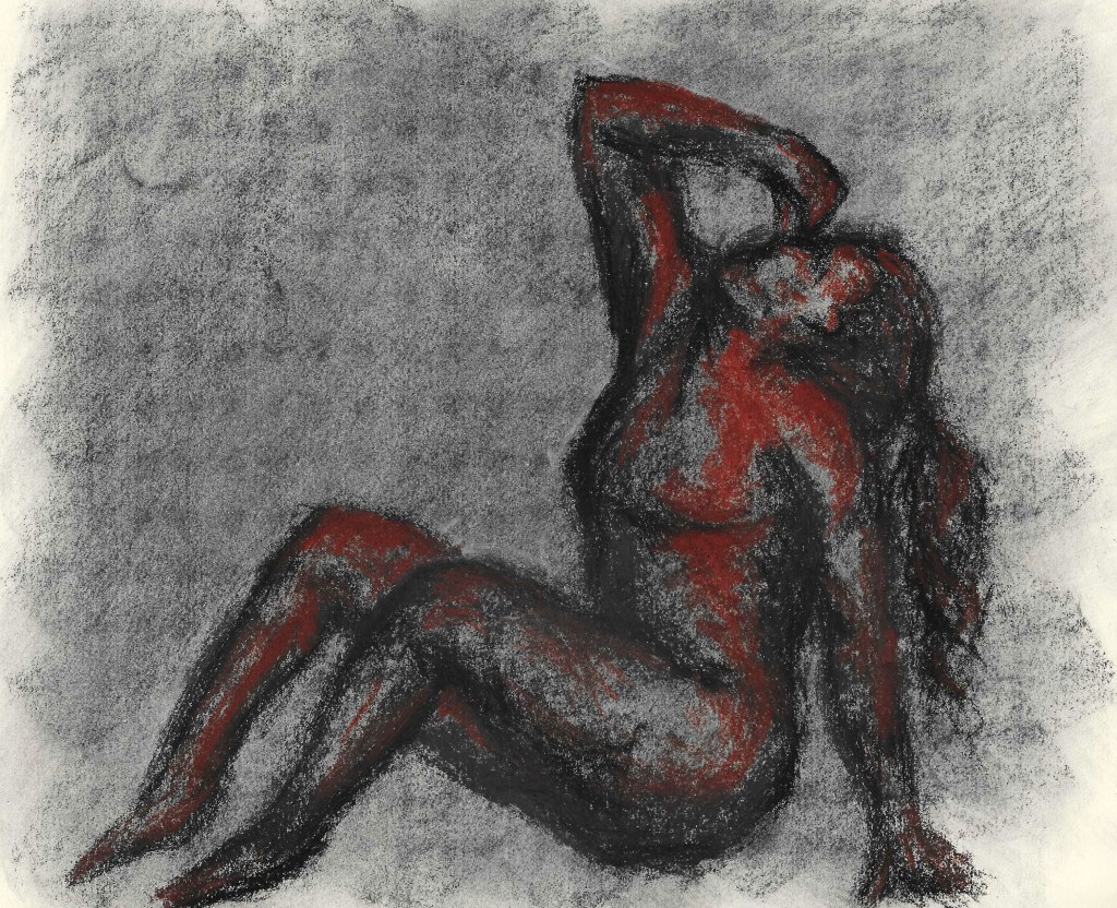
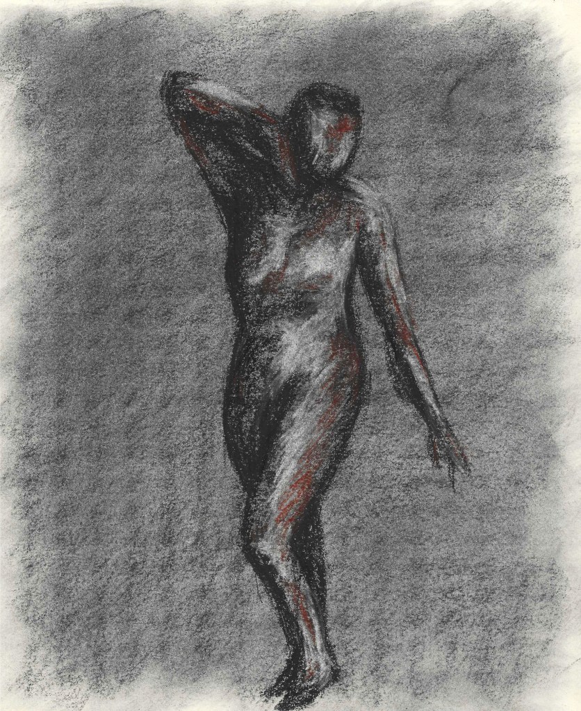
The next 2 pages are both more detailed with some tone and facial features included. For each figure I used 2 colours, 1 for the construction lines/framework and another for the tone and outline. I used a range of sets, some being different shades of the same colour, some complementary and some contrasting.
I really enjoyed this page as it was fun to experiment with different styles of sketching using colour. The blue one in the top left is the same style as the previous pages but with biro. For the pink one next to it I drew the outline of the figure first the used a purple pencil to lightly sketch in the shadows. The green one was particularly fun and challenging as I did no framework or outline and just sketched the shadows. The red and yellow one was an outline with the lightest bits shown with the yellow. For the one next to that I used 2 different co lours for the shadows and highlights. And the last one is a negative space sketch where I focused on the silhouette.
I really enjoyed this session because I love to work with colour and I’m feeling a lot more confident with figure drawing as I can see significant improvement from week to week of the module.
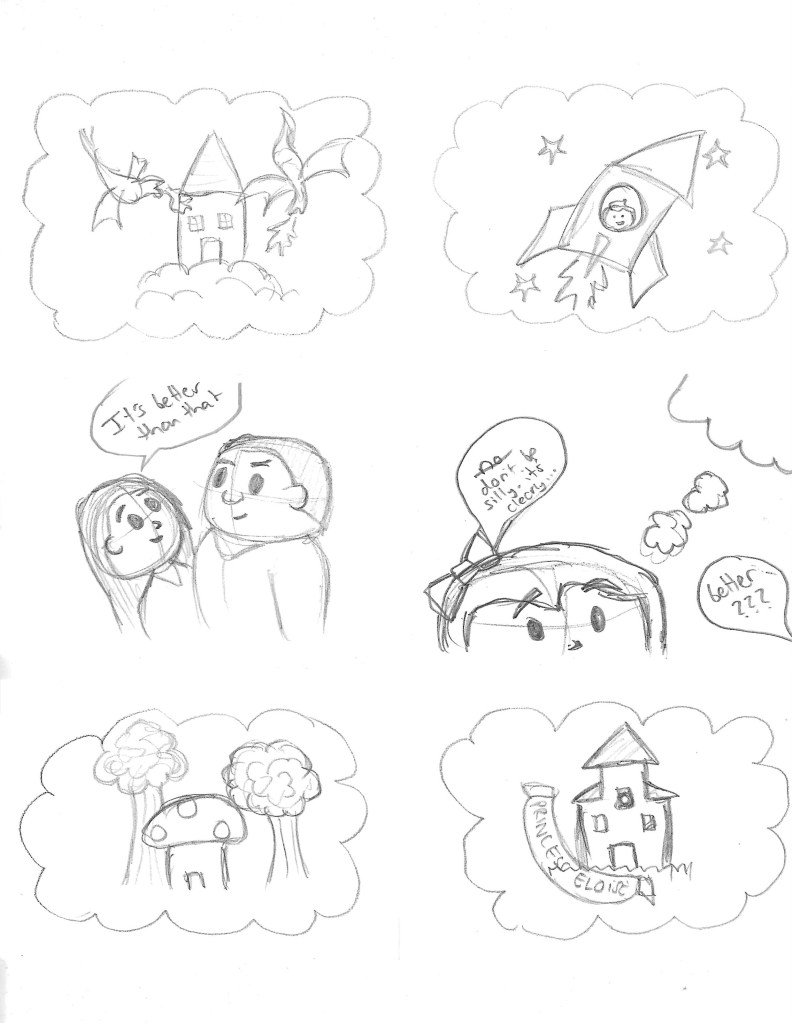
In this session we continued on with the Graphic Novel Your Life workshop with Rachael Ball. I learnt some very important things in this session such as the fundamentals of making an engaging story with interesting characters, how to pace a comic and how to effectively storyboard ideas. Most stories, even those with complex plots can usually be simplified down to a main charters goal, obstacle and action. This is key to creating a story and I’ll keep this in mind for the future. In the session we took the story we had thought of with the characters we’d created and create quick thumbnail sketches. These are my quick thumbnail sketches that I did to show my story.
These are very rough sketches, just enough to get the point across. After making these I looked through them and began to add in frames and remove ones to adjust the flow and pacing of the story. This is a good idea to do in the early stages so that you don’t waste time on lots of detailed sketches just to remove them later on. Rachael also taught us about framing in a comic and how this can impact the message it conveys. For example wide shots are good at the start to show the location and close up shots are good for drama.
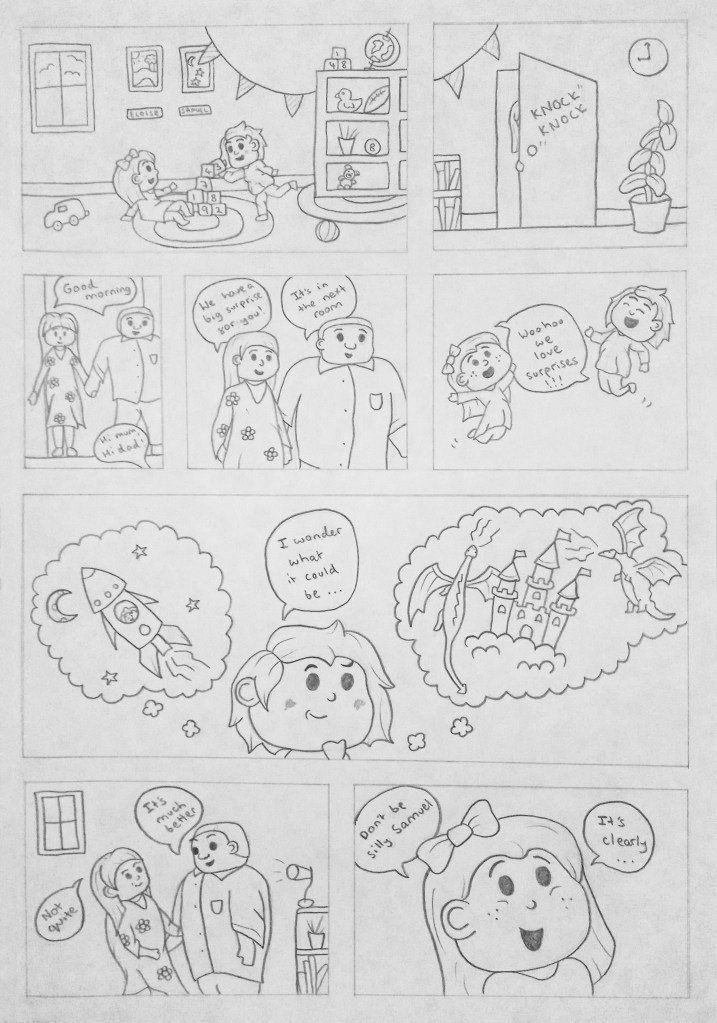
After creating the thumbnails I made the layout for the comic strip. My story is not a complex story it’s just a short wholesome story so I wanted to keep it within 2 pages. Some boxes are bigger than other others demoing of the importance of the frame. The frames where me and my sister are imaging what the surprise could be are large to give me space to show the vivid childish imaginations.
I then developed my comic strip into a more detailed storyboard. I used the layout from above. The images stay fairly similar to my initial sketches but are all more refined and neat. I really like how the pages turned out with the consistency of the images and pace of the story telling. I can see the Disney character inspiration coming though well in the illustrations. If I was to colour this comic strip I would use a simple and bold style to make the illustrations eye catching and help reflect the childish and light hearted story.
Creating characters and comic stripes is something I want to do more of as I’d like to improve of showing emotion through dynamic, caricatured characters.
This week we went to a trip to various places in London such as the Royal Festival Hall and Tate Modern to practice our documentary illustration skills. For the trip I solely focused on drawing people on sight so none where done from photos.
We were given a series of tasks including sketching people in 2 materials. I chose pencil and biro and decided that biro would be more beneficial because of the permanence of the marks, making me be more bold with the marks I made.
These sketches where from the Tate Modern. I think the sketches improved throughout the day as I became more confident in drawing in such public locations.
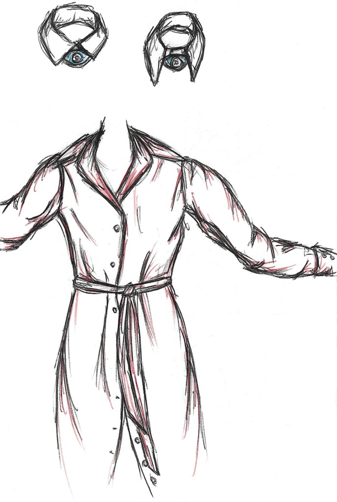
At the ‘Poets in Vogue’ exhibition we had to sketch a couple objects that interested us so I chose these collars with eyes in the middle and a dress. I loved the boldness of their colours and wanted to add a hint towards that by layering some of those colours over the black biro sketch.
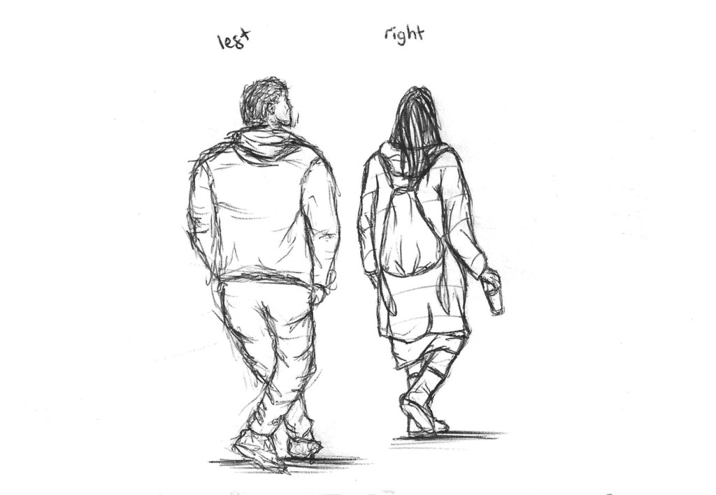
This exercise tested me as we had to draw 1 figure with our right hand and 1 with our left hand. I’m right handed and rarely try using my left hand so considering this I’m pleased with how the figure turned out.
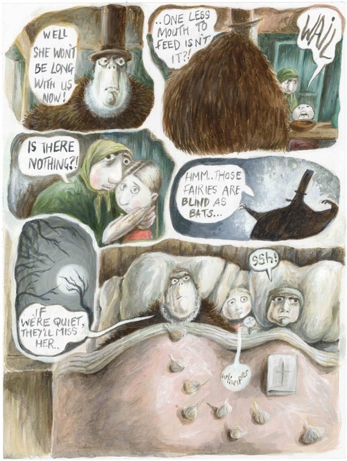
In this session we had Graphic Novel illustrator Rachel Ball come in and deliver a workshop about a different type of documentary illustration. This type is all about visually documenting a memory or experience in the form of a comic strip. This is something that really interests me as I enjoy reading comics and like the process of character design. This is an example of a page from one of Rachael’s Graphic novels.
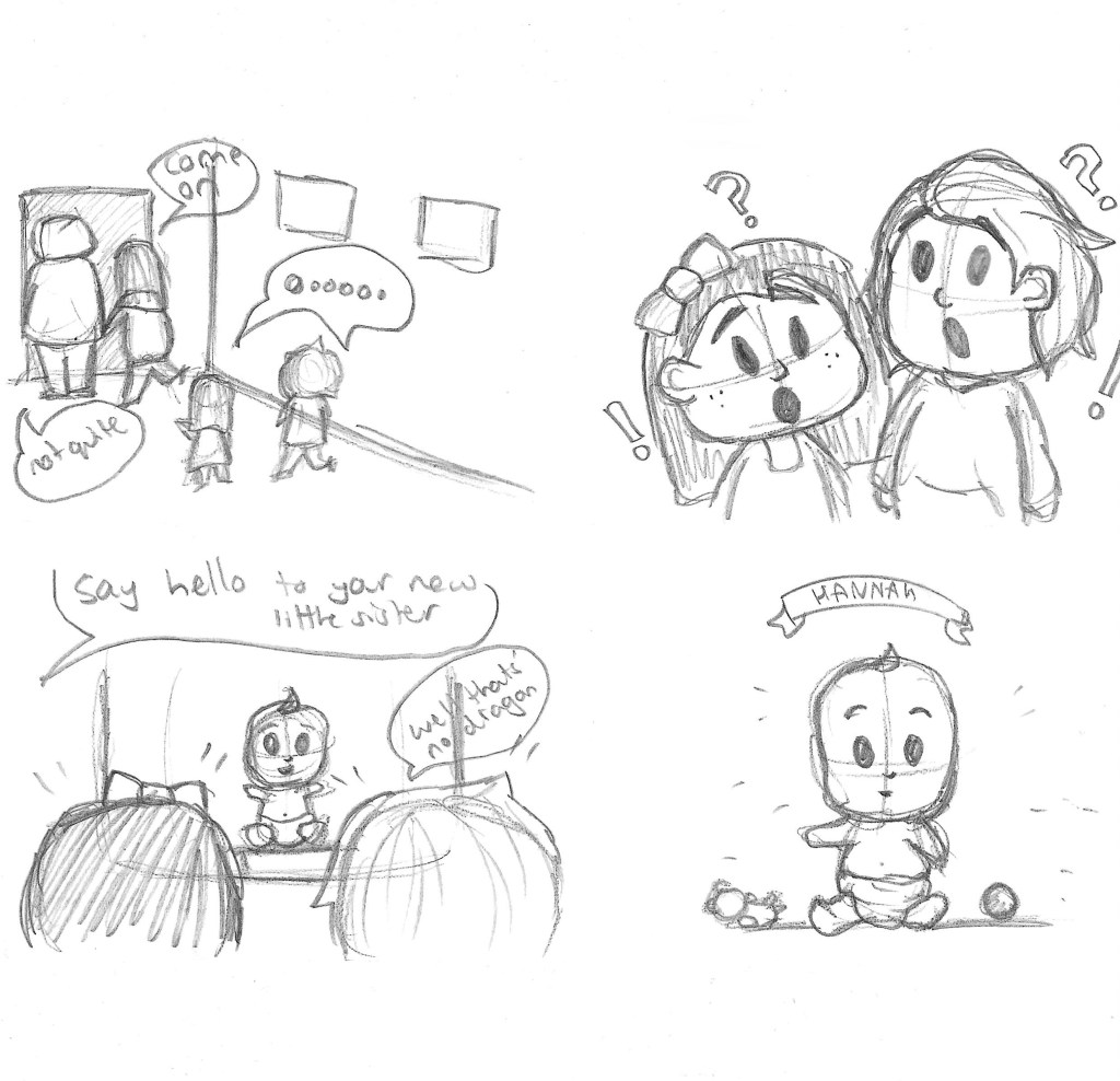
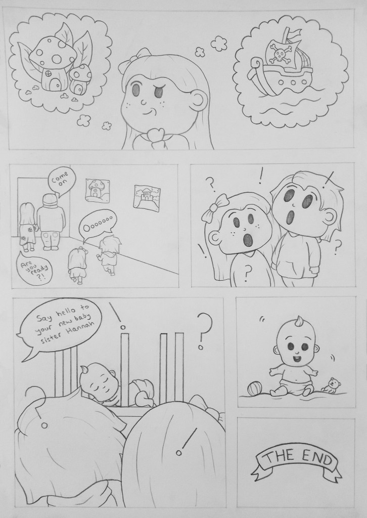
We began the session with Rachael explaining about her own work and creative process. Then she began giving us exercises that she uses when beginning her process. For example think about things such as weird dreams, embarrassing moments, favourite films, advice for your younger self. These were all a way of generating inspiration and thinking about things we like. After this we got into the main focus and that was to think about some early memories. From these we began to develop them into stories by changing bits, adding fantasy elements and just generally playing around with a memory to turn it into an interesting story. I had a few different ideas but the memory I chose to use was of me and my sister (Eloise) meeting our baby sister (Hannah) for the first time. I wanted to play on this and how me and Eloise loved to play made up games and try to capture this childish imagination. The rough idea for the story would be our parents come and tell us they’ve got a surprise and me and Eloise start thinking of what it could be and end up shocked when they introduce us to our new baby sister. I want to included images to illustrate our imaginary ideas such as dragons and aliens.
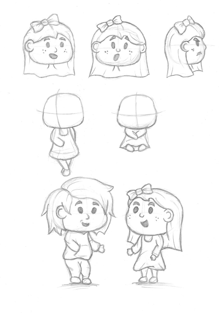
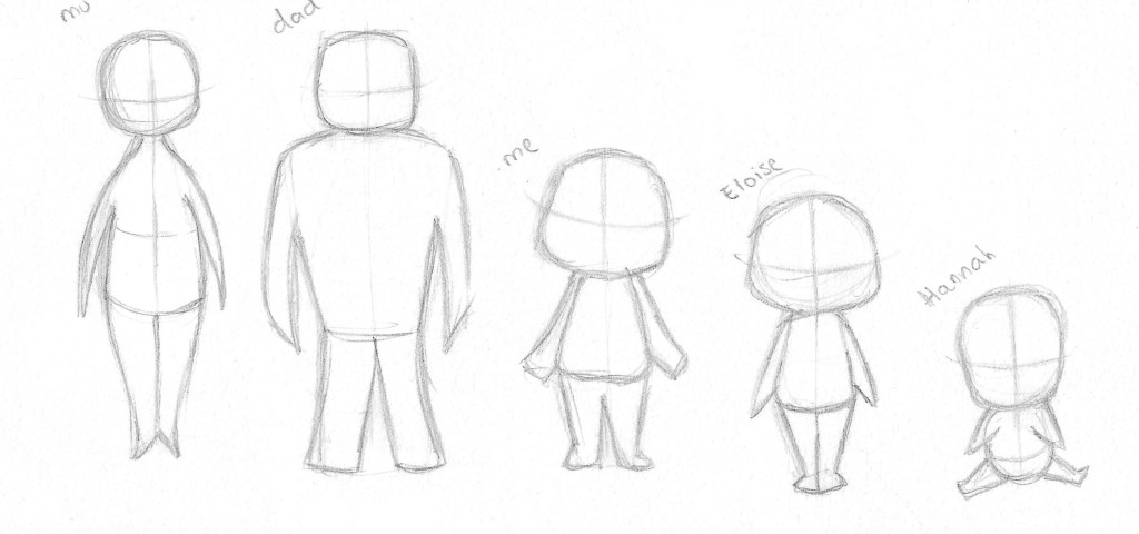
So for this story there are 5 characters I will need to design, Me, Eloise, baby Hannah and my parents. Designing these was the focus of the afternoon session.
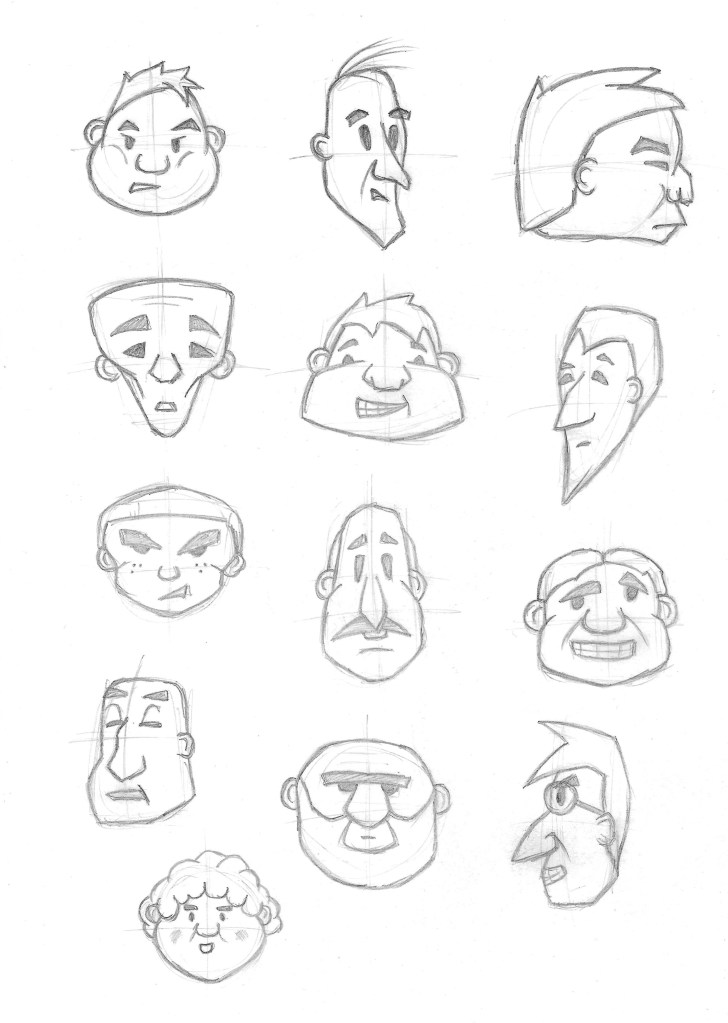
Rachael taught us some ways to being the process of designing a character such as creating fluid lines and turning them into animals or people, drawing people from observation, researching other artists. One in particular that stood out to me was the idea of caricature which is where you exaggerate features to capture someone’s essence. I to ok this into our first exercise where we had to draw characters faces from different shapes such as ovals and triangles. I enjoyed just picking a shape and turning it into a made up character.
When designing my characters faces and body shapes I took a lot of inspiration from Disney Pixar’s character designs such as Deanna Marsiglise. It’s an art style I’ve loved since I was a child and have always admired how well the artists are able to convey emotions and personality through the facial expressions and dramatic body shapes.
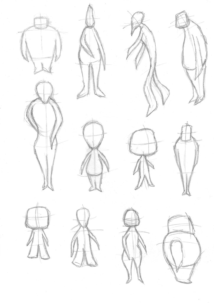
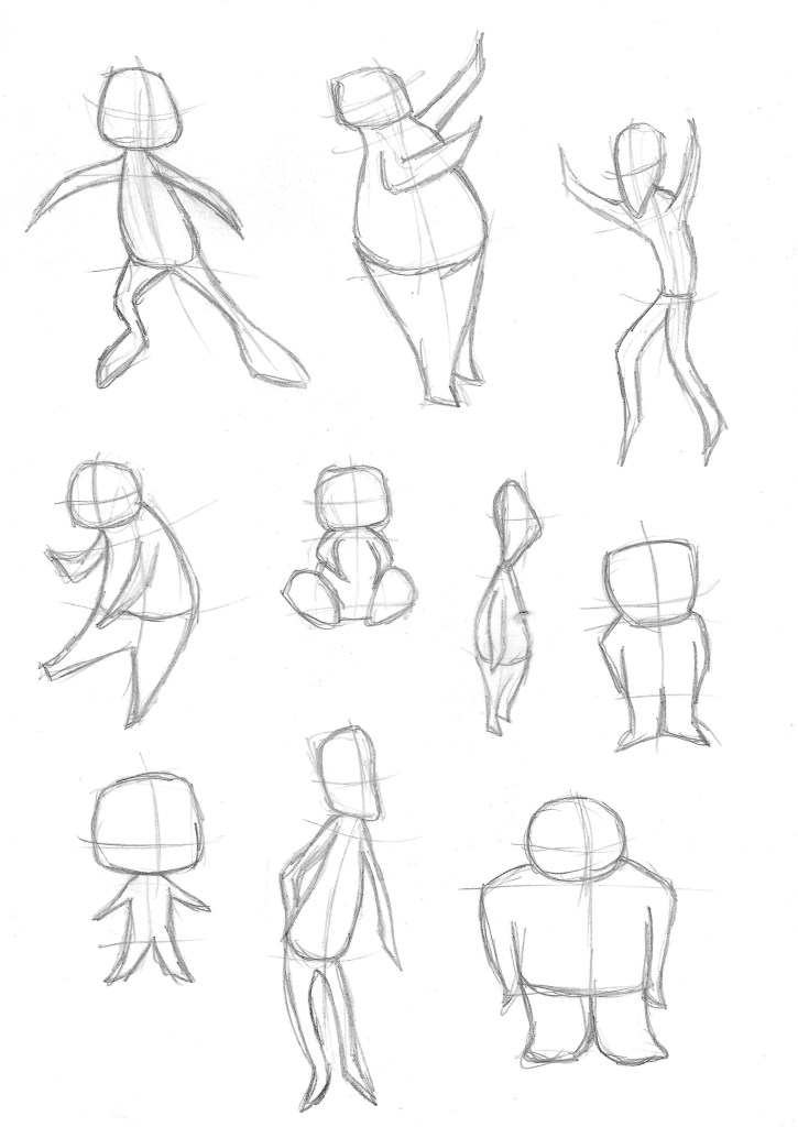
Then we moved onto creating figures out of shapes. I tried to caricature the figures by really exaggerating the proportions or certain body parts.
I started these with bendy stick figures to create more dynamic figures to try to express movements or emotions which are key to graphic novel art.
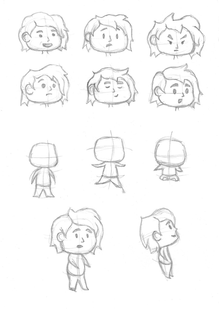
Then I started to develop one of the characters that I wanted to use in the comic strip (myself). I tested out different expressions, angles, and poses to begin to get an essence of the character.
I digitally sketched the face and body shape for one of the characters and started to think about colours for the face, hair and clothes.
I then made another character sheet for my older sister (Eloise). I aimed to keep the shapes of the body and face consistent to both characters. At the bottom of the page is a full sketch of the 2 characters I’ve worked on so far.
After try out lots of body shapes these are the ones I’ve decided to go with for each character. They have a similar style that makes them look cohesive but each figure has key differences to make the easily distinguishable and recognisable.
I really enjoyed this session about graphic novels and character design. Rachael Ball gave lots of good advice that I’ll try to implement into my own work such as building bodies and faces from shapes caricaturing someone to exaggerate features. I look forward to expanding upon my characters in the next session.
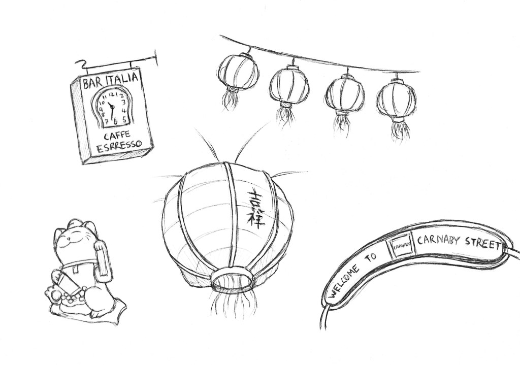
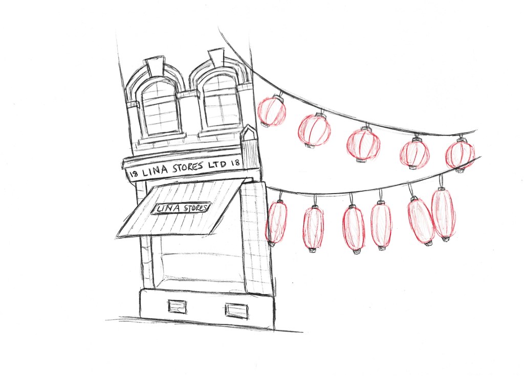
In the afternoon we had to go to the ares around the Photography gallery in London as document the communities. To the South and East of the Gallery there is China Town which is home to London’s largest Chinese community and east beyond that there is a large Italian Community centred around the famous Bar Italia. I wanted to expand my documentary illustration skills by looking at a combination of people, objects and buildings from the various locations. For my sketches I used pencils and biros as they’re medium I’m comfortable with even when having to work fast.
I think through these sketches I was able to capture the important bits of the communities that give them their identity. Generally documentary illustration is something I’m growing more confident with and I think the next step will be to expand on the mediums I use.
In the Lighting Darkness workshop we had illustrator Anna Steinberg come in to talk to us about her process and the industry in general. I found the talk very informative and interesting. Anna shared tips on her creative process from when she is approached about the project to sending of her work. One thing in particular that stood out to me was how she recorded her initial ideas with thumbnail sketches. Anna created a set of illustrations for a poetry book about genocide which is a very difficult topic to work on as there’s lots of technical and moral questions. She taught us good way of handling topics like this and we where able to put these into practice is the afternoon.
Below are some of her illustrations. The style is very minimalistic yet conveys strong messages. This idea is something I wanted to carry into my work in this workshop.
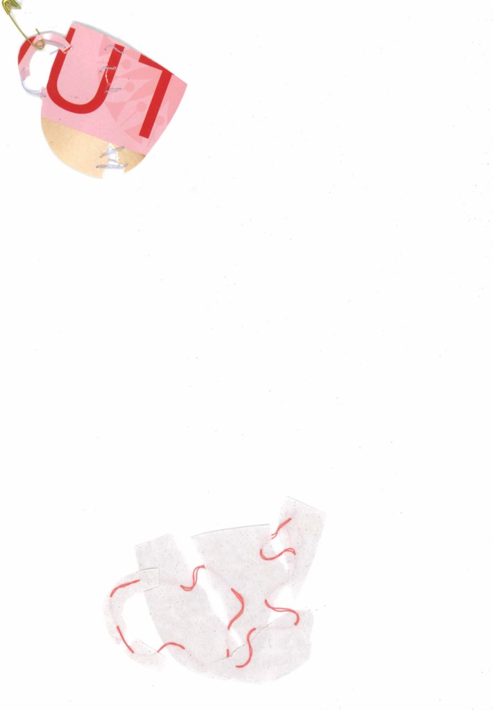
We where given as choice of 2 texts to work with and I chose the one about domestic violence. To begin this activity we read through the text to understand it and all the themes and ideas in it. We did a warm up activity involving collating shapes and altering them in different ways. Then we moved onto the main activity. One of Anna pieces of advice was to work with inanimate objects rather than people when dealing with sensitive topics as it often makes it easier to communicate the message. So for my idea I chose to use tea cups as they’re an easily recognisable silhouette and are quiet fragile therefore easily broken so worked well with the topic of domestic violence. I tested out a couple different versions but both involved the idea breaking the cup silhouette and loosely stitching it back together. This is a technique I’ve never tried before but really liked it so it’s something I’d like to further experiment with. For me this shows the damage that domestic violence cause and how it can break people. I thought is was a good metaphor and a more powerful way of communicating it than a more literal depiction of domestic violence.
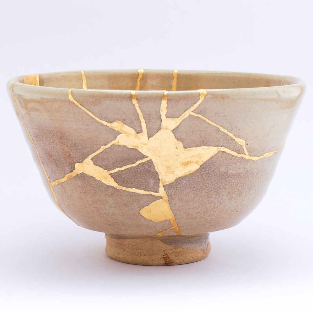
I took inspiration from the Japanese term Kintsugi which is an art form about repairing pottery. What I found so interesting about this art form was how it treats breakage and repair as part of the history of an object, rather than something to disguise so leaves them visible.
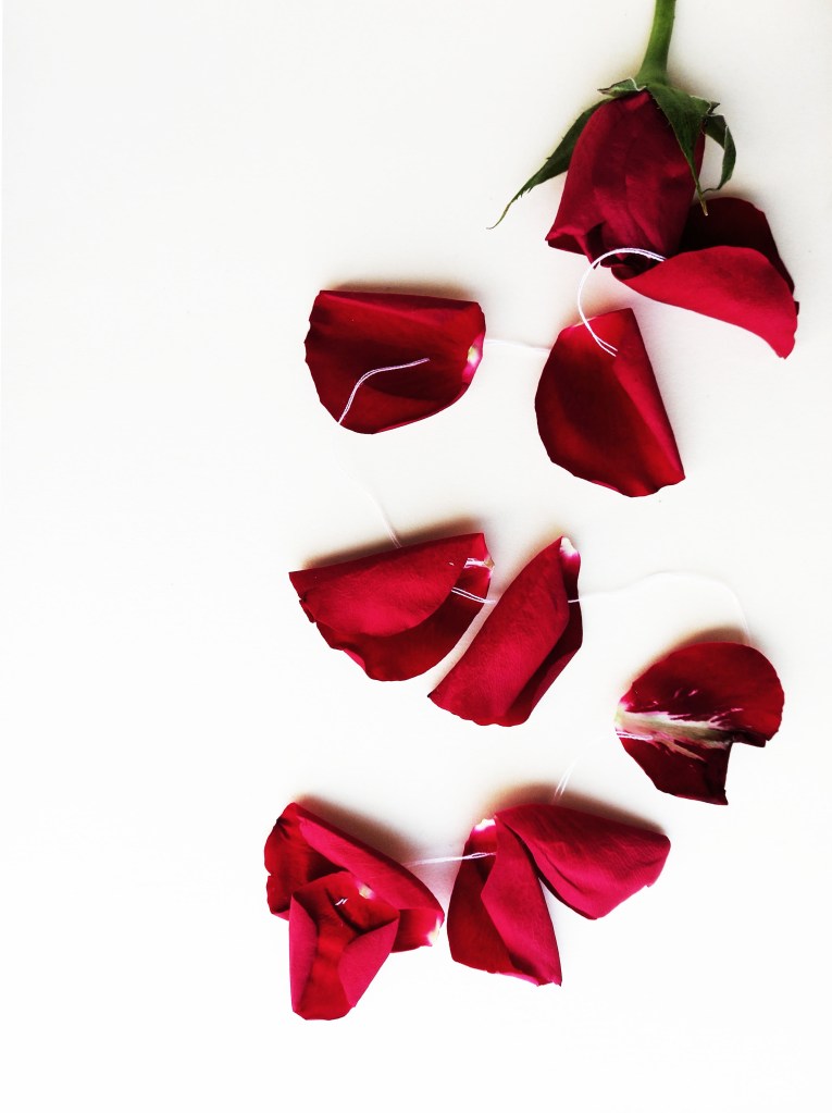
This is a piece I did at home continuing on with the theme of domestic violence. I wanted to develop on my idea of attaching something broken using thread. This time I chose a rose and I wanted to make a more mixed media piece by incorporating an organic element. I think this piece successfully represents the theme as is more visually striking than my previous attempts due to the powerful red of the rose.
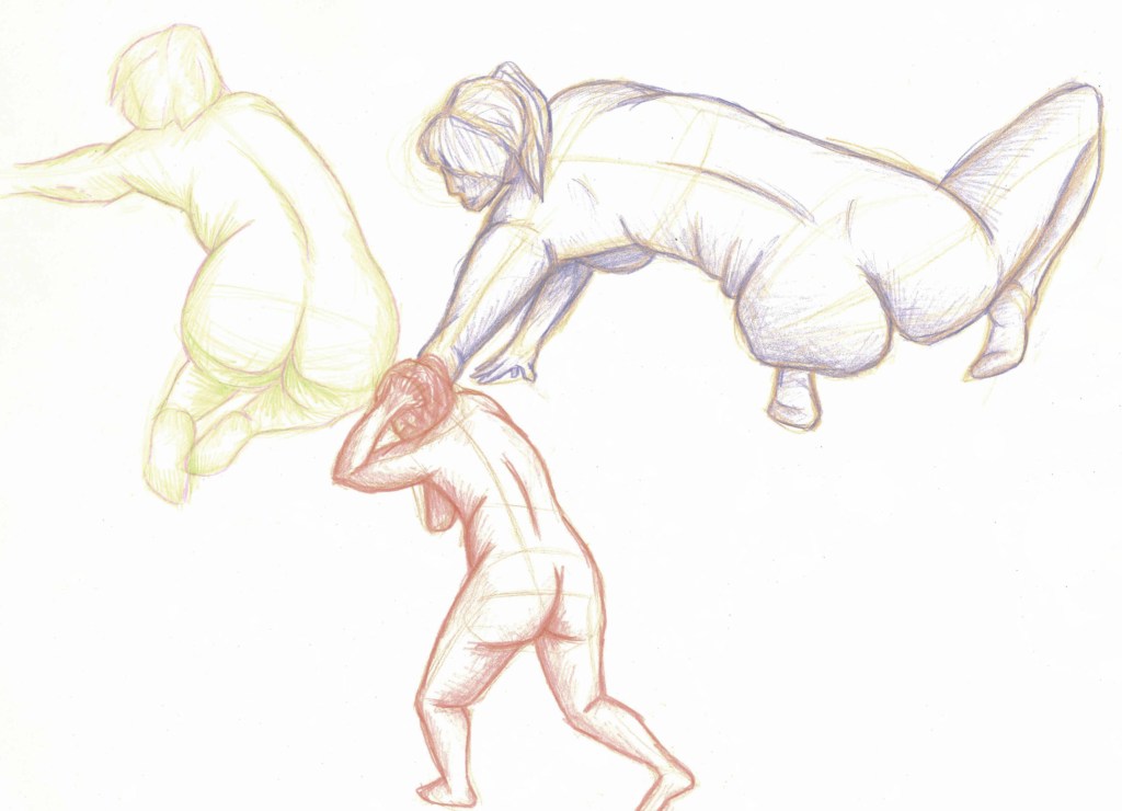
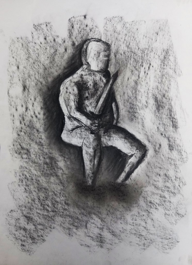
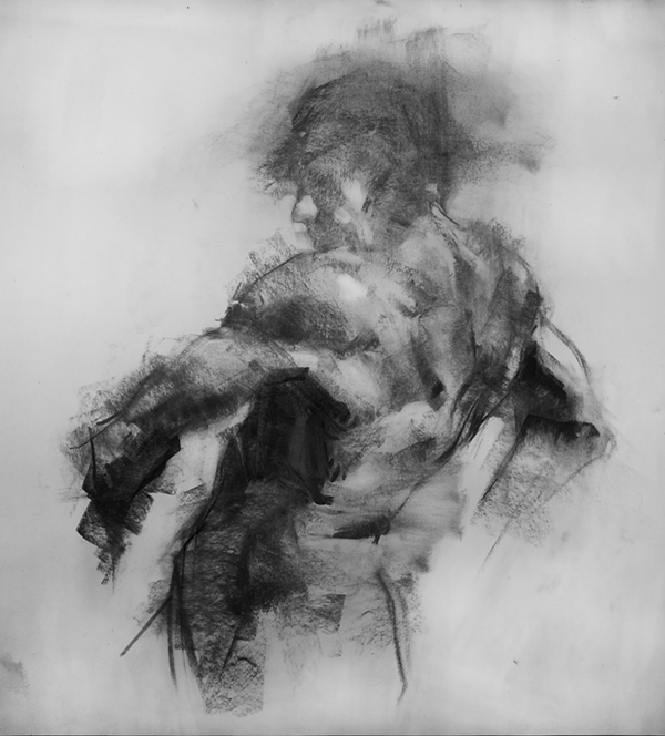
In week 3 of figure drawing we focused on tone by using charcoal. This is a medium I’ve used before and really enjoy using. The materials we used throughout this session were willow and compressed charcoal, brown chalks, erasers, a knife to cut the eraser and a tool to blend such as a blending stumps. One important thing I learnt was to add a mid tone background to the paper by roughly smudging some charcoal on the page. This way you can use an eraser to rub out the lighter areas and add charcoal to the darkest parts.
After doing some quick warm up sketches we had to complete 3 5 minute sketches of the model in different poses. We could use a combination of rubbing out and adding charcoal. Charcoal is a very versatile medium that can be redrawn and erased over and over without compromising the piece. This is something I began to understand more and take advantage of as the session went on. Even in these 3 images I can see clear improvement as I stopped drawing in such a linear way and focused more on empathising the light and dark areas to allow a figure to emerge from the mid tone background.
Then we moved onto some longer drawings. This one was a 15 minute piece. Once again we started with the mid tone background but there was more dramatic lighting as spot lights were added. To begin with we had to just use the eraser then after we could go in and add more charcoal and refine the drawing. The twist was that the lightest areas had to be drawn the darkest and the darkest areas had to be drawn the lightest. This was an interesting exercise and it made me really focus on the areas of light and dark. One technique that I think really helped to define the figure was adding areas of dark around the body.
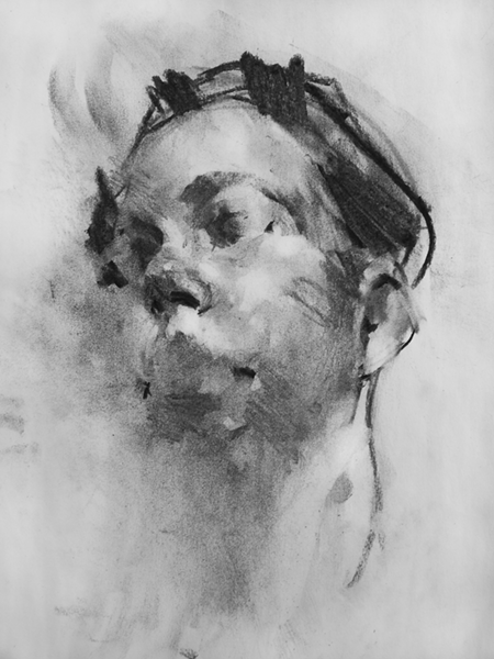
For this piece we worked on a slightly coloured piece of paper to allow us to build tone around a on a different colour. This was a slightly longer piece, we did this one for 20 minutes. I started by using the charcoal to add in the darkest bits then moved into the mid tone brown to add in the mid tones and finished off with the lightest brown for the highlights. I really like this piece a liked building up tone this way and think that working on paper that isn’t white helped me visualise the tones better. Also I liked the rough mark making and the way the colours come to build a figure rather than a linear sketch.
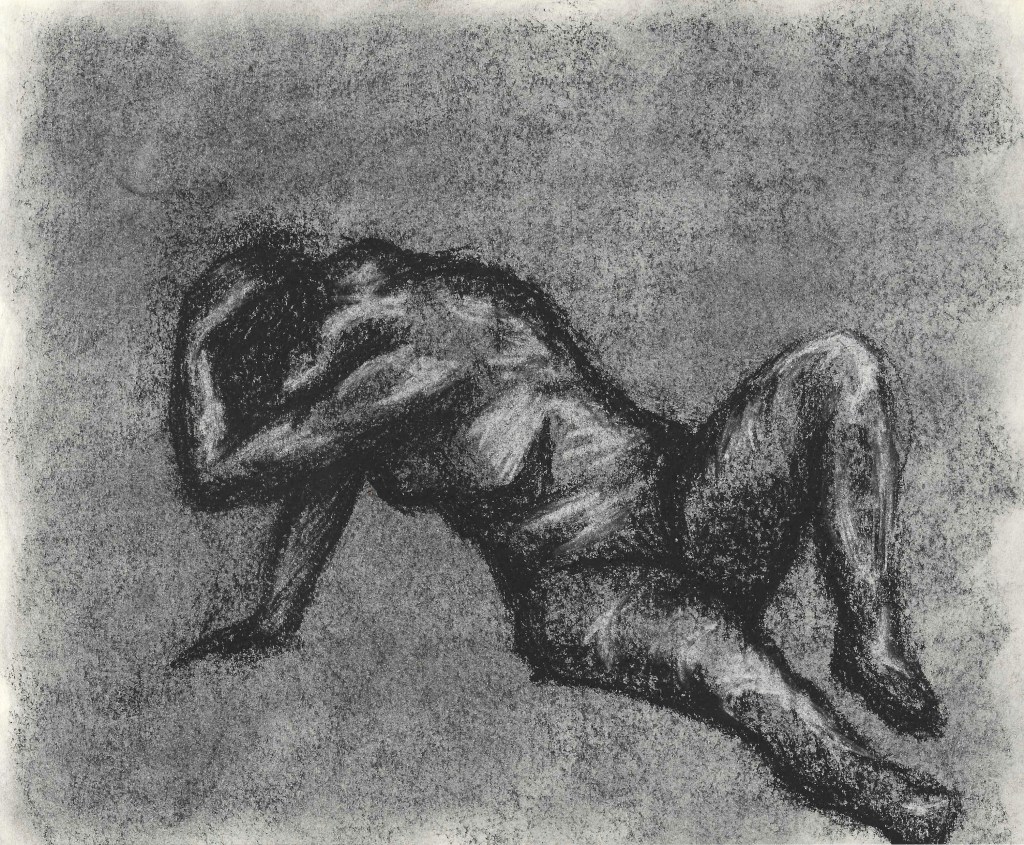
This was the final sketch of the session. I find laying down poses more challenging so was happy to get more practice of that. This time I used the paper colour as the mid tone so only added charcoal for the shadows and the lightest chalk for the highlights. I think the was effective and I was able to create a figure by just drawing out the darkest and lightest areas.
It is important to ‘fix’ work one you’re finished with it to ensure that it doesn’t smudge. You can use hair spray for this.
These are 3 charcoal sketches I did for homework. I chose a range of poses including 2 sitting down ones to challenge myself. I used techniques that we learnt in the session such as adding a base layer and sculpting with shadow instead of using lines. I’m happy with the sketches and think that they show improvement as I am now using the medium more successfully.
An artist I took inspiration from for this project was Damien Goidich. He’s a contemporary charcoal artist and I really like how he uses tone to shape a subject rather that harsh lines.
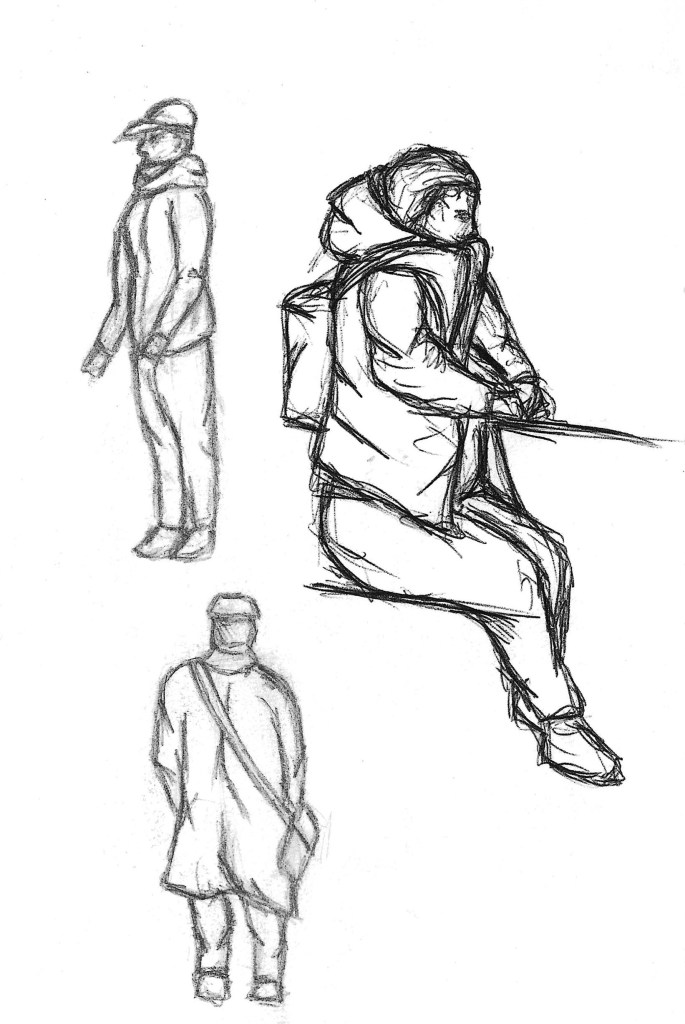
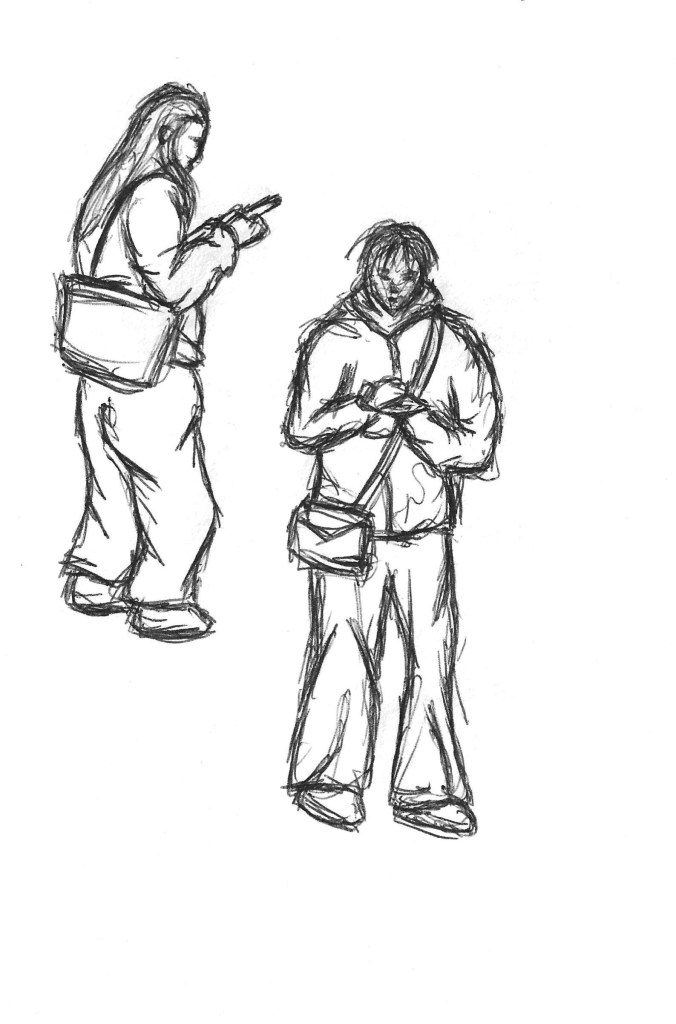
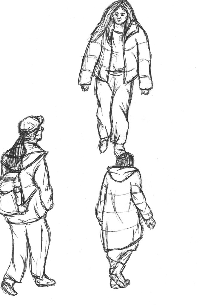
For the second week of this module we went off campus to develop our reportage illustration skills. We went to multiple different location including a private school and a shopping centre. These 2 locations are very close to each other but are very different in atmosphere and aesthetic so are interesting to compare. We were tasked with making quick observational sketches of people, activities and locations.
This task took me out of my comfort zone as drawing in public places is something I’m not confident with. It meant I had to draw fast and discreetly and making sure to capture the essential information. All the on location sketches I did where using a HB pencil as it’s my favourite medium and one that allows for quick mark making.
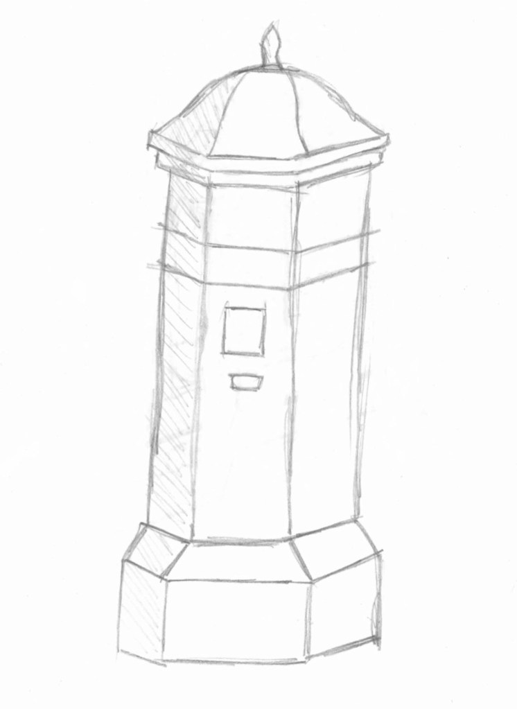
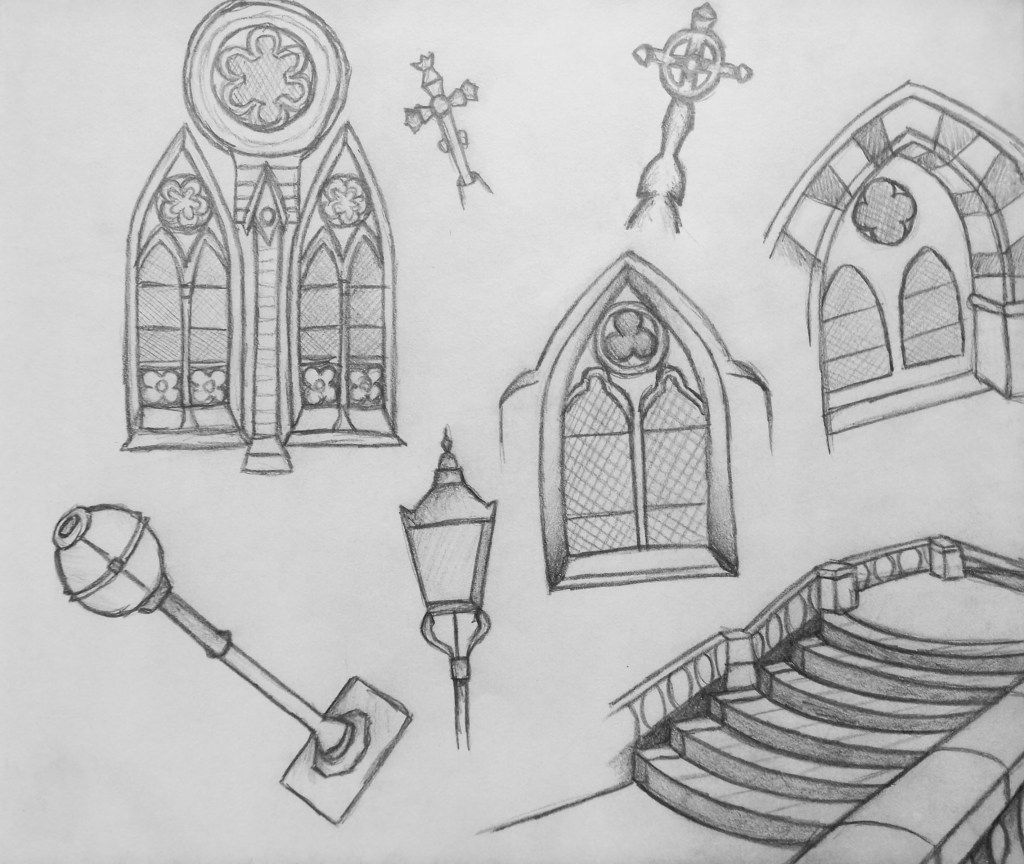
In the first location I mainly focused on the architecture and objects around the private school and they interested me. Also I felt that it was a good way to ease myself into drawing in public as I could be a bit than if I started with sketching people. For these sketches I captured the main details and also took picture so I could use my observational sketch and the photo to develop an image further.
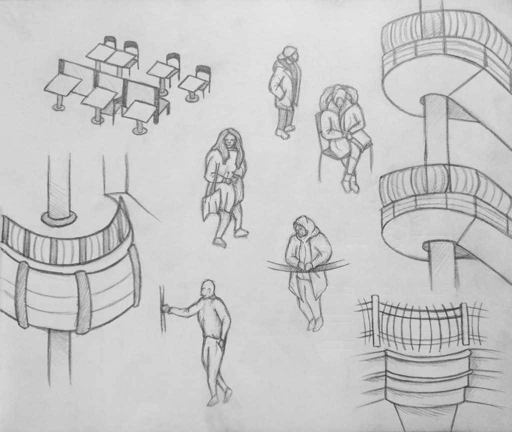
The second environment we went to was Harrow shopping centre. The 2 areas had completely different atmospheres and demographics of people. For this location I decided to focusing on sketching people. Prior to the session I watched a video with tips about gesture drawing and how to capture a person movement and body language quickly. The most helpful where to start with a line of action that runs from the head to the feet, this helps get the overall position of the person and then draw in 3 axis. One at the shoulders, hips and knees. This information alone is enough as from there, with a good understanding of prorations you can sketch a more complete figure. This was especially helpful as people where either constant moving or stopping for brief periods of time.
I became more comfortable with drawing in public as the day went on and it’s something I will continue to practice as it’s a good form of documentation.
After the session I used my observational sketches and photos to make more developed sketches from the different locations. From the private school I focused on the architecture as it was what I was drawn to most.
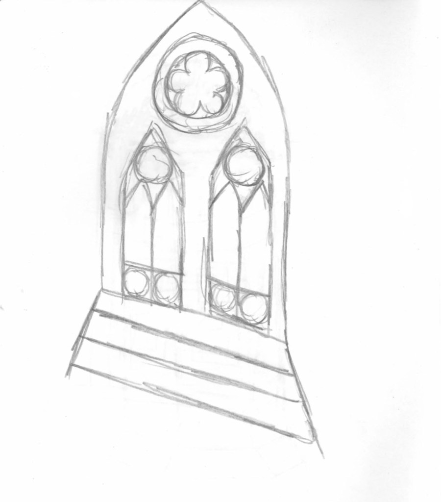
One area at the private school that particularly interested me was the church in the cemetery. So from a photo I took I made this more developed biro sketch to try and and capture the texture of the building as well and the detailed, rich architecture.
These are more detailed sketches from the shopping centre. I did some of the architecture to be able to compare the 2 locations as well as developing some of the sketches of people.
A technique I enjoy is using a base of watercolour the overlapping that with biro. I like the aesthetic of them overlapping particularly when the watercolour doesn’t completely fit within the biro lines so this is something I’d like to test out.
Overall I found the experience of drawing from observation in public to be both challenging and enjoyable. It had practical challenges such as having to work fast as well as me just initially feeling a bit uncomfortable but I quickly began to adjust. I plan to continue doing this as I can see it’s uses within documentary illustration and as a quick way of recording ideas and inspiration.
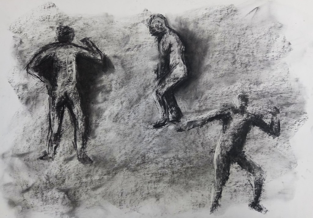
For this weeks session on figure drawing we had a live model come in and used ink to create expressive and distorted lines. The style Sumi-e uses lots of expressive lines in ink so was a good source of inspiration for this work:
The first exercise we did was a series of 9 1 minute sketches of the model in different poses. For this we used a thin black pen. It was a good warm up to get us sketching quickly and getting used to the models physique.
The second exercise was particularly challenging as we have to sketch the model while he was moving. Sketching someone in motion is difficult but because he was doing a repetitive motion I got used to it and was able to make some sketches.
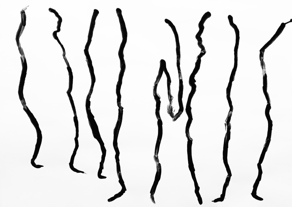
Another task was to just draw one side of the figure in one line in different poses. This was an interesting exercise as it made us focus on the negative space . It’s something I’d never done before and found it helpful as way of really focusing on a figure.
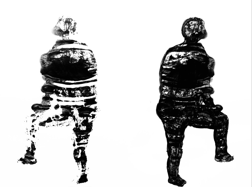
Just like the last task, for this we used black ink. We were given a time limit to sketch the outline of the model and fill it is with black ink. Then we had to fold the paper to make a print of it. I liked this task because it created an interesting print that showed a distorted figure.
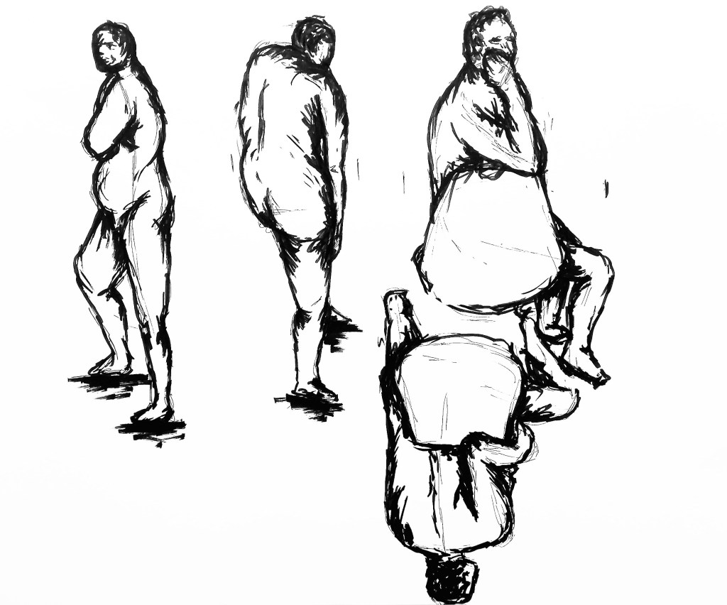
For this exercise had had a slightly longer time frame to make for sketches from different positions in the room. I got to try drawing sitting on the floor and chair as well as standing by an easel. I found I had the most control when sitting on the chair but enjoyed standing at the easel because it took me out of my comfort zone and allowed me to be a bit more dynamic. I used a thick black pen for this and was happy with the sketches I created
This was an even longer sketch and I used ink and different tools such as a sponge and sticks to create it. Using unconventional tools is something I’m not used to but was surprise by how much I enjoyed it. I was able to create and interesting texture by using them. I will try to experiment with other tools in the future.
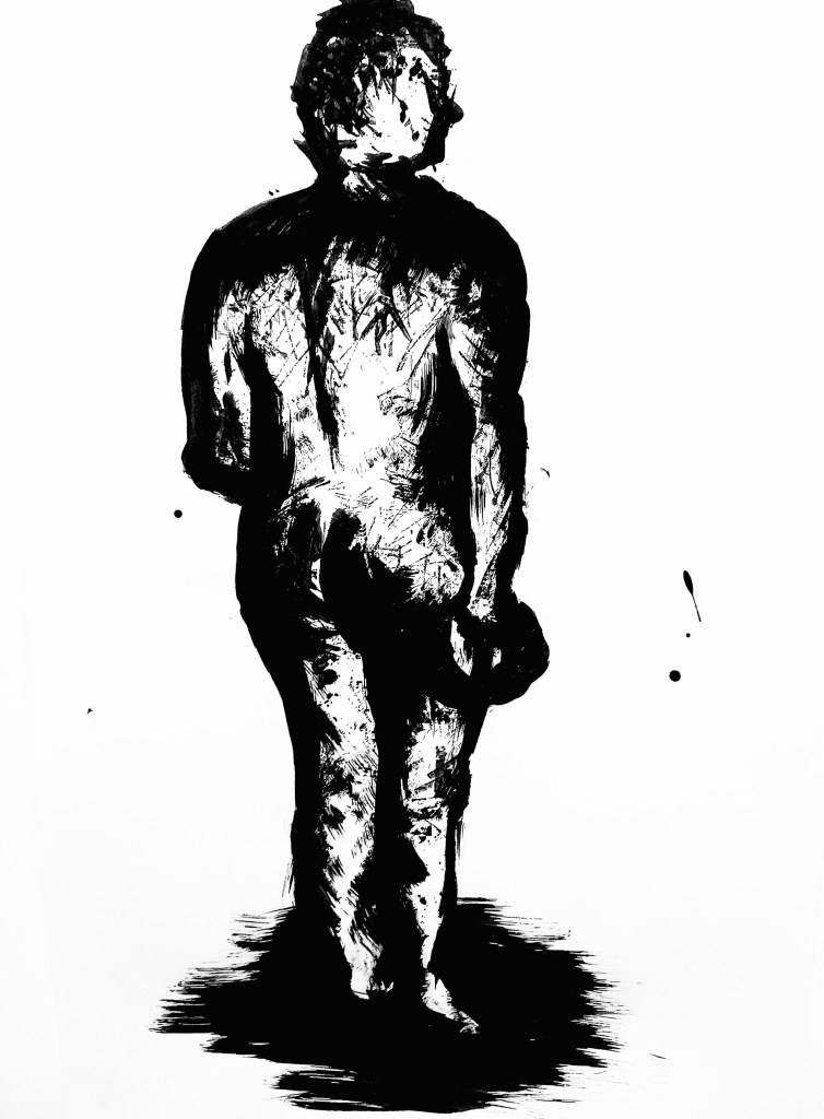
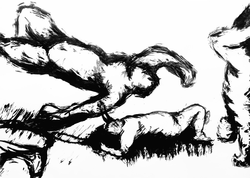
This was my favourite piece I produced in the session. The model stayed in one pose and we had 5 minutes to make a sketch and move location and draw again. We did this 4 times and I created this composition. I find laying down poses more challenging so I was happy to be able to see clear progress. Also I chose to do this is ink and it was the medium I was confident with and wanted to push myself to expand the mediums I can use.
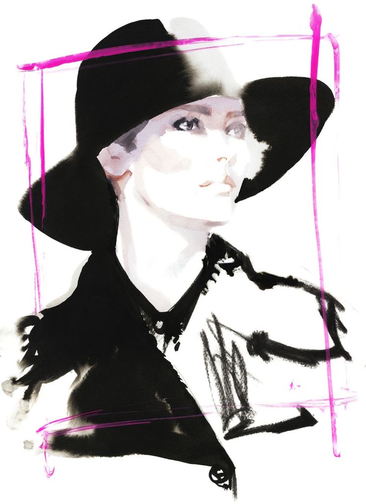
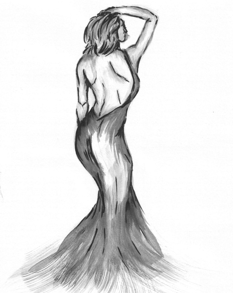
For our homework we had to create 3 fashion illustrations inspired by the work of David Downtown. I used black pens of 2 different thicknesses and black ink. Unlike in the session, I used water to dilute the ink to create different shades. This is something that I thought was successful. I used different brushed to get different strokes and marks. This is an example of David Downtown’s work.
To start each sketch I did a very light pencil gesture drawing then began to build on that. Then I used to ink at to add in the details such as folds in the clothes and body shape. I started with using lots of water and built up to less. Then in certain bits I used the pens to add more detail to the figure, clothes and facial features.
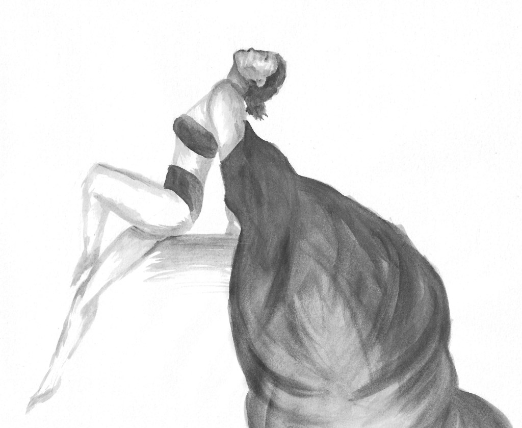
This one is slightly different in the way that it was done with just with ink and water, no pens. I like the floods and flow on the cape and the details on the figure.