Categories
Documentary Illustration Level 4

Documentary Illustration: Week 4

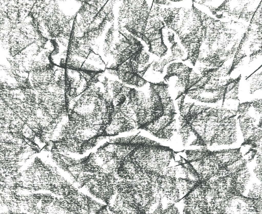
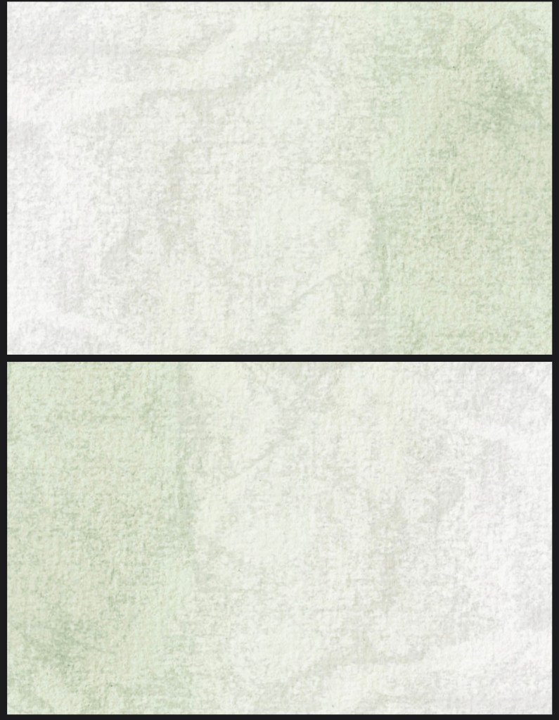
Using InDesign I made the template for the art book with the watercolour backgrounds I created. I learnt about how to create different page layouts and how to export them into a PDF with the correct layout. I like the textured backgrounds as they fit better with the natural theme of the project than plain white pages. The next step is going to be placing the images and text into the InDesign booklet. I will experiment with scanning in hand written text and using typed text to see which looks better.

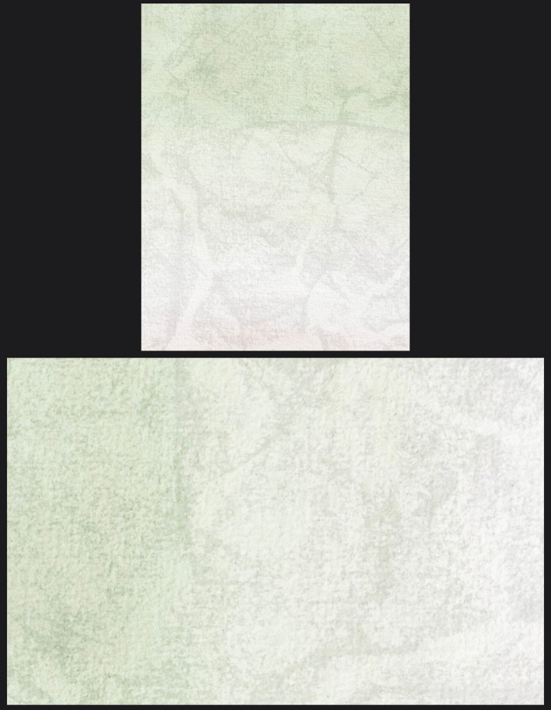
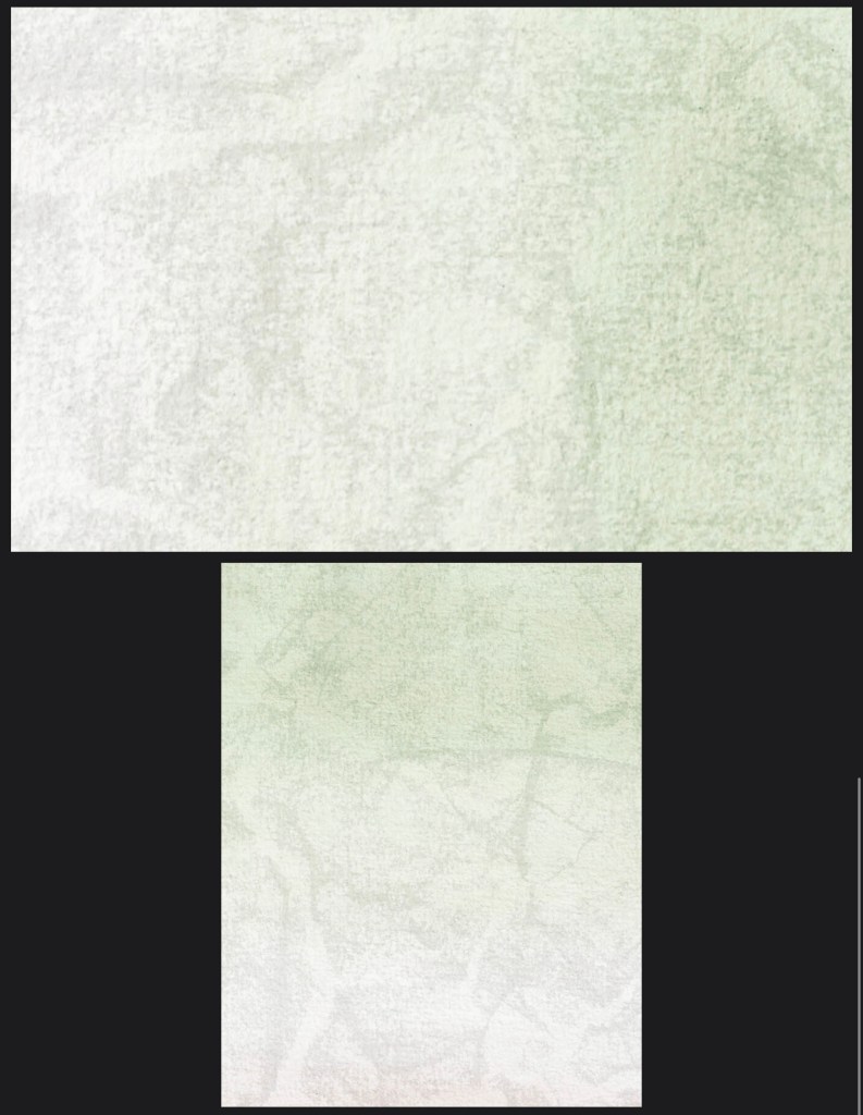
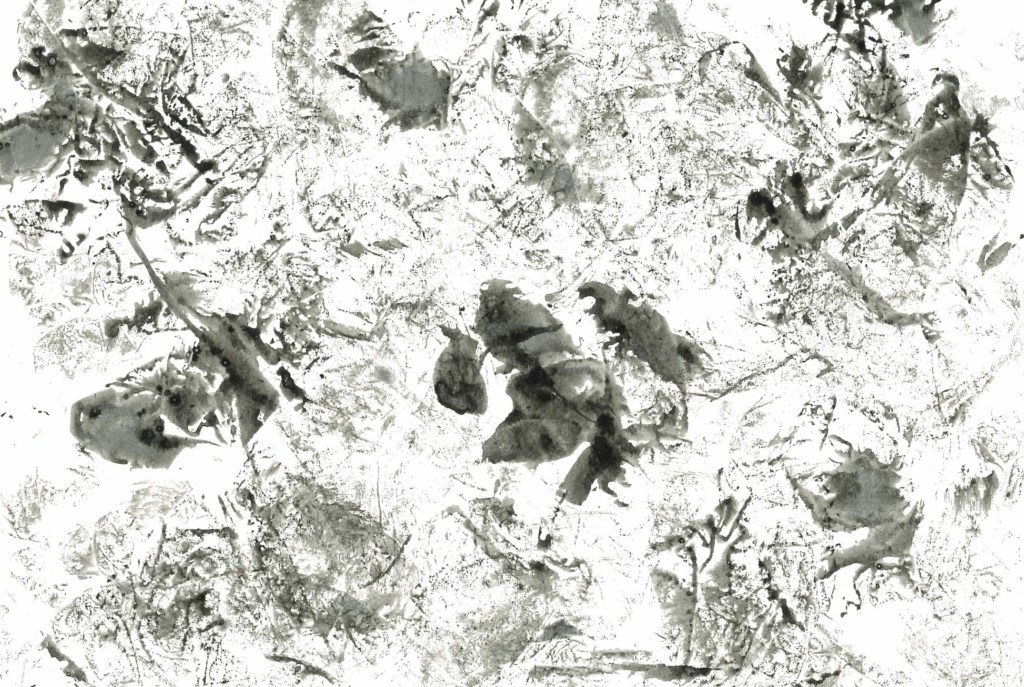
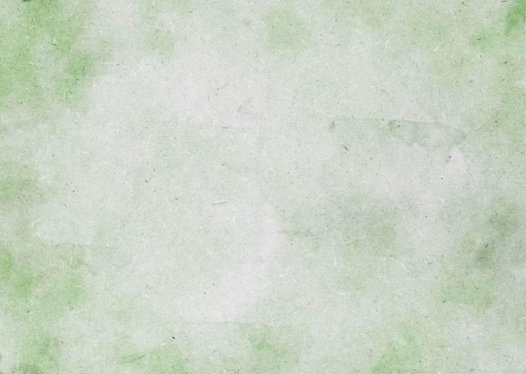
After testing exporting my template as a PDF I was unsatisfied with the quality of the background as it became too pixelated. So I found a different texture, a piece of wood, and scanned it. Then I added my water colour wash over it on Photoshop to create this textured background. It still aligns will the natural theme of the book but is a much clearer image when exported. So I will use this for all of the double page spreads in the book but I’ll keep the front and back cover the same as the initial one.

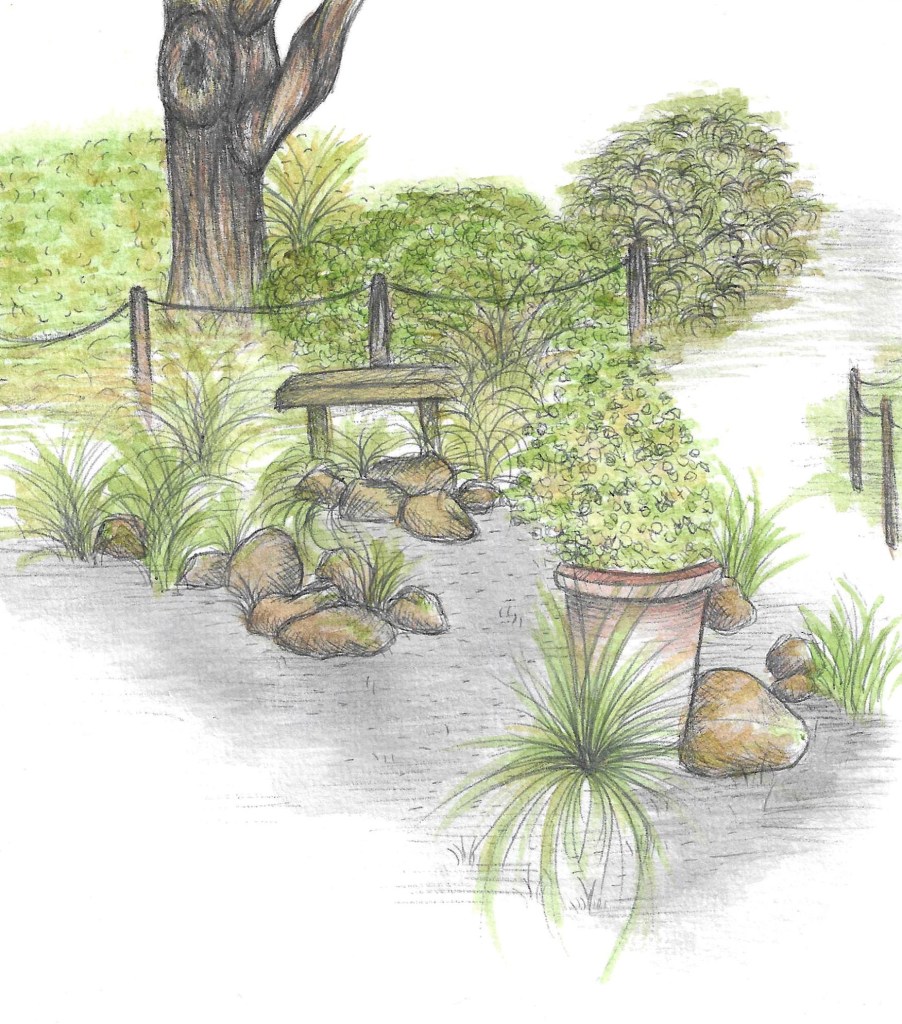
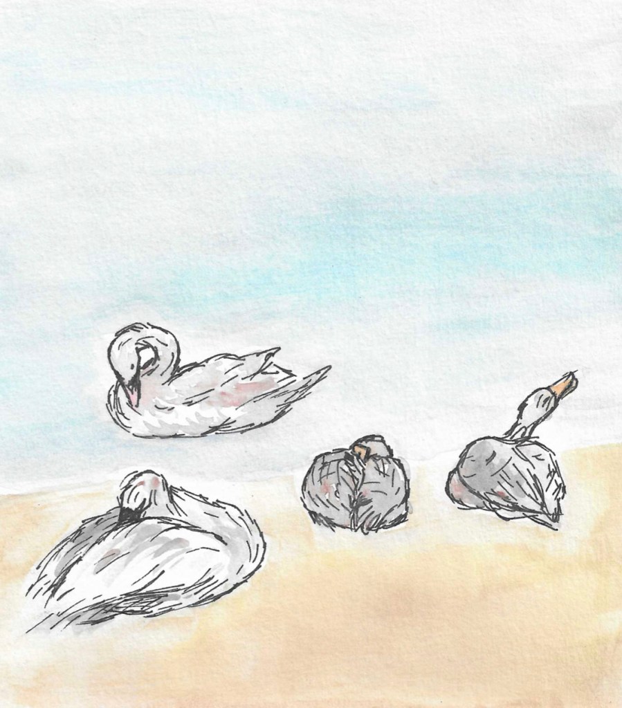
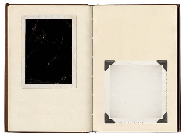
I would like to make my art book resemble an old style photo album. I can achieve this aesthetic by using corner tags, small notes around the images, and by spacing the images out. The reason I’d like this style is to create an organic and intimate experience for the viewer.

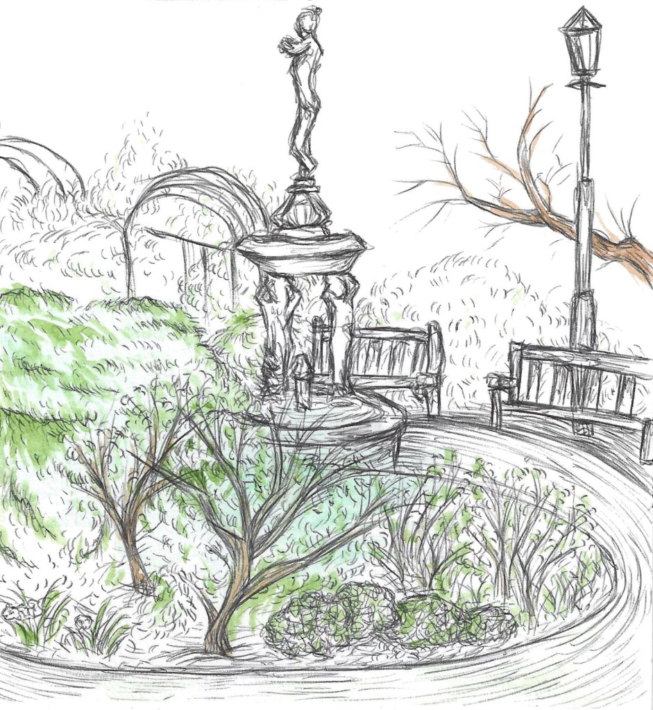
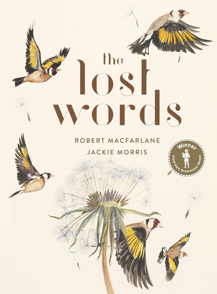
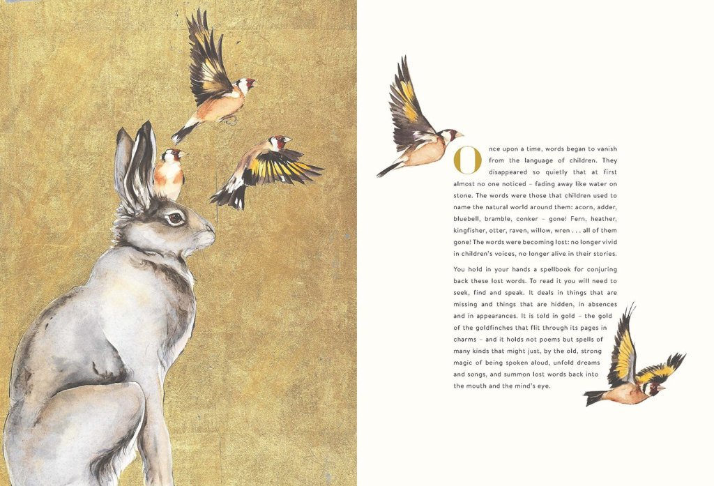
Another key inspiration for the layout of the art book is The Lost Words as I like the way the images and text are placed on the pages.

Categories
Documentary Illustration Level 4

Documentary Illustration: Week 3

After completing the illustrations for Hyde Park I moved onto the ones for the Bonnington Gardens in Vauxhall. I finished the animals last week and now I’m moving onto the plants and scenery. First I made illustrations of berries and flowers I saw in the gardens. I experimented with different techniques as well as using some of the most successful ones from the Hyde Park illustrations. I really like the colours in these images as it brings a lot of life to the collection.

These are the 3 illustrations of the scenery in the Bonnington Gardens. The first one is a more refined combination of water colour and biro.

This piece is inspired by Beatrix Potters illustrations of natural scenery.

Another experiment with marker pens.

Also I went to a session to learn about book making. It was very helpful as I now know how to produce multiple different types of books. If I have time I’d like to produce a physical art book to accompany the digital version. I would use a traditional stitch binder book style.

I have now completed all the illustrations I’ll need for this project so I can now move onto the next step, assembling them in an art book.

Categories
Drawing Exploration Level 4

Drawing Exploration: Experimental Drawing- Chance and Randomness

This weeks session was all about experimenting with different mediums to expand our approaches to image making. I tired lots of different techniques, some being successful and others not so much. I restricted myself to charcoal and ink as they’re mediums I like but feel I could expand the way I use them.

For this experiment I scrunched up a piece of paper and went over it with the side of a piece of charcoal. I really like texture and think it could be good to use as background to work over or scan and use as a paper texture on Photoshop.

I dipped a piece of tissue in some ink and used that to create this texture.

I particular liked this fragmented effect that I got by putting water and ink on a page then pressing it with a shiny fabric.

This was done by dipping string in ink and dragging it across the page. It’s a very abstract piece and as I spoke to different people they saw different things in the shapes. I personally see a bunny.

The next 2 experiments where done by randomly putting ink on one side of the page then folding it and creating a mirror image. For the first one I added texture after by using the same fabric as before. To me it looks like a turtle shell.

I find this result particularly interesting and can see many different things such as an animal face and 2 birds facing each other.

I put water on the page and a drop of ink at the top then held it up and let the ink drip down. I think it looks like a ghostly figure sitting down. This is a technique I’d like to try again and see what other results I can get.

This was my favourite technique I tried. I dipped string in ink and placed it curled up on one side of the page. Then folded the page and pulled the string out. It create this lovely effect that could be left as it is or worked into a pen.

I think this looks like flowers. I will try to incorporate this technique into my work in the future.

The final task was to use the techniques we experimented with and use them to create an abstract piece to represent the mood of a poem. I chose to illustrate the poem ‘The Wild Rose’ by Wendell Berry. I used the string technique in red and black ink and collaged over the top of it. I think I was able to abstractly capture the essence of the poem.

I found this session very helpful as it help expand my approach to drawing and gave me a few techniques to use for future pieces.

Categories
Documentary Illustration Level 4

Documentary Illustration: Week 2- Part 2

As well as visiting the gardens, I spent a lot of time this week working out the details of the project and ideas for the presentation of the art book. In order to make the art book visually cohesive, I’ve settled upon using only 3 mediums. These are marker pens, biros and watercolours. These mediums allow me enough versatility because they can be combined as well as used on their own, while still maintaining a visual flow.

One of the biggest challenges for me has been titling my project to help consolidate my ideas. The title I’ve decided on for my art book is ‘Natures Beautiful Freedom’, with the subheading ‘to document and preserve a collection of little moments’. I feel that this sums up my intentions for this project as I want it to be a set of delicate and sweet illustrations to capture the beauty of 2 locations in London.

I plan to scan all my illustrations and assemble the art book digitally using Adobe InDesign. The number of pages remains flexible but I would like it to be 10 pages long. With a front and back cover, 4 pages of illustrations for Hyde Park and 4 pages for the Bonnington Gardens. I will make a watercolour wash background which will be used for the background of each pages. The illustrations will be grouped by location and sub grouped thematically, with all the animals together, all the botanics together and all the secretary ones together. This should make it engaging for the viewer.

These are the water colour background:

Next week I will test page layouts and refine the details of the art book such as introductions to the locations and summary for the back cover.

Categories
Documentary Illustration Level 4

Documentary Illustration: Week 2

This week I visited the Bonnington Pleasure Gardens in Vauxhall. I spent some time in the gardens and going around the surrounding area. Unfortunately, due to the changing weather condition, I wasn’t able to produce many sketches on location but did get plenty of photos to draw from. The gardens is a beautifully overgrown little place so I want to capture this through my illustrations. Here are some of the photos I’m going to use as reference:

These are the illustrations of animals from the Bonnington Gardens. Here are a set of more anatomically-focused illustrations of some birds I saw.

Some bold marker style snails.

A detailed watercolour study of a cat heavily inspired by Beatrix Potter and Marco Brodde.

I also went back to Hyde Park to get some more photos. Because I had already done some sketches from Hyde Park, I had a more focused idea of what to photograph in order to comprehensively study the area.

This illustration took inspiration from the work of George Butler. I really like way the watercolour and biro overlap but don’t fit perfectly.

I used a similar style to depict some flowers that where in Hyde Park.

I have enough source material to work from so now I can focus on producing my illustrations and creating the art book for them.

Categories
Drawing Exploration Level 4

Drawing Exploration: Experimental Drawing- Image Displacement

This workshop was all about creating a visual collage in response to a text. The task was to create a collage that evokes the feelings within the text rather than a literal illustration. We were given a range of texts to choose from and I chose The Memory of Place A phenomenology of the uncanny by Dylan Trigg. The extract is below:

I have seen this place before. It is three o’clock on a Thursday afternoon, and I am standingoutside my childhood home. On the upper right, through the tree, is the room I slept in. Fromwithin that room, I would be able to hear a train in the distance. If I get close enough, perhapsnear enough to touch the door, I would be able to see the kitchen where I once burned myself.Dare I trespass beyond this door? In doing so, more than a spatial border would be transgressed.Crossing that borderline, I would risk conflating the traces of familiarity with the presence ofunfamiliarity, entering in that scene of a different timescale, and so producing a place divested ofits intimacy with my memory but now accommodating of other people’s lives.

I began by reading the text to understand the subject and feelings the text presents then finding appropriate collage materials. I found that a key feeling of the text was juxtaposition. There are many examples of this such as the past vs present and inside vs outside. I wanted to capture that so I made the decision to make 2 contrasting elements of the collage, the black and the colour. The colour is loosely held in the shape of a door and the dark surrounds it.

I cut up the collage and made a second version which I prefer. I think it’s more aesthetically appealing as the triangle shapes create a dynamic composition which draws the eyes into the colourful centre. We did a review at the end of the session and I got positive feedback with people understanding the emotions and message I was trying to convey to represent the text.

I enjoyed this session and found it useful as it taught me ways of visually representing the emotions of a text rather than simply illustrating it. I think I was successfully able to do this through my collage as it represents the bittersweet feelings in the texts.

We looked at a range of collage artists and 2 that stuck out to me where Peter Horvath and Hannah Hoch. I really like both of their styles and would like to try incorporate them into work of my own in the future.

Categories
Documentary Illustration Level 4

Documentary Illustration: Practical Portfolio Week 1

This week I visited Hyde Park, I went for around 4 hours. I spent a while wandering around the park to see what different areas there where and finding my own areas of interest. Then I found places to sit and began to sketch on location as well as take some photos to reference back to and make further developments with. I found that I had a big interest in trying to capture animal behaviours and drawing these from the photos I took. Also I really like parts where the plants and man made structures are interacting. These are a selection of the photos I took of locations I drew at as well as ones I used for later developments.

I did a study of a few different squirrels. I was lucky to get close enough to film a few and make sketches of their movements. I tired this in a few different materials, pencil, biro and marker pen.

I really like this Beatrix Potter inspired style of drawing animals. I start with a biro sketch then add watercolour. I hope to capture more animals through out this project to do more in this style. I also took inspiration from the illustrative style of the Lost Words.

I also did some biro and watercolour sketches of areas that particularly caught my eye. I like this area because there was lovely interaction with man made objects such as the sculpture and bench with the plants and bushes. I also liked how the plants where clearly only supposed to be growing in certain areas but had overgrown.

I chose this areas because of the pink leaves on the tree which had a very interesting twisted trunk. This style was heavily inspired by the documentary illustrators that I mentioned previously such as George Butler.

This dynamic marker pen style is something I will develop throughout this project. This is a sketch that I did on location.

Then I did a study of some flowers in a similar style.

I thought my first trip to Hyde Park was a success as I was able to create lots of sketches on locations and from photos I took. I will continue to develop from some of the photos and make at least 1 more trip to doing more observational drawings. I also have a greater understanding of my interests and the theme I was the images from my project to be centred around. I want to capture animal behaviours and the interactions between plants and man made objects as well as some pieces which simply reflect the beauty of nature.

Next week I plan to visit the Bonnington Gardens to do sketches there and take photos for reference. Also I think it will be important for me to come up with a title to help keep my illustrations focused and on theme so I’ll try to figure that out by next week.

Categories
Drawing Exploration Level 4

Drawing Exploration: Experimental Drawing- Reportage

This session was run by Anna Steinberg who also led one of the Documentary Illustration sessions. This was an exploration of reportage drawing which means drawing from observation as a form of recording. This is similar to what we have been doing in the Documentary Illustration. The first exercise we did was drawing each other around the classroom. This was a good warm up exercise as we were in a comfortable environment and there wasn’t much movement going on, making it easier to capture the environment and people.

On a few of the sketches I added a dilute water colour wash to things with standout colours such as peoples jumpers. I think this adds character and an energy to the sketches.

Then we moved into the Forum and sketched people there. This is a less comfortable environment but I’m getting used to drawing in public because of the work on Documentary Illustration.

I can see myself improving at doing quick figure sketches as I’m able to capture the key details. Also sometimes I caricature certain details/ features to make them stand out and really capture the essence of the person. I found it very helpful to see Anna’s reportage sketchbooks as it gave me a lot of ideas and inspiration. I really liked her use of watercolour to brig life to an image and her use of continuous line to create the characters and scenery. Watercolour is a medium I’d like to practice and improve with.

My artistic inspirations for these sketches were Anna Steinberg’s reportage sketches and George Butler’s illustration for example:

Categories
Documentary Illustration Level 4

Documentary Illustration: Practical Portfolio Proposal- London’s Natural Beauty

My proposal is to document different areas of London with rich natural beauty. I will focus on the landscapes, plants and hopefully some animals. Also I will document some interactions of people and man made structures with nature. I want to focus on natural environments to highlight the how much natural beauty there still is in cities like London and the importance of maintaining these environments. While areas like Hyde park are not all natural I want to show that nature is still thriving. I will use primary observational sketches and photographs to document the areas. I don’t want to interact with the people there as I want to capture authentic and genuine interactions with nature. 

I will produce an art book with my sketches. It will have 2 chapters, one for each location I visit. I plan to visit 2 locations, 1 well known and famous location and 1 more obscure natural area. I think it will be interesting to compare them as well and just being enjoyable to experience drawing in different types of locations. I’ve done some research about different areas and the popular location I’d like to visit is Hyde Park. The smaller area is in Vauxhall and it’s called the Bonnington Square Pleasure Gardens. Before drawing at these locations I plan to visit all of them to check that I’m happy to use those locations and see which particular bits interested me to document.

Here are some photos of the locations I’ve mentioned, Hyde Park and Bonnington Pleasure Gardens. I visited the Gardens in Vauxhall and there was lots of parts of it that interests me so I’m definitely gonna use this location.

Next week I will try to visit Hyde Park and finalise my plan then I can move onto creating the illustrations. I was doing some research of nature illustrations and found a website called the Society of Wildlife Artists and I really like some of the artists style so I’m gonna take inspiration from some of those including David Measures and Marco Brodde. Also a big influence on me since my childhood has been the work of Beatrix Potter. I love her natural illustrative style as it’s very warm and sweet and I’d like to try and capture this through my images.

David Measures

Marco Brodde

Beatrix Potter

Below are images by 3 documentary illustrators that I will be taking inspiration for when creating my illustrations. They are George Butler, Lucinda Rogers and Jim Butler (in that order).

Also I will be taking inspiration from this book titled the Lost Words. It depicts a different animal or plant for each letter of the alphabetic as a way of documenting and preserving the worlds natural beauty. I both really like the concept and art style of the illustrations.

I’ve been thinking more about the central theme that I want to tie all my images together and I’m leaning towards the ideas of nature taking over. This is in reference to the animals that come and enjoy the areas then move on and the growing of plant life.

Categories
Drawing Exploration Uncategorized

Drawing Exploration: Experimental Drawing- Line

After completing the 5 weeks of figure drawing I moved onto the second half of this module, experimental drawing. The first exercise we did was simply to choose and medium, I chose pink oil pastel, and make 10 different lines. This was a good warmup as it got us thinking about the different mark making possibilities of a single medium.

We worked in groups to do more mark making to music. I think the collaborative element was very helpful as me and my partner where able to quickly share ideas and collaborate to make a very energetic and colourful piece to represent the music.

This are some of my favourite sections of the piece. I like the movement of the lines and vibrancy of the colours.

At the start of he session I was sceptical about the approach as I usually prefer a more closely considered way of ,asking images but by the end I was enjoying it and came out with a piece I really like. This approach to mark making is something I hope we continue with in the module.

For homework this week we had to select 4 musical terms and employ each term as a key component in a series of 4 drawings. We had to use a wide variety of linear lines and marks that we explored during the session. There are many types of lines that we can use such soft, hard, curvilinear, straight, sharp, brittle, hard, broken, light, heavy, tonal, dense, open, energetic, passive, quiet. Each can be used to convey different meanings and emotions.

For this one I chose the word Vivace which means lively and quick. I tried to capture a very dynamic and energetic feeling with a range of colours and marks.

This one was inspired by the term Mancando which means waning and dying away. I didn’t want to just capture this meaning by using all dull colours, I wanted to do it by making all the energetic lines merge into one stop where are the energy disappears to.

This piece is about the term Brio which means vigour. I thought the best way of representing that would be through bold and harsh lines that are all crossing over in muted colours.

This piece represents Giorjoso, meaning merry. I used exclusively bright colours with lots of smooth curves to create a happy and free atmosphere.

For the final piece we had to pick 2 terms and create a drawing that shows a dialogue between them. I chose Allegro (lively, fast and cheerful) and Lamentoso (mournful). The way I tried to represent this is with have to set of lines going in different directions. The more vibrant lines are more dynamic and energetic but observed by the thick black lines.

The artist that I was inspired by for this piece and my homework pieces was Kandinsky. He is generally credited as one of the pioneers of abstraction in western art. I find his art style really engaging, particularly the use of colour. This is one of my favourites: