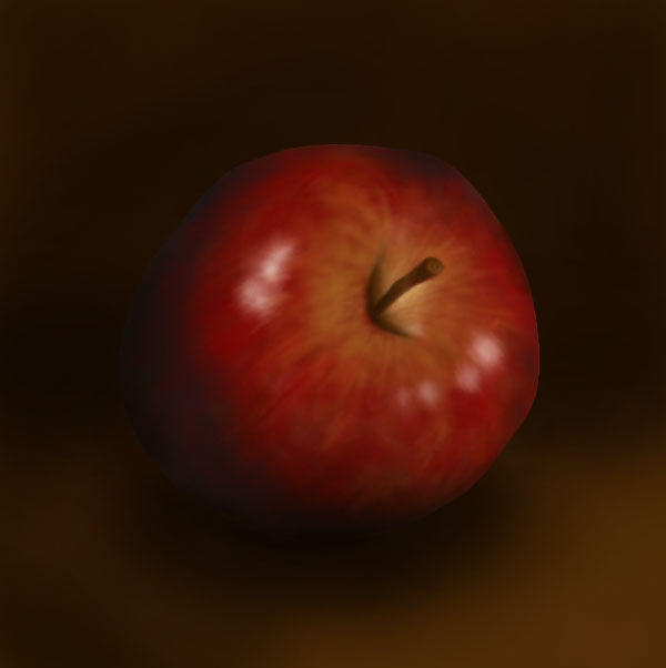
I spent about 2 hours practicing painting on the spare model. I tried out the different brushes and getting into the small gaps and little areas wasn’t a problem as I have some really fine brushes. The primer is effective as the paint seems to hold and cover the model well. Each part will need multiple layers to get the desired finish. Mixing colours for the clothes isn’t too difficult but skin tones are. I struggled with making skin tones but watched some videos on it and I now understand the theory of it. You start with black, white, red, yellow and blue. Then mix the 3 primary colours to create a base brown and build up on that by adding white, black or more of one of the primary colours. Continue to adjust the colour until you reach the right skin tone. For the painting style I’ll be taking inspiration from is the Marvel action figures that I have as they are around the same size and I’m gonna try capture the same amount of detail.
Author: samuelgreenillustration
Spraying primer is an important step as it create a surface that the paint sticks to better. Before spraying the models I did some research about the best ways to apply the primer and tried using some of these techniques in my own work. I put on safety equipment such as a mask, glasses and a glove for the hand I moved the models with. I sprayed them outside and also let them air dry outside. I found different items around my house such as coasters and metal jar lids to stick the models feet to so I could move them without messing with the primer.
I had to shake the can for 2 minutes then spray from around 20cm away from the model, this helps to create a more even coverage. I did a combination of turning the model around, moving around the model and changing the height the model was at to try to cover every part.
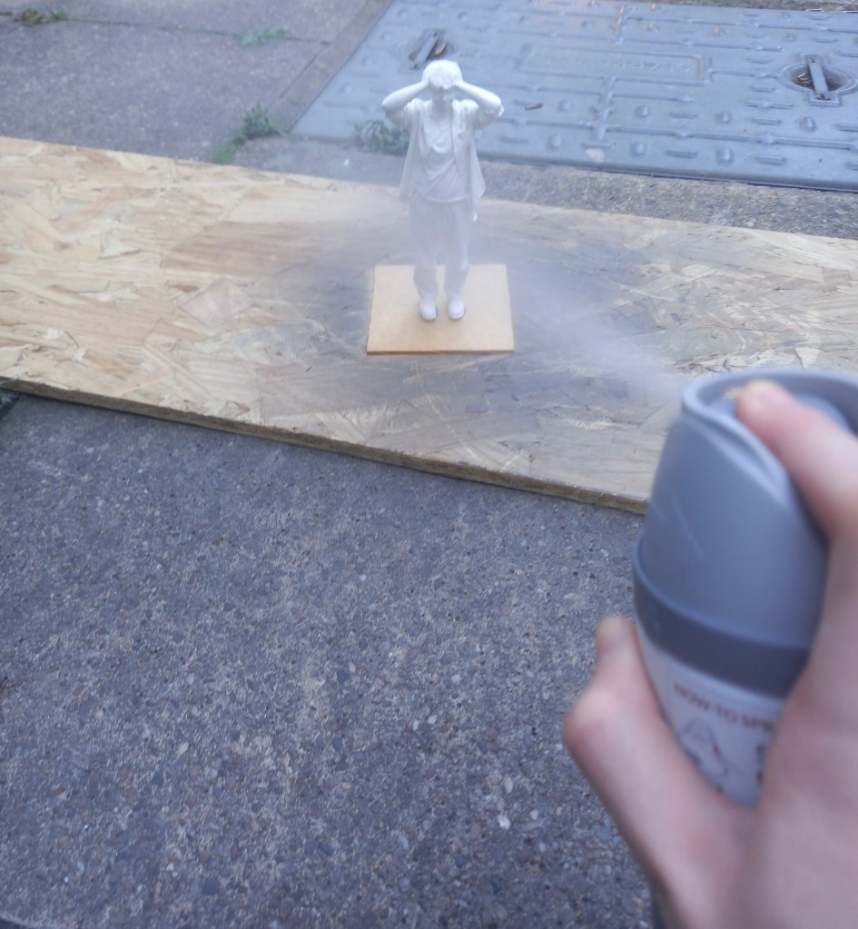
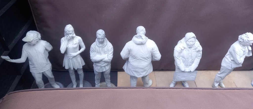
As I worked through the models I became more confident in the best technique to cover them thoroughly and evenly. I waited around an hour after spraying them and looked to see which ones needed more. In total this process took around 3 hours. It was slow to begin with as I was figuring about the best way to spray them. They’re not all perfectly sprayed as I couldn’t get the primer into certain bits such as the folds of some of the clothing but I think they’re covered well enough for painting. The primer is grey which helped as it was obvious which bits had been sprayed.
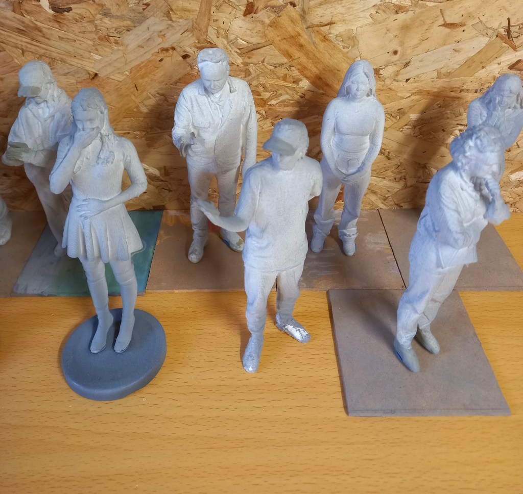
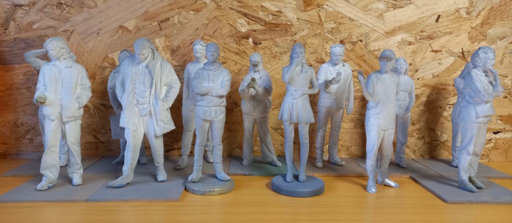
The primer takes 24 hours to dry and hardened so after this I can begin painting them.
I used 3 different levels of sand paper and tweezers to sand down the models. I would begin by picking off any big bits then use the roughest sand paper to break down the worst areas. Then I’d use the other sand papers to smooth down the areas and then use a damp cloth to wipe off the filings. This was a slow process and took about 3 hours to do all of them. I’ve done the best I can at sanding them down but there was only so much I could do because of the texture created by the 3D printer.
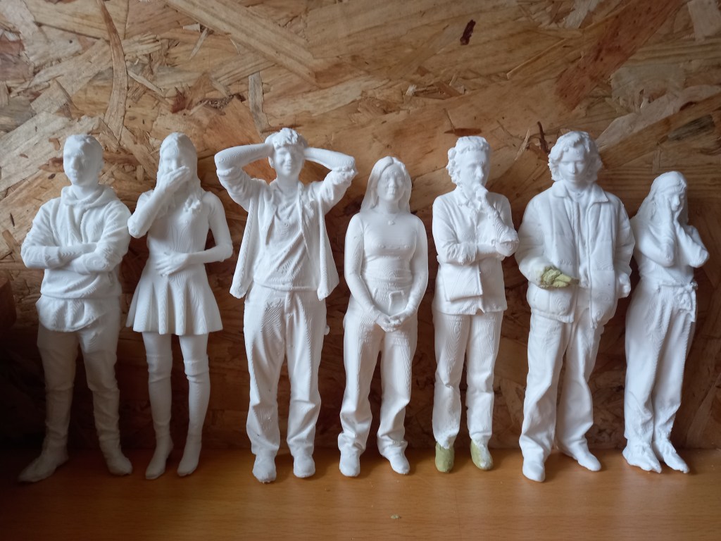
I also made sure that all the models could stand. Some already could but other took more work. I either had to sand them down or add more miliput to create a flat base.

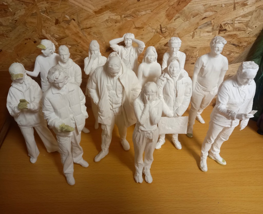
Now that they’re all repaired, sanded and able to stand I will spray them all with a primer to create a surface that’s better for the paint to stick to.
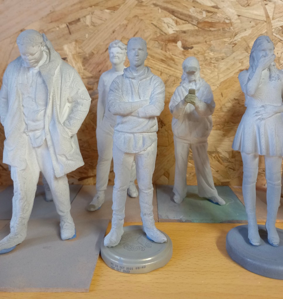
The first thing I did when I got the models was break off any big bits of plastic sticking out of the model using tweezers and scissors. Then I found the models that had printing error so I could fix them with the miliput. I had to mix the 2 parts in equal quantities for around 5 minutes. It softened up to become malleable and hardened again after a couple hours and was completely solid by the next day. There were 5 models that needed repairs in total this process took me around 3 hours. The first one I did was adding the heels onto this models shoes.

This one was more difficult as I needed to add in his phone and part of his hand. Most of the hand had been printed so I had a good base to work from.
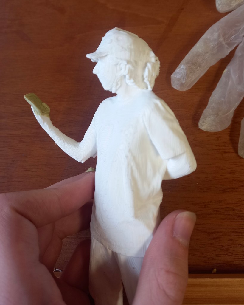
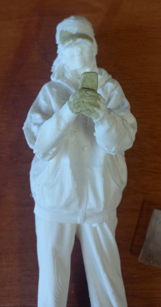
This one needed some holes in the cap filled in and her hands and phone. This was more tricky but I’m happy with the definition I got in the fingers
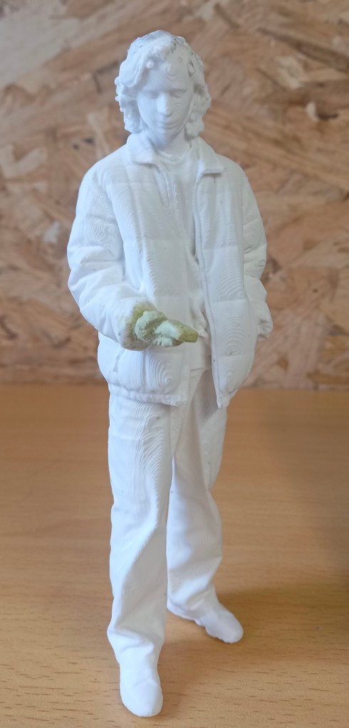
On the model on myself it needed a couple bits in the back filled in and the hand and phone. This was the most difficult as there was almost no hand printed so i had to construct it all.
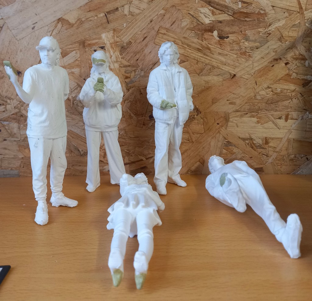
Modelling is not something I’m very confident with but it was fun repairing these prints. I’m happy with the repairs I made but in future I’d look to improve the quality of the 3D printing to avoid so many errors. The next step will be to sand down the surfaces ready for the primer.
Categories
Industry 1: Summer work
Today I received the package which has 14 models in, 2 sets of paints, a set of brushes with varying thicknesses and the moulding clay. I did some research to find out the best process for painting 3D printed models. I created a step by step plan of what to do. First use tweezers and little scissors to pick of the big bits of extra filament. Then use the moulding clay to add in certain bits that didn’t print such as hands, phones and caps. Then sand down the models to create a smoother finish. For this I will use different grains of sandpaper, a tooth brush, craft knife and tweezers. Then I’ll need to spray them with a primer, this will make the paint stick better. I’ll buy this from hobby craft for £11.50. Next is the actual painting, this will require some trail and error to see how many layers of paint it takes. A tip I learnt was to desaturate the colours with some grey to make the models appear larger and more realistic. Finally I’ll spray the models with a clear sealer to stop the paint running and give it a matte finish. I’ll also buy this in hobby craft for the same price. I aim to have these done by September so I can send them back ready to be put in the Great Hall model for display.
Categories
Reflecting on Level 4
I’ve completed my first year (Level 4) of my illustration course. I passed all 6 of the modules with grades that I’m happy with. In semester 1 I did 3 modules; Digital Arts 1, Contexts and Cultures and Visual Messaging and Communication. These where followed up by 3 more modules in semester 2; Working in Professional Contexts, Documentary Illustration and Drawing Exploration. During the summer I worked on some areas that interested me from the modules.
I found the semester 1 module Digital Arts 1 particularly challenging and for that reason one of my favourites. Prior to this module I had almost no experience with digital art. I learnt the basics of Photoshop, Illustrator and InDesign. I found InDesign the easiest to use, it’s more of a graphic design tool so I think I’ll use it least. Although I did use it in the semester 2 module Documentary Illustration to create my digital flip book. I struggled a lot with Illustrator and found it frustrating to use. I hope to become more confident with this tool in digital arts 2 next year. I think Photoshop is the most important of the tools for me to use. It’s a very complicated tool with huge possibility but I’ve become familiar with the basics and have been expanding my knowledge. I created some pieces that I’m proud of using Photoshop. On top of using the Adobe Softwares I’ve been using Procreate and have spent lots of time advancing my skills. I still think I prefer traditional drawing styles but now appreciate the potential of digital tools. In particular I always begin my creative process on paper with initial sketches then I’ll take its into a digital software.
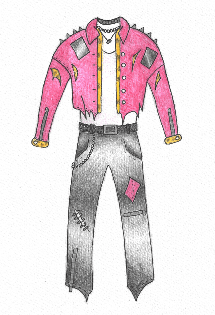
Contexts and cultures was more of a theoretical module that required less creative work. I found the modules interesting as I was able to learn about different topics such as subcultures and the hyper real but it wasn’t one of my favourites as it didn’t have much creative, hands on work. The work on subcultures was definitely my favourite, I liked designing the outfit for my subculture and chose to expand on this topic to make it the subject of my essay. Writing essays is something I’m quite confident with, having just finished my A levels. I was able to learn lots about the Punks and can use this as inspiration in my future work. Also I really liked the trip we went on to Shoreditch to look and the thriving street art culture.

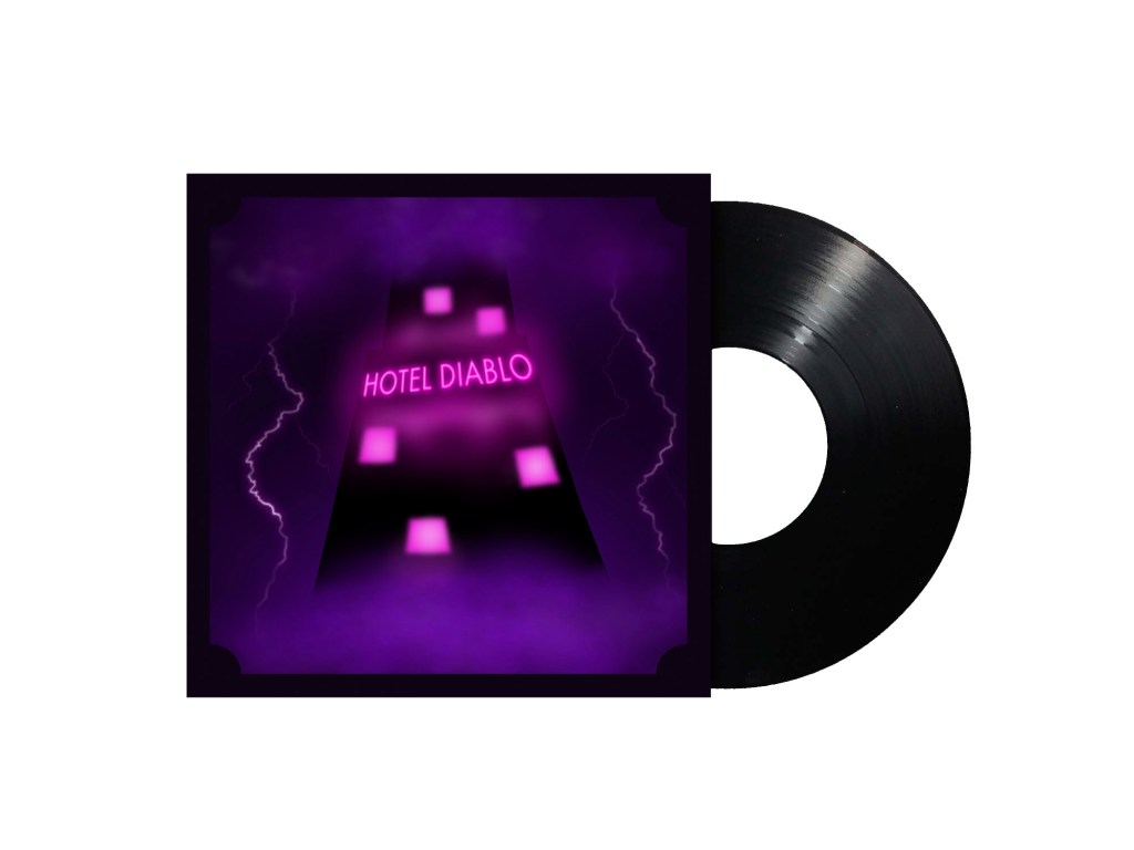
Visual Messaging and Communication is the module that I felt best matched my own skill set from semester 1. It was a much more hands on creative module which had 3 main sections. The portrait of objects, sell your house and buy gold and music packaging. The portrait of objects was enjoyable but the work largely remained within my comfort zone so didn’t really push me too much. However, the work on sell your house was more challenging. I like the 3D model we made and really enjoyed playing with lighting and angles to convey mood. I used these ideas in the second part of that brief where I made hand drawn sketches to illustrate the text. I found experimenting with hands on approaches to be very fun and produce outcomes that I really like. For the third section, I used a combination of hand drawn and digital work to produce the album packaging. It was good to apply some of my knowledge from Digital Arts into this brief. This project had the most creative freedom with made me more motivated to produce something good as it was for a topic that I’m passionate about.
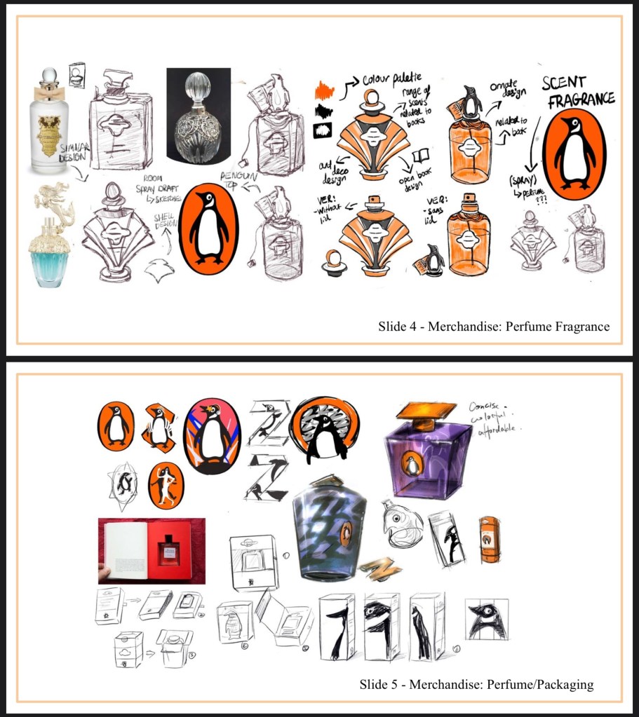
Working in Professional Contexts was a theoretical module with minimal creative work. It was very informative and I learnt a lot about the creative industry and how it operates. The first part of the module was a group project where we had to design a new merchandise campaign for the brand Penguin. We worked very successfully as a group and I found the whole experience very positive. It’s made me look forward to future group work as I could see the creative benefits of it in this project. The second part of the module was to plan how we’d tackle a client led brief. I chose the Great Hall project as I was interested in making the model figures. I got to learn how to use 3d scanning technology which was really fun and helped open up my skills in different fields. Using the 3d scanners was my favourite part of the module as it was so different to anything I’d done before. I then continued the work for this project during the summer. I used the plan I made during the semester to guide me. I learnt more about editing the scans, preparing them for printing and how to use the 3d printer. I hope to continue using working on this project and produce some nice figures.

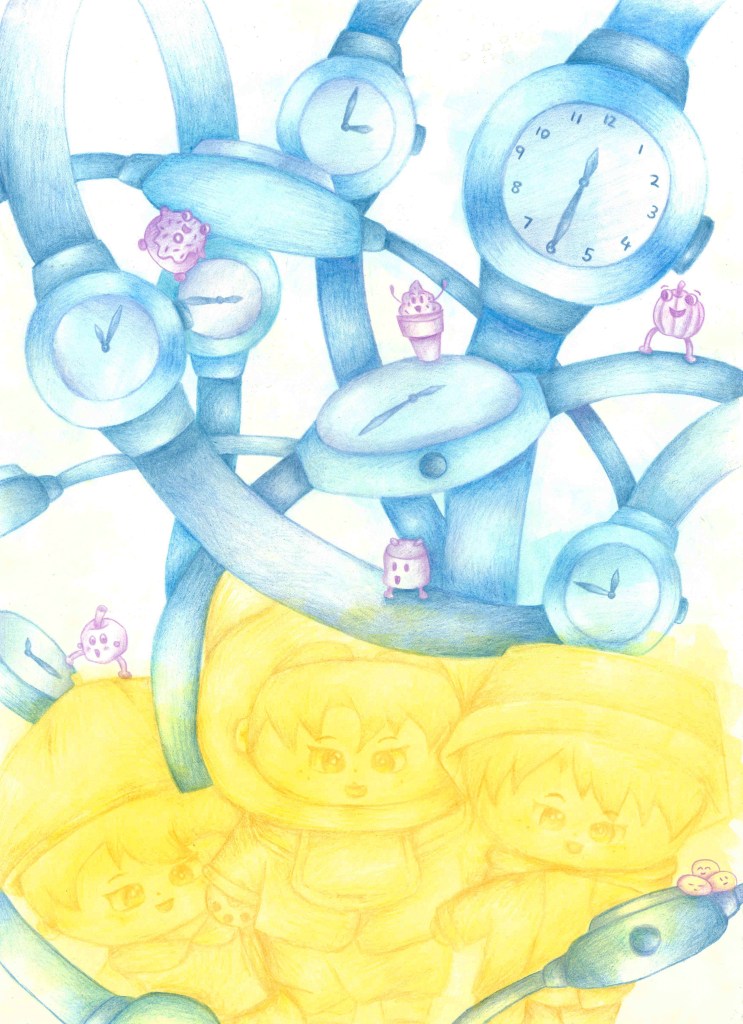
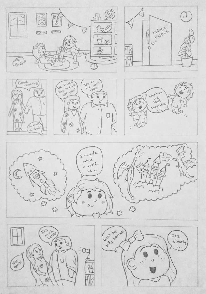
Documentary Illustration is a module that really grew on me as it progressed. Initially it was all about going out and creating observational drawings. I find drawing in public challenging and stressful but I became more confident by the end although it’s still not something I really enjoy. I’m glad this module pushed me to try something new. One session I particularly enjoyed was the one around comic books. We got to tell a story through the style of a comic book. This is an area of illustration that really interest me and that I’d like to pursue further. So I’m happy that I got an introduction to this through the module. The second half of the module was possibly my favourite project of the year. We got more creative freedom as we could choose our own topic to study. I chose to base mine around a couple of locations in London. I then went to those locations and created illustrations from what I saw. I named the project Natures Beautiful Freedom and created a digital flip book with my illustrations. I used this project to expand my technical drawing skills with watercolour and pen. Overall I’m really happy with the end result of this project.


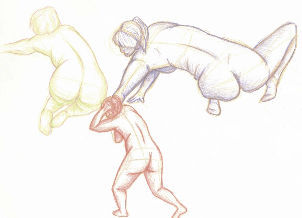
Drawing exploration was all about hands on technical drawing so suited my skill set. It really helped me to expand on my existing skills. There was 2 parts to the module, figure drawing and drawing exploration. I had a decent understanding of figure drawing already but this module allowed me to expand my knowledge and experiment with lots of different materials and techniques. I particularly enjoyed working with charcoal and ink. I am now much more confident with drawing figure and have continued to practice during the summer with more complex poses and angles as it’s a fundamental skill for illustrators. I was initially hesitant about the experimental drawing part as it’s really not my usual style of drawing. I ended up liking it a lot more than I initially thought. It really made me think about mark making and different ways of using a medium. I picked up some experimental techniques that I’ll use again in future work.


Categories
Industry 1: Summer Work
During the summer I learnt how to use shining 3D to edit the scans and get them ready to be 3D printed.
The first step is to open Shining3D and go into IR Mode then open the scan file. Then you will see the scan and use a tool that works in essentially the same way as the lasso tool on Photoshop to remove any unwanted bits such as the floor. Then click the triangle mesh option, then press accept and confirm. This essentially fills in the scan to create and object with no holes. Save it as an OBJ and simplify it to about 80% so its file size is around 50MB. Then you save it. It will save 3 files but only 1 is needed to be 3D printed.
If you’re unsatisfied with the final edited scan you can further edit to using a 3D modelling software such as Autodesk Meshmixer.
Then the scan is ready to be sent to the 3D printer. When printed it will be a white model so it will lose the colour but maintain the detail.
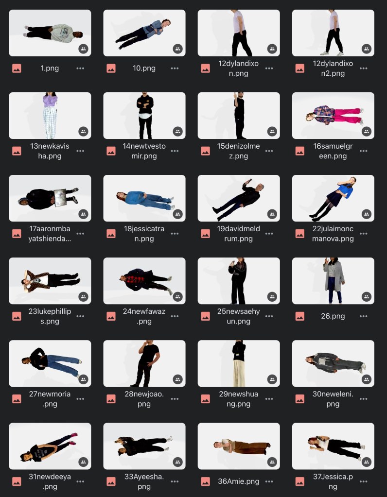
I found editing the scans not too difficult but a fairly time consuming process especially when removing the unwanted floor from around the feet. In total I spent around 5 hours editing all the scans. I’ve got the images saved on my Google drive to use for colour referencing when it comes to painting. Here are images of some of the edited scans:
I’ve put in an order for the brushes, paint and moulding filler that I’ll need, which will arrive with the models once they’ve been 3D printed and sent to me.
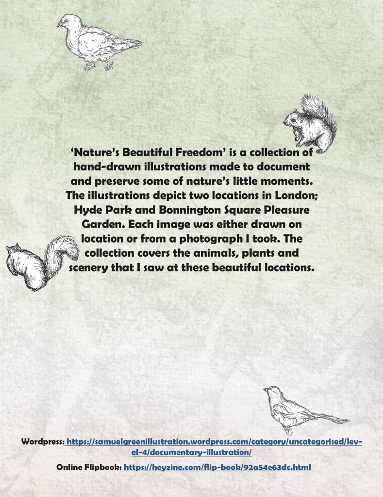
This is my finalised project. I will submit the PDF version with the link to the online flip book on the back cover. The best way to view it is through the flip book as I think it’s the most authentic way to see the sequencing of the project. Overall I’m very happy with the project as I think I was able to achieve my target and that was to show the natural beauty in London. I really enjoyed visiting the 2 places getting the opportunity to advance my observational drawing skills and improve on my use of mediums such as watercolour and biro. My illustrations take strong influence from the likes of Beatrix Potter and the Lost Words book. I think as a collection they all work well. Moreover I’m pleased that I was able to improve my skills on Adobe InDesign by creating this digital art book.
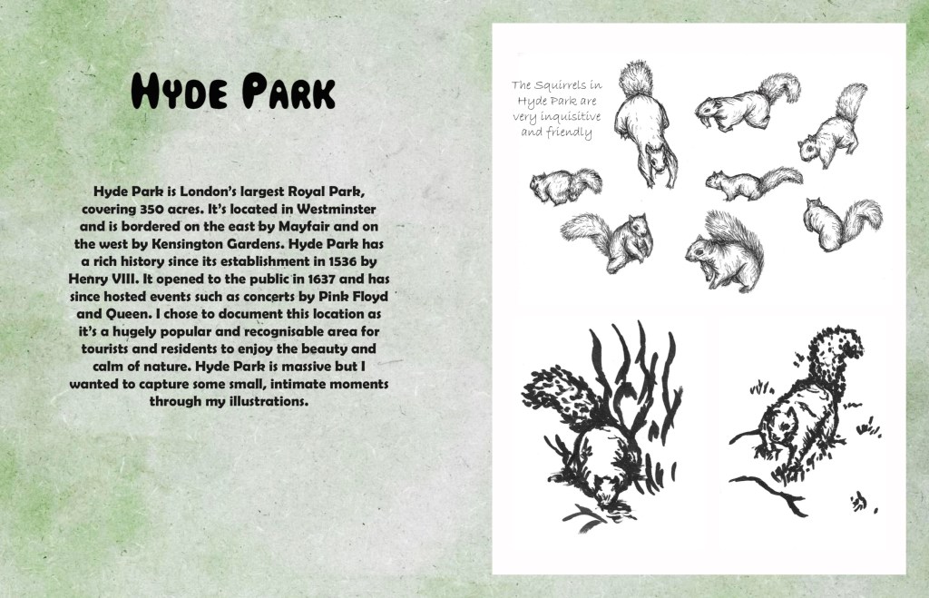
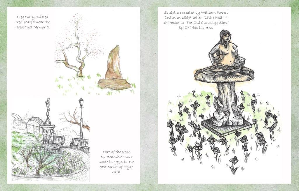
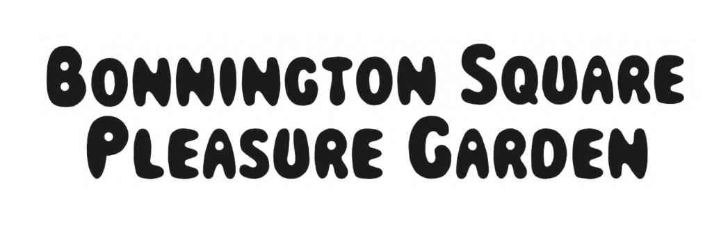
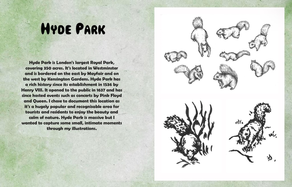
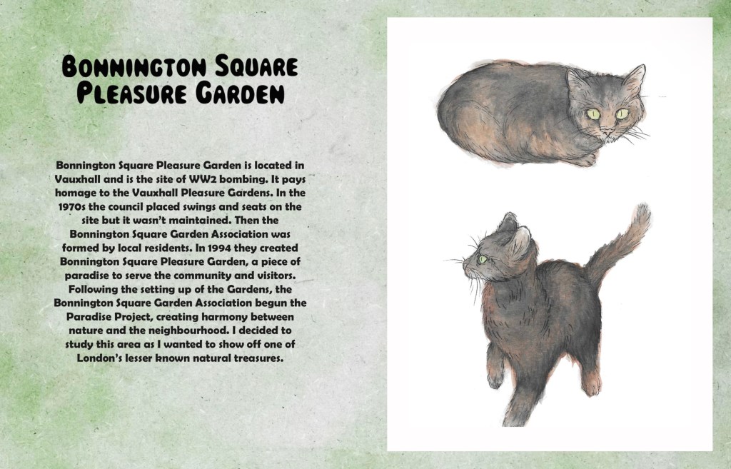
The art book is divided into 2 chapters, 1 for Hyde Park and 1 for Bonnington Square Pleasure Garden. Both chapters will begin with an introductory page, that has a title and a paragraph about the location. For the titles I used the same font as the title on the front cover.

I spent a while researching both locations to write the introductory paragraphs. I did many redrafts before I got to the final ones. I wanted it to include a brief overview of the location and its history as well as why I chose to study them. I wanted them to be informative but not too heavy with facts and stats. For the consistency of the art book I chose to type the paragraphs in the same bold font as the paragraph on the back cover.
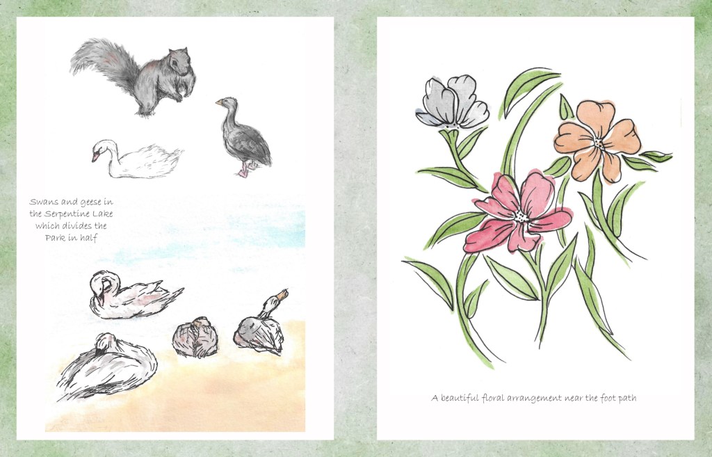
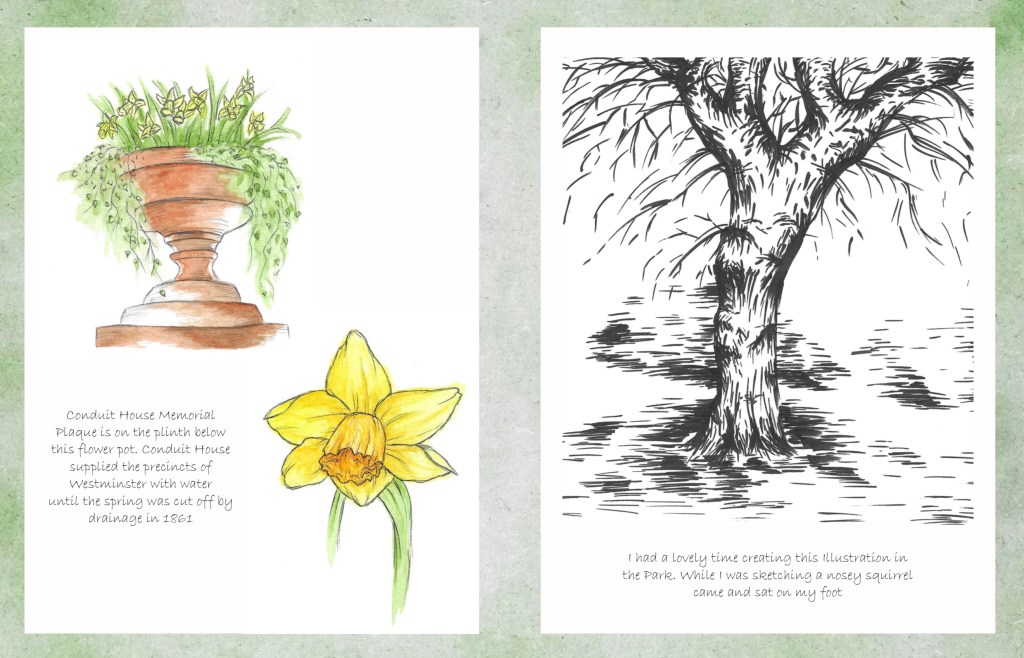
The next step was to add the little notes around the images. I experimented with hand writing them and typing them to see which I preferred. I chose to type them as I thought the hand written notes looked too messy and took away from the clean aesthetic of the pages. The font I chose was a more cursive style to imitate old hand writing styles that would’ve been seen in vintage photo albums.
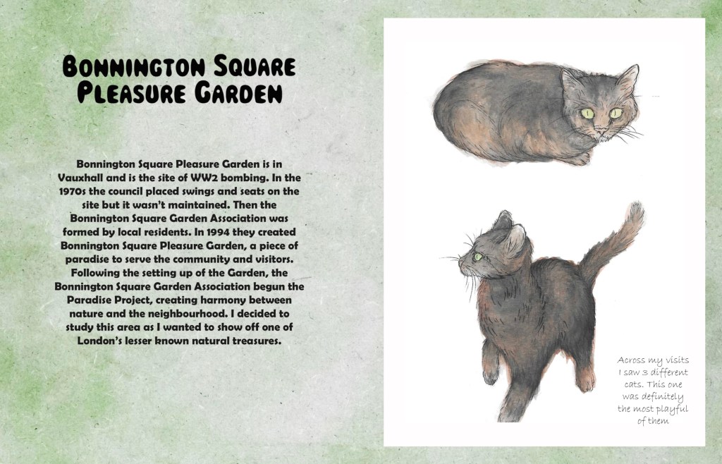
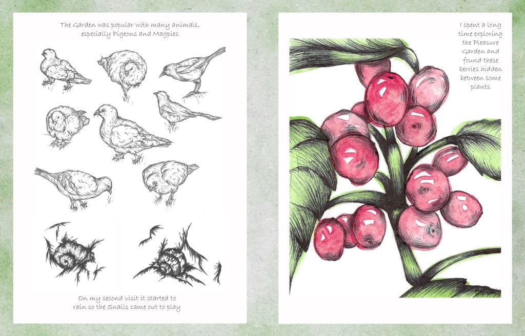
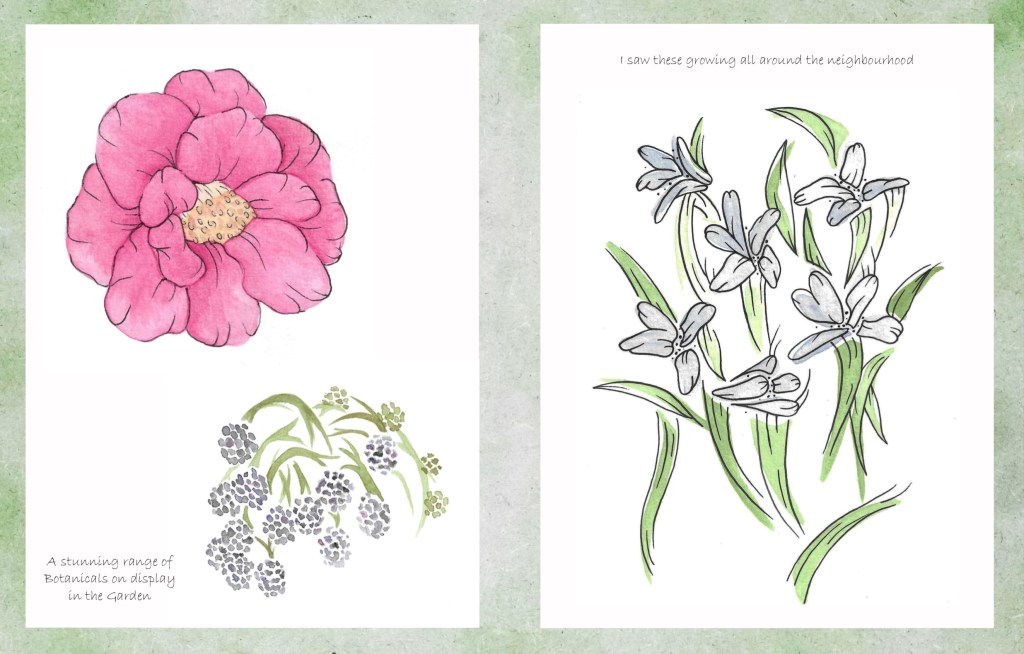
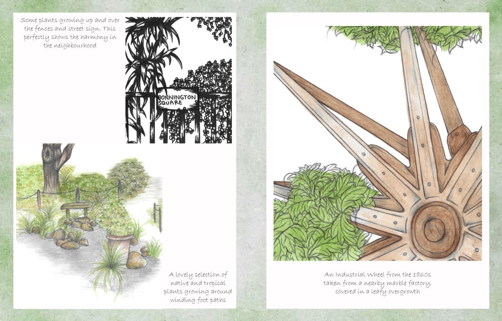
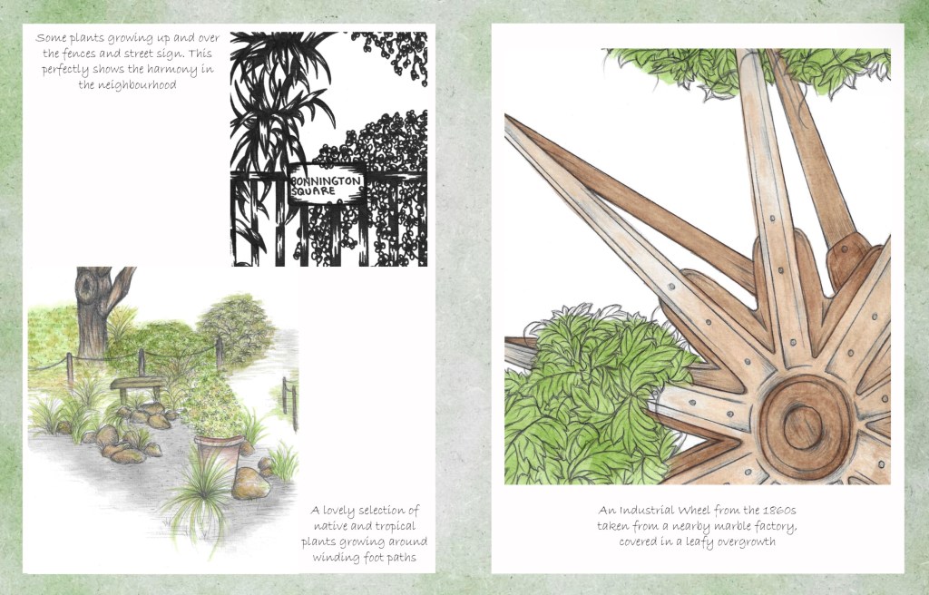
I planned out the notes for each page. The contents of the notes range from facts about the location/ subject of the illustrations, descriptions of the image and my own opinions/ stories. I wanted to make the notes feel both informative and fun to create and informal and relaxed experience for the viewer.

Then I chose where to put the annotation in relation to the images on the page.
This was the initial way I tried to layout the images. I was unhappy with this for multiple reasons. The quality of the backgrounds wasn’t good enough and the negative space around the images was too distracting. Also I felt that they was too many images crammed onto each page.
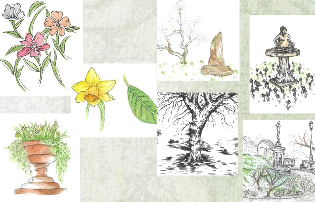
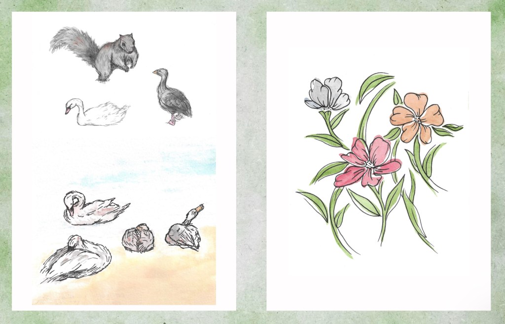
I fixed these problems by using the textured background as just a border and placing the images on a white rectangle. This helped draw the viewers attention straight to the illustrations rather than the green spaces. Also I spaced out the images better. I still kept them in themes, animals, plants and scenery. I chose to put some of the images that I felt where the strongest on their own page. This helps to slow down the experience of looking through the art book and make each image clearer.
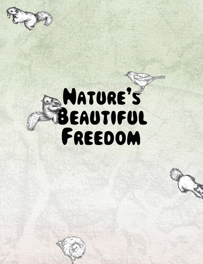
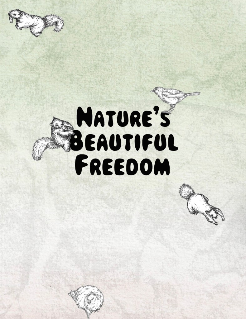
Once I had settled upon the image layout for the main pages I began to work on the front and back cover. I tried out different fonts and eventually chose this one. I liked the fun and bubbly look of it and thought it reflects the tone of my project well. I chose the title ‘Nature’s Beautiful Freedom’ earlier in the project. I used Photoshop to select the text, remove the background and save it as a PNG so when I went to place it in InDesign it would just be the words.
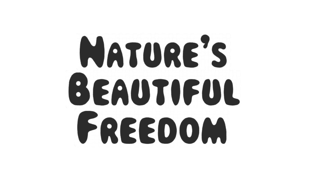
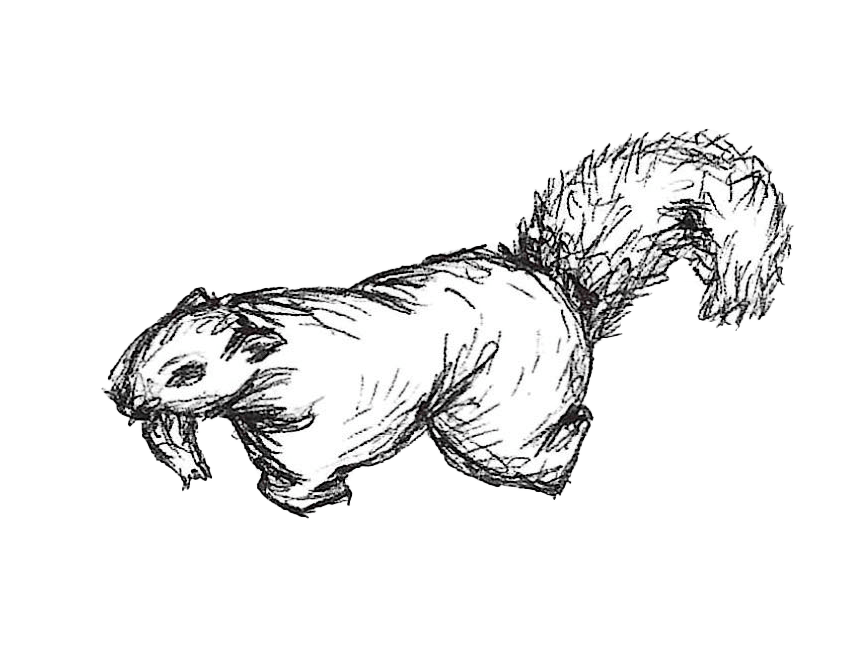
I didn’t want to overcrowd the covers but didn’t want it to just be the title on the watercolour background. I decided on cutting out some of the biro sketches of squirrels and birds to place on the covers. I used the same technique as the titles to remove the backgrounds. The animals help to make the covers more dynamic and playful, with some running off the page and others climbing on the title.

This is the font cover, I’m really happy with how the background, title and animal sketches came together.
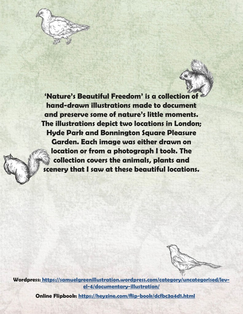
This is the back cover. I used the same textured background the same idea of the animals running around the page. It has a summary on the back of what my project is all about. I chose a different font for the larger blocks of text. I also included links to my website and an online flip book version.