The Great Hall model is currently in a flat pack form. The parts have been laser cut but we still need to make a frame for the basic shape to sit on. This is in panels and need to be stuck together. This should be a fairly quick process and then we can start to decorate the interior.
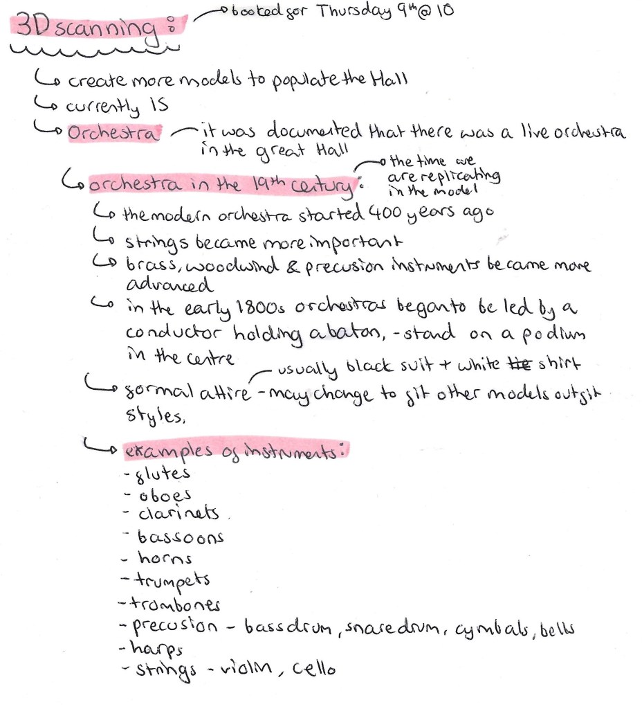
In order to capture the busy atmosphere of the Great Hall we need to make more figures to populate it more as there is currently only 15. This process will require 3D scanning, printing and painting. I booked a session to use the 3D scanner in the EMS. As well as producing a few more figures to go around the Hall we’re going to make an Orchestra to show how there was live music there at the time. I did some research about 19th century Orchestras to see how to best recreate this.
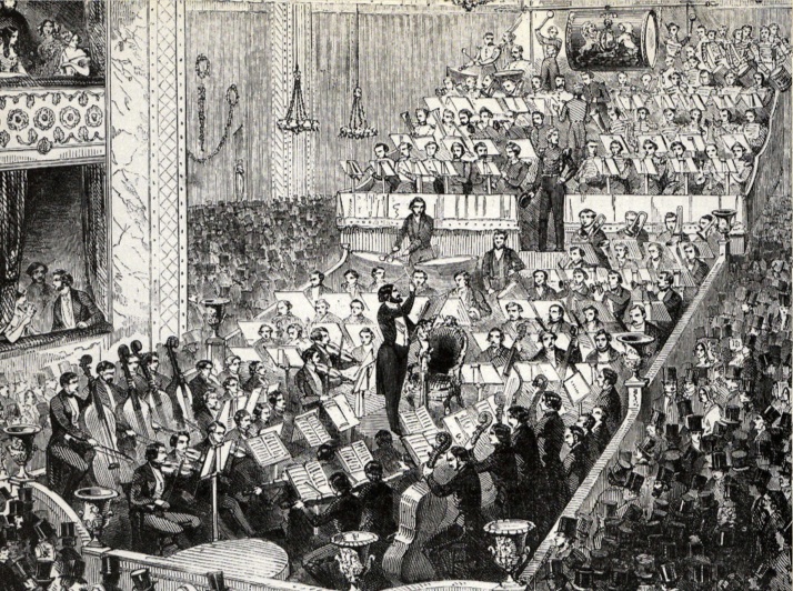
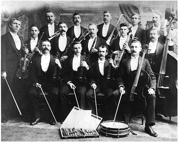
Orchestras are large groups but due to time we won’t be able to make that many so I think it’s best to scale it down to around 5 people. This will include a conductor who stands in the middle with a baton and 4 musicians who are sitting down around him. I plan on including a range on instruments such as flutes/ clarinets, percussion, trumpets/horns and strings. I will 3D scan people in the correct positions and give them props to signify the instruments but once they’ve been 3D printed I will hand model the details of the instruments.
Here are some reference images of 1800s Orchestras:
In addition to scanning people for the Orchestra, I will be scanning some of the replicas of the exhibits that where made. Such as the Diving Bell and The Wheel of Life. This way we won’t have to sculpt of 3D model the exhibits, we can just scan and print them. Also I will scan people to be specifically interacting with the exhibits, for example some sitting by the train which was in the centre of the Hall and someone in the Divers costume for the Diving Bell.
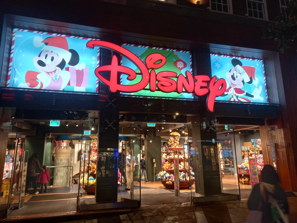
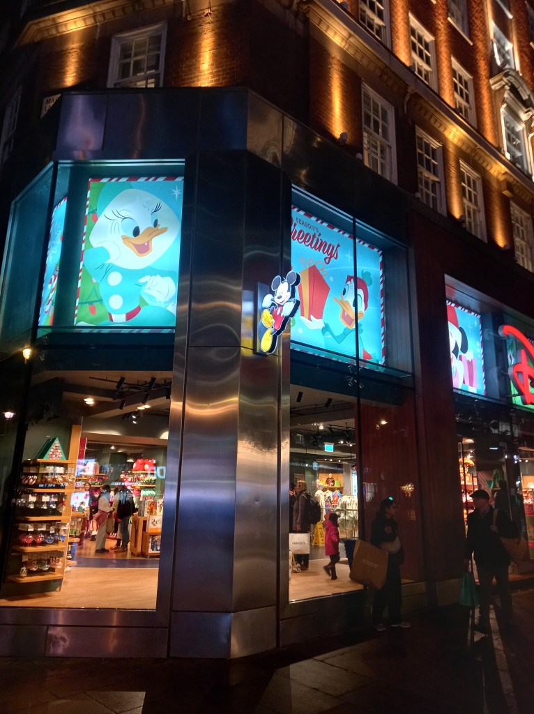
During independent learning week we where given the task visit somewhere completely dedicated to a brand. I chose the Disney Store on Oxford Street in London. Disney is a brilliant example of a brand that has become so successful that they’re able to create a world. The Disney Store is a small example of this, when you enter the shop you’re instantly immersed and surrounded by the brands visual identity and values.
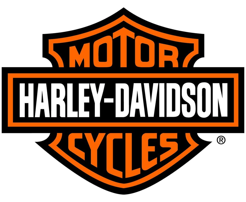
From the outside you’re instantly attracted to the icon logo. This is an example of a Word mark logo as it just consists of a word in their unique typeface. The neon sign is in red as this is the first colour our eyes see so it draws your attention from far away. The logo have a dynamic and fun script style.
No matter what side of the street or direction you’re coming from you’re bombarded with branding as their are glowing images and signs of easily recognisable characters. This is another way of them capturing your attention. The blue in the images contrast the red signs, making them both stand out. Also blue connotes trust, loyalty and accessibility, all key parts of Disneys identity.
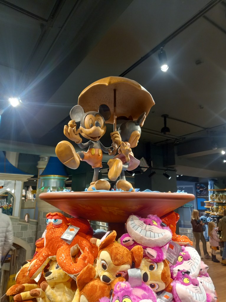
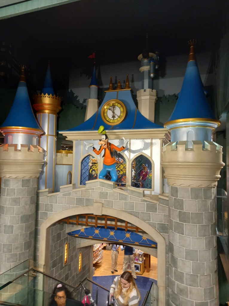
Once you enter the shop you’re immersed in Disney’s identity. There are elaborate decorations of characters and sets from the movies, making visiting the shop feel more like an experience rather than just a shopping trip.
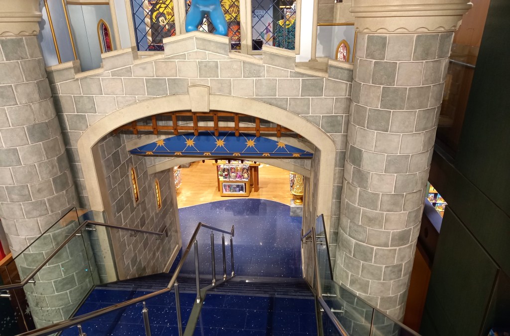
The stairs to the lower level are designed to look like you’re walking through the castle. They very cleverly navigate you around the shop. This makes people more likely to visit the other parts of the shop.
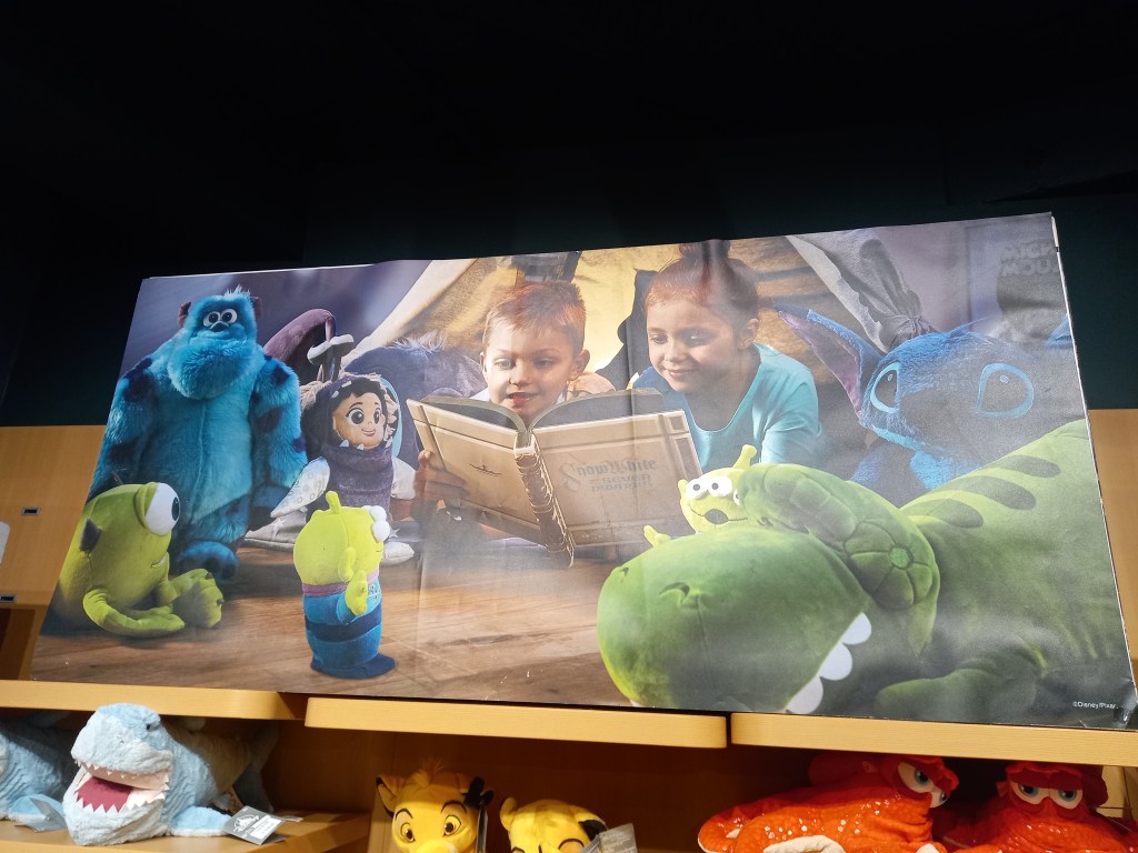
There was lots of adverts like this around the shop depicting families surrounded by Disney products. This is used to push Disney’s family friendly image and encourage families to purchase the merchandise.
This bold font was all around the store and is used so that customers can read the signs from a distance. There are a range of sizes on here. The bigger parts are what they want you to see first.
Another thing I noticed was that as you go around the store there is bright colours everywhere to engage the customer but all the floors, pillars and shelves are darker or more muted colours so you hardly notice them and your eyes are drawn to the products.
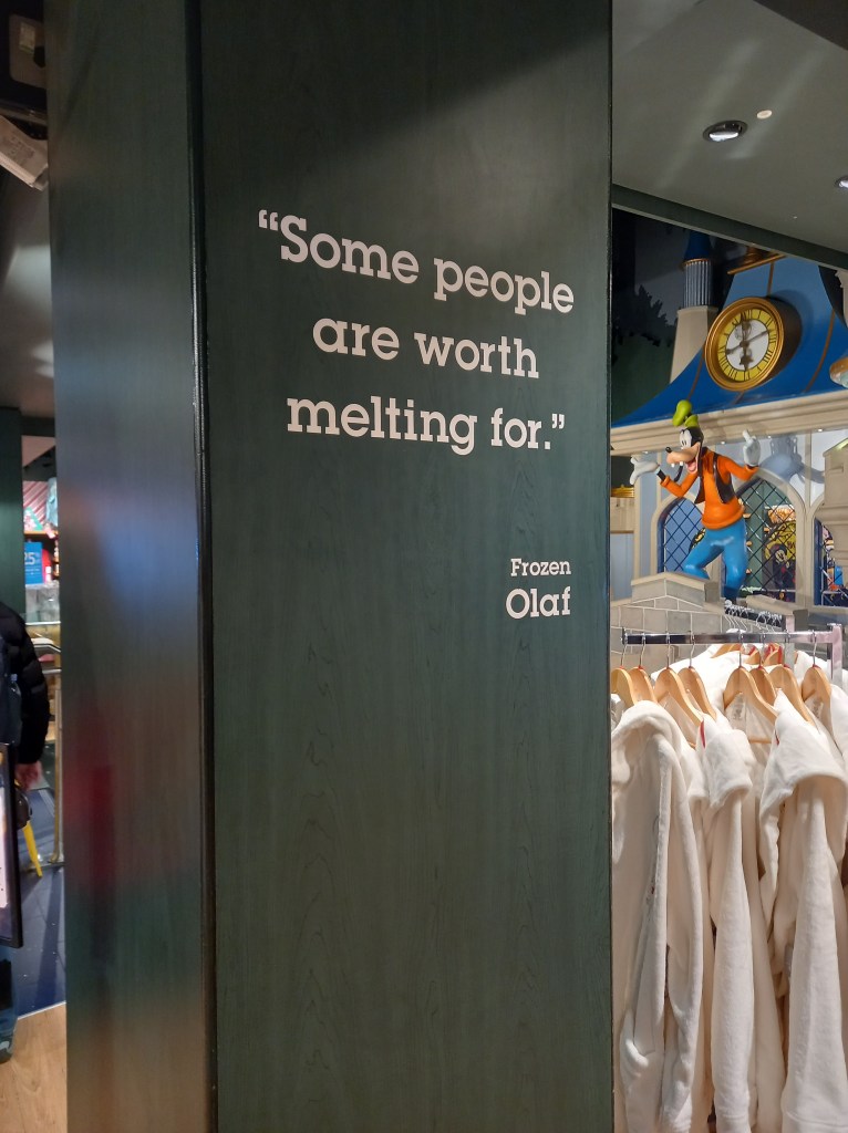
There where a few quotes like this dotted around the store. I think this is a particularly clever way of immersing you in the brand. They’ve taken quotes from popular Disney characters and using them to endorse and push Disneys values and ideas. This is a great way of making use of all the available space and bringing the characters to life.
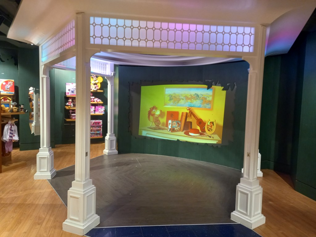
There’s also a little viewing area where you can sit and watch clips from Disney films and TV shows. This helps encourage people, especially families with children, to stay longer, increasing their chances of buying more merchandise.
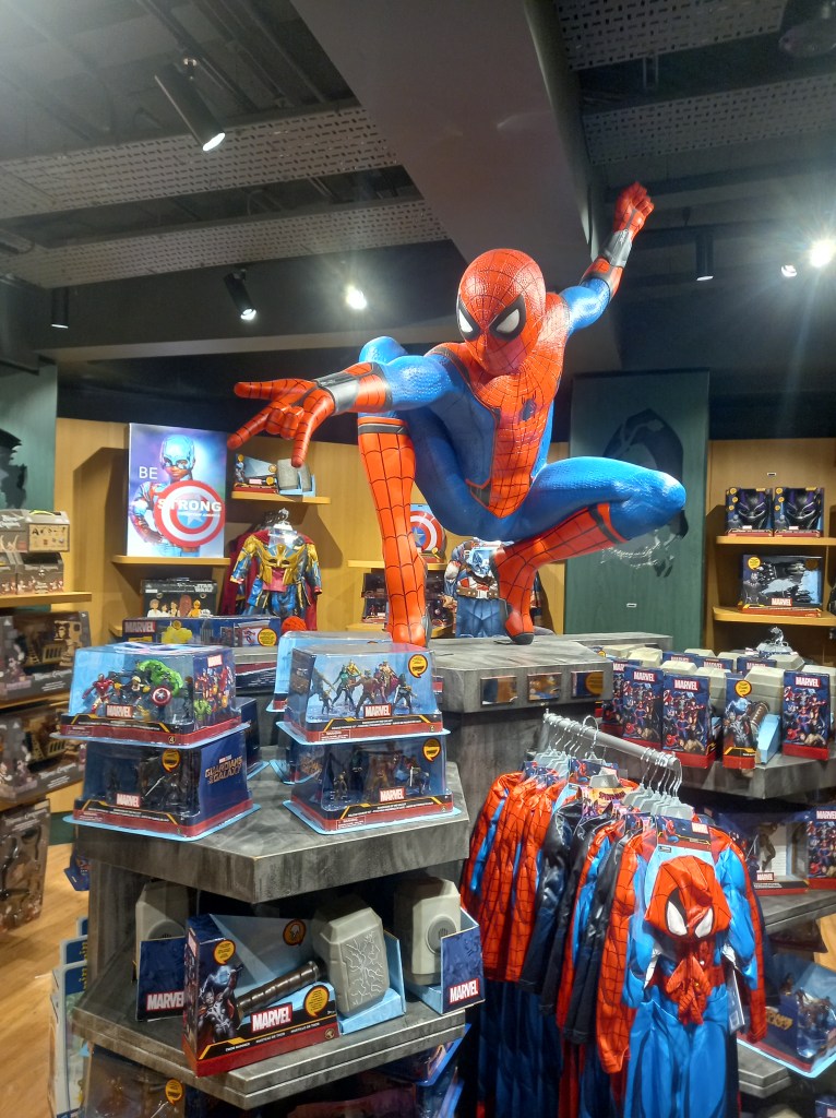
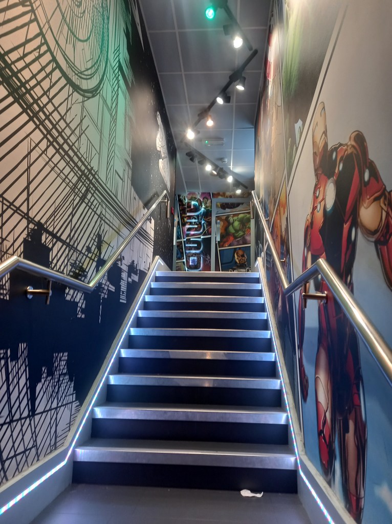
The store was divided into sections so as you go around the shop it was like taking a tour around Disneys catalogue of work. This helps to appeal to all audiences as they covered Classic Disney, Princess, Pixar, Marvel, Star Wars, National Geographic and more. This was the walk way from the main Disney store to a smaller section dedicated to Marvel and Star Wars. There was less bright colours, the colour scene was generally cooler tones with lots of blues and grey. This is an attempt to appeal to a stereotypically older and more male dominated section of Disney fans.
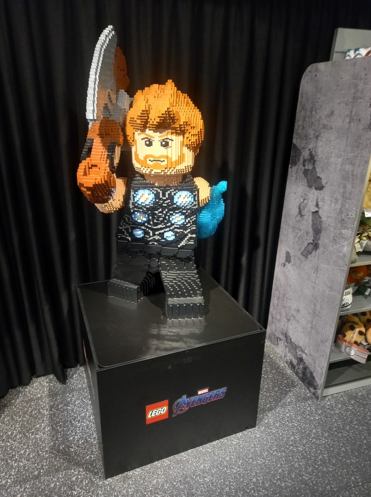
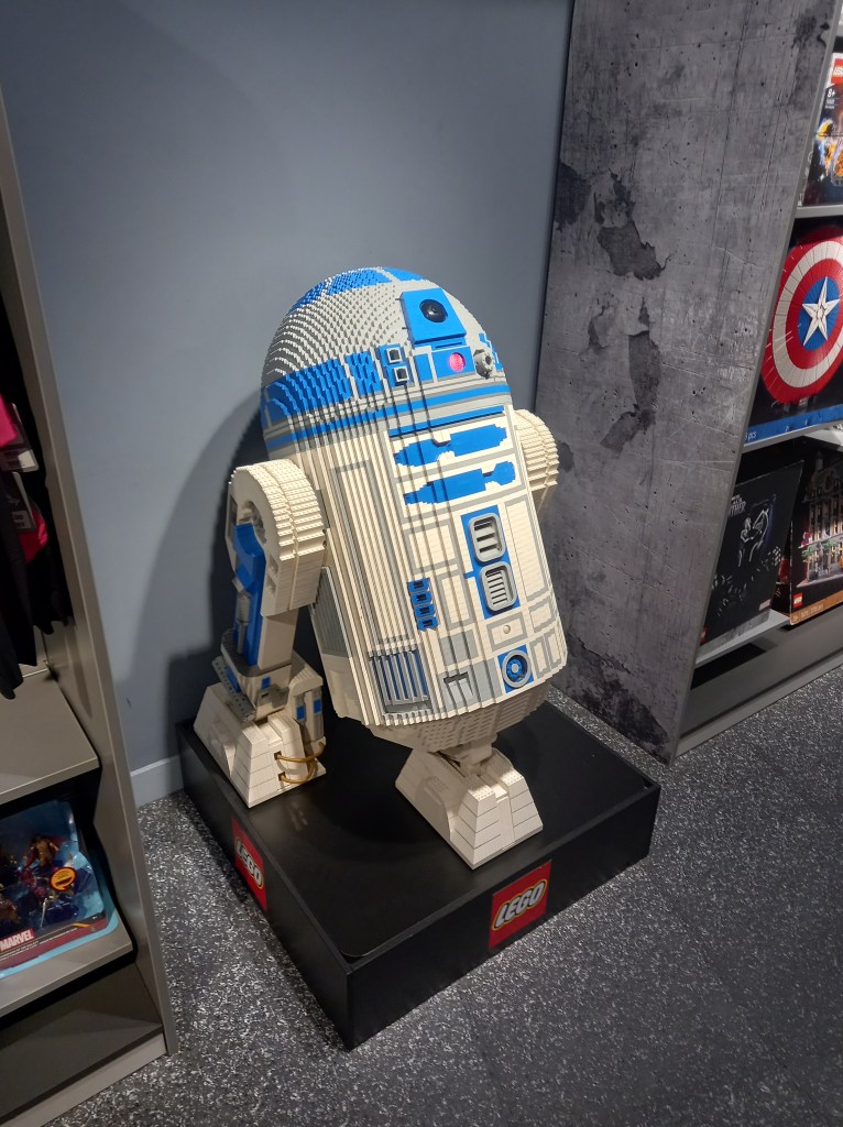
There was brand collaboration between Lego and Disney. This is mutually beneficial as both brands gain exposure and in turn sales. Also these big Lego characters are another example of the elaborate decorations.
In summary I visited the Disney Store to explore and immerse myself in a branded environment. The Disney store is a carefully designed place to engage you from the second the store comes into view. As you go around the store you’re constantly immersed in branding and Disneys identity. All the products and decorations are specifically placed to make the customer go around the whole store to encourage them to buy more merchandise.
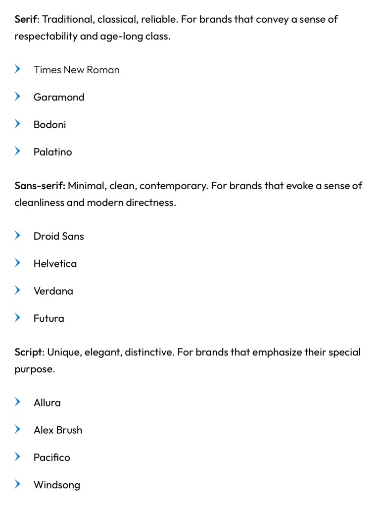
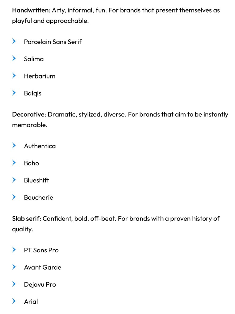
Typography is another important visual element to consider when designing a brand identity. A typeface holds a lot of power to influence a viewer perception of a brand so it’s important to pick one that reflects the brands identity and values.
Here are some examples of successful brands that have their own custom typefaces:
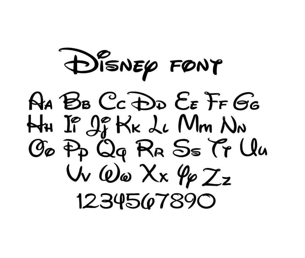
Disney have a unique and instantly recognisable typeface. It’s a script font called Waltograph, originally titled Walt Disney Script. It’s based on a stylised version of Walt Disney’s autograph so it has a lot of historical value to the brand. The typeface has a fun and dynamic look with its calligraphy style curves that embodied the family friendly, joyful identity of the Disney brand.
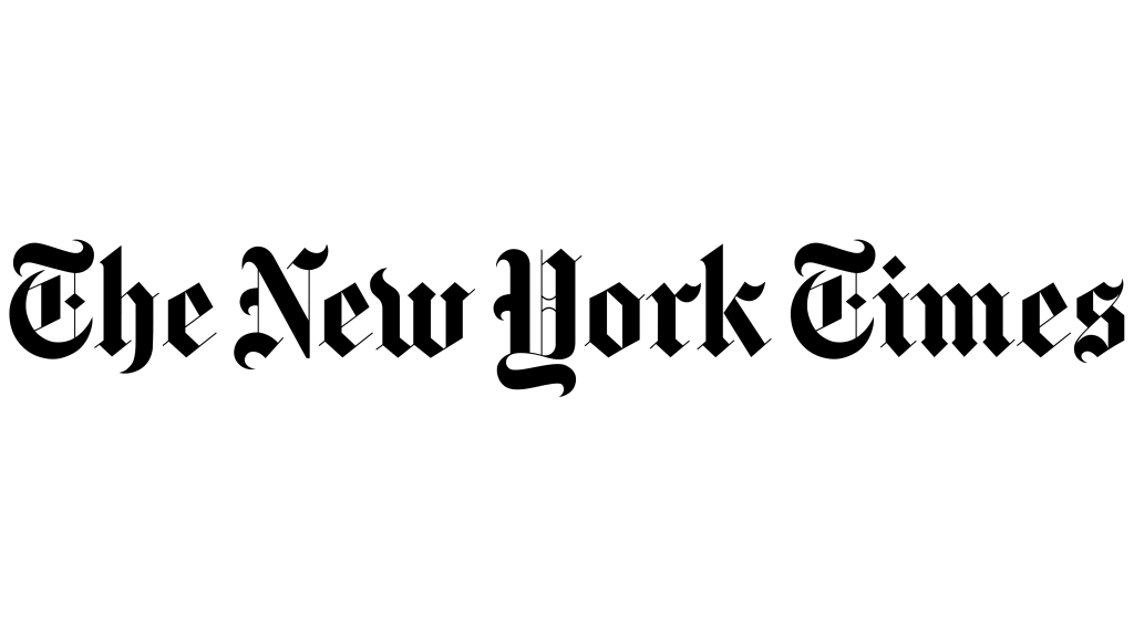
The New York Times has much rigid typeface. The font is called Cheltenham and is a serif typeface that was designed by Bertram Goodhue and Ingalls Kimball in 1896. The brands successfully demonstrates it serious tone through the blocky typeface. It also has an elegance and sophistication to it suggesting that their readers have a particular lifestyle.
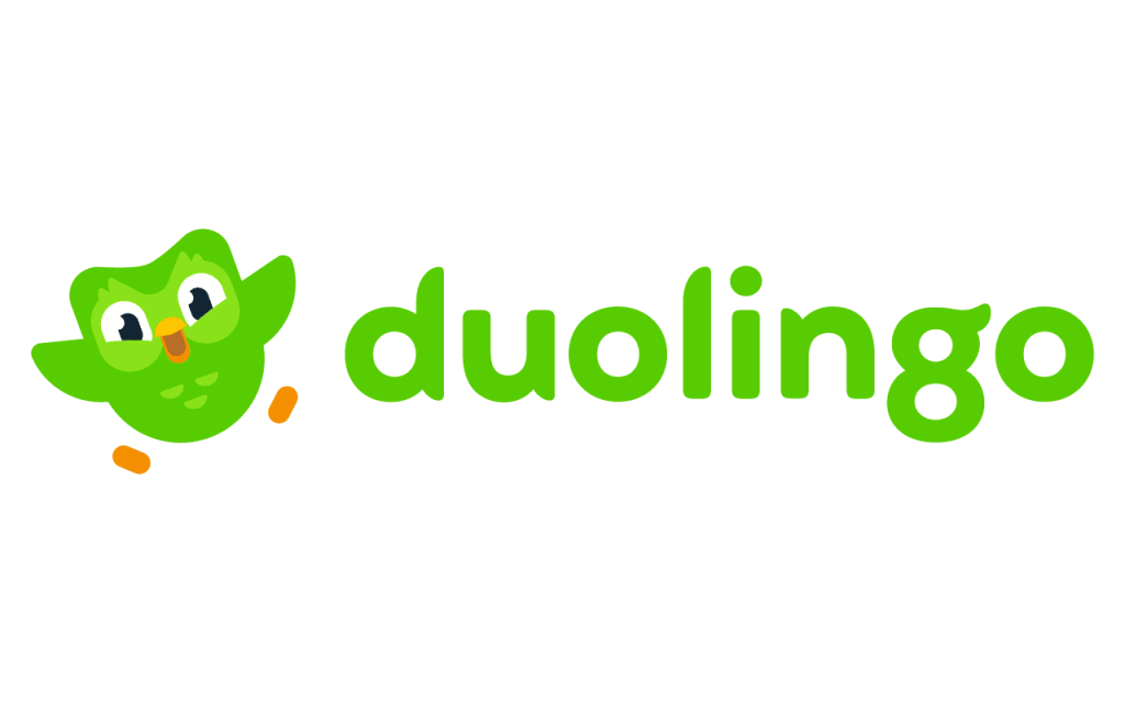
Duolingo’s custom typeface is called Feather Bold. The brand uses its iconic green that’s seen on its mascot in the typeface to make it recognisable. It’s a legible font with bold lettering, appealing to younger people as well as just making it easy to read from far away. Some of the letters have parts that mimic the wings of the mascot. It has a fun and welcoming atmosphere, aligning with how the brand aims to be perceived.
I looked at a series of different typefaces and these are some of my favourites.
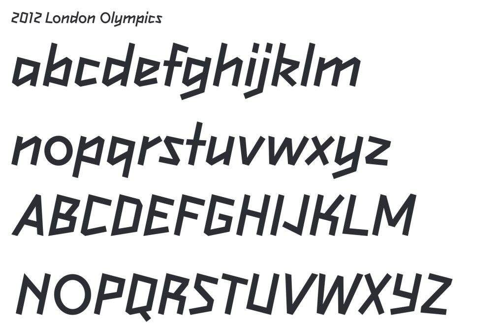
I like how dynamic this typeface is and I think it perfectly embodies the brand as it is inspired by a a figure running. The way the letters lean to the right gives the impression of movement and speed.
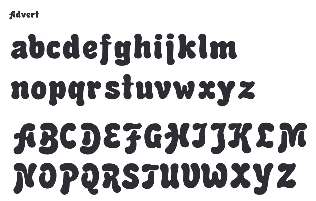
Advert is a very bubbly and energetic typeface with lots of playful energy. I think it would perfectly compliment a brand aimed at children.
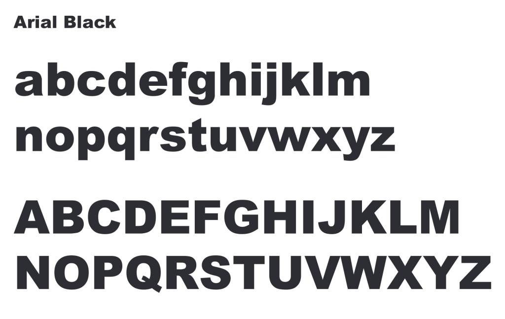
Aria; Black is a very popular typeface that is commonly used for titles and the parts that need to be bold. It’s rigid and is very easy to read from far away as well as up close.
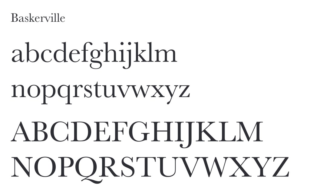
Baskerville is another popular typeface that works well for larger bodies of text as even in small it is legible while still being visually interesting and having an elegance to its lettering.
These are some of the most common typeface styles and some examples along with a description of the feelings and ideas they connote:
Some places you can get fonts from are Google Fonts, Adobe Fonts, Dalton Maag, Font Meme and Font Library. Some are free and some you will have to pay for a license.
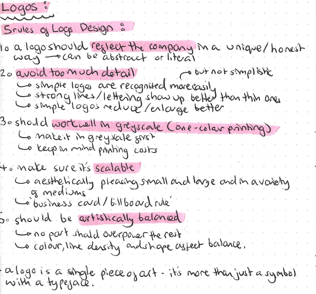
Another key aspect of constructing a brand is to create a logo that represents the brand identity, value and service/product.
These are the 7 different types of logos. It’s important to understand what all 7 are, the differences between them and the reasons for choosing each one. After learning what they all are and looking at examples of each type I think my favourite types of logos are pictorial and mascot logo such as Apple, WWF and Pringles. These are examples of iconographic logos. I feel like they’re the most fun and visually engaging. However, depending on the brand these may not always be appropriate for example the BBC uses a letter mark logo and this is perfect for their more serious brand identity.
Letter mark logo example:
Word mark logo example:
Pictorial logo example:
Abstract logo example:
Mascot logo example:
Combination logo example:
Emblem logo example:
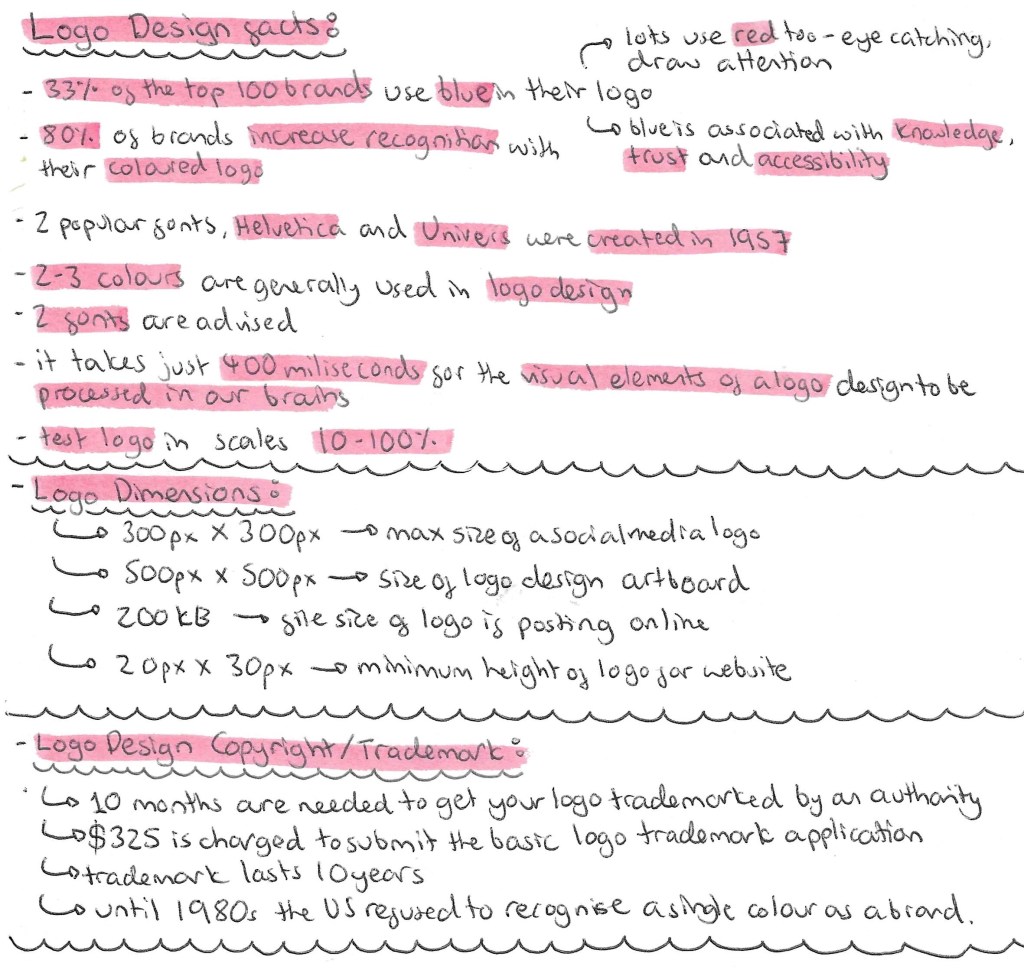
When designing it is often advised to make it fit within a contained shape such as a square, rectangle or circle and this makes it easier to place in both digital and physical media. This isn’t always the case but can make product design easier.
A logo should be a vector. A vector’s main advantage over its raster counterparts is its infinite scalability, you can scale logos up or down without loss of resolution and quality. In addition to being scalable, vector logos are easily editable. The best logo making software is Abode Illustrator. I usedIllustrator last year as part of the Digital Arts module but wasn’t overly confident with the software so will spend lots of time practicing as it’s an important industry standard software. Below are some keyboard shortcuts that will help with using Illustrator:
In this weeks session we looked at 3 key graphic design elements that go into creating any successful brand, the logo, colour choices and typographic choices.
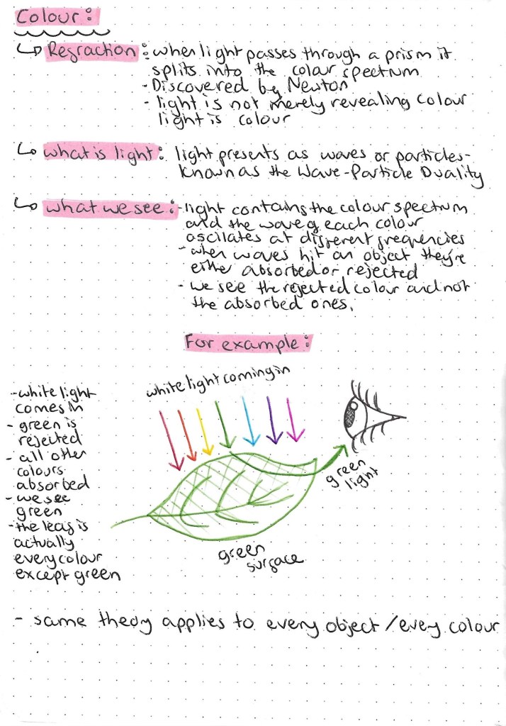
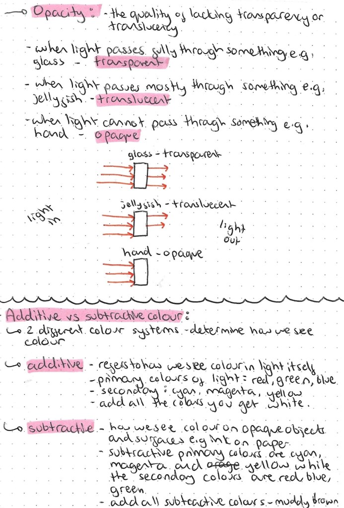
I find the science behind light a interesting topic so I’ll be exploring this further. Also the idea that an object we see as green actually being every colour but green is very interesting and quite confusing so I tried to depict this is a simple way with an illustration.
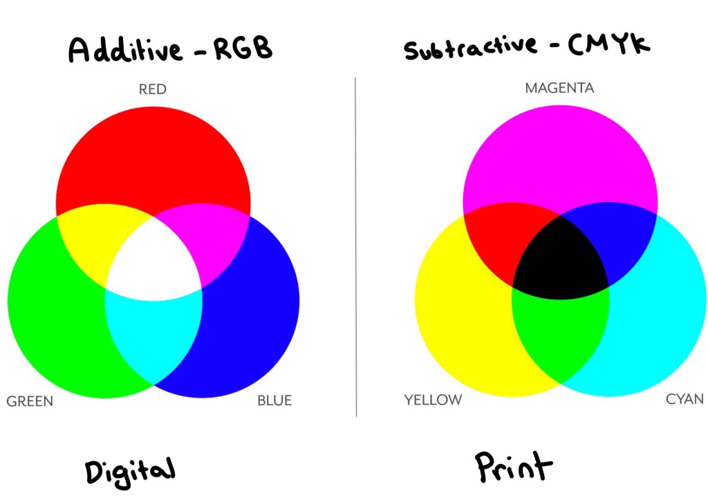
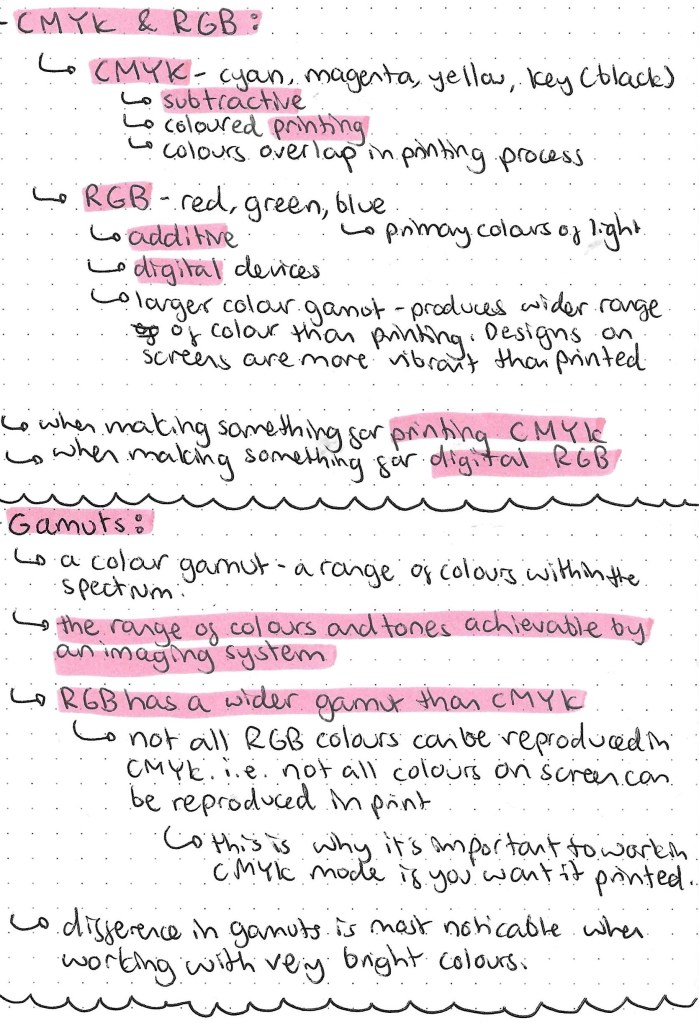
Understanding the different between additive and subtractive colours is key to anyone doing graphic design based work. The image below contains all the key information needed. I think the main take always from this research was the RGB is the colour mode used when your work will be viewed on a screen and CMYK is the colour mode used when your work will be printed. It’s easy to change colour modes on apps such as Adobe Photoshop.
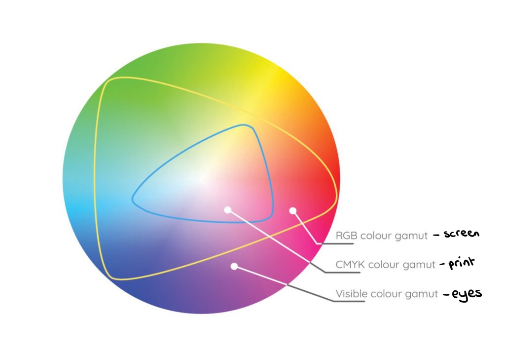
The image below shows the different gamuts, colour ranges, that can be achieved in different formats. Our eyes have the biggest colour gamut, then the RGB screen mode then CMYK print has the smallest gamut.
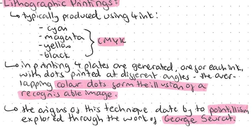
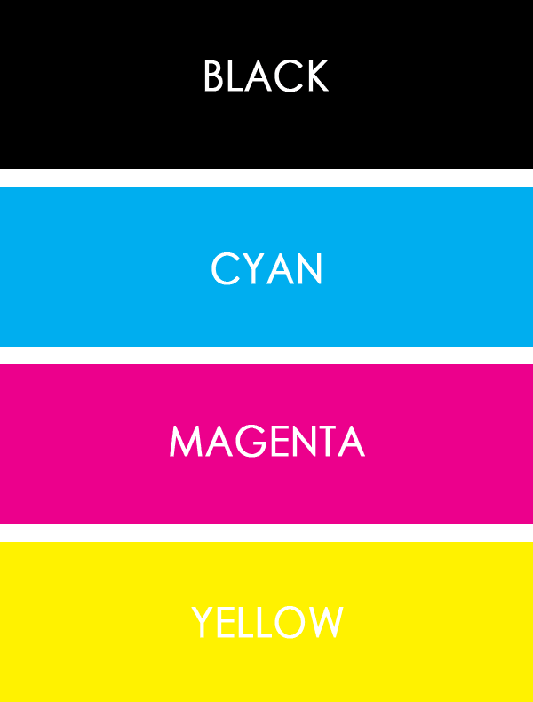
Prior to doing this research I had actually seen Lithographic printing but just didn’t really understand it. I have a mini Canon printer at home and you can see the image as it goes through the different stages. First the yellow gets printed, then the magenta, then the cyan and finally the black. This builds up to form a whole images. By the end of the process you wouldn’t know that only 4 colours had been used.
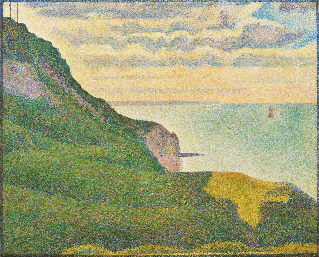
This is an example of a pointillism painting by George Seurat:
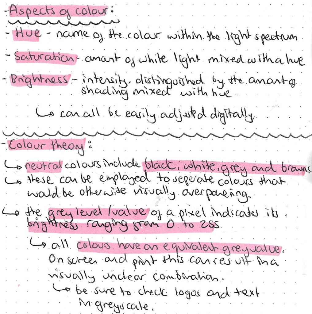
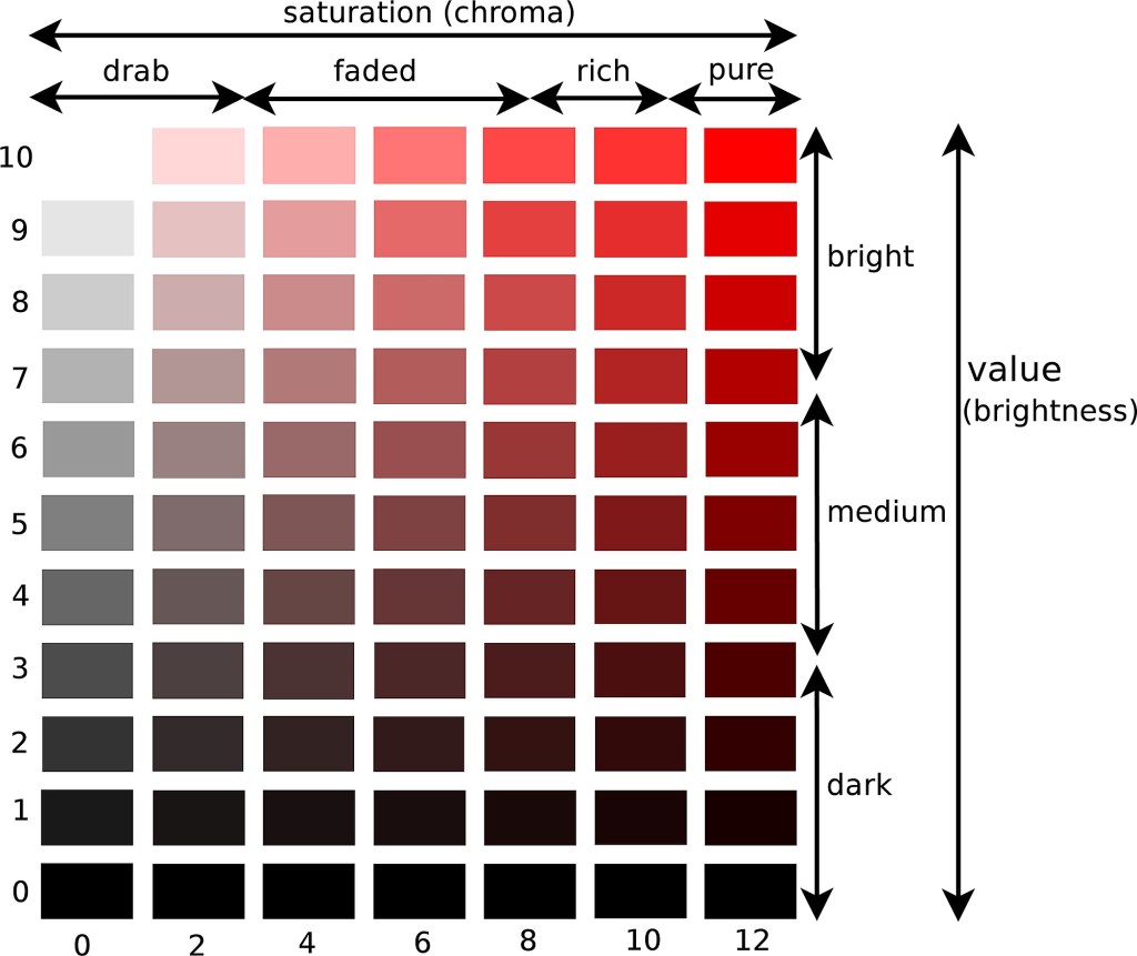
This image clearly shows the relationship between hue, saturation and brightness:
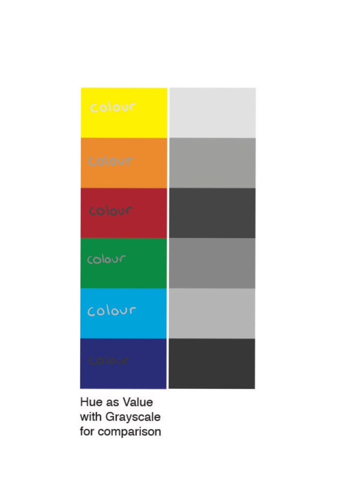
On the left is the hue and on the right is the grey value. As you can see when the 2 are combined it becomes difficult to read and uneasy on the eye. So when designing a logo or making colour choices it’s important to test the hue against its greyscale value.
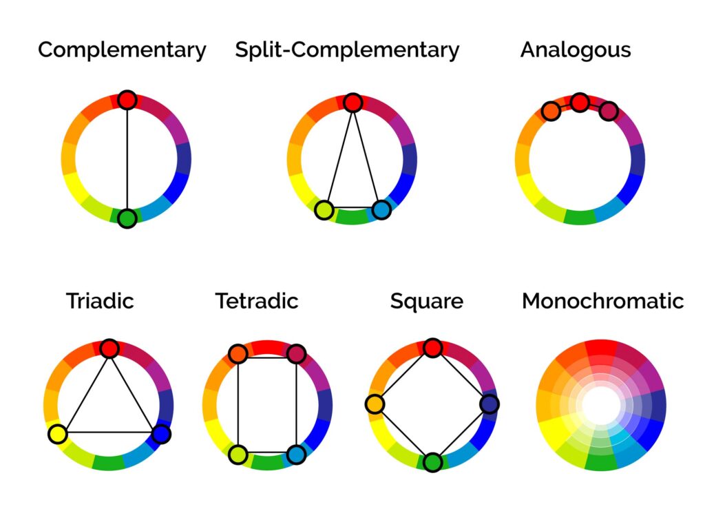
These are several different colour relationship that are important to know before deciding on a colour palette. Most brands have between 2 and 4 main colour in their palette.
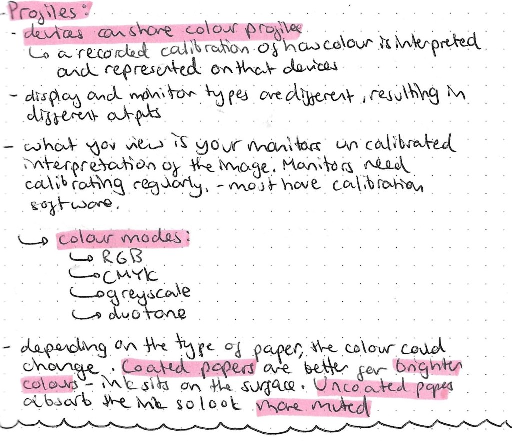
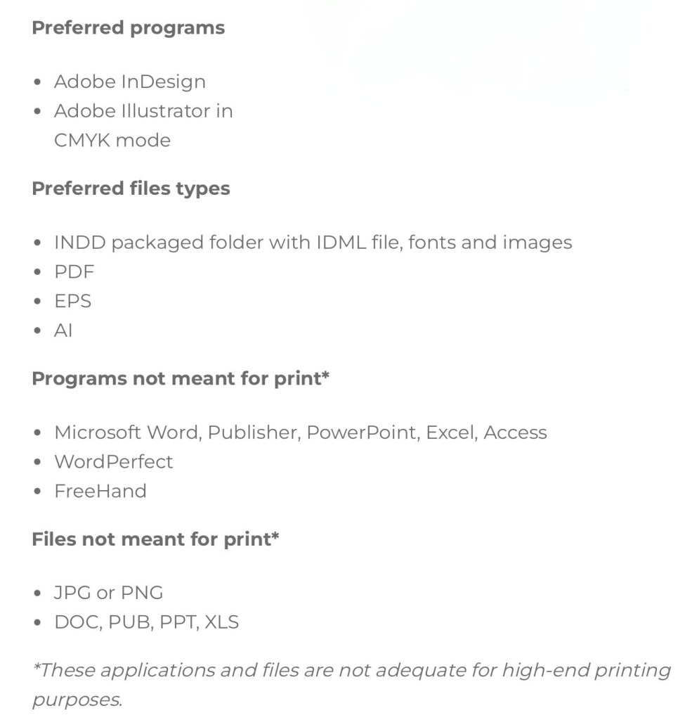
This is a helpful list about the more technical side of printing in colour with suggestions of what file types and programs to use.
The Pantone Color System, or PMS, is a standardised colour system which is widely used around the world. It was devised to help printers and designers to specify and control colors for printing projects. The Pantone Color System allows you to specify colors that cannot be mixed in traditional CMYK. This is good to use to ensure you get the exact colour you want as each colour I’d described by a numerical value. There are also many other apps and website available to help with colour choices. They can recommend palettes, test contrast, test it’s greyscale value to make sure that your chosen colour palette will work across screen and print.
I will be buying 2 books, Colour Index and Process Colour Manual to help me explore and develop my understanding of colour relationship.
Here are 3 main colour palette formulas that brands use:
This is a screenshot taken from a resource by the Colour Palette Studio.
When picking a branded colour palette you’ll need a selection of tools include a colour picker, a contrast tester and the Hex codes so you can communicate and share exactly what colours you’ve chosen. Hex codes allow you to add your chosen colours across all platforms.
We were given a choice of Enterprise Projects to work on for this module, the one I chose was creating a 1:10 scale Model of the Great Hall. This is a live project so will push me to work collaboratively for a client to deadlines. The Great Hall was used in the 19th century to display new inventions and celebrate the advancements of science and technology during the Victorian times. I spent a lot of time over the summer working on some figures for this project so I wanted to continue with it. It will be a hands on project and I’ll get the chance to learn lots of new skills such as prop/ set design, woodwork, sculpting, 3D modelling/ scanning and electronics as well as improving my skills with model making. I think this will be a very rewarding project especially when we can see it all come together and be displayed. The client for this brief is the University of Westminster and more specially Peter Bonfield for the Universities 185th Birthday celebration. It is a piece designed to celebrate Westminster’s’ rich history and the historical importance of the Great Hall. The model is also being made to be viewed by students and staff at the university and potentially the general public.
I’ve done some research into the techniques and materials used in professional model making. I think it’s important when taking on a project to look at industry standard work so I’ve looked at some companies that make 3D models such as Phoenix Force and TPD Creative to see their process and what they use.
Model making has many uses across a range of industries, it is very important in the fields of design, engineering and architecture. It is crucial in the process of creating products and structures that function as intended and meet specific requirements. A model is a 3D representation of an object that can be used to test a range of things such feasibility, functionality, and performance. It’s used for prototypes, testing and analysing, visualising concepts and communicating ideas.
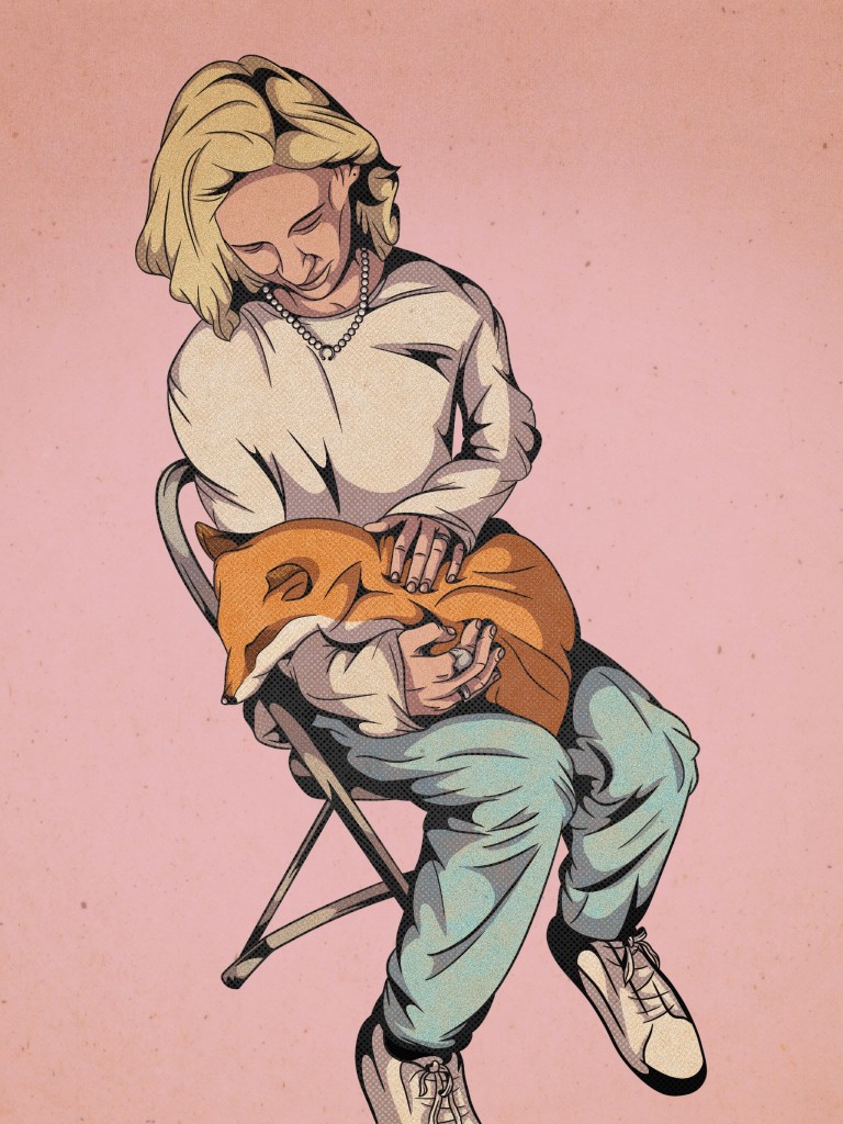
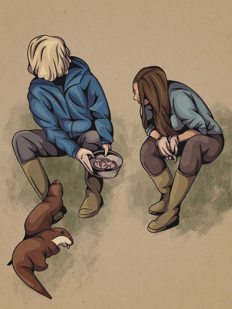
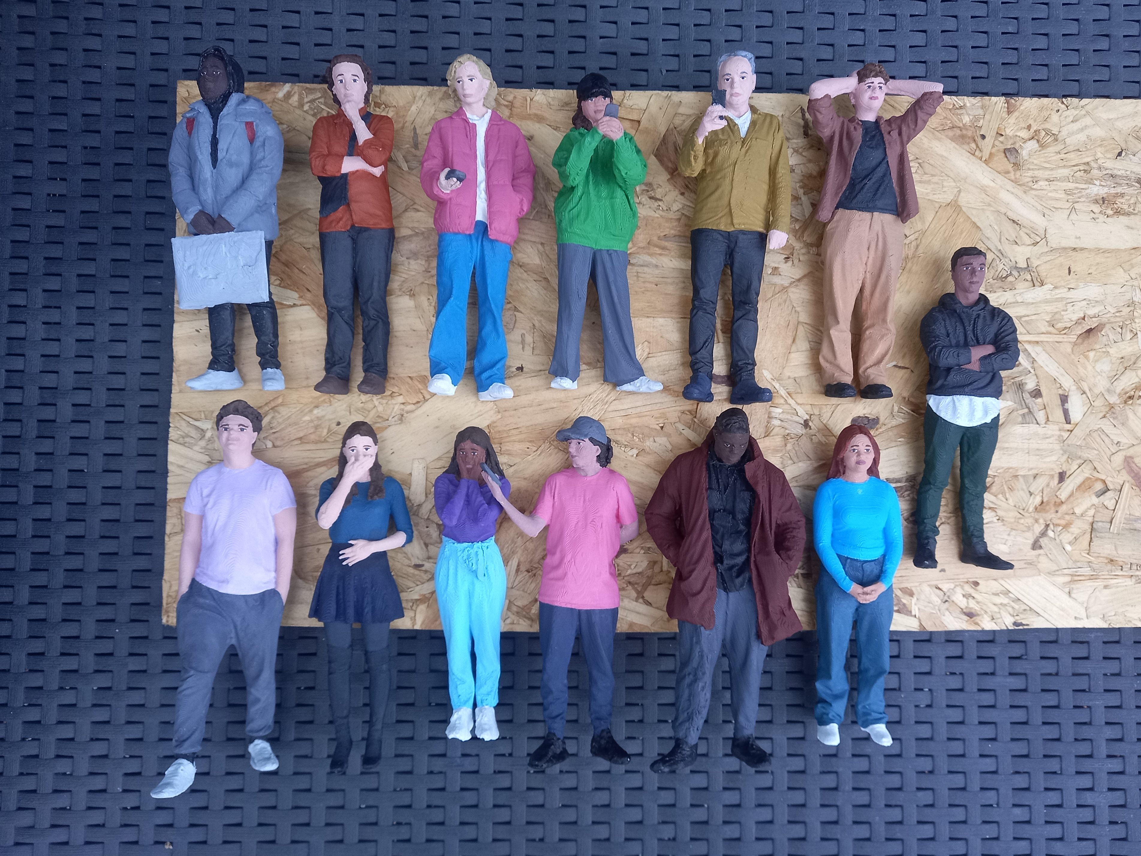
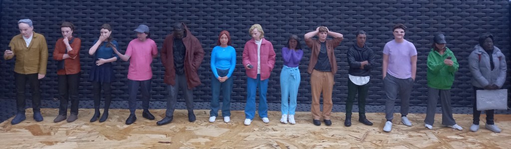
The main areas of interest in this project for me are making the figures, building the set/exhibits and post production such as lighting and arrangement. At this point in time there is a laser cut flat pack of the overall shape of the Hall, which is 3 meters long when built. There are also 15 completed figures which I worked on during the summer. They are wearing bright coloured modern clothing as we wanted the model to be as if modern day people had gone back in time and visited the Hall. This is a way of making the model more interesting and relatable to the audience. Also it will contrast the muted colours around the Hall to make the model more visually engaging. These are the figures I completed during the summer ( see blog roll titled ‘3D models summer work’ for detail on this process.)
The first thing I will be doing is making more figures to populate the Hall. This will involve 3D scanning, editing the scans, 3D printing and finally painting. I will aim to produce a minimum of 10 more to make the Hall feel more busy. The figures I’ve already made have lots of general walking and looking around poses so these will be perfect to generally having around the Hall but now I want some more specific poses such as people interacting with the exhibitions and each other. This will make the model more interesting for viewers as there will be lots of little interaction within the model happening. Also it has been documented that there was live music in the Hall so I will aim to reproduce this. I will scan and print people in the poses then model the instruments by hand. After the figures are completed I will move onto finishing up the base of the Hall and modelling some of the exhibits using a combination of 3D printing, 3D modelling and hand modelling. Due to the time constraints during the module we will be aiming to completed all the figures and begin creating the exhibits.
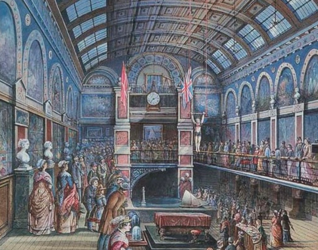
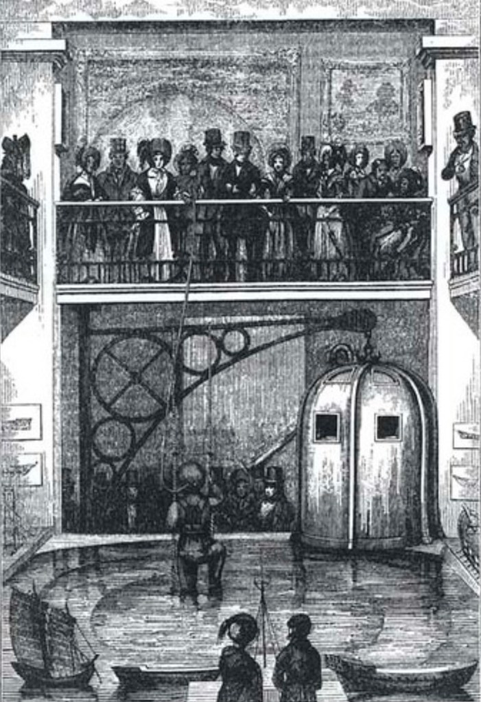
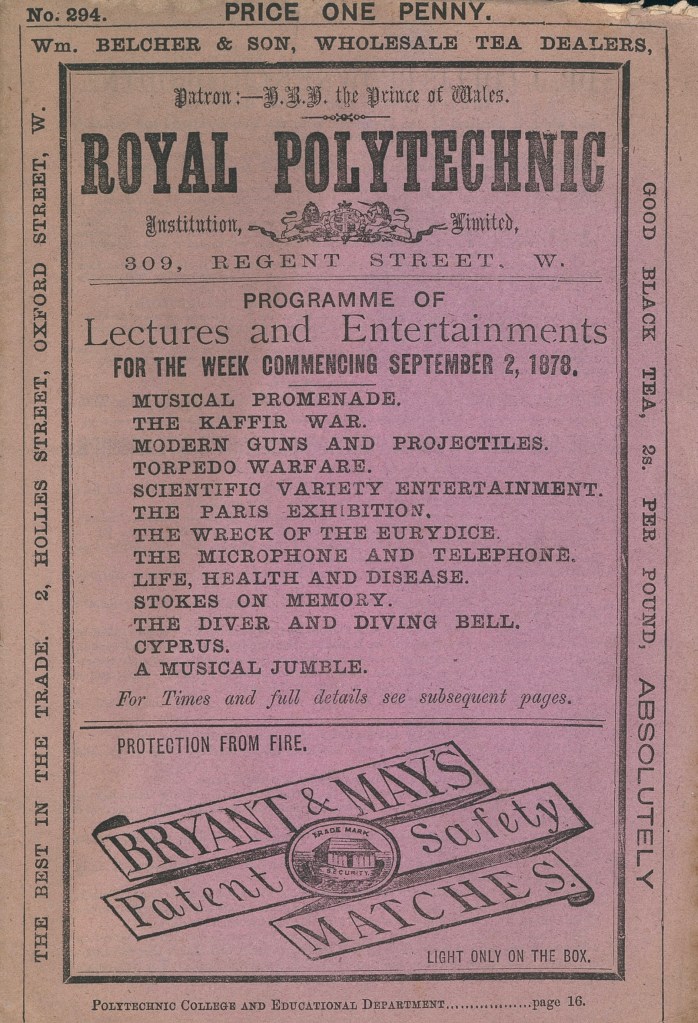
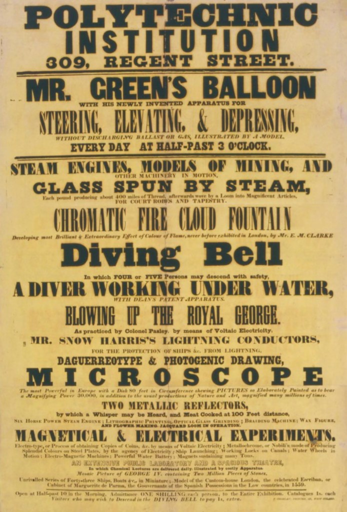
The Polytechnic Institution was opened in August 1838 to provide the public with a practical knowledge of the arts and sciences. The institution opened in 1839. Public attractions included exhibitions, working machines and models, scientific lectures, rides in a diving bell and demonstrations of photography. John Henry Pepper was its most famous showman, someone who we want to recreate for this model.
These are reference images of the Great Hall:
The next 2 provide a good list of the exhibits on display in the Great Hall:
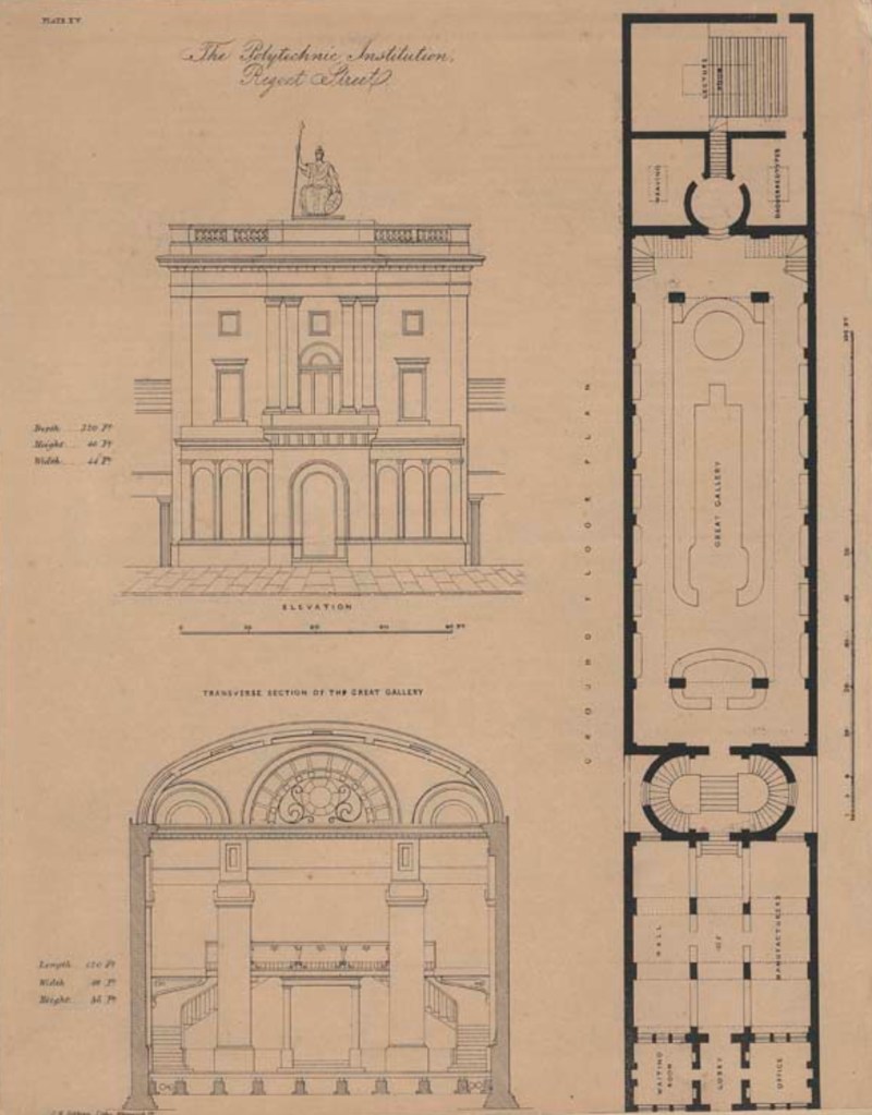
This is a reference image we used to help create the laser cut flat pack of the Hall:
For this project I will be working as a model making so I did some research into this industry. The responsibilities will vary depending on their specific job and industry. Model making is a process that combines manual and digital techniques to accurately represent the desired object or design. Some tasks will require more detail than others.
Below are some key skills that a model maker needs:
Reading and interpreting technical drawings such as blueprints and floor plans.
Selecting appropriate materials for the project. Some options are wood, plastic, and metal.
Using a range of tools and equipment, such as saws, drills, laser cutters and 3D printers.
Applying finishes or coatings such as paint to the model.
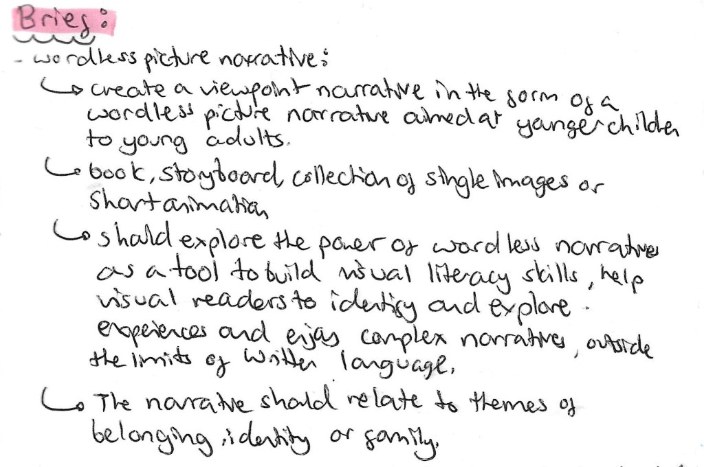
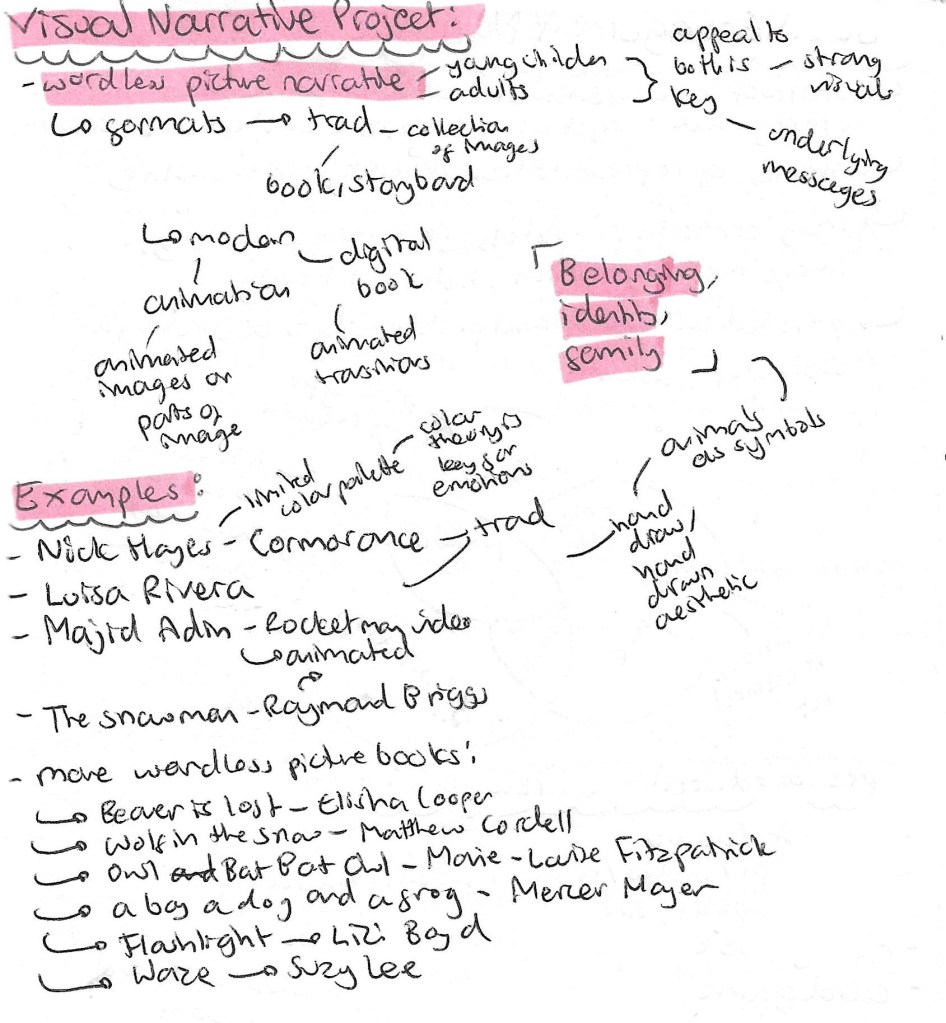
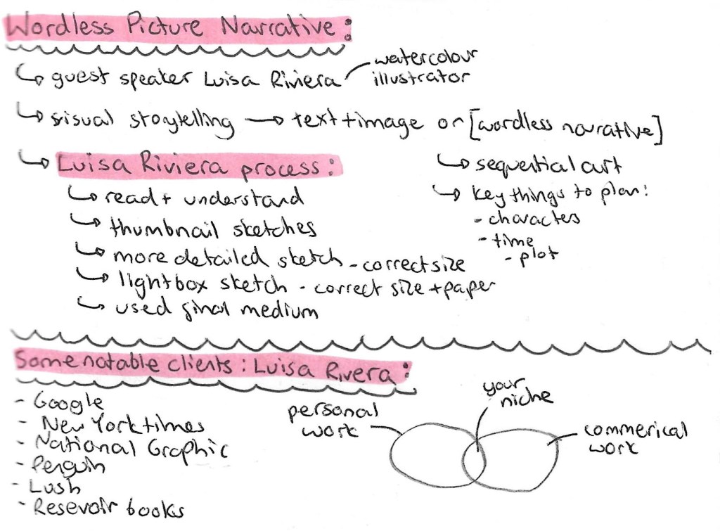
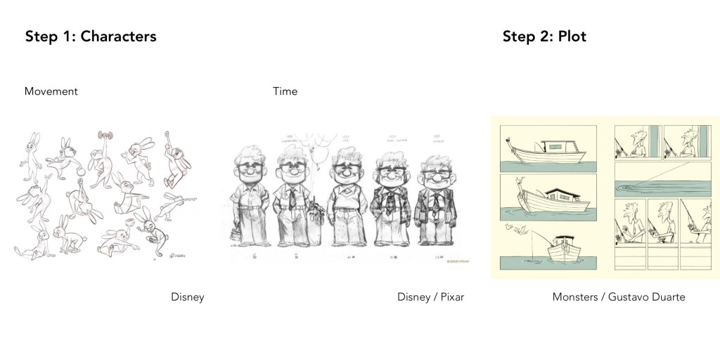
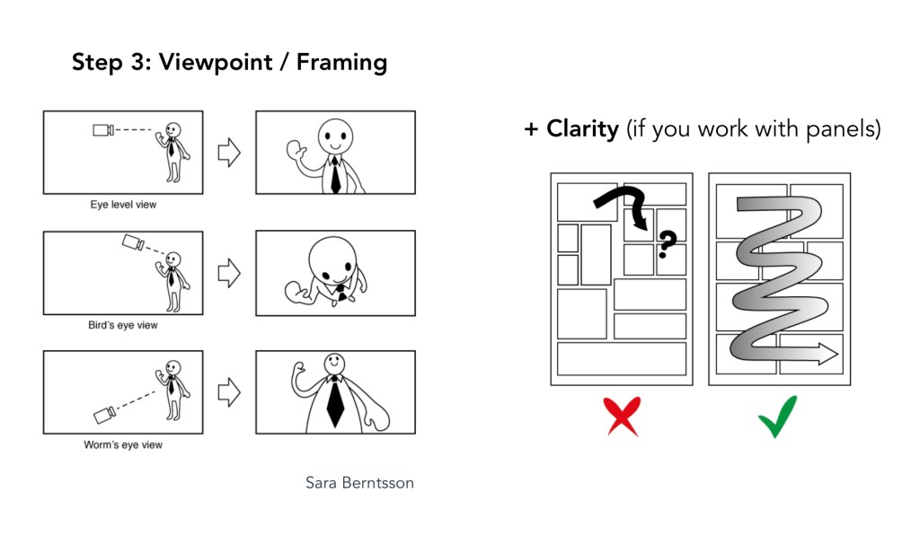
The third potential brief we where introduced to was about creating a wordless picture narrative, this is a narrative that is entirely expressed through illustrations. In summary it is to create a viewpoint narrative in the form of a wordless picture narrative exploring the themes of identity, belonging and family. From the beginning of this module I’ve had a stronger interest in this brief compared to the other as it’s more something I general enjoying creating and engaging with. Below is the criteria for this brief.
This page contains some of the research I did before the session to familiarise myself with the topic and some of the examples I looked at to get a sense of the style. Wordless picture narratives is a style of illustrated book I really admire as it takes great artistic and storytelling skills to convey an entire narrative solely through images.
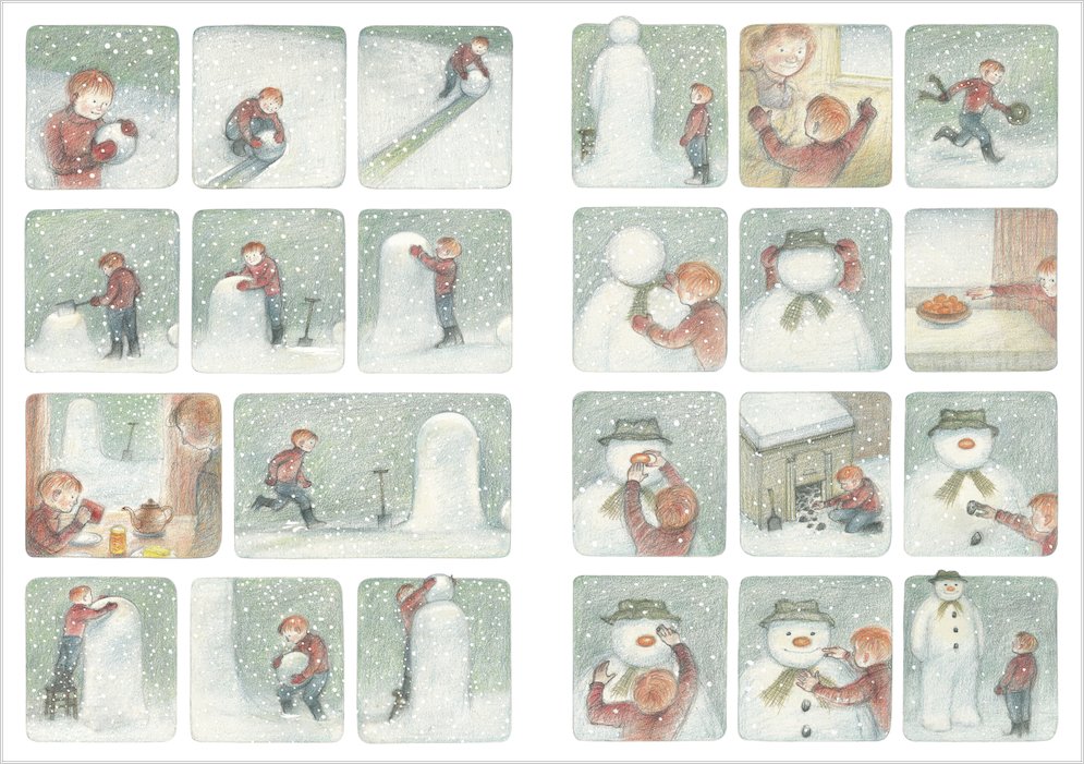
‘The Snowman’ is a wordless picture book by Raymond Briggs made in 1978 and was adapted into an animated television film in 1982. This is a childhood favourite of mine as I always loved how to story was told through just beautiful visuals and well chosen music. Following a night of heavy snowfall, a young boy named James wakes up and plays in the snow, eventually building a large snowman. At the stroke of midnight, he sneaks downstairs to find the snowman magically comes to life. The story has a sad ending as James wakes up and finds the snowman melted in the morning. The story has similar themes to that of our brief such as family and belonging. My favourite thing about this piece is the hand drawn quality of the visuals.
Another example of a wordless picture narrative is ‘Cormorance’ by Nick Hayes. This is the story of a girl and a boy and and a deserted reservoir. The girl wants only to impress her mother, and finds the perfect challenge to prove herself. The boy suffers a tragedy, becomes fixated with a lost memento and makes it his mission to find it. The water is where, one day, the two will meet. What I particularly like about this example is the strong use of colour. Hayes has picked a very simple colour palette of just 2 complementary colours, blue and orange. This helps create the mood of the piece and is a technique I will consider using.
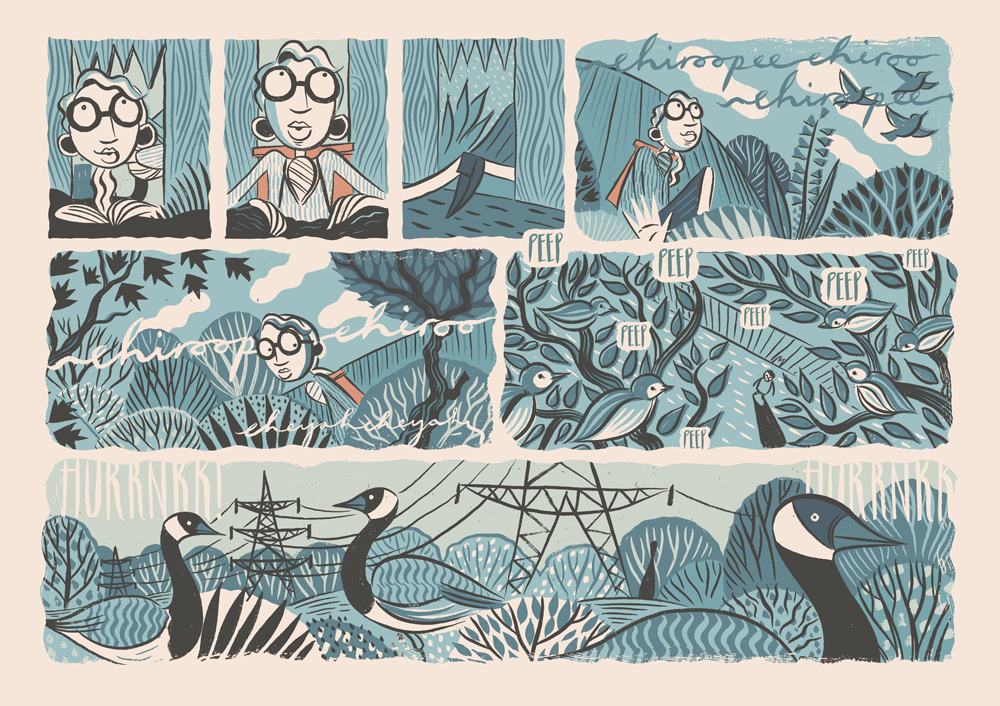
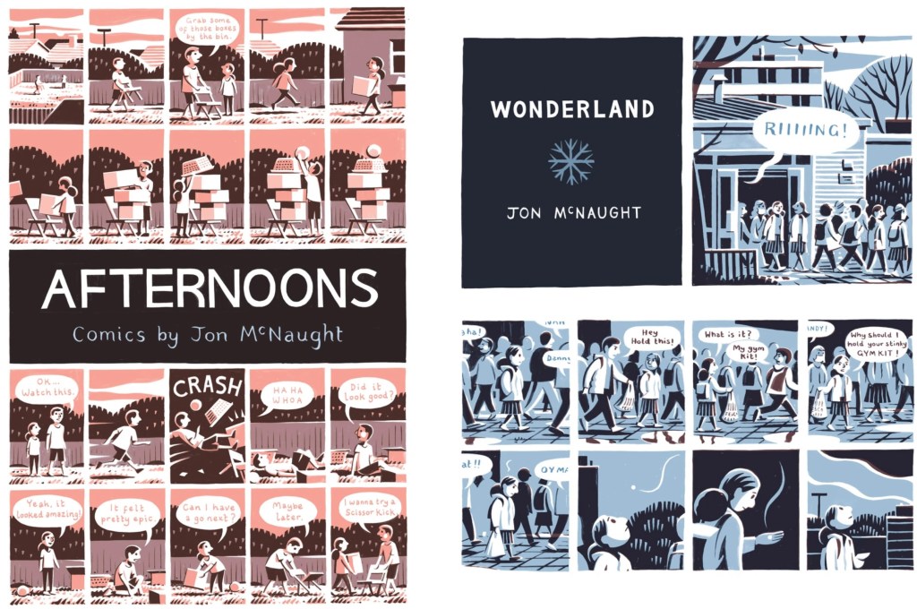
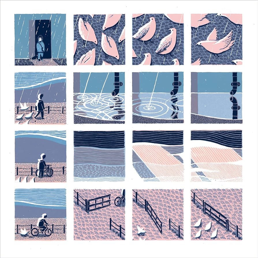
John Mcnaught has a similar visual style for his wordless narratives, very minimal colour palette and cartoonish characters. I think for wordless narratives, reducing the colour palette to 1 or 2 colours with lots of variation is shades is very effective as it easily translates mood and emotion to the visual reader.
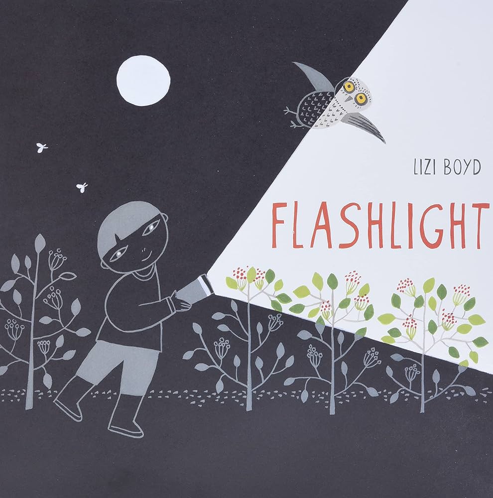
This is the cover from Liao Boyd’s story titled ‘Flashlight’. She uses colour in a very interesting way. We usually associated lots of bright and warm colours with children’s books but Lizi Boyd takes it in the complete opposite direction. The majority of the book is black with just simple white outlines. Only small sections are in colour, these are the bits the character is shining his flashlight onto. I think this is a really clever way of controlling and limiting your colour use to engage children with your narrative
For the session we had Luisa Rivera come in to speak to us about the topic of wordless picture narratives and her work. She is a London-based artist originally from Chile, working primarily on paper with water-based media, exploring our relationship with the environment through multiple layers of interpretation. She draws on storytelling to create narratives that are inhabited predominantly by women and natural elements, covering themes such as ecology, feminism, and personal memory.
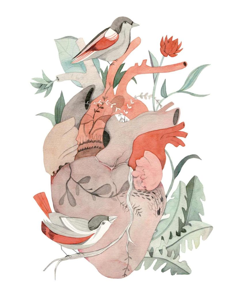
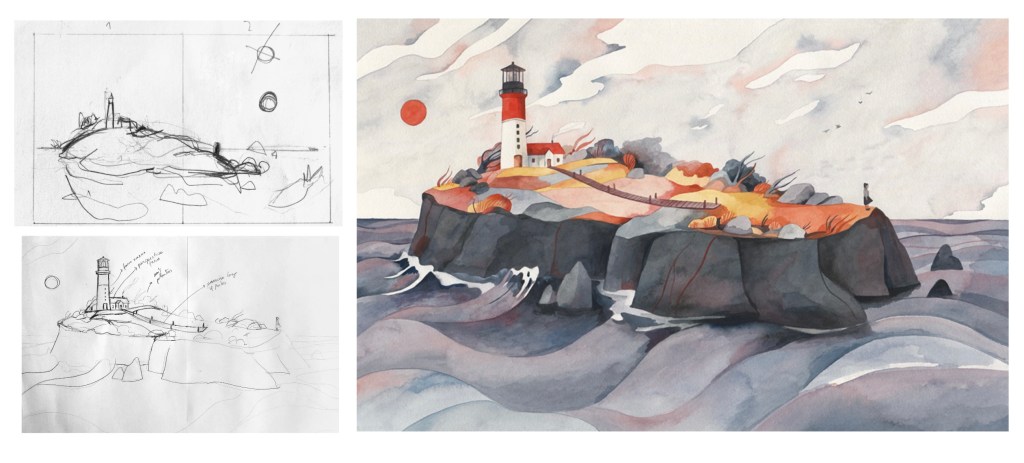
These are 2 of Rivera’s pieces that I particularly like. I love the delicate water colour style combine that she uses and is able to get intricate details it’s. The colour aren’t too bright, they have a nice muted look. I like the thematic combination between fantasy and reality with all natural and real elements but combined in an almost magical looking way.
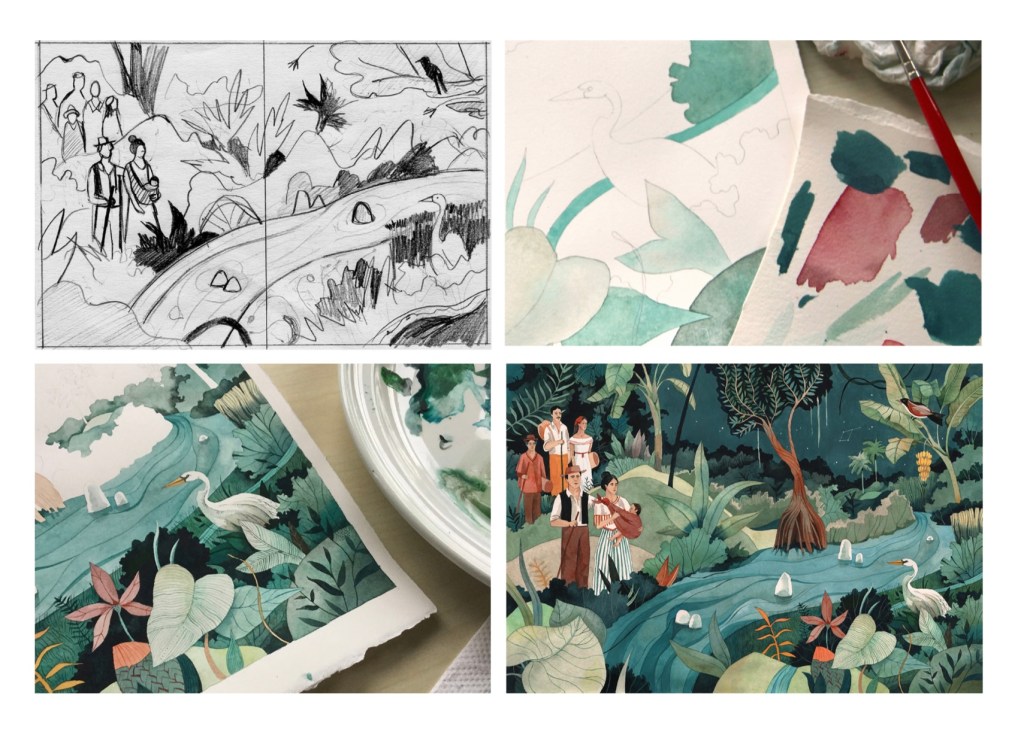
Luisa Rivera also took us through her creative process from when she is applying to get the work from the client to its final submission. The images below show the progress from a rough thumbnail sketch to the final outcome. She starts with a thumbnail sketch for ideas then moves onto slightly more detailed sketches, mapping out placement. Then she tests out colour and finally uses a light box to transfer the sketch onto the right type of paper and starts using her medium of choice, usually water colour.
These are some of the things that Rivera said are the key things to think about when planing a wordless picture narrative.
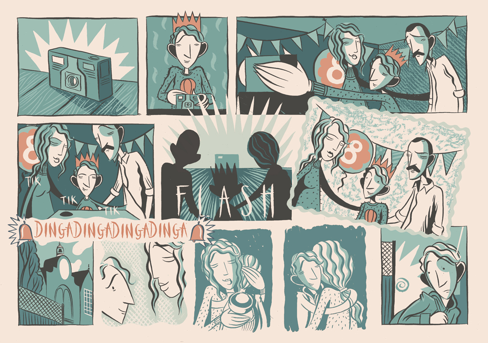
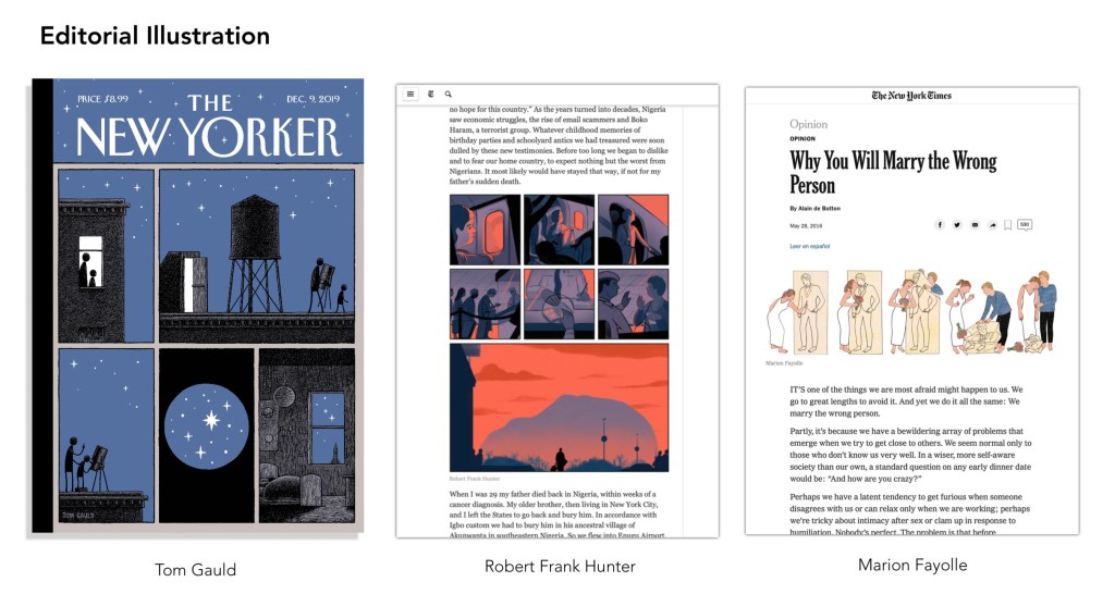
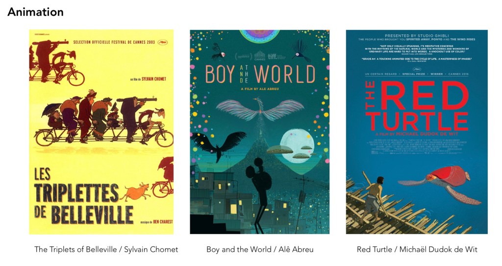
These are some examples of wordless narratives in other forms, editorial illustration and animatics. I will look into these as they will all be helpful in enriching my knowledge of wordless picture narratives so I’m able to construct my own.
I really enjoyed this session and learnt a lot about this type of narrative from my own research and the talk we had with Luisa Rivera. The next step is to choose which of the 3 briefs to develop on.
After completing the presentation we each had to make our individual page for the team document. This page had to cover our own research and we where advised to treat it like an information poster instead of just a page of text. Unlike the video for this we had more individual creative freedom because the pages didn’t need to have the same format. The only thing we kept consistent was the landscape orientation so that it fits nicely as a team document.
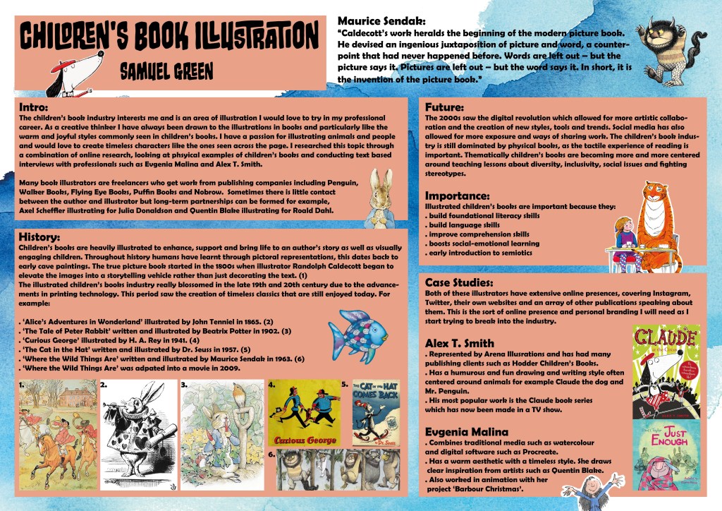
Below is my page covering all my research about children’s book illustration. I planned out the poster in sections based on how I researched it, an introduction/ overview, the history, future/importance and case studies. I think the page has lots of information but isn’t too crammed that it becomes a mess. To make it more visually engaging I used a blue water colour paper texture for the background and complementary orange boxes for the text. Also I added in images the back up what the text was saying and various children’s book characters around the page.
This is the team document we submitted containing the link to the video and each of our pages of individual research. We kept the same cover for the document and video to provide visual consistency to make them look like a pair.
I found this project interesting as I was able to learn lots about an industry of interest to me, book illustration. Also it helped to improve my team working and communication skills as we had to stay in contact and work together to progress through the project and produce the desired outcomes.
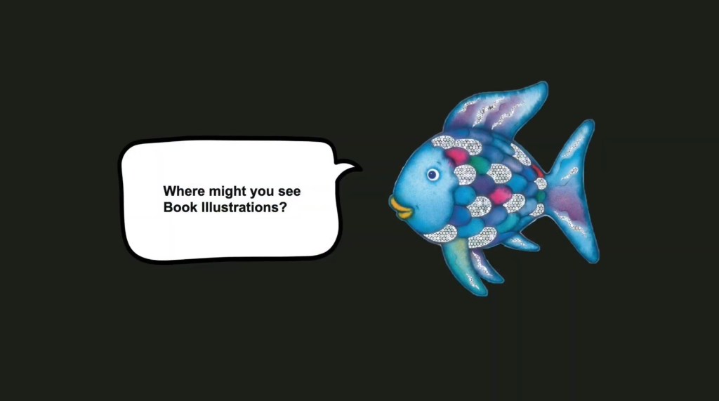
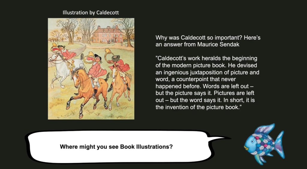
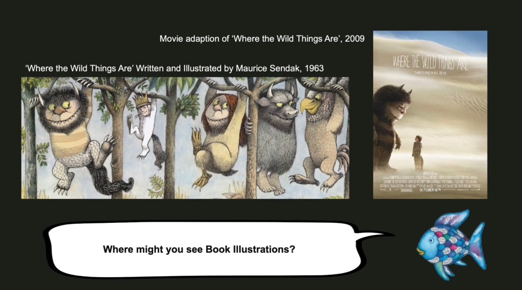
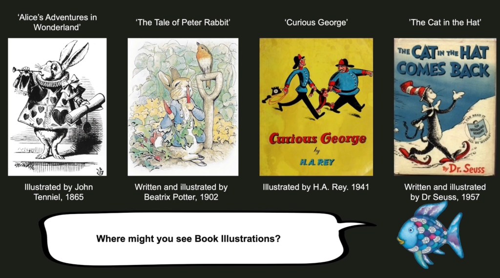
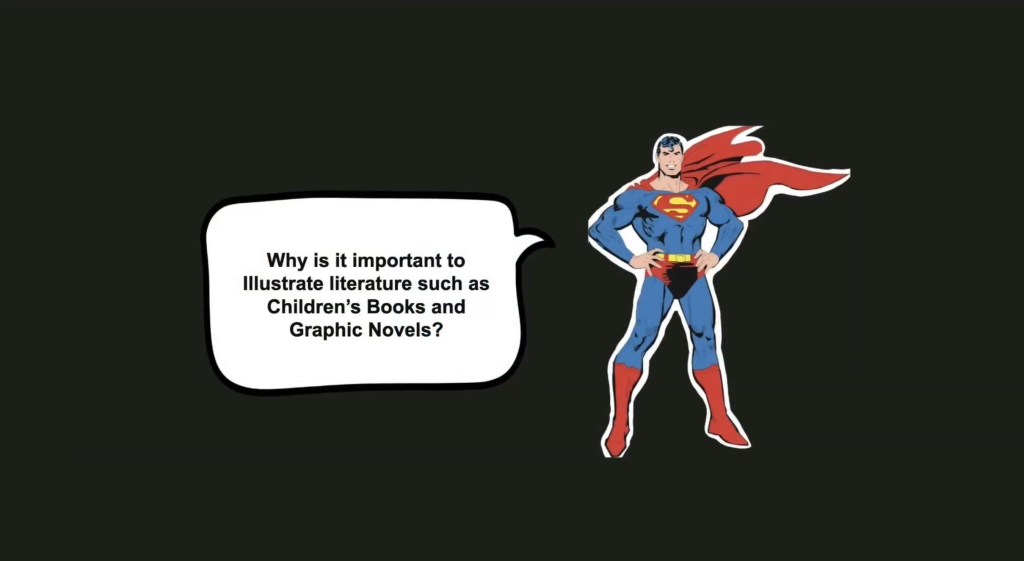
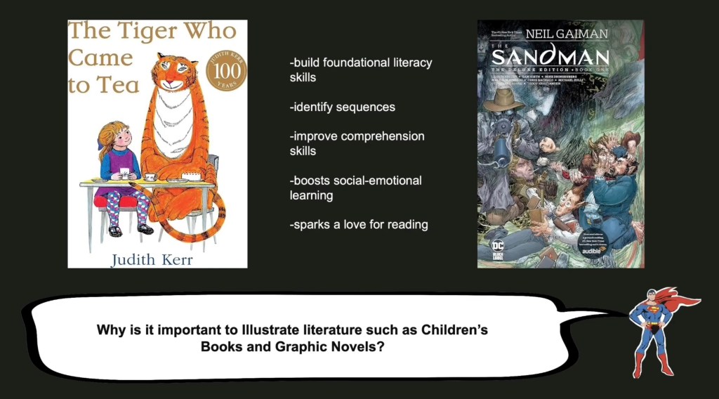
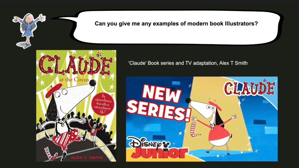
These are screenshots from the finished video. We had the audio which was read from the script and now we had to make a visual piece to go along with it. We decided to do a consistent visual style across all of the presentation to help make it easily accessible and straight forward to understand. We went with a black background for the whole thing as a way to draw the attention to the images and words on the page and not overcomplicate it visually.
We decided that each of the questions would be asked by a popular children’s book or graphic novel character as a way to link it to the contents of the presentation and just make it more fun to look at. I used Photoshop to make a PNG out of all the images and put them on the slides. Trying to find the right speech bubble was hard so I ended up drawing my own one on Procreate and using that. On the slides with the answers it also has the question either at the top or bottom on the page so that at any point the viewer could refer back to it. The contents on these pages is predominantly the images from the script but also has some captions containing key dates and names as well as some small bits of text. We didn’t want to overcrowd the pages and make it so the viewer got most of the answer through the audio but this was supplemented with visual examples and key information on the presentation. Below are screenshots from the parts that I answered.
Once we made the presentation the last thing to do was sync the changes from one slide to another with the audio. When this was finished we posted it to YouTube. Some improvements that I would make to the video after reviewing it would be to add some animatic elements as another way to make it more visually engaging. Also we needed to improve the audio as through speakers certain parts as much louder than others, making it harder to understand and interrupting the flow. However, overall I’m happy with the video as there is lots of good content in it which thoroughly covering the book illustration industry. Also I think the format of a conversational Q and A was unique and was a good way to share and combine everyone’s research.