Categories
Level 5 Visual Storytelling

Visual Storytelling : Project Development

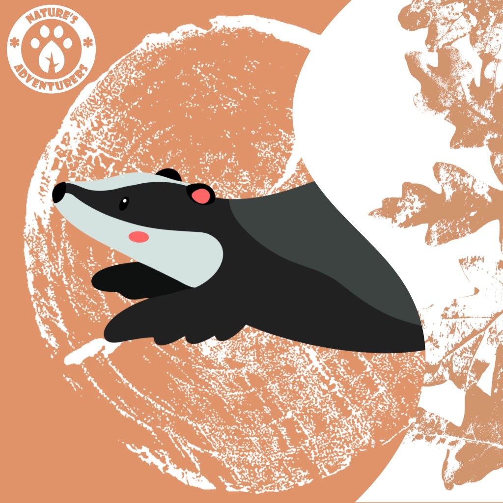
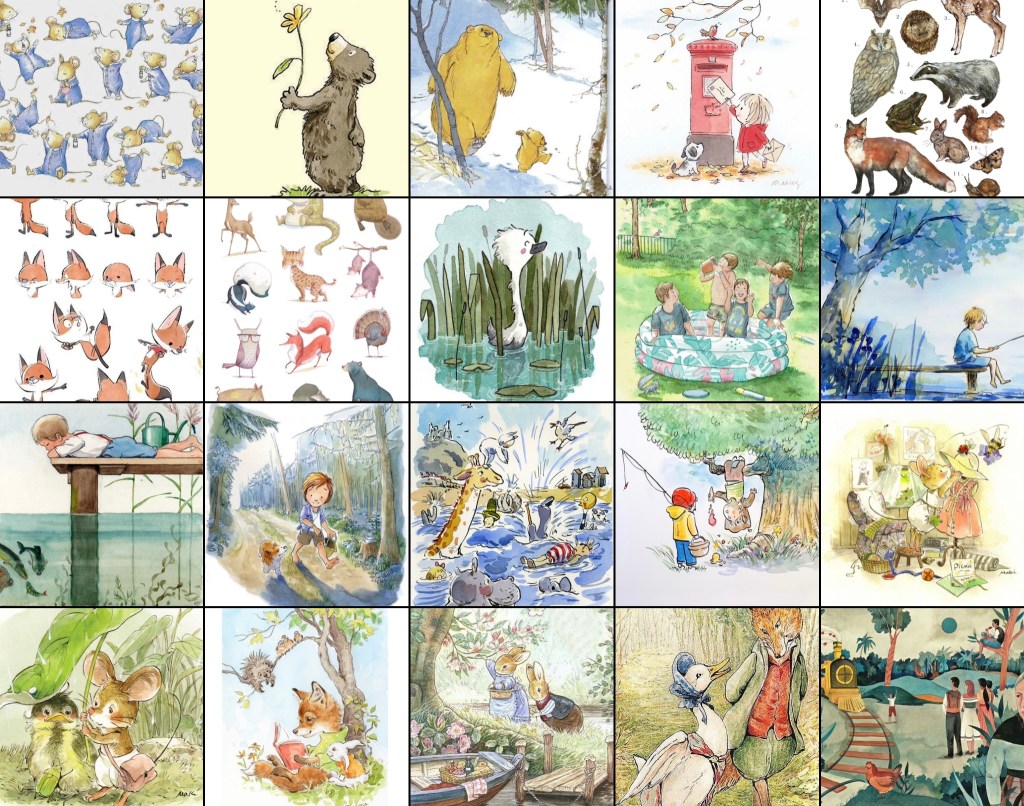
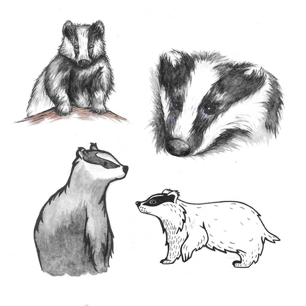
These are a few different visual styles that I tested, depicting a badger with watercolour and pens. My favourites for this project are the 2 on the left. I think the style I’m going to choose is somewhere in between the 2. With a bit more detail that the bottom one but not as much scratchy shading as the top one.

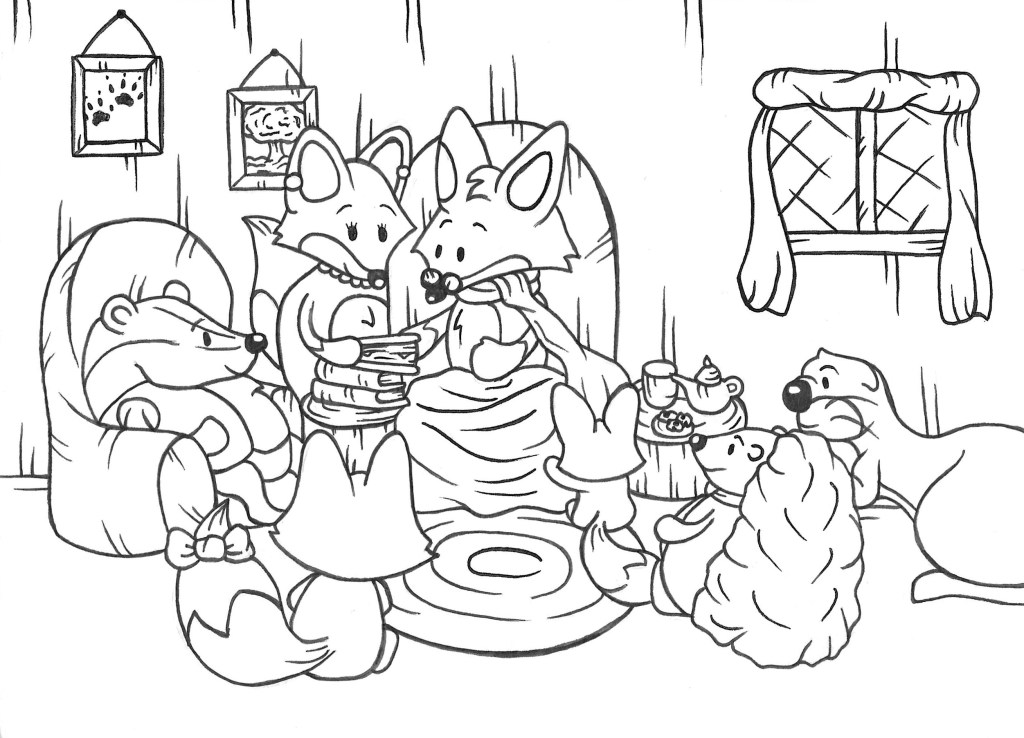
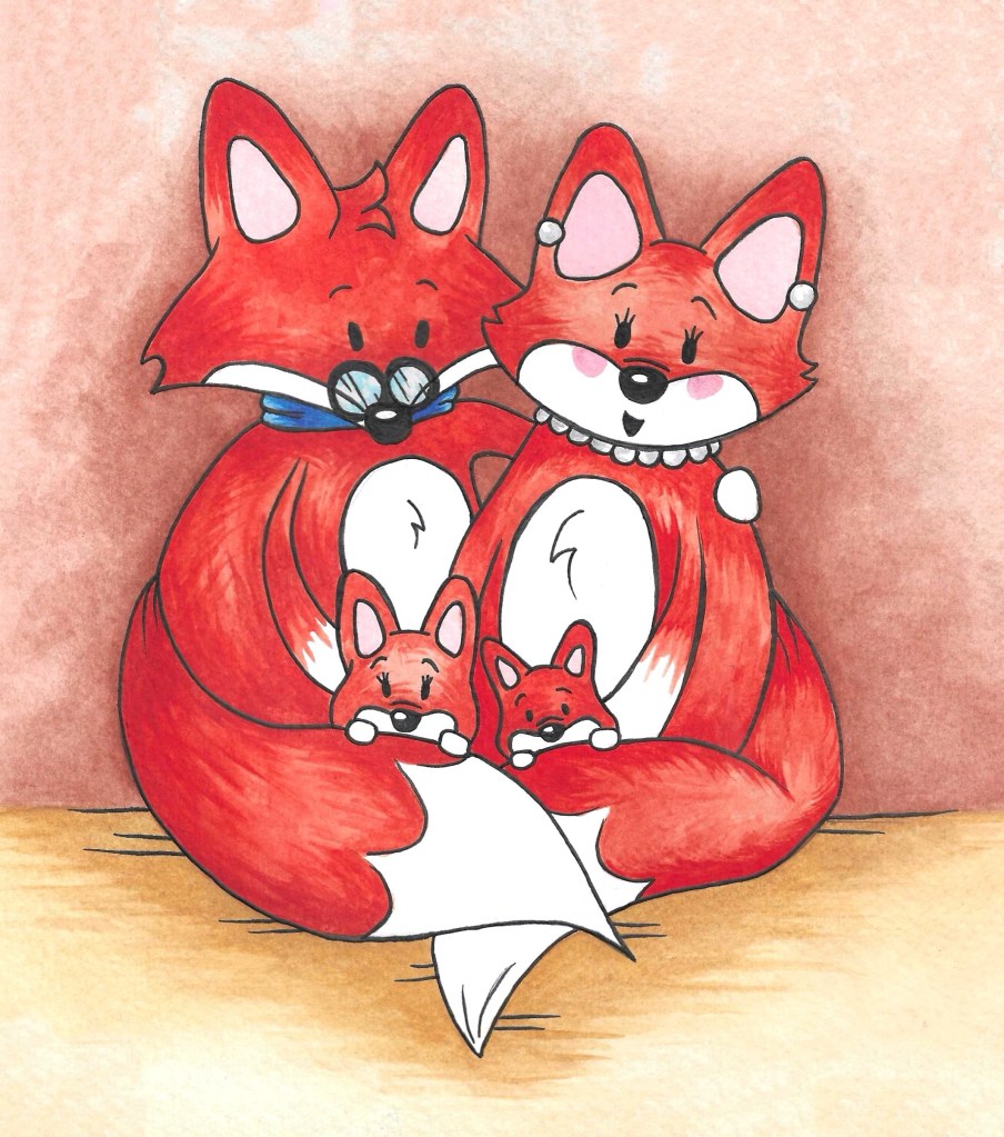
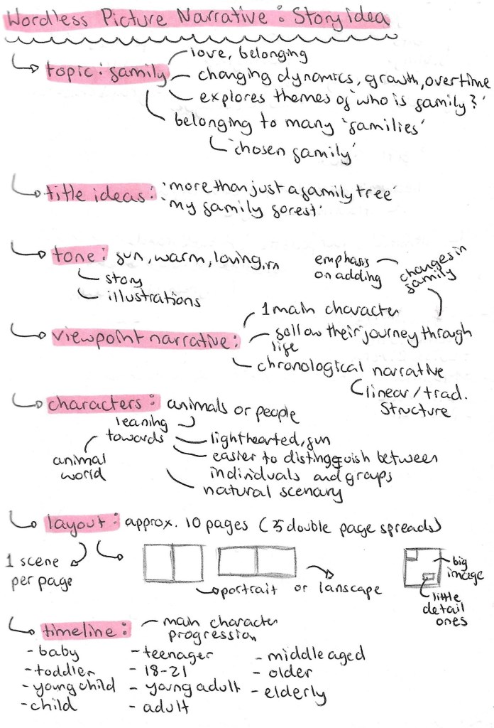
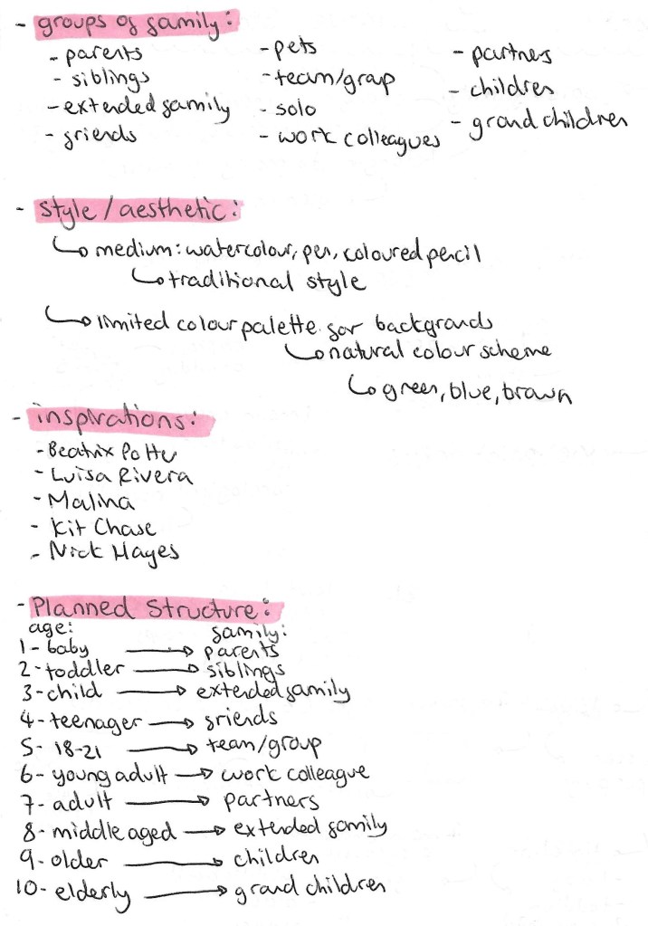
This page consists of my developed plan. I’ve changed the title to ‘Family is Forever’ as I think this is a simple title that is easily understood by my target audience, children of around 5 to 10. Also the repetition of words starting with ‘F’ makes it catchy and memorable. A key theme of this wordless narrative is time and this titles gives this idea. I worked out the different types of ‘family’ I wanted to represent and which characters I’ll use for each.

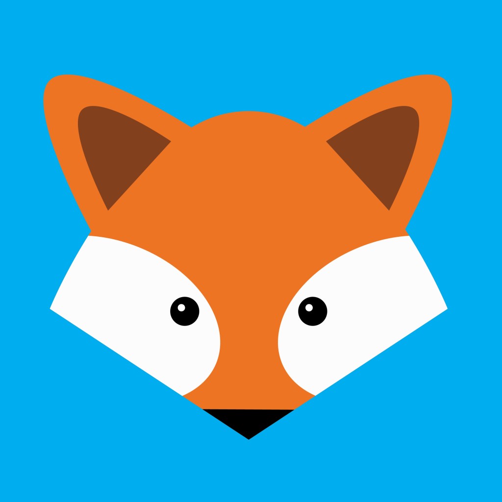
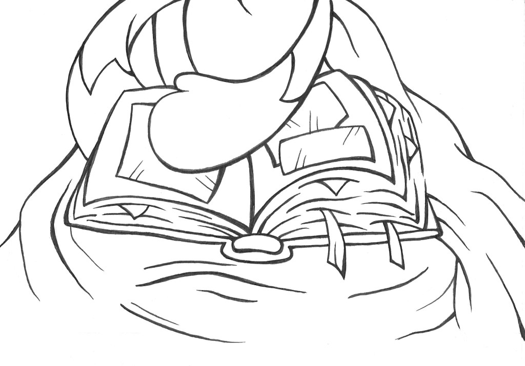
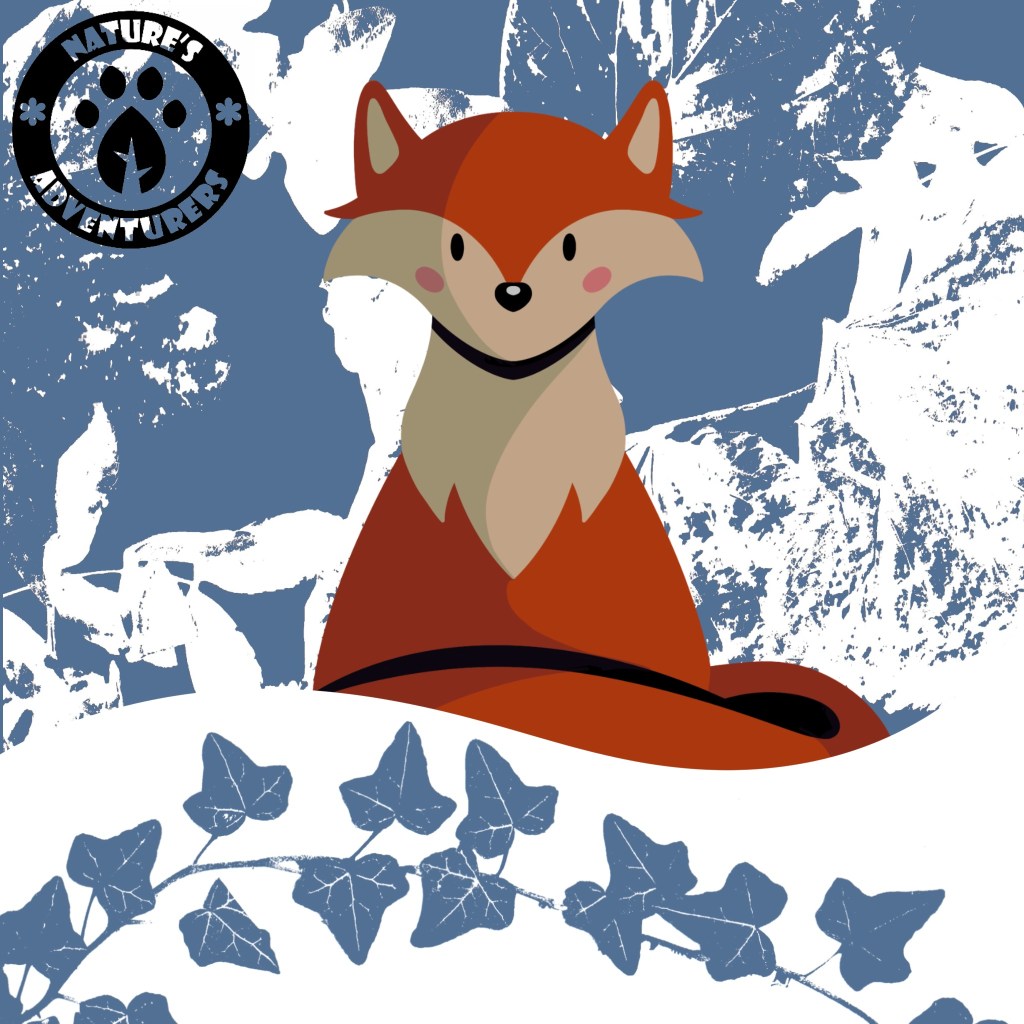
The main feedback I got on my plan last week was to work on the actual narrative so I decided to structure the story with a broad narrative with mini narratives within this. The overall narrative is about the main character, a male fox, and his family and friends who he shows through a photo album if his life. The viewer then sees lots of little memories and moments from his life. These are the mini narratives.

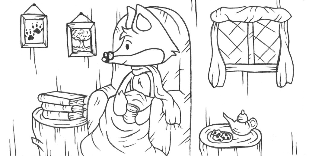
This is a more in depth look at the narrative in a page by page breakdown of the story. It was suggested to me that the minimum pages for even a short narrative story is 12 pages. My plan has 14 pages plus 2 pages for the front and back cover. The narrative will be broken down into 4 sections, the current scene, memories from when the main fox was young, middle aged and old. The story will start and end with the current scene. In order to make a clear visual difference between the current scene and memories as to not cause confusion, I will do the current scene in structure full panel illustrations but I’ll do the memories in a more loose bubbled format.

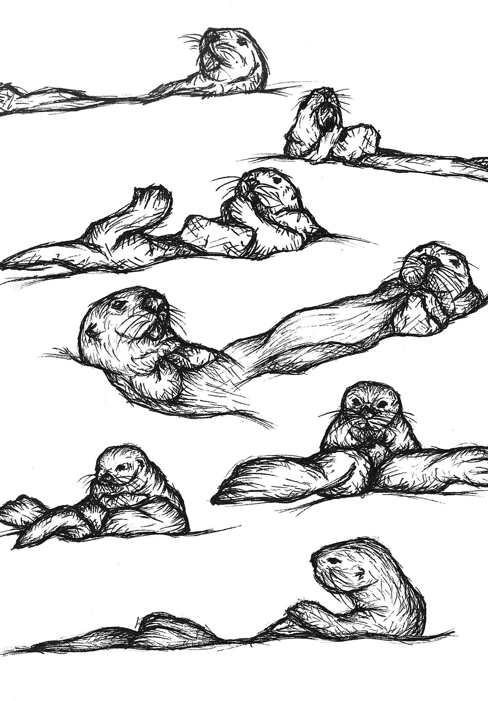
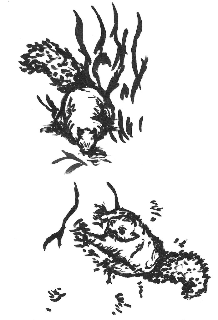
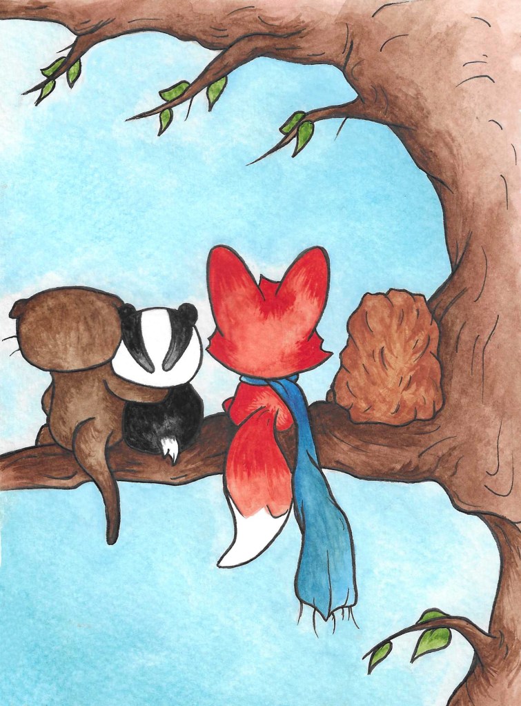
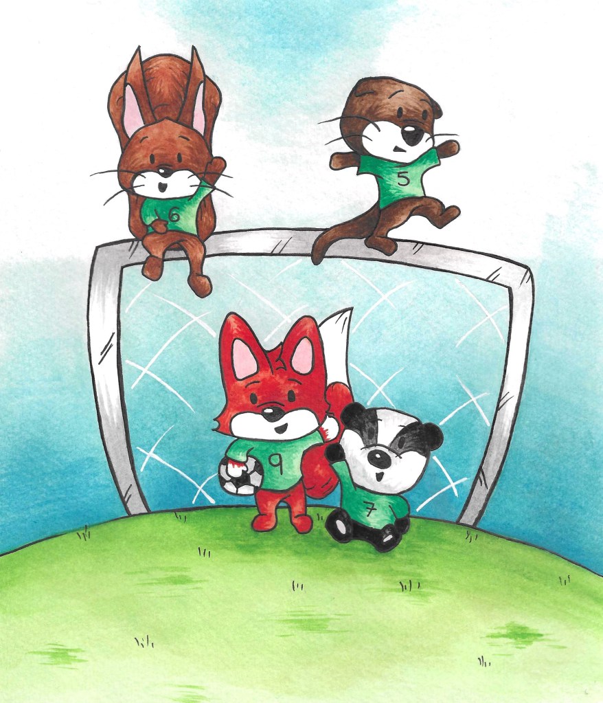
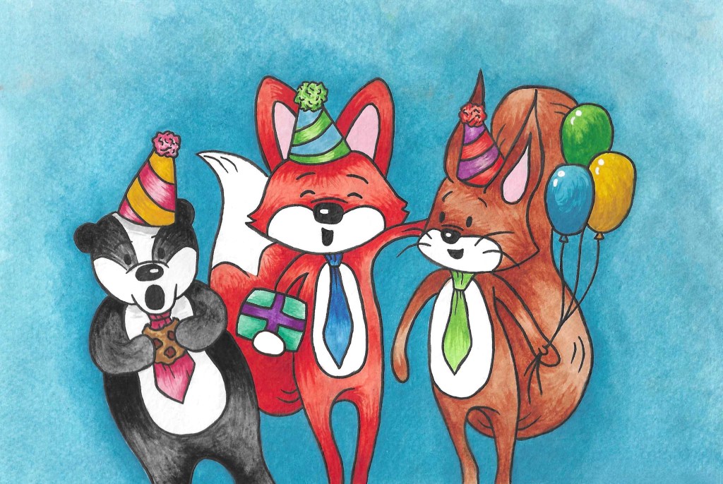
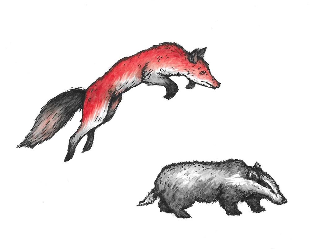
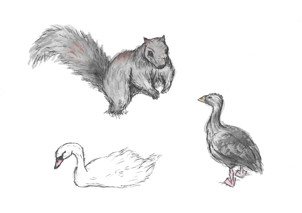
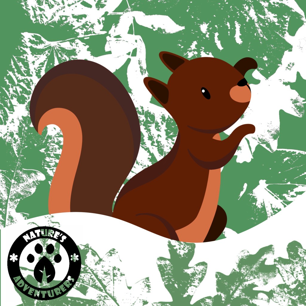
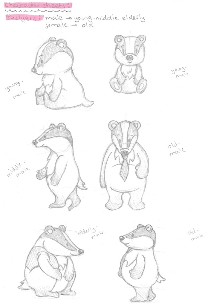
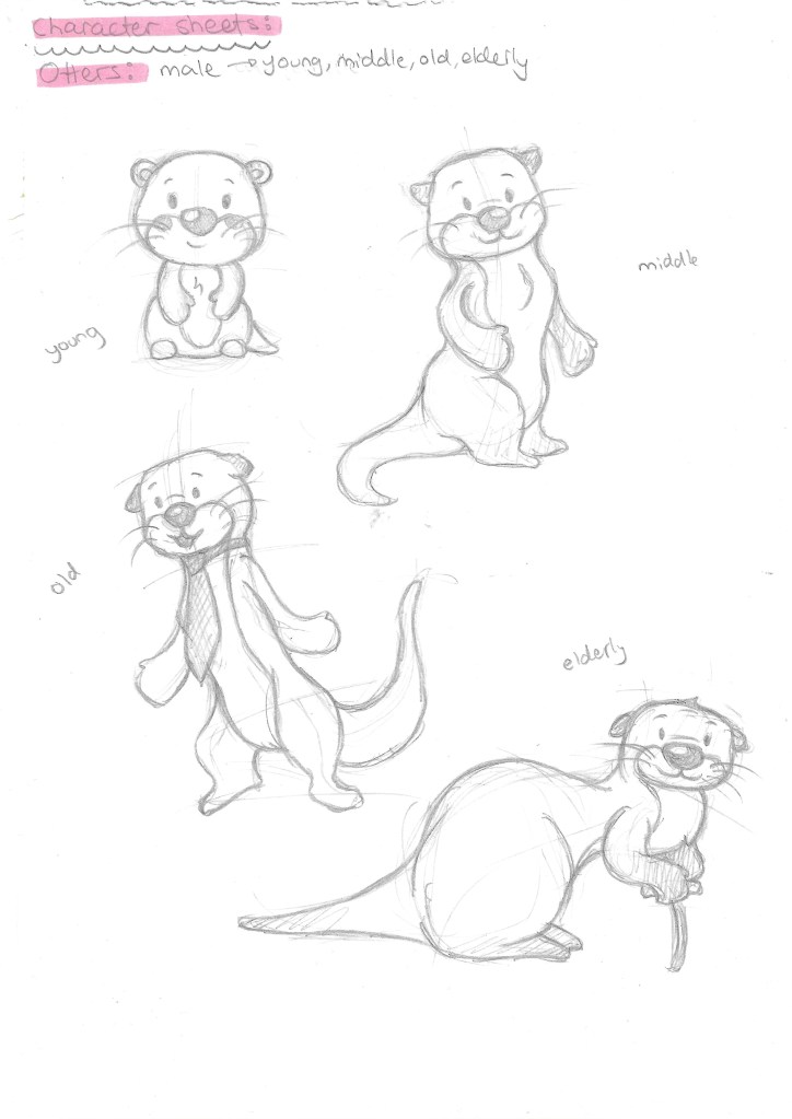
With the story planned out I started designing the characters. I started by making a list of all the characters I’ll need and what stage or stages of their life they’ll be at. The characters in the story will be the main fox, the wife fox, fox parents, grandparents, siblings, children and grandchildren. As well as badgers, otters, hedgehogs and squirrels.

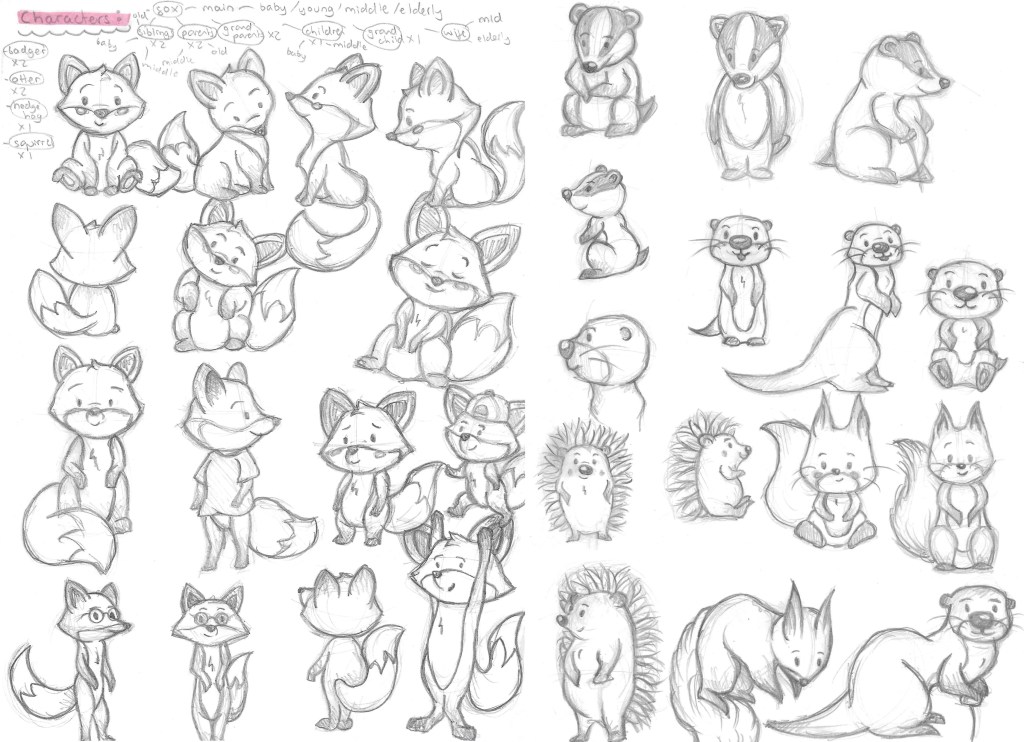
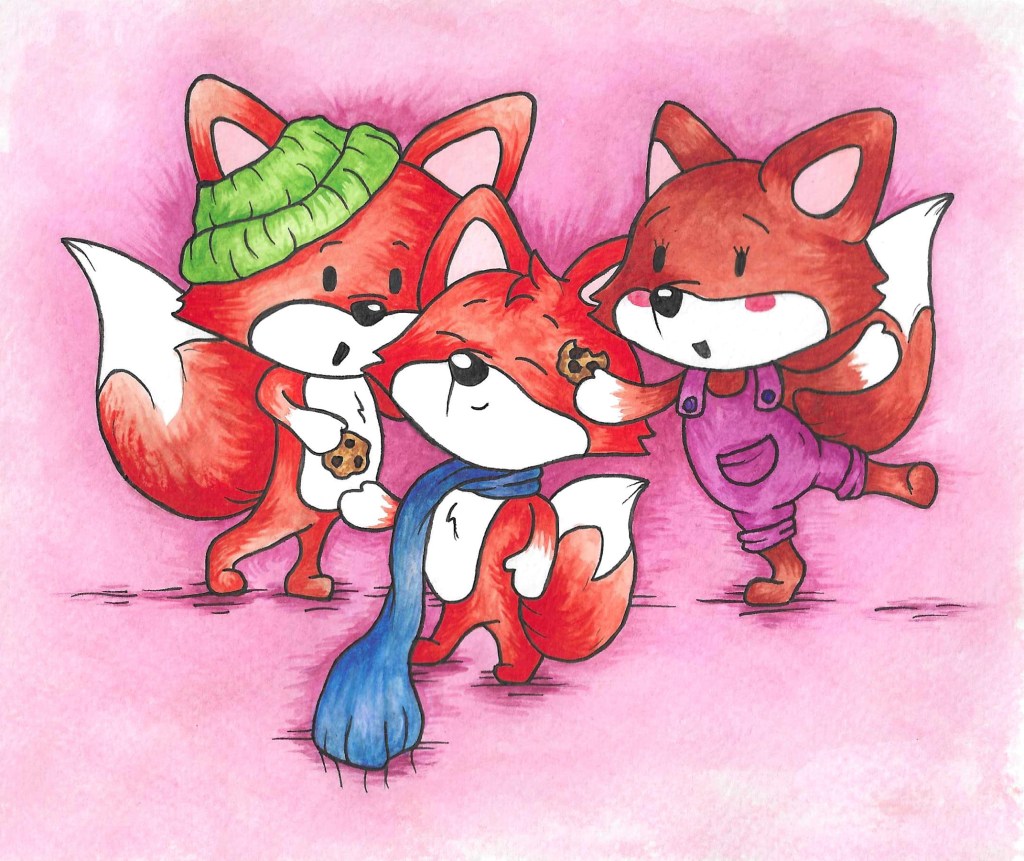
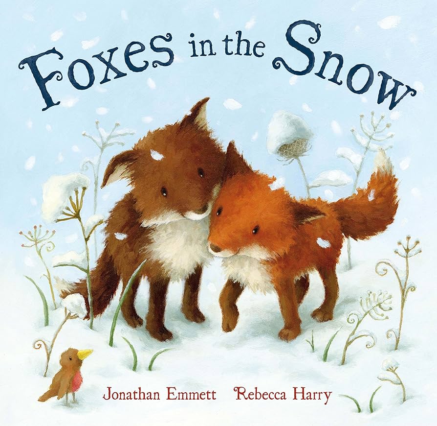
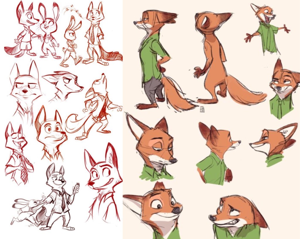
I researched lots of children’s books about animals and specifically foxes to get stylistic inspiration for my characters. One that really stood out to me was the illustrations from the book ‘Foxes in the Snow’. I also looked at Disney characters such as Nick Wilde from Zootopia. Disney are great at designing characters with lots of expression and personality. I wanted to make my characters somewhat humanised in regard to how them move to allow for more dynamic and expressive poses and facial expressions.

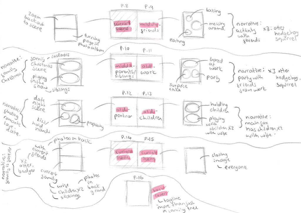
This is a storyboard of part of my story. This process helped me figure out composition, scenery and character poses. Now I’m ready to begin transferring the sketches to the right paper and start the final images. 

Categories
Brands Level 5

Brands: Adobe Illustrator

I have been learning and practicing using Adobe Illustrator. This is a powerful software that’s ideal for making vector illustrations and is often used by graphic designers to create logos so is ideal to use for this module. I was introduced to the software last year in Digital Arts 1 but didn’t take it much further so I’ve had to relearn it this year. I started by watching introductory videos to get me familiar with the layout and the different basic tools including shape tools, pen tool and pathway tool.

I created these 2 images using the basic shape tools. These tools are straight forward to use and manipulate at a basic level but become more difficult when you need to combine them to create more complex shapes and paths.

For these 2 I used a combination of shape tools, the pen tool and the pathfinder options. The pen tool is a difficult tool to manipulate accurately so I’m gonna need to keep working on it but I’m happy with the progress I’m making with it.

The Duolingo logo: this was a fun one to work on as it required lots of use of the pathfinder tool. While the logo may look like it has many complex shapes, the majority can be broken down into simple shapes like rectangles and circles. And for the bits that can’t the pen tool is needed.

Categories
Brands Level 5

Brands: Format and technologies

Last week we where given the project brief so came to this session with an idea of what topic we wanted to do. In the session we learnt about different formats that branding can be used in. This helped give me ideas an inspiration for my project.

There are 5 main formats that we can use to assemble our branding campaigns. These are print, moving image/digital, physical, spatial and events. Which type or combination you use would depend on the idea behind the project and who your audience is as the format needs to be appropriate to the topic and target market. For my project on based around getting children more engaged and interested in nature I plan on create a diverse campaign utilising most is not all the formats. Below is more detail on the different formats:

Then we looked at a few examples of social campaigns to get us thinking more about what goes into creating a social campaign.

This is the Save Brixton Arches logo, I love have graphic and bold it is, it immediately commands your attention which is idea for this kind of social campaign.

This is Owlie from the Vogue Fashion’s Night Out Campaign:

Then we looked at some different packaging examples and simple ways of branding items such as using Water Slide Decal Paper. We also spoke about pop ups and looked at some helpful resources on how to create these kinds of effects which I think would appeal to my target audience for the project, young children. This was all useful to me for my campaign as I want to produce a range of physical products.

Here is some technical information the our tutor gave us about different types of paper and what needs to be considered when choosing which type to use for construction and printing.

Categories
Industry 2: Professional Practice and Enterprise Level 5

Industry 2: 3D Scanning

3D scanners take a physical object, and digitises it so it can be saved, shared, and edited on a computer. Scanners contain many components such as cameras and lasers. 3D scanners can achieve a level of precision and accuracy that a normal camera or 2D scanner can’t. 3D scanners measure millions of points in a single measurement with a high level of precision. Scanners retain this high level of precision on objects ranging from very small to very large. The scanning hardware makes the digital representations and the scanning software allows you to work with the scan. 3D scanning is used in many industries such as architecture and model making for prototyping, quality control testing and 3D printing.

We had a session in the EMS area doing some 3D scanning for the model of the Great Hall. It was good to practice and expand on the skills I learnt from doing this last year. My partner for this project had no experience doing this kind of work so I was able to take on more of a leadership role and teach him about the software and processes involved. I learnt some new things about 3D scanning and printing such as different materials that the printers can use and why you would choose each one. For example resin gives a more clean and smooth finish as opposed to PLA, Poly Lactic Acid, a biodegradable plastic.I also learnt about about 3D software that I could use such as Tinkercad, Unreal Engine and Cinema 4D for 3D modelling.

Before we started we made a list of what we needed to complete (left). We need to scan someone to be Professor Pepper, a Deep Sea Diver and their Diving Bell, an Orchestra, some more general visitors and the Wheel of Life.

On the right of the board are notes I made to help us use the 3D scanning software Shining 3D. This is an industry standard software as it’s one of the most reliable and highest quality 3D scanners. We used Eiscan sensors which are handheld devices that someone holds and moves around the person being scanned. 3D scanning works by a sensor sending out light which gets reflected off a surface and goes back into the sensor. The time this takes indicates how far away the subject is so the software os able to construct a model using this information.

Process: the subject picks their pose, making sure it’s something they can hold comfortably for a few minutes because too much movement will disrupt the scan. Then you select IR mode on Shining 3D, this is a lower quality scan than the other option but is more reliable. As our figures will be 1:10 scale we don’t need perfect details because they won’t be noticeable. Make sure to turn the data quality indicator on, the shows the subject being scanned in red, yellow and green on the monitor. Red is where there’s not enough data yet and green is when it’s got enough data. This helps you know what areas to scan again and what bits to leave. Then the person scanning starts to go around the model with the Eiscan sensor. A couple good tips I learnt where to start with the face and areas that are most likely to move during the scan, usually arms. Also when scanning try to work fluid motions because the sensor picks this up best. Once you’ve scanned the subject using the lasso tool, hold the shift key and circle around any errors to remove them. This is a similar process to using Photoshop. Then you’ll need to optimise and mesh the scan, this helps to fill in any gaps. It’s important to simply it to around 50 STL MB, so the file size is not too big and scan be printed. Finally save the scan and now it’s ready to be printed.

This is an image of the model scan forming in Shining 3D. It’s a quick process, only taking about 10 minutes from start to finish.

There were a few times that we had to repeat scans as they didn’t come out well. This was either due to the subject moving too much or the person scanning not capturing all the areas well enough. These are some of the scans we did during the session. We were able to scan Professor Pepper, 2 general visitors, and a 5 person Orchestra with a conductor, violin player, bass drummer, flutist and cello player. We picked instruments and poses that were authentic to the time period. For the instrument we used place holder such as metal poles and screw drivers so that the people being scanned could pose as if they where actually holding it. Once they’re 3D printed we will hand model the instruments. In the same way I did before I’ll hand fill any gaps or remodel any bits that don’t print well.

We also scanned the model of the Diving Bell using a different 3D scanning software that’s on an iPad called Polycam which is often used by architects for interior design work. It’s an easier software to use but produces lower equality scans with less detail. This is fine for the Diving Bell as it’s a big geometric shape with minimal detail so came out well with the scan.

We will have 1 more session of 3D scanning to get some more general visitors and scan the Wheel of Life as we didn’t get time to do those. We want more general people to populate the Hall right now we have 13 completed figures, 6 unpainted ones and 2 scans waiting to be printed. This is a total of 21 and our target was 25. Next week they will start to be 3D printed and once that’s done we can paint them.

Categories
Portfolio

Figure Drawing

Categories
Portfolio

Biro/Pen

Categories
Brands Level 5

Brands: Branding mini brief

Now that we’ve studied colour, typography and logos in terms of constructing a brand we where given a mini branding brief in preparation for our main brief. I recently started volunteering for East London Water Works Park in the design and communications branches. So for the mini brief I decided to create a new logo, colour palette and typography for them.

Here is an image on their current logo and a screenshot from their websites home page. It’s a combination logo as it has both an image a words. What’s great about this style of logo is that if you take either part away it still works. It’s ideal for new and fairly unknown brands as this way people can start to learn and recognise the brands name and logo. Both parts fit nicely into circle and square shapes, making it easy to place on products and advertisements. The simplistic vector images of water and a leaf are very nicely made and quickly translate to the viewer what the brand it about. Also the minimalistic colour palette of just different shades of blue with white as a neutral colour also supports the natural, water focused theme. The logo also work well I’m greyscale or in fully black or white. The typography is nice but not that interesting, with simple bold fonts for headings and a basic font for the paragraphs. They have a nice base but I see areas that I could improve to help improve the companies branding.

This is my work on adjusting the colour palette for the branding. The key alterations I made were increasing the variation between the 3 shades of blue, adding some green into the palette and adding brown as an additional natural neutral tone. I will keep white as the primary neutral tone as it brightens up the page as helps keep a calm feel to the brands image.

These are all the compliant pairings in the colour palette and their contrast score, 4.5 is the target to have enough contrast.

I like the fonts used as they’re very legible, making them easily accessible. However, this bold, simple style means a lack of personality so I found 2 fonts that I think bring more character to the branding. These 2 are a lot more fluid and bubbly, imitating water which compliments the logo and colour palette. Below are tests showing all the different contrasting colour options with the 2 fonts. I think these would be best used for big headings and in more informal branding such as social media posts. I would still keep the current typeface for the bodies of text as I want them to be as simple as easy to read as possible.

This show all the different compliant pairings of colours, highlights the diverse typography opportunities with the new colour palette.

Here are 3 possible typefaces for the logo. I kept the same layout as the original but gave the fonts a bit more of a fun personality and tried each in 3 different colours. The dark blue would be for the official logo, then there would be an all black and an all white version and the green one would be for alternative colour scheme.

I applied my favourite 2 to the current logo. I made some colour changes to the logo. I made the 2 blues in the water ripples less similar so they’re more eye catching and made the leaf green to symbolise what the brand is aiming for.

Here are the different colour variations of the logo with my favourite new typeface. There’s a full colour version, an all black one and a monochrome blue one.

I then applied some of these changes to a screenshot of the website. The logo has been recoloured, the typeface is the logo has been changed, the typeface and colour has been changed for the ‘a bold vision’ heading. Also I changed the blue backdrop to a darker shade to make the text stand out more. Overall I think the changes have improved the branding while not taking away from the brand values and the original branding ideas.

I did a few hand drawn sketches of logo redesign ideas. I wanted to keep the leaf and water as symbols in the logo but played around with the composition. This is an example of a pictorial logo which can also be combined with the brand name. I wanted to make the logo more dynamic so I tested different compositions.

I redrew the logo ideas digitally using Procreate and made minor adjustments. I made them in all black as it’s important when making a logo to create it in greyscale values to check the design is good before adding colour.

Here are a few potential colour options for the logos using the colour palette I made or the brand. I think my favourite of the colour schemes is the bottom right one as I think the bright green and blue mixed with the darker blue work well together and are very eye catching. To properly make this logo I would use Adobe Illustrator and vectorise it.

Categories
Portfolio

Watercolour

Categories
Portfolio

Digital Art

Screenshot
Categories
Level 5 Visual Storytelling

Visual Storytelling: Pitch

After completing the sessions on the 3 possible briefs I have decided to do the Visual Storytelling project. I will draw inspiration and ideas from from the other briefs where I can to strengthen the project. Wordless picture narratives are the type of narrative I enjoy viewing the most and it has the strongest link to my personal career ambitions.

Pitch: I want to create a wordless picture narrative all about the power and love of belonging to a family. I want to explore how family dynamics and how your ‘chosen family’ may change overtime. The narrative will have a fun and warm tone as I want it to be a celebration of family. It will be a viewpoint narrative as it will be a chronological journey through 1 main character’s life. I plan for the characters to all be animals, specifically the wildlife you’d see around England such as foxes, badgers, hedgehogs and squirrels. I think this will help make the narrative more fun and visually engaging. I plan to creat 20 images, so 5 double page spreads probably in landscape orientation. Each page will depict a stage in the main characters like and a moment where they felt love from someone or a group that they can call his family. In terms of the visuals I want to use watercolour with little details of pen and coloured pencil to depict these beautiful natural scenes to try create a world that these animals live in. I will be taking inspiration from the likes of Beatrix Potter, Luisa Rivera, Evgenia Malina and more.

Beatrix Potter:

Luisa Rivera:

Kit Chase:

Evgenia Malina:

Here’s a mood board I made with visual inspiration from different illustrators: