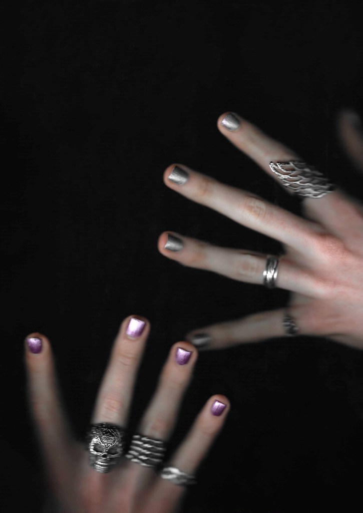
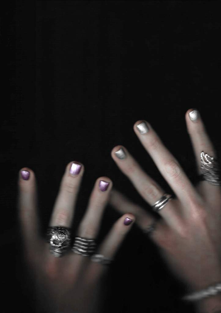
Scanning: this is a technique that I’ve been working on in my spare time as I like the image quality. I also touched on it in my ‘Bloody Valentine’ work. I wanted to utilise scanning in my project as it produces images that have a lovely blend of high resolution focussed areas and more blurred, grainy parts. Also I like the darkness of the backgrounds. This style has a similar look to some of the Hotel Diablo images but contrasting the style used by UN DN and nail polish advertising in general. Normally they used super high definition, well lit photos which I will use but I also wanted to incorporate more gurney, grainy scans. I particularly think this style of image will work well on posters, with the hand made sketches and typography.
Hands: not all of these scans of hands have the colours from the Hotel Diablo nail polish palette. I won’t be using those ones for final pieces, but they will be used for experimentation. I want to be very controlled with the colour seen in my final work as my colour palette will be important to the visual identity. These scans feature my hands with a few that have a girls hands in them too. I will get more of a mixture when it comes to the photography. This is important as UN DN prides itself on being a unisex brand and MGK has a very mixed audience so the advertising needs to represent both boy and girls. I took scans in different poses , orientations and distance away to get a variety of images to work with. Personally I like the ones that are about further away as they get more textured and grainy, giving them a more interesting effect. The scanning produced really nice shine on the nail polish which really helps make them stand out in the image. I think there’s already staring to be a nice blend between the different aesthetics.


Hands with flowers: I wanted to introduced roses into some to add another layer to the compositions. I think these are really successful, the colours of the roses really pop and nicely contrast the dark, grainy style. Flowers is a subject I started to explore in my sketches and think it could become a really important theme throughout my work. I like the colour and life they bring to an image which nicely sits between the dark, grunge aesthetic and the clean, pretty style typically used by nail polish companies. I will explore this more as I go through the project.
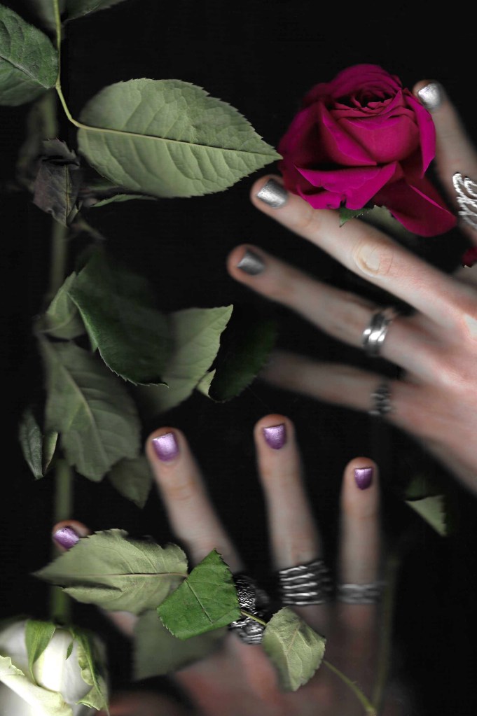
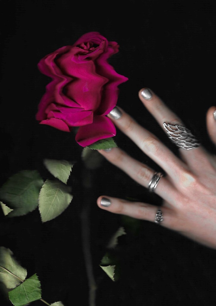
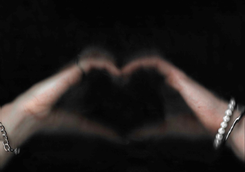
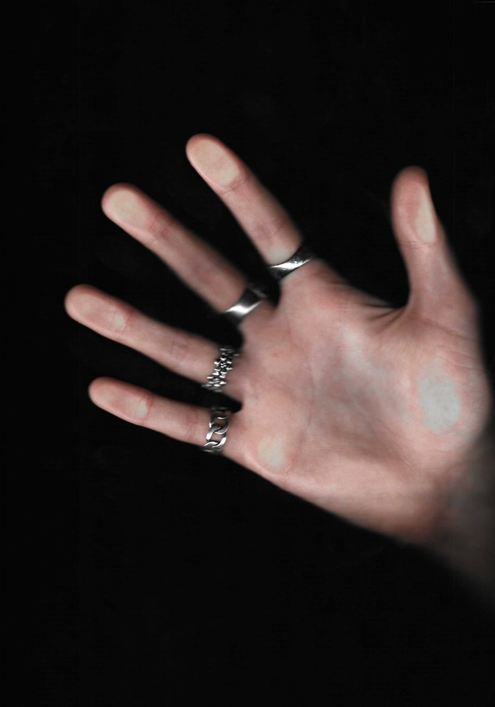
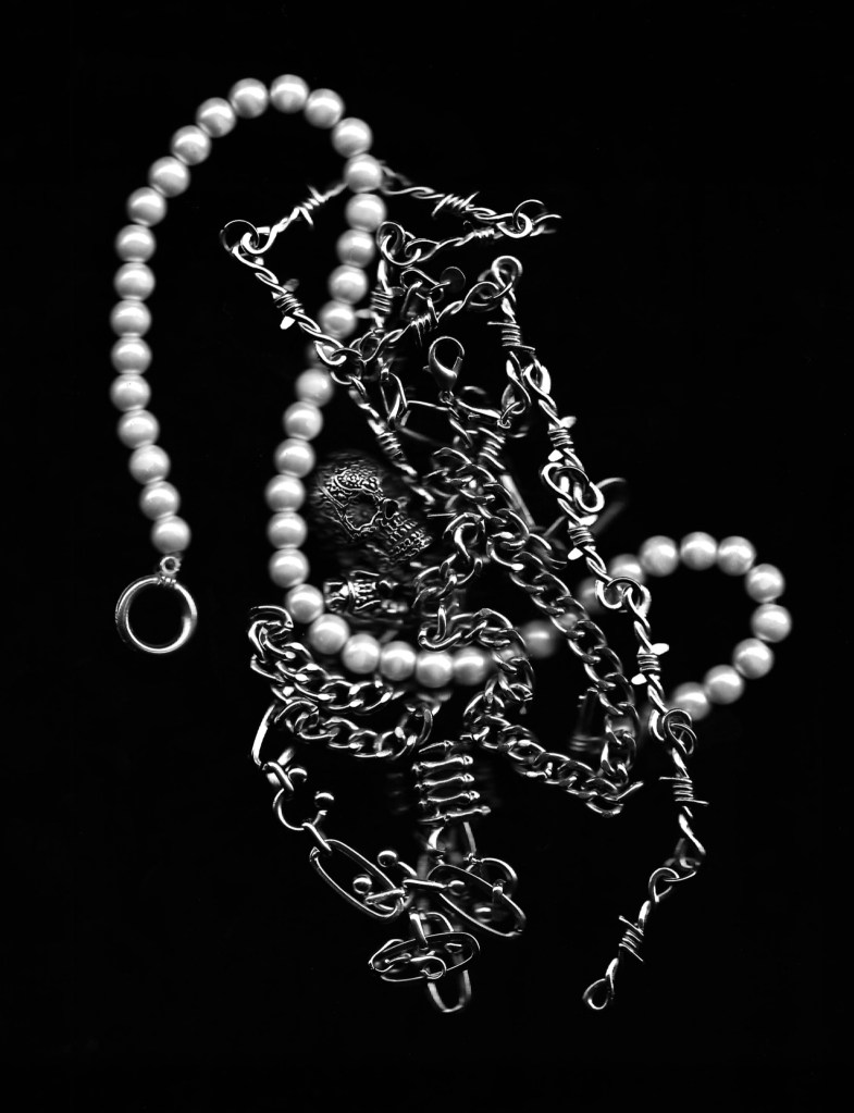
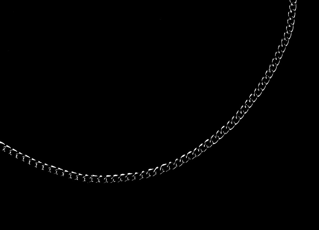
Jewellery: jewellery is going to play a key part in the visual identity of this event. I will specifically be using silver and pearl jewellery. These are my favourite types of jewellery so I have lots of pieces that I can used for the photos and scans. They nicely complement the colour palette. Silver jewellery has roots on punk and rock culture so works for that side of the aesthetic. Also pearls are becoming more trendy and are something MGK is seen wearing a lot. These 2 jewellery styles will be familiar and popular within the target audience. In the hand scans you can see lots of this jewellery and I wanted to experiment with it more. They create a really nice shine and could make interesting overlays and textures.


Reflection: I think these scanning experiments were really successfully. I’m very happy with the image quality and show the start of merging the 2 aesthetics into one cohesive visual identity for the event. I’m particularly pleased with how well the scanner is able to pick up the texture of the nail polish. The next step will be to start exploring how I can combine these scans with the typography, sketches and colour palette.
