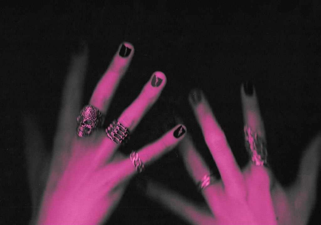
I was really happy with the results of my scanning experimentation. I like the dark, grainy aesthetic that it produces while still showing the shiny, metallic texture of the nail polish. The scans already dramatically differ from the normal promotional images seen on social media. But I still wanted to more of a distinct visual identity by bringing in the colour palette, sketches and typography. A concern that my tutors raised about my scans was how it’s not necessarily obvious that the focus is on the nail polish so I needed to try and find ways of highlighting this to show that it’s the focal point of the composition. I plan for the scans to mainly be used for the poster designs but may also be used a bit in the video.
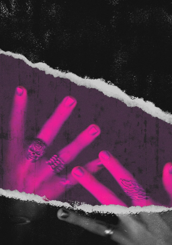
Experimenting with rips: these are all different experiments I did around the idea of ripping or removing bits of a top layer to reveal the coloured scan. Nail polish is used as a form of self expression and the idea behind the rips is that it’s revealing someone true expression. I tried out different eraser brushes in Procreate and various paper textures. Having the top layer in greyscale really highlights the coloured nails on the layer beneath, immediately drawing your eye to that area. I particularly like the ones where the top layer looks like paper, I think this could make for a really nice poster. It has a nice vintage rock band feel so I think this style successfully blends the 2 visual styles into 1 identity.
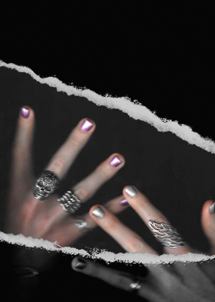
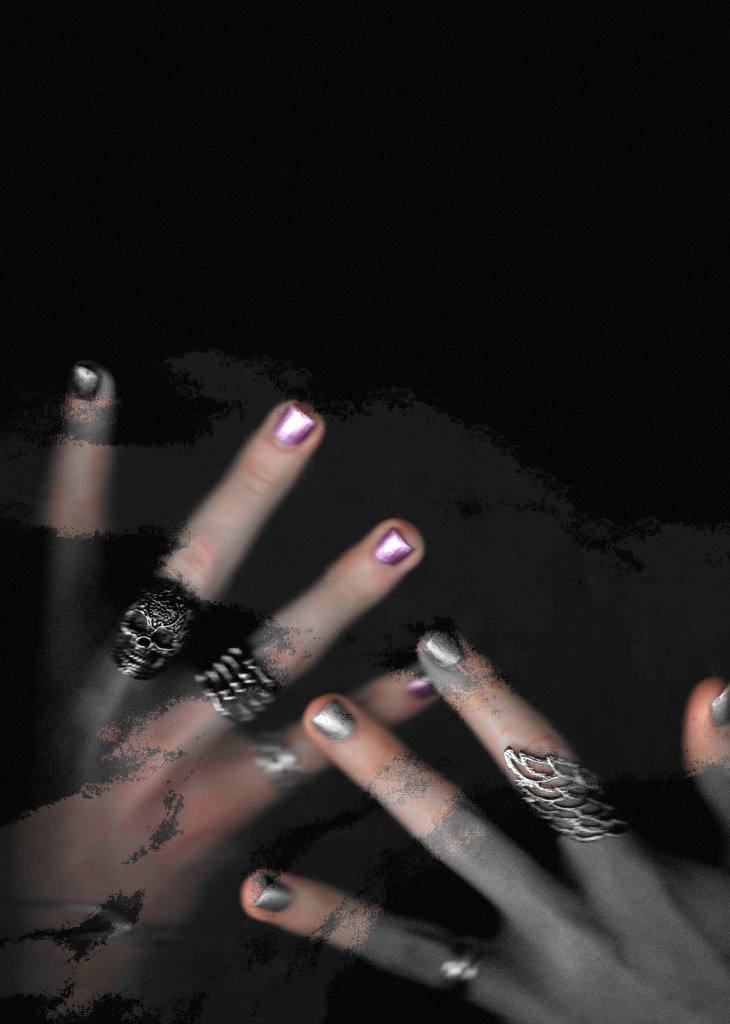
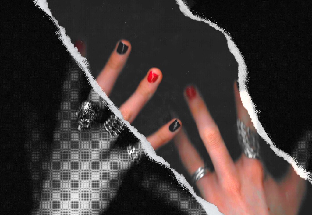


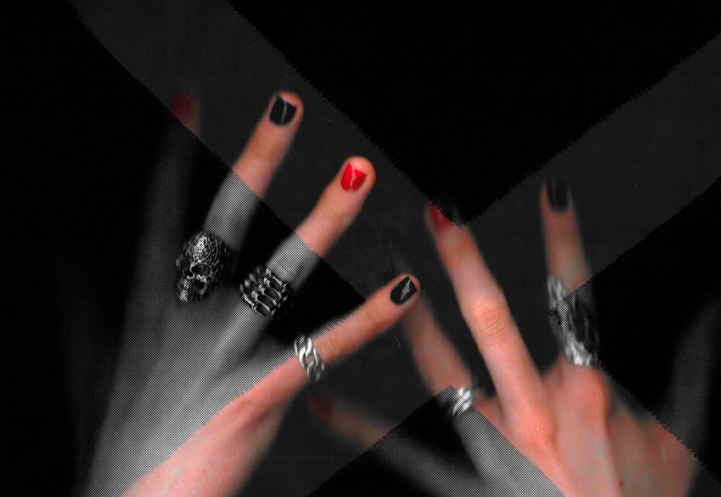
Experimenting with colour: I think the colour palette I chose for the event was really strong and needed to be more visible in the designs than just on the nails. I experimented with where I put the colour, in the background or on the hands. Blending modes on Photoshop and Procreate were key in exploring different ways of presenting the colours. With the colour the scans are so much more visually interesting and unique. They really stand out from the other designs in this field. In some cases the colour does distract from the nail polish but I don’t think this is necessarily an issue because the visual style is meant to contrast the classic cleanly photographed aesthetic. The combination of textures, rips and colours is looking really nice and definitely something I will take into my poster designs.

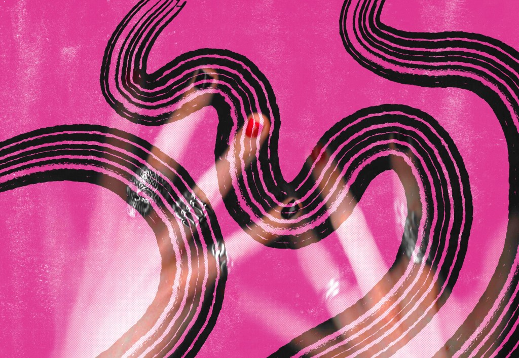
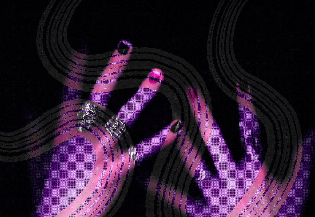
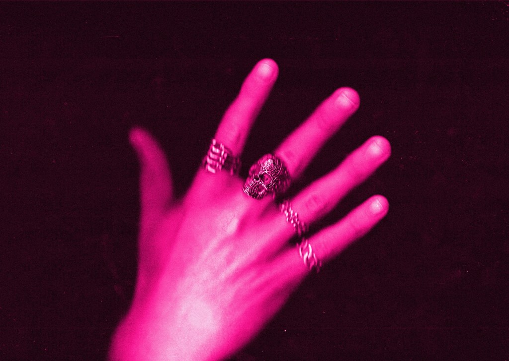

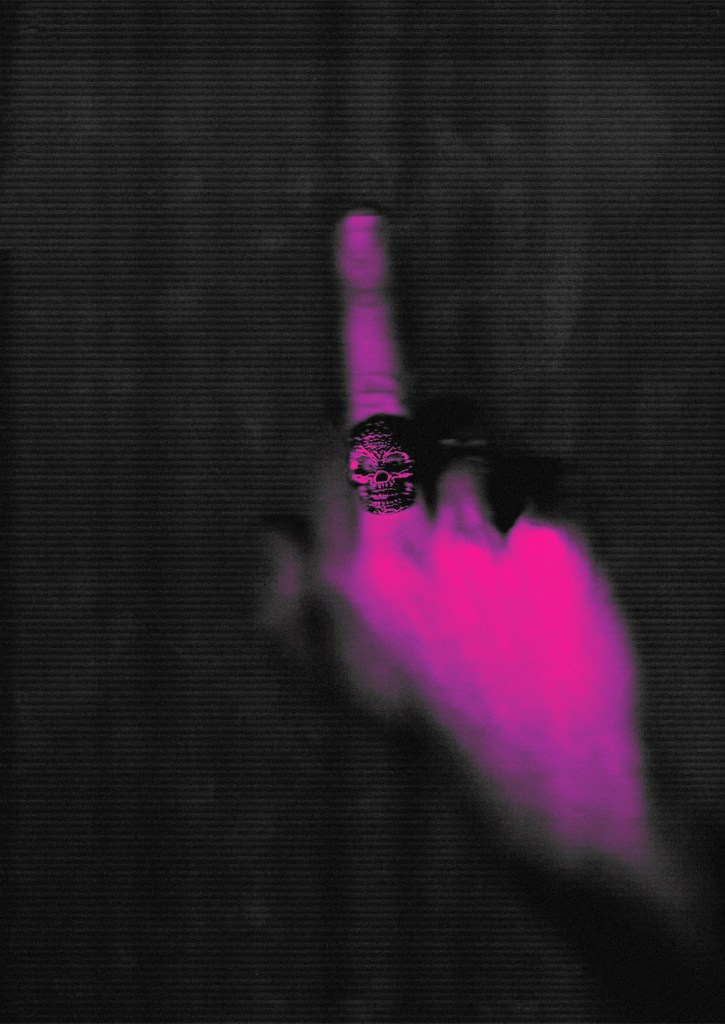
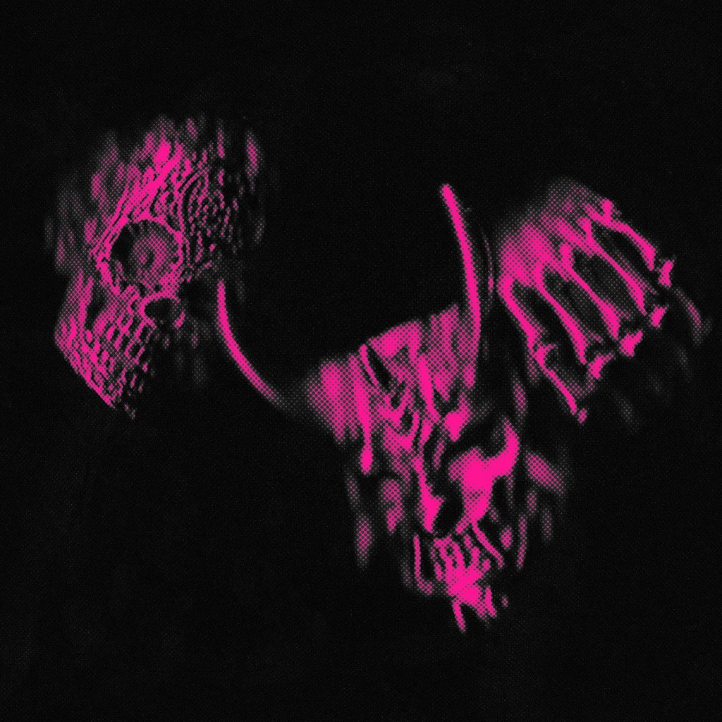
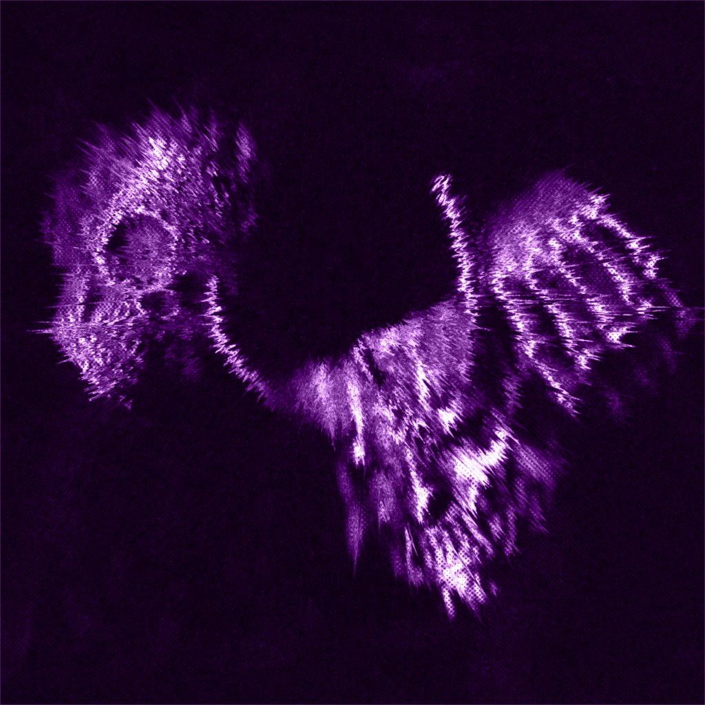
Adding extra details: For these ones I took a couple edited scans and added in some of my hand drawn sketches, prints and jewellery textures. I inverted them to make them all white. These help to add another level of interest and meaning to the designs. I like how layered the visual identity is becoming but I don’t think I’ll use these extra details on all my designs. I think some images are strong enough with just the scans and colours and the extra bits will make them too busy.


Reflection: I’m really happy all the different ways I’ve experimented with editing the scans. I think my work is starting to reflect the unique visual identity I was aiming for with the textures, colours and extra details such as the sketches. It is distinctly different from any other nail polish advertising I found during my social media research. I also this is starting to successfully blend the dark, moody aesthetic of Hotel Diablo with the styles of UN DN. I will be taking these ideas into my posters designs.