Sketches (hand drawn): through my research I found that the Hotel Diablo cd has motifs and sketches to depict different songs. Also UN DN occasionally use little sketches to overlay their photos. I wanted to develop on this ideas and have an important part of my visual identity by hand drawn sketches. I approached these sketches in a similar way to the typography. I wanted loose quick sketches that feel natural and unrefined. I wanted lots of sharp lines and crosses to make up the details. I also used the same black markers to get the same line quality and weight. I made a list of symbols are objects that represent the album, brand and overall aesthetic I wanted to achieve. All my sketches are below, some things included are: nail polish bottles, hands, skulls, cherries, safety pins, keys, dice, flowers and barbed wire. Below I will give a brief explanation as to why I chose certain things to illustrate.
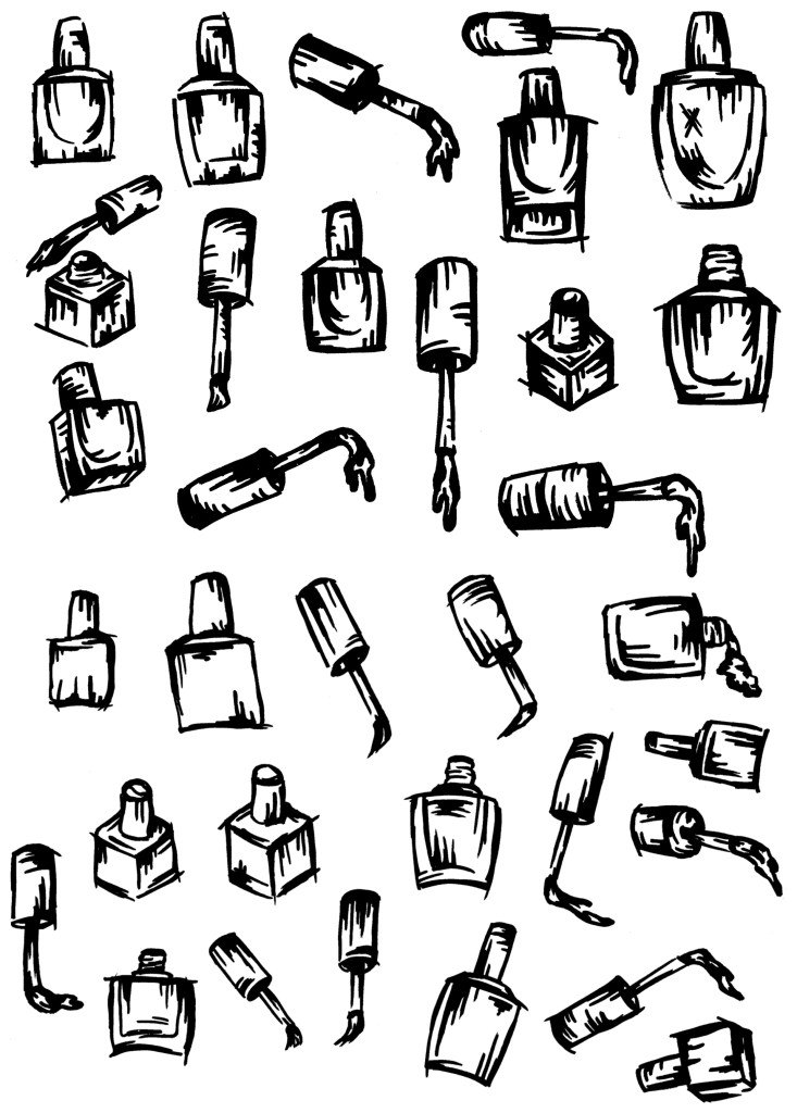
Nail polish bottles: these are simply to act as a literal depiction of the product to connect UN DN to this style that they haven’t previously explored much. I want to balance out the 2 aesthetics and this style of sketches leans more towards the Hotel Diablo side so I want to make sure the connection to UN DN isn’t lost.
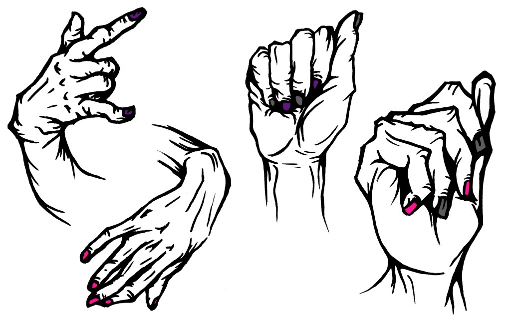
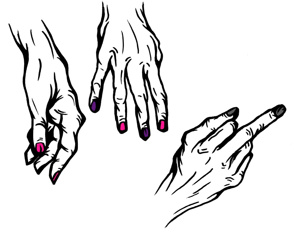
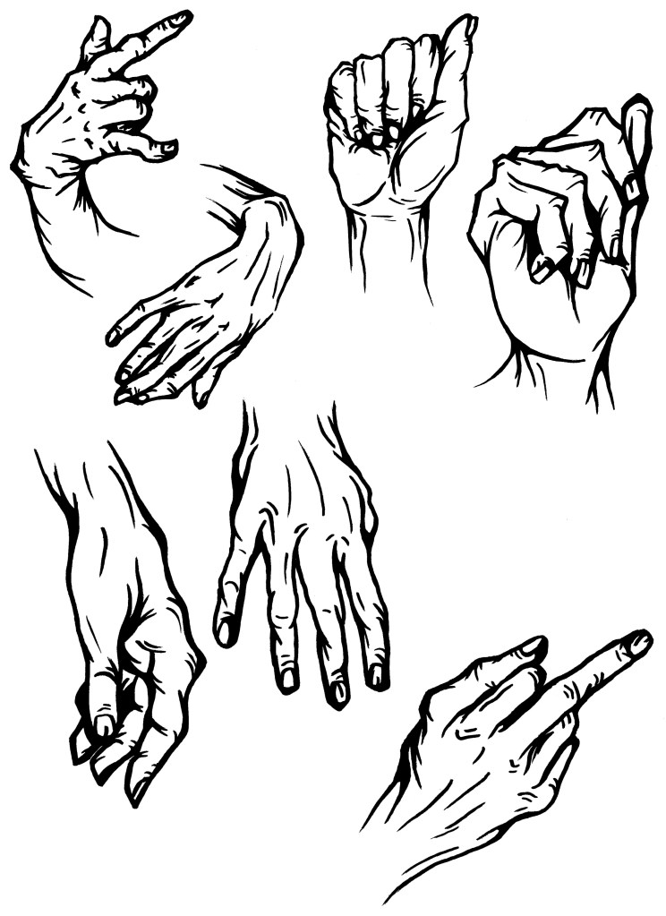
Hands: hands are obviously an essential part of advertising any nail polish brand so I wanted to bring this into my sketches. I went with stylised hands inspired by the Hotel Diablo graphic novel. On some I expedited with digitally adding the event colour palette to the nails, bringing this element of the visual identity back into the sketches which are otherwise all black.
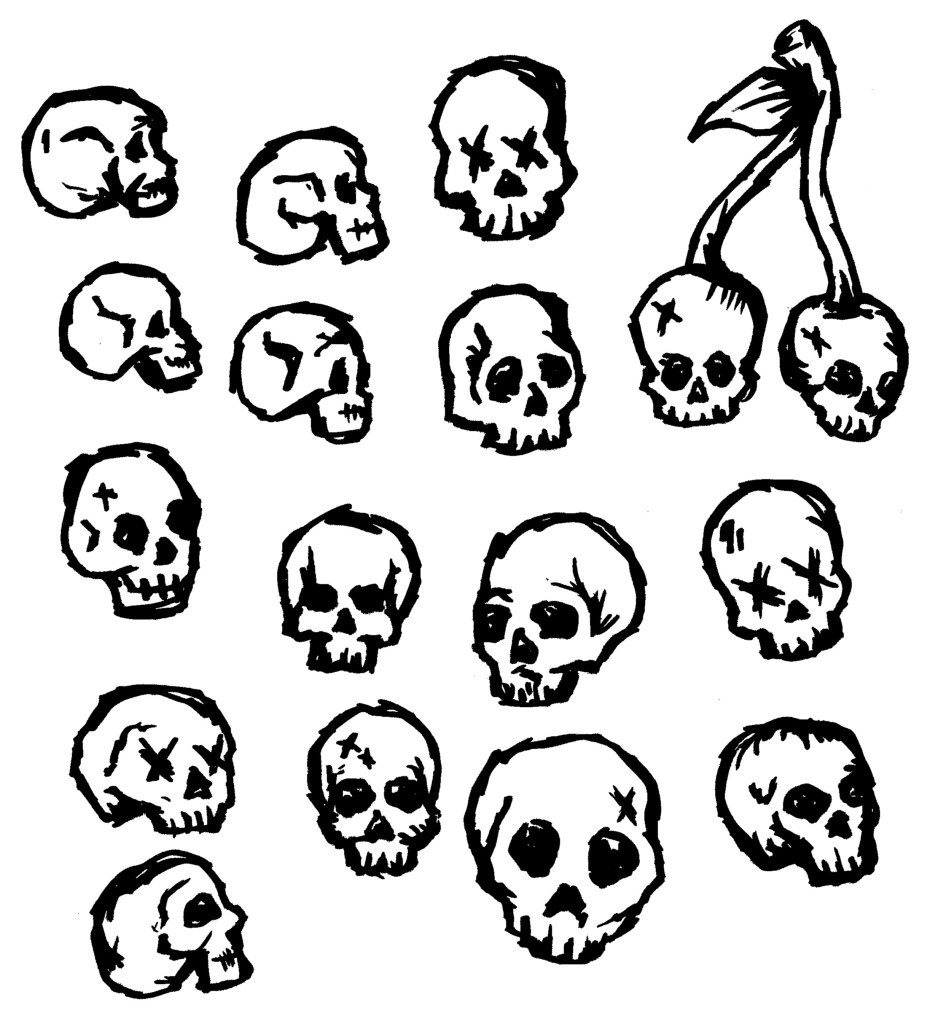
Skulls: skulls have been used a little bit in UN DNs advertising and Hotel Diablo’s album art. They’re also just something I enjoy sketching and wanted to include it as I think it works with the dark, grunge you aesthetic that I want to incorporate.
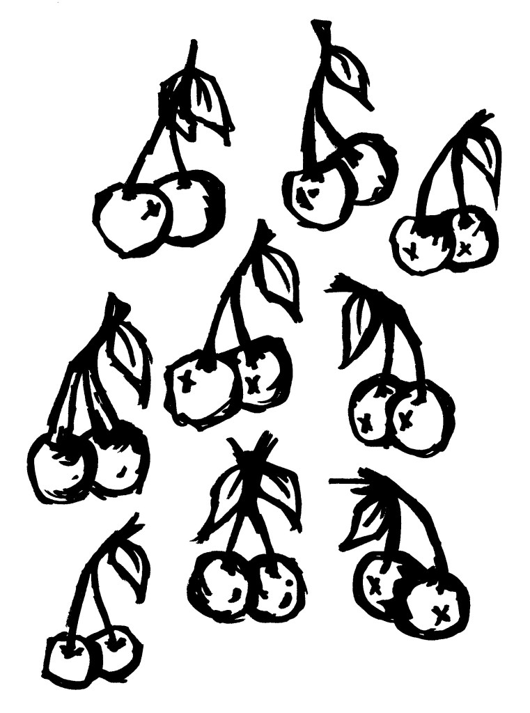
Cherries: cherries are a fun symbol and bring a more colourful energy which can help balance out some of the darker symbol such as the skulls and barbed wire. Also they are sometimes used to represent sex or femininity.
Safety pins: these are an iconic Punk symbol. These have become linked with rock and emo culture so link with the style of music seen on the album and will be a familiar symbol to MGK’s audience. Also Camden, the location of the event, has lots of historical connection to the Punk movement so these sketches are a reference to that.

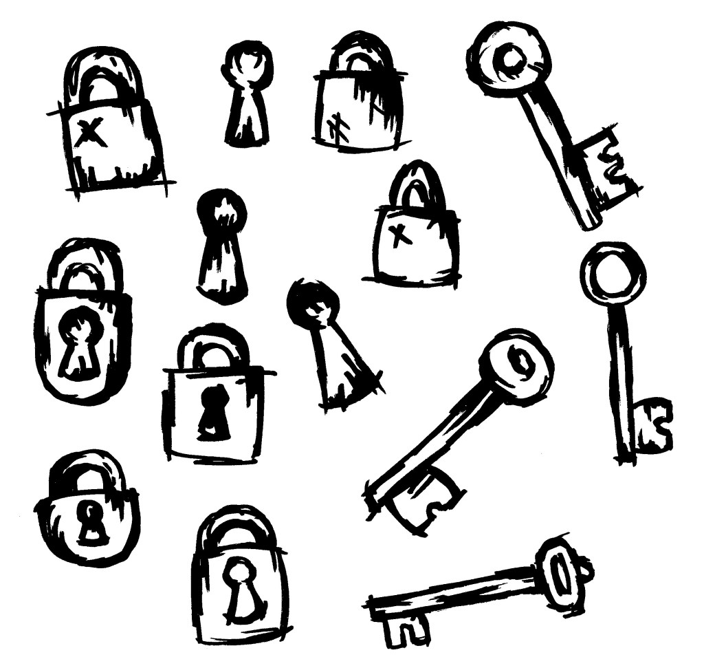
Locks and keys: these have a literal connection to the imagery seen in the Hotel Diablo comic. They also have a more metaphorical meaning. The album is very introspective and is about MGK essentially opening his mind to his audience, so these are a good way to symbolise that.
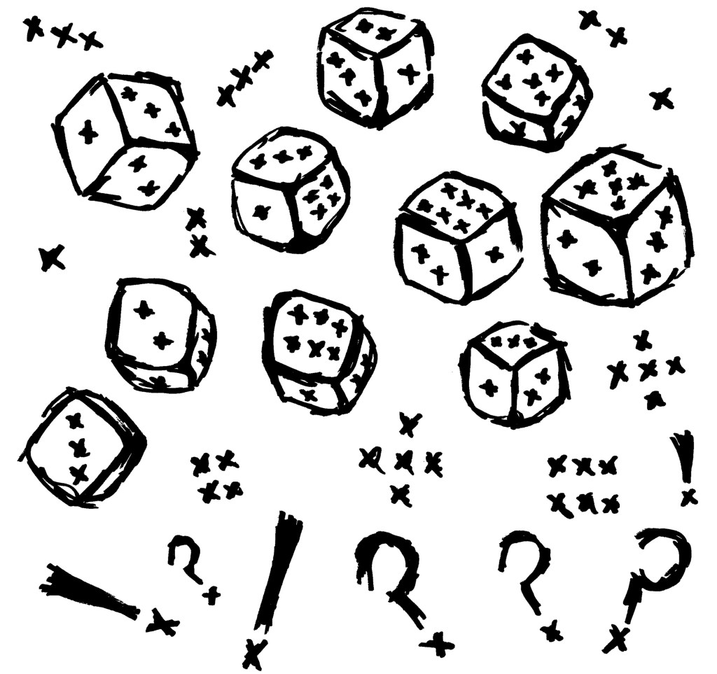
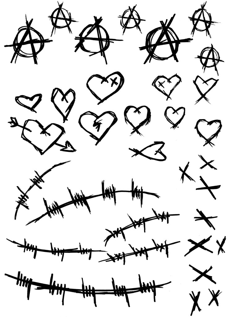
Dice and punctuation: the punctuation is a way of expressing the emotions seen throughout the album. The dice are specifically linked to the song ‘Roulette’ and the lyric on ‘el Diablo’ that says ‘I shoot dice, yeah, gamble with my life, yeah’. I wanted to include some sketches that are nods to specific songs that only fans would understand the meaning behind.
Flowers: flowers have been used a lot in the advertising of UN DN’s collection with JXDN called Metamorphosis. I really liked the aesthetic of this collection and wanted to carry some of that into my work. Flowers bring life to an image and help keep a positivity to the visual identity.

Chains and female bodies: MGK wears a lot of jewellery, that’s part of his brand image. Also it a common thin within rock and rap culture so will link to the clothing that the target audience would wear. The female bodies are inspired by some of the imagery seen on the inside of the Hotel Diablo cd. It’s also a reference to the sexual themes discussed on the album.

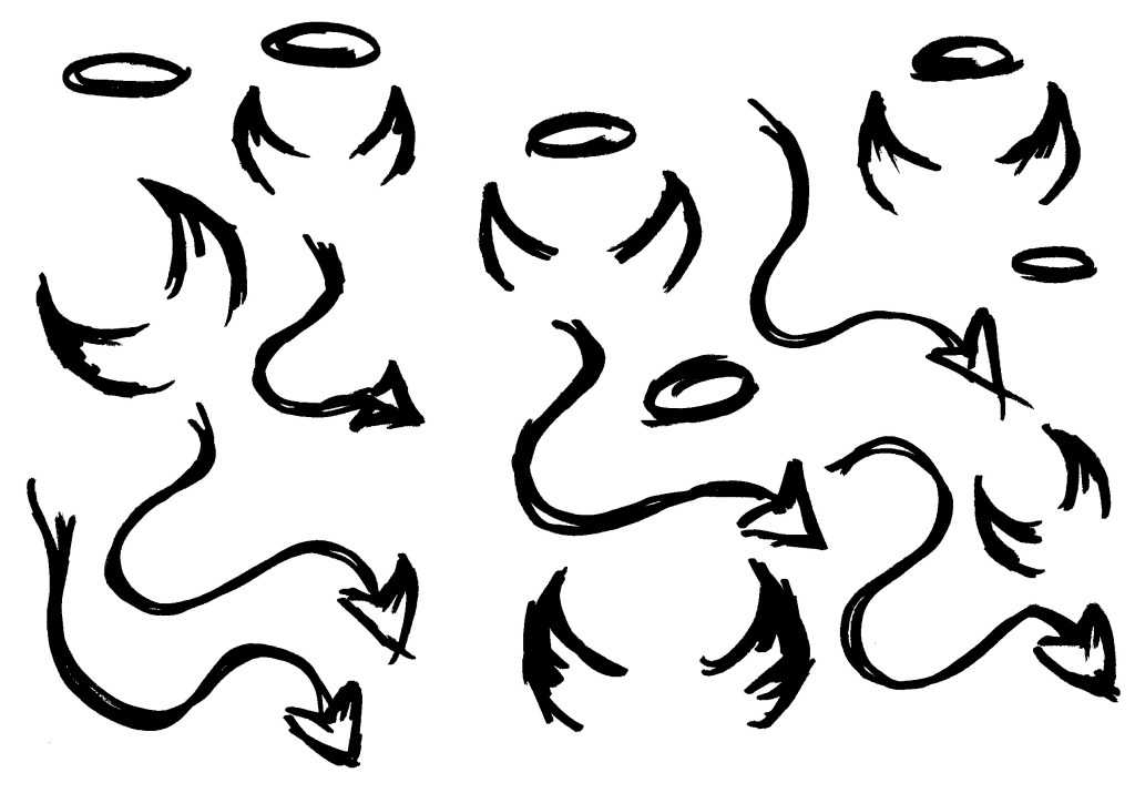
Devil and angles: these are a reference to the song ‘el Diablo’ and the themes of good vs evil snd right vs wrong, seen throughout the album. I think these could be used to overlay images to create an additional layer of meaning.
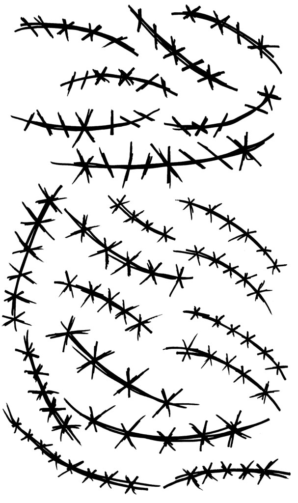
Stitching: stitching on a surface level is simply a cool symbol that could be used as a border of to decorate an image. It also has a more metaphorical meaning, symbolising repair and struggle, ideas central to the songs on Hotel Diablo.
Sketching from ‘Bloody Valentine’ project: these are the sketches I used in that project. For the most part they apply to my main project so I will be able to reuse them.
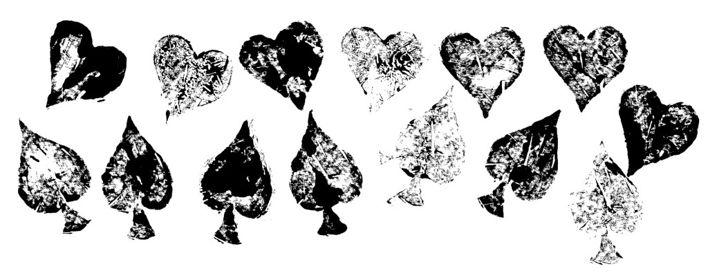
Printing: The lip and finger prints are from my work on ‘Bloody Valentine’ earlier in the module. The hearts and ace symbols are Lino prints that I made for my Digital Arts 2 project. I might use these visual assets in some of my designs as I feel they complete the other styles well. The symbols of lips, finger prints, hearts and aces all work seamlessly with the subjects of the hand drawn sketches.

Reflection: with my primary creative interest being illustration these were really enjoyable to created. I got to work with one of my favourite mediums in a style I really like. I like that these sketches have the same visual language as my typography, this will help to maintain a consistent and recognisable visual identity. These sketches do lean more towards the Hotel Diablo aesthetic but I will balance this out with the other imagery I create so that the nail polish part of the event isn’t overshadowed.
