Plan: below is a plan of what I wanted in the posters including what images, textures, overlays and information. The format I wanted for the poster was A4 but could be scaled up to A3 or A2. I chose this format as it’s a standard paper size so would be easy and cost effective to print. The poster were all made digitally but for the event I’d want some physically printed to go around Camden and the venue. To maximise the posters use I’d also share them on social media, particularly Instagram. Sharing them across multiple avenues of communication also helps increase engagement and awareness of the event.
Final posters: these are the 8 final poster designs. I created them with different intentions but they all maintain the same visual language in order to keep the identity of the event consistent.
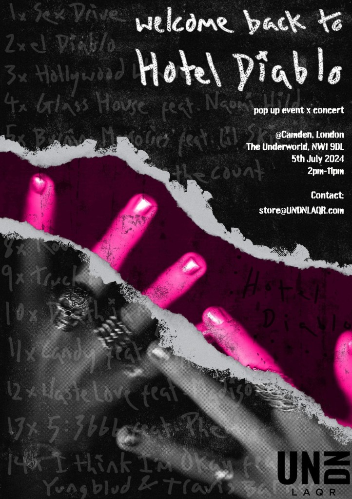
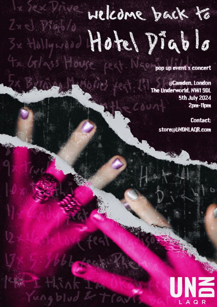
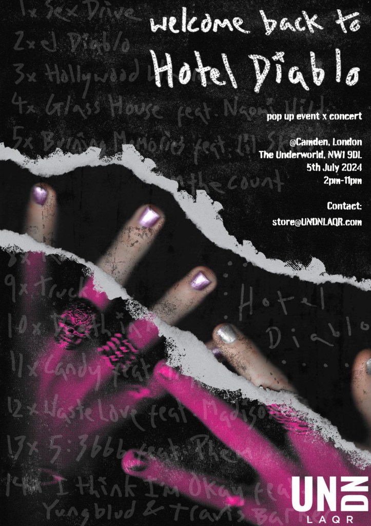
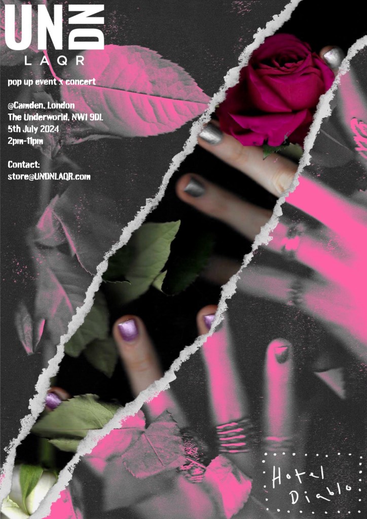
Ripped scan posters: the first 4 posters are all based around the ripped paper. This is an aesthetic I have been developing and really like how it highlights the nails, making them the centre of attention in the composition. The idea was inspired by vintage rock band posters and some of the more experimental nail polish advertising I saw on Pinterest. The intention for these posters are to be printed and put around Camden before the event but would also be shared on social media and the website.
The first 3 are variations of the same design, they just have the colour focused in different places. I think having different variations of the poster around Camden would be fun as people could try to find all the different ones. These posters have a dark, moody aesthetic heavily inspired by the Hotel Diablo aesthetic. The ripped paper allows for the nails to stand out, making sure the UN DN element of the event is not missed. The logo is visible in the bottom right. Some notable parts of the design is the track list written in my hand made typography running through the ripped paper. This is not too distracting but is a nice detail that fans of the album would be able to pick up on. Also the Hotel Diablo symbol is subtlety placed under the rip. The idea behind this is the paper is ripped to reveal the album and people’s expression and creatively through their nail design. Also the title of the event ‘Welcome back to Hotel Diablo’ is written in my typography and placed in the top right corner. The event details are written in an Adobe font called Burnaby that has a similar textured style to the rest of the poster.
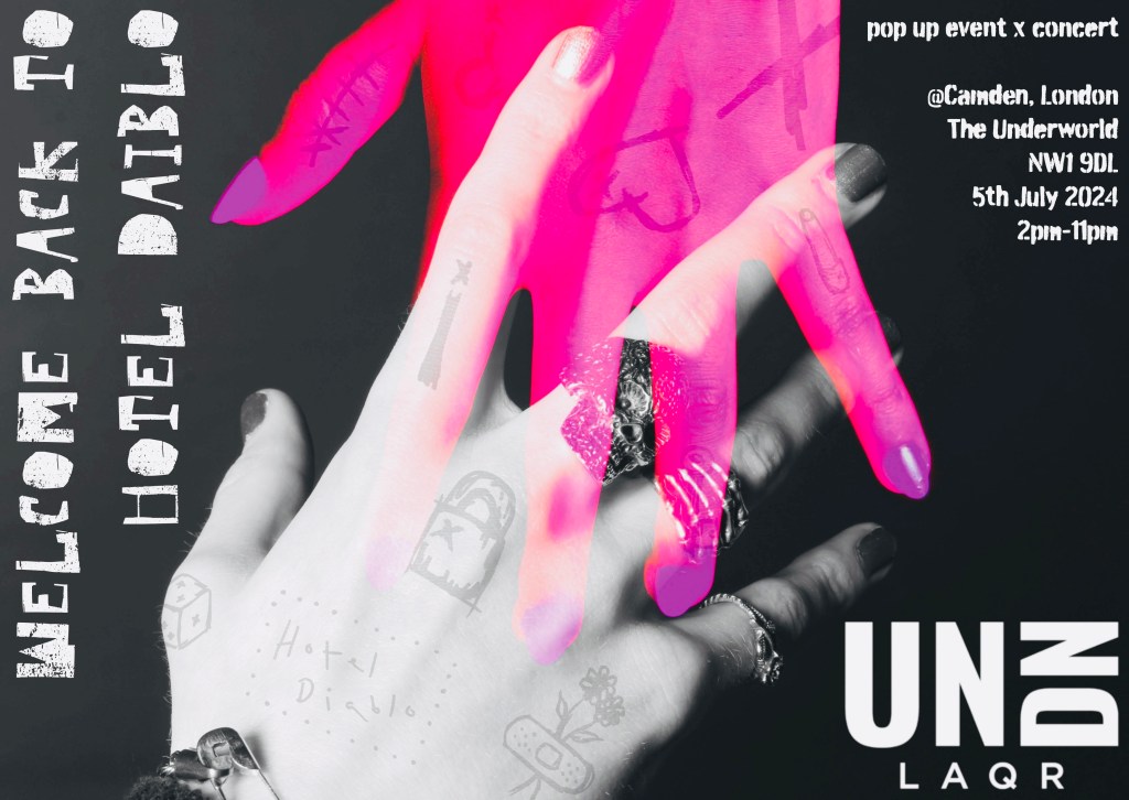
This poster had very similar ideas to the first 3 but use one of the scans with a rose. I wanted to bring the floral element into the posters. This poster has both the logos clearly on display in opposite corners. I removed the track list so this poster is less heavy on the Hotel Diablo side and more related to the overall aesthetic on the event.
Photographic posters: these 2 posters were made with photos I took in the studio rather than scans. They have a clearer aesthetic than the ripped paper ones so are more aimed towards the UN DN side of the event. The intention for these ones is that they’re used primarily on social media rather than printed. The key part of these is the striking pinks and purples. The colours are so bold that they would really stand out online compared to other advertising in this field.
The idea behind the first poster was the have a male and female hand interlocking to represent the unisex nature in UN DN. The pink hand really catches your eye in comparison to the rest of the greyscale image. I wanted to draw the viewers attention this way then get them to look at the subtle details on the hand. I put my sketches over the hands almost like tattoos. This is also where the Hotel Diablo logo is on this poster, because I wanted it to be subtle and thought this was a unique way to display it.
This is a different take on the ripped idea. Rather than ripped paper it’s more of a digital glitch style with the normal coloured fingers showing past the glitchy pink hands. This poster is all around very colourful as there are no bits in greyscale. I chose the place both the logos tighter in the top right corner to create a balance between the 2 sides of the event. In terms of added details this poster is the most simple. I made this decision as I feel the image and colours are so strong on their own, any other details would just be distracting.

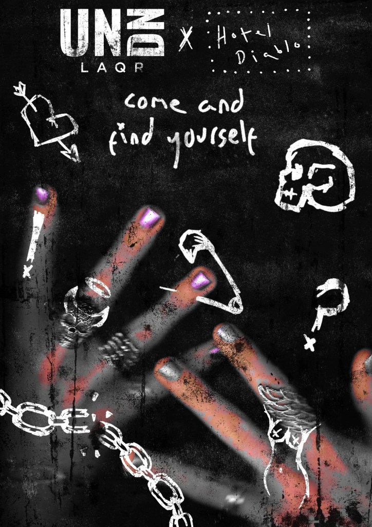
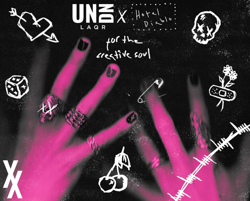
Decorative posters: these posters are intended to be placed inside the venue. They’re solely decorative, just displaying the aesthetic and visual identity of the event. This means they don’t have the event details on them. They have both logos at the top clearly showing it’s a collaboration event. The first one has ‘come and find yourself’ written on it. This is the first lyric on Hotel Diablo so it’s a reference fans will understand. The second poster says ‘for the creative soul’, a slogan used by UN DN. For the visual style I went for lots of gritty textures and covered in my sketches. The style is inspired by the posters I made for ‘Bloody Valentine’ with this collage/scrapbook aesthetic.
Reflection: Overall I’m really pleased with the set of posters I’ve created. They are varied visually to align with the intention but all fit one solid visual identity. The typography, colours, logos are consistent throughout. Added details such a textures and sketches are used on some. I think these posters appeal to the audience well and really stand out in comparison to the other nail polish advertising that is currently being seen.
