Stop Motion studio: I also booked myself into the stop motion studio to get some other shots . Stop Motion is a technique I’ve been working with in Digital Arts 2 so I, familiar and comfortable with the equipment and the technical process. I wanted to explore taking photos here is because it’s easier finely adjust the lighting and get really clear close ups of the nail polish. Also I wanted to have some stop motion sequences in my video as this is a growing trend in advertising and is a]something that I haven’t seen used in the nail polish world.
Coloured background close ups: The colours in these shots are really powerful. I bought paper to match each colour in the Hotel Diablo palette and the results are really striking. When using Dragon Frame to shoot in the stop Motion studio there’s an easy way to set the focus on one area and have the rest unfocused. This allowed me to get these nice shots of the nail polish spilt out over the paper. It shows the lovely shiny, metallic texture and shine that it has.

I’m really happy with these short, looping stop motion sequences that I shot with Dragon Frame and edited on Procreate. I wanted a jumpy animation so I shot it at a low frame rate. This helps show that it is stop motion rather than a typical nail polish video that would be seen on social media. I like the coordination between the backgrounds, nails and bottles. They make for really eye catching sequences. The addition of my hand drawn sketches adds another layer to the composition and helps to tie the visual identity together.


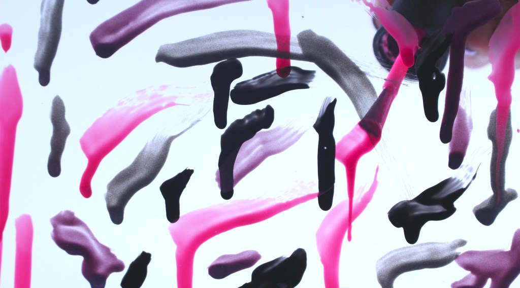
Paint drips: this is one of my favourite sequences that I shot. To achieve the shot I painted nail polish onto a glass sheet that I positioned close up to the camera. The photo is a picture from ten process of me layering up the nail polish. I like the abstractness of the stop motion sequence as it promotes the product but in a unique way. You still get the textural quality of the nail polish without actually showing it in a bottle or of someone nail. It also clearly focuses on the colour palette that will be used at the event.

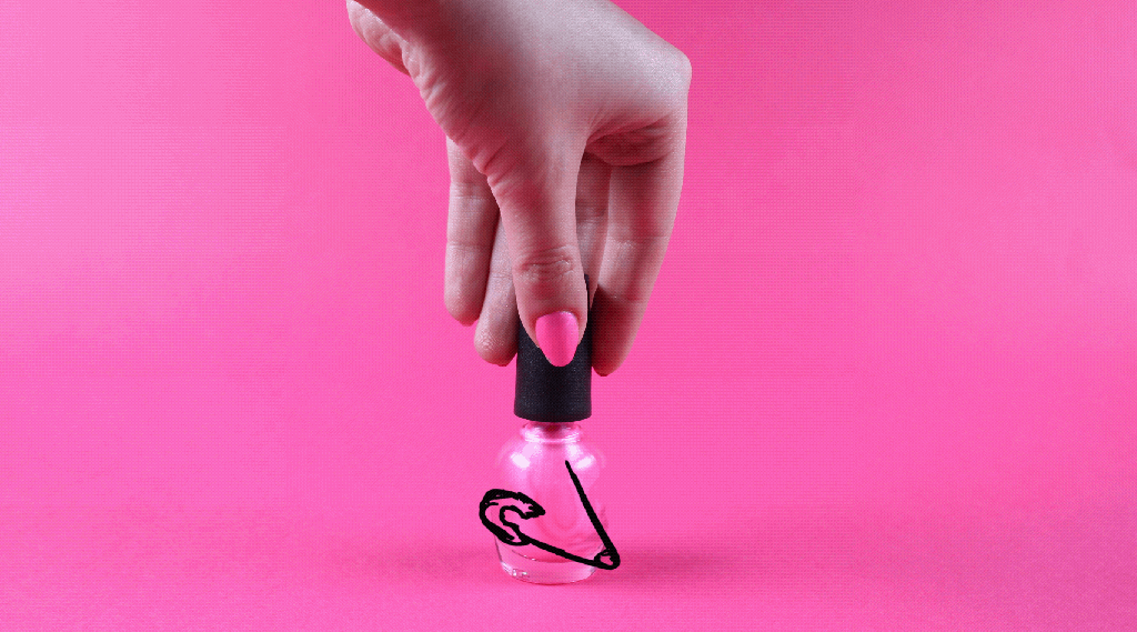
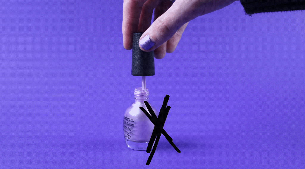
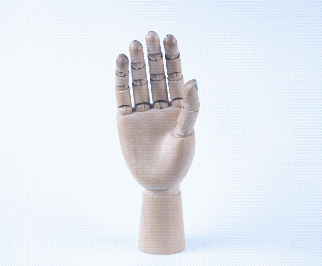
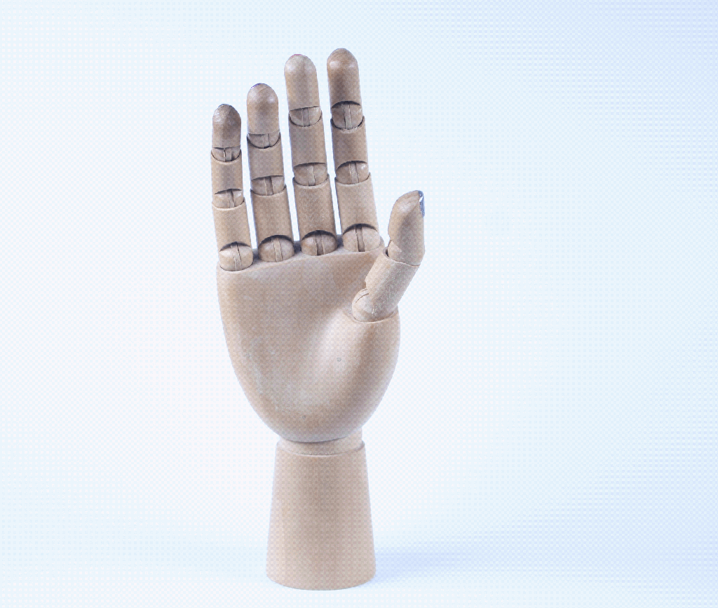
Art hand models: I painted the art hand models nails with the Hotel Diablo palette. This is an object familiar to most creative people so aligns with the creative identity that UN DN has. I wanted a smooth stop motion look for these so shot it at a higher frame rate and moved it in small increments. I think these sequences are fun and contrast the typical clean cut style of nail polish promotion. It’s a slightly different way of showing nail polish being used, it goes against the expected image of a person with painted nails.
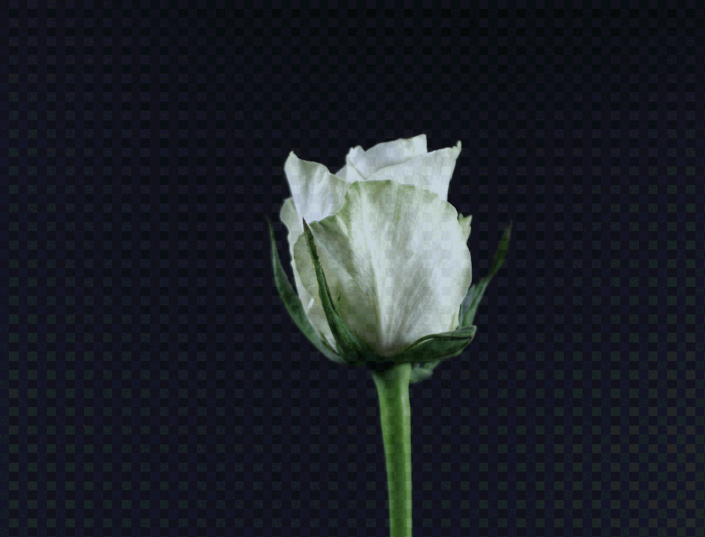
Flower: flowers have become an important subject in my sketches and photography. This sequence is a reference back to the Metamorphosis collection made by UN DN. The video show the petals of the flower falling of and then coming back which loops in a continuous cycle . At the moment the sequence does really show the visual identity I’m aiming for so if I do use it in my final pieces I will need to do some editing.
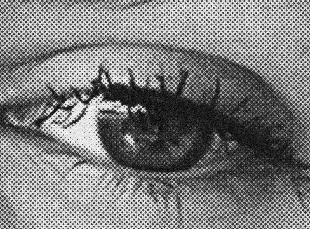
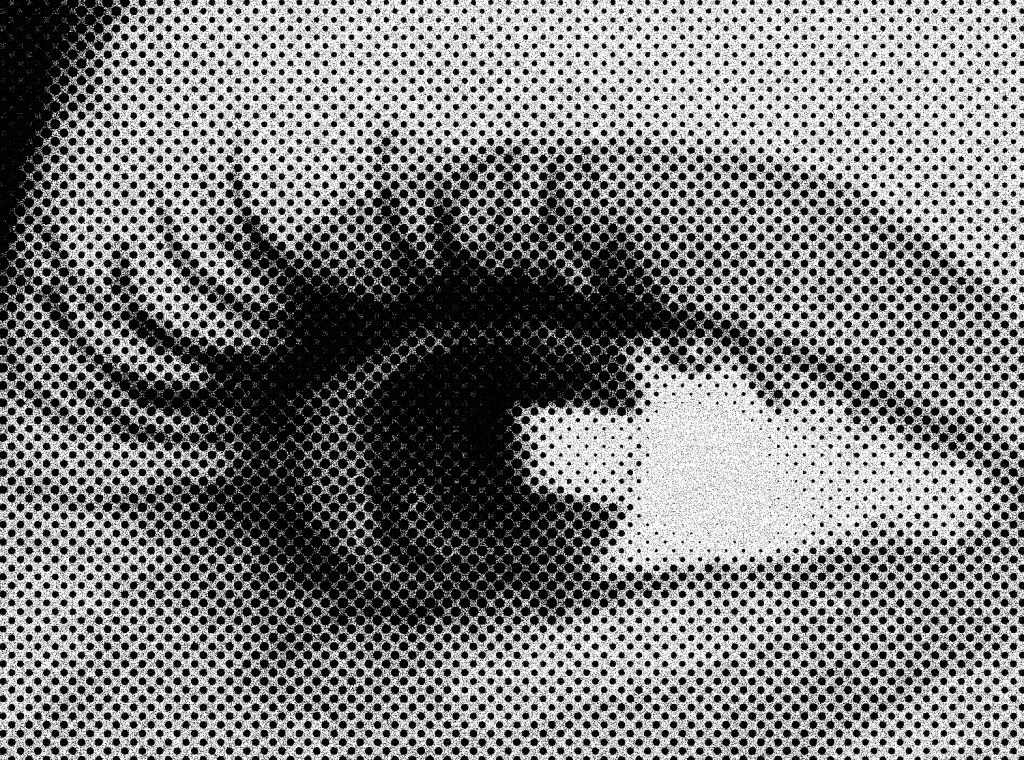
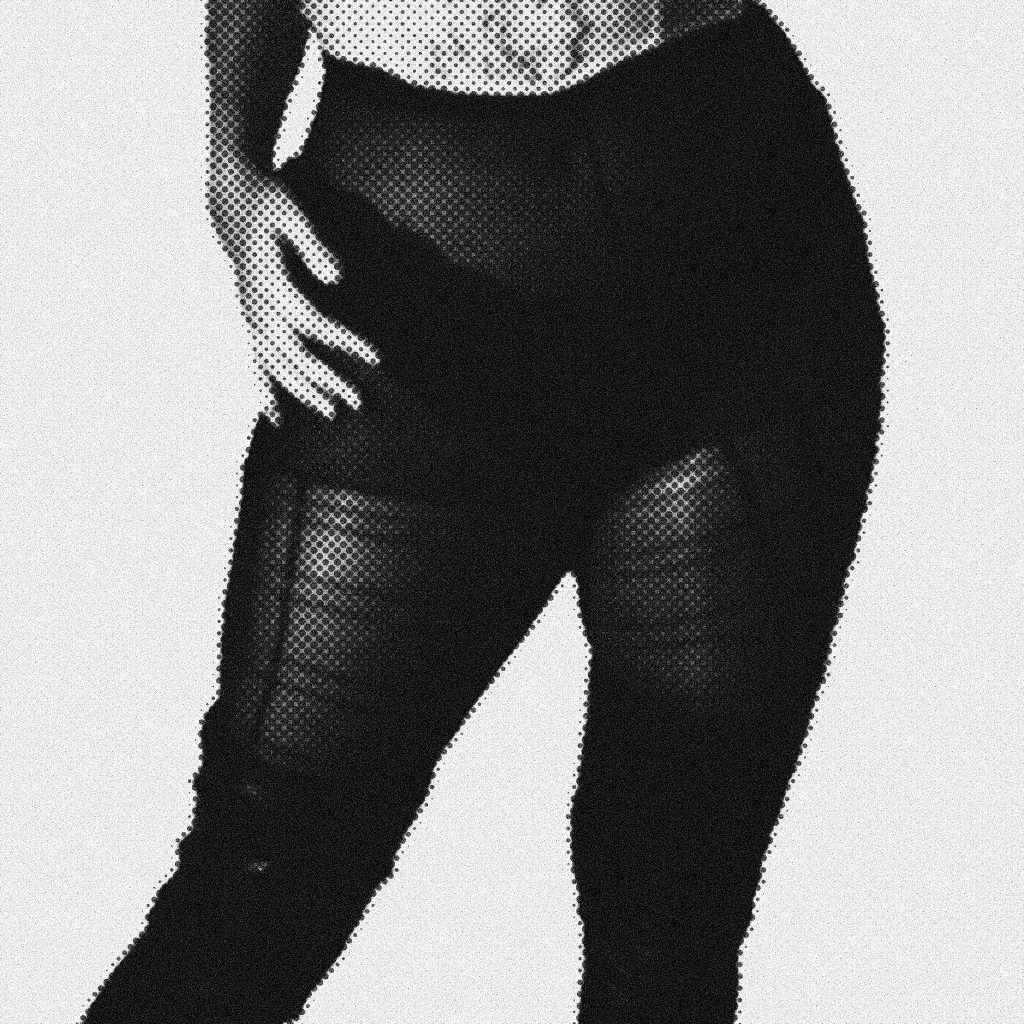
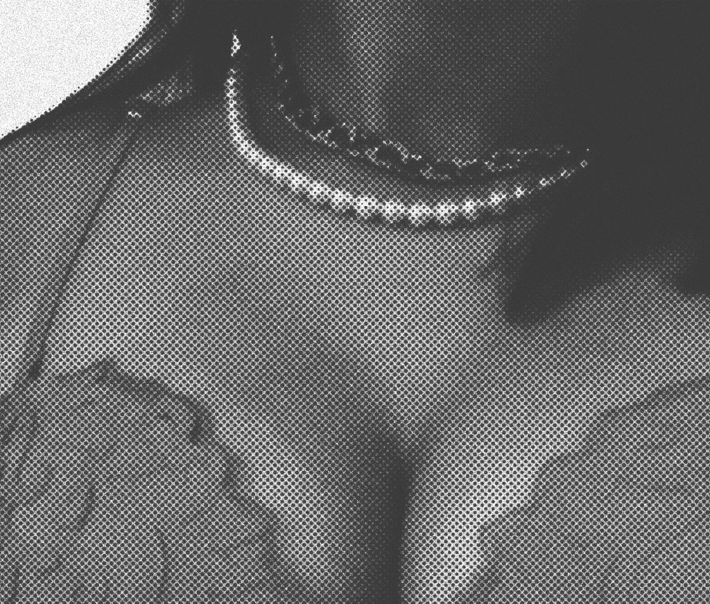
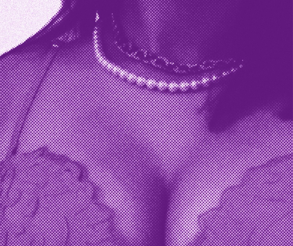
Halftone Images: these are a series of close up images focusing on eyes and the female body . These are subject that I’ve been exploring in my other photography and sketches. I experimented with different halftone patterns, grains, textures, colours and blend modes to see what effects I got get. I’m really pleased with the results and think they have a nice vintage style that is similar to comic book and classic band posters.


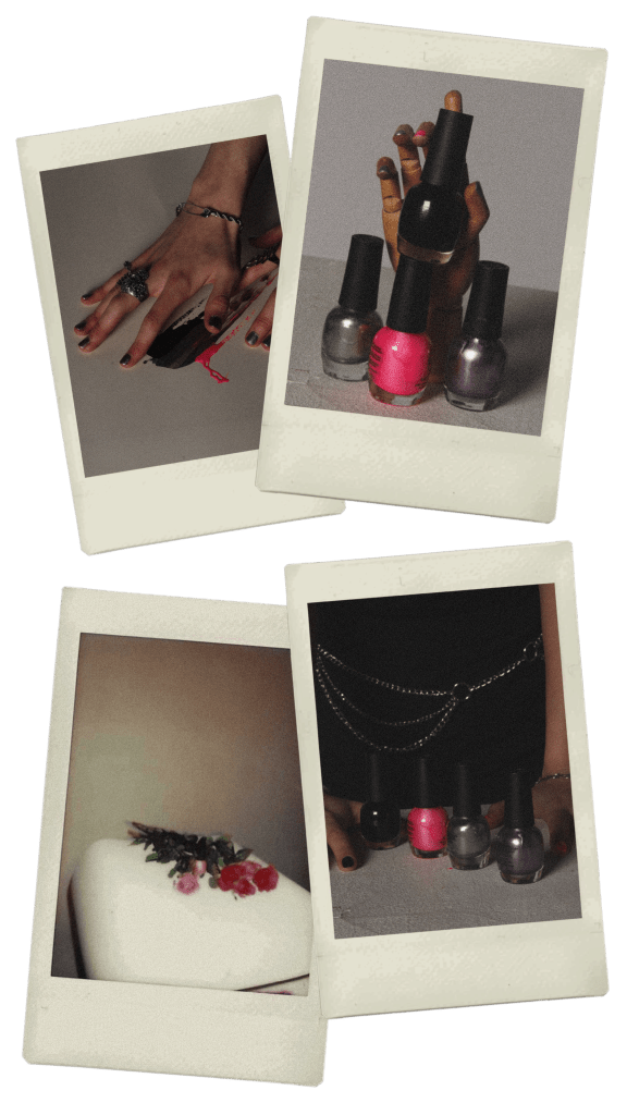
Polaroids: I took some Polaroid pictures during my session in the studio and digitally edited some of my normal photos onto Polaroids. I really like the vintage aesthetic of Polaroids and is something that UN DN have explored abut so I wanted to develop that. Also one of the parts of the pop up event will be a photo wall where people can take pictures will Polaroids and stick theirs up.