Plan: For the interactive design part of this project I chose to create a website mockup on Figma. I wanted to make a website rather than an app as it feels more relevant to a one off nail polish and convert event. Also it can simply be a separate tab of UN DNs existing website. Below is an initial plan of some ideas for my interactive website:

I then hand drew a simple plan for the design of the website. The plan consists of a 4 page layout, a home page, a welcome page, an about page and a details page. Below are notes about what visuals I’ll use and where they’ll go, details about the interactive transitions and more.

Digital mockup: after making the plan on paper I used Procreate to make a digital version, adding in the images and colours. This was a very basic plan which I made lots of changes to but I think it was a helpful step in making me visualise how it could look.

Figma wireframes: then I started working on Figma. I hadn’t used Figma before this project so it was a good opportunity to learn a new design tool. Earlier in the module I watched some tutorials so I had a basic understanding and found it relatively simple to use. Wireframes are used as placeholders to mark out where you want different elements to go. Once I was happy with the wireframes I started working over the top, adding in my images and text.

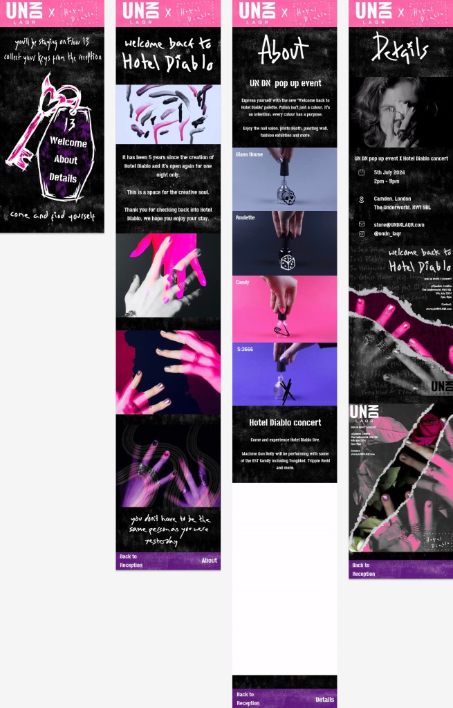
Final Figma design: these are the final versions of all 4 pages. I wanted to keep the visual identity really consistent with the video and posters. The colour scheme, textures and typography are the same. A lot of the images that are here are also used in the posters or video. The idea behind the website takes a lot of inspiration from the format of a hotel to immerse viewers in the world of Hotel Diablo. The language used across the pages push this concept. Across the other pages I have used a mixture of photos and animated GIFs. These just makes them experience of exploring the website more engaging because the visual media is varied. The main colour on the pages is black with white textures and has the pop of pink and purple at the top and bottom. This distribution of colour is similar to the video.
Home page: On the top of the home page it references ‘Floor 13’ which is a song on the album. Throughout the design I refer to the home page as the reception as if it was a hotel. The menu is on a key chain so they navigate through the page like they’re walking through Hotel Diablo. At the bottom it says ‘come and find yourself’, the first lyric on the album which is included in the posters and video too.
Welcome back to Hotel Diablo: this page is titled with the event name and introduced what the event is about. I chose the dripping nail polish GIF to be the first image they seen because it a unique and abstract image but also immediately gets across the product and colour palette. Then there are a series of edited images of hands showing the aesthetic of the event.
About: this page explains the 2 parts of the event, the UN DN pop up and the Hotel Diablo concert. I explain both parts are used animated GIFs to represent them. I gave each of the nail polish bottles a name from a song on the album and a way to connect both parts of the event. I think this is a cool way of naming them and is similar to the style of names that UN DN use. When explaining about the concert I say Yungblud and Trippie Redd will also be performing with MGK. They’re frequent collaborators and are features on Hotel Diablo so are relevant guests who will be popular with the target audience. Also I say ‘EST’ which is the name of MGKs fanbase. It stands for ‘every stands together’ and I included it as a subtle detail that fans would appreciate.
Details: this final page includes all the sensations information about the event. This page has 2 of the poster designs at the bottom. I wanted to connect the static and interactive designs. I would have the posters displayed change every couple of days so it stays exiting different for any viewer that came back to look at the details again.

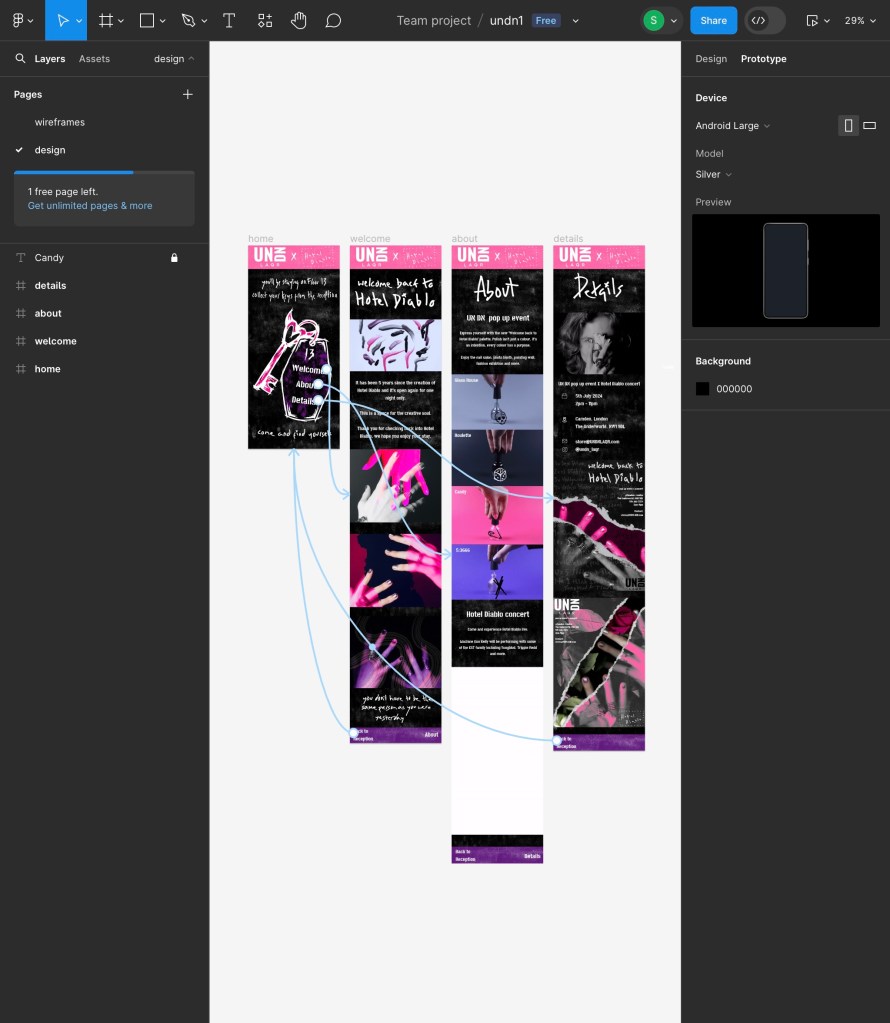
Prototype tab: this is a screenshot of the prototype tab my Figma document. This is where you make the interactions that allow viewers to move from one page to another. I kept mine fairly simple with the 3 buttons on the home page that take you to each of the corresponding pages. Then on each of the 3 pages there is a button to go back to the home page and a button to move onto the next page. This way they can just go from page to page or come back to the home page and use the key each time. I set slow transitions so that the viewer get more of a sense of where they’re going. The animation style I chose is a slide up to simulate an elevator that’s going up. This is another way to push the hotel concept of the website.

Final version with audio: I want there to be music playing the whole time while the viewer is on the website. I was unable to do this in Figma so this is a screen recording of me going between the pages with the Floor 13 instrumental playing. I chose this song as its one of the songs of the album and is where I say the viewer will be going in the first line of the home page. Also it’s another way to promote the music for the concert. The reason it’s only the instrumental version is that I think with the lyrics it would be too distracting but the instrumental just adds a cool touch to tie the whole concept together.
Full Floor 13 instrumental:
Reflection: I learnt a lot through creating this interactive website. I learnt how to use Figma and about the fundamentals of designing a website. I’m very happy with how the final design came out. It successfully carries that visual identity from the posters and video. I think through the visuals, translations and audio I was able to create an immersive website that takes the viewer into the world on Hotel Diablo and the event.