I continued to develop my ideas for the projects typography. I decided to have the main, recognisable typefaces for the advertising to be in a rough, loose, hand written style. This is key to the visual identity of my event and will be seen across the static, sequential and interactive pieces. As I mentioned previously this is a stylised version of my handwriting, created with black markers. I chose to do them all in black for convenience and will digitally a,tee the colours if necessary. I experimented with the idea of writing out an alphabet in this style and constructing the text from that. I felt that this would make it too rigid and wouldn’t have the authentic and personal style that I was aiming for. The inspirations for this style was to try combine the typography used by both UN DN and Hotel Diablo to find a balance. It has the careless style of Hotel Diablo combined with the thick, bold line weight used by UN DN. More about this typography style can be found in my post about the event details and my work on ‘Bloody Valentine’.
Logo:
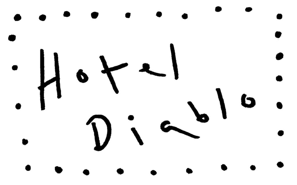
Hotel Diablo tracklist:

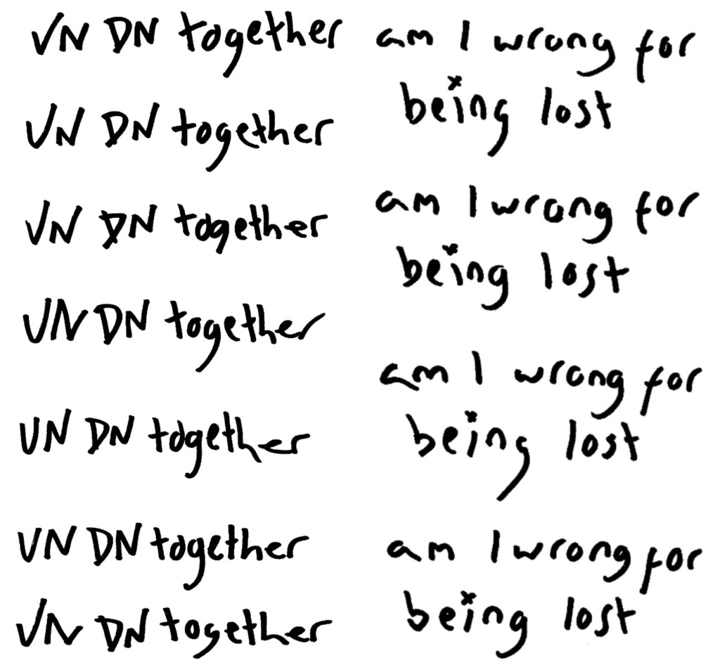
Hotel Diablo lyrics and UN DN slogans:
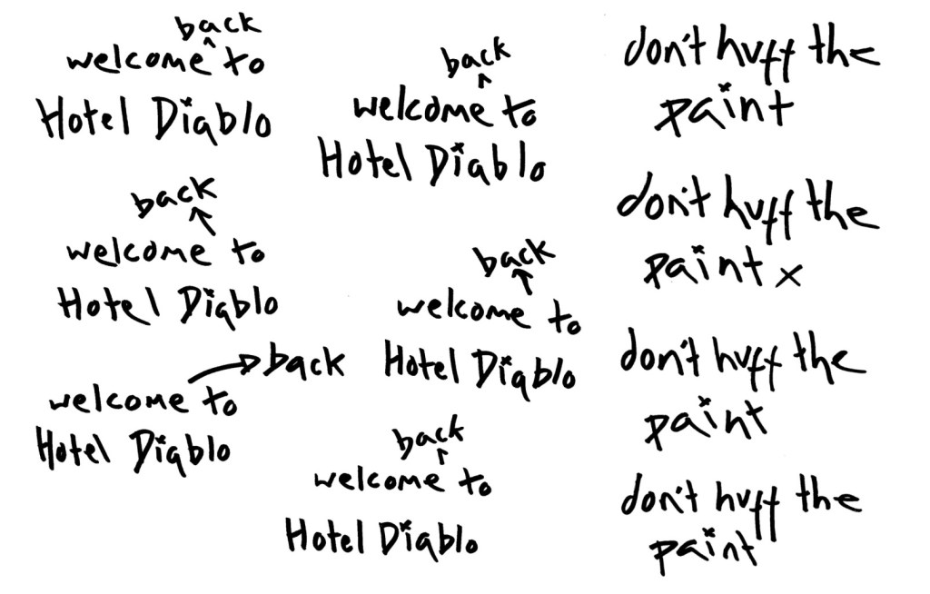
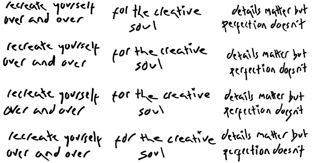
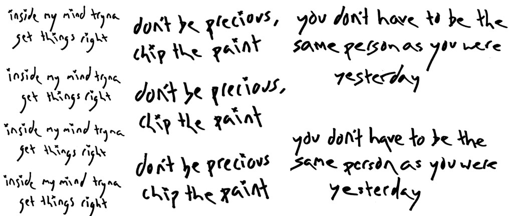
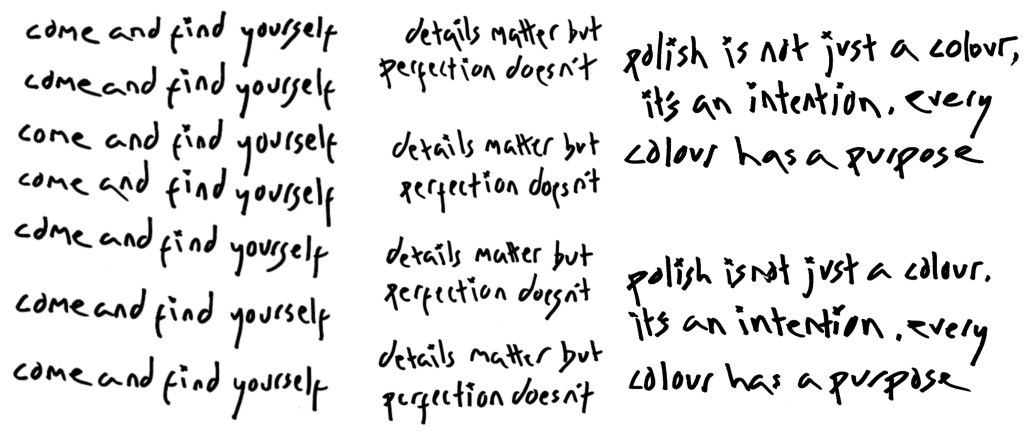
Reflection: I’m really happy with this typographic choice. While it was a more time consuming process than just using a digital typeface such as one available with Adobe, I think it was worth the extra time. I now have a unique typeface that will make my visual identity stand out from other nail polish companies or similar events. I did multiple versions of each word or phrase so that I had variation and options. Also I would like to try and create a similar stop motion effect that the Young V&A use in their visual identity.
