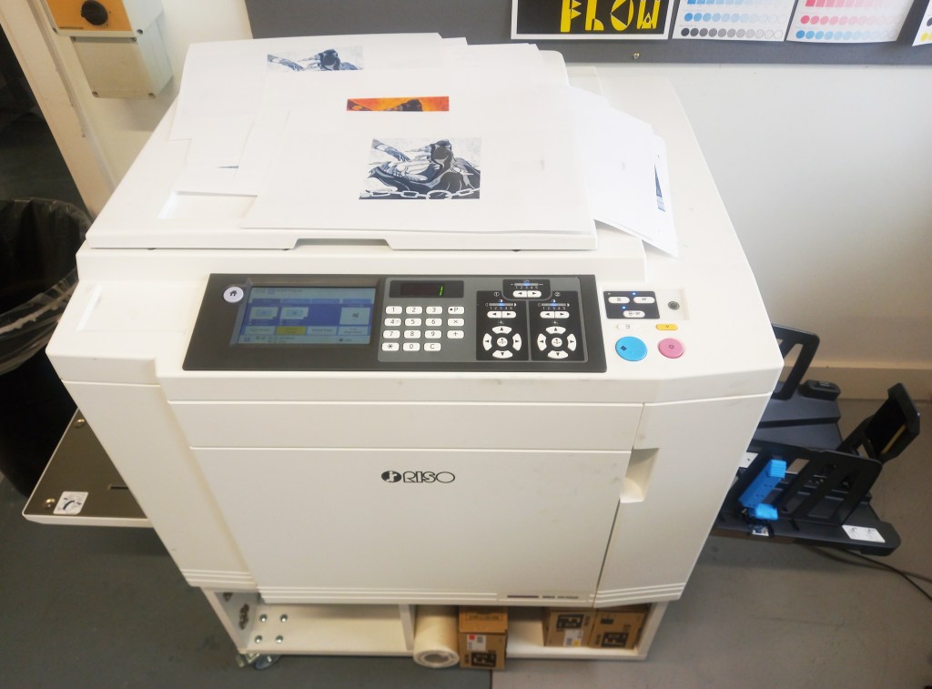
Photos from printing studio session: I booked a day in the printing studio to create my Riso prints. Before the session I prepared all the colour separations I needed as greyscale PDFs. Due to time constraints I chose only 2 illustrations to print, ‘Binding of Fenrir’ and ‘Ragnarok’.

Binding of Fenrir: I chose to do this one as it’s in the middle on the timeline of myths that I illustrated and it’s one of my personal favourites. I really like the striking colour palette with the intense orange mixed with the cool blues. I wanted to experiment with these colours further by using different combinations of inks. Below is a selection of my prints with different colour variations:
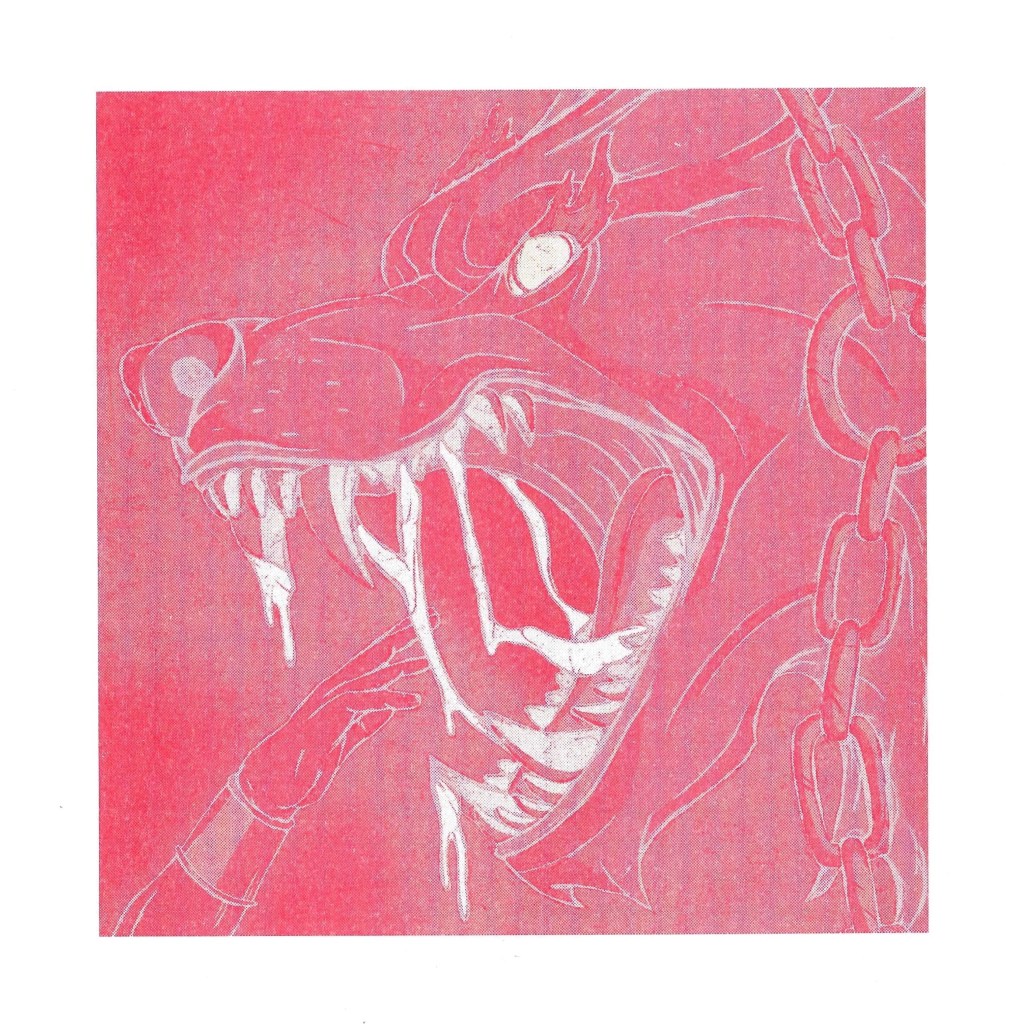
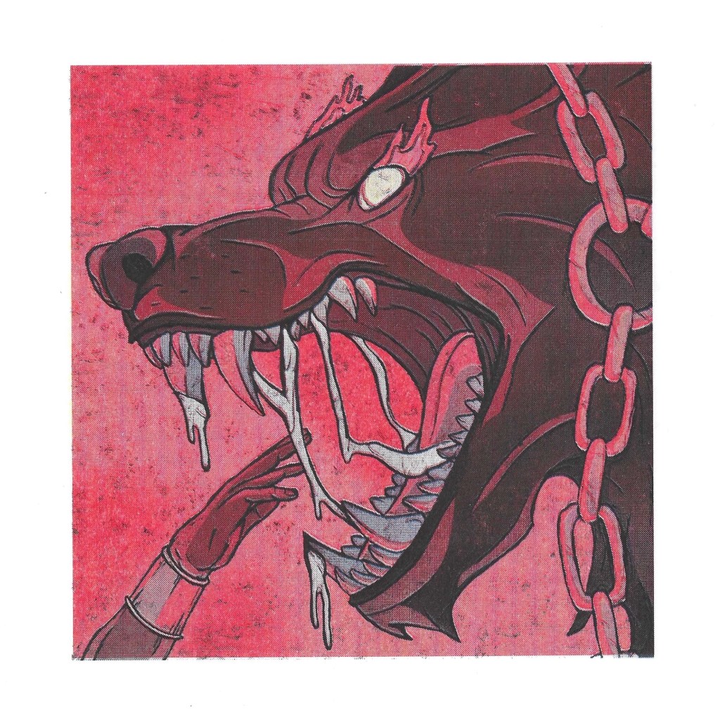
Red: with Riso printing you have to print one colour at a time and then layer the next colour over the top, making sure that the registration is correct. This is an example of a print with only 1 colour profile.
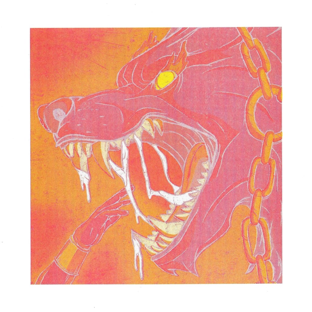
Red and yellow: here I put a yellow layer over on top of a red print. This is where it starts becoming interesting. This image has even more intensity than the original as it has the strength of the warm tones while removing the cold side of the palette. I think this is an interesting variation of the image but I think without the darker elements you don’t get the strong contrast that the original has.
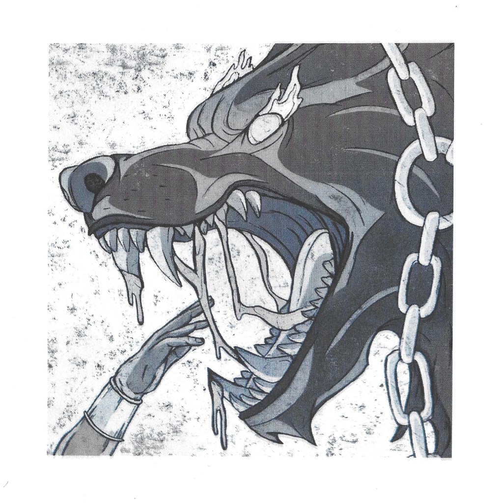
Blue and black: with these prints I went for the complete opposite of the previous one, only using black and blue. The results of this were unexpected but I really like these variants. The cold tones give the image an icy feeling rather than intense heat. I think it still maintains the drama but takes the palette in a direction I hadn’t considered. Below are 3 versions of this colour combination. For the second one I added 2 layers of black and for the third one 3 layers. This was to experiment with the boldness of the colours. I really like the gritty texture that’s in the background.
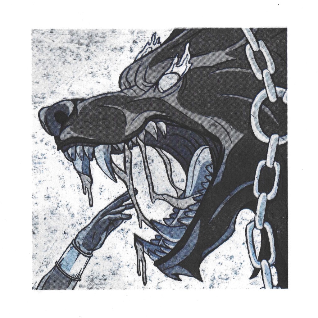
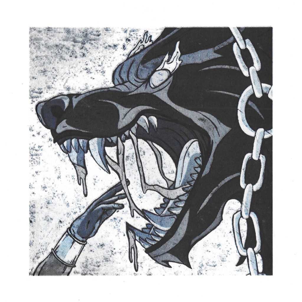
Red, blue and black: this was a colour combination I tested using the colour profiles in Photoshop. By removing the yellow it creates a darker tone, while still maintaining the feeling of extreme heat. The second one has a double layer of black and blue. I prefer this one as it makes Fenrir and the hand stand out more from the background as there’s a greater contrast.

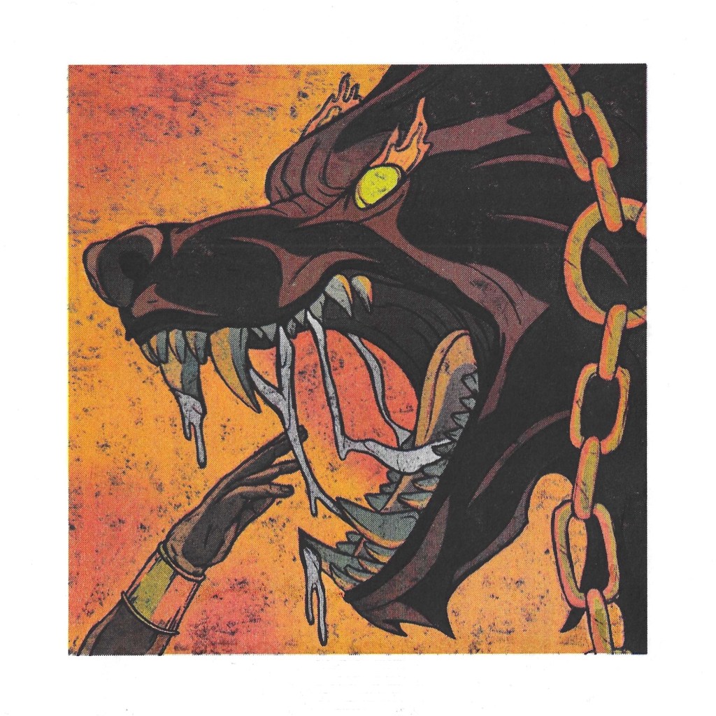
Red, yellow, blue and black: these prints have all 4 colours so are the full colour prints of my illustration. I’m really happy with these prints, they show my image with the palette I original made. I especially like the second one which has double layers of blue and black. I think this best shows the contrast that I had in my original design.

Hatching over Riso print: I wanted to bring back in some hatching over one of the prints. I chose to add the pen work over a red and yellow print. This lighter palette allowed the black pen to really stand out. As I found through experiments earlier in the module, my preferred style of shading with a pen is using street line hatching so this is predominantly what is in this image. I’m happy with this image as I think it successfully combines the 2 mediums.

Ragnarok: this is the other image I chose to print with Riso. It’s the climax of Norse mythology and one of my favourite designs. I really like having the 3 giants together in one image. Also Ragnarok is the topic of my essay so this was another opportunity to explore this myth. Below are a selections of my prints with different colour variations:
Red: This is an example of a print with only 1 colour profile, red. I think the single colour prints are interesting visual experiments but I don’t really like them as final images. They’re lacking a lot of the depth and contrast that the original images have.
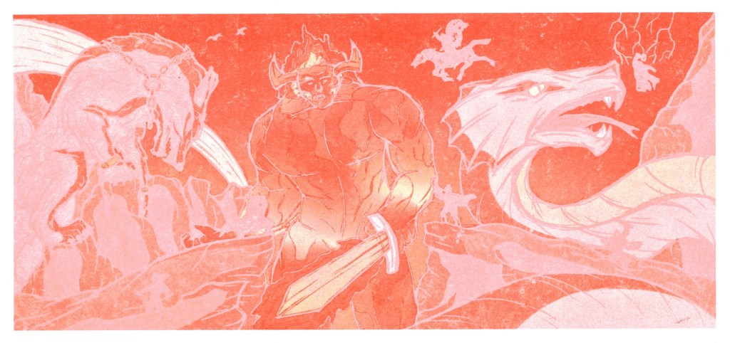
Red and yellow: here I put a yellow layer over the red print. I like the way that Surtr looks but I still think Fenrir and Jörmungandr feel a bit lifeless as they’re missing the darker tones that they originally have. One interesting element of the image are the gods. In the original they’re black silhouettes but in this version they’re a lot lighter. They seem abit like ghosts which is interesting foreshadowing for the death of the gods.

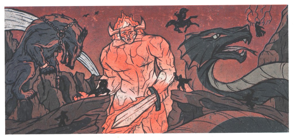
Blue and black: I really liked the blue and black prints for the Fenrir image so wanted to try that combination for this image too. Once again I’m very happy with this combination. There’s a nice amount of detail and contrast and contrast betweenthe light and shadows. It’s a huge difference from the original design but I like how cold and sombre this image feels with the darker, colder palette.

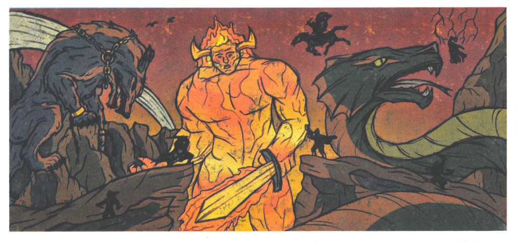
Red, blue and black: I knew I wanted to try out this colour combination after testing it on Photoshop. It’s not drastically different from the full colour version but just has more of an emphasis on red. It has a nice dramatic tone and the colours translate the idea that this is just before the end of the world.
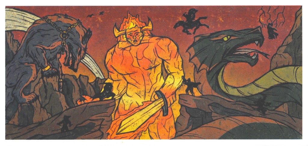
Red, yellow, blue and black: these prints have all 4 colours so are the full colour prints of my illustration. I’m really happy with these prints, they show my image with the original palette. I especially like the second one which has double layers of red and yellow, highlighting the warmth of Surtr and the intensity of the apocalyptic event.
I had lots of fun doing the Riso printing and learnt so much about the technique from my session in the studio. I’m really pleased with the outcomes of my prints as I was able to create lots of different colour variations of 2 of my illustrations. I got some prints that showed my illustrations as I had intended and through experimenting with different colour combination I achieved some prints with completely different tones. This was a really valuable experience and helped me develop my illustrations further and see new possibilities for them. If I had more time I would have liked to print all 5 illustrations to have the whole series. I intend to still do this in my own time.