I have my finalised colour illustrations and I wanted to do some experiments to see how they would look with different filters and variations. This helped me get an idea of potentially what formats my work could take other than just printed images. It also helped me see how to expand my work to different audiences.
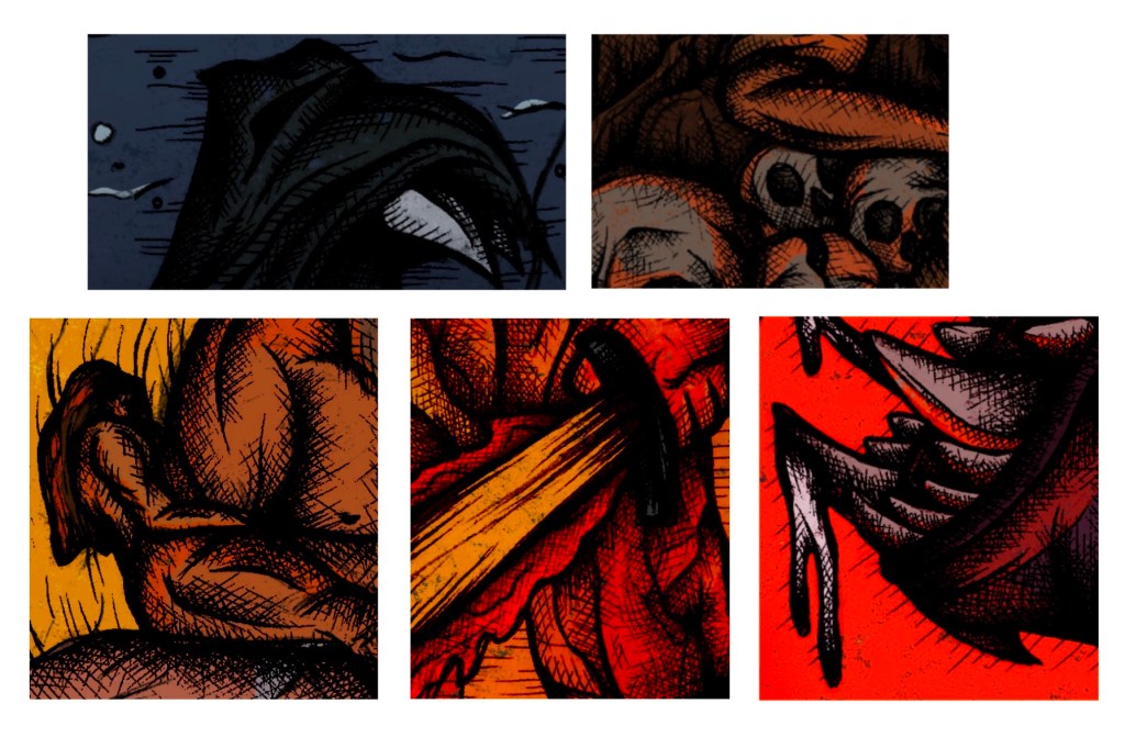
Hatching over colour: I took the hatching sections that I made and overlayed them onto my coloured illustrations to see how the 2 elements work together. I like the style but I prefer the style that the images already had as I feel this style of dense hatching and shading makes the illustrations too dark and block some of the colour. If I was to do a whole image with this combination, I would make the hatching less dense to allow the colour palette shine.
Photoshop filters/editing: all of the other experiments were done on Adobe Photoshop using the image filters. For each I did the whole set of illustrations as I think it’s key that they’re kept as a set. While they work as stand alone images I think they are made better when placed together and get a better sense of the whole story.
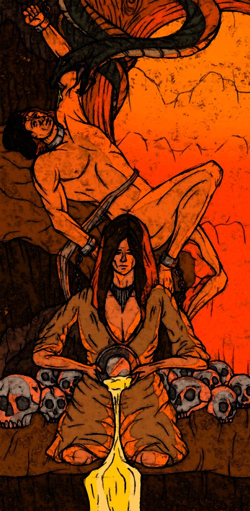
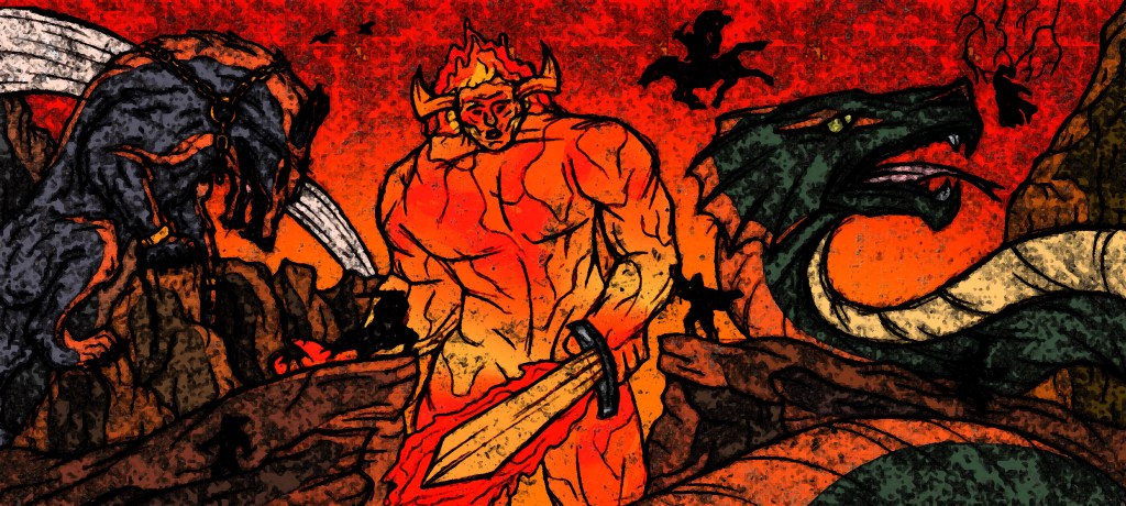
Plastic wrap filter: this filter is my favourite out of all the ones I tried. It makes the images look like glossy tiles. This is an outcome I had never considered but I now think these illustrations could make a really nice set of decorative tiles.
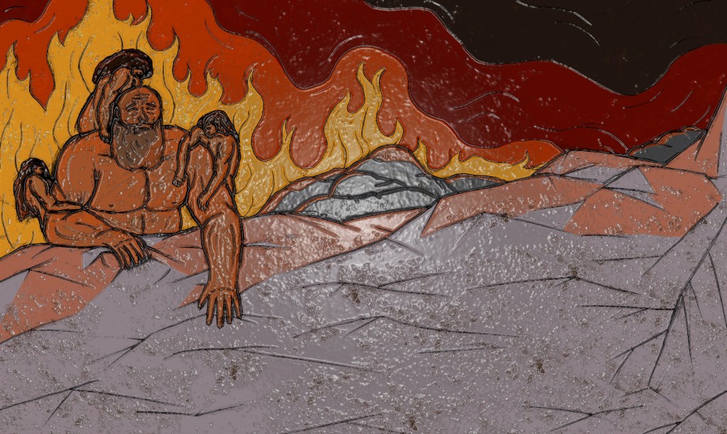
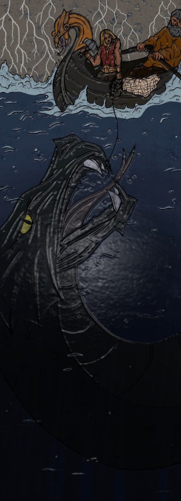

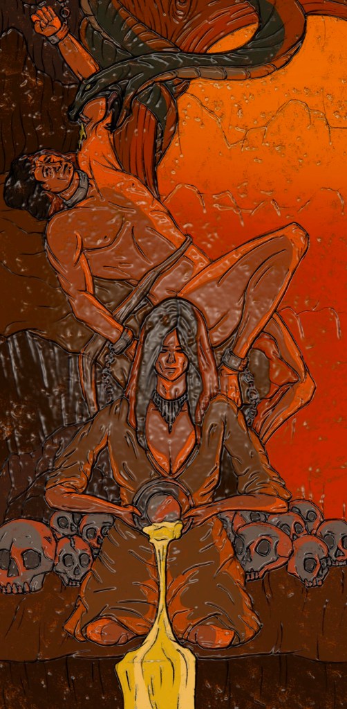
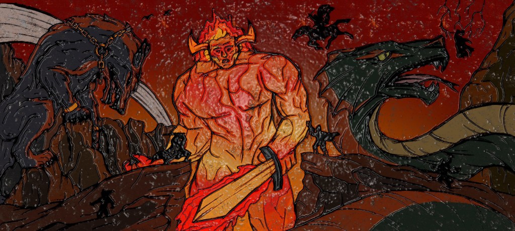
Mosaic filter: continuing with the theme of tiles, I applied a mosaic filter to my series of illustrations. I think having these as mosaic pieces would be interesting as it’s an old technique which contrasts my modern style of illustrations. I can imagine these being big mural style mosaics which would an interesting way to experience them.
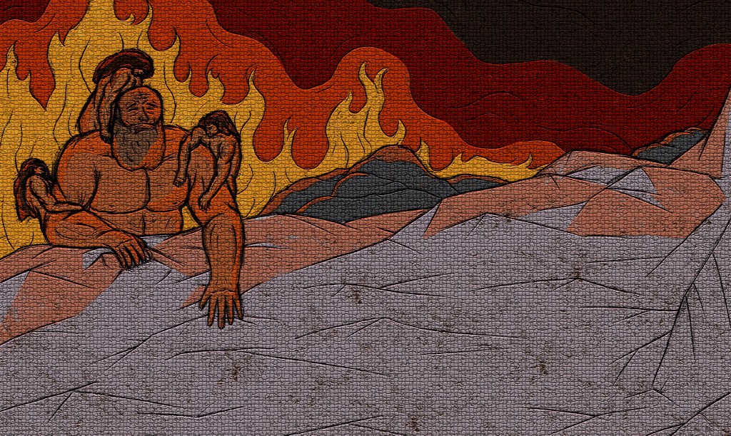
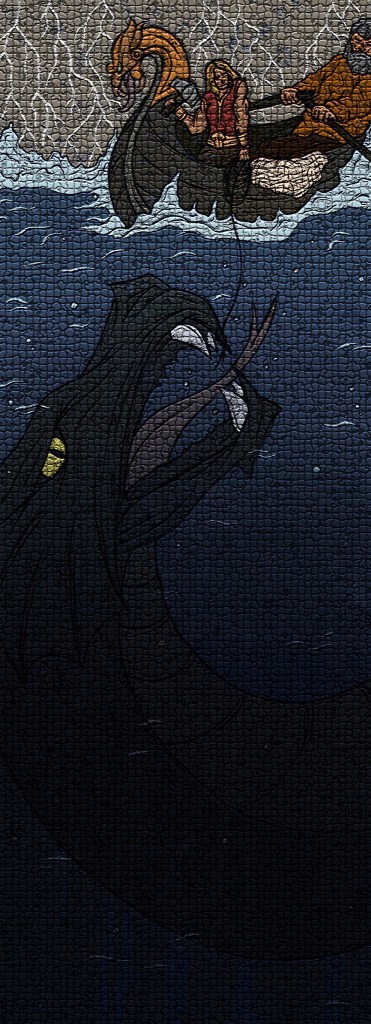
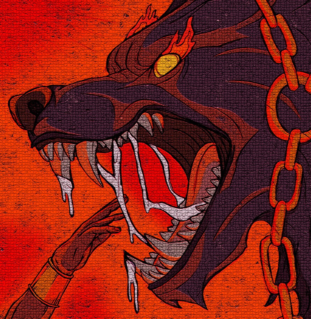
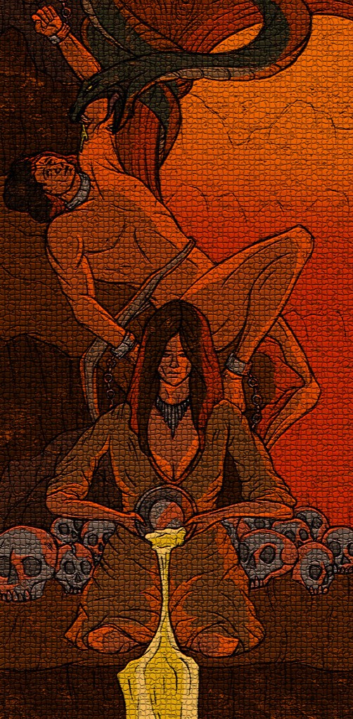

Fresco filter: to achieve these I used a combination of the Fesco filter on Photoshop and overlaying some of the textures I created in the creative workshop. This really lightened up the images and added more of a random texture. I like the aesthetic and think they could make interesting posters which could be scaled up or down. I wouldn’t replace the originals with them but I think they’re a fun variant.
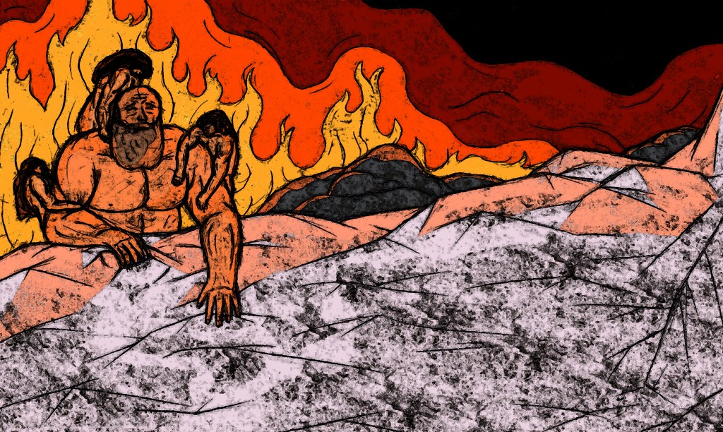
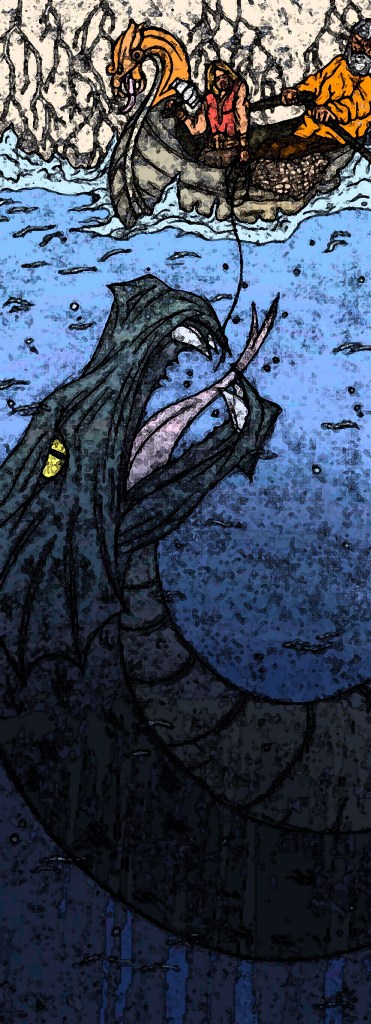
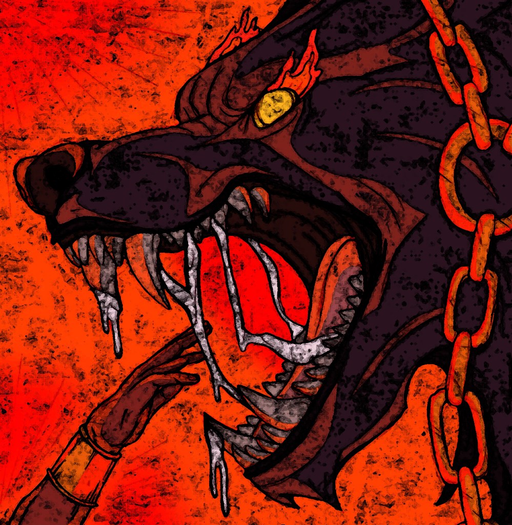
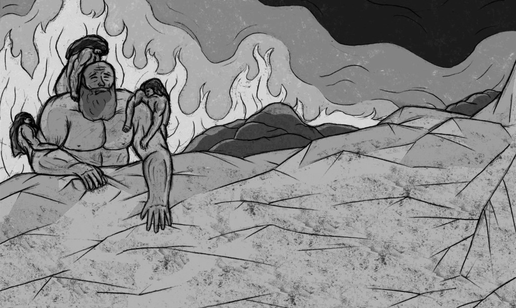
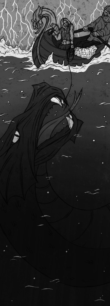
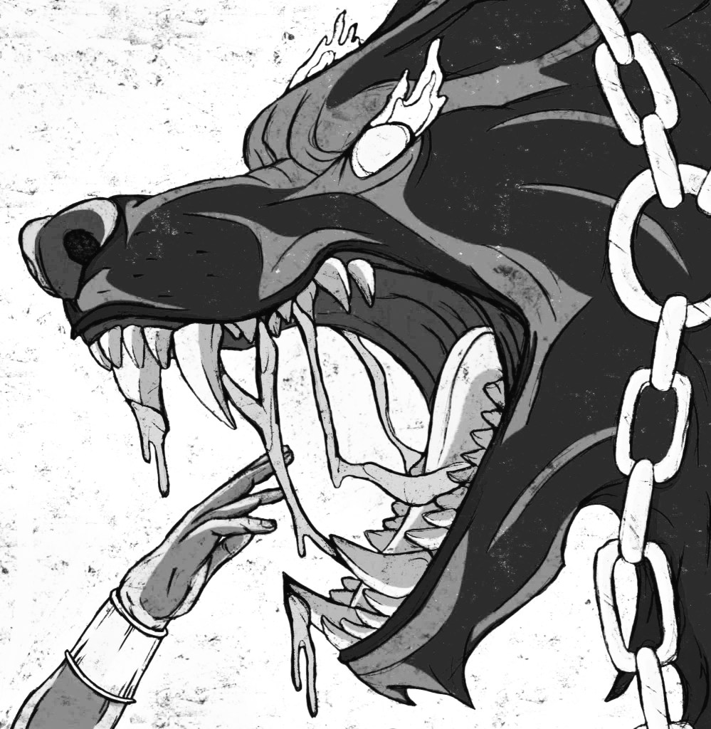
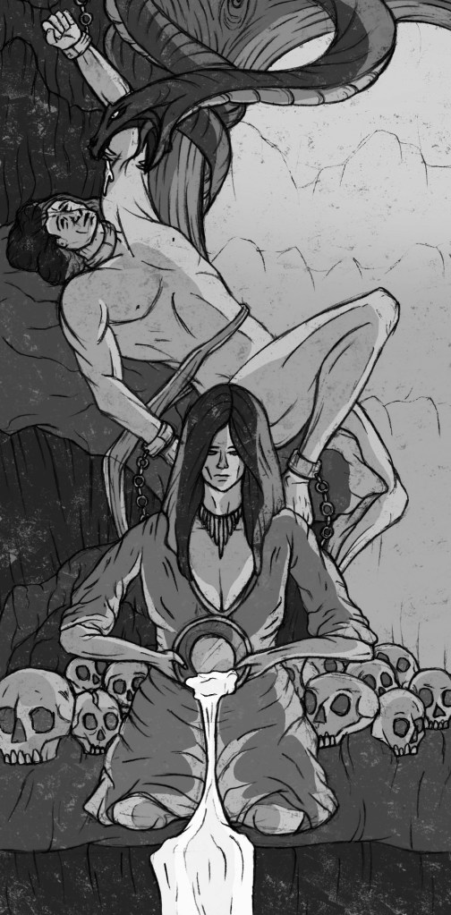
Black and white: these are greyscale versions of the colour images. It’s interesting to see how they look without colour as colour was such a key part of my development of the illustrations. I think seeing them like this shows the strength of the designs and compositions and the still tell the stories and are visually strong. However, the colour really elevates them so I wouldn’t use greyscale version of the images for any sort of outcome.

Creating these different experiments was a fun process and gave me some new ideas on what formats and styles my illustrations could take such as a tile or mosaic.