Base Colours: I scanned my final sketches and edited them to make them look like they were drawn in pen rather than pencil. To colour my images I used Procreate. I have a large range of brushes I can use and created some of my own textured brushes from the images I made in the creative workshop. This post shows all my illustrations with base colours. Before starting I had a pretty good idea of the colour palette I wanted for each image. I took inspiration from the Norse mythology colour palette which consists of colours found of Norse artefacts.
Creation of the cosmos: this image is divided into 2 distinct sections with different palettes. The top sections is fire so has a very warm feeling and the bottom is ice with a much cooler palette. This contrast is key to telling the Norse creation story. This image needs the 2 parts to merge more so I will add reflections of the fire onto the characters and ice.
Thor fishing Jormungandr: I wanted this image to have a more earthy palette which is why I went for lots of greens, blues and browns. These colours work as a nice and cohesive palette. There are a couple points of contrast that really stand out, the eyes and teeth of Jörmungandr. I want to try emphasise these more to make them more eye catching for the viewer. Another alteration I want to make is to have the bottom of the image darker, to hide Jörmungandr more and make him seem like he’s rising from the depths of the ocean.

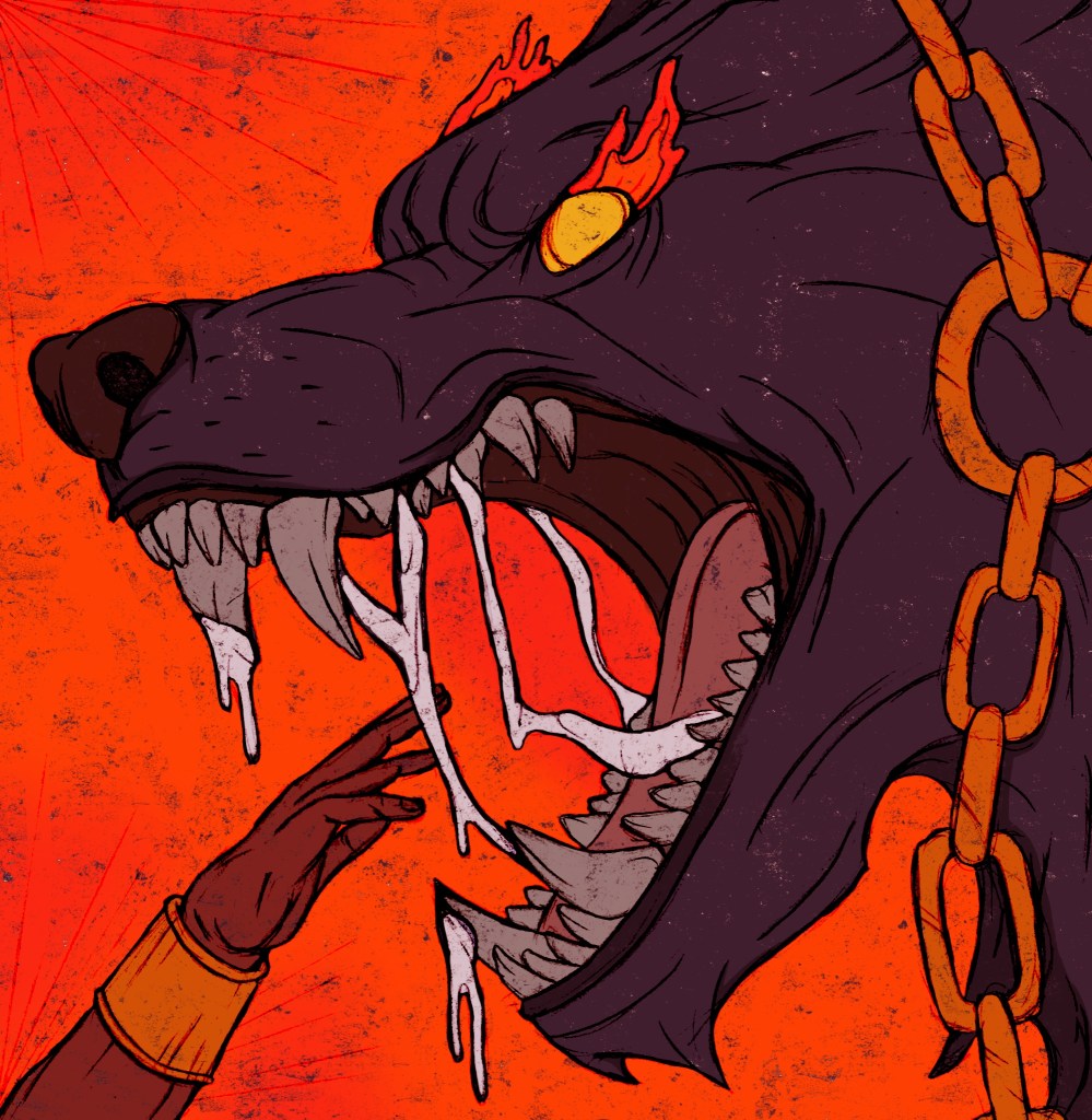
Binding of Fenrir: the contrast between the intense warmth of the orange and the cool tones of Fenrir are really striking. I’m really happy with the colours, the image just needs reflections of the warmth on the characters to much it feel like the heat it surrounding them rather than just behind them. I think this change will significantly improve the design and make it less flat.
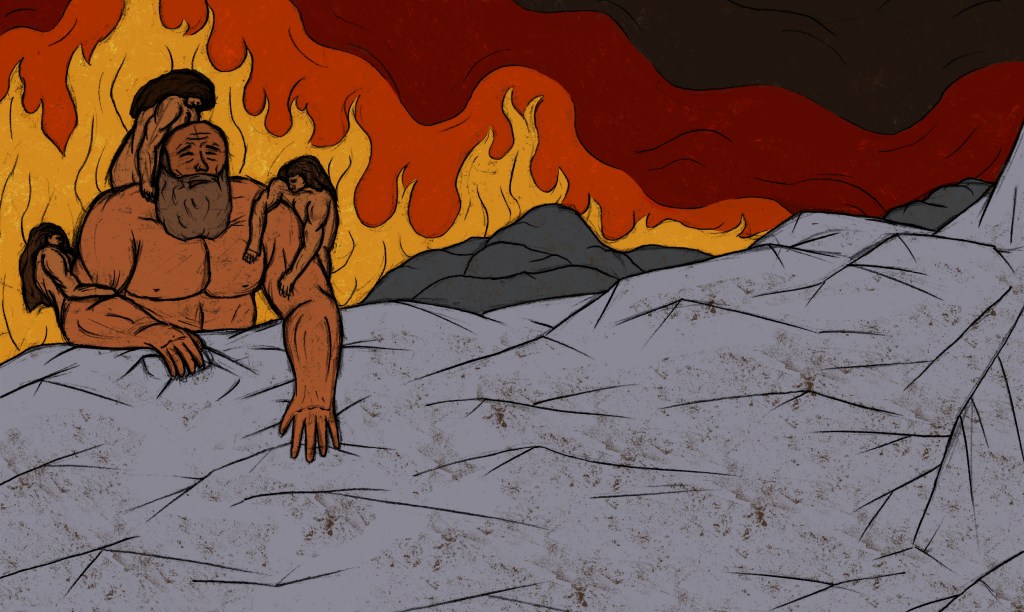
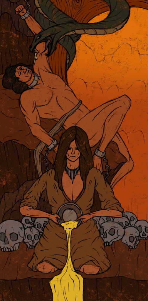
Loki bound: the colour palette of this image had the smallest range, mostly just consisting of shades of brown and yellow. I wanted this image to feel almost uncomfortably hot to show the suffering of the characters. The current colours are too muted to really translate this idea. I’ll need to add in more orange and highlights will play a key parts in creating this sense of overwhelming heat.
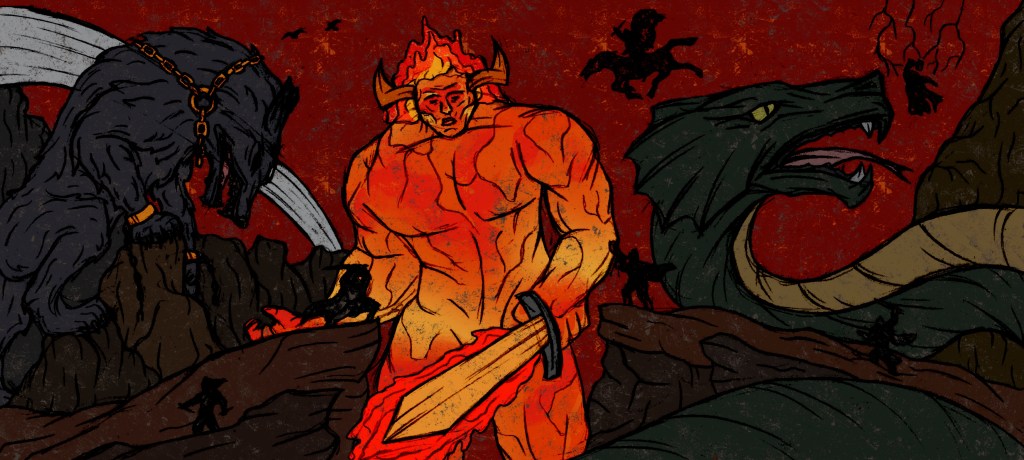
Ragnarok: this image has the most diverse colour palette. The background a scenery is mostly deep red and a mixture of dark browns. The gods are simple black silhouettes. Each of the creatures has their own colours. I’m happy with this distribution of colour but my main issue with it currently is that it’s generally too dark. It needs more light and warmth radiating from the centre (Surtr) to lighten up the rest of the characters/surroundings.
The next step will be to add in lighting, highlights and shadows to make them all feel more dramatic and visually engaging. This will be a key part in getting across the narrative of the images as at the moment they feel pretty flat and a bit lifeless.
