This project has 3 outcomes, a static piece, a sequential piece and an interactive piece. So far in the module we’ve covered static and sequential so this we starting looking at interactive sequences. We had an introduction to Figma, my notes for this are on the next post.
Our first activity was looking at storyboarding and rhythm. I will use storyboarding as a technique to plan my social media video. This is a good way visualise what will happen in the sequence and how best to add rhythm and action into to stop it from becoming boring. A good way to do this could be physically draw or print different parts of the sequence and rearrange them. This is the way we worked in session 1 to analyse Kurosawa’s short film. We where given some advice on ways to stop a sequence becoming monotonous such as changing angles, zooming in and out, changing the background and mixing dynamic and static elements.

Simplifying complex lettering: for this task we looked a the Young V & A and their visual identity, specifically their typography. They take a selection of basic typefaces but use them in a fun and dynamic way with stop motion. This style nicely appeals to their target audience which is children and it’s an engaging way of using typefaces. This is a good example of targeting creative decision to a specific demographic. Below are more notes on this topic:
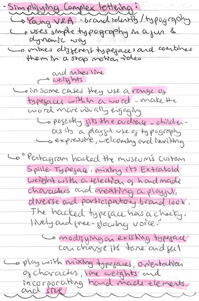
These are examples of the visual identity of Young V & A. The first is digital/sequential advertising, the second is physical/static advertising and the third is a series of physical merchandise. What’s interesting about these is that they’re not consistent with colour but still maintain a consistent visual identity through their strong use of typography and style of image. This is a good example of how you can really vary a certain design elements so long as others are kept consistent.


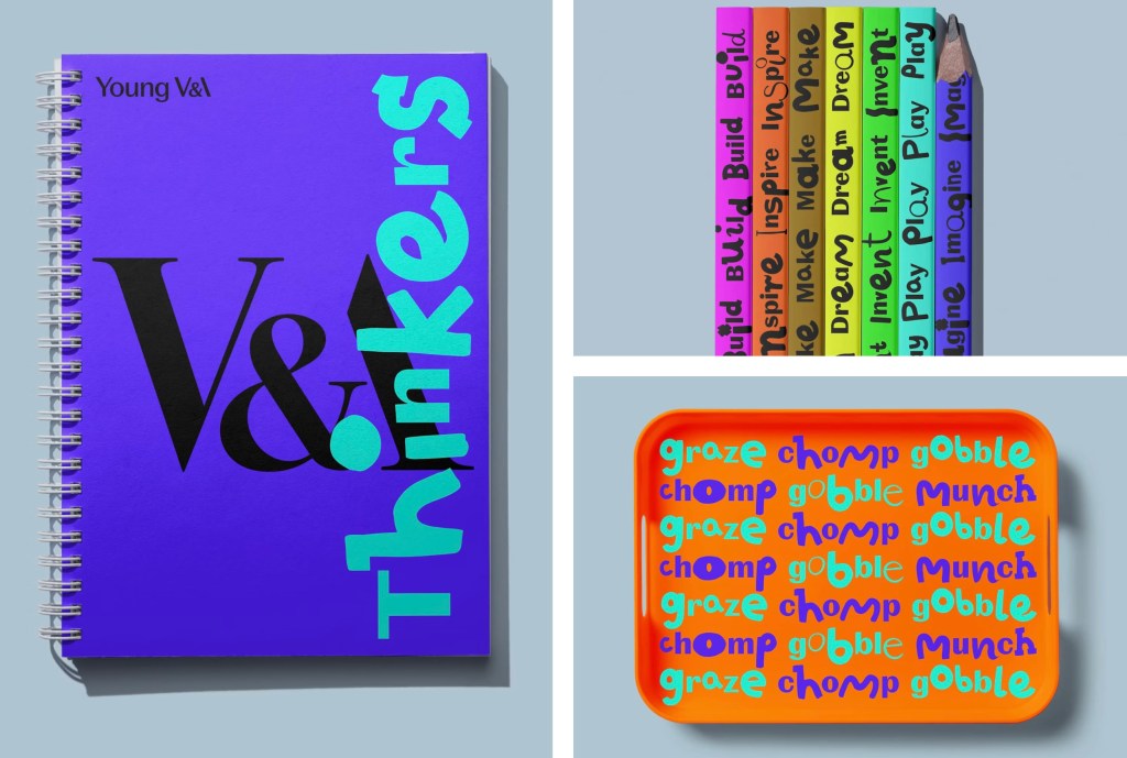
Reflection: this session was good as we started to looked at interactive design. Also I am now ready to start creating a storyboard for my sequential piece after our activity about how to successfully add action and rhythm to make a storyboard more engaging. The research about Young V & A was good as I learnt about an interesting way of manipulating typefaces. Their use of stop motion is a good way to incorporate many simple typefaces and make them into a visually engaging sequence. This is a style that I will consider for my project work.
