This week we explored the visual identity of a sequence. Before this we had explored creating sequences with actions, audios and interactions so now we are looking at how to give a sequence a recognisable identity. For our project work it will be important that all our outcomes are tied together by a consistent visual language to make them feel connected. This is key when promoting an event across different platforms, especially social media. The first activity was looking at a series of contemporary creative festivals and analysing visual identity. Below are a list of the festivals that we explored:
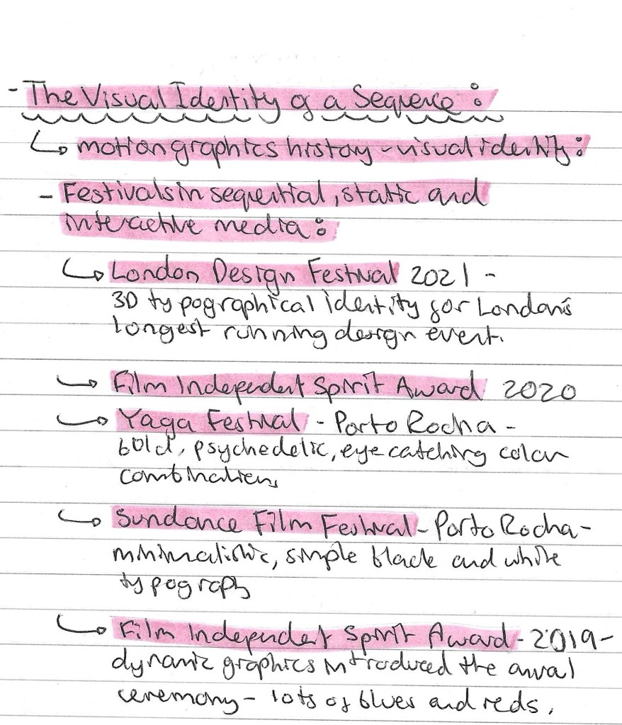
London Design Festival: this is London’s longest running design festival and below is its visual identity from 2021. It has a very simple colour palette of just 3 colours, black, white and red. The red is a bold colours so immediately draws people’s attention and it’s strongly connected to London. I like the 3D typographic style, it’s unique and interesting enough that it can carry a poster with just the typography. This simple combination of colour and typography is enough to be the visual identity and this can be seen across advertising and a variety of merchandise.
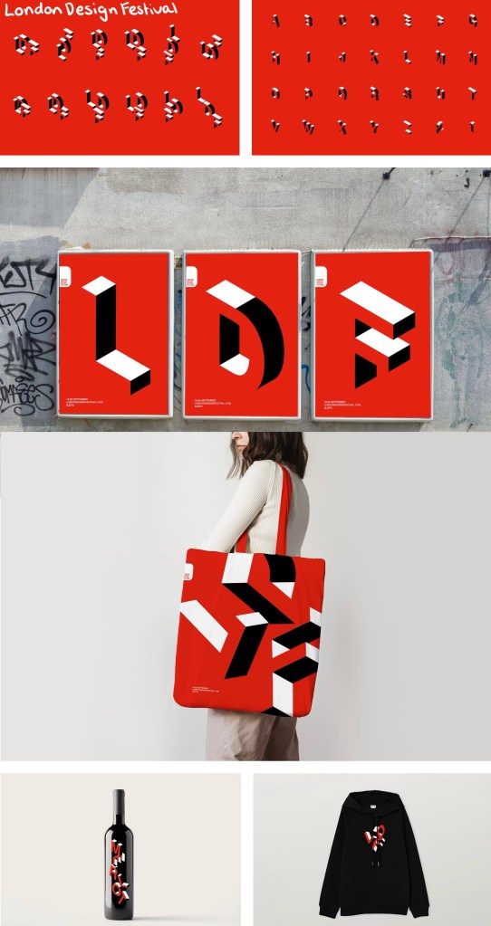
Yaga festival: This festival has a really a really strong use of colour. They use bold, eye catching and psychedelic colour combinations. The colours are the key part of visual identity as they use unique and unusual combinations of colours so will stick in the minds of viewers. Similarly to the London Design Festival, vibrant red typography is really eye catching and contrasting to the rest of the colour palette. Below a range of digital advertising, physical advertising and merchandise all with a consistent visual identity:
Sequences in abstract films- early 20th century: our second activity was to look at a range of avant-garde abstract films from the early 20th century. Here is a list of the films we watched and some notes I made about them:
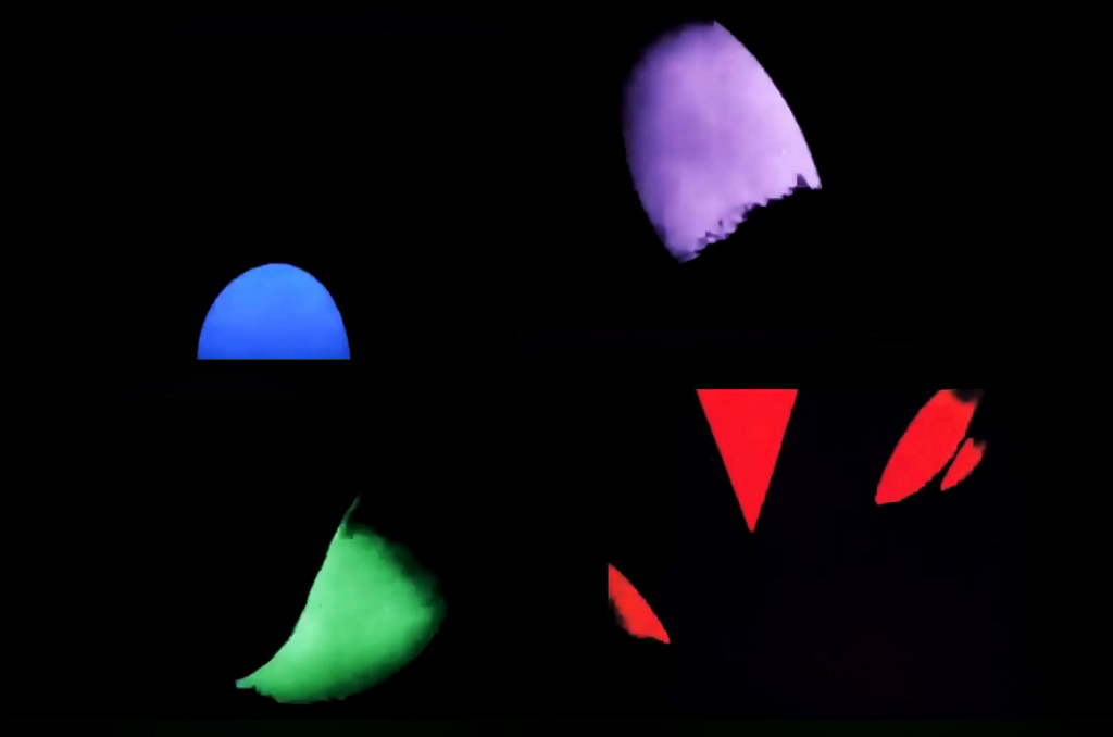
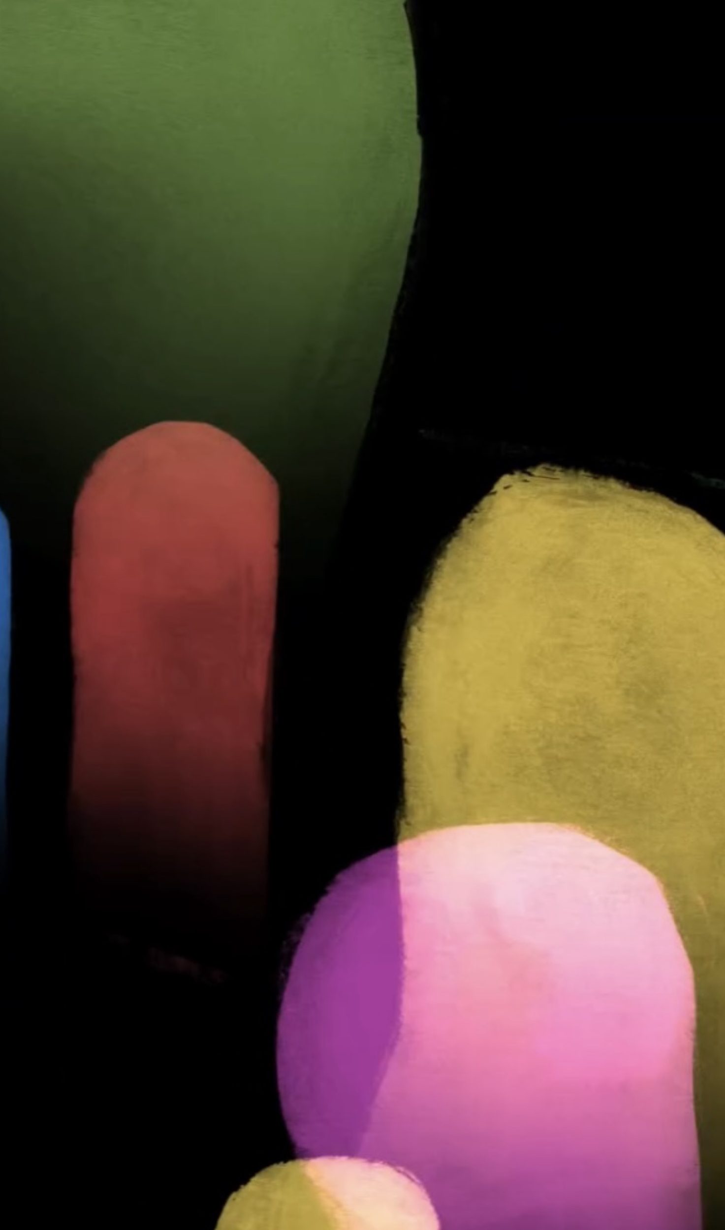
Walter Ruttmann (top) and Michael Socha (bottom): Ruttman’s 1921 film titled ‘Lichtspiel Opus’ has simple motion graphics with colourful abstract shapes. At the time this was very advanced animation. Most animation at the time was black and white so these pops of colour really made his work stand out and be more visually interesting. The influence of this style of work can still be seen today. For example in the work by Michael Socha who puts a modern twists on it. The animation is much smoother but the principle of simple abstract shapes moving remains the same.
Title sequences: another activity we had was looking at the visual identity of different title sequences. We looked at 5 different title sequences from the 1900s. Below are the notes I made about each sequences:
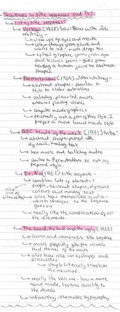
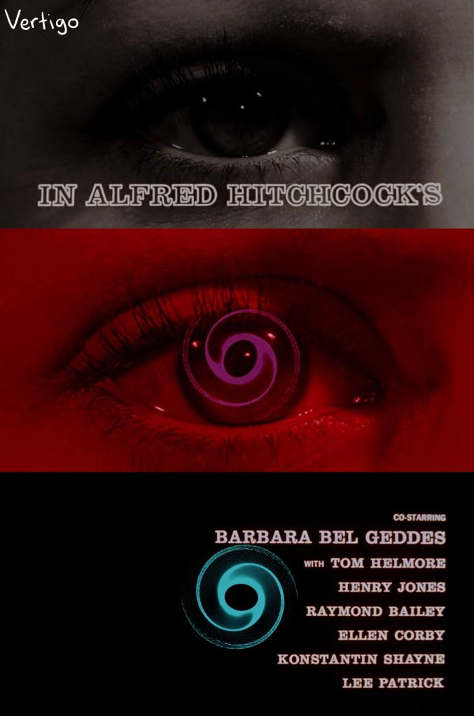
Vertigo (1958):
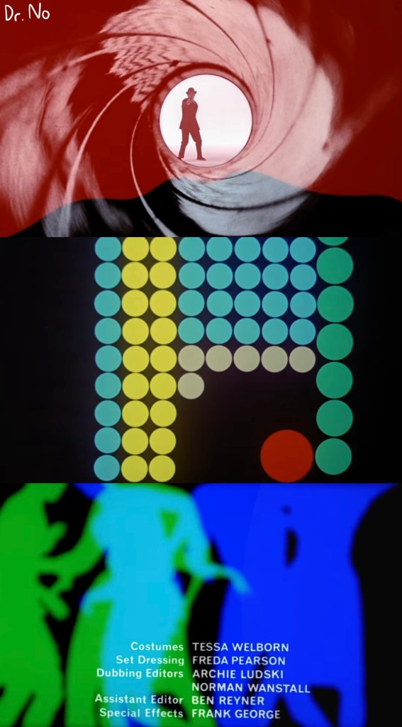
Dr. No (1962):
The good, the bad and the ugly (1966):

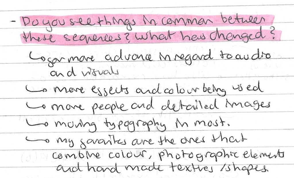
Review of the title sequence activity:
Mission Impossible title sequence: this was an interesting example to look at as it has developed a lot from its original in 1969 to its most recent one from 2023. The style and visual language has remained the same which has helped give the franchise its recognisable visual identity. The quality of the visuals has improved significantly with the advancements in digital technology available. The most noticeable change is the pace of the sequences increasing. The originals were seen as fast but now they’re dramatically quicker. This helps keep the, feeling fresh and exciting to viewers. This is a great example of a sequence that has maintained its visual identity while still evolving to meet the current demands.
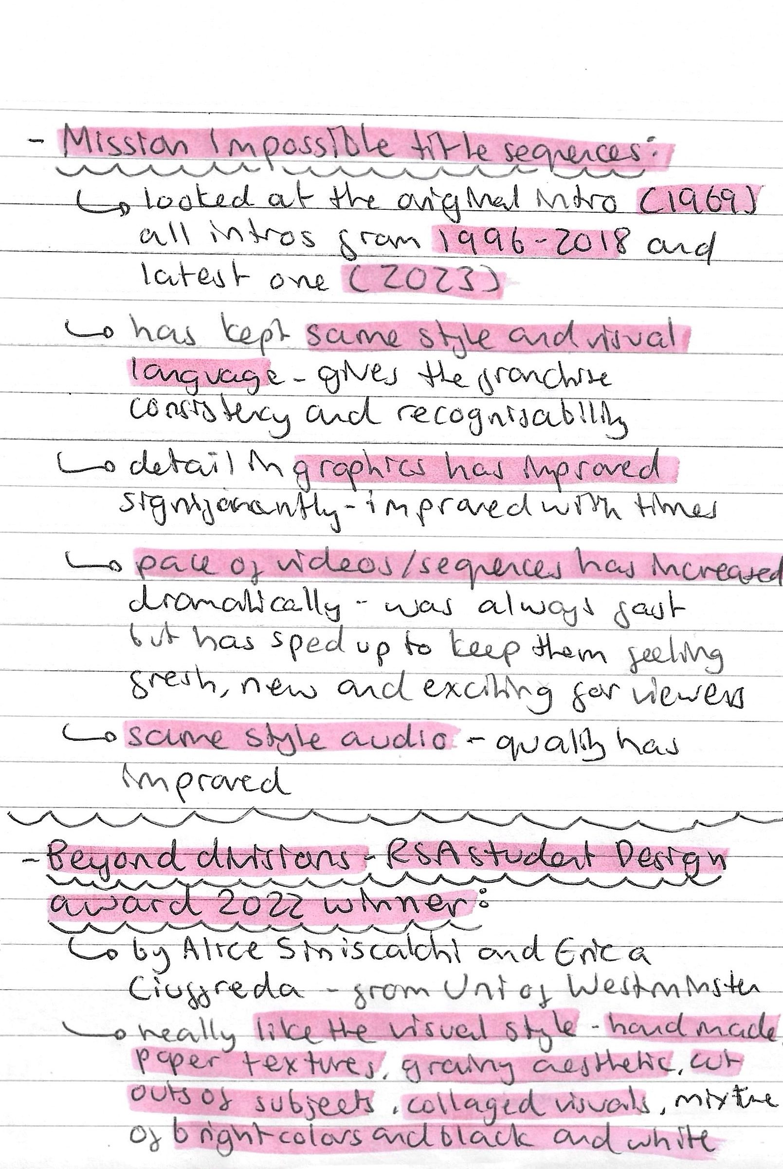
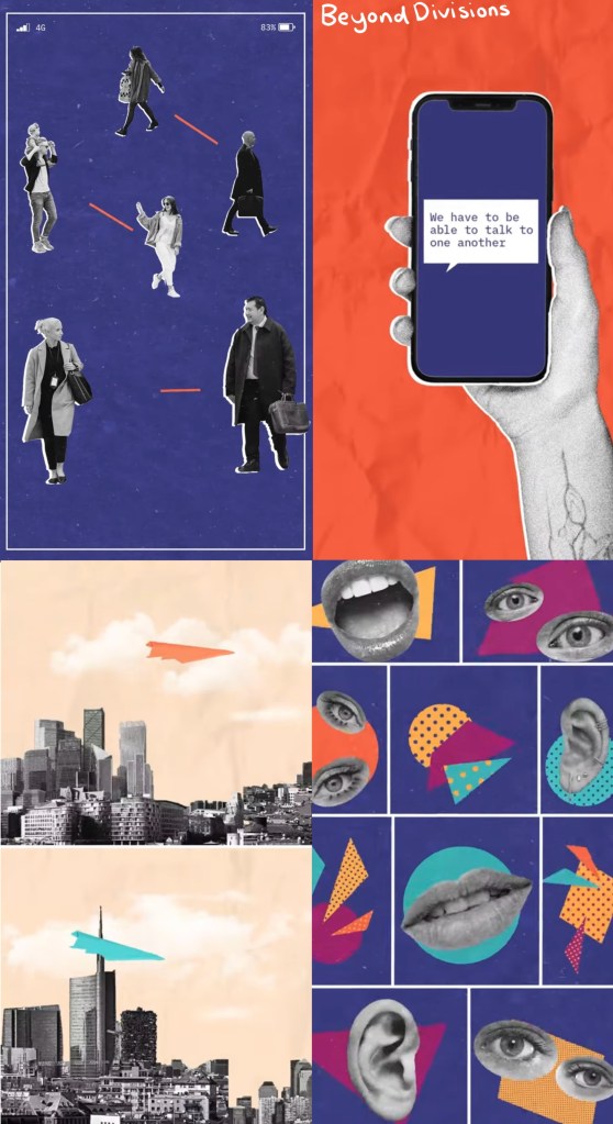
Beyond Divisions: this is a Student Design award winning piece from 2022. I really like the visual style of this video. It has hand made paper textures, grainy textures, paper cut outs all put together in a collage format. Also the use of bright colours against greyscale images is a really effective colour palette as it helps guide the eye to the important parts. The combination of visual styles is something I would like to try use in my project work.
Reflections: this session was helpful as it taught me a lot about the importance of creating a unique and recognisable visual identity. This is key to this project as all 3 of the outcomes will needed to have the same visual language in terms of colour, aesthetic, imagery and typography. We looked at design festivals, abstract films and title sequences, giving me a broad range of research to take ideas from. As well as learning about the importance of a visual identity I started to think more about what sort of styles I’d like my project to have, these are ideas I’ll be developing over the coming weeks.
