Adobe Illustrator is a software that I’m comfortable with having been introduced to it in Digital Arts 1 last year and using it heavily during the Brands module I did last semester. I still find certain parts challenging such as creating complex forms with the pen tool. I’ve wanted to continue developing my skills and growing my confidence with the software so this workshop was the perfect opportunity.
Notes from workshop:


I was comfortable with most of these tools on Illustrator prior to the workshop but only at a fairly basic level. I feel that the areas to need to improve on most are using the pathfinder and clipping mask tools as these can really advance a piece and help speed up a workflow.
Design websites for inspiration:


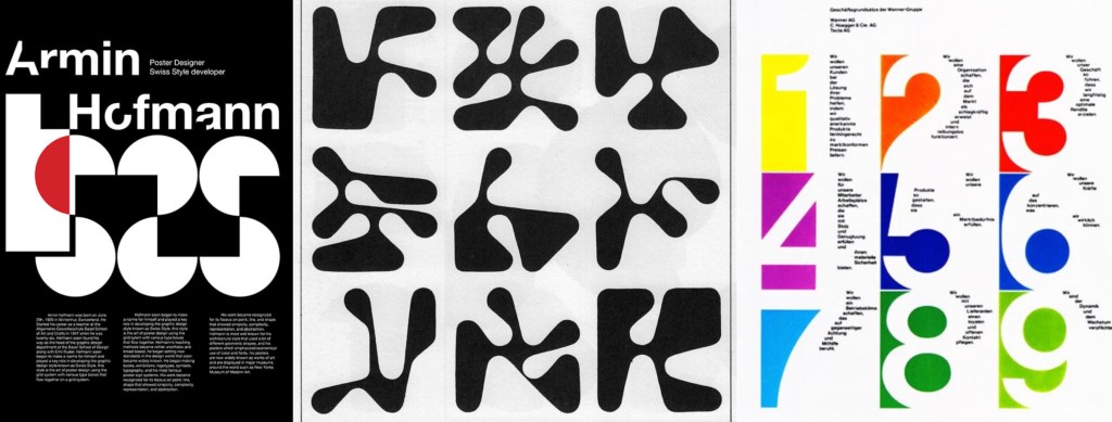
Armin Hofmann: this is an artist that creates unique and playful typefaces which he then applies to posters. I really like his work and how he creates typefaces that are strong enough to carry a poster without the need for images or other design elements. The typefaces are interesting as he stretches the limit of what a letterform is to the point that some may not even recognise it.
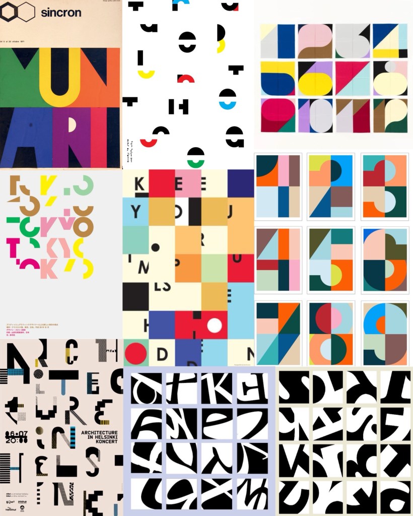
Visual Research: after looking at a range of typographical art the things that interest me the most are the combinations of bright colours and breaking the letter forms into sections. These are ideas an themes I wanted to experiment with in my Illustrator work.
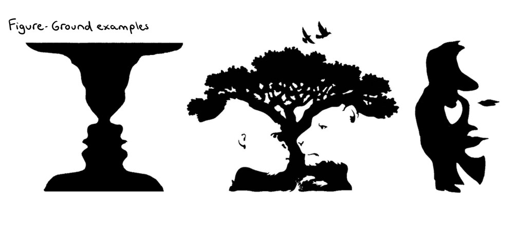
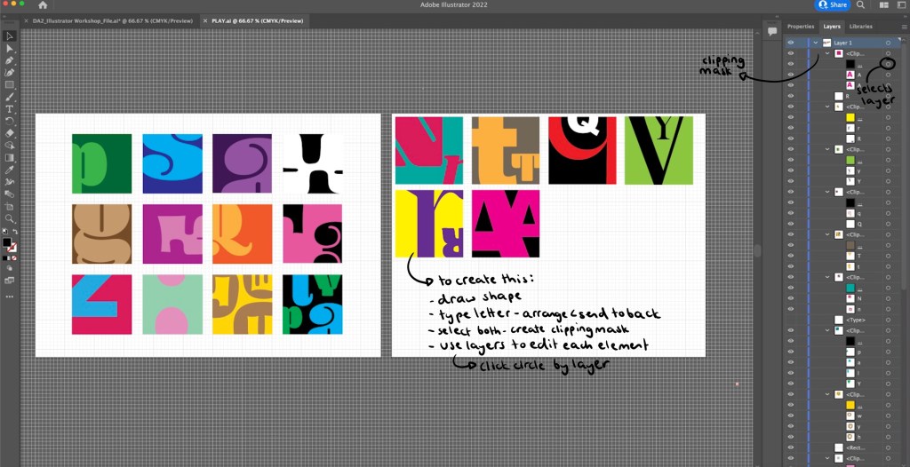
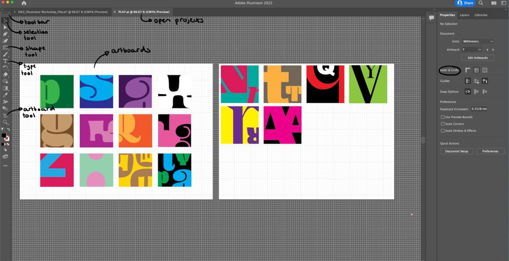
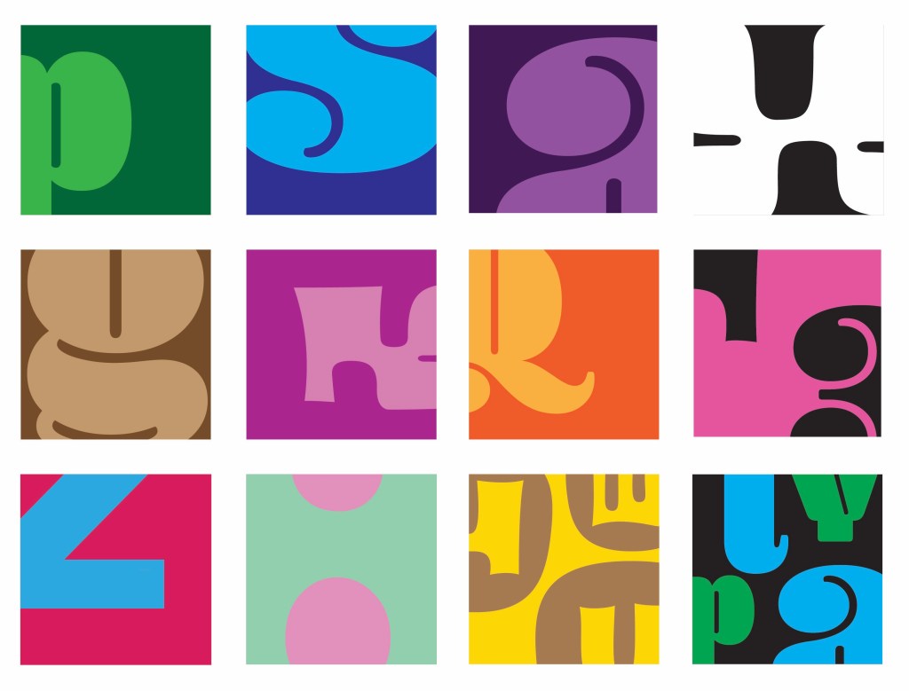
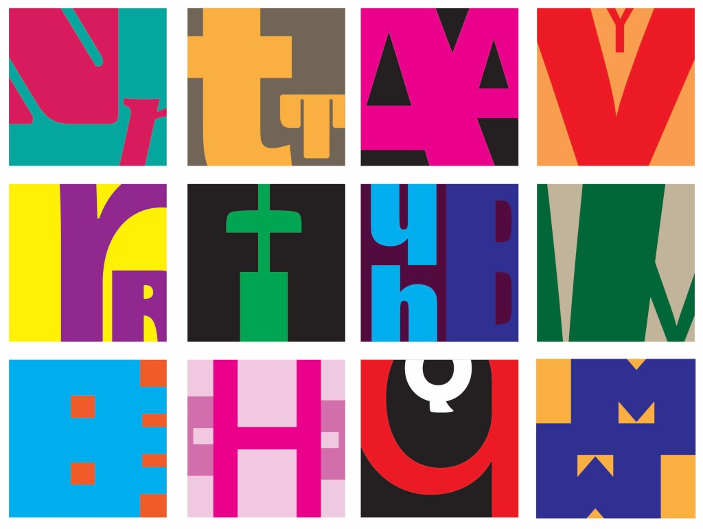
Illustrator Workshop: in the session we worked with the idea of Figure and Ground, having the letterform and the subject. I experimented with the colour combinations and how much of the letter form I showed. Some are obvious and others are more abstracted as I only showed a small section of the letter. I really enjoyed this more playful approach to typography as it’s not normally something I work with. Below is a step by step guide of how I created these small squares containing the letters. Creating a clipping mask on Illustrator is not something I knew how to do before so that was an interesting skill to learn.
Outcomes from workshop: during the session I produced a range of different letterform experiments. My favourites are the more abstracted ones where I only show a small section or a really zoomed in part of the letterform. I find these more visually interesting and unique. They also became more playful and fun when I started adding multiple letterform into one square as the negative space created was interesting.
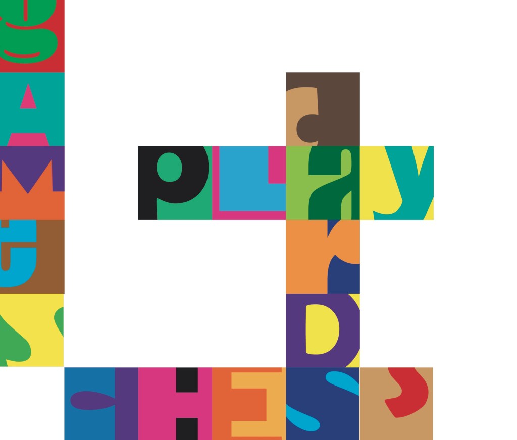
Independent work: Word-search: after the workshop I took the ideas I had been working on to create a unique style of word search. Word searches are a classic game and form of play enjoyed by adults and children. I wanted to bring a twist to this by making it more complicated. I only showed a section of each letterform, making it harder to spot the words. I also used a range of colour combinations and typefaces to throw off the viewers eye. I’m happy with this piece but to improve it I would make it bigger with more squares and more words to find to make the game more fun and last longer.
Words to find: play, cards, chess, games
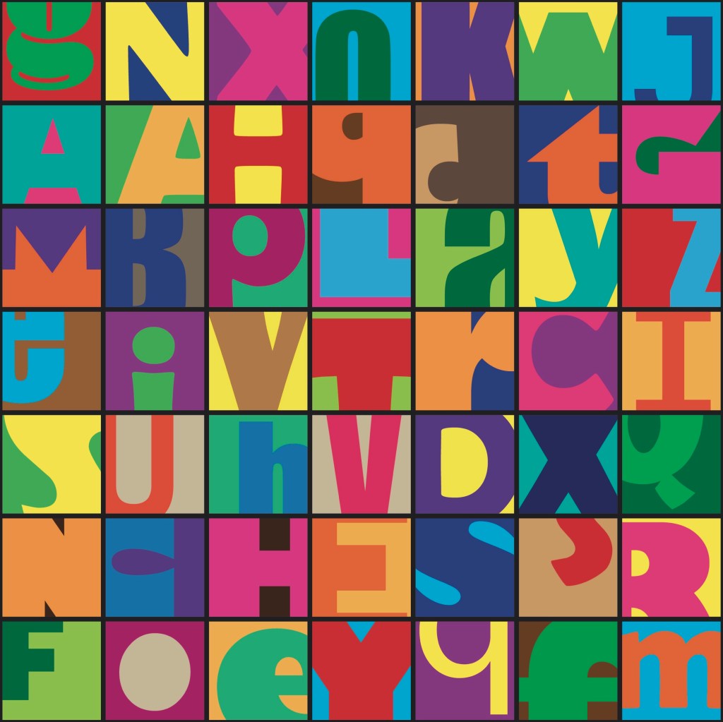
These are the answers to the word search. When creating it I started by placing down just the words that needed to be found and the pop laughed the rest of the grid with random letters.
Reflection: I really enjoyed this session, it gave me an opportunity to practice and build on my developing Illustrator skills. I improved on the skills I already had and learnt new tool such as the clipping mask tool. Experimenting with typography is not something I do often but is something I’ll consider for my project. I am happy with the pieces I created as I think there is a playful use of typefaces, colours and composition which I applied to a game scenario, a word search.
