
Today we went through some of tools and features that Photoshop offers. Out of all the creative software we will be exploring in this module, I’m most confident with Photoshop having used it a fair amount in my first year. I had become confident will the basic tools and a handful of more specialised features and am now looking to master the basics and put them into practise.
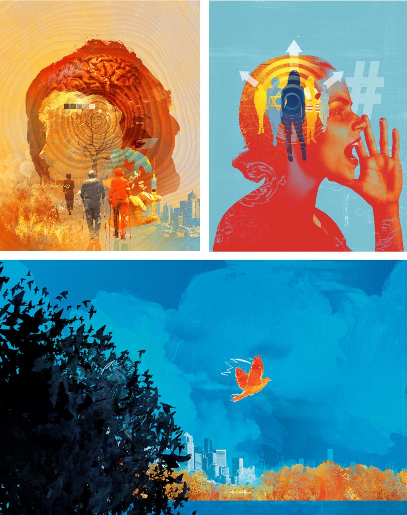
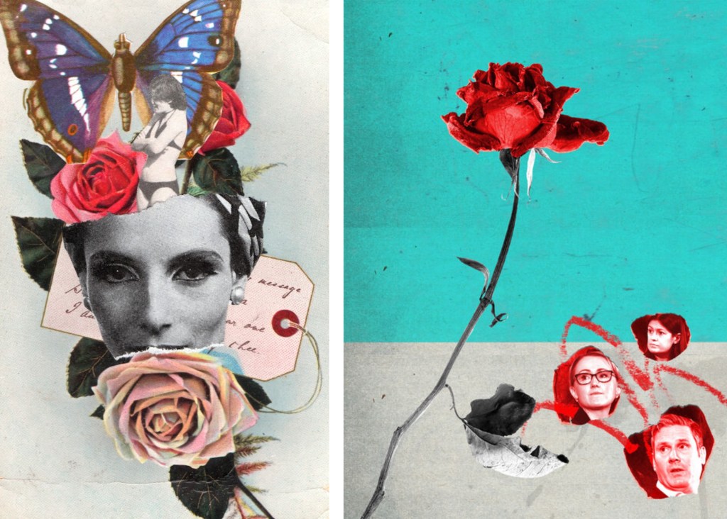
We looked at some examples of creative practices with a focus on composition and mixed media digital collage. Some of the artists that I looked at in the first week produce work in this style such as Chris Haughton, Tim Marrs and Kate Miller. Below are a list of artists who produce work with interesting compositions and use of mixed media digital collage. This is a style I really like but not something I regularly produce so this workshop was a great opportunity for me to push myself and explore this style of work.
Artist Research:
Jill Calder: her style is really fun with lots of brightly coloured elements all layering up to create a busy composition. It has a looseness to the mark making that I find appealing, this coupled with the colours helps to create a magical feeling to artwork. There is a nice hand made quality to these mark and textures.
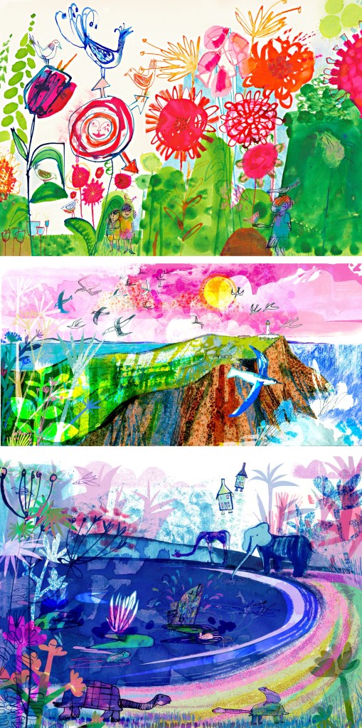
Andy Potts: these digital collages have nice textures on them which I would think are real textures that I have been scanned in to make them feel less flat. The colours are much more controlled, choosing limited colour palettes, making use of complimentary partings. The layers build up in layers with varying opacities.
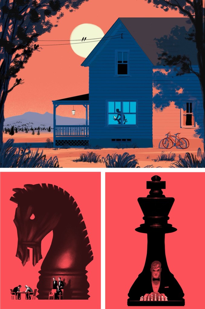
Paul Blow: this is a more refined and clean digital style. The less chaotic compositions help make each element stand out more with his powerful use of limited colour palettes. I particularly like the chess pieces as he’s transformed a board game into an intense and cinematic piece largely down to the scaling and colouring of the different parts.
Michelle Thompson: these digital collages have the most resemblance to traditional hand made collages, lots of rough elements placed together in a more free way. I really like the different textures and minimal colours as it really makes certain parts stand out.
Maria Midttun: the printed textures are created by hand, scanned in and manipulated digitally. This helps to ground the digital collage in a traditional collage style. I like the contrast between the rough cut, block coloured backgrounds with the greyscale textures used to make the characters.
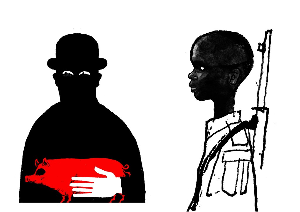
David Foldvari: these pieces have a really nice quality of marks with rough inky lines being mixed with detailed shaded parts. The controlled minimal use of colour helps to draw the viewer into a certain part with the striking red standing out on the black and white.
Photoshop workshop:
We had a Photoshop demonstration of a range of basic tools before we began working on the creative challenge. Here are some of the things we went through:
- Setting up a canvas (Size, PPI, RGB & CYMK)
- Overview of Photoshop tools (Sidebar and tabs)
- Copying and Pasting image assets into the canvas
- Cutting, Moving, Rotating, Transforming, Erasing
- Editing Colour, Contrast and Opacity
- Using the Clone Stamp, Brush and Paint Bucket tools
- Layers panel (Organising, Grouping and Naming)
- Quick Mask tool
- History panel
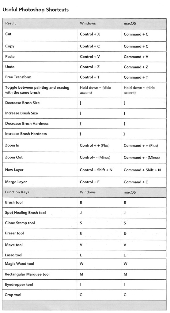
- Useful shortcuts
I was at least comfortable with most of these as Photoshop is a software I used semi-regularly. The ones from the list that I found the most challenging where using the quick mask tool and the shortcuts. The main difficulty for me was using Photoshop on the Universities Macs as I’m more used to using it on an IPad or Windows laptop. This means the interfaces and keyboard commands are slightly different for what I’m used to, making my process slower. In particular, I’m much more comfortable selecting and cutting images with the touch screen on an IPad.
Below is a table of key Photoshop shortcuts across different devices:
Creative challenges: Visual Juxtaposition
Key terms:
- Juxtaposition: an act or instance of placing close together or side by side for comparison and contrast.
- Collage: a picture or design created through the assemblage of different forms, thus creating something new.
We had to combine imagery and manipulate material from a range of sources to create a new meaning to express the theme of ‘play’. I used my collection of visual media that I made based on the theme of ‘play’ and images from the British Library’s collection on Flickr to create visual juxtapositions and metaphors in Photoshop. I made the images below during and after the session:
1. For this one I wanted to go for a really random style by mixing elements that visually shouldn’t go together into a cohesive compositions. I think I was able to achieve this by using a combination of images from Flickr and the card textures that I created to form the collage. Using layers was key to this piece and I was able to create depth by layering the 3 greyscale textures and the bottom and place the chess piece with the card design in between them.
2. This collage was created solely with images I took from Flickr. I really wanted to use these as I love this traditional illustration style and think it works really well in a digital collage. The difficulty of the image was cutting out the complex shapes cleanly. To do this I had to use a range of selection tools including the lasso, object selection and quick selection tool to remove the backgrounds. This was a time consuming process but it was worth the time to achieve the detail and precision. For the style and composition I took inspiration from Michelle Thompson, who I mentioned in my artist research.
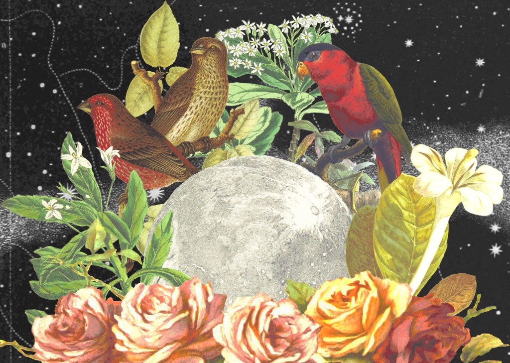
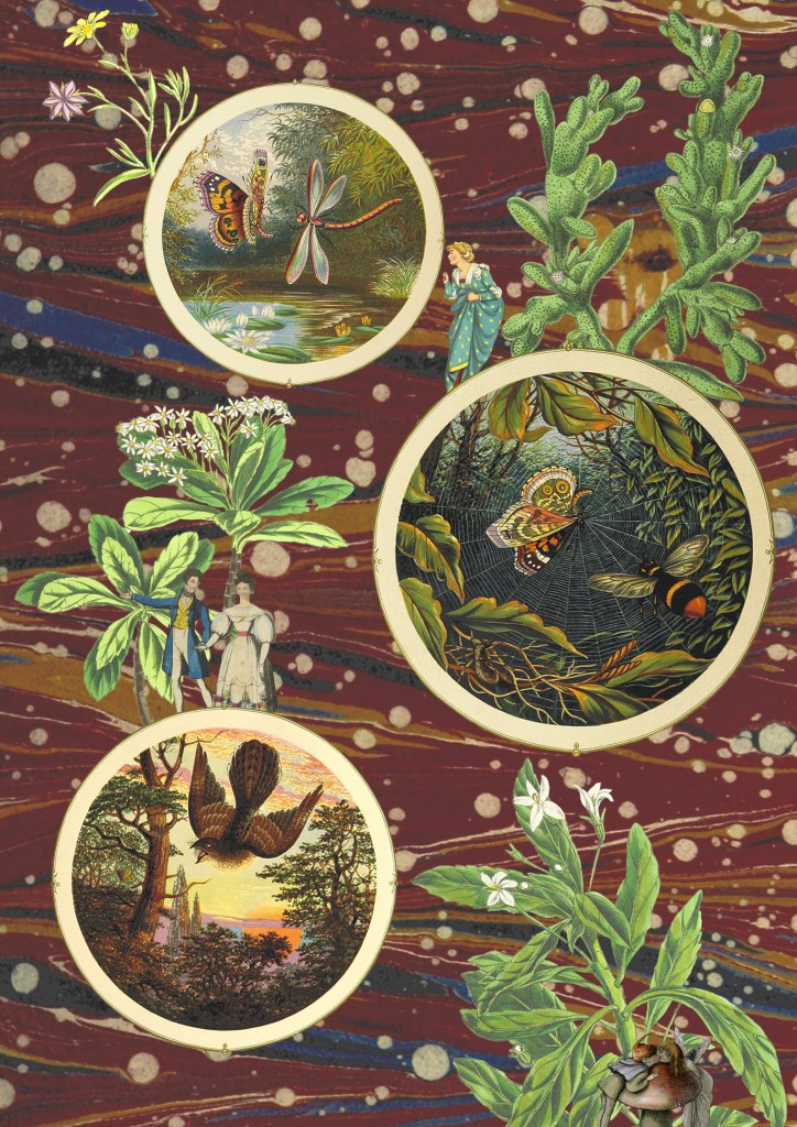
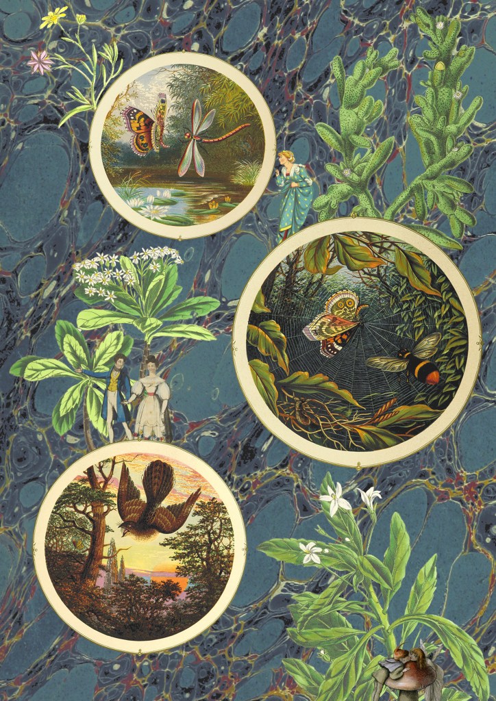
3 and 4. The next 2 are variations of the same image, with only the backgrounds changed. I couldn’t decide which background I liked more as they both work well in the composition and give the collage different feelings. For this one I tried to create a more conceptual collage with a narrative. I used circular photo frames to act as portals with characters and objects interacting with them. Once again the main difficulty was cutting out the images cleanly. I enjoyed creating this more fantasy based one with more of a playful idea and meaning rather than just an aesthetic collage.
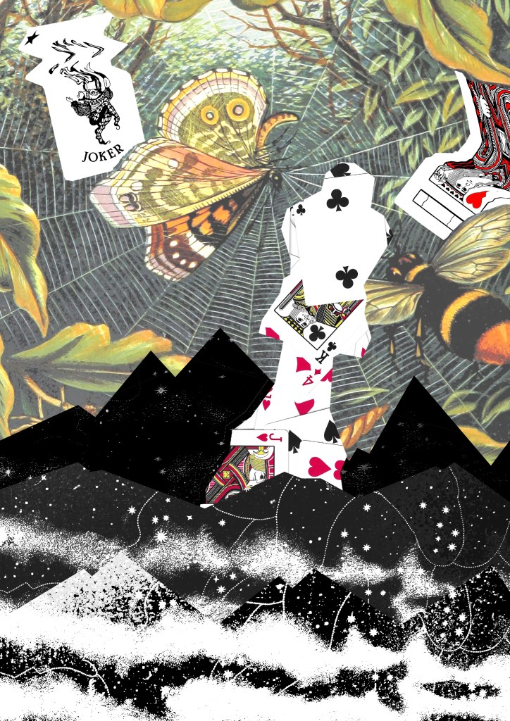
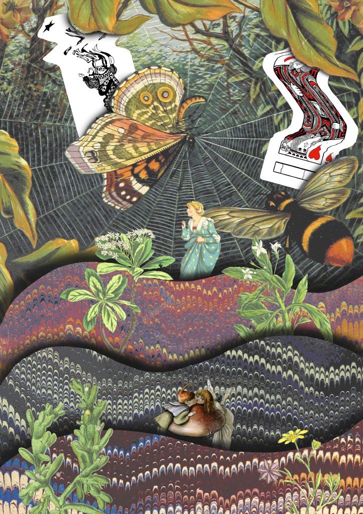
5. I drew on the ideas from images 3 and 4 and combined them with some of the visual elements from image 1, the cards and background. Theres a juxtaposition between the visual language of the images from Flickr and my experimental card scans. I was able to balance these contrasting elements by maintaining the same playful and fantasy style. I used a lot of the Photoshop tools we discussed in the workshop to create this including, selection tools, layering, brushes and editing the colours.
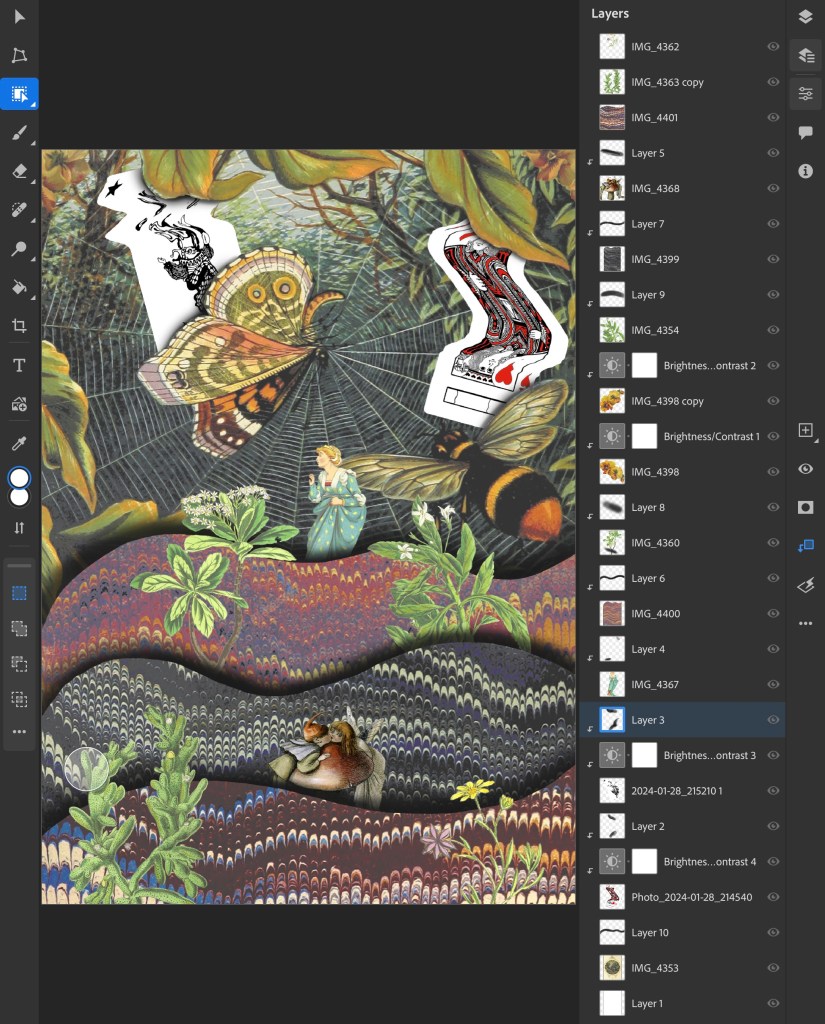
This is a screenshot from my Photoshop document showing all the layers and adjustment layers used to build up this collage:
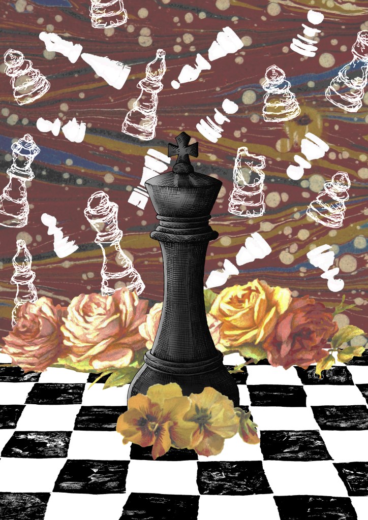
6. The previous collages has a playful concept whereas this one I went for a more obvious depiction on play by using my chess piece illustrations and Lino printed board. I combined these with a background and floral images from Flickr. The concept of this collage was that the black chess piece had one the game and all the white pieces in the background are ghosts. These one challenged me to combined multiple contrasting visual aesthetics into one collage.
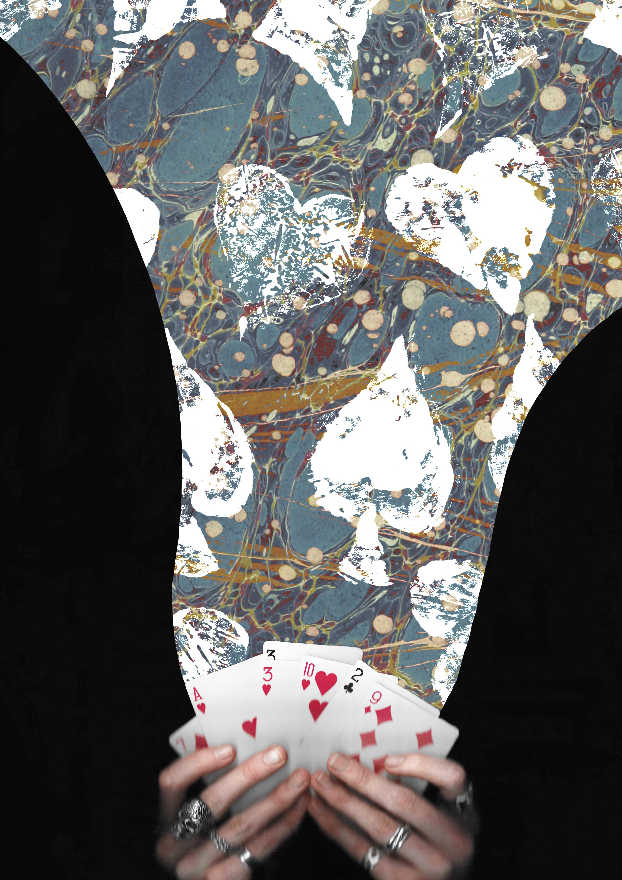
7. I wanted to create some more with the cards theme so made this one of magical cards. I used a layer mask to add the blue texture to only the part flowing from the cards. Then I overlayed the Lino printed symbol on top using blending modes. I went for a more dynamic composition for this one with unbalanced large and small elements.
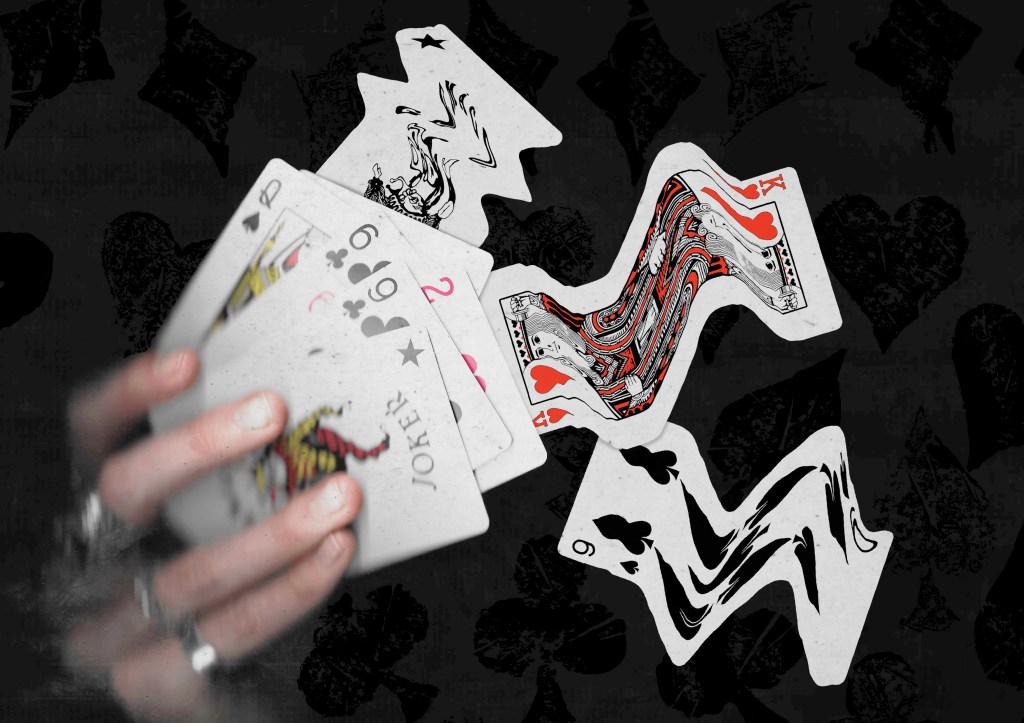
8. This is another collage using the scans I took of my hands holding some cards. This one also has a fantasy, playful concept with the cards moving out of the deck in a dynamic way. I really like this ideas and think it could work really well with an animated events of the 3 warped cards moving.
Reflection: I really enjoyed this Photoshop workshop, I was able to advance my skills with the basics tools and learn some new more advance tools. I’m happy with the series of collage I was able to create during and after the session in response to the creative challenge. I tackled the theme of play with both the visual elements, style and concepts to create a range of collages with juxtaposition. I experimented with the composition and arrangement to create a range of image, some being balanced and others being more dynamic. When creating the digital collages I considered hierarchy, scale, colour, tone, marks and texture.
