Click this link to view the completed project: https://heyzine.com/flip-book/27275454d2.html#page/1
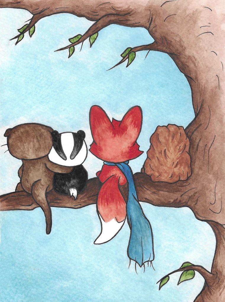
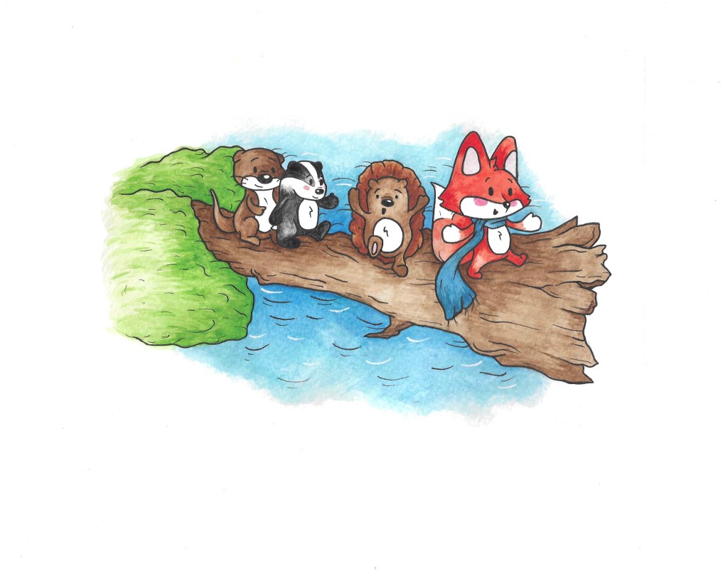
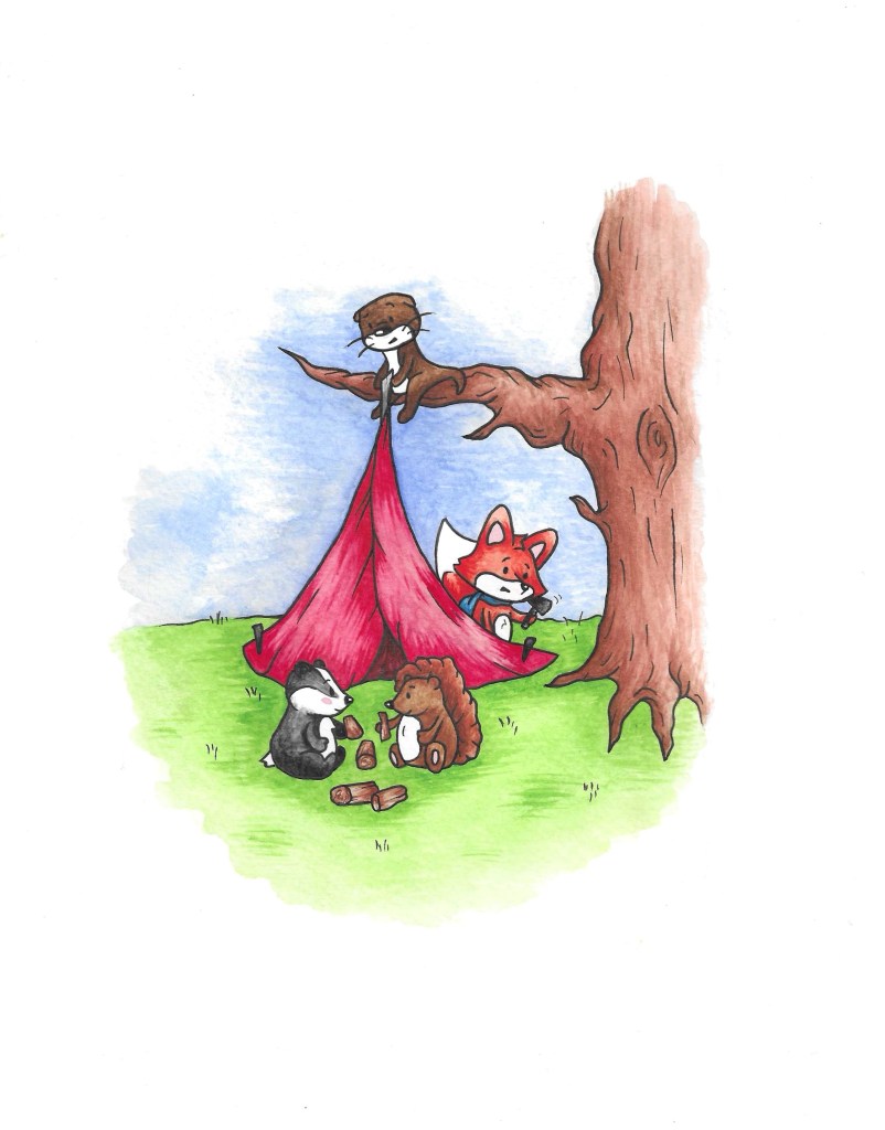
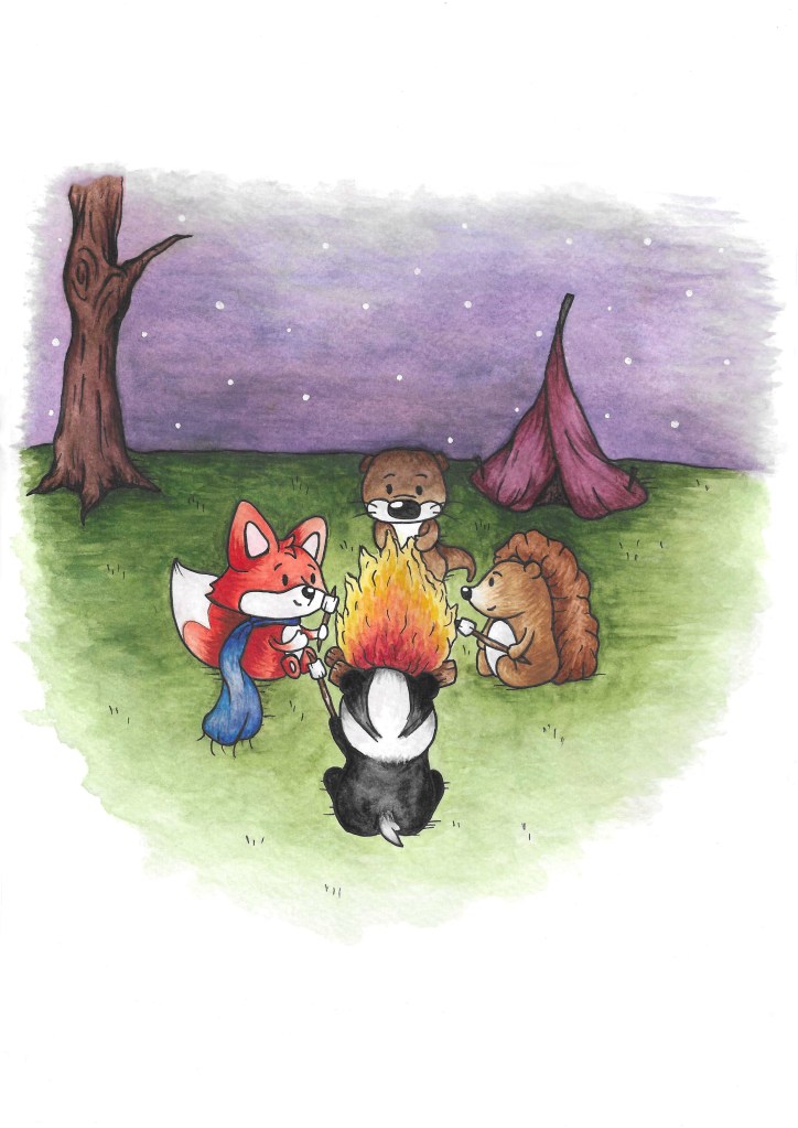
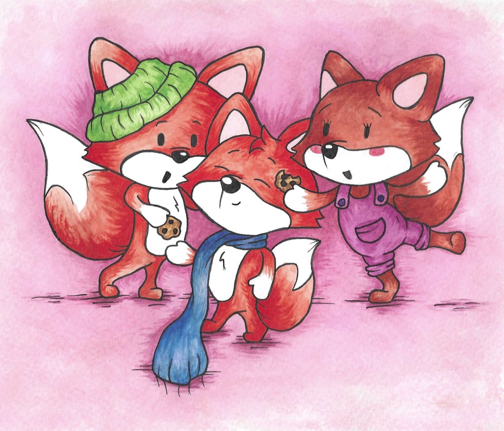
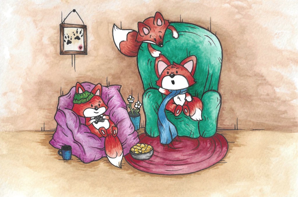
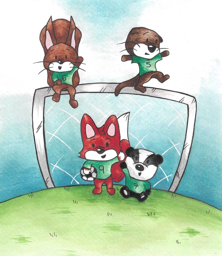
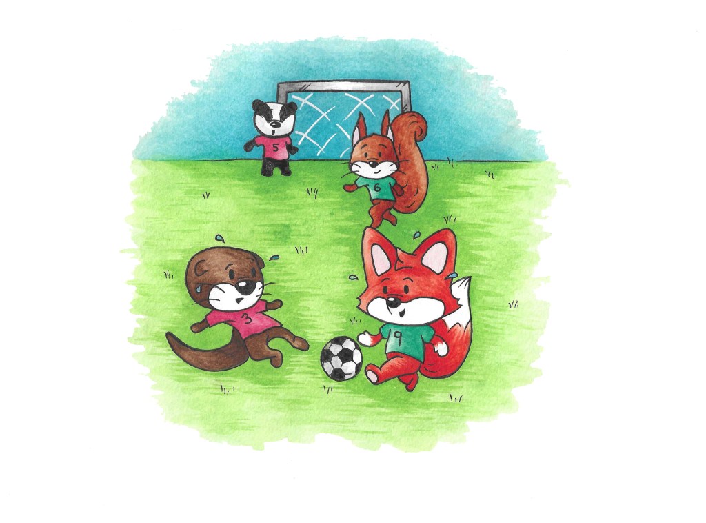
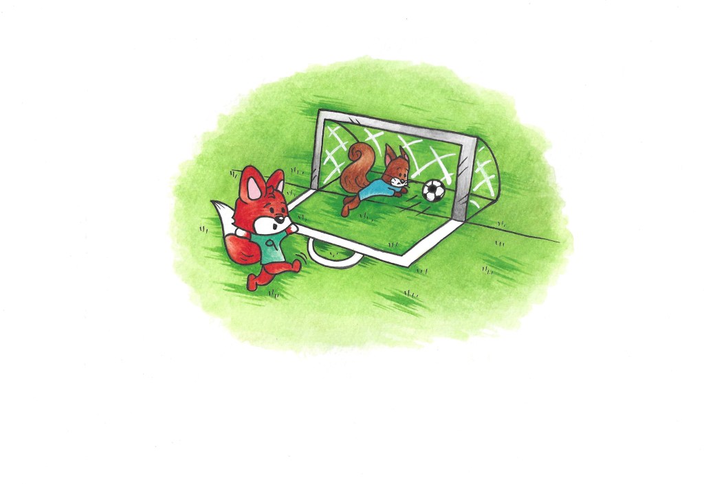
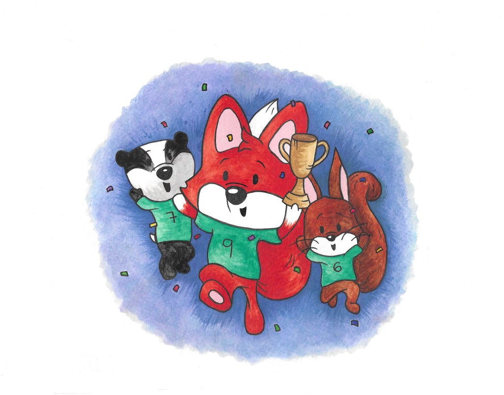
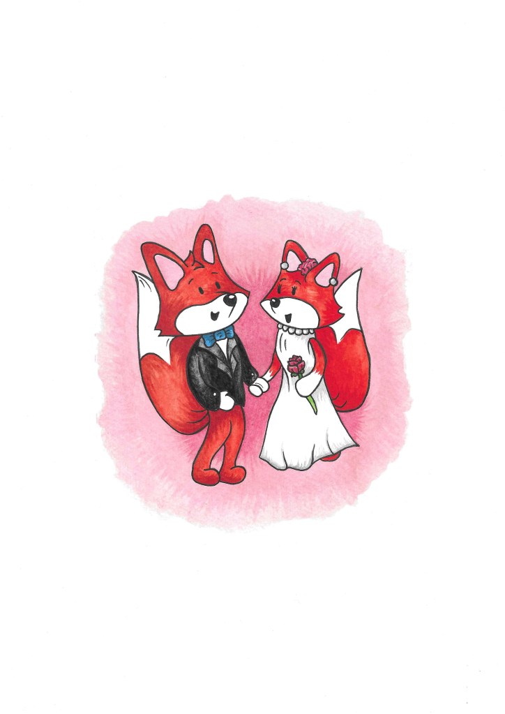
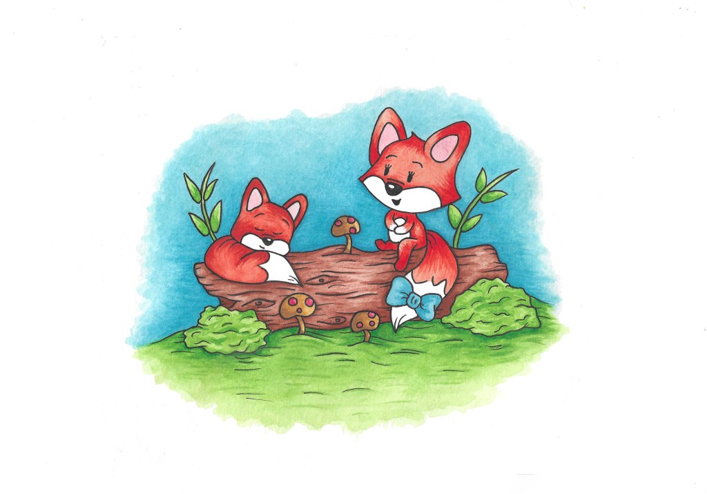
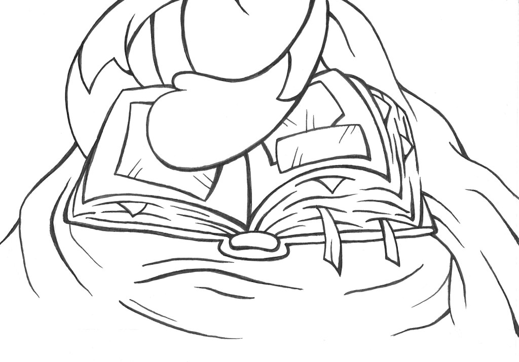
These are all the finished images I used, I made them with watercolour and pen:

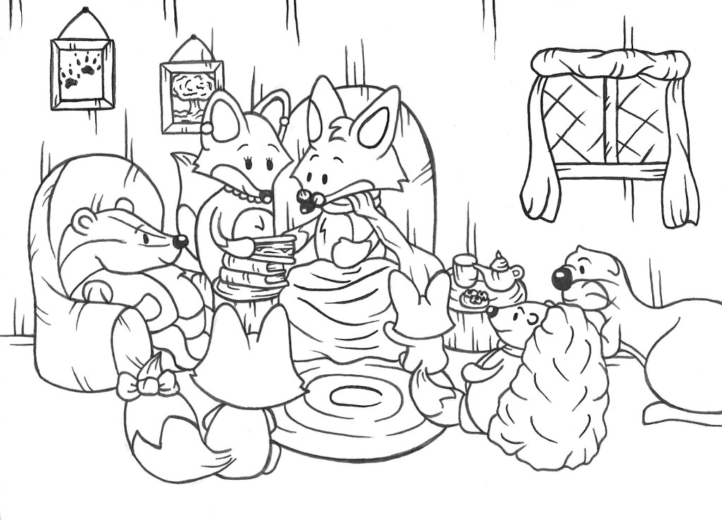
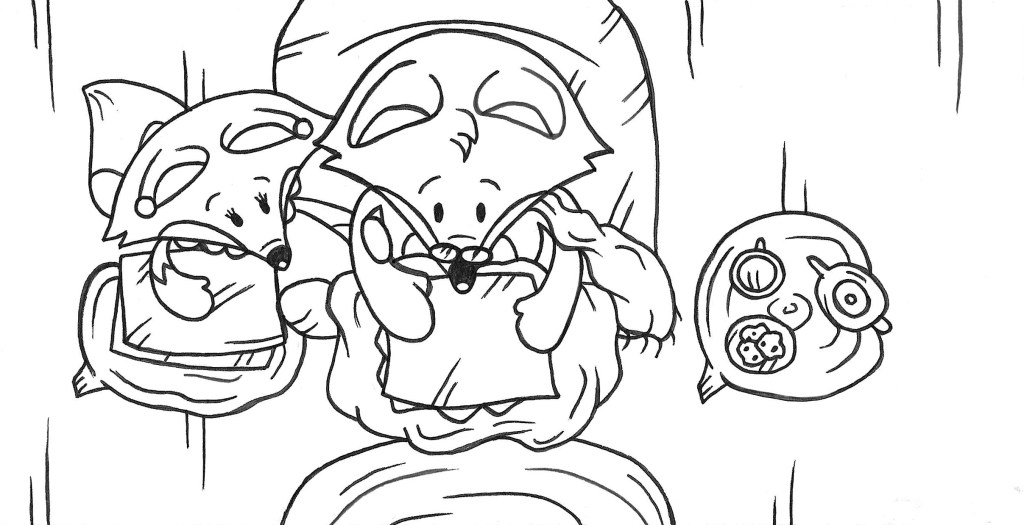
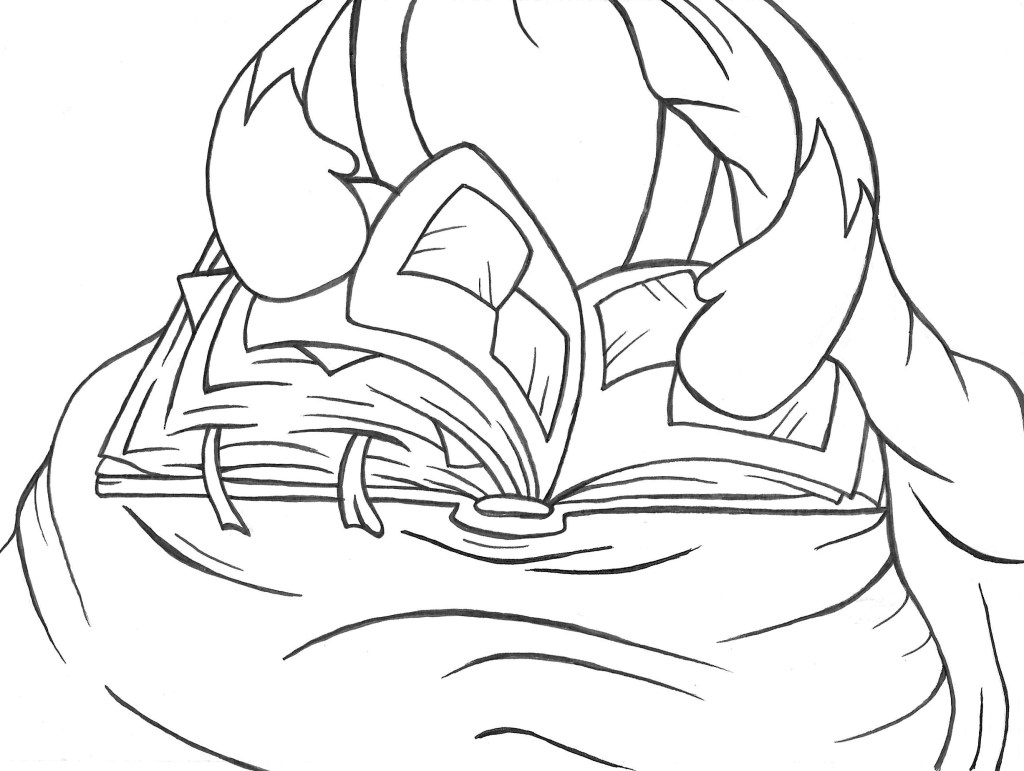
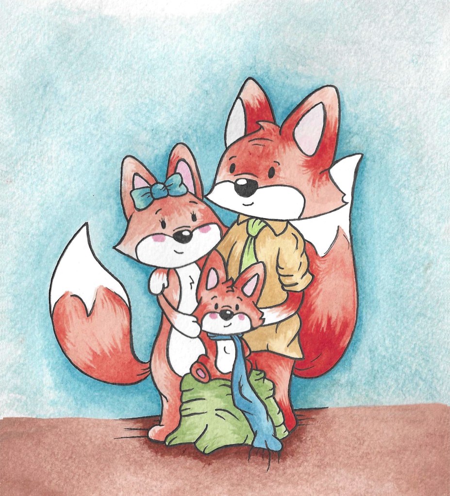
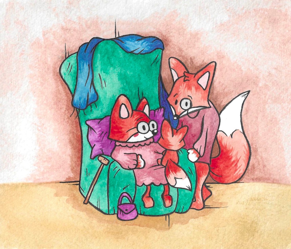
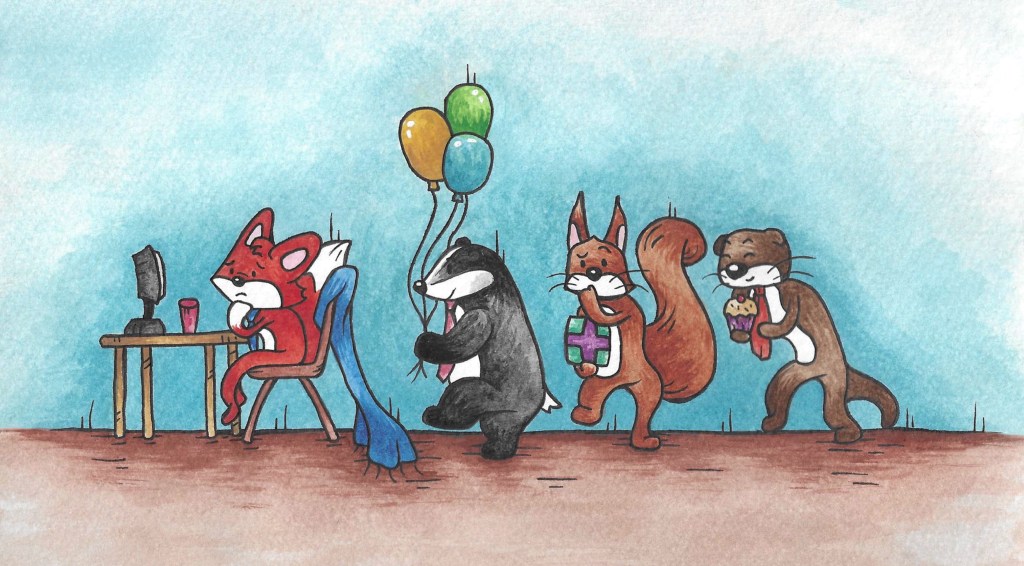
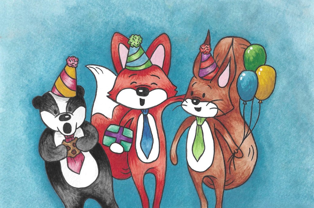
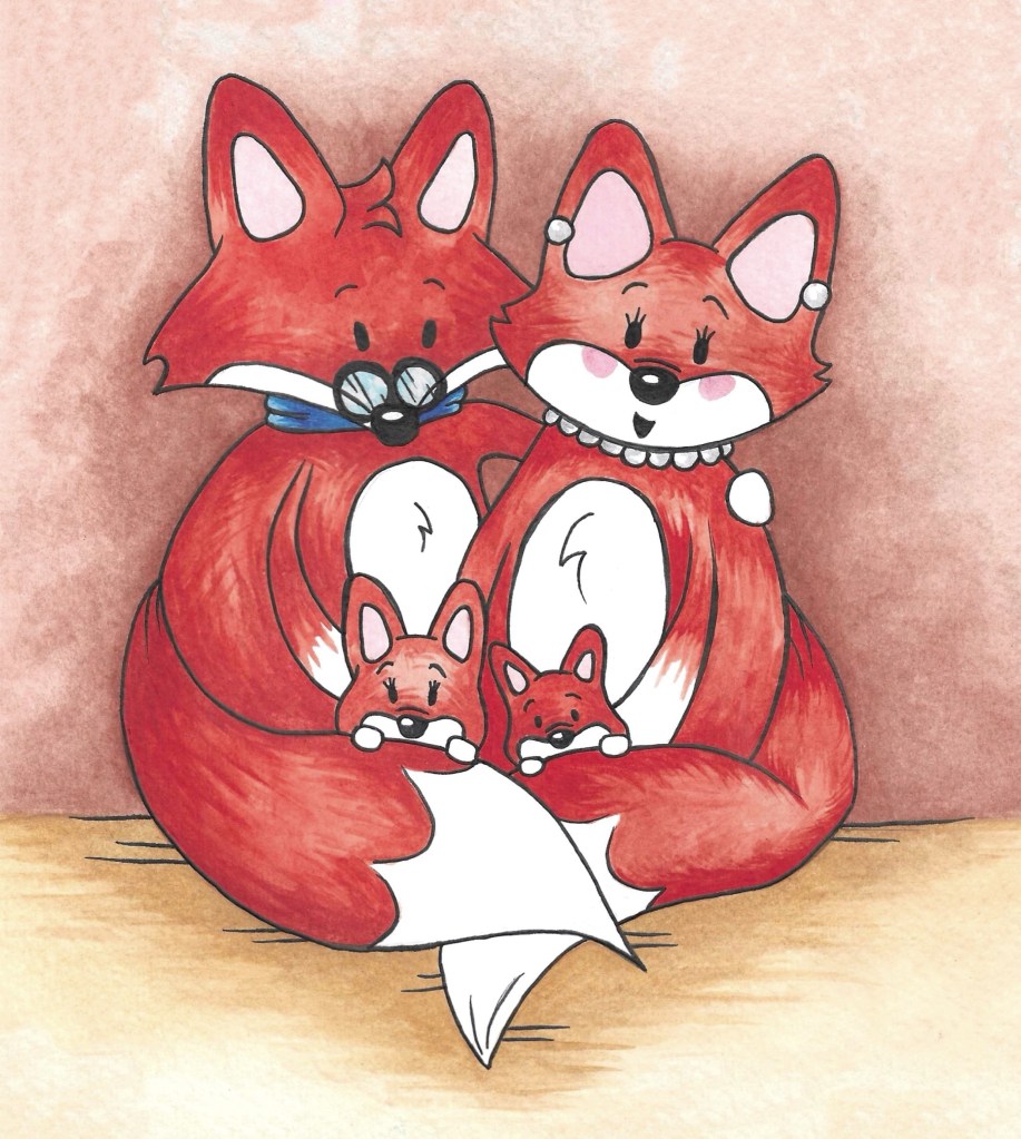
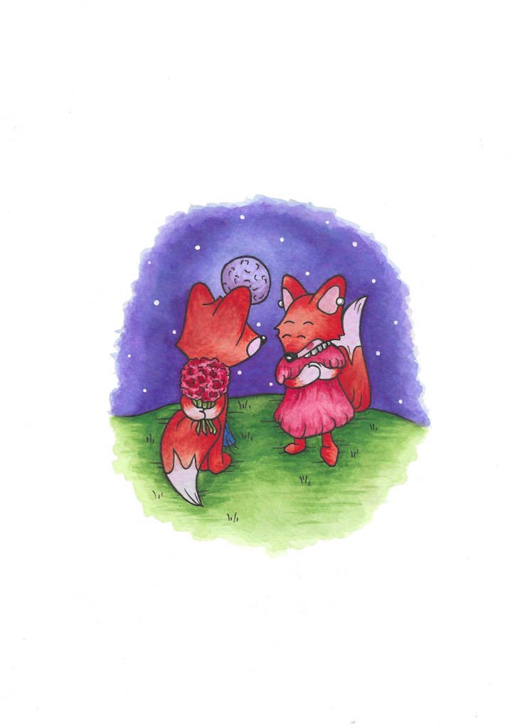

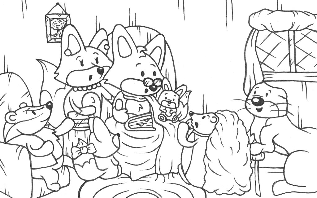
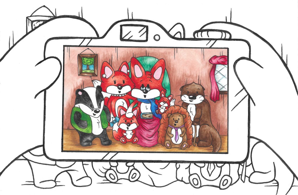
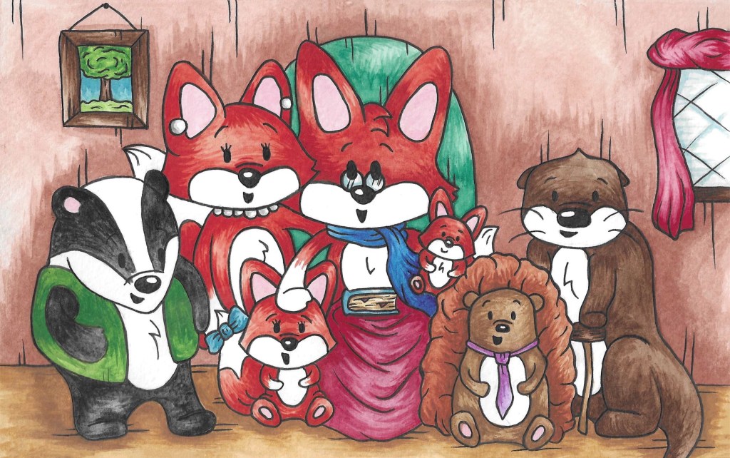
In summary the story is about an old fox who is with his family and friends and he shows them a photo album of his life. I worked a lot on creating an interesting narrative structure. The structure I chose has 3 layers, the present scene, the photo album and the memories. The narrative starts with the current scene then jumps back and forth between the photo album and the memories and eventually returns to the current scene. I think the last page is particularly important for the narrative as the present scene becomes a photo in the album.
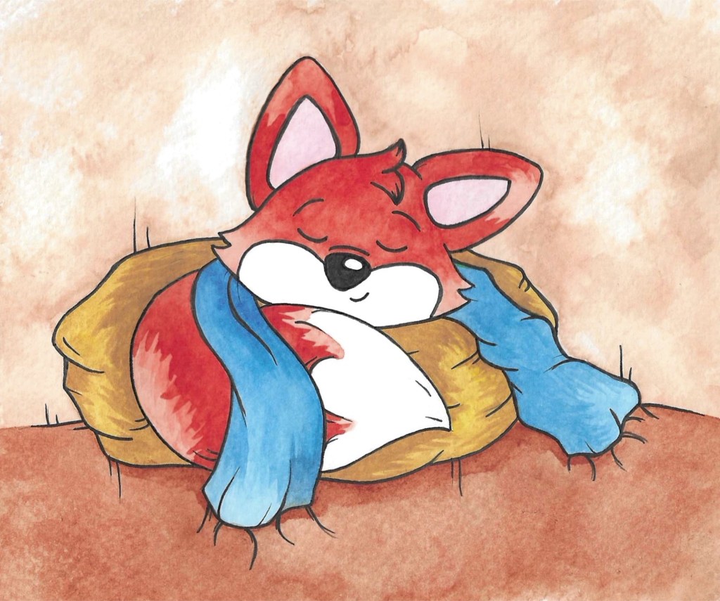
I chose the title as it immediately explains 2 of the key themes in the story, time and family. Also, it has simple words that can be under- stood by young children. The brief wanted the story to be aimed at children and young adults and I think I achieved both. The story is lighthearted and fun, when this is combined with the colourful and warm illustrations I think it would be appealing to children and help build their visual literacy skills. The style I tried to achieve is heavily inspired by the children book illustrators I liked growing up such as Beatrix Potter and Axel Scheffler. I wanted the style to be nostalgic for young adults and remind them on the picture book they read as I child. The story is about family, belonging and love, these are all timeless themes and are relatable to people of all ages as my narrative covers a character’s journey from being a baby to being and adulthood.
The format I chose to make was a digital book. I wanted to combine traditional mediums and digital software to create my story. All the illustrations are made by hand with watercolour and pen. I chose these mediums as I like combination of the bright, warm colours and the strong black lines. I then scanned all the images and made any small corrections I needed using Adobe Photoshop. For the format I used Adobe InDesign. By the final stages I had all of my layout described but I still had to make decisions about the background as I needed to make a clear visual difference between the 3 different layers of the narrative. As well as different background I used different visual assets to help make the difference clear such as tape for the corners of the photos and bubbles for the memories. The next step for this story would be to actually get the InDesign document that I made printed into a physical book to help give the story a more tactile experience.
