The next step was to take the visual assets I had created and start developing them into ideas that I can use to create outcomes for the campaign. The 3 visual style I have chosen are natural textures, digital illustrations and photography. I was very happy which each style individually but the challenge is to combine the 3 contrasting visual aesthetic to create a cohesive brand identity. I experimented with the raw assets to see how best to use them for the campaign.
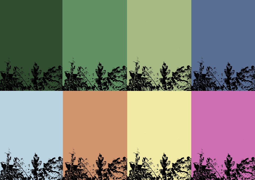
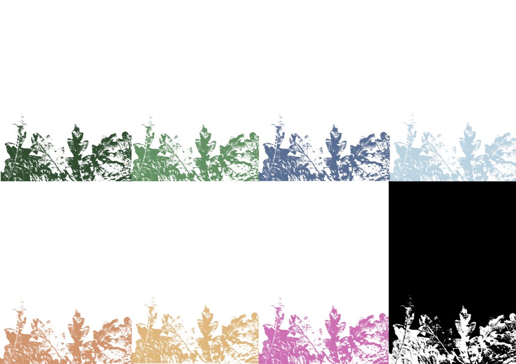
I took the textures that I made from scanning and printing and played with the colours to make them match the tone and aesthetic of the campaign. I used the brand colour palette which I saved on Procreate and all the relevant Adobe softwares. I used different blend modes to achieve different distributions of colour. This process is far more time effective than doing physical prints in each colour. I certainly wanted less black as I wanted white to be the most common neural tone as it helps lighten the image and give it a more welcoming feeling. Below are some experiments I did using the leaf textures, wood textures, lino prints and branded colour palette.


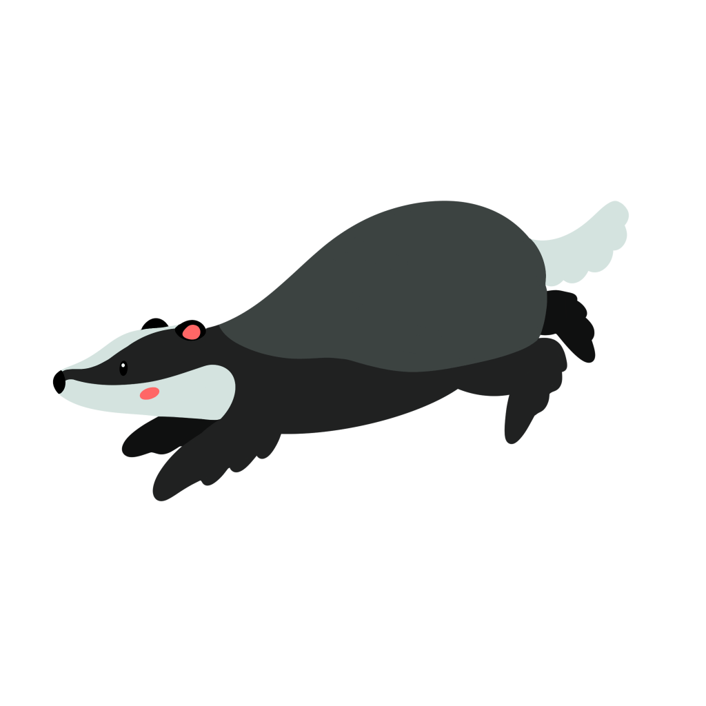
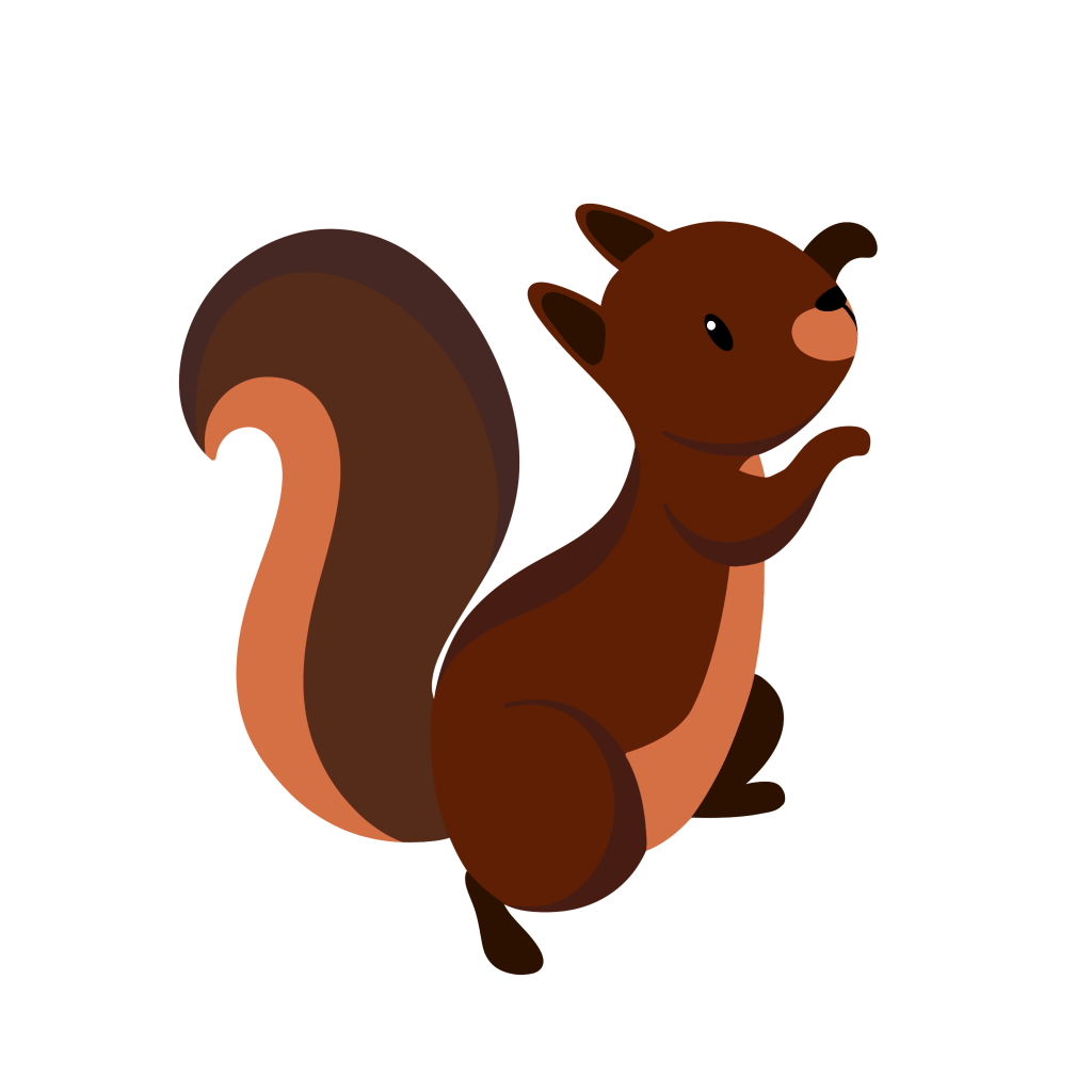
In order to make the digital illustration of my characters more versatile I removed the textures I put on them and vectorised them on Adobe Illustrator. I used the image trace tool, this is the same process I used for the logo. They can now be scaled really big and really small. I still like the look of the textured versions so I may still use them for some outcomes. Below are the vectorised version of each character:
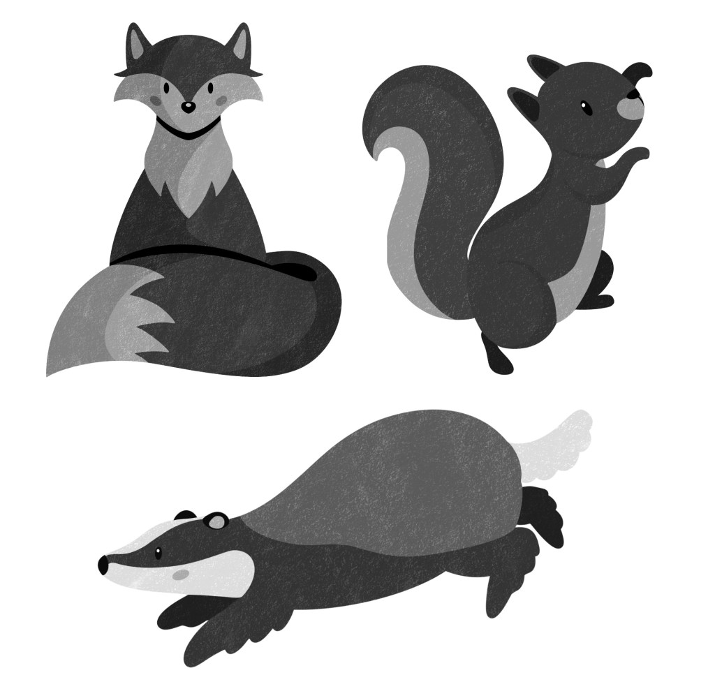
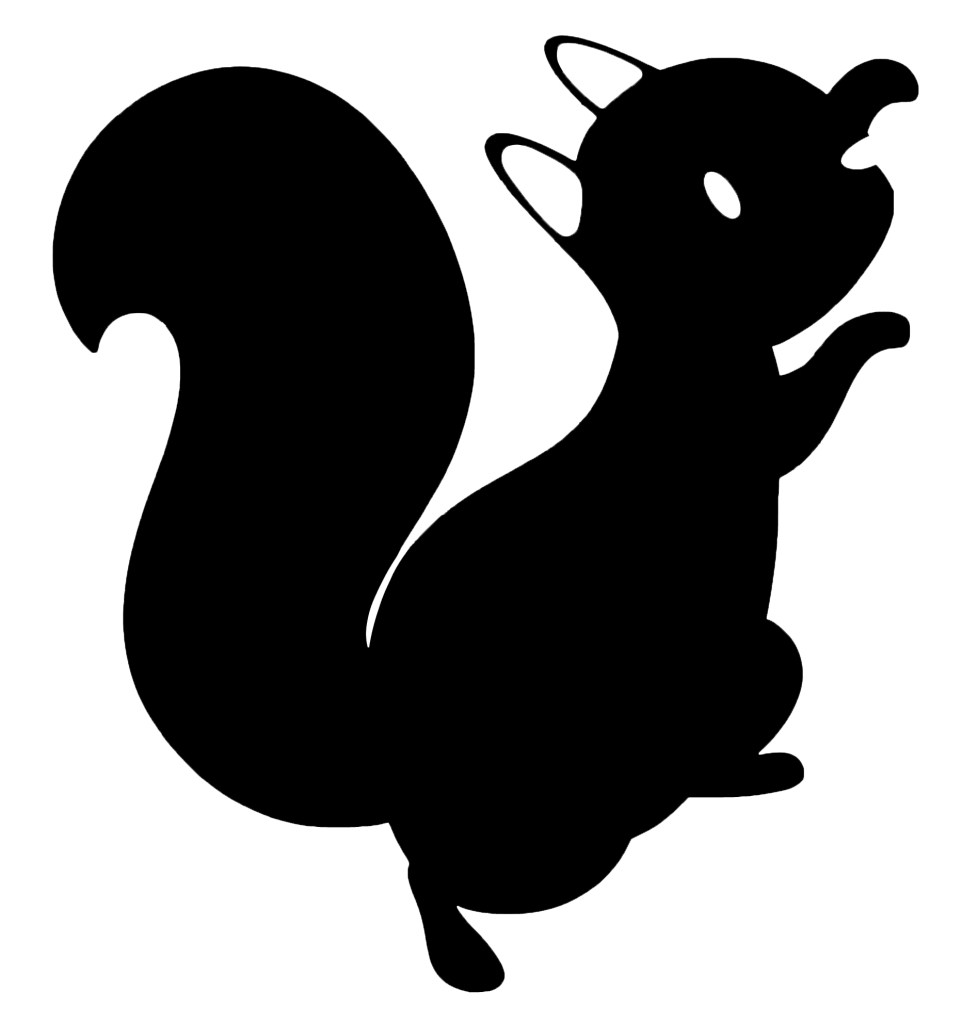
In one of the sessions I had I was given feedback on my designs and told that for some outcomes, in particular merchandise, the characters may be better with less colour. This is because I already have lots of strong colours in the brand palette so to actually make the characters stand out I need to remove the colour. I experimented with different ways to do this. First I tried just desaturating the colours but I didn’t like this as they seemed too lifeless and I thought the details didn’t translate well.
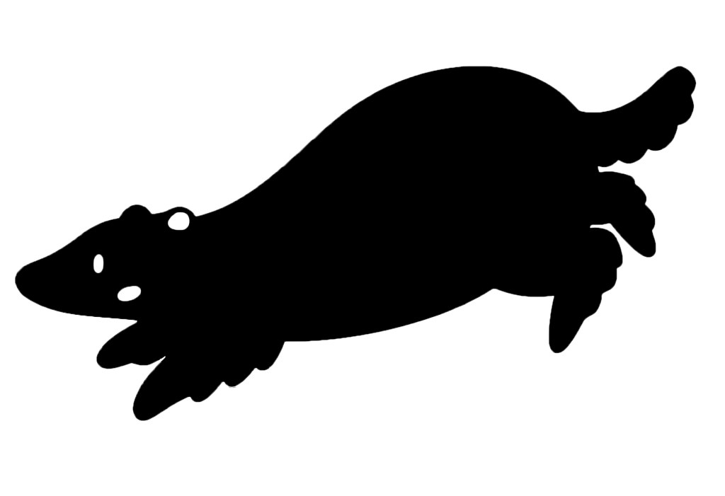
I preferred this more graphic silhouette style. It’s a much more minimalistic look and I think it’s nice as you still get the shape so can recognise the character and what animal it is. I’m going to try experiment with this style on some merchandise.

I wanted to start combining the photographs I took of the cut outs of the characters with the textures. I saved white PNG versions of some of the textures and played with different compositions. I chose white as it’s clean and simple and was the most eye catching colour against the busy photos. I really like the unique combination of the visual styles. In these compositions I can see potential for social media posts and possibly posters.
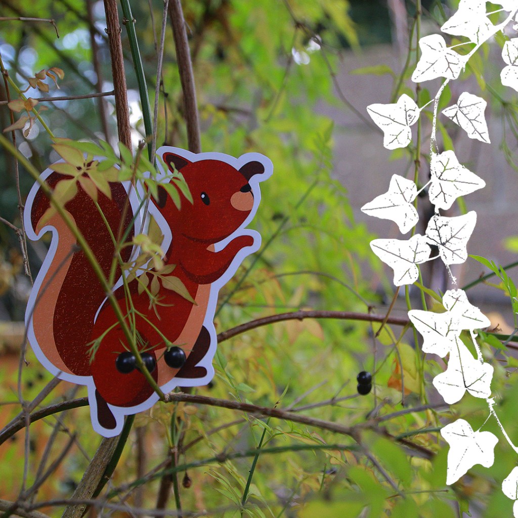
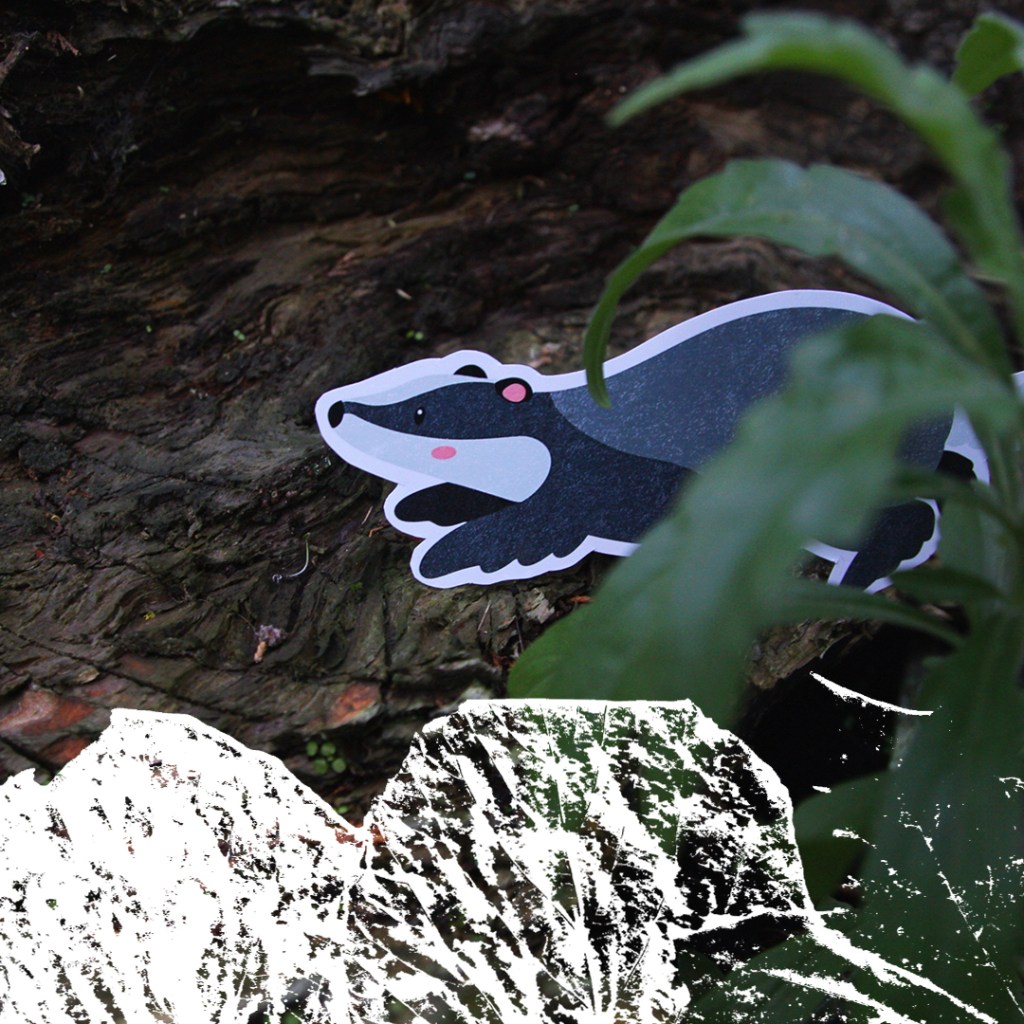

I experimented with this way of combining them on some of the stock images but found that in some cases the textures didn’t stand out enough no matter what colour I used. The solution I came up with for this problem was to use these nice curved shapes with colours from the branded palette and put the textures over the top. This style is something I really wanted to continue with and use as a key part of my brands visual language especially for digital and printed outcomes. The curves are versatile and can be used to compliment the subject of the photos.

I experimented with the each style of visual asset and ways to combine them to create a cohesive visual language. I am happy with the ideas and the next step is the experiment with combining the visual styles with the other branding elements (typefaces and logo). Also I will begin making the outcomes for the campaign.
