I have chosen the branding/campaign identity by creating a name, slogan and designing the logo, colour palette and typefaces. Now it’s time to create the visual assets for the branding outcomes. In order to decide the visual style I researched what children ages 5-10 respond best to. I plan to have 3 key visual asset styles, natural textures, digital illustrations and photography.
Natural Textures
I made a range of natural textured work to use as backgrounds, borders and overlays. To do this I used digital scanners to scan real textures and different printing styles. This delicate style is aimed more towards the parents as older people appreciate more subtle and refined details. The textures will complement the bright colour palette and help emphasise the natural, hands-on theme of the campaign.
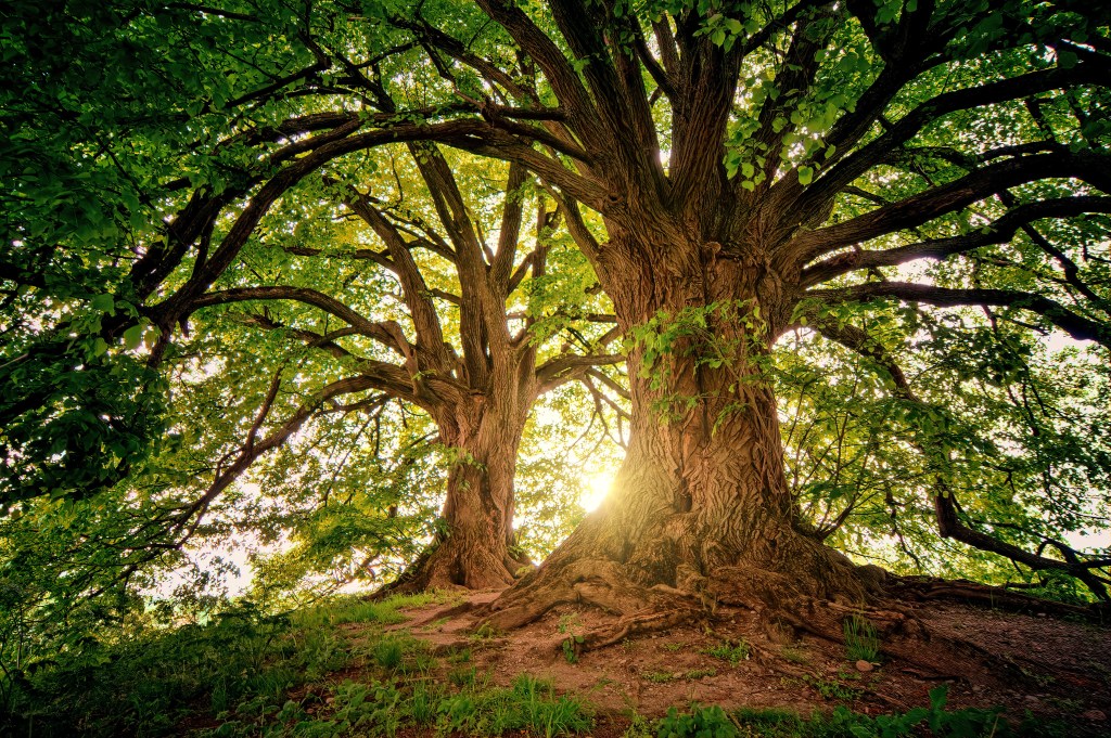
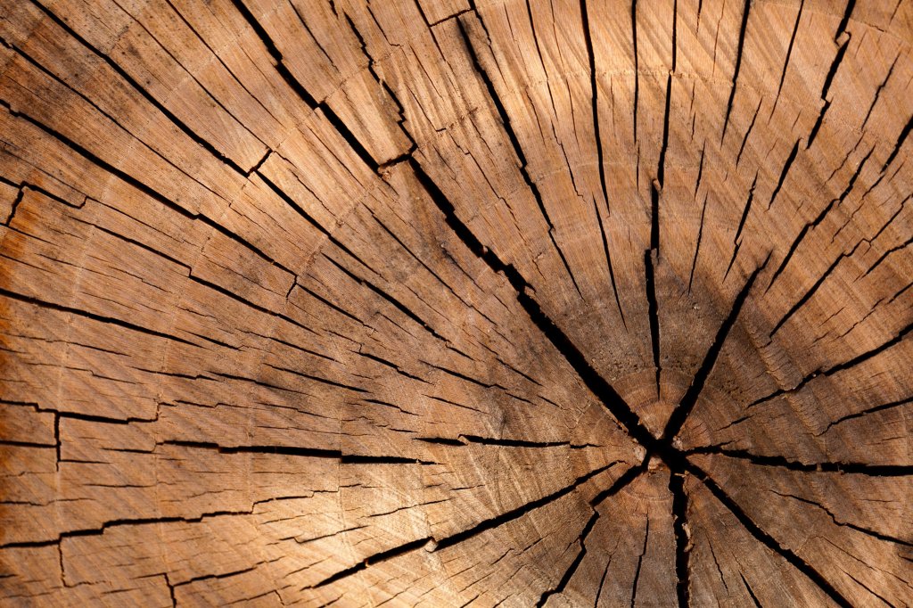
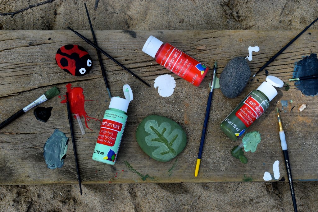
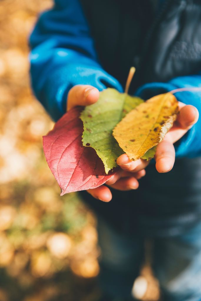
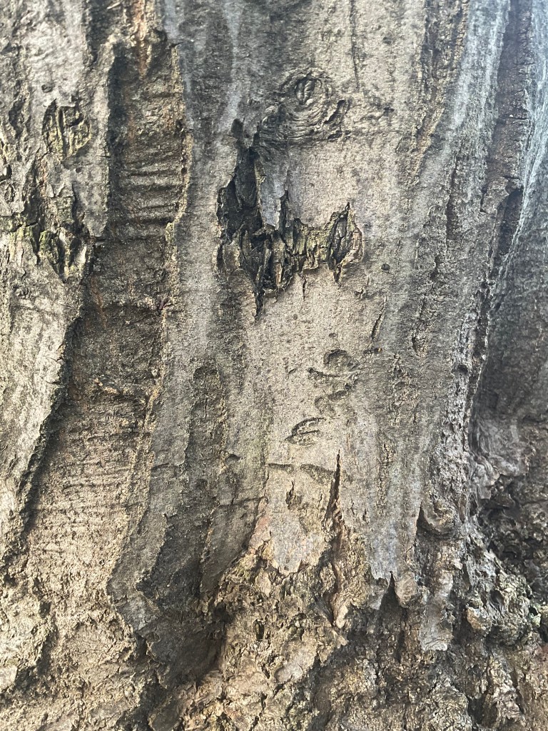
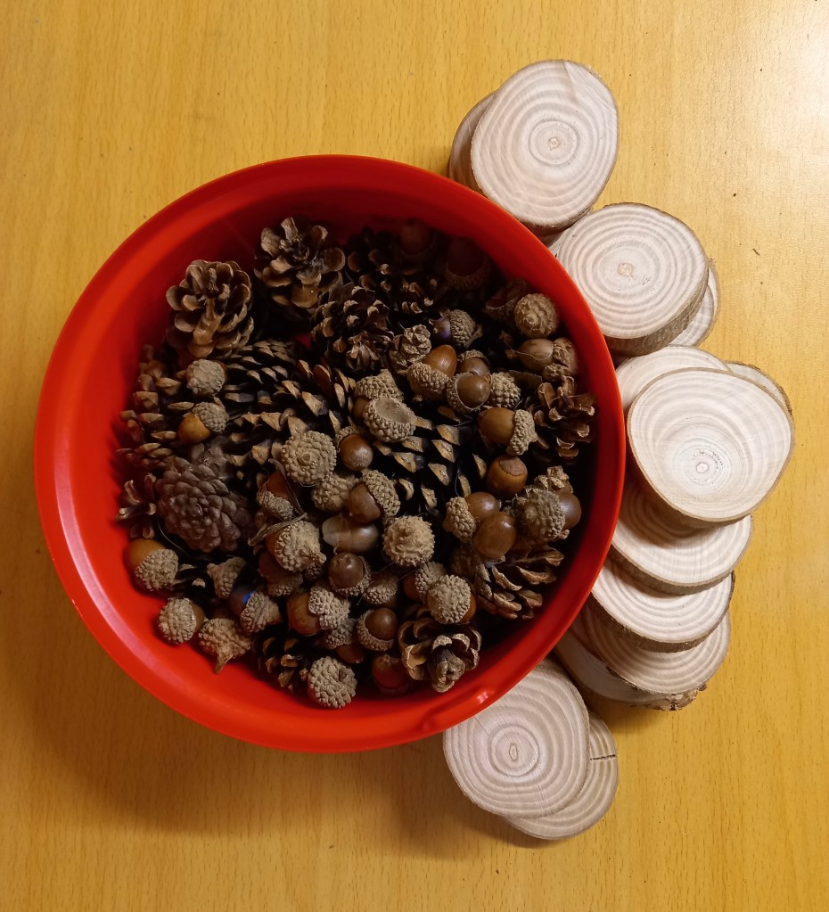
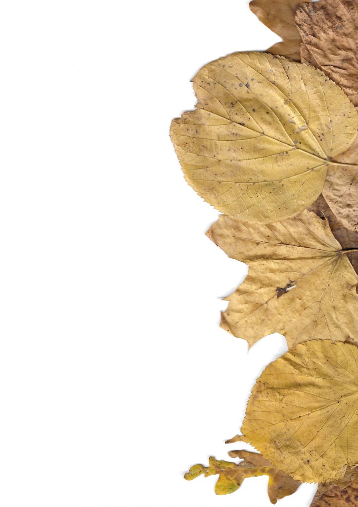
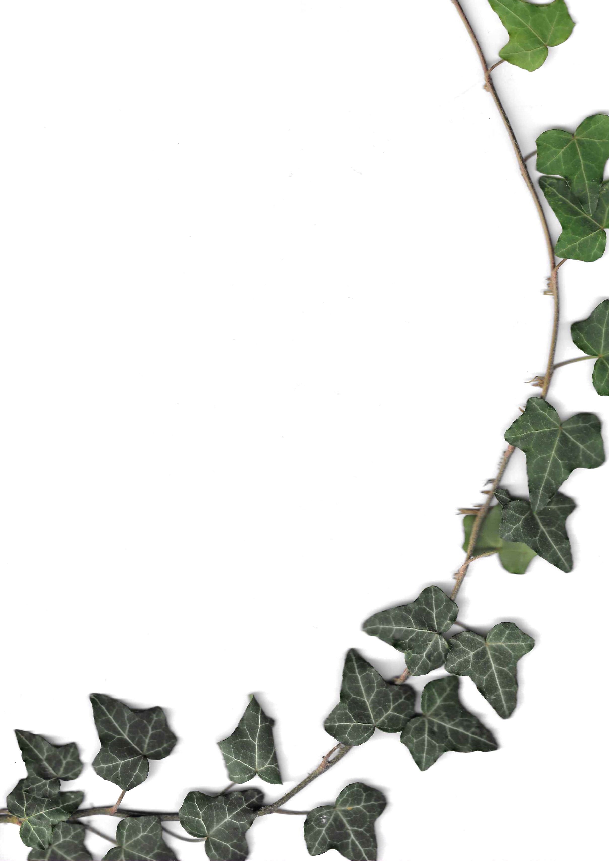
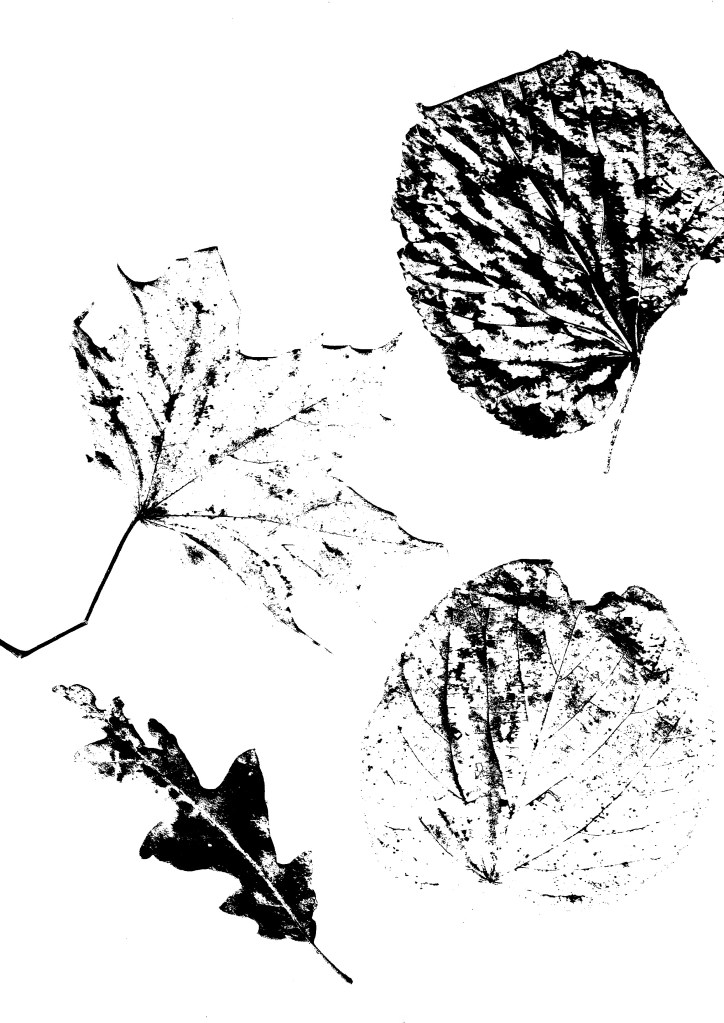
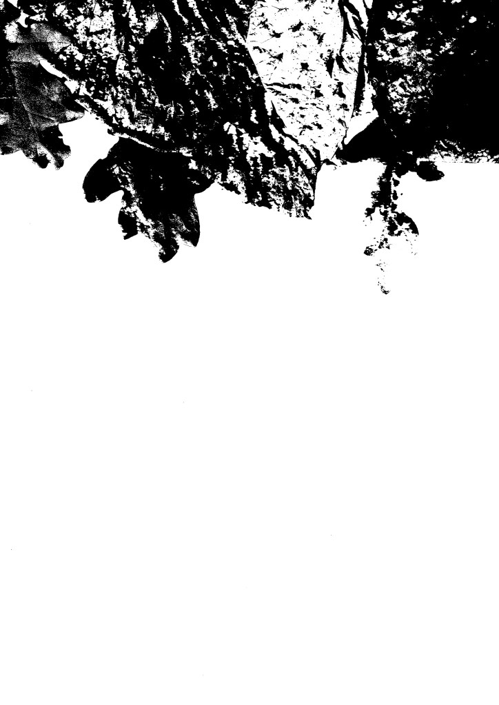
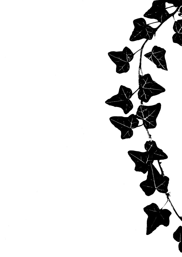
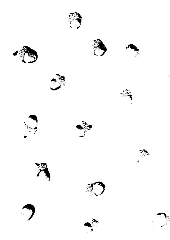
Below are a range of natural textures that I have collected and photographed. They include tree bark, leaves, pine cones and acorns.
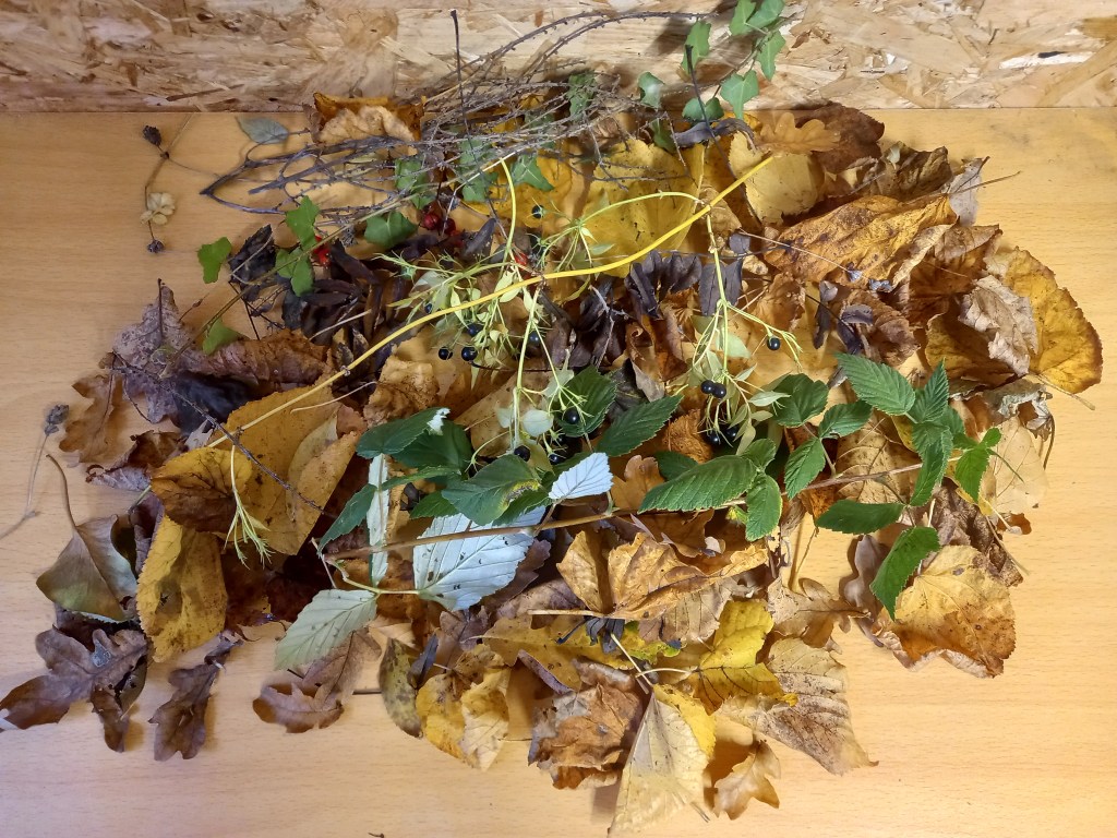
I used the printer scanner that I have at home to make a bunch of different compositions from the random assortment of leaves I collected. Some are with lots of leaves covering the whole area, some are in more organised placements such as the corners and others are focused on specific leaves. This gives me a range of images to edit and use.

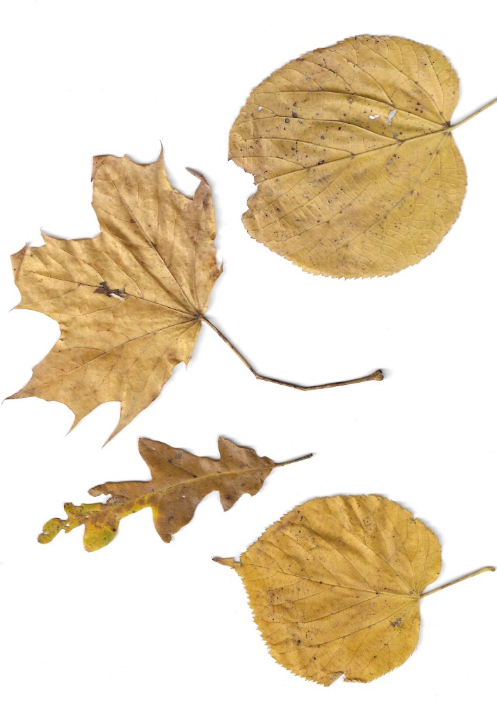
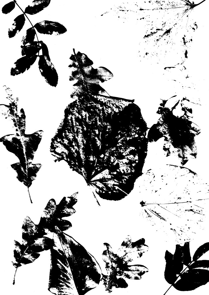
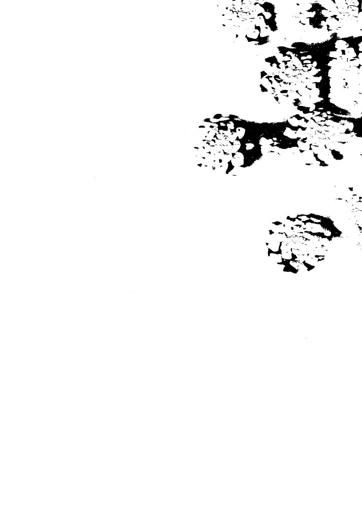
The scanning software that I use (HP Smart) has a range of filters that can be applied to the scan so I experimented with them and chose to use this one as I like the graphic contrast it creates between the light and dark parts. It has the style of a screen print which is an aesthetic that I really like.
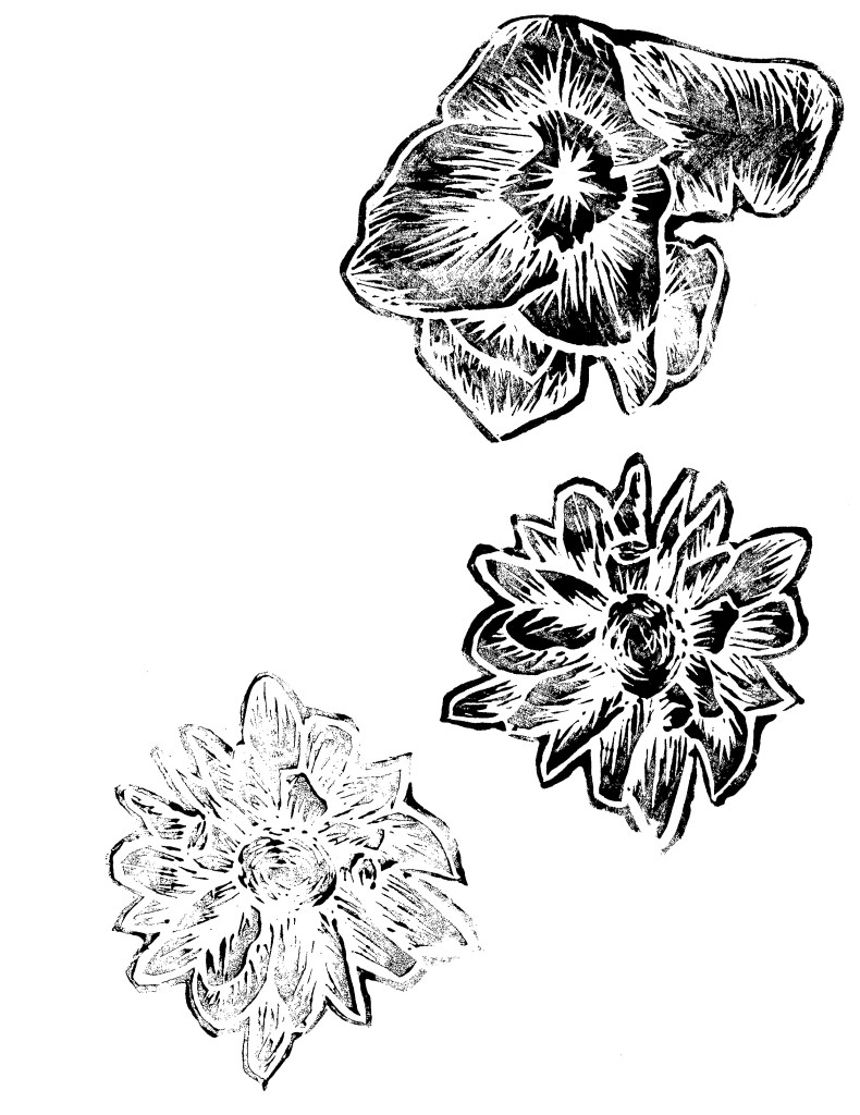
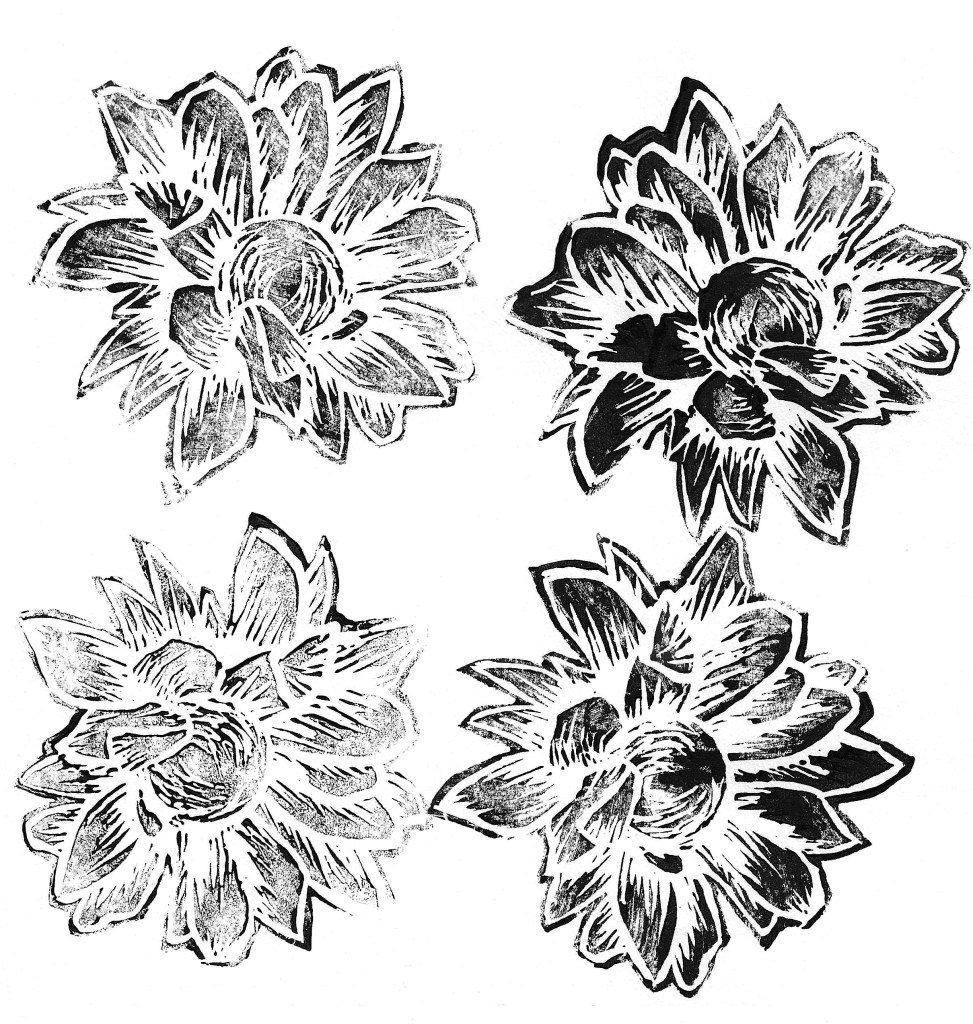
Lino printing is a technique that I have experimented with previously and I think it creates a really nice textured look. Using the printing facilities at the University I carved at series of floral Lino cuts. I chose a dynamic carving style to create lots of texture. From my previous experience I have found that this style produces the most bold and striking results. To save myself time I only printed in black ink, making sure to get some darker and some more faded prints with each design. I will later colour them digitally to align better with the campaign identity.
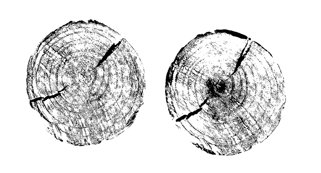
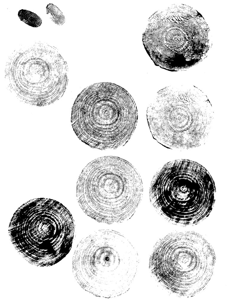
I also experimented with printing over wooden discs. Initially I tried using the same ink I used for the Lino prints but it was too thick so it didn’t print the fine textures of the grain. So I tried using black acrylic and that worked much better as it’s thinner so the prints came out much more detailed. In the same way I did with the Lino prints, I only printed them in black and will alter the colour digitally.
Digital Illustrations
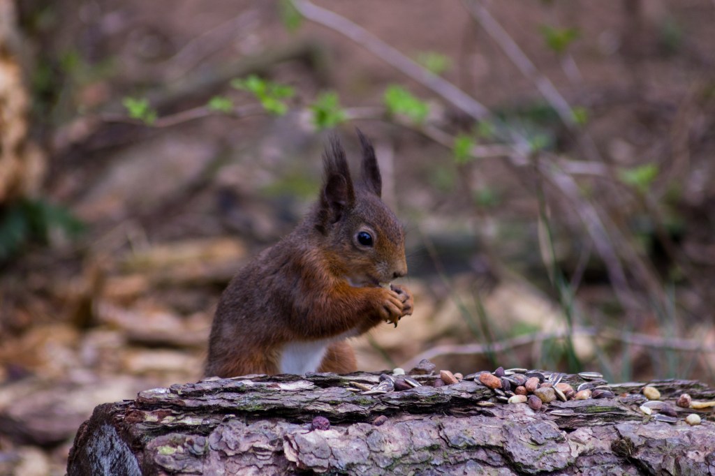
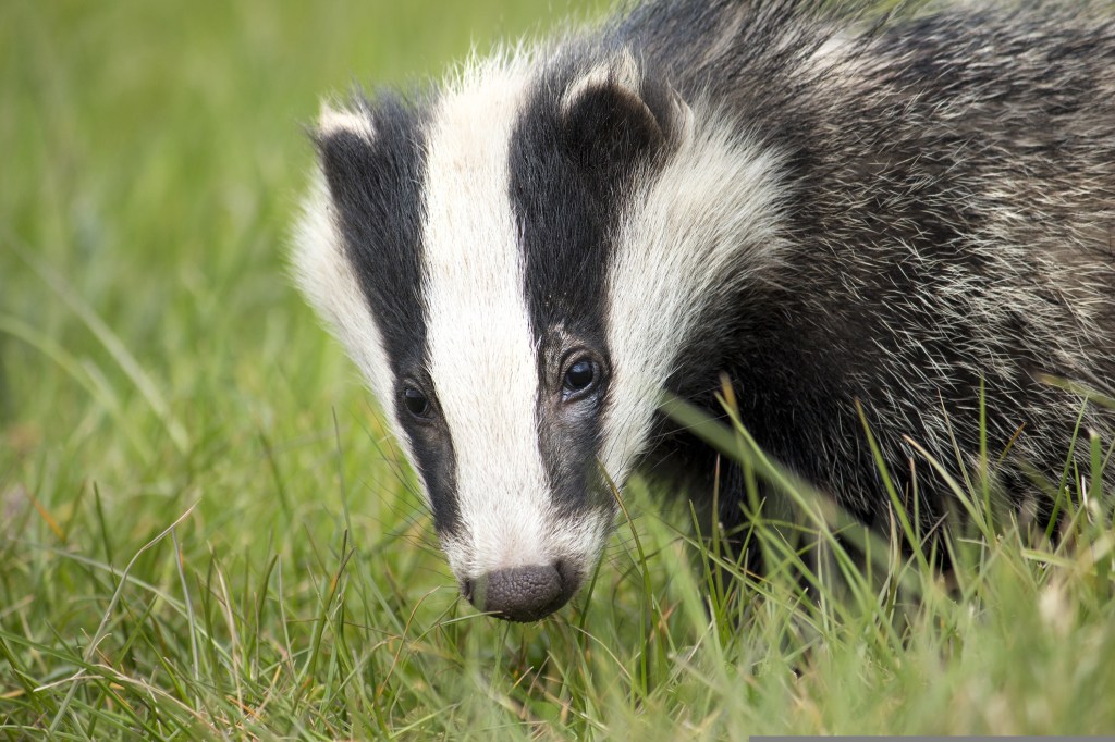
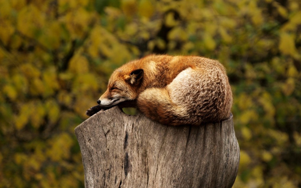
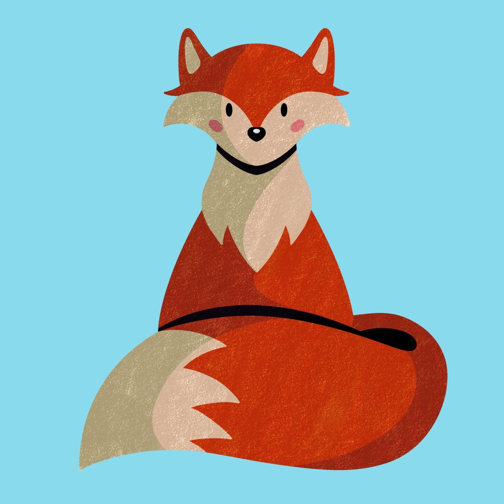
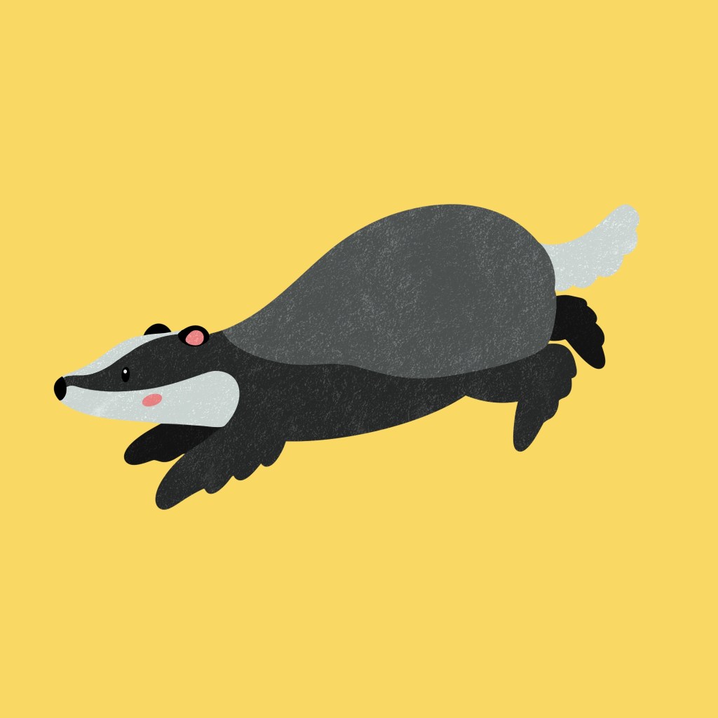
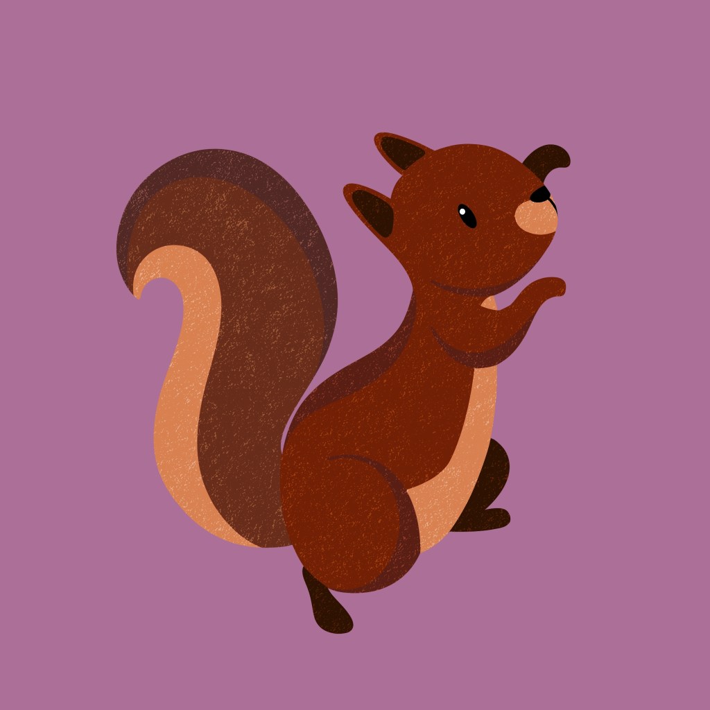
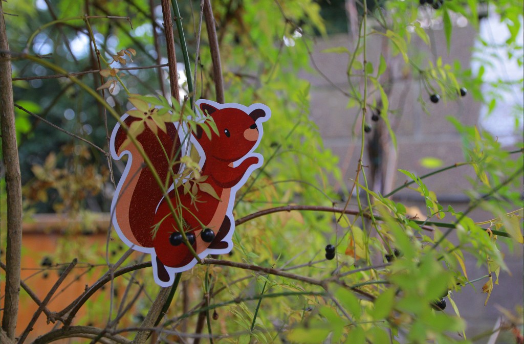
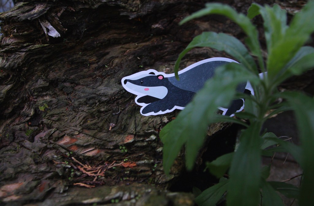
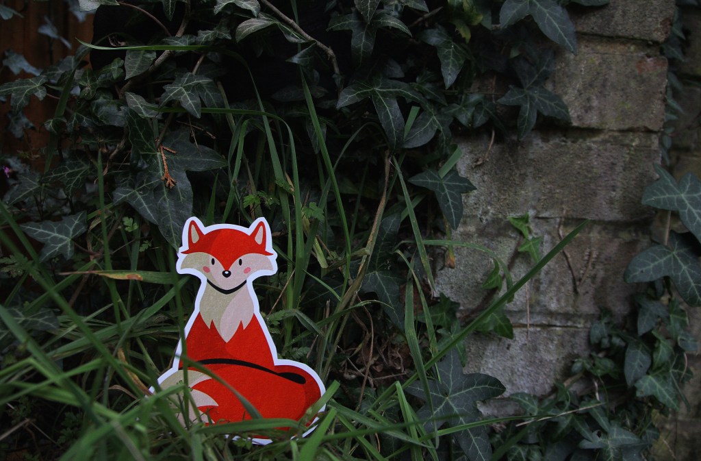
I created characters that will be used across publications and merchandise because it gives the campaign a welcoming and friendly face that will help to engage and encourage children to take part. Many brands use animal mascots such as Tony the Tiger to encourage children to engage with the product. These characters are of UK wildlife as the campaign is based in the Uk so children will relate better to these animals as opposed to a lion for example. I researched different Uk wildlife and decided to go with a fox, badger and squirrel as they’re easily recognisable as they all have distinctive characteristics. I came up with names for each character to help bring them to life. They’re as Freddy the fox, Benny the badger and Susie the squirrel. I wanted them all the end with and ‘e’ sounds and be an alliteration to make them sound cute and be memorable even for children. I used digital media (Procreate) to make these cartoonish and fun vector style illustrations as this way I’ll be able to achieve eye catching colours on screen and in print. These characters will stand out and nicely contrast the organic textured work. I made sure to not make the colours too bright and use CMYK colours so they will look the same on screen and in print.
Freddy the fox
Benny the badger
Susie the squirrel
Photography
The other visual style I will use is photography. Through my research I found that almost all brands about nature feature photography as a key part of their branding. Photography is a great way to attract both the parents and children. This will help add a realism to the branding, in contrast to the cartoonish characters. I think the blend of these 3 visual styles is unique as I haven’t come across another brand who uses all 3 simultaneously.
I rented a camera from the University to take some of my own photos for the campaign. The camera I used was a Canon EOS 60D. I don’t have much experience with high quality cameras so I explained my ideas to the staff in the Photography store and they recommended this one because it is ideal for high resolution images and one of the easier models to use as a beginner. The campaigns and brands that are the most successful, especially when aimed at children, are the ones who step into world creation. I attempted this by trying to bring my digital characters into the real world, creating a spatial outcome. To do this I printed out the characters in nice glossy paper and with a good quality printer then cut them out and placed them around my garden. I’m very happy with the results as the camera produced highly quality photos depicting the chapters I created as if they were real animals. I like the contrast between the natural surrounds and the digital drawings.
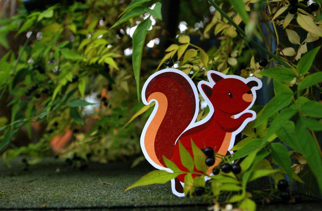


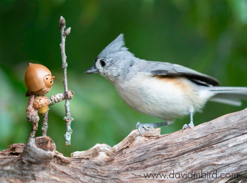
I took inspiration from the artist David M Bird who makes little characters and captures these beautiful moments of his characters interacting with nature. One of his photographs is below:
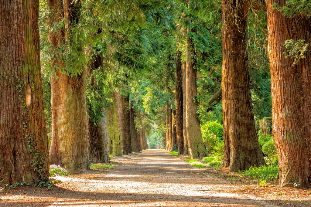
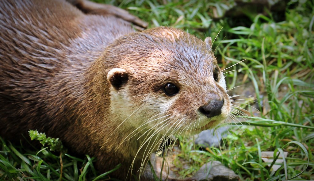
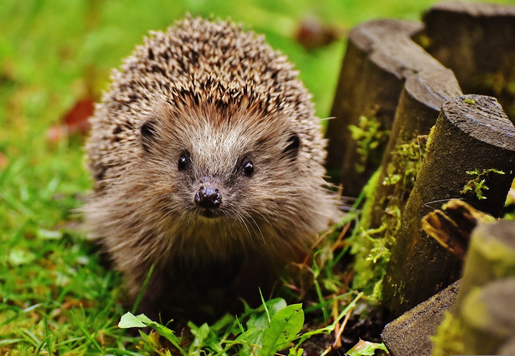
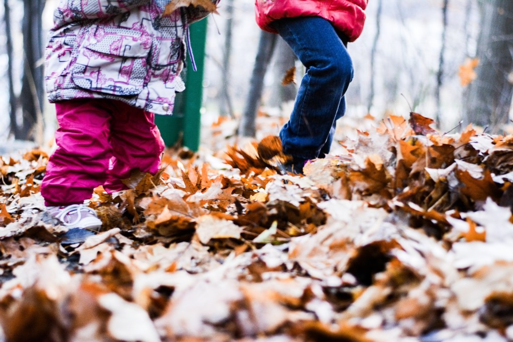
To supplement my own photos I will be using royalty free photos from websites such as Pixabay and Unsplash. I downloaded photos of natural scenery, plants, animals, and children playing that I can use for promotional material for the campaign. With stock photos there is often the issue of them looking generic and boring so I spent some time trying to find interesting and targeted ones for specific purposes. Once I combine the photos with the other visual assets and branding elements they will become unique and more engaging for my target audience.