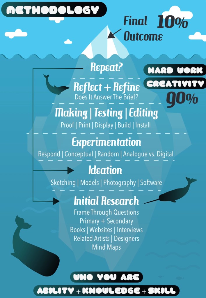
I worked on creating the branding identity for my campaign about getting children more involved and engaged with nature. This is a diagram that illustrates the process of completing a project. It can be applied to this ‘campaign for change’ brief. It’s still the early stages of the project so I’m still working at the initial research and ideation parts.
Before making any branding decisions it’s important to research and figure out exactly what topic you want to tackle. The main thing I needed to figure out more specifically was who I wanted my target audience to be. My campaign will be a type of social club, inspired by the Scouts and Brownies, to engage children with the natural world. I looked into the different stages of child development to get a better understand of what age group I wanted to target. I decided to aim my campaign at children aged 5-10. This is not a strict rule as anyone would be welcome but more of a guideline to help me create the branding and campaign. 5-10 covers the end of early childhood to the middle of middle childhood. Some activities and product may be more target to the younger or older end of this bracket but everything will be suitable for all.
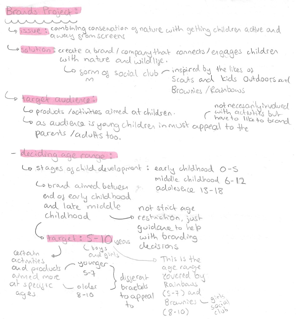
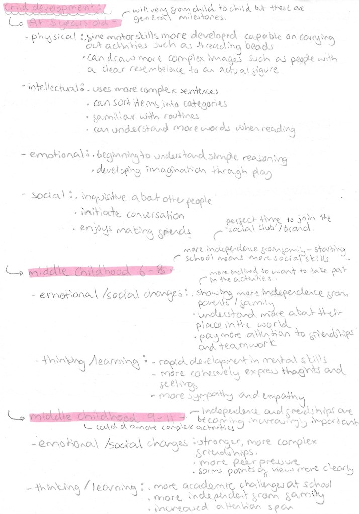
This is my research into children in this age bracket. With this information I can properly target my branding and campaign style. The key reasons for choosing this age group are that by 5 most children have a basic level of reading and can understand and carry out activities. And by 10 then can complete more complex activities and are much more social. Extending the age range any more would make branding decisions much more tricky, less cohesive and less targeted.
Branding/Campaign identity:
With the topic and target audience decided it was time to create the campaigns identity which is comprised of a name, slogans, colour palette and selection of typefaces. Before making decisions about any of these I established what I wanted the values of my campaign to be. So I created a list of 10 words that sum up my campaigns values: adventurous, crafty, educational, engaging, fun, friendly, kind-hearted, social, warm and welcoming.
Name/Slogan:
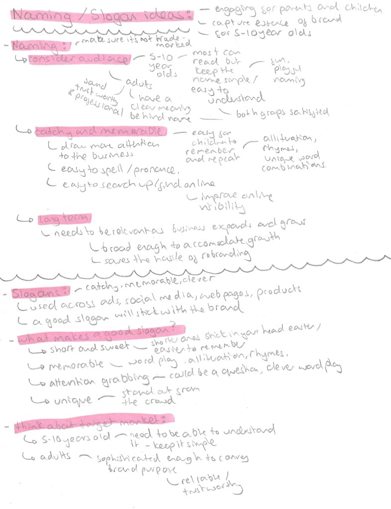
For the name it has to appeal to children as they’re the target audience but also the parents. I went through different versions of the name before I settled on ‘Nature’s Adventurers’. My initial idea was to call the campaign ‘growing with nature’ but with some research I found there was already a company with this name so didn’t want to potentially infringe on any copyright laws. So I then thought of ‘Nature’s Little Adventurers’ but found this too wordy so settled on ‘Nature’s Adventurers’. Also I thought that including ‘little’ in the name may come across as patronising to the older children in my target audience so didn’t want to exclude anyone. The name is short and simple but gets across the key themes of the campaign.

3 word slogans such as Nike’s ‘just do it’, are particularly catchy and popular so I wanted to create my own for the official slogan of the campaign. I tried different combinations of words but choose ‘play, learn, explore’ as they’re all short and simple words that children in my target audience would know and understand. Also the 3 words sum up and encapsulate what I want to achieve with the campaign. I came up with other taglines that can be used across flyers and social media. I really liked ‘growing with nature’ so I wanted to keep it as a possible taglines seen as I couldn’t use it for the name. For activities and products targeted at the younger part of the target audience I could refer to them as ‘Little Explorers’, this name could be used on merchandise such as badges and stickers. A tagline that I thought would be more targeted at the parents was ‘replace screen time with green time’. It has a nice rhyme to it and explorers the other part of the campaign which is to reduce screen time for children by getting them out in nature.
Colour Palette:
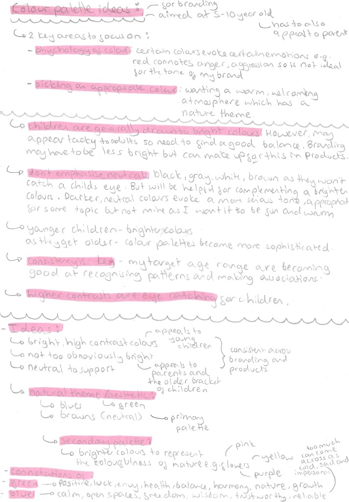
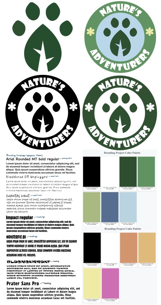
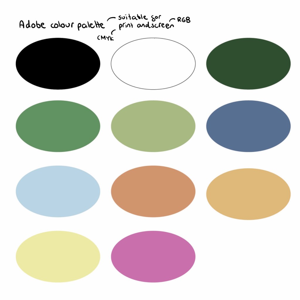
This is the final colour palette I chose for the branding. I did lots of research into how to tailor a colour palette to children. I will keep the palette consists across all platforms and products as children respond well to consistency as they’re good at recognising patterns. The key pieces of advice where that children are generally drawn to bright colours but make them not too bright as they could come across at tacky to the parents and don’t emphasise neutral colours. I went through lots of variations before I chose this palette. For the neutrals I wanted black and white as they go well in every palette. I would primarily use white more for backgrounds as it lightens up the page and black for the writing as it’s easily readable, making it child friendly. Green and blue as they’re commonly associated with nature so would translate this message well to children. I chose a couple different shades of each. These are cool colours so I wanted to contrast these with some warmer colours, these being orange, yellow and pink. These are eye catching and pair well with the cooler shades.

I took this palette and added it into Adobe Illustrator and Photoshop. I chose colours that aren’t too bright so they’re easy on the eyes and are compatible in both CMYK and RGB colour modes. This means I can use the same palette across print and digital media.
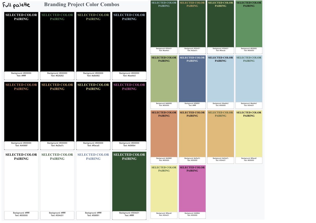
I put the palette into a software that checks the contrast between colours. A score of 4.5 and above is the target for a good pairing. These are all the colour pairing with above a 4.5 contrast. The colour palette gives me a wide range of compatible colours to use.
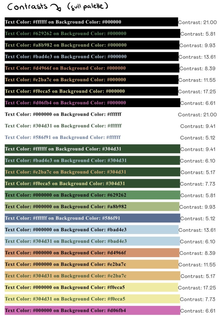
These are of the compatible pairings that are user friendly:
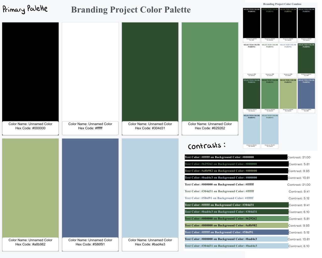
The cooler, more natural earthy tones are the primary colour palette. This image shows the colours, compatible pairings and contrasts within the primary palette:
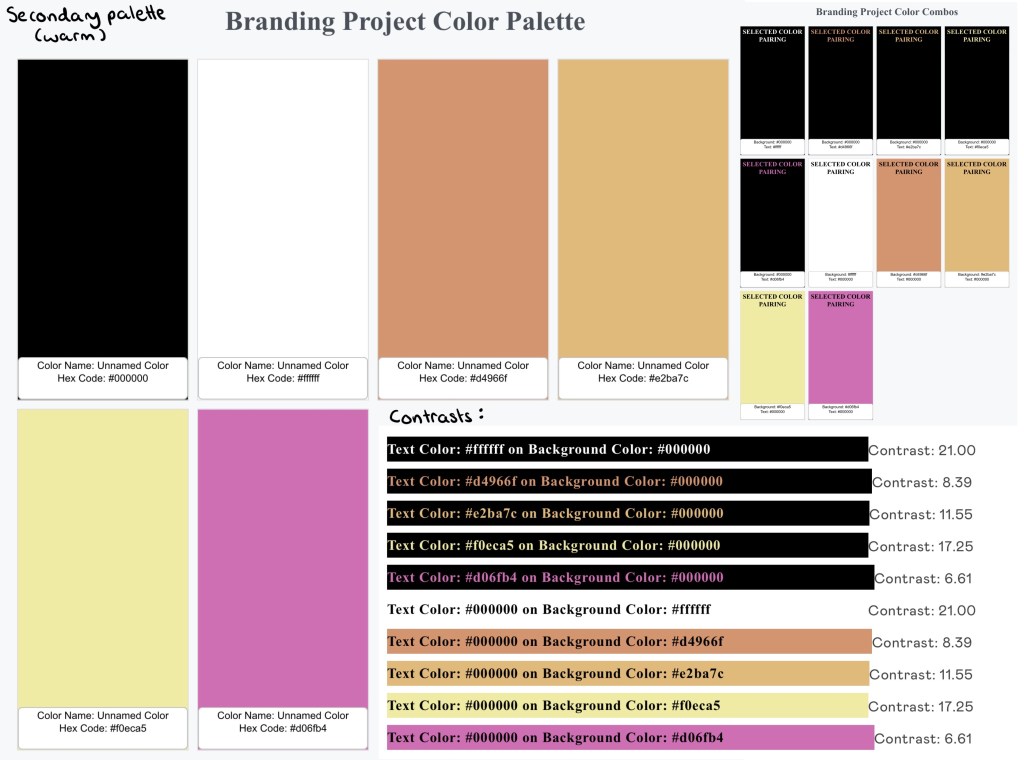
The primary palette will be complimented with accents of the warmer secondary palette. This image shows the colours, compatible pairings and contrasts within the secondary palette:
Typefaces:
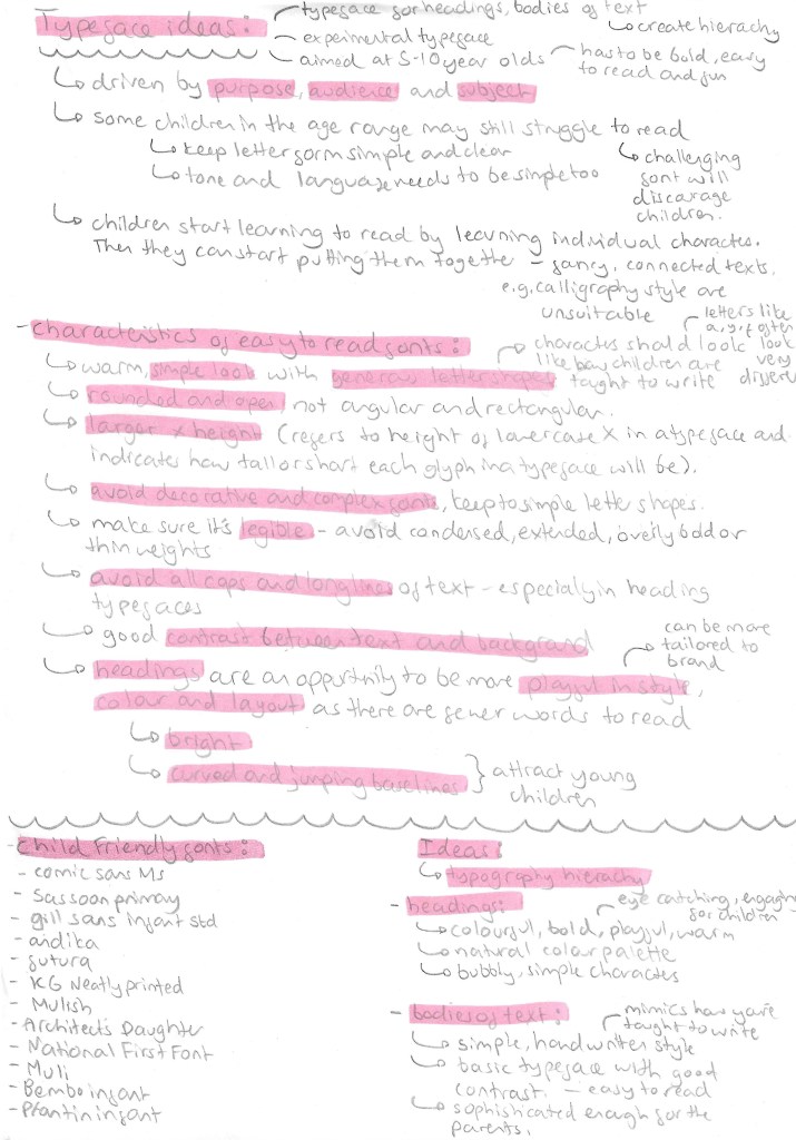
A good set of typefaces for a brand needs at least a typeface for bodies of text, a typefaces for heading and a more decorative typeface. Deciding on good typefaces was important as it needs to be appealing to both parents and children as well as legible to accommodate for children with different levels of reading ability. I looked in the Adobe font stock as I wanted all the fonts I chose to be easily available across Photoshop, Illustrator and InDesign as there are the software I plan to create most of my products. For the paragraphs I chose Arial Rounded MT bold regular. This is a simple typeface with nice rounded edges that give it a friendly appeal. It also maintains a professional look that is aimed at the parents because these larger bodies of text with be information for them. For the shorter bodies of text I’ll use a combination of Blockhead OT Unplugged and Chantal Light. They’re more dynamic and fun with nice simple letter forms that are written in the style that I child would learn to write in. The hand written style is perfect for notes and captions. For headings I’ll use Impact Regular and Monsterific BB. Impact is a rigid bold typeface that is perfect for more professional heading. Monstreific is more decorative and fun so is perfect for title and products I want the children to engage with.
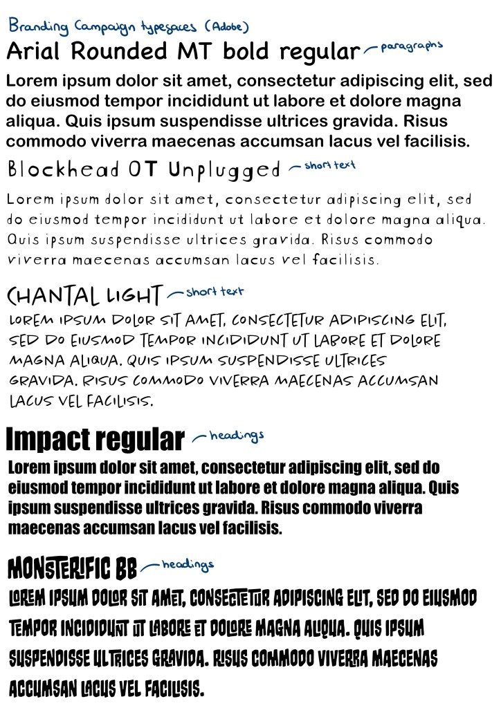
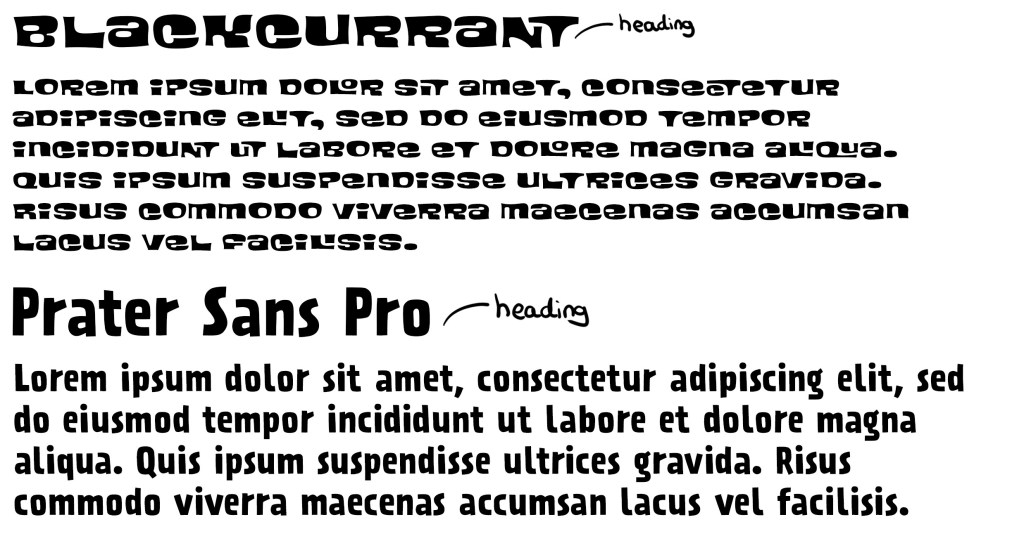
Blackcurrant and Prater Sans Pro are 2 more Adobe fonts I added to my collection of typefaces to use. I had a meeting about my project and got feedback on the typography choices. I was told I needed more heading fonts that reflect the fun and playful theme of my campaign. Impact is too rigid and compact for some headings so I chose a couple other options.
Logo:

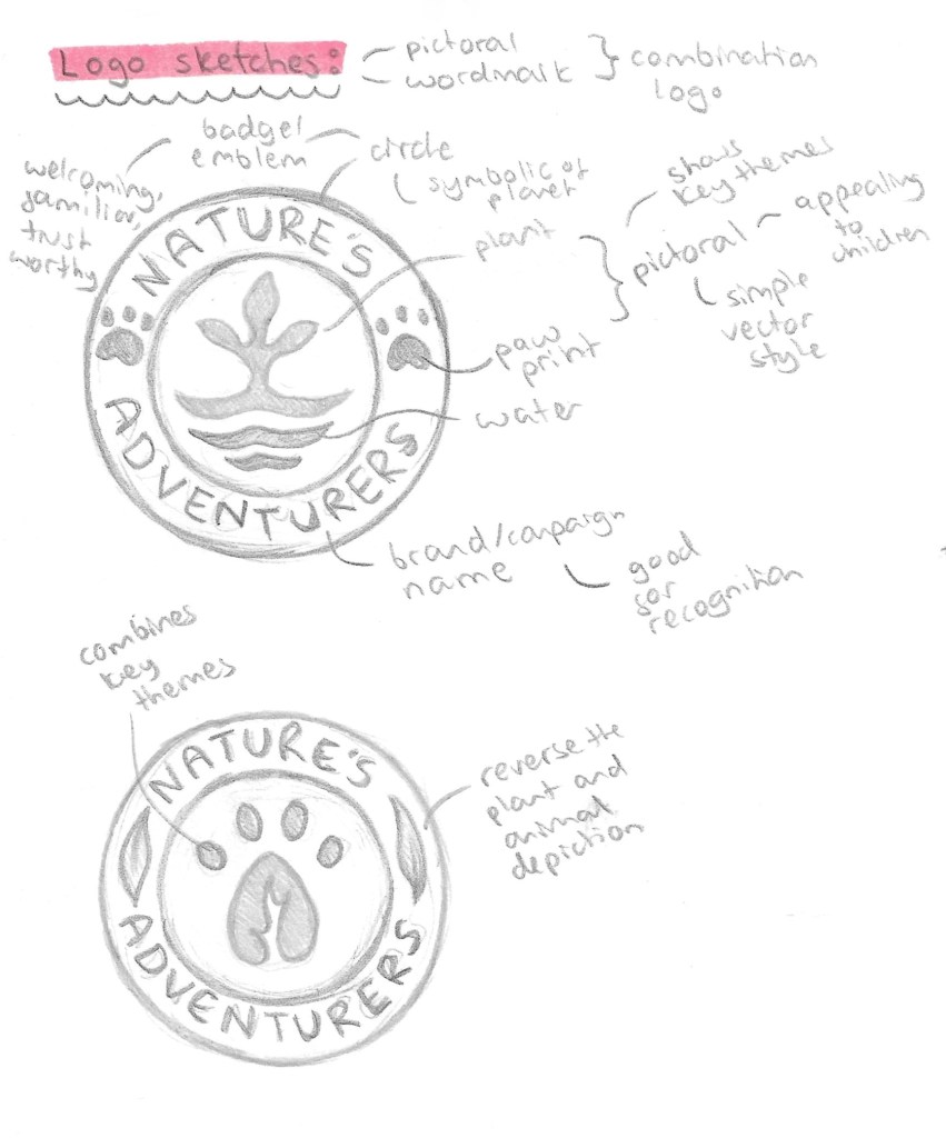
The style of logo I wanted was a combination logo that has an image and the brand name. This is ideal for starting businesses and campaigns as it gets people familiar with the image and the name, improving recognition and in the future 1 element could be removed and leave other. I also wanted it to be en emblem style and resemble a badge so having an image in the middle with the name curved around it. This will then make it perfect for merchandising. Below are a couple sketches I did of ideas with annotations for the reason behind the design choices.
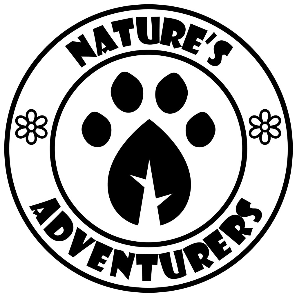
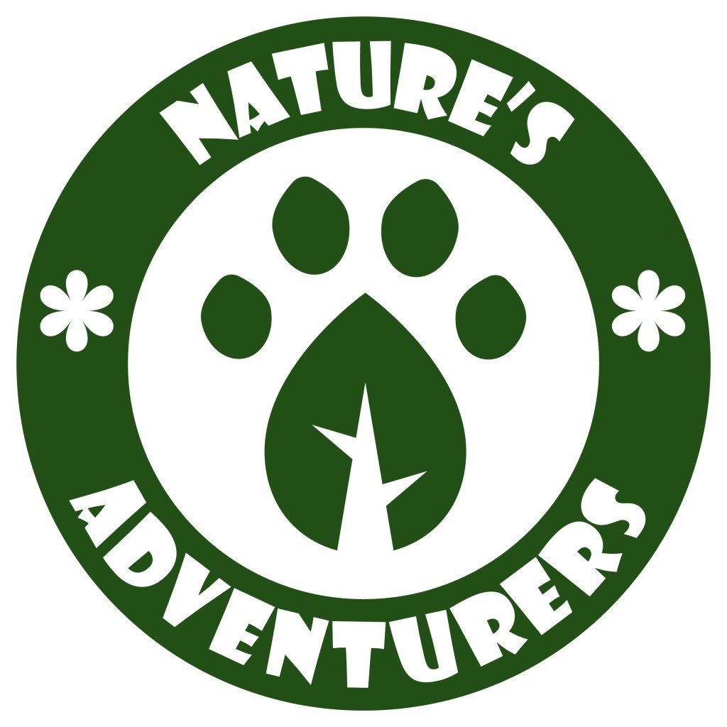
I then combined the designs into this logo which I made of Adobe Illustrator mostly just using the shape tools, pen tool and pathfinder tool. I made it in black and white because it’s important that the logo works in grey scale before introducing colour as colour is such a powerful tool for messaging. I used Impact for the typeface as it’s bold and legible even from a distance.
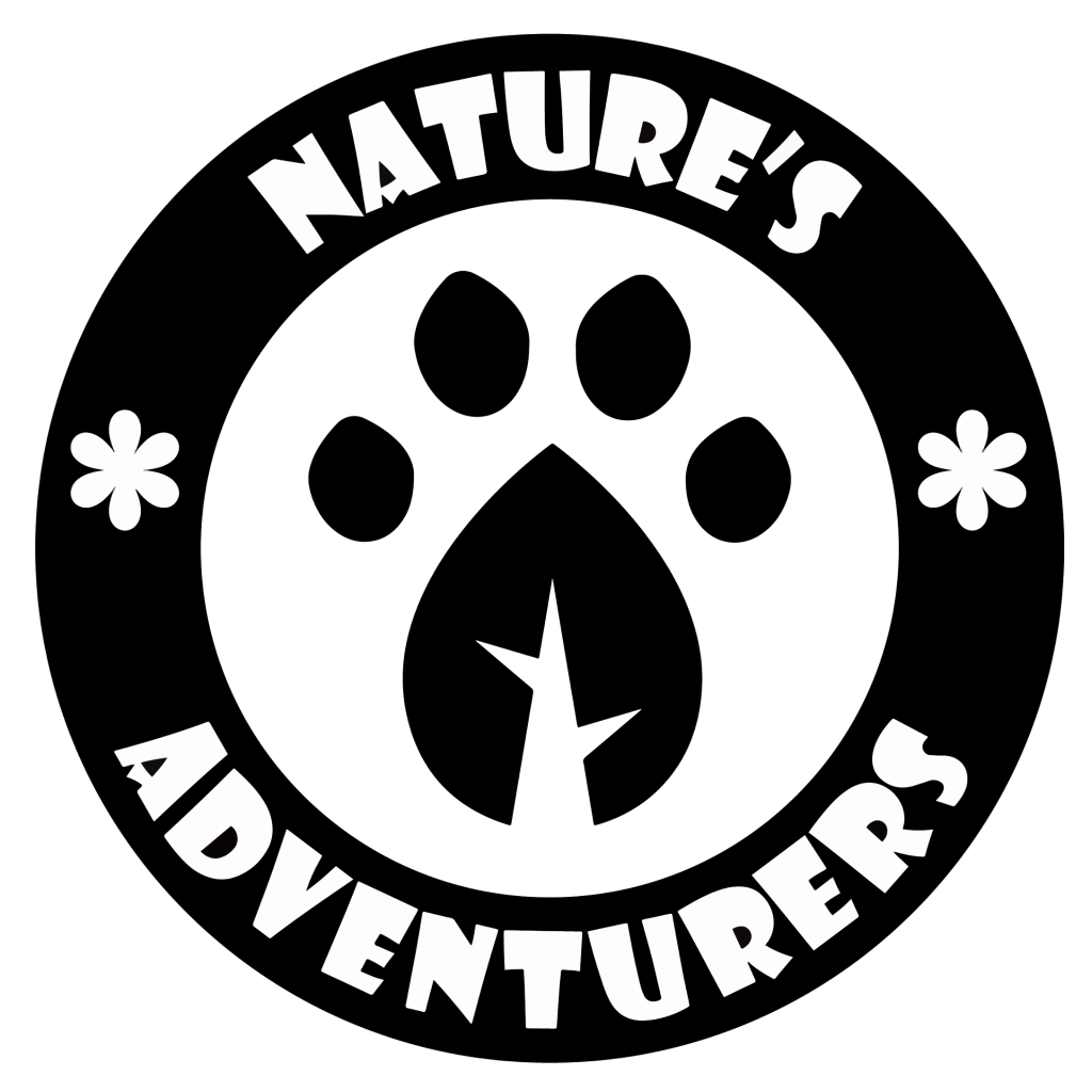
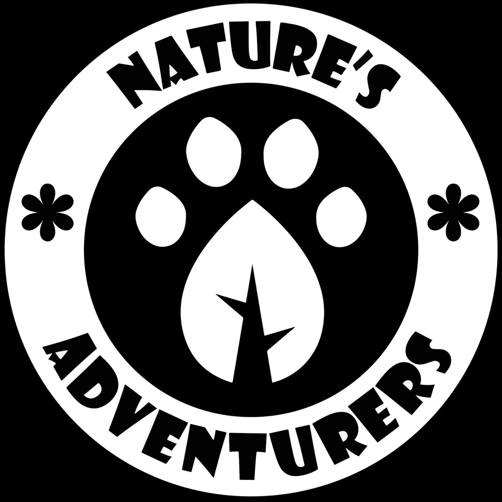
These versions are made with white and just dark green or black. They won’t be the official coloured logo but it’s good to have a couple variants of the logo with minimal colour to use on certain formats and merchandise.
I took the paw print leaf design out of it logo and will use this as the most reduced emblem of the campaign. This is in the same way that brands like Puma have their logo with the symbol and brand name but often they only use the symbol. I really like the design that I created and think it will work well across all formats. This is the submark logo.

Here are 4 full coloured versions made using colours from the colour palette I made, this means they will work on screen and in print.
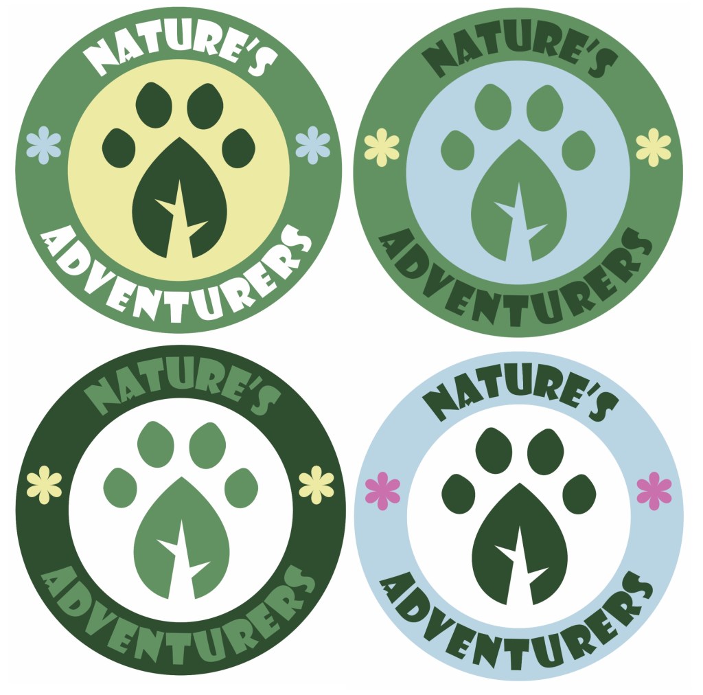
These are my favourite 2 variations of the coloured logo, they have the same layout of colour just with different shades of green. I am struggling to decide which one to use so I’ll ask a range of people and try test the logo on my target audience to get feedback. The green and blue work well together and create a natural and welcoming look. I think the small yellow flowers add a warmth to the logo. I’m happy with the image in the centre and I was able to combine an animal paw print and a leaf to make a single image which translate the themes of the campaign.
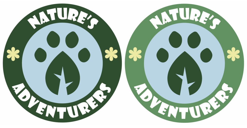
After thinking about it and asking a range of people, I chose the logo on the right to be the main logo of the campaign. The feedback I got was that the lighter green outer circle is more welcoming and fun and made the paw print leaf stand out more. I then took the logo and vectorised it in Adobe Illustrator using the image trace tool so it’s scalable. This means I can change its size and the image won’t lose quality and become pixelated. This is ideal for a logo because you can put it on a big billboard or a small badge and it will have the exact same quality.
An overview of the campaigns visual identity: