Now that we’ve studied colour, typography and logos in terms of constructing a brand we where given a mini branding brief in preparation for our main brief. I recently started volunteering for East London Water Works Park in the design and communications branches. So for the mini brief I decided to create a new logo, colour palette and typography for them.
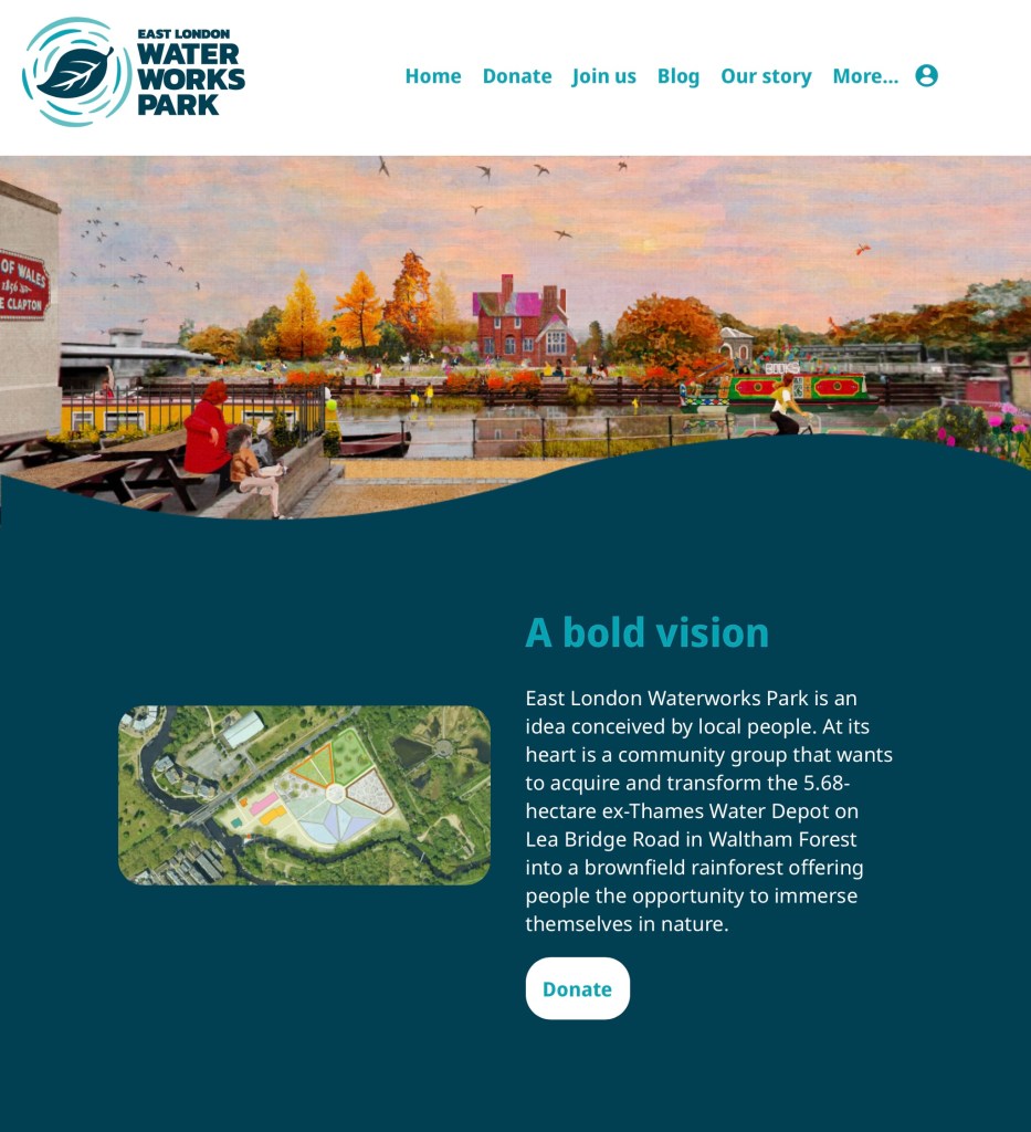
Here is an image on their current logo and a screenshot from their websites home page. It’s a combination logo as it has both an image a words. What’s great about this style of logo is that if you take either part away it still works. It’s ideal for new and fairly unknown brands as this way people can start to learn and recognise the brands name and logo. Both parts fit nicely into circle and square shapes, making it easy to place on products and advertisements. The simplistic vector images of water and a leaf are very nicely made and quickly translate to the viewer what the brand it about. Also the minimalistic colour palette of just different shades of blue with white as a neutral colour also supports the natural, water focused theme. The logo also work well I’m greyscale or in fully black or white. The typography is nice but not that interesting, with simple bold fonts for headings and a basic font for the paragraphs. They have a nice base but I see areas that I could improve to help improve the companies branding.
This is my work on adjusting the colour palette for the branding. The key alterations I made were increasing the variation between the 3 shades of blue, adding some green into the palette and adding brown as an additional natural neutral tone. I will keep white as the primary neutral tone as it brightens up the page as helps keep a calm feel to the brands image.
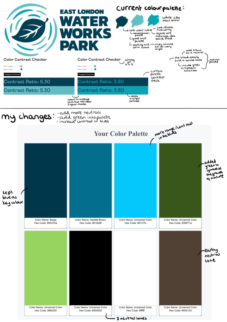
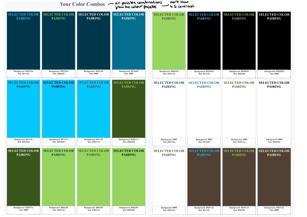
These are all the compliant pairings in the colour palette and their contrast score, 4.5 is the target to have enough contrast.

I like the fonts used as they’re very legible, making them easily accessible. However, this bold, simple style means a lack of personality so I found 2 fonts that I think bring more character to the branding. These 2 are a lot more fluid and bubbly, imitating water which compliments the logo and colour palette. Below are tests showing all the different contrasting colour options with the 2 fonts. I think these would be best used for big headings and in more informal branding such as social media posts. I would still keep the current typeface for the bodies of text as I want them to be as simple as easy to read as possible.
This show all the different compliant pairings of colours, highlights the diverse typography opportunities with the new colour palette.

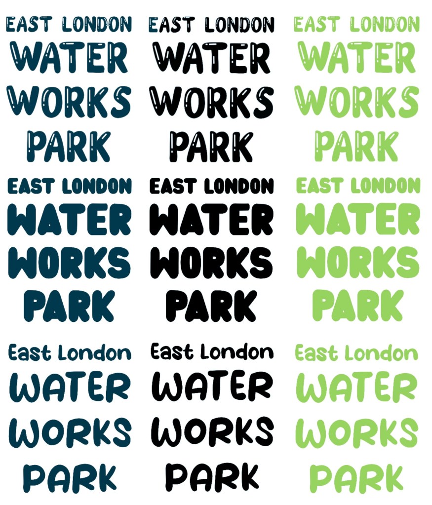
Here are 3 possible typefaces for the logo. I kept the same layout as the original but gave the fonts a bit more of a fun personality and tried each in 3 different colours. The dark blue would be for the official logo, then there would be an all black and an all white version and the green one would be for alternative colour scheme.
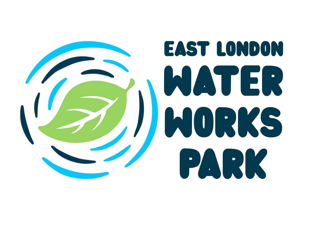
I applied my favourite 2 to the current logo. I made some colour changes to the logo. I made the 2 blues in the water ripples less similar so they’re more eye catching and made the leaf green to symbolise what the brand is aiming for.

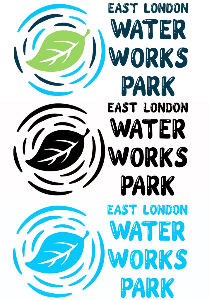
Here are the different colour variations of the logo with my favourite new typeface. There’s a full colour version, an all black one and a monochrome blue one.
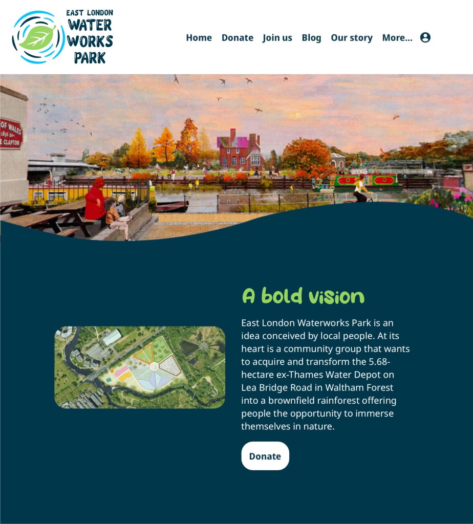
I then applied some of these changes to a screenshot of the website. The logo has been recoloured, the typeface is the logo has been changed, the typeface and colour has been changed for the ‘a bold vision’ heading. Also I changed the blue backdrop to a darker shade to make the text stand out more. Overall I think the changes have improved the branding while not taking away from the brand values and the original branding ideas.
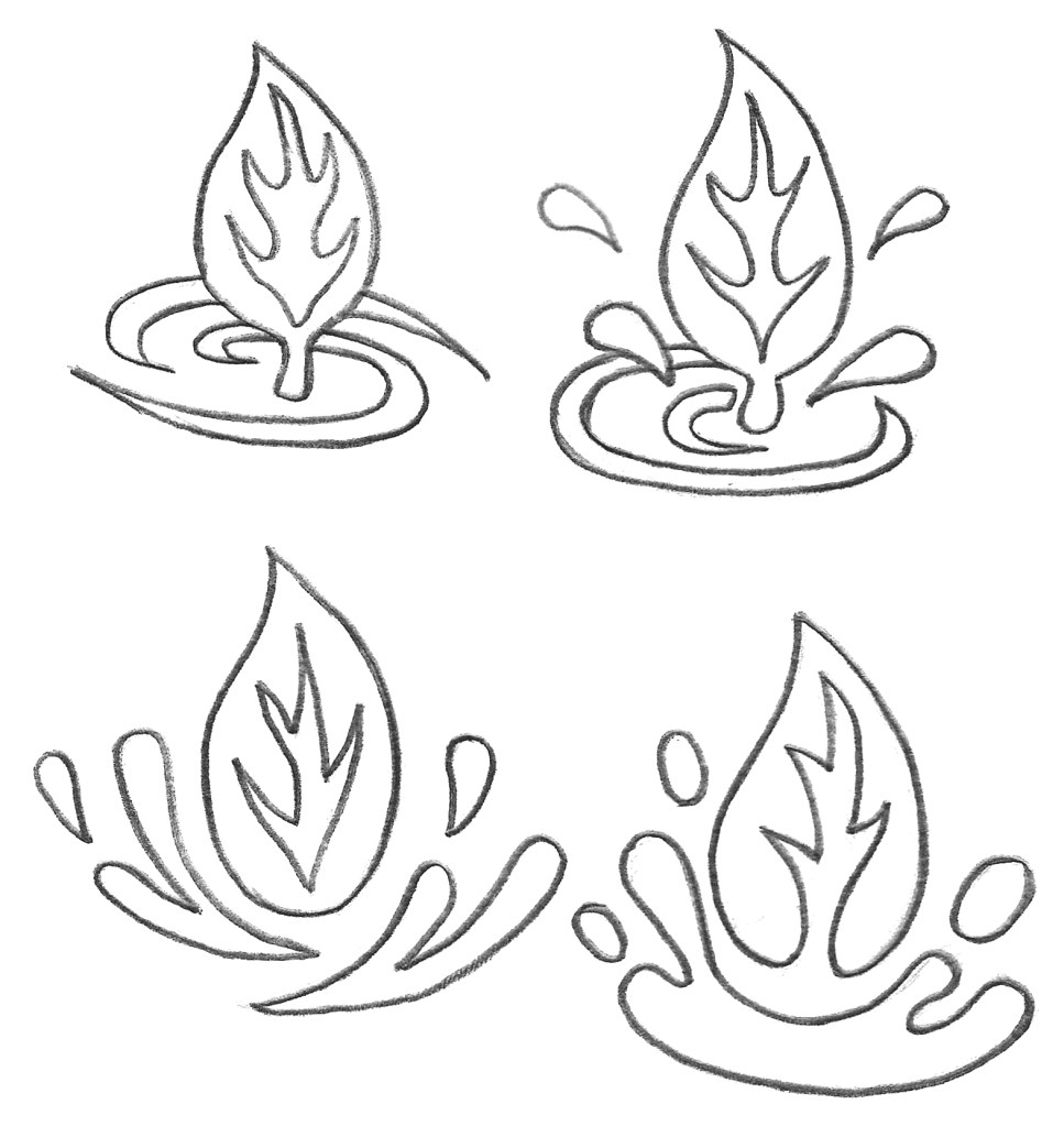
I did a few hand drawn sketches of logo redesign ideas. I wanted to keep the leaf and water as symbols in the logo but played around with the composition. This is an example of a pictorial logo which can also be combined with the brand name. I wanted to make the logo more dynamic so I tested different compositions.
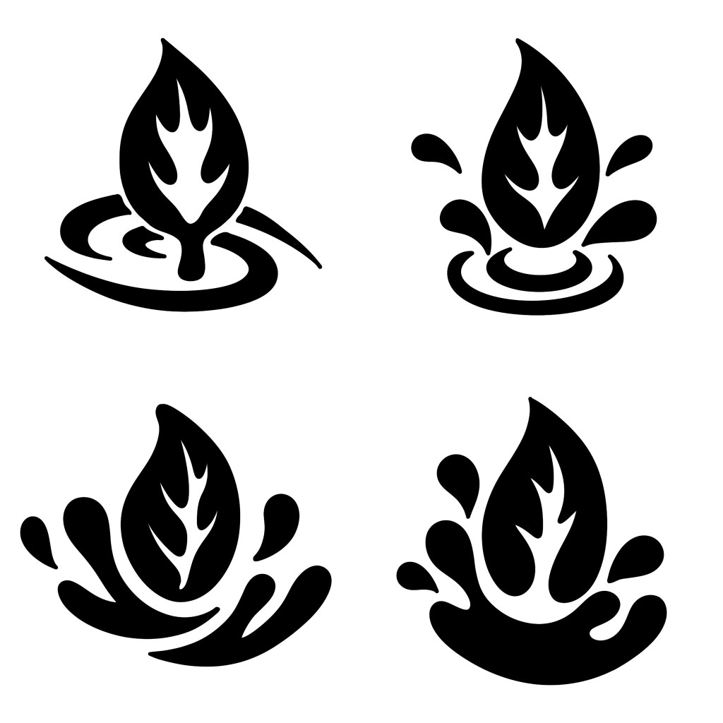
I redrew the logo ideas digitally using Procreate and made minor adjustments. I made them in all black as it’s important when making a logo to create it in greyscale values to check the design is good before adding colour.
Here are a few potential colour options for the logos using the colour palette I made or the brand. I think my favourite of the colour schemes is the bottom right one as I think the bright green and blue mixed with the darker blue work well together and are very eye catching. To properly make this logo I would use Adobe Illustrator and vectorise it.

