During independent learning week we where given the task visit somewhere completely dedicated to a brand. I chose the Disney Store on Oxford Street in London. Disney is a brilliant example of a brand that has become so successful that they’re able to create a world. The Disney Store is a small example of this, when you enter the shop you’re instantly immersed and surrounded by the brands visual identity and values.
From the outside you’re instantly attracted to the icon logo. This is an example of a Word mark logo as it just consists of a word in their unique typeface. The neon sign is in red as this is the first colour our eyes see so it draws your attention from far away. The logo have a dynamic and fun script style.
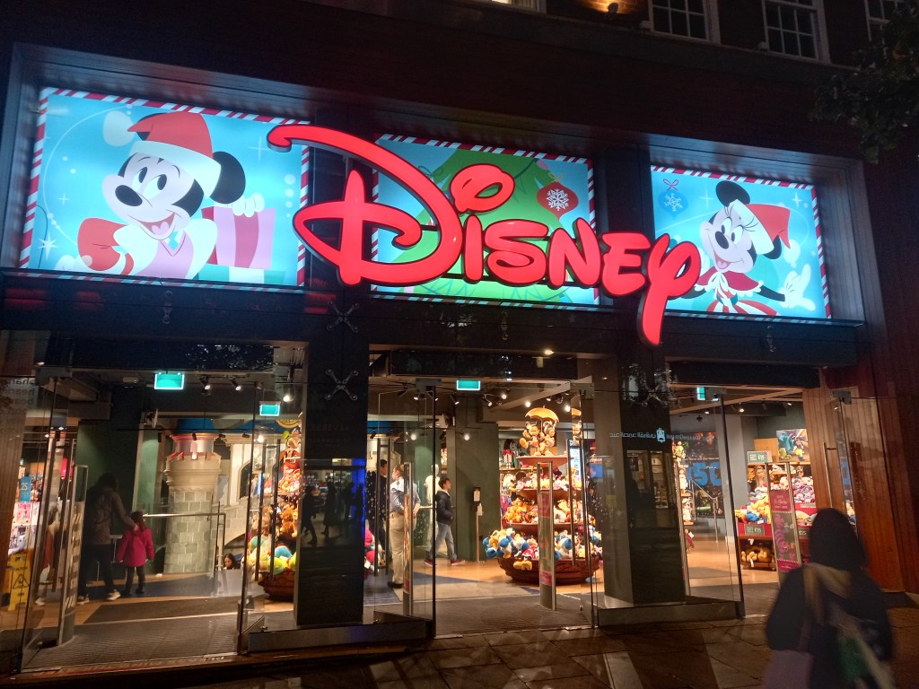
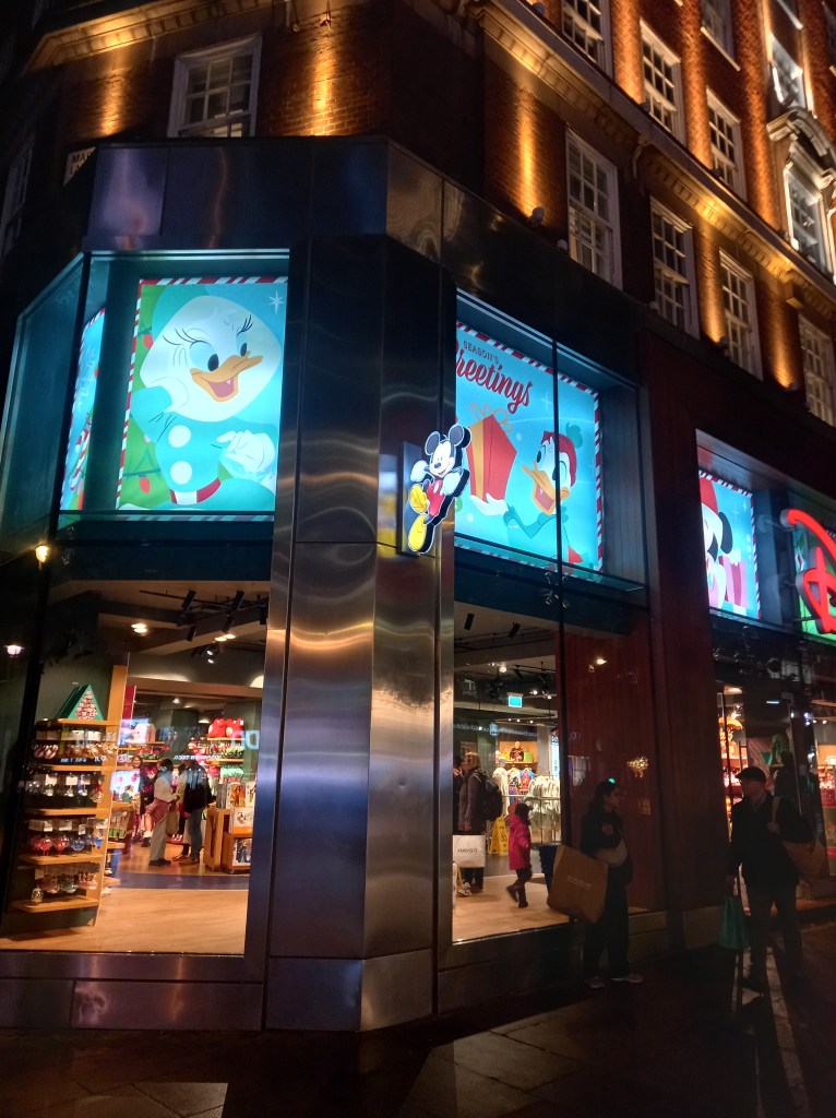
No matter what side of the street or direction you’re coming from you’re bombarded with branding as their are glowing images and signs of easily recognisable characters. This is another way of them capturing your attention. The blue in the images contrast the red signs, making them both stand out. Also blue connotes trust, loyalty and accessibility, all key parts of Disneys identity.
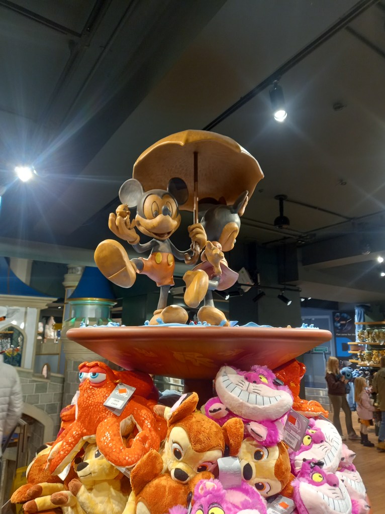
Once you enter the shop you’re immersed in Disney’s identity. There are elaborate decorations of characters and sets from the movies, making visiting the shop feel more like an experience rather than just a shopping trip.
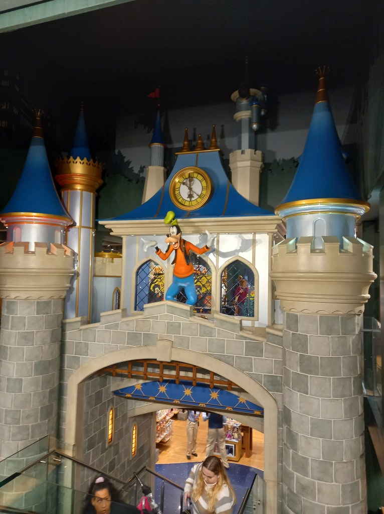
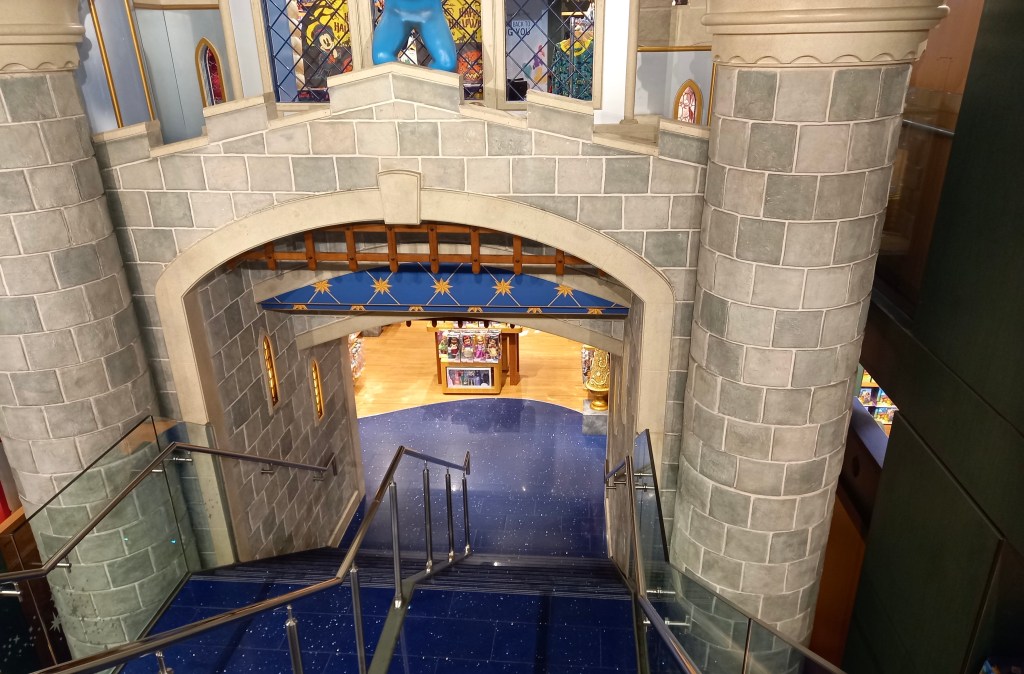
The stairs to the lower level are designed to look like you’re walking through the castle. They very cleverly navigate you around the shop. This makes people more likely to visit the other parts of the shop.
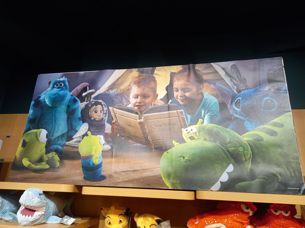
There was lots of adverts like this around the shop depicting families surrounded by Disney products. This is used to push Disney’s family friendly image and encourage families to purchase the merchandise.
This bold font was all around the store and is used so that customers can read the signs from a distance. There are a range of sizes on here. The bigger parts are what they want you to see first.
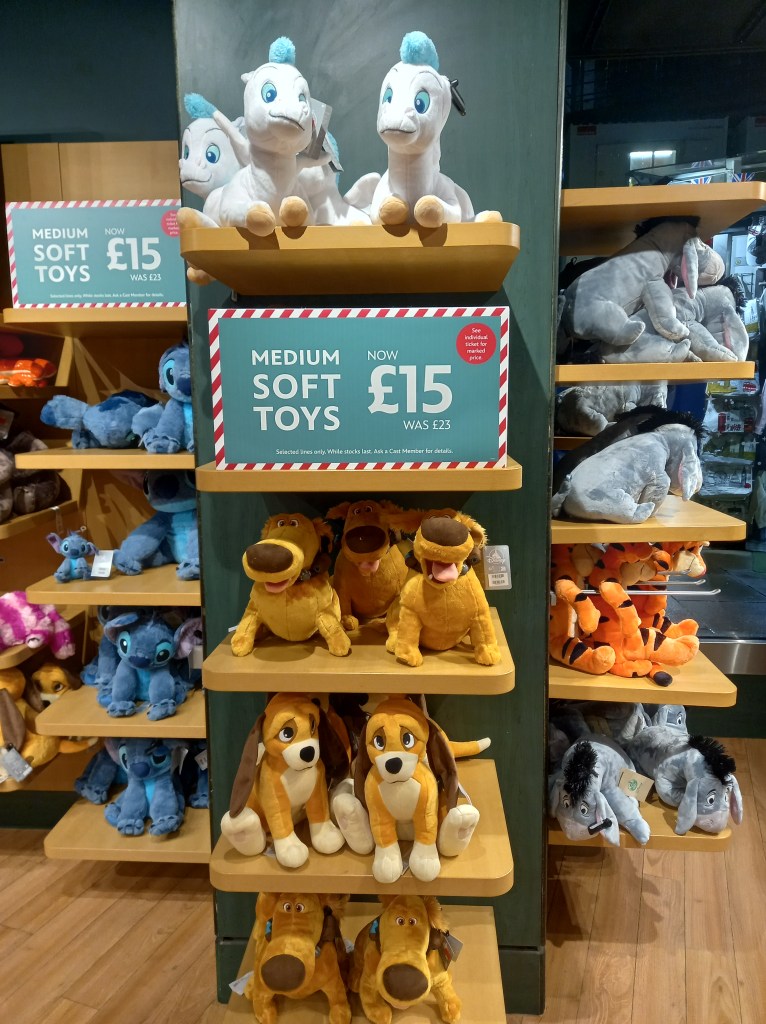
Another thing I noticed was that as you go around the store there is bright colours everywhere to engage the customer but all the floors, pillars and shelves are darker or more muted colours so you hardly notice them and your eyes are drawn to the products.
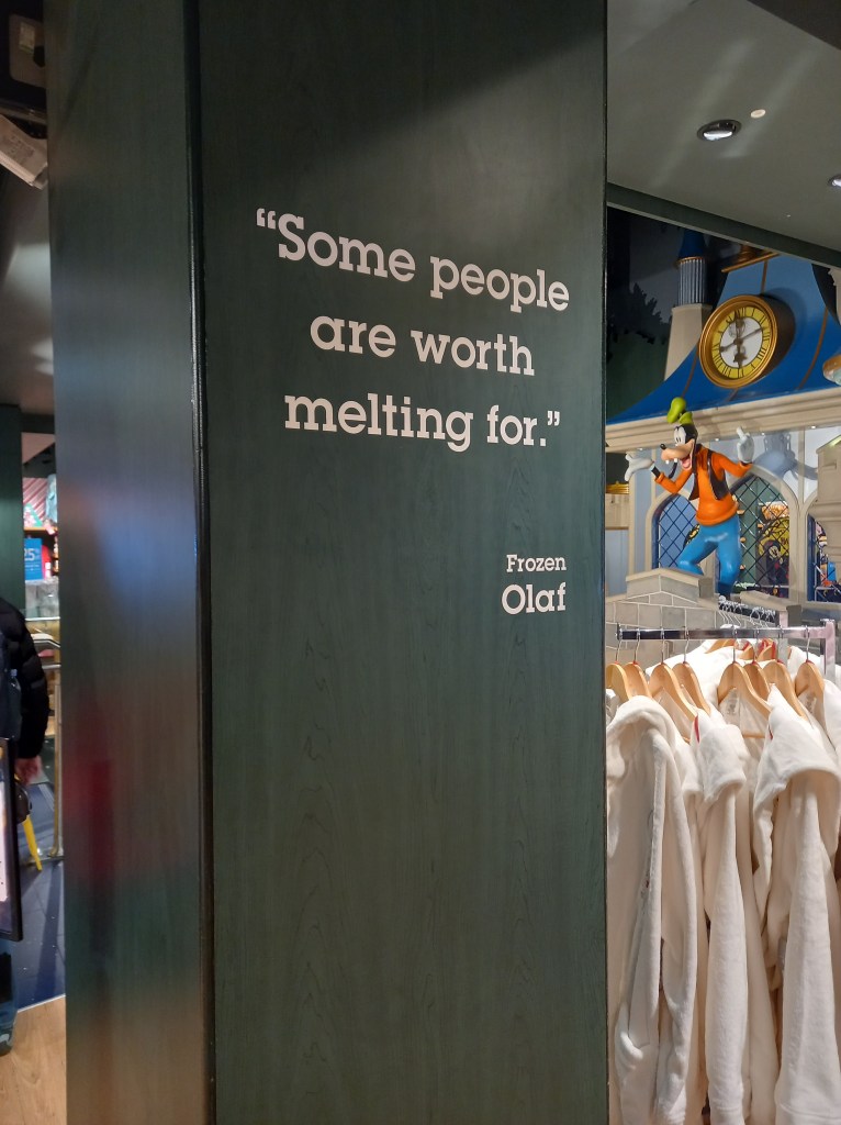
There where a few quotes like this dotted around the store. I think this is a particularly clever way of immersing you in the brand. They’ve taken quotes from popular Disney characters and using them to endorse and push Disneys values and ideas. This is a great way of making use of all the available space and bringing the characters to life.
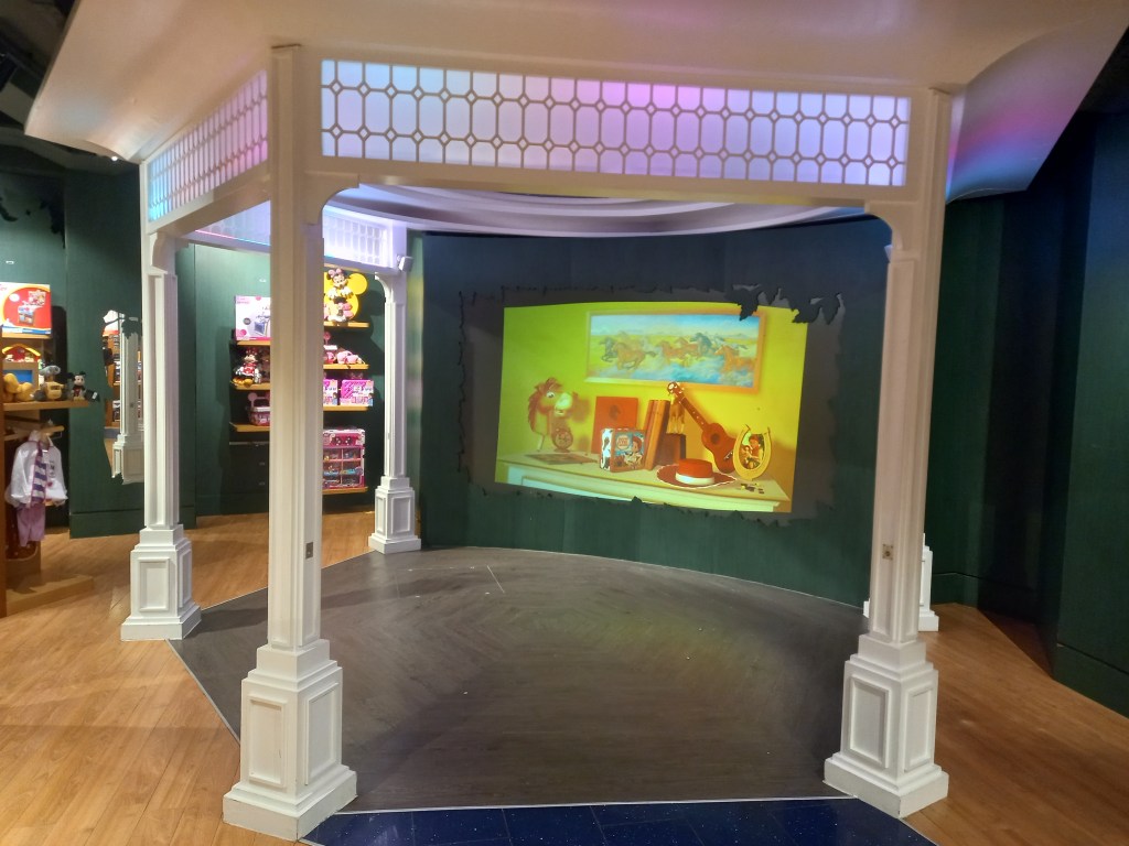
There’s also a little viewing area where you can sit and watch clips from Disney films and TV shows. This helps encourage people, especially families with children, to stay longer, increasing their chances of buying more merchandise.
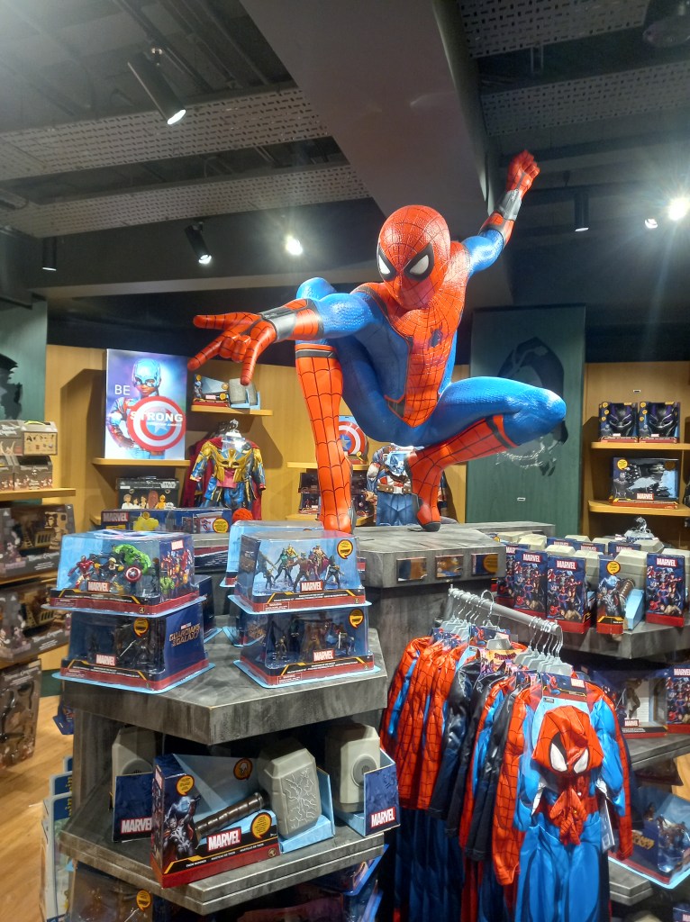
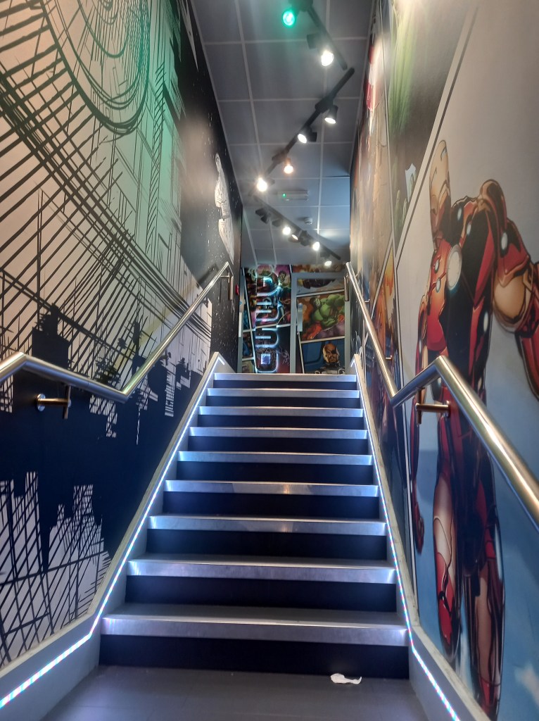
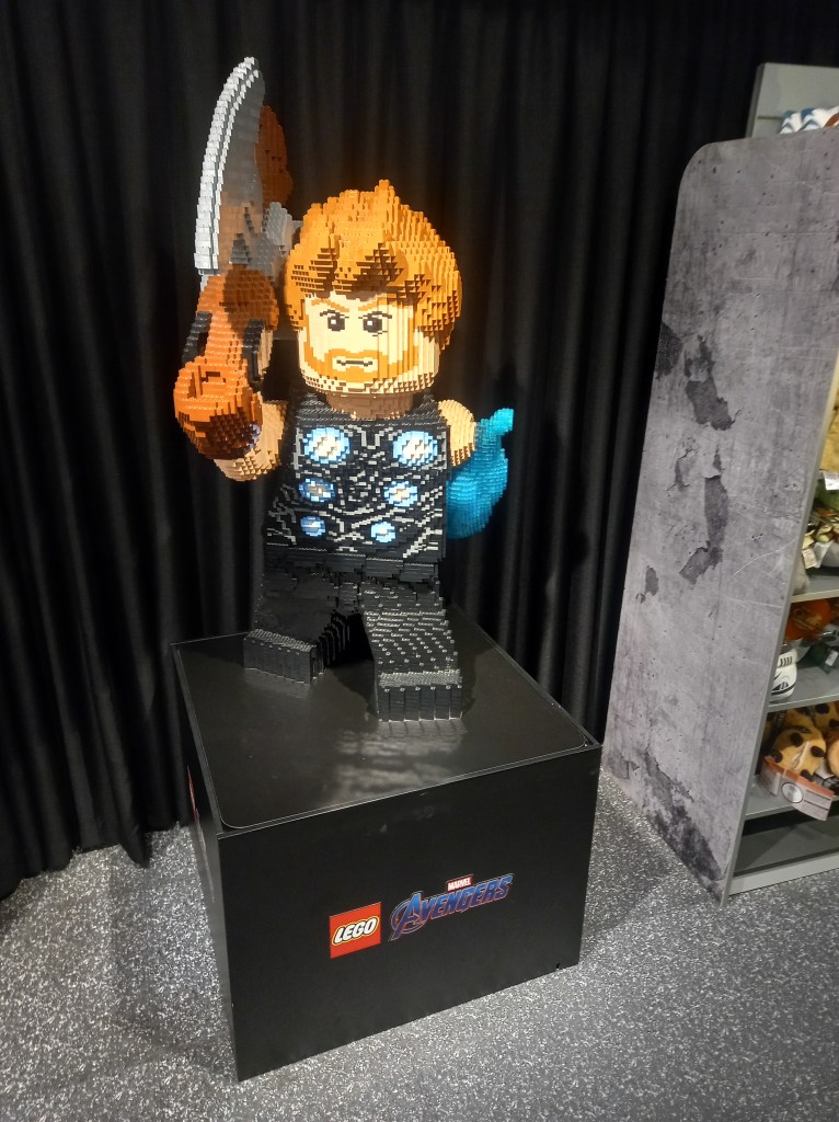
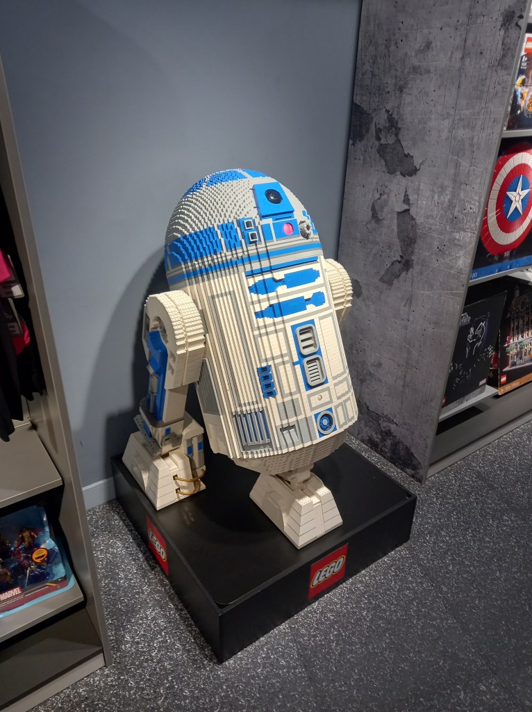
The store was divided into sections so as you go around the shop it was like taking a tour around Disneys catalogue of work. This helps to appeal to all audiences as they covered Classic Disney, Princess, Pixar, Marvel, Star Wars, National Geographic and more. This was the walk way from the main Disney store to a smaller section dedicated to Marvel and Star Wars. There was less bright colours, the colour scene was generally cooler tones with lots of blues and grey. This is an attempt to appeal to a stereotypically older and more male dominated section of Disney fans.
There was brand collaboration between Lego and Disney. This is mutually beneficial as both brands gain exposure and in turn sales. Also these big Lego characters are another example of the elaborate decorations.
In summary I visited the Disney Store to explore and immerse myself in a branded environment. The Disney store is a carefully designed place to engage you from the second the store comes into view. As you go around the store you’re constantly immersed in branding and Disneys identity. All the products and decorations are specifically placed to make the customer go around the whole store to encourage them to buy more merchandise.
