Typography is another important visual element to consider when designing a brand identity. A typeface holds a lot of power to influence a viewer perception of a brand so it’s important to pick one that reflects the brands identity and values.


Here are some examples of successful brands that have their own custom typefaces:
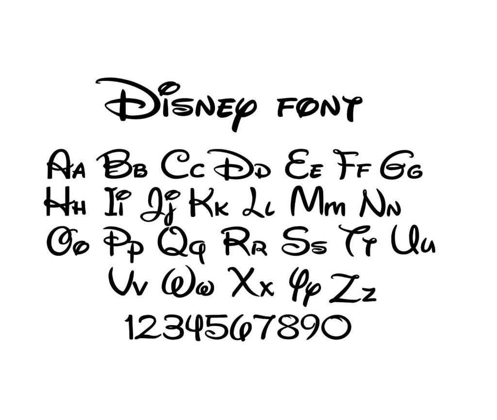
Disney have a unique and instantly recognisable typeface. It’s a script font called Waltograph, originally titled Walt Disney Script. It’s based on a stylised version of Walt Disney’s autograph so it has a lot of historical value to the brand. The typeface has a fun and dynamic look with its calligraphy style curves that embodied the family friendly, joyful identity of the Disney brand.
The New York Times has much rigid typeface. The font is called Cheltenham and is a serif typeface that was designed by Bertram Goodhue and Ingalls Kimball in 1896. The brands successfully demonstrates it serious tone through the blocky typeface. It also has an elegance and sophistication to it suggesting that their readers have a particular lifestyle.

Duolingo’s custom typeface is called Feather Bold. The brand uses its iconic green that’s seen on its mascot in the typeface to make it recognisable. It’s a legible font with bold lettering, appealing to younger people as well as just making it easy to read from far away. Some of the letters have parts that mimic the wings of the mascot. It has a fun and welcoming atmosphere, aligning with how the brand aims to be perceived.

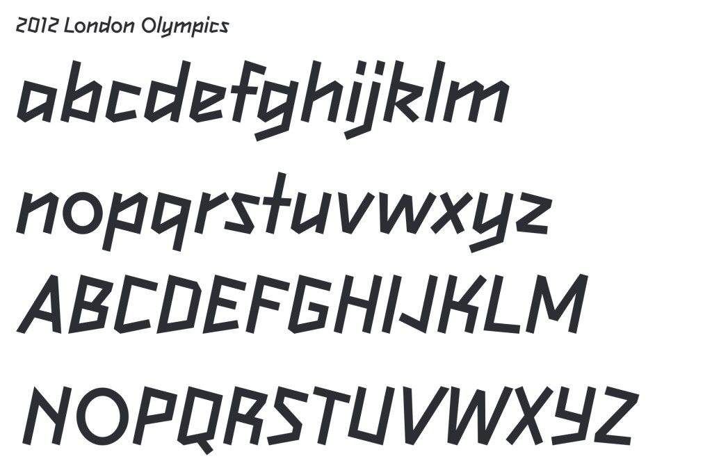
I looked at a series of different typefaces and these are some of my favourites.
I like how dynamic this typeface is and I think it perfectly embodies the brand as it is inspired by a a figure running. The way the letters lean to the right gives the impression of movement and speed.
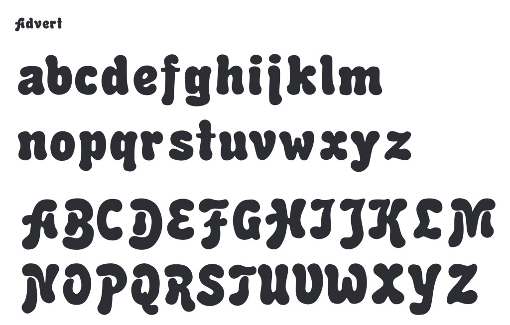
Advert is a very bubbly and energetic typeface with lots of playful energy. I think it would perfectly compliment a brand aimed at children.
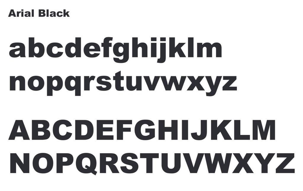
Aria; Black is a very popular typeface that is commonly used for titles and the parts that need to be bold. It’s rigid and is very easy to read from far away as well as up close.
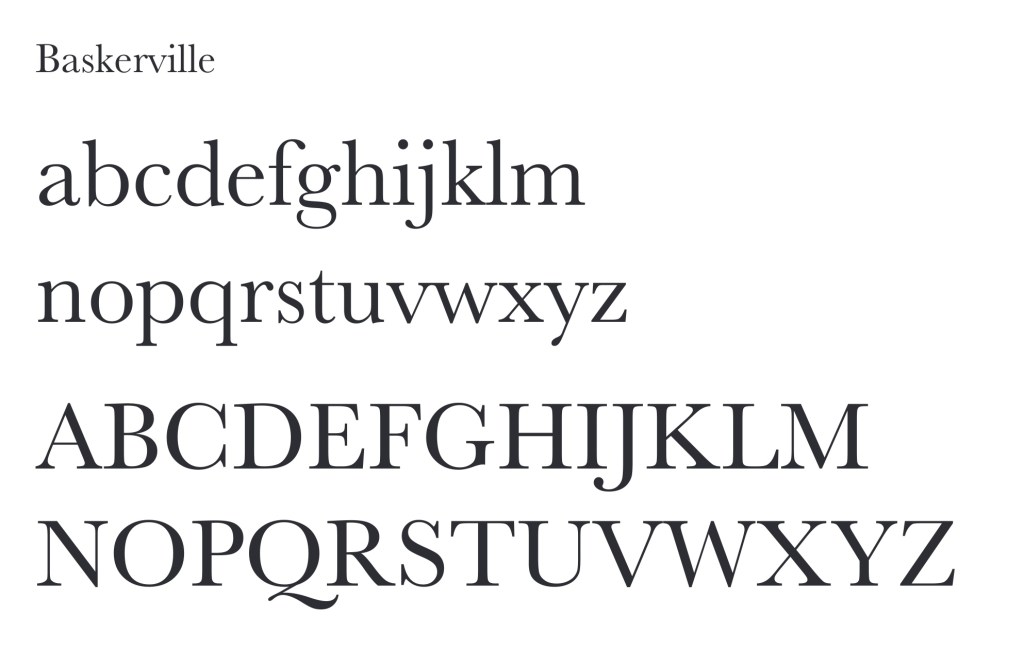
Baskerville is another popular typeface that works well for larger bodies of text as even in small it is legible while still being visually interesting and having an elegance to its lettering.
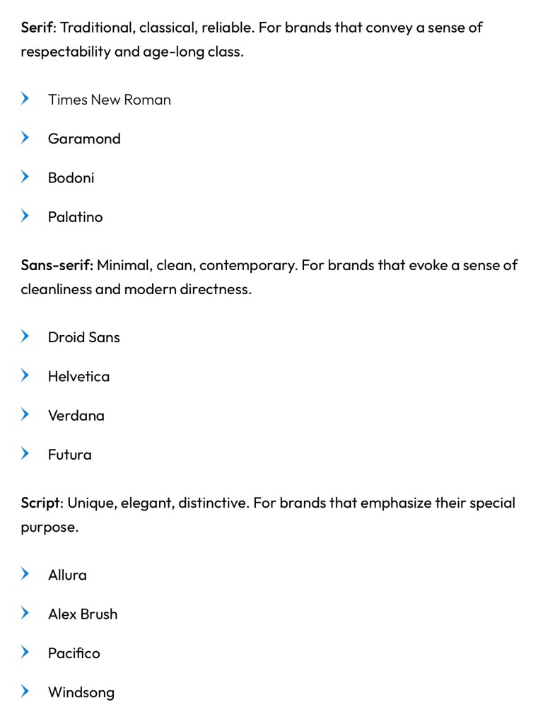
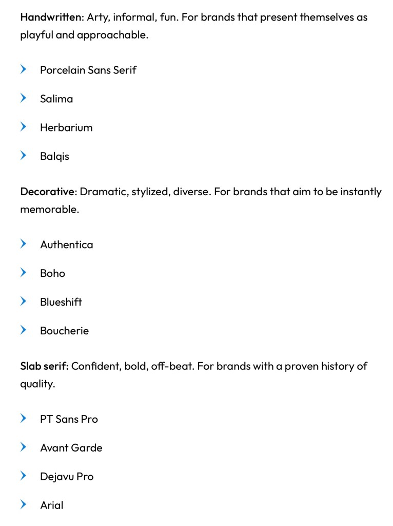
These are some of the most common typeface styles and some examples along with a description of the feelings and ideas they connote:

Some places you can get fonts from are Google Fonts, Adobe Fonts, Dalton Maag, Font Meme and Font Library. Some are free and some you will have to pay for a license.