In this weeks session we looked at 3 key graphic design elements that go into creating any successful brand, the logo, colour choices and typographic choices.
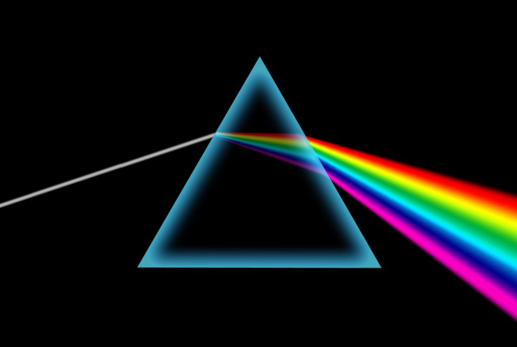
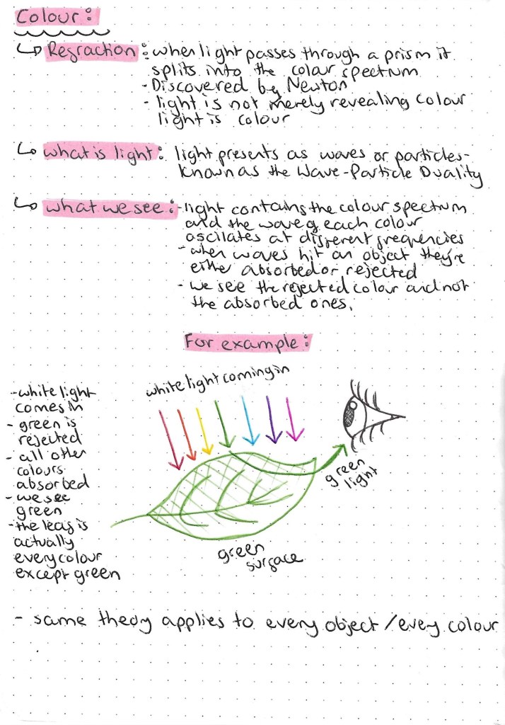
I find the science behind light a interesting topic so I’ll be exploring this further. Also the idea that an object we see as green actually being every colour but green is very interesting and quite confusing so I tried to depict this is a simple way with an illustration.
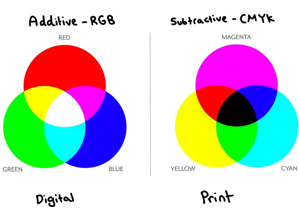
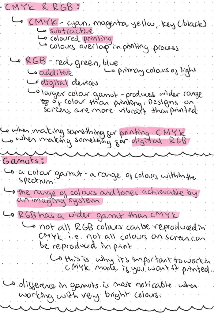
Understanding the different between additive and subtractive colours is key to anyone doing graphic design based work. The image below contains all the key information needed. I think the main take always from this research was the RGB is the colour mode used when your work will be viewed on a screen and CMYK is the colour mode used when your work will be printed. It’s easy to change colour modes on apps such as Adobe Photoshop.
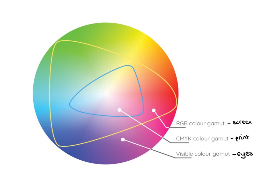
The image below shows the different gamuts, colour ranges, that can be achieved in different formats. Our eyes have the biggest colour gamut, then the RGB screen mode then CMYK print has the smallest gamut.
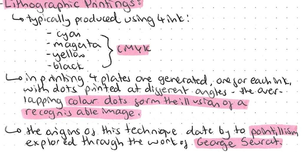
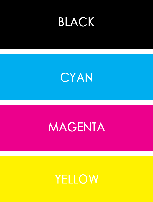
Prior to doing this research I had actually seen Lithographic printing but just didn’t really understand it. I have a mini Canon printer at home and you can see the image as it goes through the different stages. First the yellow gets printed, then the magenta, then the cyan and finally the black. This builds up to form a whole images. By the end of the process you wouldn’t know that only 4 colours had been used.
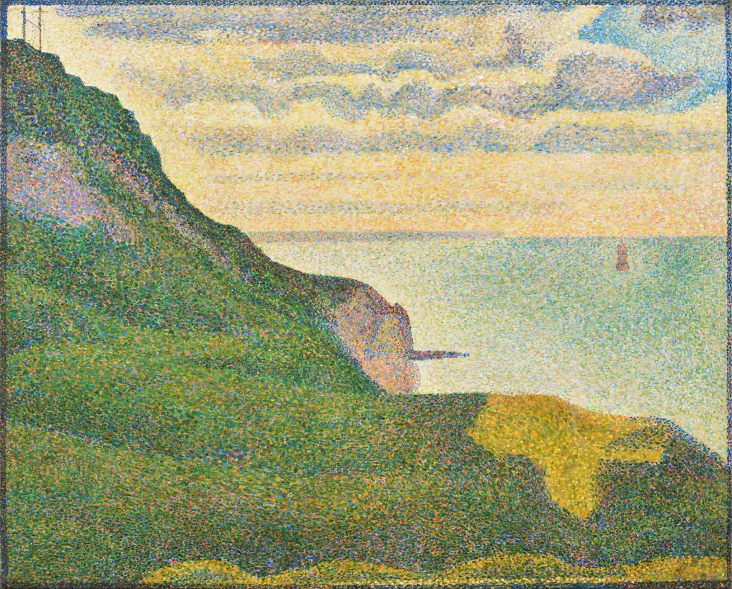
This is an example of a pointillism painting by George Seurat:
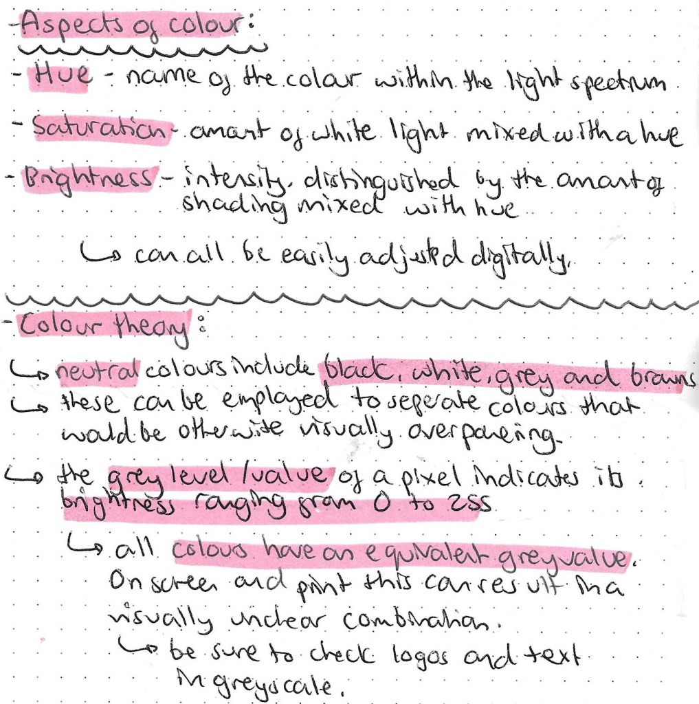
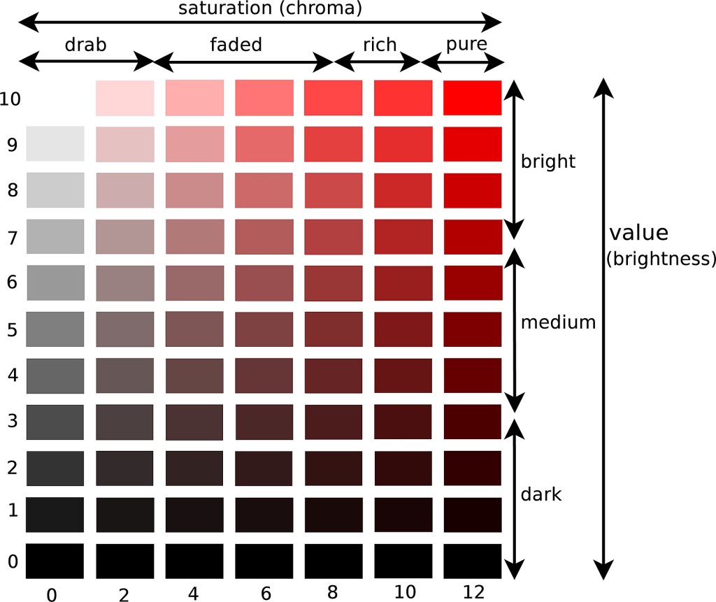
This image clearly shows the relationship between hue, saturation and brightness:
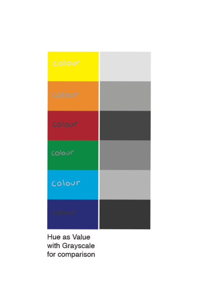
On the left is the hue and on the right is the grey value. As you can see when the 2 are combined it becomes difficult to read and uneasy on the eye. So when designing a logo or making colour choices it’s important to test the hue against its greyscale value.
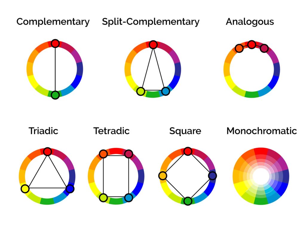
These are several different colour relationship that are important to know before deciding on a colour palette. Most brands have between 2 and 4 main colour in their palette.
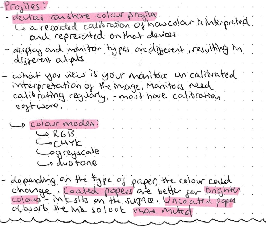
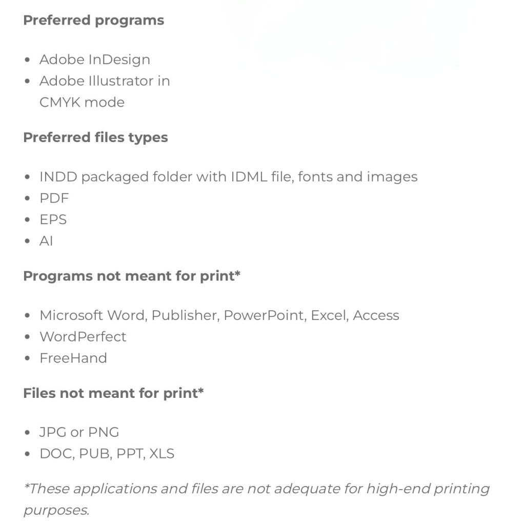
This is a helpful list about the more technical side of printing in colour with suggestions of what file types and programs to use.
The Pantone Color System, or PMS, is a standardised colour system which is widely used around the world. It was devised to help printers and designers to specify and control colors for printing projects. The Pantone Color System allows you to specify colors that cannot be mixed in traditional CMYK. This is good to use to ensure you get the exact colour you want as each colour I’d described by a numerical value. There are also many other apps and website available to help with colour choices. They can recommend palettes, test contrast, test it’s greyscale value to make sure that your chosen colour palette will work across screen and print.
I will be buying 2 books, Colour Index and Process Colour Manual to help me explore and develop my understanding of colour relationship.
Here are 3 main colour palette formulas that brands use:

This is a screenshot taken from a resource by the Colour Palette Studio.
When picking a branded colour palette you’ll need a selection of tools include a colour picker, a contrast tester and the Hex codes so you can communicate and share exactly what colours you’ve chosen. Hex codes allow you to add your chosen colours across all platforms.
