The art book is divided into 2 chapters, 1 for Hyde Park and 1 for Bonnington Square Pleasure Garden. Both chapters will begin with an introductory page, that has a title and a paragraph about the location. For the titles I used the same font as the title on the front cover.

I spent a while researching both locations to write the introductory paragraphs. I did many redrafts before I got to the final ones. I wanted it to include a brief overview of the location and its history as well as why I chose to study them. I wanted them to be informative but not too heavy with facts and stats. For the consistency of the art book I chose to type the paragraphs in the same bold font as the paragraph on the back cover.
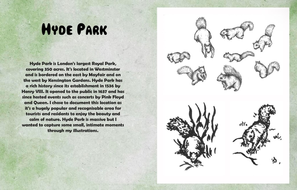
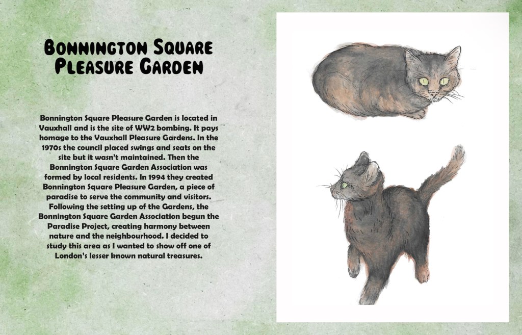
The next step was to add the little notes around the images. I experimented with hand writing them and typing them to see which I preferred. I chose to type them as I thought the hand written notes looked too messy and took away from the clean aesthetic of the pages. The font I chose was a more cursive style to imitate old hand writing styles that would’ve been seen in vintage photo albums.
I planned out the notes for each page. The contents of the notes range from facts about the location/ subject of the illustrations, descriptions of the image and my own opinions/ stories. I wanted to make the notes feel both informative and fun to create and informal and relaxed experience for the viewer.
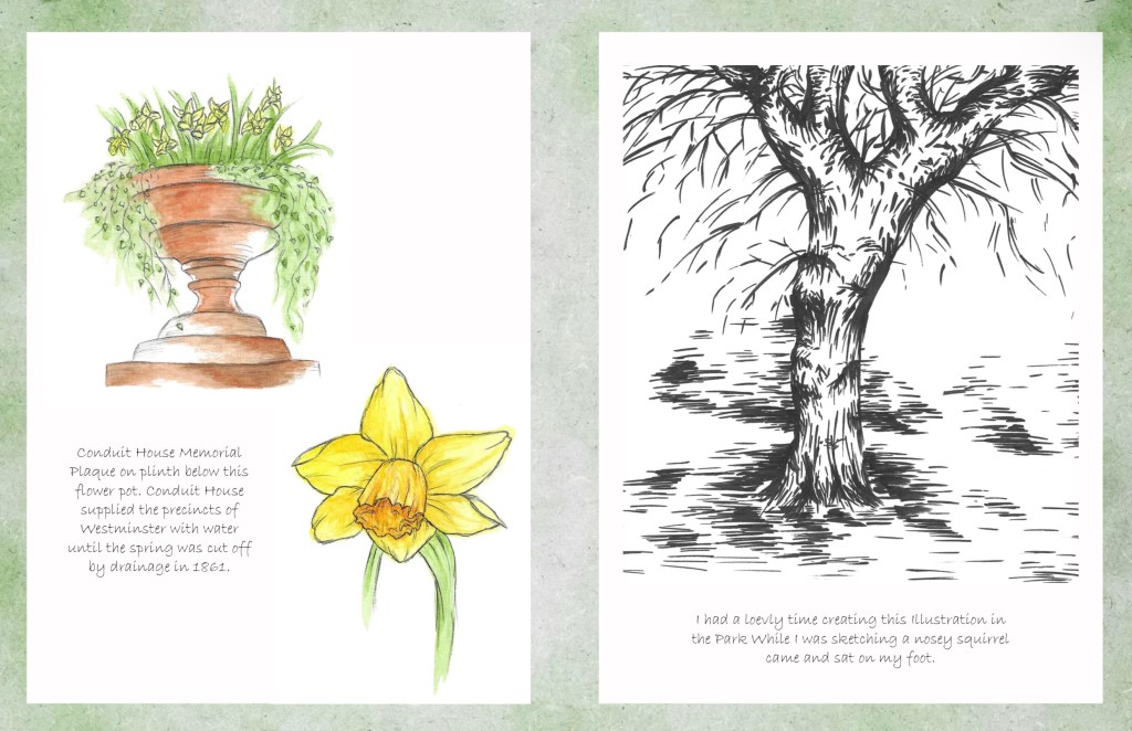
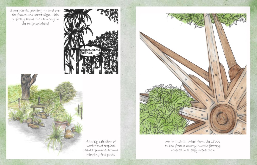
Then I chose where to put the annotation in relation to the images on the page.