All the Illustration, Graphic Design and Animation student where split into groups to work on a collaborative project to go alongside our digital arts learning. The aim of the project is to create a set of illustrated stamps and present them in a designed format containing some research and the design process. We were given complete control over the style of the stamps, whether that be digital or more traditional style illustrations.
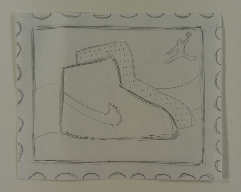
My group and I discussed different options for the subject of the stamps but eventually decided on sneaker culture as we all agreed it would be fun and had lots of ideas of how to illustrate them. We then talked about which sneakers to do and wanted to pick iconic silhouettes that would be easily recognisable such as converse, Air Force 1s, vans, doc martens and Jordan’s. We each where given a shoe to do, mine was the Jordan’s.
Stamps are printed small so we thought that detailed realistic illustrations might not translate the best. Instead we thought that bold colours and simple shapes would work best. So the style we decided to go for was heavily inspired by the pop art movement.
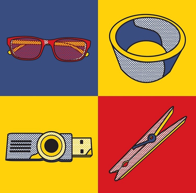

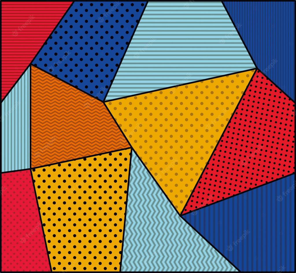
Pop art often used patterns such as dots and geometric shapes in the background so we thought this was something we could experiment with.


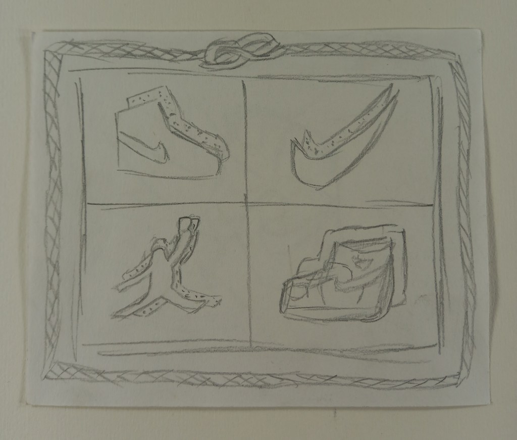
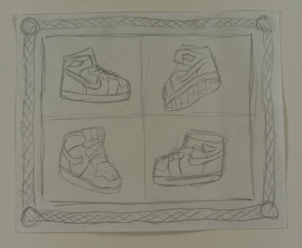
Here are several quick composition sketches I did to test out and experiment with lots of different ideas.

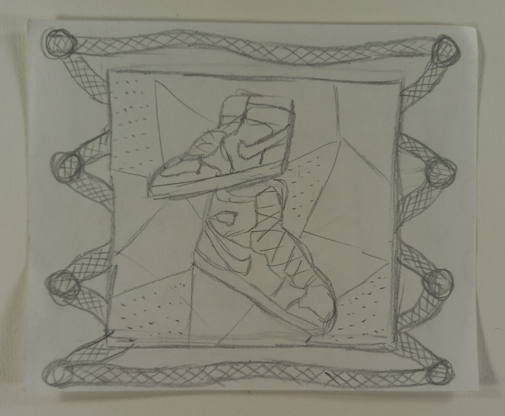

After doing some sketches, this is the composition I decided to go with. I like the lace border as I think it fits the theme well. Also I think the images divided into 4 are very striking because of the range of colour you can get. For the shoes I chose 4 different angles all pointing to the middle. I wanted the silhouette with minimal details, enough to get the idea of what shoe it is but not too much as to not overcrowd the composition.
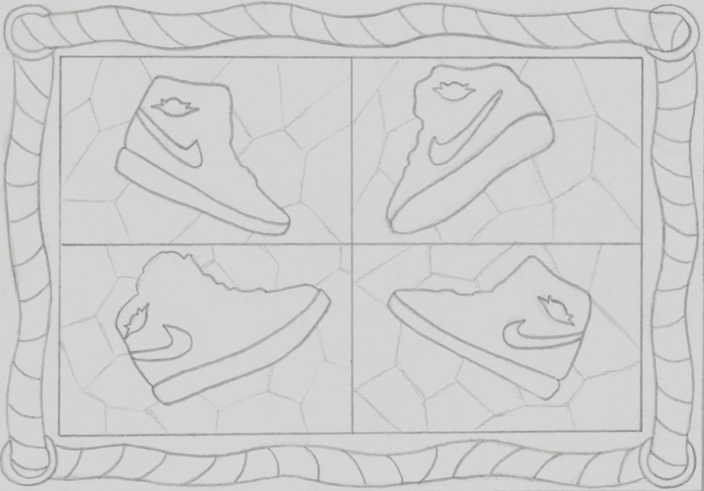
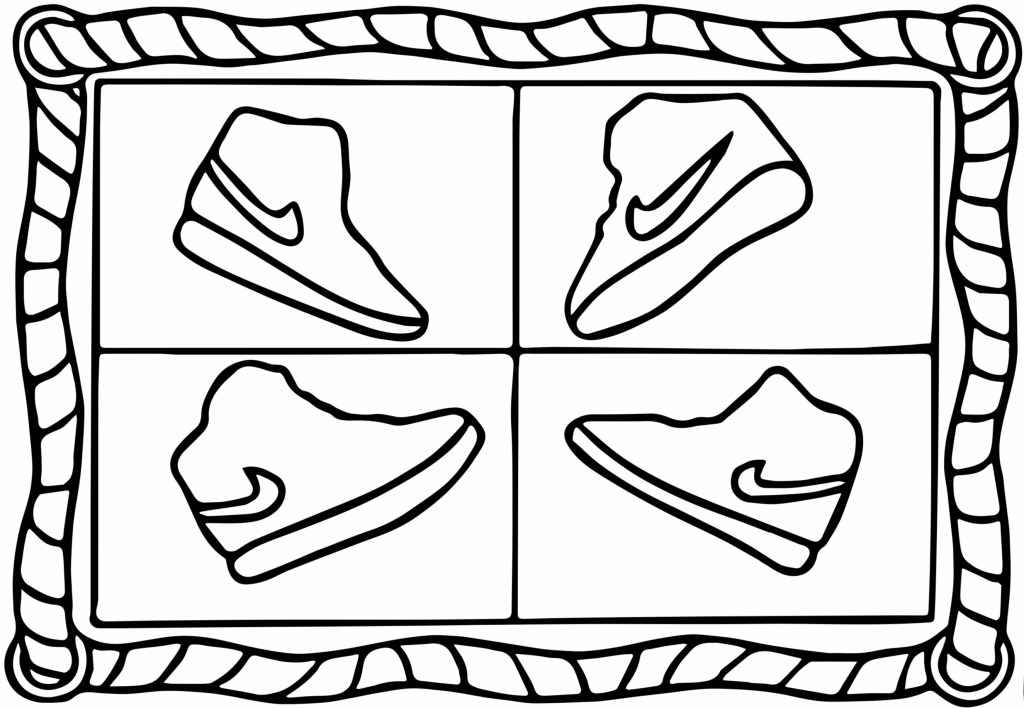
I drew over my sketch in marker so I could scan it and then used Adobe Capture to improve the line work. Before doing this I made a few last minute changes. I removed the geometric shapes in the background and they made the stamp too crowded and distracted from the shoe. I also removed the Jordan logo as it was too small to really be needed when viewing at an actual stamp size.
Using the skills I’ve developed in the digital arts module I added the colour on photoshop using the select and fill tool as well as the colour swatches. I’ve tested out lots of colour schemes, such as pastels colours, warm colours, cool colours and monochromatic ones. I’m gonna continue to experiment with colour schemes to find the final one that I’ll use as my stamp for the project.

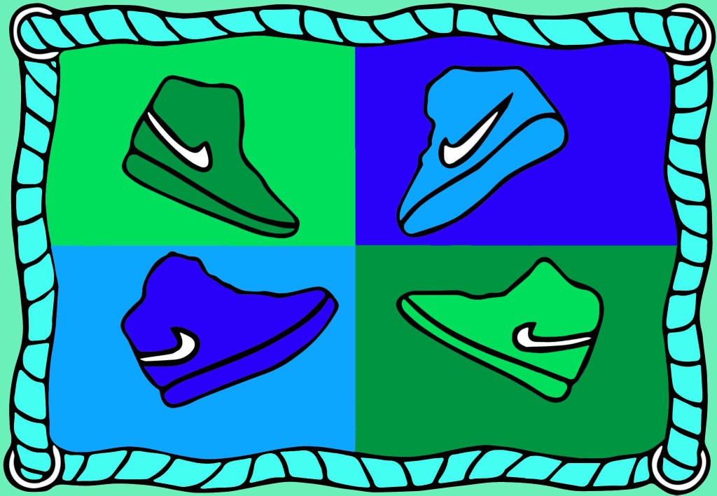
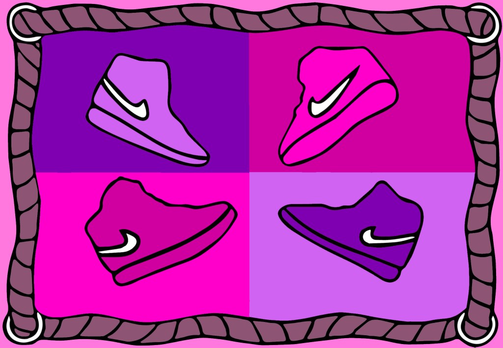

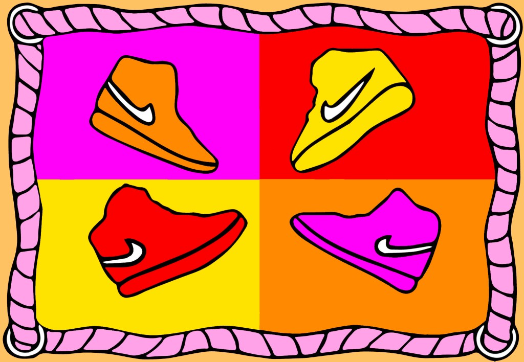
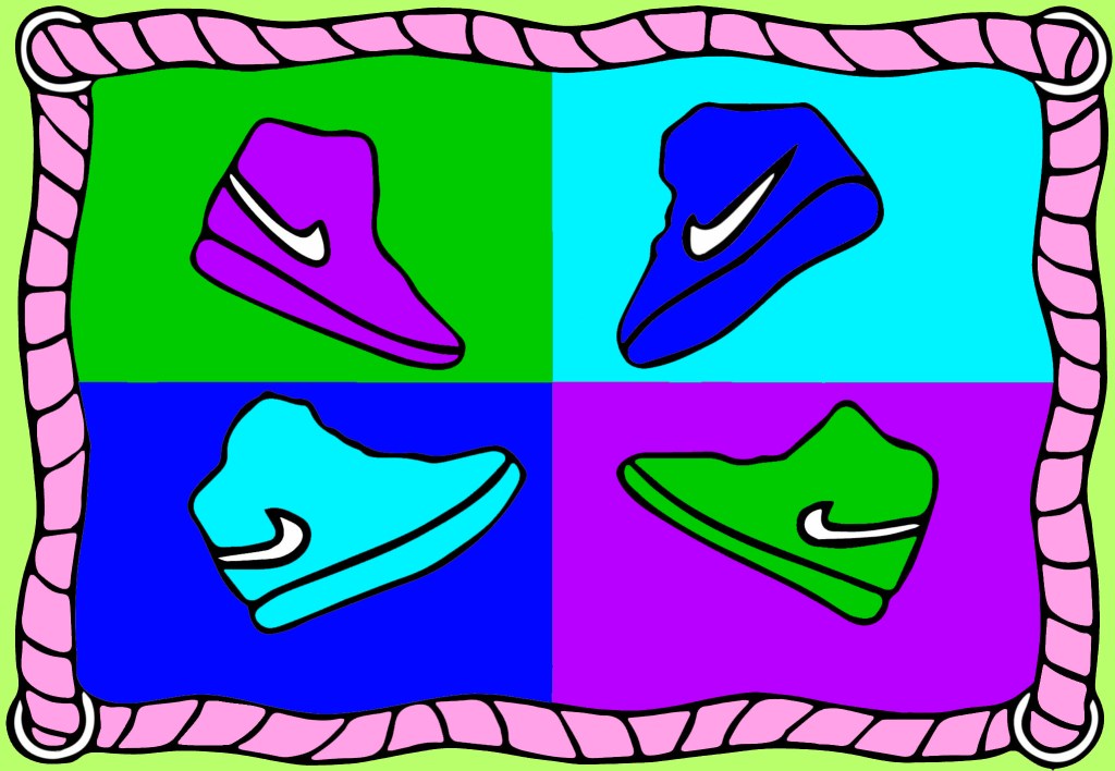

I think my favourite of the colour schemes is this pastel one. I think it it a shift away from the traditional bold colours of pop art. I personally really like soft pastel colours and I think the colours I chose work well as a composition.
