Categories
Level 4 Visual Messaging and Communication

Visual Messaging: ‘Human Library’ Draw to explore 2

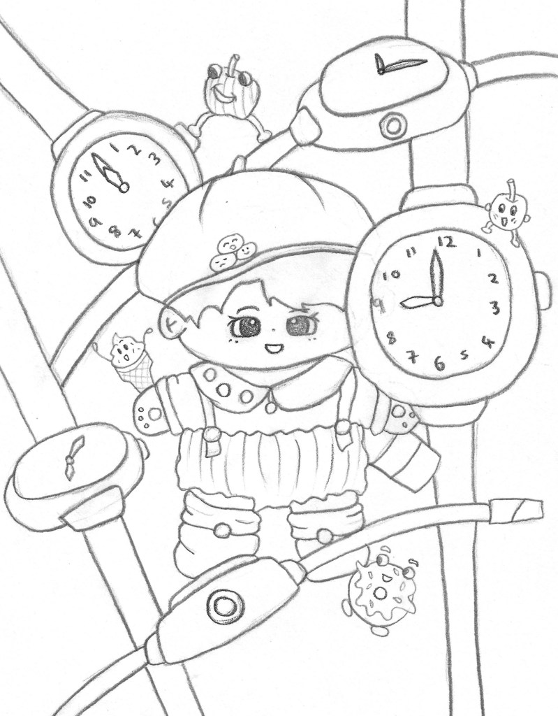
This task was an extension of what we did last week with the observational drawings of our partners sentimental objects. I expanded on the ideas I already had and experimented with new styles and techniques. I also began to consider more about how I could reflect Jianyn’s personality and the things we discussed through my sketches.

I continued to experiment with the blue monochromatic style for these watches. for these I used oil pastel and was pleased with the strength of colour I was able to make.
In our discussion my partner said she really likes the colour yellow so I began to experiment with this colour. I think it helps convey her fun and bubbly personality. I used a water colour backdrop with coloured pencil sketches of some of her cartoon food designs, continuing with the monochromatic theme which I really like.
These combined the watercolour background overlaid with a more detailed sketch. I like the aesthetic of having the rough shape of the object then sketching it but slightly moving the subject. It creates this nice mixed media overlapping image.
More of the same style sketches.
Continuing with the overlapping mixed media idea, I tested out doing a marker pen sketch over watercolour. I really like this one as the bold, dynamic marks made by the pen really compliment the subtle orange water colour behind it.
A similar piece of a coloured pencil watch overlapping a marker pen watch.
This sketch incorporates the blue watch with contrasting black lines and a strong purple background. This is all done in oil pastels and I really like the dramatic feel of the dark background which makes the light watch stand out by creating a strong contrast.
At the end of this session I began to think about combining all the styles and still life sketches I’d done into one composition to reflect the personality of my partner. Here is my first rough idea of a composition. It has different angles of the teddy with lots of different sized watches overlapping each other. This creates a sense of movement and dynamism and I included some of Jiayun’s cartoon foods which are interacting with the other components of this sketch. I think this composition is able to portray a fun, cute and bubbly feeling which I believe reflects my partner and would also be aided by the addition of colour which is something I will continue to explore with more roughs. I was inspired by sci-fi and cartoon movie posters as wanted to capture that sort of life and playfulness.
Another rough composition sketch. This one has only 1 teddy with watches surrounding it. I like the foods in this piece and the life they bring to it but I prefer the arrangement of the first rough as it has more movement and the teddy feels more apart of the composition.

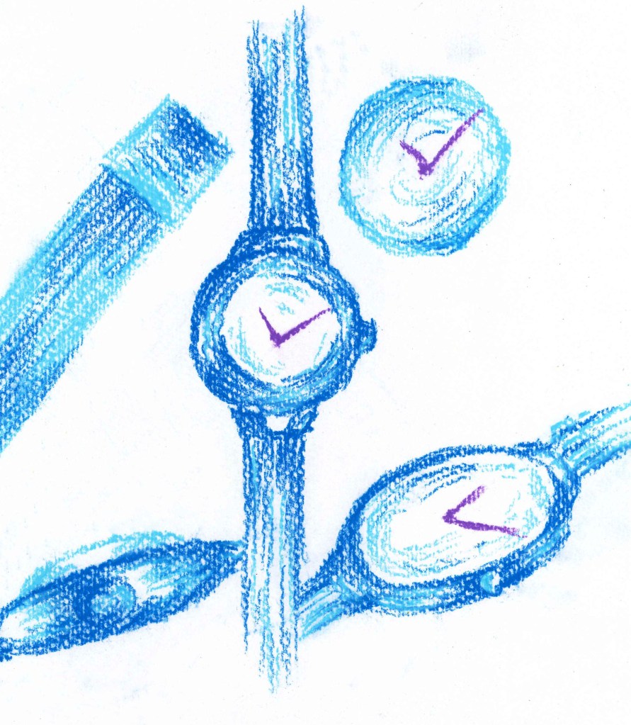
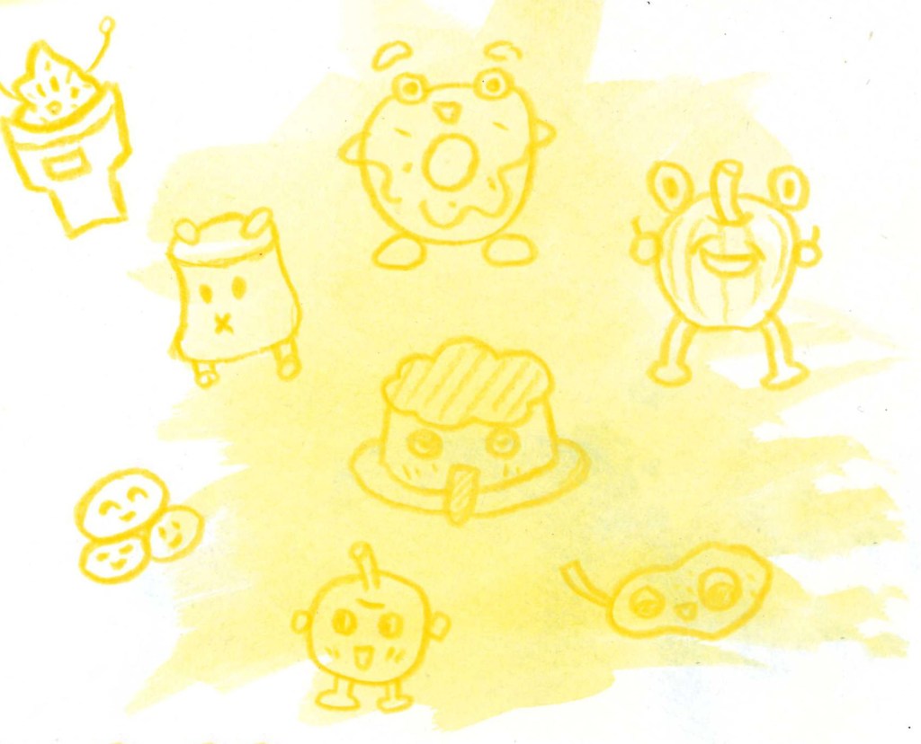
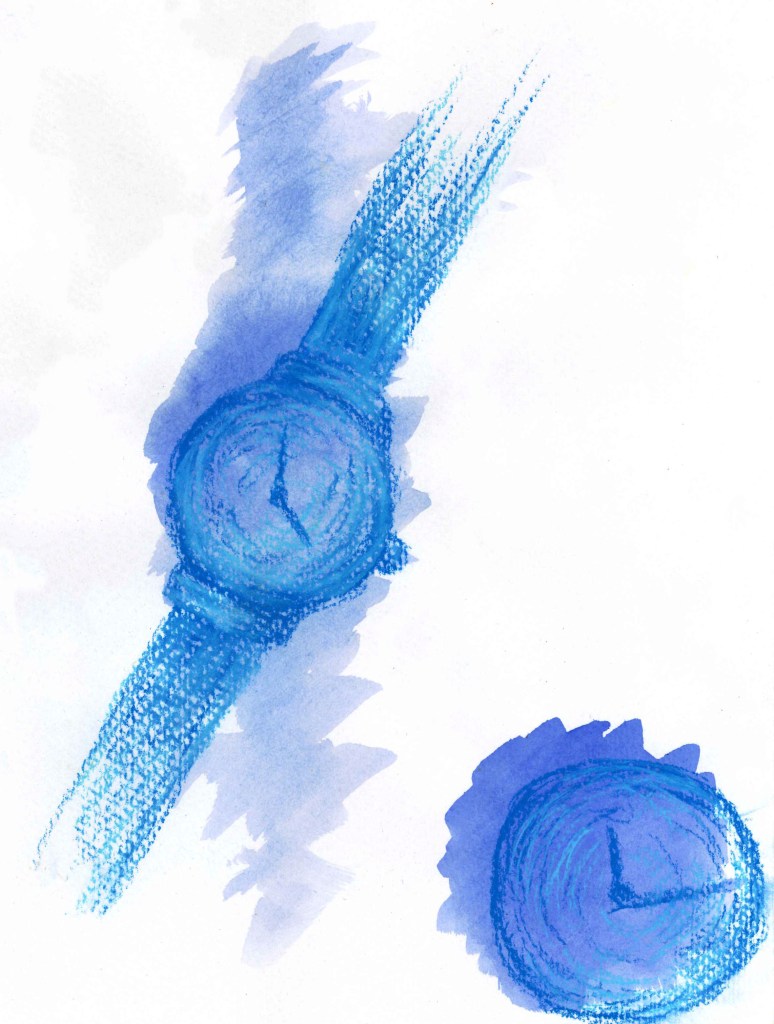
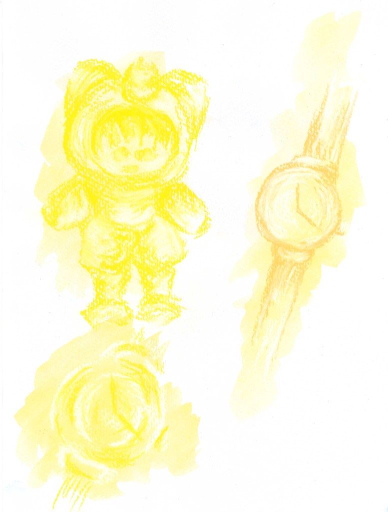
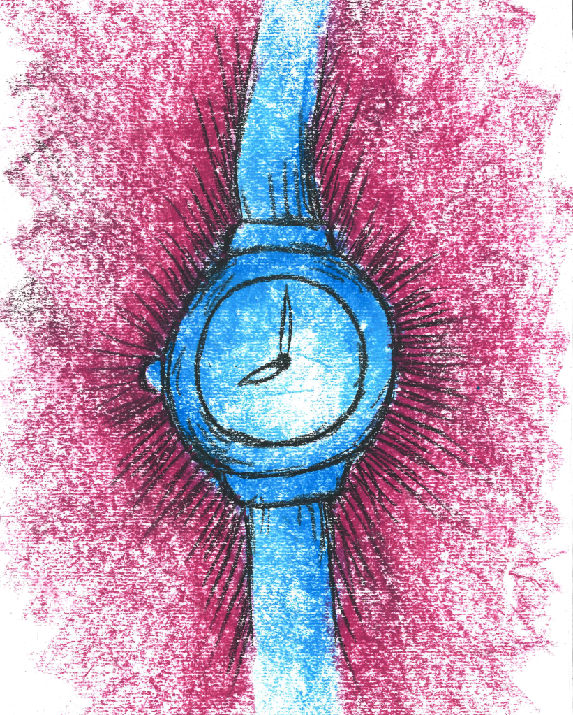
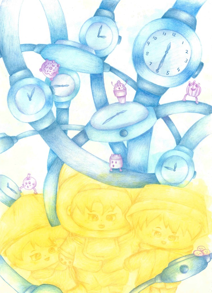
Here is my final image for this brief. I took ideas from all three roughs but mostly the first one as it was my favourite. I chose to use a simple colour palette, limiting it to purple, blue and yellow as these are my partners favourite. Each of the three elements is limited to 1 colour. I used water colour to add a subtle backdrop colour and coloured pencils to add in the details and tones.I think this piece is successful in portraying my partners personality through her sentimental objects. I’m happy with the vibrant colours I used and think it creates a fun and playful atmosphere.

Leave a comment